A special thanks to my blogging friend, Artie, of Color Outside the Lines, for sharing this story with me!
Meredith Corporation which publishes such magazines as Traditional Home and Better Homes and Gardens also keeps the racks full with their special edition issues such as – Country French, Kitchen and Bath Ideas and Makeovers, Renovation Style, Elegant Homes and Décor. Another popular title is Tuscan Style. Word of warning though, Meredith has a sneaky way of publishing the same magazine twice – several years apart. Be sure you check the cover to see that it doesn’t say “Back By Special Demand” or you might be buying something you previously bought before. One such reissued magazine was Tuscan Style which first came out in 2007 and then was repeated again in 2010. This particular issue featured the beautiful Spanish styled Los Feliz house of Michelle Niday, an interior designer. The story is a little out date as over five years ago, Michelle sold the house and moved to a loft in downtown, while her Los Feliz house sold and then sold again. Here are the three versions! Enjoy!!!
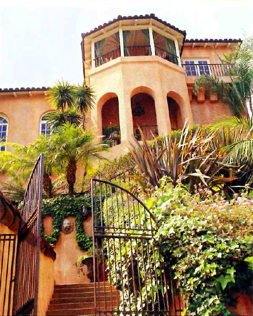
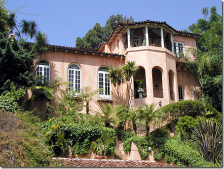
The Los Feliz house was built in the 1931, with 3 bedrooms and 3 baths, and surprisingly a 3 car garage. The views are amazing from the turret’s balcony.
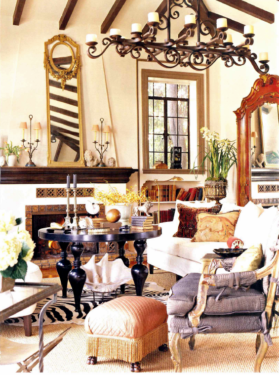
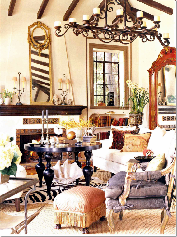
The living room furnished by owner, interior designer Michelle Niday, is an eclectic collection of antiques and accessories. Michelle says she likes every room to have something a little “off.” She doesn’t like her interiors to be taken too seriously. She doesn’t like any printed fabrics, except for striped ones. She likes flea market shopping as much as high brow antique shopping. Textures play an important role in her designs. Here, her slipcovered white sofas are separated by a tall coffee table. These pictures are from the early 2000s.
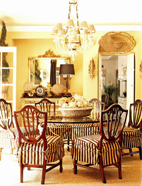
Seagrass lies underneath a glass table, surrounded by boldly striped slipcovers. Shells are found everywhere throughout the house.
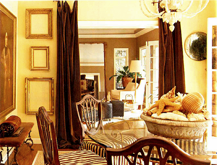
Another view of the dining room shows a collection of empty hanging frames. Velvet portieres divide the dining room from the sitting room.
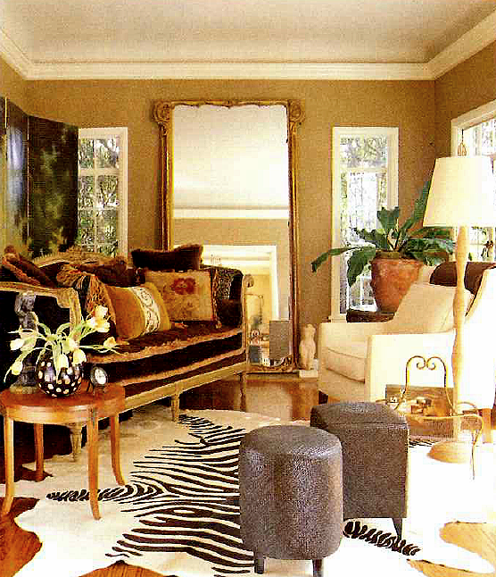
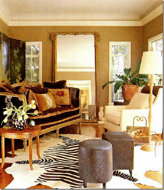
In the small sitting room, a faux zebra provides the much loved stripes. A French daybed serves as the sofa and a large antique mirror doubles the visual space.
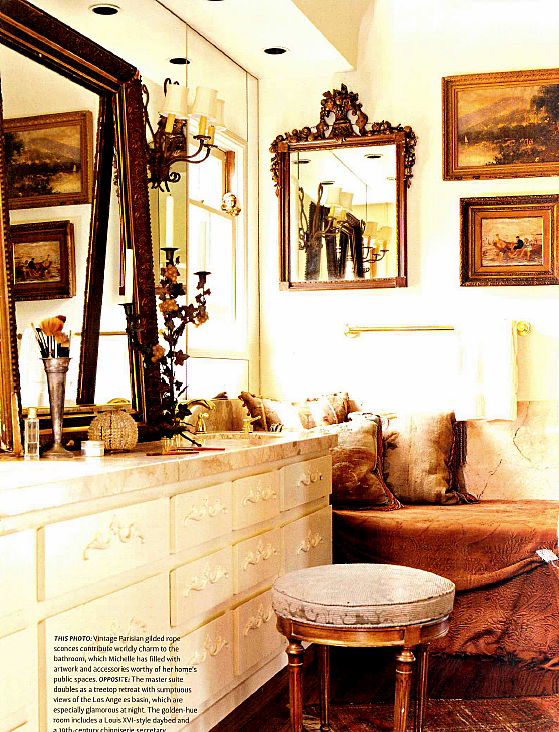
With pillows and bedspreads, Michelle turns the bathroom into a sitting space.
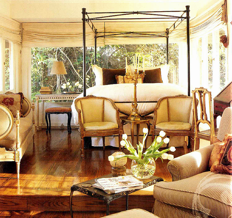
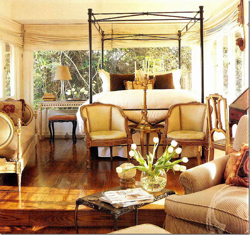
The master bedroom is like a treehouse – with endless views of L.A. Dressy antique furniture mixes with striped upholstered couches and chairs. Right after these pictures of Michelle’s house were first published, she sold it to move downtown into the Toy Factory Lofts:
Built in 1924, this warehouse was most recently a toy factory, hence its name.
Today, the building looks like this – with 119 lofts plus first floor retail spaces.
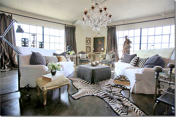
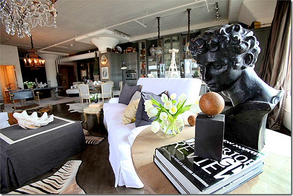
Wow!!! Today, Michelle lives in this open loft space at the Toy Factory Lofts. She says when she moved in, it looked like an empty garage. Even her own mother doubted her abilities to turn the blank space into a beautiful home. I have to say that I love how Michelle’s taste has evolved over the years. It’s more streamlined and less cluttered. It’s more “decorated.” Of course I love the white slipped sofas – but I also love the striped pillows and the way the two zzebra rugs mimic the stripes. The grays look wonderful against the white, as do the brown silk taffeta curtains. Michelle says the curtains and the wide plank wood flooring were two of three must haves. The third? The crystal chandelier. I just wish these pictures were bigger!!!!!
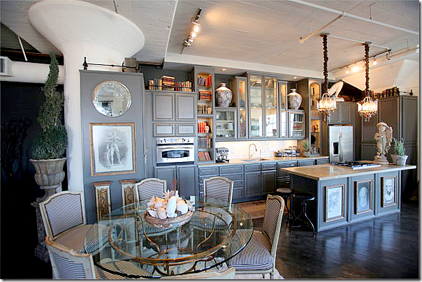
Looking the other direction, you can see the ottoman has white trim on its top and the French chairs are slipped in the same Belgian gray linen. Notice she uses two zebra rugs in this large space. The kitchen and dining area are on the right, back. The sleeping area is behind the dining room area on the left side. Hanging over the living area is a great chandelier found in the famous Paris flea market, the Marche aux Puces. Niday says she wanted this loft to resemble a Parisian apartment. Do you think it does?
A close up of the side table next to the sofa. I love the high backs of her sofas.
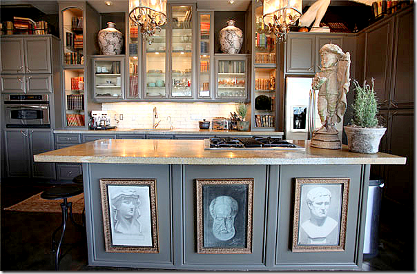
The kitchen was designed by Michelle and her contractor who is also her fiancé. Stripes cover the French dining room chairs. Trying to make the kitchen look less like a kitchen, Michelle added books and accessories to the open painted gray cabinetry.
A close up of the shelves with books and accessories along with plates and glasses. Michelle loves statues and concrete urns and pots.
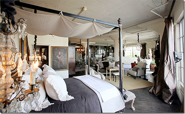
In the bedroom area, a large four poster iron bed looks similar to the one used in her Los Feliz house – but it’s different. The curtain were made with extra lining so they would be full and luscious. The rods are simple industrial ones. A second seating area is between the kitchen and the bed, it’s “walls” marked by the seagrass rug.
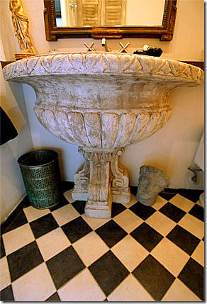
The sink was once a fountain, found in a L.A. shop, while the floors came from Country Floors.
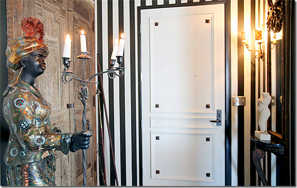
And finally, the entrance to the loft has a rare female blackamoor, along with wood antique doors. After living here awhile, Niday added more stripes to the entrance area.
The beautiful 1932 Los Feliz house was put up for sale again after Niday first sold it. Here, you can see the listing pictures and how different the house looks under the new owners. Out front, the living area is where the three French doors are.
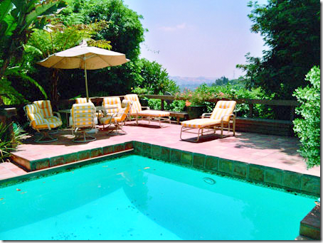
What a gorgeous setting!!!! Just gorgeous!!!!! The property is amazing.
The swimming pool with its stunning views.
The view of the valley – incredible!!!
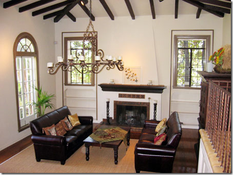
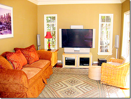
The living room under the new owners looks totally different. The chandelier remained. Even the bookcases were left bare. Remember what it used to look like?
The same room, under Michelle. What a difference! So warm!
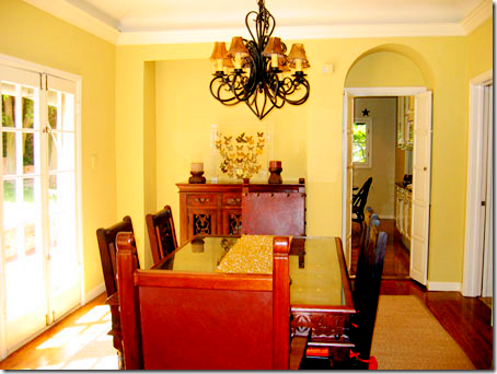
The dining room today – looks like the paint color remained. Here’s how it was under Michelle’s ownership:
The chandelier is different – as is all the furniture. It really looks so different today!
The sitting room as it is today retains the caramel wall color, but that is all that remains the same:
I prefer Michelle’s décor to how this room looks today – I like the large mirror between the two windows. Michelle likes to put furniture on an angle – do you? I rarely use that arrangement, but many people love the drama it creates.
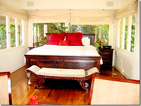
The bedroom today. The shades remain. I like that the bed is centered here. Michelle’s was off centered.
I wish we could see the other side of the room, I wonder if it is the turret room? I just adore this room – I love all the antiques and the soft muted colors. As beautiful as the Los Feliz house is, I think if I had to choose between the décor of this house and the décor of the loft – I would pick the loft! I just love the way Michelle Niday decorated it!!! It really does look like a Parisian apartment – in the middle of downtown Los Angeles:
The Parisian styled loft!!! So beautiful. If I owned a loft – this is exactly how I would decorate it – with lots of white slips, grays, browns, antiques everywhere, chandeliers, and antique books and shells. I think this room is gorgeous. Unfortunately, Michelle Niday does not have a web site that I can find if you would like to contact her. I couldn’t even find an email address for her BUT – I’m sure Google White pages could help you in your search.
To read the L.A. Times story about the loft, go HERE.
Please, welcome a new Cote de Texas sponsor:
GREIGE – who sell everything from furniture to accessories to fabric. Go HERE to see their shop.
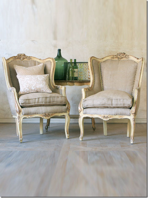
And, highlighting another CdT Sponsor: The Bella Cottage HERE who recently received new merchandise, including this beautiful pair of antique gilt French chairs.
One Designer, Two Houses, Three Looks
Campaigning for Campagne
Going to the book store these days to look for décor magazines is soooo depressing! There is so little available now! Since it seems like the economy is getting better, perhaps we can hope for some new titles in the future or maybe some old titles returning. That would be nice. Imagine Southern Accents being published again. If you do happen to be looking for a new magazine to read, the French language Campagne is an interesting one. Campagne tends to get overshadowed by the slicker Cote Sud and Cote Quest and that’s a shame. Most of the foreign décor magazines are so different than ours. The houses are not styled for the photoshoot, which can be either refreshing or off putting, depending on your personal preference. Campagne’s houses tend to be really not prepared, as if the photographer just showed up one morning, camera in tow, totally unexpected. But, it’s this easy approach to décor that is part of the appeal of the magazine. They have a great web site too – the best part being you can read the articles translated into English on your computer. The computerized translations are not perfect, but at least you can get the basic meaning of the stories. Here are a few houses from the magazine that caught my eye. Enjoy!
HOUSE #1:
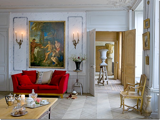
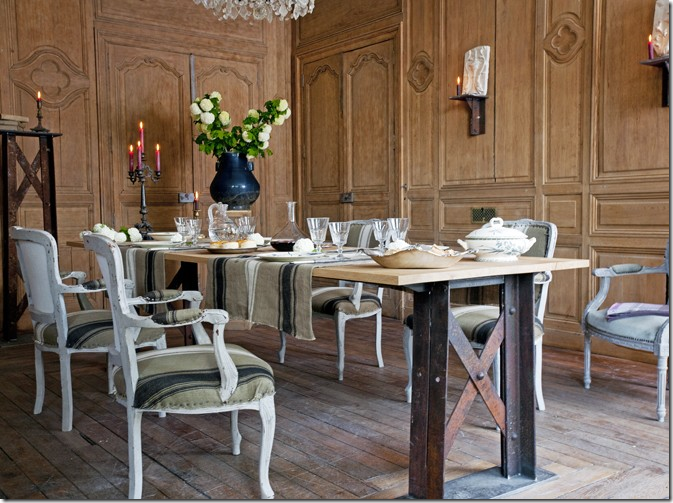
This hotel particulier, a Napoleon III styled mansion, was until recently used as a rehab hospital. It was purchased by a couple who are antique dealers. Together they restored the house to its once former glamour. Here, the main living area shows how the rooms are laid out on an enfilade. Notice the urns that are enfilade too: small, medium, then large. I love the shock of the red amidst all the blue and I love the lone urn standing on a rustic ladder.
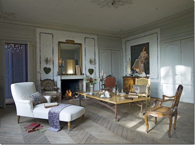
The same room, opposite view. The house, built in 1860, came with historical documents which the owners used to recreate the original furnishings. When the house was bought, the original ceiling was hidden by a false one, which the new owners removed. They also faux marbled the walls in this room.
The floors are oak and were pickled and scraped using a brushed steel wool. The walls were stripped too. The owners mixed an industrial styled table with antique chairs covered in ticking.
The kitchen. I would love to see what is through that door!
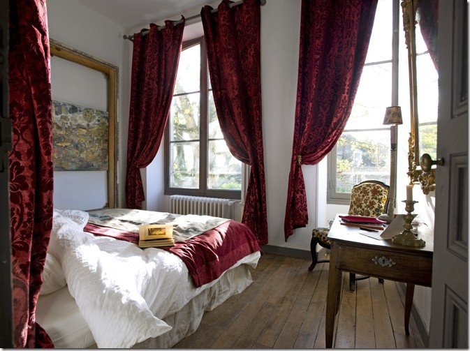
Gorgeous red velvet fabric is used for curtains in this bedroom and the fabric’s color becomes the focal point.
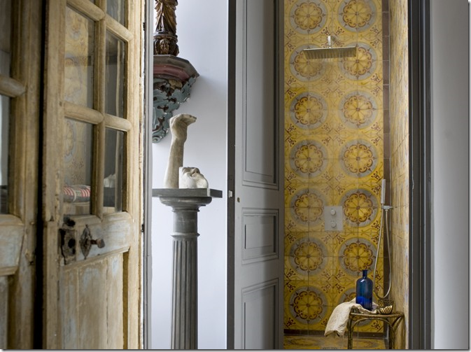
So original – you won’t see another bathroom like this, ever! The shower was made out old cement tiles.
HOUSE #2:
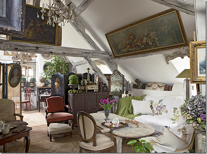
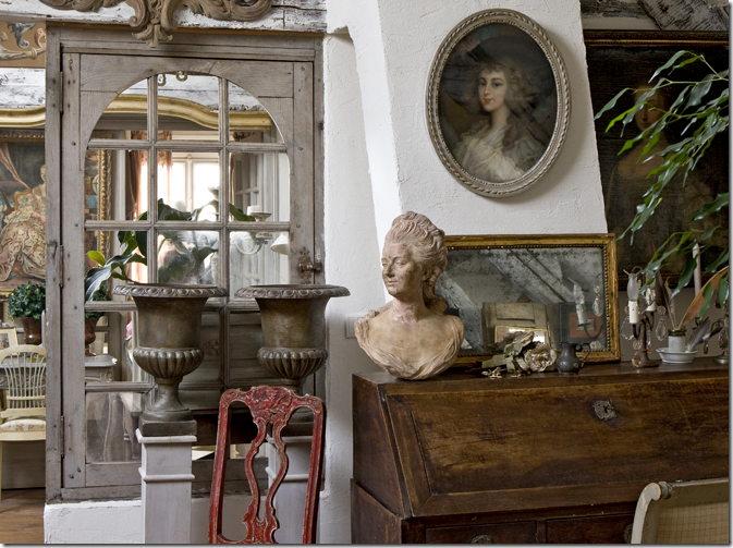
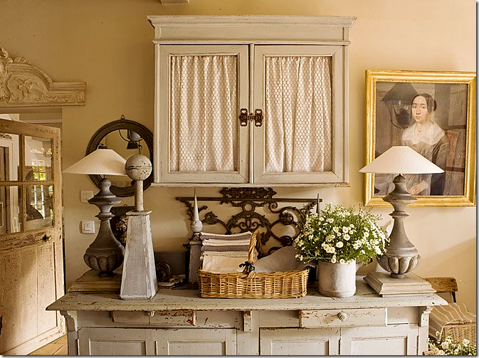
This house is in a village, one hour from Paris – part country and part city. The house is connected to the barn. Like the previous owners, these owners are in the decorating business. This house is magical – a complete utter mess of clutter – and it lures you trying to discover what is hiding in the corners. This living room sits in the barn part of the house.
The barn was sold off separately from the house over 50 years ago. Today, the new owners bought both the barn and house and reconnected them. Here, leaving the barn and entering the house.
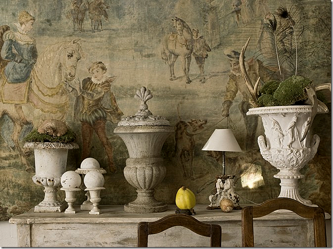
My favorite picture from this house. In the dining room, such a beautiful backdrop to a collection of urns.
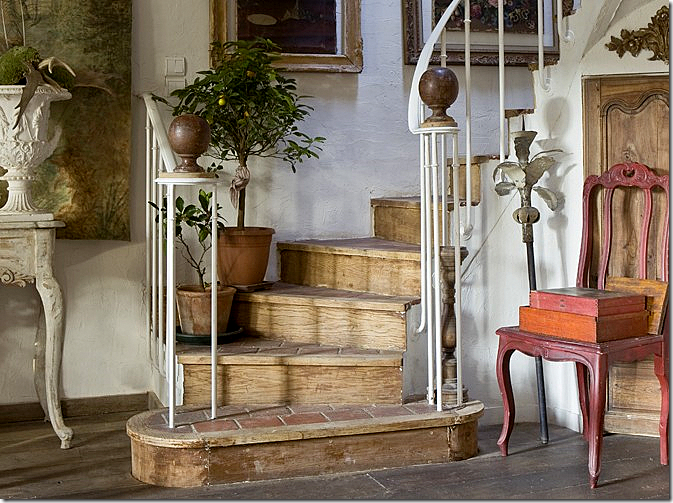
Rustic stairs – made of tile treads, wood and iron – topped with two antique bronze finials.
There is just so much clutter everywhere! You could look and look and still not see it all.
The kitchen with thick concrete countertops. Notice the “crown molding.”
Vignettes are everywhere. I love those sconces and lamps.
The dining room almost seems quiet compared to the rest of the house.
You could take 1/10th of what they own and totally furnish a house with it.
They stripped and limed the shelves – turning the library into a bedroom.
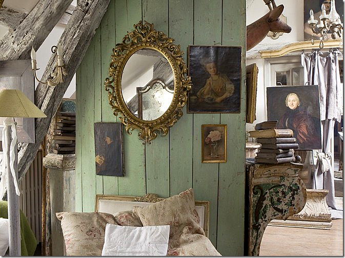
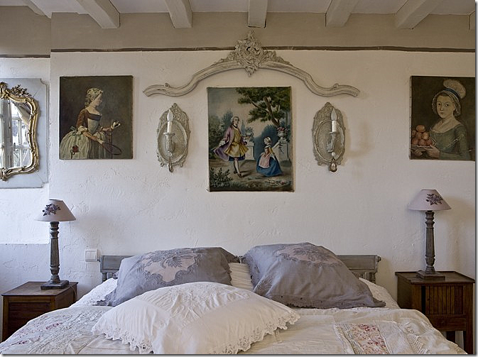
Another bedroom. I love those portraits – both of them!!
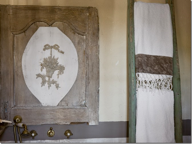
They made a medicine chest out of an old door.
HOUSE #3
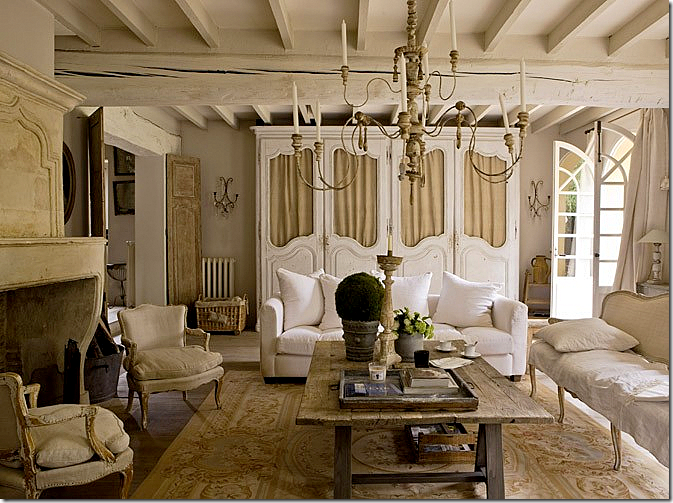
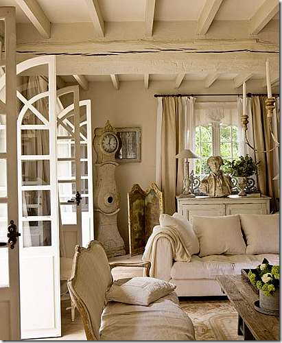
The owners of this house waited 10 years to buy it! Antique dealers and horse traders, their property caters to both sets of customers. I am so crazy about this living room! You could try for ages to get your house in the U.S. to look authentic like this, but you can never get it exactly right!
The décor is a mix of French and Swedish. A Swedish Mora clock stands in the corner.
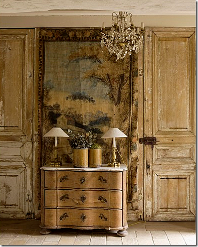
That door! That boiserie! That tapestry! That chandelier!
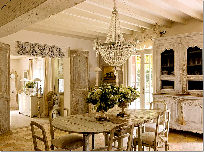
Past the living room is the dining room – all French and Swedish in whites and creams. Gorgeous!!!! Notice those doors leading from the living room.
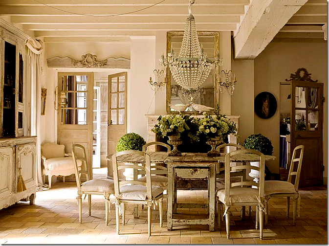
The other side of the dining room showing the gorgeous fireplace, mirror and chandelier. Perfection – this picture makes me cry it’s so beautiful.
A vignette by the dining room. Great lamps.
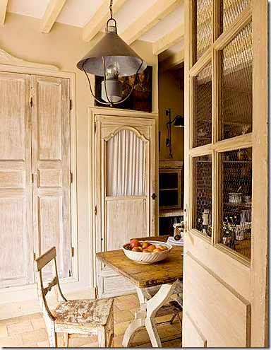
A view into the breakfast room and kitchen through the wired door. Notice the pantry doors.
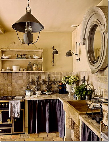
The kitchen. Love the light fixtures. Unfortunately – no pictures of bedrooms!!!!
As you can see, Campagne is no Southern Accents or Veranda. It’s houses aren’t styled in the way we are used to in America. And the French don’t live like we do – where every paper and scrap of mail is tidily put away the minute it’s discarded. They are much more relaxed about their houses than we are. If you like this look, check out the magazine – you’ll love it. If these types of interiors don’t appeal – run to the nearest Architectural Digest. Myself – I like a little of both and I suspect you do too????
THREE GIVEAWAYS ARE COMING!! WATCH FOR DETAILS!!

