COTE DE TEXAS: Search results for irving
Showing posts sorted by date for query irving. Sort by relevance Show all posts

My New Favorite

92 comments


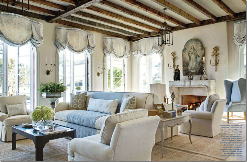
Do you have a favorite living room  - an image from a magazine that you’ve keep in a folder for years and years?   I do.  And recently, I’ve realized I have a new favorite that I want to share with you.   I started writing this story a few days ago and as it grew, the road to the end twisted and turned and took me to places I never intended to go.  With each picture, one design inspires another inspires another.  It’s a lesson learned – classic design isn’t born out of the nothing.  It’s all about inspiration.


image

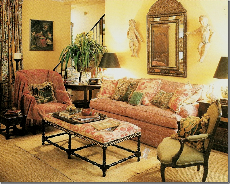
This was my favorite living room for years and probably will always be – Carol Glasser’s former house.  It didn’t matter how often she changed it around (and she did, quite often) – it was always beautiful.  Glasser influenced so many people through the years.   She was the first with seagrass and slips and putti and oushaks and transferware – the list is endless.  But she didn’t make it all up – she was inspired by the grand country homes found in England.  She just happened to be the one to bring it all back to the south, beautifully.  I can’t stress how influential she was to an entire generation raised on Southern Accents and Veranda.


image

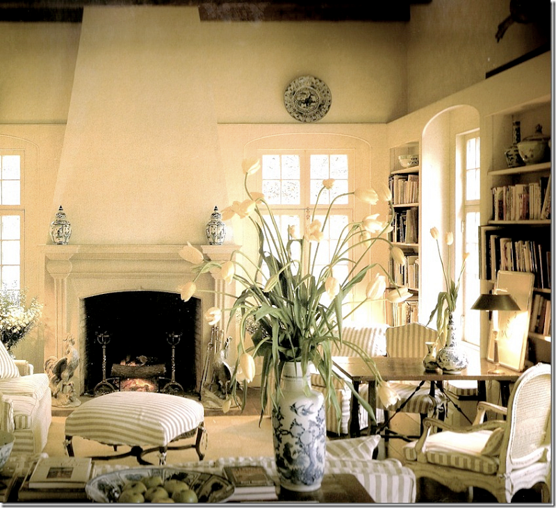
I know I just showed this, but this Dan Carithers living room was a favorite for years.  And still is, along with almost any of his other living rooms, and bedrooms – he was the best there is.   I love the way he used French antiques in his designs. 


image

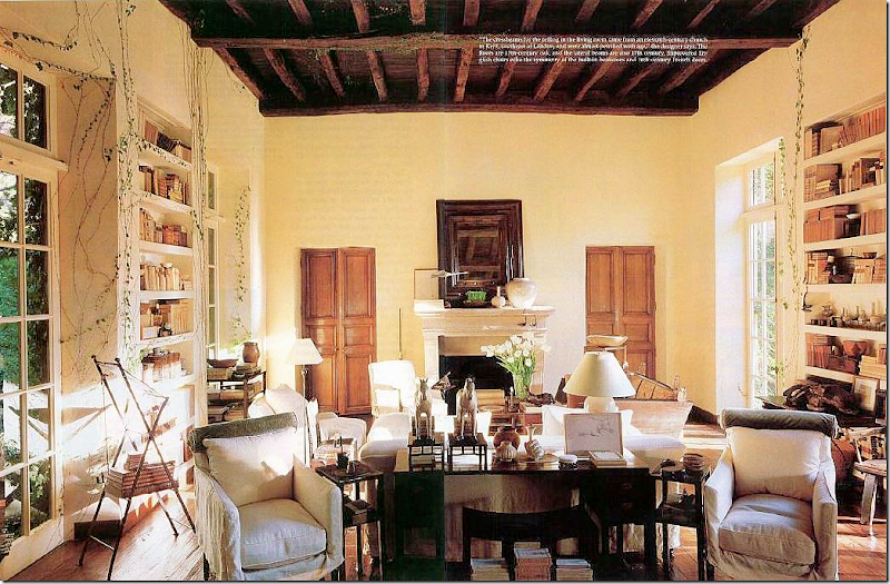
I obsessed over Rose Tarlow’s living room for ages.  And, her entire house.  I still love it.  Tarlow has such impeccable taste, nothing is ever a compromise with her.


image

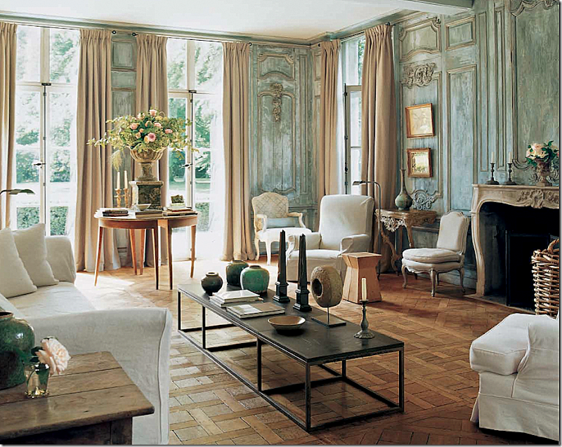
This Belgian house of Edouard Vermeulen is so beautiful – I didn’t think it could ever be beaten – and still don’t.   The paneling is unreal gorgeous.  How many people attempted to create those walls and probably failed?  Impossible to imitate.


image

David Easton’s summer house was a favorite – and so is Penelope Bianchi’s living/dining room.  She modeled her house, especially this room with the dual fireplaces, after his.  Gorgeous room, gorgeous house, gorgeous property.  Each time it was published I just stared.


carolina-irving-living-room

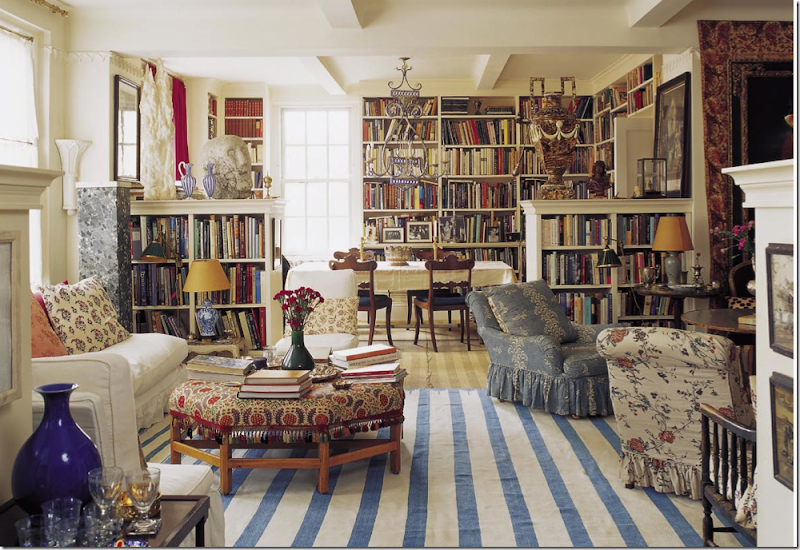
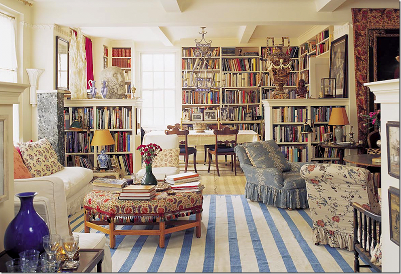
For a few years, I thought Carolina Irving’s NYC apartment was exactly what a living room should look – warm, casual, welcoming.  It still moves me with its slips and Robert Kime ottoman and blue and white rug and books galore.  Another living room in the states that should be in the Cotswolds'.


image

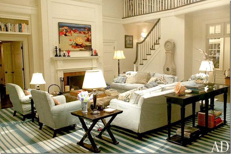
My obsession with this beach house is significant because it’s not even a house.  It’s the set from Something’s Gotta Give.   I’ve always said that if I ever write a book, it will be about how this movie house influenced homeowners around the country to decorate their own houses.  That Mora clock?  Yes, it started right here.


image

Jane Moore’s design for her daughter – still influences me today – years after the room was published.  One of the first houses in the south that used painted Swedish antiques throughout.  Perfection.  How many designers were influenced by Moore?  Probably too many to count.


vernada3

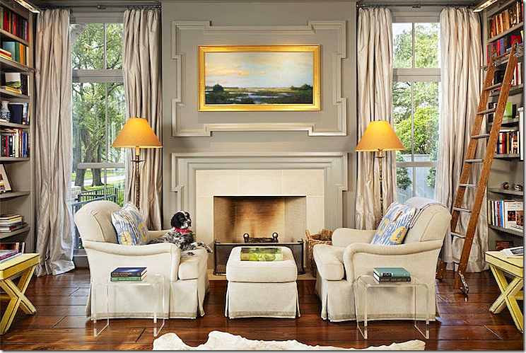
Last year, this living room by James Howard became a new favorite.  While I wouldn’t have done the window treatments like this – I still believe this a beautiful room  - so peaceful, so elegant and casual at the same time.


image

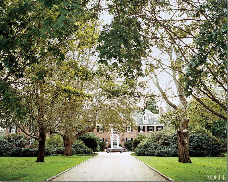
My new favorite living room is located in this house built in 1929 in Southampton, New York.   There are 25 rooms and the house is 180 ft wide from left to right.   It is owned by fashion designer Tory Burch – these pictures were first seen in Vogue and then in almost every blog on the web.  Still, I can’t help but show it again here.  It’s just that gorgeous.  It was designed by the uber chic architect and designer Daniel Romualdez, and decorator Eve Hood, a friend of Tory’s since they were 19 and away on a summer at sea program.   Romualdez is incredible, a true genius.  He is influenced by classic design and doesn’t try to hide it, instead, he celebrates it.  Norman Jean Roy, photographer.


image

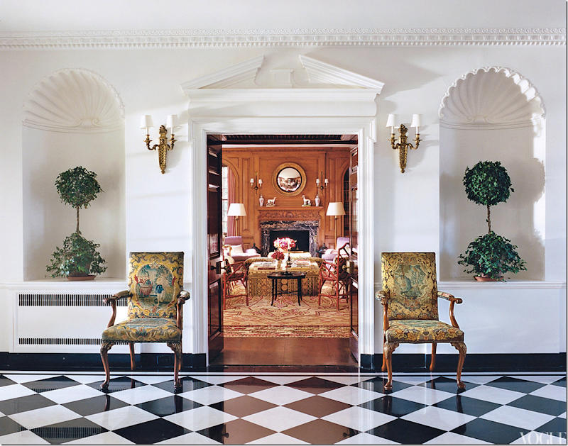
The entry hall has classic black and white marble.  The double wood doors open up to the library.  Unfortunately there aren’t pictures of this room.   These two chairs actually came with the house.


image

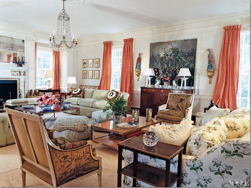
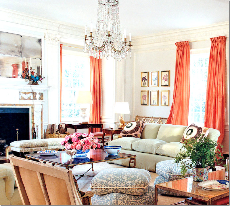
And here is the living room that is now on my most favorite list.  Isn’t it gorgeous?  I just could stare at it forever.  Lucky Tory Burch gets to live there! 

Looking at this makes me feel so inadequate.  I would love to be talented enough to put together a room like this.   It’s just such a beautiful design, without flaw or mistake.  It’s perfection.  And it makes me want to break out of the “Houston Look” rut and bring in color and pattern everywhere.  But, don’t you first have to own a house like this?

I’ve been feeling this way about color and pattern for a while.  And I know it won’t change how I want to live,  it does make me yearn for a second home to decorate just like this!  Of course, first I’d have to win the lotto – but that’s what dreams are all about, right?

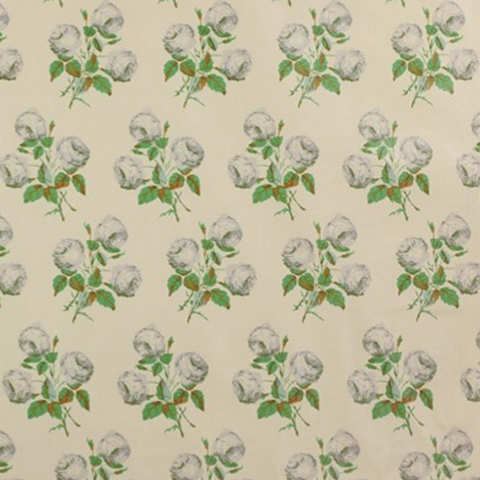
There’s really nothing new here.  The fabrics are well known and old.  The slipcovered sofa in the chintz is just the well known Colefax and Fowler print, Bowood.  But, has it ever looked better or more fresh???   I know I said I wouldn’t change a thing, but I would of course.  I’m not a huge fan of the John Dickinson white lamps and I would probably do stools instead of pillows on the floor – but those are just tiny details.  Would I ever choose those luscious taffeta curtains in peach – or pink grapefruit - as they are described?  No. Never -  I wouldn’t have thought of that.  But don’t they just make the room?  And I wouldn’t have peacocks either, but again – they are so perfect there!   Everything is.  And the chandelier – something about that dressy, crystal confection is so right for the room – like that perfect necklace or brooch that completes the outfit. 

Who am I kidding?  If I did this room, it would be all white and slipped and that’s the whole point.   Am I getting ready to branch out?  Are you?   Does this room affect you the way it does me?  At this point, I’m ready to ask it to get married!!


image

The classic Colefax and Fowler, Bowood, on the slipcovered sofa. 


image

Close of the second seating arrangement by the fireplace.  Two celadon covered sofas face each other – with Suzani pillows.  I love the blue fabric on the pillows. 


image

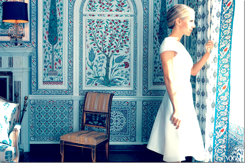
The dining room is covered in custom Iksel.  Incredible.  These panels are based on Persian Iznik tiles.  I wish we could see more of this room!!!!

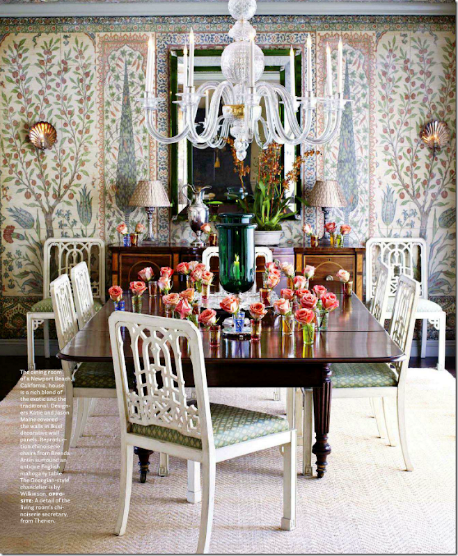
This wallcovering has gotten popular in the past few years.  Here, it is used in a Californian dining room:


image


image

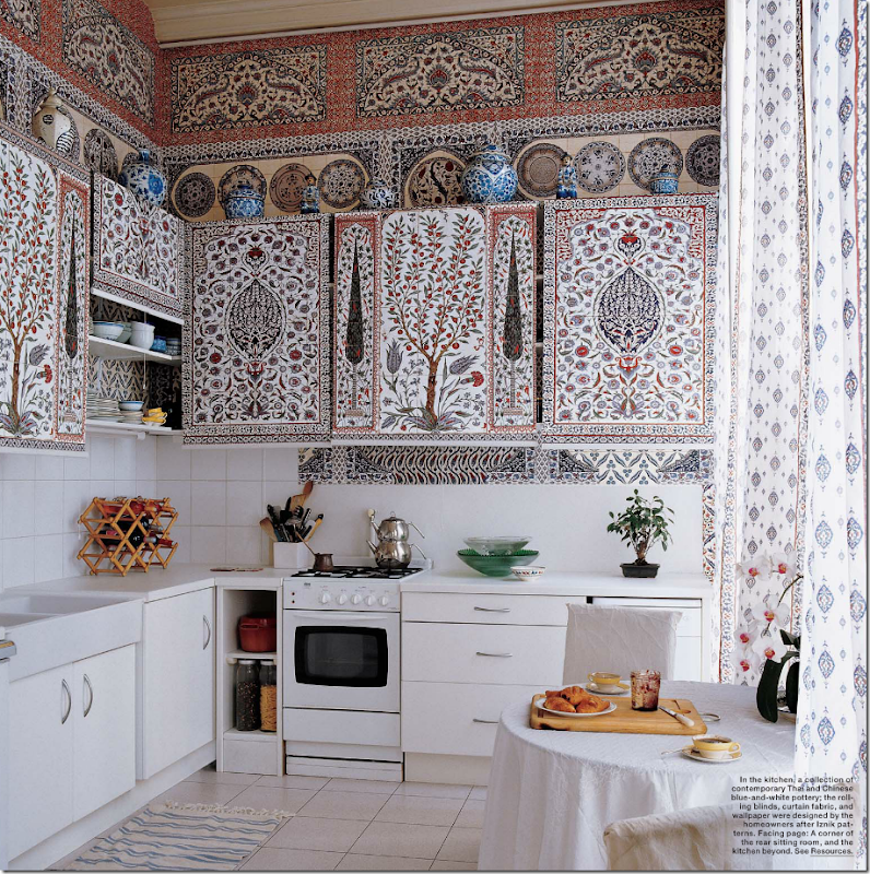
And in the apartment that the owners of Iksel live in  - they used the same pattern in the kitchen!  The cabinet doors are actually shades. 


image

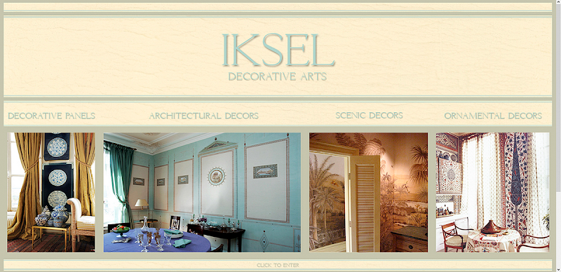
To read more about Iksel, go HERE.


image

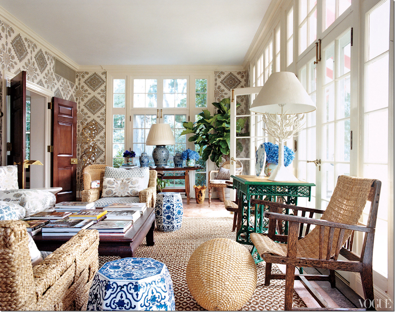
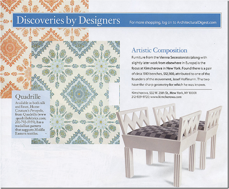
Tory’s solarium is all kinds of wonderful.  Great textured rug and vintage John Himmel chairs.  The fabric on the walls and chairs are both from Quadrille.  The walls just make the room.   Love the blue and white garden seats.  The doors are so beautiful too.   It’s so classic.  So pretty to look at.  Eye candy.  Just gorgeous!!!!!!!!!!!!


image

The Quadrille fabric on the furniture and walls.


image

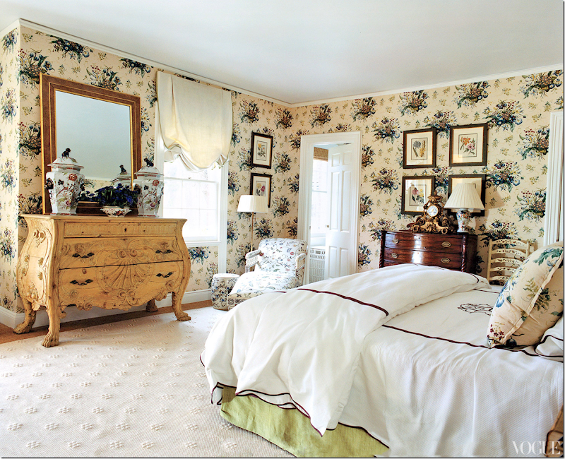
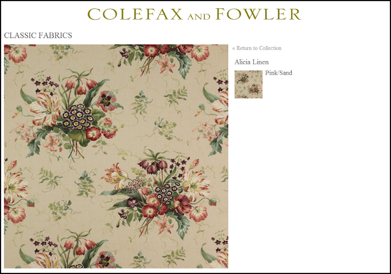
The master bedroom has a Colefax and Fowler classic print that lines the walls and is on the pillows.  Beautiful chest.  Love the oversized jars on it.  The walls make the room have a vintage feel, but the bedding and rug updates it for today.


image

Fabric on the walls but in a different colorway.

There are more pictures of the outside of the house on the web site if you haven’t seen them before. HERE


And more… 

Tory lives with her three sons in an apartment in the Pierre Hotel that is several suites put together.  Again, the wonderful Daniel Romualdez worked with her on this, and he also does all her stores.  Here’s a few pictures:


image

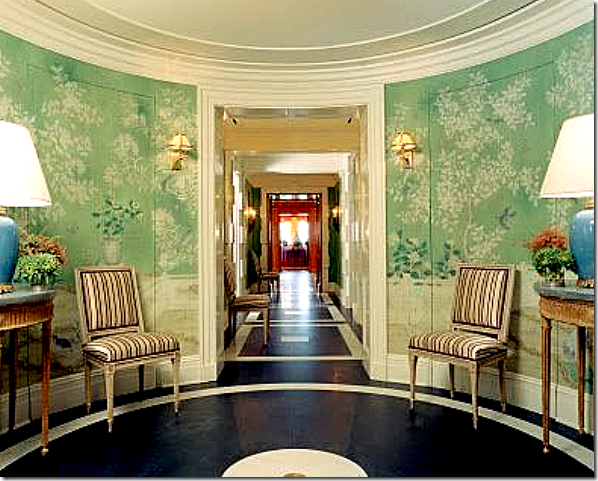
The foyer with the painted floor and beautiful hand painted wall paper. 


image

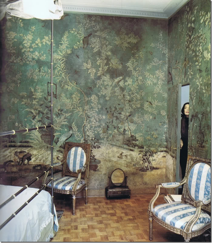
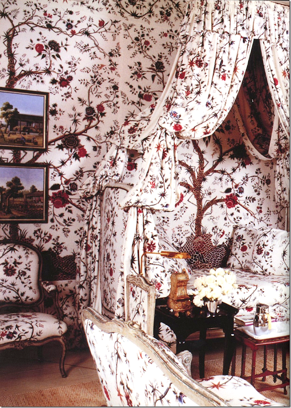
Was Romualdez influenced by this Pauline de Rothschild bedroom in Tory’s entry hall?  Maybe not directly, but certainly indirectly - this image has caused a resurgence in hand painted chinoiserie paper. 


image

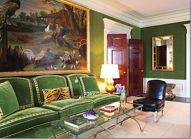
The drawing room is covered in moss green velvet with simple textured rugs, beautiful double doors, again, and wonderful porcelains.  This sofa sits against the front wall facing the fireplace.


image

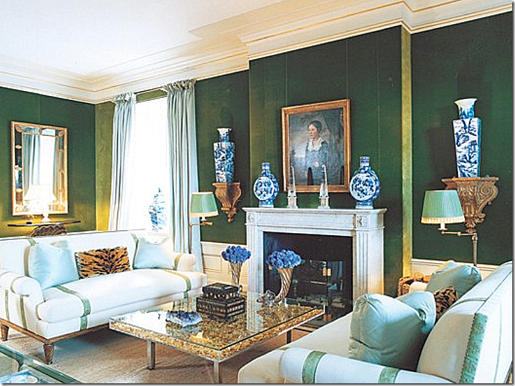
Across are two white sofas and lots of blue and white antique porcelains, which I love. 


image

That painting is amazing.  I love the blue and white against the green velvet.


image

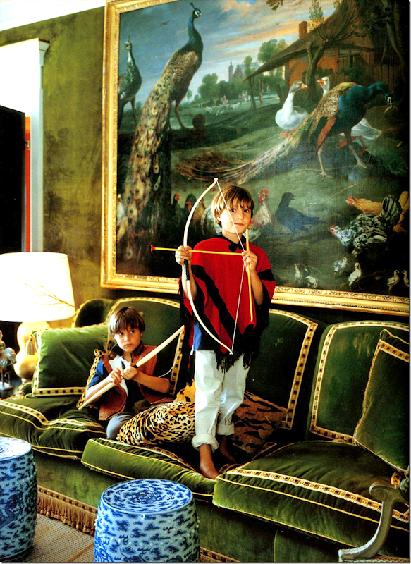
History repeats itself:  you can see here at Hôtel d'Orrouer, the Paris home Hubert de Givenchy, where Romualdez might have gotten his inspiration for Tory’s living room with the same green velvet sofa with trim, the leopard pillows, even the green pleated shades.   Classic design never goes out of style.  Today, this color green is so in vogue. 


image

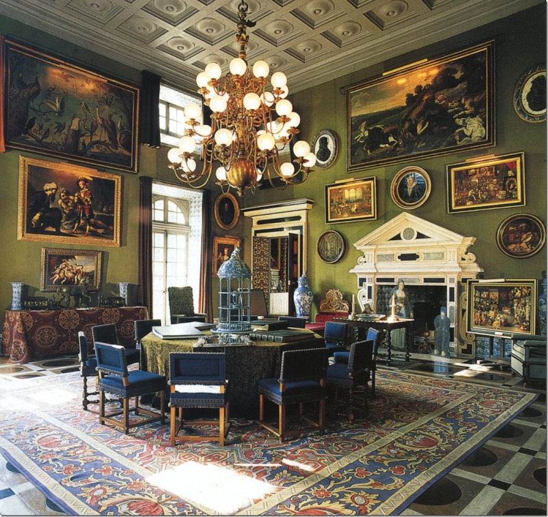
And further, was Givenchy influenced by Charles de Beistegui?   Or did Beistegui influence Romualdez directly?  Photograph from Mark Sikes HERE.


More pictures of Tory Burch’s NYC apartment are available in this book: 


And more…

image

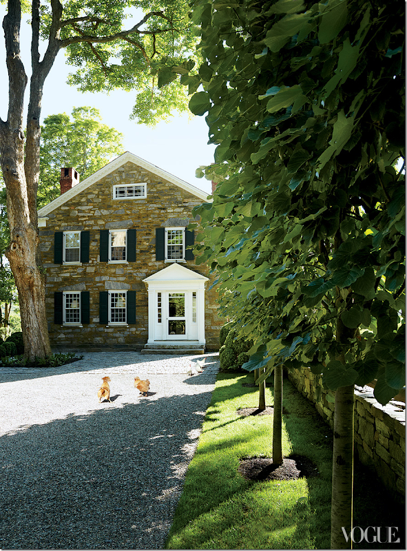
Architect designer Daniel Romualdez is the man behind all of Tory’s houses and her stores.  And his own houses are also incredible.  I believe he owns five, now, including this one in Connecticut that once belonged to the late clothier Bill Blass.  It’s an 18th century, former tavern -  made of stone. 


image

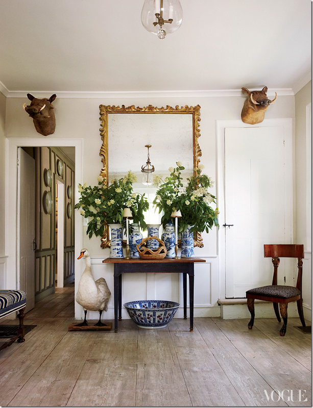
Romualdez had seen the house before.  But, it sold to someone else after Bass died.  Once they put it on the market, he looked at it again and this time bought it.    The maple floors are original to the house, from 1779.  Love the juxtaposition between the fine and rustic here in the entry hall.


image

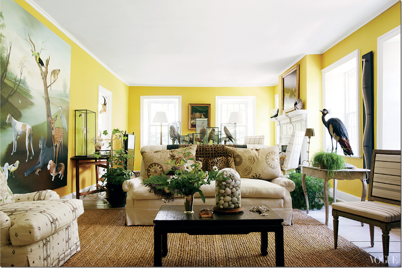
The living room is a double sized room, just like the master bedroom.  Painted bright yellow, it so different than what it looked like when Bill Blass lived here.  “Bill had beautiful pieces of furniture,” remembers Oscar de la Renta of the living room, “but it was designed for no one to have a conversation in!”   Today it looks cozy and warm and certainly right for conversation.  


image

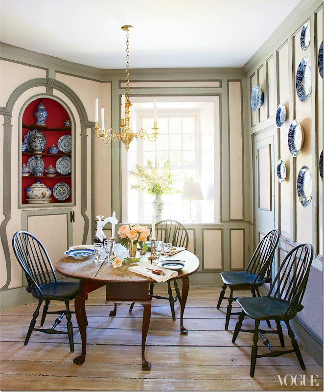
Apparently, Blass used this a bar area.  

“I never, ever bought a Windsor chair in my life before!” says Romualdez, laughing. “It wasn’t exactly my aesthetic. It was a big learning curve, but now I’m obsessed. And I can’t believe that you can buy a beautiful, super–high quality eighteenth-century Windsor chair cheaper than a chair from Crate & Barrel or Ikea.”


image

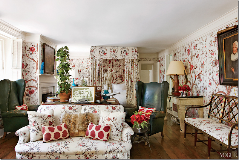
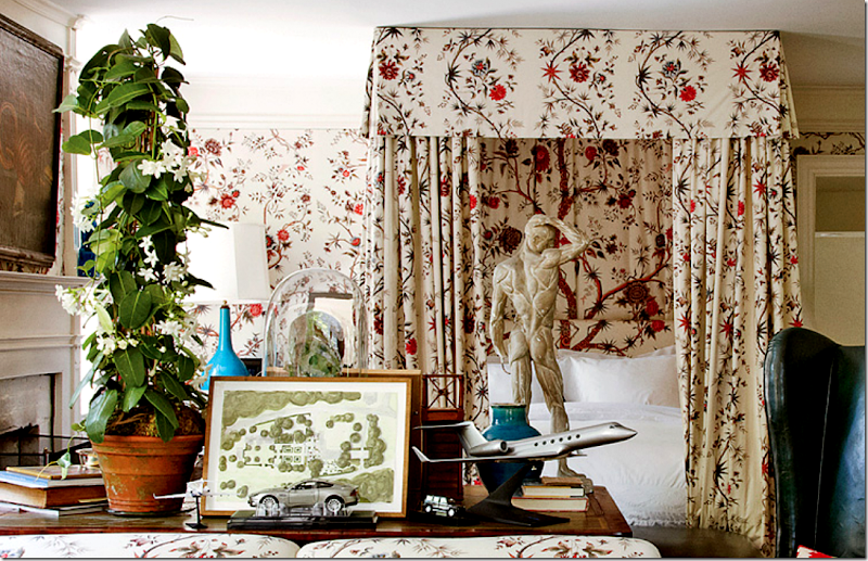
Yes.  Well  - what can I say?  Drop dead gorgeous!!!!!!!!!!!!!!  The bedroom.   The fabric is Braquenié’s “Tree of Life” and it’s a stunner.  I’d NEVER leave this room!!!  Love the pops of blue throughout.  The antique wing chairs are divine.  But it’s that fabric!!!! 


image

Close up of the table between the bed and sofa.  On the table is the plan for the house’s gardens and the model of a plan he outfitted for a client. 


image

Again, just like in Tory Burch’s NYC apartment where Romualdez was influenced by Hubert Givenchy – here you can see in this bedroom of Givenchy’s he has used the same exact fabric.  Again, classic design never dates!


And, here is how the bedroom looked when Blass lived here.  So different!!!


image

The property with sheep grazing behind the house. 

To see more of Daniel Romualdez properties – the  Wall Street Journal showed them HERE


image

And back.  Any excuse to post this picture again!  It’s really interesting though, how one picture can take you on a road trip that you really didn’t intend to go on.  From my own favorite rooms to my new one…to Tory’s NYC apartment to Givenchy’s living room..to Daniel Romualdez’s Connecticut home to Bill Blass and back to Givenchy again.  All these rooms that connect through great design and inspiration.

I hope you were inspired too!!!


Do you have an all time favorite room and a new favorite one???

Leave a comment and tell us about it!


Library Woes

211 comments


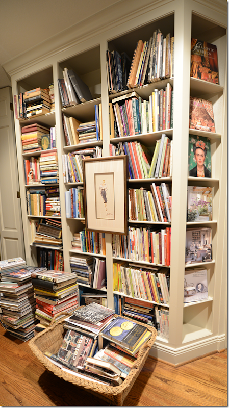
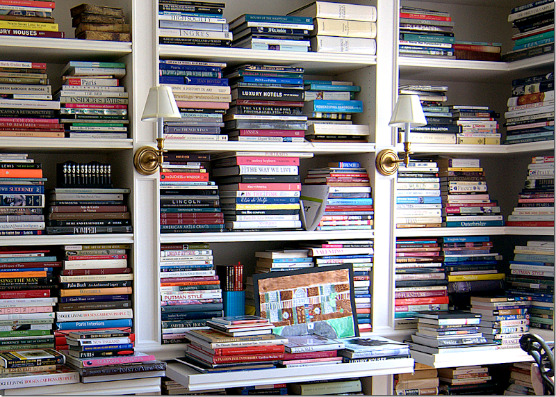
Over the past five years, I’ve written about my book storage issue more than a few times.  The fact is that design books have overtaken my house, like rats in the attic. 

AND, speaking of rats in the attic – remember my story about U-Verse???  We had a problem with our connections that U-Verse couldn’t seem to get fixed.  WELL…..

After I wrote about our TV/Internet problems, I got an email from the husband of a reader who was worried my computer issues would affect the blog – thus making his wife unhappy.    Said husband is an executive with ATT.  Last SUNDAY (yes, Sunday) I get a call from U-Verse, asking to come out and fix my issues.  WHOA.  Since then, they’ve been here a few more times and things are working amazingly perfect so far.  The culprit?  Hiding deep in the wall was the main electrical line to the modem – all chewed up by some animal,  either a rat, squirrel or raccoon!!  Take your pick. 

So a huge thank you to ATT, the reader and her husband who really went all out to solve my issues.   I still can’t get over the excellent service we got.   Thank you!!!!

So, back to my design books which have overtaken my house like rats in the attic.  Ever since I started watching Hoarders on TV, I’ve felt like they were going to put me on the show, sitting high on top of a pile of books, sleeping on them with an old pillow and a ratty quilt.  I love that show.  Nothing makes you want to edit and clean your house more than watching an episode of Hoarders.  Here’s the problem:


image

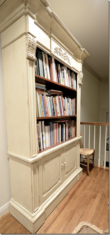
The main bookshelf in my house is here on the landing.  When we first moved in, it was more than adequate.  But that was around 18 years ago and we have long since outgrown this.  In addition, there’s another small bookshelf in the guest room.   As you can see, the books that don’t fit in are now standing in three tall stacks with more books in the basket.


image

At first I put the stacks of extra books against this wall, but when Halo Styles sent me this cabinet by error, I kept it, and filled it up with excess books.  By the way, the 2 shelves inside the cabinet doors are also filled with books.  And…the stacks continued to grow.


image

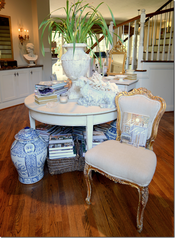
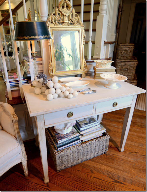
The books are everywhere.  The first you thing you see when you come inside my house is this library table with masses of books underneath.


image

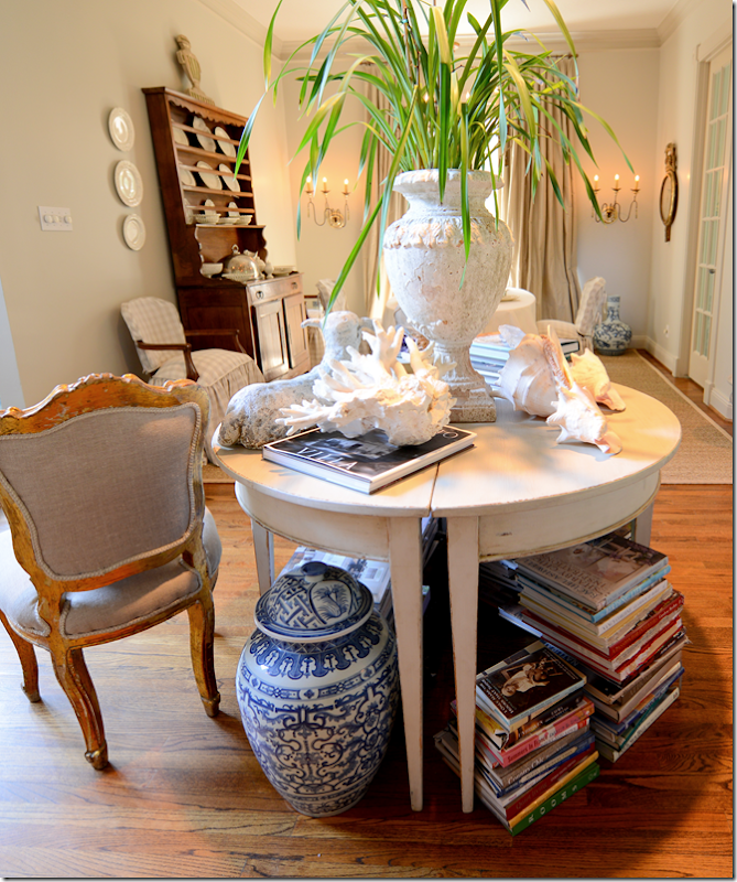
And more on this side of the table.


image

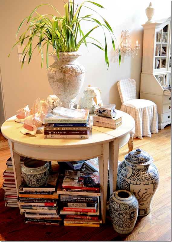
And even more.  There are also stacks of books in the living room, under the end tables and coffee table.


image

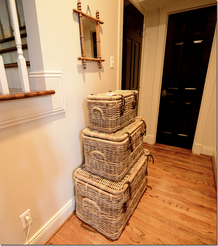
I bought this set of 3 Kooboo baskets to hide more books.  Each one is filled to the top.  It weighs a ton to move these. 


image

There are more books under this table, and there are even books on the stair steps.


image

There are more in the family room.  This basket is filled with books.  So is another basket under the coffee table.  And there are more books on the breakfast table just waiting for a home.   I don’t even have the nerve to show you the stacks of beautiful design books that are rotting away in the garage.  Sinful!!  But I literally have no room for them.   I also have a large collection of gorgeous Beta-Plus books that are scattered all over the place, here, there, in the guest bathroom even.  I want them all together – like they should be.


image

I probably could fill up these shelves with books, but I want this to be filled with antique books not design books.  I know.  It’s stupid.


So, after years of deliberations…here’s the solution.


image

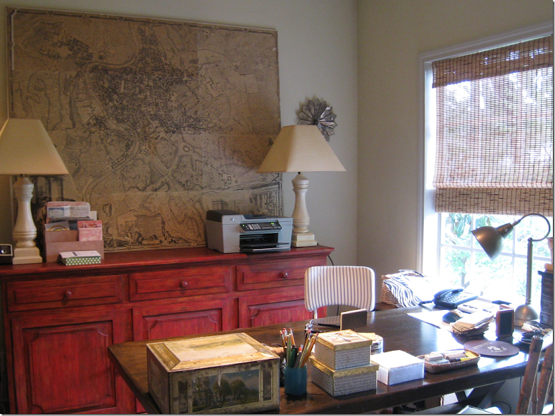
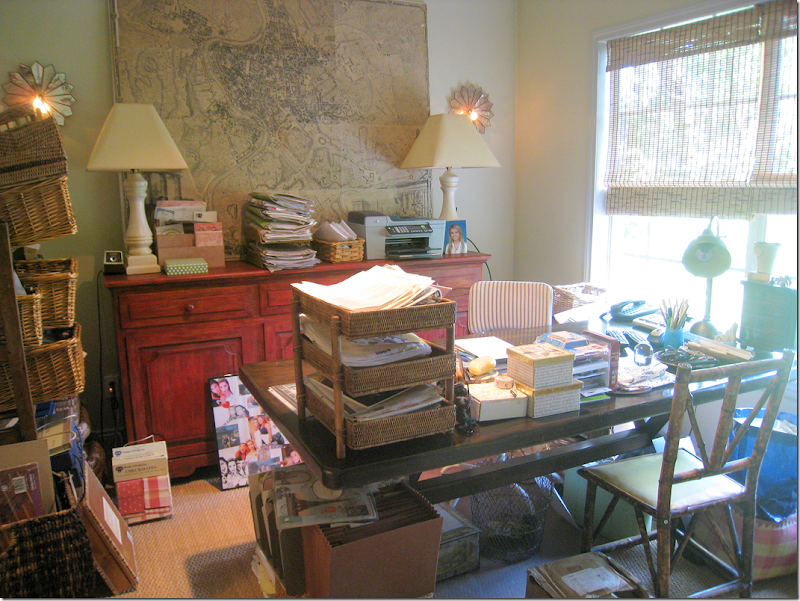
This is my “office” – a teeny, tiny guest room. I took this picture about five years ago, cleaned it all up for the picture.


image

Because this is how it really looks.  But the thing is, I don’t really use this room much, anymore.  Elisabeth and I used to spend hours in here together on our computers.   But now, I’m always blogging downstairs, outside most of the time to escape the blaring TV, and I certainly never had a client in “my office” before.  Plus, all those catalogues and samples that were once so important to the business – it’s all on the internet now – I can’t remember the last time I opened a 20 pound catalogue from a furniture company.   And, then, since the blog keeps me so busy, I don’t take on as many clients these days.  And please, that red console is enough to scare away any client that walks here!  Red?  Seriously, what was I thinking?  The desk is an x-frame dining room table from Pier One that I bought over 10 years ago.  Those chairs are long gone.  Actually there are the kooboo wicker chairs in there now, well they were in there…..because….


image

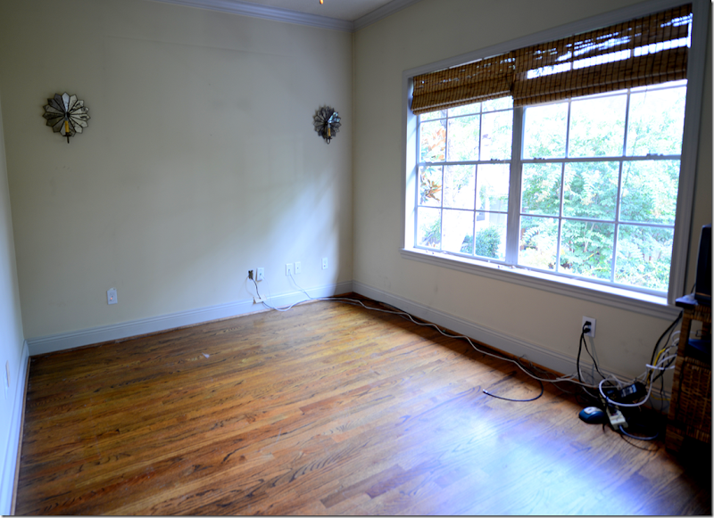
The office looks like this today!   I spent a day this week cleaning it all out – filing client files in the storage closet, getting rid of old catalogues, lugging that red console downstairs (well helper James really lugged it down the stairs) and he’s also taking that antique map home, though he doesn’t really understand what he has!  Next week, there are going to be wall to wall bookshelves installed in this room.  The shelves will start on the left side of the room, go around to the back wall, and onto the right wall.   The shelves will run above the window and down on the right side of it.   Underneath the window will be a built in seat with a lid on it for storage.   For when the carpenter is finished,   I’ve already hired a high school student to help me gather up all the books from all over the house and garage and she’s going to alphabetize them by author!   I’m soooo excited!   I’ve been dreaming about a library for years now and this has always been the logical place for it.

This room adjoins Elisabeth’s bedroom through their shared bathroom, so I envision she could also use it as a sort of TV room when she has friends over.   Or, if ever any of our parents come and lives with us,  they could have both Elisabeth’s bedroom and the library and use it as a private living area.  My mother is reading is and saying “No way am I EVER moving in with you!!!!”  ok, ok, I hear you.

At one point I thought that maybe I should turn the living room into the library – we could extend the house into the front yard and make that room so much bigger.  The shelves could be two stories high.  But, Ben was really against that idea – too expensive.   So, the office is the perfect place.  I can still use it as a office, which I will, but it will be more streamlined – all the customer files will go in the closet which is now a sort of filing room.   Fabric samples are stored in bins on a huge metal shelving unit in the garage.   

  So, now I’m looking for some décor inspiration for a new library.


image

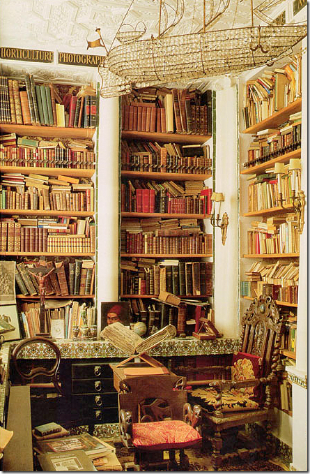
Try googling libraries on the internet and this is what you get.  Historically, libraries have been beautiful spaces – especially state owned ones, like our own Library of Congress.  I’ve never been there before and had no idea how gorgeous it is!!!  Stunning.  Built in 1886 it was based on the Paris Opera House.


image

Admont Abbey’s library is the largest monastic library in the world.  It’s interesting to see how different styles of design determine the décor – this Baroque building has been called the Eight Wonder of the World due to it being the largest example of Late Baroque in Europe.  It actually looks like Disneyland to me.


image

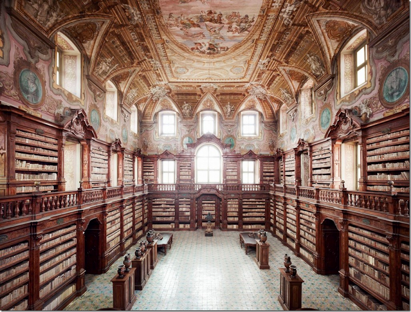
The National Library Of The Girolamini Oratory, Naples, Italy – embroiled in a huge scandal this year when its inexperienced head librarian was charged with stealing over 3000 priceless books and then trying to sell them!!!


image

The Trinity College Library in Dublin is the largest library in Ireland.  Built in 1732 it has seen significant architectural changes – the bottom level was filled in – it was originally an arcade to keep the books dry, and the arched dome was added in the 19th century. 


image

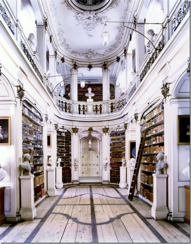
Not all beautiful state libraries are huge.   Duchess Anna Amalia Library in Weimar was built in 1562 as Anna’s house and was converted into the library in 1761.  The oval Rococo hall is so charming!! This would make a beautiful home library.


image

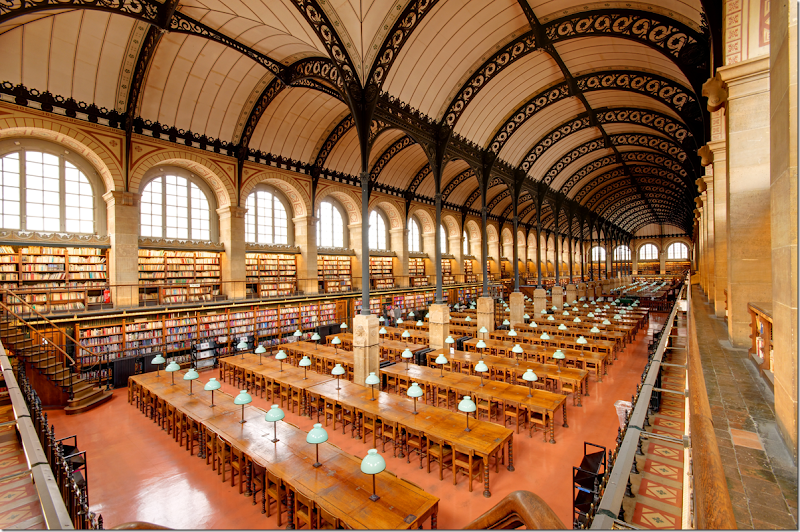
The St. Genevieve Library of Paris, built in 1842-50,  is the first large building to have used structural iron as an décor element.  The ceiling is so gorgeous, it looks like black lace.


image

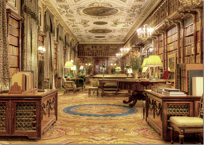
Not all fabulous libraries are owned by the state or the monarchy.  Large manor houses often had private libraries.  Here, at the celebrated estate Chatsworth, is its main library.  Sorry to say – I think they need new curtain fabric – this fabric almost blends in with the books!  This library is one of six in the house and is the largest library in private hands in England.


image

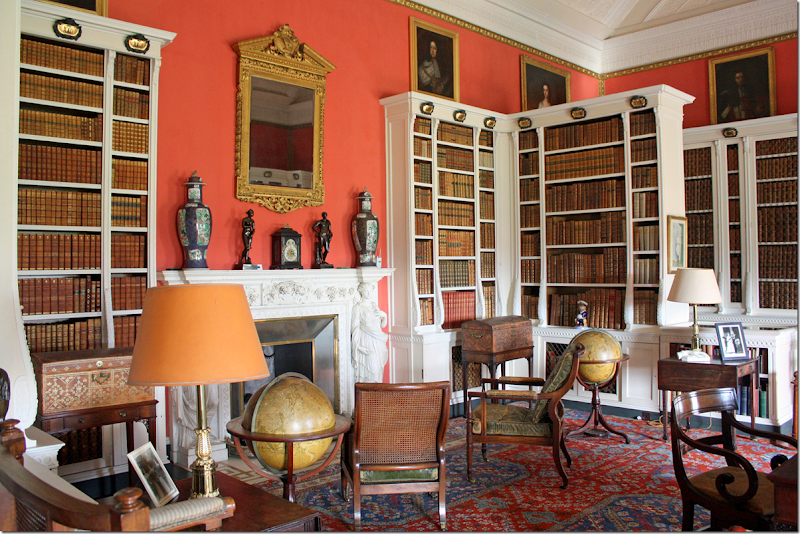
I like this library at Belton House in England.  The bright walls are so great against the white bookshelves.


image

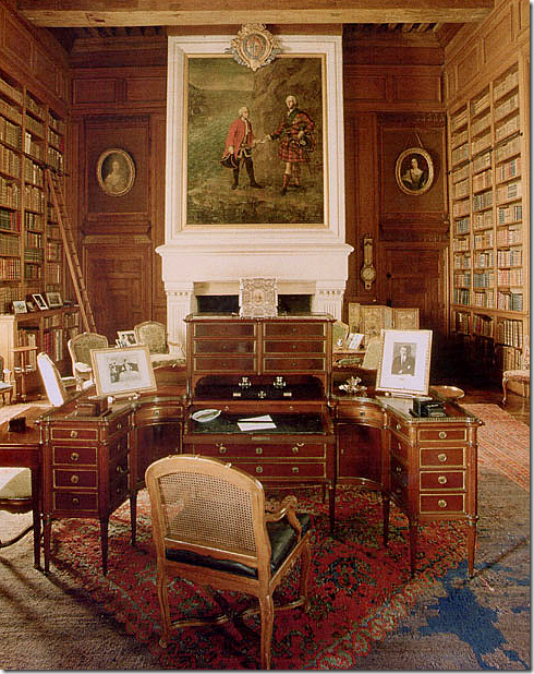
Another grand house library, Chateau de Serrant, in France – the desk is incredible, and I love the round portraits. 


 image

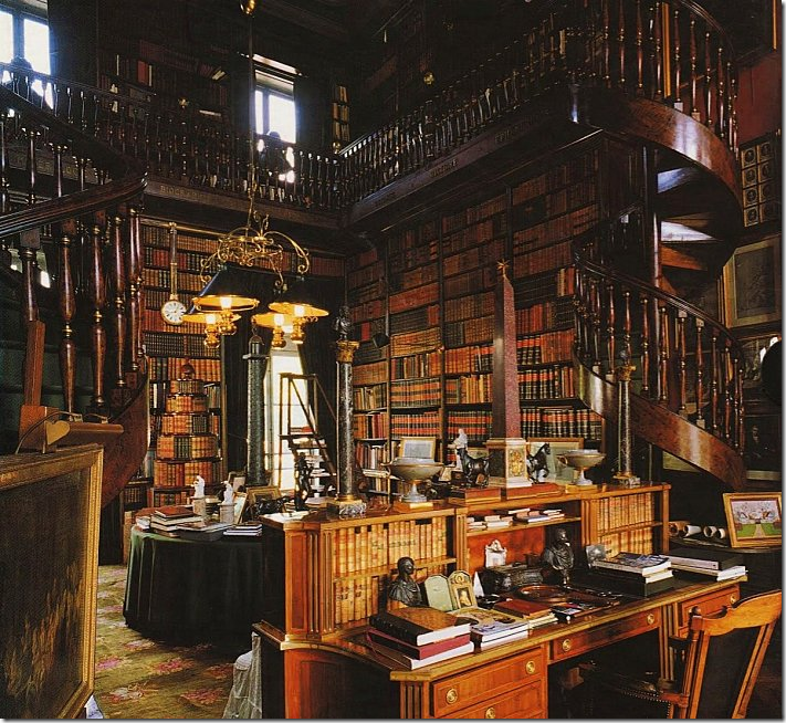
This library at Chateau de Groussay was the inspiration for the library in My Fair Lady.   There are so many grand home libraries in Europe, it’s hard to pick a favorite.  But, I love a two story library – with a balcony, just like this.  Add a fireplace, and you could live in here!


image

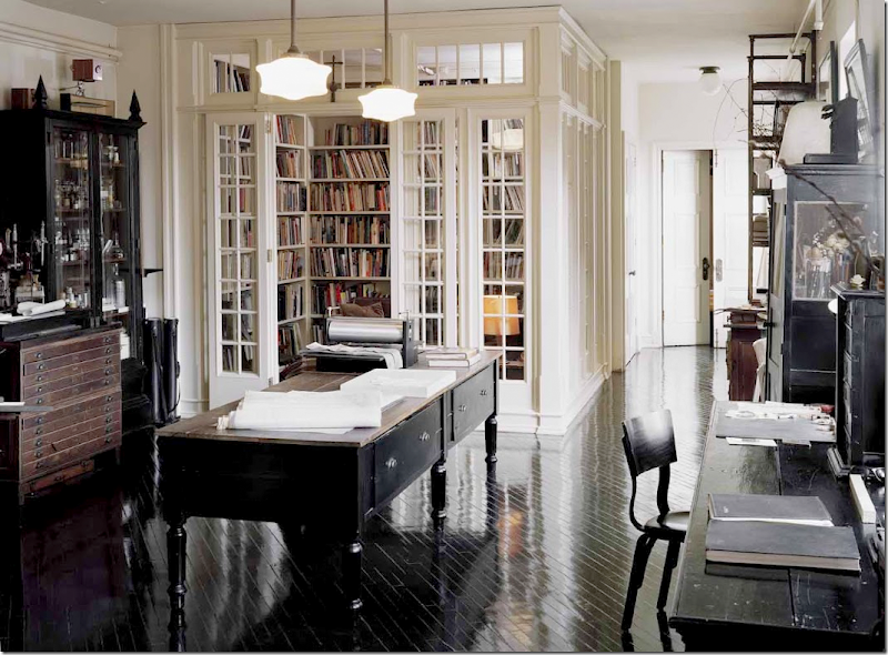
But, let’s get serious.  My tiny library is never going to be grand.  Still, I keep looking for inspiration.  This library was designed inside a NY loft.  The architects closed it off by installing paned glass walls and doors.


image

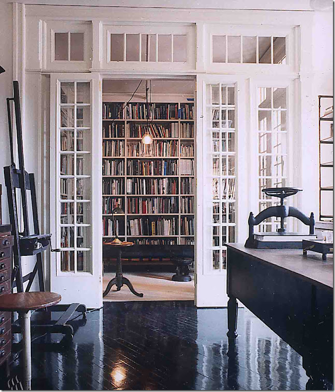
A closer view.  Isn’t it incredible?  The kitchen is located right past this room.  I imagine the designers came up with this solution to have a quiet place to read in an open loft.   When I see this, I keep thinking maybe I should remove the doors in my library and replace them with glass paned French doors.  It would add a little character to the tiny room.  Designed by Roman and Williams.


image

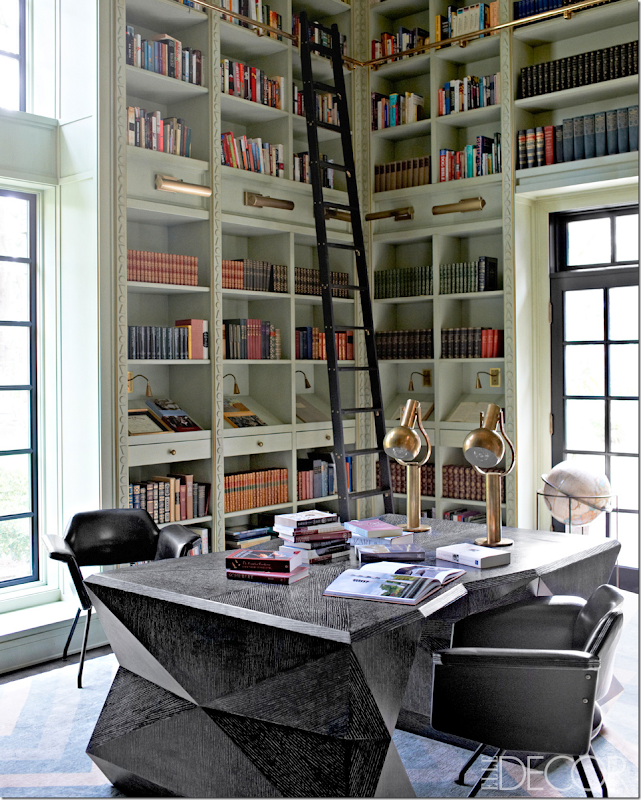
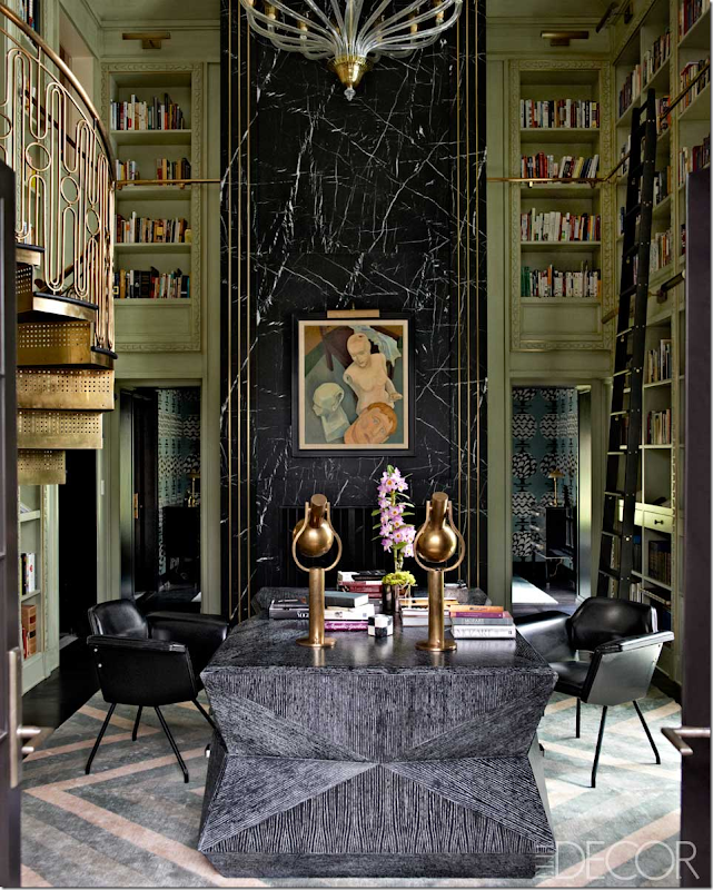
Seen in Elle Décor, this library has to be one of the most incredible ones I’ve seen in years.  Of course it was designed by Kelly Wearstler, who else?     I have been staring at this for days.  Kelly designed that amazing partners desk and the carpet.  I love the lights over the shelves – that is something I am considering in my own space. 


image

Look at the wall of marble – only Wearstler would add something like that.  I love the color of the painted wood and the carved detailing on it.  Look closer – it’s just a triangle, a circle, and an upside down triangle! 


image

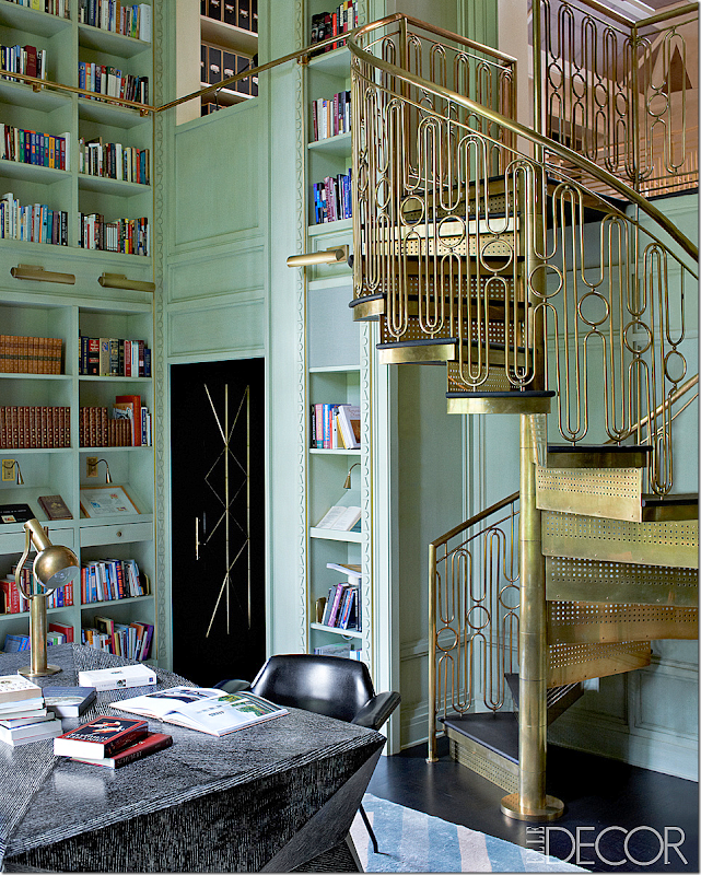
Look at the brass deco styled staircase designed by Wearstler. Amazing.  The main staircase in the house has the same railing.  To die for!!!!!


image

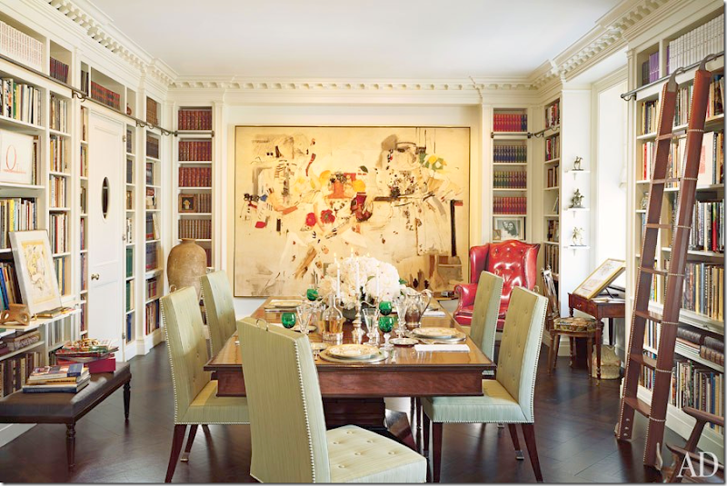
If you can’t have a dedicated library, I’ve always thought a combination dining room/library is a good use of space. 


image

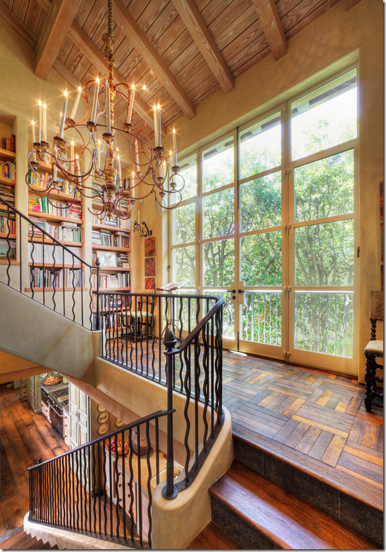
Another place to find extra space for book shelves – on the landing.  These shelves go up with the stairs.   Beautiful.


image

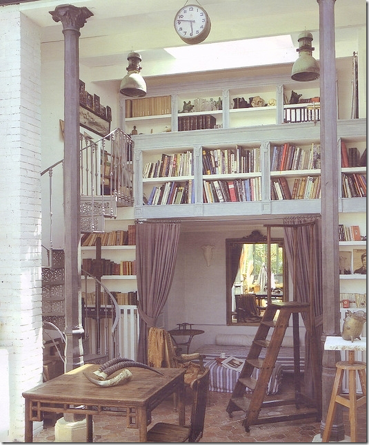
I love this small library – with the loft over the sofa.  What a great idea if you are short on space – like me!  Too bad my ceilings are just 9 ft in that room – so I can’t build a loft.


image

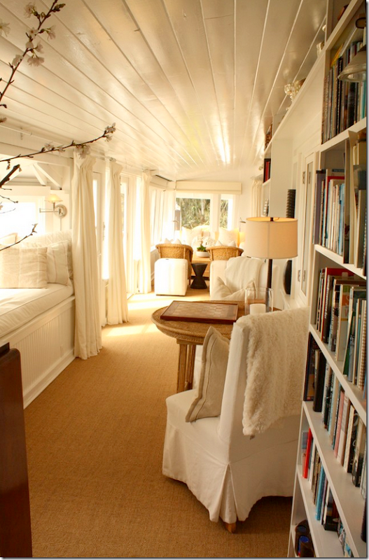
More found space – I love how this narrow room has the library against one side.   Love that window seat with the beadboard – maybe I should add beadboard at the bottom of mine. 


image

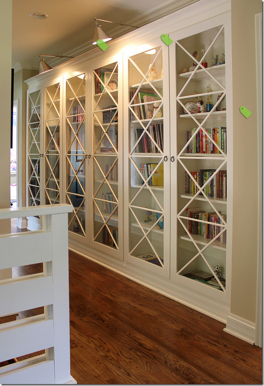
This is  a dream – glass doors over the books.  Love those lights too.  But this wouldn’t work for my shelves over the window – plus the ones at the side of the window are so narrow. 


image

Plus, if you have doors, it keeps the shelves from looking so messy.  I am scared mine are going to end up like these!!   But, what a great library!!!  That chandelier!


image

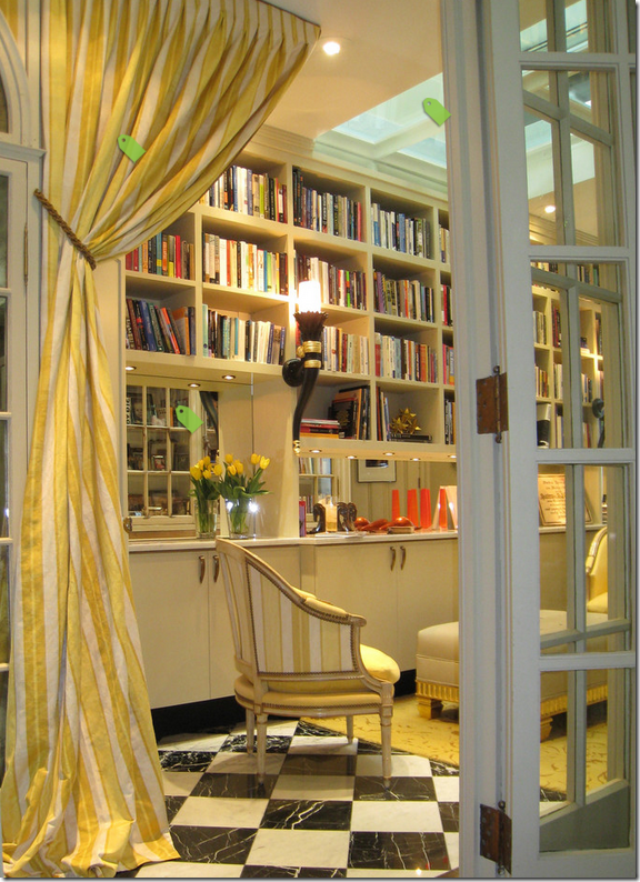
I love the black and white marble floors and the glass French doors – I am really thinking I should do a French door instead of the regular one I have. OR, I could find an antique door and replace the closet door with that one.


image

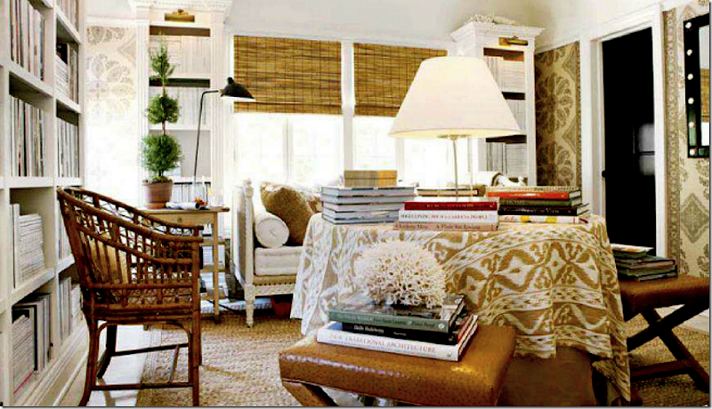
I love Mark Sikes second floor library.  He used that wonderful wallcovering by Peter Dunham.  How nice!  He has the brass lights, like the Wearstler library which I love.  And I love his skirted table with the ikat.  Nice French day bed too.  Apple matting.  Black doors.  Textured shades.  I wonder if I didn’t do the windowseat – would a daybed fit there?    And, if I was going to wallpaper – this room would be an inspiration.  I completely love it.


image

This library got me thinking about curtains – again, if there wasn’t a window seat, could I add beautiful curtains?  Maybe I shouldn’t do the window seat, but there are going to be shelves above the window, so curtains are probably out either way. 


image

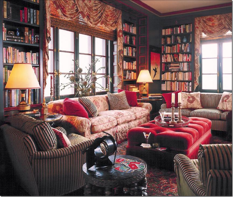
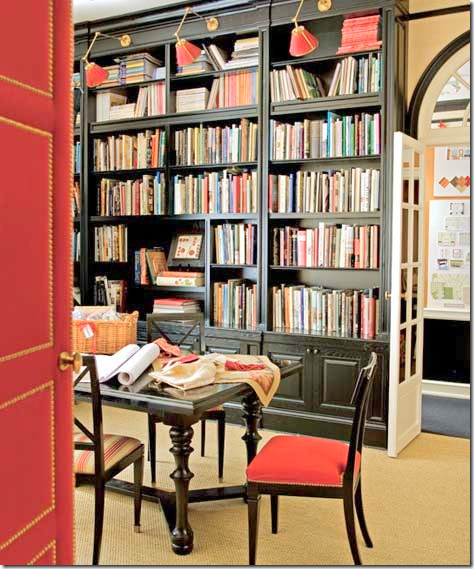
I’m leaning to a white/gray library, but this one always makes me stop.  I love the dark painted wood – it’s so cozy and warm and comfortable looking.  Plus, I’m a sucker for all the Bennison fabric.  Alessandra Branca.


image

This has always been a huge inspiration – Carolina Irving’s NYC apartment.  I love her books everywhere – especially how she turned the dining room into a library.   I do have a blue and white striped rug I could use in there.  This apartment is just perfect – so well designed, so classic. 


image

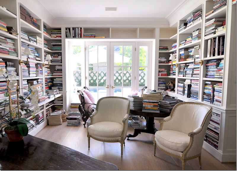
Back to reality, this library really influenced me.  This house was shown on the blog a few months ago and it had the most amazing library – filled with only design books and travel books.  I loved the pull out shelves and the way it is simply furnished with a table and a few antique chairs and a desk.  My shelves are similar in that they go over the window like this and down the sides on the left and right.  But, her cabinetry is so gorgeous – totally first class.   Mine won’t be so bespoke, I’m afraid. 


image

Here’s a closeup of the lights and the pull out shelves.  I won’t be having those shelves though.   And my room is much smaller than this.  But I do like the lights on the shelves like this.


image

Another Branca library – here I LOVE the lights.  Hard to decide should I do these kinds of lights or the horizontal bar lights?    No one does red and black like Branca. 


image

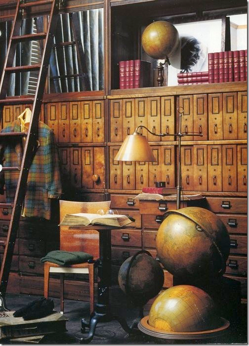
Maybe I’ll move all my globes upstairs to the office. 


image

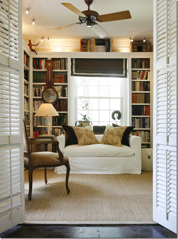
This study by Ashley Goforth reminded me of what mine will look like – the shelves over the window and down the sides, the seagrass, the white slips.  Simple and clean.  I like the shutter doors too. 


image

Would a fabric shade be better than a bamboo one?  Should I do a love seat instead of two chairs???


image

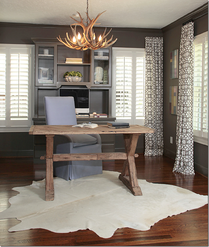
Another study by Goforth had me thinking – so I do a white cow rug over the seagrass or a striped rug?  And what light fixture?  Should I do dark gray on the shelves and a lighter gray on the walls or vice versa?  Or just white shelves?   Decisions!!


neutral-colors-living-room-decorating-ideas

Another inspiration – I still love seagrass and checks.  For sure I will use checked fabric on the chairs and maybe the window seat – or just a pillow or two.  Another inspiration is the linen fabric that softens the bookcase.  Such a great idea!!   Wish I could do that too – but I’ll have too many shelves.    Notice how Pierce added the row of pictures right where the curtains open. 


So, in the end, what décor am I going to go with?  I love the cluttered, messy look of libraries, especially the  ones found in old grand houses, but mine isn’t like that.   There’s nothing architecturally interesting to that room at all.   I keep looking at two images that appeal to me:


image

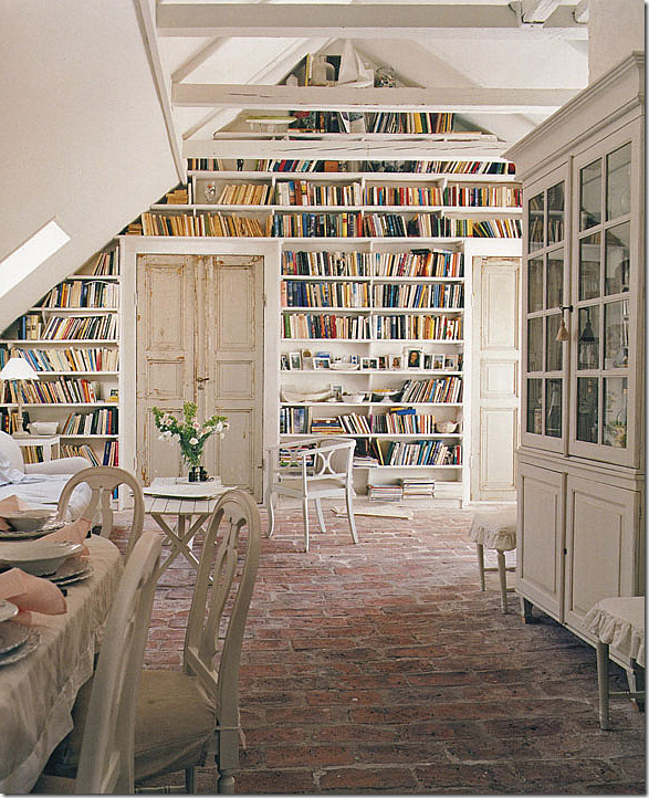
I love the white and cream and gray in this room.  I know everyone is doing their houses in bright colors with patterns everywhere – but I just can’t.  It’s just not me.  And, I love those old doors – maybe I could find a set like that.  Plus -  I love the brick floors – but that isn’t going to happen.


image

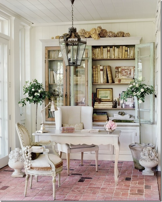
I love Brooke of Velvet and Linen’s office too.  I love the Swedish chairs and the grays and creams.  And I love her little desk.  And the brick floors.  If I didn’t need more shelves, I would just do a cabinet, but I need more.  And Brooke’s books are antiques, so much prettier than the real thing.  My shelves will never look this quiet – the book spines are too colorful.    AND…..should I do a real desk or a round table? 


image

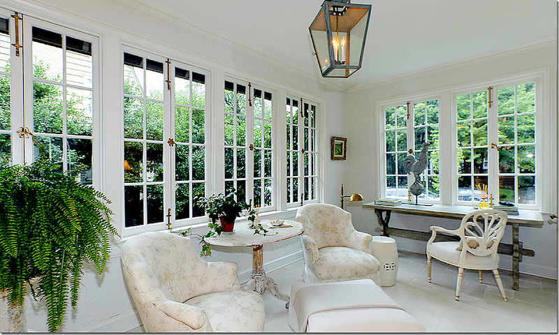
This study decorated by Tone on Tone – who, by the way, has a great new blog, HERE – makes me wonder should I do two chairs and a Swedish table like this instead of a real desk?  Love the lantern.  


Questions to figure out:

1.  What color should I paint the room?

2.  Should the shelves be white?

3.  Should I leave the seagrass or get a rug or layer a white cowhide or zebra?

4. Chandelier or ceiling fan?  hehe   Ceiling fan IS leaving – chandy or lantern?

5.  Should there be a desk or round table?

6.  Two chairs?  Or a chair and a ottoman?

Right now I’m thinking about gray walls and ceiling:


James WhiteSkimming Stone

Maybe Farrow and Ball:  James White – or Skimming Stones on the walls and ceiling and a pure white on the bookshelves?    Or should it all be gray?


image

Should I do horizontal lights or sconces or not do any lighting at all?  Big question to figure out quickly.  Is the lighting too contemporary looking?


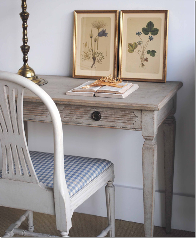
I’m thinking about a small desk like this from The Lone Ranger. Just need to be sure the back is painted, if not, he’ll do that for sure. I love Elisabeth’s faux French desk, but I can’t do the same desk in both rooms. Maybe I can find another desk source.


image

Here’s a gorgeous desk from Tone on Tone.  Should I do the blue and white check?  Or just a gray and white check?


Or should I just do a round table with two chairs?


downloading...

Of course M. Naeve has THE most gorgeous Swedish table ever.  Period 18th century.  Just a tad out of my price range, unfortunately.   Maybe she’ll let me borrow it???


image

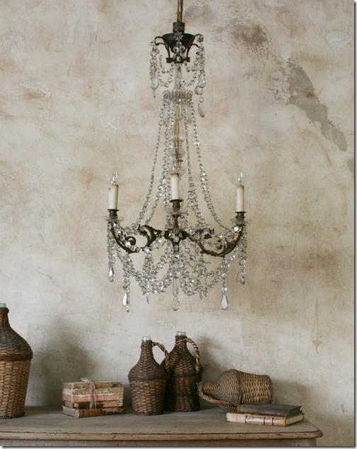
Chandelier?


image

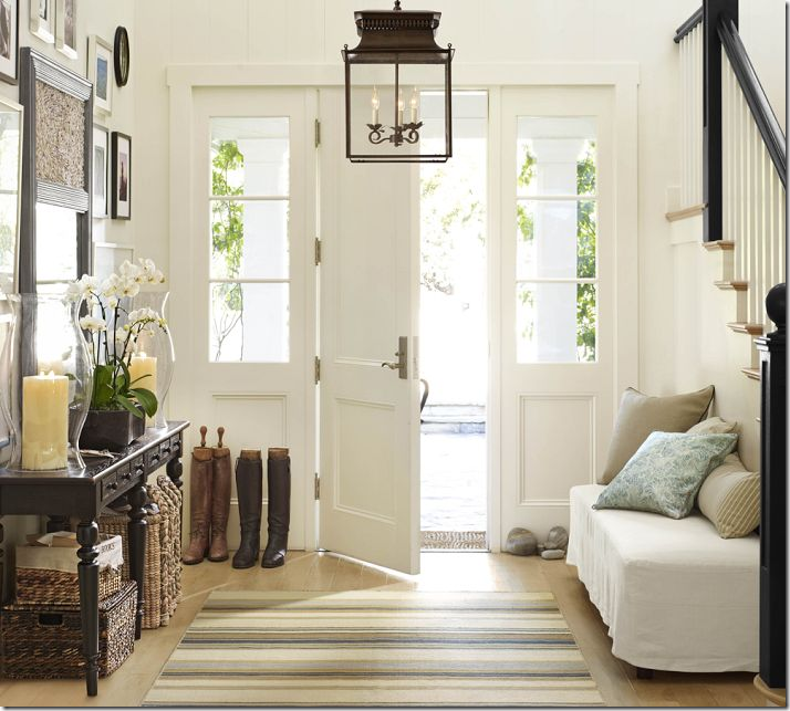
Or this lantern, for instance, from Pottery Barn?


downloading...

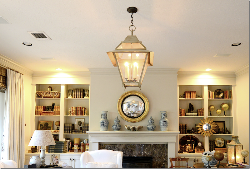
Or go for the real thing from Chateau Domingue


image

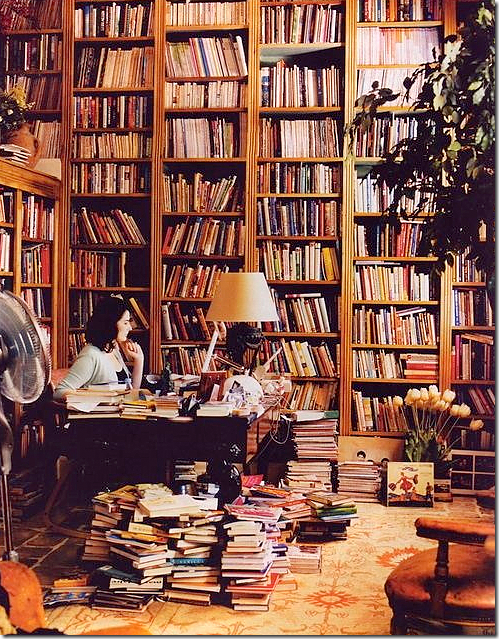
I don’t know why I’m making such a big deal out of this tiny room.  In the end, it will probably look like Nigella Lawson’s in a few months.  Still – I love her library!! 


AND, after the carpenter is done upstairs, we might do this:


image

You see how those shelves are open? 


image

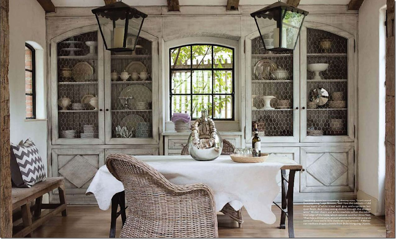
I’m thinking about adding doors like Jill Brinson’s.  They won’t be just like hers of course, but I’d be using them as the inspiration.   I think it will quiet down the room to have the doors on the shelves, plus, I love the way they look.   I could have Leslie with Segreto paint the new doors and the cabinets to look somewhat like Jill’s.  Well, it’s still in the talking stage, but the carpenter says he can do it.  Ben wants to do this.  Huge surprise.

So, what do you think?  I’m really anxious to hear your ideas and comments about the library and the maybe new cabinet doors.  If you have any suggestions – let me know – I’m all ears.    You are the only one I have to bounce this off with.  So, give me your thoughts.  It’s hard to plan it without any outside advice. 

Maybe I should hire a decorator?