Since it seemed like so many of you enjoyed the last Before & After, I have one more.
The reason why I really like these kinds of stories is that it shows how you can update your house for today and for the next decade. It shows what others are doing to update their houses, and it’s also a lesson in what looks good and what doesn’t look quite as good when remodeling.
These renovations in Houston (and everywhere, I suppose) are happening because the massive age group – The Baby Boomer Generation - is now older and are becoming grandparents.They are moving out of their family homes into empty nest townhouses and condos.
And taking their place are the Generations X, Y, and the Millennials who are just marrying and starting families and moving into the old Baby Boomers family homes.
The Millennials have a different idea of decorating. They want color and glamour, pattern and sophistication and Baby Boomer’s houses are a bit bland and rather boring for them. They didn’t grow up with Mid Century design, so to Millennials, it looks new and fresh. To those over 50 – it’s more of a “been there, done that.”
And while Baby Boomers may look on these new design trends with skepticism and even disdain, the Millennials have fresh and exciting ideas and the energy to try them out.
So, here is a Before & After – a house bridging these two distinct generations:
Located in Southampton, an older, very leafy and pretty section of Houston, the house was built in 1984, at the start of the gentification of these mature neighborhoods. Babyboomers flooded near town, tearing down the cottages and building massive two story brick houses that were much too large for the typically small town lots. At 6,150, this lot is a bit bigger than the typical 50 x 100, which allows for an extra room or two in the house. And even more unique, there is an alley that runs behind the house! The garage faces the alley and thus the street is mercifully free of driveways!! Why did we ever abandon this wonderful design?
The brick isn’t the typical red, rather it is a warm orange. The light upstairs gives off an eerie yellow glow through the plantation shutters. Regardless, the house is not typical Georgian, with its arched door and round window above it, and these differences set it off from the neighbors.
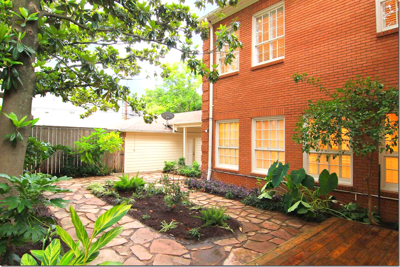
At back, plant beds are set off by irregular stones. There is no grass, making it easy to maintain.
The back door connects to the garage through a covered walkway.
A view from the house of the backyard. Looks strange to not see a garage door! The door faces the back alleyway instead of the front.
The 1984 house was sold in 2012. It was listed as a 4 bedroom, 3 bath house. The new owners undertook a massive renovation, by the construction firm headed by Kurt Hahnfeld HERE.
2016: The house today! Painted Houston White, the orange is long gone and the house looks so much more contemporary and “today.” Someone commented that all the houses in Houston are white. No, they aren’t. But it is definitely a trend with the younger Generation, and I love it - so I tend to show more white houses. Trust me, most Houston houses are either boring beige or red brick.
The landscaping was edited and a fresh row of box was added, while a back row was removed. Ferns flank the entry and an arch of evergreen wisteria was added.
2016: The glass was removed from the door and sidelights for privacy, but the top windows were left to let in some light. Love the large lantern that was added. In short, the facade is much prettier today!
2016: Painted white, the trim is a warm gray. Pairs of contemporary lanterns were added besides the French doors. The biggest change is all the free form pavers were removed, along with beds. There is now grass, with square pavers and beds along the fence.
2016: The view of the new grass yard looking towards the garage.
The square stones are set in gray gravel and look very sophisticated now.
2012: Looking from the front door – the living room is on the left and the dining room is at the right. The end of the hall has unique curved walls with niches. What is strange though is how the wall at the end of the hall blocks the view and stops the sight line.
2012: And looking back towards the front door, with a close up of the lighted curved walls and niches. The ceiling is vaulted in the foyer. The hardwoods are orange, to match the brick color, and the walls are a beige.
2016: The front door, with the wood instead of glass. By keeping the high windows, it still has an airy feel. An antique chest and trumeau with contemporary lamps, gives a hint of what is to come.
2016: The foyer looks completely different with the white walls and the dark hardwoods. To the right you can see the stairs, but the biggest change is the wall at the end of the hall is now gone! Perfection!!! The lighted niches are also now gone and contemporary sconces light the hall. What a huge difference. Without the dead end hall, it looks more open and inviting and warm. Also, notice the high wainscot which was added, it adds so much to the hall!
2012: At the very right of the front door is the paneled study.
And against the back wall is a fireplace, which is nice, I guess, in an office. Under the stair is a bar.
2016: And now the room is painted the trendy Farrow & Ball cobalt blue! Again – the paint gives the room a huge youthful vibe. Notice the Marilyn Monroe book (looks like the last house!) Love the Chiang Mai Dragon fabric mixed with the blue. The contemporary crystal chandelier from Visual Comfort is the final touch. I only wish we could see what the fireplace looks like now. I’m sure it’s a huge improvement over how it was.
2012: To the left of the hall is the large living room – here with the view towards the back yard.
2012: With the black fireplace.
2012: And the two windows facing the front door.
2012: Here’s a view of the backyard how it was with the large bed surrounded by the free form pavers.
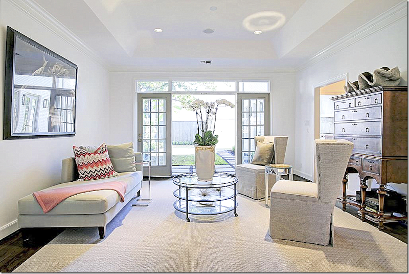
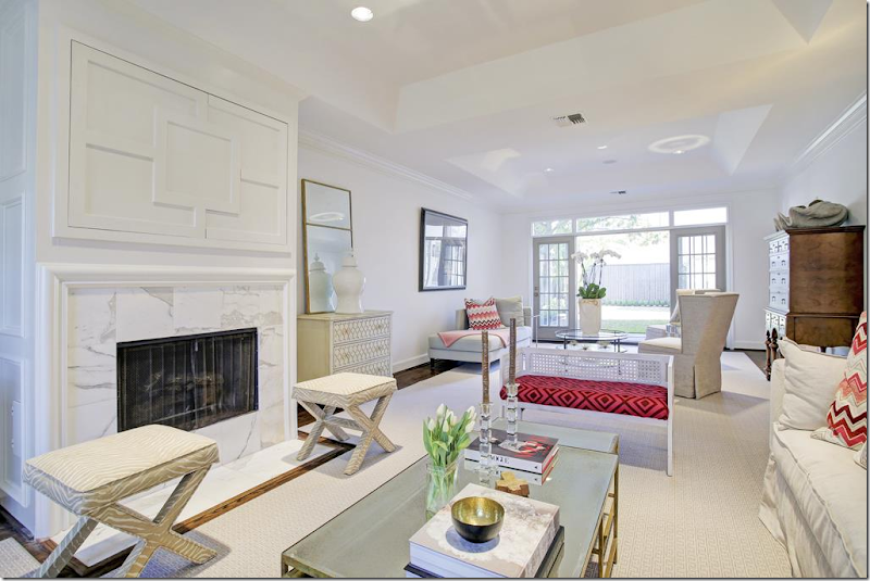
2016: And here is the living room updated for today with the white walls. The fireplace was an eyesore the way it jutted out from the wall with black marble, but now, in all white it blends into the walls and doesn’t seem nearly as large.
White marble on the hearth along with wood trim above the mantel, which hides the flatscreen. The large room is divided into two conversation areas.
2016: The quietly patterned rug in gray and white warms up the space. Near the back French door, two modern chairs and a chaise are mixed with an antique chest which adds warmth and weight.
2016: At the front windows, a slipcovered white sectional wraps around the corner. David Hicks hot pink fabric on a bench, gilt coffee table – all perfect for a young family looking for a bit of contemporary and glamour.
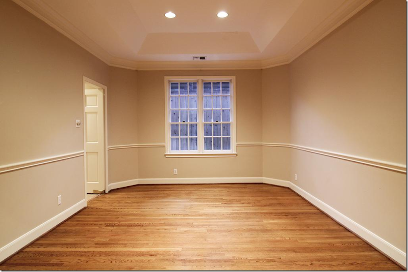
2012: The dining room is to the right of the entry hall, across from the living room. With its beige walls and orange wood, it looks more like the 90s.
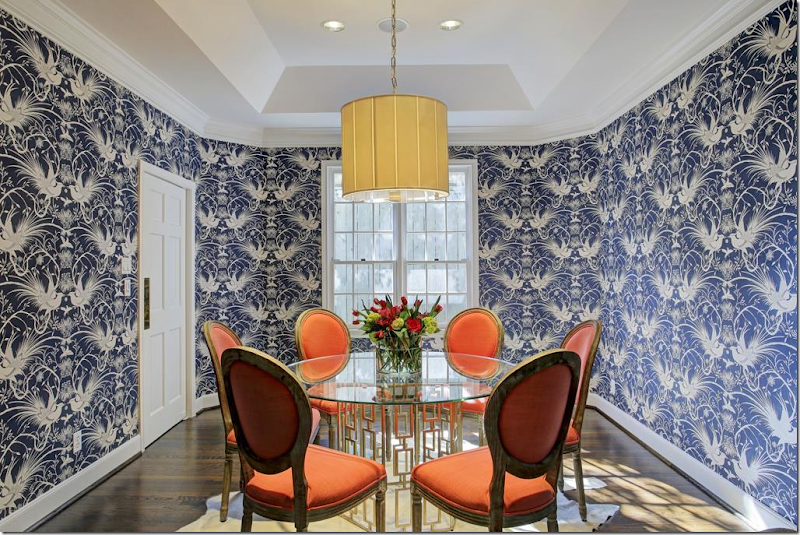
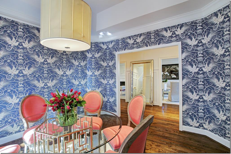
2016: Today, the dining room is ultra chic with its fabulous Mokum wallpaper. I love the orange against the cobalt blue.
2016: And a view towards the living room.
2012: The entry hall leads straight back to the kitchen – with the wall so you can’t see into the kitchen from the hall. This was removed by the new owners.
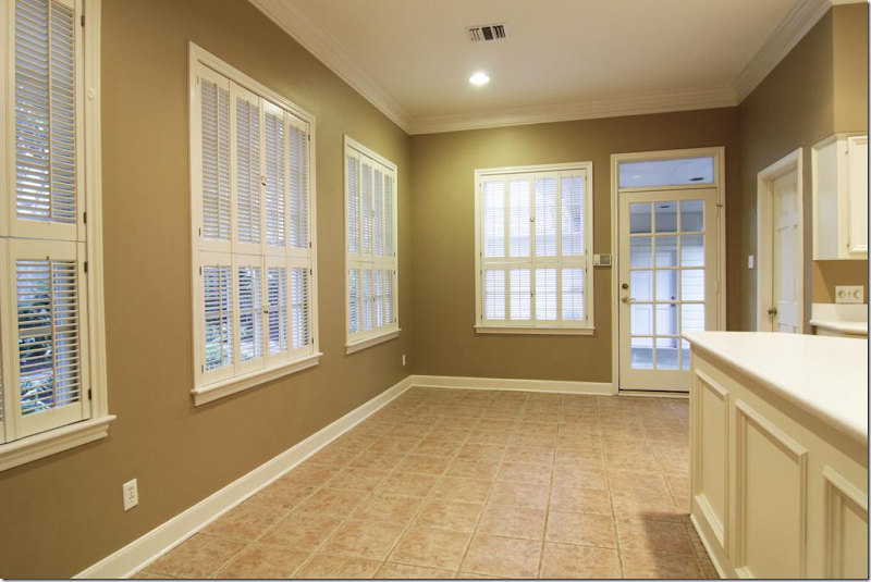
2012: Past the wall is the long breakfast room. This area saw the biggest change – it was totally gutted. Here you can see it was a boring dark beige, with tile floor. The door leads to the garage.
2012: At the right of the breakfast area is the kitchen with Corian countertops.
2012: Looking from the kitchen to the breakfast area and out to the backyard.
2012: Finally – the door at the back leads to the dining room.
2016: And, past the curved end of the hall, with the wall removed, you can now see into the breakfast area.
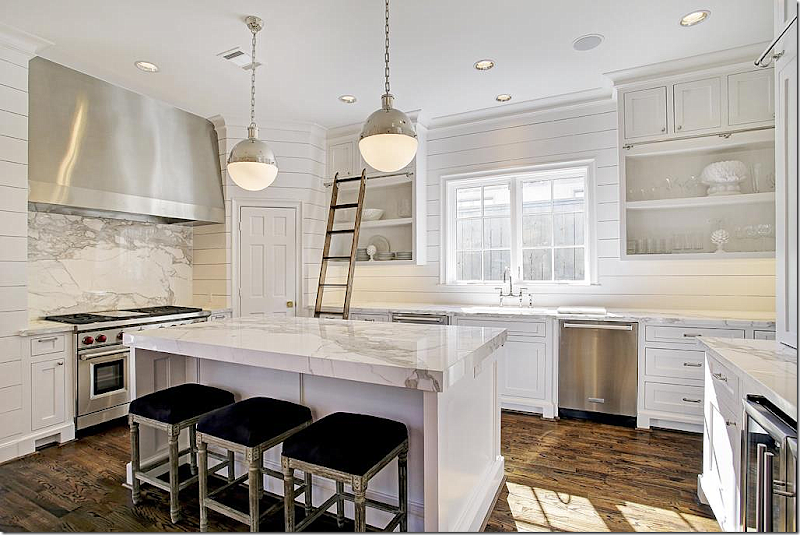
2016: The new breakfast area, opened to the kitchen, is much wider. The walls are shiplap, which gives a warm cozy look to mix with the modern furnishings. Here’s a link the iconic Ingo Maurer Zellel’z 5 chandelier. HERE.
2016: The island is covered in stunning marble, as is backsplash. It’s gorgeous. Love the library ladder for the upper cabinets.
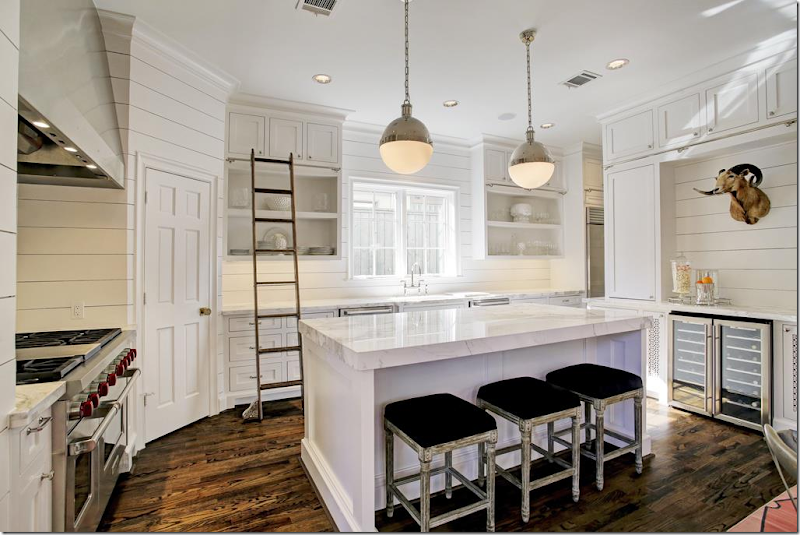
2016: Another view – double wine refrigerator. All the appliances are top of the line.
2016: Looking towards the back yard. Gorgeous Calacutta marble.
2016: Between the dining room and kitchen, the butler’s pantry has interesting grills on the doors – love the marble shelf. A small detail – that looks so luxe.
2012: Sea of carpet upstairs – the playroom.
2016: Upstairs, no carpet – warm hardwoods instead. The playroom has China Seas wallpaper, a cute Sputnik, and Kelly Wearstler fabrics all mixed together for a young, modern look.
2012: Upstairs, the master bedroom with more gold carpet and dark beige walls with plantation shutters.
2012: The master bedroom with marble tile. Nice, but a bit dated and in need of an update.
2016: The large master bedroom has beautiful windows – and the new hardwoods make a HUGE difference! The walls are covered in Farrow & Ball wallpaper in Ocelot. Visual Comfort chandelier. I love the curtains – they are perfect!
Another view – be sure to notice how they added trim on the walls – which frames panels of the wallpaper, instead of just putting the paper throughout. This is a different way to hang paper – which I love.
2016: Hard to believe it’s the same bathroom! New vanity with marble and marble herringbone tile floor. Sheer white linen shade at the window. Crystal chandelier. Stunning, just stunning. This bathroom and the kitchen are beyond fabulous!!!
2016: The Maax bathtub was turned and placed in front of a mirror to become a focal point when you walk into the room. Remember to think of sight lines – they are so important. Just as the sight line from the front door was blocked by the wall and it was removed, the bathtub was turned to create a better sight line. So beautiful.
2016: The laundry is near the master bedroom, with mosaic tile floors and shiplap walls like the kitchen.
2012: Guest bedroom before.
2016: And after with white paint and hardwoods and a capiz light.
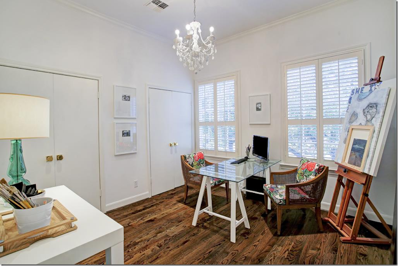
2012: Before bedroom #3.
2016: After, a study with hardwoods, white paint, and new gilt doorknobs.
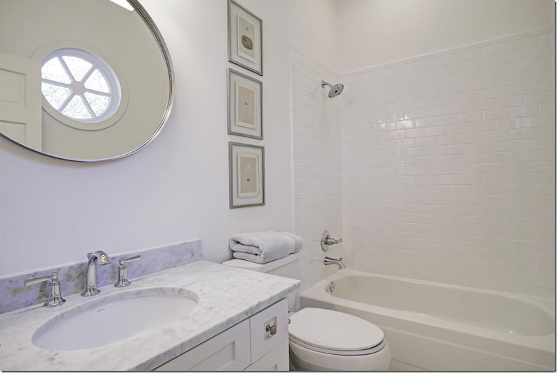
2012: Beige walls, tile, Corian makes for a 1980s bathroom.
2016: Marble, nickel, new cabinet faces, and subway tiles – turns the bathroom into a classic that will look good for years.
2016: And another marble and subway tile bath with new cabinet faces on the vanity.
To tour or see more about this house for sale, go HERE.
Coming Up: Two new giveaways!!! Be sure to check back soon!!!


