Starting out 2019 with a story on interior design - renovations of two homes, one classic, one contemporary, and both in Ft. Worth.
An eagle-eyed reader sent me a link to a house for sale in Fort Worth, Texas. Ft. Worth is the twin city of Dallas…think Minneapolis and St. Paul. Over the years, Ft. Worth has grown into its own and is no longer in the shadow of Dallas. It’s a cowtown, known for the great cattle trade which was driven through Ft. Worth.
Not a movie set – the real thing.
Ft. Worth was a stop on the Chisholm Trail and millions of longhorns were driven through town and then, further up north. Some stayed put at the legendary stockyards.
Later, with the help of oil money, the town quietly became very sophisticated. It is home to some of the most praised contemporary architecture and its museums are highly rated. Ft. Worth is no longer just a cowtown, although natives embrace their past at the popular Sundance Square.
So, when I looked at the photos of the Ft. Worth house the reader sent me, I wasn’t surprised to find a home that had been sensitively renovated in the finest taste and filled with French antiques. Ft. Worth? Of course!
Here is today’s house, along with a second one I found that seemed a perfect match to show together.
Enjoy!
The Reader’s House:
Built in 1940, it is located on a beautiful street in Ft. Worth. Years and years ago, 27 to be exact, Ben and I spent two years in this town. Needless to say, when Mr. Slippersocksman & I lived in Ft. Worth, our street and house looked nothing like this. At all. LOL. I WISH!!!
When you look at this red-brick house – it looks as if there have been no changes, right? WRONG!!!!
Today we have the BEFORE images to see exactly what has been renovated.
For instance, in this photo, there are new stairs made of brick instead of stone, new stone retaining walls, a new door, and a new bronze awning – which all add up to make the house look more charming while retaining the old world feel it now has.
BEFORE: The same façade.
There were many trees blocking the house which were all taken down – I'm guessing the roots were damaging the foundation since the trees were planted so close to the house. Before, this door was considered the side entrance, now it is the front door.
The house sits on just under an acre on a pie-shaped wooded lot. It has been completely renovated, with all new mechanicals. The new garage is on the opposite side and the drive winds past what is now the front door.
Another HUGE change is the new tiled roof. It’s not actually new – it was reclaimed from an old house in Tyler, Texas!!!
Across the lot is a park.
BEFORE: There were some changes made to this side – the window above what was once the garage is now gone.
There are two outdoor dining/sitting areas. This side door leads into the dining room. I’m going to guess this round flowerbed was once a pond of some kind, now filled in. There’s a new window in what was once the garage.
BEFORE: The back side was once the front side, seen here. The garage doors were later moved to the side, creating a large expanse of lawn. Even later, a new garage was built in front of this one. It looks like this bronze awning was moved to the front door.
Midway Renovation: Here, the trees were cleared out. The door was removed and an additional arched window was added. The Tudor woodwork was removed and replaced with brick. The garage doors were removed. A fireplace was added where the garage doors once were. The story above the garage was enlarged.
These changes took me a long while to finally figure it all out. Without floor plans, it wasn’t easy. I KNEW this was the same house but it just didn’t make sense – the garage really threw me off. After studying this before photo – I realized that the new owners added a new garage at the front of this old one where the fireplace had been added. Now there is a brand new garage. Look below:
You can see the three car garage is new – added right in front of that old one where the new fireplace was added. They also added a charming arched terrace and dining area between the new garage and the former façade. The white line around the house is actually the base of an iron fence that encloses an area for dogs. The gate has stone columns flanking it.
Below: major changes are easily seen in this sequence of photos below. The first façade, Faux Tudor. The second photo, all trees gone, all Faux Tudor gone, front door moved to other side, new arched window now there instead. New fireplace added to garage whose doors were closed off. The third photo – as it is today. New garage added along with terrace:
Nice view of the pie shaped lot.
Before: Interior
In this photo, you can see the old front door next to the arched window. This door was removed and another arched window was added – this is no longer the front entrance. The stairs are next to the front door.
The view into the living room through columns which were removed.
The main part of the living room. The door in the hallway is now the front door.
AFTER: The two arched windows – the one on the left is new. Behind the wall are the stairs.
The house is now painted all white with black/brown floors. This room is filled with beautiful French and Swedish antiques. The columns are now gone, opening up the alcove.
Another view of the living room, with the new French marble mantle. Gray silk curtains. Area rug.
This photo is distorted, but you can see the new front door through the hallway. The new kitchen is to the right of the door.
Close up of the alcove with the arched windows. Love this. Beautiful chandelier. Notice the beautiful a/c grill! Even the most utilitarian item can be pretty!!!
Through the window, you can see the enclosed terrace – with the new iron fence that surrounds the area, probably erected for the dogs to be protected and yet leave the lawn open to the views. Great idea, really. And notice the newly planted line of trees that will provide privacy when grown.
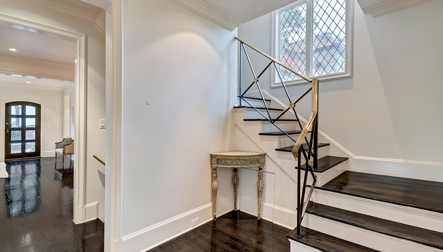
Past the wall in the arched window alcove is the beautiful stairway. Just beautiful. So simple, but so chic and luxe. No, not beautiful – they are gorgeous! The brass banister. The X-decorative element. LOVE!
Next to this are the stairs that lead down to the basement. And further along is the dining room.
Here is how the stairs looked before. Now, I’m sure that many would just paint the stairs white and the bannister black and call it a day. And it would be very pretty. But….
But…then you wouldn’t have this beauty to look at every day!
BEFORE: The front façade. To the right of the door is the living room and the arched window alcove. To the left is the kitchen and then the dining room.
AFTER: How it looks today, with the new façade, new door, awning, new brick steps, stone retaining wall and new roof. New landscaping. Just beautiful. Beautiful!!!!
Before – past the living room is the family room. This room becomes the kitchen in the renovation.
Another view shows the dining room.
The dining room.
The new dining room. I love this room!! Marble table mixed with Italian chairs.


Around the walls are handpainted wallpaper panels. These might be old or antique, not sure, but they are protected behind glass. Love the lilac silk curtains. I love this room. Did I say that already?
Well. I do!
One more view! Notice outside, they kept this old tree since it wasn’t too close to the house. It adds so much to the dining area out back.
The dramatic kitchen is new – at the front of the house to the left of the door. It takes the place of the former family room. I think I would have left the ceiling plain, but - it’s probably gorgeous in person. The cabinets are finished to look like a piano with 13 coats of black paint.
I like the two diagonally-placed pantry doors flanking the center window.
The breakfast room picks up the black in the kitchen through these wallpaper panels. Notice the bar cart that mimics the stairs. Antique mirror. So pretty and so different than typical breakfast rooms.
This room was carved out of the old kitchen space next to the stairs. The window looks into the new arched terrace.
The former kitchen – next to the stairs. Today this is the breakfast room and the kitchen is across the hall where the family room once was.
This family room was added in what was once the garage. I would love to see that piece of furniture against this wall on the right. What is that?
This owner has such beautiful antiques.
Upstairs, a study was carved out of a small space – love the library lights.
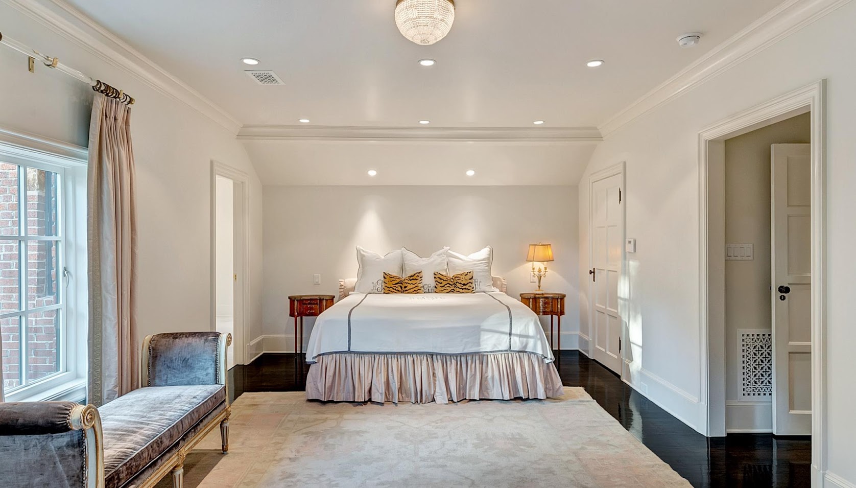
Master Bedroom. Matching silk curtains and dust ruffle. Blue matches the velvet. Antique rug. Very simple but pretty.
Master bathroom was added through the left door.
This room was a bedroom which was changed into the master suite due to the proximity of the space over what was once the garage – which became the master bathroom.
And here – the new master bathroom suite is huge – filled with beautiful white marble and silk curtains that match the bedroom.


You can see the top of the covered, arched terrace out this window.
The closet is luxe with mirrored drawers, inset into the wall. Brass curtain rods and a large tufted bench. Notice how the flatscreen looks like a piece of art work. I wonder if that is a channel?
Again, all this space was once above the garage. It was enlarged to become the master bathroom suite.
A drinks and coffee room/kitchenette located off the bathroom. Nice!!!!
BEFORE: Here is this bedroom before – not the master at all. But its location near the old garage which became the master bathroom is the reason this room was chosen. It’s off the main hall – you can see the stairs leading down.
BEFORE: At the other end of the hall was the master bedroom which is open to the attic!! What a surprise. But, the new owners enclosed the attic again. It is rather imposing looking.
A view from the attic or the third story down into what was then the master bedroom. At the end of the attic floor is a tall but skinny rectangular window – there is one at each side of the attic. They remain there today.
Here is the bedroom today with its ceiling now lowered.
The guest bathroom, covered in gray marble.
Before: A library at the front – located over the new kitchen.
And after – the same room with new floors and window and doors.
I think this must be the basement – due to the window. If you look carefully you can see what might be this basement window on the front façade:
See that rectangle on the front – underneath the window at the left of the front door – it looks like a basement window, for the room above.
Nighttime look at the side yard.
Another nighttime look at the “back yard” – enclosed area around the new terrace. Close up of the brick and stone façade.
View at dusk from the newly added arched terrace.
This house was for sale and then for rent – and now for sale again. If you are interested, go HERE.
WHAT A HOUSE! A fun house to figure out what was changed and what remained and a wonderful look at French and Swedish antiques! Beautiful décor in the living and dining room. That kitchen!!!!
And so, my reader alerted me to this house thinking I would like it and she was right, I do! The house has been obviously staged for the photos – I’m sure more than half the owner’s furniture was already moved out.
So…while looking at this house, it left me curious to see more houses in Ft. Worth. It had been a long while since I had looked and I decided to shop around for houses in Ft. Worth. Who knows? Maybe Mr. Slippersocksman will want to move there again and send me back into that zombie-like state he put me through the last time he told me we were moving to Ft. Worth, taking a HUGE pay cut too!!! LOL
Memories of life with Ben.
Needless to say, my father wasn’t too pleased or understanding about the pay cut. Ben said it was about “paying dues” “learning the ropes” “making connections” and “good for my career.”
He was right in the end, I have to admit.
Enough about Mr. Slippersocksman. Back to the house in Ft. Worth.
Anyway, while I was perusing other houses for sale in Ft. Worth, I found a house with interiors that reminded me of the one shown above – perhaps they used the same designer? I wanted to show you this second house for an important lesson in design. I want you to see how this designer married contemporary architecture with French antiques. And yes, she will prove it can be done and done very beautifully.
Enjoy!

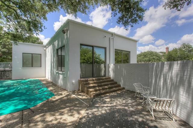
This house in Ft. Worth was built in 1980 and has 3,132 sq. ft. The new owners updated the front windows, added antique urns, and a charming vignette with French chairs. These French decorative objects tell you – “Wait! Don’t dismiss me as just another contemporary house! I like antiques too!!!”
Notice I am using lots of quotes today!!!
Before the renovation – the windows were contemporary and the air conditioner unit was visible. The outdoor lights were very large. It’s the new windows that make such a difference, along with the French decorative items.
The back yard is small – it runs along the line of the house. On a slope, half of the yard is lower than the other. The renovated swimming pool becomes a focal point as does the new landscaping and windows that overlook the area. New stone paths around the pool, along with mondo ground cover updates the area. Additionally, new stone work wall and stairs divide the lower pool area from the higher grass area of the yard.
Lights on the tree add ambiance! Lights are not for Christmas only. A few strategically placed lights will brighten the black hole that backyards become. Look how wonderful this looks! Urn placed atop the new stone work that divides the two areas.
BEFORE: old, dirty pebbled paths around the pool were removed. Trees were trimmed. Here, at the far left, the old terrace between the two areas can be seen. This was torn down and replaced.
Before: Another view of the back area before it was landscaped by the new owners.
BEFORE: The grass area of the backyard before it was landscaped. Really not very nice. The pea gravel is not very attractive – loose gravel is much better than pea gravel and looks so "trendy.”
AFTER: Here is the newly landscaped back yard. Grass replaced the pea gravel. A stone wall surrounds the yard. You can see at the far left the new terrace that divides the two areas with the urns atop the short columns. Here, on the right, is a stone table with cushions which adds a sitting area.
One other view of the new terrace outside the breakfast room which divides the lower swimming pool from the higher, grass yard.
This small yard shows how important it is to hire a landscape architect to design a plan, no matter how small your space is! In fact, the smaller the more important it is!!!
BEFORE: The front door opens to a large foyer that ends in the dining area. Tiled floors. The living room is to the left, down a few steps. To the right is the library.
Close up of the dining area with high windows.
OOOOOOHHHHH KAY.
The new owners deserve a Medal of Forward Thinking to be able to see what this house could become.
Seriously, this dining room would make me turn around and walk away, yet the new owners could see beyond it. Kudos!
Notice how the rug here matches the rug in the foyer. Love the table base and the a/c vents. Not really.
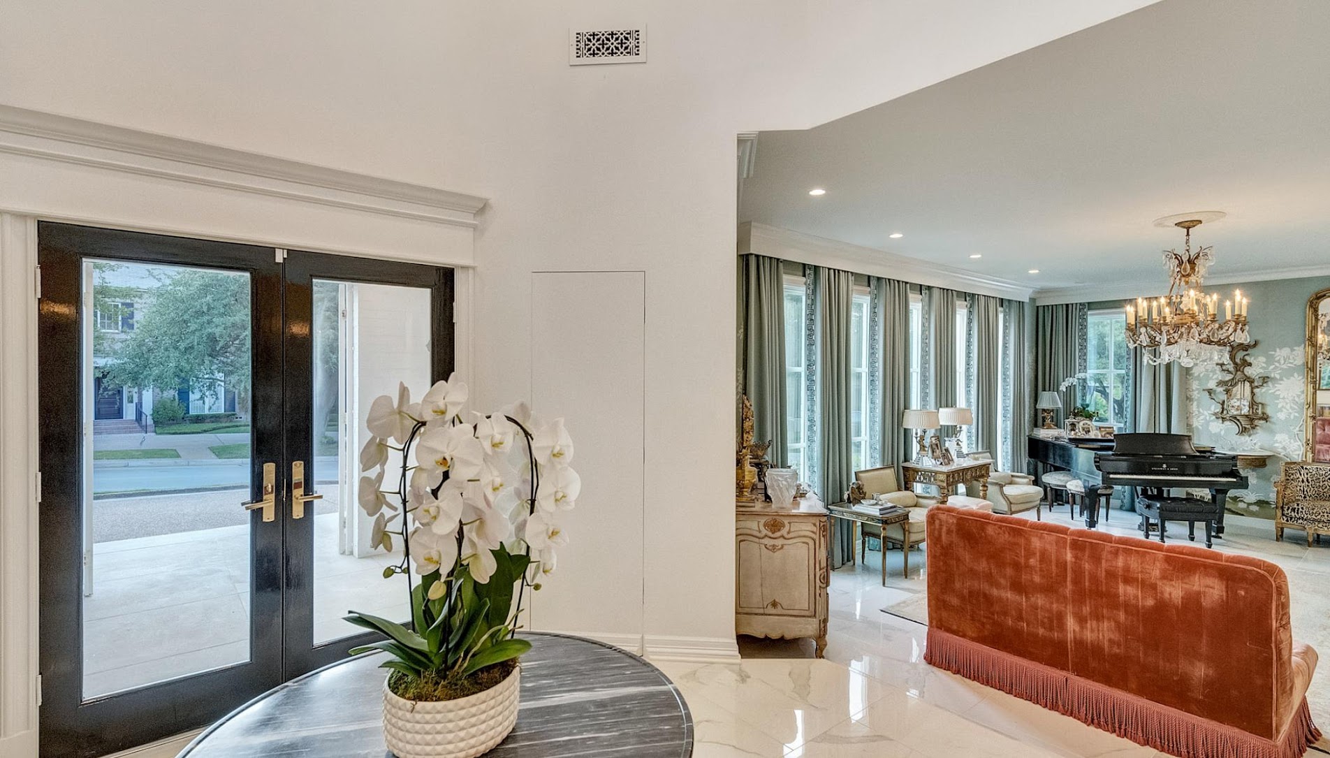
AFTER: Let’s look at the foyer first. Ignore the living room for now! New marble floor replaced all the white tiles. Newly painted front door.
AND here is the new dining area. A gorgeous antique velvet covered settee sits against the side wall with a fabulous mirror that reflects the living room. The door to the library was removed from the foyer.
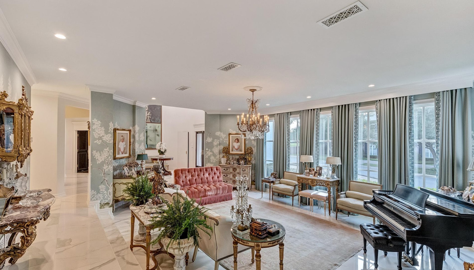
Beyond is the dining room – with its walls painted white. No longer black, the walls disappear and make the dining room look so much larger.
A gorgeous collection of antique furniture in the dining room. Wow. Just wow! Those consoles are eye candy. Wow. I am speechless. At the left is a collection of silver domes. Antique mirrors reflect each other. At the back is an etagere that holds more antiques. Crystal sconces flank the etagere.
AND notice, the crown molding is gold leafed! The upper windows are now thankfully gone. The ceiling was mirrored and it remained. New, old fashioned a/c vents update the look. The vents look the same as those in the previous house. What a difference they make!!
Compare the two dining rooms. This designer took an eyesore and made an oasis.
To the left is the living room.
BEFORE: From the foyer, the view into the sunken living room. Lots of greenery is distracting.
The view towards the foyer that opens to the library with its double doors. Mirrors flank the doorway to the foyer.
A view from the hallway behind the living room – shows the original windows which the new owner removed.
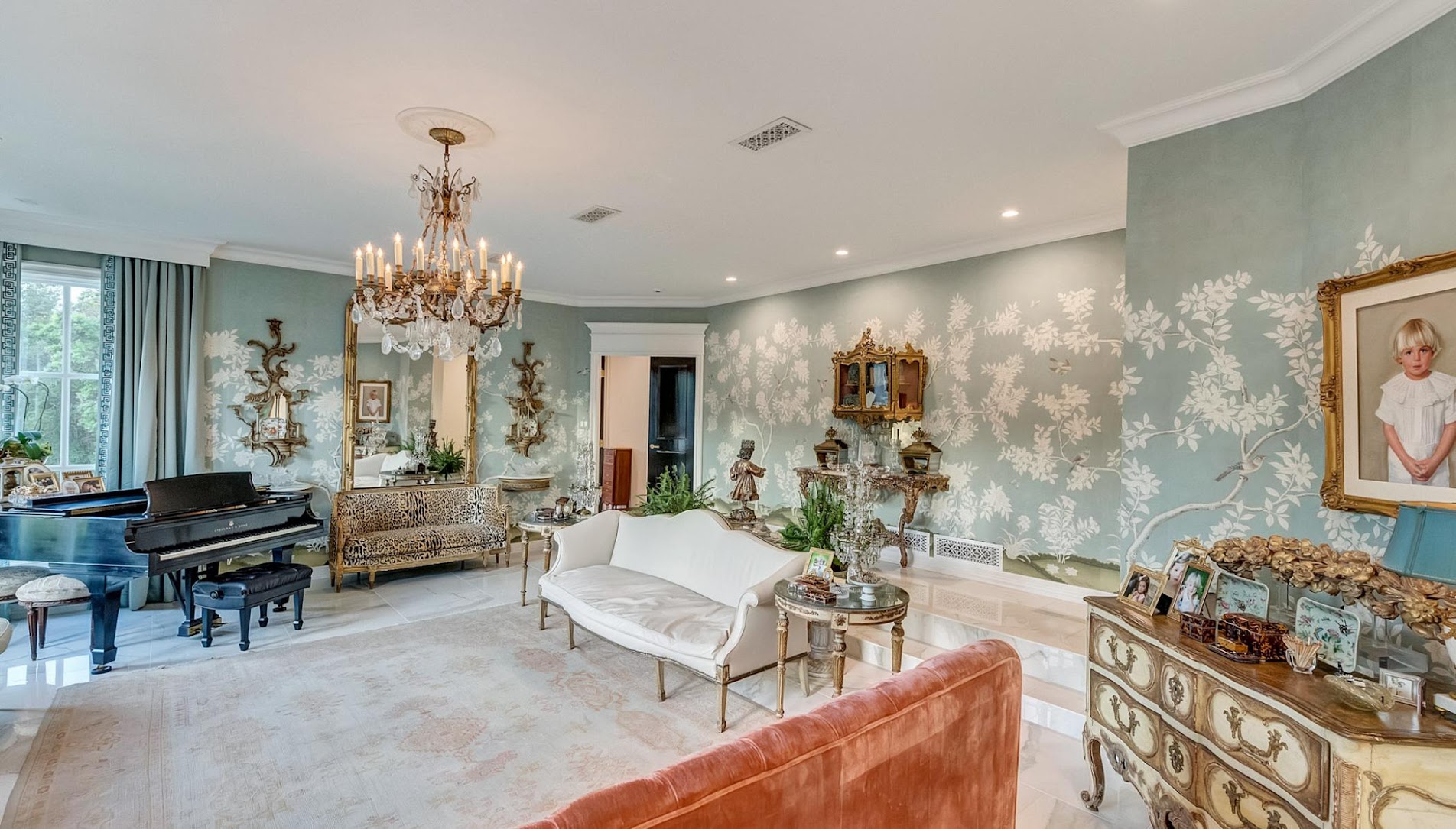
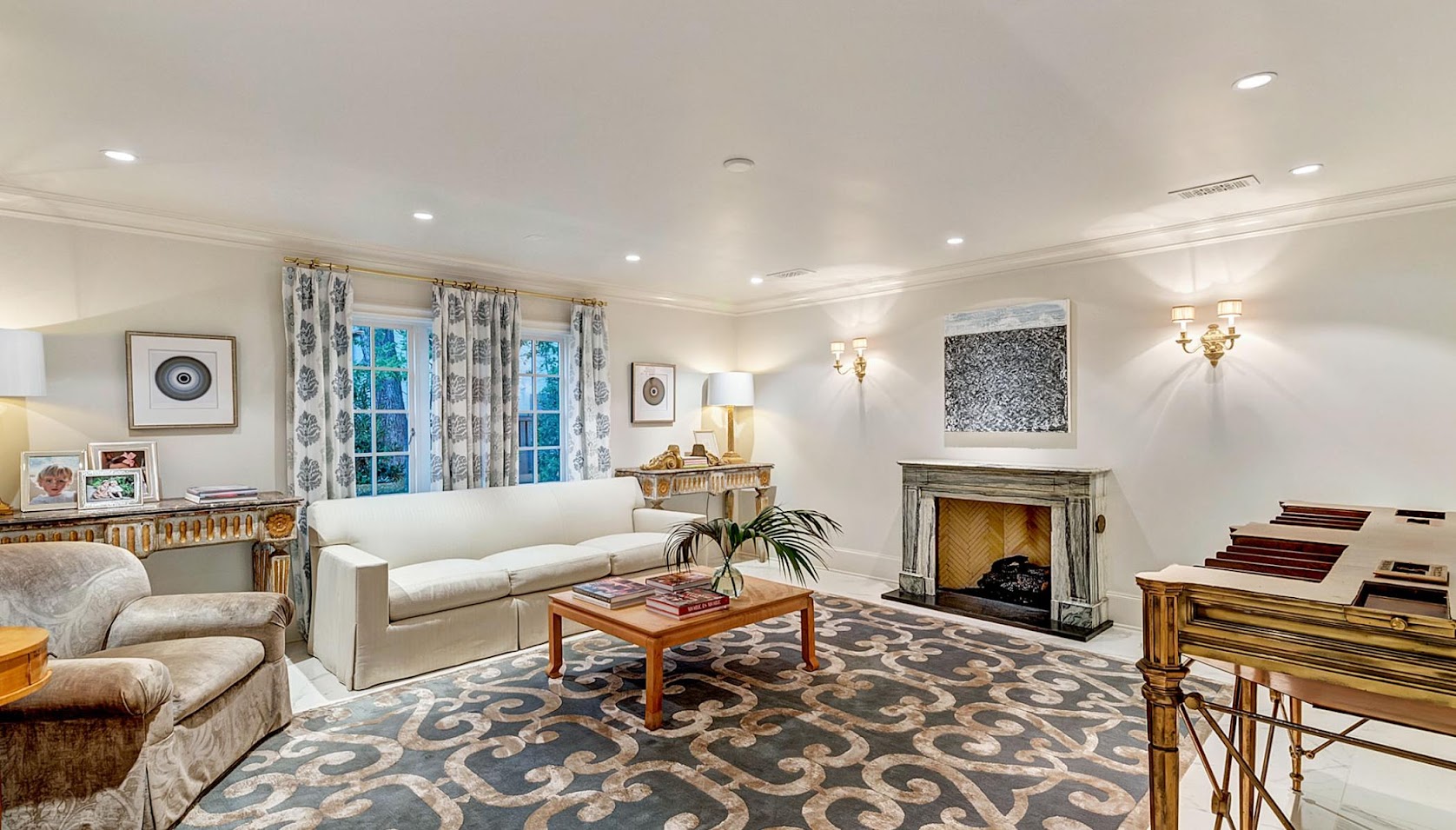
AFTER: Sigh. Double sigh. OMG. Please resuscitate me. New marble floors make the sunken aspect of the living room disappear. The mirrored walls were removed and gorgeous hand painted wallpaper (probably De Gournay) was hung throughout the room, including the hallway. The wallpaper was a risky move. It’s a classic decorative element, yet the house is contemporary. But, as you can see, this was a risk well taken because it produced such a wonderful look. At the center, a beautiful crystal chandelier.
The mirrors that flanked the foyer doorway are gone, replaced by the wallpaper. There are chests there now with portraits above. The new windows also tone down the contemporary feel. Silk curtains with borders heighten the look of the new windows. I ADORE the apricot velvet sofa with tufting and fringe.
A closer view. Large mirror reflects it all – it is flanked by sconces and consoles. To the right – another console with a hanging etagere. LOVE. The faded antique rug picks up the apricot velvet color. And, my favorite – another favorite, it’s hard to be choosey – the settee under the mirror. Help me lord. I know envy is a mortal sin, but I am envious, I’ll admit it. Envious of that settee!!!!!
Once more. Notice the double doors to the library were closed off during the renovation. Another brilliant move that allows for the vignette in the foyer that is visible from the living room.
The library with a fireplace and …
… and another domed type ceiling.
The library was turned into a bedroom with a sitting room. The dome was removed, new floors were placed down, the walls were painted or stained a deep silvery brown. Notice the tiny basketball net!!!! This must be a boy’s room – how nice it is with the fireplace!!
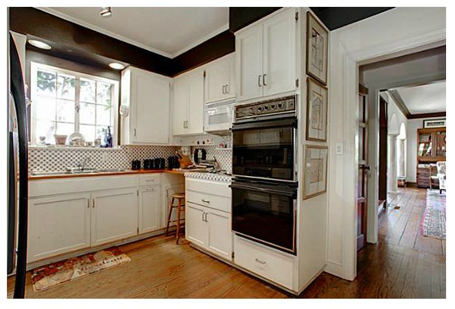
Before: The kitchen is one room that wasn’t updated. Perhaps the owners stopped here but the room is nice enough. Maybe they aren’t cooks! One big change is – new doors, lacquered in deep black and the new a/c vents.
BEFORE: The view towards the pool and backyard.
AFTER: No much change besides the new door and a/c vents AND the new doors to the outside. The view says it all.
More views of the backyard. The breakfast room is updated with French chairs, table, crystal chandelier instead of a ceiling fan and a pair of antique columns that flank the curtains.
BEFORE: The master bedroom was a sea of taupe carpet, large plate glass windows, and padded walls.
Today the room could not be more different. Look at those dark steps leading up to the bathroom! How charming. The new owners made an alcove out of curtains, trimmed in a pattern that was repeated on the dust ruffle. Love the patterned rug in gray and white.
BEFORE: The sitting room next to the master bedroom becomes an office.
AFTER: The office in the master bedroom, with its new window, overlooks the beautiful pool. Lining the walls are prints of French architectural drawings. Striped silk curtains.
At this point I have totally forgotten that this is a completely modern home. Have you?
AFTER: The master bathroom wasn’t updated much – except for the new doors, lacquered in black. The antique chair and the etagere add a more luxe look until the room is updated with new marble floors and counters.
BEFORE: The guest room.
BEFORE: The bathroom.
This room overlooks the backyard. The room got new wood floors and windows. Darling lilac touches. Matching trim on curtains and dust ruffle. A mix of antiques and new. This bathroom was completely redone. New double doors in the same lacquered black found throughout the house.
The bathroom redone in gray subway tile and brass fittings. Since this bathroom and others are renovated, it makes me think the owners just didn’t get around to the kitchen and master bathroom redos yet.
Even the laundry room is too cute – with wallpaper and black countertops.
The living room, again. These two houses shown today remind me of each other. Both have the same extremely pretty ac vents – who knew they could be so pretty? Both are filled with fine French antiques, not rustic Round Top type French antiques. There is a difference, which you can see here. Both houses use dark doors, and marble.
The two houses also have the same wood floor stains and the same interior “look.” One is a contemporary house with French antiques, the other is a classic Tudor with French antiques. Regardless, I love both looks. The above contemporary in a French way…and
the Tudor architecture with a mix of French antiques and contemporary touches in art, etc.
Which house is your favorite?
The older façade, completely renovated. OR…
The newer contemporary, toned downed with a beautiful French antiques? This house recently sold HERE.
Hard to vote for one over the other!!!
To each of you – a happy and very healthy 2019!!!!!!!