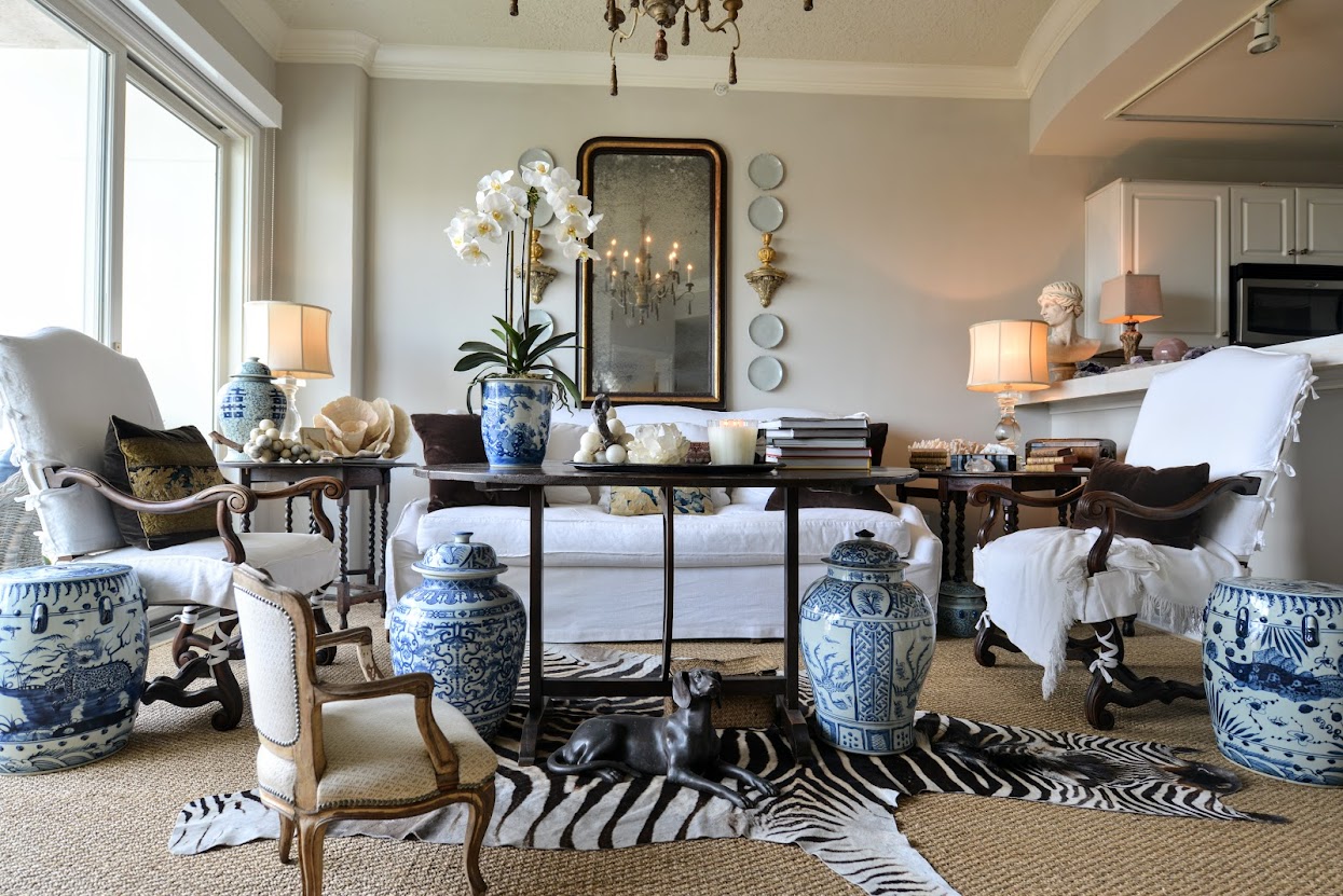
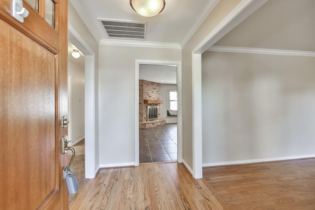
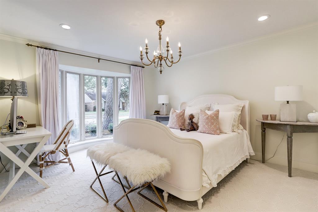
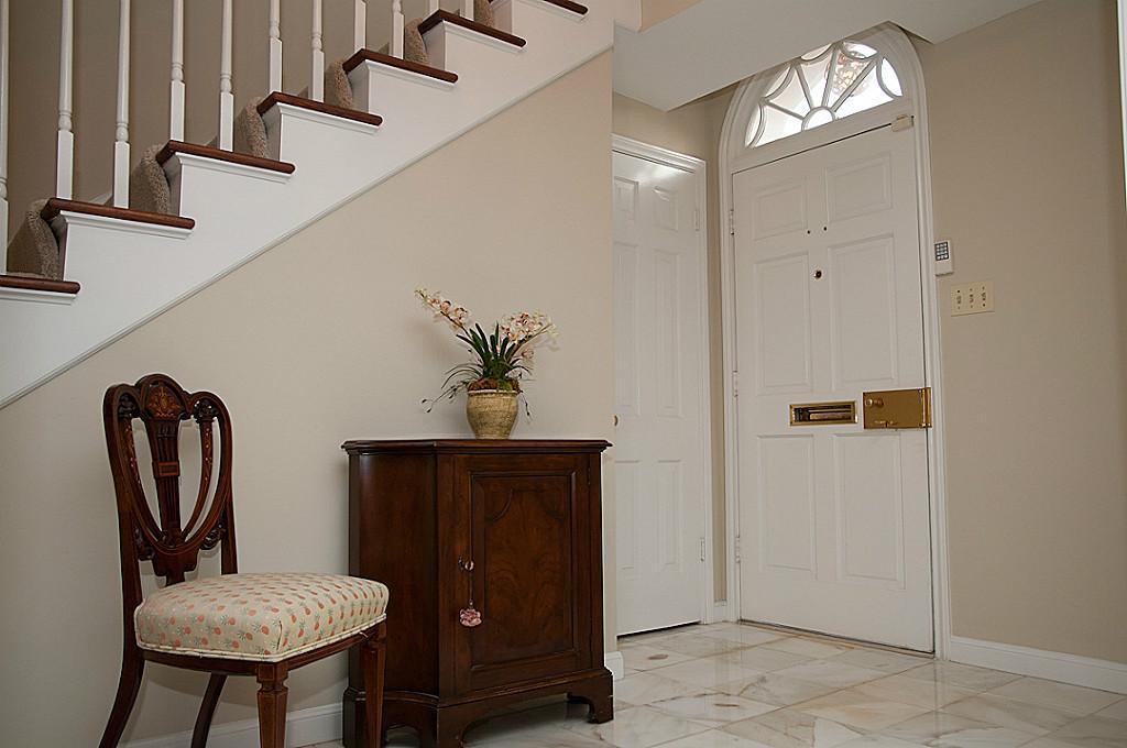
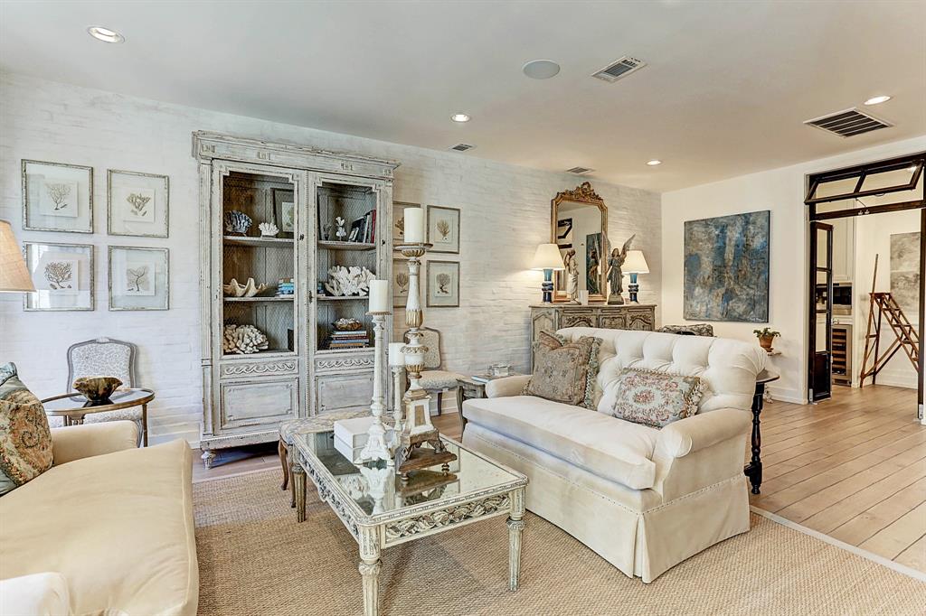
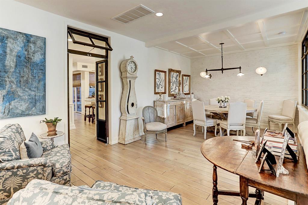
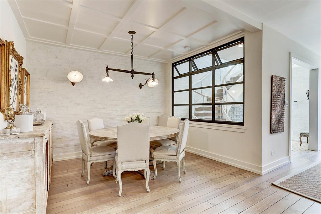
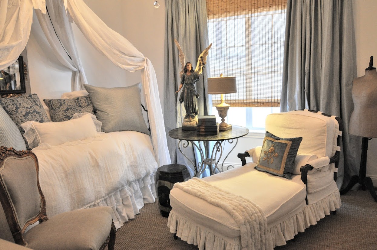
Last week I showed my new apartment, where Mr. Slippersocksman and I are currently living the life while downsizing.
First, I want to sincerely offer a HUGE, humbled thank you to all of you who commented. Thank you for all your prayers for Ben – who is feeling a bit better lately. I can’t tell you all how much your thoughts and suggestions meant to him and me.
Please know that if I didn’t personally respond to your comment, I read it.
Ben and I were astounded by your outpouring of love (yes love!) and support.
Thank you from the bottom of our hearts.
Now a word or two or three about downsizing and flipping and house renovation. In your comments, so many of you mentioned that you were either thinking of downsizing and moving to a small place. It got me thinking about how to get a house noticed by a buyer. What makes a house attractive to a prospective buyer? Flipping is so popular these days – what makes someone drawn to one house over another?
The flipper who bought our house, immediately sold it to another person who told us he was planning on moving into the house after he renovated it. But truth be told, he too was a flipper. He spent the past eight months completely renovating the house in order to flip it. The process has been amazing to watch and I’ll discuss that in detail in Part Three of this story.
All this talk about flipping got me thinking about it. What would our flipper do to our house? What would he chose to keep or toss out? In the end, it’s all about the bottom dollar. What do you need to do in order to make your house appealing to a future owner?
What I am going to say may apply only to Texas. Flipping houses is regional – what goes for customers in Waco might not be what is trendy in Flagstaff. So, looking at most Houston flips - if you are planning on selling your home or flipping one – there are several things that attract lookers who buy - no matter the price of the house.
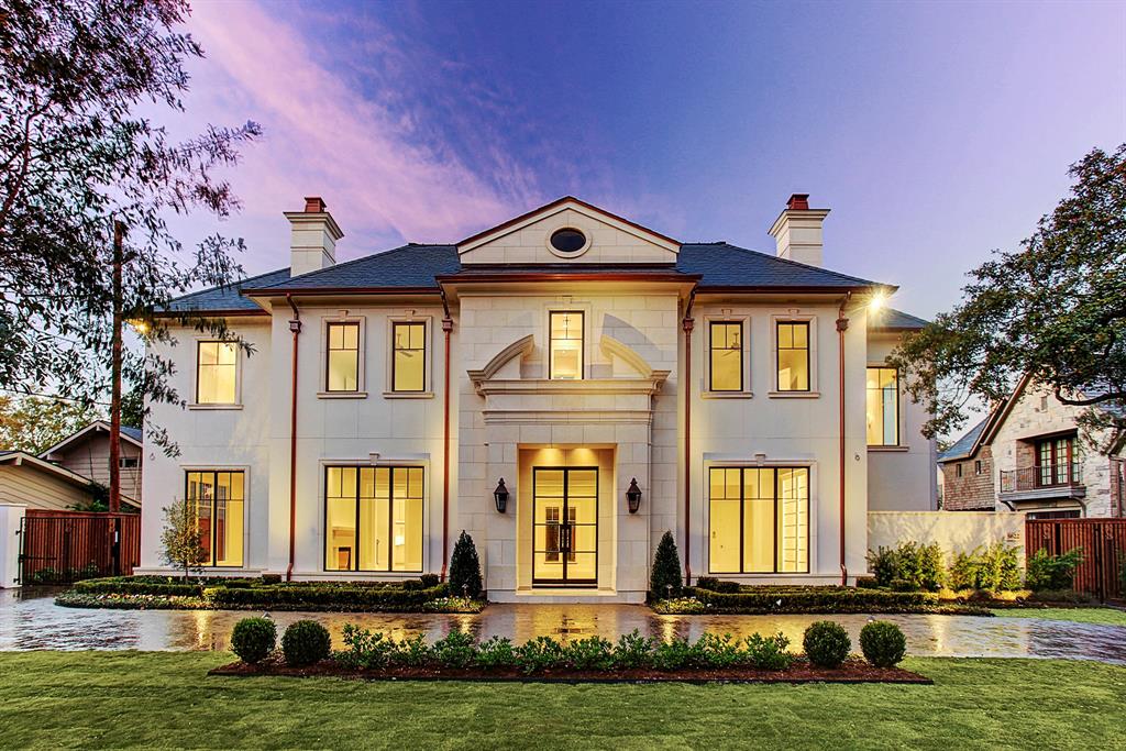
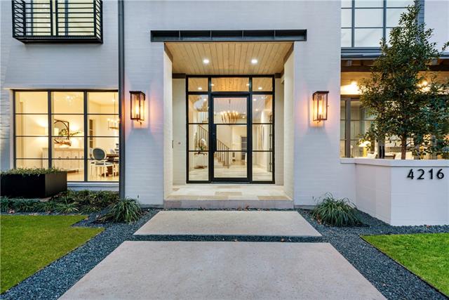
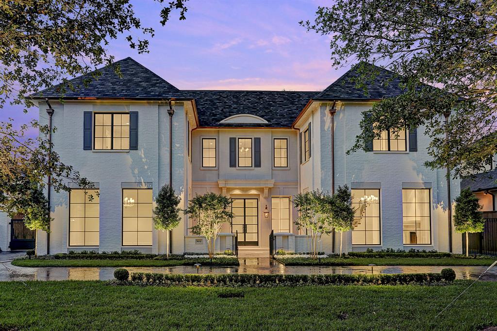
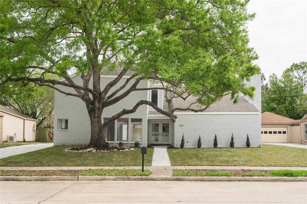
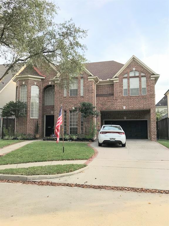
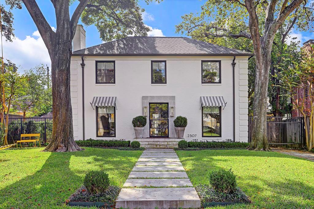
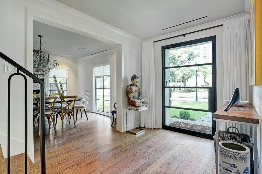
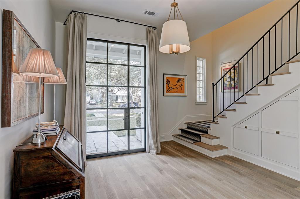
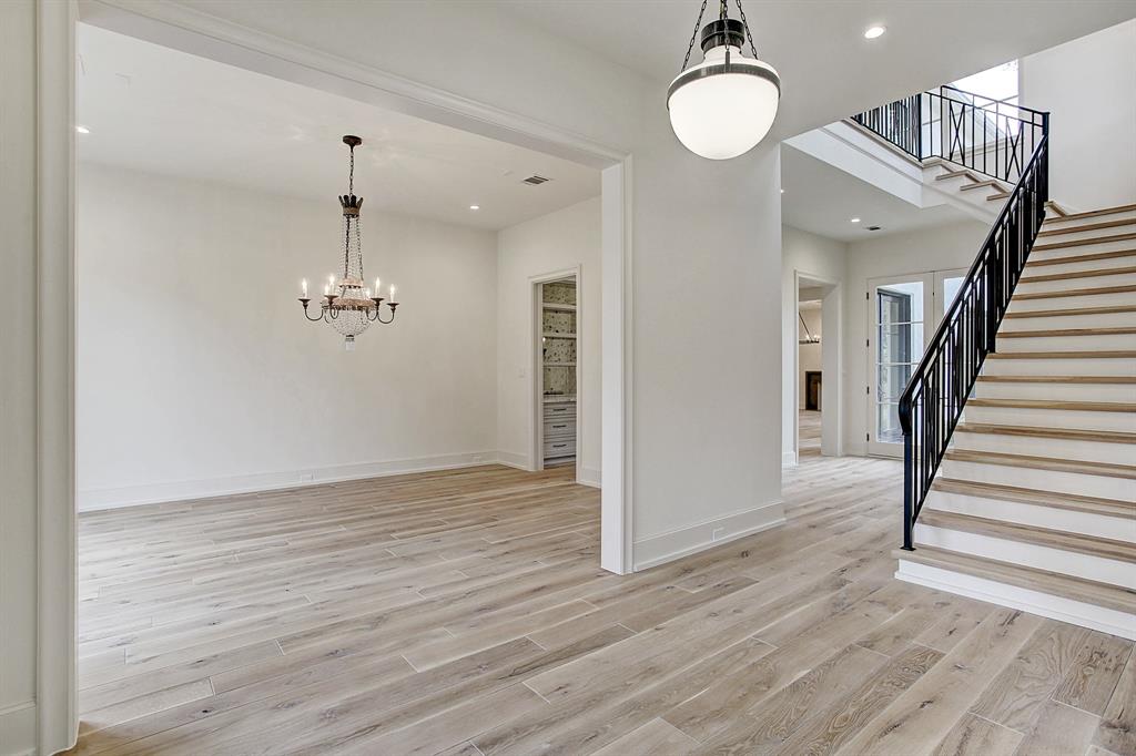
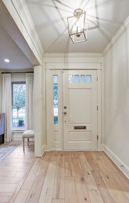
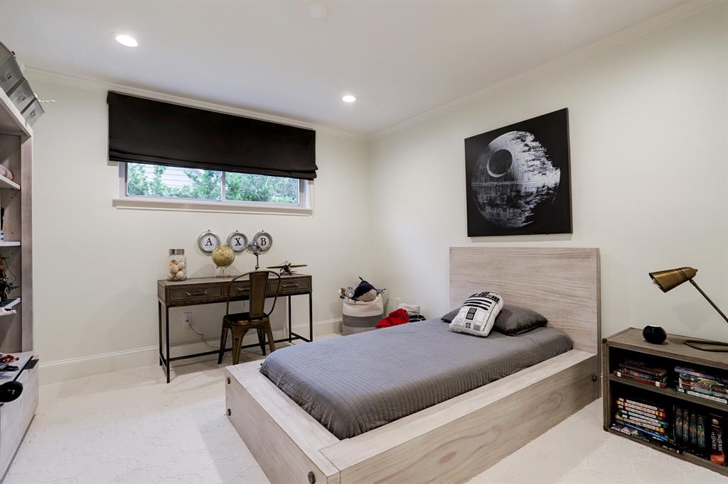
The black steel front door is a must when building or flipping a house. Solid front doors are OUT.
NOW, do NOT go throw out your front door because I said they were out. I happen to love solid front doors and I LOVED my own front door. But the younger set, the Millennials and Generation Xers, all want black steel and glass front doors.
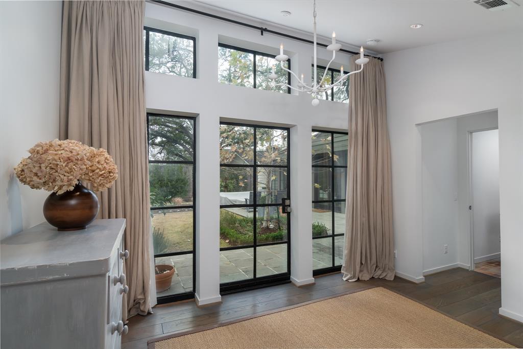
And if you have the cash, toss in some black framed steel windows too and a few slider doors.
Even if you don’t want to spend the money on all steel framed windows – the front door has to be steel.
There you go, that’s better.

Another see through steel front door.
And here.
I don’t really care for that shiplap and wonder why they used it, but everything else is so pretty. The front door, the windows, the stone trim, the garage door and the lights over that door. The interiors are fabulous too. Another trend? In lieu of a sidewalk, just put in large stepping stones.

Beautiful.
These doors and windows will slow down any driver, for sure So will these sidewalks of stepping stones.
Even a smaller house, a renovated one, will sell quicker with that new front door. It screams – I’m Renovated! Come in and see!!!
Notice something else about all these houses?
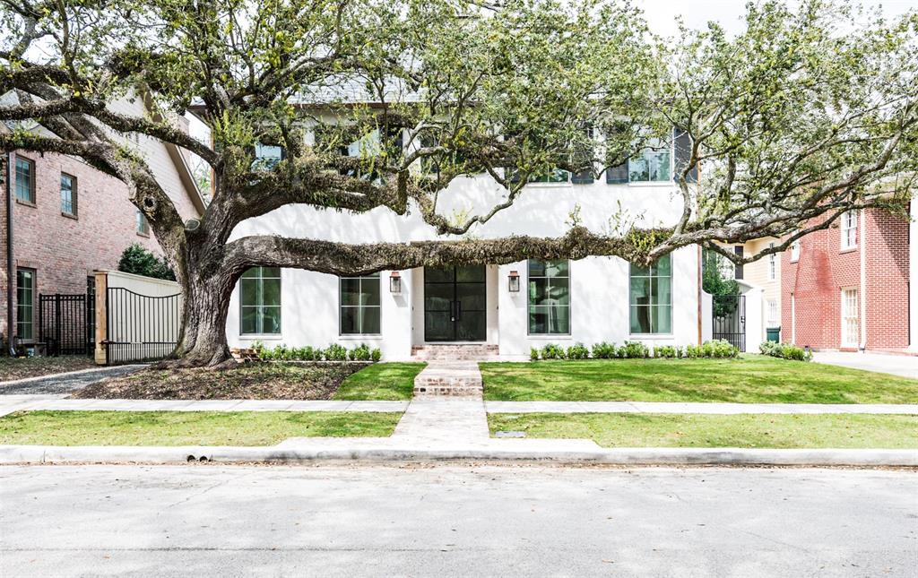
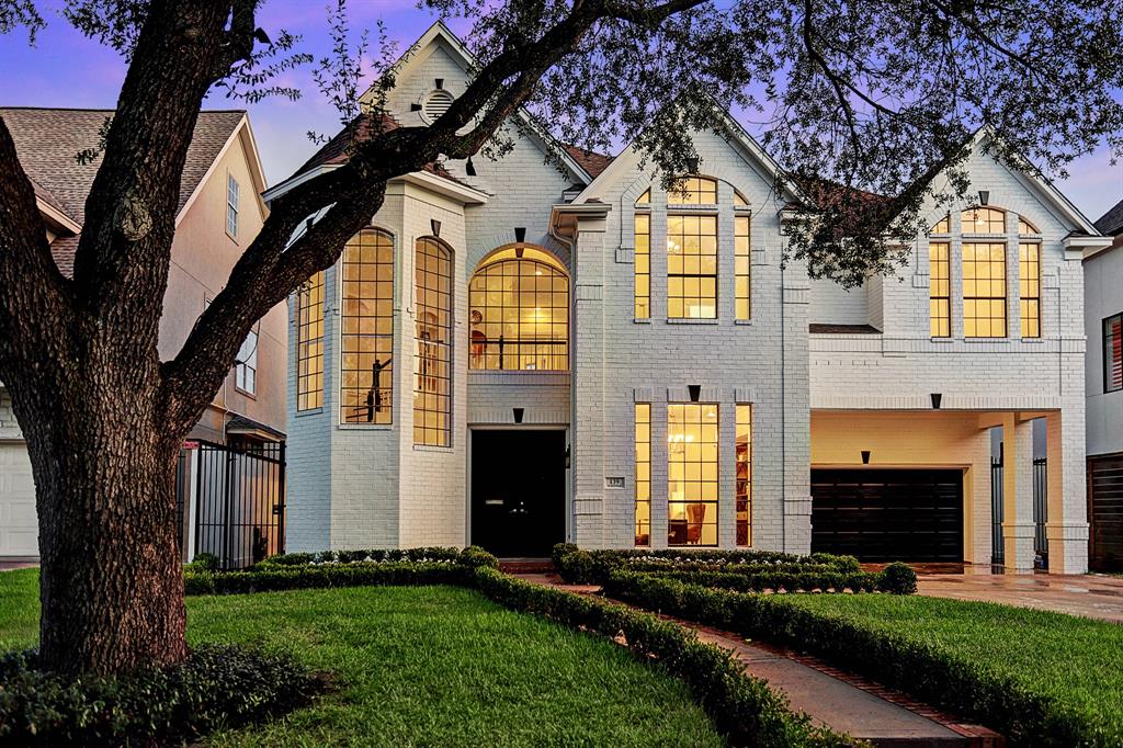
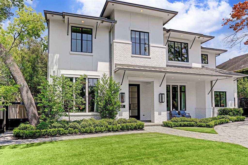
All new and flipped houses MUST be white.
Yep. Paint that house white. In the 90s – red brick made a comeback and every house in West U was built with red brick. Now it’s all white. All those red brick houses are painted white to sell the house.
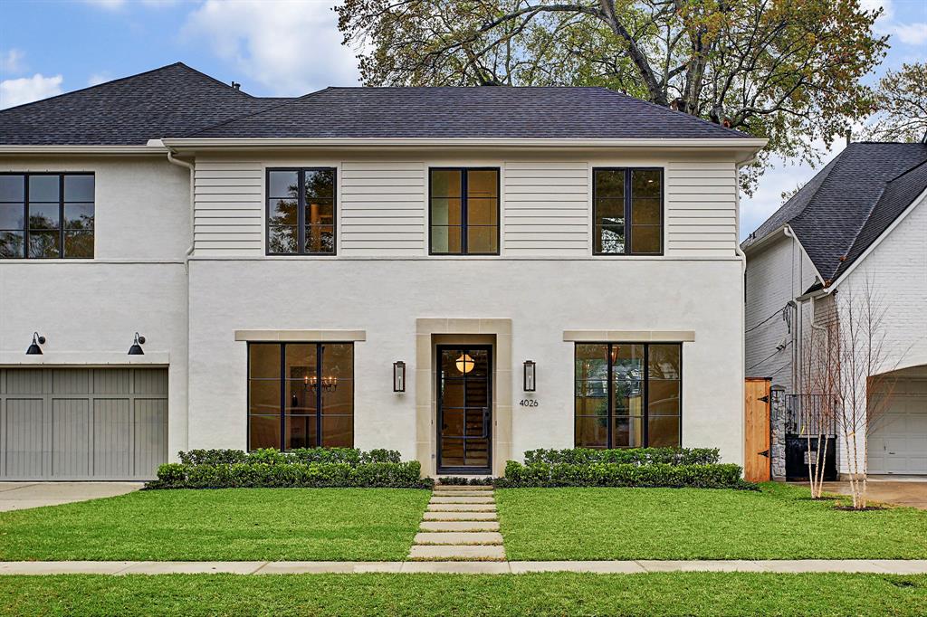
This house was renovated and painted white. No steel glass front door – just a regular glass door, which is a nice compromise.
But the white brick stands out from the beige brick that is found up and down this street.
Oh, and another thing that helps to sell a house? A 50 year old oak tree or two.
My cousin’s house with its 90s red brick in Bellaire. During Harvey it flooded just an inch – still the entire downstairs had to be redone. Being empty nesters, it was a good excuse to downsize! They are now moving to a highrise.
So different! The inside is incredible. Wish I had before photos to show you. The house was quickly bought by a flipper who completely renovated it, painted it white, and sold it quickly after the renovation was complete.
White facade, oak tree!, box woods – even without the glass front door, it still screams RENO!
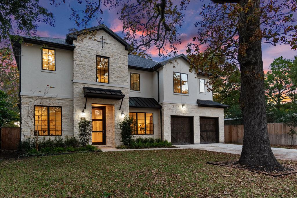
Here’s a before & after in River Oaks. A classic, it would be pretty with some pressure washing. Instead…
White paint. Steel glass front door and windows. Stone surround. Trendy stepping stones.
AND awnings! Another reno trend.
Seriously – is this the same house? Incredibly it is.
This house was designed by Mary Patton – HERE. She obviously has quite a talent for renovating houses – if you are looking for an interior designer who understands updating for today.
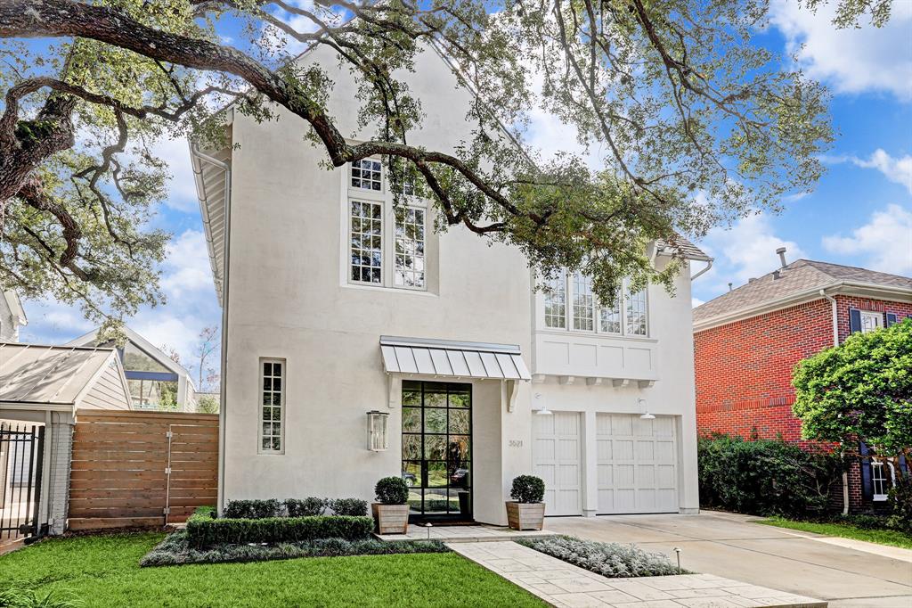
White facade, check, steel glass front door, check, boxwoods, check, awning, check!
White paint, steel glass door, awning – metal, upstairs awnings too.
Awnings. And yet, another HUGE trend – faux grass. I don’t get it at all. Especially if you have dogs. But this graux is everywhere!!!!

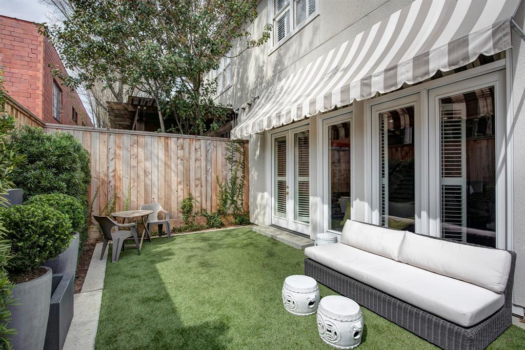
OK, OK, the doors ARE gorgeous, but what about privacy????
Portieres are a great way to preserve privacy and be chic at the same time.
The inside of the Mary Patton house shown before. The Buddah’s name is actually Rick. Just in case you were wondering!!!
Another example. See? Go ask your husband – “what’s your excuse now?”
Love this one! Although it’s really a back door.
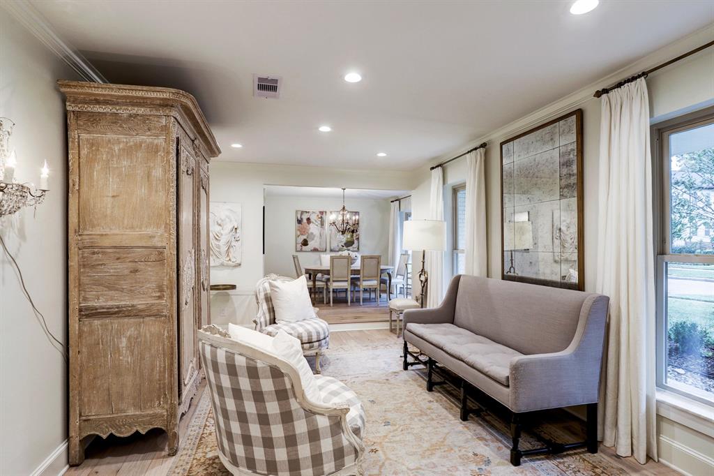
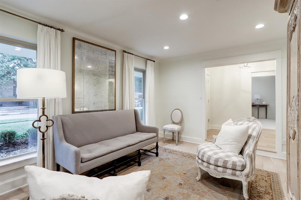
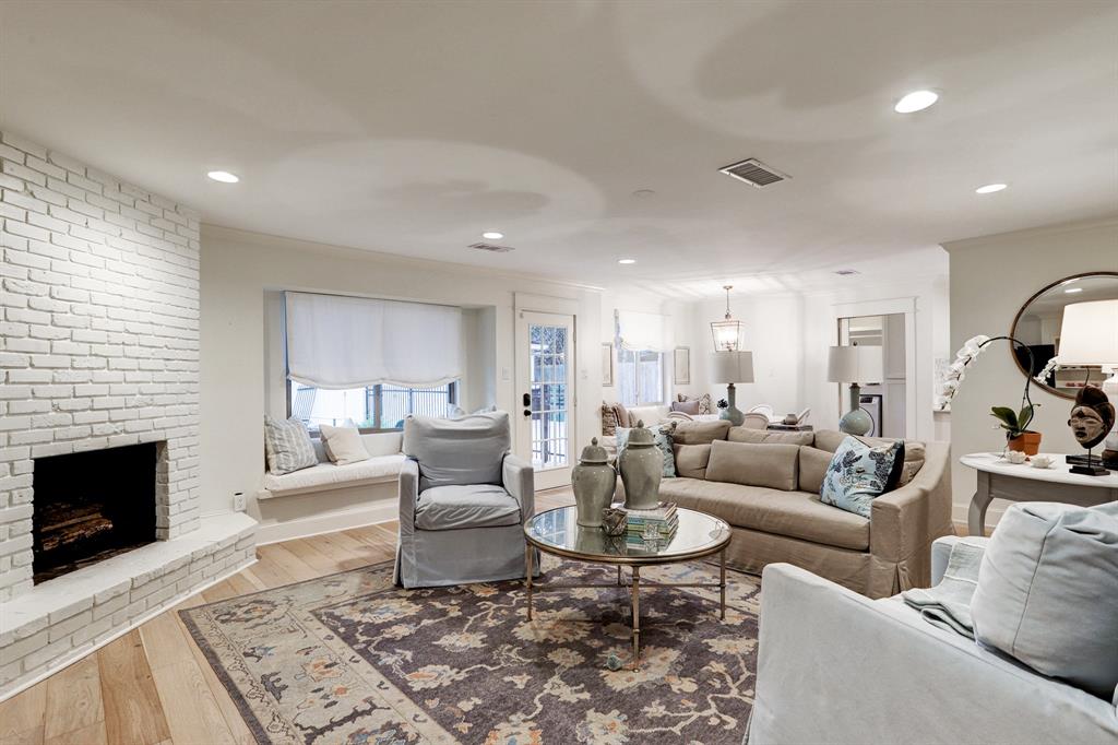
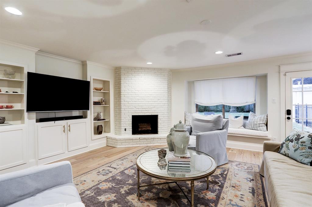
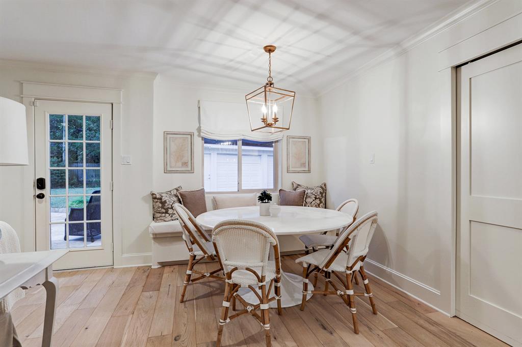
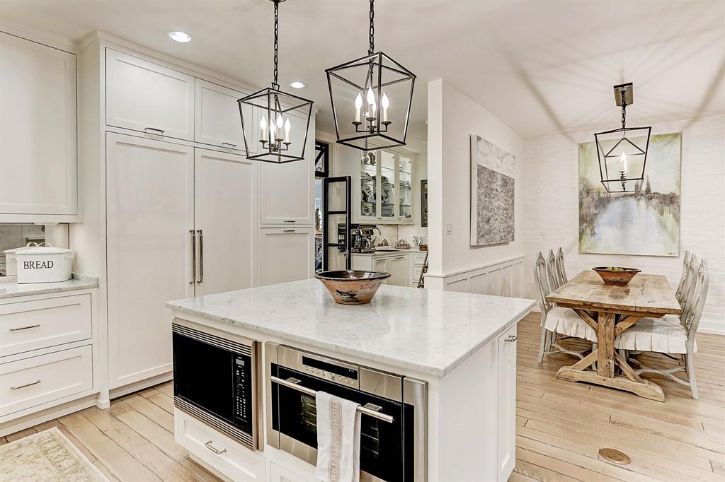
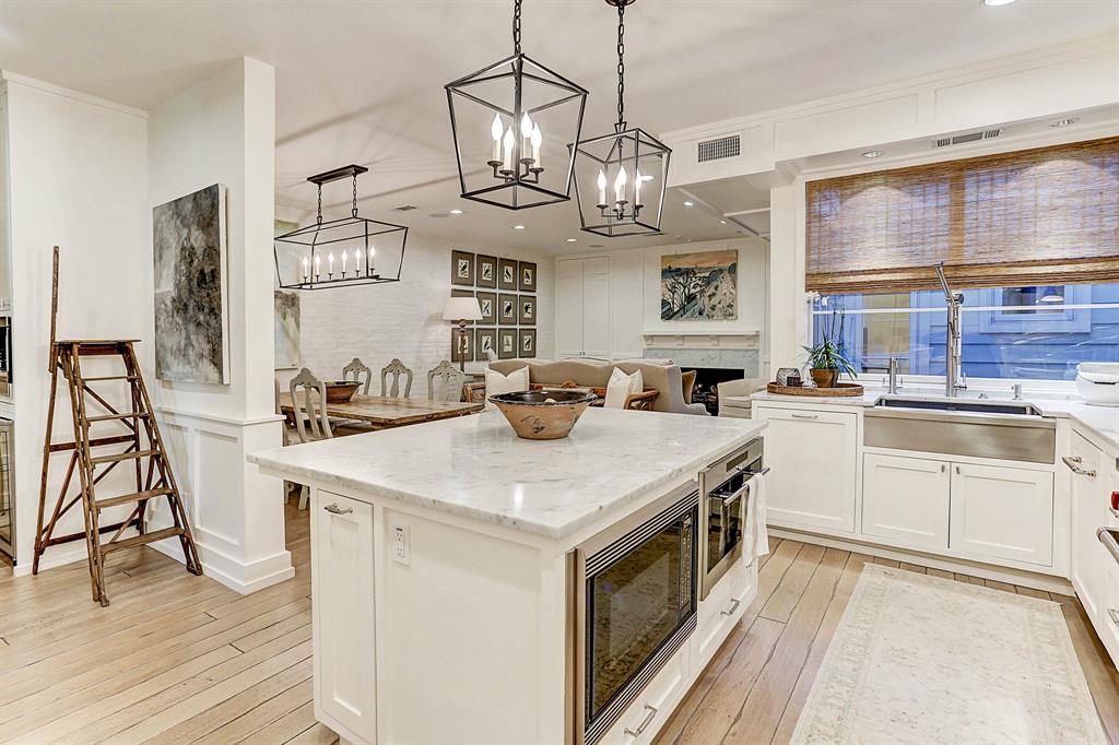
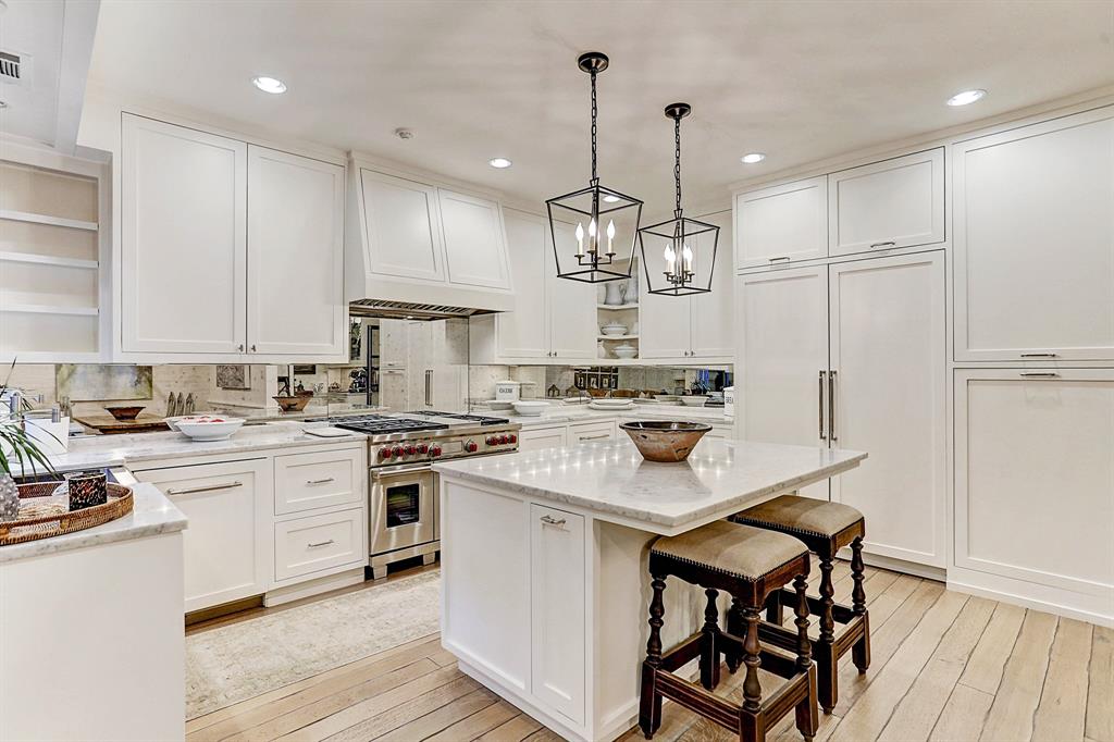
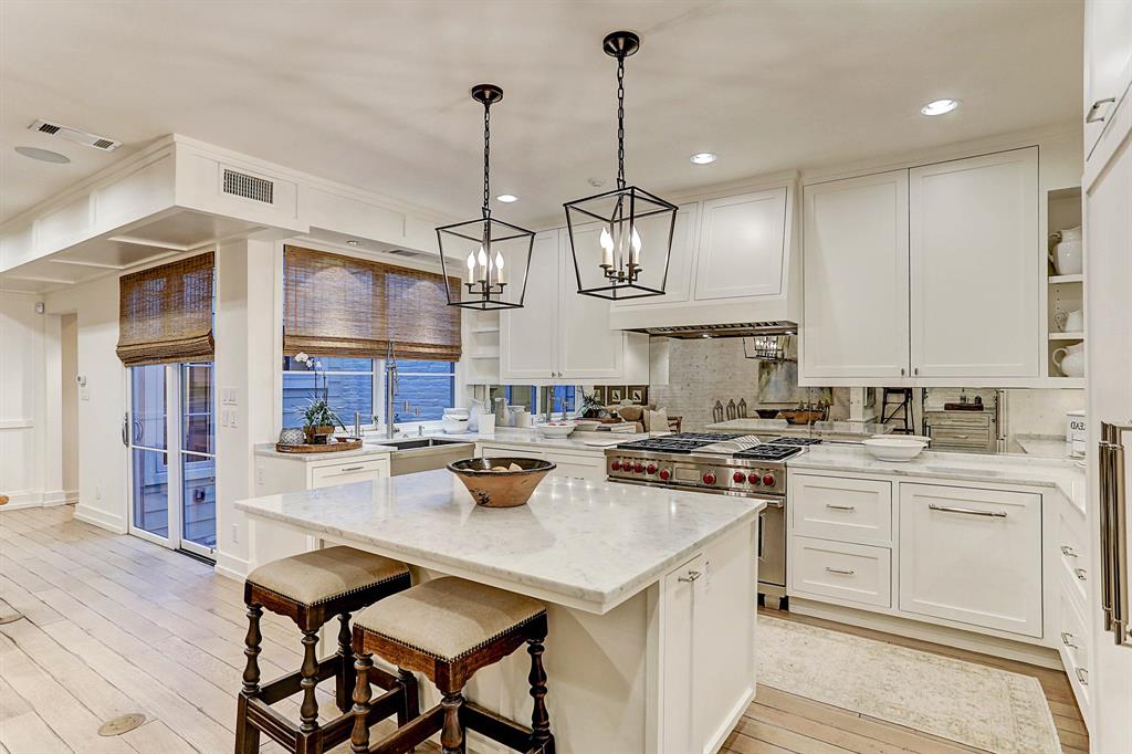
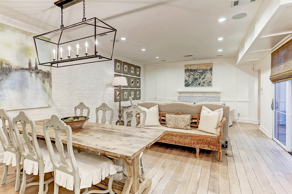
Inside there are several things that will help you sell a flipped or renovated house faster. Light floors. Either real wood or vinyl which can look very real. But if you can afford it – go for the French oak like this. Gorgeous.
Beautiful.
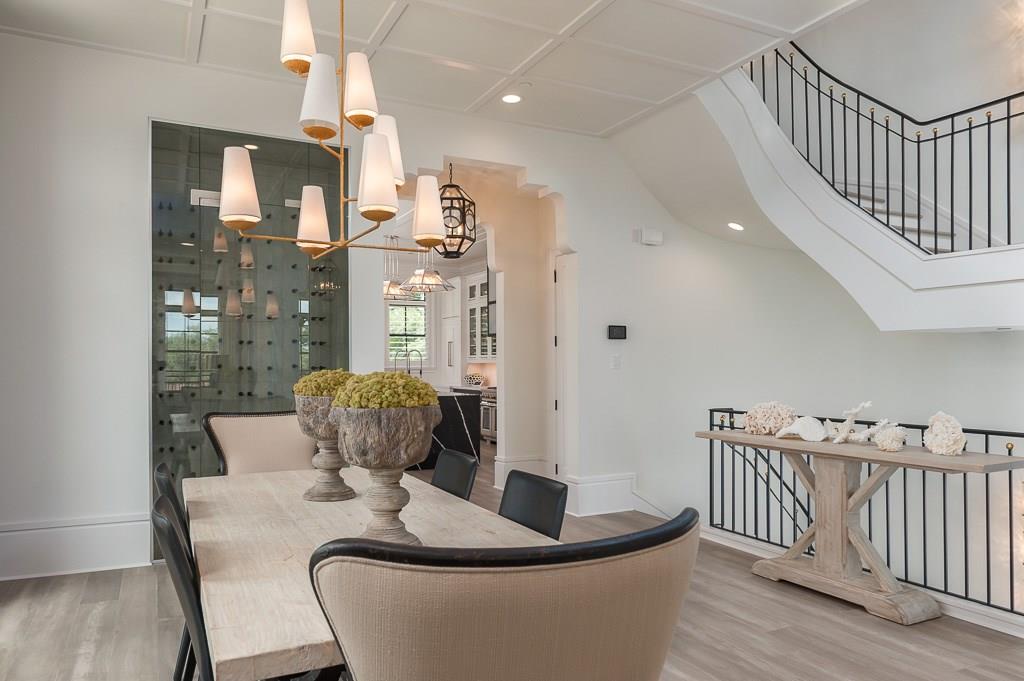
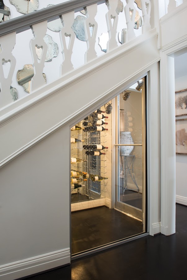
After the light floors – another trend is wine rooms that are visible through glass walls. The bottle becomes art. Except these people have no bottles in theirs.
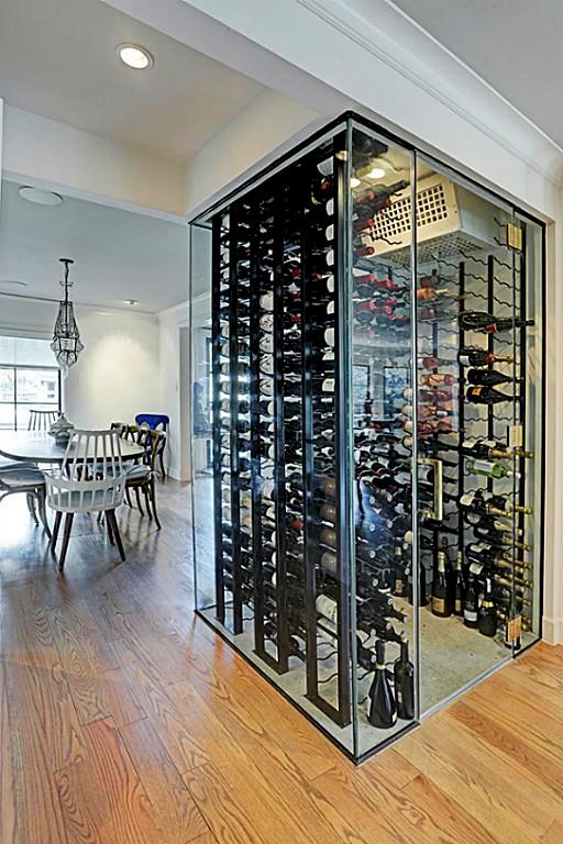
Here you go!
Now, if you are flipping or selling a less expensive house – I wouldn’t put in a wine room. But if your house is above 2,000,000 – it’s a necessity.
Remember the Before & After story about the house the Aidan Gray flipped in High Point HERE. I loved that story!!!
The before was an old, classic.

The after – painted white, in the snow. I loved this photo.
The comments were pretty wild. Many thought Randal should not have painted the house. I was firmly in the white paint lane. I think I would paint the world white, if I could.
The story was tied in with a HUGE giveaway. Lots of chandeliers from Aidan Gray. In the end, the story was a success.
And here – in the corner under the stairs, Randal put a wine room behind glass. There was no other room for a wine room and this was genius.
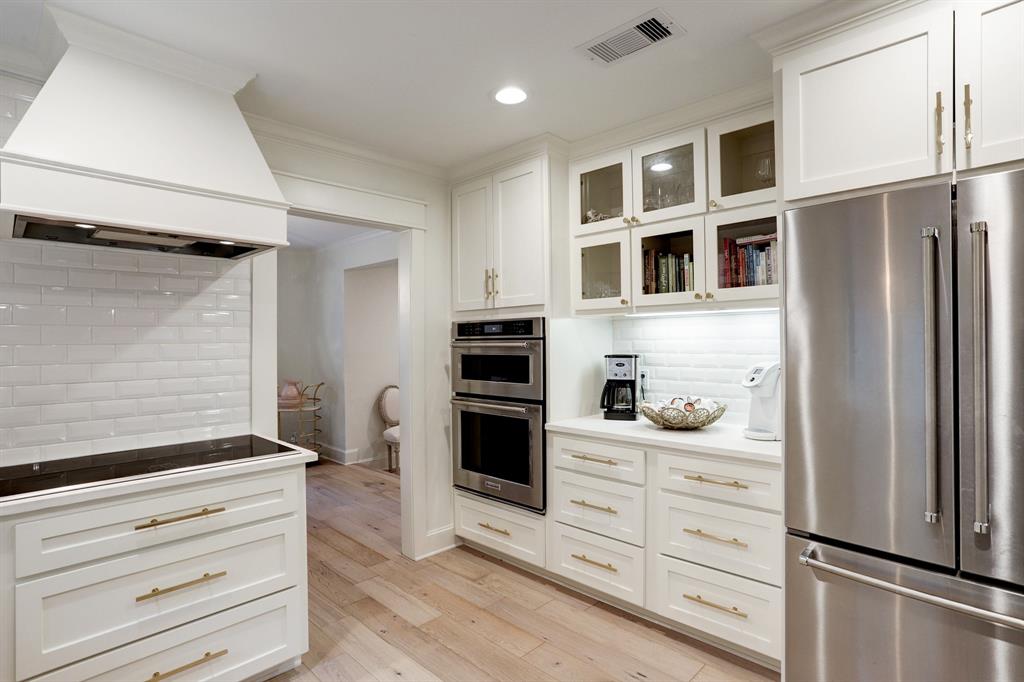
White marble is still in and looks prettiest with white walls and the light floors. If flippers don’t use marble, they use Quartzite or Quartz in white. People are complaining left and right about Quartzite etching. Wasn’t it supposed to be impervious? It’s not. Quartz is supposed to be impervious to etching.
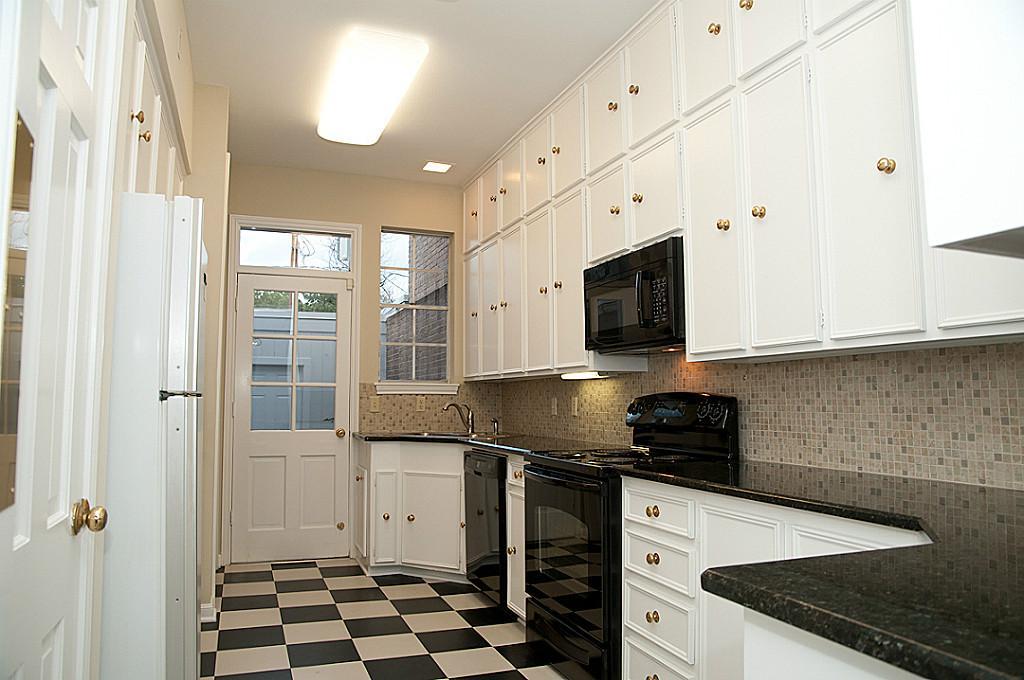
Don’t ask me – I’m stuck with this gosh awful kitchen that I refuse to tell you what the counters are made of.
I miss my kitchen counters and sink. There, I said it!
Still…
Nothing looks prettier with white and grayish walls and light floors than white marble.
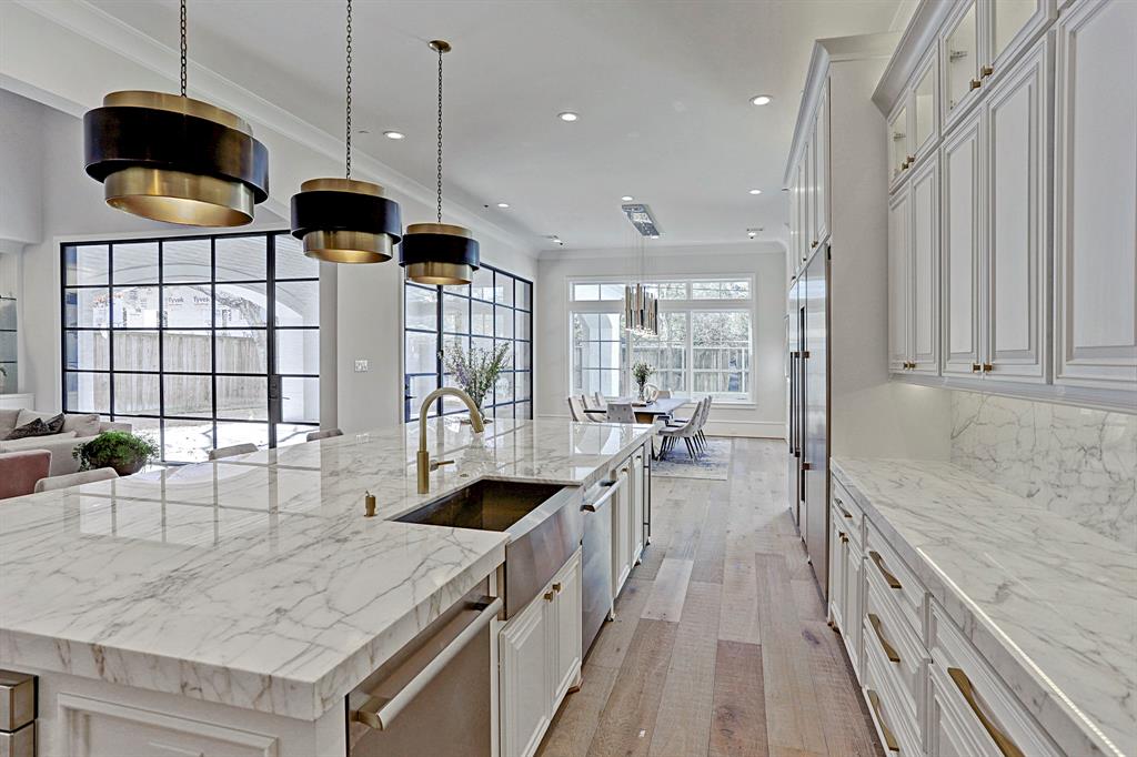
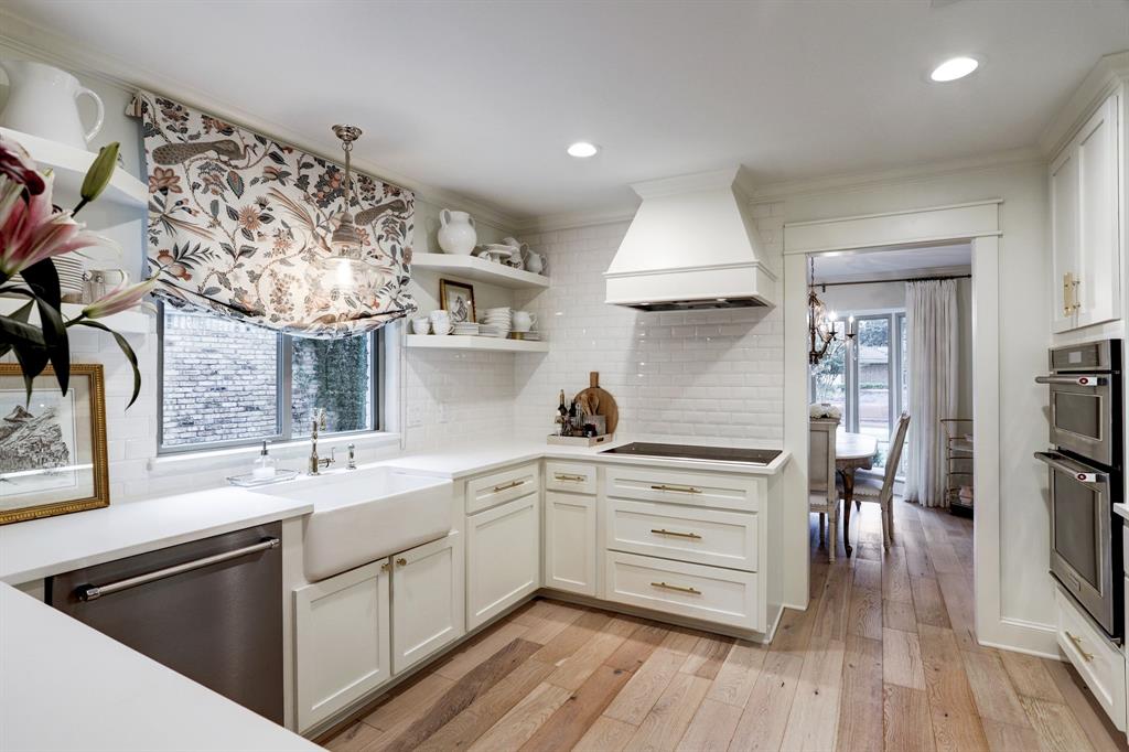
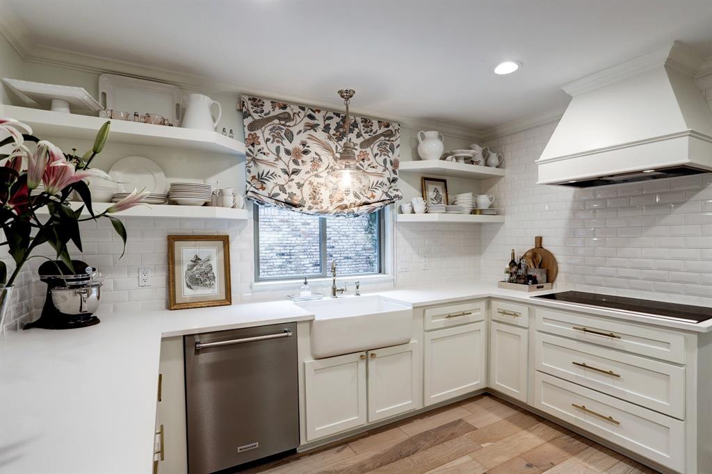
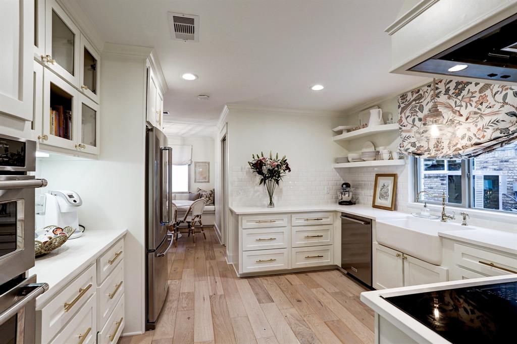
This has it all – marble, black steel doors, windows, farm sink, brass, white walls, light floors.
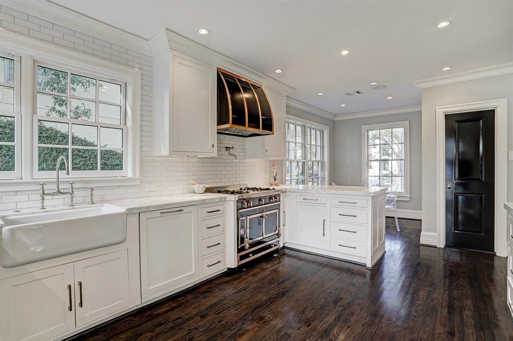
A smaller renovated kitchen with a fabulous stove, farm sink, marble, subway. How long have you been asking if white marble will go out soon? I guess not. It’s hotter than ever.
Take the subway tile up to the ceiling.
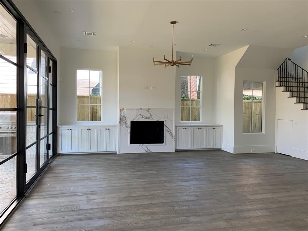
The dark floors? I love them, but, the lighter just look trendier, hotter, stylish, lit.
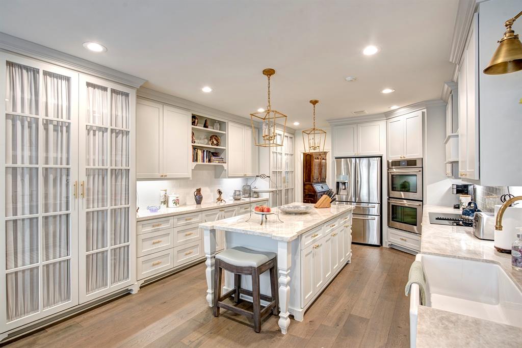
Here’s a sweet, cozy kitchen with updated trends – French oak floors, brass, farm sink. But those pantries with the glass doors!!! Fabulous!
To flip a house or to renovate a house doesn’t mean it has to be contemporary – just updated. Here, the French oak floors and Quartz counters, brass hardware – all read new, but it is still warm and not stark.
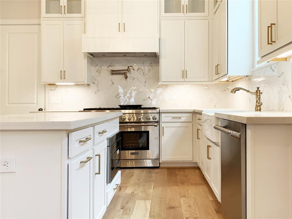
Even in a small budget townhouse – trendy subway on the diagonal, quartz counters, brass hardware, farm sink, and the French oak look floors. They aren’t the real French oak – but they look great. Couldn’t be more simple, but it looks luxe.

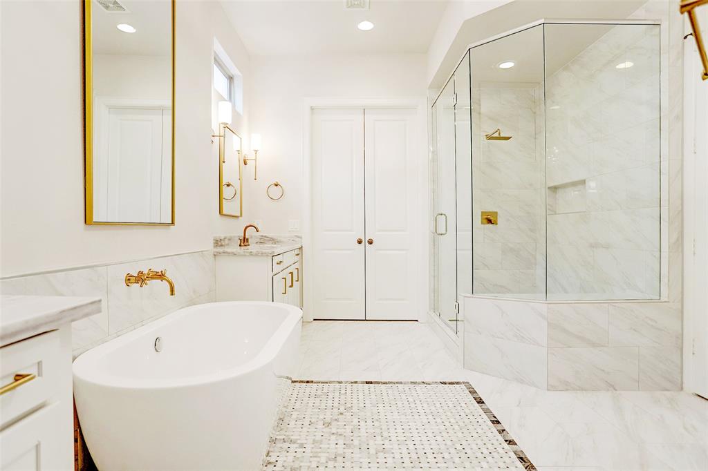
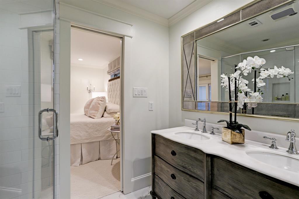
In bathrooms – you HAVE to have a free standing tub if you want a successful flip or renovation.
Nothing else will do.
In another low budget new construction – the tub makes it look like a million dollar townhouse, although it is much, much less. Seriously – doesn’t this look very luxe?
Marble, brass, and the seemingly frameless shower door (it’s not really) - another must.
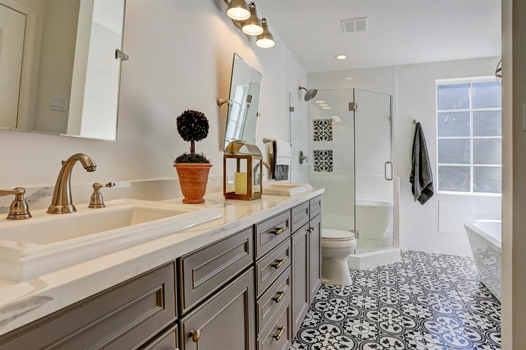
The Bohemian look still attracts customers, but mostly younger and with lower budgets.
The concrete tiles, the stained wood cabinets, white walls, free standing tub, and a true frameless shower door.
Again, for a few extra $$ – the walls should have been tiled with the subway to the ceiling. It would just give it that extra style.
A plain house, not much architecturally – with a bathroom like this and a kitchen in the same vein – would sell within days.
I’m sure the real estate agents reading this are rolling their eyes at me!!!! “What a know-it-all!!!!!”
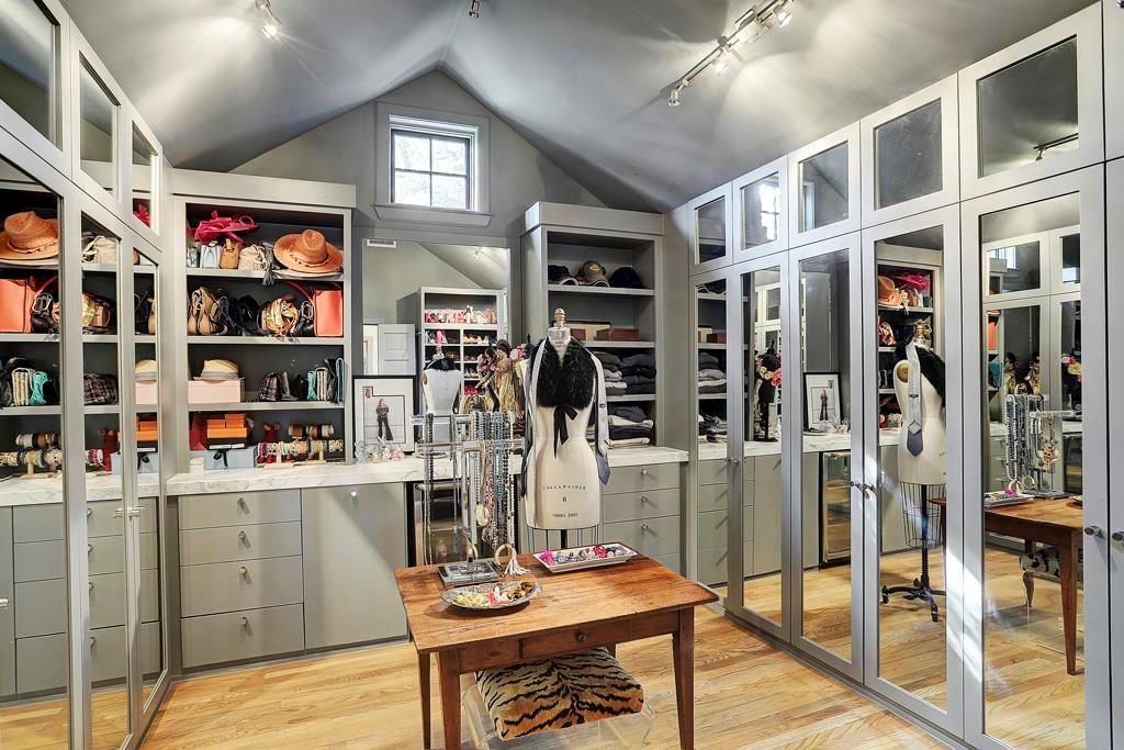
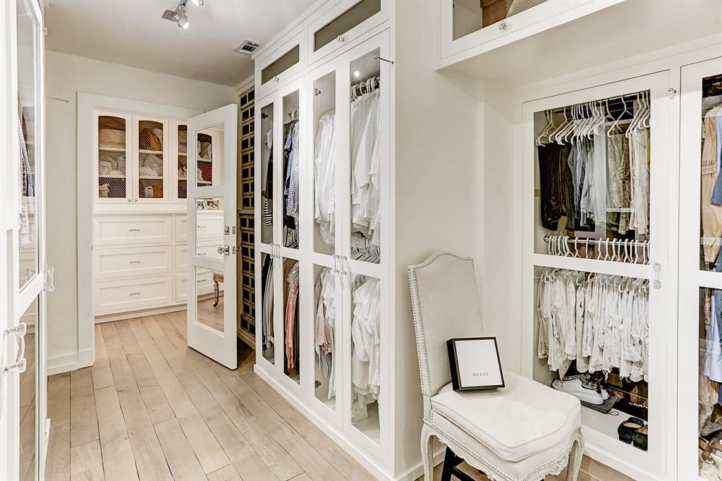
Another feature showing up in more and more houses are master closets with doors that hide the hanging clothes. This one looks like a store! Love it!! And notice the window – that’s another feature in closets that I’ve been seeing lately.
The natural light makes the closet look more like a room, a space, to sit in.
Shiplap. As hot as it is, I don’t see much of it used in Houston – at all. I love it, but professional builders and flippers don’t seem to use it much here. Now, in Waco, that’s another story!
A Beautiful Before & After:
I’m not the only one downsizing. I was amazed reading the comments how many of you are either downsizing or thinking about it. Which got me thinking that you are probably as interested in downsizing and flipping as I am.
I found this house on HAR. This owner had downsized from a gorgeous, huge, custom built, Nantucket styled shingled house on a large lot – to this much smaller house in Meyerland.
Not sure why the owner is downsizing and I’m not going to show the former house because she didn’t use that much of her old furniture. But, I stumbled on her new house – which is now for sale – and was struck by how fabulously it was renovated.
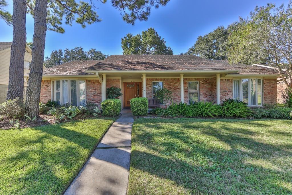
Built in the 1960s with 2100+ sq. feet. A typical ranchburger in Meyerland which has had devastating floods in the past decade. Many have raised their houses to escape the waters. It just depends on where you are located. Others remodel and sell, if they can.
Now, it doesn’t state if this house flooded during Harvey. It was redone before it was sold to our downsizing owner, but the sale sheet does state it did NOT flood in 2015 or 2016. So, if it flooded during Harvey, that may have just been the anomaly of Harvey. Priced at 475,000 – if you are looking to downsize to a smaller, one story house – GRAB THIS!!!! I think it’s a perfect redo, and it’s reasonably priced. I get lots and lots of requests for reasonably priced redos – so let’s go inside…
Wait!!!!
Let’s look at the new facade first!
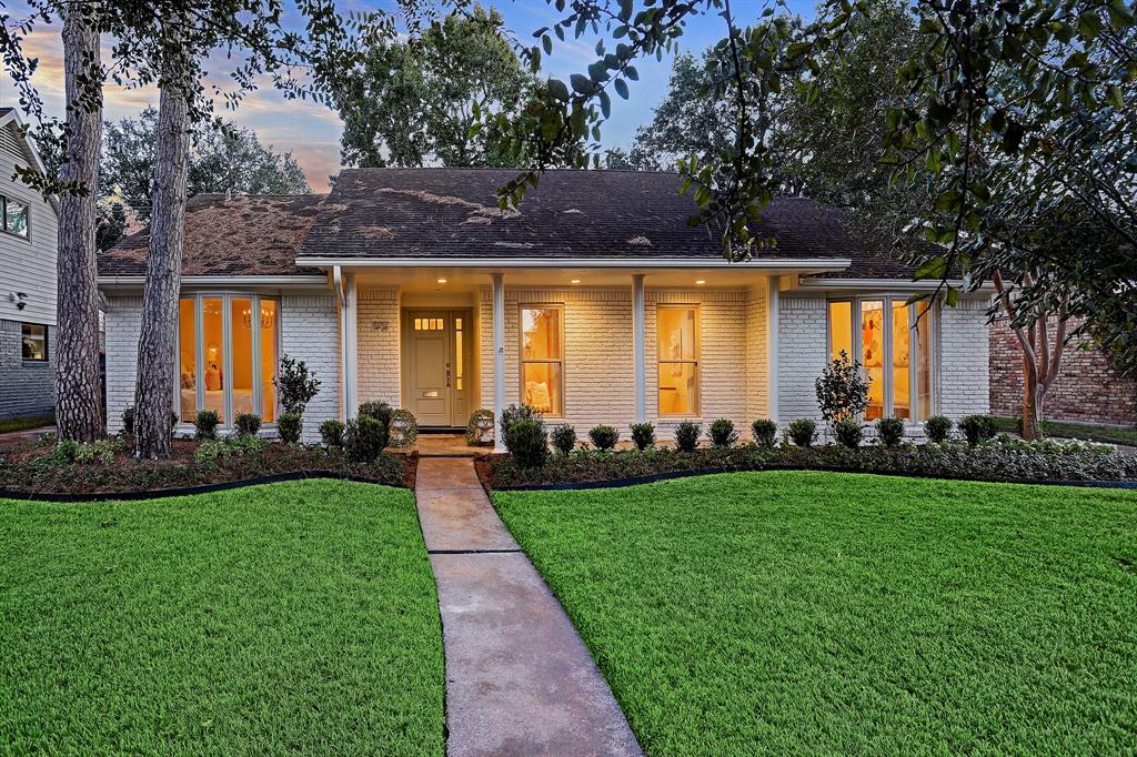
Painted white, of course! with new landscaping. The white paint shouts “Come in and see my new decor!!!” And the new boxwood garden shows someone with good taste lives here.
BEFORE: The entry leads to the family room straight ahead and the living/dining rooms to the right, bedrooms to the left.

BEFORE: Typical ranchburger design with the living room and dining room to the right.
AFTER: I assume the floors are new. They look like stripped pine. Very pretty.
This is the room that caught my eye! The beautiful French chairs in brown and white check. I die!
Why do I still love checks so much?!?!? Give me a check and I’m happy. I might not have even given this house a second glance if not for these chairs.
Across is an old French armoire and there’s a French sofa that looks antique. Pretty Oushak rug and crystal sconces. Lovely mirror. Soft linen curtains.
Walls painted a soft white, not a blinding white white – which makes them easier on the eye.
Understated but so pretty.
View towards the foyer.
The floors look so pretty here. French table with French chairs. Modern art is juxtaposed with the modern art and mid century modern bar cart!
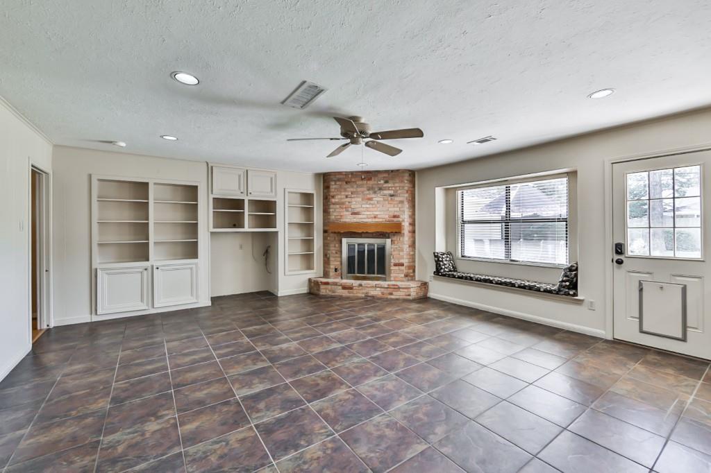
BEFORE: Slate tiled floors with built ins and corner fireplace. Let’s see if the owner can make this room pretty. THIS is a challenge!
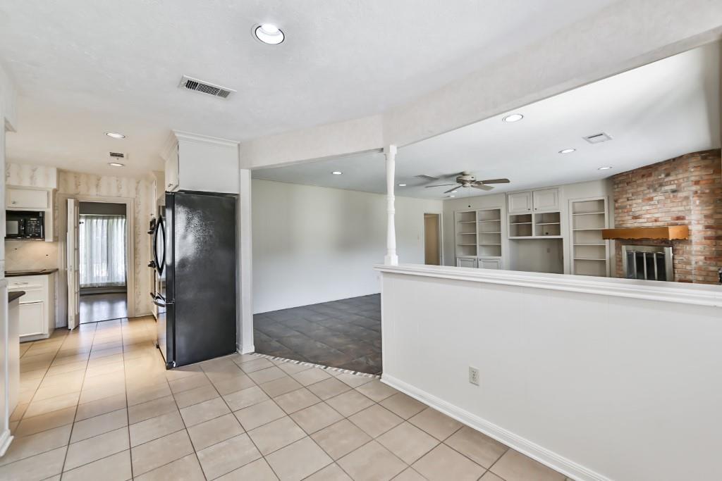
Pony wall from the breakfast room and kitchen. Yet another tiled floor.
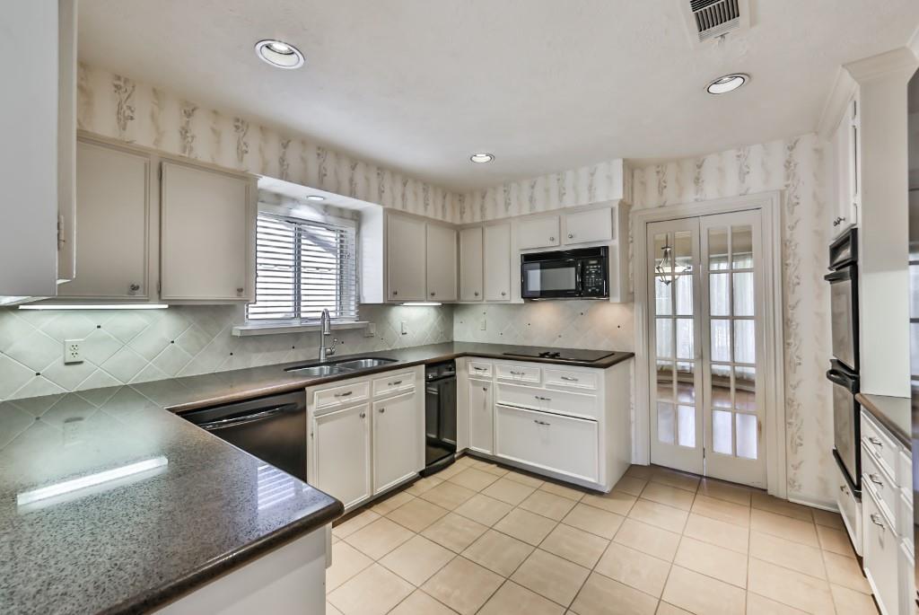
And the kitchen – a typical U shape from 1960s ranchburgers. It was even updated with granite and backsplash.
AFTER:
First, the fireplace was painted white and the mantel was removed as was the fugly screen. What’s left is a pretty fireplace with a black box.
And notice – the 60s styled pony wall is gone. Behind the sofa is a console with two celadon lamps.

I LOVE those paintings!!!! LOVE!!!
Pretty furniture – khaki and pale pale blue. Swedish styled table, probably from The Lone Ranger.
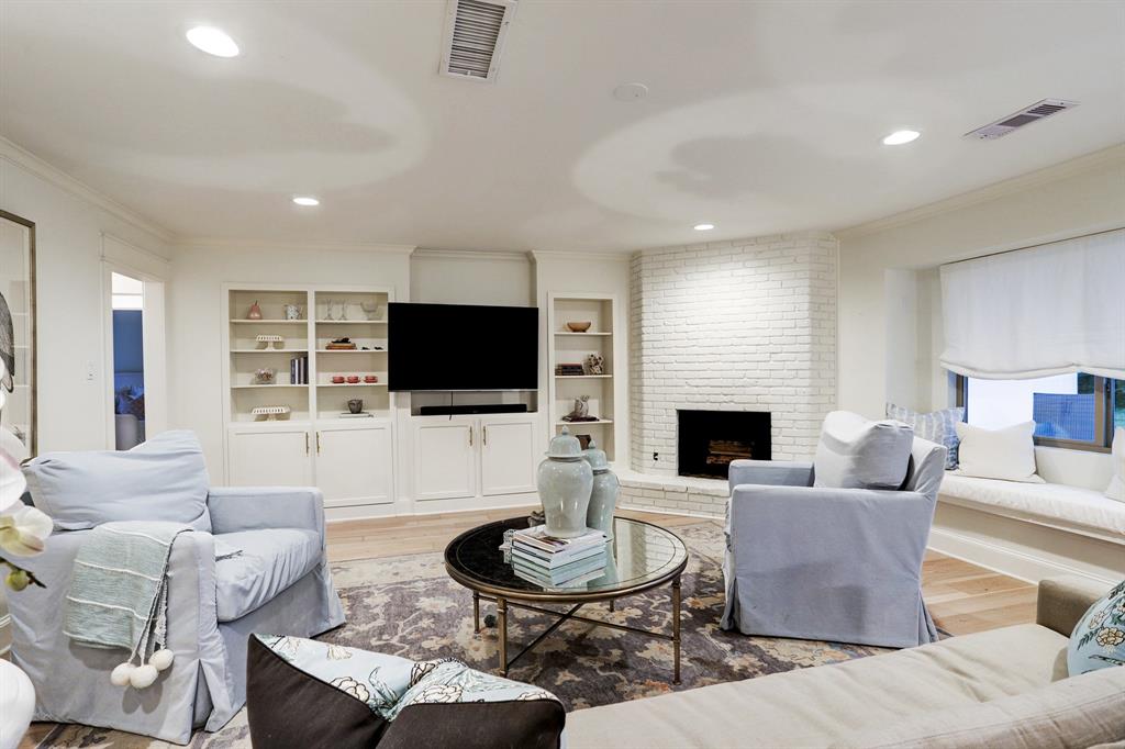
NOW: one comment. The cabinets were reworked just a bit but I would have done it differently. I would have taken out the two shelving units on the left and centered the TV. It would be less obtrusive set back without those shelves closing it in.
Across, a pretty linen shade and a window seat. Another Oushak rug.

And here you can see the breakfast area with the wonderful French chairs, window seat, lantern – and you ca see the console table behind the sofa.
Removing the pony wall is such a no-brainer, I’m surprised the previous owners didn’t do it!
Eero Saarinen table on Amazon for a great price . HERE
White French bistro chairs. HERE
New back door lets in more light.
The kitchen is fabulous. I love what she did here. I don’t think a huge amount was spent even though it looks like it. Let’s break it down.
One thing to notice – the door has been removed and the molding around the doorway has been beefed up. In fact, throughout the house – all moldings around the doors have been added onto which gives it a very luxe appearance.
Either there are new cabinets or new faced doors. If these are new cabinets then the expense went up. New farm sink, of course. The footprint is the same which keeps costs way down. New counters, new subway tiles which are affordable. The soffit and upper cabinets were removed which looks wonderful. New colorful shade is a great choice. It adds the right amount of pop to the family room and the kitchen. New hood over stove, losing the microwave. AND new lantern over the farmsink and new light cans.
The only thing I would have done different – here it comes! I would have run the subway all the way around, to the ceiling. You can see around the door – they didn’t do this. I would have also used a range instead of a wall oven and cooktop.
And here, you can see where the tiles stop. I just think that it looks more finished to go up to the top. The refrigerator is now built in which looks SO much better.
It’s just beautiful. It doesn’t have to be huge and have all the finest appliances to be wonderful. And this is a wonderful kitchen.

After: The laundry is well thought out – the counter above is perfect for folding and stacking and the rod is another useful idea.

Before: The room with the pretty windows is so unattractive with all those shelves!
After: Instead, you have the pretty guest room with Swedish demilunes and a French bed. Notice the Shaw carpet – that’s really pretty.
Before: bathroom
After: The door was removed from the shower room – which makes the bathroom look so much larger. Notice the soffit was removed here too, again making it seem bigger. New concrete tile floor, new double sinks, simple round mirrors, new subway tile, bathtub, and polished nickel faucets.
And, here I go. Sorry homeowner! For a few thousands more in labor and tile – the entire bathroom would have been fabulous if all its walls were tiled.
Ditto the kitchen and laundry.
BEFORE: The second bedroom.
AFTER: New boy’s room. OK, another comment. She loathes me by now. But seriously – I love this house and would move in today, as is, without all the tiled walls even! I’m just pointing out things that would make this house sell in a few days.
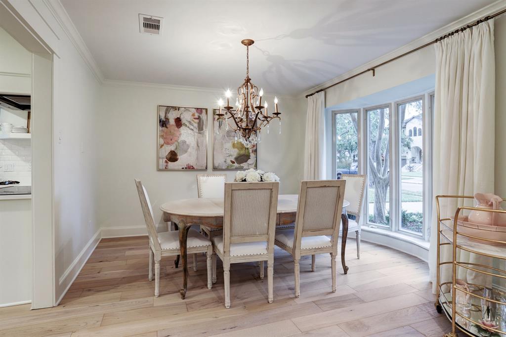
Comment: I would have enlarged the window. That can easily be done in just a day or two. We did it in our dining room and it was such a game changer – and not expensive!
Before: The master. Again – that window!!

After: Hard to believe it’s the same room!!! Here’s the pretty master bedroom. Notice the large window that leads to the back patio. I would have covered up this small window. Put some wood 2x4s and drywall and make a wall there. You leave the window for the outside and the next owner.
Pretty and soothing. Decorated so prettily.
Except for the window. LOL. I should just keep my big mouth shut! But for those who may be thinking about renovating a 60s house – you will find these windows in those houses. People are always afraid of taking out a window, but I’m here to tell you it’s not that big of an ordeal and the rewards are so worth it.

BEFORE: The master was redone, but it’s a bit too masculine.
And seriously people. Why do you need a WINE RACK in the master bathroom!?!?!?!?
Do you think the previous owner didn’t realize she put a wine rack in the master bathroom???
I mean, that IS a wine rack, right?!?!?
AFTER: Here. Just perfect. A beautiful vanity.
It looks like the RH Empire Rosette vanity but painted black. Love the middle detailing – the point.
And another view.
The back yard with the view into the master bedroom. Lots of room for a pool.
And the family room view to the back yard. The house is still for sale HERE.
I don’t think this will be available for long. I do wonder where why the owner is moving. It is such a perfect house for a family or empty nesters who want to be on one floor!
And, there is one more renovation that caught my eye.
This was another downsizing – the owner moved from a much larger, custom home into this smaller townhouse. Built in 1970 by the renowned Lucien Hood, the owner had it renovated by architect J. Marshall Porterfield. The architect did a terrific job – it’s wonderful reno and the interiors are just so pretty. It’s more expensive than our last renovation at $899,000. Of course, it’s under contract already because it’s fabulous.
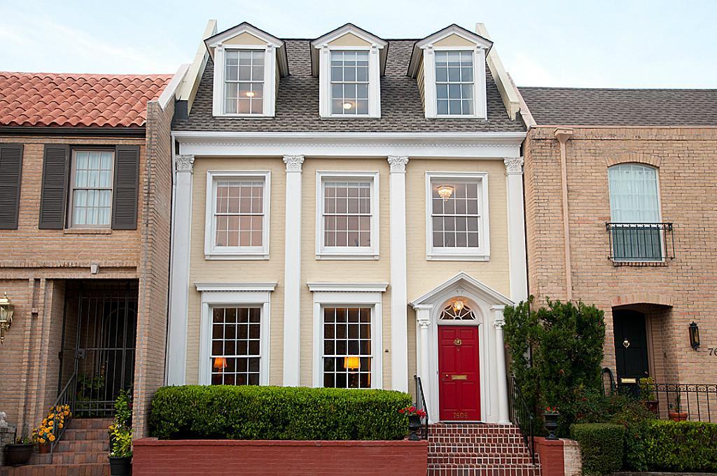
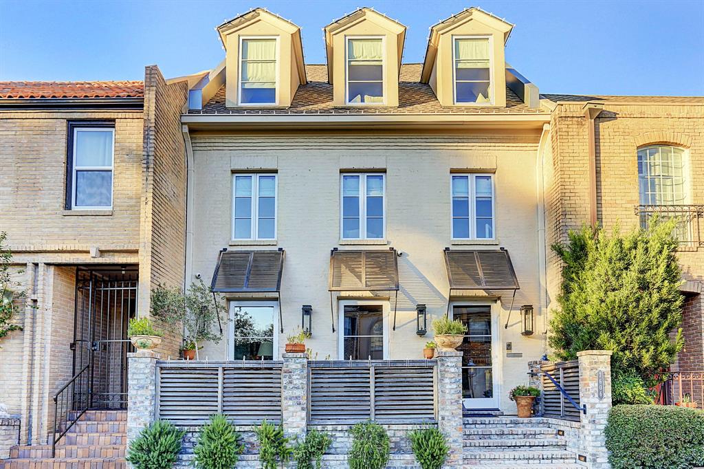
BEFORE: The townhouse was built to resemble one found in London. Here, the front is painted yellow and white. Look at the beautiful trim and columns. Very pretty. I do hate that red brick planter though! Otherwise, it’s a very pretty townhouse.
BEFORE: The front door opens to the foyer with a staircase that leads straight up to the second floor.
Before, the townhouse was pretty. It was plain and needed some interior updating, but it was in good condition, as is.
The new owner had something else in mind…..
Here is the townhouse today. Gorgeous. Just gorgeous! Painted a soft white, all the white trim was removed. New glass front door and windows. Wood awnings are fabulous!!!!!! Notice the new brick and wood fence that creates a private porch.
Inside the front porch – this is a great idea in a townhouse with no yard.
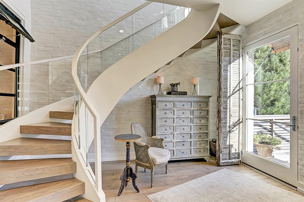
The foyer is such a HUGE change. The brick under the sheetrock is revealed and painted. I assume this is where the brick came from, it could be a veneered brick. Antique shutters at the front door and windows. But without a doubt, the showpiece is the cantilevered staircase with glass sides. Beautiful!!!!!!!!

Before: The townhouse was pretty as is. Pretty but plain.
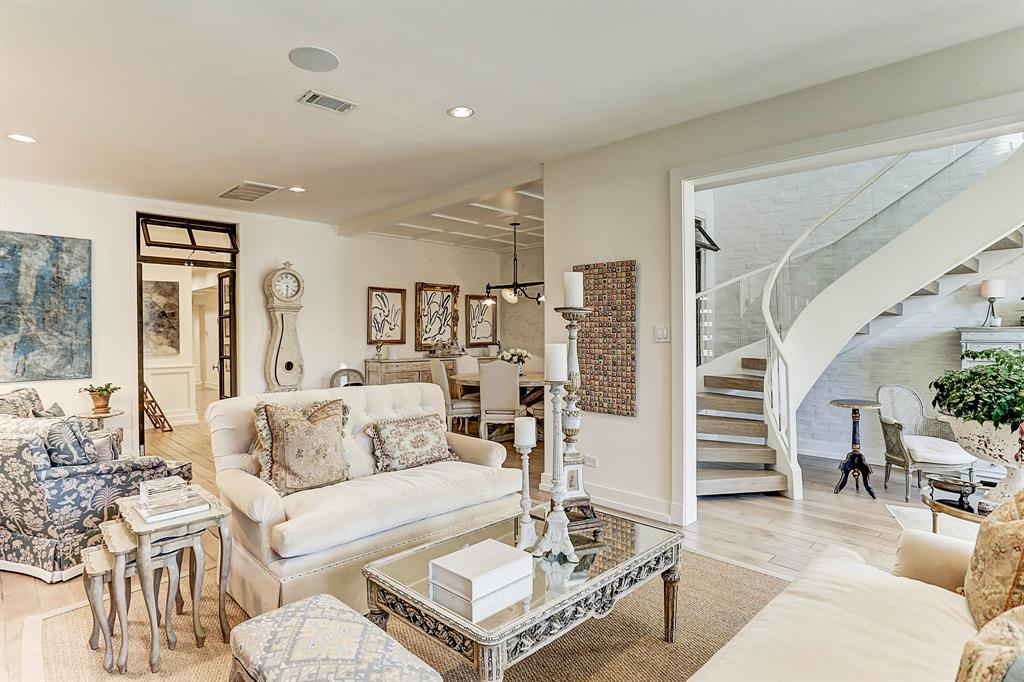
Today: new hardwoods in white oak. In the back is the dining room. Through the doors is the kitchen and family room.
Notice this side of the townhouse has the painted brick wall also. Through the back door – which was replaced with the black steel doors - is the bar and family room/kitchen.

Looking towards the front windows. Gate leg table acts as a console.
Across from the living area is the dining room with interesting lights. Notice the transom in the door.
The dining room with a built in window that opens to the foyer and its beautiful stairway. And notice the transom here too – which lets in air and sounds, thereby keeping the dining room from feeling isolated.
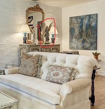
And just a note – did you notice the Santos in the corner? Did it look familiar? Yep. The same one.
It’s the same santos that I bought for Elisabeth’s room from Olivine (now in their new store in Galveston.)
Helen the owner and I laugh about this santos and how many calls she gets each time it’s featured!!!! If only she had this amount– she could have sold 100s of them Everyone loves it!!!

On a closer look, it is interesting how many things this owner and I share! Besides the Santos, there is her collection of shells – some of them are exactly the same as mine. Her candlestick on the coffee table is larger than mine, but otherwise it’s the same. Her Swedish clock. I wonder if she got hers from the Lone Ranger too? Her French gate leg table is the same as mine.
No wonder I’m attracted to this townhouse!!! It’s really comical, but I’d love to know what the owner is like!!
Moving on to the back part of the townhouse:

BEFORE: Once past the living room is the bar, on the left.
Before: On the right is the kitchen.

Before: Past the kitchen is the family room and atrium. And look – the brick wall!
AFTER: The beautiful kitchen!!! The bar remains, behind is the breakfast room with the brick walls.

Here is the remodeled bar and coffee bar! Love that. Makes a bar more useful. Also, it’s used as a butler’s pantry too.
The view from the kitchen into the family room/breakfast room.
The old kitchen was much smaller and closed off. In the renovation it was made larger and more open to the bar and family room.
Marble of course. And top of the line appliances. Antiqued mirror backsplash.
The enlarged kitchen with white marble.
The family room.

Looking back towards the kitchen. Notice the powder room through the doorway with an interesting barndoor. The brick wall reappears in the powder room. What I do miss in this renovation is the large bank of windows looking into the atrium. Beautiful side chair. That stretcher!

The fireplace was reworked.

The powder room with its brick wall and marble sink.
Here you can see the atrium is now much smaller after the renovation.
Before: the master suite with its own fireplace.
Before: The guest room.
Before: The bathroom, 1960s beauty.

After: The master bedroom with the wood floor upstairs. The fireplace mantel was reworked and cabinets were freshened up with doors and chicken wire. More brick on the fireplace – instead of dry wall. Through the door is a small terrace.
Outdated shelves? Doors and screens can make them look more pleasing as you can see here.
New master bathroom. And so worth it! New walls of marble subway tiles. And of course, there is that free standing tub.

And the other side. Notice the doorknobs! So pretty.
The master closet is incredible. Love the wood floor in here and the cabinets with screens and glass. Someone loves white jeans and white linen shirts. I think she is copying me? First the santos and now the white linen!!! LOL

I would do anything for this closet.
The guest room. Barn doors on closet.

White marble and subway tile.
Before. There is a third floor. Here is how it once was. Look what the architect did with this.
Saving the best for last!!!
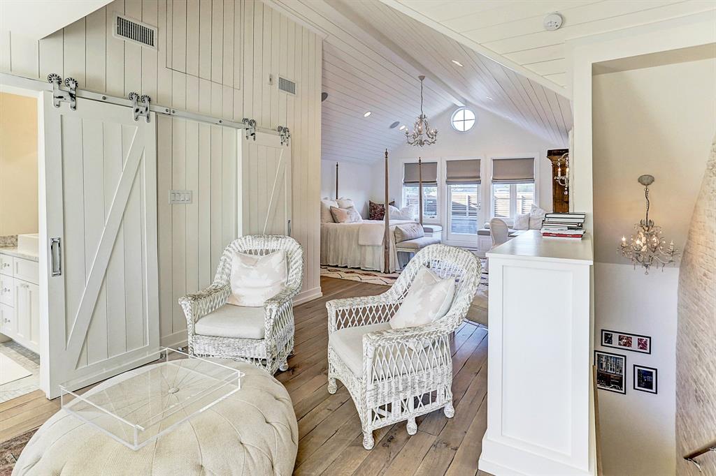
Whoa. Just whoa. Brick walls flank the stairs. Wood floors. Shiplap ceiling and walls. Barn doors. White wicker. And the round bullseye window.
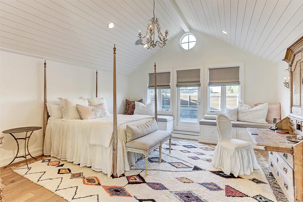
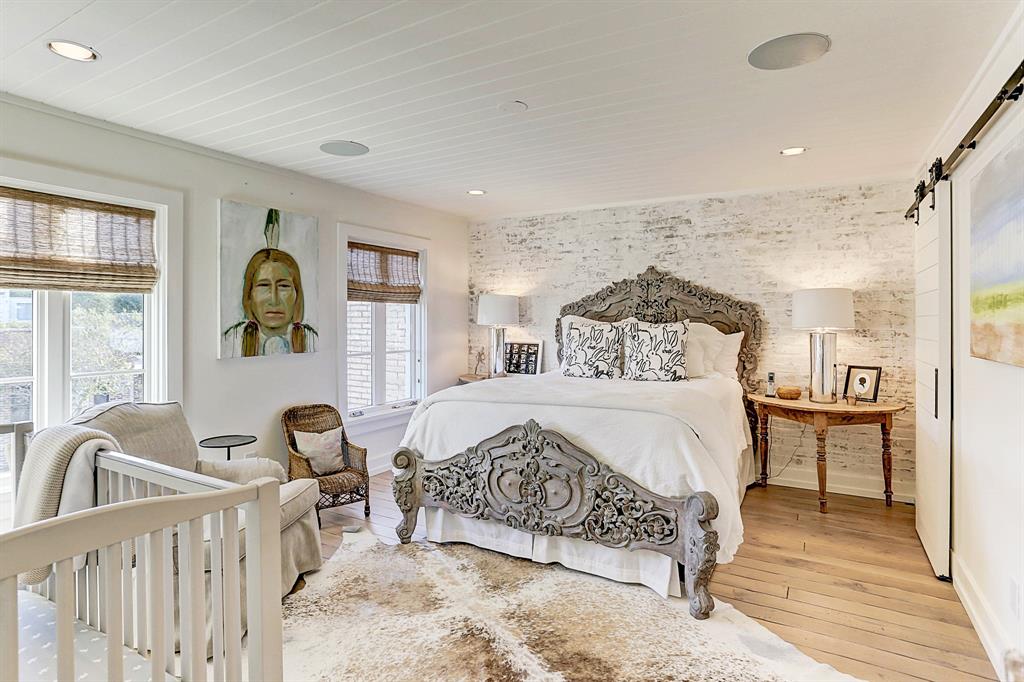
And the bedroom with the large terrace. What a darling room! Too bad the gorgeous closet is downstairs! I would make this my master bedroom. It is so cozy with this ceiling.
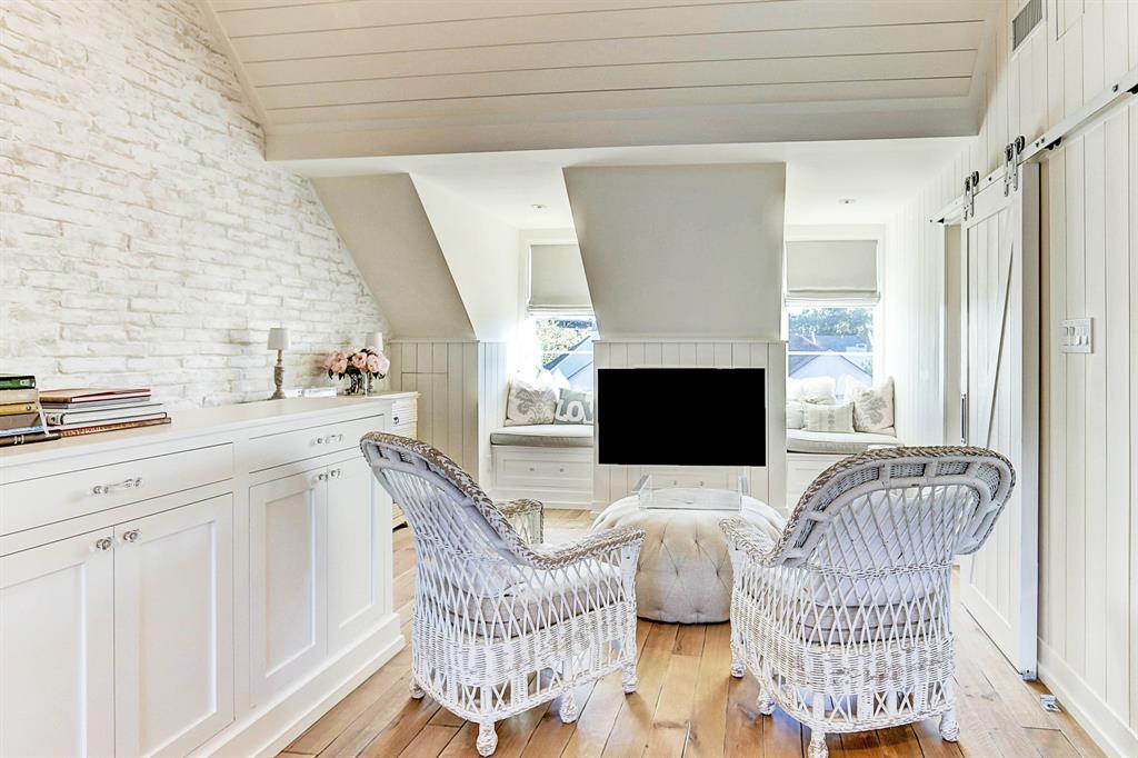
Look at this! The upstairs two dormers facing the front, the barn doors and window seats. LOVE~!!
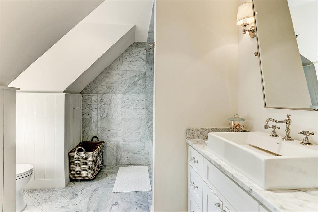
The bathroom.

And it’s roof top terrace.
Such a beautiful townhouse!
Sale pending HERE.
Part Three on Downsizing coming next!