A kind reader sent me a link to a house for sale in Atlanta. As usual, MANY thanks to all the readers who send me ideas. It makes my job just a little bit easier, so keep them coming! Please!!
The house in Atlanta is for sale, and of course, I love a great before & after, so with a little research, I was thrilled to find old photos of the house and how it once was decorated.
Yeah!!!!
The house caused a media stir when it went on market, so finding older photos of it are that much more valuable. It is vintage – built in 1930 by Flip Burge. The renowned Norman Askin had recently restored the house including the kitchen, and bathrooms.
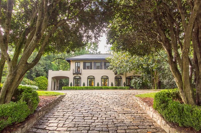
BEFORE: A cobblestone drive up from the street leads to the house. The façade is perfectly symmetrical BUT – on the left the Porte cochere, where the front door is, is open to the outside. At the far right, the matching Porte cochere is now enclosed inside the house, as its bar/sitting room. It is possible that the front door was once at the very left under where the Juliet balcony is. Instead it now opens from the Porte cochere.

BEFORE: Another view. To reach the garage, you drive down through the Porte cochere, on the left side, to the garage which is located underneath the house.

A closer view of the façade – on the right side, at the front of the sunroom, is a patio with an outdoor eating area.

BEFORE: The back side of the house leads to a large stone patio which is actually the roof of the garage.
Not much of the exterior has changed from the previous ownership until now.

From the back – the garage is seen under the large back terrace. The breakfast room is where the tall bay window is. I think this back addition, the garage and the kitchen/breakfast rooms, was added on at a later date.

The side view which shows the add on. I think all this area past these two side windows was added on later.

The Carriage House – was this the original garage before one was built closer to the home, under the terrace? This is large enough to be its own house – with two bedrooms and baths and a living room. OR, was this house bought and added to the estate at a later date?
SOOOO nosey!!!!
Ready to go inside??!?!?
INTERIORS:

BEFORE: The entry is painted a beautiful green color. The view goes through the living room to the sun room.
The BEFORE décor is vintage 1990s. It is very well done, very pretty, but just a bit outdated.
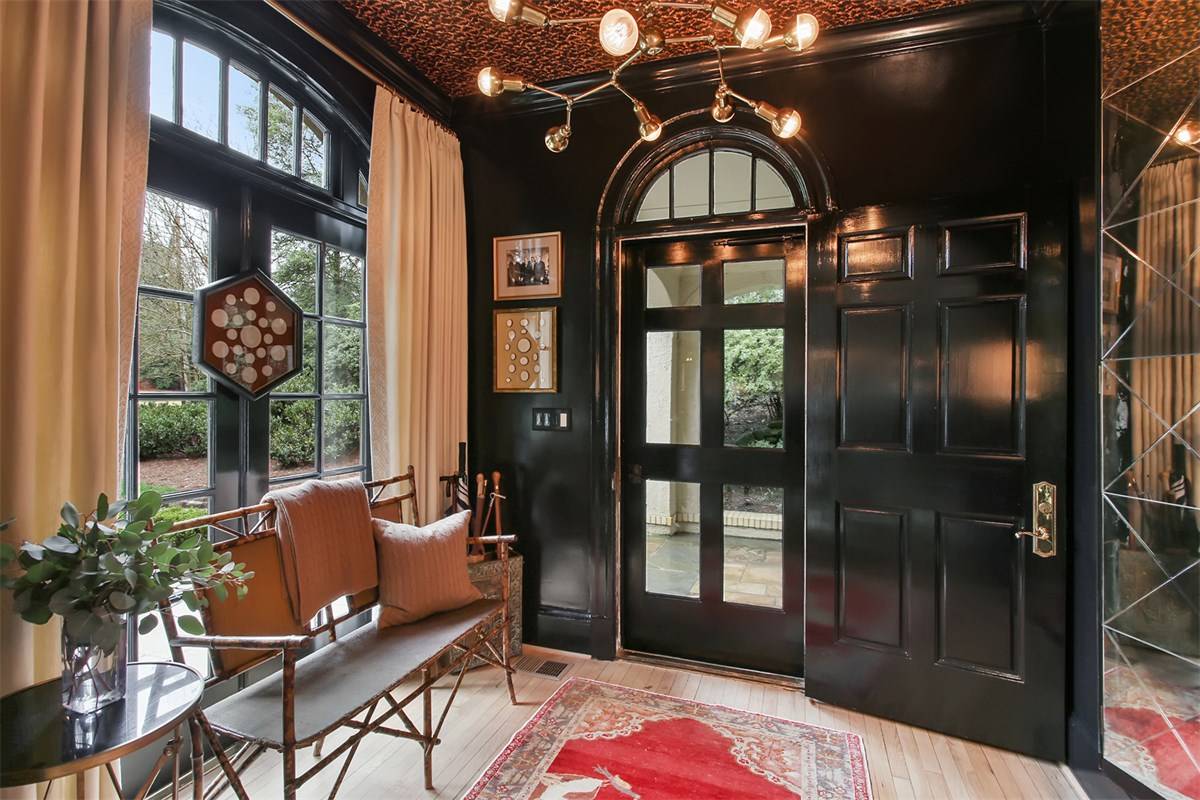
AFTER: I wish I knew who decorated the house! The entry is painted black to accent the lighter colors throughout. Love this so much! And love the curtains and bamboo bench.
There’s another front door with glass panels to let more light into the house.

BEFORE: Through the living room is the family room on the left. The next arch is the dining room. Past the fireplace is the sunroom. The décor is English inspired – it’s as if the owner grew up in the UK. The yellow walls, the portraits, the antique accessories, and the very detailed, beautiful curtains would be just as at home in the English countryside as here in Atlanta.
TODAY: I love this room!! Look how different this room looks now – so modern, so young, so chic. It’s a great mix of new and old.
The light colors mix with the black accents repeated from the entry hall. Layered antique rug over a heavy textured rug. LOVE.
The main change is the mantel and the dated trumeau over the door (not seen here.)
.
From the other side. Notice the rug. On many fine rugs, there is a light side and a dark side – which you can plainly see the dark side in this photo. Most people prefer the light side – to show the rug off at its best, place the light side where you enter the room.
Notice more black accents – the framed prints with the black mats. AND finally, notice the curtains with pretty ivory panels.
And the view towards the dining room. Notice that two arches – the one into the family room has a faux transom. This owner replaced the transom with an antique mirror.

BEFORE: The sun room. I like the room, but not the rug. And the curtains are a tad too much.

BEFORE: And again, the sun room with the wet bar. Here you can see into the foyer and the original white paneled front door.

AFTER: The sun room is updated with a traditionally up to date look. A mix of textures fill the room. Notice the hem on the gray sofas. What a difference there is without the heavy curtains.
And LOVE the star light!!

Updated bar with shiplap!!!!

Notice the beautiful windows with glass doors. I believe this was once open aired, just like the foyer Porte cochere.

BEFORE: Another view of the living room, looking into the dining room. Not a big fan of those torches!!! Just saying!!!!

BEFORE: The dining room. Very classic. LOVE the wallpaper and LOVE the chandelier.

BEFORE: Another view of the dining room. Through the door on the left is the family room and kitchen area.

AFTER: Wow!!!! LOVE LOVE!!!!! I just really love this for some reason. Love how pretty the window/doors look painted black, again. Love the hanging screen.

And the opposite view with matching sunburst mirrors.
Great Regency chandelier – again, black accents.
But, I’m surprised there are no panels at these windows.

Past the living room is the family room. I wonder if this was once the kitchen and the house was added on past this room?

Looking out towards the window. More English décor.

BEFORE: And the built ins. The kitchen is past that door on the right.

AFTER: English inspired furniture. Very clubby, masculine.

Another view. You can see the overbearing built in was redone.

BEFORE: The kitchen and breakfast room behind.
Nice enough, but you know the new owners redid it!!!

BEFORE: The breakfast room/sitting room.

AFTER: Uh huh!!! Yes! LOVE. Again.
It seems as if the cabinets were just repainted, along with the island. New counters make a huge difference. Subway tile with black grout (again, black) is another main difference. Upper cabinets were removed and lots of brass pendants were added.

View of the new windows. Past the kitchen is the breakfast/family room.

Seating was added to the island. Love the brass legs.

Cute Dutch door added, probably for the dog’s benefit. (Oh, this is one thing I miss so much being in an apartment – a doggie door!!!) Notice the wood floors were bleached. And notice the bead board on the ceiling between the beams.

And: The powder room is painted black with a marble and brass vanity. Gold accents. Adding a new vanity is a great way to update an old bathroom.

UPSTAIRS. Before. This is a pretty French/English inspired bedroom.

AFTER: The master bedroom is very casual. None of the After bedrooms are quite as decorated as the downstairs.

There are two bathrooms in this suite, plus a small laundry room.

One of the closets and bathrooms.
The new bathroom with more of the subway and black grout - again, pulling the black upstairs.
The marble, tub, the brass – it is so fabulous.

The second bath is the husbands. Again – for those with a shower, think about leaving out the step. That way, with an injury or stroke – you can just roll into the shower in your wheelchair. Baby Boomer Tips to growing old gracefully.

There’s a second laundry upstairs, off the master bathroom.

BEFORE: There is a series of English styled bedrooms. I think that one of these bedrooms actually became the second bath in the master bedroom.

After: The pink bedroom becomes the nursery. Pretty room with all the bright windows.

Another renovated bathroom. I like when there are a lot of bathrooms that the same decorative elements are used. Otherwise it can get too frou frou. I like these classic bathrooms, a lot.

BEFORE: And yet another.

And another classic bathroom.

Downstairs is the basement where the garage is.

And more – a mud room. Lots of charm down here.

The carriage house – two bedrooms and bathrooms.

BEFORE: More English décor.

Before: A bedroom with more chintz.

AFTER: The carriage house is used as an office, it appears.

The carriage house would make a great place for children who are either fresh out of college or just married and are saving money for a new house.

This bathroom is beyond cute. Love the mirror!!! Love the black grout.

The house was beautifully decorated – twenty years ago. It was time for a refresh. The new owners hired a top rated architect who gave them a new kitchen and bathrooms and immediately, the house went from ho-hum to wonderful. No clue who the interior designer was, but it’s a good mix between new and old, modern and classic. Just because you want “new” doesn’t mean you can’t add antiques and classic elements and still have a totally chic look.
To see the real estate listing, go HERE.