
The Gray Entry Hall, Dallas, 2010
Long time readers of Cote de Texas will remember a designer that I featured many times during the early days of my blog. Most likely you also follow her yourself. At that time, Kristin Mullen, from Dallas, had designed her family’s large estate which had a wonderful foyer/hall which she decorated in grays, well before gray was the trend. Around that time, Kristin opened a retail store and lately, she has been a major draw in Round Top, showing gorgeous antiques she procures in Europe, including Sweden. Kristin has garnered lots of national press and her Instagram is a popular one. She often stars in her own interesting and many times funny video reels.
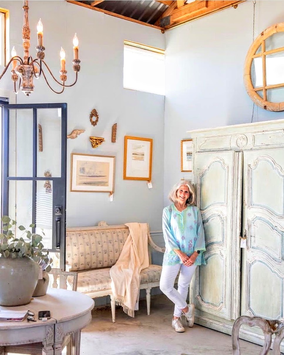
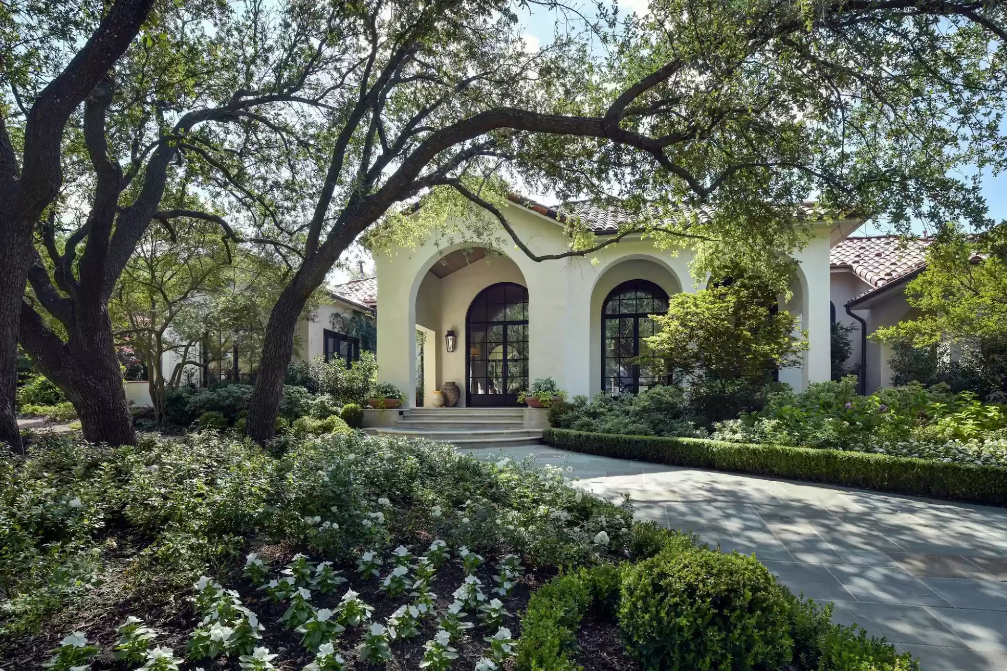
As a successful interior designer, Kristin’s portfolio is quite large, filled with beautiful homes she has designed. But, there is one house in Dallas that is really exceptional. The young owner, who loves antiques, lived across the street from Kristin and was drawn to her style of decorating. She hired Kristin to work her magic on her own new house she had just bought.
I say new, but the house was built in 1993 and it was in need of total updating. With Kristin’s help, it went from a dowdy, over designed house to a pared down, gorgeous vision. Kristin’s work on this house was such a success that this summer Traditional Home featured it.
Recently, the house was sold and the new owners have also hired Kristin to once again update and tweak the interiors. I thought it would be interesting to see the house, before, after and where Kristin is taking it now with new owners. Robbie Fusch was the architect in charge of this large renovation.
Enjoy!!!

BEFORE: The house was trapped in a 1990s vibe with cast iron trim and arched columns with a balustrade around the front porch.

BEFORE: The French fountain remained, but all the twisted columns and moldings were removed by the new owners.

AFTER: The house, in a gated community in Dallas, as it looks today with its freshly painted white stucco façade. Beautiful pale blue shutters give a clue to its Swedish inspired interiors. All the twisted columns and balustrades are now gone.
AFTER: Even the landscape was redone – the pink flowers were exchanged for white ones.

The floor plan will help you follow along with all the changes made.
AFTER: The new black framed front door sets the stage for what is inside. To the left, the French fountain remains.

Before: The front door. Stained glass. Wow. What a door! Today, there is the plain, black steel door instead of this. To the right of the door is the dining room, which is pretty – both before and after.

BEFORE: The entry from the opposite direction looking towards the living room. A skirted table sits in the center of a long hall that runs the length of the house.
As you can see, the house was very well designed, very pretty, but today it seems dated and a bit cluttered for the new owners who like a more clean lined look. As you might guess, I do like the mirror with the plates surrounding it!!!

DURING: The old, fancy door is replaced with Kristin’s new steel version.
AFTER: I love, love, love this! First, the Versailles floors were stripped and the walls painted white. Love the lantern and the screen. So pretty.

BEFORE: The dining room. Pretty curtains and French table and chairs.

BEFORE: Notice the BEFORE ceiling with its strange circles.

AFTER: Swedish and French antiques star in the new dining room. Curtains with a blue trim on the leading edge. Through the arch is a Swedish settee and a blue mural lit by an Italian lantern. While the house is now a vision in cream and white – pale blue is the accent color throughout. At the window are perfectly tailored curtains. And notice the new paneled ceiling – all the odd squares and circles are now gone.

Another detail to notice. The HVAC grill – it’s a work of art! I’m obsessed with these artistic grills.

Design Detail. This small niche off the dining room is small but with a vaulted ceiling and a window. You can see this area off the entry, so Kristin knew its importance. It comes at the end of an enfilade and has to be a focal point, an eye-catcher. Kristin certainly created one with the large mural wallpaper and Swedish settee, Fortuny pillows and an Italian light.

BEFORE: To the right is the front door – a skirted table divides the area between the foyer and living room. Towards the right is the long hall with vaulted arches that runs the length of the house.

BEFORE: Close up view of the living room divided from the hall by fauxed marble columns.

BEFORE: The living room from the opposite direction. Travertine fireplace will be painted over. At the left is the skirted table and front door. The hall on the left leads to the master suite.
BEFORE: One last view of the living room – that ceiling, more circles and squares!! I just do not understand why these ceilings were designed to be such an eyesore!!!

AFTER: Wow!!! The windows were left uncovered. The old travertine fireplace was covered in white which allows its form to now shine. The faux marble columns were replaced with straight posts that end in newly created arches. Here the crowns hang between the windows and the barely blue twin sofas are placed in a L shape.
Next, notice that the furniture is moved around for different photoshoots.

Here, the blue striped antique daybed faces the fireplace. Gorgeous gilt antique barometer is the focal point on the mantel.
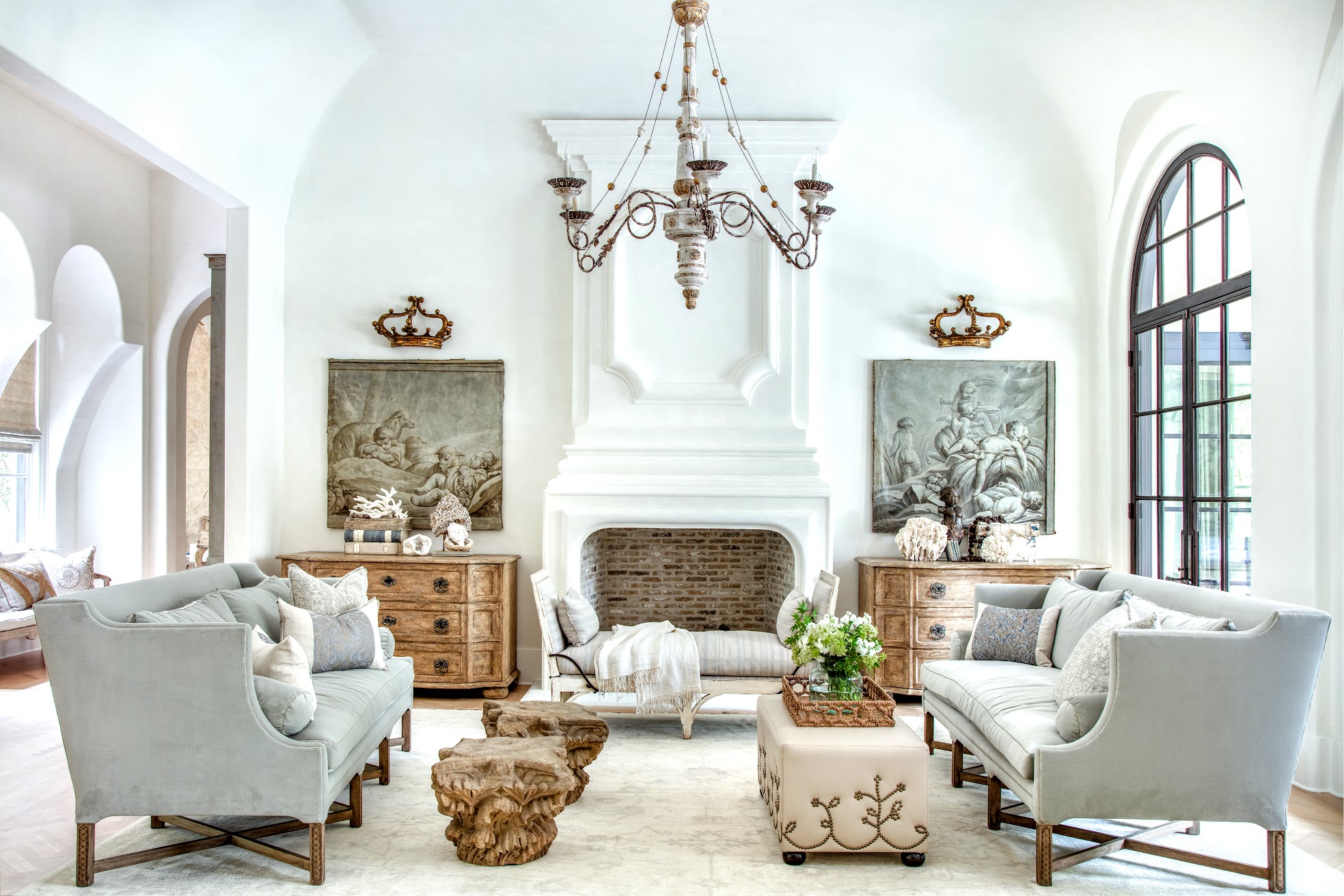
My favorite photo. The crowns have been moved here and the barometer is placed elsewhere in the room. The crowns are now the focal point. Notice the daybed is in front of the fireplace. AND, here you can see the antique capitals used for coffee tables, along with an embellished ottoman. Notice how beautiful the fireplace looks without the travertine. It is all so gorgeous. On the far left you can see the hall that leads to the master suite. Kristin – I love this!!!

The homeowner collects specimen shells which are casually displayed on the chests.

A larger view of the foyer, the living room AND the hall to the master suite.

AFTER: Beautiful bleached Versailles patterned wood floors. Faux columns removed. Wonderful carved wood door serves as a focal point on this hall.
In the house, there are several halls that are prominent and needed to be decorated, as seen here.

AFTER: Looking back from the master suite hall to the living room.
One mark of a good designer is if they can design good bookshelves. Kristin can.
But, you would be surprised by how many well known designers can not. The best shelfer in the biz? Suzanne Kasler.
Let’s take a quick look at the master suite at the left side of the house before we move to the right side and the kitchen and family room.

BEFORE: Across from the master suite is the office that overlooks the front yard. Ceiling fan! Actually, I do like the way the study is decorated.

BEFORE: Another view of the study. BUT I swear!!! They took the real estate photos with the vacuum cleaner set up!!!!!!!!! WTF?!?!?!? I guess that’s a vacuum cleaner, it looks like one. I can assure you Kristin’s photos don’t have a Hoover in them!!
lol

Across from the office is the master bedroom. The built ins were later removed.

DURING: New old beams and new stone walls replacing the wallpaper in the office will make it a special room.

AFTER: The master suite office. It appears the shade remained, but new curtains hang. French lanterns flank the large window.

I LOVE this office! That rug!!! The ottoman – so so cute!! The antique desk is beautiful and so is the Mora clock!! Out this window is the French fountain in the front courtyard.

Beautiful Swedish Mora clock in the study stands against the new stone walls.

All the built ins are now removed. The arch leads back to the bedroom.

DURING: A new patio is made for a seating area outside the office.

AFTER: The newly designed front patio. On the other side of the office is this courtyard with its French café set.
BEFORE: The master bedroom off the office with a large bay window and thick moldings.

BEFORE: Master bedroom. The fireplace before was a weird wraparound shape that had to be straightened out. DURING: The new bedroom with a wood ceiling and chandelier and the thick moldings removed.


AFTER: The bedroom decorated by Kristin in muted tones and shades of blue.

AFTER: At the window, a French day bed and chair sit under a gorgeous wood and crystal chandelier.

OK OK OK - I finally have one negative comment to make! That flatscreen. I mean – look how beautiful the fireplace is with its brick interior and hearth. Perfection! But that flatscreen ruins the mantel and the entire bedroom. Why wouldn’t they get a Samsung Frame TV. Like me?
Shameless plug:

In my new beach house, that is a flatscreen TV – A Samsung Frame TV. You can pick from numerous frames, modern to ornate, AND you can choose any painting, any style. You can change the painting daily. The TV sits completely flat on the wall and the frame just snaps on – with magnets. It’s incredible. The best investment and it’s not even expensive. Check it out here. My frame is a Deco Frame also from Amazon here.
It will change your family room or bedroom – they are incredible!!!
Shameless plug over – back to Kristin Mullen’s beautifully designed house.

BEFORE: Master bath with one long vanity. Lots of chandeliers and sconces and mirrors makes it look very fussy.

AFTER: The row of vanities was removed, it was replaced with two built in vanities with a closet between, all with antiqued fronts.

After: The second vanity. The former marble tile is replaced with the stone floor. Two matching antique mirrors are so perfect for the space. Gorgeous bathroom. Not flashy, not overdone, just beautiful.

AFTER: The powder room. With wallpaper and stone sink.
Here is the floor plan again. The next photos are of the right side of the house past the living and dining rooms.

Past the living room is the breakfast room and the kitchen and butlers pantry which is next to the grand staircase and large family room. Guest rooms are past the stairs.

BEFORE: The kitchen with the main hall behind the refrigerator. A large peninsula separates the kitchen from what will become the breakfast room.

BEFORE: The range and refrigerator will swap places when the kitchen is completely renovated. Just like the rest of the house before, the kitchen was fussy and busy. Kristin and the architect Robbie Fusch quieted it and created a more sophisticated look.

BEFORE: Again, the peninsula will be removed and the French doors – straightened out to create a wonderful breakfast room.

BEFORE: The other side of the kitchen looking towards the stair hall and family room.

AFTER: The new kitchen with its two islands – one an antique drapers tables, new beams, and newly bricked arched ceiling. The two doors behind the range lead to the main hall and butlers pantry.

AFTER: Across from the drapers table is this newly created niche.

The stove. Love the small vegetable sink in the marble topped island.

AFTER: Past the living room hall and across from the kitchen is the newly created breakfast room that overlooks the backyard and swimming pool. The beams were added to divide the space from the kitchen. This is a another favorite area of mine. I just love the banquette and the built in shelves.

AFTER: Close up of the breakfast area. So cute!
AFTER: The breakfast room sits next to the stair hall and family room.

BEFORE: Behind the kitchen is the long hall that leads to the butler’s pantry and the laundry which is right across from this breakfront. Here you can see at the end of the hall, the skirted table that sits between the foyer and living room AND at the end of the long hall, the door at the Master Suite.
DURING: Looking at the other direction of the long hall, ending at the butler’s pantry and laundry.

After: Behind the kitchen’s range, you can see the refrigerator at the left, is the butler’s pantry hall. Here, an old door flanked with two antique chairs. So pretty.
Everything is SOOOO pretty!

The vignette in the butler’s pantry hall. Across this hall it leads into the dining room. And through those wood French doors is the laundry room.

Here, in the hall behind the kitchen, this leads into the dining room. And here, we are back to where we began, at the entry with a view to this same space, below:

AFTER: And back to the dining room – this niche leads into the butler’s pantry behind the kitchen.

BEFORE: The butler’s pantry breakfront and the laundry room.

AFTER: In the butler’s pantry, the original breakfront was painted blue. An antique Italian lantern was added.

AFTER: The laundry room today, without many changes – which is a first in this house.

BEFORE: Next to the kitchen is the stair hall and family room.
I remember when Kristin first posted this photo and I thought – yikes! What in the world can she do with that?????
Just wait!!!

BEFORE: Looking back from the stair hall with its stained glass window, into the kitchen and where the breakfast room is today.

Before: The view of the ceiling of the stairhall.

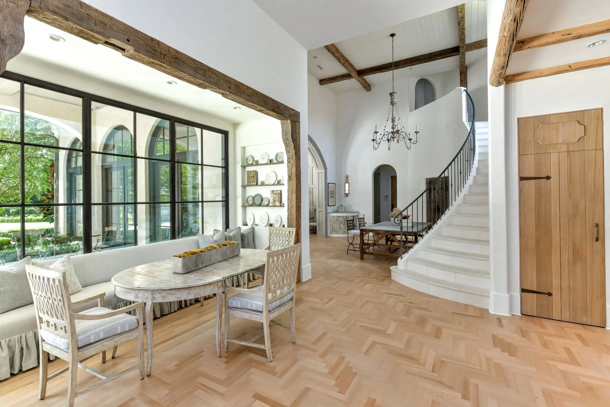
AFTER: The stair hall has been completely changed. It’s amazing compared to what a mess it was before. The stairs are now stone and look so elegant. New minimalistic railings. Notice the new planked ceiling – much less fussy!

Another view. The table acts as a secondary place to eat or serve from during parties. The open bar area is closed now behind doors. Notice the landing is closed off now instead of being open to view. The prettiest? The large sweeping white wall – compare that stair wall to what it was before:
BEFORE: The stair hall before just so fussy with so many details. The rug alone was so busy. The railing was just too much.

AFTER: The view from the family room. The stained glass windows were removed in favor of this much simpler design.
I told you Kristin turned this sow’s ear into a silk purse!!!
It is just so quietly beautiful.

BEFORE: The family room off the stair hall and kitchen.

BEFORE: The family room with windows on both sides, a large fireplace, and a busy ceiling – as was found throughout the house.

AFTER: A new antique mantel is now the focal point. Twin shelves flank the fireplace. The paneling was lightened, along with the floors, and the ceiling was simplified with old beams. The furniture was changed and added to at a later photoshoot below:

Another photoshoot with upholstered chairs. I love the chairs by the fireplace. Blue, again, is the main color. Two lanterns are reflected in the mirror.

Close up of the incredible mantel.

Second powder room.

BEFORE: Guest room.

After: Past the family room are two guest rooms. This one has a mural that is the focal point.

BEFORE: Another guest room.

AFTER: The same room decorated for a boy. The wallpaper resembles wood planks and the bookshelves remained, just repainted.

The attached bathroom.

Another guest room all in whites and grays.

BEFORE: Upstairs media room, again very busy.

AFTER: The shelves were painted in blue. Again, much calmer.

Another view of the media room.

Today: The back porch overlooking the pool.

After the house was shown this summer in Traditional Home, it was sold!!! The new owners also hired Kristin to help them pull the house together – yet again! Here is the new entry hall. More rustic, not quite as dramatic as the entry was with the large mural.

In the living room, matching chests flank the fireplace – as before.

In the main hall, behind the kitchen and next to the butler’s pantry is this area – again the two stools are completely different. Modern art versus the antique panel that was there before.

Another area, now with a console, more modern art, and antique accessories.

In the family room, modern chairs sit across from a now white sofa.

Kristin sits in the newest version of the soon to be finished family room. Hard to tell if those curtains are new or the same as before.
The house will soon be finished – yet again – and it will interesting to see the final décor by Kristin Mullen.

TODAY: Such a beautiful room and house. And what a great job Kristin Mullen and the architect did with this once dated and fussy home. I can’t wait to see its latest version!
Kristin’s web site is HERE.