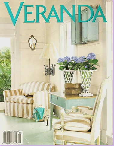
Remember this cover of Veranda, from the summer of 2004? It was of a beach house in Galveston (yes! that dreaded Galveston again!), designed by Houston great, Babs Watkins. The beach house generated quite a stir as it was knock-out gorgeous and was furnished with wonderful, painted antiques instead of typical tacky, beachy, white wicker. The most alluring aspect of the house was the color aqua used throughout. Aqua was everywhere, aqua floors, aqua fabrics, aqua furniture, aqua mirrors. Without a doubt, owing to how memorable this beach house was, it started a trend for Veranda: each summer since this home has graced the cover, Veranda has featured another aqua beach house. Obviously they are trying to top Watkins' version, but in my opinion, the torch has not been passed. Watkins' work remains the best of all the Veranda "Aqua Beach Houses."
Babs has held onto her crown, because frankly, none of the competition has yet come up with a better version. It's easy to understand its appeal, the beach house is tasteful, yet fun, serene and calming - yet youthful. This certainly isn't your mother's beach house. The young owners, with small children, have built a house to entertain friends and family and to create memories. It certainly is everything one would want in a second home, if, of course, you have a couple of cool millions. Today the house is over five years old and it's up for sale. In fact, this is the second time it has been listed. It's held up pretty well, and is remarkably still "photo ready" for a second shoot which is amazing for a beach house considering the wear and tear they take.
Below are photos both from the Veranda shoot and from the Real Estate shoot. If you love this house as much as I do, this is your chance to see much more of it than was published in Veranda. The real estate pictures are extensive and reveal many surprises about the house. And, if by chance you are interested in purchasing it, you're too late! The house is listed as "sale pending."
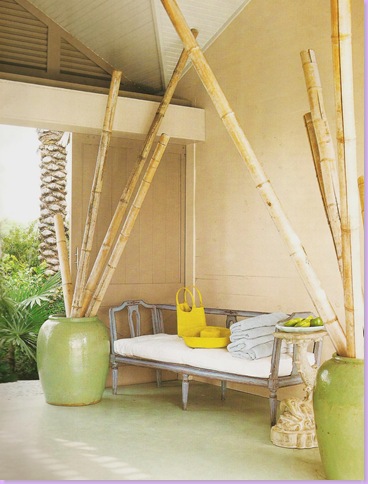
The entrance to the house. Of course the living areas are on the second and third floors. Here, next to the garage is an antique bench which sets the tone for what is to come inside. I know, I know, everyone puts rare, antique painted benches outside to face the elements. Of course they do!
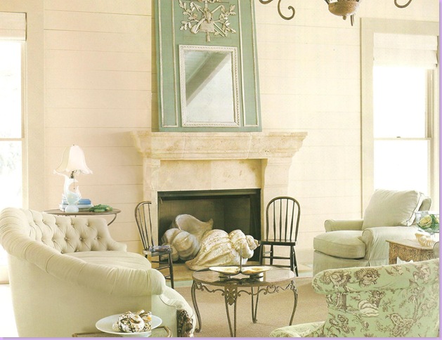
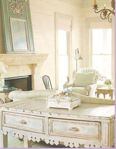
The main living area. Limestone fireplace with oversized shells instead of logs. Antique upholstered pieces are covered in pale aqua linen. The sofa is beautifully curved and tufted. The chairs wear a Hinson and Co. oriental styled toile. Seagrass covers the floor. The mirror is a trumeau, aqua and cream.
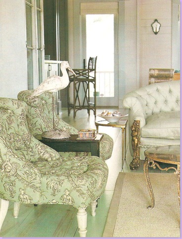
Another view of the living area, with a close up of the Hinson toile covered chairs. Watkins chose to paint the floors and ceiling aqua, rather than the walls, which would have been the typical choice. Even the paint technique is atypical - the floors which are pine, had the aqua colored paint ragged across them. The paint is just transparent enough so that the grain of the pine is still visible. The effect is quite beautiful and the floors are an important design element in the house.
Another view of the living area. The painted 19th century French butcher's table sits behind the tufted sofa.
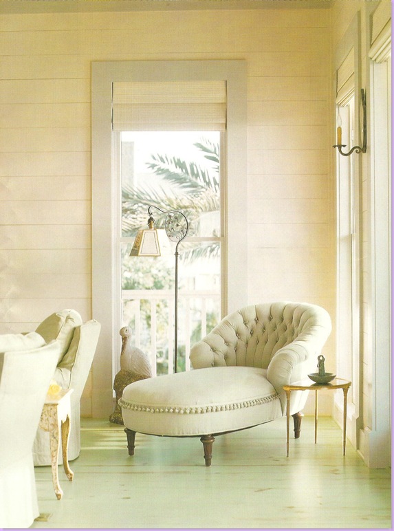
In the corner of the living room, this gorgeous antique tufted chaise with its hanging ball trim holds court. The trim is just enough of a playful touch to bring the formality of the chaise down a notch.
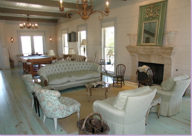
From the Real Estate Photos: over five years later, not much has changed here. The colors in this photo are more true to life than the Veranda scans. Notice the cream colored plank wood walls and the windows with the aqua trim. I adore the two child sized wood chairs in front of the fireplace.
A view towards the other side of the large room. Here you can see the ceiling, which is painted aqua, and the wood rafters. On the other side of the tufted sofa is the biggest surprise of the Real Estate photo shoot.
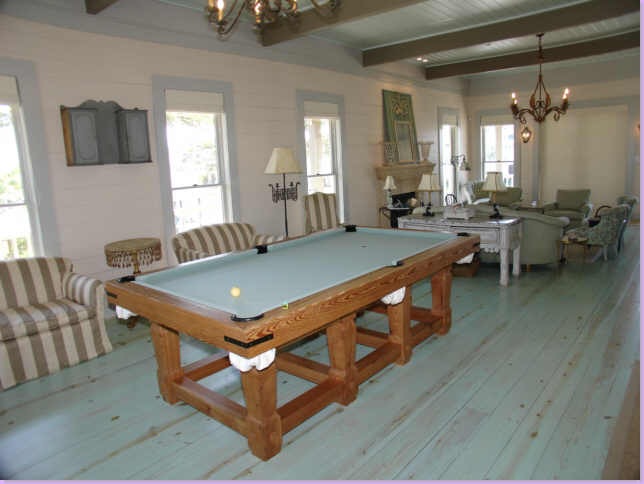
The surprise - a pool table custom made for the house. I wonder if this was put in after Babs furnished the house or if Babs placed it here herself. Veranda totally avoided any mention of the pool table.
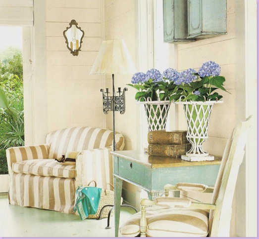
Here is how Veranda presented the pool table area! Quite a difference. The two vases are now on the fireplace mantle and the aqua painted table has been moved elsewhere. I love the khaki and white striped linen fabric used with all the aqua.
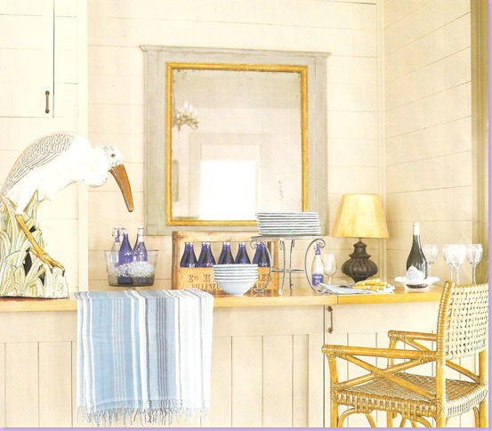
This bar is across from the pool table. Typical for Watkins, there is very little art work in the home. She prefers antique mirrors in lieu of canvases.
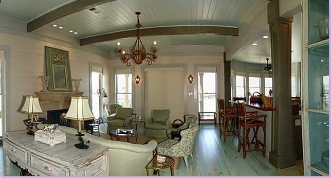
One more surprising view - the kitchen on the right is open to the living room. I took this picture off the virtual home tour, hence the distortions of the ceiling, etc.
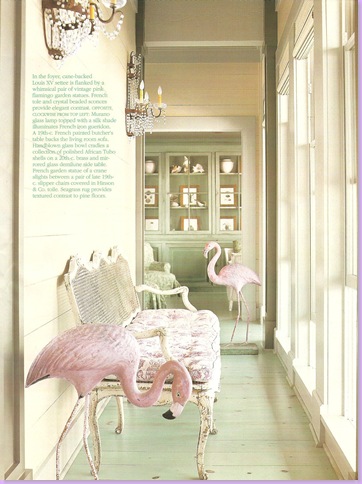
In the entry hall, a painted antique cane bench has pink and white toile fabric on its cushion. Antique crystal sconces are juxtaposed against the frivolity of the vintage flamingos.
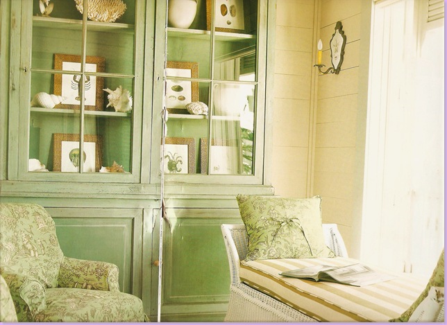
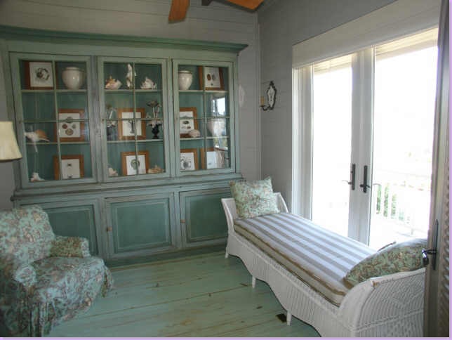
Beyond the entry hall is a small sitting room with a large painted green bookcase filled with shells and sea animal prints. The white wicker (yes! white wicker) chaise is covered in the linen stripe. Note how Waktins handled the self welt on the settee. And, notice the mirrored sconce - these are placed all around the house for soft, atmospheric light.
Over five years later, not much has changed in the bookshelves! Amazing!
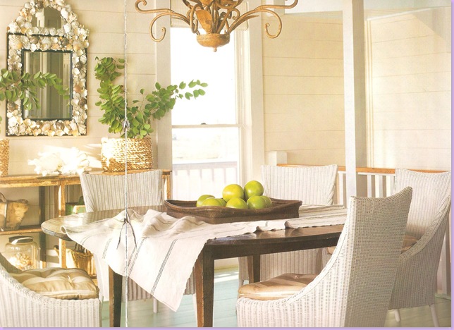
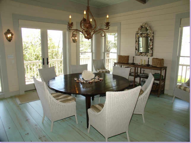
The dining room with the open staircase to its right. There is also an elevator in the beach house. Antique table and wicker chairs, with the striped fabric on its cushions. Across the table is a large wooden console filled with beach mementos.
And, how it looks today!
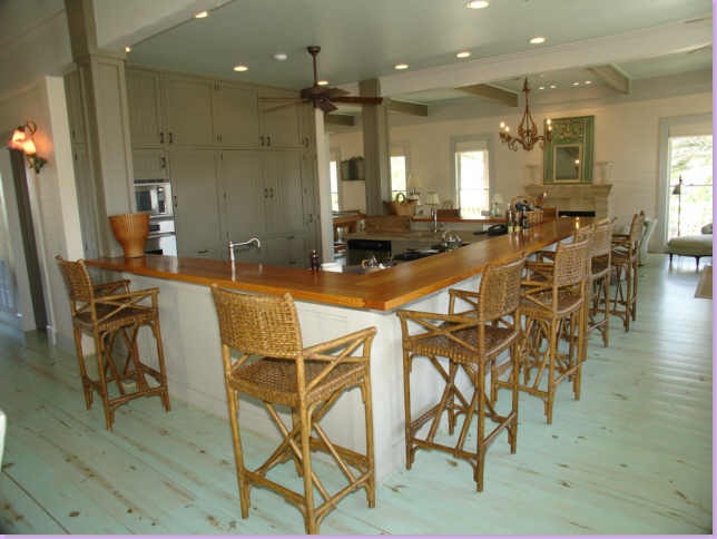
The kitchen opens to the dining and living room with a large wrap around bar.
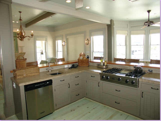
Inside the kitchen, looking out towards the living area and outside view.
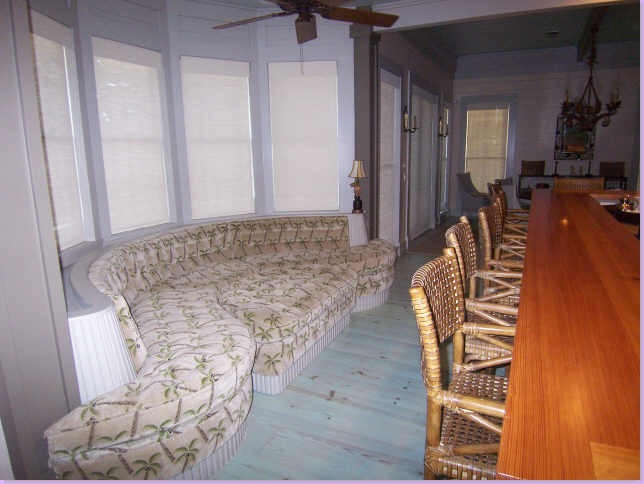
Another big surprise of the Real Estate pictures. A large, tufted, curved banquette with a huge ottoman that fits into the banquette like a big puzzle piece. A woven palm tree fabric covers the banquette. Personally, I understand why this was kept from the Veranda readers. I find it rather unattractive, myself. Do you agree or disagree?
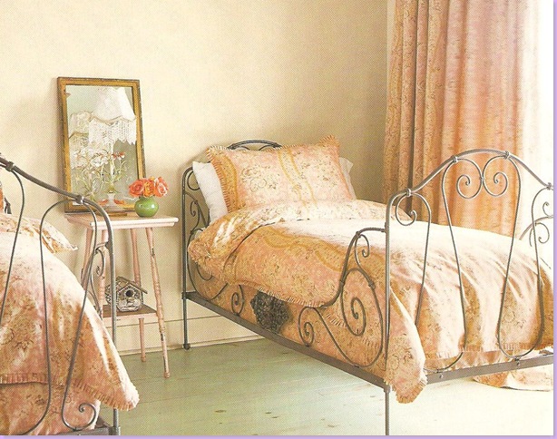
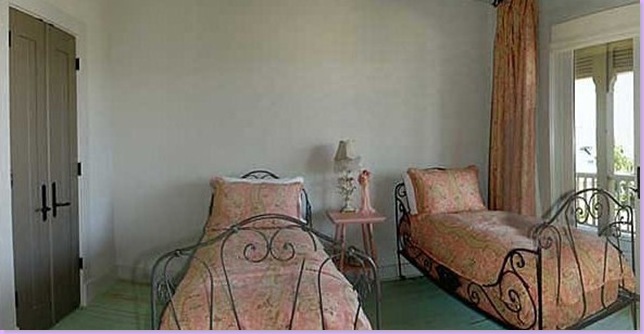
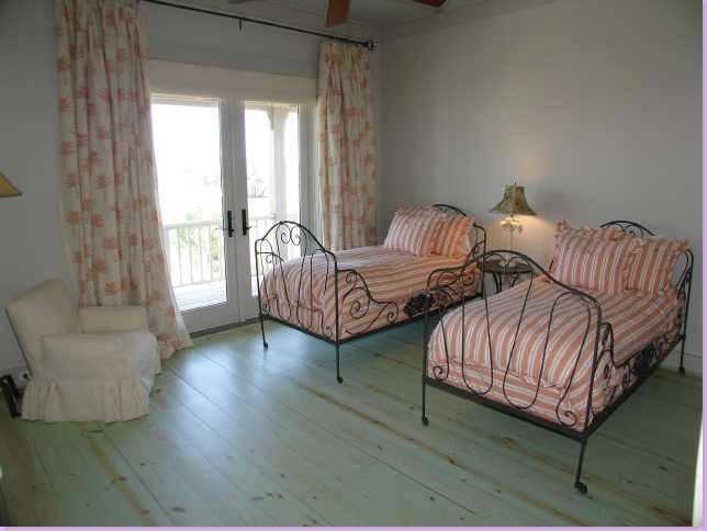
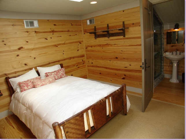
One of the charming guest rooms with twin iron beds.
And today. Here you can see the wonderful doors that run throughout the house: paneled and painted gray.
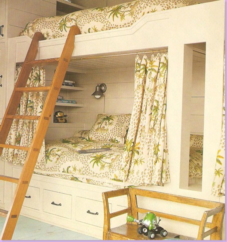
And the ubiquitous beach house bunk room. These bunks have curtains that provide the sleeper with privacy and turns each bunk its own tiny room.
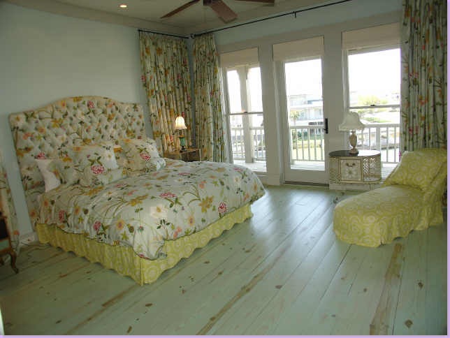
The master bedroom, another surprise to Veranda readers. Colorful floral fabric covers almost everything. A yellow fabric covers the rest.
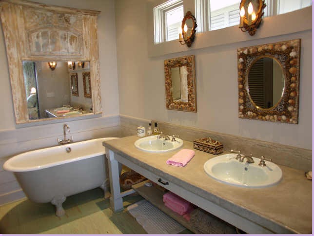
The master bathroom. Again, Babs puts her special mirrors everywhere. Here: above the bathtub, a rustic trumeau. The vanity has a concrete top.
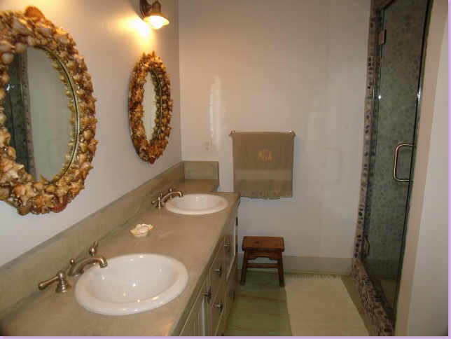
Another bathroom, with river rock shower stall and shell mirrors.
Another guest room with striped and floral fabrics and charming iron beds.
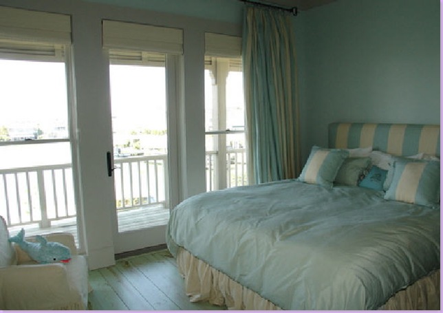
Aqua and cream stripes for this bedroom.
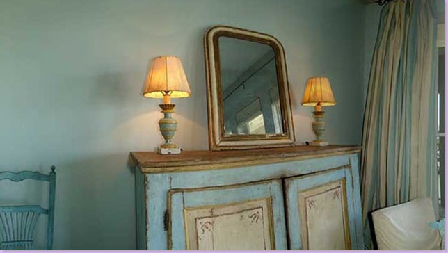
Notice the caliber of antiques Babs places everywhere. Here, in the above guest room, a gorgeous painted buffet with two fabulous lamps, and a wonderful antique mirror. All this for just an upstairs bedroom that is not even the master!
Another guest room which obviously didn't quite get the "Babs touch." Perhaps its the nanny's room, after all the original owners had five young children.
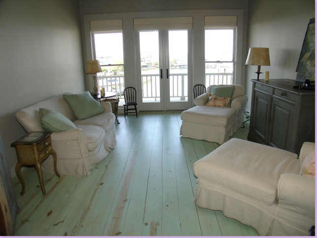
An upstairs TV room filled with a cushy slipcovered sofa and matching chaises.
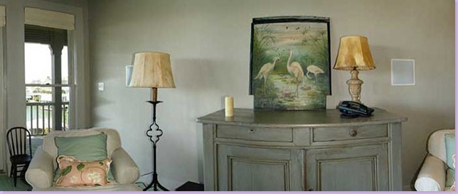
Close up of the upstairs TV room with yet another painted buffet. Are there any aqua painted buffets left in the world?
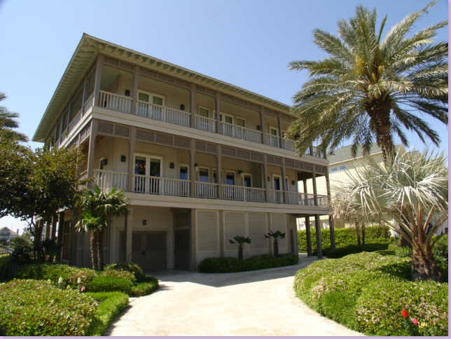
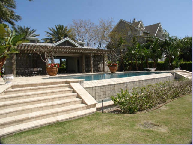
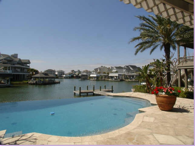
The house and it's property, located on three lots, is on the bay side, not the ocean.
On one of the three lots, a pool house was built to service the swimmers. God forbid they should walk back to the main house for towels and drinks!
View of the negative edge swimming pool overlooking the canal that leads out to the bay.
To view the Houston Real Estate listing of this beach house, go here. Be sure to take the Virtual Tour. But hurry up! Sale is pending and the site will be down soon. It doesn't specify whether the furniture comes with the house or not - except for the custom pool table - that does stay. And, if you are impressed with Babs Watkins' use of antiques in this beach house, be sure to visit her online store at 1st Dibs, here.
And for just a little more aqua fun, check out Veranda's 2005 version of the Aqua Beach House. "Second Sandbar" is available for vacation rentals in Seaside, Florida. Decorated by Toby West, the house is reminiscent of Watkins' house, but with West's own wonderful stamp on it. View it here.


Are you TRYING to stop my heart? No, serously. That is one fabulous home.
ReplyDeleteThat's the way to go to the beach!!!!!!!!!! Just beautiful.
ReplyDeleteThat's some serious coin for someone with 5 young children! I'd like to be in whatever business they're in! :)
ReplyDeleteLovely home with tons of space. I think the other "non-Babs" room has to be for the live-in help - no one could handle that house all on their own and call it a "vacation"!
This is lovely- the aqua is so pretty- I think the best shots are the ones that show less though so perhaps it is a little over done.....and not fond of the huge shells is this a new trend?
ReplyDeleteLOVE the shell mirrors. Looks like I will be busy this weekend. I wat to do these for my master bath. Thanks for the pic...again :)
ReplyDeleteThank you for this post, we have a beach house in NC and my copy of this issue of Veranda is my favorite as well! It is falling apart from my constantly, for years, referring to it!
ReplyDeletethanks
Thanks for this post and all the great pictures! I love the look of a river rock-floored shower but wonder if it would hurt your feet? I mean, it would probably feel like a massage at first, but after several months, I think I would want just a smooth floor.
ReplyDeleteGreat post - I always love the ones that combine real estate and design!
ReplyDeleteI initially loved the aqua floors, but liked them less and less the more I saw of the house. I think it dominates too much. However, I still appreciate the design and the lovely antiques!
Love the aqua, hate the banquette. Why is it that real estate pictures never flatter what is obviously, in this case, a beautiful house? If I had only seen the real estate pics, I'm not sure if I would have given it a second look...
ReplyDeleteThanks for the tour!
xoxo,
mary
What fun to see the different shots from the real estate listing! I understand what you mean about the banquette. Not crazy about it either. Maybe with a small table instead of the ottoman and a different fabric. The bedrooms with those twin iron beds are so cute!
ReplyDeleteFun post! :)
Wow that house is so amazing, that is some kind if beach house, the floors are inspiring , what you have me thinking, I will be ripping out my carpeting there are so many options now I have one more, what am I to do.
ReplyDeleteThe built in seating is an eye sore, the only flaw I can see although I do imagine it is a popular spot to hang out , but could have been done nicely , its awful , easy to remove.
I will have to check my bank account and see if we can make a deal.... oh probably not . In my dreams, thanks again for sharing , that was fun to see.
Chris
I want that house! Who paints Babs' furniture? I saw a competitor today...if this is not the same person. Maybe I should go look at beach instead of the hill country for a 2nd home!!!! Maybe I should finish what I've started in my city home. I'll ask my designer what she thinks!
ReplyDeletehb
Can we talk for a moment about those ubiquitous aqua-stained floors? What was the intention, apart from a misconstrued evocation of the Swedish look?
ReplyDeleteFor once in my life I heard myself crying out for natural wood planks! It was aiming at being ethereal but wound up being anaemic, in desperate need of a blood transfusion. I recently toured a grand old house whose floors had been treated this way, each and every room an essay in the bleached look, and it did nothing for the furnishings. Pale scrubbed floors are wonderful. This aqua aberration is not.
I would love to see more of your home , it is so beautiful , I love how you perfectly layer and make your rooms look so inviting.
ReplyDeleteLight or dark , is my dilemma , I love painted white floors and dark floors are always a great foundation to start with , the question for me is do I need to think of resale in the long term and go safe or just do what I want , I think I may go for an origional approach in my flooring , I installed pine with the chance that it would look good and wear well and it worked, I think I am going to go with my gut and try the painted white pine boards .
Please show more of your home .
Chris
Love this beautiful bay house! I was lucky enough to visit it once... lots of dainty/small furniture... not your typical wet bathing suit stuff... so the oddly pictured banquette is a piece that actually works for lots of lounging folks. It is not quite as weird in person! The huge sea shells were brought in for the photo shoot. I found them a few months later and snagged them for my own bay house across the canal from this home. I think they are a fabulous find and they look great in front of my fireplace! I will wait a few weeks and sneak over there to see if the new owners bought all of the furniture too. I'll keep you posted!
ReplyDeleteCreative Tonic - hi! Do I know you? Email me - I want to ask you a few questions about the house!!!
ReplyDeletemrballbox329@aol.com
chrisKauf: email me - I'll give you the link to pictures of my house!!!
ReplyDeletemrballbox329@aol.com
Toby Toby Toby - if I didn't love you so much.....!!!! ha!!!
ReplyDeleteCreative Tonic has been in the house before, so if you are reading this - tell us what the floors really look like. In some pictures they look nice, in others, not so nice! Tonic: What are your thoughts on the floor for poor Toby who is having fits over the aqua floors!!!
I guess it comes down to personal taste. I LOVE the aqua floors. I'd never thought of adding colour to the floorboards and keeping the walls neutral. I love the idea and think the furniture and fabrics blend beautifully. I'd can honestly say this is for the most part the most beautiful home I've ever seen. I am head over heels in love. Thank you Joni for making my year!
ReplyDeleteAnna :)
Fabulous house ! May I dare to dream to buy it ???
ReplyDeleteVery pretty house...love everything but I have to admit...the floors are too much of a commitment of color. I would find my eyes darting to the floors instead of art or furniture. Maybe it's just the photos but it reminds me of the green I keep finding in deep in our walls when we gut a room in our very old house. A green I call 'institutional green'. With floors that color you almost can't change the tone in any room in the house. Everything else is lovely.
ReplyDeleteMy opinion, of course... the floors are VERY cool. Great idea, different and I love the juxtaposition of them with so many antiques. I think it must a been a huge design decision- on the part of the homeowner- a big commitment. I happen to LOVE anything turquoise/aqua so my opinion might be a bit swayed. Painted floors are so pretty to me, I love the idea of them... but I would be afraid to own them!!! With lots of kids, dogs, guests, wet feet etc... I am sure the more worn the better. Really, the floors left a beautiful impression with me- they were truly not overwhelming to my eye... just a soft, unique, painterly background!
ReplyDeleteWell,that was a close call.
ReplyDeleteI was prepared to get bitch-slapped for not loving those aqua floors, but you relegated the task to a surrogate. Sneaky!
Look here everyone, I have been a fan of painted floors long before most of you were born. Think of Deeda Blair's house, or Pauline de Rothschild's set at Albany~ two examples of just how charming pale floors can be. Somehow that Beach House got it all wrong~another case of a good idea badly executed.
I'm sticking to my guns here.
Amazing pictures, I love her use of unique mirrors in lieu of a lot of artwork.
ReplyDelete-Lauren
LOVE Babs Watkins' work. Also loved all the comments to this post! Joni, thanks.
ReplyDeleteSome kind of BEACH HOUSE! Love Veranda mag... they have great photos!
ReplyDeletesooooo soothing. i can see why that hideous banquette was left out! horrible. also the floral explosion in the bedroom. not my taste! the rest is beautiful!!! i always love seeing the real space vs. the styled space. great post!
ReplyDeleteOkay, I think I can guess what happened with that banquette... Can't you hear the conversation?
ReplyDeleteCLIENT: Uh... Listen, I hate to ask you this, but my husband, he has this wierd fantasy of installing a sort of banquette area. He was in this, I guess, nightclub with dancers or something in Vegas and he just thought this thing was really cool. I KNOW it sounds ridiculous, but with all the floral in the bedroom and the aqua floors, I thought maybe I could concede here and get away with it since it's just our beach house? I THINK I've talked him out of the crushed velvet into something a little more beachy, but...
DESIGNER: Oh, sweet Jesus...
I'm biting my tongue now, but I really think the 'no art/canvas' rule adds serenity to the house. Your mind is free to relax. I love this post Joni!
ReplyDeleteToby, you are messing with SHE WHO MUST NOT BE DISAGREED WITH. hahahah.
ReplyDeleteI like the floor, I am not sure I could live with it full time. I might have to whitewash it a bit. Still, it IS a beach house.
What I love about this home, which I have actually seen, from the water and from the road (seems like to me it's on a cul de sac) is that while I liked the exterior (love the birdsbeak rafters) I had no idea how unique the interior would be.
The plank walls really give the feel of a beach house, similar to some of the old camp houses that were build down on the beach in Galveston. By the way, I love Galveston and do not apologize for it. It's had many incarnations and will have many more.
I despise that banquette. Maybe in another fabric, but not that 2001 Ubiquitous Palm Tree fabric. I don't care for the Furniture store French Provincial sofas in the living room. That's not practical for a beach house. Everything else (with the exception of the Sauna looking guest room) I love. Love the washed finishes in the house. Joni, what YOU could do with this house!!!
Thanks for posting this. I've always wondered what it looked like inside.
"Joni, what YOU could do with this house!!!"
ReplyDeleteI agree! Joni's decor looks almost like Real French!
Wow, what a fabulous home, Joni! Thanks for providing us with all the additional photos - a treat. The ony thing that is a minus is that banquette. It looks like it belongs in a psuedo Tommy Bahama conversion van! Yikes!
ReplyDeleteOh the power of good lighting, eh?! how fun to see the photo shoot pix vs. the real estate pix. I actually like the floors in the photo shoot pix...not as much in the real estate ones. hmmm.
ReplyDeleteThanks for that great treat joni!
And Annechovie, you had me LOL about the Tommy Bahama conversion van comment!!
Anne! I had a swig of diet coke when I read that about the Tommy Bahama conversion van!!! I'm not supposed to get liquid on my flatscreen!!!!
ReplyDeleteToo funny!
What a beautiful home. It is move in ready for me. I am in agreement about the banquette though.
ReplyDeleteThis post is a perfect example of the difference of how a house looks when styled for a photo shoot and the house when people are actually living their lives in it. Much like the model before she gets her make up on.
I still have that issue of Veranda!
ReplyDeleteLove that house! Congrats to the new lucky owners!
What a gorgeous home! Im ready to move in!
ReplyDeleteGreat post, Joni, and as usual, great follow up conversation and perspective. I loved that house when it was featured in the magazine, but I am afraid real estate people typically just don't capture the beauty of homes like magazines - a little different styling, don't you think?! Anyway, thanks for your visit and I am working on my post right now on my friend's house! Thanks for the encouragement.
ReplyDeleteThat is just one fabulous bay/beach house. Don't we all dream to have one For me, a combination of Aqua, Turquoise, and White would be perfect for any beach house.
ReplyDeleteSuch a lovely post, thanks.
I love those vintage flamingos!! I saw the most insane beach houses when we were driving around FL this weekend. I would have looked to peek inside!
ReplyDeleteI always love seeing the differences between a staged photo shoot for a mag and a regular photo of the same space. It's like getting to see a celebrity without her makeup on! Fun.
ReplyDeleteThat banquette was an interesting idea, but I'm not really digging it. It just doesn't seem to belong in that house.
GREAT post, Joni! -Julia
I loved that huge seashell in the fireplace.
ReplyDeleteBrandee :-)
There are too many pieces in here to covet! I want to devour that pom-pom chaise like a cupcake.
ReplyDeleteI'm so with you on that banquette that looks like it was covered from Hancock's clearance rack. (sorry, Hancock's).
This is one of my favorites you've posted. I am a huge fan of blue and of anything painted! I adore those floors. ADORE! And I admire the owners who were bold enough to go for it!!!!!!! Good for them.
ReplyDeleteThanks for refreshing my memory about Julie's mom, Babs :)
ReplyDeleteCan anyone tell me where I can find a similar couch? Where do I begin looking?
ReplyDelete