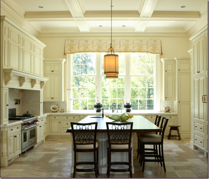
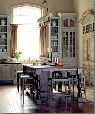
Things That Inspire recently emailed me this picture of the kitchen, below, and said, “I love this – this is my dream kitchen.” While I immediately agreed it was indeed beautiful, my mind started thinking – what is it about this kitchen that intrigues us both? What elements make it so appealing? How could she take this picture and recreate this kitchen in a new home or even in a current home? I emailed her back, writing - “the most interesting thing about this kitchen is the large, high window, the symmetry of the placement of the window, the approach to the kitchen, and the large island with the lighting fixtures above. The cabinetry is nice of course, but it’s the symmetry of the room, with the large wide window that really catches the eye.” Things That Inspired wrote back “I just liked it, I didn’t analyze why, but you’re right about the window.”
Things That Inspire’s dream kitchen: the large center window is the most important element to include if wanting to copy this kitchen. The second element is the actual shape of the room – square, with a large center island with hanging fixtures. Paint the walls and cabinets cream and place floor tiles in the same color. And lastly – bring the cabinetry to the ceiling.
That conversation got me thinking. Design blogging exposes one daily to hundreds of images. Most are fleeting, few linger in the mind. When a room does impress, it’s for a reason, though the exact reason might not be overtly apparent. Sometimes, only by dissecting the elements in a room can one understand the appeal and further, utilize those elements in one’s own home. Understanding the pleasing elements in a photograph can be a good tool if you are in the market for a new home or are remodeling, or maybe you are just looking for ways to rearrange a tired room. But, how does one isolate what appeals? How does one look at a picture and determine the elements that are important to incorporate in your own design?
Recently, I did a small remodeling project in my kitchen and in preparation I furiously studied pictures of kitchens in magazines and blogs. So many blogs show the same kitchen over and over again – of course! The beauty of certain kitchens appeals to all, but why? Kitchens are hot now - it seems everyone is either updating theirs or thinking about doing it – and with good reason. The kitchen has undergone a huge transformation while no one was paying attention. The other day, I picked up a kitchen remodeling book at the store – it was older, from the mid 90’s. Not exactly ancient, but for a design trend, ten years is a life time. In this book, 95 per cent of the kitchens shown had stained wood cabinets, mostly in light, honey tones. The white kitchen was a rarity. Appliances were mostly black and stainless, some white. Granite was the countertop de jour. Sinks were stainless and under mounted. Light fixtures were cans and fluorescent. Faux Italian styled kitchens were the rage. In short – the kitchens from the 90’s look nothing like the kitchens of the 2,000’s. Thank goodness.
The kitchens of today shown in shelter magazine and on design blogs are mostly white with stainless appliances. Painted cabinets are either gray or ivory or black. Stained wood is dark – honey color wood is a thing of the past – and then, often used only to highlight a center island. Of course, there are all types of kitchens being built today, but the one that builders are putting in spec homes time and time again are white or cream, and marble is the top choice of countertops. Recently, the L.A. Times asked designers what was out in design. One was sick of stainless appliances – which made me laugh – what would he propose to replace stainless? Colored appliances. I think the harvest gold refrigerators have cured us all of those! Another said granite was now dated and recommended Corian, marble, soapstone and concrete, all great choices! So, today, let’s examine some of the kitchens that we oohed and aahed over this past year and try to figure out how we can me them our own!
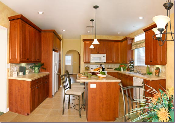
This kitchen suddenly looks dated, though it’s elements are current – the stainless appliances and center island with granite certainly remains in fashion. But the honey colored wood and floors have been left behind for either darker woods, or gray and white paint.
Although the owners updated this kitchen with pendant lights, granite countertops and tumbled marble backsplash, the white appliances and honey colored stained wood reads passé. A house with this kitchen, though updated, would not sell as quickly as one with painted cabinets and marble countertops. Stainless appliances would have to be installed too.
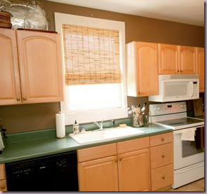
Cottage Living magazine showcased this kitchen remodel of a honey colored wood kitchen with green Formica. Yikes! The owner, a friend of Erika’s from the blog, Urban Grace, works for the magazine. Erika just recently posted a wonderful story on this kitchen – read it here.
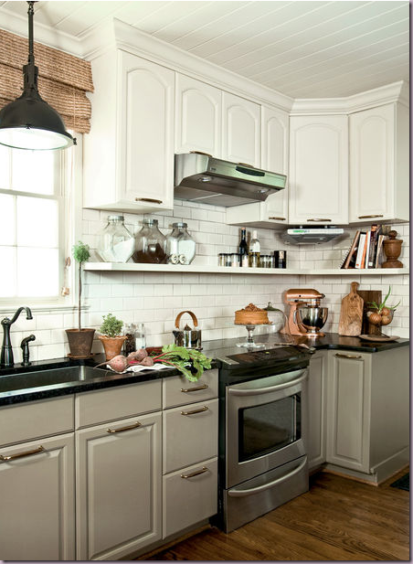
The finished product: How to change a kitchen stuck in the early 90s with honey colored oak cabinets? Paint them gray, or white or both!
Looking at the kitchen through the dining room.
The remodeled version brought into the 21st century: gray painted bottom cabinets mixed with white painted upper ones, white subway tile backsplash, hanging cabinets from the ceiling, open displays shelves to hold dishes and tools, stainless appliances, outdoor lighting fixture brought indo0rs, new bead board ceiling, oversized hardware, and oil rubbed bronze faucets. Each of these elements helped to update a kitchen hopelessly stuck in the 90s. This kitchen is a success – but what elements did she not change but still the kitchen remains trendy? The cabinets. Despite the endless advertisements for fancy cabinetry made in England, a coat of paint can rescue almost anything and bring it up to date. Take a lesson here. Prioritize. If you are a cook who needs all the latest bells and whistles in your drawers, a paint job won’t be enough for you. In reality, these simple cabinets look great here, and the owner saved thousands of dollars that she was able to put into appliances.
ELEMENTS TO COPY:
1. Gray painted cabinets on the bottom, white on top. The gray paint on the cabinets is Farrow and Ball Mouse’s Back.
Paint dated cabinetry, don’t replace it.
2. Black or dark countertops – either granite, soapstone, Corian.
3. Stainless appliances.
4. White subway tiles.
5. Open Shelving.
6. Large, outdoor lighting fixture.
Suzanne Kasler’s kitchen for a Southern Accents Showcase Home.
View from across the island.
Bloggers love this kitchen – it’s been shown on numerous sites, dozens of time. Designed by Suzanne Kasler for a Southern Living show house in Florida, the appeal of this kitchen is easy to see: the light blue subway tiles on the backsplash. The blue tiles are highly reflective of the light pouring in from the large windows which are another important element. The highly polished Carrara marble continues the shiny feel of the space. The natural brown window shades tone down all the light. Finally the over scaled hardware on the island drawers are great. What is interesting is that Kasler chose NOT to use polished nickel fixtures, rather she opted for a matte finish. Perhaps this was chosen as a foil to all the light reflecting surfaces.
ELEMENTS TO COPY:
1. Light blue subway tiles with a glossy finish.
2. Carrara marble, highly polished.
3. Stainless appliances.
4. Woven fiber shade in brown.
5. Oversized hardware and fixtures in matte finished nickel.
6. Glass paned upper cabinets, but no upper cabinets on window wall.
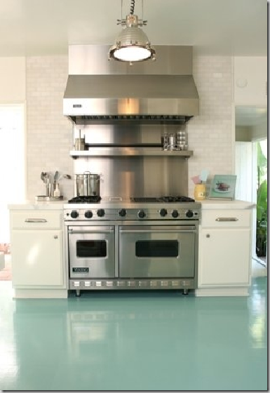
A variation on the above kitchen, is this one designed by Windsor Smith. The beautiful blue is on the floor, here, rather than the walls. A wood floor, painted this gorgeous color in a glossy finish is a way to inject color into an all white kitchen. Consider painting tired wood floors rather than stain them. It’s a great way to get a totally new look.
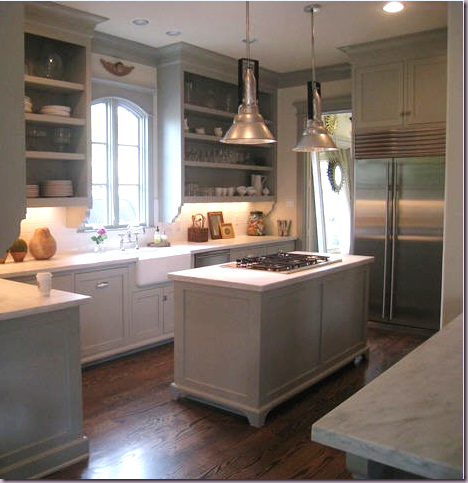
Stalking the Wheat's remains one of the most commented stories on Cote de Texas, with the kitchen the most preferred room. I’ve found this picture copied on numerous blogs, which is so exciting. But why are so many people drawn to this kitchen? In a word, the color.
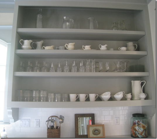
Sally Wheat removed the cabinet doors and had the carpenter create 3 inch thick shelves which give them a more solid presence.
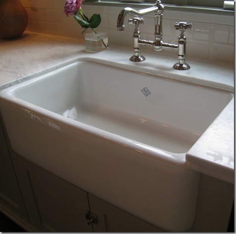
The original Shaw farm sink with the cute emblem. This brand is my favorite of all the farm sinks – I think I just like the emblem! Polished nickel bridge faucet gives a very authentic look to the kitchen.
ELEMENTS TO COPY:
1. Benjamin Moore Fieldstone paint on the cabinets and trim, white on the walls, dark wood floors.
2. Carrara marble countertops, subway tile backsplash.
3. Remove cabinet doors, use 2 to 3” thick shelves, and attach brackets under cabinets.
4. Center island – attach “legs.”
5. Two large stainless industrial lighting fixtures and stainless appliances.
6. Shaw sink and a bridge, polished nickel faucet underneath a charming arched wood casement window.
7. Bin and latches hardware.
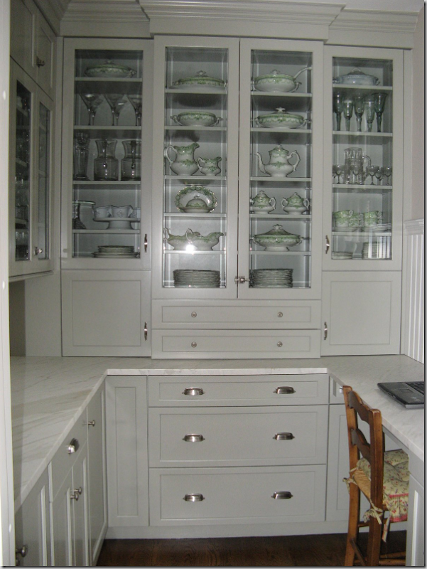
Gina from the blog Willow Decor emailed me some time ago inquiring about Sally Wheat’s paint color. Tonight she posted the results. From an empty closet, she created this incredible PANTRY using the Wheat’s kitchen as a guide! The lighting makes the paint look lighter, but it’s exactly the same, as is the gorgeous honed Carrara marble and bin pulls and latches. Be sure to read the whole story at Willow Decor and see the before and after pictures. Great job, Gina!
Bellacasa designed kitchen in Houston
When designing kitchens, like any other room, a focal point needs to be established. This kitchen actually has two focal points. The back wall where the sink is under the long bank of windows is one focal point - sinks and the window above them are a typical choice for focus. Another choice that is gaining in popularity in the states, is the range and hood. Europe, with their less frequent use of wall ovens, has long made the range and hood the center of attention. Here, this kitchen with its large range and even larger hood demonstrates how to turn this area into a focal point. This beautiful kitchen designed by Bellacasa of Houston popped up on quite a few blogs – and for good reason, it is beautiful. Though it appears that ease movement between the appliances was abandoned for visual considerations. The range is so far from the sink and it’s placement right in the middle of the eating area makes it seem impractical. The black and white marble floors are an additional eye catching and essential element.
ELEMENTS TO COPY:
1. Create a focal point with the range and hood.
2. Create a second focal point with the sink and a large bank of windows along back wall. No overhead cabinets on this wall!
3. Design the kitchen in a rectangular shape for symmetrical proportion.
4. Include a large eating area in the middle of the room with a chandelier hanging over it.
5. Black and white marble floors on the diagonal sets off cabinetry that is painted a gray-green.
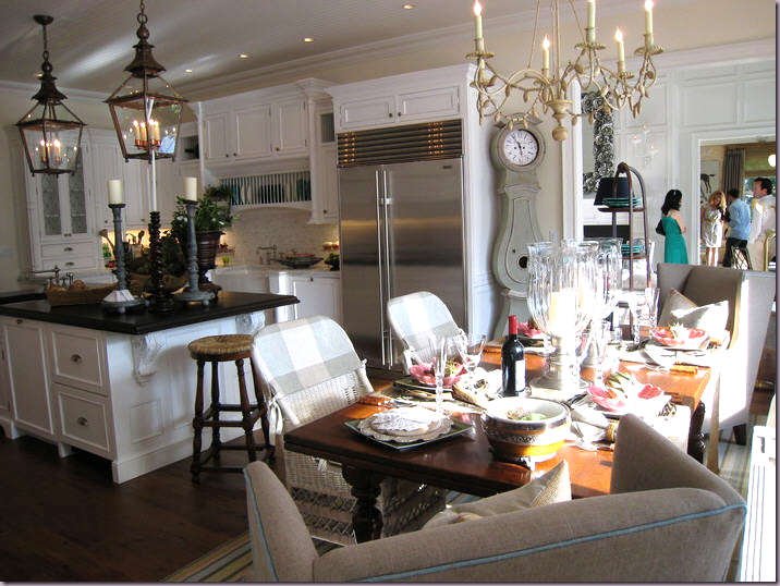
This image from a showcase house floated around the blogs this past year. Again, white painted cabinets and a large island are two common elements. But other details makes this kitchen different. First, the two large French antique styled lanterns pop the island. The lanterns are quite beautiful and by using two – they become the focal point. The island top is further brought into prominence with it’s black countertop. It appears to be honed finished black granite. The Swedish Mora clock is an accessory, but it’s an important eye-catching one. And last, the chandelier, cream painted iron and wood, plays an important roll. Less important, but notable, is the plate rack over the sink. Since there are no windows to create interest, the plate rack is a great alternative, and something to remember when considering your own kitchen design. I wish we could see the range – sometimes tells me it IS a range and not a cook top and wall oven.
ELEMENTS TO COPY:
1. Use two large lanterns over the island to create the focal point when copying this design.
2. Honed black granite brings further importance to the island as the focal point.
3. Consider using a plate rack above the sink when a window isn’t possible.
4. Large clocks, either round Station clocks or tall Mora clocks create interest.
5. A contrasting chandelier goes above the breakfast table.
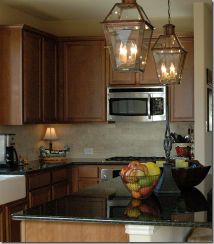
A loyal reader of Cote de Texas recently built a new house. When she saw the above kitchen with the two lanterns, she had to have them and ordered these two beauties from Bevolo, which specializes in recreating antique lanterns. She’s just moved in and sent me this picture today to show off her kitchen. Aren’t the lanterns gorgeous? Her kitchen opens to her living area so the lanterns can be enjoyed while using the couch. Great job Cindy!
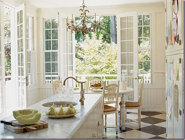
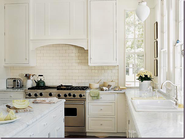
Seen in Southern Accents, Frank Randolph created this beautiful conservatory style kitchen here and below.
The all white kitchen, with Carrara marble and painted white cabinetry.
This kitchen seen in Southern Accents by Frank Randolph proved to be one of the most popular of the year, judging by blogger approval. Why? It’s a basic white cabinetry, Carrara marble affair. What’s important here – is the space – the attached breakfast room sets this kitchen apart. The French doors and sun streaming through the wood mullions provide much of the appeal – it’s as if the kitchen was located in a separate conservatory built in the 18oos. The black and white marble floors and the bead board further add to the “past era” look of this space. In the kitchen area, upper cabinets were nixed in favor of more French windows that reach from side to side. A range and the hood hidden behind a wooden arch provide another focal point. Absolutely gorgeous – and easy to copy!
ELEMENTS TO COPY:
1. Use wall to wall French windows and doors and bead board to create a conservatory like space.
2. White cabinetry, Carrara marble and white subway tile for the backsplash.
3. Black and white marble floors.
4. Use a stainless range and wooden, arched hood.
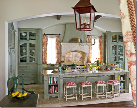
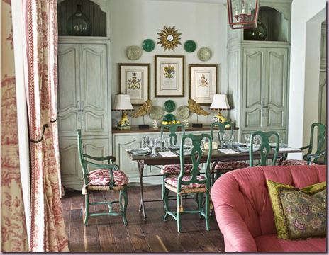
Michelle Allman from Houston designed this kitchen above and below:
This kitchen shown in House Beautiful, designed by Houstonian Michelle Allman, created a huge amount of attention in the blogs this year. Everyone seemed to love it, which is interesting because it is not white and there’s no Carrara marble. This is important to ponder for a moment. This kitchen and breakfast room goes against all trends, yet it doesn’t seem lost in another decade. It should say to everyone, if you love something – go for it, even if the trend setters say it’s out of style. The death knell for toile has been rung so many times, yet – here it is looking fresh and timeless. Where to start with this kitchen? It’s appeal lies in it’s warmness, it’s hominess. The first element is the cabinetry, faux painted a seafoam green. The focal point is the back wall – with two armoires symmetrically flanking a large oven and new limestone mantle, replicating the look of an antique fireplace. A large arch tops the vignette, as do other arches which separate the rooms – the toile hangs as portieres in the archways. A large island holds the sink and the refrigerator is hidden on the left in yet another armoire. An iron chandelier hangs over the island, while a red lantern hangs over the dining table. I think I would have used lanterns in both places, myself. The ceiling is high with rafters. The floor in the kitchen is limestone and there are wood planks in the breakfast room – again, I would have used the dark wood floors throughout for more continuity. But, that’s just me. Across from the kitchen, the breakfast room continues the country French look with the zinc topped table and green painted chairs. The armoire cabinetry is repeated here with two more cabinets flanking a buffet. In the kitchen, the wood in the armoire doors is removed and replaced with chicken wire, in the breakfast room the armoire doors are closed. Of course, to copy this kitchen, you would need the space, an expert carpenter and painter – to say the least. But, you can achieve the feel following the steps below:
ELEMENTS TO COPY:
1. Focal point of the kitchen is most important with symmetrical armoires flanking large mantel and oven. The most important element is the two armoires – they could actually flank the sink – with a row of windows and curtains above – the effect would be almost the same. The armoires in the seafoam are the most important elements to recreate here.
2. Seafoam painted cabinetry, with lots of curvy, French detailing.
3. Large island placed in front of back wall.
4. Arches used between armoires and rooms.
5. Pink-red toile used as curtains in both rooms.
6. Red lanterns used in both rooms.
7. Bright white walls and dark wood floors.
Another house in Houston by Bellacasa eerily similar to the kitchen before!
This kitchen, also in Houston, was designed by Bellacasa. The similarity between these two kitchens is striking and one is left wondering which came first, and which was copied? Oh well – both are beautiful and imitation is the sincerest form of flattery. Here you can see that the basic elements are the same, so the feel of the rooms is very similar. This room is longer and not as wide, but the two armoires play the most important part again. Red toile appears again. And again, there are two armoires flanking an oven and the hood, but this hood is more traditional and not reminiscent of a fireplace. Again, there is a large island, but this island is dark, not seafoam. I think two red lanterns over the island would look so much better here. The refrigerator is an over the top element, hiding behind yet another armoire. This I would eliminate. These pictures of the second toile kitchen illustrate how similar these special kitchens are, and how easy it is to take the elements you like from a space and make them your own.
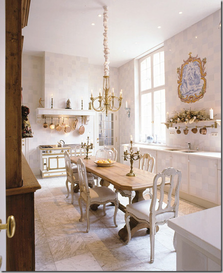
This beauty of a kitchen was found in Belgium. At first glance it looks like a dining room, not a kitchen. The floors are marble and the walls and cabinets are finished in what appears to be wallpaper. The area above the sink becomes the focal point – a shelf with a blue and white mural. Large windows frame the sink on both sides. The French La Cornue range in white and brass is the jewelry of the room. The copper pots above blend in with the brass in the room. The painted white chairs surrounding the light wood table doubles as an island. Finishing it off is a large wood cabinet. A simple, yet elegant space – recreating this space would not be hard, but the La Cornue is extremely expensive – and it is such an important element here. I would copy this look by putting a white range inside a cabinet, also painted white and use brass hardware.
ELEMENTS TO COPY:
1. White walls and cabinets and white marble countertops and floors.
2. Create a focal point on the sink wall with flanking windows and no overhead cabinets.
A medallion like mural could be duplicated by hanging blue and white plates.
3. Use white oven with brass hardware to create another focal point, hanging brass pots.
4. A large light table with white chairs make the kitchen a very dressy place and it can double as a dining room.
5. A brass or crystal chandelier would both work here.
San Francisco kitchen, with two farm sinks.
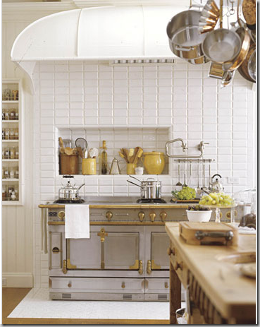
The beautiful La Cornue range sits under the original hood.
This kitchen in a turn of the century house in San Francisco showed up on everyone’s favorite list. A House Beautiful Kitchen of the Month – this photo of its double farm sinks with the twin dishwashers and Calacutta Ora marble is what really caught everyone’s eye. The farm sinks, seeing a huge revival these days, with beautiful polished nickel faucets are so beautiful – why not have two? The owner has four children and she says she puts the dirty dishes in one sink while she’s cooking in the other. She also has two refrigerators, one with glass doors for vegetables only – must be nice!
ELEMENTS TO COPY:
1. Focal point wall with two sinks and polished nickel faucets.
2. White Carrara marble, white cabinets.
3. La Cornue range – set with it’s own tiled floor platform – substitute a large range here.
4. The rounded hood fits over the entire area with a wall of subway tile reaching to the top. Inset a cubby for oils!
Interior designer Pam Pierce from Houston designed her own kitchen in a true country French manner. The cabinets are highly unusual – handmade with cubbies where the appliances are inset, along with wood doors. Steel windows and doors are another unusual element. Rustic wood shutters provide texture, as does the antique butchers table. Limestone floor and stucco walls add more tactile finishes. The two large accessories, the antique French lantern and cow’s head are important to the design.
A view into Pierce’s breakfast room where the antique table and bench is. The focal point is the cabinet – constructed in a similar manner to the kitchen cabinets. Burlap portieres separate the two areas. Just beautiful. Is it possible to recreate this kitchen anywhere? It would be difficult, but there are certain elements that would be important to duplicate:
ELEMENTS TO COPY:
1. Plaster skimmed walls – with no moldings at all.
2. Iron windows with painted black frames.
3. Rustic, simple cabinetry – with old shutters for doors.
4. Cream colored honed, stone floors.
5. Spare, oversized antique accessories such as a lantern or large apothecary jars.
6. Rough burlap or linen curtains.
7. Rustic wood island.
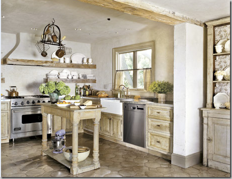
This kitchen by Jose Solis Betancourt, who learned from the master John Saladino, is similar to Pierce’s kitchen, but is more traditional. If you like Pierce’s space, but feel it would too difficult to recreate, take a good look at this one. Rather than using centuries old floor tiles, these tiles are readily available. The carpentry looks rustic because of its faux paint job, not because he used antique doors, like Pierce. Betancourt did use what looks like aged timber, but a good faux artist could recreate their texture. Notice how he used the timber as shelves! An antique island is so attractive – and so much more interesting than a new one, in the right setting. The range and it’s hood become the focal point.
ELEMENTS TO COPY:
1. Use white and fauxed pale wood tones to recreate a rustic look.
2. Timber is used for shelves, molding and rafters which add to the antique, rustic look.
3. Saltillo tiles can be painted to match the cabinetry.
4. Incorporate an antique table or console to use as a center island.
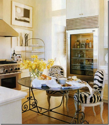
Shabby Slips owner Renea Abbott’s kitchen in her Houston townhouse is a personal favorite. Pared down and simple, the beauty lies in her top of the line appliances and eat in kitchen table. White marble countertops and white walls add to the sparse, clean look. The only color is in the flowers and refrigerated items!
ELEMENTS TO COPY:
1. Stainless appliances, range and hood. The refrigerator’s see through door is essential to the design.
2. White walls and countertops, light colored floors – the least amount of color, the better.
3. Zebra pattern on chair’s upholstery or cushions. An alternative would be a zebra rug or faux zebra rug instead.
4. French styled zinc table with scrolls adds necessary curvy lines to the room.
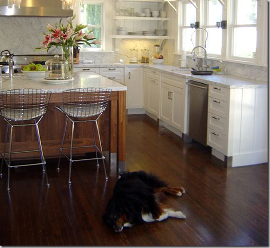
Blogger Katiedid from Sacramento added a new kitchen to her home this year which was met with resounding approval from the design blogosphere. An all white design with white marble, walls, and cabinetry, Katie added a stained wood island to pop the space. The wood blends with the dark hardwood floors and is an essential element of her design. Katie used the Carrara marble as her backsplash, elevating it’s importance stylistically. The range with it’s large hood becomes the focal point. Katie also decided against upper cabinets over her sink, opting instead for a bank of windows. Open shelving takes the place of the cabinets. Stainless appliances and contemporary stainless chairs add the finishing touches.
ELEMENTS TO COPY:
1. Dark stained wood island and floors.
2. White walls, cabinets, and Carrara marble countertops with the marble backsplash a must.
3. Range with stainless hood.
4. No overhead cabinets, banks of windows instead.
5. Contemporary bar stools bring this kitchen into the 21st century.
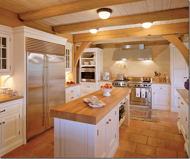
A farmhouse style kitchen for today. Bright white walls and cabinets contrast with butcher block, rustic beams, and Saltillo floor tiles. The range and hood alcove becomes the focal point. Antique rugs on the floor warm up the room. Glass paned cabinets add texture. Ceiling is wood boards.
ELEMENTS TO COPY:
1. Stark white walls and cabinets.
2. Butcher block island.
3. Mexican tile floors.
4. Wood ceiling with rafters.
5. Range and hood in alcove becomes the focal point.
6. Most important element – two colors only, white and pine color.
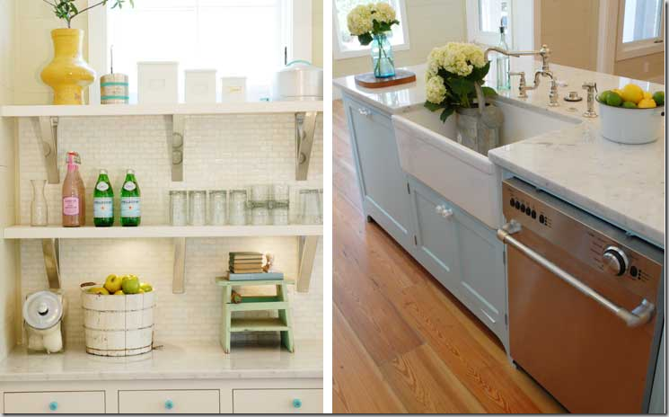
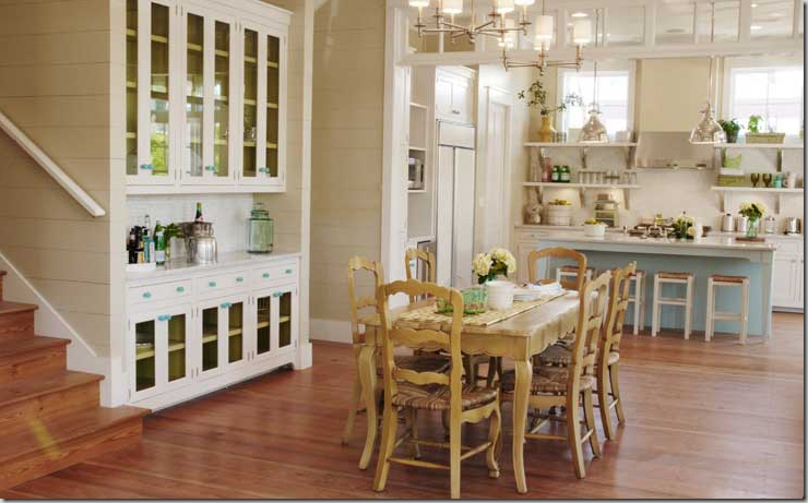
This kitchen designed by blogger Erika of Urban Grace in Florida is another blogosphere favorite. Everyone loved this beach town kitchen it for it’s stylish casualness. The fabulous tall backsplash with open shelving and windows above becomes the focal point here. Erika used white marble and white tiles and mixed in lots of stainless, but as a surprise – she added the color blue on the island and in the knobs. The added color brings a playfulness to the design and makes it more accessible. She then added yellow accents. If you love color and white, think about adding both in your kitchen design, like Erica did.
The knobs are glass, colored blue and the island is painted blue, not white.
Looking in from the large living-dining area at the kitchen.
ELEMENTS TO COPY:
1. Create a focal point along the back wall by placing the range and hood here, flanked by long open shelving with stainless accents.
If possible, add windows above the shelves.
2. Add color to the island – it doesn’t have to be blue!
3. Two lighting fixtures are better than one when the island is long. These fixtures add just the right amount of accent.
4. Use colored glass knobs to match the accent island color.
5. Instead of a plain entry way, add a row of transoms windows above the opening.
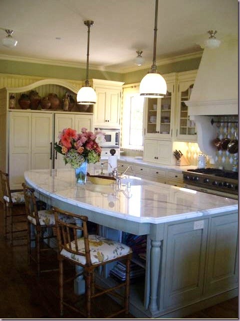
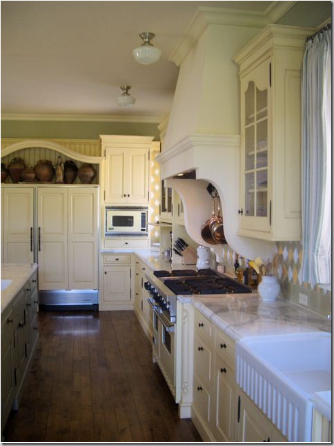
This southern California kitchen designed by blogger Velvet and Linen’s Brooke Giannetti and her architect husband Steve received rave reviews when Brooke first showed it. A colorful room, filled with greens and blues and yellows, there is Carrara marble on the countertops, along with a wonderful mix of colors used in the tile backsplash. The cabinets are a luscious warm, cream color, not white. Here again, the range with the large fireplace hood is the focal point. The curves in the island are repeated in the shelf above the refrigerator and in the glass paned cabinets. Wonderful bamboo styled bar stools with a flowery fabric fit the kitchen’s style. Reproduction school house lighting was used over the island and the range – which adds to the turn of the century feel in this space.
A close up of the range hood’s curved detailing and colorful backsplash.
ELEMENTS TO COPY:
1. Color: use cream on cabinets, and blues, greens, and yellows on island and backsplash.
2. White marble and farm sink are other authentic elements to use in a turn-of-the-century look kitchen.
3. The large range with fireplace hood becomes the focal point, flanked by glass paned cabinets.
4. Curves – use curves in the island, the cabinetry, the hood – the curves are as important an element as the color is to recreate this look in your own home.
5. Authentic school house lighting.
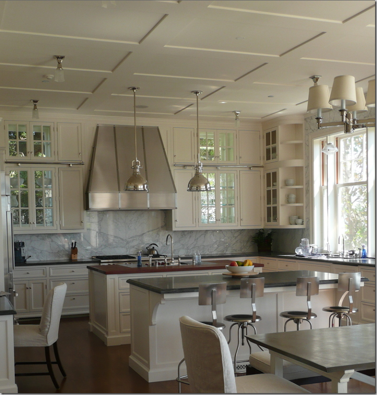
Another Giannetti designed kitchen. Steve Giannetti is fast becoming one of my favorite architects (Sorry Kurt!) His homes take you back to another era, when beautiful detailing mattered. There is such an authenticity to his designs, you might not realize the home is new – there is no detail too small not to matter, whether it is the molding or the air conditioning vents – everything is stylish and delightful. This kitchen is a perfect example of this attention to detail. Large, cool, and serene, it reminds one of those wonderful old servants kitchens of old – so beautiful! Two islands were used, with a Calacutta Ora marble backsplash. To create contrast – Giannetti used black granite and wood countertops. Stainless pendants and appliances provide the sparkle, as do the glass paned cabinets which are backed with windows. The bar stools could not be more perfect!
ELEMENTS TO EMULATE:
1. Black granite countertops, white marble backsplash with white wood cabinetry and wall color. This look is all about subtle contrast.
2. Large island, preferably two, if space allows, but the second island is not necessary to achieve this look.
3. The range and large stainless hood become the focal point along the back wall, flanked by glass paned cabinets.
Consider backing the cabinets with windows to let light stream in.
4. Two hanging stainless lights highlight the island.
5. Sink is placed underneath a row of windows – no upper cabinetry along this wall.
6. Industrial bar stools made of steel, while not essential, are highly desired.
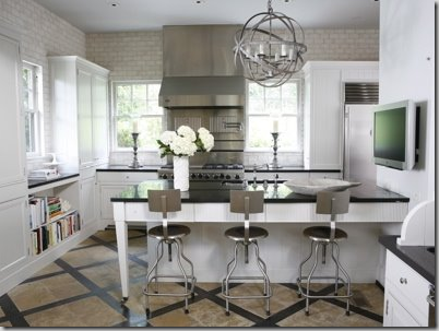
Take a peek at this kitchen found on Pure Style Home – a great blog written by young interior designer Lauren. The chairs bought at Beach Dwelling are the same ones as in the Giannetti designed kitchen. The kitchen is very similar in elements and could be a good copy. The floors though send this kitchen off into a different style - good, just different!
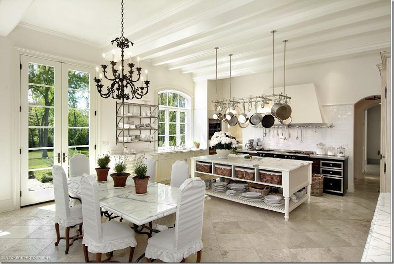
A home for sale in Illinois with a marble kitchen.
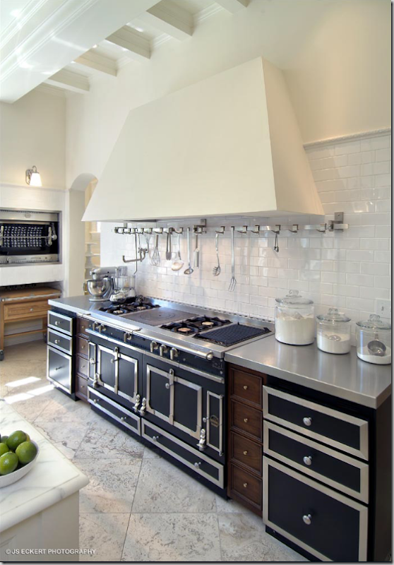
A close up of the gorgeous, La Cornue range – to die for!
This kitchen, in Illinois faced mixed reviews – some loved it, some found it cold. I happen to love it. A large space, the gorgeous, heavily veined marble is the star here. Carrara marble like this is hard to find now, if not impossible. The Carrara now coming from the quarries is gray with little to no veining – it looks mushy, not crisp like this. An alternative to Carrara is Calacutta Ora marble. These two marbles are often confused and truly – I’m not sure if this is Carrara or Calacutta myself! Besides the marble, the other standout is the French La Cornue, a masterpiece few of us will ever be able to afford, unfortunately, as one this size can cost as much as $40,000! The large pot rack is another eye catching feature. The triple, arched casement window is charming. The floors are also marble, as is the table top. Stunning is the word that comes to mind.
ELEMENTS TO COPY:
1. White: white walls, floors, cabinets, upholstery.
2. Marble, white Carrara or Calacutta marble everywhere and then some.
3. Focal point – French range with hood. A substitute would be an American stainless or black range – which would provide the focal point.
4. Large steel pot rack.
5. Island with baskets, which add needed texture.
Other popular photographs of kitchens give ideas to use:
In New Orleans, this homeowner added silk draperies to her kitchen, as if it was the living room! I adore this room. Her antique light fixture is beautiful.
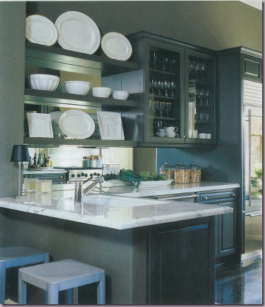
Houstonian interior designer Lisa Epley used a dark color on her kitchen walls. The color gives it a very sophisticated look which is great to use when the kitchen is open to the living areas. Large white plates and platters pop the wall color, as does her beautiful Calacutta Ora marble countertops. The mirror backsplash and glass paned cabinets add more sparkle and drama to this dressy kitchen.
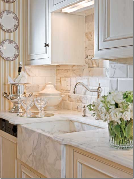
To me, the prettiest elements in a kitchen today is the farm sink and polished nickel faucets along with heavily veined white marble. This has it all! The backsplash is subway tiles made of marble, as is the farm sink.
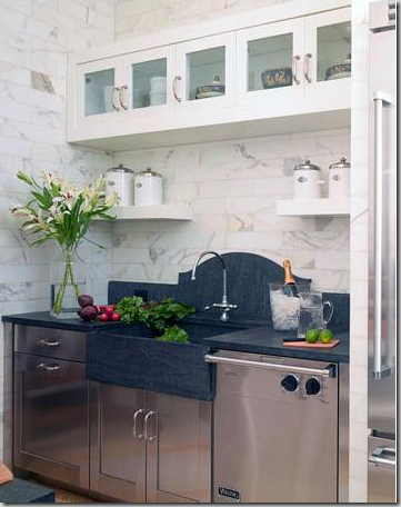
When you don’t have a window above the sink, I love this treatment of the backsplash – a slab, carved in a high arch, the soapstone takes over as the focal point. I love marble handled this way – in a kitchen and in a bathroom.
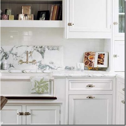
This white marble backsplash would have looked fabulous if the fabricator had carved it in an arch. Oh well – they didn’t ask me for advice, and it’s still beautiful.
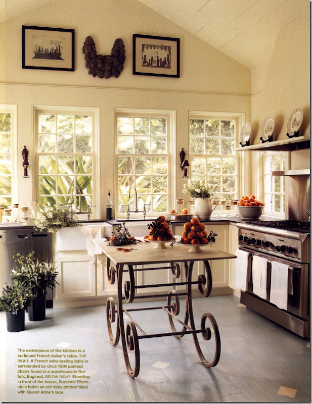
If you are tired of your dark hardwoods and want a lighter look in your kitchen, consider painting them! Simple to do and a great alternative to brown floors, just be sure to seal it. Also, this kitchen has a beautiful wall of windows above the sink. I love how Suzanne Rheinstein put lighted sconces between the windows – this is a good idea to incorporate. And, her antique baker’s table makes a perfect focal point.
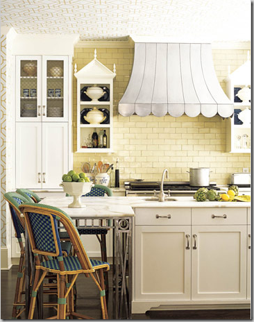
Everyone, I mean everyone, loved this kitchen in House Beautiful. The range hood is incredible! Scallops and curves make it as sexy as it is cute. Two pagoda styled shelves flank the hood. The cream subway tiles set off all the lighter colored cabinetry. White marble countertops were used and be sure to notice the iron table legs! A range hood like this is definitely worth copying!
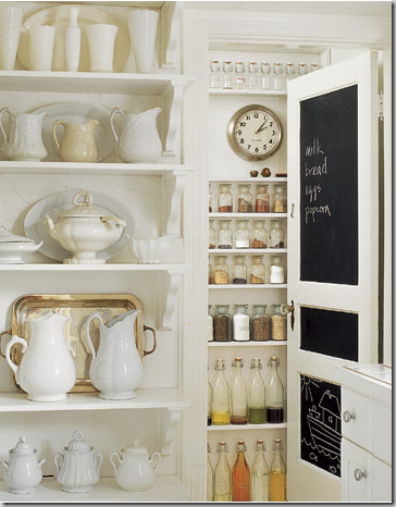
Ironstone looks wonderful in all white kitchens. You don’t have to spend a fortune either. Ironstone, even old pieces, are relatively inexpensive, especially on eBay. Too much of ironstone is never enough! If you don’t want to buy old, go to Target and buy a set of white plates and platters – the effect will be the same. Notice too, the blackboard inset into the pantry door. This is another great accent in white kitchens.
Besides hanging ironstone platters on the wall, put them on wonderful, old vintage shelves, like here! These antique, rusted brackets are nice contrasts to the shiny white tile and white plates. Collect platters, plates, pitchers and tureens. Tureens do great second duty as planters too.
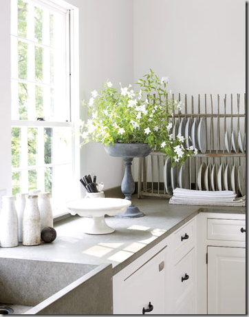
Plate racks make good and useful accessories. An antique plate rack is desirable, but a built in one will do just fine! You can hang them, or just place them on the countertop like this one, or you can build them into your cabinetry.
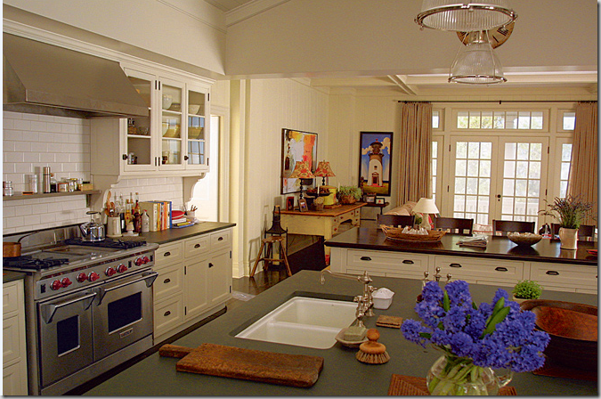
And finally, the kitchen that spawned a thousand copies: the Something’s Gotta Give kitchen. Everyone loved the white cabinetry, the subway tiles, the black soapstone countertops (though they were really just painted wood for the movie), the polished nickel fixtures, the great range and stainless hood, the glass paned cabinets, the school house light fixtures, and the huge double islands and bin pulls. Looking at this kitchen today, years later, it is amazing how prophetic this design was. Today, it seems almost commonplace. Back then, people took pictures of the kitchen to their designers and said “I want this.” So did all of America it seemed.
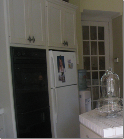
The most beautiful kitchen in West University, not! This is my disaster before the updates. Oy! Stunning, isn’t it? I’ll show it next time. It will look better on its own rather than compared to such gorgeous kitchen shown here today!
For a detailed study of farm sinks and fixtures, be sure to visit Brooke’s Velvet and Linen.











What a nice post - we are building a new home and I have been thinking kitchens all weekend! This is a very comprehensive essay!! Now how do you choose??? There are so many gorgeous styles.
ReplyDeleteLove almost everyone, thanks for all the hard work. Also was waiting to see your new kitchen, glad to know it is coming soon. xo, MB
ReplyDeleteYou have outdone yourself on this one! I still like the first kitchen the best, and now I have a much better understanding why. This is a great reference for anyone remodeling their kitchen, or just thinking about it.
ReplyDeleteIt makes me wonder what people will think in 10 years. These kitchens seem so timeless, but it seems like the home decor industry ruthlessly dictates things to be 'out' every few years or so. I have read so many times that granite is out, that stainless is out...
There is one kitchen you didn't show, and it belongs to one of your favorite designers. Dan Carrithers designed his kitchen over 30 years ago, and it truly looks timeless...a big overhead window, armoires for the dishes, a big wall of windows...sounds familiar?
My conclusion after reading all of this and seeing all of the pictures is that American kitchens are going more European these days. I love it!
A must read for anyone thinking of renovating their kitchen! So many fantastic ones - how to pick? I think I need several houses and have a different one in each. Thanks for showing my Butler's Pantry!
ReplyDeletexxx-Gina
What an amazing piece of work! I can't wait to pour over your post and devour every word and picture. When John gets home tonight I am going to get him to look at it as evidence that our orange, or as you so delicatly call them ~ honey ~ colored, cabinets needs paint.
ReplyDeleteOh oh oh - your blog is my favourite of the 132 that I subscribe to - and I am especially bookmarking this post as I contemplate changing my kitchen by painting all the cabinets. It's almost been a year since I moved and I am almost ready to step out with the paintbrush (I painted so much to sell our old place it's taken that long to get over it!)
ReplyDeletethanks a bunch!
Megan
Wow, this is an AMAZING post! I can't belive you posted that kitchen from Something's Gotta Give! My fave kitchen of all time is by the same designer, James Radin. He made this kitchen for the director of the movie: http://www.housebeautiful.com/cm/housebeautiful/images/7-blue-kitchen-1007_xlg.jpg
ReplyDeleteIsn't it just beautiful? It's inspired by the Something's Gotta Give kitchen.
I should really send you a pic of my horribly dated 90s kitchen. There's nothing there that is worth rescuing. (it's like one of those horrible before-pictures..)
And you really outdid yourself here, this has to be one of my favorite posts!
This was an education! I am still trying to absorb it all. Love the way you took the elements apart for us. I look forward to seeing your masterpiece!
ReplyDeleteGreat post!
Well that was a wonderful way to start my day , I am inspired all right .
ReplyDeleteCan't wait to see your kitchen too ,
Cheers
Chris
Oh Joni. What a treasure to hang on to. All this info, broken down for us. FABULOUS job. Shouldn't it be in .pdf??? "Kitchens by Cote!"
ReplyDeleteOh, my - so many beautiful kitchens!
ReplyDeleteBefore we built our house, I had for years saved pictures of houses and rooms I liked. When I looked through all of these as I made decisions for my own dream kitchen, I realized that every kitchen I'd clipped had white cabinets.
For people who actually cook, however, a kitchen needs to be functional in addition to being visually pleasing. I can't imagine actually cooking in some of these kitchens because you'd wear yourself out running from one side to the other toting things from the refrigerator to the stove. And the thought of getting stains on that beautiful marble makes me shudder.
Thanks for the wonderful tour. I can't wait to see your kitchen!
Hi Joni - What a feast for the eyes! Just beautiful and inspiring! Thanks for sharing. Deborah
ReplyDeletethe "home for sale in Illinois" 'bout took my midwestern breath away.
ReplyDelete...wish I knew where it was, being from Illinois and all.
The shelf of ironstone right here at the bottom....well, you KNOW how my heart goes out for that the white stuff
This comment has been removed by the author.
ReplyDeleteThis is the best compilation of great kitchens! I'm just beginning mine and this give some great ideas. However, I guess I am the lone ranger who wants their cooktop in the island. I hate having my back to the room while working - what am I missing?
ReplyDeleteWow! What eye candy! I LOVE all the kitchens.. I have ALWAYS loved white/painted cabinetry.. esp. with marble counters...my dream kitchen.
ReplyDeleteThanks for all the inspiration.
Ugh, all of these lovely kitchens make mine seem like a dog. I have to admit I have the honey colored cabinets and although I liked them at first they do seem a bit dated. I'm going to have to live with them my husband would die if I wanted to change them.
ReplyDeleteAhhh, that gray in the Wheat's kitchen is stunning - I have never thought of painting the cabinets in my kitchen gray (they're white, and dying for a shock of something other than the sad sad sad duldrum it is now) Scott only has white stoneware in the cabinets (Pfaltzgraff Heritage) and I'm loving the way the Wheats white pops off that gray. I need to get glass front cabinet doors as they're open now, and paint the walls something lighter - instead of the very dark sage green they are now. Oh now you have me spending money in my mind! Eeeek! NOT. A. GOOD. IDEA!
ReplyDeleteI absolutely love your teaching posts, as I call them. Where else would we get such fabulous, accessible information on how to get from here to there? Thanks!
ReplyDeleteDefinitely bookmarking this one for my dream kitchen file. One of my all-time favorite kitchens is the Connecticut home from Country Living with the gray slate countertops (the image with the dish rack) ... It's just so weathered & clean feeling. It has no uppers on the main wall & all windows.. ahhhh that's in my dream kitchen recipe. Will be referring back to this post often!
ReplyDeleteOh there is hope for my little kitchen! That before and after is very, very close to what I have now (EEEEK!) and what I want in the 'after' shot. I love the antique rusted bracket for the shelving - and the Wheat's grey is lovely! I saw that gorgeous Butler's pantry before going to bed last night and dreamt of it all night long! Oh so much I want... =) I loved this post, thanks for all the insight, copy lists and the beautiful photos!
ReplyDeletexo Isa
I was just speaking with a friend yesterday about painting my kitchen cabinets. This post, and Gina's pantry, may have just pushed me over the edge!
ReplyDeleteI am loving grey now and I am against upper cabinets. I want clean space these days. Tremendous feature post Joni!
ReplyDeleteJoni, your posts have so much thought and effort put into them -it astounds me! WOW! I have to take a coffee break 1/2 way through!!
ReplyDeleteI think any kitchen with lots of windows, a la cornue stove and white marble is my dream :-)
Wow~ Just wanted to say thanks for such an amazing post! These kitchens are incredible and provide such inspiration. You are a very gifted designer and I feel grateful that I "stumbled" upon your blog. Thanks again! ~Elizabeth
ReplyDeleteBest post ever, hands down. If you ever tire of designing, you need to teach! Mrs. Webb's class is still my favorite!!!!!!
ReplyDeleteYep I was just thinking that this was the best post I've ever read or seen on anyone's site!!! Amazing I'm sending everyone over here! Thanks
ReplyDeleteJoni, do you even sleep, the work you have put into this. I love the Illinois Home and the French Country, oh and the makeover with both gray and white cabinets. I will have to come back and peruse at length!
ReplyDeleteHi Joni,
ReplyDeleteThanks so much for the nice comments on my kitchens. The list of elements is really a good way to review the images and really see what makes them great.
Thanks
Steve Giannetti
Brooke's husband....
I'm going to come back and look at this post many times. It's wonderful. Thanks for putting it altogether.
ReplyDeleteSo many great kitchens! I love this post, Joni. I can't wait to see pictures of your new kitchen!
ReplyDeleteHi Joni,
ReplyDeleteAMAZING entry! Thank you so much. beautiful, comprehensive to say the least, and most important to me, useful..... WoW. I collect and read all the shelter magazines,,,,, (for years)... and have never seen an article on kitchens as exciting and intelligent as yours with the "elements to copy", why we love it feature. Excellent. and now how about some sleep for you??? When do you do that??
best from,
CE
Great inspiration indeed! Thanks for the great post.
ReplyDeleteWhat a wonderful dissection of kitchen design! You've featured many of my favourite pictures...which, of course, informed my own recent remodel of my kitchen - white shaker cabinets, stainless appliances, marble backsplash, oversized hardware naturally! I think its a classic look and hopefully it will last longer than the honey-toned wood, tumbled backsplash look of the 1990's. Wonderful post!
ReplyDeleteIt is funny how kitchens have evolved the last 10-15 years or so. and how the trend as gone back to white or cream. Loved all these inspiration pics!
ReplyDeleteMy kitchen is nothing special, but I've got some plans to update my countertop, sink & faucet. Since I already have white cabinets, I will probably do a dark countertop. Love that classic look! My kitchen will never look like any of these, but I sure enjoy drooling over them.
Such a great post ... . with your ever astute observations.
ReplyDeleteFAVS:
-Industrial steel barstools
-Black La Cornue
-Slouchy Silk curtains
-That DDraper Blk/Wht floor (of course!)
Judith
Joni,
ReplyDeleteYou are the best-I always love your blog!!!
Thank you for your generous work.
Joni, you are unbelievable! Absolutely amazing and beautiful post. Thank you for all the work you put into educating and entertaining all of us. Can't wait to see your kitchen.
ReplyDeleteKerry
Joni - gorgeous - and helpful - post. Loved the details. I DO want to see your kitchen. Don't forget.
ReplyDeleteHi Joni
ReplyDeleteGreat post and I like how you have disected the elements in detail. Kitchens are one of the most important rooms in the home and the most expensive. So it is really important to get it right.
PS....I am looking forward to seeing your kitchen.
ReplyDeleteWOW! so many beautiful kitchens - but photo #1 took my breath away!!! Love the window!
ReplyDeleteOkay - so I probably posted the best and funniest post I have ever done on my blog...my riding lesson photographed! ..and don't laugh so loud that I might hear you!
Have a great week!
Simply beautiful. Althugh for me all the pictures didn't appear. Also, since I didn't see all the pictures, I wasn't sure if I missed a black kitchen (sorry to say I skimed over the write up looking for the black kitchen since that holds an interest for me).
ReplyDeleteGreat post, Joni! One goal for my own home this year is to tweak my kitchen. We remodeled about 8 yrs ago and I still love most of it (especially the creamy white cabinets), but feel the need to change some details. Your post plus my file of tear sheets should get me where I want to go, so thanks!
ReplyDeleteJoni! LOVE this post! (And thank you so very much for including my little kitchen!) What a great collection, and I agree....my favorite kitchens are those with painted cabinetry too. And really, S.S. is not going anywhere anytime soon. I will be putting these in my kitchen file! You are amazing.
ReplyDeleteWow! What a great post! This was a kitchen magazine in itself. I love that first kitchen I think mostly because of the high ceilings and the painted beams. Thank you so much for sharing all this!
ReplyDeleteI no longer need a office file on kitchens, Joni!! I am bookmarking this! Perfection!
ReplyDeleteGreat post, Joni. As always, I learned so much and will be back to study it even more.
ReplyDeleteI'm profiling best design blogs this week. Yours is number one. I hope you're okay that I've used a few photos from your blog. If not, just let me know, and I'll take them off. :-)
Great post, Joni. As always, I learned so much and will be back to study it even more.
ReplyDeleteI'm profiling best design blogs this week. Yours is number one. I hope you're okay that I've used a few photos from your blog. If not, just let me know, and I'll take them off. :-)
Great post, Joni. As always, I learned so much and will be back to study it even more.
ReplyDeleteI'm profiling best design blogs this week. Yours is number one. I hope you're okay that I've used a few photos from your blog. If not, just let me know, and I'll take them off. :-)
Your encyclopedic kitchen post is truly amazing. There is definitely a list of elements that are must haves for new kitchens, and some that are truly timeless.
ReplyDeleteNow the tough part is going home to my kitchen tonight without immediately running out to the paint and lighting stores!
Joni - Another KO post...just fabulous! What I like about what you've posted, is that you've shown the kitchen morphing from a sterile, utilitarian room into a relaxing, lived-in room that has absorbed the character and spirit from the rest of the home...making it the ultimate room of comfort.
ReplyDeleteI enjoyed this very much, especially the part about painting the dated cabinets, instead installing new, very expensive English ones. I do not care for these, anyway. I am all for spending money, and all for decoration, but I think those fake columns area an inauthentic contrivance, and since I am a mechanical engineer, and the columns don't hold up anything, so it doesn't add up for me. Nor do I care for the cabinet panels on the frig. One recent magazine quoted a decorator, who liked the TV exposed(I don't), said "would you buy an armoire for your oven?" I wouldn't, and I would not put armoire doors on my frig or dish washer. I like those fancy machines, and I am cheered every time I see and hear them whirring away! Jenny Johnson Austin, Texas
ReplyDeleteWOW ... A SPECTACULAR POST! ... 2 cups of coffee later and I'm sooo much more the wiser! I am currently building my home and recognised a few kitchens in your post that have inspired me along the way... dissecting their appealing elements really is an art form and you have achieved that beautifully. I was originally inspired by the light in the Southern Accents kitchen. Determined to have French doors and transoms, at the end of my kitchen, my whole house design revolved around those damn doors.... expensive support beams for the top floor ensued as a result! I find the Giannetti kitchens just spectacular. Brooke and Steve have such a penchant for detail. I drool over every post in Brooke's blog. Thank you for such an informative piece.... destined for the annals of 'Legendary Blog Posts'. A-M xx
ReplyDeleteThank you Joni for all of the kitchen eye candy! If I had to choose one, it would be impossible. However, I am really diggin' on Pam Pierce's simple, earthy but elegant design!
ReplyDeleteJoni~ Another FABULOUS post! Every single example of the new kitchen is gorgeous! you are so good and showing so many examples and pointing out the great design feature of each.
ReplyDeleteI love kitchens and when we designed our Virginia one in 2002-ish we picked White cabinets and black honed granite , carrera marble....I remember the designer we hired to oversee the construction (we were out of state) telling me that I had made a "mistake" because the lanterns I chose were really exterior lighting. That was when this look was really coming out so I had a difficult time finding photos for inspiration. It was before the film "as good as it gets"
Anyway, I love this post---our new kitchen (just minutes form West U) is very similar to many of these (marble island and marble subway tile backsplash, white cabinets, ceiling beams.... I am trying to figure out what to put on my windows. So, this was helpful and spurred some ideas.
If I were not so embarrassed by how unsettled we still are, I'd have you over for tea.
Kim
A tremendous amount of work here, thank you! Although I like pale painted kitchens with lots of light, and have one myself, I've received a lot of negative criticism about it from the locals. I live in the countryside in Oregon, where oak and green formica would not be looked down on. Here in Oregon, at least in the country, it's seemingly all about strong, often dark colors, especially greens, and a Craftsman look. In fact, if I were trying to sell the house with that kitchen, I could probably just put Craftsman pulls on the doors, add images of salmon, elks, and Doug Firs, and call it good. The lesson I've learned is that selling is all about the target market, rather than my personal preferences. And out here, the target buyer is sort of a Sarah Palin type, if you KWIM.
ReplyDeleteJoni,
ReplyDeleteYou outdo yourself every single time!
I think you need to take another virtual vacation after working so hard on this fabulous post!!!
Kudos for the images and more importantly all of your valuable observations and commentary!
great post! we are in the middle of designing/building a house and are basing the whole kitchen around an aubergine lacanche range from france (well maybe not the whole kitchen)...stainless would have been a lot easier but I am enjoying the challenge...was thinking gray for the cabinets but there are so many variations of gray that it is certainly overwhelming...your post was definatlety helpful!
ReplyDeletehonored to see my handiwork, but really just thrilled about your big reveal... ;)
ReplyDeletecan't wait!
XO
E
Wow, what an amazing post! You must have spent days compiling this! I especially LOVE the belgium kitchen with the fabulous table in the center! And idea I will definetely use as inspiration for future projects!!
ReplyDeleteWhat a fabulous, thorough entry! Thank you. I loved so many of the kitchens. The white ones, though, were my favorites.
ReplyDeleteI just spent another morning at the University of C de T! I ran into Steve's office this morning to show your post to him. We were both blown away by the detail and thought that went into your writing. To have our work included is just beyond amazing.
ReplyDeleteI will have to read it several more times to let all of this information seep in.
Terrific job!
xo
Brooke
I just spent another morning at the University of C de T! I ran into Steve's office this morning to show your post to him. We were both blown away by the detail and thought that went into your writing. To have our work included is just beyond amazing.
ReplyDeleteI will have to read it several more times to let all of this information seep in.
Terrific job!
xo
Brooke
Eagerly awaiting your show and tell kitchen pics! Wonderful post by the way and timely - I have kitchens on the brain. Smiles,LC
ReplyDeleteThank you for a wonderful post.
ReplyDeleteI will be re reading it often!
Phenomenal Post!
ReplyDeleteThank you for all the hard work that must have gone into creating it!
Layla :-)
Who needs shelter magazines when we've got YOU!!!! Joni, thank you so much for breaking down each piece and truly educating us on the why's and how to's!
ReplyDeleteOooohhh I can't wait to see your new kitchen!!!!
Thank you so much for this comprehensive post. We are in the midst of renovating, essentially the whole house, but the kitchen was our initial and is our ultimate goal. This post will be a fantastic resource. So much reference in one place--and all distilled with your expert eye. Thank you.
ReplyDeleteFabulous post...all anyone needs if remodeling a kitchen...my "dream" kitchen is a traditional Mexican style...living on the border has influenced me quite a bit.
ReplyDeleteI should know better than to get on your blog when I am crunched for time! Oh my goodness. I just want to sit and absorb each photo. Such fabulousness needs time to soak in. Thanks again.
ReplyDeleteKaren
Beautiful post, all of those kitchens are amazing. Beautifully written, and beautiful pictures! I cant wait to see how yours came out, post pics soon!
ReplyDeleteJoni- I love kitchens, the heart of the home! I am so hooked on the one from Erika's site with the 90's that is my kitchen! I love how the short cabinets were moved up and the open shelve underneath. I printed the pictures out and your list of elements to copy. Thanks!
ReplyDeleteWow! Thankyou, I loved that.
ReplyDeleteI have never seen such a collection of beautiful kitchens all in one place! Thank you for the wonderful and educational post!
ReplyDeleteCan you please stop raising blog bar.
ReplyDeleteYour posts just get better every time. I love all the kitchens with white cabinets and marble. The kitchen and dining room are the next two remodeling projects in our home. These kitchens are definitely in the inspiration folder.
P.S. Katiedid is the only blogger I'm familiar with in the line up and I have to say she did a magnificent job and I am so inspired by her talent. Great job Katie!!!
Oh. my. goodnes. I think this is my favorite post ever! Loved how you broke down the design elements...I dream about a kitchen remodel and the lists of items to copy was truly inspired!
ReplyDeleteWhat a fabulous post. Thanks for the time you put into this...
ReplyDeleteOMG! Thanks for all of the valuable info. Now I feel ready and armed to present my kitchen ideas to Hubby. Thanks to all of your work!
ReplyDeleteWOWSA! What a great info, inspiration packed post! I was gone on vaca these past 10 days..couldn't wait to come back and see what all you fabulouse bloggers have been up to! Missed you all!
ReplyDeleteOMG - I've died and gone to heaven! Thank you so much!
ReplyDeletejoni - you rock! how can we all thank you for your generosity? --though i don't think my husband will be thinking that kindly about you when i suggest to him that we paint our (only) 5 year old natural cherry kitchen cabinets white/ grey.... i am so loyal to everything else, but why am i so fickle when it comes to design?
ReplyDeleteWhat perfect timing!! I just picked out my wallpaper last night for my kitchen. I will be taking before and after shots and posting them on my blog. I gleaned at least five new ideas from your post and feel so lucky right at this moment. Keep up the good work.
ReplyDeleteShelly
Wow! What a detailed, thoughtful, generous post. It's bookmarked and will be essential for our kitchen reno. Sally Wheat's kitchen is my favorite. I could easily move right into her home and live happily ever after. Thanks so much!
ReplyDeleteWhether we have seen these or not, you have done a fabulous job selecting the great elements in each kitchen, Excellent Job....
ReplyDeletexoxo,
Cathleen
What a great post! I'll be sure to book mark this if I ever get a chance to do my own kitchen!
ReplyDeleteYou've done it again, Joni! These kitchens are driving me wild. I am glad that we are still a year or two away from our kitchen reno so I will have time to decide on all of the elements. Just when I thought I had covered everything you show me these. Already planning on those two gorgeous lanterns over the island and the farm sink. Every post of yours is simply divine!
ReplyDeleteInteresting and beautiful! I like kitchen #1 best.
ReplyDeleteIs it true that Cottage Living will be no more?? - I just got a postcard. How can it be?
Amazing post, Joni! This could be a BOOK or magazine! (Hope you're shopping a publisher...)
ReplyDeleteI have a small kitchen that opens to a small family room. I painted my honey oak cabs white and have stainless appliances, but need new countertops. Marble wouldn't look right with my stuff nor is it common in the home styles here in AZ. What would be a good alternative? I am wanting something light/open/current. Would a golden juparana granite w/ a lot of movement still be consider "current" or something else?
OMG, what a post!! And now I am totally depressed about my little rental kitchen in the UK. ;-)
ReplyDeleteWell done, Joni!
Oh, I am such an old stick-in-the-mud! I love the timelessness of a country French kitchen! As soon as I see toile, I feel my insides start to smile. My eyes hover over transferware and Quimper plates on the wall and the curved lines of the chairs. I guess I'll just steer straight and let fashion swing by me every once in a while!...Debbie
ReplyDeleteJoni, Joni, Joni! What a fabulous post! WOW!! I loved it and will go back now and LOOK again and again! And study it also! I need to do some updating myself even tho' I love my Europeon style kitchen......It needs some tweaking for sure. Wonderful ideas you have laid out here and I , for one, thank you!
ReplyDeleteJoni, You've certainly out done yourself on this post.. there are so many things to "borrow" if I was ready to do a kitchen update. I would be hard pressed to pick a favorite.. so I believe I'll just make a copy of all of them and put them in the save file for future reference.. I love the coach lanterns..they are certainly screaming to me..Wonderful ideas.. thanks so much..hugs ~lynne~
ReplyDeleteJoni — you are marvelous at pulling out the lesson and helping us to learn and not just look! That said, most of these kitchens leave me cold. I like Erika's work and her friend's kitchen is a great transformation.
ReplyDeleteBut as someone who has cooked in small and large kitchens, give me small any day of the week. I don't want to walk a mile. I have cork floors — the best for your legs, feet and back. And I stay away from hard surfaces around all my china and glassware — too easy to break things. I'm a serious cook and want everything in easy reach. Most of these kitchens don't look like real people use them, let alone cook in them.
Joni,
ReplyDeleteYou are such a talented lady...your creativity is outstanding. This post is beautiful and so very informative. I realize now that my 9 year old house needs a kitchen facelift! Oh, but where to choose? Like most decorators, I like too many things and it's hard to pick "just one"!
Blessings to ya!
Joni, Thank you for this great kitchen post. Your attention to detail is amazing! Your post comes at a perfect time for me as I am just about to order up all the different kitchen "ingredients" and I always get to this point in my design process and start to second quess myself.... in your post I saw things I am incorporating into my new kitchen and things that I really dislike (even after seeing/hearing that they are really popular)... meaning that it was a reminder for me to "trust your gut, trust your gut" and I needed that, so "thanks!!"
ReplyDeletejoan
You really need to do a book, Joni. This was a marvelous post -- not simply eye candy, but thoughtful, too.
ReplyDeleteThat first kitchen took my breath away. Gorgeous. I think another subtle touch that appeals is the fact that the coffered ceiling echoes the divided light windows. I lust after that window! LOL
xoxo,
Mary
Joni, You are such a wealth of information.Looking at your blog is like looking at several high end design magazines at one time.Thank you for always reaching out to help others attain a beautiful enviroment.I have a very small kitchen compared to any of these and I have painted my dated 70s kitchen in a depression green color called Northern Green from Pratt and Lambert.Now that they are painted I can't imagine my kitchen any other way.I would love to have carrera marble on my counters but a bit leary of the up keep and staining issues, any feedback on that would be appreciated.Kathysue
ReplyDeleteGreat post, Joni. You have married both the science of design with the heart of it and given me lots to think about. I cannot wait to see your kitchen!
ReplyDeleteThis is wonderful Joni!
ReplyDeleteThe way that you distilled the elements of each kitchen - brilliant.
I have to disagree with one thing, however. Stainless steel appliances are overrated. I would buy a s/s commercial range, but the residential "s/s" appliances with s/s fronts and black painted sides are awful. I think they look cheesy.
Of course many of your posts have the real deal - real commercial appliances, not the big box wannabes. When I remodel my kitchen all the appliances will be white, except for the range.
Oh how fun was that??
ReplyDeleteI loved this post and the photos of inspiration are amazing... thank you for sharing!!
xo,
Kim
Joni, these people are right. You seriously need to write a book, or something!!!! Your talent amazes me! I so loved this post. Thank you for using my kitchen...I'm VERY flattered!!!
ReplyDeleteSally
Truly beautiful kitchens all and I so loved seeing each one. Sadly, I have most oif the elements that are in the one listed as passe'!
ReplyDelete: ( I have oak cabinets but I LIKE them. I really do! I have tossed wround the idea of painting them white as we have white appliances and do not have the money to replace 6 year old appliances! : )
*sigh* Another reason I rarely post my house. I love it but know that some of it's looks are outdated. I LOVE the farmhouse kitchen you showed, white cabinets and tile floors, butcher block counters. We have such a tight budget and Bill is so *Green* conscious. I will have to compare prices of tile to wood florrs and what I can do for counters and whether to have my cabinets painted. Oh to be more wealthy! *laugh* Such is why I do not ask for ideas often as I let myself get embarrassed instead of being proud of what i do have. I plan NOTto be that way this year! I am going to show pics of my house in the next few weeks and ask for ideas, ones that I can afford and may not have thought about.
Thanks for the great ideas. You SHOULD wrote that book...it would be so wonderful. Your home is just perfection as far as I am concerned!
Love,
Sue
Joni, your blog is my bliss, seriously! I'm right up there with 'Things That Inspire' in her choice of the fantasy dream kitchen. With a fast second going to the Illnois marble kitchen alongside Erika's 'Urban Grace' kitchen.
ReplyDeleteI weathered the ruts of hell in a kitchen remodel six years ago. What a bumpy ride that was! The energy and expense was worth it all as it has become the heartbeat of our home whether alone or entertaining.
The white ironstone you featured is the best in photography and design ideas to fawn over. You are more deserving than ever to be at the top of the list in the design blog world. Thank you, thank you, thank you for giving all of us so much of your talent and time.
You are bound to set a world's record for comments ... for sure!
I haven't finished your post yet but I had to stop and say FABULOUS! This is so helpful to understand why, why, why for those of us who are trying to attain similar looks in our home. Today's economy is forcing us to really look at the details and your post does this. I hope you will do this again with other rooms. LOVE IT!
ReplyDeleteWhat a wonderful "Joni" post. This is why I love coming to your blog. I not only see pictures I love, you tell me why I love them, and in this post, you pointed out what I could do to replicate them! Wonderful post. I wish I could redo my kitchen. My dear husband would have a stroke if he read that! laurie
ReplyDeleteJoni -- your pictures look sensational! Brilliant idea to share your tips this way. You know I love Suzanne's version above!
ReplyDeleteCongrats on your latest mentions.
enough already,
ReplyDeletei was rushed to hospital, right when i had scrolled to the end of this post !
those kitchens are to die for !
love you xx
This is a fabulous post. I'll come back to it again and again.
ReplyDeleteI do have a question. What is the # for Benjamin Moore's Fieldstone paint? I couldn't find it in their palette.
Wow!! What a post.
ReplyDeleteI will return to read more carefully...
(I knew Renee Zellweger's dress would be controversial!)
BB
What a Jaw Dropping spread Joni! You are right about two kitchens being top favorites in the blogopshere because Suzanne Kasler's showcase kitchen and Urban Grace' designed kitchens were my favorite in this post. I also love Candace Olson's kitchen designs. I noticed most of the kitchens I liked have some glass in the cabinetry and either glass or white countertops (whether it be quartz or marble). My other favorite for a countertop is Onyx or natural Butcher block that has been stained and glazed to a shiny surface. Great POST!!!!!
ReplyDeleteCheers,
Karen O.
P.s. I wasn't trying to hint about the toile in the girl's room lol. I do like toile hehe.
I am flabbergasted at your energy and diligence in outlining what makes these beautiful kitchens so pleasing. Thank you so much. We just finished our very rustic kitchen and boy o boy, could I have used YOU about a year ago when we embarked on the mission! Your thorough post is a valuable resource. Thank you again. Your blog is bookmarked for SURE. Best wishes.
ReplyDeleteOMG I'm having heart palpitations after reading this post! So many gorgeous kitchens for inspiration, and your notes on each are just wonderful. I'm in the midst of a kitchen reno right now, and I'll be combing back through for some ideas. Thanks so much!
ReplyDeleteJoni - Such a great post! I don't even need to save all my magazines now - you have culled out the best and told me how to achieve my favorite -if I ever get to do so! Truly, thank you for the thorough descriptions and step by step plans - maybe my favorite post of yours ever! Thank you!!
ReplyDeleteI love the symmetry of Michelle Allman's kitchen...and the "feel" of the floor plan
ReplyDeletecan't say thanks enough for such a great post... :)
I love all of these kitchens SO much, and I love the fact that you took the time to analyze what works in each! Girl, you are GOOD! But you know I think that. Stay warm...
ReplyDeleteXO,
Sheila :-)
What an amazing post - I don't know where to begin. You have covered so much information it is astounding!! My hat is off to you!! You win the super blogger kitchen design award hands down!!!
ReplyDeleteJONI. EVeryone's already said everything I wanted to say ... but thank you. Thank you from little ol' me! GORGEOUS! You even enlarge some of my favorite kitchen pictures (like the pathetically tiny ones from Cottage Living website) and I love you for it. - Julie
ReplyDeleteWhat an amazing post. You have taught me so much. Thanks a bunch.
ReplyDeleteHello Joni... can you please provide a summary? ;-)
ReplyDeleteI need another day to finish your post - unbelievable good!
thanks, you are unbeatable and please: never stop blogging!
Hi Joni,
ReplyDeleteI've got some sleuthin' for ya - how about the kitchen on The Starter Wife? It's very different from these gorgeous kitchens but it's super cute.
Je t'aime your blog!
Maria
I had to swing back over to take another look at a few things.. I believe this is one of my favorite posts. :-) hugs ~lynne~
ReplyDeleteok, my second comment, but I have a question for you. The silvered hanging pots and pans in the Pierce kitchen. What about these?? Could you cook in them?? I have never seen any others like this.... have you?
ReplyDeleteCE
Joni - Thank you for this - a mini-magazine in one post! I love your eye for detail.
ReplyDeleteWow what an AMAZING post!!!!!
ReplyDeleteEddie
Joni that was such a great post. I love white kitchens too...the immaculate look and orderliness that goes with it.
ReplyDeleteI am loving airy, spacious, and well-lighted kitchens and it must have enough storage spaces.
What a wonderful post!! Beautiful photos and love your commentaries with each!
ReplyDeleteI know this is a lot of work and appreciate your doing it. You really should put this in a book!
Congrats on your Best blog award too!
You are most deserving!
Have a beautiful day!
I am about to do something possibly quite tragic to my kitchen.
ReplyDeleteI need you to talk me out of it.
Please click here:
http://cottageofstone.blogspot.com/2009/01/new-kitchen-idea-is-it-crazy.html
I love the makeover Cottage Living kitchen. It caught my eye in the mag a few months ago too. They're all pretty, but like others have said, some seem like they would be tough to cook in. Methinks though that possibly there are hired people that do such tasks in some of those kitchens :) I love white cabinets, but the white on white on white of the cabinets/carrera/subway combo seems a teensy bit cold to me despite its cache these days. Cold in a pretty way, mind you, but still. I love the Wheat's kitchen with that lovely natural gray. So socking away that paint color name for future reference. A lovely post as always!
ReplyDeletelove them all ... so hard to choose!
ReplyDeleteJoni: What a wonderful post. I once worked for a builder and kitchens took most home buyers time with getting the selections right...little vision....
ReplyDeletethese kitchens are well thought out and planned...love them...Fay
Dear Joni,
ReplyDeleteThis post is among my favorites. It made me swoon. The baby blue subway tiles in the kitchen are Ann Sachs. I ordered some. They are to die for.
I love so many of these, but I have a special weakness for white marble countertops, something I will have in the not to distant future and I love the sinks made of marble as well. I also love the double farm sinks in that kichen. The arch topped oak cabinets that were painted are exactly like mine only mine are Maple. I am going to paint mine as well. LOVE the look.
Thanks for your sweet notes. I am coming out of my fog and hope to be back to posting. I have a long road ahead but I am all about going on. Wonderful wonderful post.
XXX Kevin
That is one heck of a post Joni. I need to come back to finish reading. You need to get yourself a BOOK DEAL! You have an amazing design brain and a lot more to share than what you can fit on this blog. And when you do get that deal, remember I was one of your biggest fans. ; )
ReplyDeleteWhat an awesome, awesome post! xo Terri
hi Joni- I really had time to sit and read through this post this afternoon. It is by far one of the best and most helpful posts out there. Thank you! I have really enjoyed reading it. Your own kitchen looks fabulous as well. Maybe in some time you could post on how you are liking your honed marble counter tops and if they are a lot to maintain or if they clean easily. I have heard both sides of it and am curious on your opinion. Erika is a friend of mine from our long time ago days at Victoria Hagan. thanks again for the great posts. I also meant to write that I think your NCIDQ/ASID post & commentary is quite a good read as well! best, laura
ReplyDeleteWhat a beautiful job!! A lot of work you put out here. The Michelle Allman kitchen is to die for! Since I have a new kitchen with white cabinets,it surely makes me want to paint..even though I love my white! I will have to come back again and again to take it all in. I wanted to look at designs today and first thing I thought of was to visit your blog.... you certainly don't disappoint! Thank you for all the photos! ~Cheryl
ReplyDelete´´´´´´´´´´´´´´¶´´¶´´´¶¶
ReplyDelete´´´´´´´´´´´´´´¶´¶¶´¶¶
´´´´´´´´´¶¶¶¶´´´´´´¶¶¶¶¶¶
´´´´´´´¶¶´´´´´´´´´´´´´´´´¶¶
´´´´´¶¶´´´´´´´´¶¶´´´´´´´´´´¶¶
´´´¶¶´´´´´´´´´´´´´´´´´´´´´´´´¶¶
´´¶¶´´´´´´´´´´´´´´´´´´´´´´´´´´¶¶
´´¶´´´´´´´´´´´´´´´´´´´´´´´´´´´¶´
´¶´´´´´´´´´´´´´´´´¶´´´´´´´´´´´´´
´¶´´´´´´´´´´´´´¶¶¶¶´´´´´´´´´´´´´´
´¶´´´´´´´´´´´´¶¶´¶´´´´´´´´´´´¶´´´
´¶´´´´´´´´´´¶¶¶¶¶¶´´´´´´´¶¶¶¶´´´´
´¶´´´´´´´´´¶¶¶¶¶¶¶´´´´´´¶¶´´¶´´´´
´´¶´´´´´´´´¶¶¶¶¶´¶´´´´´¶¶¶¶¶¶´´´
´´¶¶´´´´´´´¶´´´´´¶´´´´¶¶¶¶¶¶´´´¶¶
´´´¶¶´´´´´´¶´´´´¶´´´´¶¶¶¶´´´´´
´´´´¶´´´´´´¶´´´¶´´´´´¶´´´´´´´
´´´´¶´´´´´´¶¶¶¶´´´´´´´´´¶´´¶¶
´´´´¶¶´´´´´´´´´´´´´´´¶¶¶´´
´´´´´¶¶¶´´´´´´´¶¶¶¶¶´´´´´´
´´´´´´´´¶¶¶´´´´´¶¶´´´´´´´¶¶
´´´´´´´´´´´´¶¶´´´´´¶¶¶¶¶¶´
´´´´´´´´´´¶¶´´´´´´¶¶´
´´´´´´´¶¶¶¶´´´´´´´´¶´¶¶
´´´´´´´´´¶´´¶¶´´´´´¶´´´
´´´´¶¶¶¶¶¶´¶´´´´´´´¶´´¶´
´´¶¶´´´¶¶¶¶´¶´´´´´´¶´´´¶¶¶¶¶¶¶
´´¶¶´´´´´´¶¶¶¶´´´´´¶´¶¶´´´´´¶¶
´´¶´´´´´´´´´´¶¶¶¶¶¶¶¶´´´´´´´´´
´´´¶¶´´´´´´´´´¶´´´¶´´´´´´´´´´
´´´´¶¶¶¶¶¶¶¶¶¶¶´´´¶¶¶¶¶¶¶¶¶¶¶
DEAR I LIKE URS BLOG.IT'S SO NICE.I LIKE IT.BEST WISHES TAKE CARE.
NOW CHECK MY BLOGS
NOW YOU CAN SEE COLLECTION OF WORLD'S BEST PHOTOS
WOW WHAT A BEAUTY
AMAZING
BEST PHOTOS OF THE WORLD
NATURE OF GOD
COOL PHOTOS BANK
JAZZ OF LIFE
BEAUTY OF WILDLIFE
I was very inspired by this post and am ready to switch out my kitchen stools! Does anyone know where I could purchase the bar stools (with the scroll backs) in the first photo? I think they're beautiful!!
ReplyDeleteWOW! What a gift! Thank you, thank you. I am jumping around loving this, loving that. Those watery blue tiles in Susan Kasler's kitchen, everything about Katiedid's kitchen... the clean, white, airiness, I could go on and on... I will come back again and again to look and dream.
ReplyDeleteI was very amazed with this kind of blog. This is really really nice a very beautiful pictures are very interesting and lovable. I hope that you will posts more and thank you for sharing.
ReplyDeleteThis is the BEST kitchen blog I have found to date. Thank you for the beautiful images and all the key design aspects you pointed out. Now-one question-what material are the beautiful gray countertops in some of the final pictures in the post? About to start our own kitchen remodel.
ReplyDeleteI have studied this blog and the inspiring pictures for days now (multiple times per day!!!) We are about to remodel our kitchen and I am at a dilemma regarding countertop materials...would love your two cents, please.
ReplyDeleteWe are going to do a traditional white painted kitchen with white subway tile backsplash, and most likely tumbled travertine floors. The island and range mantle will look very similar to the green, yellow and blue kitchen kitchen on your blog designed by Brooke and Steve Gianetti. This island will be 44 sq. ft., and this remodel is making our kitchen and large living/family room into one space.
I CANNOT decide between concrete countertops on the cabinets and distressed wood on the island vs. honed white granite on the cabinets and honed black granite on the island. Any thoughts?
We are in a 50s ranch style house in Spring Branch.
Also - loved your "Stalking the Wheats" blogs - what amazing style she has.
Thanks,
Wendy
What a nice post - I sell kitchens at discount cabinets and I have been thinking kitchens all weekend! This is a very comprehensive essay!! Now how do you choose??? There are so many gorgeous styles.
ReplyDeleteAbsolutely love the sea foam kitchens!!!
ReplyDeleteDo you happen to know actual name of the paint and who makes it?
I think I'm going to pull the trigger and do it to my kitchen!!!
Many thanks!
It look fabulous...hopping to see more from your end...
ReplyDeleteWhat a truly fabulous post! Thank you for deconstructing these photos into workable design elements. Well done.
ReplyDeleteI feel as if a wonderful -- informative, useful, complete, beautiful -- book about good kitchen design escaped the printer' warehouse and landed on the internet, by mistake! Surely I cannot be this lucky! But, clearly, I am. And so are many others who appreciate this carefully thought-out primer on specifics of kitchen appeal. THANK YOU!
ReplyDeleteJoni- Ok, I just love you. I promise, I'm not crazy, I'm just so impressed!!!
ReplyDeleteHow can you do this so well!? I just started a blog, and I feel totally inadequate.
You are so thorough and amazing at what you do! Thank you for sharing your thoughts- I can't enter an Ikea w/o thinking of you and the white sofa the whole time.
Thank you for what you do! I'm a big fan! xoxo
Those antiques are so beautiful. I am searching for some Cot bed bedding related stuff and i get your blog. Its fantastic. Thanks for this beneficial content.
ReplyDeleteThose Kitchen Cabinets are beautiful. Alot of the RTA cabinet companies don't carry the high end accessories. One of the companies that does is Four Less Cabinets
ReplyDeleteThe website for Four Less Cabinets is www.fourlesscabinets.com
ReplyDeleteJust wondering, why I took so long to read this post.
ReplyDeleteThis post is worth to die for!
Late to the party again! I've been pouring over kitchen ideas for months & I HATE that none of the ones I love have the cooktop in the island. I don't want to cook with my back to everyone or I'd miss the party all together! What to do?
ReplyDeleteLate to the party again! I've been pouring over kitchen ideas for months & I HATE that none of the ones I love have the cooktop in the island. I don't want to cook with my back to everyone or I'd miss the party all together! What to do?
ReplyDeletegreat kitchen ideas! of course the remodel does not need to cost a fortune. To create a high end look you will definitely need to add some accesories like appliques and decorative corbels.
ReplyDeleteFirst of all you are one of my favorite blogspots. Secondly, what a lot of work you put into your articles. I am 1 day into my new blog and I think I should have a journalism degree and have taken a professional photography class! Thirdly, you know you nailed your article when 2 years later it feels like you could have written it just last night. I love this post. I love the pictures. I love your style and comments and how wonderfully your personality shines through your articles. I hang on every word and linger at every picture. I won't ever get sick of an amazing white kitchen and i love the over the top ones just as much as i love some of the simpler images of kitchens that were nailed with creativity and timeless details. Thanks for all your hardwork. It is evident and appreciated.
ReplyDeleteYes, so the kitchen looks great and natural. The best designs of kitchen cabinets those are custom-made. I even like the concept of wood, while designing a kitchen. A good post.
ReplyDeleteWhen remodeling your Kitchen, an alternative to new cabinets is kitchen refacing, by replacing you cabinet doors and drawers - Cabinet Refacing. When replacing your cabinet doors, you can achieve a beautiful new kitchen look at a fraction of the cost. Save 50-70% by replacing your kitchen cabinet doors. We carry a beautiful line of wood cabinet doors and cabinet drawers to make you're dream kitchen a reality in hickory, cherry, and maple doors in various styles from raised panel, flat panel and shaker. Select your cabinet door style and order today!!! Replacing your cabinet doors is one of the easiest DIY projects that you could do with one of the biggest impacts. They say that kitchens and baths sell homes. Yet in today’s market it’s tough to dish out 10-20 thousand on new kitchen cabinets, especially when the housing market is down. An alternative is to replace your cabinet doors with new replacement doors and freshen up the cabinet frames - cabinet refacing. Most kitchens cost about $1000 or less in materials and a weekend of your time. The transformation is a spectacular kitchen makeover which adds instant value to your home for years. When replacing your cabinet doors you may want to use the full overlay doors as they cover up most of the frame on the existing cabinets. Even though cabinet refinishing is a simple project, most people find it complicated. What I have found is that the hardest part is figuring out what door sizes are needed. Other then that it’s a matter of changing doors and hinges.
ReplyDeletewww.fourlesscabinets.com
whoa!!!, you had a passion in blogging, thumbs up for your work of love.. Hehe very inspiring ideas,
ReplyDeleteanyway I'm william
mind if I put a link back to you?
(clickable) ------> Satin Shirt
Joni, I can not tell you how often I return to this post! Thanks for all of your hard work and Keep on Blogging!
ReplyDeleteHI
ReplyDeleteI'm quite pleased with the ifonrmation in this post.nice and useful!
thank you!
HI
ReplyDeleteKitchens 101: Elements to Copy
Great post! and incredible blog ! Very helpful post! I must say. Simple & interesting. Wonderful work!
thank you!
At the coach outlet online you have the largest selection of the day. If you touch the item and like it, keep it in your possession until you make your final decision.The coach factory outlet has been in business for many years. You can log in to find more information about its products and services.You know, Coach items are so perfect and fascinating. Now I grow up, and find coach outlet on the Internet offering affordable products with reliable quality.
ReplyDeleteThere certainly are a amount of methods to acquire affordable coach products at coach factory outlet,it could possibly the most effective options.the most vital cause may be the reality that you simply can purchase genuine coach products at there.All people give the good comments for the coach factory online, and now the Coach outlet store provides many discount goods online.Coach bags enjoy high popularity throughout the world. I would like to share the coach factory outlet online with you. What are you waiting for? Just come to visit.
ReplyDeleteThere certainly are a amount of methods to acquire affordable coach products at coach factory outlet,it could possibly the most effective options.the most vital cause may be the reality that you simply can purchase genuine coach products at there.It is believed that you will like the products on the coach factory online. There are spacious sizes and different colors, styles and so on.in the market you definitely can find various colorways that are designed in as well as the high quality that applied in. For most of you would like to come. So just come to our coach factory outlet online store to choose one.
ReplyDeletecoach outlet has always been simple,durable style features to win consumers.The products are more flexible,with easy bleaching,wear characteristics,and simply use a damp cloth.Where there are women, there are bags. Where there are bags, there are coach outlet store online. Coach products are the direction indicator of the latest fashion and trend.At the coach outlet online you have the largest selection of the day. If you touch the item and like it, keep it in your possession until you make your final decision.
ReplyDeleteThe Coach bag is from the latest release of Coach Bags. Its crisp, scribble material, leather handle, perfectly complements the relaxed shape of this stylish pouch. All the items of coach outlet online Store fit all of your essentials and more.Bright colors, exquisite workmanship, durable material and up-to-date style all lead to the great fame of the goods in coach outlet.As a fashion and modern lady, you can never have too many bags but Coach, Coach is a great leather handbags brand. coach outlet store online have different look according to different designer concept.
ReplyDeleteWhat an amazing piece of work! I can't wait to pour over your post and devour every word and picture. When John gets home tonight I am going to get him to look at it as evidence that our orange, or as you so delicatly call them ~ honey ~ colored, cabinets needs paint.
ReplyDeletePictures to paintings
photos to paintings
photo to painting
picture to painting
painting from photo
Hello
ReplyDeleteArticles like this are an example of quick helpful answers. I adore it a ton, thank you a lot!
Hello
ReplyDeleteKitchens 101: Elements to Copy
First-class info is really here. Great looking site you have here and great post too. Thank you.
nice house
ReplyDeleteWell I really liked it.
ReplyDeleteI wonder how you got so good. This is really a fascinating blog, lots of stuff that I can get into. One thing I just want to say is that your Blog is so perfect!
ReplyDeleteKitchen Design North East
I adore this kitchen, complete with equipments and well spaced working area.
ReplyDeletei am searching some useful information, immediately i found this post and gain some useful information great work such a great brain to use.
ReplyDelete
ReplyDeleteCustom design printed T-Shirts at whatflop and use our Virtual Lab to upload your own artwork, or choose from 10,000+
images in our library. Design tee shirts, jackets, hats, mugs, sweatshirts and business wear in just minutes,
previewing your design in the Lab before you order.
design a t shirt
print on shirts
digital t shirt printing
custom tee shirts
create t shirts
Love almost everyone, thanks for all the hard work. Also was waiting to see your new kitchen, glad to know it is coming soon.
ReplyDeleteGift card printing
This is my first time i visit here.
ReplyDeleteI found so many interesting stuff in your blog especially its discussion.
From the tons of comments on your articles, I guess I am not the only one having all the enjoyment here!
keep up the good work.
How could she take this picture and recreate this kitchen in a new home or even in a current home? I emailed her back, writing - “the most interesting thing about this kitchen is the large, high window, the symmetry of the placement of the window, the approach to the kitchen, and the large island with the lighting fixtures above. The cabinetry is nice of course, but it’s the symmetry of the room, with the large wide window that really catches the eye.” Things That Inspired wrote back plumber in glendora
ReplyDeleteI love this wonderful blog and I agree that better to put glass doors on your pantry or even at your kitchen.
ReplyDeleteMust say, these kitchen interior designs are among the best in kitchen decoration or remodeling.
ReplyDeleteI love the decoration... furniture everything... Its really beautiful... check out something here...
ReplyDeletewhite bedroom furniture
dining room furniture
interior design ideas
bedroom design ideas
Lighting Sale
What a beautiful combination of options... and I love the back splash!
ReplyDeleteThanks for sharing this.
Kitchen in lucknow
Your site is very informative and your articles are wonderful. helpful resources
ReplyDeleteHi there, nice post. This is an interesting and very informative topic. Thanks for sharing you thoughts on this issue. Keep it up, looking forward to read another one in the future. Cheers!
ReplyDeleteKitchen remodeling is not only an aesthetically pleasing renovation for your home, but also a great investment with tremendous resale value. Kitchens are considered the center of the home.
Kitchen remodeler in wenham
It’s obvious you know your topic and you appear fervent about it. I’m developing a fresh blog plus I’m struggling to make it look good,
ReplyDeleteSinks for Kitchen India
Your blog is good and more informative.. .I have found a new alliance opportunity for Designers/Interior Designer and Architect with a company called GROHE.GROHE Designer Alliance through which you can grow your professional network.
ReplyDeleteThank you so much for putting your effort on presenting your ideas and thought clearly. It so easy to understand. Thank you so much. Looking forward for your next post.
ReplyDeleteWe also allow Discount Kitchen Cabinets Victoria to our regular clients. Sounds interesting to you? Then get our cheap custom kitchen cabinets for your kitchen today. You will surely love our designs.Cabnet works is a leading provider of affordable kitchen remodeling in Victoria since last 30 years. They manufacture high quality cabinets even in a small budget.
ReplyDeleteThis comment has been removed by the author.
ReplyDeleteThis comment has been removed by the author.
DeleteInterior works are good. and lighting beautiful. Lighting For Artwork
ReplyDeletei was searching for useful information, immediately i found this post and gain some useful information great work.
ReplyDeleteReplyDelete
For me, I personally think the factor that makes a good kitchen is ample of storage while not being too bulky or cluttered. The storage cabinets also should not be of a color tone that is not too dark and might make the kitchen look small instead. A symmetrical set of windows really helps to brighten up and beautify the kitchen but if that is impossible, then just be smart on fixing the lighting inside.
ReplyDeleteThis is an awesome blog. I found this article very helpful. I bookmarked this website.
ReplyDeleteThat Awesome kitchens element Please visit our website
ReplyDeleteكشف تسربات المياه
ReplyDeleteشركة كشف تسربات المياه بالرياض
شركة كشف تسربات بالرياض
شركة كشف تسربات
شركات كشف تسربات بالرياض
افضل شركة كشف تسربات
كشف تسربات بالرياض
كشف تسربات المياه في الرياض
شركة كشف تسرب المياه
مؤسسة كشف تسرب المياه
كشف تسرب الماء
كشف تسربات المياه بدون تكسير
اصلاح تسربات المياه
الكشف عن تسرب المياه
شركة مكافحة حشرات بالرياض
شركة تخزين اثاث
شركة نقل اثاث الرياض
شركة تسليك المجارى بالرياض
ReplyDeleteتسليك مجارى بالرياض
تنظيف البيارات
شركات تسليك مجارى بالرياض
تنظيف بيارات بالرياض
تسليك البالوعات
تسليك مجارى
شركة تنظيف بيارات بالرياض
شركة تسليك مجارى
افضل شركة تسليك مجارى
كشف تسربات
شركة مكافحة حشرات بالرياض
ReplyDeleteشركة تخزين اثاث
شركة نقل اثاث الرياض
شركة تنظيف خزانات بالرياض
شركة مكافحة حشرات بالرياض
شركة رش مبيدات بالرياض
شركة نقل اثاث بالرياض
شركة نقل عفش بالرياض
شركة عزل خزانات بالرياض
كشف تسرب المياه
شركة تنظيف فلل بالرياض
شركة تنظيف خزانات بالرياض
ReplyDeleteشركة تنظيف مجالس بالرياض
تسليك مجارى
تخزين اثاث
شركة تنظيف موكيت بالرياض
شركة تنظيف شقق بالرياض
شركة تنظيف منازل بالرياض
شركة تنظيف بيارات بالرياض
شركات المبيدات
تنظيف منازل الرياض
غسيل خزانات
شركة عزل اسطح بالرياض
شركة نظافة
ReplyDeleteشركة تنظيف مسابح بالرياض
شركة تنظيف كنب بالرياض
شركة جلى بلاط بالرياض
مؤسسة نظافة بالرياض
شركة رش مبيدات حشرية بالرياض