Sweet Artie, the voice behind Color Outside The Lines, emailed me some pictures last week, saying he thought I would enjoy them. Well, thanks Artie, you were right – though the word “like” is actually an understatement. On so many levels – these photos present endless opportunities to look, admire, critique, devour, learn, remember but certainly, not forget. So enjoy! And thank you Artie. I owe you one!!
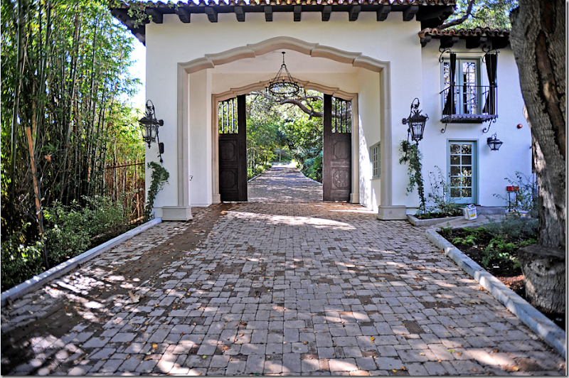
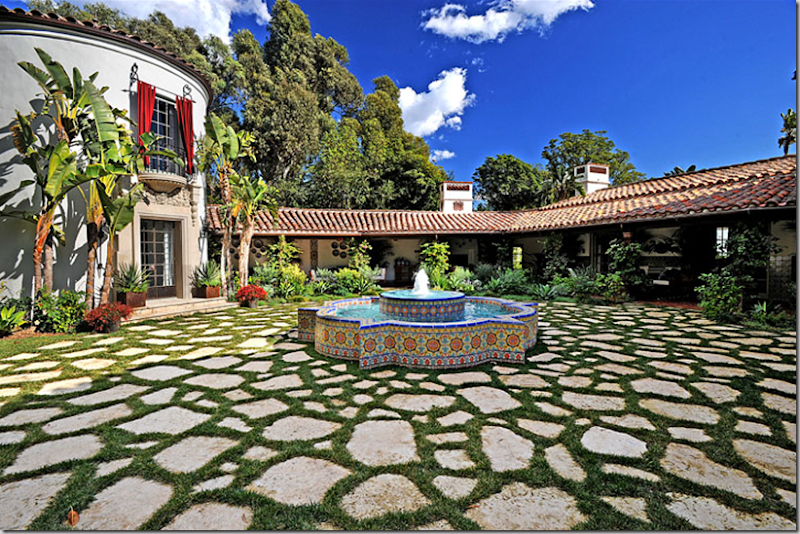
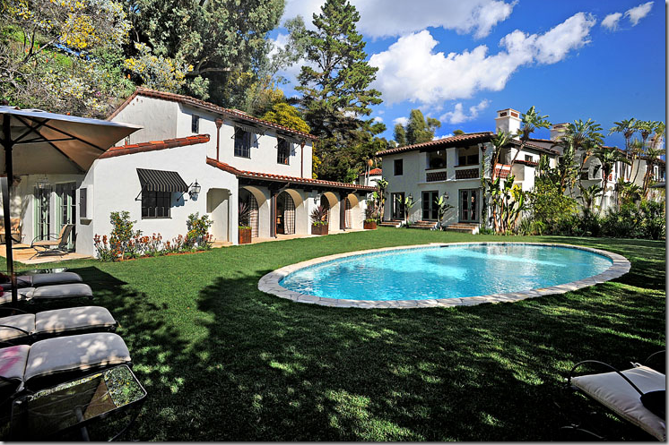
Down a long brick drive, through wooden doors and a gate house, you enter the property.
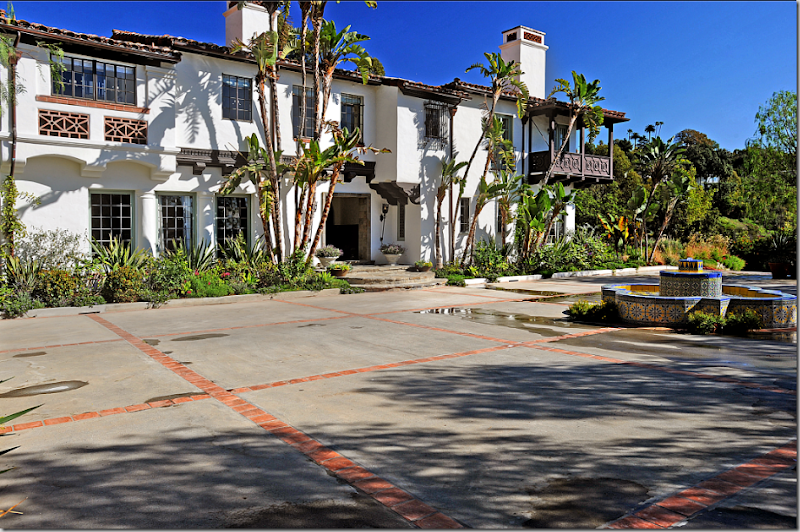
It is big, and it is old, very old. There are also two guest houses and an underground garage for 15 cars. The property is large – suffice it to say.
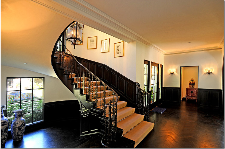
The walls are white, the floors are black herringbone wood, and notice that the doors are painted black too. The architecture is Mediterranean.
No one lives here. The house has been completely furnished so that potential owners might imagine how it would look to live here. It’s called “staging.” This is an example of mega-staging to the nth degree.
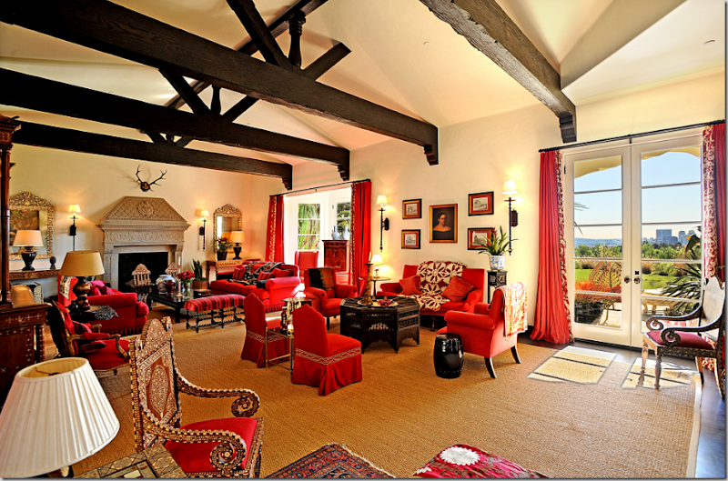
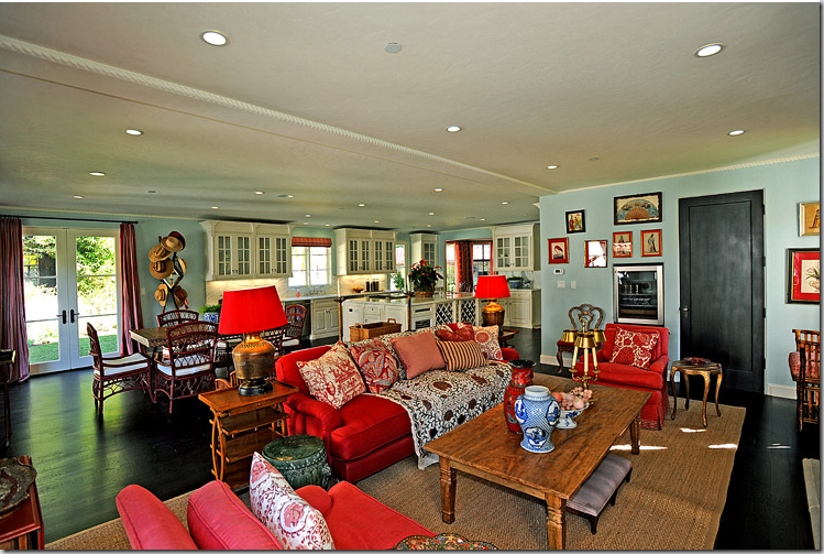
The main room is all red, really, really red! The carpet is a huge piece of seagrass, which shows how much color and texture seagrass actually adds to a room. The golden rug becomes the second major color here, after the red.
The living room is large enough for three separate seating groups. There are many Moroccan inspired accent pieces of furniture, along with English antiques. Suzanis cover the large sofas. Blue and white porcelains are accents. This room sets the color theme for the entire property. Almost every room has a touch of red, golden-beige, black and blue & white.
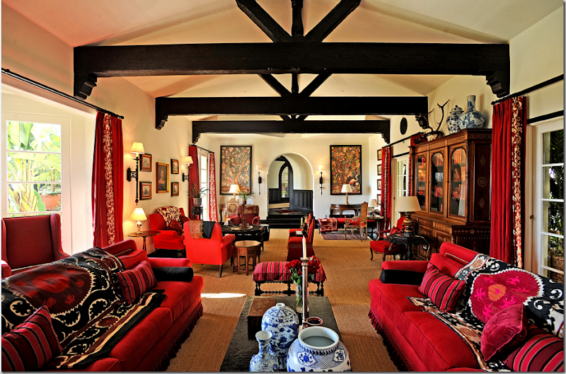
I think whether you like this room or not, will be highly personal. It has started to grow on me, actually. But I do feel that if some of the upholstery was covered in white, or the beige, it would have given the eye a place to rest. Right now, all the red makes it hard to appreciate the antiques and the subtleties in the room.
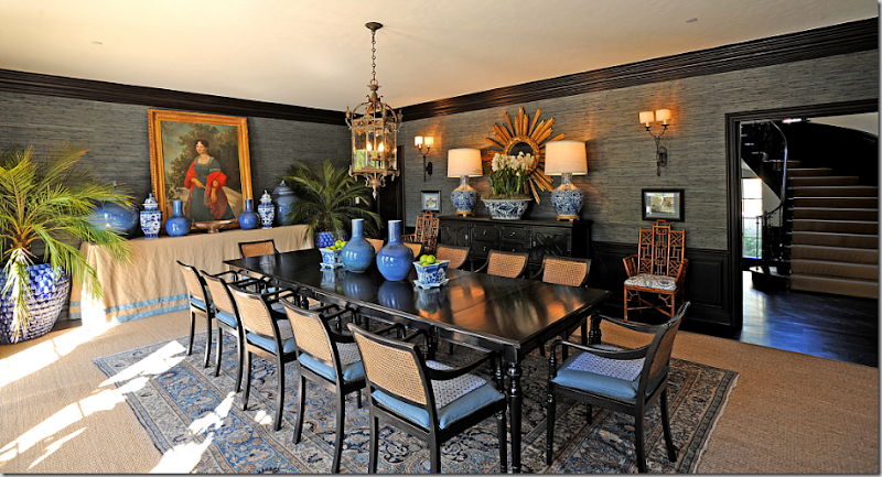
The dining room is a respite from all the red – done in blues with again, the seagrass and the chairs’ caning playing a major roll in the color scheme. Dyed grasscloth covers the walls. Notice the touch of red shows up in the painting! Perfection!
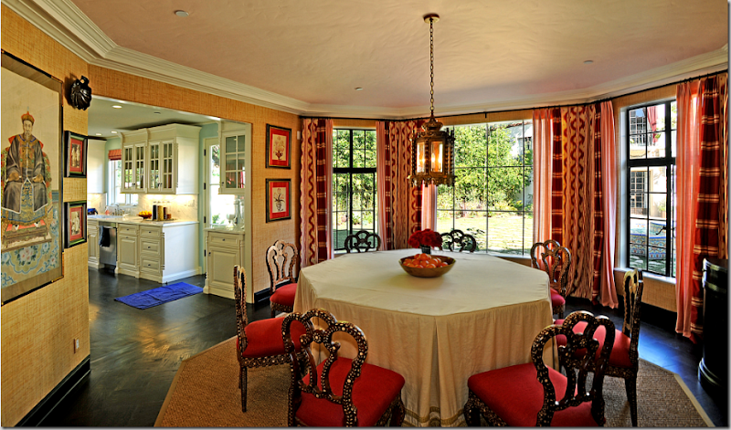
The breakfast room brings back the red and the mother-of-pearl furniture. Ikats and stripes make up the curtains. Again, the seagrass and the grasscloth tone down the bright reds. There are actually two breakfast rooms in the house.
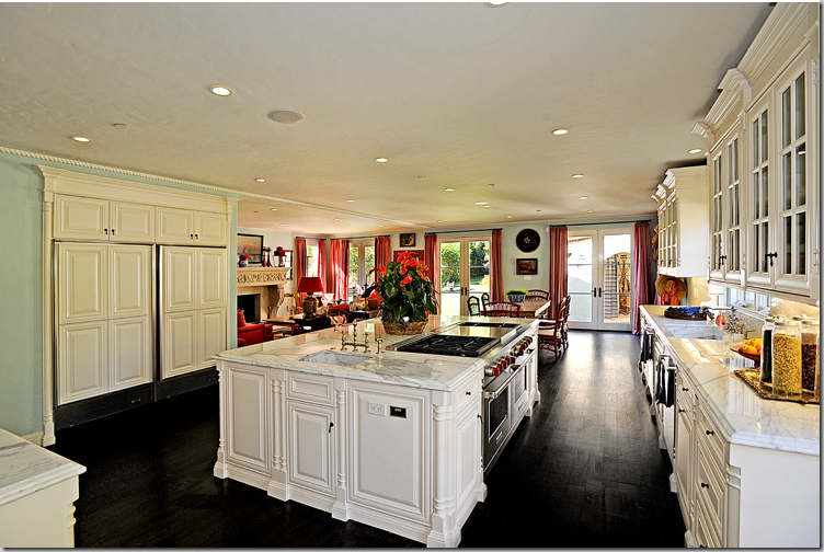
The adjoining kitchen is nice and white with marble and light blue walls. Again, everything is high contrast between white and black.
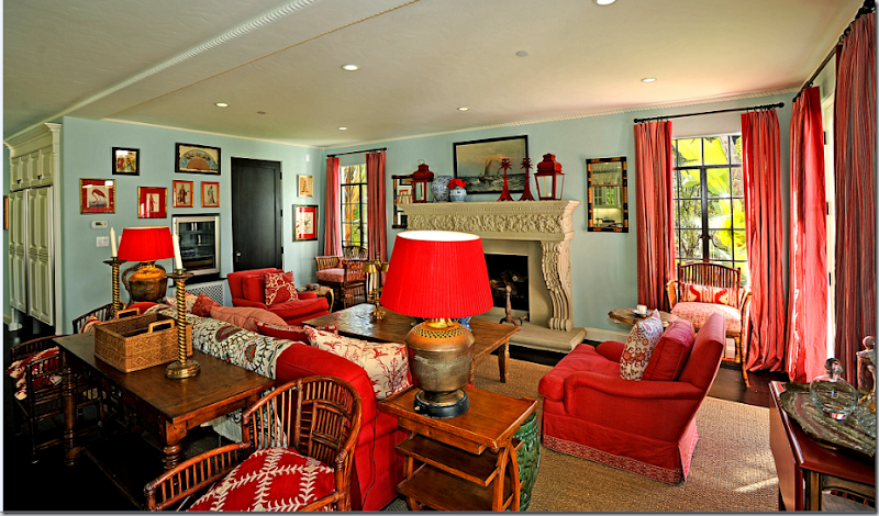
The family room is next to the second breakfast room. More suzanis – on the sofa and made into pillows.
The family room again – notice the blue walls, how warm they actually are, which is nice shade to mix with reds. My favorite item in the room? The red lanterns on the mantel! I love those!
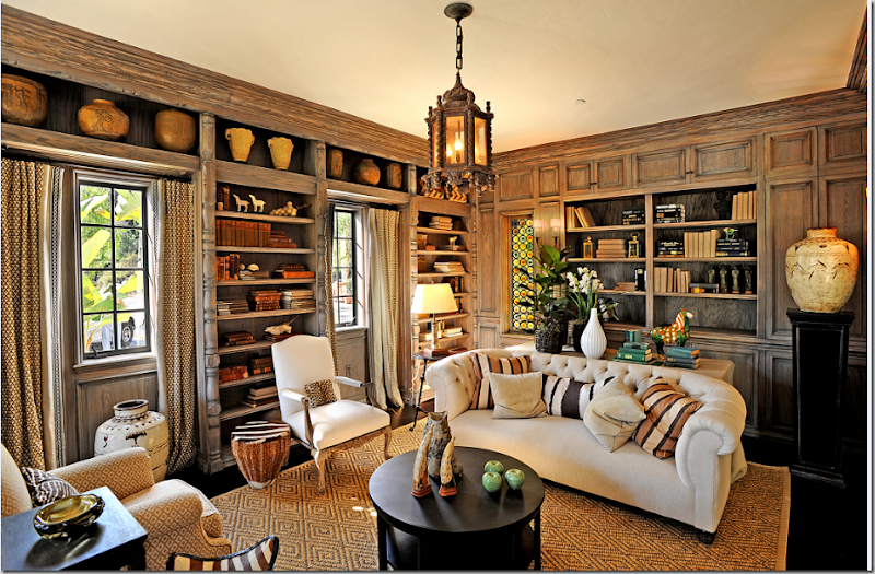
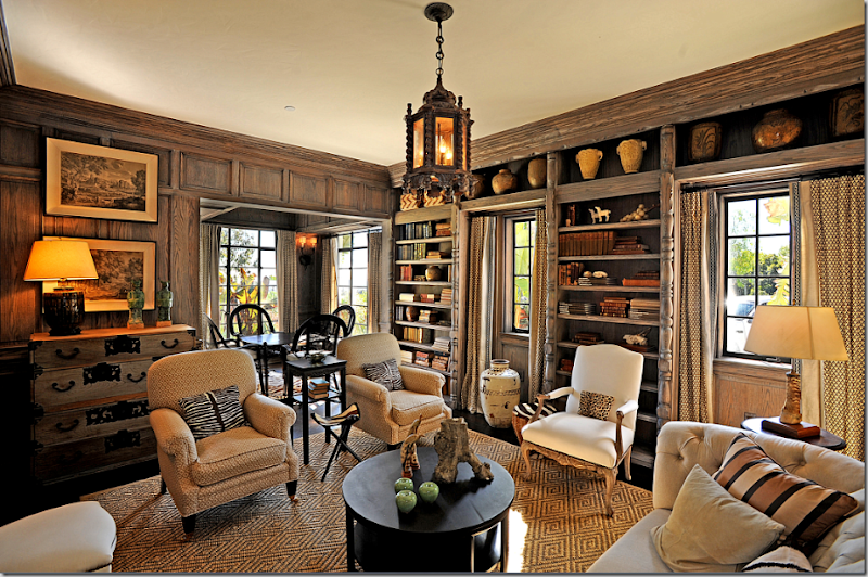
The library: Ahhhhh. You can relax now. Imagine if the big living area was done in these colors instead of the red, so much more restful! I love this room. The plain seagrass has been replaced by Starke’s diamond pattern in the library. I love the patterned curtains and the pillows. Beautiful!
Another view, showing the card playing area.
The upstairs family room is white, black and beige, again – with zebra and blue & white accents. The blue and white porcelains are a running them throughout the house. Symmetry symmetry.
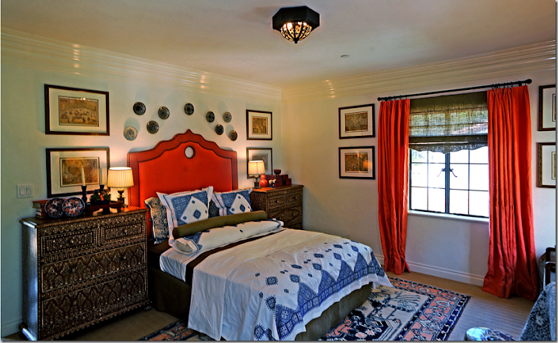
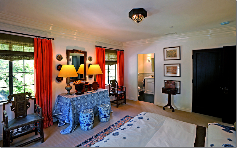
One of the bedrooms has red accents and a Moroccan theme with more of the mother-of-pearl furniture. This red is more of a persimmon shade than the truer red downstairs.
Indienne cloth covers a skirted table. Again, the rug provides the calming color against the high contrast of the red, black and white.
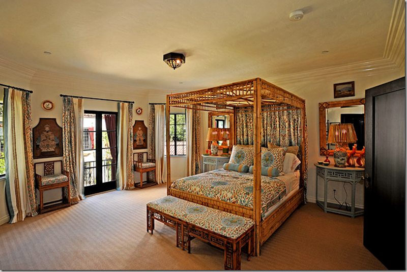
Another of the bedrooms with the light blues. Seeing a color theme yet?
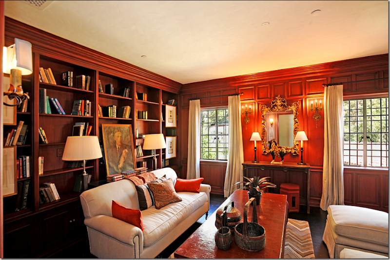
The upstairs library has the white upholstery again which pops against the dark floors and the wood paneling.
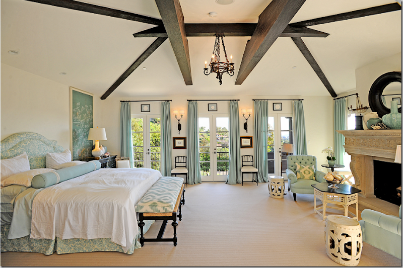
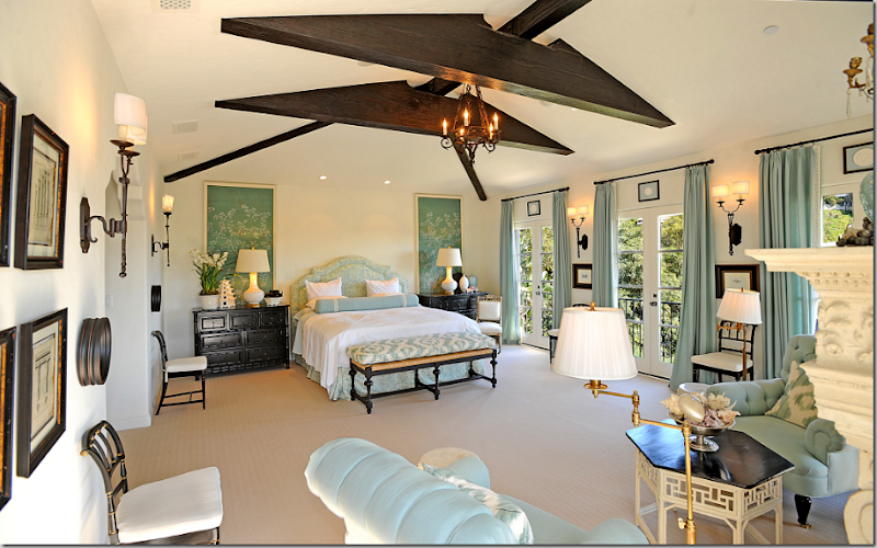
The master bedroom is the most calming room in the house. Warm blue, not quite an aqua, with beige carpet, and white and black accents. Notice the perfect symmetry on the window wall – the small frame above each French door, the sconces and chairs flanking the middle door.
I love the framed wallpaper panels that flank the bed and the touches of ikat fabric. I just love this bedroom! And – I think this is the first room with absolutely no red in it – yet it ties in with the rest of the house through the blues, white and black accents.
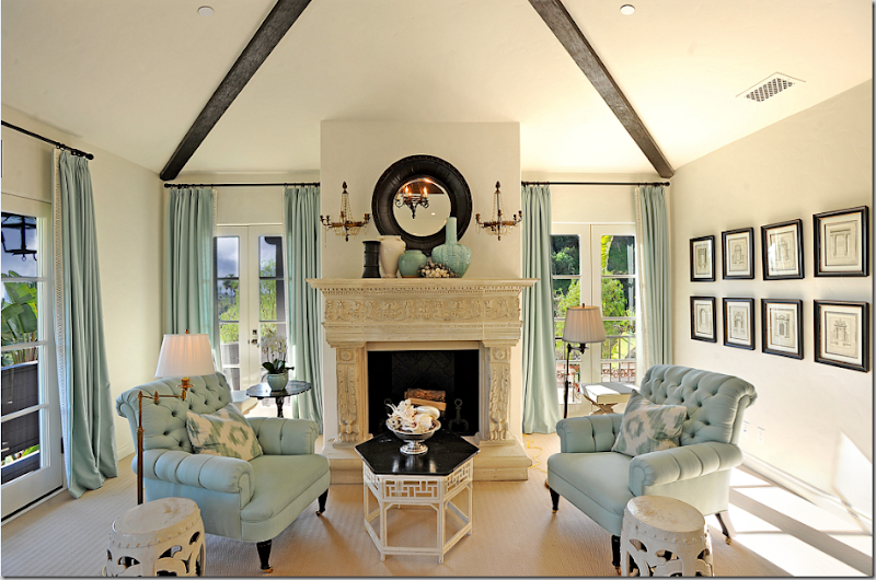
The tufted chairs with wheeled feet are wonderful. And the fireplace with a black framed mirror and crystal sconces add perfect symmetry.
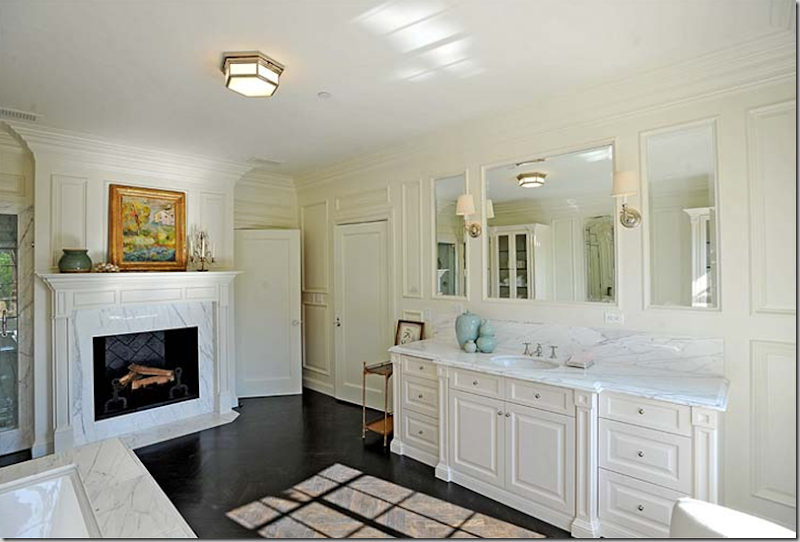
The woman’s master bathroom is all white marble and even has a fireplace!
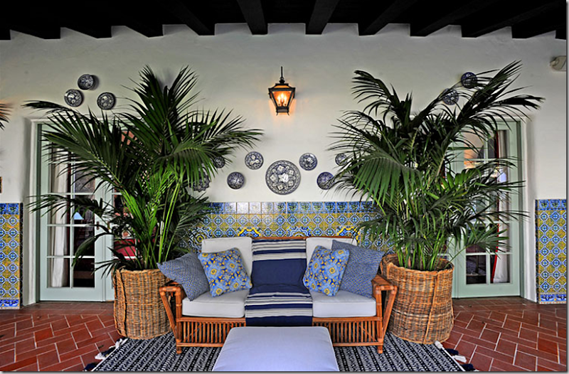
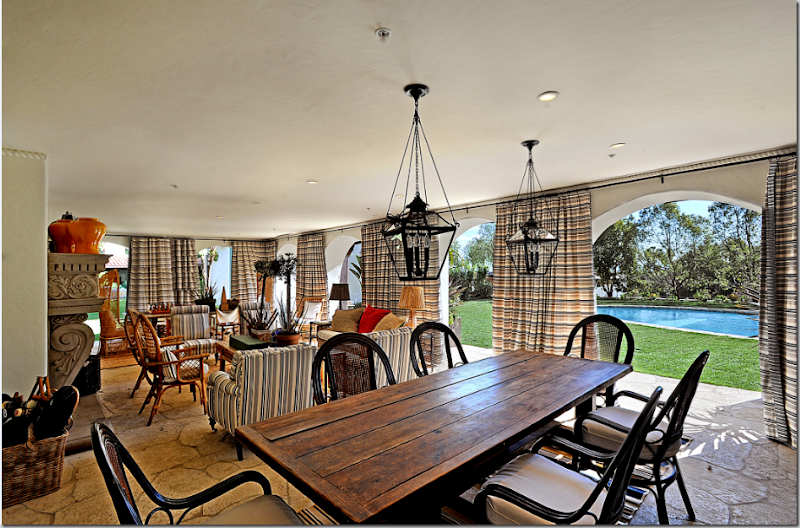
The open air loggia connects the main house with one of the guest houses. Notice how the outside window of the guest house is curtained in red! And notice the tiled fountain – it picks up the house’s color theme.
The entire loggia is decorated in blues and white with touches of yellow.
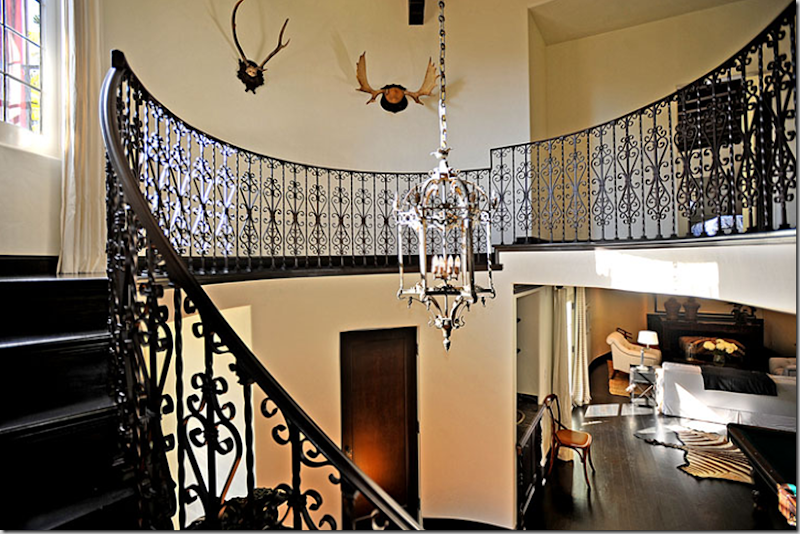
The main guest house has a rotunda where the staircase is located. Just as in the main house, it is decorated with black hardwoods and white stucco walls.
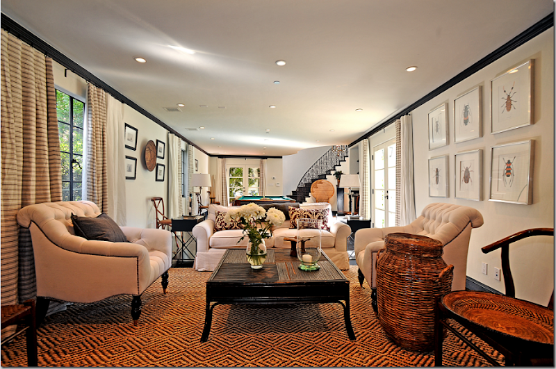
The main guest house contains a combination media and game room. The furnishings are white with black accents, the textured rug again adds the important color.
The second guest house acts as the pool house and has a gym and more guest bedrooms. There is another smaller pool outside the gym. And not to worry – there is a wine cellar and servant’s quarter.
And finally, the pool house is furnished in the same color scheme as the main house, black, white, red, and khaki. Love the two lanterns – love the curtains, love the room!
OK, now that you have seen the Suzani House – do you have any clue as to who the interior designer is? Any guesses? I would bet a million dollars on whom I think it is – that’s how sure I am. Would you?





Joni, you are such a tease. Do tell us who the designer is. BTW, my favorite room was the Master Bedroom...beautiful!
ReplyDeleteWow, wow! I don't know which photo I love the most:)
ReplyDeleteWow- that was an exercise- All that red made me uptight and then Ahhhhh relaxing neutrals and calming blues. Can't wait to hear the answer.
ReplyDeleteLoved that treat. Love the large photo's and your amazing comments. Thanks for inspiring us!
ReplyDeleteWhile I love red, this seems over done to me. But, it is my favorite color combo, the warm blue with the red and touches of warm wood tones. Gorgeous.
ReplyDeleteLove the pictures and your breakdown of them all. So very bold!But oh,so beautiful. Were you a teacher in a former life?Lovin' Joni.
ReplyDeleteBoy, all I can say is WOW! I could live there. Such a gorgeous home and property. There is so much to see and admire. Maybe I can steal a few of their ideas. Thanks for sharing. Hugs, Marty
ReplyDeleteI am NOT a red fan, so once I got to the blue bedroom I slowed down and enjoyed. Beautiful bedroom. I also really liked the guard gate and the 'main' guest house. Great tour!
ReplyDeleteWow, I could move right into the master bedroom! I'm not a red person at all, but I'm always interested to see how others use it. Thanks for sharing!
ReplyDeleteI can look past the red enough to say this is a gorgeous house, but I totally agree with your "de-redifying" suggestions for some of those rooms!
ReplyDeleteMy guess is Michael S. Smith???
ReplyDeleteMy guess is Katheryn Ireland. I didn't peek at the other comments so I wouldn't be jaded...now I need to look.
ReplyDeleteLove the family room/breakfast room/kitchen area... has a real Lynn von Kersting vibe to it except there's not enough stuff hanging from the ceiling. I'm definitely a fan of red but I'd switch out those big red lampshades for something more neutral and lose the suzani on the sofa and instead upholster it with a red print rather than solid. Everything else in this area is perfect. The blue dining room and master bedroom are pretty fantastic too. Says Michael S. Smith to me. Where is this house and what's it on the market for? Can't even imagine.
ReplyDeleteSo much for "staging" in neutral colors so it appeals to more of the public! Loved that master bedroom! laurie
ReplyDeleteYoooooo .... what a home. I'm overwhelmed with beauty. Hmmmm ... red and beige ... quite a stunning combination of colors. The family room and kitchen are both beautiful. And the library is to die for. Also, the master suite was stunning.
ReplyDeleteI don't think I'll ante up a million dollar bet on who the designer is. It could be Michael Smith; however, there is another male designer that loves red but I can't recall his name right now.
My thanks goes to Artie and Joni for allowing us bloggers to see this home.
Martin Lawrence Bullard!
ReplyDeleteI too thought Martyn Lawrence Bullard, but I can't find these shots from his website. Still - looks very Martyn! So glad you posted these Joni, and thanks for the shout out.
ReplyDeleteLove the Loggia, the upstairs family room, the master. Just too much red, and I love red!
ReplyDeleteMy favorite room is the master bedroom. My guess is Kathryn Ireland. I would love to know the location.
ReplyDeleteMarion
weeeeeee what a ride!
ReplyDeleteamazing that no one lives here!
my guess (and i wouldn't bet a dime because you are so much smarter ha ha) is lynn von kersting.
xo xo
I could live in the guest house even.lol Gorgeous house even if it was not decorated. Love the staircase. mishelle
ReplyDeleteI'll guess Von Kersting, too.
ReplyDeleteI love the guest house and the pool area. Gives me some ideas. I think there is too much red in the LR. But, as you said...there are some gorgeous pieces in there.
I REALLY love how big the pictures are. It helps to really see everything.
Thanks for the great post!
Wow! I love the kitchen and blue bedroom; the blues are gorgeous.
ReplyDeleteGreat post, Joni!!
The red and blue combo has me thinking - Mary McDonald. I also saw an interview with her where she said she always finds a room to use that soft blue color...
ReplyDeleteThanks for the comments and all the lovely pictures. I like red but in small doses. Red should be the lipstick of a room. I am guessing Mary Mcdonald.
ReplyDeleteThanks,
Dabney
What a fabulous home! The staging is unbelievably elaborate. And such a strong statement, too! Ordinarily, I love red. But, that much red is overwhelming, even to me.
ReplyDeleteThanks for pointing out the details that us lesser mortals would have missed. It made the photos so much more interesting.
Don't know which room I enjoyed most! The great room was spectacular even though a little red goes a long way for me.Thanks so much for sharing with us!
ReplyDeleteToo, too much red!!! Not too fond of the decorating. It all seems to be overdone. Wonder how long it will be until they find a buyer for this one. The designer needs to be briefed on what appeals to most buyers.
ReplyDeleteKiller! Think the upstairs family room is my fave, but oh...I GUESS I could live in the guest house..hmmm...
ReplyDeleteCould only take a quick peek, but will definitely be back to S.T.U.D.Y.
Great post, as always!
Now that's what I call "staging"! M. Smith maybe.
ReplyDeleteI vote for Martyn Lawrence-Bullard... In Annie Kelly's book Rooms to Inspire there are photos of his own place that look strikingly similar.
ReplyDeleteI feel like it could be Kathryn Ireland. I think some things are done beautifully, but some are just too much. Too many accesories, artwork. My eyes cannot rest looking at some of these rooms.
ReplyDeleteAbsolutely beautiful rooms!The master bedroom is perfect. This house seems to have come together over a life time...love the distressed wood table, mix of upholstery pieces and cane chairs...great job whoever did it.
ReplyDeleteGreat touches...you'd never get board here...Yeah, I agree the red room needs to give the eye someplace to rest, but the quality of the pieces is excellent ...Love this house... Fay
Joni,
ReplyDeleteI never seen such an elaborately staged house. And I truly enjoyed going through each picture.
The black floors and trim--wow--all that seagrass in the house was needed to give it some relief (and don't you see EVERYTHING with floors that dark) everyone I know that has super dark brown floors HATES THEM for that reason!
Also I thought it was interesting that all the drapery treatments were long--touching the floor, I'm starting to think that's the look I prefer.
I have no idea who the designer is though - will you post that?
Loved this post as always, it did require a coffee which I truly enjoyed while reading your post!
xo
Maria
I am going to guess Mary McDonald!! It was beautiful home--thanks for sharing --I always check your blog first thing in the morning as I drink my coffee before my children awake as a special treat...
ReplyDeleteI loved the outside shots and especially the outside curtains on the second floor! Really ties the outside to the inside!
ReplyDeleteI will love to see who the designer is!
~Learning more and more from you every week!
.............The Rhinestone Contessa
Beautiful home, but I can't believe with all the attention to detail, no one bothered to iron the bedding. The white bedding, with blue detail is very wrinkled, sorry to be so picky, but it really stood out.
ReplyDeleteToo much red for me, but I loved the master bedroom and the first guest house.
ReplyDeleteI adore those dark wood floors!
ReplyDeleteIt looks to me to be the work of Mary McDonald as well. I saw her stage the old Buster Keaton Estate in a similar way. It is crisp fesh and simple. Very livable but I agree with Joni, the red room would be more livable with white or neutral upholstery. It could be Michael S. Smith but it is a little too crisp. Or are we all being fooled. Maybe Barclas Buttera. The guest house and the library are PERFECT.
ReplyDeleteI say Martyn Lawrence Bullard or an acolyte of his.
ReplyDeleteI don't know who the designer is, but I love that master bedroom too. And the cabinetry in the bathroom and kitchen makes me wonder what the toe-kick fuss is all about. :-)
ReplyDeleteMy favorite is the master bedroom and I think that is a celadon, isn't it? My favorite color....this gives me inspiration for my bedroom which I am about to redo! Thanks, Joni!
ReplyDeleteI agree. A bit of beige or white on a few sofas would bring 'rest' to the eyes in wonderful space. Fantastic post!
ReplyDeleteI don't know enough about design to guess who the desginer might be. That was way too much red for me and I love red! It seems that if they were styling the house for sale they would have used a more nuetral color scheme. But it is beautiful!
ReplyDeleteIt has a lot of Lyn von Kersting style, but not enough different colors to be her, I think. Too much red, in my opinion, but well done. Wish I could get that kind of staging job!!
ReplyDeleteThere are so many Michael Smith signatures in this house--the most obvious of which Joni has cunningly (mis?)directed us to with the title of the post--Suzanis! There are the sisals, the Asian art, the pottery vignettes, the little Moroccan tables. Even the breakfast room looks like an attempt to copy his own breakfast room, from the latern over the table down to the octagonal shape! But the house is missing some Michael Smith things too, like modern art, more of a mix of antique and contemporary furniture, and my favorite--pots of Boston ferns on table tops! The rooms just don't seem eclectic enough. And I don't remember seeing Michael Smith use Suzanis as this designer has. When I first looked at this house I thought it had been done someone who admires Michael Smith, but not by the great one himself. Will I have to eat my words??
ReplyDeleteRed is my favorite color, but that living room had too much even for me!
Joni, I love your blog! Have been lurking for some time now, but I couldn't resist this post. Yours is truly the best of the decor blogs!
Beautiful home - way too much red for me but elegantly done, all the same. Not gonna try on the designer - just gonna enjoy the pics, especially the blue master bedroom and lady bathroom. Thanks to you both for sharing!
ReplyDeleteMichael S. Smith I'd guess. Moroccan influences, layered rugs, paneled drapes on curtain rods and plenty of accessories are his style.
ReplyDeleteI find it all too matchy-matchy and the two lost antlers on the staircase wall are just odd.
I love your blog and this one is especially great. What a treat to have so many photos to look at and to see how the designer came up with new chapters for each room in the story he/she was trying to tell. I may not have loved every room but I am so impressed by the creativity that went into this house. Wow!!
ReplyDeleteWow! Thanks for inviting us to see this gorgeous estate! My favorite style! I just had to blog about it, sending bloggers your way to see more! love your blog! Its on my fav list!
ReplyDeleteMichelle
This home is beautiful.
ReplyDeleteTo be able to stage such a large home is quite a feat!
I am so bad at guessing who the designer is. Other than you, I can't think of anyone up for the task!
xo
Brooke
Wow, that's quite a house!!!
ReplyDeleteMaybe I'm weird, but the two pictures that stand out the most to me are the ones that show views through the arched doorways. I especially like one looking from the living room through the doorway with the halves of two other doorways in the sight lines.
I really like the pool house -- LOVE the big wood table :-)
I don't have a clue who the designer is, so I won't even make a guess. Looking forward to reading the answer!!
Kelly @ DesignTies
Love the library & the turquoise colors in the master. A great home.
ReplyDeleteLeslie
lamaisonfou blog
Hey Joni...thanks for visiting my blog and noticing the new layout. I'm excited about it and yes, that's the view from my house. We have terrific sunsets.
ReplyDeleteI'm thinking MLB or maybe Michelle N :)
ReplyDeleteIt could be Michelle Nussbaumer, a Texan. Didn't think of her.
ReplyDeleteThese are great pictures, but I am not surprised. I recently featured your blog in my own -- http://pearlinparis.vox.com/library/post/dfw-blogging.html --
ReplyDeletein a roundup of Dallas/Texas culture sites I visit regularly. Thanks for the inspiration and the grat pictures!
I was not familiar with Martyn Lawrence-Bullard, I checked him out and I have to change my mind it is not Mary Mcdonald, she uses more white with red. It is M.L-B., the give away is the use of red for curtains and the susanis on couches. I like his style but I like Mary's better.
ReplyDeleteThanks,
Dabney
Thank you so much for sharing this post.
ReplyDeleteYou never disappoint. Just gorgeous and thanks so much for sharing .
ReplyDeleteArtie is adorable, sweet & thoughtful too.
ReplyDeletethat library is yummy, yummy.
the finish on the build-in bookcases is my favorite finish color of all time.
xx
I'm crazy about that cute Artie! He's a doll!
ReplyDeleteAnd Joni, I think I like the library and the master bedroom best. Love the blue in the master, and the fabric on that bench.
XO,
Sheila :-)
wowza! these are amazing... definitely agree w/ other posts about the red... but it just kept getting better and better... i'd live in the courtyard w/ the fountain :) absolutely gorgeous - thanks for sharing!
ReplyDeleteI think red is a neutral, but even I say Whoooa! I think it is being staged for people from the middle east. Maybe they still have money.
ReplyDeleteI had been thinking Martyn Lawrence-Bullard, but what about Alessandra Branca? She loves red and black.
ReplyDeleteI guess Michael S. Smith also....for a house that is staged with this much detail I just think he would be one that would put this much thought and effort into it. But after seeing the other guesses...I am torn.
ReplyDeleteMy first thought about this house was OMG...this is STAGING?!?!?
Thanks Joni...it is just beautiful!!
That was a magnificent tour. While I didn't love every room, probably because of colors, there were always details that inspired me. My favorite is the black framed pictures over the windows with the drapes going all of the way to the ceiling. It makes that otherwise blank space an important part of the design.
ReplyDeleteunbelieveable! love love the herringbone floors. need some of those in my life, I think.
ReplyDeletecan't wait to find out who is responsible for this!
Throwing out another name....Peter Dunham. Still thinking Mary McDonald though.
ReplyDeleteThat bathroom is the stuff of my dreams.
ReplyDeleteThe library and the kitchen we could lay down and die in!
ReplyDeleteHave a wonderful weekend Joni. :)
Joy and Janet
This home is so beautifully styled! I think styling talent is something you are born with and it cannot be taught! I am so envious! And I would crawl on my hands and knees over broken glass and burning coals for that sunburst mirror on the wall in the formal dining room! Mad LOVE!!!
ReplyDeleteVickie
I'm surprised EVERY suggestion has been for west coast (or Texas or Chicago) based designers. Isn't it in the realm of possibility that a New York/east coast based designer claims this work? I do love so much about this home but have to say the Moroccan bedroom throws me off, especially the too small, mismatched rug. Please don't hold us in suspense much longer!
ReplyDeleteOh these are wonderful pictures! You have to just love Artie.
ReplyDeleteI am suprised that the stagers selected such a strong color as the tomato red. In color psychology you want to stay away from tons of red when selling a home as it makes people feel anxious and wanting to move from the room quicker. (Hello~McDonald's?) I agree that a much more soothing palette would have done wonders for the main room. The bedroom really was delicious.
I would gladly move out of my house to have someone come stage like that for me! Incredible!!!
ReplyDeleteSeems I'm in the minority. Hate it. This house has no restraint, no peace, no humor. (Unlike most of your wonderful postings.) There's too much going on; everything is supersized and loud. Definitely not Lynn von Kersting, who mixes whimsy, warmth and charm. Don't see those qualities in this house. Instead, this house screams nouveau riche and reminds me of a souped-up Frongate house. Could be a conscious sales strategy, I suppose.
ReplyDeleteummm.....wow.......thats the most amazing house! Thats some staging though...wow again. I love that staircase -LOVE IT - especially the little window under it! And the family room with turquoise walls and red accents is the most chic room in the house!
ReplyDeleteLove the name of your proposed autobiography titles. Very funny.
ReplyDeleteAnd here I thought excess was out of style.
ReplyDeleteWell, whoever, the designer is, I can't stand it.
While I don't like everything about this house, I think the master bedroom is exquisite. And I love the brick driveway and gate house.
ReplyDeleteThanks for sharing! I always enjoy your pictures and commentary.
I love the gorgegous black and white on the walls.
ReplyDeleteFar too much 'read' in some of the rooms for my personal liking however I will happily settle for ANY of the others.
ReplyDeleteWith sincere appreciation for the tour Joni! -Brenda-
Ooops, shud have read..... 'RED'. LOL
ReplyDeleteSo, who is it??
ReplyDeleteI love the lady's bath with fireplace. Mmmmmmm. I'll take one, please.
You know, I never looked at details so closely before I started reading your blog. So, thanks!!
Is this Buster Keaton's Beverly Hills "Italian Villa?"
ReplyDeleteIt is certainly similar in architectural style, isn't it? I know that the staging of the Buster Keaton Estate was done by Mary Mcdonald. I think she is the designer who staged this house as well. The style is so similar! I guess we'll have to wait to see.
ReplyDeleteTalk about dragging something out....
ReplyDeleteGod, I forgot to say for sure who it was!!!! Mary McDonald.
ReplyDeletesorry about that. forgive moi.
Hey! Nice topic, but will this really work?
ReplyDeleteAmiable post and this mail helped me alot in my college assignement. Say thank you you seeking your information.
ReplyDelete