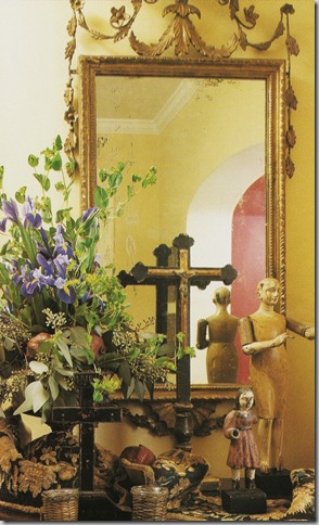
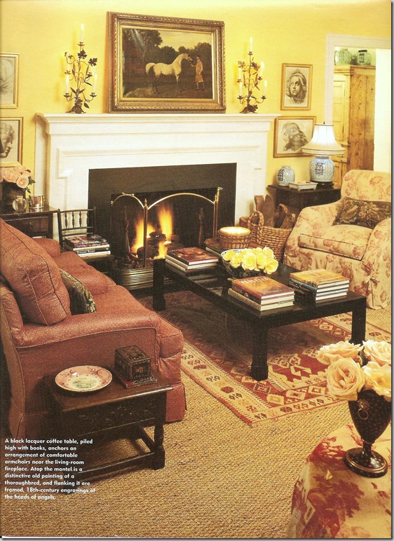
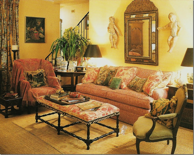
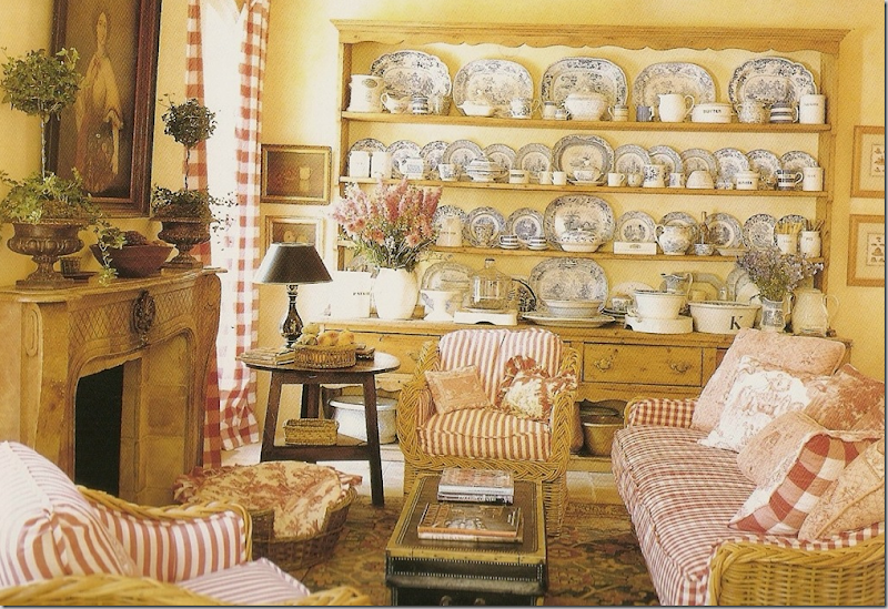
For year Glasser and her husband lived in this one perfect house – small by River Oaks’s standards where the neighbors might just be on the International Best Dressed list. But it is the size that made the house so perfect. Each room was cozy, designed for human proportions – no vast master suite with acres of wall to wall carpeting and empty spaces to fill up with tacky furniture. The house was built in the 30s, and though its facade is Georgian, it possessed a few elements that set it apart and attracted Glasser to it in the first place: one was the staircase with its iron railing that slightly wound around the back of the living room. The house was not ostentatious, and anyone who knows Carol’s style would know she would never live like that. She likes a house to be well lived in, each room is to be enjoyed, comfortable, inviting, and with layers of collections acquired over a lifetime scattered about. She likes muted, patinaed surfaces, rubbed leathers and slightly peeling paints. But make no mistake, there is no Shabby Chic here at all. There is nothing trendy about Glasser, instead everything is classic. In fact, the ghost of Nancy Lancaster looms around each corner: for years the walls of the living room were Nancy’s fabulous shade of butta yellow. And yes, Glasser credits her youthful travels to England and her first exposure to Lancaster and Colefax and Fowler as a major influence. Later travels to France and India influenced her too and in different ways. She loves color – though the precise shades have evolved through the years – a love of red softened into apricot, blues turned into teals, yellows mellowed into a cream. And her penchant for dark wo0d furniture and pine is now tempered with a love of muted gray, painted finishes.
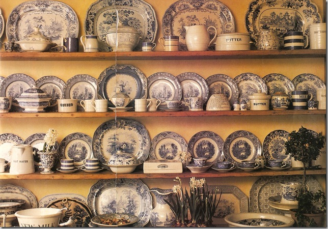
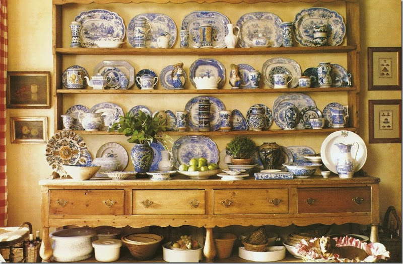
I look around my house and see Glasser’s influence in so many things, like blue and white transferware. Carol’s huge, 10 ft long Welsh dresser with her famous collection of the blue and white plates sparked my own collection, along with my sister’s, and probably half the women in Houston. And there is the seagrass rugs and the wall-to-wall seagrass, decades ago before anyone in Houston even heard of it. There is Bennison, that beautiful, hand-blocked linen, muted with the look of tobacco stains – her entire bedroom was covered in Bennison’s Roses and it remains one of my favorite fabrics to this day. There are so many things that Glasser had before anyone else here did; things that are still fresh today, though she has decorated this way for over twenty-five years now. She loved antique paisley – fabrics and throws - and her pillows were made of scraps of the finest Flemish tapestries, always. Her kitchen had ironstone that said “Butter” and “Real Butter” – before it became so popular it was mass produced. Her collection of putti rivaled the pope’s, along with the gilt candlesticks from Italy and the chandeliers that were never electrified. Her living room had a blue and white striped dhurri rug – eons before Something’s Gotta Give was released. Her dining room became a warm, red library and antique rattan replaced stuffy chairs. There were slipcovers on soft, cushy, George Smith furniture with English saddle arms and authentic proportions. Do you need more proof of her chicness? Each room had a hint of black lacquer or chinoiserie somewhere. Kenneth Turner wicker basket candles were massed everywhere. When art was too expensive, she bought antique mirrors, along with tortoiseshell boxes and crystal match strikers, and Santos, and delft, and down – everywhere there was soft, down comfort. Her perfect house was inviting: the kitchen was added on to create a sitting room with imported terra cotta tiles from Provence and beams for the ceiling. Her keywords are: cozy and warm and comfort and romance – flowers were everywhere and masses of fruit were piled high in French confit bowls – before they, too, were trendy, of course. She decanted before decanting was hip.

The beautiful Carol Glasser, in her Perfect House’s bedroom – wrapped in her paisley and surrounded by Bennison and bamboo. 1993.
The perfect house was published in the eagerly awaited, first issue of Mary Emmerling’s now defunct magazine. I still have that copy, worn and used. A year after that, the house was in a Houston magazine. And then in Veranda two or three times. Another house, one that she and Emmerling collaborated on and lived in together for a short while in Santa Fe was treated to an entire book about the process, written, of course, by Mary. Each time it was published, the house had changed, been tweeked a little, sometimes a lot. And each new viewing of her house was studied for the details: what was different, what was gone, what was new? Sometimes a real treat arrived in the mail when a client’s house was published! A friend of mine’s house was done by Carol three times, and twice it made the cover of a national magazine. Another house she did in Memorial – a gorgeous home – was immortalized to great acclaim. But, mostly her clients prefer their anonymity and what a shame it is not to be able to see the beauty! There’s no web site, no google hits, it’s all elusive and that’s part of the mystique of Carol Glasser.
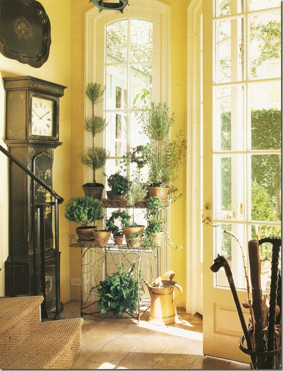
Her back yard, an antique plant stand filled with romantic roses.
After over 15 years in the perfect house, Glasser began to change it and drastically. All the reds in the living room were gone, replaced by peaches and creams; the yellow walls were plastered ivory with a hint of apricot. The new decor was featured in two books: Emmerling’s Romantic Country and Peter Vitale’s The Divine Home. Each book had a few pictures of the new peach interiors – but not enough for this fanatic! It was torture not to be able to see more of the new direction Glasser had taken her house in, after having followed it for so long. And so, that was the end of the Perfect House. Soon after the remodeling, the house was sold, and she moved on, to a much needed (her family had grown) somewhat larger house, on a secluded cul-de-sac which I’ve stalked too many times to count. What does it look like – her new house? I know there are painted white Louis XVI style dining chairs with seafoam, Chelsea Edition check fabric. You can see those in the front window. I know, I know - arrest me! My sister-in-law attended a function at the Glasser’s new home a few months ago and called me as she left, raving and oohing & ahhing, knowing all the while she was torturing me. I’m sure the big reveal of her new interiors will be coming out soon in Southern Accents (Karen, please hurry already!) or Veranda or House Beautiful. Hopefully. I need a new Carol fix, and soon!!!!
A portion of the famous Glasser blue and white transferware collection.
The perfect house is gone – sold, gutted, and redesigned by a new lucky owner. And yet, there it was one day, for sale again. The pictures of the new owner’s interpretation of the Perfect House were on HAR for one final look. And what a shock! What a surprise! If you hadn’t studied the house intently for two decades, you would never have recognized it was the Perfect House. But, it was. Still beautiful, still perfect, just different – oh SO different. So enjoy!!!!
Evolution of the living room:
1994: The dhurri has been replaced by seagrass and a smaller area rug. The mirror becomes a painting. But everything else remains the same.
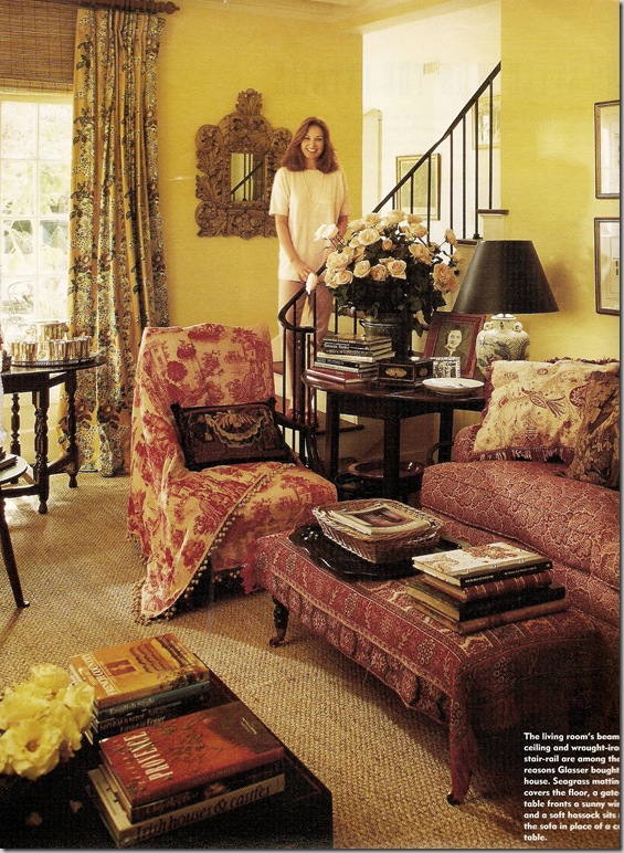
1994: The other side of the living room: a large piece of an antique toile remnant covers the chair, the pillows are antique tapestries. Notice the curtain treatment – taken to the ceiling, with shades – perfection! The charming, winding stairway was a selling point for Glasser.
The gateleg table in front of the window – filled with delft, santos, and candlesticks.
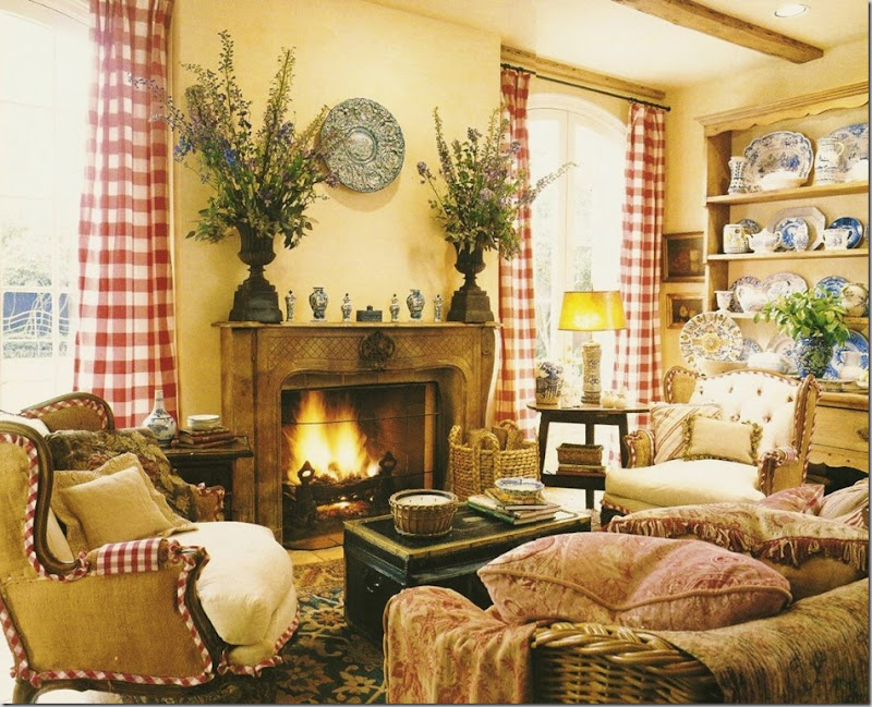
2000 in Veranda: A main change this time is the toile textile was upholstered into a new coffee table. Additional pillows were made from the remaining pieces. Putti and mirrors appear behind the sofa. Chairs are switched out. A new, antique oushak is added to this vignette.
In the back yard, a small entry way leads to the staircase, carpeted in seagrass. Black chinoiserie tall clock, tole tray, and antique wire plant stand add to the romance which abounds everywhere – even in the back doorway!!!
The Dining Room/Library:
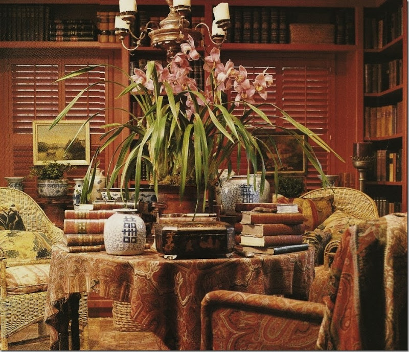
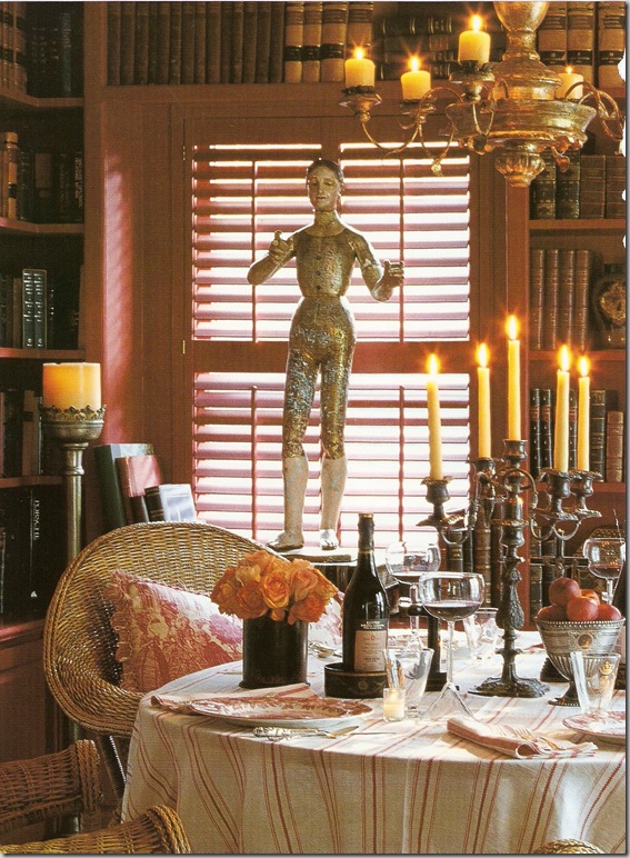
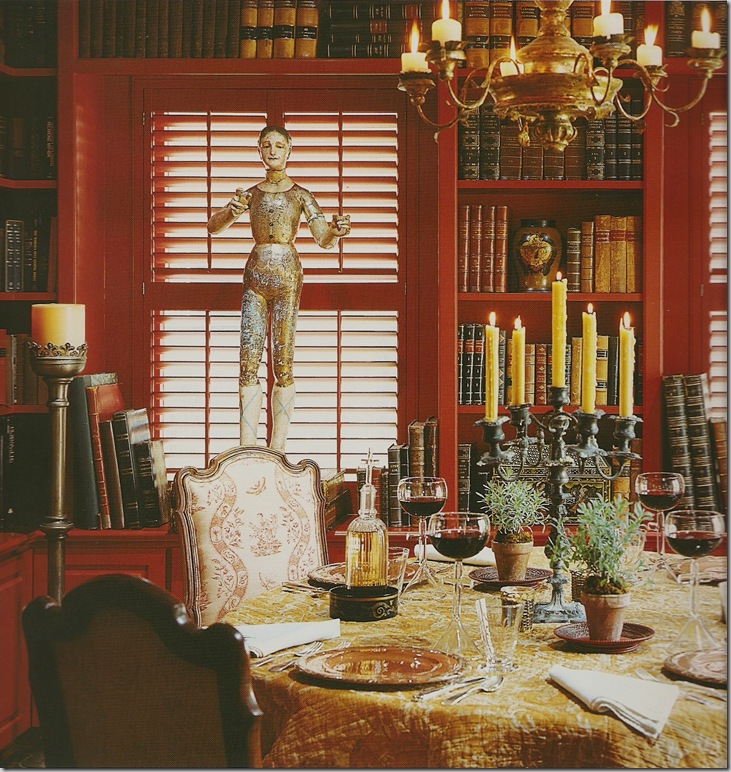
Through the years, the dining room remains about the same – only styled differently for shoots. Basically a library, painted red, with shutters. The main gateleg table is always piled high with flowers, books and porcelains. Here the wicker chairs with their antique tapestry pillows share the space with red paisleys and a chair upholstered in the paisley fabric.
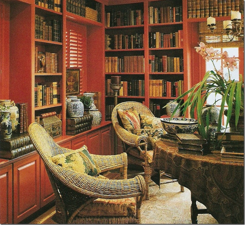
Another shot of the library, showing the left side of the room – a mirror image. Here you can see the thread bare, worn Oushak – aged to perfection!
The Family Room/Breakfast/Kitchen:
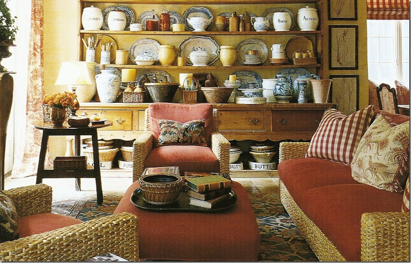
An early version of the family room which adjoins the kitchen and breakfast room. The furniture is all toiles and check. But the showstopper is the 10 ft long pine Welsh dresser filled with a gorgeous collection of blue and white transferware mixed in with white ironstone. This collection was an inspiration for many who saw it – me included!
A close up of the antique pine dresser, styled differently. Throughout the years and the shoots, the arrangement slightly changed. It was never only blue and white transferware again, as in the previous picture. Notice the little dog in her upholstered basket bed.
For the 2000 Veranda shoot, Glasser made a lot of styling changes (which caused a lot of discussion among readers!) French chairs with muslin and tacked on trim were used for the shoot only. As were the urns and the mantel change. When the magazine came out, I remember not liking these chairs, but over the years – I’ve come to completely change my opinion and think they are just darling!!!
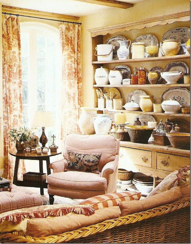
And still even later – the check drapes were changed to toile. The dresser has even less blue and white transferware remaining. Should I get rid of mine too????
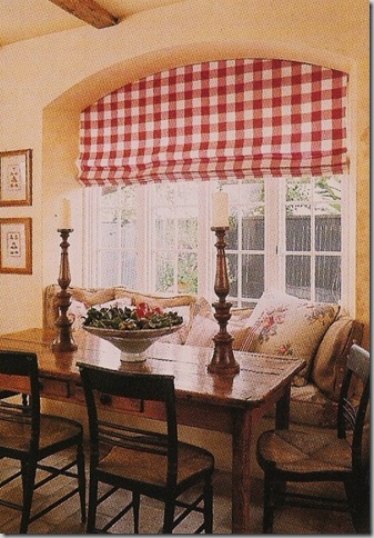
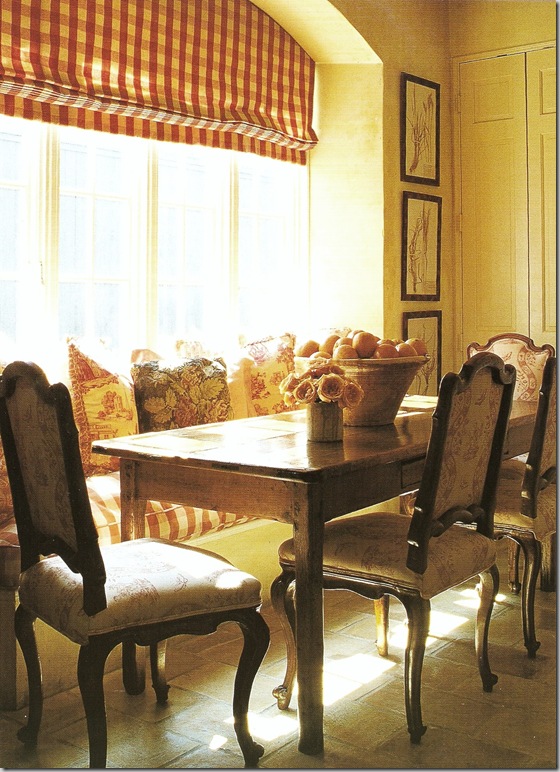
The breakfast room with its Colefax and Fowler chintz pillows on the window seat and check fabric slipcovers on the Hitchcock chairs. The arched window follows the arches found throughout the house.
The breakfast room without the slipcovers.
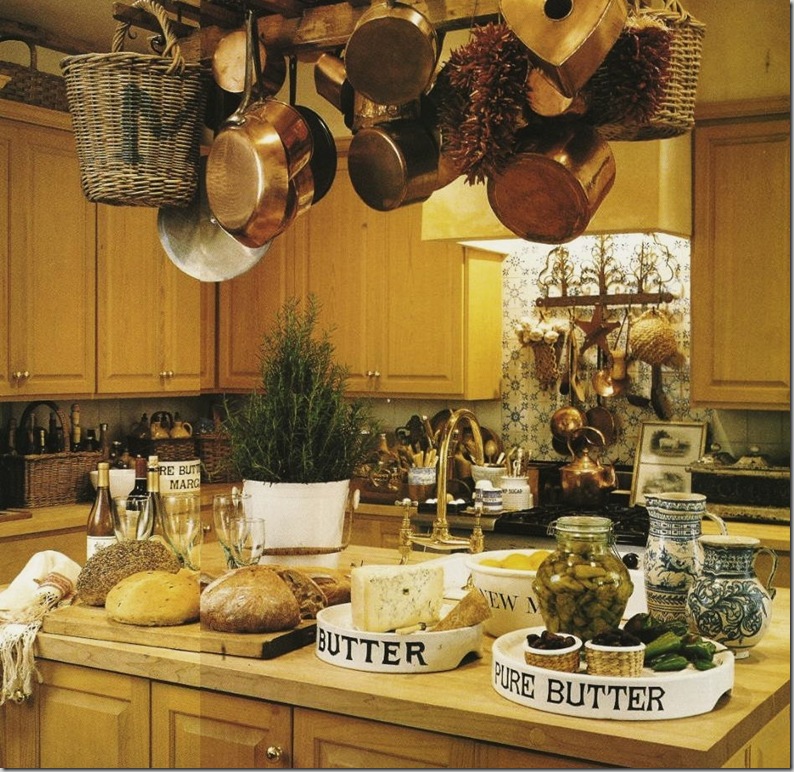
The kitchen, adjacent to the breakfast area and sitting area, is always styled with copper pots, white ironstone, wicker baskets and faience.
The Master Bedroom:
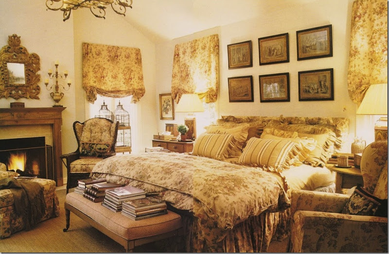
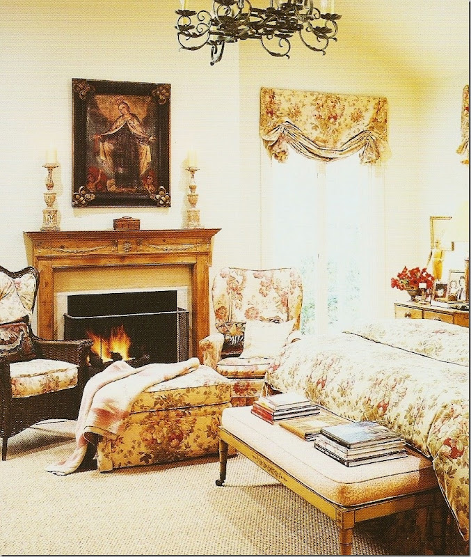
The bedroom is a vision in Bennison’s Roses. Glasser kept the room much the same throughout her years here. Why mess with perfection? Only the bench and the side chair on the right aren’t covered in Roses. This room is pure Glasser – warm, comfortable, inviting, cozy. This room could just as well be in the countryside of England, as in the middle of Houston!
The New Look. After about 15 years, big changes in the Perfect House started to happen:
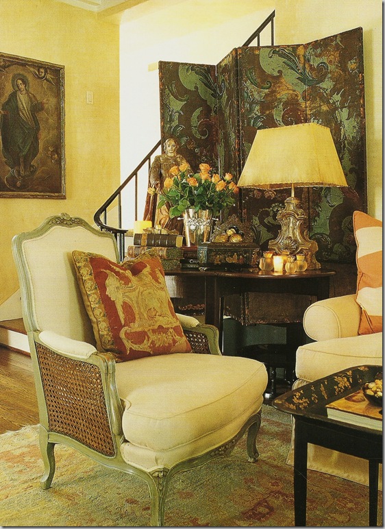
A vignette from the new look with the lighter walls.
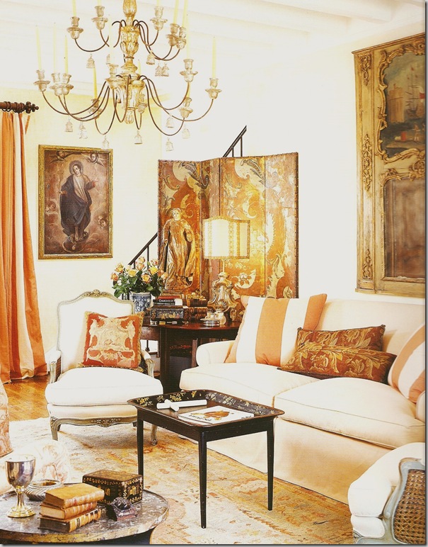
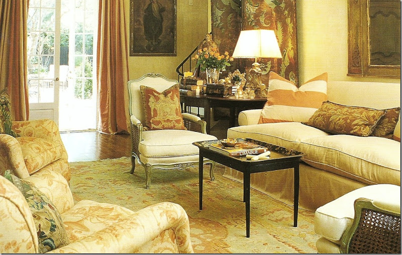
The living room: all the red and paisley is long gone. The yellow walls have been replastered in cream with a hint of apricot. A leather screen sits behind the cream colored sofa. The curtains and pillows are a peach and cream silk stripe. Painted French chairs flank the sofa. A French trumeau sits over the sofa and a stunning antique Italian chandelier hangs from the ceiling.
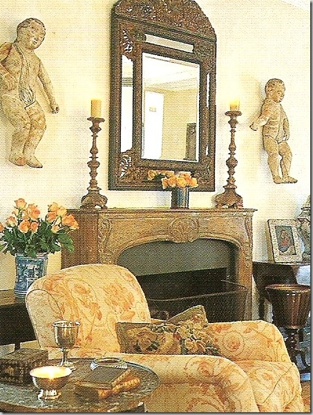
A French fireplace mantel replaces the former wooden one. The putti now flank the mirror. Two wonderful chairs with great arms are upholstered in a Beaumont and Fletcher fabric in peach. An antique Oushak replaces the seagrass.
Another view of the fireplace with the new mantel.
Just beautiful! I love the new decor!
The blue and white lamps with black shades have been replaced with gilt Italian styled lamps with rawhide shades. The pillow is stunning!
The dining room restyled for the new decor – lighter with the white and red striped fabric.
And restyled yet again – French chairs from the breakfast room paired with a French quilt.
The sitting room got new water hyacinth furniture covered in persimmon. I recognize that middle pillow from the living room almost 20 years ago~ I love that!!! The transferware is now almost completely gone, save a few platters. New herbiers flank the breakfast table.
The Hitckcock chairs have been replaced with French chairs, upholstered in Bennison red and cream toile fabric.
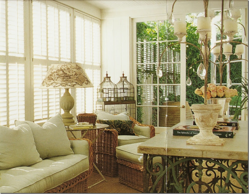
A rare glimpse of the small sitting room off the living room – all white! This furniture was once in the sitting room. I love that lampshade!!!!! The birdcage has moved from the bedroom to here.
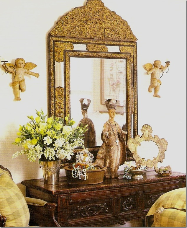
The console with the gilt mirror that was once above the bedroom’s fireplace. Glasser says she has never gotten rid of an antique that she has bought, and I believe her! She moves them from room to room, which is such a wonderful thing about antiques – they look good anywhere.
The bedroom as it was before the house sold. Basically the same, just the mantelscape has changed.
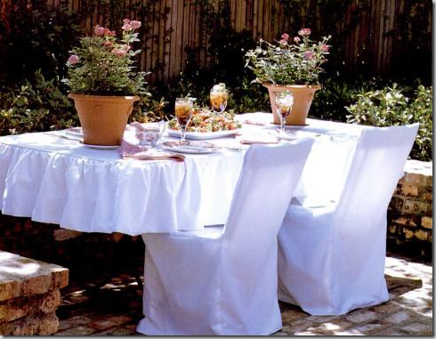
For a book her friend, English designer Katrin Cargill wrote, Fabrications, slipcovers were made for the furniture outside. Just charming!
And here, in blue and white.
Around a built in seating ledge, the table was decorated in white slipcovers for Katrin Cargill’s book, Fabrications.
AND NOW FOR SOMETHING COMPLETELY DIFFERENT: The woman who bought The Perfect House, lived there a few years and put it on the market! These pictures from HAR.com give you a glimpse of the Perfect House as it is today. Somewhere along the way, I have unfortunately lost the listing pictures for when the Glassers had the house for sale to compare.
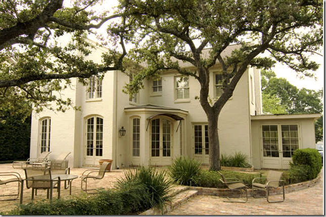
The Perfect House: the living room is on the left, the dining room/library is the right window. I’m not sure how much this has changed. I think the two trees were planted after the Glassers left. And the house may have been painted another color.
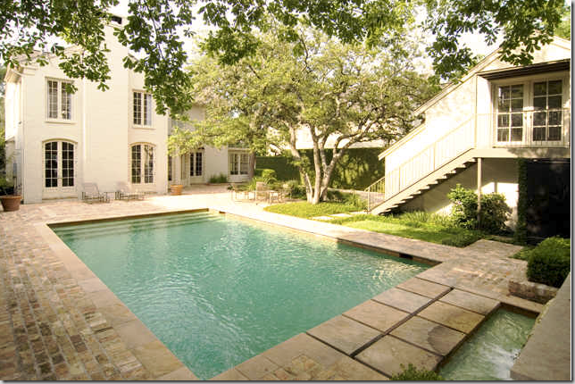
The back yard: the backdoor foyer which Glasser had decorated with the tall clock is located in the center. The family room is to the left with the master bedroom above it. This was a new addition that the Glasser added when they moved in. The living room is the French door next to the backdoor foyer. The white sitting room is at the far right.
The backyard swimming pool. The sitting room looks out over the pool. The garage has been turned into a guest house upstairs. The main house has only two bedrooms.
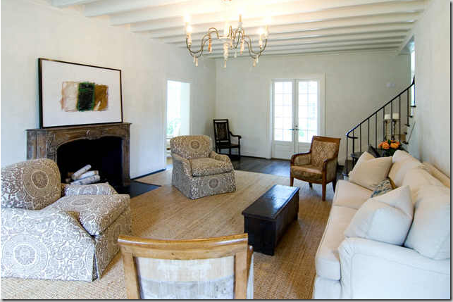
The new living room! How different can it be? The chairs actually look like the same style – I wonder if they were just recovered? Everything looks so stark and white compared to when Glasser lived here, yet it is still very beautiful, as is!
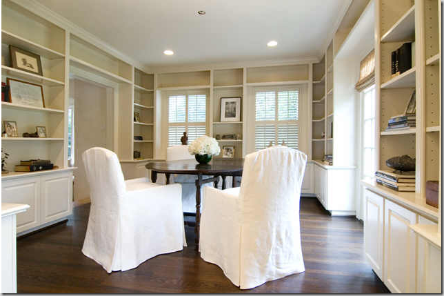
The dining room/library. The door to the left leads to the kitchen. It looks so different all white!!!!!
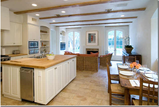
The sitting room/kitchen. You can really see the French pavers here. The furniture looks exactly like what Carol had! Did she sell this set with the house? Or did she stage this for the realtor? This room really looks wonderful! I like how the cabinets are painted now. It all looks so fresh. You can see the dining room through the door next to the refrigerator.
Looking out towards the pool and the back yard. On the left, between the two built in shelves is the back door foyer and the way back into the living room. I wish you could see the range to see if the blue and white tiles were removed. I miss the curtains, among other things.
The master bedroom – without all the Bennison. Plus the fireplace mantel has changed. This is so pretty and soothing, but I do miss the Bennison! I told you it was completely different!
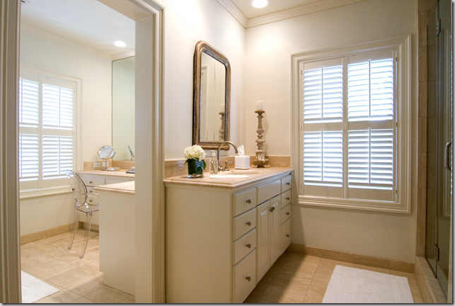
The master bathroom and vanity area.
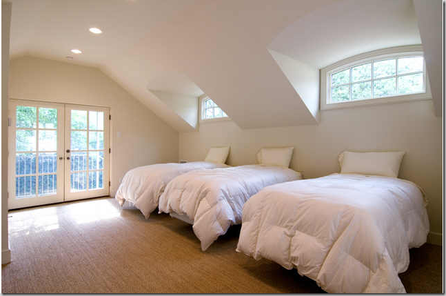
Above the garage, the guest quarters – set up as a bunk room. This would be a perfect room for a teenager, or a college age child – or an office.
GLIMPSES OF THE FUTURE????
In an interview with Carol Glasser in Antique Shops and Designers, these pictures were included. Are they from her new house? I don’t know, but they could be! I can’t wait for the new house to be published! I hope it will be. These pictures look so interesting.
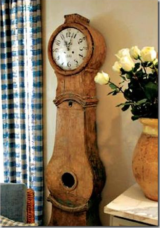
A Swedish Moro clock. The roses certainly look like Glasser’s style!
I hope you have enjoyed reading about Carol Glasser and seeing how she has influenced my own design style through the years. To read more about this talented designer and her fabulous style, see these books:
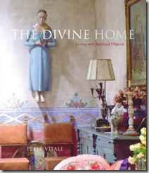
Peter Vitale’s, The Divine Home, has pictures of The Perfect House, available here.
Mary Emmerling’s Romantic Country has a story about Glasser’s former house, too. Available here.














I clearly see Carol's influence all over your house! She does beautiful work. When the house was hers, I did not notice all of the beautiful architectural details, just the decor. I absolutely love the shape of the doors in the family/keeping room. This is a post that I will go through again to see new things the second time around!
ReplyDeleteLet us know when the 'new' house is published. I wonder how Carol's husband deals with her redecorating every few years? He must know it is part of the package. I can't even get my husband to let me replace our grill that is starting to disintegrate because 'it still functions just fine'.
I always learn a lot of things reading your blog. Greatest blog ever!! Alway Divine Afflatus!!
ReplyDeleteThank you!!
Joni,
ReplyDeleteCount me in as a Carol Glasser fan! I have always loved her work also and thought I had collected everything that pictured her home, but thanks to you, I now have more. Fabulous post. I also cannot wait to see her new house. Her style is fabulous. Thank you, thank you for this!
Hi.
ReplyDeleteI'm a new reader. Good job. I have learned a lot and enjoyed doing it.
Your post on the Rothschild Barbados beach home was like a history lesson. I hadn't realized everything had gone so white.
One this post I esp like seeing the heavily padded reading chairs. They look so comfortable.
Which brings up a point: I have been in a few houses that were professionally decorated and while the blushing bride and her gal pals were all a titter over the new look, all the big guy husbands were perplexed to find a chair that would hold them up.
I've seen some hubs go out back and sit on a planter wall and just wait until time to leave. ASAP, btw.
I'm just wondering if you've noticed the middle aged men of today are bigger than their dads and weigh much more, too? The furniture scaled to 1930's bodies just doesn't cut it anymore. It it time to scale up. WAY up!
Maybe on a future post you can point out how the decorator incluced a certain piece of furniture in a room just to please the next big guy invited over?
I have a feeling you are very influential amongst the up and coming decorators. Perhaps you can point out this growing problem?
I would enjoy reading your opinion on the topic.
I am a fan now! Thanks for sharing and I could see a bit of joni in those spaces...
ReplyDeleteJoni, I have collected the same pictures for YEARS! If life had turned out differently, I think you and I would have been on "house patrol" together DAILY in Houston!!! This was such a fun post for me to read. I love how you break down the elements of a room and give such a good description of the owner and her style. You, Joni, are so talented in your own right. Clearly, you just need to call Carol and ask her to lunch!! She needs to know YOU!!
ReplyDeleteThe perfect post of the perfect house. I stand amazed with your talent and ability to deliver such interesting material.
ReplyDeleteThanks so much. Love your blog!
Victoria
It was indeed the perfect house. I hope to see Carol's new home! It certainly will be amazing! Thanks so much, Joni!
ReplyDeleteYou're right, it is the perfect house.And Ms Glasser decorated it perfectly.Traditional with the new scuffed off! Loved the checked welting in the family room and the breakfast area with banquette. And who doesn't love blue and white.What a collection. Thanks again Joni for a lovely post!
ReplyDeleteJoni - I've loved the pages of Carol's home and SO wish I had saved my magazines. Great detail. It is indeed perfect. As your blog is!
ReplyDeleteJoni I sure see you in her style too! I didn't know that she collaborated with Mary Emmerling on the Santa Fe house...I always loved seeing that home!
ReplyDeleteI think one of these days...you just need to stop and ring the doorbell. Introduce yourself. How could she not find you utterly charming, and invite you in for your long awaited tour.
Just sayin'.
I'm hyperventilating!
ReplyDeleteThe before is so beautiful and homey. I mean -how many beautiful things can one person have? She's hoarding them from all of us! I like the updates that have been done to the house though afterwards -wish I could see it full lived in with the updates! Love those painted cabinets. The facade is just beautiful - it is a perfect house!
ReplyDeleteAnother original Joni post! This is what I love about you! You find the story, and do not recycle designer's web catalogs ha ha.
ReplyDeleteI've looked at images for years, and never read the copy. I never cared about a designer's name or back story.
I just responded to the rooms.
And yes dear Joni, these rooms were favorites of mine back in the day when I was all about English country house style.
Funny about the first style you love, it's like a first love, you never get over it h aha.
Now thanks to you, I know who the designer is, and so much more.
You have changed the way I look at books and magazines and blogs. I read the copy now ha ha.
I love the way you make designers and decorators rock stars!
Thanks for a great morning read with my coffee (in my red toile cup of course).
xo xo
Joni,
ReplyDeleteIt's funny that you can be a fan without knowing on certain issues. I have seen the perfect house but never really looked at the creater. I have the Mary E book where they style her home but never honed in on Ms. Glasser. I have also been drawn to the religious icon book not knowing some of the photos were hers. Anyway, love the look of her perfect home, I am sure that wherever she calls home now is perfect too! What a great story...the things you learn, the world is too a small place!
Leslie
lamaisonfou blog
Joni, what a great feature this one is. I love her style and what is so amazing is how fresh those 1993-94 pics look, just as current as now. You would never know they were that old, just goes to show how classic & traditional style will always be around. Love this!
ReplyDeleteSuch a pretty woman and such a talent! It's easy to see why she's a favorite of yours. It's also amazing how different the house looks without her touch... empty and without personality. Great post as usual!
ReplyDeleteWhat a wonderful post. I have always loved her style and always amazed at her ability to add such wonderful texture and pattern with just the right balance. The home now is truly different. Thanks for sharing. Hugs, Marty
ReplyDeleteAll I can say is: Carol Glasser come forward, call Joni today! Carol, you must introduce yourself to Joni!
ReplyDeleteWho else in the design blogger world would do such an extensive piece on Carol's work. Why, Joni, of course!
How about Beverly Jacomini? Any chance a piece on her work?
Fantastic photos and writing! Thanks, Joni, for the beautiful work you produce and share with us all!
You've made my day! Again!
Fascinating evolution of style. Why does it always seem that as a person "matures", so does their style? I must be "immature". I like all of the layers of the earlier shots. Do you see a Bremerman influence too?
ReplyDeleteOoh, I loved this. Her style reminds me of Charles Faudree somewhat. I have such an affinity for houses from this period. They have so much grace and you're right, they are just cozy and comfortable. No barn-like rooms. But for me, it's painful to see what the new owners did! I much preferred Glasser's style, and I loved the mirror above the fireplace in the first photo of her marvelous Bennison bedroom!! Great work, Joni!
ReplyDeleteThe original decor was the best in this Anglophile's opinion. The new decor, while a minimalist's dream is in stark contrast to the original and is totally missing the "Come in, sit down, let me comfort and lift you" atmosphere of it's earlier ambience. I'm totally in love with the Engish country style of it's "Heyday years". Now THAT is my kinda style!
ReplyDeleteI am especially partial to the Welsh sideboard. I finally found one I could afford in our London days - although mine is oak, not pine - and not 10 feet! But there is comfort in the dark wood, the worn patina and the uneven surfaces that have LIVED and SEEN life - if only it could "talk". And I collected Welsh lovespoons to go with it.
Thanks so much for sharing - those rooms inspire me. Classics never go out of style.
Joni, you never cease to amaze me with your talent and craft. You are well on your way to becoming an interior designer historian. I'm telling you ... you need to publish a book.
ReplyDeleteThis was a relaxing, enjoyable read and very informative as well. I never knew Carol Glasser as an interior designer but she has a wonderful style.
I realize that the last view of the perfect house now up for sale is staged to sell but it looks so striped and naked compared to the other pictures.
Thanks again for a great Monday morning read ... a perfect way to begin the week.
Hi Joni!
ReplyDeleteLove the photos, esp. the religious statues and artifacts! Thanks for giving us a look! By the way, did you ever tell who the designer was on that beautiful mediterranean home?
Michelle
Zuniga Interiors
Viewing the 'stripped down' version of the home itself, I can see why Carol fell in love with it.
ReplyDeleteSuch an abundance of glorious windows! Strangely enough, I also find the rear of the home far more appealing than its frontage.
Thank you again Joni for sharing the photos and giving me insight to another top Interior Designer. Now if she would only share some of her antiques with the rest of us.....smiles. -Brenda-
My first thought was: Joni, call her and introduce yourself...perhaps ask to interview her, then I read the other comments and many said the same!
ReplyDeleteYou write so well (and put always some humour in your stories) and research before writing...the best!Every time I read your Posts I want to stop my Blog!!!
what a lovely article! I enjoyed it so much, I searched for more by Carol Glasser and came upon this link for 2007 swedish design..http://www.housebeautiful.com/decorating/furniture-swedish-fantasy-0407
ReplyDeleteJoni,
ReplyDeleteReally gorgeous - very different as the years go on - which is always nice to see - shows that people LIVE there, and as years change people change, the way we live, the things we do - it all changes, and it's nice to see the rooms of a home change with the homeowners. I'm also a little more fond of the dining room in white or cream. What do you think?
I loved Glasser's lighter, fresher look.
ReplyDeleteI about DIED when I saw all the turquoise and coral beaded rosaries and sacred hearts piled high in vintage bowls - fantastic detail! You see it a lot in mexican-influenced interiors as well, and it gets me every time - swoon!
Thank you again, for an utterly engaging and educational post!
Carol's interiors are incredibly cozy! They really say "home" to me.
ReplyDeleteHowever, I really like how some of her fabulous additions (like the fireplace mantles) are much more prominent in the new owner's version of the house. Love the white library too.
Great post and what an eye you have finding all of her antiques as they move around the house. This was like a Where's Waldo for designers :)
Joni you have perfected perfection!! How do you continue to do this? I am screaming...a book, a book!!! Please!!!!!
ReplyDeleteAlso, call Carol and take her to lunch. She needs to meet you. You, my dear, have made her a star!! No one does it quite like you.
What a beautiful home. I love all of the topiaries too. I always enjoy reading your blog!
ReplyDeleteI am as excited as a child on Christmas morning when I open your blog and find a new topic. You have introduced me to a new world of people (that I will never meet)places (that I will never see) and beautiful homes (that I can't afford). Yet, I feel as though I am transported to these places and the lovely homes. Your writing is like a magic carpet and I am along for the ride.
ReplyDeleteCarol Ann
OhMy...I LOVE this post! If I told you how many hours I have spent studying Carol's house you wouldn't believe me (okay, maybe 'you' would Joni!!) Such magical inspiration. I've been struggling with painting my newel post my trim or black, and now after reading this post it needs to be black! Thank you!
ReplyDeleteThat 2000 Veranda shoot totally changed my aesthetic. I will be forever grateful.. And her red dining room gave me the courage to keep a study red for years, even when out red went out of favor, because I loved it so much. It came and went and then came back again, as colors do.
I must say this is my very favorite post of yours Joni! I can NOT wait to see her new home... Thank you for this post! I needed this inspiration at this very moment!
joan
Anoth absolutely delightful post with another inspiring moment - I'm now going to wrap my cellar steps in seagrass - I know it will look perfect thanks to the stair photo you posted. Also on my mind - somehow I think I would certainly enjoy the food & conversation at the Perfect House when it was owned by the Glasser's - something warm & soothing about it. The photos of it after the Glasser's moved just appear to be geared toward 'folks' with a much more rushed/hurried life style . . . maybe I'm just maturing too rapidly. Thank you!
ReplyDeleteGorgeous pictures, great taste in decorating. You should write a book or two like Betty Lou Phillips?
ReplyDelete***** Dearest Joni~
ReplyDelete"SOMEONE" needs to print a copy of this wonderful tribute/"blog of honor" (AND the comments), and place it w/ some FAB, spring-colored cabbage roses on her doorstep...
There should be a note included, showing a beautiful photo of her home on the front (a photo YOU took!), & INSIDE should be your handwritten note inviting her for tea, brunch or lunch...
Being honored & revered like this doesn't happen every day, and I suspect she will say yes. (You are NOT an "unknown", my deah', & I don't think she would "fear for her safety" or anythng LIKE that!... Well, TOOOO much, anyway!!! Grins!)!!!...
Let us know, my friend???
Thank you for this MOST WONDERFUL eye candy & faaaaabulous read!
Hugs & warmest & best wishes for a "positively" received response!
XO, Linda *****
This looks like a facinating post! Oh, I wish it wasn't so late...I'll be back to read it in full tomorrow! I can tell so far that I'm in love with the library...my dream has always been to have a dining room surround by walls and walls of old books. Can't wait to read more! Thanks for the time that went into putting this post together...I'll be back! :-) Susan
ReplyDeleteYesterday, I only had time to look at the pictures and a few of your first comments. Today I read every word!! I love ,love, love this post. I want more...
ReplyDeleteLOVED this post too. I totally see a lot of Carol's style in you.
ReplyDeleteSo many things to love about all of different stages the perfect house went through... Having trouble picking favorites, but I have to say I do love all the white the new owner added... but it's hard not to miss Carol's warmth. Great post & I love to see the evolution of a house & designer's style like this!!
xoxo,
lauren
Now I know why you love her so much! Who wouldn't? Thanks for sharing such inspirational photos of her home. I love her style and hope you will post more about her in the future as more photos become available.
ReplyDeleteWhat great houses. I love the mix of patterns, textures and colors!! Great inspirations Joni.
ReplyDeletePatricia
Just when I think your blog can't possibly get any better, you roll out a new, fresh and even more inspiring, informative post. I am totally amazed at your ability to capture my attention. I'm with Visual Vamp on this, for years I've just looked at the pictures, only able to identify the most notable designers, but I love reading your posts!!!! Thank you so much for sharing your talent.
ReplyDeleteNola
The Bloom Girls
Nashville, TN
Ms Glasser's style is lovely -- reminds me of one of my all-time favorites Charles Faudree -- and I can clearly see how she influenced yours.
ReplyDeleteSurely she'll invite you into her new home after this post -- how could she not!? Unless your admitted stalking concerns her... I'll look for a future post. Will it be titled "Joni Meets Carol" or "Carol Calls the Cops, Joni Goes to Jail" ??
Thanks for your wonderful report on Carol Glasser. Her style is truly timeless and I find a lot that I like even in the images from 1993. Her home has warmth that is sadly missing from the redo.
ReplyDeleteTricia - Avolli
Hi Joni...
ReplyDeleteWhat style...loved this post !!
Thank you,
Kathy :)
Joni...
ReplyDeleteNow THIS is my kind of house...lots of color and warmth. I covet her bamboo or is it tortoise shell desk? Glorious. The decor is stunning.
Blessings...
I do very much like her style. It is sooo inviting and totally livable. You just feel sooo soothed and comforted to imagine living in those rooms. I love rooms that look as if they evolved over many years and were not decorated all at once. Thanks for sharing all these great pics...can't wait to see her new home! Susan
ReplyDeletethe library/dining room hits the ball out of the park !!
ReplyDeletei prefer the 1st house. it is warmer and has a bohemian feel.
it looks a great deal like what i used to do while working out of casa casa on palm beach.
*santos' galore
( this is my fave post )
This post is incredible, Joni. I am amazed at Carol Glasser talent. She has the amazing ability to create inviting, layered interiors that are sophisticated and elegant.
ReplyDeleteI am dying to redecorate our home, but have been feeling overwhelmed by the task. I do believe Ms. Glasser has given me the push that I needed.
I am off to read your post again (for the third time!)
xo
Brooke
Perfect, perfect homes. I see so many things that I love.
ReplyDeleteJoni, have a wonderful and happy Passover~!
I can tell why you love Glasser's style so much -- the mix of luscious fabrics and beautiful antiques is amazing! And I, too, love the idea of moving antiques from room to room. It's a great way to see something familiar with "new" eyes.
ReplyDeleteThe new owner's real estate pix made the beautiful house look lifeless. I guess I just need color and clutter. lol Preferably antique clutter!
xoxo,
Mary
Another Glasser fan here too! A simply wonderful style -- warm and welcoming! Yes -- do send over a copy of this brillant posting to her office and see what happens next! LOL! I have that book "Romantic Country" -- and it remains one of fav books of all time! Thanks again for such delightful photos -- and your words too!
ReplyDeleteJan at Rosemary Cottage
Hi! I love your blog!! Beautiful pictures!!!
ReplyDeleteKlem Anette from Norway:)
What a great read...THANK YOU! I remember her beautiful house from years ago...wasn't it covered in ivy? Going back to read this again. Thanks Joni. :)
ReplyDeleteJoni, I have always loved anything I've seen that Glasser designed. I guess now I know why I always love your designs so much. They ARE so similar. This was a wonderful post, as always, and since I'm seeing it at 1:00 a.m., I'll have to come back and go through it again another day. Loved it! laurie
ReplyDeleteThank you, Joni, for another wonderful story! The back entrance of this house has always been in my memory since the first time I saw it published, just a fantastic mix! The sisal stairs, black clock, antique flower stand...wow! I look forward to all your posts....much better than the magazines these days!
ReplyDeleteJoni,
ReplyDeleteFascinating post. I always enjoy your decor sleuth posts, with Sherlock Holmes dissections of changes. Been away from the posts for a while and what a lot of catching up to do!
http://forum.webhostlist.de/forum/members/newviagra.html
ReplyDelete[b]FREE VIAGRA VIAGRA BESTELLEN[/b]
lhttp://www.ile-maurice.com/forum/members/newviagra.html
[b]VIAGRA Deutschland PREISVERGLECH BESTELLEN VIAGRA[/b]
VIAGRA BESTELLEN eur 0.85 Pro Pille >> Klicken Sie Hier << BESTELLEN BILLIG VIAGRA CIALIS VIAGRA® kaufen Viagra im Internet Kaufen BILLIG
http://www.flooringchat.com/member.php?u=19861
[b]VIAGRA Holland BILLIG VIAGRA REZEPTFREI BESTELLEN[/b]
[url=http://www.getsomeskillz.co.uk/forum/member.php?u=13]VIAGRA BILLIG PREISVERGLECH BESTELLEN[/url] - VIAGRA Holland
[b]VIAGRA® kaufen VIAGRA[/b]
[b]VIAGRA Kaufen REZEPTFREI VIAGRA[/b]
[url=http://cafesuoimo.com/member.php?u=8]online bestellen[/url] - alternativ zu VIAGRA
[b]VIAGRA Austria VIAGRA PREISVERGLECH BESTELLEN[/b]
[b]alternativ zu VIAGRA PREISVERGLECH BESTELLEN VIAGRA[/b]
[b]VIAGRA rezeptfrei VIAGRA BILLIG[/b]
ReplyDeletehttp://www.getsomeskillz.co.uk/forum/member.php?u=13
[b]VIAGRA online BESTELLEN VIAGRA PREISVERGLECH BESTELLEN[/b]
VIAGRA BESTELLEN eur 0.85 Pro Pille >> Klicken Sie Hier << BESTELLEN BILLIG VIAGRA CIALIS VIAGRA im internet kaufen KAUFEN Preiswerter Viagra
http://cafesuoimo.com/member.php?u=8
[b]VIAGRA alternatives VIAGRA REZEPTFREI[/b]
[url=http://www.barroco.comyr.com/member.php?u=3]VIAGRA REZEPTFREI BILLIG[/url] - VIAGRA Oesterreich
[b]alternativ zu VIAGRA VIAGRA BESTELLEN[/b]
[b]VIAGRA on line PREISVERGLECH BESTELLEN VIAGRA[/b]
[url=http://www.noise-unltd.com/member.php?u=2 ]BILLIG VIAGRA[/url] - VIAGRA online bestellen
[b]VIAGRA Austria PREISVERGLECH VIAGRA REZEPTFREI[/b]
[b]FREE VIAGRA REZEPTFREI BESTELLEN VIAGRA[/b]
http://www.djmal.net/thaspot/members/viagrakaufend
ReplyDelete[b]VIAGRA Austria VIAGRA PREISVERGLECH BILLIG[/b]
http://www.serataanime.it/forum2/member.php?u=336
[b]VIAGRA Austria BILLIG VIAGRA REZEPTFREI BESTELLEN[/b]
VIAGRA BESTELLEN eur 0.85 Pro Pille >> Klicken Sie Hier << BESTELLEN BILLIG VIAGRA CIALIS VIAGRA rezeptfrei VIAGRA PREISVERGLEICH
http://www.barroco.comyr.com/member.php?u=3
[b]VIAGRA® kaufen VIAGRA PREISVERGLECH BESTELLEN[/b]
[url=http://www.einvestorhelp.com/member.php?u=37776]VIAGRA Oesterreich[/url] - VIAGRA Nederland
[b]VIAGRA Holland PREISVERGLECH BESTELLEN VIAGRA[/b]
[b]VIAGRA versand VIAGRA BESTELLEN[/b]
[url=http://www.zonatuning.com/members/viagrakaufend]VIAGRA PREISVERGLECH BESTELLEN[/url] - VIAGRA fuer frau
[b]VIAGRA Kaufen VIAGRA BILLIG PREISVERGLECH BESTELLEN[/b]
[b]VIAGRA Holland VIAGRA[/b]
[b]VIAGRA® kaufen
VIAGRA Deutschland
VIAGRA online kaufen
VIAGRA on line
VIAGRA alternativ
VIAGRA rezeptfrei
VIAGRA Kaufen
VIAGRA Apotheke[/b]
I merely wished to officially say "Hi there" to everyone here. In my opinion , that this appears like an unusually appealing place to be online.
ReplyDeleteI cannot wait to begin. Do you have any sort of guidance for someone in the beginning stages? Any certain section that you would advise more versus others to begin?
I want to to share with you a quote that i have often found to be tremendously motivational in order to start formal introductions:
[quote]Never believe in mirrors or newspapers. ~Tom Stoppard[/quote]
Greetings,
Mark
[url=http://www.hadigel.net/indir/indir.asp?id=2689]windows live messenger[/url]
ReplyDelete"Staropolskim obyczajem,
ReplyDeletegdy w Wigilię gwiazda wstaje,
Nowy Rok zaś cyfrę zmienia,
wszyscy wszystkim ślą życzenia.
Przy tej pięknej sposobności
i ja życzę Wam radości,
aby wszystkim się darzyło,
z roku na rok lepiej było."
[url=http://www.karty-swiateczne.com]kartki świąteczne[/url] - kartki świąteczne
NIECH MIKOŁAJ PRZYNIESIE CI PEŁEN WOREK SZCZĘŚCIA I POCIECHY DLA SERCA!
- Żyj z rodziną i przyjaciółmi w zgodzie i pogódź się z nimi nawet jeśli to niemożliwe!
CZAS ŚWIĄT TO OKRES WIARY, NADZIEI, POJEDNANIA I WYBACZANIA!
Niech nadchodzące święta, pełne rodzinnego ciepła i odpoczynku, napełnią Was prawdziwą radością i pokojem. Niech będzie to dla Was chwila wytchnienia od codzienności, chwila refleksji i dobrej nowiny, która wyzwoli to, co najlepsze i da siły do podejmowania nowych zadań na cały zbliżający się nowy rok
Hi Joni - I'm obviously going way back here... but I've been obsessed with the french bergere chairs with the muslin since the Veranda 2000! We moved into our house that same year and I wanted these chairs so badly but wasn't brave enough to make it happen.... Now, I am brave! Do you have any idea who makes these chairs... or should I say "made". I love it that I still love them a decade later...
ReplyDeletePlease let me know if you know!!
I did not notice all of the beautiful architectural details, just the decor and flower
ReplyDeleteOh - what a heaven of a post! I adore the red and yellow. Trying to come up with the right yellow for my home. Would love to know what Carol used in this home. Beautiful. Thanks for posting these pics.
ReplyDeleteThank you for sharing this interesting and informative article, painting with airless spray gun will be faster and more interesting!
ReplyDelete