 Two weeks ago on The Skirted Roundtable (listen here if you missed it) Linda, Megan and I got into a heated discussion about Bunny Williams’ Kips Bay Showhouse living room – which landed on the cover of the August issue of House Beautiful. Linda actually posed the question to Megan and I - “is this room truly great because Bunny Williams designed it?” House Beautiful proclaimed just exactly this: that what made the room great was that Williams had designed it. Well, the three of us didn’t quite agree with the magazine. And though Bunny Williams is a personal favorite of mine, I think I liked the room the least of us three. That discussion on the Skirted Roundtable was really all in fun – certainly we realized the irony which prompted the question “Who do we think we are?” to challenge Bunny Williams on design? Megan compared it to telling Yves St. Laurent to stop with the flourishes. Yes, it is very amusing to imagine. But in truth, the discussion garnered quite a lot of comments from people – some agreed with us and some very esteemed people disagreed. One blogger most knowledgeable about design, Aesthete's Lament, said he had actually been in Bunny’s Kips Bay room and found “the space itself was glorious and did not lend itself well to being photographed. I stood in that room, for a very long time, and that was really the only way to understand the space. When you stood in the room, with the sunlight seeping in through the windows, the lamps turned a bit low, et cetera, it was wonderful and alluring and fresh.” Toby Worthington, a highly intelligent commenter proclaimed “Bunny Still Rules.” Even the editor in chief of House Beautiful, Stephen Drucker, weighed in with: “Fascinating. Wish I could have joined the skirted roundtable for this one. This is what magazines are all about: love it/hate it. Interesting to note... we've been deluged with requests for the coffee table in Bunny's room.” Trust us, Mr. Drucker, we would have loved to have you on and join in on the discussion.
Still, as much fun as it was to dissect the Kips Bay room, I feel a little uneasy about it all. After all, Bunny Williams is and remains a favorite of mine. Her book, An Affair with a House, has to be one of the top ten design books ever written. Each page has a glorious picture of her Connecticut farmhouse – there are very few design books I have loved so or felt such an emotional connection to. All I want is one day to stand in the rebuilt barn and take in the beauty of that room in person. Put it on my bucket list, along with visiting Villa di Lemma. So, today, apart from my Skirted Roundtable partners, I revisit the Williams’ Kips Bay all-in-one living space, with a little background history first.
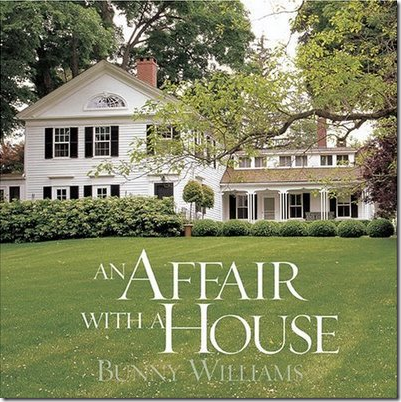 One of my top five favorite design books published. The story of the evolution of Bunny Williams country house – with the addition of husband John Rosselli’s influence along the way. Fabulous.
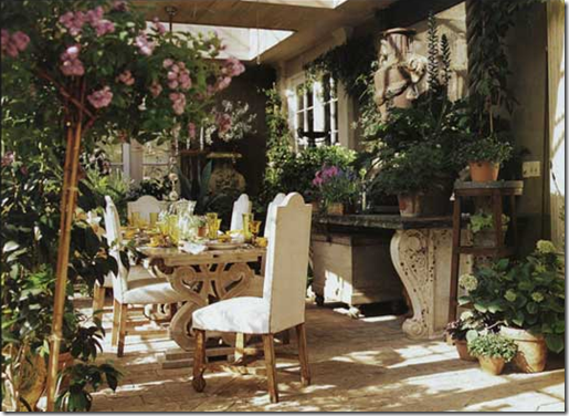
The first time I was ever exposed to Bunny Williams was with a photograph of her beautiful conservatory – constructed from a pile of old French doors she had found. This room was my introduction to Williams which started a long love affair.
Another view of the room.
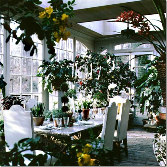
And here: you can see the doors that make up the conservatory along with the old brick floor. The ceiling is all skylights. This is the site of many dinners parties at the Connecticut farmhouse.
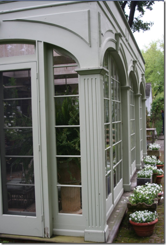
A rare shot of the outside of the conservatory.
Originally, it was Bunny’s great handling of the English Country Manor look that attracted me. A cluttered look with books piled everywhere, slips in ticking and Colefax and Fowler fabrics, fabulous antiques – and even more fabulous accessories – this style of design was a favorite of mine for years and still today, I have a soft spot for it. Bunny’s country house was not about being neat and tidy. It was about really living in a house and enjoying it – gardening, reading books, having an early evening drink with visiting guests, sitting around a fireplace, enjoying home cooked meals with dogs and chickens running to and fro. It was about a house that was well used and well loved.
The kitchen in the Connecticut house. What’s there not to love about a room like this?
The library in the original house on the estate. Is this America or England? Hard to tell, which is part of Williams’ appeal.
An early picture of the side porch of the main house.
And a later, a more styled picture from the same porch with new slips and chairs.
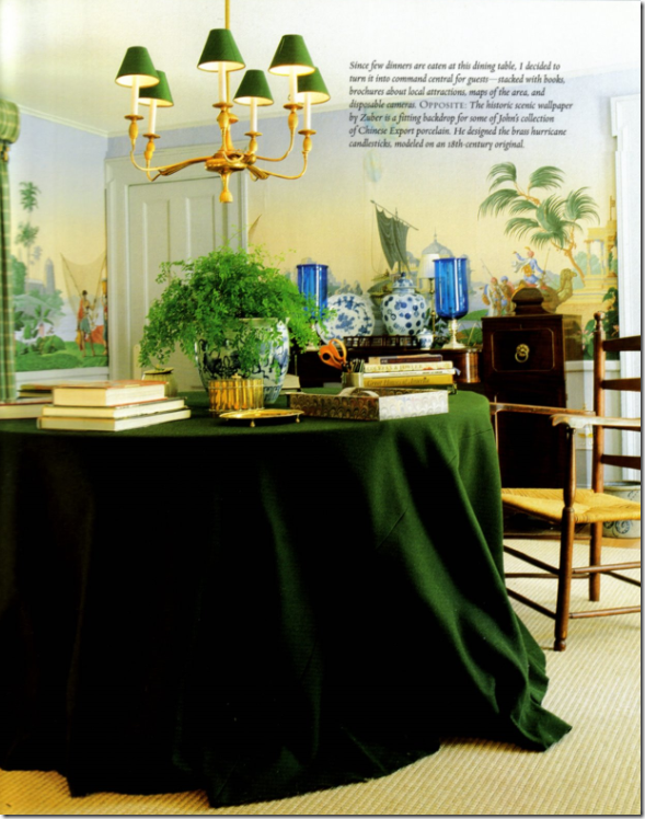
After her next door neighbor fabric designer Alan Campbell died, Bunny bought his house to keep for guests. She turned his dining room with the Zuber wallpaper into a library of sorts – since meals aren’t really eaten here anymore.
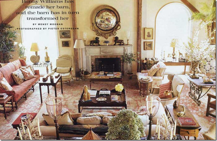
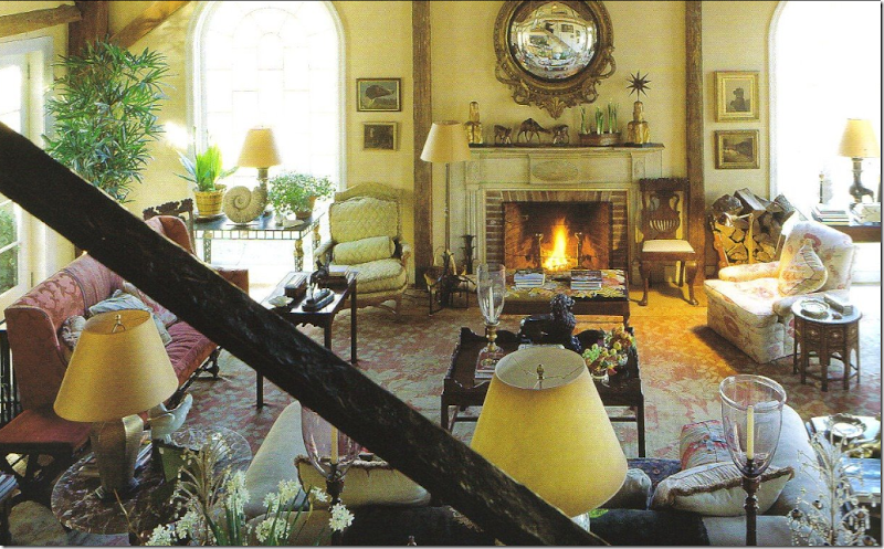
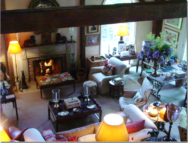
One of my favorite rooms ever – the barn/garage that Bunny’s husband John Rosselli eyed for renovation. The final results is a huge, high ceilinged space where most of the entertaining at Connecticut happens. The scale of the furniture is purposefully large to fill the space. Looking at this room, it somehow reminds me of the Kip Bay room – large, tall ceilinged and multi purposed. Like I said, one day I want to experience this room.
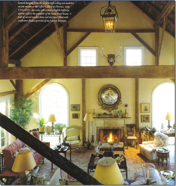
Another view shows how tall the room actually is.
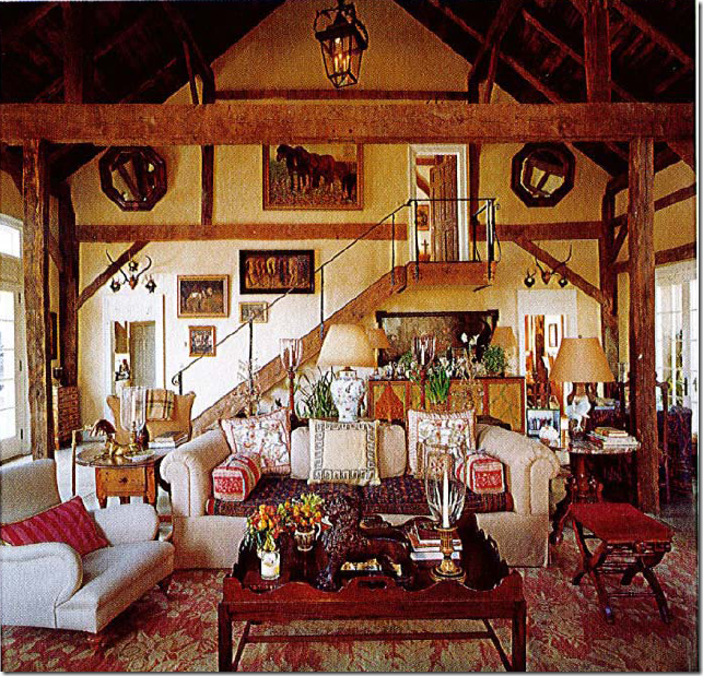
Looking the other way – you can see the stairs that lead to a bedroom. The rug is amazing. Again – is this America or some house in the countryside of England? No one does English country better than Williams. Once she said she can do an English styled room with her eyes closed – it comes that easy to her.
A close up of the great room – high back antique sofa, I spy a comfy club chair in a famous Robert Kime fabric, lots of hurricanes, English tables, and wonderful lamps. The rug is truly amazing.
A very recent shot of the barn – the Kime chair is now recovered. Otherwise everything looks very much the same except for the rug! Where is the gorgeous rug?
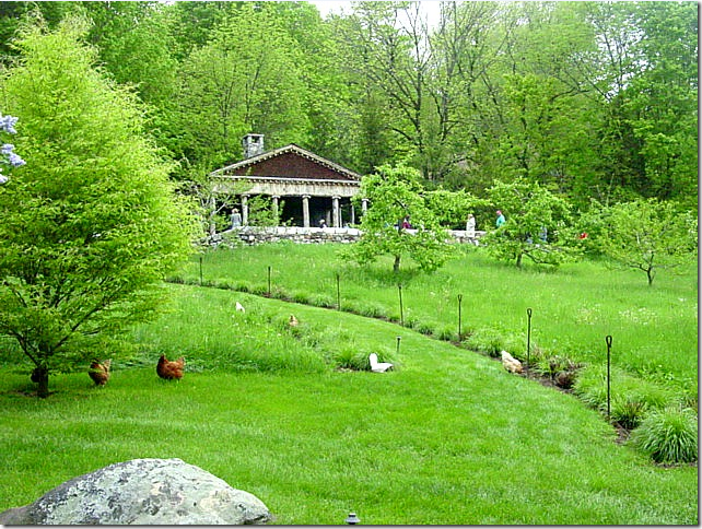
The pool house sits high on a bluff while the chickens just roam around. This picture was taken on a garden tour this year that also included Michael Trapp’s former house.
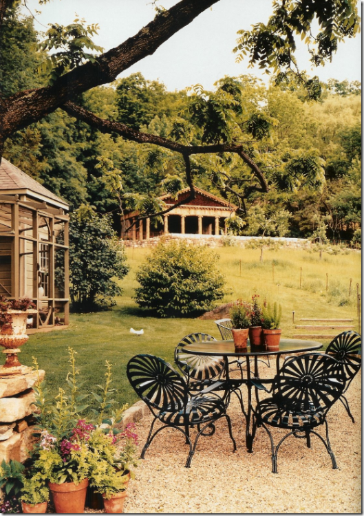
A view of the aviary and the pool house in the back, taken from a magazine spread.
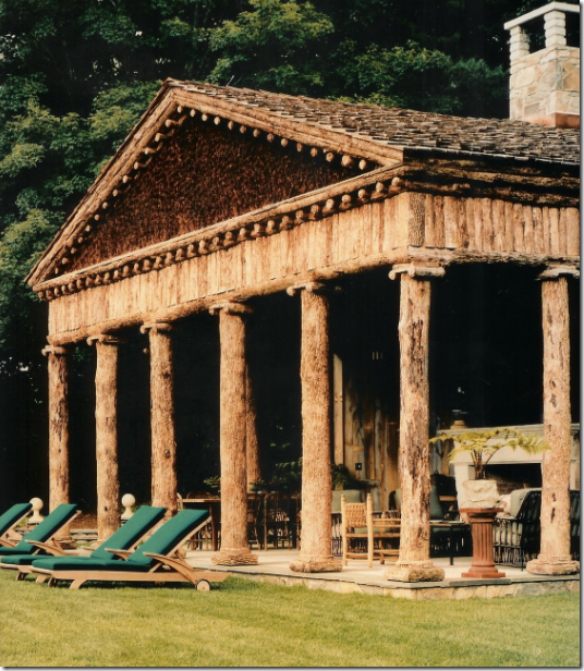
Close up the unusual pool house designed by Bunny and John to resemble a Greek temple made out of wood, not marble.
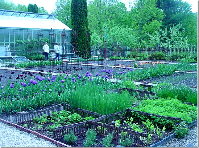
Spring flowers and vegetables growing behind the large working greenhouse.
In New York – Bunny and Rosselli live a slightly dressier and more sophisticated life, their love of antique furniture is evident here as is their love of wall to wall seagrass (had to throw that in, of course!)
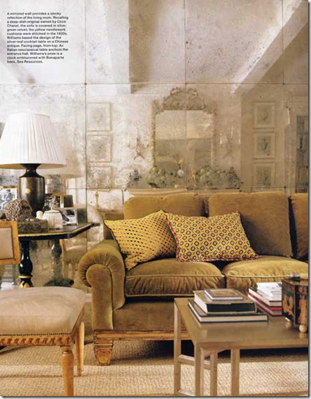
The living room in their New York apartment has a wall of antiqued mirror – used to great effect!
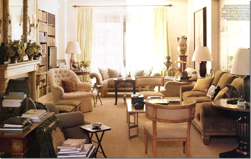
A wider shot of the living room with the antiqued mirrors – just gorgeous. I love the barrel back chairs and the day bed in front of the window. The apartment has a beautiful array of antique furniture and comfortable upholstered pieces – exactly what you would expect from a dynamite pair such as Williams and Rosselli. Don’t you wonder which one has the final say in the design of their living spaces?
The handsome and debonair John Rosselli poses in their New York apartment, courtesy of New York Social Diary.
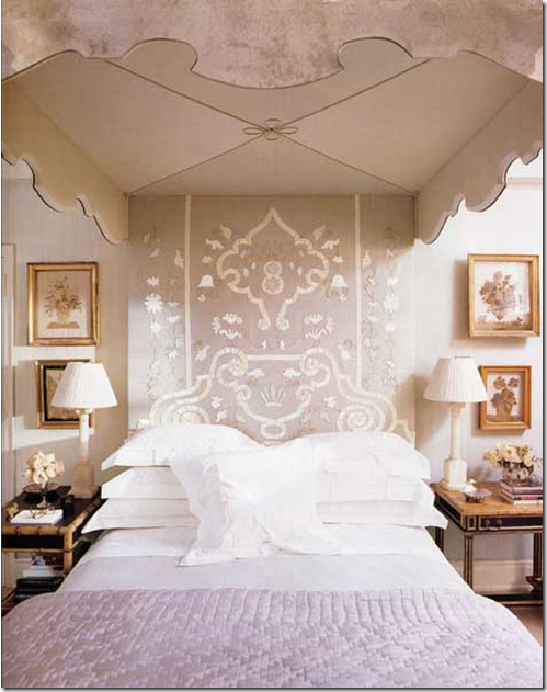
Most amazing is their mirrored bed from the 1930’s paired with an Indian textile. Williams is known for sumptuous bedrooms.
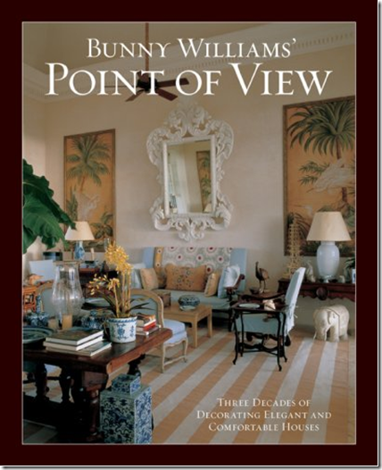
Williams third book, Point of View, is an overview from her thirty years of designing interiors. The cover shot, though, is highly personal and shows the house in Punta Cana that she and Rosselli recently built. Again, this room reminds me of the Kips Bay room with it’s high ceilings and large art work. Doesn’t this room seem like a beach styled version of her large barn room in Connecticut? I adore this room!!
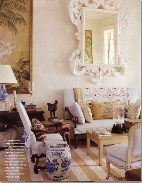
A close up – I love the striped dhurri rug and the antique settee and Os de Mouton chair flanked by the blue and white garden seat. Just beautiful!
A close up of the room from the book – you can only see one side of the large room in these pictures – actually it is double sized – with the other side being a mirror image.
I love this picture – all the dogs, the books, the white linen, the tapestry, the slips – look how huge that sofa truly is!!! What a cute couple they make. John is not too handsome is he?
I particularly like this dining room designed by Bunny Williams – it’s soft moss green walls lined with a set of china, a table skirted, and beautiful painted chairs.
Another beautiful living room designed by Williams that has the feel in layout of her Kips Bay room – the sitting area is one side, the dining room the other. What a glorious room!
Another large living room, with multiple seating areas, just like the Kips Bay living room. Isn’t that painting gorgeous – it makes the entire room!
Another beach styled room, large, high ceilinged - an eating and living space in one – just like Kips Bay.
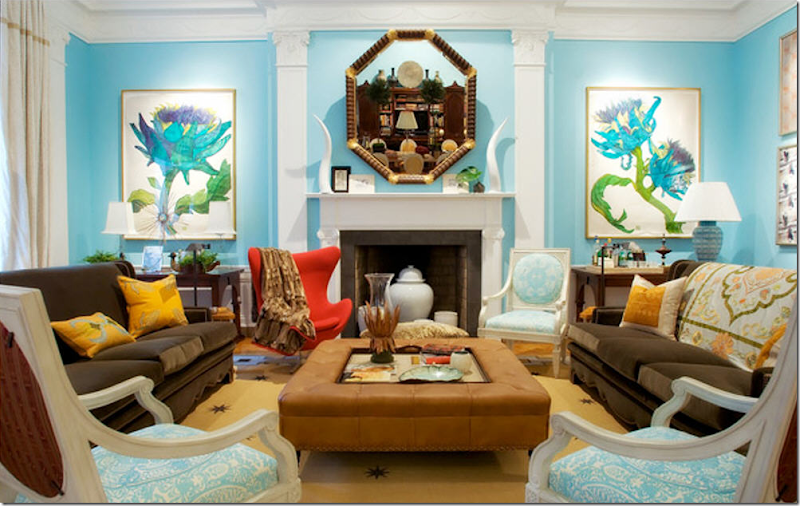
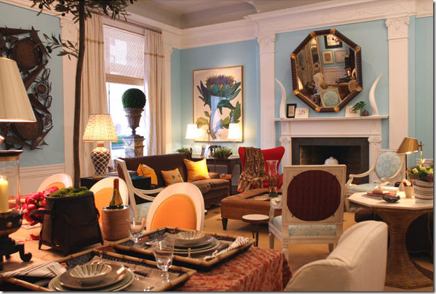
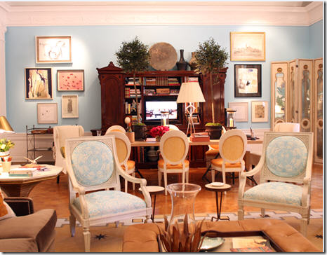
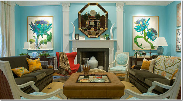
Which brings us back to the room being discussed – the Kips Bay Showhouse – all in one room, that Williams designed this year. The turquoise blue walls were paired with the furniture from her new line – BeeLine Home. Megan and Linda liked the blue walls – I did too, just not with the olive-green sofas from her Bee Line furniture.
The famous red chair that caused a lot of discussion – do you like it mixed with the blue and the olive greens? And another big topic for discussion was the red fabric on the back of the white chairs – love it/hate it?
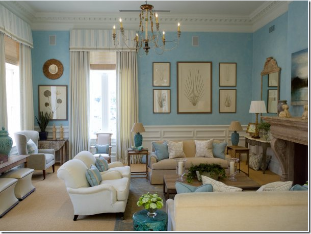
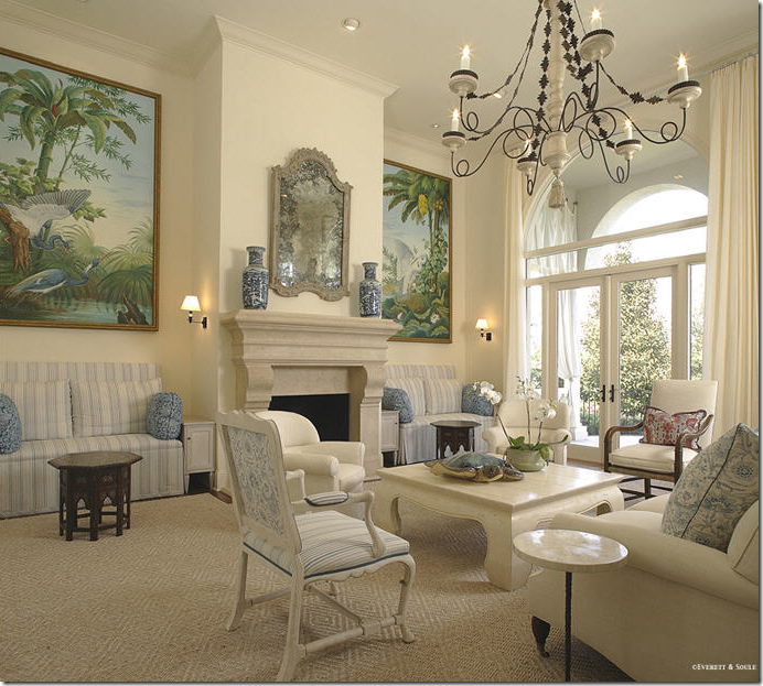
After we taped the Skirted Roundtable, Megan sent me this picture – from Mrs. Howards - and said this reminded her of the Kips Bay room- the wall color. Yes, it is very similar. Megan thought the blue walls in Kips Bay looked good toned down by the olive colored upholstery or else the turquoise would have looked too themed or juvenile. Well – here the same blue walled room looks neither themed or juvenile. I think this is beautiful and calm, perhaps expected and a little boring compared to the Kips Bay room, but it does seem to make sense.
My main issue with the room was I thought it was two designs in one – there was the beautiful art work which explained the turquoise walls and the white chairs with blue fabric. And, the olive green sofas with the saffron yellow pillows is another design element. It seems that there are two design themes going on in this room where there should be one.
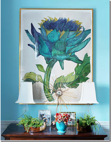
The two design elements in the room: blue walls and fabric inspired by the art work, which I love.
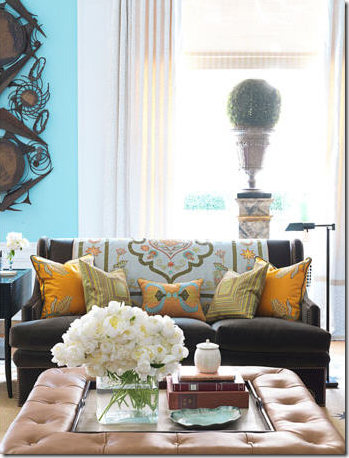
The second element: The olive green sofas and tan leather ottoman mixed with saffron pillows and textiles.
Megan and Linda objected most to the space planning, they felt there was too much going on in the room. That wasn’t my thought. That is Bunny – that is what she does best. My problem was the blue design/olive design happening in the same room. And the red chair.
Here, you can’t really see the olive sofas with the yellow tapestries – so it looks good from this angle. At first glance, I thought the red chair was a stroke of genius. The longer I studied it, the less I thought that. I think I will go to my maker never understanding the red chair mixed with the blue/ green element, mixed with the olive/yellow element. The three of us agreed that we didn’t especially love the painted rug either, do you?
Here’s another large room that reminds me of Bunny’s Kip Bay room – the large art work flanking the fireplace, yet the design of this room makes sense to me. Or is it too boring and bland compared to the Kips Bay room? Myself, I could live here and be happy.
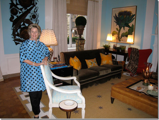
Ms. Williams on the opening night of Kips Bay stands in her room. Why do I even care if I like this room or not? I never even gave it a second thought until it landed on the cover of House Beautiful. I usually adore everything this woman creates! I have never not understood anything she’s designed before. Oh, well. What do you think? Do you love it and think I’m crazy?
To judge the new furniture line away from the turquoise blue walls at Kips Bay – here is a room set up with the Beeline Home furniture – doesn’t this show off her new furniture line to its best advantage? I adore this!! It’s so Bunny!! (picture sent to me from Mrs. Blandings via Chris Wiggins via Beeline Home web site – thank you!)
A different room set up with her Beeline Home furniture – again – beautiful! I love that tapestry on the back of the sofa – I would love to own that!! Here the walls have been painted the same color as the sofa, it is so beautiful – and the art work – the same as used in Kips Bay looks even better here too, for some reason. I love this blue mixed with the green here – it is more toned down than the turquoise, it looks perfect!
Another vignette showing the wonderful desk and mirror - love this. And I love the bunny rabbit too!
Which brings me really to the point of all this! A reader listened to the Skirted Roundtable discussion and was moved to create the room he felt Bunny Williams SHOULD have designed, God help us! Like I said - who do we think we are? The reader is Magnaverde, aka Bart, interior designer, and a prolific commenter with a wonderful apartment that was featured in Oprah Winfrey’s O Home magazine. Here it is – Magnaverde’s version of the Kips Bay room:
Kips Bay as it should have been - Magnaverde: The blue elements have disappeared except for the chairs. The blue/green art work has been changed out for modern works in brown and white. The walls have become a dark caramel tone to blend in more with the coffee table and olive green sofas. The white horns on the mantel are gone – the mirror makes more sense now without them. The red chair remains and it does looks wonderful. I’m such a matchy matchy person – I would have changed the blue fabric on the chairs to the saffron color, but that’s me. What do you think? Better? Worse? Leave this to the professionals? Thank you Magnaverde for your drawing – I love it!!! To see pictures of Magaverde aka Bart’s most delicious apartment, go here, and here.
Hopefully now I will put this issue to bed. There’s a new House Beautiful out – with Windsor Smith’s new house on the cover and I’m in love!!! Her kitchen! Her pink study! AND – there’s a gorgeous house in Austin, Texas – done up all in Belgian linen slipcovers that is just to die for. House Beautiful proves again – they are THE magazine to reckon with now. Each month, it gets better and better and this month is a killer. Thank you Mr. Drucker!
To listen, or relisten to our discussion of the Kips Bay room on The Skirted Roundtable, go here.












I am certainly not one to judge B. Williams, BUT this just isn't her-especially after being reminded by your photos of all of the wonderful rooms she has created in the past. No, I still don't like the KB room. The funny thing is, it doesn't look livable to me, and that has been one of the things that appealed to me about BW rooms in the past. They weren't designed just for show-they were designed for living. Of course, this is a showroom, but why do a showroom if it's not something people would want to live in? When I start thinking my rooms have too many conflicting elements, I'm going to go back and look at this KB Showroom, & I think I'll feel better about my home!! Of course, this room will probably cause the next new trend, but I'm afraid I'm staying behind (as if I hadn't always!) laurie
ReplyDeleteThank you for the delightful photo essay on Bunny Williams' projects.
ReplyDeletePhoebe Howard is the designer of the blue room with the similar blue color to the much discussed Bunny Williams Kips Bay Show House room.
The Phoebe Howard room is in the Howard's just opened Charlotte store, Max & Company.
http://www.mrshowardpersonalshopper.com
/mrs_howard_personal
_shopp/2009/08/max-company-in-charlotte.html
You'll recognize something from the Bunny Williams show house room in the Howard's new store
Thanks, I had a feeling it was her!!!!!! thank you so much - I updated the post. thanks!!
ReplyDeleteI think, IMHO, that the Kips Bay room has elements that go with each other, the sofas look great with the rug, the red chair looks great with the ottoman, the art work looks great with the blue walls but they don't work together. They seem to be having a wrestling match.
ReplyDeleteThat being said her barn in Ct is one of the loveliest rooms I have ever seen. The layout and furniture placement is the same as this room but it just looks so much better. Everything is just plain beautiful in that room with nothing competing with something else in the room. It is perfection.
I don't think Bunny Williams is losing any sleep over this, the room probably does look fabulous in person and reads bad in photos maybe she should invite you up for a personal tour to explain her choices to you. Wouldn't that be fabulous! MB
Well, Joni...a lovely (and redeeming)post. That barn room...well, her entire property...and other designs, are just stunning!
ReplyDeleteThe Kips Bay room is still jarring to me...and for my eye it is the color on the walls (could it be the lighting?)If they were taken down a notch or two it would be much more calming. But...judging from her outfit at the opening...I don't believe calm was a direction she was going.
Your reader had an interesting take on changing the wall color...but the most fave pieces in the room (IMHO) are those spectacular peacock blue huge botanicals!
Do me a favor...DO NOT have Mr Drucker on the skirted roundtable...I don't want to see House Beautiful go the way of Southern Accents. ;~0
Here's a thought: maybe Ms. Williams, like Picasso, having nailed the English Country Look wanted to play around with edgy creativity! I prefer the other rooms as well but the room on the cover was a showhouse room. And incidentally it was a showcase for her new collection.
ReplyDeleteMarion
I actually loved the room, and always excited to see a bold use of color since shelter magazines always seem to be a sea of neutral (I'm not knocking neutral---there are many lovely neutral rooms and they are much easier to live with, but to me they are as often boring as they are beautiful). In addition, turquoise and saffron are two of my favorite colors, and I like them mixed with olive. There were a couple of things I personally didn't like--I am still ambivalent about the egg chair, the red fabric on the armchair backs (I like the idea of it--I just hated that particular fabric for some reason), and I didn't like the rug (again a personal thing--I just don't like painted and stenciled natrual fiber rugs--I feel that if you want print go for a woven--the whole idea of a natural fiber is for it to be, well, natural), but all in all I loved it. And finally, as someone who has picked out more shades of offwhite paint and good basic neutral upholstery fabric for clients, I do understand the urge to do something different and more bold when you're doing a showroom where you don't have to worry about whether or not the client will love the bright blue walls in 6 months time.
ReplyDeleteFinally, Joni, just keep in mind that no matter if people love or loathe it, Ms. Williams has succeeded beautifully with this space--it's engaged readers. People are talking about her work--passionately. And I think that was one of the reasons she went for a look that was something of a departure for her--if so, it certainly worked.
I listened with great interest to SRT discussing this subject, and I mean, there's no study book answer here, but I did feel annoyed reading HB stating that it was a perfect room "because Bunny Williams did it". Because I simply don't agree.
ReplyDeleteIt was interesting to see mystery man's version of the room, however he removed all the freshness from it as well. I really loved the blue walls and the botanical art work, they were probably my fave parts of the room (I know, not much). I agree with the removal of the horns and other accessories from the mantle though. I would probably have turned the room more H.Regency, but that's not what Bunny's about, is it. (away with the muddy color on the sofa's, in with kelly green fabric instead and so on...) I also think it's overfurnished and too much going on. I want to edit for her. But again - I don't share her taste - we go in totally different directions.
But I think discussions like these are so important, and I would really love to hear SRT do it again. And maybe invite different editors so they can fill in with their thoughts like Stephen Drucker suggested.
I would love for this to be a returning subject (with different designs of course)!
Ms. Williams rooms, latest published project excepted, have a collected, acquired quality as opposed to an "installed" look. The KB room read more like an advertisement. The House Beautiful subtitle delaring the room "great" because it was designed by Bunny Williams rankled me, and I may have been predestined to dislike the room. It's akin to saying a song is great because so-and-so sang it. Everyone has greatest hits and some definite misses, but fortunately for most of us, our misses aren't published in a national magazine.
ReplyDeleteSort of rings of The Emporers New Clothes. No question it is considered good design because Bunny Williams designed it. Certainly Bunny Williams stepped outside of her comfort zone and perhaps House Beautiful is applauding the fact. I believe "The Skirted Roundtable" debate over the cover and it's interpretation should receive louder applause. I typically covet the rooms designed by Bunny Williams yet, not this time. Perhaps the design is out of my comfort zone too.
ReplyDeleteLisa
Joni - terrific post - thank you! I have always loved everything designed by Bunny Williams, but totally agree with you about this room. The incompatibility of several of its elements, as well as the overcrammed feeling may be because she was trying to get so many of her BeeLine items in there. I do love her new line and wish the best for her in marketing it. ...and I wish I had seen this room in person, since I can really believe your responder who said it was much better in real life and did not photograph well. I'm looking forward to seeing what Bunny will do next!
ReplyDeleteI agree with you and enjoyed your two examples more than the KB room. The red chair is just wrong and the olive couch with saffron pillows just don't do it for me. Thanks for the debate.
ReplyDeleteI really don't like the room. Way too much going on. But then again, I don't really care for her style anyway. Not a big fan of English Country. But the Kips Bay room is pretty bad. Too many colors, patterns, and different styles mixing. Your "comparison rooms" were much better. I could actually live in them and not feel like I was surrounded by clutter. Just my opinion, which of course doesn't matter anyway, right? :)
ReplyDeleteWhy should the art of interior design, or garden design, be exempt from the art of criticism?
ReplyDeleteNewspapers, magazines, tv shows produce excellent movie reviews. Why not interiors & landscapes?
New exhibit at MOMA, Getty, Menil, High? None receive a pass from critics. Why should KB or Queen Bunny?
I adore Bunny's work and when she produces a new tangent it should be expected to have criticism. Anything less is insulting to her profession. As if it weren't worthy of what art exhibits receive.
Great post!
Garden & Be Well, XO Tara
I love Bunny, and I gave her book Point of View to a designer friend. The toned down rooms shown in your post, Joni I could definitely live with; perhaps with a few comfy throws and more contemporary art. You get the point though. I agree with another reader that Bunny may have trying to be edgy by tossing in that red chair, I also don't care for that coffee table...just my own opinion & taste though! I can see it in other design settings.
ReplyDeleteFirst impression - did not like it at all. Especially the modern red chair. Not necessarily the red color just the design of the chair. I don't like mid-century design. I do love An Affair With A House - ESPECIALLY the conservatory dining room and the barn room. LOVE THESE !!!! I love the one big room with multiple sitting and dining areas.
ReplyDeleteSecond impression - still don't care for the room. I like elements and/or areas but not as a whole.
I enjoyed the Skirted Roundtable discussion and totally agree with the notion that just because a well-known designer designed it doesn't mean that it is "automatically" wonderful.
Thanks for all of your fabulous blog posts. They make my day, week, month and year. Can't wait to find out who your #1 designer choice is and also the rest of your top 10 design elements. Thanks for all the joy your blog brings to each of us.
I was intriqued with the room when I saw it...because there is so much to consider, as your discussion shows! I would have a hard time "living" in the room, but a great deal of fun to look at and learn from!
ReplyDeleteJanell
Fundamental to this discussion is that THE elements of good design remain the samae regardless of who your are, or how famous you have become. Good design has RHYTHM, the regular recurrence or natural flow of related elements. To prevent that rhythm from becoming boring, CONTRAST is needed. If contrast is overdone, the result is chaos. In the simplest of design terms: Does this room lack RHYTHM, or have too much CONTRAST? Bonnie-claire
ReplyDeleteWhat a relief! I struggled with the HB cover story about Bunny Williams' Kips Bay home: I read and reread the article, I studied the photos, I tried to make sense of it. I am certainly no design scholar, but was definitely missing what was great about this room. It felt a little like everyone started speaking in a foreign language that I didn't understand. For me, something was just OFF about that room. Thank you for helping to not feel crazy. After hearing the discussion and reading your post, I am relieved to know I am not alone in questioning whether this room is "truly great".
ReplyDeleteAs always, Joni, you've provided us with a great topic and encouraged us to think for ourselves.
Hi Joni,
ReplyDeleteThanks for this post on Bunny Williams. I usually really like her work and I have her gorgeous book "An affair with a House" and I hate to say it but I absolutely hated this room, even when I went back several times to have another look at it. Maybe it's as some of your other readers suggested and Bunny is trying to branch out and do something really different. I applaude her on that but virtually everything in the room I didn't like, from the rug on the floor to the art work on the walls and over crowding of the room in general and I detest that red chair, especially the design of it and it seems that nothing makes sense and is fighting against each other. I think the coffee table would look better if the tray was taken away. I don't think I could feel comfortable being in this room, but in saying that maybe the pictures don't pick up the feel of this and let's face it what would I know...I'm not a trained interior designer!!!
Hope you are keeping well Joni.
Take care
Love Janine
XXOO
Tasmania, Australia
..to borrow a line from HGTV, "it looks like a rainbow threw up in there."
ReplyDeleteI like a lot of things Bunny Williams does, and adore her new book. Although I love to have a lot of "stuff", I find her rooms have way too much "stuff" and sometimes I get worn out looking at them. Having said that, I extract wonderful ideas from her designs and usually all of the elements flow together in a way that is pleasing and certainly livable...(assuming you have a large staff to clean all of those things). This time, there were elements that were wonderful, but not together in the same room. Your criticism was right on. No need to apologize, you are not saying she is a bad designer, only that this room did not reflect her ability. Simply said, it looked like a hodgepodge. Perhaps, as one reader suggested, there was an issue of "art vs. commerce".
PS I normally love most everything in House Beautiful. This month I had he same reaction you did.
Diane
The biggest issue with the red chair is that it doesn't relate to anything in the room style wise but even more so, with colour! It looks like the client had to have it and the designer just ignored it.
ReplyDeleteAlso the only thing that relates to the wall colour is the artwork and the white and turquoise chairs.
The wall colour is clean and the sofa, carpet and ottoman are 'dirty' colours which is why (in my lowly opinion) it really doesn't work.
Clean and dirty colours can be combined but so far the only combinations I've seen where it works is if dirty gray/olive greens mixed with fresh lime greens, and there was enough repetition of the fresh and the muted colours together to make it work.
Personally, I think she is brilliant! Look at all the publicity she's getting from this room. I think she knew exactly what she was doing!!!
Fabulous post - first I must pick up one or both of Bunny's books. I am pleased that you ladies brought up this subject. When my issue arrived my first reaction was dislike. I loved all the elements but like you didn't think they all melded together. I love the unexpected, but had trouble picturing the red chair (a favorite) in a "happy marriage" with it's environment. But I definitely have no ground to stand on in criticizing Ms. Williams. I have the most ultimate respect for her work. What is enjoyable about this is it's unexpected & it creates conversation. Proves Bunny is not becoming boring with age! Something we all likely try to achieve. Thanks for the great info as always Joni ~ deb
ReplyDeleteWhat is the message? Kip's Bay showrooms, according to HB, often set a trend for years to come. bunny's message: happy (bright turquoise), balanced, (muddy sofas balance the large wall unit on opposite wall), spontaneous (throw in the well loved piece-red chair), used (note all the pull up chairs instead of heavy upholstered pieces).
ReplyDeleteYes, I was rather critical with my SRT comment, but now I see that the showhouse is supposed to be a bit "cheeky". Designers are not supposed to create livable rooms (see 2007 showhouse) This is the platform where they can push the edge. they don't have a client to please!
Here, Bunny gets out of her traditional element, and challenges US~THE READERS~ to push the envelope also. I think we are trending, as a nation, to less consumerism. Many of us enjoy palettes that are more neutral, fewer items on tables, bringing the natural inside.
I love the bright walls! the stenciled rug ties in to the columns bordering the fireplace (an elevation vs a plan). It's not something I want in my home, but it separates the space. Remember, this is not the living room; it is supposed to be an "everything room", as one might have in a loft.
I like the sofa color! As previously mentioned, without it, the bookcase/TV unit would be out of balance. Brown is expected, the bronze color is edgy. The ethnic textiles are a trend that will continue, imho, and the saffron and green in the piece draped over the sofa set the palette for the pillows.
It is hard to tell exactly what colors are in the textile because we don't have a closeup. note how different the colors look in the picture with the overhead spots turned up max , vs the picture with bunny in her polka dots. I do believe much of the problem is with the styling/photographer.
Also, notice the bronzy sculpture on the wall. anything else would detract from the botanicals, so the muddy, bronzy sofas also tie the sculpture into the mix.
the pillows and textile can be changed out for a totally different look.
bunny has done a good job with scale. I like how she placed the topiaries to draw the eye up, and I like how the focal point remains on the botanicals.
The horns on the mantle---well, it is another effort to bring in a contemporary element. I like the idea, but perhaps a mid-century art glass piece would have worked better. Yet the mantle seems empty without them.
Now--as far as the red chair!!! It has achieved its purpose, which is to get all of us in an uproar!! I would have preferred a modern piece in a complementary color. Since bunny says everything blends, perhaps this is again a lighting issue. I think her point is that she wants the room to be used, and if that means a comfortable funky chair--go for it.
I want to reiterate the lack of the usual upholstered chairs. so, where is there a comfortable chair to sit in? the red chair is that chair.
If this were an actual room, where would you want to sit? the red chair?!
I guess my thoughts now are that Bunny is a brilliant decorator, and she has succeeded in her delivery here. The Kip's Bay showroom is intended to cause us get out of our element and push the limits a bit.
thanks joni, for bringing this back to the table--the roundtable!
see ya!!
Kathy
Great designers are like all great artists-their work is going to be discussed and watched to see if they stand the test of time. Just listened to your podcase-great informed discussion on what you liked and didn't like. A real education for me on what to look for. Thanks!
ReplyDeleteI understand the difference between a showcase room and a true living room. I admire the taste and writing of AAL, TW and Magnaverde (my holy trinity actually) who came to BW's room on another blog. I cherished reading "Affair with a House." In that, I loved BW's taste and her sentiments.
ReplyDeleteI hated this room from the gitgo. I am not a fan of this shade of blue. I thought the huge botanicals looked like something from Little Shop of Horrors. I just kept feeling this room was BW's personal show and sell, and it turned me off. Big Time.
Do we really need to be pushed out of our comfort zones in our own homes where our own comfort is its main purpose? Do we need more explanations of the backstory on this room so that we can finally appreciate it? I don't think so. We, while adoring BW's body of work, can say emphatically this room isn't for us. It doesn't mean we are cruel or mean or doing a hatchet job on BW. It, does say however, wherever we live, we have a right to our own opinions and that our not agreeing with the sages of design is in many ways more indicative of our confidence in our own design style than chiming in with those who think this room is spectacular simply because BW did it.
I love bunny, hated the room. I have both her books and she will always be one of the great designers. But we can all make a mess sometimes...I loved artie's room...I am guessing of course. Thanks for always keeping everyone on thier toes.
ReplyDeleteI think that you are certainly allowed an opinion, we all are whether we're "experts" or not. I don't believe in the idea that a room is great simply because so-and-so designed it.
ReplyDeleteSome of her designs that you have featured are wonderful to my untrained eye but that Kips Bay room would rankle me every time I entered it. The wall color borders on neon and the olive sofas, leather ottoman, the chairs upholstered in that neon turquoise (again) with dark red upholstery on the back? What's that about? The red chair... oh my. Wait - that track lighting. I'm sure someone said that was a no-no. Wouldn't recessed lighting with eyeball spots be better? I don't know.
I think as I'm getting older the less-is-more idea is kicking in. This room has so much going on it's bothersome to my eyes. I do love that other blue room from Mrs. Howards. This room doesn't demand your eye to work overtime and your brain to process all that pattern, color, chairs, lamps, accessories. The Mrs. Howards room would be a relaxing place.
But, that's just my uninformed opinion. And I agree with Anon..... about the Emperor's New Clothes.
- Suzanne
Great Post Joni, I think we need to remember that show homes and the Kipps Bay Show in particular are meant to be the haute couture shows of interior design. Designers are encouraged and expected to push the boundaries of design and step out of their "ready to wear" persona's to create rooms that will drive trends and set standards for future work. How boring and stale it would be to just repeat the same design style over and over every year. That being said, just as with couture fashion, there are experiments that just go wrong. I don't think this room falls into that category. I think as your reader who attended the show pointed out, the experience of being in the room is quite different from the what photograph portrays. I just wish I lived close enough to visit it in person myself.
ReplyDeleteFascinating to see the room "re-done" by digital fine tuning! I would love to see the room re-done simply in the vivid blues and whites. Perhaps creamy white sofas (slips?) -- and white leather around the coffee table? Maybe one of her tall white mirrors (from her husband of course!) above a simply decorated mantel? And -- to top it off -- the Infamous Egg Chair -- recast in blue turquoise leather? And on the other side of the room -- the huge entertainment center re-done in white too -- so it would work with the white dining chairs and the pretty mirrored screen in the corner! Hmmmmm .... just wondering! Love this kind of discussion! Many thanks for providing such thought-provoking postings!
ReplyDeleteJan at Rosemary Cottage
LOL diane, "looks like a rainbow threw up in here"
ReplyDeletei love that you bring together a forum joni to discuss design. just as we can ooh and ahh over a room we can say additionally comment on what we do not understand provided the person of topic is not maligned and discussed with grace. you provide that joni.
personally love everything that bunny williams does except for this room. i have had the pleasure to be in bunny's farmhouse/conservatory/grounds,all expectations were exceeded
debra
I love the room in question. This room is like “Palm Beach meets the winter.” The dark olive green couches, the dark stencils on the rug and the brown coffee table work as a neutral base for the rest of the blues and white around the room to flow. The dark mirror and the dark wall sculpture tie the blues, the white and dark tones together. The saffron yellow pillows are not strangers either; if you look closer to the details around the room there is enough yellow repeated throughout: in the gorgeous botanical prints, in the art wall behind one of the couches, in the textile, in the gold/yellowish parts of the mirror and in the dining chairs.
ReplyDeleteThe red chair is what I think every up-to-date room should have: that unexpected conversational piece.
The two other rooms you are comparing it to are from my point of view too expected and over-done. Not bad, but with all due respect, too boring for me. We can’t continue on gravitating towards the same type of design or else we’ll end up tired and uninspired.
I agree on one point: this room is a little bit on the over furnished side. It can be easily fixed by getting rid of the topiaries and lamp on top of the dining table. Instead of the yellow side chairs I would have used two benches to light up the room. But then again, who am I to tell Bunny Williams what to do?
P.S. love her Punta Cana home and all the rest of the images in this post. Thank you, once again, for opening an interesting discussion.
Have to go back and make time to listen to the Skirted Roundtables, but... I don't think the room works. The Florida colors are challenging, and I can't then take the British furniture jumble as well. I also am not fond of the artwork, so the reader redesign is easier to live with, although an entirely different concept. I am fond of that red chair somewhere else, but B.W. does Domino doesn't work for me. Its also strange if the room is showcasing her new furniture line to not do that at all successfully. It seems to me that she's trying to break out of her image as purveyor of very expensive classic british rooms, but hasn't quite evolved a new idea to replace it. I'd love to see an modern asian turquoise pattern (Roselli has some patterns like this), with less art of better quality, fewer side chairs, and skip the gimmicks(horns, red chair). Then I'd know if I liked olive and turquoise together.
ReplyDeleteI think we made it very clear that we had complete respect and admiration for Bunny Williams and House Beautiful. I personally don't feel a need to 'mea culpa'.
ReplyDeleteWe predicated the show with the acknowledgment, that we're certainly not the authority. We're not the interior designer police.
I think one needs to be careful not to agree with a designer merely for political purposes- not choosing the popular path, if you don't abide by it... is a good thing. And Joni, you really seemed to have some strong aversions to many elements in this room.
Also, Isn't it good sometimes for the publications to hear how their audience receives them? It's akin to a focus group.
what's the purpose of the SRT, if not to be honest about how we feel? I hope the SRT doesn't become driven by whether or not our opinions are popular. Personally, I love when you are on a roll. It's refreshing and honest and always done with respect.
I almost don't feel qualified to even comment on this post. I have a definite design sense, but if it is "correct" or not I have no clue (in fact I am almost positive it is not):-) and half the time have no clue if what I am looking at on the cover of HB (or any mag) is truly great design or not. I just love looking at this stuff (rooms, houses, decor) and I know when I like or love something. Having said that, I don't love or even like this room, but I can say that I dislike it a LOT less in the shot where the dining table can be seen, things all seem to work much better in that photo. All the furniture works together, for me anyway . . .but I still don't care for the wall color. The fact that it doesn't "go" isn't an issue (I never care if things don't "go" actually like when they don't sometimes) I just don't like that color. That is the one thing that throws the whole room off, I just don't like the wall color. It seems BW definitely wanted an unexpedted color that pushed the envelope . . personally (and yes, lol, who do I think I am) I'd have chosen a different unexpected color. I think a shade of fairly bright pink/salmon would have done the trick. I will say, that the addition of the red chair (that I don't care for either) is actually a very, very English thing to do, to just thow in something completely modern looking, completely "out of synch" that just doesn't seem to "go" with the anything . .to me, that is about as authentically English (aIthough I don't even know if BW was going for an "English" look here) as you can get, more authentic than her barn. The barn house (it's beautiful but for my tastes so cluttered, and it is always small, cozy rooms that set my heart aflutter) is English in a way that very few English people actually decorate anymore. On the whole we deoorate in a much more edgy way than American books/magazines have ever seemed to depict. It seems to me that BW has always decorates in a VERY traditional English way, and now, having read your so informative blog and looking at all those photos (I don't own any of her books) this room is actually decorated in a way you are FAR more likely to see in a well decorated Enlish home nowadays. I don't know if it is meant to be "English sstyle" but I'd say she has hit the nail on the head in that it looks very (incredibly) European, I'd have said a European person designed actually, might have sworn it. I wonder if she has just come back from a nice long vacation!:-)
ReplyDeleteI have not listened to the Skirted Roundtable discussion - YET! I will. But, I too saw this room in person. I tend to be very positive about most things - I have to really hate something to say I don't like it - and I thought this room was interesting to look at (although roped off, so I couldn't get a close look at anything). But, I also recognized it for what it was - an advertisement timed perfectly to coincide with the new Bunny Williams line BeeLine. I have seen some of her new line at Mrs. Howard, and I love many of the pieces. I can't help but think, though, that in a normal year - if Bunny were doing a showhouse without launching a furniture line at the same time - she would fill it more with unique and one of a kind things, which is the approach that Charlotte Moss took in her room at the same showhouse.
ReplyDeleteYou guys should next dissect the Charlotte Moss bedroom from Kips Bay 2009. In my humble opinion, it was divine - both literally (she used hundreds of yards of Michael Devine fabric) and figuratively. It was not matchy matchy - it just worked. It had so much depth and interest to it.
Thank you Joni for such great discussion. I just listened to SRT over the weekend and was suprised at the reaction to the HB cover and BW's room. I was so excited to see that room as the cover as I had seen a few pics on the internet. Although some of the details (horns, spikey star thing,rug,chair back fabric) I didn't care for, overall I found the room fresh, warm and happy. Loved the mix of colors which I think added to the vibrancy/calmed it down beautifully. Just have to add I think Stephen Drucker is brilliant. He has made HB functional,fun, practical, full of info, and absolutely gorgeous. My only complaint is I've now become a pack rat with that mag as I can't throw out a copy! Thank you again for all the time and effort you put into CdeT!
ReplyDeleteHi Joni!
ReplyDeleteThis terrific discussion brings to mind Edith Wharton's words from her seminal 1897 book 'The Decoration of Houses'. "The tendency is to want things because other people have them, rather than to have things because they are wanted." In this case, we should want this room because Bunny Williams designed it, even though it doesn't look good - colors and proportion are both off - and it makes most people feel uncomfortable - too much going on. Or as Edith Wharton would say "... there is a violent break in the continuity of treatment."
And a little bit of design/publishing gossip here, sales never covered the six-figure advance Bunny received for her book 'An Affair with a House'. A little fact that comes straight from her book agent.
Tells me that people are looking for stylish approachable 'doable' design. And Joni, you are the best out there!
Genevieve
Hi Joni... I don't mind the blue wall or the olive sofas (although they wouldn't be my first choice - and on second thought, neither would that wall color be), but to me, what ruins the room is that padded coffee table and the mirror above the fireplace. Perhaps if the coffee table/ottoman would have been covered in a darker leather and if it was all padded, rather than have the center of it for the wooden tray, I think it would be more cohesive with the room. Another problem that I see, (and I realize that a juxtoposition of materials, colors and textures is often the thing that makes a room wonderful), is that the art on the back wall is almost cartoonish and that mixed with the seriousness of those sofas just doesn't jive for me. Oh, and then throw in those bull horns and it really reads silly. I agree with an anonymous commenter above... just because a famous designer designs something doesn't make it great. I guess it just gives them more license to do whatever the heck they want to try to do, regardless of good design principles. And oftentimes, the designs are hideous! O.K., let's even throw good design principles out the window... because we all know that some great rooms break all the design rules. But, what we have here is not (in my opinion), good design across the board. Having said that, I do think Williams has designed some beautiful spaces, but I think she missed on this one.
ReplyDeleteI love my Sunday mornings with you, Ms Joni. I love it when there is a debate on someones Design, so much fun reading what everyone has to say about this room. I do have to say that I couldn't wait to read the comments to see what Maria of "Color Me Happy" would have to say about rude mix of colors. With that being said you must know I too have problems with that room. The "any thing goes" look just doesn't work for me. Pick it apart, delete, delete, and separate, and you could have two fine designs.
ReplyDeleteJoni - I really enjoyed this post, & can't wait to hear the SRT discussion.
ReplyDeleteWhen I got this HB, I mentally filed this room under the "just for show" category, which I suppose it really is. I guess I've become a little numb to so much in magazines being "unlivable." As I often think, it's what I do for a living, & not that it makes my eye better than anyone else's, but if I can't figure out how to use it then how will consumers who have other things to focus on in life understand it?
But maybe that's the point - much like the couture fashion shows: to push the edge & highlight different elements than we ordinarily see. Certainly in my store we focus on presentation, & often incorporate looks that might not translate exactly to how it would be used in a home, but the hope is that we inspire our customers, so maybe I'm guilty of the same!
Wow - something generating passion and emotion that has NOTHING to do with the Federal Gov't or Obama! I'm impressed. :)
ReplyDeleteLove the "lived-in-elegance-been-here-awhile" look of her other designs (although of course I'm prejudiced because I'm a rabid Anglophile with a Texas/English manor house of my own). But this blue room? Not so much. To me it looks like "Man Men" meets "Gilligan's Island/South Pacific" with a little "Lost" thrown in for good measure. Not my cup of tea.
But I also think that if SHE likes it, then the objective was met. It's not MY house (although I'd love to have that one in the "Love Affair" book of hers) so I hope she's very happy with it.
Still thinking about the earlier post of "smaller houses" - that was a delicious treat. No one big and famous; no rambling estate; real people with more realistic budgets (although most of my friends would think anything over $400k not very realistic) - just delightful insights (figuratively and literally) in how the other, oh, 30% (?) live!
Oh Joni!! Please tell me who did the room just before the one Bunny is in posing in her room. I LOVE THAT ROOM!! It is right on target with style that I absolutely adore It is just a dream. Please let me know who did it. THANK YOU for all your help and your eye. You are amazing and fun!!
ReplyDeletejoni in dallas
Bunny Williams' own home is still my favorite.
ReplyDeleteNot a big fan of the House Beautiful room, but I do love her new line of furniture. We just spec'd that ottoman with the tray in the middle. I can't wait to see it in my clients' family room.
xo
Brooke
One more comment. I felt that the room made me think of what would happen if I went shopping and my husband went on his own and we moved the things in together. Kind of like Designing for the Sexes. I love the white and turquoise. My husband would surely come home with horns, olive sofas and the coffee table. Interesting. I guess this is supposed to be the no rules year. Do what cha wanna do!! Not really what I want to do.
ReplyDeleteLove your blog!
joni from BigD
Never a dull moment with you, Miss Joni! Even the uber-talented Mr. Drucker can't help commenting - I love it! I personally find the room a bit jarring, but then, no matter how good someone is, they're gonna have off days or rooms you don't like as well. Same goes for my art. Maybe she was just tired of doing the predictable. I love most of her work.
ReplyDeleteThere were elements of the room I did not understand, i.e. the red chair and the rug, and I do agree about the red chair backs - I did not like them. However, I felt in it's essence it was truly English - collected and a bit eccentric and not American matchy-matchy. I felt all the contrast rooms shown seemed safe and very hotel-like. In short, bland. I think you did a marvelous, respectful critique of a great designer. I often find in looking back at rooms a few years on that what I thought was jarring, I now find pleasing and I realize that they were at the forefront of a design sea change. Thank you as always for the best blog around.
ReplyDeleteHi Joni~
ReplyDeleteWhat an interesting post! Definitely NOT my Dream Room! I just don't get it. Makes me unable to think, sorta causes my brain to stop functioning. To each their own, right? I think many decorate in this fashion though and I really loved reading others comments.
You loved Windsor Smith's house? Really?
ReplyDeleteHi Joni,
ReplyDeleteI think if any of us had walked into that room with no idea of who had designed it...we would easily declare that we did not like it. But since we know it's done by BW...we REALLY want to like it. Why? Because we like BW, a lot...and we normally love her style. It's really disconcerting (or at least it is for me) to see a room done so completely contrary to what I've come to know and love from BW.
I adore her book, An Affair with a House. It is my absolute favorite "design/decorating" book, bar none. I could pour through it over and over and never tire of her wonderful rooms. But I truly don't care for the KB room. I would feel a jittery mess after an hour in that room...totally not my style. I hope BW goes back to the look we know and love.
Susan
Perhaps the problem with showhouses is that they are designed not for real people but for, well, show! Compared to the comfortable, lived-in qualities of Ms. Williams' own houses, this Kips Bay room was made to create an instant, dramatic effect for visitors passing through. I can't imagine coming home to this room day after day, as I can the rooms in her own houses (if only). But for a momentary WOW, I think the room does exactly what it should do, which is to entertain people who have bought tickets.
ReplyDeleteMaybe what makes a room great, after all, is that it makes us examine our opinions and preferences—just as you have done.
Thanks for encouraging us to really look.
Mary B.
Like yourself I normally love Ms. William's creations, however the room in question I feel borderlines 'garish'. If I had to vote between Bunny's and Mrs. Howard's room, I'm afraid the latter wud win hands-down.
ReplyDelete-Brenda-
Hi Joni! We were thrilled when Bunny chose us to make two inserts for her Sister Parish cachepot in her new BeeLine collection. She presented them on her Bunny's Buzz on her website and put a link to our website on her site. The cachepot with our floral insert [the other insert is magnolias] was put in John Rosselli's shop.
ReplyDeleteI love the room as is, mostly because I love the artwork..so much and everything seems to sing and harmonize off them. Funny, last time you had controversy (about skirted tables) you ended up started a new side business - 'SRT' - so, it seems that by default, you will be starting another blog called 'Kips Bay' sooner or later. Ha!
ReplyDelete...first i love the red chair...having said that i don't think i would have ever thought this was a BW room...the photography seemed deceiving...in some pictures the room was so much more appealing...however i think it was the choice of furniture and accessories that did now seem like bunny williams...replace the elements of the room with what we expect of bunny williams...books and more books...dog leashes...mirrors...more traditional art...family pictures...personal treasures... fabrics and textures ...and it would be bunny williams... the placement of the elements seemed right...the elements themselves seemed off...however after saying all that...IF this room represented the family and its life...then it was a bunny williams room...or maybe bunny just wanted to shake us all up...do i think bunny williams would live in this room...not in a million years...and nither would i...
ReplyDeleteOh Joni - - I forgot..... that photo of their New York apartment living room antiques mirrors?? You simply MUST see Julie and Julia simply for the set designs. There's a scene where Julia and Paul are eating dinner in a French restaurant and there are these drop dead gorgeous antique mirror panels behind them in the banquette. And their car is to die for!
ReplyDelete- Suzanne
I have to agree with the 'Skirted Roundtable'. Not crazy about this room of Ms. Williams at all. Way too much going on and I could not live comfortably in this space.
ReplyDeleteRoberta
Melanie: YES - I adored her house - not the black play room, but i loved the entry hall, the family room with that gorgeous fabric of hers (the line is so beautiful!) the kitchen, wow, the pink room - the pink room is so fabulous. I love her style and her furniture, I think she is hugely talented, though overpriced. Her fabric though is really affordable.
ReplyDeletePS...jave just looked at some of the other rooms in 2009 kbsh...the emperor is naked as a jay bird...i have the feeling this was an april fool's day joke...
ReplyDeleteWow! Next time someone says to me "you blog about interior design?... how much is there to talk about?", I'll point them to this post! Almost 60 comments so far on a Sunday! For the record, I alternately loved and felt a little mamipulated by Ms Williams' Kips Bay room. Love the bold colors, love the mishmash of patterns and furnishings. LOVE the botanicals and the ottoman and the blue chairs with red backs, even the olive sofas. But I did resent being "told" by HB that the room was "great" simply because of the designer's identity, and the fact that so many pieces in the room were from Bunny's own line as if it was a show"room" instead of a show"house". (But then, who am I to say I wouldn't have done the same thing with "my" new furniture line?) I also agree with Jackie about showhouses being the haute couture of interiors... or at least that's what the great ones should be. You might not want to walk down the street looking like those models in their exagerated clothing, wild makeup and hair, but there's certainly always something to take away... and talk about!!
ReplyDeleteWow! Next time someone says to me "you blog about interior design?... how much is there to talk about?", I'll point them to this post! Almost 60 comments so far on a Sunday! For the record, I alternately loved and felt a little mamipulated by Ms Williams' Kips Bay room. Love the bold colors, love the mishmash of patterns and furnishings. LOVE the botanicals and the ottoman and the blue chairs with red backs, even the olive sofas. But I did resent being "told" by HB that the room was "great" simply because of the designer's identity, and the fact that so many pieces in the room were from Bunny's own line as if it was a show"room" instead of a show"house". (But then, who am I to say I wouldn't have done the same thing with "my" new furniture line?) I also agree with Jackie about showhouses being the haute couture of interiors... or at least that's what the great ones should be. You might not want to walk down the street looking like those models in their exagerated clothing, wild makeup and hair, but there's certainly always something to take away... and talk about!!
ReplyDeleteIt's often my feeling that showhouse rooms are meant to spark both imagination and critique, and if that's so, Ms. Williams has succeeded magnificently! It seems designers design for three groups of people...clients, showhouses, and themselves... and often those designs look vastly different.
ReplyDeleteWith showhouse rooms, I often form narratives in my head for the invisible people who might inhabit them. I will say I have a most interested profile for the person who might life within Ms. Williams' design. And with all kind respect to Mr. Anonymous, seeing his design alongside Ms. Williams only serves to show how interesting her room actually is. Even though, I'd never choose it for myself!
Discussion is healthy, don't you think?
An Affair with a House is one of my faves too and not just because I hail from that neck of the woods but I will say, I am interested to see the remarks about the room because when I first looked it over in photo, I felt the same way.
ReplyDeleteBut what a difference real light can make with everything? After years in the light box with lab dips, I am disappointed in myself that fact did not occur to me at all...
I love Bunny Williams and her Affair with a House . . . .love that style and oh, to live in that house . . .
ReplyDeleteHi, Joni :)
ReplyDeleteI took Bunny Williams' Point of View with me on vacation a few months back. Loved it! Gorgeous pictures, but also very useful. I read the chapter on "Layering" again and again.
You know, my take on this whole Kips Bay thing is that Ms. Williams was *purposefully* breaking some rules in this room. She was not at all after a safe and calm room. This room was all about the unexpected and about showing her talent - she can break the rules in style. I personally loved this room. Not for my house - but it was so *artfully* done, in my opinion. There were a few elements that I personally felt might have been edited more (pillows on the sofa - less pattern), but like I said, I think she was going for it here. **IF** anyone were going to pull off that red chair in an otherwise traditional room, I'm not sure it could've been done better.
My two cents.
XO,
Jacci
Sorry - just had to pop back in again and say that those Point of View photos of her NY apartment living room had me mesmerized for most of our drive north! :) I kept going on and on about that room. My husband is very patient ;)
ReplyDeleteXO,
Jacci
I hated the room - but loved the pictures you posted of her other work. I'm anxious to add her book to my library!
ReplyDeleteI hated the room - but loved the pictures you posted of her other work. I'm anxious to add her book to my library!
ReplyDeleteI liked the red chair. Turner always put a spot of red in every landscape. The off thing to me was the walls with the 'matching' botanicals, which lead in one direction then the murky olive, saddle brown, dark rose on the chair backs in another. The clear blue with drab colors was just strange, in a too dissonant expression of mixing. I love mixing and I also like a lot going on, but this room just doesn't please me. I also am a fan of hers, her style is so inviting, at ease, friendly no matter how elegant.
ReplyDeleteThis is definitely not one of my favorites of Bunny Williams designed rooms. Love the wall color and some of the elements, but like you, have issues with the olive sofas and some other elements. I do like the pop of red in the chair, but I probably would have opted for the pop of red in something smaller than the chair. Love, love, love the Phoebe Howard room and was just drooling over it this weekend. Maybe Bunny was designing with a hubby in mind like mine (Mr. Slippersocks #2) and that's the reason for the dual design elements in that room. Looking forward to the new House Beautiful and thanks for the "peek!"
ReplyDeleteVictoria in North Texas
Toby Worthington and Aesthete's Lament come closest to representing the opinion/logic "It's great because Bunny Williams decorated it."
ReplyDeleteTraditionalists need to have their idols at all costs, they need those Mt. Rushmore figures, and they will figure out whatever kind of argument is necessary to keep them idols--to avoid having to concede "Bunny WIlliams messed up." So they reach for the one argument almost no one here can refute: "Well, I've been inside it, so I can judge more authoritatively than any of you."
I challenge Aesthete to do a post showing ten rooms that photographed terribly but were in fact beautiful to be inside of.
As for the Magnaverde room: He made it more conventional, but it's not more likeable. The wall color should be called "Baby Got Sick."
The Egg chair could have worked, but not in that color.
JoniM: i dont know who did that! anyone know?
ReplyDeleteMy thought is that the room has been a success for Bunny Williams - like it or not we are all talking about it, we will be buying her books and no doubt the Beeline furniture too. Controversy sometimes is what is needed to get attention.....xv
ReplyDeleteI'm totally with you on this one, Joni! I LOVE BW design but the Kips Bay room ... and that coffee table, sh-sh-sh, don't want it even for free.
ReplyDeleteIt sounds like we can all agree that the room did not photograph well.
ReplyDeleteIs this the prettiest cover HB has ever done? No.
Will this issue sell as many impulse newstand/checkout issues as other HB covers ? Probably not.
Is this Bunny's best room. No.
Is there a quick fix for this room ? No.
Joni has posted better snaps of this room in this post to help us better appreciate the time, effort & energy that went into this space,--thank you.
Who are we to pass judgment on the picture of the space? The same people who mourn the loss of Southern Accents.
Bunny has put together many spaces that make us all exhale with relief, the photo of this space was not one of them. Next.
What a marathon read - both post and comments - and utterly fascinating.
ReplyDeleteThe chimney wall sings! I love the blue and white and have just used the exact combination for a bedroom but it is the elements used that really work. Sarah Graham's drawings are a marvel; bold in conception and rarely seen in todays contemporary market. She reminds me of Audubon. The hexagonal mirror, hung proud at the top to break the line of the cornice is a nice flourish. The only things I'd remove are the plaster horns.
It is the body of the room that fails, to my eye everything is on the identical level and doesn't attempt to compete with the pair of pilasters flanking the chimneypiece. Perhaps a wingchair could have replaced the egg chair or a 'lighter' coffee table.
This is the wonder of taste everyone has a different eye and a differing opinion. I much enjoyed all points.
Thanks.
Joni,
ReplyDeletePlease forgive me if this has already been stated, as I'm coming to the conversation a bit late.
One thing that's important to understanding the room is that the showhouse this year was a tribute to Albert Hadley. Bunny was one of the only decorators to take this up and, as a Parish-Hadley alumna, incorporate Hadley-isms in the room, such as the stenciled sisal border and the pop of red on the egg chair (which I also thought was a bit inharmonious.) The room had huge proportions with very tall (maybe 14' tall) ceilings and did not look overcrowded. Something else that might make it less what we think of as typical Bunny is that a member of her Beeline staff - not her decorating team - was in charge of the project.
I saw the room firsthand, and believe it or not, I thought the room looked better - and quite pretty - in the House Beautiful pictures than in person.
I'm definitely not judging Bunny's new room, but I did think it was too busy for me. I think I am more like you, like to match. I didn't get the saffron mixed in. I might have be okay with the olive and blue otherwise. This olive seems like the new black? Thanks for sharing.
ReplyDeleteI do prefer Bart's rendition. And thanks for the link!
ReplyDeleteAnon 11.35 pm:
ReplyDeleteDo get over yourself.
If you'd been paying proper attention to the Skirted Roundtable comments, it was clearly stated that I found the room far from ideal, its effects a bit too
obviously provocative and the overall mood a bit jarring.
What I objected to was the wholesale dismissal of Bunny Williams, the suggestion that her work was suspect and that she herself was some kind of fraud.
That is what prompted my lighthearted Bunny Rules
remark, which you've taken far too seriously.
As for the suggestion that Aesthete's Lament come
up with photos of rooms that do not photograph well~how would you expect him to present such a thesis on the internet? It would be a self-defeating task, in that you'd have to take his word for it. And you, dear Anon, wouldn't care for THAT at all.
I really appreciated your post. I also adore Bunny Williams' An Affair With a House, and I usually love all of her rooms. But this one just left me puzzled. Still love her - but not a fan of this particular room.
ReplyDeleteI actually find the tight collection really fashionable. It's a little busy, but in this particular instance, I wouldn't have it any other way.
ReplyDeleteNicolette
http://www.furnitureanddesignideas.com/
The Bunny Williams style isn't really English Country. It's a rich New York bankers version of it, with a heavy topping of 80's excess. If Ms. Williams were not so well-connected, this work would not have made it to the HB cover-- most decorators have moved on from this style years ago.
ReplyDeleteI listened with great interest to the podcast, but was hesitant to weigh in with my own, as yet undeveloped, opinion. After reading your post, I have to say that overall, I like the room very much, green velvet sofas included. I think they add a touch of coziness to an otherwise cool feeling room. The one thing I do not care for is the color of the red chair (and chair back fabric). If it had been a ochre yellow similiar to the sofa pillows, I think it would have made a difference. I agree with AL. It would probably be a brilliant room in person!
ReplyDeleteI think you lose credibility for liking something if you aren't willing to step up and say when you don't. That's what I love about Cote and SRT-- the criticism is valid because it's explained, researched and back up with reasoning. All the more reason to pay attention when you say you LOVE something. My first thought when I got that HB was, "Will Cote DARE to say something about this? I wonder if she'll speak out because I can't imagine Joni would like this. But I know how much she loves and admires Bunny Williams' work-- will she feel comfortable speaking out?" I am so, so glad you stayed true to yourself and took the plunge. It adds to your credibility. And I do NOT think you three should apologize for your commentary by saying, "Who do we think we are?" YOU are who the rooms are designed for, are you not? Call it like it is (as you usually do). Or like you think it is. It does matter and your opinions do count. I mean, why is it okay to say you don't like cheap wall-to-wall carpeting, recliners, and chenille sectionals, but not okay to say you don't like the stenciled rug and huge leather tray table that cost thousands. Surely more of America (although not necessarily your readers, of course) would be offended by your words on chenille than horns flanking a mirror.
ReplyDeleteOn another note (sort of in defense of the offensive room) if everyone did what was expected, how much fun would that be? The awards shows are a little less intersting to watch now that the stars are ALL professionally dressed by highly paid stylists. I'll definitely be looking for the next agazine spread on Bunny Williams-- is she taking a new direction? Is she going to retreat back to the tried and true? What will she do? And as you have noted, Charles Faudree has gone more Swedish, more neutral than what he has become known for, but seems to be doing it successfully. I love his new, more soothing rooms. But at the same time, it's a little disappointing because in a sea of fashionable neutrality, his rooms really stuck out as cheerful little masterpieces.
Bunny just finished decorating my 34 year old niece's estate in Connecticut. The wonderful thing about Bunny is she didn't blink an eye when my niece suggested Pottery Barn rugs in the children's rooms.
ReplyDelete(she has 4 all under the age of 8) Bunny had the whole family over to her own home after the job was completed. Living in Houston I was happy to hear that a top designer on the East Coast can be just as gracious as a Southern designer.
Yes Joni,
ReplyDeleteI agree...You are crazy!
Bunny Williams is A. Human, and B. an artist. AND she's lived and worked a long time. Maybe when you get to be her age, and reach her level of success, you'll want to stretch a bit too.
There is not one thing wrong with the HB cover or Mrs. William's work.
And there are many good things too.
The "redesign" is laughable. Brown walls and bad art don't constitute a design plan in any way shape or form. At most it's a cute computer trick.
When all of the naysayers are invited to participate in Kips Bay, or for that matter in any show house, put their work up for scrutiny and "expert" analysis ha ha.
In the meantime, step away from the computer ha ha.
You know I love you...
xo xo
So well said.. I loved the pulsating energy and sheer visual appeal of Bunny's room and I thought I was the only person who felt cheated seeing that marvelous room turned into a 'brown room' knock off..
Deletetotally respect "an aesthete's lament" comments and enjoy her blog and wish I too could have stood in the room - alas don't have funds to see Kips Bay showhouse but know I can always count on HB to gives us at least some of the rooms! Joni, I am sure you have seen Nina Williams book The Illustrate Cottage - some of the rooms in that, on a more modest scale , but no less grand in effect, show what can be done absent Bunny's immense and stupendous (and expensive) barn room - while BW's room is indeed "to die for" Nina Williams big studio room and others appeal to me in the same way and seem more, shall we say, attainable... Just a thought.
ReplyDeleteThanks for all the discussion.
Suzanne on St. Simons
I too love Bunny Williams' sense of design, their country home and their fabulous NYC shops. I can't speak from personal opinion about the Kips Bay room or the paint color etc. as I did not have a chance to see it. However Joni, your opinions are valid and I would feel no guilt over any emails you may receive. :)
ReplyDeleteWhat I loved most about going to Kips Bay, when I lived in NYC, was reviewing all the rooms with my design colleagues afterwards. It has always been a venue open to differing opinions and discussion and that is in part, what is so fun about the experience.
What I think is so terrific about the Skirted Round Table is that you are opening this design discussion online and interactive. It is really brilliant and should be commended! I look forward to weighing in on the next room up for discussion. :)
Joni - You're not crazy - the room looks like a "decorator" cleaned out her warehouse of leftover items from 10 years worth of different jobs. That ottoman was left over from a ski condo in Vale that didn't fit in the room - the white chairs were never used on a job because there wasn't enough of the leftover blue/white fabric from a Palm Beach job to cover the backs (hence the heavy dark fabric "tabbed" on the backs of these lovely chairs)- every leftover piece of second rate art was nailed up to cover the cool blue of the walls - that retro 50's red chair didn't make it into the single guys high rise - and that rug was starting to deteriorate in the warehouse from the rubber coated bottom up...The room started fantastically with those gorgeous botanicals and those icy hued walls and then ----
ReplyDeleteWhat marvelous comments you get! Such enthusiasm, pro and con. Decorating is such a subjective art, don't you think? One's personal opinions, one's gut feelings, are hard to divorce from commentary, I often find. (Myself included.) And though I am loathe to respond to anyone calling himself or herself Anonymous (so cowardly, I think, and too easy for someone with an axe to grind to do so with impunity), I will say, once again: Ms Williams's Kips Bay room was lovely, as an experience. So many rooms photograph badly. And by that I mean so many rooms meant to be lived in rather that those specifically designed to be photographed. It's the difference, a friend once told me, between styling and decorating. I have seen numerous neutral rooms that look bland and dull beyond measure but when one stands in them for a while, their subtleties become apparent, subtleties impossible to capture on camera. I know of a ravishingly beautiful room in Texas like this and which will likely not see the light of day in a publication because its succession of delicate gradations of bisque look wearily flat on camera. Which is a pity, because I think it is one of that particular decorator's triumphs. Thank you for stoking the coals, Cote!
ReplyDeleteThat being said, I wasn't fond of the red chair either. Now, I'm heading back to the hammock and another Agatha Christie novel.
ReplyDeleteEmily Eerdmans said "Something else that might make it less what we think of as typical Bunny is that a member of her Beeline staff - not her decorating team - was in charge of the project."
ReplyDeleteIf that's the case, then it explains a lot about the room and the excessive use of Beeline's furniture line.
Toby Worthington said "What I objected to was the wholesale dismissal of Bunny Williams, the suggestion that her work was suspect and that she herself was some kind of fraud.",
I'm not sure where you got the impression that anyone was suggesting that BW was some kind of fraud. It certainly was not in the podcast and I don't recall anything like that in the comments either. We took great pains to extol her career and stature and I specifically tried to make it clear that the act of saying one doesn't like something is in no way an indictment of the person or their work in general. Just one particular aspect, under discussion. There was clearly no wholesale dismissal intended or executed.
When one first sees a room it is either good or not good. That Kips Bay living room sucks. There is nothing in it that looks like it belongs there. It does not have the focus of style that Ms. Williams usually stamps her rooms with. The color on the walls is to bright to go with the rest of the accessories. The art work doen't have the same spirit as the furniture. Where oh where has her taste gone? That job would rate a C- in my book and I would not want to be in that room at all. The guy who did the changing of things did a good job but I wasn't crazy about his stuff either. Ann
ReplyDeleteI did not care for the Kips Bay room on the cover of HB---at all. Too many different elements and I did not find the whole pleasing.
ReplyDeleteThat being said, I loved Bunny's book An Affair With a House and it is one of my all time favorite decorating books. Like you Joni, the barn room is my very favorite thing in the book.
I am no one to judge Bunny's designs--but I do know what I like when I see it--and what I don't like.
I love the KB room. That said I think there is too much furniture in there...a tendency of mine that I deplore.
ReplyDeleteBut I think the room is brilliant. For me it really works to balance the muted colors with pure clean ones.
IMHO, the room was beautiful and thought provoking—if you're interested in design. I was fortunate to see it in person, and again IMHO it photographed beautifully. I don't think we have to, or even should, all like the same spaces and designs. How boring would that be? BW's room is extremely English Country in spirit...beyond a mere imitation of the style. This has obviously made it very contentious here.
ReplyDeleteBTW, Anon 1:07. BW is Southern...at least by birth and upbringing.
Joni-
ReplyDeleteWow- what a post and what a discussion on the SRT! I applaud you for bringing your view "to the table"! or so to speak! Fabulous look back at the history of Ms. Williams style! The Kips Bay room does not seem like her norm- though being designers- we so many times evolve and our inspiration and designs change. I think to be a designer- one should not always do the same look- its new looks, different for each house,client,situation etc. Jackie Von Togel had a great comment to your post! With that said, I do agree with you- that the room had too many elements and it was very eclectic to say the least. Visit my blog for my post and take on this room. I was visually excited for the fabulous elements in the room and the eclectic arrangement of the room! The House Beasutiful feature was great and so was yours! You are awesome Joni!
XX
Michelle
Zuniga Interiors
Joni~
ReplyDeleteYou seem to be a gracious and sensible person.
It appears as if you girls may have taken some heat over the last SRT. I am sorry, because I enjoyed the respectful comments.
I too liked elements in the photo, and others I did not like, yet, I didn't understand why I didn't like them. Meaning I am not always sure why I can love something in one room of my own home and then move it to another and it doesn't work.
The item may still be pretty and valuable, but I am just not "feeling it".
I think you girls kinda said that. At least that's what I heard.
Dee
I am not really a designer so I don't feel I should really have any say in what is good and what's not. I CAN tell you that I prefer the rooms that make more sense in their color pallet. It makes me feel calm and peaceful.....no thinking necessary. Adding different color themes that oppose each other, all in the same room just wouldn't be my style.
ReplyDeleteThere you have my opinion. Not worth a hill of beans but I thought I'd let you know :)
Okay, so I'm not going to spend the time to read all of the 100 COMMENTS! But, I'm going to add my 2 cents. I agree with you Joni. The blue walls to me are not "grayed" down enough to go with the olive sofas. But, you can see from the Beeline Furniture photo that the right blue goes beautifully. I like the pop of red with the turquoise, but without "that" olive. Or with the Olive, but without "that" turquoise. Great post as usual!
ReplyDeleteI have thought about this--and agree that the room reads too much as an advertisement for Bunny Williams' Beeline furniture. Perhaps the real issue is that she should not have used so many of these pieces in one place.
ReplyDeleteHey Y'all:
ReplyDeleteGreat comments - I esp. like the ones who actually liked the room - loved Vamp, as always. she is right in a way - try doing it yourself. I can't !!! I know that!!! Anyway - as always, thanks for the support and the wonderful comments. I may not get to answer all of them, but I read them and enjoy them and am grateful for them. You all are the best in the world!!! Thanks!!! and no mean anon comments yet, I dont think!!!
Note to Linda Merrill of Skirted Roundtable: It ought to have been clarified that the remarks that were dismissive of Bunny Williams came from the column of reader's comments, in this case our friend Anonymous, who likened Ms Williams to John Cheever "whose work" ( I am paraphrasing here) "was praised at the beginning, but hasn't withstood the test of time."
ReplyDeleteThat comment was pretentious drivel, of course; nonetheless, the tone of the podcast seemed at times to encourage doubts about BWs work. I might add that some credibility was sacrificed when the only excuse for disliking her carpet design, was a personal aversion to "stars"~an oddly subjective remark in the context of an informed panel. (There are pentagonal stars which are boring and jejune~but the Albert Hadley stars are hexagonal and chic. A minor point perhaps, but the room was intended as an homage to Albert~something never mentioned in the discussion until Emily Eerdmans left a comment. )
Rubs hands! Oh boy, a dust-up!!
ReplyDeleteThat line about some upsetting "esteemed experts" or whatever burned me up. Bunny Williams, like Charlotte Moss and Michael Smith are at the top of their game. They can take the heat. I do not like it at all, though I can point out her style all over the place. Does that mean she's not a brilliant designer? No. It just means it does not please MY eye, or in this case, several eyes. I still love her and 95% of her designs. And you specifically ASKED us, your readers what WE thought.
I was hoping you would blog on this room...I thought I was the only one that didn't like it! Those olive sofas are plain awful in this context and the pillows, etc., are simply jarring in the room. The rug/carpet/whatever was out of place in this room (and I love seagrass). The monstrosity of a cocktail table is also out of place. And the horns on the mantel? Calling Dr. Freud. I love red and use it in my home but that chair is so out of place..then the orange pillows...YIKES! Too mixed up and not a soothing room. But you gotta love the botanticals!
ReplyDeleteThanks, Joni for doing such a great job and being so informative. I always feel as though I have just had the best decorating lesson ever. And to the lovely Mr. Drucker - thank you for making HB the best out there!
I don't care who hates me after this but that coffee table is the ugliest I've ever seen! The whole room looks as if she was trying to put the 70's into it? I'm totally having a bad flashback.....
ReplyDeleteWhen I first saw the cover of HB my reaction was I didn't love it and just because BW did it didn't make me decide to warm up to it. Every design decision she makes has a reason behind it so I hope that her doing this room fulfilled an opportunity to do something maybe that she hasn't done with clients. A show house room that let her step outside of her usual look a little. I like her references to Parrish Hadley though. I always enjoy your posts and skirted roundtable which allow for honest reactions and open discussion. Not my favorite room but respect her even more for stepping out of her usual style.
ReplyDeleteI never gave the room much thought (before or after SR)...it's a 'showhouse room' and I'm often not a huge fan- too impersonal, preferring instead to see how people "really" live. Now if this room had been a client's house I would have thought it presumptuous, and would have had more of an opinion.
ReplyDeleteI 'now' think the room was brilliant with all the talk/controversy it has caused at exactly the time of her furniture line debut! Priceless marketing. Do I believe it was all intentional... probably not. But if her intent was to stand out in a house full of other designers I think she hit that one square on!
Correction to my earlier words about Albert Hadley's
ReplyDeletepropensity for Gothick star shapes: they are octagonal
not hexagonal, having 8 points not 6. Though to be perfeclty honest, anything is better than a 5 pointed star, unless it's emblazoned on a flag.
I have always adored Bunny Williams but I feel like she's trying to channel Dorothy Draper in the KB design. It is not working for her. She should stick with what she knows best!
ReplyDeleteNote to Toby Worthington - All of design appreciation has roots in personal likes and dislikes and is therefor subjective. I fail to understand how stating my personal dislike of stars - on my own broadcast - somehow sacrificed my credibility. Regardless of whether they were an homage to Mr. Hadley (a fact I did acknowledge in the broadcast with regards to the use of red) or not. I simply said I merely don't like them. I didn't claim no one should like them or they were wrong. My main critique of the rug was that the pattern was too boxy and I preferred Ms. Williams rug in the Edith Wharton dining room which was also a painted sisal, but had a more flowing soft pattern.
ReplyDeleteReferencing John Cheever is pretentious but using the word jejune is not?
You said "the tone of the podcast seemed at times to encourage doubts about BWs work." Listen again, open your ears. You are wrong.
Note to Linda Merrill:
ReplyDeleteI do not apologize for using the word "jejeune", but I am profoundly sorry for misspelling it as "jejune".
Sorry, this is another case of the "Emperor's New Clothes". Someone tells us it's the finest and we believe rather than appear stupid, uneducated, or ill-informed.
ReplyDeleteWhat I see in "decor" magazines these days is anything goes and someone calls good design. I'm glad that some us will yell out "but he has nothing on".
Oh my heaven! All of this discussion about a room that most people never saw in person?!
ReplyDeleteI saw it- 3 times: for the opening night diner, and two visits afterward.
It was a wonderful room! None of these photos do it justice. It was probably 25-28 feet square with a ceiling height of probably 16 feet.
There was no crowding of furniture. The furniture plan was flawless. The colors were great- it was a happy, modern room that was full of well priced things.
There were no major pieces of furniture or art. No Degas. No Kent tables. In fact, very few one of a kind type of things. Which, in and of itself, makes this room a wonder- Mrs. Williams managed to use easily available furniture and art to create a room that is unique. There isn't a hint of commercialism in it.
She tried a new look and she succeeded.
Everyone who wants to complain about it would be better served to try something new for themselves.
Joni's Blog is Called Cote de Texas. It is NOT the Edict of Milan. She has enabled the comments feature deliberately. One thing I might add, is that had she not, you would not have been able to post YOUR opinion, Anonymous.
ReplyDeleteI don't call people whose opinions differ from mine "complainers".
That said, you make some excellent points. Without your first and last line, the post was thought provoking. With them, it was a complaint.
Every day, wrote a check if you have something new. Cool blog. I look forward to returning. Successes and new wave.
ReplyDeleteSorry to necro-post but the Bunny's Kip Bay show house design is beautiful to my untrained eye. The palette reminds me of a Monet painting. He would put a drab olive together with a that clear blue and a tiny dribble of bright red just to tantalize your eye and the sun drenched yellows that make your mouth water. There was a local shop nearby where I live on the South side of Atlanta designed and owned by a very talented local decorator that long ago went out of business. The shop was called "Monet's Garden" and she arranged colors in her shop like a impressions painter too. I have tried to copy the look in my own house. The palette in the Kip Bay house isn't "tight" but it isn't so strange or disjointed either. I think Claude Monet would have liked it. I would love to have experienced it in person, but I think the room photographed beautifully.
ReplyDeleteagen togel
ReplyDeleteweb togel
bandar togel terpercaya
agen togel terpercaya
situs togel terpercaya
togel online
togel online terpercaya
bandar online
bandar togel
agen togel online
togel on line
cara main togel online
agen judi togel online
sgp online
judi online singapore
data pengeluaran
live hongkong togel
togel live hk
bandar judi togel
bandar judi togel online
sgp pools 4d
result 4d hari ini
tohel
togell
togelsgp
togel
judi togel online
bandar judi togel online terpercaya
agen togel sgp
agen togel hongkong
agen togel hk
agen togel singapura
agen togel sydney
thanks for the amazing post
baccarat
ReplyDeletebaccarat online
cara bermain baccarat
cara main baccarat
baccarat indonesia
tangkas asia
ReplyDeletejudi online terpercaya
royal tangkas
agen judi bola tangkas
tangkas gold
agen judi bola tangkas terpercaya
agen taruhan bola
judi taruhan bola online
agen sbobet
p2play
agen judi p2play
freebet tanpa deposit
ReplyDeletewaptogel
situs poker online paling bagus
freebet tanpa deposit
ReplyDeletewaptogel
situs poker online paling bagus
freebet tanpa deposit
ReplyDeletewaptogel
situs poker online paling bagus
freebet tanpa deposit
ReplyDeletewaptogel
situs poker online paling bagus
freebet tanpa deposit
ReplyDeletewaptogel
situs poker online paling bagus
http://royal99web.com
ReplyDeletehttp://royal99web.com/
royal99
royal99bet
royal 99
royal 99 bet
baccarat online
baccarat
baccarat online indonesia
judi online baccarat
daftar baccarat online
baccarat online terpercaya
baccarat online android
baccarat online uang asli
judi baccarat online
cara bermain baccarat
baccarat indonesia
sbobet baccarat
baccarat sbobet
roulette online
roulette online terpercaya
roulette
judi roulette online terpercaya
judi online roulette
daftar roulette online
roulette online indonesia
situs roulette online
judi roulette online
rumus roulette online
game roulette online
cara main roulette biar menang
blackjack online
dadu online
rolet
gambar rolet
rolet online
judi rolet
game rolet
judi rolet online terpercaya
daftar rolet
rolet judi
ion casino
agen ion casino
ion casino android
link alternatif ion casino
bolatangkas
ReplyDeletewww bolatangkas com
bolatangkas free
bolatangkas asia
bola tangkas online
bola tangkas
bola tangkas asia
bola tangkas 2
bola tangkas online terbesar
bola tangkas android
bola tangkas 88
bola tangkas online terpercaya
bola tangkas online android
judi bola tangkas
bola tangkas baru
sv388
daftar sv388
sv388 login
Thankyou For Give me a Nice content and dont forget
ReplyDeleteVisit my Page :
[url=http://134.19.190.93/]IYAPOKER[/url]/a>
[url=http://134.19.190.92/]BANDARASIA[/url]/a>
[url=http://judibolasbobet88.com/]CARA Bermain SBOBET[/url]/a>
http://134.19.190.78
ReplyDeletebola tangkas online
sabung ayam online
situs poker online terpopuler
poker online cc
ReplyDeletefreechip poker
daftar poker online
poker online uang asli
poker online terbaik
poker game poker online
situs poker online paling bagus
poker online uang asli tanpa modal
situs poker online terpopuler
poker online uang asli terbaru
texas holdem poker online
poker online bonus member baru
cara bermain poker online
cara menghapus tencent qq
situs poker online terpercaya
situs judi poker online terpercaya
poker online uang asli tanpa modal
poker online uang asli terbaru
cara hack poker online uang asli
poker bonus new member
poker online pakai uang asli
poker online uang asli tanpa deposit
judi poker online dengan uang asli
poker online uang asli terbaik
poker online bonus new member
situs poker online terpercaya 2015
poker online uang asli bank bni
cara membuat website poker online uang asli
bonus new member poker
rajapoker88 situs agen judi poker bandar domino qq online terpercaya
situs poker online terpercaya 2016
berkahpoker.com agen poker online uang asli terpercaya indonesia
nusantarapoker.com agen poker online terpercaya indonesia dengan uang asli
texas poker online uang asli
sbobet indonesia
ReplyDeletesbobetasia
sbobet asia
sbobet online
royal tangkas
ReplyDeletetangkas royal
tangkas gold
gold tangkas
link alternatif sbobet
ReplyDeletesitus sbobet
sbobet asia link alternatif
link sbobet
wap sbobet
sbobet mobile
ReplyDeletewap sbobet mobile
sbobet mobile android
wap sbobet
link alternatif wap sbobet
situs poker online resmi
ReplyDeletejudi poker online
poker online indonesia terpercaya
ceme online terpercaya
sbobet mobile
baccarat online indonesia
tangkas gold
ReplyDeleteThis blog is precious and the content is difficult to find out. So Join Faster and look how lucky you are :
ReplyDeletehttp://grand77site.com/
http://45.64.128.165/
http://bandartogel.pro/
http://togelsgp.gratis/
http://togelonline.pro
http://judionlinebonus.com/
link alternatif sbobet
ReplyDeleteBermain judi togel online sekarang sudah sangat mudah di mainkan oleh banyak orang, karena hanya dengan menggunakan koneksi internet saja mereka bisa bermain dan mendapatkan keuntungan yang banyak dengan mudah.
ReplyDeleteTerlebih lagi jika anda bermain di SukaTogel karena bandar judi togel tersebut sudah menyediakan tempatuntuk anda yang ingin bermain judi togel online melalui HP atau mobile anda, yang membuat anda bisa bermain di mana saja dan kapan saja untuk bisa meraih kemenangan dalam bermain judi togel online.
banyak bonus yang akan di tawarkan oleh Suka Togel seperti bonus permainan togel sebesar 4D = 66%, 3D= 59%, dan 2D=30,3%. dan juga anda bisa mendapatkan bonus referral sebesar 1% yang berlaku seumur hidup.
untuk informasi lebih lanjut mengenai bonus yang bisa anda dapatkan maka bisa mengunjungi website Suka Togel di bawah ini.
Buku Mimpi 2d
I think this is among the most vital info for me. And i am glad reading your article. But should remark on few general things, The web site style is great, the articles is really excellent : D. Good job, cheers
ReplyDeletehttps://primbononline.weebly.com/
http://www.togelonline.gratis/
ReplyDeleteTogel Online Gratis
togel online
togel singapura
togel sgp
togel sg
togel hk
situs togel online
Togel Online Gratis
togel online
togel singapura
suka togel sgp
togel sg
situs togel online
I got this web site from my buddy who informed me about this website and at the moment this time I am visiting this web
ReplyDeletepage and reading very informative content at this place.
link alternatif sbobet
tangkasnet
link sbobet
icetuna
sbobet88
www.sbobet.com
sbobet.com
betfortuna
harybox
richuse
sbobet casino
338sbobet.com
wow , excellent article thank you so much brother
ReplyDeleteแทง
แจกเครดิตฟรี
เว็บพนันบอล ดีที่สุด
พนัน
เว็บพนันบอล
Thanks for sharing such an amazing information with us and for more further queries you can directly reach us through our given websites
ReplyDeletethe solution to being rich
judi online impian
güvenilir bahis siteleri arasında yer alan onobet kolay üyelik ve yeni üyelik bonusları ile sizleri bekliyor.
ReplyDeleteInfo tentang mantra sakti tembus togel dijamin ampuh dan terpercaya bisa anda dapatkan disini. Anda bisa melakukannya dirumah untuk dapat menerawang angka yang bakal keluar untuk semua pasaran. Sekarang menebak togel 4 angka bukanlah hal yang sulit dan bisa dimenangkan setiap harinya.
ReplyDeleterumus togel
I really loved reading your blog. It was very well authored and easy to understand. Unlike other blogs I have read which are really not that good.Thanks alot!
ReplyDelete안전놀이터
http://368betmobile.me/
ReplyDeletehttp://agentangkasnet.site/
http://login368bet.pro/
http://ioncasino.site/
http://daftarioncasino.me/
bandar togel online
agen tangkasnet terpercaya
Wonderful blog post.Really thanks! Cool.Really appreciate you sharing that post.Really getting excited about study more. Awesome.Im obliged for the article.Really many thanks! Great.
ReplyDeleteagen poker online
domino online
bonus poker
domino qiu qiu
Agen Poker Terpercaya Deposit 10000 (10 ribu)
ReplyDeleteTogel Singapore
ReplyDeleteTogel Hongkong
Data SGP
Data HK
Togel Online
Dewa Togel
Link Alternatif Klub4d
ReplyDeletePermainan Poker Online adalah permainan judi yang sangat populer di dunia, karena judi Poker sangatlah menguntungkan bagi sebagian besar orang. Anda bisa mendapatkan keuntungan yang banyak dengan mudah tanpa harus membuang banyak waktu, serta anda juga pastinya akan mendapatkan banyak bonus dalam bermain judi poker online.
ReplyDeleteUntuk informasi cara bermain Poker Online, Ceme, Capsa dan Domino menang hingga ratusan juta rupiah, tips dan trik jitu dalam bermain poker. anda bisa klik link yang ada di bawah ini untuk melihatnya
cara main domino
thank you for the good information provided, also visit our page
ReplyDeleteSitus Judi Online Terpercaya
Togel212
Togel Online
Agen Judi Togel Online
Casino Online
Situs Judi Togel Online Terpercaya
Sabung Ayam Online
Situs Judi Poker Online
Agen Judi Poker Online
Agen Judi Bola Online
agen judi bola online
agen judi sportbook
agen judi bola terpercaya di indonesia
sportbook
212
thank you for the good information provided, also visit our page
ReplyDeleteHoyaJackpot
kumpulan bandar togel online
ReplyDeletecara judi togel online
judi togel hongkong online
togel online terpecaya
online togel singapura hari ini
togel online live
bandar judi togel online terpercaya
togel online terbesar dan terpercaya
main togel online mto
cara main judi togel online
togel online sidney
cara daftar togel online king4d
situs togel online terbesar
cara daftar togel online di indotogel
judi online togel terpercaya
daftar togel online melalui hp
cara pasang togel hongkong online
cara daftar togel online singapura
daftar situs togel online terpercaya
cara main judi togel online
togel sgp online
cara deposit togel online
situs judi online togel
togel hongkong online live
12Naga
12 Naga
Situs Judi Online Terpercaya
ReplyDeletetogel online
togel online terpercaya
togel singapore online
daftar togel online
bandar togel online
togel online sgp
situs togel online
togel online org
nomor hongkong togel online
togel online deposit 50000
judi togel online
aplikasi togel online
online togel
agen togel online
togel online terbaik
togel jakarta online
cara main togel online
totomini togel online
judi online togel
agen togel online terpercaya
pasang togel online
dewa togel online
www togel online
situs togel online terpercaya
keluaran togel sgp online
Daftar Agen Judi Bola Resmi
ReplyDeletePoker Online
Sbobet
Main Poker
Judi Bola
Capsa Susun Online
Situs judi bola online yang sanggup memberikan keuntungan dalam waktu yang singkat. Anda bisa dengan mudahnya mendapatkan uang dengan segala jenis pasaran dan jenis permainan yang kami tawarkan. Bonus yang kami berikan juga bisa langsung anda terima dan akan masuk ke akun yang sudah anda daftarkan sebelumnya. Segera bermain di kasirjudi sekarang juga, dan dapatkan keuntungan yang fantastis. http://www.spitsisterscafe.com/daftar-situs-judi-bola-online-terpercaya-langsung-dapat-bonus-3-juta/
ReplyDeleteJadwal TV Bola Hari Ini
ReplyDeleteTerima Kasih untuk Share nya, saya juga menyukai Situs dengan tampilan yang kalian buat! Tapi jika kalian tertarik ingin bermain bersama Situs SBOBET yang ada di Indonesia, kalian bisa coba bergabung yuk bersama kami! Salah satu Situs SBOBET Online paling aman dan juga nyaman yang ada di Indonesia. Dengan proses deposit dan withdraw yang sangat - sangat CEPAT! Untuk informasi lebih lanjut, bisa langsung kunjungi Link Situs Resmi kami di sini : Situs Resmi SBOBET.
ReplyDeleteuntuk bermain casino online kami dapat memberikan situs terbaik untuk bermain situs judi baccarat online dapat memberikan kemenangan yang banyak
ReplyDeletebagi anda yang mencari situs poker online anda dapat bermain di judi poker online terpercaya yang tentunya 100% player vs player tanpa adanya bot
ReplyDeleteagen poker online
ReplyDeleteagen poker ceme online
agen poker qiu qiu
agen poker terbaik dan terpercaya
agen poker indonesia
agen domino qiu qiu
dnapoker
dnanaga
Poker Bonus New member 20%
dnahoki
dewapoker
nagapoker
promo bonus
idn poker
situs judi online
daftar agen poker terbaik
daftar agen poker terpercaya
DNAPOKER
ReplyDelete12Naga
12 Naga
judi bola
situs judi bola resmi
situs judi bola
judi bola online
agen judi bola
judi bola terpercaya
bandar judi bola terbesar di dunia
judi bola 88
kumpulan situs judi bola terpercaya
situs judi bola terbesar
7meter judi bola
situs judi bola terpercaya
agen judi bola terpercaya
judi bola piala dunia 2018
judi bola macau
judi online bola
cara main judi bola
judi bola indonesia
judi bola 365
cara bermain judi bola
cara daftar judi bola
rahasia judi bola jiki
judi bola adil
agen judi bola online
daftar situs judi bola resmi
cara menang judi bola
v88 judi bola
rumus judi bola cap jiki
situs judi bola online terpercaya
judi bola gila
bandar judi bola
Hello you can visit like Our website has links below.
ReplyDeletehttp://www.dafaball55.com/
sbobet asian
ไพ่ joker
sbobet asia
ดูบอลยูโรสด
sbobet
maxbet
บาคาร่า
sa gaming
คาสิโนออนไลน์
qqpoker
ReplyDeletedaftar368bet.biz
ReplyDeleteagen368bet.org
linkalternatif368bet.net
situsbola368bet.com
bandar368bet.com
Bandar Ceme
ReplyDeleteKlik 4D
Klik 4D
Klik 4D
Ceme Online
Domino QQ Online
Domino QQ Online
Domino QQ Online
http://agenorientalcasino.club/
ReplyDeletehttp://agenorientalcasino.info/
http://agenorientalcasino.top/
http://agenorientalcasino.xyz/
http://agenorientalcasino.rocks/
http://agenorientalcasino.club/
ReplyDeletehttp://agenorientalcasino.info/
http://agenorientalcasino.top/
http://agenorientalcasino.xyz/
http://agenorientalcasino.rocks/
http://bolabet188.club/
ReplyDeletehttps://agensbobetterpercaya.top/
ReplyDeletehttps://agensbobet.rocks/
https://caradaftarsbobet.rocks/
https://sbobetbola.club/
https://situsalternatifsbobet.top/
Sukabet - Mainkan judi slot paling terbaik di Indonesia, hanya di situs slot terbaik sukabet.co. Kami memiliki variasi permainan judi online terbaik dari berbagai provider yang ada di Indonesia. Kini anda bisa daftar slot online dengan mudah di situs slot online terpercaya sukabet.co. Dapatkan hadiah kawasaki ninja 250cc, berbagai alat elektronik, ataupun smartphone dengan berbagai varian. Dengan cara bergabung di situs judi sukabet.co
ReplyDeleteSukabet - Baru main dapat bonus cashback 5-10% ? Tidak bisa anda temukan di situs judi slot manapun, hanya di situs slot online terpercaya sukabet.co. Kami memberikan layanan terbaik dalam bermain judi online demi pengalaman terbaik bagi anda yang memuaskan. Kumpulkan sukapoin dari permainan judi yang anda mainkan, dan tukarkan dengan berbagai hadiah menarik seperti motor kawasaki ninja 250cc, berbagai peralatan elektronik canggih, dan juga berbagai varian smartphone terbaru. Hanya di situs judi slot ternama sukabet.co
ReplyDelete
ReplyDeletehttp://bolabet188.vip
ReplyDelete
ReplyDeletedewapoker88
bandarq
royalflush99
Jagoanpoker
dominoqq
poker online
royalflush88
idrbola88
cintabokep69
bokep indo
streaming bokep
Video xxx
bokep online
ReplyDeletedewapoker88
bandarq
royalflush99
Jagoanpoker
dominoqq
poker online
judi poker online terpercaya
royalflush88
idrbola88
cintabokep69
bokep indo
streaming bokep
Video xxx
bokep online
ReplyDeletedewapoker88
bandarq
royalflush99
Jagoanpoker
dominoqq
poker online
judi poker online terpercaya
royalflush88
idrbola88
cintabokep69
bokep indo
streaming bokep
Video xxx
bokep online
ReplyDeletedewapoker88
bandarq
royalflush99
Jagoanpoker
dominoqq
poker online
royalflush88
idrbola88
cintabokep69
bokep indo
streaming bokep
Video xxx
bokep online
http://bolabet188.xyz/
ReplyDeletehttp://www.mypokeronline88.com/
ReplyDeletehttp://www.taruhanpoker.co/
http://www.bermainpokeronline.co/
http://www.mybetbpoker.co/
http://www.plazapoker.co/
Hanya dengan uang 25 rb rupiah anda sudah bisa bermain di bandar bola kasirjudi dan sudah bisa berkesempatan untuk mendapatkan bonus dan promo unik lainnya. Kunjungi situs kasirjudi untuk mengetahui info lebih lanjut tentang apa saja yang bisa anda dapatkan disini. http://lolimpia.com/cara-daftar-sbobet-online-langsung-dapat-bonus-3-juta-rupiah/
ReplyDeletehttp://bolabet188.vip/
ReplyDeletePlease visit my website for an accurate information alternative games
ReplyDeletemy website : Linkpokers.com
Naked - http://bolabet188.vip
ReplyDeleteTotodraw
ReplyDeletehttp://daftarsv388.xyz/
ReplyDeletehttp://bolabet188.xyz/
ReplyDeletehttp://totodraw.club/
ReplyDeletehttp://agentotodraw.club/
ReplyDeletehttp://sbobettotodraw.com/
ReplyDeletedeposit slot sv388 pulsa
ReplyDeleteidn casino
ReplyDeletehttp://sv388.rocks
ReplyDeleteAgensv388.xyz
ReplyDelete