In the past year or so since I first showed Sally Wheat’s house, I’ve received many emails about her kitchen. While everyone seems to love her house – it’s the one story on my blog people talk most about – it’s her kitchen that really strikes a chord with so many readers. And for good reason – it’s beautiful – and at the same time, it’s attainable. While unquestionably luxurious, it’s not huge or over the top. It’s size is moderate and the appliances, save for the refrigerator, are all affordable. Because its size is more typical and there isn’t an antique limestone hood for a focal point, the kitchen appeals to a wide range of readers. Those with dated kitchens in need of an updating look at Sally’s kitchen and think: I could have something like that. I know I did.
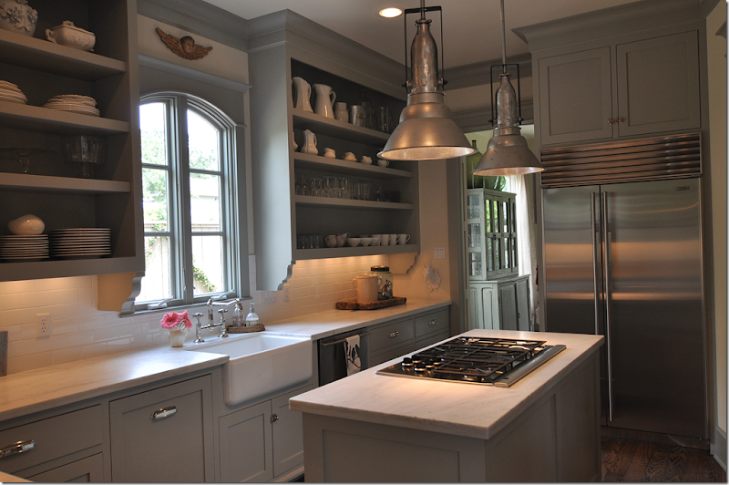
Sally’s Kitchen: the inspiration behind my own small kitchen remodeling.
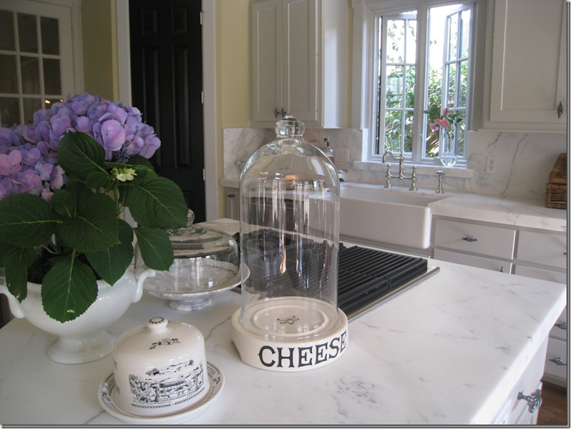
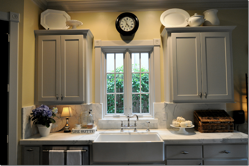 My Kitchen – After it’s renovation.
After I first went to Sally’s house, seeing her kitchen prodded me to finally give my own kitchen the remodeling it desperately needed. While I couldn’t afford the beautiful Sub-Zero refrigerator she had, I could afford a new stainless one. And while I couldn’t buy new cabinets, I could paint mine gray, like Sally’s. The major elements I chose to copy were the casement windows, the farm sink, and the polished nickel faucet. I had already replaced my hardware, but to do it over again, I would probably have chosen the bin pulls like Sally. Of course, the biggest expense was replacing the tile countertops. Although Sally also has white marble, I would have used it regardless of whether Sally had used black granite. The marble was without a doubt the most important element in my renovation and the one thing I wanted above all else.
My center island holds my cooktop, just like Sally’s does.
Another aspect of our kitchens Sally and I both share are center islands where our cooktops are located. If Sally’s kitchen had a fabulous limestone hood and a chef’s range – it would be focal point, and something that would be out of the price range of most who wanted to copy her look. But it is exactly the lack of such luxury that makes so many people look at her kitchen and realize they could have something very similar.
Case in point. This is quite a stunning kitchen with a gorgeous stone hood. The contrast between the black and white painted cabinets and the white marble and wood countertops keeps it all so interesting. But, copy this kitchen? No. There would be nothing you could do to a “regular” kitchen to make it look anything like this, not with a range hood like this that is such a bold focal point.
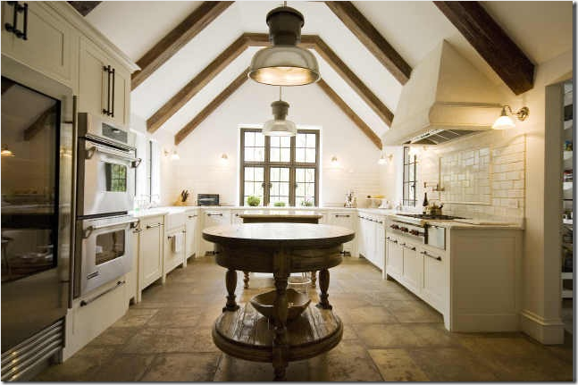
Another case in point: A beautiful kitchen like this is just a dream for 99.99% of the world. Even if you wanted to copy this kitchen, it would be virtually impossible to do so unless you had the basic elements: a gloriously tall, pitched ceiling with beams. Everything about this room is custom – the antique stone floor, the stone hood, the windows, the cabinetry. Even the island is a unique antique. I think when searching for inspiration it’s best to be realistic. Find something that you could honestly make your own, rather than reaching for something that will never look as good!
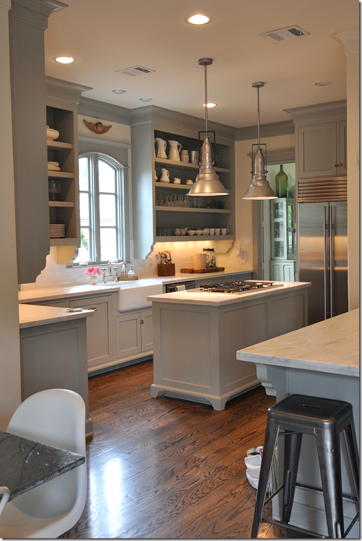
By contrast, Sally Wheat’s wonderful kitchen IS attainable: the size, the style, the painted cabinets, the stainless appliances. While some things in this space may be out of the reach of budget conscious remodelers, it is still full of wonderful elements that most could copy. So, it was no shock when I got an email from a reader in west Houston who had done just that. She had recently completed a remodeling of her house – the living room, dining room, kitchen and family room had all been taken down to the studs. She told me that her new kitchen was modeled after, of course, Sally Wheat’s! When I looked at her pictures of her kitchen, I could immediately see the elements she took from Sally to use in her own kitchen. The homeowner said she used the blog for much of her inspiration. She intently studied Sally’s kitchen, noting which things she loved and which she wanted changed. And though she says the two kitchens don’t look that much alike, Sally’s kitchen was an enormous influence on her. But, it must be noted that the redo was also this homeowner’s vision. And what a vision! What a remodel! Enjoy!
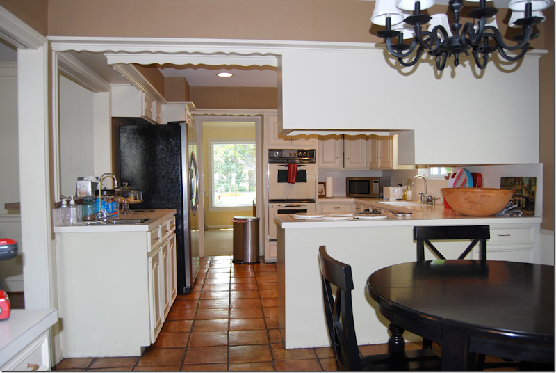
BEFORE: the house has a typical floor plan for Houston. At the entry, the living room, then dining room is located to the left. The family room is straight ahead and looks out to the backyard. The kitchen connects to the dining room and family room. Here you can see the yellow dining room with its large window connected to the kitchen through the door. The family room is on the left, where the bar is. The breakfast room is shown, right off the kitchen. The homeowner could have chosen to do a simple remodeling: freshly painted cabinets, new countertops, new appliances – and maybe new floors. Many people with kitchens like this do just that – and no more. But this homeowner had bigger ideas. She wanted to turn her unused living room into a dining room. The freed up dining room space would become part of the kitchen. The wall between the family room and living room/dining room would be taken down. The entire public area of the house would be open and airy, each room easily accessible from the next. To do this, the walls would have to be taken down to the studs.
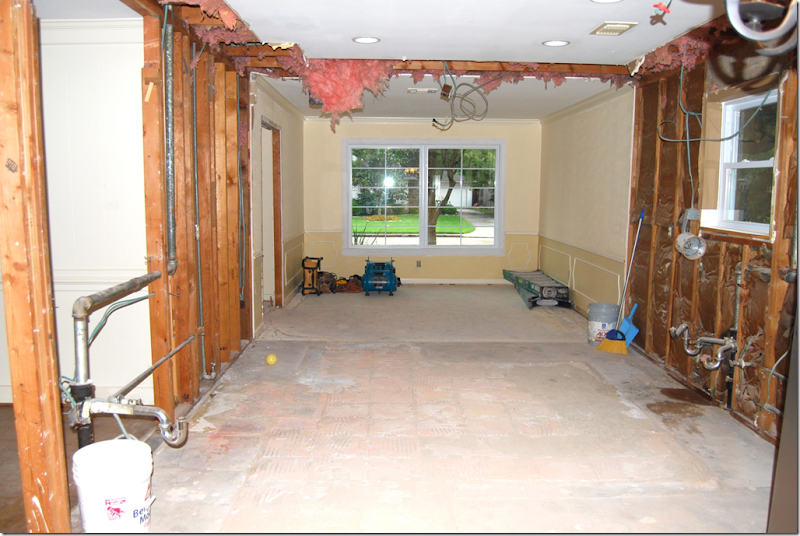
DURING: The kitchen was totally removed. The wall between the kitchen and dining room was also removed so that the kitchen would be one large space. You can see where the old terracotta floor in the kitchen was – the dining room’s foundation is slightly higher. It’s so fascinating to look inside the walls at all the pipes and wires! And look how old the wood looks, it’s probably so hard and rigid after being encased inside the sheetrock for so many years.
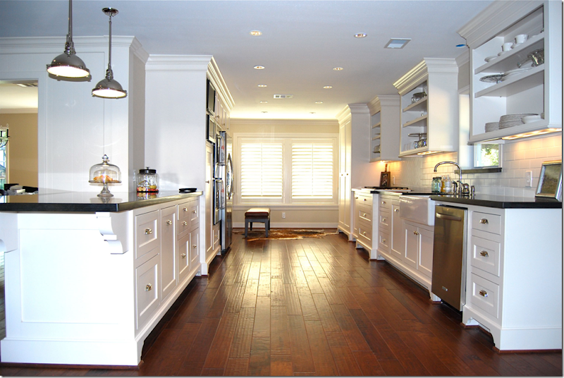
AFTER: The stunning kitchen is revealed! Isn’t this gorgeous? It’s even more amazing when you realize the homeowner is neither a designer nor an architect – she did this all on her own vision!!! The small kitchen is now long – the former dining room has been added to the square ootage. What was once a small U-shaped kitchen, is now a long galley styled space. The footed cabinetry borrows its look from Sally’s kitchen – in both kitchens the Shaker doors are inset. While the inset doors are more expensive, just adding “feet” to cabinets is a wonderful way to simulate this vintage look when remodeling. Both this homeowner and Sally used bin pulls for hardware – the homeowner purchased hers from Restoration Hardware. Both used white subway tile and dark hardwood floors. A major difference though is this: Sally’s cabinets are gray and her countertops are white marble. This homeowner chose white cabinets and honed black granite countertops. Both are wonderful and highly personal choices – none is either right or wrong. The pendant lights are similar to Sally’s, but not quite the same: Sally bought hers at Brown, the homeowner bought hers at Lighting Headquarters on EBay. The cabinets are painted Sherwin Williams’ Divine White.
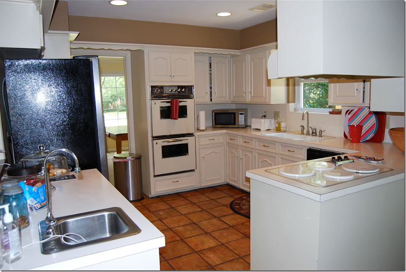
BEFORE: The U-shaped kitchen, with the dining room on the left and the breakfast room on the right.
DURING: Looking from the family room, over the counter, into the kitchen. The farm sink has been installed. This sink was one important element that the homeowner wanted to repeat from Sally’s kitchen.
AFTER: The same view looking from the family room into the kitchen. Here you can see an important element that the homeowner borrowed from Sally Wheat: the open overhead cabinets. This feature is quite prominent in Sally’s kitchen, as it is here. Just beautiful! I love the honed black granite – it doesn’t look like granite – it looks more like soapstone. Do you also see the influence of the Something’s Gotta Give kitchen?
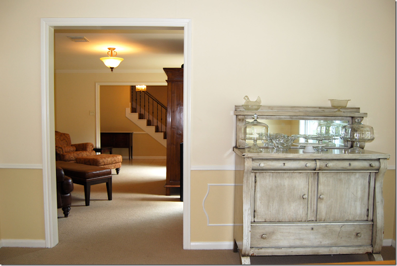 BEFORE: The dining room - looking through the living room into the entry. The living room will become the dining room. The dining room will become the kitchen.

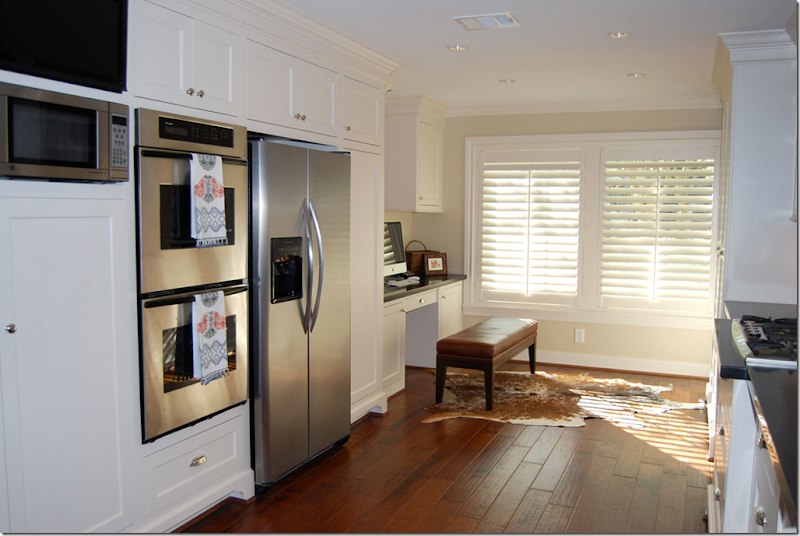
AFTER: Where the dining room once was becomes a work area for the homeowner with the addition of a built in desk. I love the leather bench instead of a chair – and I love the cowhide rug! Sally also uses cowhides in her home. The homeowner added pricey looking wooden shutters. The floors are Anderson, hand scraped hardwoods. And of course, all the appliances are stainless. Notice the refrigerator – a trick I used too. Instead of an expensive built in Sub Zero, the cabinets are built out around the refrigerator, where at first glance, it looks like a built in one.
BEFORE: The family room, looking into the kitchen and breakfast room. This entire wall between the kitchen and family room will be removed. The wall between the family room and living room, where the sofa is now, will also be removed.
AFTER: Here is how it looks from the family room into the kitchen. Gone is the doorway and the pass through. Instead there is a large counter and the two rooms flow into each other. So beautiful! The breakfast room gets the wooden shutters too.
BEFORE: A view from the kitchen into the family room. The wall where the sofa is will be removed to open up the living room/dining room to the family room.
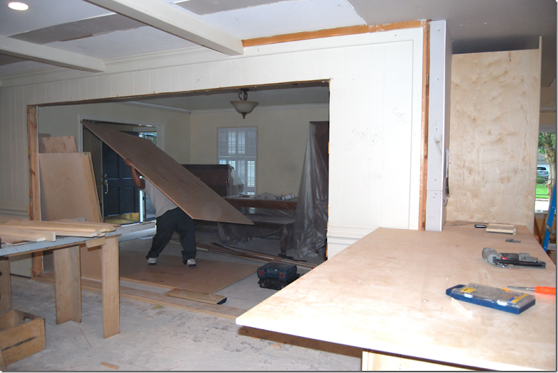
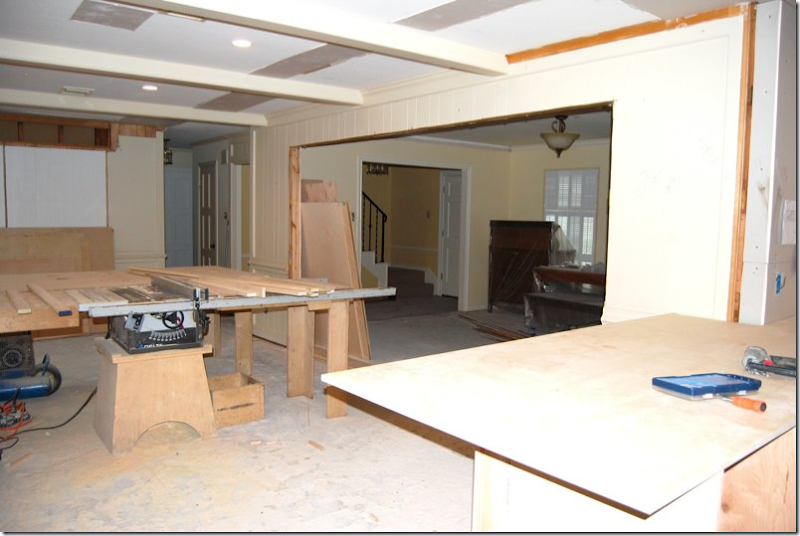
DURING: The same view with the wall between the family room and living room/dining room removed. The wall between the family room and the kitchen has also been removed. Suddenly – the small rooms are all open to each and seem much bigger.
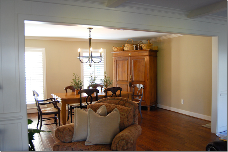
AFTER: the view from the family room into the new dining room, which used to be living room – and all closed off. Instead, now the two rooms flow into each other. The once rarely used living room becomes an open dining room which gets much more use and visibility. The former dining room is long gone – it now part of the kitchen.
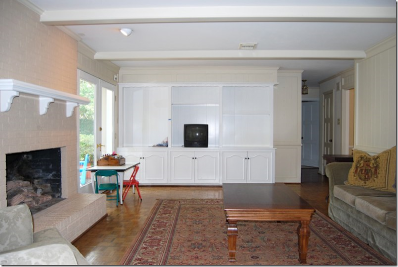 BEFORE: The family room before the wall between the two rooms was removed. Here you can see the old flooring, the 60’s parquet that is found in every house in West Houston! The dated shelving unit was also replaced.
DURING: The family room is now open to what was once the living room, but will now be the dining room.
AFTER: The view from the kitchen to the family room. The shelving unit was replaced with an attractive console. So much more prettier!!
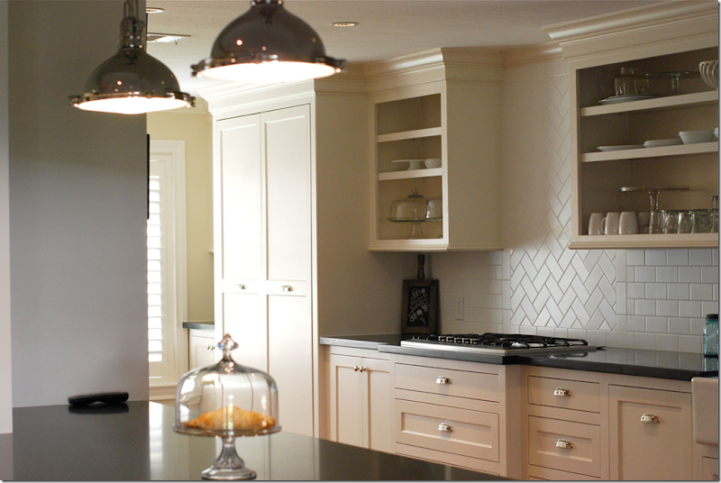 A closer look at the subway tiles which were installed in a herringbone pattern above the cooktop. There is so much storage space!
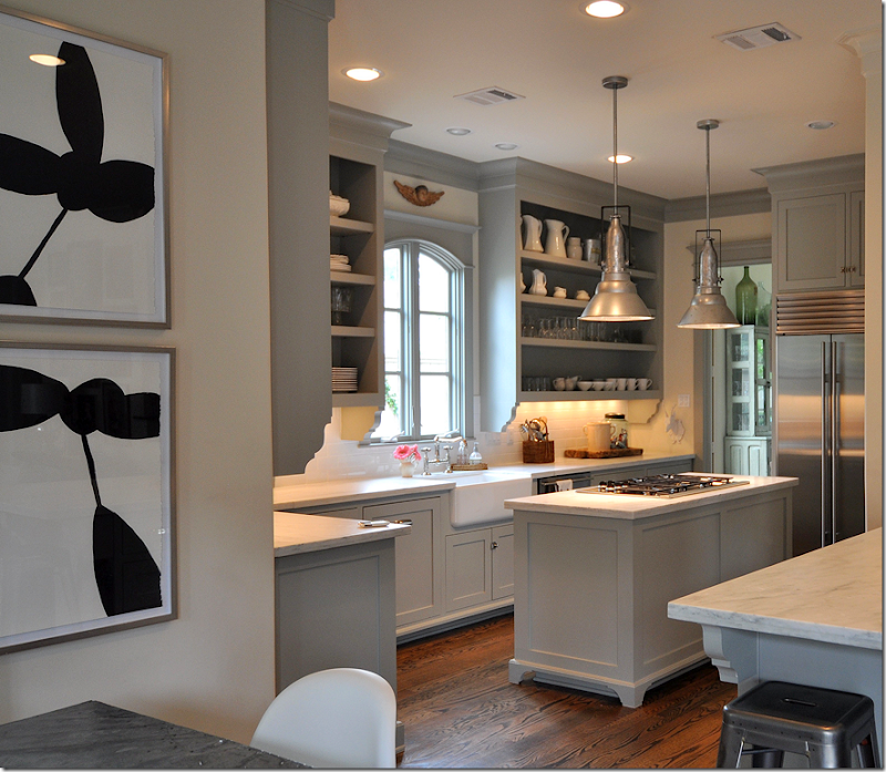
The homeowner’s new kitchen: notice the brackets placed under the bar; in Sally’s house the similar looking brackets are placed under the overhead cabinets instead. Here, the homeowner copied the bracket elements, but chose to use them in a different way – something to remember. Elements can be utilized differently but still give the same visual effect! Notice, also, the similarity in the overhead cabinets to Sally’s (see below.)
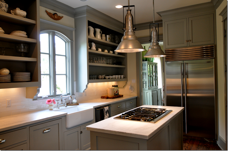
Another look at the inspiration kitchen – notice Sally’s inset cabinets – how similar they look to the homeowner’s and how important an element they are! Also, the farm sink is another important element she chose, as are the white subway tiles. Notice the brackets underneath Sally’s cabinets, the homeowner chose to copy these – but used them instead under her bar counter, thereby getting the same effect. Notice too – how similar the lighting pendants are – another important decorative item in both kitchens.
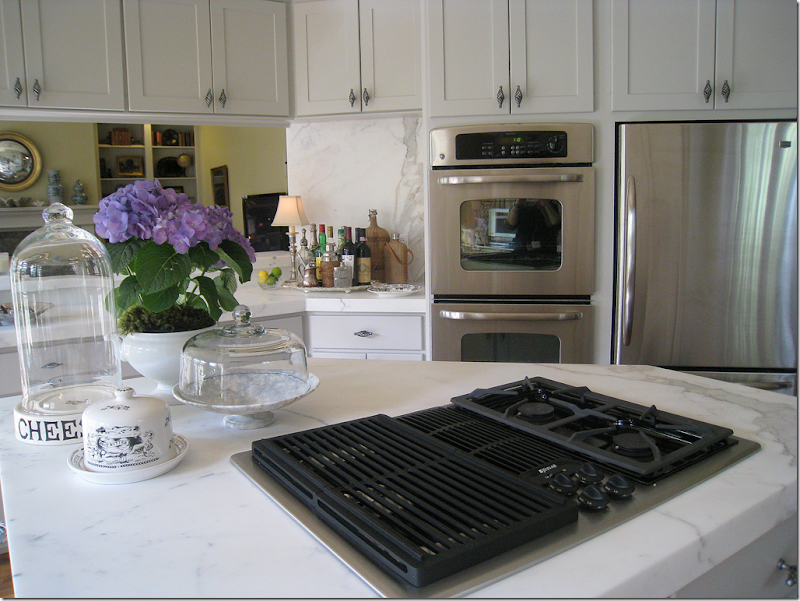 My kitchen remodel: I used exactly the same trick as the homeowner to make my refrigerator look like a built in Sub Zero does. By adding cabinets above that are the same depth as the refrigerator, the unit looks cleaner lined and more custom. My refrigerator was so inexpensive, yet I think it looks rather great! Asked how and why I chose my particular appliances, I was drawn to the handles. If I liked the handle, I chose that appliance over the next one with the same price.
And finally – one last look at the beautiful new kitchen! Job very well done! I just love this remodel – it is so well thought out by someone who is not a designer or an architect. Not sure they could have done a better job. Many thanks to the homeowner for sharing her new remodel! Congratulations, use it in good health and much happiness!!!!!
Remember – Be sure to share your remodel with us! We love them!!

![[SK_WPF.JPG]](https://blogger.googleusercontent.com/img/b/R29vZ2xl/AVvXsEgvIOA2v6xOBX8U-Tir3Y_VQiCfgIQ1BihfvIgJhHPpRi0W5z0DXtHxOsgDlRm5x5yWTqQBk0XHhV9eWS2oTSBoyJl-mJnOXmagtUKvaE-7IsXtnFD2o49XpnqeTSvhjIlfDf5HE96HpqY/s1600/SK_WPF.JPG)






Stunning! Congratulations to your reader! Her kitchen looks gorgeous!Blogs are a real source to inspiration and certainly yours Joni!!
ReplyDeletexx
Greet
What a great take on an even greater kitchen inspiration. The homeowner did a wonderful job integrating elements that she loved into her own design.
ReplyDeleteBravo job well done!
Leslie
This is a visual feast! I really think we have design blogs to thank for helping bring the process out of the pages of magazines and into the homes of those of us who love beautiful things but can't always afford the materials (or, more importantly, the expertise!) of high-end design.
ReplyDeleteHave you posted your cabinet paint color somewhere? We have a kitchen that's on the "five year plan" for a gut remodel, but until then grey cabinets would go a long way to making it better.
It is so perfect , no details were missed.
ReplyDeleteIt is so perfect , no details were missed.
ReplyDeleteI love it!!! wonderful job, and thanks for sharing!! nice post Joni!
ReplyDeleteGreat post joni, and beautiful kitchen homeowner! I loved all 3 kitchens!
ReplyDeleteWho knew that attainable could look so good!! I love this kitchen (and this whole post, too).
ReplyDeleteYour reader did a fantastic job. Beautiful.
ReplyDeleteWonderful kitchen. Have kept the after photo in my 'scrapbook'.
ReplyDeleteI am constantly amazed that many American houses can be reconfigured so easily. Walls taken down etc.
ZoeB
Found your blog recently, moving to Texas this spring - thanks for all the great decor ideas - I'll be back for more visits!
ReplyDeleteI am so impressed with this homeowner. Most would have not dared to tackle a renovation of this size on their own. Beautiful details and well executed. And yes, I absolutely see the "Wheat" and "Gotta Give" influences. Thanks for the tour!
ReplyDeleteJoni,
ReplyDeleteLove your kitchen. Please share the color of your kitchen walls. Restrained Gold by Sherwin Williams has been suggested. Do you have any thoughts on that color. Love your blog!!!!!! Thanks for taking time each day to enlighten ours.
Joni,
ReplyDeleteThanks for sharing. I love your kitchen. I just redid mine last summer & it's the best money I've ever spent! We have enjoyed it more than anything I've done in this house. Thanks for sharing the great remodels. I love to see kitchens go from "old and yucky" to "new and dreamy". Hope you are well.
Gwen Driscoll
Ragland Hill Social
Beautiful re-do - Thanks Joni for your great blog and the inspiration it brings us all.
ReplyDeleteI like the open shelving-- so much safer than cabinets with doors. But, as God is my witness, I'll never have a downdraft again. If you really cook, especially spicy food like curry, the whole house smells! And I would not put the ovens next to the refrigerator. Imagine one person opening the doors on each appliance at the same time-- potentially dangerous. Never mind the added energy cost-- even with insulation between the two appliances, using the ovens is bound to make the refrigerator kick on more than it would otherwise.
ReplyDeleteI enjoyed your post. Thank you once again!
ReplyDeleteGreat remodel and love both your kitchen's and Sally's.
ReplyDeleteWow, her kitchen looks beautiful! And I love the honed black marble and white cabinets! It's so interesting to look at the pictures....it really seems to capture the same feel. I love it!
ReplyDeleteSally Wheat
Wow! Looking to do my tiny ski condo kitchen over (its from the 80s). I will be back to stare at this post for inspiration, again and again, I am sure! Thanks.
ReplyDeleteThank you for sharing the simplicity! All the kitchens have a quiet calm and don't look overwhelming.It's amazing the result when walls come down.Great inspiration.
ReplyDeleteJulia
I agree with the observation that ovens next to the fridge is unusual if for no other reason that visual appeal. The stainless appliances would look better broken up throughout the layout rather than stashed next to each other.
ReplyDeleteOh the power of good renovation. I love it when these old houses are graced with it.
ReplyDeleteFabulous- I love seeing remodels!!
ReplyDeleteGood job Joni and home owner! I really love the "stunning" kitchen! Do you think the cabinets are black or dark charcoal? May I ask what source that picture is from?
ReplyDeleteTina Ramer
All three kitchens are GORGEOUS!! However, none have overhead hoods. Can anybody comment on the practicality of this?
ReplyDeleteJoni, I love your blog. Thank you for all the work you put into it.
This is almost the 1968 house I grew up in, parents still live there. Mom has same white ovens shown in 'before' pics.
ReplyDeleteThey've upgraded some; not this much. Fun to see possibilities.
Doing a few things to my kitchen now. Had no idea how A-Few-Things could cause so much chaos in the doing. Husband? We had a rubber-meets-the-road conversation last nite. Unpleasant, but one must be firm at times.
He's now on board.
Garden & Be Well, XO Tara
This comment has been removed by the author.
ReplyDeleteJoni, thankyou for showing 3 kitchens with similarities but also pointing out the differences. Love all three. I actually prefer working in a smallish kitchen so I like the layout of your kitchen.The carrara counters and white tile black splash is in my dream/someday file. I loved living vicariously through these wonderful images,Kathysue
ReplyDeleteWhat a wonderful renovation - and I adore your cozy kitchen Joni!
ReplyDeleteI love all three kitchens, they are so similar! I love carrara marble but also black counters too. Your kitchen is wonderful and I've been admiring it on your blog I just posted a small teaser of my Wine Country kitchen and I notice we have a similar love: Cheese platforms with domes. I love these so much! --Delores
ReplyDeleteI am so excited to see my kitchen on your blog! It is a honor to be featured. This is so much fun! Thank you for inspiring me to create a kitchen that I love. Your thoughts and ideas are an inspiration for us all who study your blog in order to create something fabulous within our budget.
ReplyDeleteWith careful thought, design can be duplicated. But, you do have to have vision, as you stated, the homeowner did. Boy did she! Thanks for making it seems attainable to an average Jo.
ReplyDeletePretty please...tell the color of your kitchen cabinets.
Dee
Gorgeous! Congrats to the reader for creating such a wonderful kitchen!!!!
ReplyDeleteThanks for sharing!!!!
~Des
Another great post Joni! Thank you from a loyal reader.
ReplyDeleteI would also like to see a discussion of marble as a kitchen countertop. Are you trying to keep it pristine? Do you cook a lot? Are you just not worrying about it?
We are getting ready for a kitchen update/remodel in our Dallas house. The countertop decision is holding me up. We have soapstone in our farmhouse and even though it takes some maintenance (mineral oil), we are considering it for our house in the city. After four years, I still like it. It does not have the even tone of granite--but I think I may like it better---for us.
The white marble is gorgeous though---but what about etching? We have it in one bathroom and I find myself being very protective.
All three of these kitchens are beautiful. It was such a treat to see all of them.
Love all 3 kitchens. White marble does etch. I tried everything to get the etching out and it didn't work. I was careful as well but after 4 years, it didnt' look good. Maybe honed white marble would do better.
ReplyDeleteI am in the beginning stages of a kitchen/bath remodel of a log home and am considering soapstone/honed slate/ honed limestone. Any suggestions?
Also are those cabinets on this feature job built?
i love sally's vision and her house. Her work is such an inspiration.
ReplyDeleteHow excited were these people when the project was finished?! Not only because, it's such a stress to have your house under construction, but the outcome was beautiful!!
btw, I'd love to replace my countertops with marble....hmmm.
Amazing! And so inspiring to see a home owner take on such a large renovation without the help of a designer or architect and have it turn out so beautiful. Absolutely amazing!
ReplyDeletePoneeexcumn, clomid online atroppyimpope, [url=http://www.webjam.com/clomidonline]buy clomid[/url] NekthurbPreek
ReplyDelete23
Thank you for sharing! What a fantastic job that she did!
ReplyDelete~ Joanna
What a beautiful kitchens' tale with such a happy ending. I agree with you in choosing to renovate wisely within your budget. Your kitchen is gorgeous and so is the reader's. She was on Velvet & Linen contest for the coffee table, which would have added a nice touch to the sitting area.
ReplyDeleteWhat an inspirational kitchen re-do! I am impressed that she did it by her own design (of course, with great reference pictures)- and it looks great.
ReplyDeleteAnonymous,
ReplyDeleteIn our restored log house we chose to have zinc countertops. I can't comment yet as they are not quite finished and I haven't used them yet. As I mentioned above, we have soapstone in our farmhouse kitchen and really like it. Be forewarned though that it takes a while and some persistence with mineral oil to get it looking great. Our soapstone has veins and I like that. I also like that you can set very hot things on it without worry. It does not stain or etch. Having to apply mineral oil about once a month (and then wipe it off ) appears to be the only drawback. Like most black countertops, little crumbs show. If you see soapstone in a magazine feature, you can be sure that it has been prepared for the photo with mineral oil and lots of wiping.
I may be mistaken, but I think most limestone is quite porous.
Is it wrong to be in love with a kitchen???? Me thinkth not!
ReplyDeleteBoth are beautiful.
Joni...hoe do i email you?
ReplyDeletejenny johnston
texasjennyj@comcast.net
Gosh, I swear I knew that exact house, but when I saw the stairs I knew it wasn't. Guessing it's in the neighborhood behind Memorial City Mall. That kitchen looks oh so nice.
ReplyDeleteBeautiful story! Question:To extend the counter top over the lip of the sink (as in the new remodel) or stop half way so that a portion of the sink lip is exposed? Is cleaning that little exposed lip edge more difficult? Is there exposed grout that could discolor or food get trapped? Opinions? To extend or not?
ReplyDeleteI have honed white marble - and had it sealed. If you wipe IMMEDIATELY after a spill it will not etch - but otherwise it etches just like polished. If you want an idea of how a honed white counter will look in 10 - 20 years go to Kuhl Linscomb in their linen area - they have a DIVINE yellowed,old-used-to-be-white counter on their desk. It looks French - and has weathered like the old European counters. The look is "old world,soft as butter - can't stop your fingers from stroking it". If that's what you want to achieve - hone your marble and just sit back and enjoy it age!And your guests who "spill" will love your laid back attitude!
ReplyDeletei would love to know the paint color on the grey cabinets too. i am obsessed with grey lately..paint, clothes..even my boys have new grey sweaters!
ReplyDeleteThis makes me want to ask my land lord to remove the doors on my upper cabinets and paint my kitchen gray.
ReplyDeletexoxo,
nancy
What pretty kitchens....I really like the grey cabinets....I happen to love grey...I feel it is so neutral....I just love the color orange and I think the 2 colors are smashing together !!!
ReplyDeleteNice post Joni..
beautiful kitchens girls...thanks for sharing..>..<
Kathy :)
Thank you! You have no idea what you have done for me.
ReplyDeleteBeautiful kitchens! I live in Houston and would love to know the name of the contractor who did the homeowner's kitchen.
ReplyDeleteI love how the cabinets go all the way up to the ceiling. Does anyone know the ceiling height of either of the houses? measurements for this arrangement would be greatly appreciated!
ReplyDeleteShe gets a STANDING "O"!! WOW! beautiful transformation indeed!
ReplyDeleteI love this! It's great to see three spaces all based on the same theme, and to show how the same look can be had with different budgets, materials, and fixtures. Good stuff! And I love Sally's pendant lighting--a lot.
ReplyDeleteAll the kitchens are beautiful! Please tell me the source of the cheese platter on your countertop.
ReplyDeleteEnjoyed the images, but more importantly I appreciated your guiding points of what can be achieved to get a similar look when the space is limited. It gives me hope and ideas for my kitchen update.
ReplyDeleteJoni,
ReplyDeleteThank you for keeping in mind that many of us have limited funds, and showing us how we can have beautiful homes on a budget!
And yes, - Please post the name of the gray paint used on your and Sally's cabinets.
Thanks a bundle!
Really interesting post. I love hearing about how it all came together. Thanks!
ReplyDeleteThanks Joni
ReplyDeleteI do love all the photo's of the amazing mansions homes you show.Us ordinary folk love too see what people with homes just like ours do when faced with a decorating dilema as we can't afford designers on our budgets usually. Here in Australia our homes don't tend to feature alot of detail. So we have to make our own.
Kind Regards
Karen
PS:As always your comments help us find our way
Joni,
ReplyDeleteYes you've done it again.
More kitchen envy by me and noted in comments above.
Now it's time to remodel my 60's kitchen, but decision making isn't a skill I have.
So for now I will keep rereading this post and also the S Wheat kitchen post and your kitchen remodel post.
The gray in Sally Wheat's kitchen is BM fieldstone. But I'd like to know what gray Joni chose for her kitchen too.
ReplyDeleteI have to confess a concern about the open shelving/unvented cooktop combination. I once read that cooking without using a ventilation fan sends a pound of invisible oil droplets through your house every year. That could add up to a lot of shelf cleaning. Perhaps there were downdrafts that I didn't see; I hope they are powerful.
here is my thought. I live in Europe and if you want to have kitchen like these three ( all beautiful!!!) you have to pay big money, but seriously. These kind of kitchens are famous brands (Scavolini, Marchi group, lots of UK top brands) and they cost a fortune (this size probably around 20k euro and even more).
ReplyDeleteIs it cheaper in US? And I do get a feeling that there are many more specialised stores (hardware / wood) which help you to do it DIY??
Am I right or not?
ANAM
Back again, already...with a question. Do you happen to know where that black and white print (1st photo) is from? Who makes it?
ReplyDeleteThanks.
Could the reader let us know what honed granite was used and how she liked it. I am looking for honed black granite and I would lover her input.
ReplyDeleteBeautiful Job!
such a gorgeous post. love it all! I am about to paint our cabinets gray too and add a subway tile. love, love this post, have I already said that?
ReplyDeleteYes, please do divulge the contractor! I'm in West Houston too. Anyway you could give us an idea how much this cost? My layout is the same. I've always dreamed of incorporating the small old dining area into the kitchen.
ReplyDeleteGreat post. Houston is so lucky to have you!!
Imagine my delight when I saw this post and realized that the pictures show a house with the EXACT same layout/features/EVERYTHING my husband and I just purchased in Nottingham Forest in November. I mean, it is our exact house!! Ours is farther along with updates than this one was (e.g., granite counters, new floors, etc.), but it is amazing to see the potential -- the redo is breathtaking. I feel a big remodel coming on in a few years, and now I'm lucky enough to have a great example to go by! Thanks so much for sharing this one -- I'm in love.
ReplyDeleteall are just GORGEOUS!!!! I can't wait until we get inset doors & superthick stone countertops!!! (will be YEARS!!)
ReplyDeleteI love the simple elegance in all 3 kitchens. They're so beautiful and timeless.
How did you like the kitchen in "It's Complicated" - I thought of you. I love the "Wheats" kitchen.
ReplyDeleteAs always you show such great ideas - sophisiticated and as I refer to the "hub and heart of the home is the kitchen!"
pve
That's a beautiful kitchen remodel. Such a great job she did with all of her choices!
ReplyDeleteOh she must be tickled pink with her gorgeous work! What a great kitchen...all of them are supberb!!
ReplyDeleteBravo!
The lights I am looking for something very close to those and or if we can find those...any ideas on the location ???? Love Love Love your blog! XOXO
ReplyDeleteI keep coming back to this post....these kitchens are beautiful. May I ask what type of wood you had repainted in your kitchen? We've got a very open floor plan and a large kitchen. Given the size of the kitchen, a total remodel is not in the cards. But, I cannot stand the 1991 builder's oak. I've found a craftsman who paints the cabinets in a process similar to that of painting a car....I just worry about the grain....
ReplyDeleteI love your blog. Having grown up in Tanglewood...I yearn for Texas every time I stop by!
What a lovely kitchen! But, now I am vascillating again on that black / white decision. Just when I was thinking to paint my basement cabinets black, I fall in love with white cabinets! I romance those for a while then I fall in love with black all over again.
ReplyDeletePaula ~ Mise en scène
Oooh the plates and bowls really POP against the colored cabinets. So pretty!
ReplyDeletewhat a great redo post!
ReplyDeleteyou are fast!
ReplyDeleteWhat a fabulous post! It's fun to see how different people incorporate similar ideas to make them their own. Beautiful!!
ReplyDeleteJoni,
ReplyDeleteI remember when you posted your kitchen redo and it is just so beautiful. I like the color on your cabinets like the home you showcased....what color is that?
That kitchen transformation is quite amazing, What a job getting tile up, leveling the floor and laying the hardwoods...very nice!
Always enjoy seeing what's going on in Houston!
xx
All three are such beautiful kitchens. They all have such a peaceful vibe. 3 very talented home owners created these beautiful kitchens. laurie
ReplyDeleteI love your beautiful Kitchen posts ~ and showed them to family and friends in the throws of remodeling! We too underwent an enormous remodeling project, and the Kitchen was at the heart of it. I became the designer. It took years, not months to complete but worth the wait. Seattle Homes & Lifestyles feaured La Cucina Dolci in it's current issue. Thank you for the inspiration, It helps to know you are not in something alone. Your blog is fantastic! Monica
ReplyDeleteI love your beautiful Kitchen posts ~ and showed them to family and friends in the throws of remodeling! We too underwent an enormous remodeling project, and the Kitchen was at the heart of it. I became the designer. It took years, not months to complete but worth the wait. Seattle Homes & Lifestyles feaured La Cucina Dolci in it's current issue. Thank you for the inspiration, It helps to know you are not in something alone. Your blog is fantastic! Monica
ReplyDeleteP.S. roomtoinspire just featured our home on its site ~
ReplyDeleteMonica
What an amazing renovation. Both kitchens are lovely!
ReplyDeleteI too live in West Houston and I swear we all have very similar floorplans with different exteriors! But my real question is in your kitchen remodel--what window manufacturer did you use--are they wood clad, wood, or vinyl or ??????? because they are beautiful and windows are like jewerly for a home in my opinion.
ReplyDeleteWheat kichen yes. Other kitchen, boring, why bother with all the photos. You can do better
ReplyDeleteWhat a gorgeous remodel! I'd love to know where she found her dining table. We have the same dining chairs and have been looking for a table just like it for over a year. Would love to know where it came from. Thanks!
ReplyDeleteJoni - I love your kitchen! How charme your 'mini bar' is set out on the counter - no squeaky doors to contend with. And, your right, the window is important :}
ReplyDeleteLOVE LOVE LOVE kitchens!!!
ReplyDeleteBTW... LOVED your giveaway post... you had some FAB photos... so I stole 2 and painted them... just wanted to show YOU!
Take a look...
http://fififlowersdesign.blogspot.com/2010/01/french-shop.html
http://fififlowersdesign.blogspot.com/2010/01/chic-shopper.html
ENJOY! Have a FAB weekend!
Fifi
estaliBriesty, cheapest tramadol, bealiaVet, buy cheap tramadol, Hifavamom, order tramadol nex day delivery, dofafforp, tramadol online, MatBultapetle
ReplyDeleteestaliBriesty, tramadol cheapest, bealiaVet, buy cheap tramadol, Hifavamom, order tramadol nex day delivery, dofafforp, byu tramadol online, MatBultapetle
ReplyDeleteFirst of all I must say I LOVE your blog!
ReplyDeleteI tried to find the great pendant lights in the kitchen redo from Brown..I clicked on the link and was not successful. Can you tell me who the manufacturer of those pendant lights is? I would love to buy the same ones for my kitchen. Thank you!!!
I am always searching online for articles that can help me. There is obviously a lot to know about this. I think you made some good points in Features also. Keep working, great job! dryer repair Los Angeles
ReplyDeleteThanks for your tips. Many bloggers do not know how to monetize their blogs. I sure hopes this helps them and for those who have been making peanuts, they can now gear up to make even more.
ReplyDeleteAppliance repair Houston
This kitchen is beautiful! Love your style!
ReplyDeleteNice post.
ReplyDelete