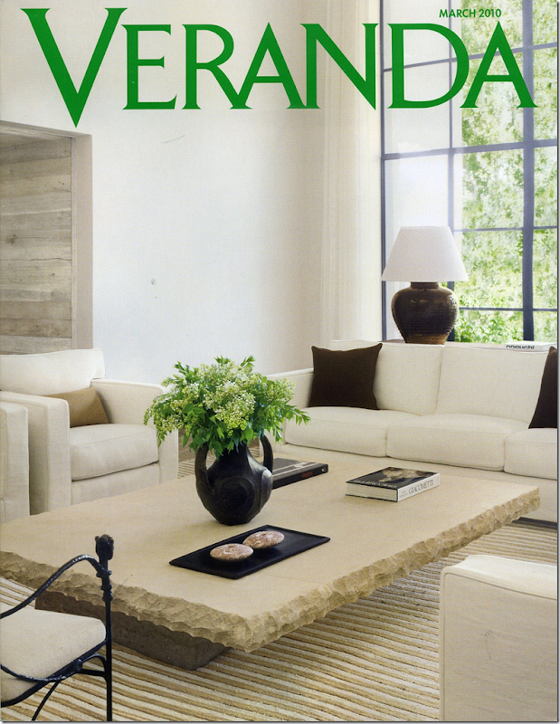
This month’s Veranda – it’s a good one!
I opened an email from a reader – she casually mentioned she wasn’t happy with the new Veranda, she found it boring and thought perhaps I would join her in the bashing. I thought, should I? Should I pretend I agreed with the reader even when I truly didn’t? After all she is quite nice and sweet enough to email me and the last thing I would want to do is offend her by arguing about a magazine, of all things! So, I pondered my answer to her (and I wonder why my emails are so stacked up!) before I chose a neutral position:
I wrote back:“haha. I kind of liked a few articles - the one from Houston especially!” - an understatement of the year, I would say. Kind of liked it? How about, well – more on that later!
As I said, it’s just a magazine after all – 150 pages of a few pretty pictures and lots of advertising in between. But, why did she dislike this Veranda so much, when I absolutely loved it? Who knows. I’m sure if the editors could bottle up the formula for what makes a magazine likable, they would. The fact is, I think it’s a great issue, full of beautiful homes and mouth watering jewelry and gorgeous flowers. What more could any woman want?
Reading it, I felt that editor Lisa Newsom had called me up and said, “Joni, what do you want to see in the March issue? Tell me!” And then, she delivered it. All.
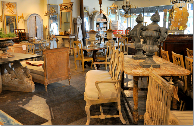
Tara Shaw’s Houston shop.
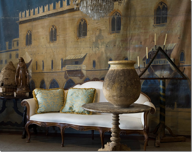
The issue is full of things a Houstonian would love, so maybe I am biased. Newsom starts with a small piece on Tara Shaw’s new antique reproduction line. She then shows a house in Colorado owned by a Houston businessman/socialite – it’s always a thrill to see how the other half lives! Then, there’s a wonderful apartment in Paris full of antiques – owned by an American designer. And whoa – Newsom even adds a house by Dan Carithers. How long has it been since any new work by this Atlanta designer has been seen? That alone is worth the price of the magazine.
But Newsom doesn’t stop there. The cover story is a house by the hottest married couple in interior design – they are so hot despite the fact that no one even knows their name, much less can pronounce it or spell it. The Belgian, Californian, Mediterranean Modern house all rolled into one is the work of Michael and Alexandra Misczynski. Remember those names. You are going to be hearing them a lot. Well, just remember the name of their business - Atelier AM - if you have trouble with their last name. Except how do you really pronounce Atelier? Why did they choose a difficult business name when their own last name is impossible???
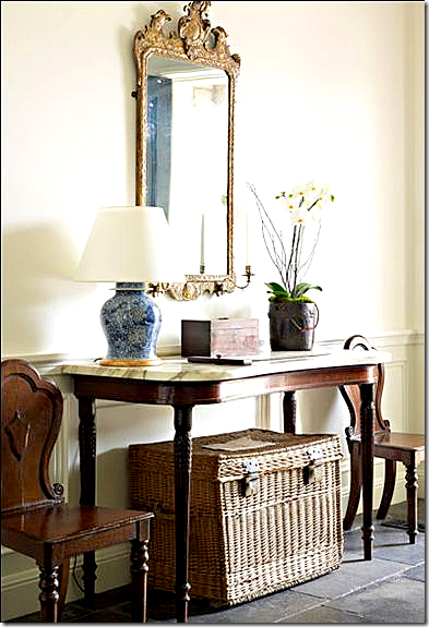
A casual entry hall by Atelier AM aka Michael and Alexandra Misczynski.
Everyone who can properly pronounce their name is talking about this couple. The Misczynskis started their own business in 2002, and half of Hollywood, who are probably the only people who can afford them, have hired them. The focal point of the house in this month’s Veranda is a huge wood cabinet bought in Belgium from Axel Vervoordt. I can only imagine how much that one piece cost, much less the rest of the furniture. It’s all casual and wonderfully Rough Luxe, but don’t let casual be confused with inexpensive. Everything here has a provenance.
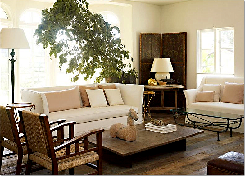
Living room by Atelier AM. I love this room – with the blush pink silk pillows mixed in with all the rough woods. Atelier AM is the personification of Rough Luxe. Beyond fabulous!!!
But, it wasn’t for Carithers or the French Apartment or Tara Shaw or the Misczywhoevers that had me driving by the grocery store at 12:00 midnight and stalking Barnes and Noble looking for the March Veranda, even though that felt so good! I hadn’t driven around looking for a new magazine issue in ages! It’s just too sad to do all obsessing now - the racks are so empty! There are so few decor magazines left to buy except for the Big Three, what I now call House Beautiful, Elle Decor, and Veranda and a few international issues. But, I digress. I had heard the blogosphere mumbling about this Veranda showing Kay O’Toole’s new house and that was what had my mouth watering like Edward’s whenever Bella is around. Honestly, I’ve been waiting over two years for this issue!
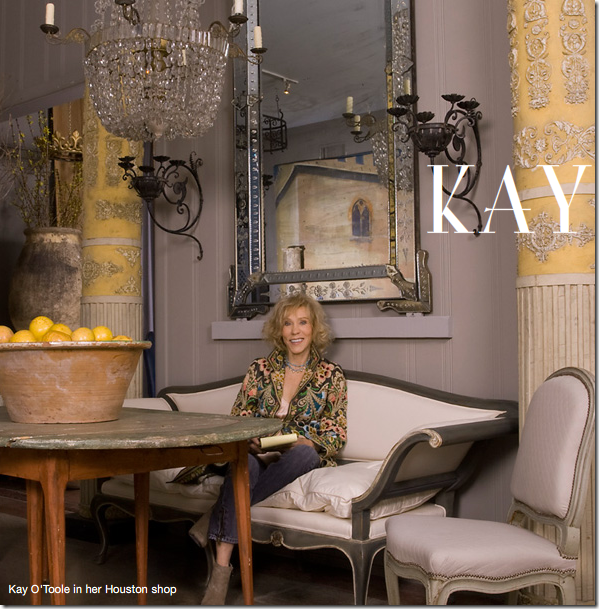
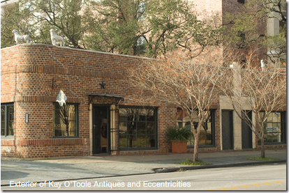
O’Toole owns a French antique shop housed in a 1920s brick building that was once home to several different businesses. Through the years, she eventually acquired the entire building and tore down the dividing walls – creating a long and narrow haven for the best of what France, and now Belgium, Sweden, and Italy have to offer. O’Toole has an uncanny eye to buy just exactly what you want – everything in her shop is delicious. It’s impossible to walk away without feeling wistful about what you have left behind for someone else to stake claim on. O’Toole’s eye extends of course to interior design. Not for other people, but for herself. Through the years her changing houses and decor have been published, allowing her devotees to follow her lead. The crowning touch was her apartment in a mid century high rise that half of Houston’s designers – interior and fashion – live in. Again, like at her shop, she combined one apartment with another, and another again – stretching her living space to accommodate her growing collection of French chairs, no doubt. The apartment was so far ahead of itself. Looking back at it now – she moved there over 15 years ago - it’s amazing to recognize the trends she indulged in before they were trendy. She had white vellum books when no else did, and crowns were everywhere before anyone collected them. There were painted pieces and dark woods mixed in with concrete garden elements, though hers were centuries old. There was a light gray antique Fortuny covering most of the chairs - cut from curtain panels she had uncovered. Houstonians who are into design went slightly batty over her place. I know I studied it – every inch and then some. At one point I even took out some tracing paper and tried to draw the floor plan in order to understand it better. It was, in a word, gorgeous. Simple, almost plain, yet elegant, a Parisian flat in the middle of the southwest. In the end, I think that apartment was publicized three times, once locally, once in Veranda, and once in a decor book. Each photo shoot was just a little different than the next to create excitement. The space was so perfect for Kay. She shared it with her partner, just the two of them, high in air, overlooking the greenest part of Houston. Why would anyone ever move?
O’Toole’s shop, a mix of French, Swedish, Belgian and Italian antiques.
But O’Toole had other plans. She had long dreamt of living in a house modeled on a centuries old New Orleans design. She marches to her to her own silent beat, and she was now ready to create a symphony. Behind her shop, which fronts one of the longest and most traveled streets in Houston, there is a large back yard, filled with a gravel parking lot and ferns – thick and unruly. She decided to build her house, an enfilade, in the back of the yard. One long side would face the parking lot and the store’s back, the other side would face the back property’s fence. The house would be narrow and one room deep in most places. She would design it on scraps of napkins at dinner, tweaking it until it became her masterpiece. Finally, the enfilade became a reality, rising up from the ferns and gravel.
Kay’s antique shop, filled with European antiques.
One day Kay was sweet enough to take me out back to see the house, still under construction. She graciously smiled at my ooh’s and ah’s, and pointed out what would be where – her kitchen, the living room, her bedroom. She showed me the French doors that had just been installed. They were from a large cache of old metal windows she bought when a River Oaks mansion was being demolished and she had designed her enfilade around these glorious pieces of glass and steel. When it was all finished I once stopped by and hinted at maybe seeing it again, now completed and furnished. Oh no, it was a mess, not ready for its debut, a million excuses from someone who is a perfectionist at being a non perfectionist.
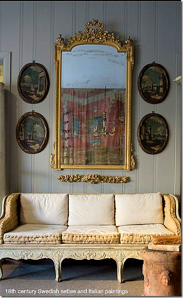
I adore these oval Italian paintings.
So, do you understand, now, when I say I’ve been waiting for a few years, to see inside Kay’s new house – her own personal piece of the French countryside, hidden away right off a busy street in Houston? I knew it would be published, but when? This month, Lisa Newsome – finally gives me the grand tour.
Kay’s shop: Kay O’Toole Antiques and Eccentricities. Her new house is located behind this 1920’s brick building, past the gravel parking lot and fern garden.
I would love to show and discuss the photoshoot of O’Toole’s new house here, but I can’t ruin it for any of you who haven’t yet seen it. Instead, let’s look back at her former place in the sky and remember how beautiful it all was back then!
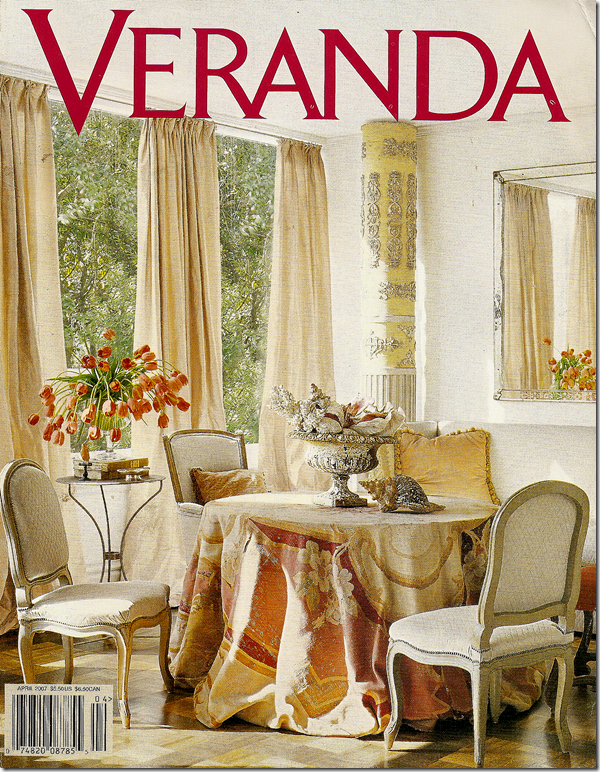
The March 2007 issue of Veranda shows Kay’s famous antique Aubusson rug, casually draped over a round table. Stunning. I’ve wanted to copy this look for years! One of Veranda’s prettiest covers. All photos by Tria Giovan for Veranda.
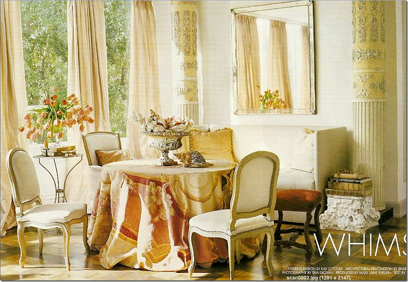
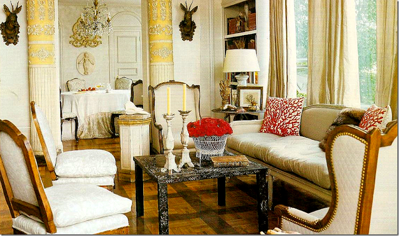 The main living area in the highrise – with the French settee surrounded by French chairs, some covered in the gray Fortuny and some in a quilted white linen. Ahead of the trend, two faux deer heads flank the doorway to the dining room. The walls were painted white back then, while most of us still had color on ours. Silk taffeta curtains hang simply from the top of the windows. The yellow papier mache columns played an integral role in the design of this apartment, but they are absent from the enfilade. Instead, they have now moved to the store, looking for a new home.
 Off the living room is the dining room with the gray and white Fortuny covered chairs. The fabric covers the table too. An antique screen shields a door. In the new house, the Fortuny is gone, replaced by a light lavender fabric that covers the chairs.
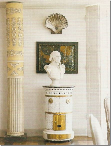 More trendy items from years ago: A Swedish stove stands next to one of the many papier mache columns placed about the space. A bust stands guard under a large clam shell. This army figure shows up again in the enfilade.
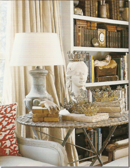
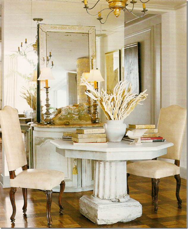
Next to the main living area is another sitting area – three apartments were merged into one. A concrete capital holds antique books, while a steel garden table holds tulips. On the skirted table, one of the prettiest I have ever seen, a crusty urn holds a collection of shells, again, years before shells became so important in today’s decor. The walls are stark white, while the taffeta curtains are a slight champagne color. Too gorgeous!!
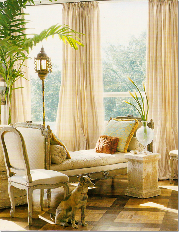 Across from the skirted table is a daybed with another garden element standing in for a table.
Reflected in a wall of antiqued mirror is more concrete, vellum books, and ironstone. Birds are another favorite of O’Toole’s. Notice the beautiful painted console. The parquet floors have been painted in a Versailles pattern. The mirror reflects the Italian light fixture that today is so wildly popular.
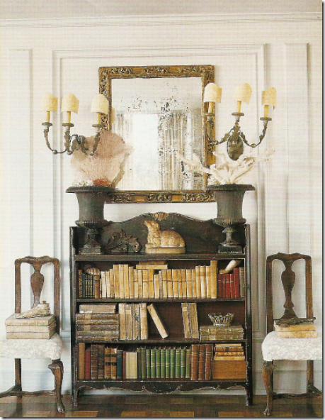 Two Fortuny covered chairs hold more antique vellum books. More urns, more shells, including sea fans. This might be the first time I ever saw sea fans used as a decorative object.
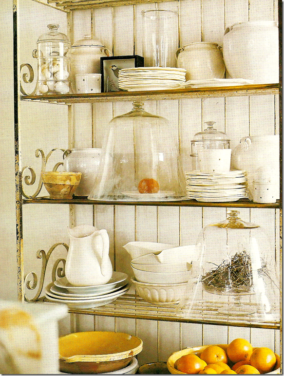
This is the only picture of the kitchen – which is actually two made into one. Here, a collection of iron stone and yellow ware, cloches and bird nests and eggs all rest on an antique baker’s rack.
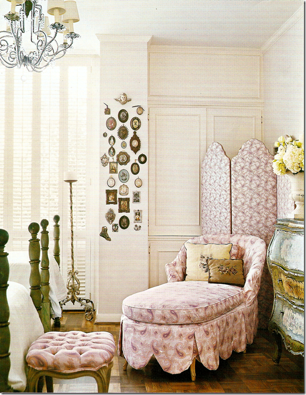
The guest room is a charming space – a Paisley slipcovered chaise with its large scalloped detail shares space with another screen and antique commode.
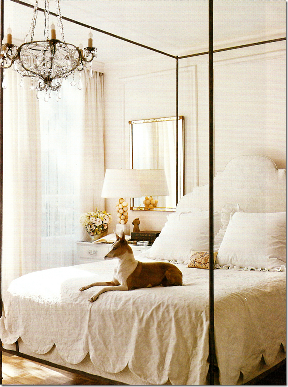
O’Toole’s bedroom features another large scalloped detailing. The simple room is all in white – all moldings were added by Kay. The new house, shown in this month’s Veranda is still all antiques, mostly monochromatic with touches of lilac. Above all, it is elegant – just as this space was and it is totally original, totally Kay O’Toole. Finally, it is interesting to compare the two spaces, seeing what pieces were reused and what was not. Her bed, for instance, is used in the new enfilade, exactly as seen here. See it all in the March 2010 Veranda.
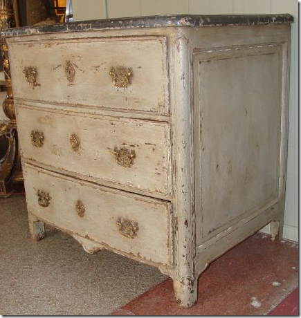
Kay O’Toole has a store on 1st Dibs. This painted French commode is a personal favorite. Beautiful!
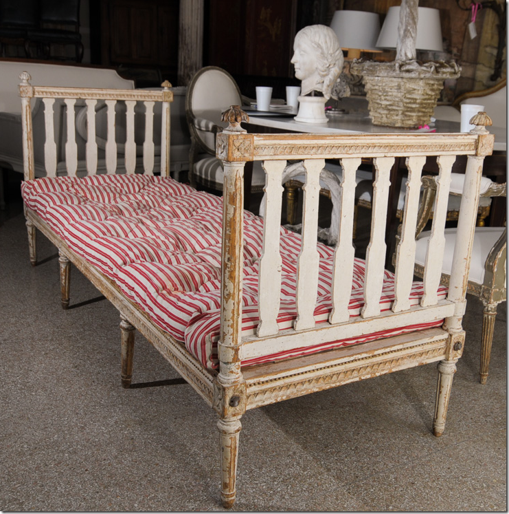
This Gustavian daybed is another favorite.
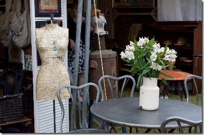
And I love the Venetian sofas on her 1st Dibs site! To see Kay O’Toole’s web site on 1st Dibs, go HERE.
It’s really raining Houston in magazines this month. Another great Houston house is in the beautiful “All About Blue” March issue from House Beautiful! The house is designed by a trio of Houstonians: Babs Watkins, Julie Watkins Baker, and Eleanor Cummings. Whew! What a bevy of talent. The house is absolutely gorgeous and another must see. Congratulations to all of you!!

A special shout-out to interior designer and blogger Tobi Fairley whose work graces the cover of this month’s House Beautiful, above! A huge congratulations to Tobi!! To read her blog and see her beautiful portfolio, go HERE.
Don’t forget Texans – this Sunday is the Urban Market. For directions and times, go HERE.
AND AND – one last thing – I promise! - Cote de Texas is going to be offering a fabulous giveaway next week. Be sure to check in for more information. You are going to LOVE this giveaway, I PROMISE you!!!

Joni,
ReplyDeleteNow I have to drag about Phuket looking for Veranda,
this IS difficult!...that was just a wee bit mean..hehehe......dying to see the house behind the shop!
Fun post,lots of inspiration for sure.... as usual!
Thanks again...off to search!
I was smitten with the Carithers' house. But then, I always like what he does.
ReplyDeleteI don't normally flock to get Veranda, but you have convinced me that this issue is a must have! I should be so lucky to have a collection of french chairs and truly she was (is) ahead of her time with those gorgeous coral pillows and all of the other sealife elements that are so popular today. Truly a trendsetter and I look forward to seeing her new digs!
ReplyDeleteKat :)
Hi, Joni! Great post as usual.
ReplyDeleteIt's funny, I had a similar reaction when I first opened "Verandah," but as I studied the contents, I really enjoyed it.
I am still reading "House Beautiful," but I was interested to see what the issue said about room colors. I'm getting ready to paint a bedroom Palladian Blue, and yet, I saw another blue I liked possibly even better. We shall see.
Always, ALWAYS love your take on design. Thanks for sharing! XO
I received my March issue of Veranda on Thursday and have been savoring it ever since just for the feature on Kay O'Toole's home. I keep picking up the magazine to look at the photos. It's all wonderful, but the kitchen in particular is amazing. Thanks for showing the photos of her previous home which I'd not seen before.
ReplyDeleteDeborah
Joni, I absolutely love the photo with all the beautiful iron stone and yellow ware on the antique baker's rack! It's so beautiful.
ReplyDeleteReally enjoyed the March issue of Veranda - Best one in months. I was excited to see more on Tara Shaw and loved Kay O'Toole's home She has that magic - I also have the March 07 issue and the cover has always been one of my favorites and I hadn't connected the two until I read your blog. Learn so much from you - thank you for your great postings. Great design and Houston seem to go hand and hand.
ReplyDeleteJanice from Pemaquid
From one impassioned Texan to another...I love this post!!! Like a good magazine it's full of opinion, style, shopping entertainment, and better yet, something to look forward to!
ReplyDeleteJoni, please renew my yearly subscription...
xo Lisa
I've noticed lots and lots of Houston interiors AND exteriors in the pages of Veranda lately. It's as if they combed coastal Texas to give weight to the issues. I haven't gotten March yet - I'm sure it'll be here next week, but I am overjoyed to take a peak inside. Afterall, that cover - well, WOW! Gosh it's been so long since I've been back to Texas - perhaps I need a little trip? Thanks for sharing your views - and the great 07 covers. LOVE LOVE LOVE that rug draped over the table ... I'm copying it. FOR SURE! .... hmmm, wonder how those kilim rugs will lay?
ReplyDeleteI must try and find this issue Joni - I love Kay O'Toole's style...she puts things together beautifully. xv
ReplyDeleteI don't know how you do it and i can't imagine the amount of time that goes into each post, but each one is an unbelievable treat. With each post I am thrilled with the quality of your pictures and your writing and each one is better than the last.
ReplyDeleteThank you so much
cece
I enjoy your writing as much as the pictures! I don't get Veranda but I will now..I have to see the new house, I love the "before"!
ReplyDeleteThank you for taking the time to write such an informative and interesting blog. Mary
Gorgeous!
ReplyDeleteLove the day bed photo with the Palm Tree draping over... I want one ~~
xoxo Laura
I absolutely loved this month's Veranda - I thought it was the best issue I had seen in a while! In fact, there was a room in this month issue that provided an architectural solution to a problem I had been struggling with in the design of my new house!
ReplyDeleteIt sounds like the magazines are having a hard time pinpointing what to feature. Over the top lavish Greenwich, CT type houses are not PC these days. The California look - although there isn't one pure look, but rather a layered, nuanced look that combines aspects of different styles - is very in, but it doesn't appeal to all readers. I think that Veranda's approach this month - something for everyone - was a good one. My guess is there was at least one house that really spoke to each reader, and one house they really hated!
Plus - your #1 guy, Dan Carrithers, had a house featured.
Loved this issue of Veranda. I don't think there are any that I haven't been able to find something I loved. Now I must go back and see if I have the 2007 issue still saved as I remember these older pictures as well. How lucky you must have felt getting a sneak peak at Kay O'Toole's house before it was complete.
ReplyDeleteThe March 2007 issue of Veranda featuring Kay O'Toole is probably my favorite article featured in the last few years - LOVED everything about it, and still do. You mentioned this house had been published three times - in what book was that? Do you remember? I don't know how I missed that one! I am sure the article on her new house, even though I have not seen it yet, will end up frayed and dog eared in my file for years just like her last!
ReplyDeleteP.S. Thanks for your comment on my
blog - glad you liked it!
Nancy
drooling over the O' Toole casually draped aubusson rug... off to Barnes and Noble for my copy. and ps
ReplyDeletegod bless texas... love their presence in interior design.
When I first started reading this morning I wasn't sure if I knew who Kay was. While reading the descriptions leading up to the pictures I started to wonder if it could be from an issue I have saved and return to frequently. As soon as I saw the pictures I understood exactly what you were talking about. I return to that article time and again. Now I can't wait to get the March issue. And we're expecting 10 inches of snow so it's going to be a few days!!
ReplyDeleteVeranda is probably the only mag I don't subscribe too! Will have to buy it. Great post and will be interested to see how Kay's taste and style has evolved from her last home.
ReplyDeleteAs soon as Barnes and Nobles opens, I will be at the magazine rack. This issue looks fantastic. Are those original Giacometti pieces in the Atelier AM photo? This couple has amazing talent, I guess classic sculptural minimalism might work to describe their style. Super post.
ReplyDeleteHi Joni. Kay's early home was in "Domestic Art: Curated Interiors". What is there possibly not to like? Don't have my issue yet...argh!! Great post. Thanks, Trish
ReplyDeleteI loved the March issue of Veranda. Kay’s antique Aubusson rug draped over that round table made that room my favorite of all of the photos. Just FYI for anyone who does not yet subscribe to Veranda, Amazon has it on sale right now.
ReplyDeleteBeing from DC I enjoyed the feature on Michel Ricard and his Citronelle restaurant. My husband proposed to me there, so it will always hold a special place in my heart.
ReplyDeleteI have to admit I wasn't that impressed with this issue of Veranda. It's a subjective thing I suppose. It just isn't my style(too fru fru). I will take another look though to see if I'm missing something.
ReplyDeleteThanks for your wonderful posts, Joni. Cotedetexas is my new addiction!
Love the issue, love your commentaries! I have to get to the market now but will read it all more carefully this evening. Thanks for all the insight!!
ReplyDeleteI too love the March issue of Veranda…antiques, great design, what’s not to love? Funny but I had saved the 2007 issue featuring Kay O’Toole’s home and because of her I started searching for crowns. Great post once again Joni, one that I’ll be back to stare at again and again!
ReplyDeleteJoni,
ReplyDeleteI loved this issue of Veranda too. First I've liked in many months. So beautiful. Hope you are well.
G
I am loving House Beautiful and everything it features...the way they feature homes is so personal. I feel like I was a guest visiting. But....Veranda leaves me cold just like AD. The rooms are not warm and friendly at all. I looked at Kaye's house and wondered where I would sit if I ever were a visitor. It's expensive alright but not very warm and inviting.
ReplyDeleteI think Kay O'Toole's first home was one of the most influential in design I can remember- for me personally. I loved every inch of it. Even now, seeing it again, I start to imagine how I can duplicate at least some of it in my own meager way. Just so lovely.
ReplyDeleteJoni..I was in an airport last week and picked up the February issue of Veranda...and am still pouring over it! I LOVE the design house by Saladino...all that lavendar ... ooohhh la la... can't wait to see the March issue... I love Veranda...I hope they do step it up just a few notches so they can stay on the shelves.... with the other 2 big guns!! Hope your day is WONDERFUL!!!!!
ReplyDeleteWe should all be thankful for any magazine that is still publishing. Veranda always does a good job.
ReplyDeleteWhat cracked me up is that I thought Kay O'Toole's house was Tara Shaw's house!
I kept looking for Tara's name in the text. Especially when I saw the dog who looks just like Tara's dog Jack!
I guess great minds run in the same vein in Houston!
xo xo
Yummy, yummy. I agree with VVamp...nice just to have magazines with photography and interiors as beautiful as these!
ReplyDeleteBest,
Michelle
Joni, the layering the textures, Oh my! What a talent to be able to put so many unique pieces together in such a cohesive manner. Love all of the photos. Such eye candy. I have not recieved my Veranda for March yet. I will look at it through Joni's eyes. You always point out so many points of interest. Thank you for another wonderful post that reads like a wonderful magazine article. Someone needs to snatch you up to write for their publication. Kathysue
ReplyDeleteJoni,
ReplyDeleteAnother great post from your ever
acute viewpoint .. . even for this non-Houstonian, the March Veranda looks like it's well worth a browse!
Judith
Just beautifully done, Joni. Your posts are always filled with wonderful pics + descriptions of each. Your time is well-spent as so many people enjoy your blog.
ReplyDeleteMarsha
Wait a minute, how do you pronounce "Atelier"
ReplyDeleteJoni,
ReplyDeleteThank you so much for the mention on your gorgeous blog! I am always amazed at the emense about of content and time that goes into each and every one of your posts. I, too, loved both the Veranda and the House Beautiful March issues. I read them cover to cover and found much inspiration in them both. Thanks for supporting and promoting these great shelter mags so they can stay in business for years to come!
xoxo, Tobi
The March 2007 Veranda cover shot was the start point for the decor in our master bedroom...so much fun to see it turn up on your almost three years later!
ReplyDeleteJoni, you never cease to amaze me, and if I could start fresh.... You would be my inspiration , as we love so many of the same design elements!
ReplyDeleteKarena
Hi Joni!
ReplyDeleteI just read your post and went to see the Veranda I didn't get a chance to read at the shop. I like everything Kay O'Toole does and saved that Veranda magazine with that beautiful apartment on the cover...It was gorgeous and inspiring.I even did a chaise for the shop with that scalloped bottom... Also the Tara Shaw piece was great. The California home was also fabulous. What gets me though is what great design we have here in this area of Texas. All those very talented people you feature and support......Keep up the good work.Maryanne xo
Hi Joni. Again another fabulous post. HOWEVER, I was totally disapointed with March's Veranda issue and told myself I'd cancel my subscription! (Eventhough I know I won't do it since I'd have not much else in printed material to look forward to...)I hope that the designers that read your blog are not offended, BUT... two of the homes featured made my worst ever list for either cold or contrived. Hopefuly I don't sound too hateful, but I am just expressing my personal opinion.
ReplyDeleteWell, Joni, I think you should get a thank you from Veranda, because I am going right out to buy this month's issue and I can't imagine I'm the only one! THanks for the glimpse inside! :)
ReplyDeleteGlorious post! Now I am wondering if I will hear soon Kay O'Toole talking on the SRT, as I wish, not to mention listen to dear Tobi, as in my previous wish.
ReplyDeleteCiao,
Albarosa
Hi Joni,
ReplyDeleteOh my God, the March issue of Veranda sounds like it's going to be my dream issue! Hopefully it will arrive in Victoria stores this week. I adore Dan Carithers, Tara Shaw, Kay O'Toole and the Misczynskis. I saw the Misczynski's home in another magazine - I think it was Town and Country - a few months ago.
And the March issue of House Beautiful sounds gorgeous, too. Oh, I can hardly wait to see them both. I'll be in heaven!
Thank you so much for your wonderful blog. You put so much effort into it. Reading your posts is one of the highlights of my week!
You know when I first saw my copy of Veranda, I grabbed it in much anticipation. There was a moment of wow that is a thinnner version of the mag. But when opening the issue the content was very rewarding to the reader.
ReplyDeleteSo, my next reaction was, maybe the actual size of the magazine has streamlined but the actual content seemed better than some of my archived thicker versions, and that said I have to say, a lot of the thicker versions do have a large amount of advertising, vs interiors.
So, all in all I think the initial focus is much better homes and srticles, with an even greater attention to dtails.
I thoroughly enjoyed this month and look forward to next months issue.
Thanks for the recap Joni;
Kay's house was wonderful!
Leslie
Yep. this month's Veranda was a sheer delight -- a winner for the first time in months. Almost (well ... almost) didn't miss Southern Accents as I do when most magazines arrive in the post. Best page was O'Toole's bookcase photo -- just wonderful all around!
ReplyDeleteThanks for sharing her apartment -- incredible -- "incroyable" LOL!
Jan at Rosemary Cottage (wishing and tapping her shoes together so she might end up at the Houston Urban Market -- sigh. blasted sneakers just ain't got the magic!)
I think the blogger or emailer who complained about Veranda magazine hasn't been to buy or subscribe to any magazines lately. There are so few nowadays. I have subscribed to Veranda for years and have never been disappointed. Not every issue of any publication can be dynamite or what our particular tastes are drawn to. But at least they are still there! I am so glad I saved all my Southern Accents! I do the same with my Veranda's!
ReplyDeleteThanks again for your beautiful blog.
PS
Can't wait to have Pamela Pierce's newly decorated house on the cover of Veranda!
Hi Joni!
ReplyDeleteI agree...there is definitley sonething for everyone in this issue! Contemporary, traditional, French within reach,Clean tailored antiques....lots to love to be sure. However....my one little question would be the cover shot. Although I loved the house design in general, this living room looked very eighties to me because of the coffee table. Like I said....I loved the house, just not this table.
Great post as usual my friend!!!!
Oh Joni !!!
ReplyDeleteI have stalked those yellow papier mache columns for years!! I even have a file of every photo I have of them. Kay O'Toole has always been the leader in interior design. Thanks for a wonderful, detailed post.
Veranda has become a one note...everything looks the same. Everything is beautiful...tasteful...mostly white, soulless, and costly.......I used to look forward to it...now I avoid it.......
ReplyDeleteThose papier mache columns - gorgeous, and I never would have guesses that they're moveable. I loved the huge scallops and the red ticking mattress.
ReplyDeleteJoni, I'm not from Houston but I agree with you- I love this current issue of Veranda. And in this day and age when we have lost so many beloved design magazines, I think we need to support the few that are left, even if every issue isn't to our exact liking or taste. Thanks for sharing the beautiful photos, especially from the April 2007 issue which I don't have!
ReplyDeleteJoni, I'm not from Houston but I agree with you- I love this current issue of Veranda. And in this day and age when we have lost so many beloved design magazines, I think we need to support the few that are left, even if every issue isn't to our exact liking or taste. Thanks for sharing the beautiful photos, especially from the April 2007 issue which I don't have!
ReplyDeleteWhat I enjoy about your blog is that it is a personal, educational insight into another culture of decor for me,even though sometimes I am surprised at the similarity of some furniture, and almost feels like travelling to Houston sometimes.
ReplyDeleteThank you :)
I agree with Katiedid...this cover did not do it for me and I love blue. In my opinion it fell flat or seemed a bit too cold. If I look at each elemant seperately though I like them all??? Enjoyed the homes featured inside the issue and especially those featured in this post.
ReplyDeleteVeranda is great- some issues are more to my taste then others, but that's life. You know I think Texas designers are the best in the USA! You all are so ahead of the curve on interior design. Another plus about Veranda, they have the most darling posts on jewelry each issue.
ReplyDeleteI think I need to re-subscribe to Veranda. That was terrific. Now off to check out Tobi's blog. Thanks again
ReplyDeleteJoni,
ReplyDeleteSeeing the images you posted here, to me the Veranda issue is gorgeous!
xx
Greet
I thumbed through both magazines this weekend while snowed in (barely managed to get to work today and I live downtown!). I have to say I wasn't very impressed with either magazine- but upon your recommendation, I'll take another more in-depth look! Admittedly I was just absent-mindedly looking at the pics while watching tv.....here's hoping! The enfilade house sounds wonderful and I can't picture it (but remember the lilac color!)
ReplyDeletewait...WHAT? Bella and Edward?? but what does that have to do with this great post...JONI? hee hee : )
ReplyDeleteI have been following Veranda since 1995 when I grabbed my first copy at LAX as I boarded a plane to London~I still have that issue! Veranda is to be applauded for their courage to mix things up a bit and it's just good business to go for a wider appeal as long as they stick to their core values which I see no evidence of them abandoning. Always something to learn or grow to appreciate even if it's not our own personal style. And any issue featuring Kay O'Toole goes in the stack of favorites. You Houstonians have such a wealth of design talent and resources ~ any chance of tempting some of you to move to Santa Barbara?
ReplyDeleteI have to agree with your emailer, not one of my fave issues.
ReplyDeleteEven House Beautiful... that house was too BLUE for my liking.
I love the way you wirte Joni, love that we can all have our own opinions. How boring would life be if all our houses looked the same ?
That entryhall mirror (wait, all the mirrors) are to die for!
ReplyDeleteexcellent post, thanks... you have inspired me!
-kelley
What a gorgeous home! It's going to visit me in my dreams! All the scalloped details make my heart sing!
ReplyDeleteAnd her sense of humor...the crown atop the bust!!!! And the dog painting on the screen! i love it that she doesn't take decorating too seriously!
ReplyDeleteI loved this past months Veranda! Lately I've felt there might be one or two features in a magazine that catch my attention, but this issue was chock full of them! It was so exciting to be that inspired by a magazine again! Can't wait to see Kay O'Toole's new home... I'll be obsessively re-reading my 2007 Veranda issue until then!
ReplyDeleteI too LOVED this issue of Veranda. I am a huge fan, there really hasn't been an issue I didn't read cover to cover and keep. {for later!}
ReplyDeleteKay O'Toole's home is to die. for. I still have the other images in my inspiration files. For when I grow up and have the house I really want.
I adore the Kay O'Toole's bed. I've been searching for the perfect metal four poster/canopy bed.....Any idea on where to find one or where this one might have come from? Always excited to see your latest blog entries! Stunning always.
ReplyDeleteHmmm...I've never seen anything like that in Veranda before and I love it. What do you think about those parquet floors - I wonder how hard that dark stain is to implement because I have heard parquet is hard to stain dark.
ReplyDeleteI just found your blog and LOVE it!~Page
Just gorgeous!
ReplyDeleteSo glad I stumbled here. ;)
Whenever I read your posts, I realize that I have absolutely NO eye for detail! I look at a picture and then read your caption and think, "Does that room have blush pink sofas? Why, yes, it does! How did I miss that?" LOL Thank you for opening my eyes to the lovely world of design!
ReplyDeleteYou're the best, Joni!
Just blown away, such beauty..
ReplyDeletelove this post.. Thank you Joni.
Hope you read before I get crushed with above comments..
ps renee has a birthday Feb 15th.
Just blown away, such beauty..
ReplyDeletelove this post.. Thank you Joni.
Hope you read before I get crushed with above comments..
ps renee has a birthday Feb 15th.
Joni,
ReplyDeleteThe March '07 is in my files too. I love everything about the rooms, aaahhhhhh. If money were no object. The rug draped over the table...so beautiful, and.....and....and....
Hi Joni, I am off to buy the March issue of Veranda. My subscription just ran out. I used to live in a house with an enfilade and I miss the view from the family room into the library, into the living room. There was such symmetry to the receding openings. Great post as usual.
ReplyDeleteOk, so Bella Inspirations beat me to it. But I think there will be many more blog entries inspired by your entry. For a differing point of view, please check out my post http://theshinypebble.blogspot.com/2010/02/take-shelter-dawn-of-dark-age.html. Enjoy!
ReplyDeleteHi Joni,
ReplyDeleteI am a huge fan of Kay O'Toole....I would kill for those papier mache columns. I also wanted everything she has at 1st Dibs, unfortunately for me , I will just have to keep dreaming!!! Thanks for the wonderful photos.... looking forward to seeing her new house!!!!
Joni-
ReplyDeleteWhen I opened my new issue of House Beautiful, I actually laughed out loud. I thought of you IMMEDIATELY with all those blue striped rugs in this issue.
(although, your fave is still my fave too)
I STILL remember that cover with Kay's beautifully covered table.
It must still be in my file.
Thank you for nurturing my soul.
I feel as though I've found my design legs again and much of it has to do with your blog.
annie
Hi,
ReplyDeleteI have used a photo from your site and linked back to you in my blog, Decor Arts Now.
The post is dated Feb. 9, 2010 and can be seen at http://decorartsnow.com/
Kind regards,
Lynn Byrne
Author Decor Arts Now
Okay...how do you have your mags already? Seriously I live like a mile from you and I subscribe and don't have either of these yet??? Is it some special insider deal? LOL!
ReplyDeleteI love Vernada but once in a while it feels too heavy on the ads and less content. I still love it though and will always subscribe.
I have a "bundle subscription" of trade magazines. Each month, one of my 9 design magazines is replaced with something different.
ReplyDeleteFirst it was Domino (they sent me Real Simple). Next came O Home (they sent me Woman's Day). Finally, Met Home (I received a postcard announcing it would be replaced with "Shape").
Honestly, I am happy to have a magazine that is in print. And if it focuses on a wider variety of design - even better.
Marija
Loved the article and the pics. Joni you need to get into some of the homes that Jack Arnold designs. We have seen some in Veranda, even his own but I would love to see what the people who built a " Jack Arnold Home" did with the interiors!
ReplyDeletePurchasing memory cards is such a chore... You have to search online for prices, filter through which ones are legit, around a bunch of shops,compare prices, finally buy your memory, and then hope that the price doesn't drop in the next two weeks or so.
ReplyDeleteI've been f'd over by some ridiculous price drops in the past... especially this one time when I bought a Micro SD for my R4 gaming flash card at what I mistakenly assumed was a steal, only to later see that it fell $5 in a week's time.
(Posted by FPost for R4i Nintendo DS.)
That collection of crowns has no equal. Stunning. I love this post because I will admit it - I scanned the March Veranda and thought, oh, just a lot of beige. Like a good teacher, however, you showed me how I shouldn't judge a book by its cover. I'm going to get it in a bit, since we're in the middle of a snowstorm and curling up w/ a cup of tea and giving it a second chance sounds so fulfilling. Thanks, P!
ReplyDeleteI like to look at Veranda (and mine hasn't come yet. Hmmmm) It's more "grown up" than I am (read: I have no budget for those lovelies) but it's always nice to look. And the new HB---mmmmmmm. Re-reading it like it's a Harry Potter book. Thanks for this amazing post-- SO much to see!
ReplyDeletePlease change your title to Texas Design University!
ReplyDeleteI am always learning and loving your posts! Just the asignments getting longer...
I am going to study Veranda - now!
XX V.
Gotta comment again how much I am sooo lovin this post! You don't blog every day but boy when you do it is always worth the wait. I check my e-mail every morning first thing to see if I have something new to enjoy my morning cup of java with!! Oh, BTW since I am Polish A&M 's last name is pronounced MISS CHIN SKI very easy everyone LOL.
ReplyDeleteLooks like I'm going to need the March issue! It's all so beautiful....
ReplyDeleteDear Joni,I'm eternally grateful to you for including all the photographs of shop and former home. Your and your readers appreciation has truly touched me. Your faithful reader, Kay
ReplyDeleteI love Art For Kids. It is artistic as well as extremely well made. There is really nothing as nice on the market. Gail has a fabulous product. I'm so glad you found each other.
ReplyDeleteVery nice blog, is really interesting and fabulous
ReplyDeleteReally nice!!!