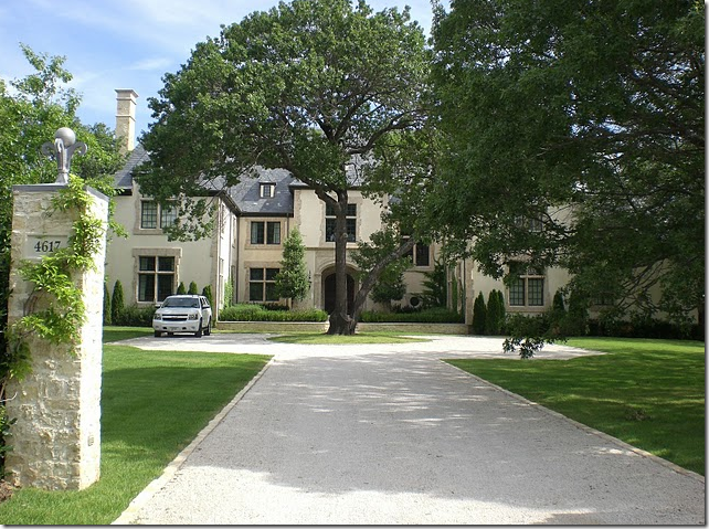
 Kristin and John Mullen’s house in Dallas. Stone gates stand at the gravel drive. The house is flanked by two wings.
Do you know someone who is really talented and detailed oriented? Someone whose house is beautifully styled down to the last accessory? A few years ago when I asked readers to send me pictures of their houses, Kristin Mullen did just that – and my mouth dropped open when I saw them. Does anyone really live like this??? Kristin’s house was gorgeous. Her pictures looked like they came straight out of a magazine and her house stood ready to be photographed at a moment’s notice. In short, it was very impressive. It didn’t take me long to figure out that Kristin is a perfectionist, a talented one at that. She enjoys fussing over her house and it shows. It IS perfect - not a newspaper or piece of mail is out of place, nor is there a corner in her large house that isn’t finished or filled with grandma’s hand-me-downs. It’s so wonderful that catalogues rent her house for their photoshoots! And on top of all that, Kristin decorated it herself. It is all the more admirable when you realize she is the mother of three sons and one daughter! Amazing. I was in awe.
The front door and main part of the stucco and stone house.
After Kristin sent me the photographs of her house, I put her in touch with a scout who quickly got her in a magazine Beautiful Kitchens and Baths (not yet published.) She deserves it. Her house was designed to be published. It was a lot of hard work to get it so beautifully furnished, but she did it, in spite of all her other responsibilities. I had never meet Kristin in person, but last Round Top, there she was: she stopped me with “Joni, is that you?” Of course she would recognize me. I am not sure any detail goes unnoticed by her. And of course she was out antiquing with a friend, shopping away. She loves designing and staging for clients and charity too. Besides being a full time mom and running a busy household, she has her own business, Covetable Designs. It’s an interior design business, a staging business (which she is just perfect at!) and she also designs and sells luxury table linens. Whew. I’m exhausted just thinking about it!!
Kristin and her husband John have lived in many different cities. They moved around a lot but seem to now be happily settled in Dallas. Looking at her life, her house, her work, you would think that everyday is a fairytale for Kristin. And it is to be sure, yet she stoically and lovingly tends to her special needs teen-aged daughter, Darcy. Darcy has been sick for most of her life and this past year she has taken a terrible turn for the worse. Kristin has written about Darcy several times on her blog and each time it rips my heart apart, knowing how painful it all must be. But still, no matter how busy she is taking care of Darcy, sleeping at her bedside at home or at the hospital, taking her to endless appointments with doctors, she never complains. She always has a smile on her face and she still makes time to create a beautiful haven for her husband and her children. Kristin is a real gem, a true one of kind inspiration. I hope you enjoy seeing her house and some of her recent design projects:
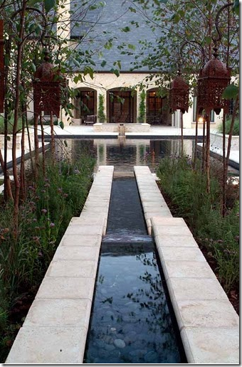
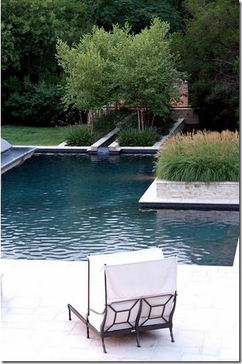
Looking from the back of the property on to the house and the loggia. A water rill leads from a fountain to the swimming pool.
The view towards the hot tub and swimming pool. Kristin says the pool was designed for both family fun and for Darcy’s physical therapy.
A closer look at the water rill leading into the swimming pool. I love the ornamental grasses in the stone beds.
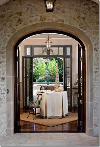
One of the my favorite parts of the house is the entry and gallery that runs through the main section. Here, looking through the front porch, to the gallery, and on to the loggia and swimming pool.
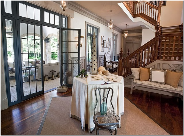
A view of the entry hall with the staircase. I love the gray painted trim and the skirted table. Of course, the table is styled with accessories and an open book. The loggia is through the French doors.
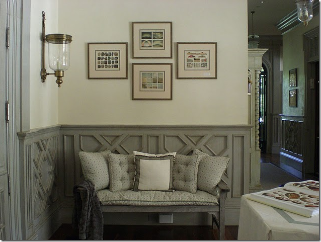
On both sides of the front door are gray painted benches, piled high with cushions. Down the gallery is the dining room.
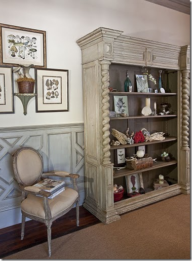
The gallery is furnished with bookcases that are filled with accessories that Kristin loves to collect.

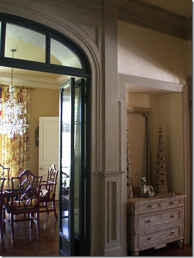
On each side of the French doors are a pair of gray painted chests with carefully selected accessories atop them.
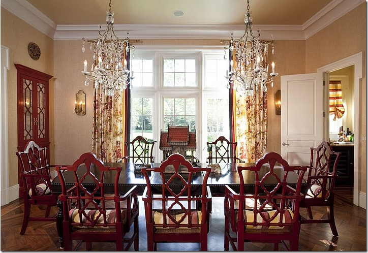
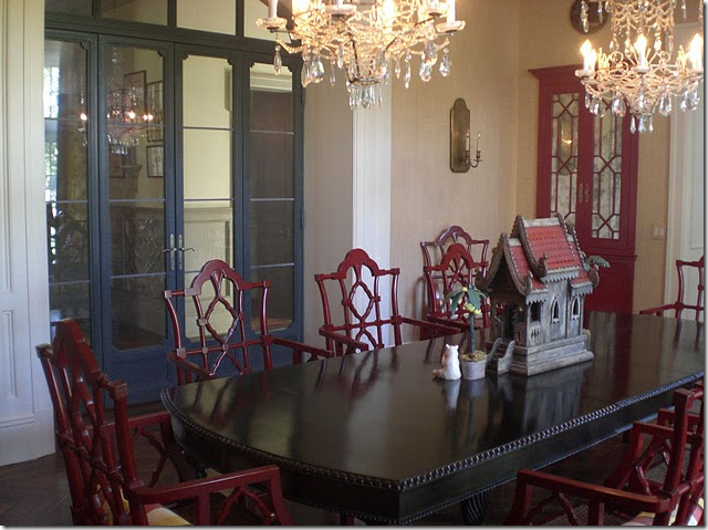
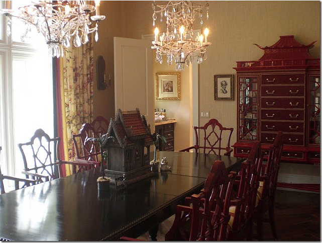
The dining room is a study in chinoiserie. Red lacquer cabinets are built into the sides of the door leading into the living room (left.) Oriental styled crystal pagoda chandeliers further set the atmosphere. Notice the darling pillows in each red lacquered chair.
A look back towards the gallery through the French doors.
Along the right wall is a red lacquer chinoiserie chest.
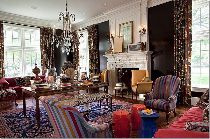
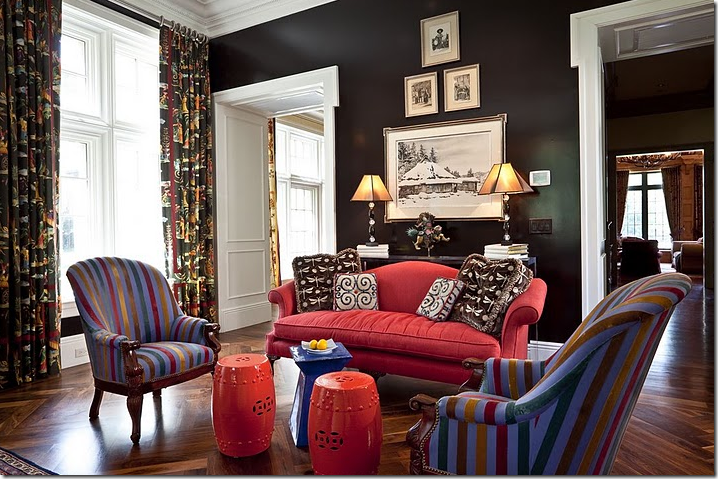
Connecting to the dining room, is the living room. The walls are lacquered a deep brown-black. Kristin loves bright and bold colors and patterns and she really outdid herself in his room. A tall table divides the room into two sitting areas with matching red sofas, though each arrangement is slightly different than the next. A crystal chandelier hangs over the center of the room.
The sitting area nearest the dining room.
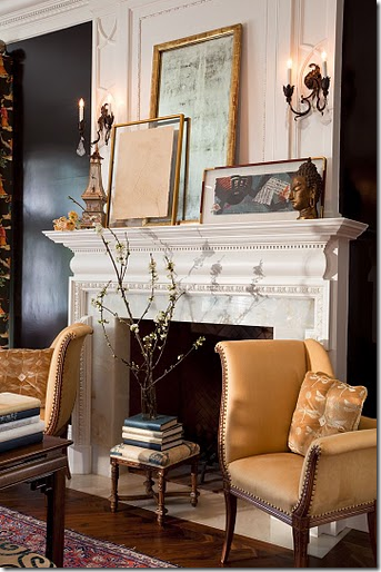
An interesting arrangement of mirrors and frames on the mantel.
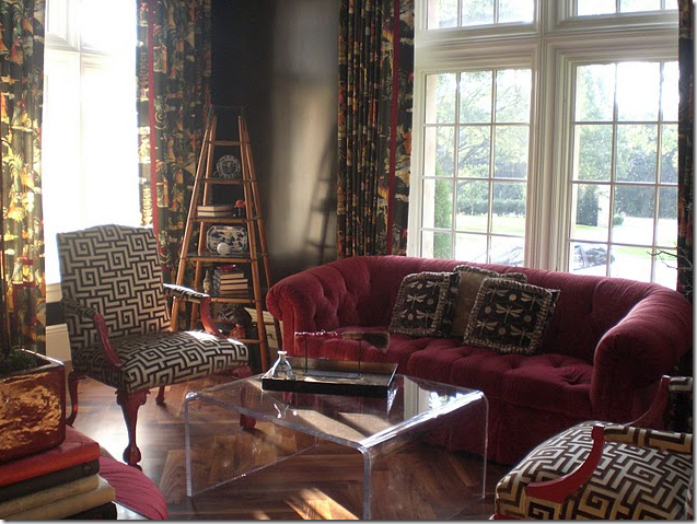
The second sitting area overlooks the front yard. I love the corner shelf unit!
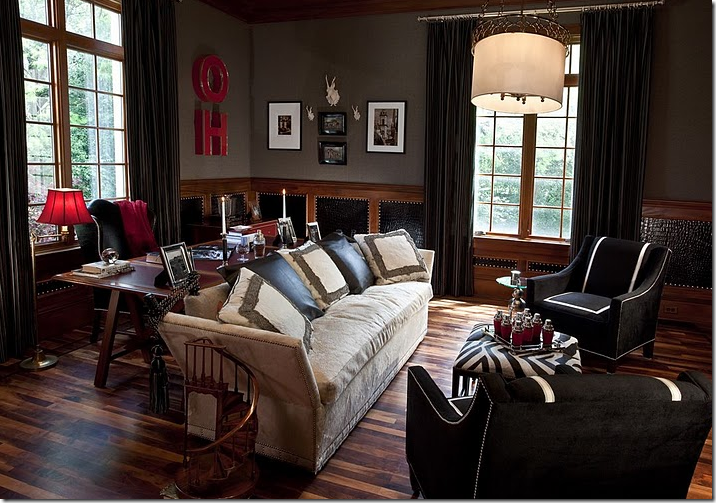
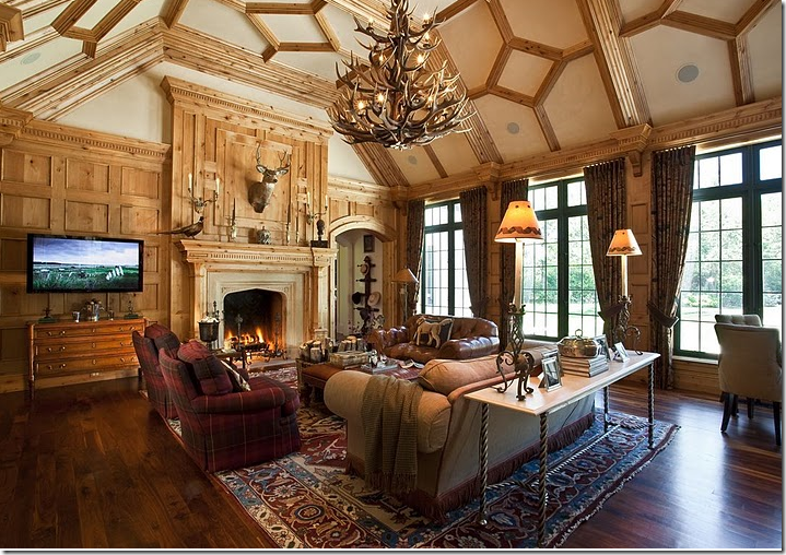 The pine paneled family room is more masculine in design – after all five men live here!! A large antler chandelier hangs over the room.
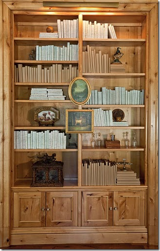
A detail shot of the bookcases in the family room. Notice how Kristin covered all her books to make them more uniform.
John’s study: notice the wainscot is made of wood, leather and nailheads.
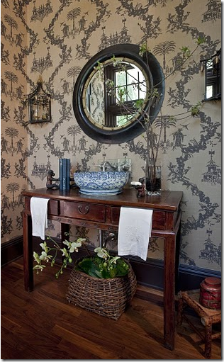
The powder room – more chinoiserie styling with an Oriental themed wallpaper. The sink is made of a large blue and white porcelain bowl. So beautiful!
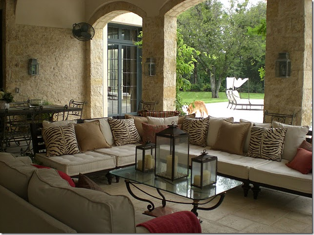
The covered loggia. Kristin decorated it with lanterns and zebra patterned pillows.
Kristin Mullen: Interior Design Project
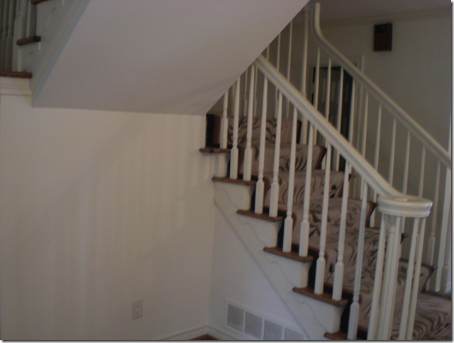
BEFORE: The staircase and entry hall of a project Kristin Mullen recently completed for a client.
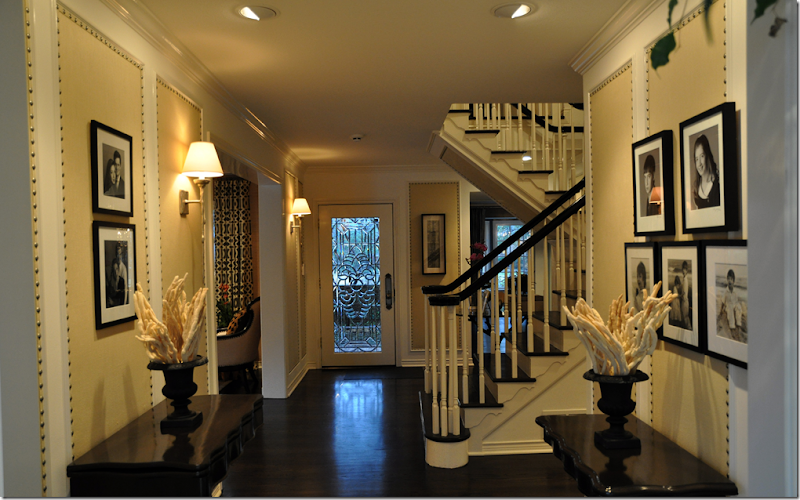
AFTER: The entry hall. Notice how Kristin wallpapered the entry hall using nailheads to highlight it and create added textural interest. So pretty!!! The newly stained dark brown/black hardwoods are so beautiful. The dark wood really pops the staircase.
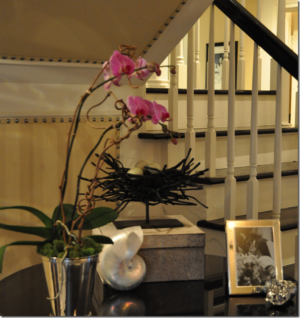
Close up of the area under the staircase.
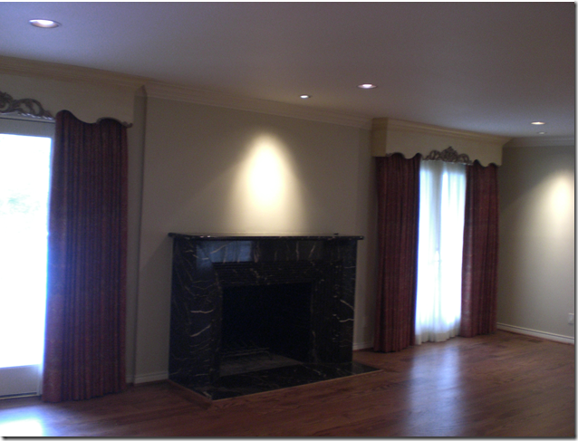
BEFORE: The living room.
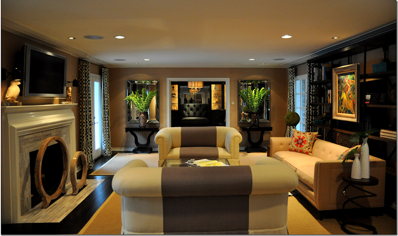
AFTER: The living room after. What a difference!! Kristin completely redid the fireplace, replacing the black marble with a light white and gray marble. She wallpapered the room and stained the hardwood floors a dark brown/black. I love her KWID curtains, they really punch up the room.
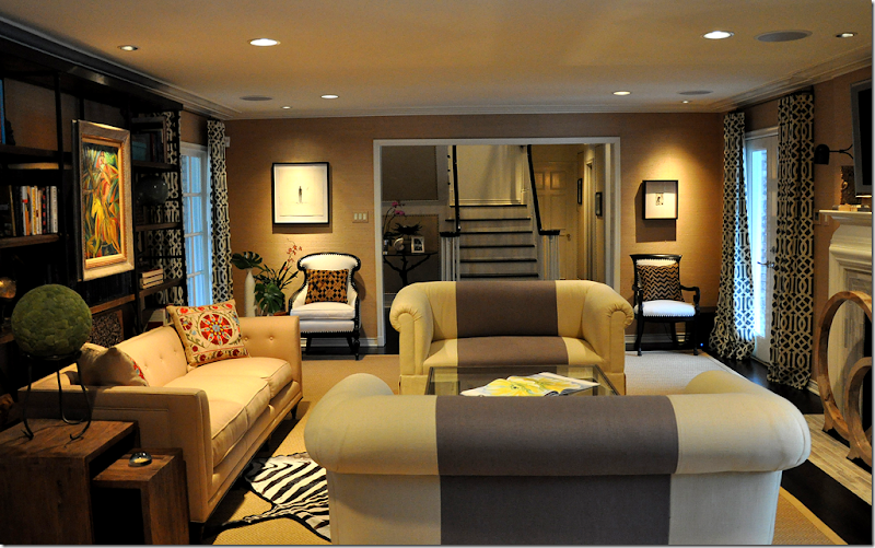
Looking the other direction. I love how Kristin accessorized the shelving unit. The room looks so different, it is amazing!
One final view of the newly decorated living room. Great job Kristin!
Details of Kristin’s Attention to Details!
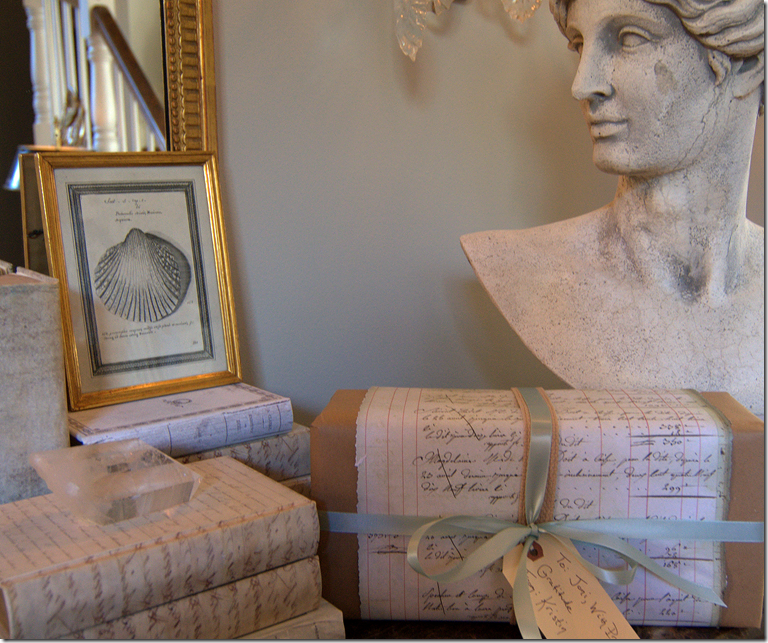
After Kristin’s house was photographed for the magazine, she felt compelled to send me a thank you gift for introducing her to the scout. Her gift was totally unnecessary but a very, very pleasant surprise. I took a picture of the wrapping so you can appreciate her attention to the tiniest of details. She used antique French household ledger paper, photocopied it, and then wrapped my gift in it, along with a special ribbon AND sealed it with hot wax. OY! But doesn’t the package look great next to my faux antique books from Tara Shaw? I didn’t want to unwrap it, it looked so pretty as is, and actually didn’t for a few days.
Kristin describes her gift wrapping techniques HERE. I TOLD you she was detailed oriented!!!! She even talks about the process: “Nothing other than the French ledger paper, the upholstery strapping, and duck egg blue ribbon were going to make the cut to wrap the gift that Joni gets. I am this way about wrapping gifts - it’s a sickness and I can’t help myself…” Kristin really demonstrates how such attention to details makes the common, uncommon.
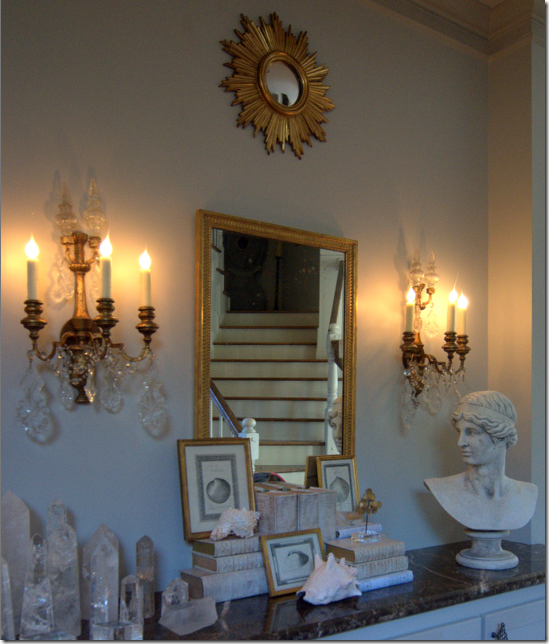
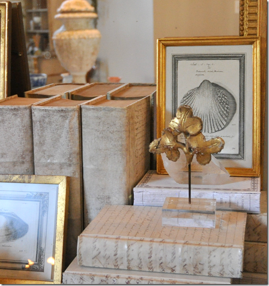 Inside, the gift was so perfect: a leaf sprig, an antique remnant – perhaps a gilded piece off a mirror frame or a cornice! Attached to a piece of lucite, it looks so perfect mixed with my own collection of shells, gold framed antique prints and mirrors. A huge thank you Kristin! I love it.
I hope you enjoyed seeing Kristin’s house and her client’s house and learning about her unique aesthetic. To read Kristin Mullen’s blog, Covetable Designs, go HERE and to visit her web site, go HERE.
Finally, here’s a sneak peak at my new paint color! I recently got rid of all the yellow in my house - painting the downstairs a warm gray, Pratt and Lambert’s Feather Gray. At first I tried a more traditional gray, but everything I own is so creamy, the gray went blue. I know I’m a professional, but let me tell you – I spent all day with a crew of painters waiting while I tested over 15 samples of paint. Paint is one of the hardest things to get right because the little sample cards do not represent the actual color! In the end I picked a winner – only to find it out it was the color of my already painted trim!!!!! Urggggh. I could have saved myself hours of aggravation where I had almost pulled out all of my frizzy, curly hair (no great loss!) But I’m thrilled with the new color. Ever since I replaced the tile in my kitchen with the white Carrera marble, the yellow walls had been driving me crazy. It just didn’t look right. Now, I can’t even remember ever having the yellow paint, the gray is completely neutral and very soothing. I’ll post more pictures of it later.
AND: I have three really great giveaways planned. The first one will be this Sunday – so stay tuned!!!`





absolutely stunning. I just cant get over the transformation.
ReplyDeleteI just love Kristin and her blog. I knew she had a lot going on in her life but had no idea about all the decorating and staging she does for others. Also thanks so much for all the pictures, I don't think I have seen that much of her house before. I have no idea how she does it all including the blog but I certainly am glad she finds the time.
ReplyDeletewell dang, you need to tell kristin to call me because apparently she does not have a kitchen!! I can help her out with that! LOL. But, where is it?? Inquiring minds want to know! Or, inquiring kitchen and bath designers maybe....~~Cheryl
ReplyDeletewww.kitchendetailsanddesign.com
well dang, you need to tell kristin to call me because apparently she does not have a kitchen!! I can help her out with that! LOL. But, where is it?? Inquiring minds want to know! Or, inquiring kitchen and bath designers maybe....~~Cheryl
ReplyDeletewww.kitchendetailsanddesign.com
wow...kristin's home is amazing. the pool area is spectacular! i really enjoyed the before and after's of her clients as well.....the nailhead trim on the walls, the way she did it, is something i've never seen before.
ReplyDeleteso so pretty. and....i like your gray paint joni!
Beautiful! I especially love the nailhead trimmed wallpaper she did for her clients home.
ReplyDeleteI could feel the change in wall color immediately when I saw the photo of your foyer. It's beautiful, Joni! Can't wait to see more.
Wow, that is one impressive lady! LOVED that nailhead trim on the walls. Looking forward to seeing more of your new paint color.
ReplyDeleteHi Joni,
ReplyDeleteI'm so glad that you have done this post of Kristin's home and business. I read the post where Kristin was describing the wrapping for your gift..it is simply stunning. The gift as well as the wrapping!!! Love what she did for her client and I am loving the nailhead trim on the walls. Speaking of walls, love your new colour Joni. I'm glad it's not just me with paint colours, it took me months of sample paints for our dining and lounge room. After all the agony, it is so worth it to get the right colour. Can't wait to see more. Please don't leave it too long!! Nearly the weekend, enjoy the remainder of your week. Hope everyone is well there.
Take care
Janine
XXOO
Tasmania, Australia
Loved reading this. I cannot wait to see your rooms in a soft gray. Boy, what an undertaking!
ReplyDeleteI failed to say that my prayers go out to Kristen and her family. It sounds like this is a very difficult time.
ReplyDeletewhat a divine home, such attention to detail, even the staircase! thanks for posting it
ReplyDeleteWhat a beautiful home she has!
ReplyDeleteAnd I love your new paint color!
Jackie
Wow Joni how wonderful and yes the attention to detail!
ReplyDeleteKarena
Art by Karena
Joni, I popped over to Kristin's blog after reading your post and now my comment about the design seems so unimportant after reading about Darcy. It is amazing what Kristin has accomplished all while loving and caring for her daughter.
ReplyDeleteI will say though, because it took me by surprise, that I was taken aback at how much I loved her dining room. I had never been to much of a chinoiserie fan, but this was done so tastefully and I am in awe of it! Every piece is stunning and perfect..every single one, just beautiful. It was my favorite room. I had to keep looking at it to soak up all the details...those chandeliers are amazing, well...everything is actually.
Very nice post!
xo J
I REALLY enjoyed this post. Especially the nest trick with the studs in the foyer, WOWOWOW.
ReplyDeleteJen Ramos
madebygirl.blogspot.com
--
I AM JEALOUS!!!!!!!!!!!!!! THis house is perfect,I just looooove it. OUtside and inside.What´s not ot love.....she has so many wonderful furniture,lamps...walls,celings...the loggia....good thing you shared these pictures,a pure delight to watch! What a spectacular home!!!! :)
ReplyDeletewhat´s the name of her blog?
I have been enjoying Covetable Design's since the beginning! Kristin's house is as lovely as she is!!! I adore the chocolate brown glossy walls. She has so much talent! Thanks for featuring her great talent!
ReplyDeletexx-Gina
Great post to start the day! Kristen's work is beautiful. She really transformed those rooms. And, your new paint color looks great. Can't wait to see the rest of your rooms!
ReplyDeleteDeborah
Wow, what an amazin lady, and talented to boot- her house is beautiful.
ReplyDeleteLove the new gray walls in your house- wow- it's so subtle and sophisticated!!!!
The nailhead trim on the walls...what a spectacular detail.
ReplyDeleteAlso LOVE your new paint color Joni. I imagine it is most soothing. (I am betting that Mr. Slipper Socks prefers it too rather than the yellow. Know my hubby would.)
-Brenda-
P.S: FYI Joni, perhaps it is just my Computer but I found quite a few of the photos just would not download for me.
ReplyDelete-Brenda-
the landscape is spectactular! was there a landscape architect involved with that?
ReplyDeleteHi Joni,
ReplyDeleteLove the post, too! She's an amazing talent. I have a friend who is similar - perfect house, always perfectly dressed and she started a foundation last year that has had amazing success. I don't know how these people get so much done in the same 24 hours I have!
Susan
P.S. I'm in the same boat with Brenda - not all the photos loaded for me.
That home is just gorgeous. She has a wonderful eye for detail. Thanks for sharing.
ReplyDeleteJoni,
ReplyDeleteI left a comment for you last night, but for some reason it didn't go through. Thank you, thank you, thank you for everything that you have done for me. You make me sound like someone I WISH I could be, so I am blushing right now. Many hugs to you, my friend.
So, so beautiful. I am obsessing over color palettes of house exteriors (as my latest post portrays) and I love the combination of the creamy stucco and stone and the gray (slate?) roof. Beautiful landscaping and interiors too!
ReplyDeleteI really love how that tree in the motor court conceals the house a bit, adds a bit of mystery.
Joni and Kristin,
ReplyDeleteSimply amazing!!!!!
Merci,
Kare
Too funny! I have the second picture of Kristin's pool you posted on my inspiration board. I found it in D Magazine. I love that pool. Her home is beautiful and she sounds like Superwoman. Very inspiring.
ReplyDeleteI really enjoyed this post - thank you! Also, I am glad to know I am not the only person that tests so many paint colors before finding the right color!
ReplyDeleteSharon
First of all, I love the new paint color, Joni! Second, I can understand not wanting to unwrap that box - it was beautifully wrapped. It really does look good next to your covered books!
ReplyDeleteKristin's home is beautiful, as is the client's home you showed here. I'd love to do my staircase that way.
Thanks for sharing this house and it's motivational owner, Kristin! Love that YOU have trouble picking the perfect paint color...now I don't feel so bad!
ReplyDeleteOh Joni, I would love to see more pictures of the house with the new gray paint scheme! The entryway looks DEVINE!
ReplyDeleteWowzer!!! That is one beautiful house, I love the little powder room the most!
ReplyDeleteJoni
ReplyDeleteCan't wait to see new pics of your home with the gray walls. I knew it was coming! I bet it is lovely..Thanks for another great post
This elicited so many comments from me while I was reading it. Yes, I talk to myself.
ReplyDeleteI had an ah ha moment while looking at the two chandeliers in dining room. I have a long table too and the two chandeliers allow for more creativity in the centerpiece area.
Black walls are always intriguing to me. This was unusual because the photos showed more than just one wall. I am still considering this for a room in our home.
I studied furniture groupings for quite some time. These were perfection.
The wrapped books on the tables are stunning but a whole bookcase? I have seen this before but I always wonder, how do you find the one book you are looking for?
Terrific post.
Pam @ Becolorful
Absolutely stunning!
ReplyDeleteLove the soft color pallet and especially the loggia!
Amazing lady.
ReplyDeleteShe certainly is a talented lady, her home is incredible and I can't wait to check out your link to her gift wrapping tutorial/philosophy.
ReplyDeleteYour new paint color looks fabulous Joni!
Beautiful post, Joni, and congratulations to Kristin on her lovely home and organization; Wow!! I'm going to check out her blog now.
ReplyDeleteJoni, Thank you for sharing Kristin's beautiful home with your readers. You are so right she covers ever detail with such beauty. I studied each picture and was literally drawn in. I love your new paint color and can not wait to see the rest all done. I can tell it is working beautifully. I am a yellow girl myself but I agree this looks amazing with the elements in your lovely home, how fun to have something new and different. A girl needs a change once-in-awhile!! Have a great rest of the week, Kathysue
ReplyDeleteOooh can't wait for the giveaway. Gosh I love your sconces.
ReplyDeleteI realized I hadn't mentioned your beautiful new paint color and how wonderful everything looks!
ReplyDeleteWe're sampling grays right now and are shocked at how unlike the swatches they. Even the small sample boards we've painted up haven't turn out anything like we excpected. The color really lightens up and changes dramatically once it's on a larger surface.
15... here we come!
Oh my goodness, what beautiful rooms, so fresh and individual. Thank you Joni for sharing this with us.
ReplyDeleteI can't see all the pictures, those dreaded little red x's.
Anyone else?
What a talent for design she has. You are right...her home is perfect!
ReplyDeleteI also can't see all of the pictures. And I want to! I'm glad it's not just me.
ReplyDeleteHi Joni,
ReplyDeleteI usually don't like these big homes but this one is an exception. I adore the black room with all the color and the little powder room with the blue and white vessel sink. What a wonderful person she is too. I can't wait to go read her blog.
~janet
Thanks for sharing with us Joni;
ReplyDeleteI love what she accomplished in those pictures. And what a good job you did with your new paint color, yes; feather gray is a good color to use. It looks like spring has sprung in your house too!
L.
This was a treat! Thanks for sharing the pictures.
ReplyDeleteGreat feature, Joni! All I can say is WOW, just WOW. She is very talented, I'll have to check out her blog.
ReplyDeleteOk , no way, i cant even imagine first a home like that, SO BEAUTIFUl. SHe is amzing, her style, and yes attention to detail.. WOW.. How lucky were you to get to visit, An absalute definition of (House Beautiful).. Love the pics. Thanks for an inpspiration..
ReplyDeleteLove the Blog,
Karryann
Absolutely stunning! The details are unbelievable.
ReplyDeleteThe last image of your new gray is fabulous. I am adding Pratt and Lambert's Feather Gray to my list of those to try. Looks perfect in your space. Please do post photos of the newly painted kitchen. Looking forward to it!
ReplyDeleteI cant see the images on my mac...only a handful come up. What does come up is stunning...but I am hungry for more! Are some of the images linked differently? I use safari as a browser...is that a problem?
ReplyDeleteJoni,
ReplyDeleteYou do such a great job on your blog. This home is warm and personal. The bright striped chairs, outdoor living space, each area says welcome.
Thanks for sharing!
bg
The photos I can see are gorgeous- dying to see the rest when the technical issues are worked out! (not a mac issue, neither of our PCs see them- when I tried to get there by link I was "Forbidden...Your client does not have permission to get URL ... from this server. (Client IP address: ...)
ReplyDeleteRate-limit exceeded
I am so trying the nailhead on the wall idea. Thank you for the inspiration!
I could not open all the pictures
ReplyDelete:( !
But what I saw took my breath away!
Joni, as always, you are a treasure and you deserve your Thank you's more then you can imagine!!
XX
Victoria
Stunning landscape design. One could not see more oriental unless on a month's tour of China - a bit over done I would say.
ReplyDeleteI reloaded this - there was a Picasa picture storage issue!!! all the pictures should show up now!!!!!!
ReplyDeletethank you and sorry about this. I apologize.
Joni
Oh my God, this woman is seriously talented! I'm so glad you chose to share this house with us, Joni. I love almost everything about it. She sounds like a wonderful person, so deserving of a beautiful home like.
ReplyDeleteThat gray is beautiful and so is your tablescape of shells, minerals, gold framed antique prints and books.
Thank you for yet another gorgeous post!
Hi Joni! Love the water rill, landscaping around it. Also love that gray wainscoting and bench(s) in the entry. And I can't wait to see your kitchen, daybed, etc with that gorgeous gray. Wish I had a crew of painters...could you send them over?! XO Trish
ReplyDeleteAhhh, that's better. (Thanks Joni.)
ReplyDeleteUltra beautiful home!!!!!! Oriental Grasses are one of my favourites as they are even appropriate for our Climate where temperatures can drop well below zero and bounce right back, come Spring.
-Brenda-
Wow, double wow, I'm dumbstruck, or maybe just plain ole dumb. What a fantastically gorgeous home. I really can't single out one room as my favorite, the dining room speaks to me though. Her landscaping/outdoor spaces are perfection as well. Thanks for sharing this inspiring blog, she does indeed have a lot on her plate! God's blessings to you all!
ReplyDeletePaint color? Did someone say paint color. :) I love paint. Love the Pratt & Lambert palette - picked a good one, Joni. Feather Gray is sophisticated and soft and delivers an understated punch of interest. Lovely.
ReplyDeleteWhat beautiful images! You are one good lady to feature such pretty things. Hope you are well.
ReplyDeleteI couldn't see all of the pictures previously but now I can. This home is stunning....she is extremely talented. I am partial to her dining room drapes as I've got the same fabric on my living room ones. You really find the best houses to feature!
ReplyDeleteJoni,
ReplyDeleteThank you for fixing the picture problem. I loved what I could see yesterday but, this morning? I'm completely blown away. That pool area! The powder room! Amazing. Just talent. Thanks for sharing this with us.
the nail head trim on the wallpaper is a great idea! looks fab! and can't WAIT to see your pics of your newly painted home!
ReplyDeleteHappy Weekend!
What a wonderful story and home. So gracious. I adore her gift wrapping and if it is a sickness she is not alone. Love your Feather Gray change and I am about to take the leap away from gold walls as well so this was an inspiration. Enjoying the Skirted Roundtable discussions which I listen to on saturday mornings. All the best.
ReplyDeleteA stunning home. I of course adore the Chinoiserie touches. The dining room is amazing. My post today is on red Chinoiserie.
ReplyDeleteJoni .. . .
ReplyDeleteso much to admire here, but I must say your gift was my absolute favorite! Kristin is certainly a girl with a great eye and a unique ability to bring it all together.
Judith
Oooooh - love it. This is a combination of colours that I usually stay away from but they look breathtaking. Her confidence with colour reminds me of Anna Spiro - most of us don't have the courage to go with what we perceive as "clashing" colours.
ReplyDeleteHurry up with the post of your new paintwork at Chez Joni - I CAN'T WAIT!
Having alot of $$$$ sure does help the decorating process!! Looks like Mullen's are doing pretty well.
ReplyDeleteJoni,
ReplyDeleteand if I could decorate like you (and Kristin)- I'd be churning out lots of transformed homes - I think I will leave that to you ladies and just paint.
Love the gray, hope slipper socks man loves it too.
pve
what a beauty! Kristin outdid herself in that halls,gallery. the fretwork wainscot is amazing as is the entirety of the space-right down to the books on the table. love the finish on the fret too. gorgeous.
ReplyDeleteK. home is so wonderful. I really enjoyed seeing all the rooms together. I can't wait to see your new gray rooms as well. The peek view is to die for. Thanks
ReplyDeleteThanks for sharing! Her home is absolutely gorgeous. I really enjoyed looking at her work - very inspiring.
ReplyDeleteLove the new gray color on your walls - it's going to be so nice and soothing now that the weather is starting to heat up!
Hope you and slipper-socks man have a wonderful weekend!
Could you get rid of the glamor shot photo and show us what you really look like. I think the "come hither" look is a bit too young for you.
ReplyDeleteJoni, that picture of you is adorable! Do not change it!
ReplyDeleteWe went through 5 months with 12 different greyish beiges on the living room wall. We finally found it with the 13th sample (it's a godsend that you can buy those tiny containers to try). I love grey, but it is so hard because it can be too cold, too blue, too pink... I wanted a soft slightly brownish grey... When I saw the last one, I knew it because there was no hesitation-- the search was finally over!
So now I have the dining room left and your seafoam dining room has me all confused! I wanted to just continue the grey, but now I am wondering if a little jewelbox of an aquaish blue might be a nice thing to try!
fantastic! Does she have a website?
ReplyDeletei came across, great web site
ReplyDeletethe simple way to create blog posts that will smash in people:
http://tinyurl.com/yjwfbz7
There certainly are a amount of methods to acquire affordable coach products at coach factory outlet,it could possibly the most effective options.the most vital cause may be the reality that you simply can purchase genuine coach products at there.All people give the good comments for the coach factory online, and now the Coach outlet store provides many discount goods online.Coach bags enjoy high popularity throughout the world. I would like to share the coach factory outlet online with you. What are you waiting for? Just come to visit.
ReplyDeletelouis vuitton uk are diversified in various kinds, handbags, backpacks, portable bags, purses, wallets and pouches. All kinds are popular among the whole word people.louis vuitton Store Online Handbags can also bring great accuracy as well as practical applicability and fashionable.Have you ever dreamed of being as charming as Madonna? Have you ever thought of becoming an envy of all your friends? If so, come to louis vuitton outlet.
ReplyDeleteWhat a gorgeous family room with that stunning ceiling! I covet that:)
ReplyDeleteSpecial Offer
ReplyDelete