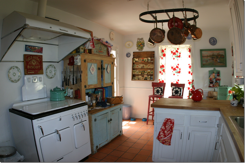
BEFORE: Reader’s kitchen before her remodeling. Actually, this kitchen is truly charming as is. That stove!!!! It is the owner’s grandmother’s original Chambers!
Emails, I get emails!! I recently got this email from a reader in Ft. Worth, Texas. Here’s what she had to say:
I love your website and pored over Kitchen Design elements for months. I wrote you once about using white marble. I wanted it but was worried about caring for it. You were so nice and wrote me back and told me to go for it - get what I love - life is short. So I did! I put honed Absolute Black on the one side and honed Carrara on the other. Our kitchen is still small -we could not get more out of the space, but we gutted it, made the door to the dining room larger, new electrical, new Pella windows, doors, hardwood floor to match the rest of our house. Out with my grandmothers Chambers stove and a new "baby" Viking to fit my small space and other new stainless appliances, THE gorgeous Shaw sink, polished nickel Perrin and Rowe bridge faucet, new cabinets, hardware and light farmhouse lights. I took all my furniture out of my dining room that I hated and we added another window. I hung some little sconces from Wisteria- best I can do till I get more money. I guess in 10 years they will say - remember all those white marble kitchens? I think I will never get tired of it.
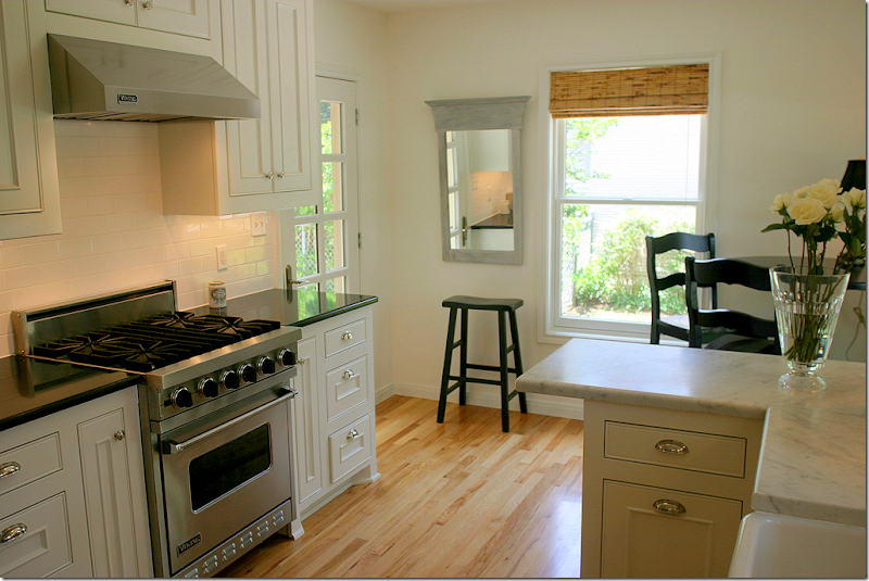 AFTER: Here is the same view – hard to believe it is the same space!!! Notice the owner used black granite and white marble together!!
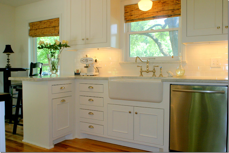
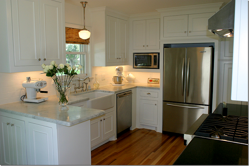 Looking the other way – at the sink area. The space is very small, but it is very functional. I prefer small kitchens myself. By using a combination range instead of a cooktop and wall ovens – the homeowner saved space.
I love the cabinetry and the hardware. Of course, the Shaw’s sink and the Perrin and Rowe bridge faucet are my favorites. I used those two elements in my own kitchen. I think they are so gorgeous.
The dining room opens off the kitchen.
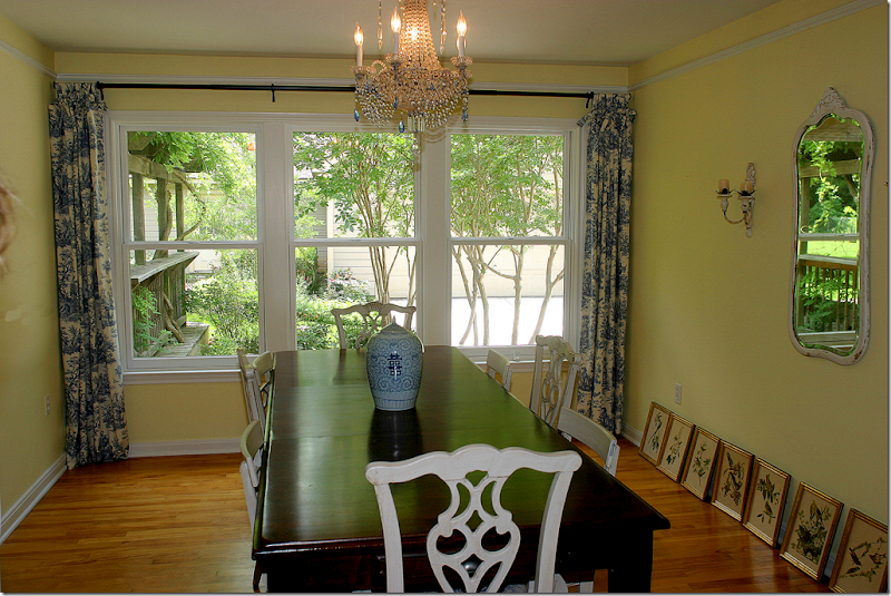 The dining room used to be red, but the owner painted it a light yellow. The chairs are from her grandmother and there are two different styles – repainted white, they blend together. The prints had not been hung when she sent me these pictures.
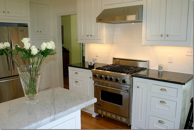 I love the white marble and I love the stainless appliances. I said that I chose my appliances for their pretty handles and it looks like the homeowner did the same thing – I love the handles on her refrigerator and the dishwasher.
Thank you so much to the homeowner for sending in these pictures! You did a great job!!!!


That is an amazing transformation, they did a fabulous job. I think it looks so much bigger and so fancy. I hope you realize how much you inspire everybody with your informative post and just plain help with questions.
ReplyDeleteWow - so pretty. I have to agree with the homeowner - I don't see myself getting tired of the white marble either. It invokes that old patisserie feel that transcends time.
ReplyDeleteLovely. And it looks like it would be so enjoyable to cook in this kitchen!
ReplyDeleteTruly incredible transformation and ingenious use of white and black marble. Thanks for sharing and inspiring.
ReplyDeleteIt's simply the kitchen of my dreams! Well done!!!!!
ReplyDelete*** It turned out F*A*B*U*L*O*U*S!!! She has created such a delightful space~~~ and am glad you were there, as always, to assist, encourage and inspire!!!
ReplyDeleteUBER CHARMING!!! Love the "roots" on the trees, visible thru the DR windows, too!
Warmest,
Linda in AZ *
bellesmom1234@comcast.net
Beautiful transformation!
ReplyDeleteGreat looking kitchen Joni!
ReplyDeleteWhat a transformation, and really nice job!
Have a great weekend,
L.
I am also in the process of gutting my kitchen and I want cerrera marble also. How bad does it stain?? Can you put a sealer on it?
ReplyDeleteForgot to say that I love the new kitchen!
ReplyDeleteAdore the white kitchen! Classic! I built one 20 years ago with white cabinets, carrera marble, and wood floors. With only appliance updates and new cabinet hardware it's as pretty today as it was then! White kitchens are absolutely timeless - unlike wood kitchens. Wood styles will always change and today's walnut and cherry cabinets are tomorrows dreaded oak.
ReplyDeleteLovely job! A tranquil setting for the enjoyment of cooking or entertaining friends. Excellent choices. I did a similar remodel except I used oil rubbed bronze knobs, hinges and door knobs because I have a black stove and a stainless refrigerator. Honestly, I regret using the darker hardware and wish I would have selected the nickel instead- it's so much easier on the eyes.....oh, Live and Learn.
ReplyDeleteNow that's a great Before and After! Your reader did a wonderful job.
ReplyDeletewow..amazing! so glad you shared.
ReplyDeleteI would love to know her source for the bamboo blinds..target no longer has them that i can find..lowe's had neat ones occassionally.hunter douglas' look to woven...i want one that are very tortous looking..not woven. if you read this homeowner, let us know about your blinds. AND ENJOY YOUR NEW KITCHEN!
I love love the mix of black granite and marble. Thank you so much for sharing - I think your kitchen is timeless. Congrats on a job well done! I would love to cook in that space.
ReplyDeleteWhat a beautiful transformation! The "before" was charming, but the "after" is gorgeous!
ReplyDeleteKat :)
I hope she kept the pie safe! I love the combination of the marble and granite! And love the painted dining room chairs--though I could never do it :)
ReplyDeleteI love what she did with this space, Joni, and I love the fact that YOU were the inspiration behind it. See what you do for people through your generous giving of advice and design info? I think people should have spaces they love, and you inspired her to have just that. I agree with you that the before kitchen was very cute, but this one is just fabulous. Love it! I also enjoyed seeing what she did with both the black granite and the white marble.
ReplyDeleteI have been eyeballing my cabinets and thinking of painting them white. I wanted white for the start, but I am on the verge of doing something about it. I have to wait a bit, but I adore that sink and faucet, too.
XO,
Sheila
Make that "from" the start. It's late! ;-)
ReplyDeleteAbsolutely gorgeous and soothing!!
ReplyDeleteAnd thank you for using the Carrara Marble!! I honestly don't know what everyone's hang up is. I mean they'll see a beautiful piece of marble from 18th century France with age and patina and think it's amazing. But get them to put a new piece in their home? Nope. I don't get it.
So thumbs up to you girlie! Just beautiful!
Tamra
The Gilded Barn
Oh my, very smart. I see myself in this kitchen, also love the granite/marble. Looks fantastic to me!!
ReplyDeleteLove the kitchen changes and I am ready to do some myself!! Inspired!
ReplyDeleteKarena
Art by Karena
It looks so lovely .Job well done. Grandma's old stove looked like it was in great condition.
ReplyDeleteNothing like a good "before" and a great "happily ever after!" See what an influence you have over kitchens Joni! Nicely done.
ReplyDeletepve
Fantastic transformation. The homeowner did an absolutely great job of updating her kitchen. It is now truly a classic design that will not go out of style !!! Bravo to the homeowners for making fabulous choices!! Gay Riggs, Baytown, TX
ReplyDeletePS - LOVE LOVE LOVE Cote de Texas. Joni has the #1 blog EVER !! Thanks, Joni for the time and effort you spend for our joy !
Great job , I love the mix of marble. 5 stars
ReplyDeleteGreat job! From so charming to SOOO FABULOUS!
ReplyDeleteWOW - that lady has good taste BIG TIME, and to think she wasn't sure about those divine benchtops!! ha
ReplyDeleteI can't believe that is the same house/kitchen. Such a drastic change. The remodeled kitchen is fantastic and the use of black and white marble is wonderful. Would not have thought of mixing the two together.
ReplyDeleteWow!! What a wonderful change! Very calming kitchen...and love the chairs in the dining room!
ReplyDeleteOMG! Falling to the floor and swooning!!! They did an amazing job!!!!!It's a classic! Great advice, Joni.....That kitchen will never go out of style- it's so luxe...J'adore. (I also like the fact that it's a "real life" sized kitchen, not two football fields big)
ReplyDeleteWonderful transformation. Don't you feel good, Joni, knowing you're making pretty all over the place through this website?
ReplyDeleteI agree that seeing a kitchen even smaller than mine turn out sooo well gives me tremendous inspiration. Since the white marble counter extends past the lower cabinets, and I see little space for a barstool, maybe they could add very shallow shelves beneath for cookbooks? I adore the dining room chandelier...it all looks so fresh and open...but sure LOVED Gradma's stove!!
ReplyDeleteLovely kitchen, great improvement, too bad she didn't keep the Chambers stove but I can see the practicality of the new one....She must be very happy! Maryanne xo
ReplyDeleteWhat an incredible transformation! WOW!!! See Joni, you inspire soooooooo many of us!!!! Take a bow my friend!!!!! ;)
ReplyDeleteHugs~
The reader created a classic kitchen that will never go out of style. She did a great job. It's certainly a kitchen one would want to spend a lot of time in if not cooking, then admiring. Good job!
ReplyDeleteBeautiful elements chosen all the way around. I also love the simple detail like the rattan shades. Adds great texture and is so much less fussy than draperies! Looks very classy!
ReplyDeleteWhat a beautiful and charming kitchen! The simplicity of the design will keep it timeless along with the subway tile and marble countertop. I love it!
ReplyDeleteBeautiful, beautiful transformation! Thank goodness your reader sent you the photos and Joni, thank you for sharing.
ReplyDeleteI'm curious about the bamboom shades, too. Still in search of something reasonably priced that will fit our windows!
To Holly Mathis Interiors - You can find the exact (Kona roman shades) that Target used to carry, at the links below. They may be a little more expensive, I don't know.
http://www.everythingfurniture.com/window-blinds-kona-roman-shades.html#axzz0qCxz7CCJ
http://www.stacksandstacks.com/kona-roman-shade-natural-finish?id=815&sku=117432&AID=10273848&PID=2007032&SID=13020300
The "old" kitchen was so charming, it felt loving even in the photos. She now has a gorgeous "forever" kitchen, truly timeless. Thanks for sharing.
ReplyDeleteWhat a beautiful transformation (hey, wanna come to my house?). She (nameless reader) must feel gratified with all the great feedback.
ReplyDeleteI do SO love the white marble.
And your web site...slightly addicted. Thank you for sharing.
Oops, I'm gushing.
Simply gorgeous and charming fresh new kitchen! I am SO very jealous -- those features are exactly what I would love to have in my own sad little kitchen! But I must ask -- did the original Chambers stove work? It was a gem! But of course -- the baby Viking is wonderful too! Thanks for sharing!
ReplyDeleteJan at Rosemary Cottage (frantically buying lottery tickets!)
How very elegant!! You certainly have inspired me! For those looking for the woven wood blinds - try to find a retail workroom in your area - many of us do hard treatments also.
ReplyDeleteI'm SO impressed, and very inspired! Love the combination of black granite and white marble. I, too, prefer a smaller kitchen. Efficient and easy to work in.
ReplyDeleteSuper job, reader - thank you for sharing!!
Jennifer
Love love LOVE it! I want to do my kitchen!!!!
ReplyDeleteJudy
Love it when people mix up materials. Pretty space.
ReplyDeleteWow!! That homeowner really has a great "eye" and is very talented! She did a beautiful job! Hope she enjoys that home for years and years to come---fabulous green views out those windows too!
ReplyDeleteThank you all for the sweet comments! I am blown away!! Joni IS wonderful- I love her website. To answer the questions about the blinds - they are from Smith and Noble. I do love cooking in my new kitchen. Sometimes just for a second I will start to look for a match to light the oven which was necessary with the Chambers. Thank you again for the lovely remarks.
ReplyDeleteLove this kitchen and love the use of two different marbles...great idea! Love the "baby" Viking stove and am thinking of going that route also with the remodel that we have been wanting since we moved in 9 years ago! But, we are wondering if the cooktop and separate wall oven is still a better option for resale.
ReplyDeleteThanks for sharing,
Gwen
Great job, but I really like the personality of the old kitchen better.
ReplyDeletexo xo
So beautiful. You can really appreciate the fine details because it is so much simpler.
ReplyDeleteWow! That is one amazing transformation........looks like a brand new home in the after shot!
ReplyDeleteBonnie
Went on a House & Garden Tour of Historical Homes in Bath, Maine today and while I saw many beautiful kitchens, your kitchen dear reader was far more beautiful than any I saw. Yours is one I would spend lots of time in just admiring - it's elegant and functional - a hard combo to beat. Joni, you are inspiration for so many, and your blog is the best!!!
ReplyDeleteJanice
Simply clean, functional and style in spades. Kudos to the homeowner for sharing!
ReplyDeleteThe new kitchen has style and clean lines. It looks like a magazine model kitchen. The old kitchen has soul and character. It looks as though someone lives there. I prefer it, though I understand the appeal of new, bright, and shiny.
ReplyDeleteThe new kitchen has style and clean lines. It looks like a magazine model kitchen. The old kitchen has soul and character. It looks as though someone lives there. I prefer it, though I understand the appeal of new, bright, and shiny.
ReplyDeleteThe new kitchen has style and clean lines. It looks like a magazine model kitchen. The old kitchen has soul and character. It looks as though someone lives there. I prefer it, though I understand the appeal of new, bright, and shiny.
ReplyDeleteLovely job...I can't think of one thing that I would change...
ReplyDeleteI bet she's having a ball cooking in there now...
So funtional....
The old kitchen had such charm...when I was a kid we had a hoosier in our kitchen.
Great post Joni...
Thanks to your reader for sharing her kitchen with us...
All the best,
Kathy :)
ps i can't stand it who won that lantern oh pls be me...fingers crossed LOL
What a gorgeous transformation! I love this kitchen but it is only a dream to me. YOu are always such a great inspiration to your readers!!! XO, Pinky
ReplyDeleteBEAUTIFUL kitchen! One of the loveliest I've ever seen. There isn't a false note anywhere. What a joy to behold! What a pleasure it must be to work in.
ReplyDeleteJoni, we're so grateful for your blog and--as someone else said previously--somewhat addicted to all of your wonderful posts.
THANK YOU.
Very classy redo. I hope the Chambers went to a good home, even if the oven did take a match to light it was a classic beauty in tis own way.
ReplyDeleteIt is amazing the difference a kitchen makes. This transformation is really great, clean, uncluttered and it gives direction to the house. Well done!
ReplyDeleteThis is beautiful. What a great job. I love all the white and it still looks comfortable and welcoming.
ReplyDeleteGorgeous! She did an excellent job....love it all!
ReplyDeleteLove the new kitchen even though the old kitchen was wonderful in a special way, too. The owner really does have a great eye and I wish her lots of Happy Cooking!
ReplyDeleteAnd Joni, you really do make the world a more beautiful place -- one room at a time!
Although the old kitchen was charming, the new is spectacular. I have a question about the dining chandy, was it existing or new? Love the idea she recycled her Granny's chairs. Thanks for the lead on Smith and Noble, I ordered some blinds this weekend.
ReplyDeleteThe new kitchen is very nice. It looks like a thousand other modern kitchens. The old kitchen had personality, warmth and character. What a shame to remove all of that. But the marble is lovely...
ReplyDeleteWow! That is totally my dream kitchen! The homeowner has terrific taste! I live in a small 1950's ranch style one story home with a small kitchen! It was so helpful to see an "inspiration" small kitchen that accomplished everything I would dream of doing in my kitchen!
ReplyDeleteWould the homeowner be willing to post a source list for her new kitchen? I'm curious about who makes the cabinets? The dishwasher? The fridge? The microwave? The hardware on the cabinets? The paint color on the cabinets? Etc?
Thanks for posting this BEAUTIFUL kitchen!?! I wish more blogs would post small kitchen remodels! Most of us live in smaller kitchens than those "huge" kitchens! So nice to see a DREAM kitchen that might fit in my house!
~ Ali
Beautiful transformation! smiles
ReplyDeleteIt's a wonderfully beautiful kitchen, but I like the first one, too! I am interested to know if the homeowner thought of glass fronted cabinets given that the kitchen is small but decided against it? I want to do the same in mine and am wondering if it is not the way to go?
ReplyDeleteJust perfect! I love everything about this kitchen. The transformation is huge and awesome!
ReplyDeleteWhat a beautiful makeover!! I just saved a few photos in my "future kitchen" file because I love it!
ReplyDeleteOh, how I love before and after photos! This transformation is fabulous. I love her new kitchen with the mix of materials, stainless appliances and that sink! I cheaped out and got a Kohler farmhouse, but wish I got the Shaw sink. Absolute black and Carerra are my favorite materials for countertops too.
ReplyDeleteShe nailed it here!
The kitchen looks great and I love the combination of Absolute black and carerra. It is crisp and clean. The sink is fabulous. I think small functional kitchens are so smart.
ReplyDeleteI love that sink! Gorgeous kitchen! <3
ReplyDelete- Ollie
www.olliecrafoord.se
Beautiful! Well done.
ReplyDeleteKate
I really like all of the different areas you addressed with the kitchen remodel. I really appreciate it. Really Fantastic Kitchen!
ReplyDeleteI love this kitchen and am seriously contemplating doing this to my kitchen too! I also love yor didning room table can you tell me where you got that? BEAUTIFUL!
ReplyDeleteto anonymous above - Pottery Barn Table several, several years ago, but I think they have similar variations now. It can seat 12 people with all leaves or 6 if you want smaller. I went to a dinner party last week and my friend had a newer version. Thanks for your kind comments.
ReplyDeleteJulie in Fort Worth
the renovated kitchen is beautiful, but to be honest the original had so much more personality and charm. it's a shame that it's gone!
ReplyDeletelouis vuitton uk are diversified in various kinds, handbags, backpacks, portable bags, purses, wallets and pouches. All kinds are popular among the whole word people.louis vuitton Store Online Handbags can also bring great accuracy as well as practical applicability and fashionable.Have you ever dreamed of being as charming as Madonna? Have you ever thought of becoming an envy of all your friends? If so, come to louis vuitton outlet.
ReplyDeleteAt the coach outlet online you have the largest selection of the day. If you touch the item and like it, keep it in your possession until you make your final decision.The coach factory outlet has been in business for many years. You can log in to find more information about its products and services.You know, Coach items are so perfect and fascinating. Now I grow up, and find coach outlet on the Internet offering affordable products with reliable quality.
ReplyDeleteThere certainly are a amount of methods to acquire affordable coach products at coach factory outlet,it could possibly the most effective options.the most vital cause may be the reality that you simply can purchase genuine coach products at there.All people give the good comments for the coach factory online, and now the Coach outlet store provides many discount goods online.Coach bags enjoy high popularity throughout the world. I would like to share the coach factory outlet online with you. What are you waiting for? Just come to visit.
ReplyDeleteThere certainly are a amount of methods to acquire affordable coach products at coach factory outlet,it could possibly the most effective options.the most vital cause may be the reality that you simply can purchase genuine coach products at there.It is believed that you will like the products on the coach factory online. There are spacious sizes and different colors, styles and so on.in the market you definitely can find various colorways that are designed in as well as the high quality that applied in. For most of you would like to come. So just come to our coach factory outlet online store to choose one.
ReplyDeleteWow, that "before" kitchen is the way I'd like mine to look!
ReplyDeleteThis is absolutely stunning.....I have never seen it before....shades definitely will contribute to it's décor.
ReplyDeleteRoman shades concord, ca
That kitchen redo is a significant improvement! Love the bridge faucet too.
ReplyDelete