New Orleans interior designer Gerrie Bremermann has made a career out of designing French interiors – heavy on the use of antiques. Her designs are timeless and classic – a Bremermann room doesn’t date. To be sure, it is her use of antiques that help to make her designs everlasting. Her rooms are sophisticated, yet they are also warm and cozy, a rare combination that is hard to achieve. She prefers using natural and relaxed fabrics such as linens and cottons. She loves painted furniture, crystal chandeliers and sconces, trumeaus, and wonderful full and luscious silk curtains. She usually works with a palette of creams, ivories, golds, and caramels, because “they are timeless and they work.” Bremermann certainly has her own recognizable look. A self taught designer, she leans towards the dainty and feminine French antiques of the 18th century although lately she has been using more Swedish antiques than before. She is tops in the field and has been in the business long enough that she is hired by second and third generation clients. Bremermann is a grande dame with impeccable style and taste. She is known best for lightening up New Orleans’ heavily gilded aesthetic. Preferring to design more casual interiors, Bremermann set up shop on trendy Magazine Street leaving behind the old guard on Royal Street in the French Quarter.
But, last year Bremermann stirred things up a bit. A house she designed in Palm Beach landed on the pages of the late Southern Accents and it was a huge departure from her usual designs. Yes, Bremermann has been gravitating towards more lighter interiors: a few recent projects leaned more to the airy Swedish style than the French. Still, the Palm Beach house was so light, so white, so fresh and youthful – it seemed to be the work of a 30s-something designer, rather than one with Bremermann’s experience. The walls of the beach house were stark white, something that her fans weren’t accustomed to seeing. The living room had a long, Belgian inspired slipped covered sofa – Belgian? Bremermann? Pictures of the house were splashed all over the design blogosphere – especially pictures of the beautiful living room with its gold and pink accents. The other sitting room was also highly praised for its gray and cream color scheme and the Amanda Talley abstract painting over the fireplace. The dining room was notable for two oversized mirrors standing diagonally in the corners. The house was photographed by the hugely accomplished Tria Giovan HERE.
The Palm Beach house remains the last published job for Bremermann so followers of her work are left wondering if this new style will be seen again? More amazing is that at a time when most in her shoes would be thinking of retirement, Bremermann pulled out all the stops to create something so remarkably new and different. It will be interesting to see where she takes us next!
Today, I’ll show first a quick look at her older work, then we’ll look at her latest, the Palm Beach house. I’ll compare the real estate photographs of the Palm Beach house with the Southern Accents photographs. Yes, the Palm Beach house is up for sale. I love, love, love to see real estate photos of houses that have been published. I think it’s fascinating to see the difference between the two. Comparing the two photographers is really a study in how truly talented the professional design photographers are – their pictures are works of art. By contrast, the real estate photos are amateurish and do nothing to make the house look inviting. How they ever sell a house based on those photos, I’ll never understand.
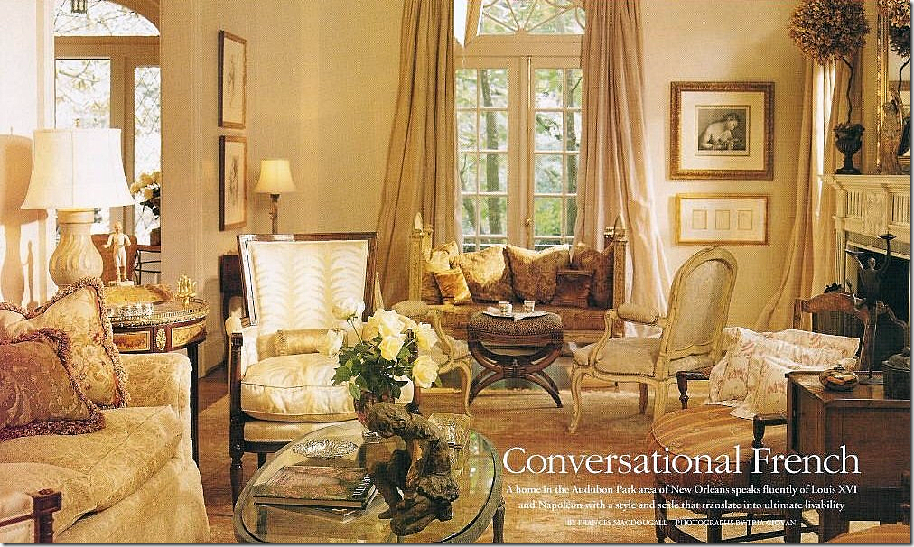
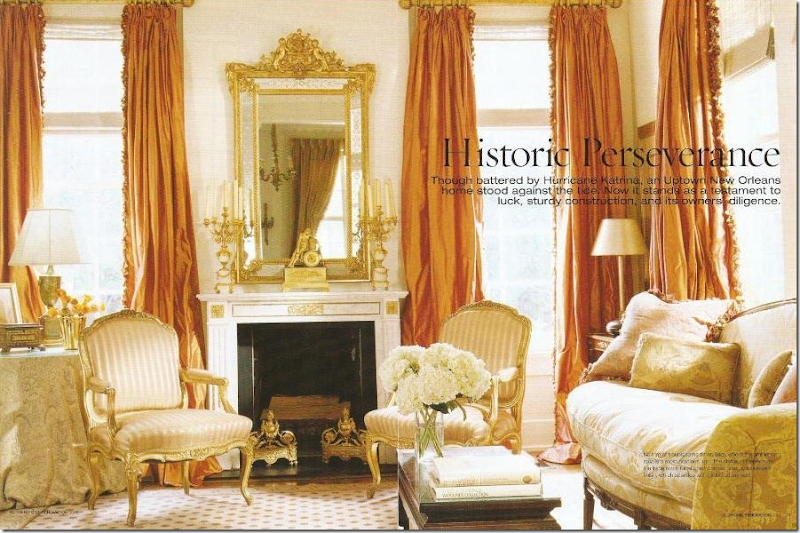
An early example of Bremermann’s work. This room is pure Bremermann – timeless, classic, inviting, warm, sophisticated yet inviting. Her love of French antiques is shown here with the multiples of chairs. Bremermann loves using French chairs – because you can easily move them around the room as needed for guests and conversation. The room’s color palette is typical of Bremermann – golds, ivories, and creams. Beautiful antique oushak rug covers the hardwoods. The luscious ballgown silk curtains are a trademark. I would be willing to lay odds that the owners have kept this room exactly as is all these years later.
Another favorite of mine is this dining room with the oversized antique Italian light fixture – Bremermann purposely used the large chandelier because it brings a playful, youthful element to the room. The scalloped slipcovered seats also help alleviate any seriousness in the decor. Again, gorgeous antiques and gorgeous curtains. The painted, cane chairs are devine!
Another personal favorite – this living room in New Orleans is more dressy than most of Bremermann’s interiors. The curtains are to die for and have been copied over and over again. Bremermann has a formula for her curtains and she once described it in a magazine article. I dutifully wrote it down and it helped me formulate my own curtain formula! The key to the lushness is using three widths of fabric.

The Palm Beach House – Real Estate VS Professional Photography:
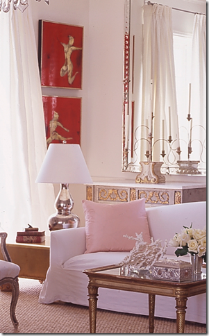
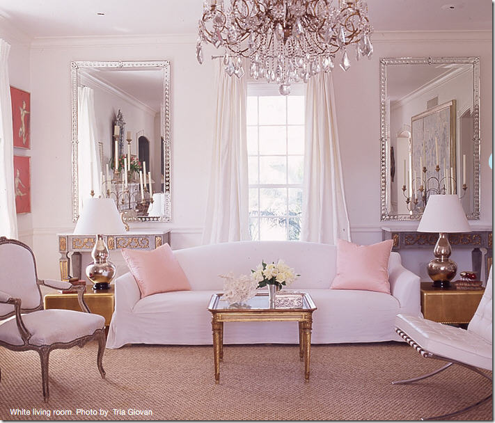
The Palm Beach house – the latest publicized work by Gerrie Bremermann. A clear departure for her: here she uses a long, tight cushion, slipcovered Belgian inspired sofa. It is beyond gorgeous - swoonable. Two gold leaf contemporary tables flank it, while an antique gold leaf table is used as a coffee table. The two painted gilt French consoles along the back wall are showstoppers, while the mirrors with their contemporary lines frame the entire vignette. The crystal chandelier looks gorgeous here. A simple seagrass covers the floors – it’s a beach house after all! Notice how Bremermann mixed the gold with the silver. White silk taffetta curtains hang off simple pewter rods. The two pink pillows give a pop of color.
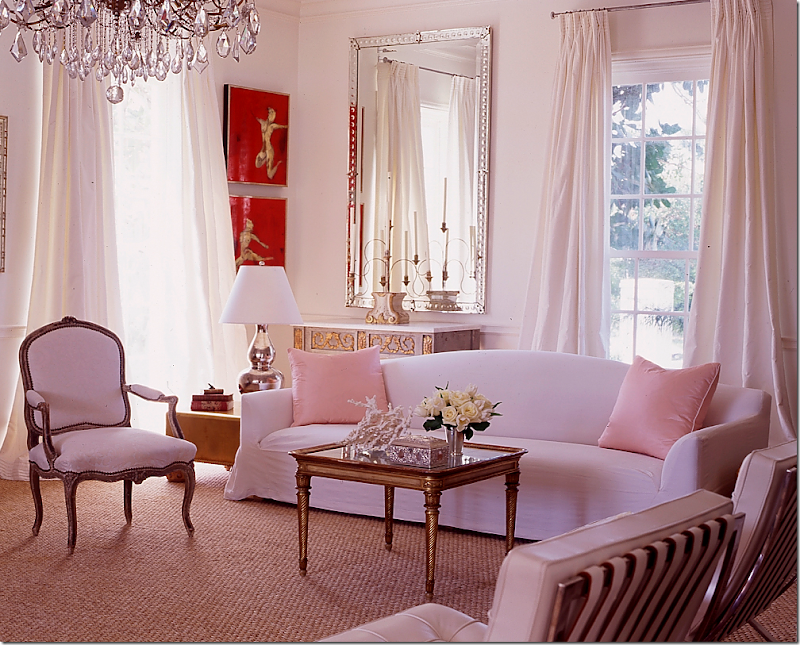
Another view – this house was such a stunner for devotees of Bremermann’s work. The stark white is unusual for her, as is the contemporary furniture she mixed in with all the antiques. The look is sophisticated in a youthful way. I imagine a young couple living here with their small children. It’s fresh, hip, and slightly trendy. Photos by Tria Giovan.
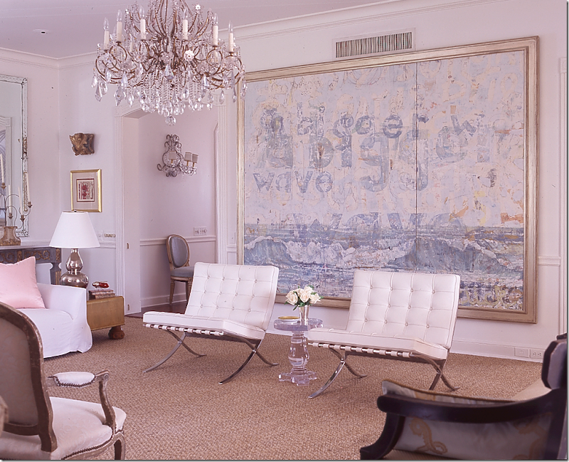
Another view – here you see the oversized oil painting by Nicole Charbonnet that takes up the wall. The painting introduces another pastel color, blue, into the room. I love the white leather on the Mies Van der Rohe Barcelona chairs and the acrylic table. Beautiful sconces peek in the hallway where a French chair wears more light blue. It’s a shame the a/c vent couldn’t be moved! This is surely the first time I’ve ever seen Bremermann use the Barcelona chair.
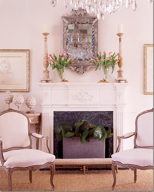
And, across from the Charbonnet painting is the fireplace with a stunning Venetian mirror over it. Notice the pair of antique painted French chairs are across from the pair of the contemporary Barcelona chairs. Notice how in all the pictures of the this room, Giovan took tight shots – creating vignettes with her lens. Now, do you want to see what this room really looks like – away from the lens of the fabulous Tria Giovan who took the pictures for Southern Accents???? Look below:
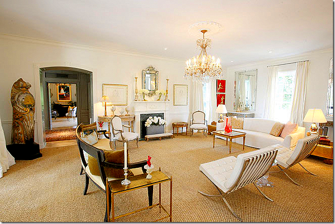
The living room as seen in the real estate brochure: The room is actually much larger than it looked in S.A. The vignette with the sofa and mirrors and consoles is not as dramatic here. Also – what a gorgeous bench! That’s a surprise. Across the entry hall on the left, you can see into the grey sitting room. I must say that the room is furnished exactly as it was photographed, except for the orange vases on the gold Venetian coffee table. Not sure what that is in the corner there (I’m just ignoring it.) I am dying to know if the Charbonnet is here – you can’t tell from this picture.
The sitting room with its grays and creams by Tria Giovan. This was another photograph that was shown on many design blogs. The Amanda Talley painting is stunning here – it really “makes” the room. I love the crystal sconces used next to the contemporary art work. Beautiful gilt French bench in ticking. The glass and acrylic coffee table makes the room more youthful and less stuffy. Rose Tarlow curtains. Just beautiful! Now, how does this room REALLY look????? See below!
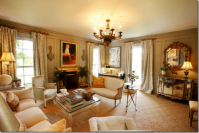
Surprise surprise surprise! The Amanda Talley has moved from above the fireplace to a side wall. Instead, a portrait of the owner’s child perhaps is there. Well…I prefer the Talley, but no one asked me of course! This room retains its beauty in this picture. You can see the mirrored console here. Notice the pattern in the seagrass rug. The chandelier is to die for – as they all are in this house. Gorgeous room! Notice how in real estate photos – they always show the vast ceiling, but professional photographers tend not to show nearly as much. Photographer Michael Lee told us on the Skirted Roundtable to sit on a chair to avoid getting that huge ceiling in your picture.
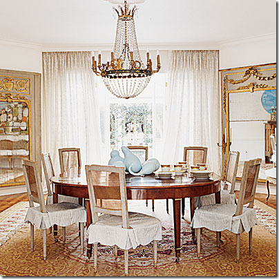 Tria Giovan’s dining room. The main attraction is the two French trumeaus in the corners. The oversized mirrors are gorgeous – as is the chandelier. The chairs are stunning, painted and caned with slipcovers. I like the casual French chairs paired with the more dressy and streamlined table. Notice how nicely framed the table and mirrors are in the photo. Just beautiful.
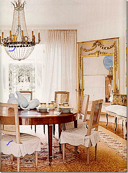 A somewhat larger but cropped picture where you can see more detail of the chandelier and the French bench on the right with its BViz pillow. How does this room REALLY look? See below:
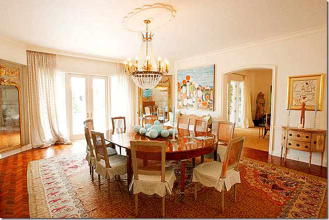
The real estate photograph: The room looks huge – with all the ceiling showing again. As for the decor - I think I prefer the quieter rooms – the living room and the sitting room. This seems a little too colorful for me. But give me those chairs, the chandelier and the mirrors and I’ll die a happy woman!
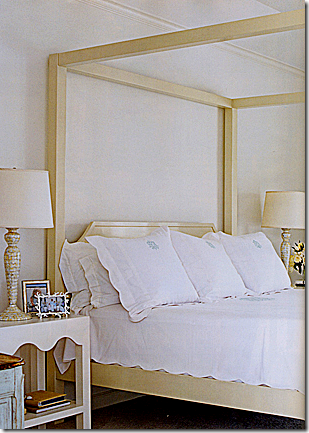 The bedroom with the beautiful Leontine Linens, of course! And how does the master bedroom really look?
Real Estate photo: Ceiling, ceiling ceiling. This room really looks huge here. Matching antique painted consoles with sconces are almost lost. Pretty Swedish sofa. I think part of the issue is the sheer size of the rooms in this house. When you get such huge rooms – you really need to fill them up with furniture, otherwise they look bare. This room could use a whole sitting arrangement in it. And real estate photographers want to show you the entire room – they don’t want it to look good, with little closeup of vignettes.
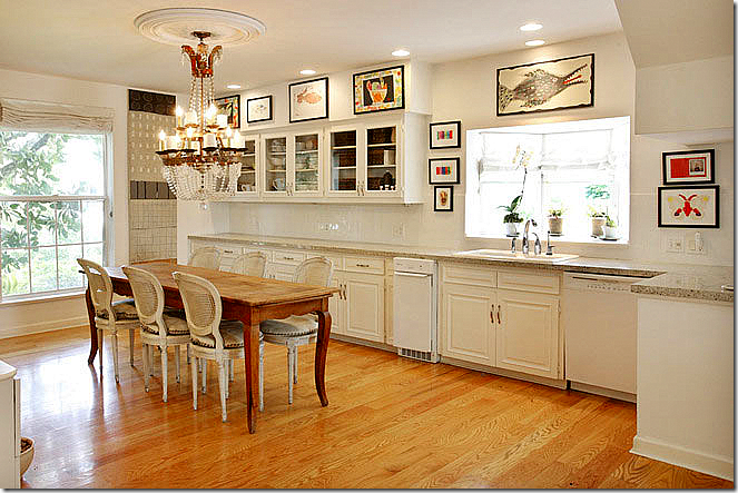 Real Estate photo: large chandelier, French table and chairs dress up the simple kitchen. No professional picture to compare it to.
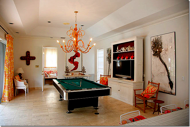
Real Estate photo: the play room. The photographer did nothing to make this room look appealing!!!
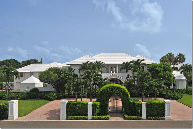 Front of the house – the house was on the market for over 12 million, but was later reduced. The web site doesn’t say if it ever sold.
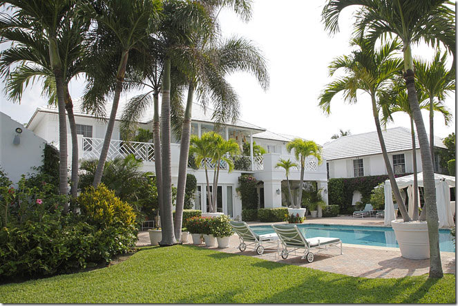 Beautiful. The back of the house.
Lesson to be learned: Always hire a professional photographer to take pictures for your portfolio if you are an interior designer. It makes a huge difference. If you can’t afford one, then borrow a good camera with a wide angle lens. Remember to sit down for pictures – if you don’t have a tripod. I’m sure this house is as beautiful in person as Tria Giovan’s photos show it to be, but it’s just such a shame the real estate photos always make the house look not as pretty as it is.
I have a series called Cote de Texas Top Ten Designers HERE (that I still haven’t finished!) and Bremermann made the list at #4. To read that in-depth look at her career, go HERE.




I'm addicted....the swoonable livingroom picture is completely SWOONABLE!
ReplyDeleteCertainly good advice re the photographer...all that ceiling brings the room down...
This is a huge departure for Brennerman. fabulous details and I love Amanda's art (better over the fireplace of course!!)and Charbonnets. Her draperies are divine.
ReplyDeleteGreat points made Joni!
Karena
Art by Karena
fascinating post! I so detest the crazy wide angle lenses they use in real estate photography to make rooms look massive. To be honest, you see the same thing in some issues of AD as well. Most design pubs prefer more intimate angles and not revealing the whole room in one image -- so much better to enjoy the room bit by bit. But let's not forget, the magic of great design photography is generally the result of teamwork: a photographer, a photo assistant, a stylist and sometimes an art director (some stylists also art direct), and of course the interior designer. ALL of the members of this team must be at the top of their game to produce the very best photos. Full disclosure: I'm a stylist & design editor - just sending a shot out for my peeps ;-)
ReplyDelete..er, I meant shout out, not shot out.
ReplyDeleteI've always wondered how the professional stylist/photographer is able to create the "golden glow" in their work. Their's is such a warm, textured look, versus the cold sterile look of the amateur photographer...gorgeous!
ReplyDeleteLove the warm felling the photographer has been able to create!
ReplyDeleteI would love to be able to take such wonderful pictures!
Dear Joni,
ReplyDeleteYOU ARE SO RIGHT !!!
Dean Farris
How I would love to have the skills to be an interior designer!
ReplyDeleteI love the fantastic pictures!
Beautiful. I especially love the living room with Barcelona chairs (while they ever go out of style?) and that painting. It really makes the room! Love it!
ReplyDeleteThis was incredibly interesting! As someone who loves to look at the real estate listings, I can understand how real estate pictures need to have a different focus - they need to show the whole picture, not vignettes - the flow and feel of the rooms. It seems as if this is achieved using a special lens. I did get a sense for the flow of the rooms and their size - although I wonder if the lens made the rooms look bigger than they are?
ReplyDeleteMy impressions: the formal living room was too big for my taste, and the furniture was so spread out that it did not even look comfortable for conversation. Again, could have been the wide angle lens.
I love the painted paneled sitting room, although I agree that the Amanda Talley needs to go back over the fireplace. I have a personal dislike for large oil portraits (or photographs) or children as part of decor. Overall, though, I thought this room was very true to the magazine picture.
The kitchen was a surprise - it seemed very unformed and not too functional. Where are the appliances?
I actually like that playroom - what a fabulous orange chandelier. Great art too. Wouldn't that room look amazing with a professional photographer at the helm?
Patiently awaiting the CDT top 2 designers....
The lesson here for me as a designer, is to mix it up more. The way that Gerri combines the antique with classic modern pieces show a daring side, and it proves that eclectic design is not always an easy achievement. Working with the traditional client, it's often difficult to sell the idea of adding something more contemporary to the mix. I think I'll just carry this photo of Gerri's work around with me! Interesting post, Joni.
ReplyDeleteLOVE the palm beach house, love the pale cool palette. and i love the point you make about styling and photography. if i had been casually flipping through these pics in a magazine, i would not have thought it was the same house. but THIS is the question-which set of pics comes closest to the experience you would have walking into these room?
ReplyDeleteALSO love the art!
Great post!! Fascinating look at the difference between the professional, magazine quality photos and the real estate ones. Makes you almost feel that a room can't look as good in real life as it does in the styled, tight photos taken by a talented professional!
ReplyDeleteTake your time...but just want you to know that your fans are EAGERLY awaiting the next installments of your series--top designers and top design elements!!!!!!!
Oh my gosh Joni, that was really interesting. I was kind of up & down, yes & no, well maybe, or not!
ReplyDeleteI can see how real estate photos need to show...real estate but they don't really sell me on the house. Square footage is important, but the way a room feels is what really sells me. I'm just sayin.
Love that Amanda Talley, she is so neat. Great to see her art in a setting such as this one...oh, and I liked it over the fireplace too.
xo Lisa
Great post Joni! I think the answer is that real estate agents are showing the house, not the decor. And those darn wide angle lenses make the room look LARGER than it really is. Have you taken "virtual tours"? That's where you see a REALLY distorted view of room.
ReplyDeleteBottom line: I think the real estate photos view a distorted view, not a realistic view.
Another fabulous post!
ReplyDeleteAs a real estate agent, I always struggle with showcasing the bones/layout of the home or the beautiful furnishings. We use a professional photography with a wide angle lens in order to capture as much of the rooms as possible. Unfortunately this sometime distorts the dimensions. Our shoots take about an our for a typical 4 bedroom house and we get 12-15 pictures. It works well for the MLS and our brochures but of course we could never afford the time or expense of a magazine quality shoot.
You are a woman after my own heart -- a super sleuth on the hunt for beautiful homes! It just makes my day when I get the prompt that you have a new post! I love your thorough research and thoughtful analysis and have learned so much from you in terms of architecture and design (and Robert Pattinson!). Looking forward to your top designer series.
Stratosphere! Just "out of this world!" And, I'm a color person! FAB job, Joanie! franki
ReplyDeleteSuch an interesting post. But I have to admit it was difficult for me to concentrate from my giggles over your Twilight cover!!! Brilliant!
ReplyDeleteGreat Post, as usual. Surprisingly, I see great value in the real estate photos...I never realized how limited the professional ones were in giving a beautiful, artistic glimpse of a nook and missing the whole of the room.
ReplyDeleteGerrie Bremermann designs are always fabulous and I see her all over large picture number four, she’s timeless! I feel very fortunate to have met Ms. Bremermann the last time I was down in New Orleans, truly a lovely lady and fabulous shop! I understand why the real estate pictures need to be different, they’re trying to show the house/rooms not the furnishings since those won’t be staying. No matter it was fun seeing the whole room verse a fragment. Thank you once again for a great post Joni!
ReplyDeleteDebra,
The differences in the photography are truly amazing. Would love for you to do a post on how to photograph a room properly. Each post you write is a treasure trove of information.
ReplyDeleteReally large rooms are just so unnappealing to me. In the professional photos you have NO IDEA how large those rooms are, they look so cozy and livable in the professional photos. The real estate photos just make the place look cold. I realize it is not just the sheer size of the rooms, the lighting, EVERYTHING is off in the real estate phtots, but even so, I am completely struck by my own strong preference for small spaces when I compare the photos.
ReplyDeleteGreat post Joni!
ReplyDeleteAt least you can see what you're really getting with the real estate photos (if buying) -ceilings and all. :)
Although it is all completely fabulous, I'm still more drawn to her earlier work. It is just warmer and more inviting. So true on the photos. Real Estate pics can just ruin a house. A little side note, I recently heard you say on the Skirted Roundtable that you struggled because you are not a writer. You could have fooled me. I hang on your every word. Your descriptions are so colorful. Your content is always right on and so engaging. Have a great weekend.
ReplyDeletewow... that is a huge house. I love the living room though.. with the mix... those barcelona chairs.. just great...it was so fresh.
ReplyDeleteGreat idea for a post and you are so right about the value the professional photographer and stylist bring to a vision. I imagine that the shot with the Amanda Talley piece over the mantle was the work of the stylist for the photoshoot. The difference with the real estate photography is amazing, but still, those photos aren't bad. Around here, real estate photography is horrific. Those pics are works of art compared to my local realtors!
ReplyDeleteLove the beach house!!! I am a professional realtor and am going to take note of this post the next time I am taking photos for a new listing! It is funny how the ceilings are so prominent in the real estate photos! I am going to go back through my listing photos and see if I do the same thing! Great learning lesson today Joni! with beauty intertwined!
ReplyDeleteTerrific post, as always! I get so happy when I see a new Cote de Texas post pop up in Reader! :) You've got me thinking...I find the professional pics next to the real estate pics fasinating. What is a more true representation of the home? As a non-designer, regular SAHM that loves pretty homes, am I going after the unattainable when I see pretty magazine pictures and then compare them to my own home?! Maybe. I thought the Glasser pics were even more dramatic. hmmmm....
ReplyDeleteHer work just goes to prove, when you got, you got it. It doesn't matter what your style is, if your good you can make it work.
ReplyDeleteFantastic pictures. If only we could all afford professional photographers! Every time I shoot my own stuff at home I think, "Oy! why couldn't I have a good friend or relative who's a photographer!" lol
HI JONI, Another superb post. I most of all miss the Amanda Talley painting in the real estate photos of the sitting room. So much life and movement was added with that painting. Thank you.
ReplyDeleteDetective Joni is on the case. Great article.
ReplyDeleteI've of two minds about RE vs. professional photography. If ALL you see in a mag article is vignettes, you often don't get an overall sense of the space and to see how the vignettes interact with each other. I really prefer a mix of larger scale shot snd photos of a more intimate scale.
While I read everything you wrote, I only skimmed the comments so my apologeis if this has alredy been said.
ReplyDeleteThe reason these rooms look so much larger than they probably are is due to a real estate camera - they are relatively affordable for agents to buy and they take shots that are warped so you get literally the whole room/ceiling floor walls. These cameras also can be set up in the center of a room on a tripod to give 360 tours.
Just my guess.
It is fascinating to me, Joni, how artfully you teach me to "see better". Many of your posts (this one included) are tutorials in seeing--seeing more clearly, more accurately, more thoroughly.
ReplyDeleteI've been noticing for some time how much more appealing professional interior design photos are than real estate photos. Now I understand what makes the difference. Now, thanks to you, I see what makes the difference.
In viewing this post, I did notice that if I scrolled the real estate photos in this post all the way to the top of my screen and thereby "cropped" the top of the photos, they were greatly improved. There is value, I think, for real estate purposes, in seeing the whole room in a single shot. But who among us (other than looking for the telltale stains that indicate leaks perhaps) spends our time focusing on the ceiling? That is not where we put our attention. And that's not where a photo's attention should be either.
Joni, thank you!
I do prefer her earlier work as shown in the pictures you posted here. I could live in that and keep in forever. I'd bet the owners kept it that way as well. I did like the gray room in the newer photos.
ReplyDeleteDamn fish eye/architectural real estate photos. They made my beautiful high ceilings in our study look so low, we didn't even use the photos in our listing. The room was distorted beyond recognition. The RE agent said that people kept saying, "oh it looks so much better in real life"...yeah no thanks to your photos. Great post Joni, as always. I agree with your readers... you teach us to 'see'. A-M xx
ReplyDeleteShe is such a talented designer, and although I prefer her more traditional work, she handles the modern approach very well. Those curtains ... beautiful.
ReplyDeleteThe white Barcelona chairs are certainly interesting. I like white, and I like Barcelona chairs, but that combo reminds me of a pair of men's golf shoes.
I always wonder why a designer departs from the norm. Maybe they just wanted to try something new, or maybe the client requests it? At any rate, it is fun to see great talent at work, whatever the approach.
And speaking of talent, thank you for yet another gorgeous, yummy, fabulous post!
For those of us not in the Design industry, it's fascinating to have you dissect a home like this, Joni. Those painted consoles and trumeaux are just totally killer...
ReplyDeleteIntriguing comparisons:
ReplyDeleteTrad Mrs. B. vs Mod Mrs B.
Magazine photos vs reality photos.
Love it!
xo xo
I took some photo's for my blog today of a living room redo that I recently finished and you are so right, a professional photographer captures things so much better than I do. They are artists behind their lens and can capture the best features of a room and so much differently than we see it which is refreshing and eye opening.
ReplyDeleteRuthie
I feel "Things That Inspire" said .....it all, so DITTO!
ReplyDelete-Brenda-
Footnote: The chandeliers are absolutely enchanting, but I cannot help but wonder what they will look like when the usage of CFLs become mandatory. The very thought of it frightens me. :)
Hi Joni,
ReplyDeleteGerrie Bremermann is one of my favourite designers. I love her work and have kept all the same magazine shots as you.
The professional photos are drool-worthy. But, to be fair to real estate agents, the real estate photos do what they are intended to do - show the entire room and the flow from room to room. Since most homes are not sold furnished, it doesn't matter how gorgeous the sofa, chairs or table-top vignettes are. It does matter how large (or small) the room is, what's on the floor and where the windows, doors, fireplaces, etc., are. So both types of photography serve their purpose.
Joni, great post as always! Would love for you to read my recent post and comment. You are the queen of seagrass so it would be great appreciated!
ReplyDeletehttp://colorandlightatelier.blogspot.com/
I also loved the Palm Beach house. It jumped out at me when I read my SA. I love that BB is mixing it up. The Barcelona chairs were quite the departure for her, but a designer needs to listen to the space and its location.
ReplyDeleteLove the side by side photos. It's amazing how different a room looks when photographed by a "mortal" and their camera!
Love this type post and nobody does it as well as you Joni!
ReplyDeleteLove the gray sitting room and the white living room designed by Bremermann. They have that perfect balance of traditional and contemporary making them look fresh yet timeless. The colors used are perfect for Palm Beach too.
ReplyDeleteI agree that from a design perspective the "professional photos" are much more appealing to the eye. However, when a house is priced in that range often a professional photographer is hired to do the real estate photos as well. They are just hired to shoot differently. When shooting for a magazine you want the vignettes and the art, antiques, furnishings, curtains to be the stars. However, these things are not what are being sold when a house is listed. Therefore a photographer is supposed to hi-light the space not the contents.
So while I 100% agree that the photos by Tria Goivan are much more aesthetically pleasing, I think the difference could be more attributable to the purpose of the photos rather than the skill of the photographer.
so interesting.. even the colors look so different. so much more blended-feeling in the professionals
ReplyDeleteGreat post Joni and very interesting looking at the same room with different eyes...I too featured that Palm Beach living room on my blog...oh my...the room just made me go 'wow' - I love, love, love that room and would someday like to replicate it in my own home!! if only!! thanks for sharing...:)
ReplyDeletethanks everyone !!! i know that r.e. people want to show the whole room, but still - try a little harder people!!!! they dont' have to be that bad.
ReplyDeleteJoni
I can't remember every liking a room shown in our local real estate listings. They usually look totally out of proportion (often as bad as those funny mirrors at carnivals) and the only way to get a true feeling for the size is to look at the room dimentions. We were looking for a house that had a dining room large enough to accomodate our 10' dining table. The DRs always looked huge but were so often 11' x 13'. A large room can look cavernous, as does one of these. What a shame that they can be misleading.
ReplyDeleteJoni, I'm having a busy summer. Just had my first chance to get over here and spend over an hour reading through some of the posts I've missed. I always enjoy your commentary so much - though it makes me feel that I'm not very observant. After I read your commentary, I see things in the pictures that I had not seen the first time I looked at them. Thank you for sharing such beautiful decor and for pointing out what makes it beautiful. laurie
ReplyDeleteJoni,
ReplyDeleteGreat blog. She is the grand dame! Gerri has been my mentor for 20 years. I worked with her when I graduated from design school and lived in New Orleans.
She has still got it and has the greatest taste...very few designers have her gift.
I just wanted to comment and say that I really enjoyed reading your blog post real estate business here. It was very informative Aprtments room is quite big and had everything we needed in it, Its a great place is one of the best accommodation options while staying in it.
ReplyDeleteThis comment has been removed by the author.
ReplyDeleteI would kill for the Wave painting by Nicole Charbonnet.
ReplyDeleteThanks for sharing the detail description about this beautiful real estate. The photographs you have provided regarding this real estate are nice and eye-catching. These photos covers both the exterior and interiors of the real estate. A quality photograph can make the difference between getting a potential buyer to come and see a property or just throwing the listing away before even visiting. Thanks a lot.
ReplyDeletelouis vuitton uk are diversified in various kinds, handbags, backpacks, portable bags, purses, wallets and pouches. All kinds are popular among the whole word people.louis vuitton Store Online Handbags can also bring great accuracy as well as practical applicability and fashionable.Have you ever dreamed of being as charming as Madonna? Have you ever thought of becoming an envy of all your friends? If so, come to louis vuitton outlet.
ReplyDeleteAt the coach outlet online you have the largest selection of the day. If you touch the item and like it, keep it in your possession until you make your final decision.The coach factory outlet has been in business for many years. You can log in to find more information about its products and services.You know, Coach items are so perfect and fascinating. Now I grow up, and find coach outlet on the Internet offering affordable products with reliable quality.
ReplyDeleteThere certainly are a amount of methods to acquire affordable coach products at coach factory outlet,it could possibly the most effective options.the most vital cause may be the reality that you simply can purchase genuine coach products at there.It is believed that you will like the products on the coach factory online. There are spacious sizes and different colors, styles and so on.in the market you definitely can find various colorways that are designed in as well as the high quality that applied in. For most of you would like to come. So just come to our coach factory outlet online store to choose one.
ReplyDeleteThe Coach bag is from the latest release of Coach Bags. Its crisp, scribble material, leather handle, perfectly complements the relaxed shape of this stylish pouch. All the items of coach outlet online Store fit all of your essentials and more.Bright colors, exquisite workmanship, durable material and up-to-date style all lead to the great fame of the goods in coach outlet.As a fashion and modern lady, you can never have too many bags but Coach, Coach is a great leather handbags brand. coach outlet store online have different look according to different designer concept.
ReplyDeleteI am glad to find your impressive way of writing the post. Now it become easy for me to understand and implement the concept.Your art is inspiring. You're truly original
ReplyDeleteThis kind of post is always inspiring and I prefer to read quality content so I happy to find much good point here in the post.
ReplyDeleteThank you for sharing. This article is very helpful and informative. We need more article like this. Cheers!
ReplyDeleteMost American cities increased in foreclosure on dailygram.com over the past few months. Sub-prime mortgage mess is the major reason, why homes go into foreclosure.
ReplyDeleteIt proved to be Very helpful to me and I am sure to all the commentators here! real estate photo edits
ReplyDeletei love to follow your all resources, just excellent, thanks. you can visit my website
ReplyDeleteAwesome and interesting article. Great things you've always shared with us. Thanks. Just continue composing this kind of post. Austin Drone Videography
ReplyDeleteOutstanding article. Thanks for share this post.
ReplyDeleteVery helpful. Thank you for sharing.
ReplyDeleteHiya, I am really glad I have found this info. Nowadays bloggers publish just about gossip and internet stuff and this is really irritating. A good site with interesting content, that’s what I need. agen togel online
ReplyDelete