Last January, I showed the story entitled “Incredible Renovation” – about a Houston house, actually located in the suburb town of Sugarland, Texas. This 20 year old foreclosure had never been updated when the current owner, a single, empty-nester bought it. She made a few, key renovation decisions that drastically changed the look of the house: most notably, new hardwoods were laid everywhere, but the bedrooms, and a new kitchen island was built. Additionally, she retiled her bathroom, closed up a door leading from the dining room to the kitchen, removed some built-ins, and painted. The renovation took three weeks to complete – or 20 days to be exact. The transformation is astounding. So astounding, in fact, this story received over 200 comments!!!! I think it may hold the record for the most commented story ever on Cote de Texas.
When it was published, I sat back and listened to the pings of my computer’s email alert. The pings kept coming and coming and coming. I was stunned at how fast you commented and at how many of you felt the need to comment on the story. Of course, it wasn’t without controversy. What would the comment section on Cote de Texas be without controversy? Some of you refused to believe this renovation was done in just 20 days. Others argued why it was believable. It went back and forth between believers and non believers. There was even a thread on Garden Web where they discussed whether the owner did all the work herself!!! No, she didn’t perform any of the labor, but she also didn’t have a contractor or an interior designer. All the design decisions were made by her and a posse of close friends. The owner contracted all the laborers herself.
So, how was it all completed in such a short amount of time? The homeowner planned the renovation before she even closed on the house. She started purchasing items she knew she would need even before the house was hers. Once she gained entrance to it, all the tradesmen were ready to go – and many worked around the clock, late into the night. In the end, she moved in within a month of closing to a completely redone, fresh and beautiful new house.
The story caught the eye of magazine stylist extraordinaire Bonnie Broten. Bonnie freelances – producing stories for many of the titles you read, including all those owned by Meredith. Bonnie emailed me and said she had to have this house. True to her word, she came to Houston this summer, along with photographer Bill Bolin to style the house and take pictures. The story is in this month’s Renovation Style – The Before and After Issue. Also in this issue is New Hampshire blogger – For Love of A House. I thought it would be interesting to revisit this renovation story and show you all the pictures Bill took. Most ended up in the magazine, but not all did. There have been some decorating changes during the past year that I thought you also be interested in seeing. And if you are new to Cote de Texas, to read the original Incredible Renovation story – go HERE. Enjoy!!!
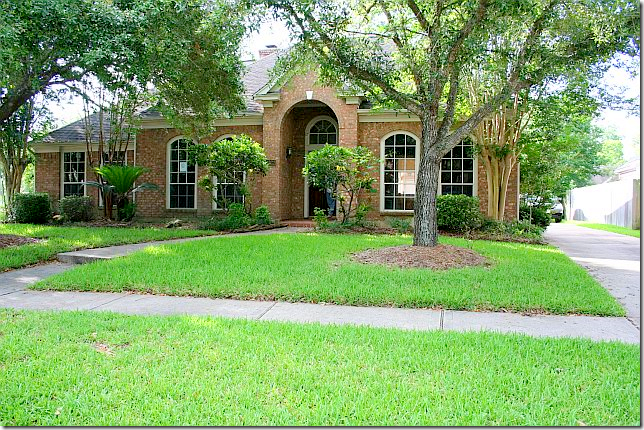
BEFORE: Twenty years old, the house had never been remodeled. The landscaping needed refreshing and pruning.
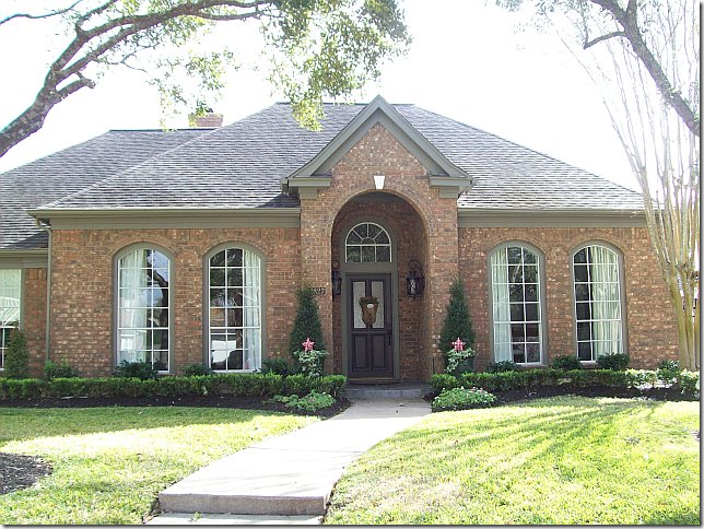
AFTER: The new homeowner opted for beds of box for a much neater look. Overgrown bushes were removed, and new trim paint in a dark khaki was painted over the former white.
BEFORE: Upon entering, through French doors with a transom, the study had carpet and a wall of built-ins. These built-ins were quickly removed and hardwood floors were laid The ceiling fan was another casualty.
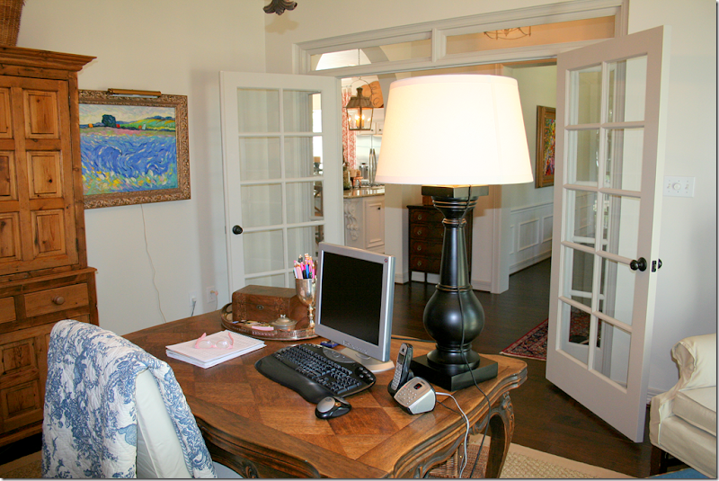
AFTER: Looking through the French door, the room is now the office for the homeowner who works from her house.
Looking through the French doors into the office. Antique furniture takes the place of the built-ins. The homeowner loves to go to Round Top where many of her accessories were collected over time. An iron light fixture takes the place of the ceiling fan.
·
RENOVATION STYLE: These photographs for the magazine were taken by Bill Bolin and styled and produced by Bonnie Broten. Changes include – a more substantial slipcovered desk chair and a new lamp. Of course, the shelves were also tweeked for the photograph. In this photo, you can see her linen curtains with their blue and white ribbon trim. Bill and Bonnie are quite a team – they are very professional and talented. Notice the beautiful lighting – with the sun streaming through the windows.
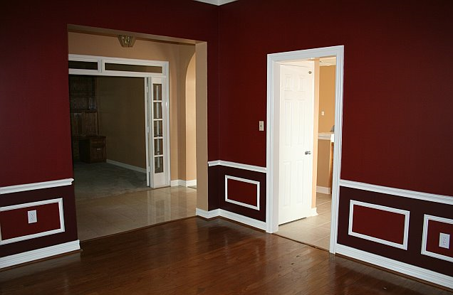
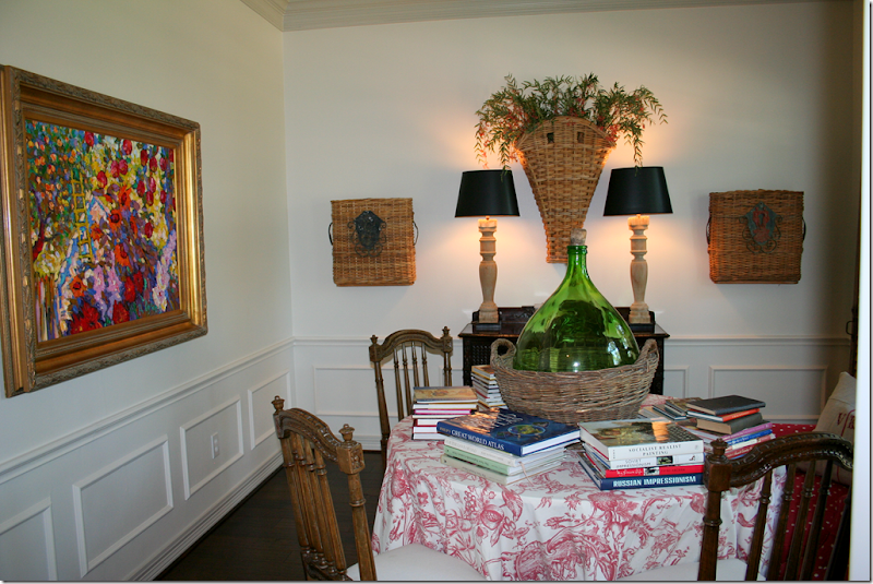
BEFORE: Across the entry hall is the dining room. Here you can see the old tile that was in the kitchen and hallway, which was replaced with hardwoods. The door to the kitchen was closed off to make more counter space in the kitchen.
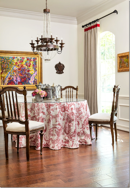
AFTER: It’s amazing what a coat of white paint can do for a room! The homeowner uses this room as a library. At the time this was taken, the chandelier hadn’t been hung.
RENOVATION STYLE: I’m not sure if Bonnie or the homeowner moved the books, but for this photo for the magazine, the ‘library’ is all dining room! A beautiful chandelier now hangs over the table and here, you can see her linen curtains with a red trim. As you might imagine, the homeowner told the magazine that red is her favorite color.
RENOVATION STYLE: Magazines always take “detail” shots – here the centerpiece in the dining room ended up as the first photograph shown in the story.
RENOVATION STYLE: This cabinet in the dining room once had no legs – the homeowner had her carpenter add them!! Inside is a collection of antique and hotel silver. So pretty!!
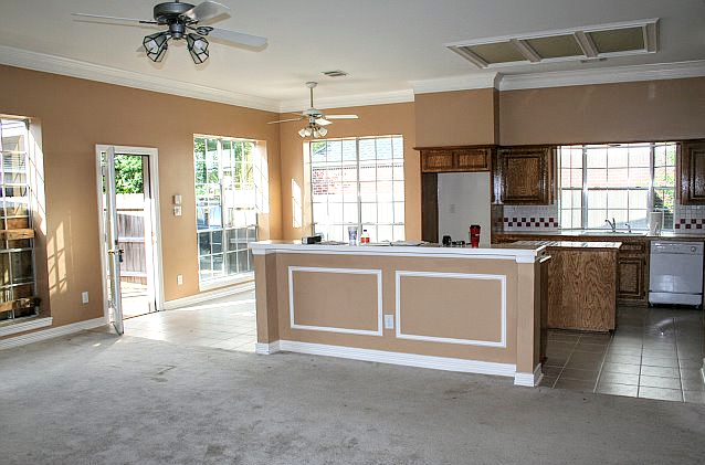
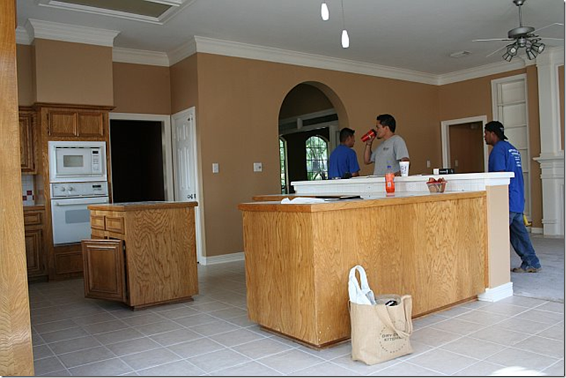
BEFORE: By far, the biggest change was in the family room – kitchen. The carpet and tile was replaced with hardwoods. The kitchen island and bar were replaced with one big island and new stainless appliances were bought one weekend at Lowe’s during a sale. The ceiling fans were also removed, as was the fluorescent light box.
AFTER: The new island is simply smashing. No other word for it. New Giallo Ornamental granite takes the place of Corian. The two lanterns, bought at market in Dallas add so much to the new atmosphere. They are just gorgeous. Notice that new crown molding was added on top of the cabinets to give them a more substantial look. The cabinets are original to the house.
BEFORE: Looking towards the family room over the old counter – the shelves flanking the fireplace were removed to make the area cleaner looking. Access to the bedrooms are through the doors.
AFTER: Looking towards the family room. New bin pulls from Lowe’s were added to the cabinets.
BEFORE: Here you can see the old door leading to the dining room – and the old pantry door on its right. The island and bar were not yet removed.
AFTER: The door from the dining room to the kitchen was closed off, adding more counterspace. The pantry door was changed out for an old door with hardware purchased at Atkins Architectural Antiques in Houston. Seagrass runner in the kitchen was added, as were textured bamboo shades at the kitchen garden window. Notice the crown molding allows for the homeowner to display trays and antique bread boards over the cabinets. The removal of the dining room door and the addition of the island were two huge improvements to the kitchen layout. The homeowner spent a large portion of her budget on the island – but she says it was worth it, and I agree. It’s fabulous.
When this house was first shown, a number of the comments concerned the gas stove – people wondered how was it added in so short a time. The homeowner answered with this: “There was already gas in the house so they were able to drop a line down from the attic into a cabinet. Then they dug a trench for the gas line in the concrete slab from the cabinet to the island, ran the line and then patched the trench. The island was built over the gas connection.” Simple!!!
Looking towards the front door and entry hall, with the office past the French doors.
Close up of the added cabinet where the dining room door was.
RENOVATION STYLE: The magazine’s only picture of the kitchen. Notice how they got the glimpse of the toile curtains into this view. Bonnie rearranged the trays and bread boards and pared down all her kitchen accessories. Styling this one shot probably took over two hours!!! Each photograph takes so long to get ready for. I was disappointed that there wasn’t a picture of the family room and kitchen together to give the readers the idea of the entire space, but the editors didn’t call for that view. When a house is photographed, the magazine editors have outlined before exactly what shots are to be taken from which spot. They judge this by using the preliminary photographs sent into the magazine by the scout. Any variation on this would have to be approved at the time by the editors. There are no surprises during photoshoots. The photographer can’t say – gee this would be a great shot. His photos are all predetermined.
RENOVATION STYLE: This detail shot of the bar with the homeowner’s collection of corkscrews didn’t make the final cut into the magazine story, although I’m sure Bonnie spent a lone time organizing the corkscrews just right.
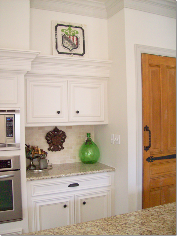
RENOVATION STYLE: This view of the vintage pantry door didn’t make the magazine either. I love this closeup view of the hardware on the door – and of the corbel holding up the granite countertop.
AFTER: The breakfast room has a wooden chandelier in place of the ceiling fan. The toile curtains came from the homeowner’s former house and fit the windows perfectly.
RENOVATION STYLE: This picture was styled with an antique tablecloth the homeowner bought in a Paris flea market! I love this view of the scrolled iron legs on the table underneath the cloth. Again, Bonnie styled it perfectly with sunny sunflowers and rattan covered glasses. Confession – that’s my white ironstone pot that the flowers are in!!! Bonnie borrowed it for this shot. Notice how the camera is at knee level, rather than eye level. That’s what a tripod is great for. I’m just learning to use mine more. And again, the sun is miraculously streaming through the window. The photograph probably timed the photos to catch the sun in each room. This beautiful photograph was a full page in the magazine – but most of the floor was cropped out.
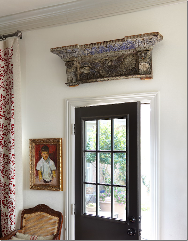
RENOVATION STYLE: This shot made the magazine – a detail showing the back door with the antique architectural fragment over it. When this was shown in the magazine, the picture was cropped – showing only part of the door and the fragment. I love the entire picture much better with the touch of toile and the chair showing.
AFTER: The family room. Many people commented on the large lamps. The homeowner loves to make lamps out of balustrades. But maybe she listened to the comments, because these two lamps were moved.
Another view showing the fireplace without the built in shelves and with the new brick surround. The fireplace is painted a darker shade of gray – to highlight it. (Paint colors listed at the end of the story.) I love that plate cabinet – it perfectly fits that small space! At this time, the TV was above the fireplace.
AFTER: Looking from the kitchen towards the family room. Here you can see the sconces flanking the fireplace. A new ceiling fan was added over this area – it is Houston after all!!!
RENOVATION STYLE: I was so surprised to see the new furniture arrangement, but I have to say it is much better – more open – without the sofa blocking the room off. The TV is now gone which may have influenced the rearranging of the room. There is now a painting over the fireplace and a darling oval footstool. A shutter was added behind the table on the left. Love the new family room arrangement.
RENOVATION STYLE: From this view, you can see the tall lamps were moved to the antique chest behind the sofa. They do look better there, I think. So pretty!
RENOVATION STYLE: This photograph was an entire page in the magazine! It is a beautiful vignette shot.
RENOVATION STYLE: This detail photo of the vintage selzer bottles did not make the magazine.
BEFORE: The bedroom was painted the same red as the dining room, while the bathroom was painted blue.
AFTER: Fresh paint and new carpet are the only changes in this large bedroom/sitting room.
RENOVATION STYLE: The bedroom taken at a much prettier angle. Love the slipcovered headboard and the large monogrammed pillows. But those lamps are my favorite. Gorgeous – silver candlesticks – they are just so wonderful!!!
AFTER: This view of the bedroom out the window that overlooks the back terrace. Pretty layered window coverings – linen curtains and bamboo shades.
RENOVATION STYLE: This picture of the same vignette taken closer up looks so much better. It really takes a professional to take pictures of houses. The homeowner took all the Before and After shots herself. Again, beautiful styling by Bonnie. I wonder if she even changed the paintings out to the side of the chair? This picture was a full page in the magazine, but it was cropped showing just the left chair and the left side of the table.
AFTER: The sitting room – I wish I could see the armoire!
RENOVATION STYLE: Here, a chest is now the coffee table and one lamp was removed for this picture. Alas, this photograph wasn’t used in the magazine story. Notice the Santa is missing from the side table – which is gone too! And notice Renovation Style magazine is seen in the basket. Hmmmm.
BEFORE: The carpeted master bathroom – needed remodeling.
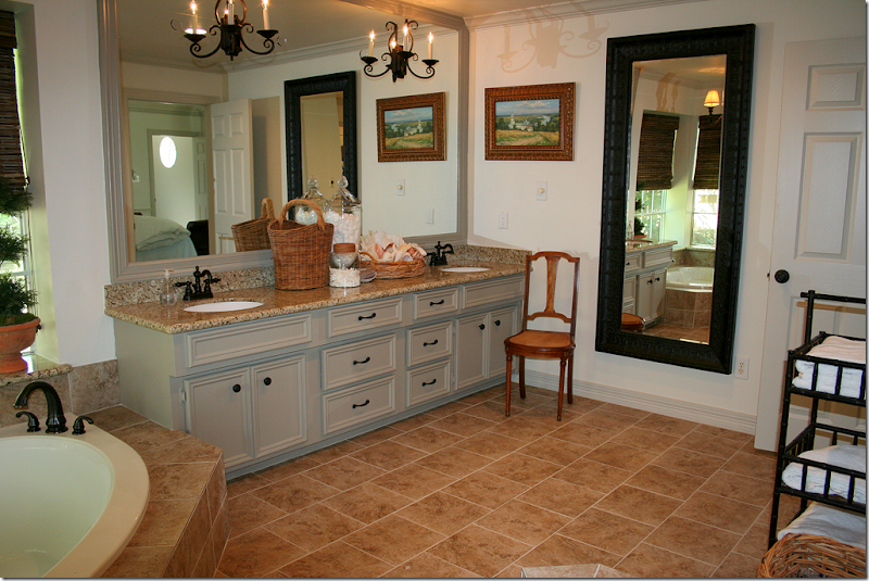
AFTER: The bathroom – was retiled, the cabinets were painted and reworked, new fixtures and knobs were added, and the shower door was removed. Sconces were added to the mirror which was also framed in wood.
RENOVATION STYLE: This picture looks so much prettier than the After one. I don’t know if it’s the lighting or the addition of the rug – but it really looks great. Not sure if Bonnie brought the rug, or the homeowner added it herself. Love the blue and white vase. Such pretty styling. Half of this picture made it into the magazine – which is a shame, because the entire picture is so pretty I think. Notice how Bill captured the hanging shelf with towels and plants in the mirror’s reflection.
AFTER: A view of the newly tiled tub – and the shower with the door removed – that made such a huge difference. Love the shades and the chandelier.
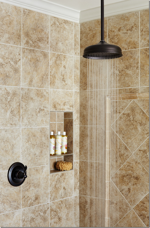
RENOVATION STYLE: Water running from the overhead faucet – this didn’t make it into the magazine.
RENOVATION STYLE: This detailed shot didn’t make it either. I can only imagine how long Bonnie worked on this to make it perfect! Each shot is styled several different ways before a perfect photo is decided upon. Such a waste it wasn’t used.
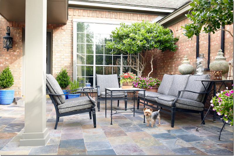
BEFORE: The house was a foreclosure – and it had been run down and vandalized – before it was sold to the homeowner. The back yard was a real mess.
RENOVATION STYLE: The new terrace, after. Hard to believe it’s the same space. The family room and master bedroom both look out onto this area. Darling dog – I wonder how hard that was to catch him like that? This photograph did make the magazine at least!!
I hope you enjoyed looking back at this Incredible Renovation story one more time. I thought it would be interesting to see how the house looks today – and how it was styled for a magazine. I was really surprised how many photographs didn’t make it in the magazine – and how those that were are cropped. I was disappointed that the view of the kitchen and the family room wasn’t shown – how they relate to one another. I think that is such a beautiful shot!!! Below are some of the paint colors. For many more sources of furniture and fabrics, etc. see the magazine. Also, if you are interested, the magazine shows a floor plan.
A huge thank you to the homeowner and to Bonnie Broten and Bill Bolin for allowing me to use these gorgeous photographs.
From the homeowner:
· Paint Colors – (all Sherwin Williams satin finish)
· Kitchen Cabinets and Walls -- Shoji White (SW 7040)
· Trim – Worldly Gray – (SW 7043)
· Fireplace – Intellectual Gray (SW 7045)
· Front and Back door – Urbane Bronze (SW 7048)
· Exterior Trim – Anonymous (SW7046)
· Fabric: I bought the drapery fabric at High Fashion – I have no idea the name or manufacturer (sorry). It was at least 5 years ago.
· Lanterns: They are 25 high x 14.5 wide plus the half circle hanger (7 inches) that attaches to the chain. The 25 includes the finial like thing above the actual lantern.
INCREDIBLE RENOVATION–PART II
Subscribe to:
Post Comments
(
Atom
)



















Like just about everyone else, I loved this house redo when you showed it way back, and was shocked and happy to see it Renovation Style!
ReplyDeleteIt is the perfect story for that magazine.
I'm definitely learning from magazine styling though, that it's not always about how the room "lives" but rather how it looks. The way that Bonnie styled the shoot of the living room - I just wonder if that's actually how the homeowner has left it. You can tell that the club chairs actually block the use of the door to the left of the fireplace. For a photo it does open up the look of the room - but maybe that's why they didn't so a shot of the room from the breakfast room or kitchen of the entire space and it's relation to the kitchen. I think you'd really be able to tell then how the furniture doesn't quite fit in this layout for normal everyday living.
Don't get me wrong - I'm not "hating" on it... just noting the things I see. I think the photographer did an amazing job - and Bonnie's magazine styling was superb ... but I admit that I prefer the more layered and collected look the homeowner did herself in the photos she sent to you.
But you know me and my clutter! LOL!!!
Great post, Joni!
Love!
ReplyDeleteLooking at this home never gets old. Love seeing all the small changes... so drool worthy!!
ReplyDeleteI love the ever note app! I think anyone whose essentially in charge of their own day should own this. I'm a freelance writer and I think without it, I'd be lost. Great post! Can't wait to read more from you!
ReplyDeleteThanks for sharing with us..
Luke’s Army
ReplyDeletehttp://www.lukesarmy.com/
Almost three years after the death of my son, Luke Borusiewicz, who died at the age of two years old in foster care (the average age of children who die in foster care is four and under), the inquest into his death has still not begun.
A pre-inquest conference was held last week where I attended by phone, but hung up minutes into the conference after hearing blatant and misleading lies from the Queensland Department of Community Services representative. It disgusts me that anyone can tell lies about a deceased baby, but a senior representative of an agency existing in the interests of protecting children, telling lies to protect its own evil interests is incorrigible.
The judge at the conference has ruled that Luke’s death has still not been investigated properly, another abomination.
I promised Luke the last time I looked at him laying there in his coffin I would do something about what the department of community services had done to him, and that I would do something to fix the child protection and foster care system, which had mistreated him from the time they had come into our lives.
People need to realize, this is not a one off case. Atrocities like this are a daily occurrence in the department of community services, world wide.
These child protection officers are answerable to no one, they are unaccountable for their actions and operate behind a media ban which helps to conceal their mistakes and malpractice.
The department of community services complaints hotline is a smoke screen for the department, acting as an early warning system alerting the department when their dishonest and unethical behavior has been discovered, allowing time for false statements to be concocted, evidence to be destroyed, and threats against distraught parents to be made.
Whilst the media are gagged when it comes to exposing the corruption rife within the department of community services, and politicians turn their back on the problems, I have devoted my life to this issue. Parental rights are a thing of the past once a child protection worker enters a family home. The onus is on discrediting a parent, no matter how much love the child and parents have for each other. Luke was everything I ever lived for, still is and always will be. I am quite prepared to go to jail for speaking out about the abuse of power and families by the department of community services staff, especially management, which is where the root of this child stealing machine is routed.
This last month, first time visitors to the site have increased by 650%. The website Crimes Against Fathers (http://www.crimesagainstfathers.com) has contributed toward a facelift and maintenance for the site.
I am in the process of picking myself up, and dusting myself off. I still can’t talk about what was done to Luke, I wake up screaming and crying from nightmares, but my faith in God, and my solicitor, eases my anguish.
The next step for me is to establish a commercial vegetable growing enterprise entitled “Luke’s Army Vegetables”, which will be sold with labels containing links to the website, and the desperate pleas of parents who have been mistreated by the department of community services, their children wrongly removed.
This plan is already underway. Through this venture I intend to fund legal support for parents who have no hope in this corrupt and cruel system of gaining true legal support.
I would like to sincerely thank the many people who have given their support and encouragement through this sad time in my life. Thankyou so much for those who post on the site, and all who have joined Luke’s Army, which is now reaching 5000 members strong. Most of all I would like to thank my Lukey Pookey, who showed me what love is, and has given me everything I have in my life, I owe you my life Luke, I love you more than anything in the world son, for ever and ever, RIP.
Luke’s Dad,
Michael Borusiewicz
Life's misfortunes fall disproportionately upon the young
http://www.lukesarmy.com/
I was fascinated by your first post on this home because the home was a great example of taking a common suburban home (one without spectacular architectural details and layout) and showing that with good taste and a good eye for purchasing furniture and accessories, a home can be completely transformed into a stylish and beautiful updated home.
ReplyDeleteThe small size made it that much more desirable. Thank you for the updates, Joni, so we can enjoy it once again.
Now, this was so much fun to see, Joni! I can't understand why people would argue that a project couldn't be completed in 20 days, but the changes were so dramatic in this I guess they were shocked. Plus, projects usually involve delays among subs. But more power to her. This is just stunning!
ReplyDeleteWhere do I start? I love so many things in the photographs. What a fabulous kitchen! And those lanterns... oh, those lanterns! And I like the fact that she added that crown molding to use as a ledge to store those neat trays. I also like the new arrangement of the family room. And in that one shot of the door that didn't make it, I love that portrait and the colors in it.
I also adore her pillow shams in the bedroom and the linen drapes she used throughout the house. And I cannot get over the difference the white made in those rooms. It's truly amazing. I also like the trim color she selected for outside. Oh, and I love her collection of antique boxes in her bedroom and how they stacked those. I love boxes! But what's not to love with this story?
Thank you, once again, for sharing and for sharing these additional pictures. I enjoyed seeing how this all flowed together and all the little details that make this house such a charming home.
XO,
Sheila
Gorgeous house! I am most interested in the bathroom. Mine is laid out the same and my husband wants to redo the tile. The framing around the mirror and the vanity extended to the tub's deck are I what I want.
ReplyDeleteJoni, Love the transformation. Loved it the last time to. Its fun to see what a stylist would do. Things look so different in photographs.They might look good in person, but once you see them in a photo they don't look the same. I always take photos n of things I decorate so I get another perspective of it.
ReplyDeleteIn the prior story about this house I was critical of what I would call "clutter" everywhere. Having seen the house professionally styled and photographed, I am amazed at the difference and hope that the owner takes something away from the process. Less is definitely more. The kitchen looks so much cleaner and fresh, the office more approachable for guests and each room has retained a warm and inviting presence without all of the junk that one collects along the way. Great pictures and styling. I realize that one must live in their home but I certainly hope that the owner through these pictures can see what a difference a bit of editing can do to a room.
ReplyDeleteWell since I can't have the house, I'll settle for picking up the magazine.. so many ideas to use in my own home... there isn't anything about that place I would change!!!
ReplyDeleteThanks for sharing!
When you first posted about this house I just fell in love with it and to get to revisit it in Reno Style and in CDT well that's just icing on the cake. I love many of the style changes the mag did but I prefer the kitchen with more on the island it just shows someone really cooks there. I don't know how you have a family and no TV in the living room/den maybe that was just for the mag shoot.
ReplyDeleteThanks again for always having the most amazing content!
I loved this home then and I still love it "photo ready" - I think most of us are tweaking our houses constantly because we like to change things up a bit!
ReplyDeleteI think I need to run out and get that magazine.
Thanks for sharing!
Debra
I so enjoyed this post...thank you for sharing it with us. So many things to take away! I think what some people call "clutter", others think of as accessory layering. It's a matter of personal taste - there is no wrong or right. I personally am coveting some of her lovely pieces, especially her collection of silver trophies and lanterns!
ReplyDeleteSo beautiful, Joni. To say that this is a huge change is an understatement! I know that the client was thrilled.
ReplyDeleteTeresa
xoxo
I loved your first post on this awesome renovation and so glad to see her hard work make a magazine - how rewarding!! Now the big question - does she hire out, haha!! Hey, I'm in Houston, I'll pay for the gas, come on out to Kingwood - please!! Thanks Joni for reminding us we can do these things with a lot of determination and a little help from our friends.
ReplyDeleteI LOVE this house!!! I even made my husband look at all the pics (the first go round...) Now, guess what he'll be looking at tonight...round two! Ha Anyway, this is awesome inspiration, especially those of us in the process of remodeling!!! I think I may have to go in a different direction with my decor. I love this because 1) it is so charming and cozy, very homey, 2) everything can be done on a budget and, 3) it will never go out of style!!!
ReplyDeleteGreat story!
Great house!
Great blog!
Thanks for sharing it with the rest of us!
Really pretty home...so perfect for Renovation Style.
ReplyDeleteI noticed we did the same thing by removing a door to the dining room...we were able to have a built in pantry that way. Thanks for showing all the photos we normally would have missed...I am running out for my copy of the magazine.
Joni, I loved the home the first time you showed it and I immediately saved the post in my inspiration file. The stylist did a beautiful job and I can't wait to buy the magazine.
ReplyDelete:) Sherry
One of my favorite makeover posts! Such a talented homeowner. I love seeing this again and especially enjoy seeing how the magazine styles the rooms. Amazing how a couple of small changes can make such a big difference.
ReplyDeleteJan
Joni I loved this home the first time you showed it and was amazed at what a lot of planning and vision could bring about. I saw it in Renovation Style and was pleased with some of the changes. It's such a beautiful home and so is For the Love of a House. I love seeing before and afters!
ReplyDeleteJoni: What I like most about this post (and some others you have been doing lately) is that this is a "Realistic" home. I love to see style and grace in a house that is not a mansion. This is a house that so many people can relate to. I contend that money can buy a lot of style (although, it fails miserably in many cases), but creatively redeeming a house like this on a budget is clever and noteworthy. Great post!
ReplyDeleteI loved this post when I first saw it and got quite a chuckle over all the comments about could it really be done in such a short time...I thought it was so much less important than WHAT she did-a beautiful, intelligent make-over that was obviously well thought out. So many ideas to take away and the styling for the magazine adds many more ideas! Thanks for a great second look!!
ReplyDeleteCheers!
Meredith
I remember being amazed with the first post of this renovation. The photo styling looks great. While I love the painting over the fireplace, it's just not realistic that there's not a TV in the kitchen/family room - and I'm not a big TV watcher. I don't see a little one tucked away in the kitchen, so I assume the TV is in the armoire in the tiny sitting room. Might be OK if there's only one of you and you don't watch TV while you cook, but can't see this working with a family, or, especially, a husband! Maybe it was just for the photoshoot? We all know how pictures in a magazine don't indicate how people really live.
ReplyDeleteThis is such a stunning home and I was thrilled to see it in RS when I picked it up! This was a fabulous edition......I would die to have my home in RS! LOL I can't believe the difference in the bathroom after it was styled....unbelievable!!!! Thanks for sharing the styled pics so we can all save them and drool over them at leisure :o)
ReplyDelete~Des
Joni,
ReplyDeleteThank you for showing us the pictures that didn't make it into the magazine! There are so many pretty shots of that house--they really should have made the article twice as long! I have enjoyed every view and especially enjoyed seeing the before and afters. Thanks!
Absolutely stunning!!
ReplyDelete20 days is definitely doable (I've done my share of remodeling) but it takes not only more than a handful of hardworking people but people who think outside the box and don't "dink around" as my husband would say, lol.
For instance, getting gas to that island. When I read how it was done I thought "exactly right, no big deal" but I well know there are so many contractors that would stand there and scratch their heads and say how hard that would be and how long it will take, yadda, yadda, yadda.....
So hats off to this very ambitious woman who is surrounded by helpful, hardworking and creative people. This is how a remodel should be done!
And Joni, hats off to you too for showing so many wonderful pictures with such great detail! I LOVE seeing the shots "that didn't make it"! Your blog is fabulous, thank you!
Tamra
The Gilded Barn
Joni,
ReplyDeleteThank you for revisiting this beautiful Reno. I loved seeing the original post (made my hubby come look at it,too) and I enjoyed this visit also. There are so many great ideas for my own current reno. I always enjoy seeing the renovations you post for us "hungry" viewers. Thanks so much!
such a great house! i plan on painting my fireplace the same color! this makes me really want to do it! love all the red, too!
ReplyDeleteashley over @
{hookedonhickory}
What a lovely home! A great project for Renovation Style. Love that pantry door, her curtain panels and that big island. The trim color is perfect! Great post, Joni.
ReplyDeleteI love their collections, and the straw lampshades!
ReplyDeleteI've loved this home since it was first posted about!
ReplyDeleteDoes anyone know what the toile fabric is on the pillows in the living room?
You are the best. No one can hold a candle to the way you ask questions and the way you answer them. I have loved your blog ever since you started. Your insight and compassion have helped me to be a better home owner and a better person. In gratitude, Ann
ReplyDeleteLove the contrast of the white kitchen cabinetry with the red toile curtains!
ReplyDeleteLove the contrast of the white kitchen cabinetry with the red toile curtains!
ReplyDeletewhere did you find your large bamboo shades? Thanks!
ReplyDeleteGreat post, and great work on bringing this house back. I'm surprised to hear there were so many comments on the brevity of the process. It is very possible. Back in the good old days (when I was still building), if every selection had been made up front, a 6,000 square foot house could easily be finished in 120 days. Including a finished basement. It takes unwavering decision making and constant monitoring of subs...but it can be done.
ReplyDeleteI haven't seen the original post yet and am now dying to see it too! I love everything the owner did in this home!!! The bathroom and kitchen are fabulous!!!! Loved seeing the magazine pics and especially the ones that "didn't make the cut"! Thanks for your ever inspiring posts, Joni. XO, Pinky
ReplyDeleteWow, Wow, WOW! Did not see it the first time but thank you for sharing it again! By the way, I just completed a similar renovation in 18 days. If you spend alot of time on the plans and have everything ready to go on "game day" and all of the contractors organized and not stepping on each other and wasting time, this is so doable! Organization and a team of contractors that you are really familiar with is the key!
ReplyDeleteThoroughly enjoyed this post with my afternoon cup of tea! Thanks Joni!!
ReplyDeleteThank you so much for sharing this post with the magazine's style changes. I love to see what professionals do to our layman's approach. It's beautiful both ways. I do like the living room better in the mag, but I rearrange mine both ways just to get it good and clean between seasons--drives my husband batty : )
ReplyDeleteI love it! Great taste and style can be shown in a small house to a large. You have to have the right touch, which this homeowner definitely has!!
ReplyDeleteWhat was the color that the bathroom cabinets were painted? My bathroom is in need......
Thanks.
Kim
What a beautiful home! I loved it the first time I saw it and it looks even better now. I love that the accessories are actually old and unique "finds" as opposed to the mass produced trendy items sold in catalogs. Did you notice that the blacks lamps in the living room are slightly shorter now and better proportioned?
ReplyDeleteyes Joni-you ARE the best. NO one can hold a candle to your blogging style! Your insights have helped me to be a better home owner too! bless you & thank-you!
ReplyDeleteLove it all!!! Boy having a professional stylist and photographer, sure makes a huge difference in the way the room looks. It is like having your hair and makeup done professionally and then getting an air brushed image of yourself, so much better!!! Thank you for sharing this lovely home again, Kathysue
ReplyDeleteAnon. 11:50, what does compassion have to do with decorating. If you want compassion you need a spiritual adviser or a psychologist. If you need compassion because you have made some terrible design decisions (we all do, don't feel badly), then you need to suck it up, walk away from them and start over. Compassion won't cut it, touch love will. Now, do not pass go and do not collect 200 dollars for that free advice. Move on and make some good decisions going forward. Most importantly, get a professional that you can trust who understands the design instincts and concepts that make you happy. Not everyone will share your vision. Find a designer who does. Good luck.
ReplyDeleteJoni,
ReplyDeleteThis is a beautiful renovation. The owner wins the organization award of the year for getting something like this done in 20 days. Are you sure??? Anyway, the photo shoots were lovely and the alterations to the kitchen were brilliant. There is a great deal to learn from this one.
Best...Victoria
The drapery fabric is from Premier Prints. It is from the Madison collection and the color is lipstick/linen. Hope this helps everyone! :)
ReplyDeleteCould we find out the brand of the cooktop, please? It looks like a smaller size, but still having five burners.
ReplyDeleteActually now that I look closer the fabric could be the Traditions collection from Premier Prints.
ReplyDeleteSuch a lovely home, I thoroughly enjoyed the before and after's. Great post Joni!!!!
ReplyDeletereally fun read Joni, I read the first post about this project and loved it-have the magazine too but
ReplyDeletethe additional information and photos was the icing on the cake.
Thanks for all the time you put into
making this blog so interesting.
anon - you are really such a negative person it just slays me. life must be a bitch when you go through it was such a weight on your shoulder.
ReplyDeleteAnn - thank you. I appreciate your kind words and realize that you weren't speaking about compassion as re. to design work. Again, thank you.
BLINDS - wide blinds usually need to be custom ordered. there are lots of companies on the internet that will do the custom size. i've used some of those before. the kind that says - budget blinds, etc. usually though, monica orders them for me. her number is on the left sidebar. call her - she'll order any blinds - no matter if you live in houston or not. here's her phone number: 832-443-1931
joni - we are buying a home for the first time, and just wondering...could the owner give a ballpark of what her renovation cost?
ReplyDeletethanks ann
I almost have this house memorized from the first post, I love it that much. I have bookmarked it with a not attached - DO NOT DELETE! This renovation just proves what can be done to take a home from vandalized and outdated to liveable and gorgeous! I'm thrilled to see the changes the homeowner has made. We all have to change our homes from time to time, don't we! Thanks, Joni, for another wonderful post.
ReplyDeleteJoni, I absolutely love this post. My favorite is what the home owner did with the front of the home. What a difference the changes made for amazing curb appeal. Currently I’m in the stages of updating our home and will use this as an inspiration tool. I’m thrilled to be able to learn and grow from this true work of art!
ReplyDeleteI bought the magazine, but you have the better pics on your blog... so inspiring, THANKS!
ReplyDeleteLOVED this house when I read the first post - - was delighted to read the exciting follow-up! I can't imagine how thrilling it must to be to have one's home featured in a national magazine. This new post is especially interesting to me for the styling elements - much to learn from professionals! (And at the same time, as others have mentioned, we must "live" in our homes and thus they rarely, if ever, look magazine-ready.)
ReplyDeleteA suggestion - perhaps Bill and Bonnie on a future Skirted Roundtable?
Jennifer
Great house! Love the kitchen and those big black table lamps! Stop by, Im having a giveaway :)
ReplyDeleteI still love this house. I think the new pictures are even better then the first. I am impressed with the speed of the renovation the most. Please post more. Lissy Parker Ldt.
ReplyDeleteLove, love this post. The pictures are just amazing. Thanks so much for sharing. Would you happen to know the paint color for the gray cabinets in the bathroom?
ReplyDeleteThanks again!
Love, love this post. The pictures are just amazing. Thanks so much for sharing. Would you happen to know the paint color for the gray cabinets in the bathroom?
ReplyDeleteThanks again!
I've recently discovered your blog. Thank you for this great post! I did look back at the original post of this amazing and inspiring renovation. Love it!!
ReplyDeleteLoved the first time you shared this house and love this follow-up. Your detail and descriptions really are the best in blogland!!
ReplyDeleteIt is especially fun to see her authentic passion in her collections not just what is currently hot in accessories.
Re: the professional photographs--the best ones make interiors look better than in real life. I kind of feel like my own interiors can never compete with what I see in the magazines because of this. I think I need to get my house published to really see its beauty.
awesome! the silverwares are also lovely!
ReplyDeletePosts like this one don't even need a comment! I mean, it's so perfect that what can you say besides the obvious? Yes, I also LOVE LOVE LOVE this place and yes, they did such an impressive job!
ReplyDeleteThank you for sharing it w/ us, Joni!
Have a blessed weekend,
xo
Luciane at HomeBunch.com
Awesome!!! Love Love his house!
ReplyDeleteGorgeous bathroom, I am most interested. so perfect for Renovation Style. thanks for share
ReplyDeleteHow fun to see the house when the owner bought it, after the owner renovated it...and then after it was styled for a photo shoot! Take care, Caroline
ReplyDeleteI didn't see this house the first time you showed it, so I'm extra glad I caught it this time! How pretty! I grew up with home investing/remodeling parents & can easily believe this project happened in just under 3 weeks. It's very inspiring. Thanks for sharing the pain colors!
ReplyDelete-Keri
The editors of Renovation Style should be very grateful to Joni because I'm sure there was a run on issues after this was published.
ReplyDeleteThe house was very nicely redone but I was glad to hear the homeowner acknowledge that she had workmen and people at the house until all hours, because even with the best organization skills, it would not have been feasible to have completed the house on her time schedule without lots of overtime, which doesn't come cheap.
I like most of the changes the mag made in the styling, with the possible exception of the family room. I'm not a fan of TVs hung over fireplaces, and I really disliked the painting hanging there now, but where, exactly, does the owner sit and watch TV? The TV had to have gone somewhere.
And I have to think that at some point there will be some kind of enclosure around the master bath shower again. It just seems awkward not to have some moisture barrier there.
Joni you are pure entertainment! I find myself so immersed in your posts that I ignore my family and anyone else in the room. I have pinned so many of your pictures to use in the house we are building, thanks for the constant inspiration!
ReplyDeleteOh Joni.. this has to be one of the BEST renovations EVER!!!
ReplyDeleteThank you so much (and thank the owner too!) for sharing this with us!!
Like everyone else, I'm amazed at the transformation! After studying your post for a while, I realized that the house's layout would be perfect for my empty-nester parents who are considering building a new home. Any chance you know more stats about the house (total square footage, width of the house, room sizes of the study, dining, and living spaces, etc.)? Any info would be appreciated!
ReplyDeleteThe difference between a successful person and others is not a lack of strength, not a lack of knowledge, but rather a lack of will. :)
ReplyDeleteAnd what, Socrates, is the food of the soul? Surely, I said, knowledge is the food of the soul.
ReplyDeleteWow they have amazing artwork. I love those colorful paintings.
ReplyDeleteWhat an excellent set of kettles!
ReplyDeleteDesign work on “greening” the building ($58 million) is also underway and expected to be completed in 2012. plumbing claremont
ReplyDeleteI'm very late to the party here, but I think those balustrade lamps are wonderful!
ReplyDelete(Jolene) Love this reno! Paint colors, flooring and window treatment in particular. Could you tell me if the ceiling color is the same as the wall color? It looks like a different color but could be color cast from the flooring...? Also, I really love the color of the cabinets in the master bath, are they the same color as the trim throughout the house?
ReplyDeleteIt's so refreshing to see a new build house look so charming and old world! I go back to this home time and time again because the designer made such smart decisions with the renovation. I am so thankful that the designer shared her paint colors, but the one paint color I was interested in was the bathroom cabinets and that is not listed. Do you happen to know the color? Many thanks in advance! Such inspiration!
ReplyDeleteDoes anyone know the paint color on the bathroom cabinet? I do not believe it was mentioned above.
ReplyDeleteThanks
Melanie
ReplyDeleteHey, Wow all the posts are very informative for the people who visit this site. Good work! We also have a Website. Please feel free to visit our site. Thank you for sharing.
Bathroom Renovation
Keep Posting:)
Its an incredible joy perusing your post.Its brimming with data I am searching for and I want to post a remark that "The substance of your post is magnificent" Great work. Find out more
ReplyDeleteAwesome review, I am a major devotee to remarking on web journals to educate the web journal scholars realize that they've added something beneficial to the internet!.. Seamless gutters
ReplyDelete