This 60s era house for sale in Houston is a total renovation – completely updated – and all done on a budget. The owner is a reader who sent in the HAR listing, thinking others might be interested in seeing the befores and afters. Or course! There’s nothing better than looking at terrible before pictures next to wonderful afters!! Additionally, there are tons of ideas here to incorporate into your own house if you are currently updating - you might want to grab and a pen and some paper to take notes. This ranchburger was built in 1962 and is typical for houses built in Houston during that era. Thousands were built here with this same exact floor plan. In fact, my own nephew and niece just bought a house with almost this same layout – built in the exact same decade. This Briarbend house is considered small by today’s standards, just under 2,000 sq ft. with 3 bedrooms and 2 bathrooms. But, growing up in the 60s – we all lived in houses with this same square footage and thought our houses were quite large. It’s a real statement of our times that unless a house is 4,000 sq. ft and more, it is thought to be a smaller starter home. If you live in Houston, the house is zoned to Briargrove Elementary – one of the best elementary schools in the city. The price was recently lowered to $465,000 and the listing can be found HERE. Enjoy!!
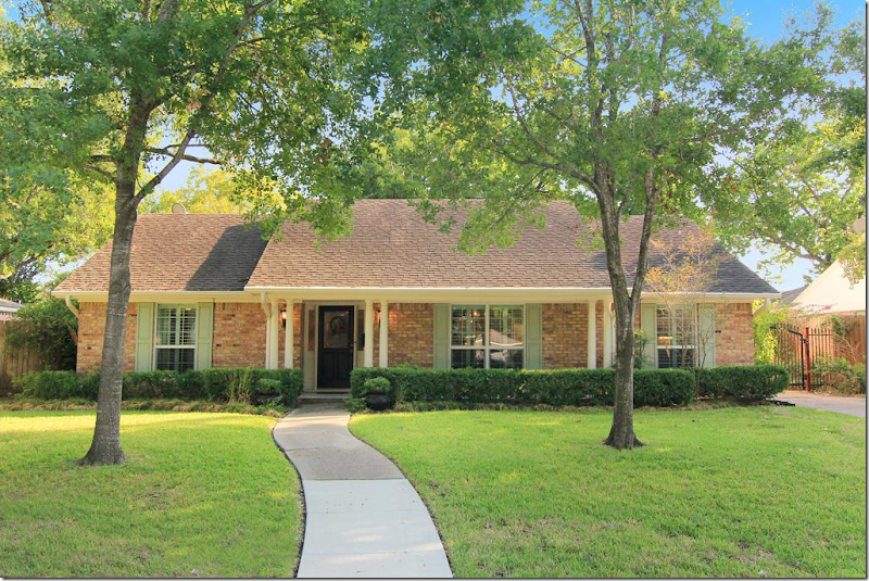
From the outside, there is no doubt the house was built in the 60’s. It’s also obvious that the floor plan consists of a living room and dining room located to the right of the front door. Past the entry hall will be the family room and the kitchen will be to the right of it. This floor plan was built all over Houston during the 50s on through to the 80s.
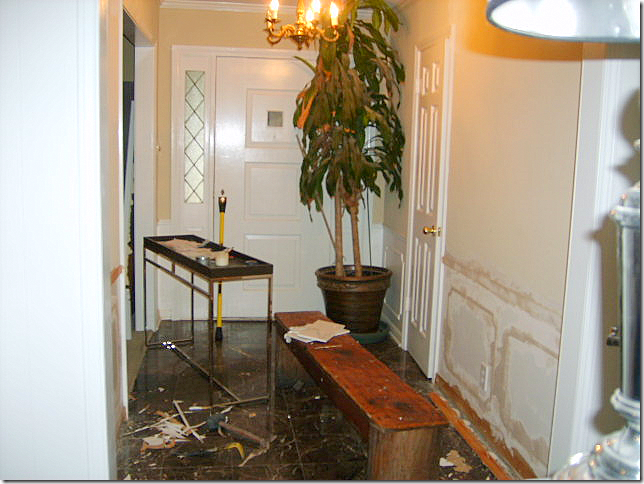
BEFORE: The entry hall. Molding was removed from the walls. Not sure what the floor was – but it looks like a marble tile.
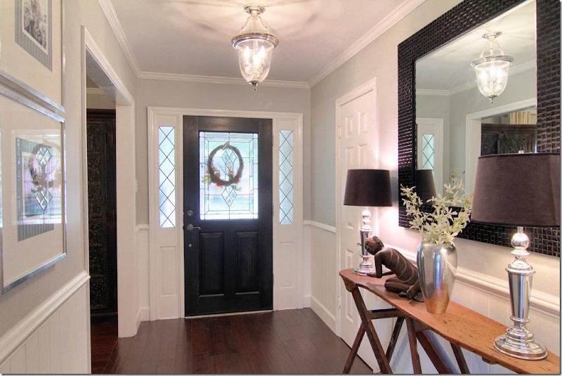
The entry hall. New hardwoods were laid in the entry, dining room, study and all the bedrooms. Beadboard was installed under the wainscot molding – which is a great alternative to new sheetrock – plus it adds a nice texture. New front door and lantern. Notice the antique wooden ironing board that is used as a console. What a cute idea!!! Pretty gray painted walls are offset by bright white molding and beadboard.
All paint colors are listed at the end of this post.
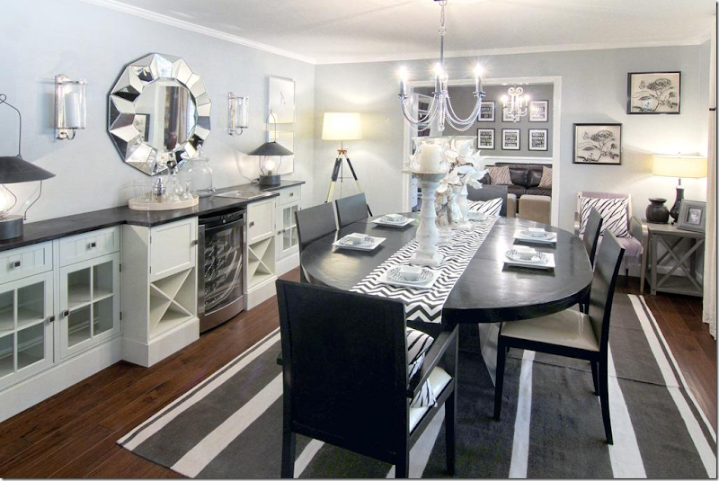
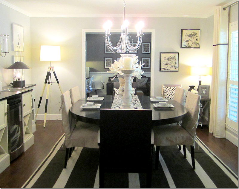
To the right of the entry hall is the living room, then the dining room. Most couples today are switching these two rooms – as shown here. The dining room is now located in the larger living room and the former dining room becomes a study or a small sitting room. Love those black lanterns on the console to the left. That looks like a wine refrigerator – which if you are lacking a bar – is good idea placed between cabinets. One piece of granite or wood tops the assorted built-ins making them look more substantial.
This view shows the windows – which are all new and all with plantation shutters. Simple drapes with a black trim have grommets – a nice contemporary, youthful look. Here, the modern chairs are slipped for a less contemporary look, adding the linen color and texture – which I prefer.
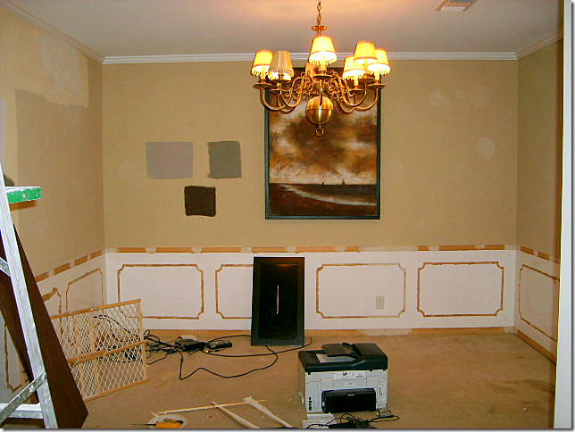
The former dining room, now a study. Again, the molding was removed from the walls.
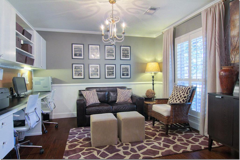
The former dining room is now a study, complete with new built-ins. All new windows with plantation shutters are found throughout the house. Again, once the molding was removed, beadboard was added to the walls below the wainscot molding. Notice the one large pillow with expensive KWID fabric. If you can’t afford curtains or upholstery out of a favorite fabric – opt for a few large pillows. You get a lot of mileage out of a few yards of pricey fabric. Clear gray walls mixed with white molding.
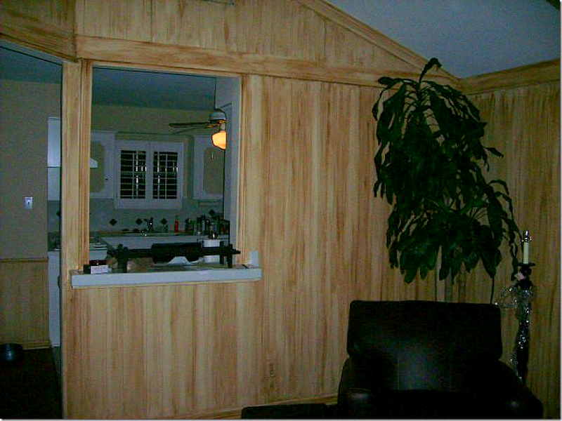
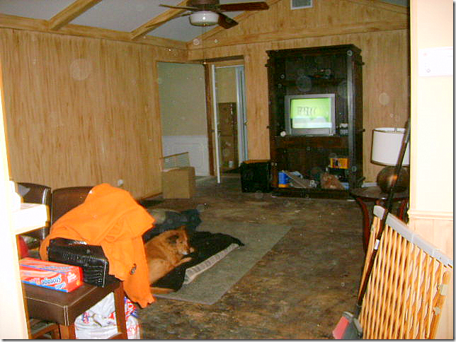
BEFORE: The family room looks into the kitchen via a pass-through. The walls have 60s yellow paneling. Just awful.
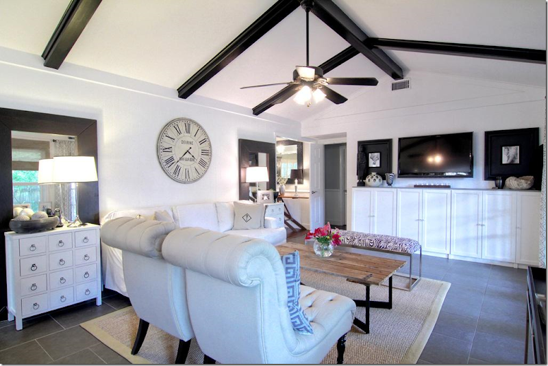
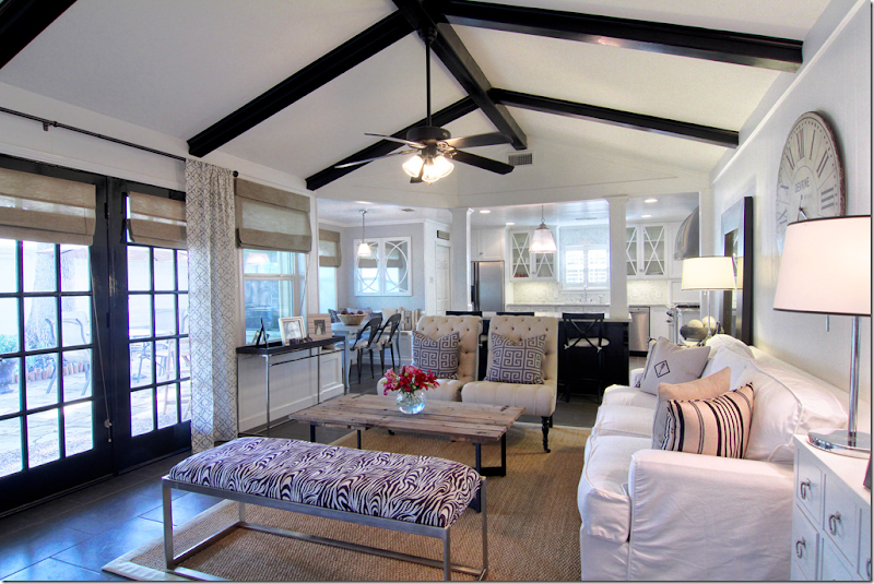
AFTER: WOW!!!!! The family room is located past the living and dining rooms – and overlooks the back yard through new French doors. The flooring is a 20X20 porcelain tile instead of hardwoods, which lends a more contemporary look – especially with the white grout. The wall between this room and the kitchen was removed – opening up the area and giving it a much more 2000s feel. The columns are probably load bearing – yet they add a substantial looking touch. I love this room – how open and fresh it looks. Most of the rooms are painted gray with white trim – but this room looks like it is all white. Matching end tables flank a contemporary styled slipcovered sofa. A Belgian inspired coffee table adds some needed texture, as does the seagrass rug. Love the large clock over the sofa and the painted black beams really add punch. Even the ceiling fan looks good with its black blades. (taking notes Brooke? – that’s my niece who is moving into their similar house next month!!)
BEFORE: Looking the opposite direction. What is that flooring material? This couple really had a vision!!
Looking the other way – you can see the entry hall with the antique ironing board at the left. Through the open door are the bedrooms. Newly installed built ins anchor the flat screen tv – it almost disappears when flanked by two large black framed prints - another great idea. Notice how behind each end table is a floor to ceiling mirror – I believe these came from Ikea, if not, Ikea has very similar ones for under $100 – a steal. They really give a lot of look for the money when two are used this way. I’m not sure if the owner removed the paneling or painted over it. Either way is fine. For clocks like this – look to Wisteria, Ballard Designs and Restoration Hardware – another big look easy on the budget.
This view shows the new French doors leading into the backyard. Painted black – they add pop to the all white room. Here, you can see the breakfast room. The mirror in the breakfast room mimics the x motif in the kitchen overhead cabinets.
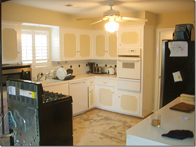
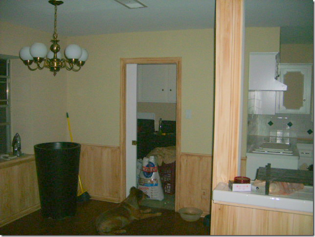
BEFORE: The kitchen was totally redone – even the appliances were moved.
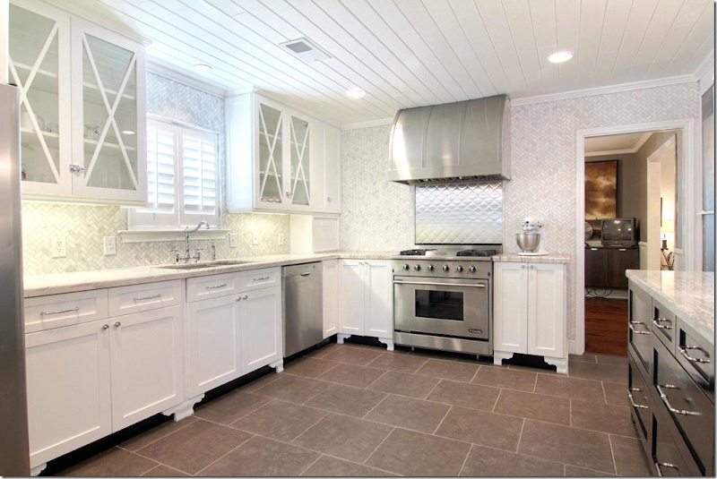
AFTER: Another huge WOW!! This kitchen is fabulous and is full of ideas. First, notice the beadboard on the ceiling – it really adds great texture – I love how they used beadboard throughout the house. Again, it is a very inexpensive material with a great look. These are all new cabinets – but adding feet to existing cabinets is always a great idea if you have the space for it. The fur down was removed – giving a more streamlined look. Carrara marble mosiac tile is used as the backsplash and is installed all the way to the ceiling in a herringbone pattern – what a great luxe look. It’s beyond fabulous!!!!! Notice the tile was extended all the way to the doorway. There are very few upper cabinets – another great, modern look. The few upper cabinets there are, all have an X motif. Kashmir valley granite was used on the counters as an alternative to white marble. Carrara would have been good economical choice too. Notice that the cabinets dividing the kitchen from the family room are painted dark gray for contrast. Great stainless hood and quilted stainless backsplash behind the range makes this a focal point of the room. Here, the oven and stove were combined. The refrigerator was moved across the room – to the left of the sink. (You can see it in the above picture of the living room.) The cabinet pulls are from Restoration Hardware and the cabinet latches are from Cliffside Industries. Through the door on the right is the study and dining room.
BEFORE: The breakfast room, off the laundry room.
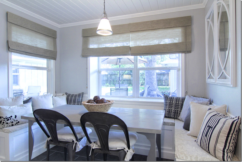
AFTER: Beadboard ceiling is carried in here from the kitchen. U shaped banquette was built for seating. Such a cute room – the banquette really makes a huge difference and is another great idea. Wonderful gray table and industrial looking chairs.
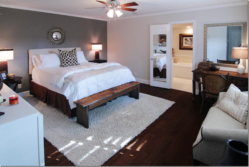
The master bedroom had hardwoods – nice and dark, love that. Can’t make them too dark. Hardwoods today should be dark as can be – or light as can be. No more middle of the road. Notice one gray wall is painted much darker – an accent wall. There’s another KWID pillow – notice what a statement it makes.
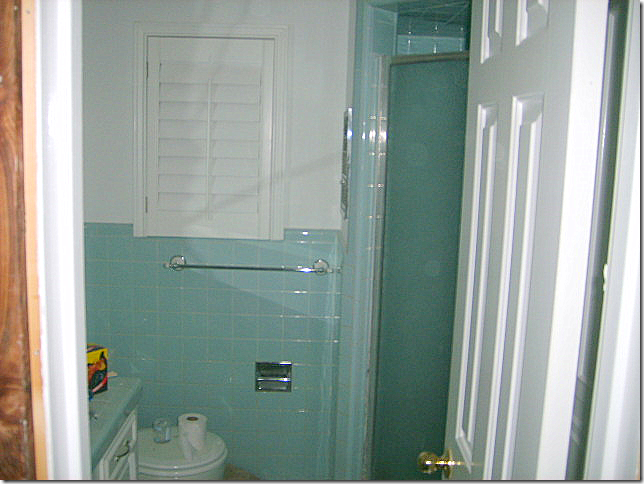
BEFORE: Master bathroom – all in 60s styled green tile.
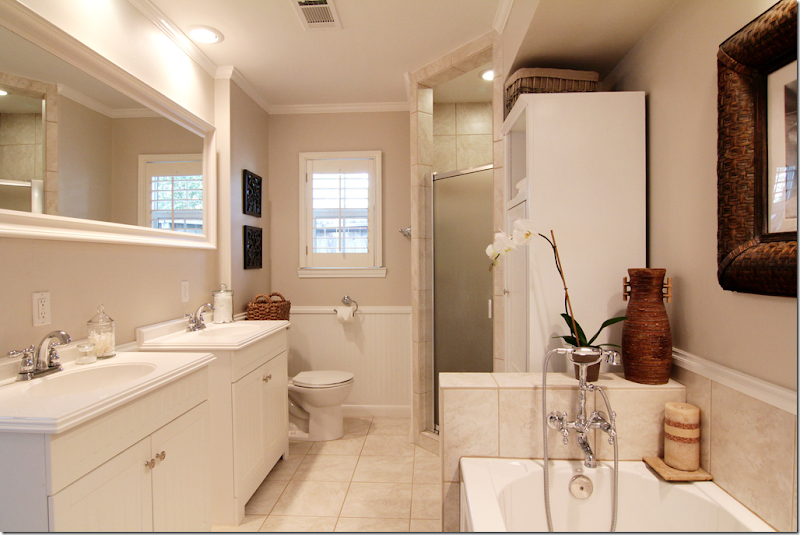
Beadboard replaced the green tile. Two new sink cabinets – easy to install as opposed to built ins. Look to Ikea for similar cabinets. It looks like the bathroom was enlarged to twice its former size, with a new tub added. Beautiful plumbing fixture in the bathroom – adds “jewelry” to the bath. Plumbing fixtures are a great place to splurge – the prettier the better.
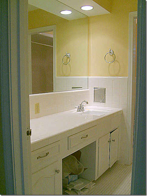
BEFORE: 2nd bathroom.
New built in cabinet hold two large sinks with great faucets. Carrara marble tile used on counter and floors. Great lights add sparkle for a kids bath that doubles as the powder room.
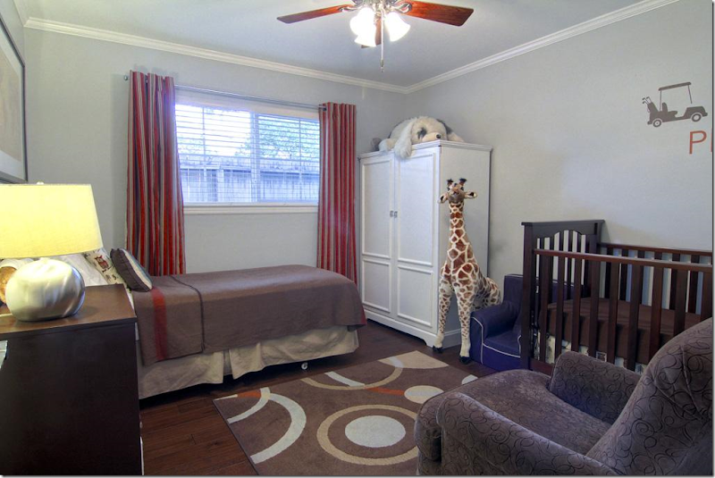
Bedroom #2 is the little boy’s room – with a darling giraffe! Again, the curtains have the grommet ring for a more modern look. Inexpensive area rug adds big color punch.
Bedroom #3 – the guest room. All the bedrooms and halls have the newly installed dark hardwood floors. If you can opt out of carpet in favor of hardwoods – do it. You never have to replace hardwoods, but you’ll be replacing your carpet every 5 to 10 years. Trust me. If you have pets – all the more reason to get hardwoods. Figure the added cost of hardwoods over carpet and divide in by 30 years x 12. You’ll be shocked how cheap it will be over the life of a mortgage to upgrade to hardwoods.
The large back yard has a newly laid flagstone terrace with French doors leading into the family room.
Nice shady backyard. When you move into a mature neighborhood – you are blessed with large trees!!! That’s a plus over moving to a new neighborhood with tiny trees.
And finally, the Briarbend neighborhood park is for your use if you move into this house!
PAINT COLORS: The main colors in the kitchen/family/bath/breakfast/foyer are Benjamin Moore's Chantilly Lace (white) and Stonington Gray. In the office they are Restoration Hardware's Slate and Benjamin Moore Chantilly Lace. The Master has Restoration Hardware Slate and Ash.
I hope you’ve enjoyed this renovated ranchburger and I hope you were able to get a few or a lot of ideas if you are currently remodeling. I really loved the kitchen – with all the tiled walls. That was stunning. I also loved the beadboard everywhere, especially on the ceiling in the kitchen and breakfast room! What was your favorite element they added?
A huge thank you to the homeowners for showing their house. For more information – go HERE.
Total Renovation for a 1960’s Houston Ranchburger
Subscribe to:
Post Comments
(
Atom
)





I loved to see the changes, dramatic changes. The floor is the first thing that changed the directions, leading to a modern, elegant, airy house with the good bones of the 60's. Lovely! I wish it will sell fast for over the asking price.
ReplyDeleteThis was so much fun to see and read and you're right this couple definitely had vision. I don't have a favorite room since every room seems so different in the before and afters. I do have one question, why are they selling this amazing home after all that work?
ReplyDeletemy favorite thing that they added was the backsplash. taking it all the way around the doorway, makes such a statement. it's nice seeing mid age homes remodeled. adding charm and life into a home of that age is something i don't get to see as often! thanks for showing!
ReplyDeleteashley over @
{hookedonhickory}
Beautiful changes. If you can deal with living through the renovation process any house can be made new again! Love what they did. xo
ReplyDeleteWow! What a difference!
ReplyDeleteLove it!
tot
I am stunned and love every room. For a small home, the neutrals are well chosen. The furnishings and accessories are perfectly edited. I will keep this post and study it often.
ReplyDeleteWOW! What a beautiful transformation!!! Everything looks amazing!
ReplyDeleteThey did a great job. I always love seeing before and afters - their kitchen is awesome! Love all the choices they made.
ReplyDeleteThank you for sharing this with us.
The kitchen was my favorite. Love the floor and the overall simplicity.
ReplyDeleteWOW! What a transformation! This house is so appealing to a young couple looking for their "forever" house! Thanks for the lovely post!
ReplyDeleteWhat a transformation, Joni.
ReplyDeleteThank you for sharing!
Teresa
xoxo
They did a great job keeping the colors consistent throughout the house. I love the built-ins in the dining room and the bead board ceiling in the kitchen. I think my favorite piece of furniture iss the antique ironing board, used as a console. Genius!
ReplyDeleteLots of great ideas in this one, Joni, and thanks for the paint colors. I hope your niece is having fun with her new home.
ReplyDeleteBest...Victoria
Oh my goodness, this post brought back some memories. I was born in Houston (and currently am a Houston Heights resident) and our first house was just like this one, but with a second story. The downstairs entry/living/den/kitchen floorplan was the same as our old house. The master was down and the three children's rooms were up. The house was new and I was born in 1962, so that's fitting for the style. What a fun journey to travel through these photos and remember my childhood home. Ours was in Bunker Hill, off Pebblebrook. My father's hunting lease was where Memorial City Mall is. The city has changed a bit since then!
ReplyDeleteOh I really want to know where they got those 2 adorable chandeliers in the bathroom!
ReplyDeleteJoni, What a beautiful renovation! The owners did a fabulous job transforming this home.
ReplyDeletexo,
Sherry
I think the horizontal mirror above the master bath sinks is also from IKEA...great prices. Very impressive kitchen.
ReplyDeleteMid century ranchers are so difficult for many reasons. Bu I think the floor plan is the the toughest. Switching the formal living room to formal dining and transforming the formal dining into a study/office is a great innovation.
ReplyDeleteLove, love, love when you show Houston ranch remodels! I live in Briargrove, so it is so helpful and fun to see!
ReplyDeleteThanks! =)
Amazing remodel Joni! This same floor plan is all over Kansas City from the 60's as well. The rooms really look large for the square footage.
ReplyDeleteThe couple are probably flipping it for a good price. Love the flooring, use of pillows, oh and do you know where they got their rugs?
xoxo
Karena
Art By Karena
Fabulous!! I love it Joni! I would probably add some more colors to the decor but I do love the all white and gray!! ;--))
ReplyDeleteWonderful changes! I remember looking at my first house, I had no imagination about what could be done. Posts like this really help people see the potential when shopping for older homes. Good job.
ReplyDeleteGorgeous! They have impeccable instincts for the interior, I really loved seeing the changes. Now, i'd love to see the back patio transformed in similar fashion... it still looks like a 'before..." (but that's the garden designer in me talking...)
ReplyDeleteJoni,
ReplyDeleteThere were so many enhancements I can't begin to choose my favorite ~~ I bet there will be a run on wooden ironing boards this week!
Thanks for sharing, Joni! The front of the house is a typical 1960's ranch, yet still charming. I was really "blown away' at the interior. I didn't like it at all, especially the black, white, and gray color scheme. I fear the house will never evolve and will be a realy mess in less than 10 years. I was so disappointed. The bedrooms and bathrooms were not too bad, but the living space was just not tastefully done. Sorry.
ReplyDeleteWow. Simply amazing. They did a wonderful job. I loved seeing the transformation of a 60's rancher. I noticed there wasn't a fireplace to work around (almost always a fixture of 60's houses where I am). If it were mine, I'd want some more older things with patina - like the ironing board - everything looks so new (except for the guest room furniture). Love that marble herringbone tile backsplash in the kitchen. The owners obviously had a vision and carried it through. I just wonder about all that white upholstery and a young toddler!
ReplyDeletetoo chilly for my tastes! Why are people so afraid to use color?
ReplyDeleteThe rug from #2 boy's bedroom is from Target. FYI to Karena.
ReplyDeleteI think the owners had tremenous imagination in what they did to this house. The transformation is so different that it doesn't look like the same house anymore. Well done!
This is a great post with LOTS of great ideas as you said...thanks! I have 3 new clients who are looking for budget updates in older houses...so it is very timely! can't wait to show them what is possible!
ReplyDeleteLove the built-ins esp. clean simple and do-able..
Cheers,
Meredith
Wow thats quite a transformation. Love how they maximized the space and made it feel so light airy and open. Love the kitchen and living area and the openness....great space!
ReplyDeletegorgeous house! wishing that i could/needed to move because that house is perfect for our fam and it's about 2 miles from my husband's office!
ReplyDeleteGreat transformation. I used to live in a house like this in Dallas some 20 years ago. The lots and location are really great. They've done a wonderful job remodeling for 2011 and made it appealing to a youthful group of buyers.
ReplyDeleteWhat a wonderful transformation. I love that they utilized the space in ways that fit their lifestyle. Gogeous finishes. What a major difference!!
ReplyDeletekathysue
THis is very pleasant and interesting. THanks for showing it.
ReplyDeleteWhat a transformation. Love all the details and the painted white wood. they made it so open. Good job.
ReplyDeleteThis is a great post--and this house could be my first house in Houston on Burgoyne on Briargrove. We thought we were so clever, lifting the old rugs, redoing the hardwood floors, painting it white and putting in french doors on the back. (The budget required living with that turquoise tile). It would have been great to have opened the kitchen to the family room in that long ago house, although again that would not have been in the budget. Briargrove was a great neighborhood. The only difference is that we thought we overpaid at $63,000 in 1970. although I agree that houses like this would be a bargain today for under $500,000!
ReplyDeleteThanks so much for finding & sharing the story of this redesign. So many people are staying in their homes rather than moving--we need redesign ideas, not endless 'HouseHunterZzzzzz.' Not to digress. In this inspiring design with so much white, each small dose of color is a especially wonderful-- the fuschia orchids in the bathroom. Love to see a small but potent hit of one color--maybe boxwood green--in the d/r and l/r.
ReplyDeleteGreat ideas--I spy an Ikea striped pillow that's been de-Ikea-ized by a monogram. Smart.
Outstanding! This gal has great design style and vision! FAB!
ReplyDeleteClearly this couple put a lot of thought, time and money into their renovation. However, there is no theme or flow to the house. A typical 60's ranch certainly did not have beadboard in the foyer and not likely anywhere else for that matter since this is a technique from the 30's and 40's and most often found in cottages. If used in the kitchen, it makes more sense, but not in the foyer. The beams running across the ceilings of some of the rooms probably dates from the former owner and is also a distraction and draws your eye to the fact that the ceilings are only 8 feet tall. 60s ranch style houses did not have beams and these should have been taken out. The best way to age a house is to over modernize its architecture.
ReplyDeleteThere seems to be a lot of tension going on between the desire to use modern decorative elements and traditional elements which are not compatible in this house. While updated, the bathroom with the modern countertop basins looks out of place within the context of the house. For all their efforts, the owners' outcome looks a bit like a kid in a candy store wanting one of each. Sorry to be unkind, but there is little flow to this home. The kitchen is by far the best redo here and of course the floors are beautiful as well. Better to show this house empty.
Why are the negative comments ALWAYS ANONYMOUS?!!
ReplyDeleteI disagree with the Anonymous Decorating Police. As you pointed out at the beginning of your post, the "Ranchburger" is ubiquitous in that part of the country, but the Retro-'60's look is not going to be for everyone who lives in these homes today. The whole point of interior design is to create a space that works, functionally and aesthetically, for the people who live and work there.
I think the kitchens and baths in this home are gorgeous, and I think the beadboard throughout the home gives it a comfortable, laid-back feel that jives well with the architectural style of the home, even if it's not "historically accurate."
Thanks for a wonderful giveaway! I would LOVE Travel Sketch #7. Thanks and crossing my fingers!! You can contact me at sheilairwin@sbcglobal.net.
ReplyDeleteI like this valuable concept. I visited your site for the first time as well as just been your fan. Maintain posting as I am gonna come to learn it every week.
ReplyDeleteWhat a nice surprise inside! I am so impressed with the vision that unfolded in this house! I just don't have that kind of an imagination! So inspired by people who do!!
ReplyDeletethanks for sharing,
Jan
I loved the black beams in the family room paired with the white walls. I thought is was a great way to tie the family room back into the dining room with the black and white patterns.
ReplyDeleteRebecca, there are no "decorating police" posting here but obviously some with a bit more experience than you have acquired, Cheeky. If the owner had hung some of the window treatments you show on your website then we might really have something to call 911 about. Now, go back to your guilting.
ReplyDeleteLots of amazing details in this house and I like many of the "timeless" appeal. They did a tremendous job! It doesn't feel the same house at all, and this is a good thing in this case. :-)
ReplyDeleteHave a Blessed Week!
xo
Luciane at HomeBunch.com
I think they did a great job on the renovation of this home! It's not an easy task to take on, trust me, I am still working on my own home and they had more to work with.
ReplyDeleteI love everything they did except the family room set up. While I like the look of the room, the bench and the chairs don't work for me personally. I can see its shaped so that there are not many ways to set it up but I think the bench sitting there just looks odd. Other than that room, everything looks wonderful!
I love how great a job they did with this home!!!! Tasteful but kept the bones.... So many of these are just being mowed down.... This is tryly an inspiration..... Thanks for showing it! Maryanne xo
ReplyDeleteWhat is the name of the 20 inch porcelain tile? Love it!
ReplyDeleteEnjoyed this, Joni! I particularly liked the kitchen and bath. Those kitchen cabinets with the glass fronts and the x-shape moldings were neat. I am always amazed at what ingenuity goes into a project!
ReplyDeleteThanks for sharing this...
XO,
Sheila
A good job, a stunning renovation. greatly inspired the interior design. thanks for sharing. I think your blog is very nice and large collection of antique images that can be used for inspiration
ReplyDeleteA good job, a stunning renovation. greatly inspired the interior design. thanks for sharing. I think your blog is very nice and large collection of antique images that can be used for inspiration
ReplyDeleteI like the exterior and I like the interior but not together ... when I walk in a house I think the feeling inside needs to reflect the exterior. For my taste it's too contemporary on the inside ...
ReplyDeleteBut - as always - thank you so much for the time you take to post. I always enjoy coming to your site.
Does anyone know where the dining room rug is from??
ReplyDeleteJoni, after seeing this post I will look where I might incorporate breadboard throughout my home. It made such a difference, especially in the kitchen. Since I'm in the processing of working on a smaller home this gave me great insight and inspiration into use of space. I too have a lot of black, grays and white I will listen to your readers and may get daring and add a bunch of color here and there.
ReplyDeleteWhat a great makeover, t
ReplyDeletehis will make someone a wonderful family home. Very interspersed in your comments about the size of homes today, it seems that in Europe we're not yet up to speed!
Joni, Good post on this renovation. Interesting comments too.
ReplyDeleteAs long as I can remember reading your blog, I can not remember any posts on using plantation shutters. Your top 10 design elements #4 curtains did not show any plantation shutters. Shutters are not curtains, but shutters are window treatments and I rarely read a blog that discusses plantation shutters. Should plantation shutters be used with curtains as shown in this post? Your posts on small stylish houses showed some homes with plantation shutters without the addition of curtains or drapes. Are plantations shutters a signature of southern homes? I'm interested in your thoughts on the do's and don'ts of using shutters in designing a room.
Love your blog.
Love the kitchen; the bathrooms, not so much. I must be weird (or old) because I really like the green tiles in the "before" master bath. The ironing board as a console is really cute, but the rest of the house makes me feel like putting on a jacket. All cool tones and so much white metal feels like an iceberg. The bones of the structure look way better than it did, absolutely, just don't like the decor. But I love it when people opt to save a perfectly good older house rather than tearing it down. Good for them.
ReplyDeleteI enjoyed this post - as I do all of yours Joni. Many great design ideas. Too much black and white and too modern & "severe" for my taste but a good example of what can be done instead of tearing down.
ReplyDeletewhat a mind blowing transformation! I am curious about one thing. Did the homeowners put two rugs together in the dining room to make a larger rug or is that just a crease in the middle of the rug?
ReplyDeleteI absolutely love this blog, but it takes forever to load each page. It's the only one I have a problem with.
ReplyDeleteHelp
Loved looking at this renovation - and love your blog. We are currently renovating an old greystone in Chicago and getting lots of ideas! Any chance we could find out the paint color of the master bathroom cabinets? Thanks!
ReplyDeleteI am so OVER all gray walls, too much white marble in the kitchen and a complete lack of warmth.
ReplyDeleteIt's a style that has just been done to death and is already looking dated.
Hi....It’s hard to find knowledgeable people on this topic, but you sound like you know what you’re talking about! Thanks for sharing this with others.
ReplyDeleteAll I can say is WOW!
ReplyDeleteAmazing transformation and so tastefully decorated. Love the kitchen with the herringbone back splash extending above the doorway. That second bathroom with vessel sinks is gorgeous too! Thanks for sharing!
ReplyDeleteThe ceiling looks so awesome, love the contrast.
ReplyDeleteDo you have a photo of the front of the house? Did you just paint the brick work or have it clad?
ReplyDeleteYour post is really nice. I just love this post and pictures. Your work is fabulous. Excellent work.
ReplyDeleteWe are from Plumb Right Plumbing Services offer best and cheap services in texas, visit us Plumbing Supply Houston
Don't be afraid to use wallpaper, though- there are some cases where papering your walls makes more sense than painting them, especially if you aren't planning to sell.
ReplyDeleteI agree, you can use some plastic wallpaper with floral, animal or abstract design instead of painting.
ReplyDeleteVery useful content with excellent ideas. I really appreciate your post, thank you for sharing.
ReplyDeletehome remodeling
I appreciate that the flippers didn't intend to keep the midcentury look so it isn't a matter of historical accuracy or integrity, but I ended up feeling that this just looked like a Bed, Bath & Beyond mailer. I love opening up the kitchen and the new flooring. I even like the french doors, but the color scheme is cold and dated and the second bath was just too over the top.
ReplyDeleteI'm really glad that I'm here on this page, eventually I'm looking for a blogsite about pantry doors and this home renovation blog appeared on me, thanks!
ReplyDeleteAwesome collection.. Some really inspiring, colourful designs!!
ReplyDeleteNice Pictures and wonderful shared to Houston Ranchburger
ReplyDeleteHouston plumbers
WOW !! What a helpful site and rocking shared to Plumbing service
ReplyDeleteHouston plumbing
They did a VERY good renovation! It's a great example of a black-and-white theme.
ReplyDeleteI truly enjoy looking through on this website , it holds fantastic blog posts.
ReplyDeleteThis is so cool! thanks for sharing.
ReplyDeleteMaster plumber houston
Hi, nice post. very nice renovation particularly on Bathroom Cabinets
ReplyDeleteI admired your helpful words. Top class contribution. I really hope you’ll write more. I'll continue looking for.mcardle home services
ReplyDeleteThis is an excellent blog along with the great knowledge. Sea Gate
ReplyDeleteFor any type of Appliance Repair Houston service is available in the various location of USA like Orange County, Malibu, San Fernando Valley California, LA. You can expect the best services at each and every service center taking into consideration your satisfaction towards the service, warranty period and the money spend on it.(281) 764-6293.
ReplyDeleteWe come across many homes dealing with water damage crisis. Especially in the kitchen area. We are EZ Appliance Repairs and we deal with many home appliance repair services. We will keep you guys in mind and maybe even refer!
ReplyDeleteThe blog was absolutely fantastic! Lot of great information which can be helpful in some or the other way. Keep updating the blog, looking forward for more contents...Great job, keep it up..
ReplyDeleteinterior design
I Never ever found such edifying blogs. SuperCarpetCleaningLasVegas.com
ReplyDeleteThis text may be value everyone’s attention. How will I learn more? shark or dyson
ReplyDeleteYour work is showing your willingness with work. Keep it and keep share this good work with us because great work is the need of every one.
ReplyDeleteCustom Faux Wood Shutters
Great post! I absolutely love this house, there are some amazing design ideas here. Thanks so much for sharing!
ReplyDeleteYour hard work is looking here such a nice interior you have chosen for your home. Really all the pictures are telling the renovation story. All pictures are so adorable. Thanks and keep sharing more with us.
ReplyDeleteHi I was searching for the blogs for many times, now I have reached at the right place.Bathroom remodel Lakeville
ReplyDeleteHey nice post man! Thanks for incredible info.kitchen remodeling sterling va
ReplyDeleteThis is my very first time that I am visiting here and I’m truly pleasurable to see everything at one place. paullewington46
ReplyDeleteThe quality of your blogs and conjointly the articles and price appreciating.kitchen renovations melbourne
ReplyDeleteI'd like to take the power of thanking you for that specialized guidance I've constantly enjoyed viewing your blog. frontpoint reviews
ReplyDeleteHi I was searching for the blogs for many times, now I have reached at the right place. MacFarlane Gro
ReplyDeleteNicely presented information in this post, I prefer to read this kind of stuff. The quality of content is fine and the conclusion is good. Thanks for the post.
ReplyDeleteglass door lock
Fully appreciate the value you are providing here.
ReplyDeleteWe Buy Houses In Houston
Loved your blog page!!!The stuff that you have remarked up here is superbly wonderful and I vigorously thank you for the same... how to get rid of bed bugs
ReplyDeleteIncredibly nice article, accurately what I was in search of. Thanks custom printed notepads
ReplyDeleteValuable site, where did u come up with the information in this posting? I am pleased I discovered it though, ill be checking back soon to find out what new content pieces u have.
ReplyDeletetemporary door lock
Home Renovations during a Home Appraisal-Can it be done?
ReplyDeletehome maintenance tracker
great tips Thank you for this information. It is really informative and helpful for the people Bathroom Remodeling Broward
ReplyDeleteThanks for high grading the content and recommending it too and do visit again for more..Discount Laminate Flooring Davie
ReplyDeleteyes definitely this type of blogs are really help for people great job.
ReplyDeletegarage door replacement san diego
Valuable information and excellent design you got here! I would like to thank you for sharing your thoughts and time into the stuff you post!!Discount Laminate Flooring Ft Lauderdale
ReplyDeleteHey...
ReplyDeleteVery nice post!! Kitchen Cabinet Doors Plantation .its cool.
This comment has been removed by the author.
ReplyDeleteHey, our company has been a fan of your site for a while now. This post, like all others, is really informative and well-thought. Thank you for sharing!
ReplyDeleteThanks for this Informative and valuable article
ReplyDelete- five nights at freddy's
I'm glad I stopped by. Great post!
ReplyDeleteBathroom Remodeling Companies
I am very enjoyed for this blog. Its an informative topic. It help me very much to solve some problems. Its opportunity are so fantastic and working style so speedy.
ReplyDeletepizza ovens repair
I read that Post and got it fine and informative.
ReplyDeleteKitchen Faucets
Please share more like that.
ReplyDeleteCertified Precision Roofing
The entire information is really good and some good insights available. Looking forward to do more clicks.
ReplyDeleteWow! This is amazing blog,i never had seen earlier this type of post which explain very well. Thanks for sharing. remodeling companies
ReplyDeleteaffordable handyman
What color was used for the shutters??
ReplyDeleteAsasa construction No.1 company provide best of basement renovation toronto for our clients in Toronto , Markham, Oshawa, Oakville, Mississauga.
ReplyDeleteI have recently started a blog, the info you provide on this site has helped me greatly. Thanks for all of your time & work. renovation singapore by going to 3d innovations
ReplyDeleteThanks for sharing this post.
ReplyDeleteGmeg Qatar is Qatar’s leading House Renevation Ideas provides to sort all your home needs ranging from construction to maintenance, quickly and professionally.Get best online home services in Qatar.