Each year Pantone picks the color that will dictate fabrics, clothing, home goods, toasters – you name it! And, this year the top color is Tangerine Tango, followed by Solar Power yellow. Well…no thank you! Both those colors do nothing for me. The two greens they predict we’ll use are a bright mossy color and a rather anemic turquoise. Despite what Pantone predicted, it seems I’ve been seeing green everywhere lately in all different shades and tones. I guess no one got the memo from Pantone.
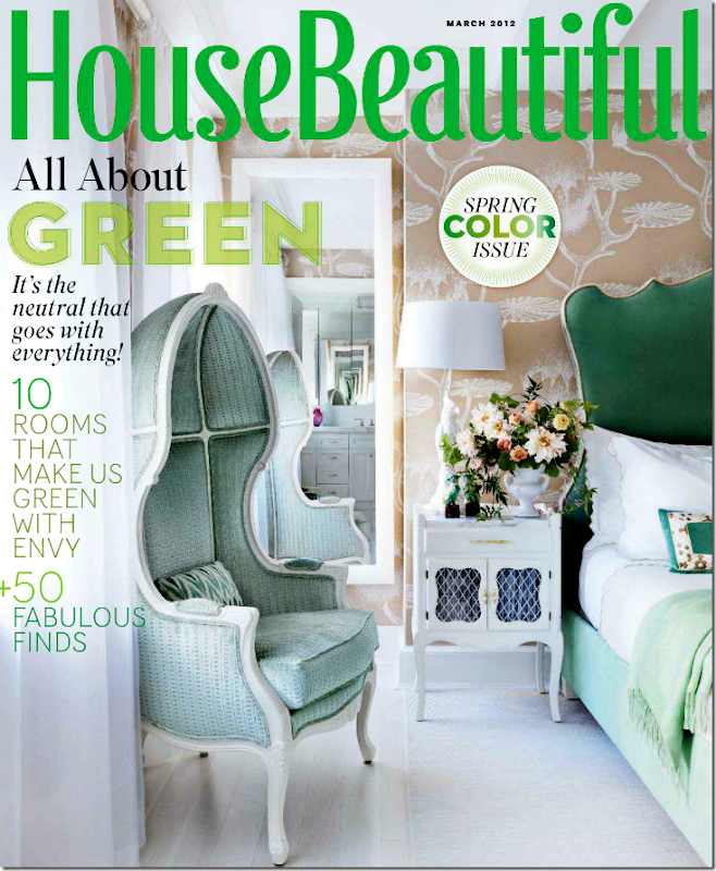
The entire issue this month from House Beautiful is green. And it’s a great issue. Look at the green headboard on the cover!
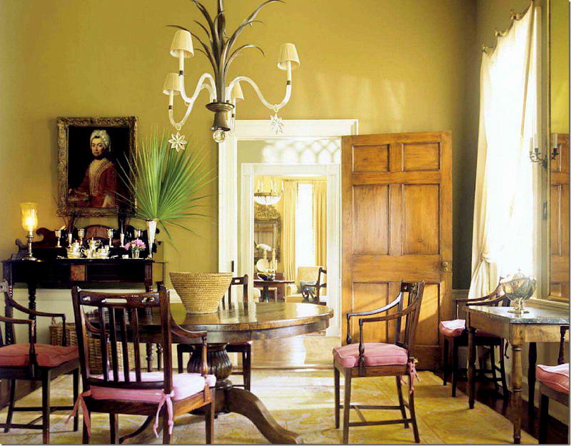
Dining room by Amelia Handegan.
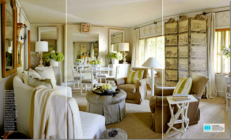
Designer Myra Hoefer redid her entire house in shades of greens and creams and golds – love it. Love her!
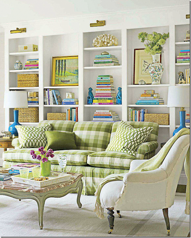
Meg Braff mixes bright greens with bright blues in this house.
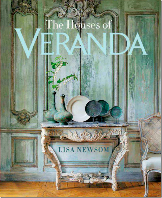
The new Veranda is green too. They are advertising their new book (CAN’T WAIT!) – with this famous cover of a house in Belgium with fauxed green walls. Probably one of their prettiest covers ever. Everything in this photograph is perfection.
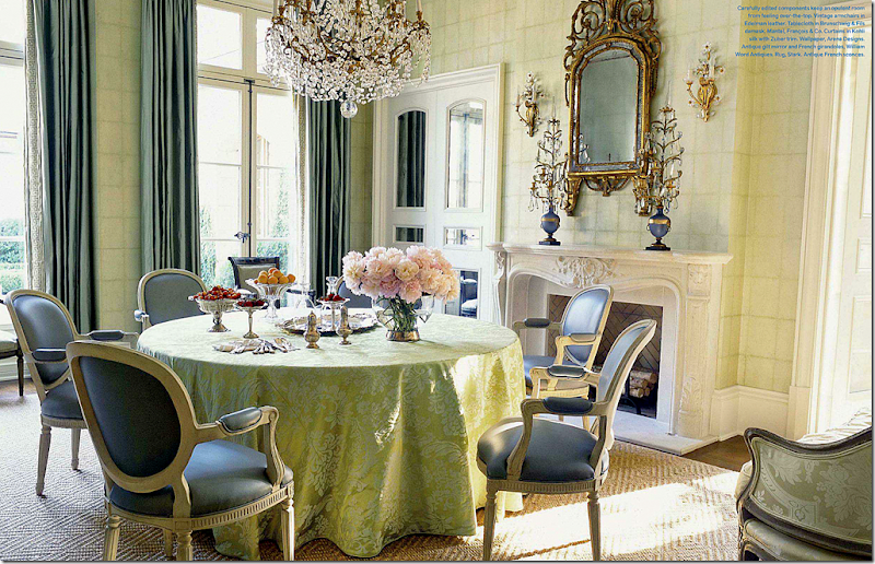
Inside Veranda, there is green everywhere – like this gorgeous dining room by Suzanne Kasler. Those chairs!
And this dining room by Jane Schwab – another beauty. (This entire house is gorgeous!)
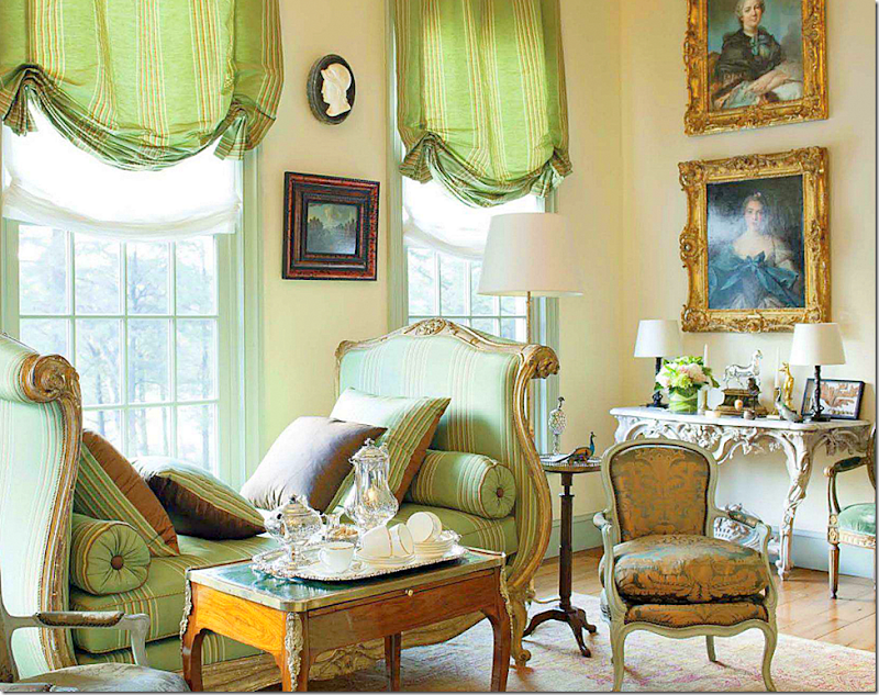
And this living room by Robert Couturier – in green stripes and French antiques. Luscious.
So, when Blayne Beacham, photographer, of Beacham & Co. Realtors in Atlanta sent me pictures of a new listing, I was just floored! Another house with green everywhere?? What is going on, I wondered?? Has green become the trendiest color while I was sleeping? OK, OK. My own bedroom is green and so is my guest room. But still, I just can’t remember green getting this popular. A few years ago, the greens were more of a seamist color, but today – they seem to be stronger and more…green! I’m loving this new shade of vivid green, especially wen you can see it used throughout a house. So, I just had to show these pictures of this house in Georgia – with its strong use of greens. It’s an historic house, built in 1939 by Frazier and Bodin. It was recently restored and renovated by architects Stephen and Kerry Fuller. ENJOY!!!!
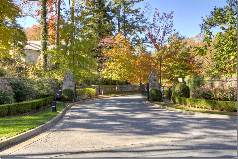
The drive up to the house is impressive – with twin, tiny stone houses that flank the gates.
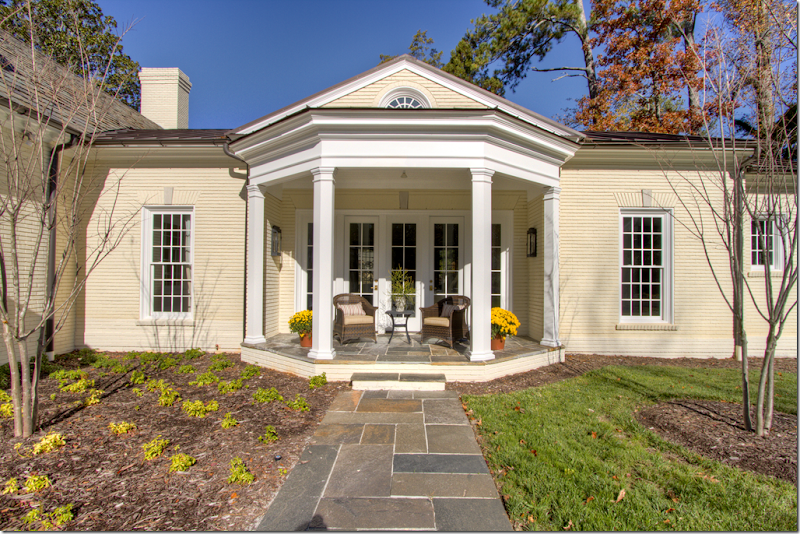
The property is almost 2 acres, the house is large with five bedrooms and 6 1/2 baths. There are 4 garages divided in two spaces. The façade hides the true size of the house.
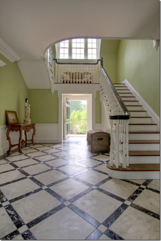
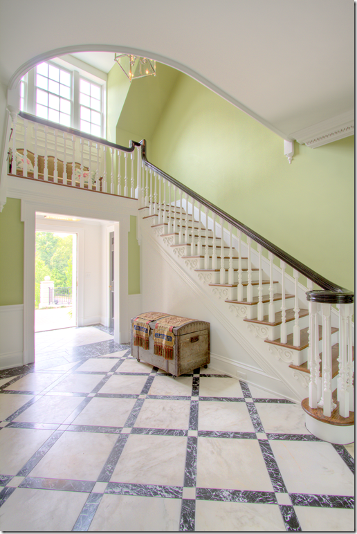
The front entry hall with green painted walls. The floors are white and back marble. I love how the stairs wrap around over the front doors. That’s something you don’t see much in new houses, but it’s so charming! I love this space. Notice the beautiful curve of the landing on the floor above.
Notice the trim work under each step – and the carved balusters. Beautiful!!!!
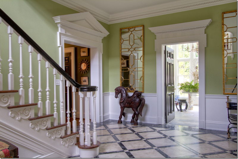
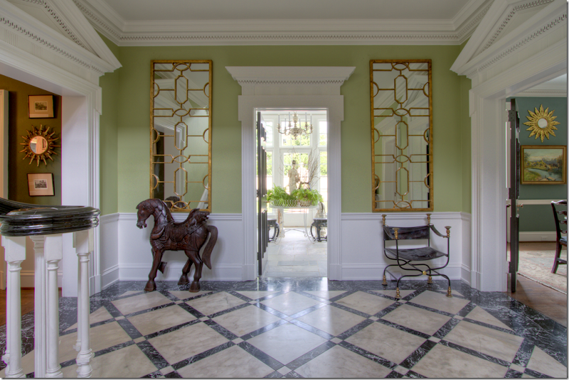
The view when entering the front door. The entry leads into the solarium. The dining room is on the right and the living room is on the left. Notice the pediments above each doorway.
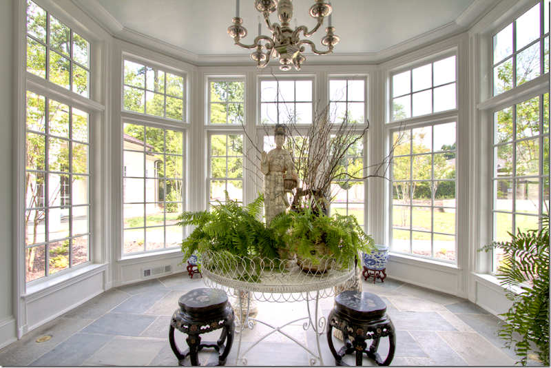
The solarium with slate floors. On the left, is the master bedroom wing, secluded from the rest of the house. The solarium overlooks a brick accent wall in the garden:
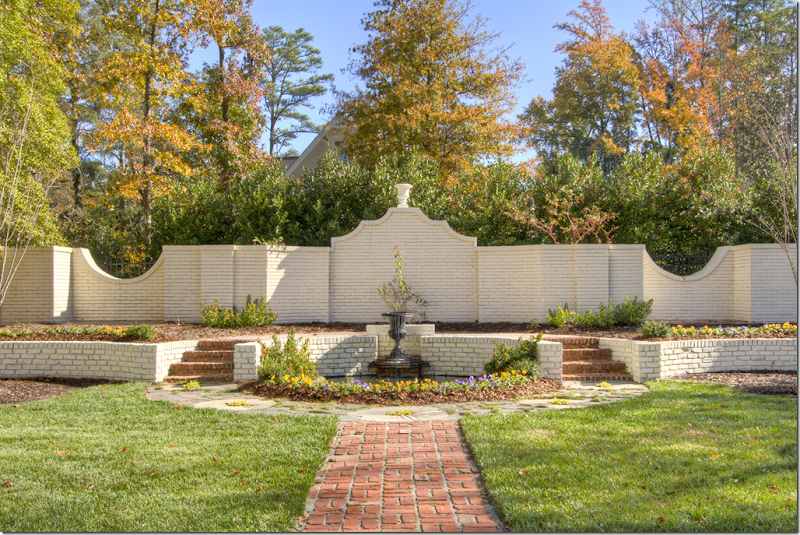
The brick accent wall which the solarium looks out on.
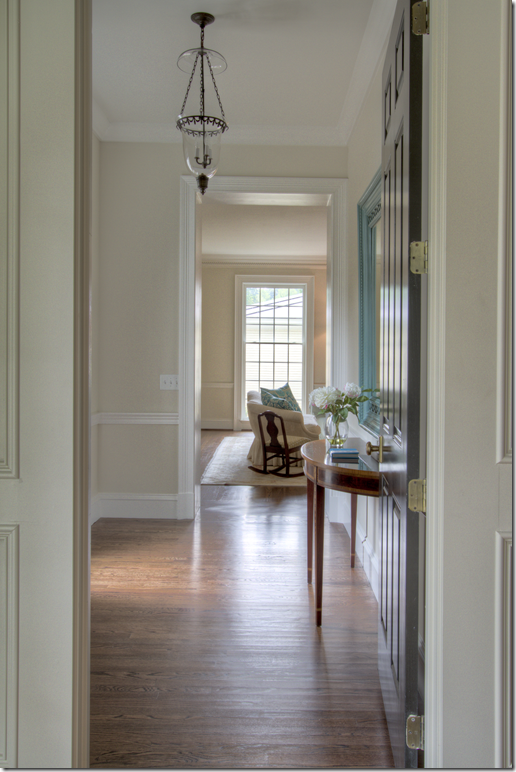
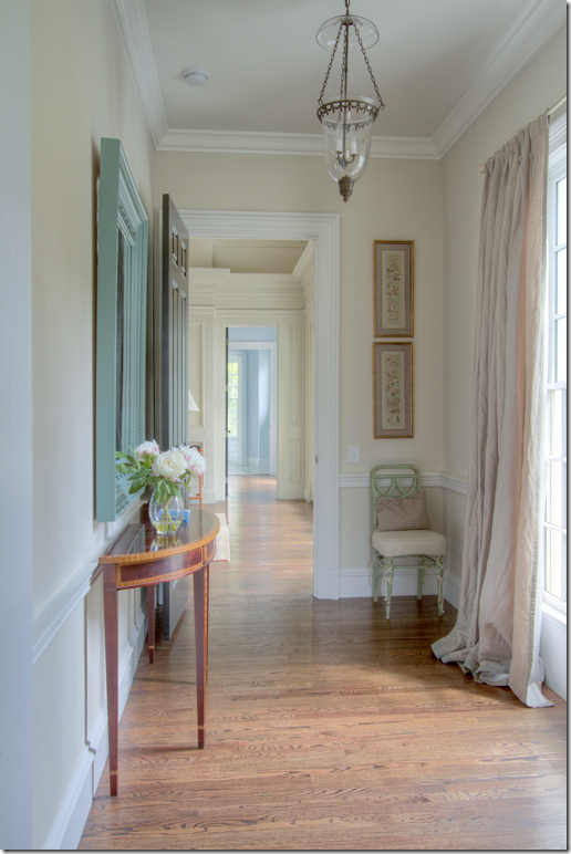
Off the entrance hall, to the left is this charming green painted hall that leads to the study and then further down, to the living room. I miss this in newer homes – halls, and separate rooms that don’t open up to each other. It makes a house so much cozier I think and it’s a feature I wish architects would bring back when designing homes today.
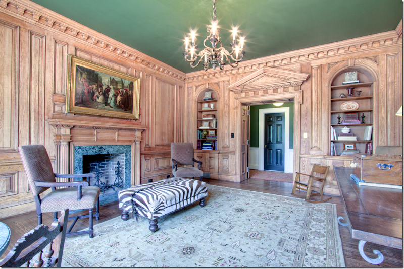
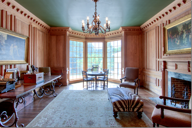
The wood paneled study. The ceiling was painted a deep green to offset the light wood walls. The ceiling ties the room in with the hallway and its helps grounds the room, making it seem warmer. Great fireplace – another feature that isn’t used as often as it was before. If this were a new house, there probably wouldn’t be a fireplace in this room.
The beautiful bay windows opens to the front of the house. This would make a perfect room to play cards in. the molding in this room is incredible.
And off the green hall, past the study, is the living room – its walls with just a hint of green to them. Notice the gorgeous woodwork – the crown molding and the pediment over the door. Twin chinoiserie cabinets and birdcages flank the grand doorway.
The view as you enter the room – a linen slipcovered sofa. There’s such a pretty symmetry to this room – the two black doors, with their gorgeous pediments, flanking the fireplace with its bullseye mirror.
This view faces the front of the house – that’s one of the garages – creating a perfect spot for a courtyard. Again, touches of green with the two velvet chairs.
A short hallway or vestibule runs between the living room and the master bedroom. You can see the living room here.
And looking from the living room into the master bedroom, on into the master bathroom. Such a beautiful spot with the antique console and mirror and chair.
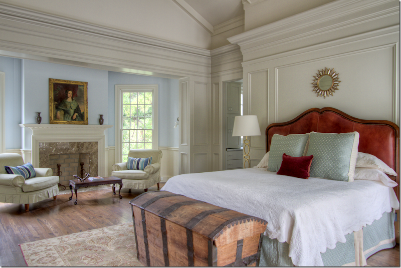
I don’t know this – but I am going to speculate that this master bedroom wing was added on during the renovation – clues – the higher ceiling. But such a beautiful room – with the sitting area and fireplace. Here – instead of greens, reds and blues are used. I love the portrait over the fireplace. The master bathroom is behind the bed through the door. On the right side of the bed, not shown, are French doors that lead to a private patio. Again, beautiful molding here.
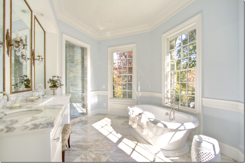
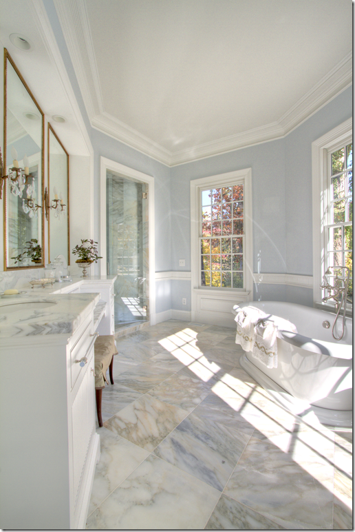
The bathroom is beautiful in light blue and white marble. Look at the pretty sconces and mirrors on the vanity. Notice the beautiful wainscot molding.
The white marble is so pretty!!
Here is the master bedroom’s private porch. It overlooks the back yard. On the far left is the window to the small vestibule that leads to the bedroom. On the far right is the bathroom. What a great place for morning coffee. And here, you can see the round window at the ceiling of the bedroom. I would assume there are two – one on each side of the room.
That’s the left side of the house. Now, we’ll go back through the living room, to the hall that leads to the entrance hall.
Back at the entrance hall, we’ll take a right to the dining room and to see the other side of the house.
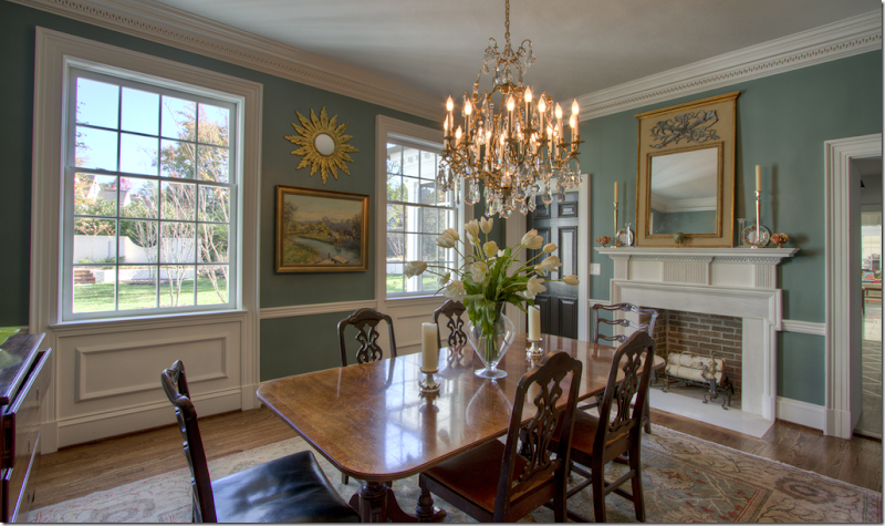
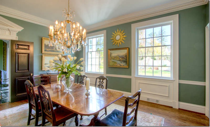
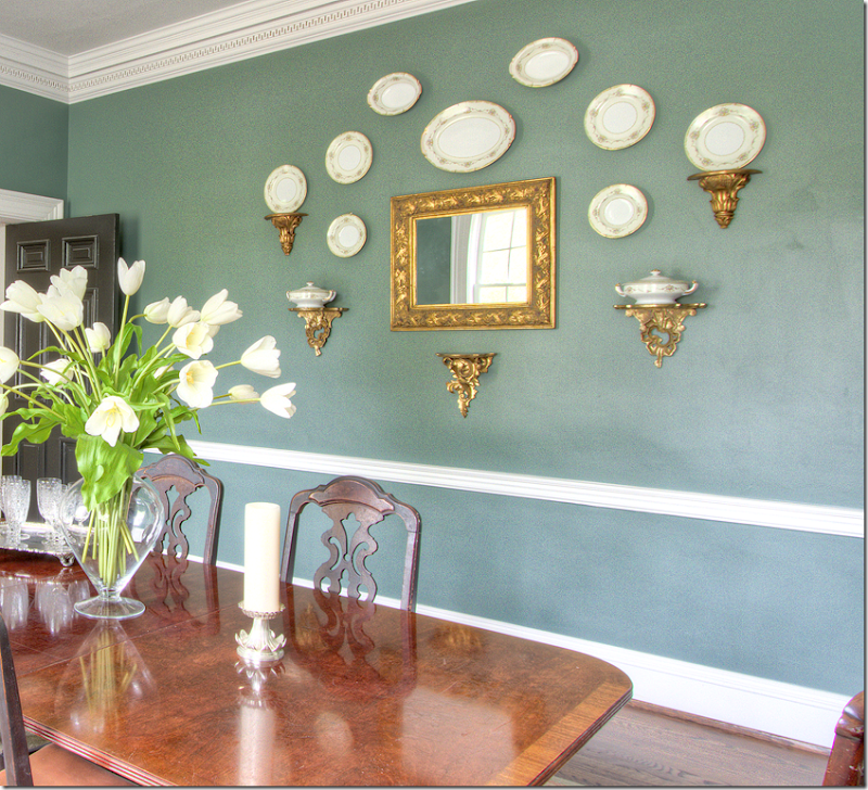
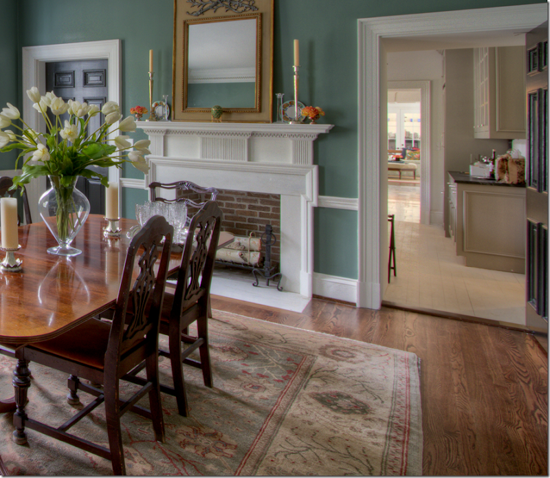
The dining room over looks the back yard (you can see the accent brick wall here.) There’s a fireplace which is such a treat!!! The walls are the same warm green found in the halls and the study. I love this room, it’s so warm and cozy looking.
A view back into the entrance hall – notice the pediment over the door – again something not found in today’s homes. And I love how all the doors are painted black. They look so great against the green walls and white of the woodwork.
And across the room is this collection of plates, hanging symmetrically around the mirror.
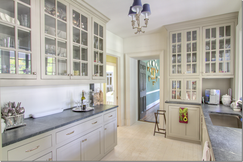
Past the dining room, is the catering kitchen/wet bar – and in the background is the kitchen and family room.
Leading from the dining room is this most charming room – a catering kitchen/wet bar. Notice the painted floors. The cabinets are a putty color with just a hint of green. Gorgeous countertops. I am assuming this is the original kitchen. And through the door – you can spy a bedroom that faces the front of the house. No pictures, though.
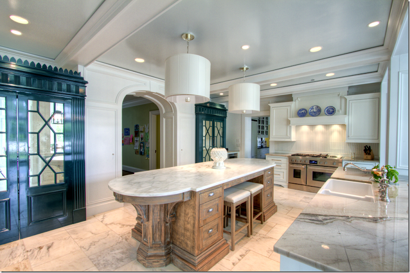
Leading off the catering kitchen is the main kitchen. I am going to assume all this part of the house is the new addition. A large marble covered island is in the center of the room. Marble floors. Twin cabinets, painted a deep green, have chinoiserie styling with mirrored doors.
And looking the other direction, to the left is the breakfast room and on the right is another beautiful cabinet and the family room.
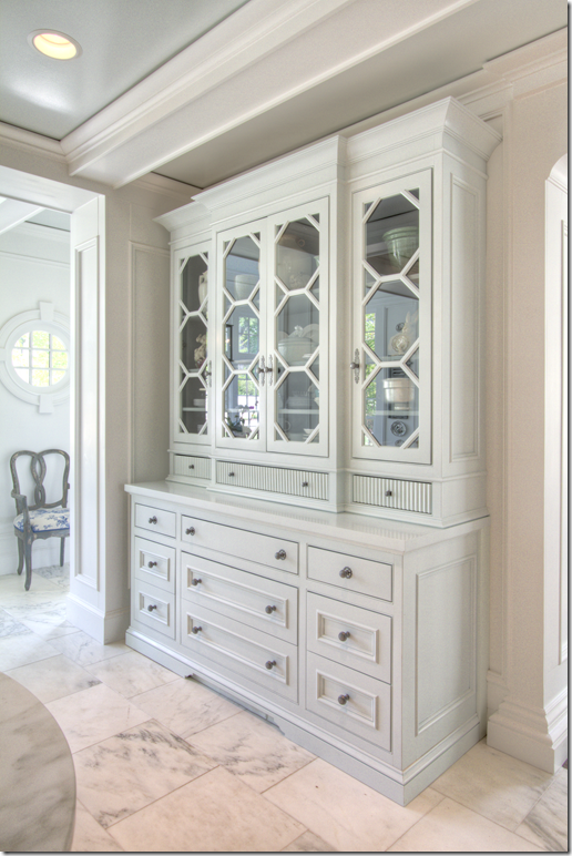
This built in has octagon shaped panes!
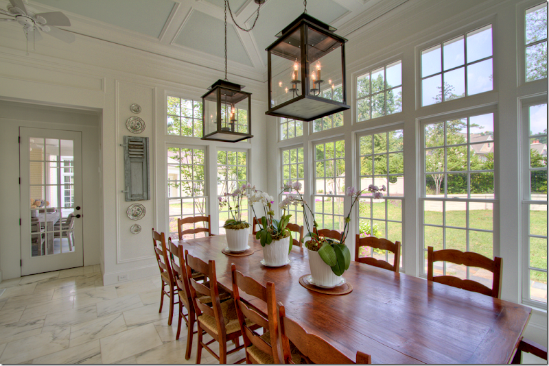
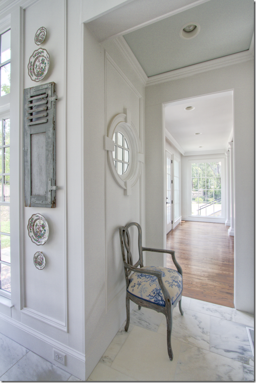
The breakfast room overlooks the back yard. Twin lanterns. Through the door is a covered porch for outdoor eating.
The breakfast room connects to the large family room here.
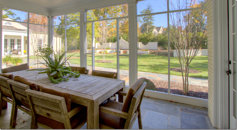
And the outdoors eating porch through the breakfast room. The catering kitchen overlooks this porch. To the left you can see the master bedroom wing.
Off the children’s play area – looking through the kitchen to the breakfast room.
e
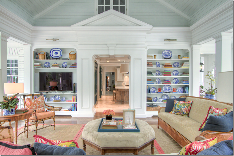
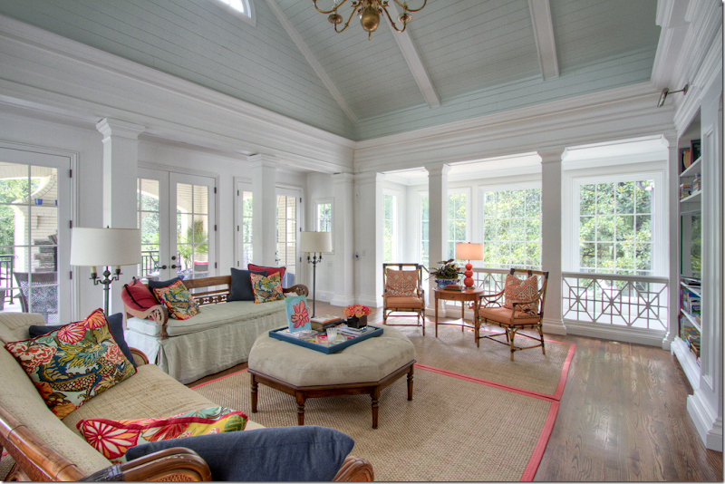
The family room is bright and cheery in greens and corals. Pillows are made out of Schumacher’s famous Chiang mai Dragon. Through the doorway is the kitchen, then the catering kitchen, through the dining room to the entrance hall. On the very right is the opening to the breakfast room. And above, is an interior window that opens to the upstairs.
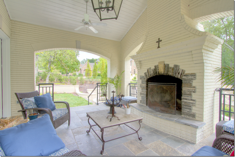
Looking the other direction – behind the family room is a covered porch with a fireplace. To the right – is the stair area leading down to the finished basement. There’s a bedroom and bathroom in the basement. Two more bedrooms are upstairs.
Here you can see the beautiful roof line and the half circle window. Behind is the porch.
The covered porch off the family room.
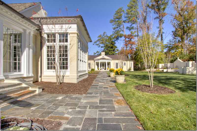
To the left is the family room, then the breakfast room with the flat roof. At the end of the walkway is the master bedroom wing.
And the end of the property – the covered porch is to the left. There’s an outdoor kitchen to its right. Below is the basement. And again, past the breakfast room with the flat roof, you can see the master bedroom wing.
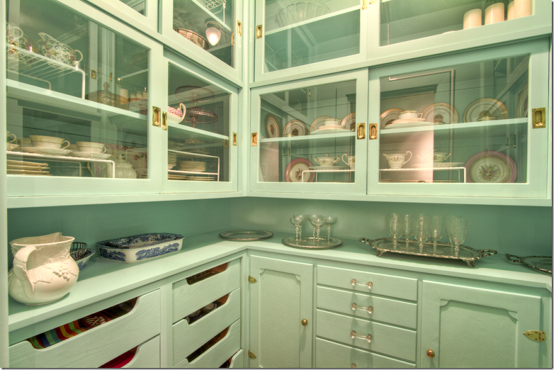
And, hidden away is this green china closet. What a luxury!
Had to show the entry hall one more time – I think it’s beautiful!!
I hope you’ve enjoyed seeing this renovated classic house in Dunwoody. What did you think about all the greens? Are you liking the green trend or not? I don’t think I could ever have an all green house. I could have an all blue house, but not green, so I would probably limit the green to just a few rooms. But that’s personal – everyone has their own color preferences. I do like the way this homeowner used green – different shades and tones throughout – instead of just one.
All photographs by Blayne Beacham. Please see Blayne’s blog HERE. She always has the best houses on her blog.
And, a huge thank you to Blayne for letting me show one of Beacham’s properties. I love when Blayne lets me show a house of theirs! I really appreciate her generosity. And I’m so demanding too - I make her remove the watermark on her photographs – just for you!! The photographs are so much prettier without them. So another HUGE thank you to Blayne for that.
To see the listing of this house, go HERE.
And finally, to see the architect Stephen Fuller’s web site, please go HERE.













Loving the green Joni.... It's a refreshing change from all the 'greige' that I can't seem to resist... xv
ReplyDeleteThis comment has been removed by the author.
ReplyDeleteBeautiful. Thank you for taking the time to share all of this loveliness. The color and use of texture are affirming to me (as I sit in our green study). (And I simply must find that book, Veranda.)
ReplyDeleteI am on the same page with you - just wrote a post on it featuring rooms in that soft green that isn't mint or sage. Love the green butlers pantry and the way the black and white marble floor works with the green walls in the entry hall!
ReplyDeleteGreen is not my favorite but I could live with it in that spectacular house.
ReplyDeleteI always feel as if I’m running behind on my decorating or maybe I’m to far forward thinking. My living room and bedroom are sage green and I love them but enough with the green I need to lighten and brighten and finally giving into the gray trend. See backwards. Love all the greens but I’m tired of them. That house is amazing and those floors, love those floors!
ReplyDeleteXX
Debra~
Love this home! It's huge, but still feels real and cozy. I think green is SO much warmer than blue; I could move right in. Thanks! Beth
ReplyDeleteWow! Absolutely adore the floorplan. It's the perfect combination of a large home but each space is intimate and human in scale. The moldings are exquisite. My mother loved green and it was the predominate color in our home while I was growing up. I prefer it now as an accent but I really enjoyed seeing how many shades they used. Also, really like the black doors, they're on my to do list!
ReplyDeleteBrilliant article, as per usual.
ReplyDeleteGreen is everywhere in nature, so it´s can´t possibly be wrong, EVER, if you think about it. The challenge is choosing the right tone of green.
I bet there is a green for everyone - even those who think they don´t like green.
And green can go greige too. Take the Farrow & Ball colours French Gray for example. It´s definitely green - and greige.
Wishing you a lovely weekend.
//Sarah
One word... Gorgeous!!!! LOVE, LOVE the green! Beautifully decorated home. Thanks for showing us, Joni.
ReplyDeleteLeigh
Oh, can I just move in? Sooo stunning! Green is not a go to colour for me, but it's so well used in this house, I don't think I would change a thing. Beautiful.
ReplyDeleteAnd as far as Pantone telling me what colours I should like, I don't necessary go for that in my house. They change too frequently. I may do it with a purse, a pair of shoes, jewelry or a scarf, but that's the extend of me following the trendy colours.
Joni- where do I even begin?? I think I am in love! Maybe a little dramatic- but seriously, this one hit is out of the pak for me. Generally speaking I'm not a "green" kinda girl but this house- stunning!! You have such beautiful architecture and design down where you live- so lucky!! Thanks as always for all of the inspiration.
ReplyDeleteJoni, Thanks again for a great post..beautiful home. I have to laugh, everything I have previously read about green seemed to have a big flashing "warning"....don't paint your rooms green as this will age a room faster than anything else...etc...so good for green - glad to see this color is getting its due!! I like green in small doses but I'm with you..I'll take blue thank you..but to be safe I prefer whites and linen...
ReplyDeleteSharon
skmatte@aol.com
Although I like green in small doses -- like in a bathroom or just pops of it using plants around the house -- I do love many things about this house. I'm green with envy about some spaces: the catering kitchen, china closet and kitchen cabinets and the hallways. I'm usually not a big fan of chinoiserie, but those cabinets are to die for! I did think the marble floors in the kitchen were a luxurious but impractical choice.
ReplyDeleteOn an unrelated note, I rec'd my copy of The Joy of Decorating and was bummed that it didn't include the paint chart. Did anyone else not get one?
Thanks, Joni for another great post.
Maureen
Your posts are amazing - I can tell you how much I look forward to seeing them in my email. What a treat seeing the inside of these amazing homes, that I would otherwise never get to see ! I thoroughly enjoy every single picture - thank you !
ReplyDeleteGorgeous house! I love all the molding used throughout the house. The architecture of this home really gives it so much personality.
ReplyDeleteI have added green in my kitchen with accessories and I plan to add some to my family room which is still being decorated little by little since being renovated. I look at green in the way I used it as a neutral color though. You can mix just about any color you wish in with it. I have blue mixed in like the house you've shown and I plan to mix in some hue of purple as well in the family room and master bedroom. I love house plants so that adds a very natural green in the rooms too.
p.s. - Have to agree with you about the pantone color report, I am NOT a fan of orange or yellow so those two colors will not be seen in my home at all. I guess I'm a cool/neutral color kinda girl.
I am breathing such a sigh of relief this morning. I have almost the identical shade of green that you've shown in the Cobblestone home's foyer in my house in the mountains and I was afraid it was out of style. It's such a calming color that I would not give it up no matter who said what about it.
ReplyDeleteHowever, I do love yellow and use it often.
Sam
Joni, thank you for sharing this emerald with us, what a jem! Green has always been my favorite color and it is all over my home, though not on my walls. I think finding the right shade of green paint is extremely difficult, as I have failed several times in several of my past homes. Currently, I have several shades of green silk dupioni drapes, a meadow shade in my famiy room, a lemongrass shade in my study and in our dining room I have a floral patterned sage green linen pair. I treat green as a neutral just like nature does, truly any color looks beautiful when paired with it. I think Pantone's color trends are just that, trends. Green is timeless.
ReplyDeleteLexi
Wonderful post of a beautiful home! Thank you, as always, for your narration. Love to hear your take on each room. Enjoy Blayne's blog very much and a big thank you to her for agreeing to share her photos with your readers without her watermark--very generous!!!
ReplyDeleteI have been slowly changing my house over the last two years to remove all of the dark and bright colors and replace them with warm grays, soft golds, whites, creams and pale blues (my absolutely favorite blue is Oxygen by C2). Only my husband's cherry paneled library has a very pale green on the walls but it is perfect with the cherry.
Love you, Joni!!!!
Anne
I've always loved green. Perhaps it's my green eyes (my husband has green eyes too!). In my new kitchen/library I'm painting the ceiling Great Barrington Green to echo the garden and trees outside the window. My friends think I'm nuts. Seems normal to me—that I like dark greens and my friends think I'm nuts!
ReplyDeleteI adore this home! Just the right amount of varying shades of green. The Cabinets in the kitchen in the deep green; gorgeous!
ReplyDeleteThe family room is a light bright breath of freshness!
The black doors with white moldings and painted walls works beautifully!
Thank you Blayne and Joni!
xoxo
Karena
Art by Karena
Sorry, I think the choice of green for the foyer and hallway and ceiling don't do any justice to the gorgeous flooring and woodwork. Seems too "Palm Beach" and needs some accents to compliment such a citrus-y color. The tinted green accents work well such as the small pantry, light tint for the cabinetry, etc. Home is gorgeous, but the the lime color (at least that's the way it looks on the monitor) doesn't work with the house's architecture. And please, that dark ceiling in the library? Too dark for the color of the paneling. I would have preferred a more traditional ceiling color. That green screams 80s green (Hunter, etc)..
ReplyDeleteI am with you Joanie that entryway is perfection! So glad green is coming back I still have green kitchen cupboards (the need to be updated kitchen!)
ReplyDeleteWhile it is all a little "grand" for my taste there are some gorgeous elements and touches. Great windows and beautiful ceilings. I prefer the softer rooms, the very creamy ones and the lovely pale blue, to some of the darker and more bold green rooms. I have always likes paler and more casual rooms, even when colorful was really in, all the red and green and yellow rooms, I was always drawn to the white and the cream "shabby chic" ones.
ReplyDeleteThe home has very distinctive 'early' area's and then additions. They have carefully used shades that are from Historical palettes in the older part of the home - very smart indeed. I like the soft apple colour in the main foyer, it would work with so many other shades and would work in any room. By far my favourite part is the china cabinet room, the use of a colour on the cabinet punctuates the colour on the dishes.
ReplyDeleteGreat posting.
I love the painted green cabinetry in the china room. Just wonderful!
ReplyDeleteI am not a big green fan. I like it in small doses. I think when you use any color if it is done in good taste your OK. I guess their beating to their own drum!
ReplyDeleteI am not usually a fan of green but this house could turn me. The mouldings...I could stare at them all day. Love the sliding door china cabinets with brass hardware....
ReplyDeleteThe owners obviously put a lot of thought into every detail of this house, it must be breaking their hearts to move. Unless, of course, they are moving to a new dream house...in which case you must bribe their real estate agent to get you photos of their new digs!
I love all the color! The green in the entryway is a color that I've had in one room of my house for years. I've changed other colors, but love that room.
ReplyDeleteLove this topic, the photos are eyecandy.
Joni! Love love this home, I could move right in, the windows in this house are amazing, so much light!! All the milllwork is so beautifully detailed, but in a simple elegant manner. I am a huge fan of green as you can tell from my own home, green kitchen cupboards, green wallpaper in entry, green striped rug in family room! I actually had to grit my teeth when I read Pantones color of the year. I declared my own color of the year in January and guess what color it was? I have since added a new piece to incorporate my color of the year in my black and white guest bathroom. I love it in there. Here is the post I wrote about my personal color choice of the year for 2012.
ReplyDeletehttp://goodlifeofdesign.blogspot.com/2012/01/my-color-pick-for-2012.html
Hi Joni,
ReplyDeleteThis post is so timely! I am about two weeks away from painting my kitchen cabinets green. It is the only color I can imagine besides white to go with my marble and backsplash. Bonnie B. emailed me and said "do it!" Then I saw the new House Beautiful which kind of sealed the deal! So, to see your post on green really hits home. My entry is exactly the same color as the entry you show. I call it apple green. Although I don't have that beautiful black and white floor to set it off, I have the leopard runner up the stairs and vintage oils of roses. So I guess green kitchen cabinets is a no-brainer. Pantone's color of the year has been the color of my life! haha!
Just love this post! Thank you for yet another vote for the color green! ~Delores
My, oh my, what a home. They thought of everything. I especially love the moldings...but also the green. It is my favorite color. We are redoing our home after a flood. You will like it...The main floor has lots of shades of green--many going toward blue. But upstairs has a predominance of blue. I will send photos when it is done. It has been six months since the flood, and it will be most likely get in by late May. What an ordeal...but I have been able to redecorate. :) Your blog has given me many ideas! You always do such great research and I love your pointing out of details. Keep writing, Joni. Your labor is much appreciated!
ReplyDeleteWow what a home! Adore all the shades of green + the Mouldings. Just can't beat the older homes for fireplaces, just redid an older home with fireplaces in every room including powder room! Loved it! Thanks, Joni xxpeggybraswelldesign.com
ReplyDeleteWhat a beautiful house!
ReplyDeleteGreen is my absolute favourite colour - sage, lichen, olive, khaki, Eau de Nil, lemongrass. What could be prettier? There wil be no glow-in-the-dark shades of orange in my home. But I guess somebody must be painting their houses Tangerine Tango. Otherwise, how would it get to be colour of the year?
By the way, Joni, what's the difference between a catering kitchen and a kitchen? Are caterers not allowed to use real kitchens?
Very funny. Actually I think they use it as a butlers pantry and wet bar. I think it's the original kitchen and I have to say personally I like this kitchen more. But thats me. Small and cozy. Wish my body was too!
DeleteWow. They don't build houses like this anymore. The mouldings are incredible! Blues and greens are my favorite colors (I like them mixed with browns and creams), so I love seeing these instead of the monochromatic tone-on-tone whites or grays (though I like that look, too, just couldn't live with it). To me it is a palette taken straight from nature. I think green is the perfect foil for natural wood stains, as shown in this magnificent study. The greens paired with white trim in the foyer and hall make it look very fresh. So not the green/gold/rusty red Tuscan or 'Starbucks' colors. I love the catering kitchen - it looks about the same width as my 1920's kitchen and is the perfect inspiration. Thanks, Blayne, for the gorgeous photos! And forget Tangerine Tango and Solar Power. Those are two of my least favorite colors. I only like yellow in flowers, and I can do without day-glow orange entirely.
ReplyDeleteI see you got Blayne to remove her trademark watermark for your blog!! So much nicer to look at the pics this way. Well I don't know, I just painted my green office greige. I am sick of green~I have had it for years in that apple green or celery green, and it really was time for a change. But these examples, especially the Veranda pics are lovely.
ReplyDeleteThat stair case is gorgeous with the fresh green and crisp white.
ReplyDeleteJoni-
ReplyDeleteI am with you on green, but I love orange to sued in moderation. These images prove that green is gorgeous.
I had an emerald green sofa and it was beautiful, but I love the light green too.
Thank you for being us such gorgeous images, and have a happy Thursday.
Teresa
xoxo
Hi Joni,
ReplyDeleteOne of the most interesting comments I've heard recently was at Benjamin Moore Color Pulse 2013 at Design San Francisco in February, where they predicted that Twitter green and Facebook blue would be THE colors for 2014.
Interestingly, I just returned from London, and the March 2012 issue of ELLE Decoration was all about blue...
I agree that green and blue are happening!
In case you're interested, here's what I posted about it on my blog, Innerspace Interior Design.
http://www.innerspaceinteriordesign.blogspot.com/2012/02/color-blues.html
http://www.innerspaceinteriordesign.blogspot.com/2012/02/color-pantone-fashion-colors.html
http://www.innerspaceinteriordesign.blogspot.com/2012/02/color-facebook-twitter-colors.html
Best,
Lisa
JONI-
ReplyDeleteThis is one of your greater posts, superbly edited and presented. So many ideas, so much territory covered, such enthusiasm. Love it.
It is what you do best--and it is classic Cote de Texas.
Every piece of information is in place, everyone is graciously and generous credited, and we get the whole and total picture.
Bravo to you, Joni.
You are the QUEEN of design bloggers, and this is wonderfully created. very best, DIANE
As anticipated, the head of the cheerleading squad has called a pep rally.
DeleteAlthough I like green in small doses -- like in a bathroom or just pops of it using plants around the house -- I do love many things about this house. I'm green with envy about some spaces: the catering kitchen, china closet and kitchen cabinets and the hallways. I'm usually not a big fan of chinoiserie, but those cabinets are to die for! I did think the marble floors in the kitchen were a luxurious but impractical choice.
ReplyDeleteThis house has some gorgeous elements, namely the woodwork and the use of windows/light and the gorgeous marble floors. However, I don't know how one could really make use of all of these rooms..repetitive and truthfully, seem totally unnecessary. I had to laugh that there are children living here (playroom).
ReplyDeleteYour post points to the homeowners use of green but that is actually my least favorite aspect of the home. And I have a green master bedroom:) and have used touches of green throughout my own home. I've lived with it for several years and have not tired of it. But in this home, I don't think it works (and agree with the poster that felt the green entryway doesn't work with the rest of the home).
I actually like the rooms that are softer in color and love how they used white walls with the soft shade of greyed-blue on the ceilings in the breakfast room and family room. The master bath is watery and gorgeous. I do like the green china closet--that is pretty and so unique.
Not a fan of the mishmash of design elements and periods--while, if done in a good way, this is my favorite style of design. But this house doesn't flow, imo. There are some specific choices that are beautiful but overall, the decorator seems confused. It's like two people were decorating this place. The dining room is just plain bad; the accessories on the mantle, the smallish table, the flowers under the chandelier, too many plates, pictures, mirrors and mish-mash in this room (and in some other parts of the home.) The living room has too many pieces of furniture of the wrong scale and throw-pillows in odd color-pairings. The kitchen choices are all wrong and the furniture sticks out like a sore thumb. I will stop and say that it just feels troubled:/ and of course, that this is just one person's opinion:) Thanks for sharing! SPD
I totally agree with you! While I love the color green (and fabulous older homes), I thought this was a hot mess - LOL! None of the greens seem to flow together and the design style is all over the place. There's eclectic in a good way and then there's "I don't get it"!
DeleteGiven the number of other rooms which require seating, the living room could have been more formally decorated and given a bit more importance in the house's design scheme (if there was one). The room is large enough for two separate seating areas. I agree the fabrics look like left overs from another house. The one thing missing in this house which would pull the design together is window treatments. Why do people spend so much money on remodels, design fees, furniture, fabrics and then neglect windows? I just don't get it.
DeleteMost shades of green are my least favorite color. That said...I just painted an outside wall emerald green and ordered GREEN JEANS! Go figure! franki
ReplyDeleteI've always been a lover a green and Myer Hoefer! Thanks for the refreshing post and pictures!
ReplyDeleteGreen is my favourite colour and I loved the green issue of House Beautiful this month - It was so unexpected and fresh.
ReplyDeleteThis house is a wow, I love the green in the entrance hall, this particular green is a really strong one and would take guts to slap it on the walls but it totally worked in combination with the black and white marble floor. I also prefer the catering kitchen to the main kitchen. Also loved all of the crown molding and woodwork.
As mentioned by another commenter above, green is everywhere in nature so how could you go wrong? I've never really thought about it until now but I could definitely live in a green house if it used all of the different shades of green available like this house in Georgia.
Hands down, my favourite colour.
ReplyDeleteAnd it looks magnificent in that house.
Funny though, I'm not wild about the kitchen.
Go figure.
While there are authentic elements of design here, I think this house is utterly ridiculous. Who on earth needs a breakfast room to seat at least 12 unless they are practicing polygamy? The "catering kitchen" is more than adequate for anyone besides the White House, and the "Main Kitchen" is nothing but pure pretentious ego stroking. Sorry. You always show us great stuff, but even a Maestro hits a linker once in a while.
ReplyDeleteI think green can be great.
That was "clinker"!
ReplyDeleteI think you meant clunker, but doubt that Joni knows the difference given some of the entries here.
DeleteI so enjoyed the tour. The green china cupboard/butler's pantry is to die for!
ReplyDeleteI ALWAYS have fun readng your blog...In particular today, it's the photography that is SO impressive in this house. Many parts of the house are gorgeous. But even when I came across rooms,that were definitely not to my taste, they were appealing purely because of the photography -- the composition, color,etc of each shot. I am definitely going to visit Blayne Beacham's blog.
ReplyDelete:)
Valerie
beautiful! enjoyed the tour!
ReplyDeleteLove that green china cabinet kitchen. I am in love!
ReplyDeleteI did an entry on pantone color of the year too - tango tangerine!
http://ideainteriors.blogspot.com/2012/02/takes-two-totango.html
But gotta say I love that green!
Elena
I'm an emerald green lover myself and that cover of House Beautiful is just divine. That entry hall is so bright and cheery with the apple green. I've just done a dining room in a lighter version of that color and it is delicious! Great cabinet with the octagon panels.
ReplyDeleteI love all of these rooms...the art is amazing and love how these rooms have it mixed with more traditional pieces in some rooms.
ReplyDeleteI was never a huge green fan...until I came to live in France. There is a shade that has lovely, worn undertone that changes based on the light. Being in Provence, light is a gift that I have plenty of. I snap up anything that I come across at the brocantes that has this tint now. Lovely post.
ReplyDeleteJoni, did you see where we can vote on your blog for Best Decor at Apartment Therapy?
ReplyDeletehttp://www.apartmenttherapy.com/best-home-design-blog-nominations-the-homies-2012-166616
I agree with several others that the house looks like it was decorated by several different designers or in stages with long periods of time between the work. It may be my monitor, but the greens actually come off as blue in some of the rooms. The combination of modern hues together with darker ones hark back to colors typically seen in 18th century Georgian homes does not work well for the modern updates as it appears in the dining room. The catering kitchen is lovely and far more appealing than the main kitchen with its clunky island. The prettiest rooms were those painted in neutral colors with more color in the fabrics. Stick with posting from published rooms as those you have chosen here are beautiful. Often there is not much to learn from real estate listings.
ReplyDeleteJoni, I love greens and have for most of my life. My bedroom is filled with my favorite color - seafoam green. I can't resist it whenever I see anything made in that color. My problem is putting in another shade so everything isn't the same! This house, while not my decorating style, is very inviting, and the color palette is but a part of that. Though it is big (I'm with you, small and cozy is good), it still feels comfortable. Interesting to look at, even if disparate.
ReplyDeleteYou know I am a huge Green fan ! So much better than blue, don't you think.lol vicky
ReplyDeleteLove this house. I used to not be a fan of green, but over the years ended up incorporating green more and more, especially in my vacation home. That china closet is amazing -- looks like jadeite, a very 30's green color. I love the big table in the breakfast area -- would be great for casually entertaining or spreading out and working on a project.
ReplyDeleteWooow what nice room are here
ReplyDeleteThis home is gorgeous. The architect did an amazing job of creating a seamless addition that addresses the needs of a modern family, while incorporating authentic period detailing to ensure that the original and new spaces share the same character and feel like they belong in the same house. I love the marble tile in the foyer -- and I even saved that pic, because I might copy it in ivory and Emperador brown marble for my master bath (if I ever get around to finishing it!). I also love the shade of blue on the walls of this home's master bath -- is there any chance you can find out what color it is?
ReplyDeleteThank you for sharing this gorgeous home. The family room is my favorite and I noted the hints of Tangerine Tango in those pillows/accents in that room.
ReplyDeleteI am so with you.....what is with Tangerine Tango? I live on the east coast of Canada (and sometimes we are a little behind the times what it comes to available decor), but I am seeing green everywhere, as well! And loving it! I almost did a post on it the same day you did and might still.
ReplyDelete(Maybe it will take a little time for some people to get acclimatized to Tangerine Tango!)
What a marvelous tour dahhling! Great collections & combinations
ReplyDeleteHello,
ReplyDeleteI love your blog! Do you recommend a great linen or light putty paint color? I have the hardest time picking paint!!!
I always though of myself as a blue girl, but over the years I've realised the versatility of some tones of green, particularly in period homes where it was often subtly used. In particular I love the traditional muted French greens and greys, which I plan to use in our house in France, when it gets to the habitable stage. Love your blog – it’s the first time I’ve visited - on Andrea’s (Frenchbasketeer) recommendation. Your hit rate is phenomenal and well deserved.
ReplyDeleteBonne semaine from Australia
GREAT PICS:) I really like your blog...so much nice inspiration.
ReplyDeleteI wish you a lovely week:)
LOVE Maria at inredningsvis.se
(Sweden)
Hi Joni, I love this home and especially the blue wood ceilings and the pretty breakfast room. We just painted our green family room a neutral beige because we had several prospective buyers say they didn't like green! Last week I went to some of my favorite design shops and each one was full of tangerine colored accessories and especially pillows. There was lots of tangerine and blue combination. If you want to see a home that uses this color beautifully check out the blog
ReplyDeletehttp://www.thefrenchtangerine.com/. Have a great week! xo, Sherry
I am new here to your blog and oh my goodness the stuff you have to look at and drool over is amazing! This home is gorgeous! I especially love the blue willow china (I think it's blue willow) is displayed. Great pops of color. Thank you so much for visiting our blog earlier and leaving such a sweet comment about our family room :)
ReplyDeleteI do like green in doses, I don't think I personally would want a room primarily green, but do appreciate it when its well done. Love the stair hall, a great color compliment to the beautiful marble flooring!
ReplyDeletewhat a stunning home. thanks blayne! that is very kind...
ReplyDeletethe judicious pops of soft colour in this home are to die for...
green and blue are my favorite colours, so they have always been in my house in abundance, but i agree that all the magazines are making me crave more. the right gray greens just work with so much too...
i really do think THIS type of soft green is the return of colour to the neutral rooms, and not those horrible tangerines and yellows they keep trying to shove down our throats. it has to be soft, to be a natural evolution from the greige look....
xo terri
do you know if this home is still for sale? the link to beacham & company no longer works. please let me know if you have any insight.
ReplyDeletethank you,
rebecca
go greeeeeeen!!! it's always been my favorite & I loved the myra hoefer house in House Beautiful. The living room is perfection. I'll love green even when it's "out." ;)
ReplyDeletexoxo,
lauren
Myra's house in House Beautiful got me excited to read magazines again. I've gone back countless times to study every detail and forever thought that having too many mirrors in my house was a bad thing. Now I can put them all back up again! xo, Jennifer
ReplyDeletethanks so much for sharing these wonderful inspirations. especially love the renovated home. certainly can see the historic influences, and I am with you on the entry. So classic and the curve is what one would expect in a historic type property although it is not 19th century it has that influence.
ReplyDeleteenjoying your blog very much! new to it
fantático blog... me encanta este post
ReplyDelete