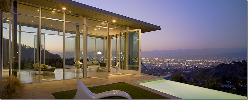
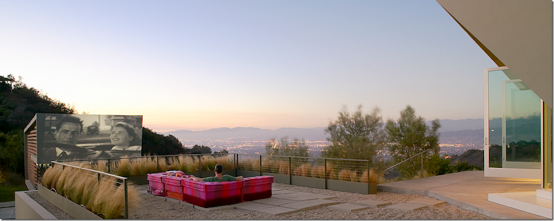
As I said last time, I’ve become really interested in the Spanish Mission or Colonial Revival architecture that is so popular in California – especially houses built in the 1920s and 1930s. While researching those houses on Los Angeles real estate web sites, I found this one house for sale with a really beautiful interior - sophisticated and well designed - it really captured my eye. The brochure said the house was designed by Hagy Belzberg, so I looked up Belzberg Architects and found another Belzberg designed house, above & below – with the movie screen on the outside.
So, I wrote the story around the movie screen house and drive-in movies. I must say, no one was really impressed with the house! Almost all the comments wanted to reminiscence about drive-in movies, and hardly anyone even mentioned the Belzberg designed movie screen house. I guess we all just don’t care much for ultra contemporary houses!!! Me neither, I have to admit, although I can certainly appreciate the architecture and I do LOVE that movie screen!
That last story grew so long that I decided to show the other house that Belzberg designed - the sophisticated house - that I really DID like, today. Enjoy!!
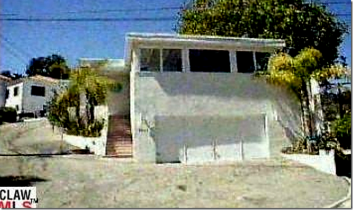
Really terrible picture! But, this is how the house looked in 1998.
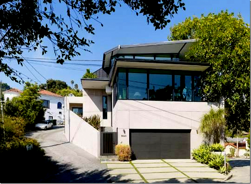
This non-descript white bungalow was built in 1956 high up on a hill above Sunset Avenue and close to the legendary Greystone Mansion. In 1998 an art-loving, young couple bought the $750,000. house for the views of downtown and the ocean – which could be seen from the rooftop. They hired Hagy Belzberg to completely renovate the 2800 sq. ft. house – which he did – taking it down to the studs and leaving only two small rooms in the back untouched, along with the outside stairs that lead to the front door. On top of the living room, above the garage, he added a second floor which houses the master bedroom, and now has the commanding views of the Pacific Ocean. Belzberg built the addition around a steel frame, which is practical in the earthquake prone area. He topped it all with a metal seam roof.
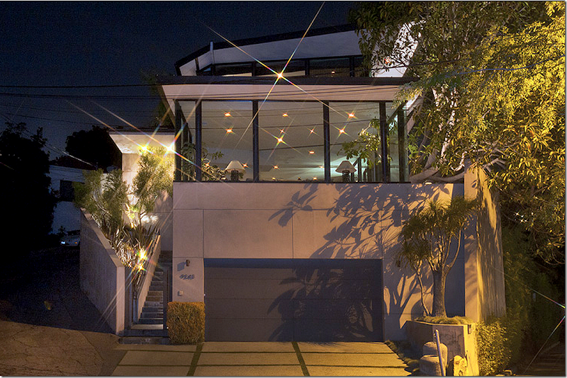
And today: the ceilings were raised to 12’ in the living area – seen in the room above the garage. The master bedroom was added above the living room. The architect deliberately kept the new second floor from over powering the façade. You can barely even see it.
And today – at night.
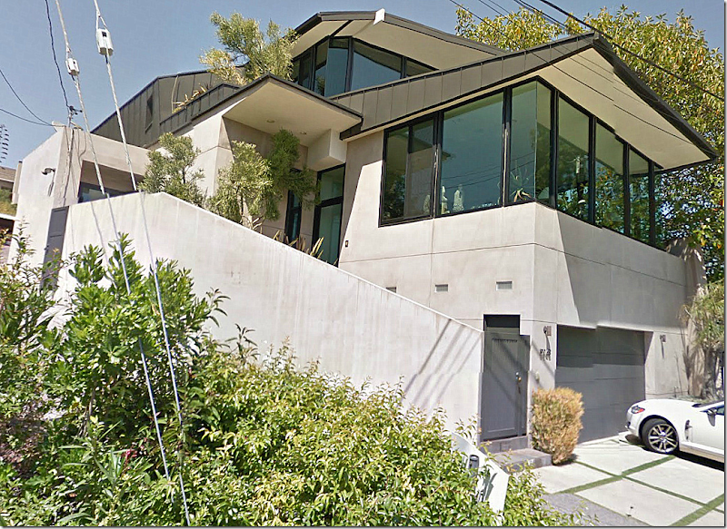
And the Google Maps Satellite view: In the google maps view, you can see part of the side of the house that wraps around the narrow, hilly street. Though listed at close to 3 1/2 million dollars, the façade doesn’t give much away! The house is now 3650 sq. ft with 3 bedrooms and 3.5 bathrooms – Belzberg added almost 1,000 sq. ft during the renovation. The house received a lot of press when it was renovated, including a long article in the L.A. Times, HERE.
The back of the house. The kitchen is on the right – inside an enclosed garden. To the left is the swimming pool which runs along one side of the house.
The original interior designer was the late Milo Baglioni, who designed several other Belzberg houses and he also the producer of Sex and the City, Darren Star’s house HERE. The art-collecting couple were so pleased with Belzberg’s results, they said: "We had wanted a place that was full of light, where friends and our dogs could sit anywhere they chose, and it's turned out so well that we hate going away." Well, not exactly true! They lived in the house for just a few years and then sold it.
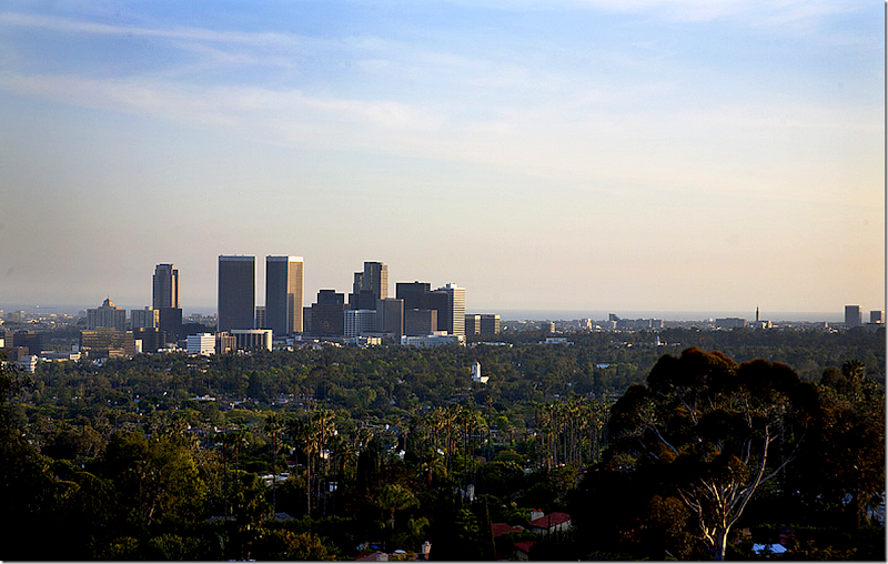
The view – of downtown and the ocean beyond - is pretty incredible and is probably one reason for the high price tag. The house overlooks Sunset Blvd. and is high in the hills.
Ready to go inside?
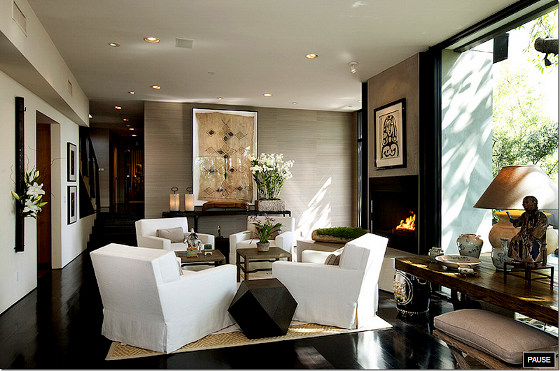
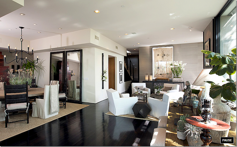
With its 12 ft ceilings, the main floor includes the living room, dining room, and family room, with two guest bedrooms and a study. The house has gorgeous dark hardwoods and white walls that are accented by textured khaki colored grasscloth wallcoverings. The newly decorated space is very sophisticated with a mix of antiques and contemporary pieces. Textiles play an important part in the design, as do Oriental accents. I love how the different spaces are defined by the light colored rugs that anchor the assorted seating areas. Notice how the dining room chairs each have a textile which hangs over its back. Another framed textile hangs in the living area.
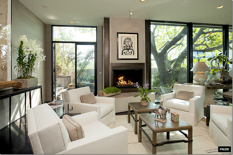
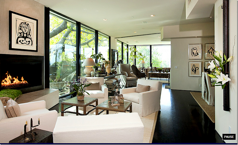
And looking at the other direction. The far wall of windows is at the front of the house, over the garage. To the left of the house is the side yard and pool. Between the family room and the living room sits a long console which houses many antiques. The living room has four identical chairs covered in white and grouped around the fireplace. And notice the vase on the wall to the right! Love that! All the art work is black and white, including the Picasso print over the fireplace.
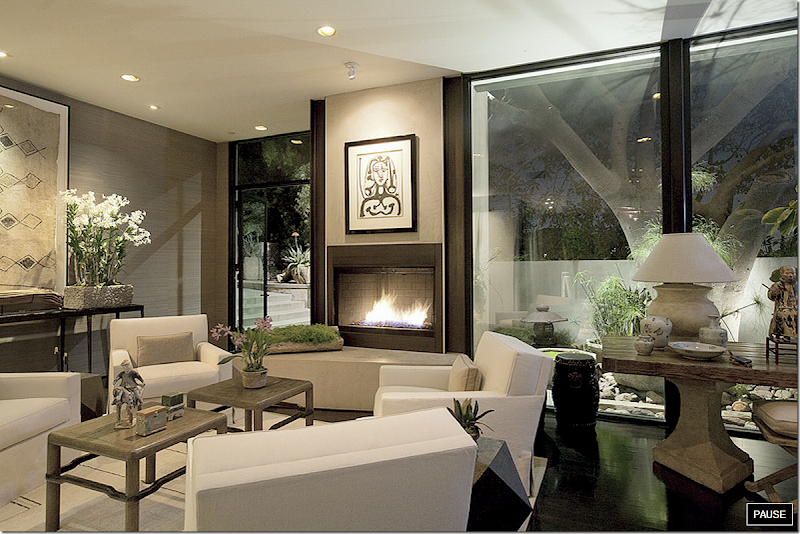
Another view of the living room – which opens onto the side garden. Layered over the seagrass is a flat weave rug with a faint pattern. There are so many textures – notice the concrete flower pot on the console and the moss covered piece of wood on the mantel. It’s all so sophisticated. It’s obvious this is the home of either empty-nesters or a single person. And, it’s a person with excellent taste.
Another view – notice the framed textile on the wall – I love that! And the console table to the right with its assortment of oriental antiques is beautiful. Across from the living area is the kitchen while behind that is the office and guest rooms and the staircase that leads to the master bedroom.
Of course, I was dying to know who designed the house, which just recently sold. Searching on the internet, I discovered the current owners had also put the house up for sale a few years earlier and the décor was different back then. Care to see how they decorated it a few years ago?
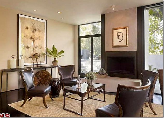
BEFORE: in 2006, some of the same elements remain – the seagrass rug, the metal console table, the wonderful framed textile. But the chairs, art work and coffee table are all different! And there is no grasscloth, instead all the walls are painted a khaki color. While the brown leather chairs are attractive, I don’t think they are weighty enough to fill up this space. The four white covered club chairs are so much better in this room.
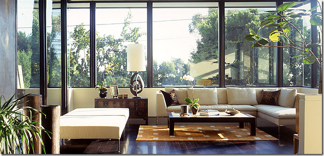
The view at night. I love that console table – with the concrete base and wood top and the lamp is stunning. Notice the gorgeous tree right outside the window. The pool and garden run along this side of the house.
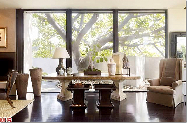
BEFORE: in 2006, the owners used the same console with a different lamp and accessories. And the x-bench is missing from under the table. Notice that beautiful tree that stands in the side yard.
The architect Hagy Belzberg said: "Like the rubber tree at the edge of the plot, the house grows from the earth and reaches for the heavens. The edge of the roof canopy was inspired by the curvature of the leaves, and its bronze tone echoes the trunk."
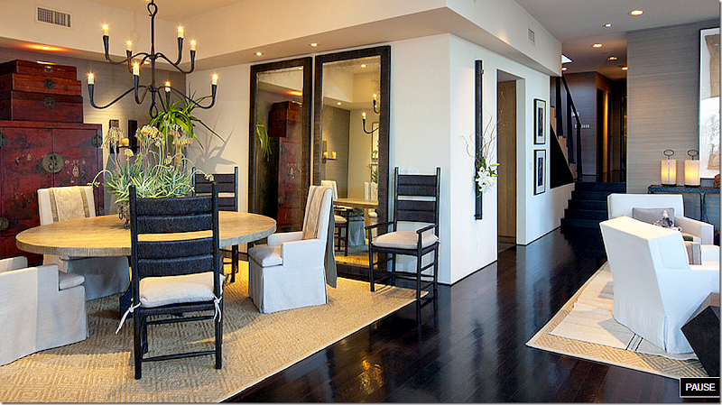
The dining room has a round table with two sets of chairs. Oriental textiles hang over the upholstered chairs. Against one wall is a red Oriental antique armoire with chests atop it. Two floor length mirrors reflect the iron chandelier, which is just perfect over the table.
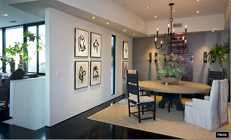 Here you can see the series of framed black and white prints on the walls. And notice the base of the dining room – the iron matches the ladderback chairs. Along the back wall is textured grasscloth which adds a bit of interest against the stark white walls.
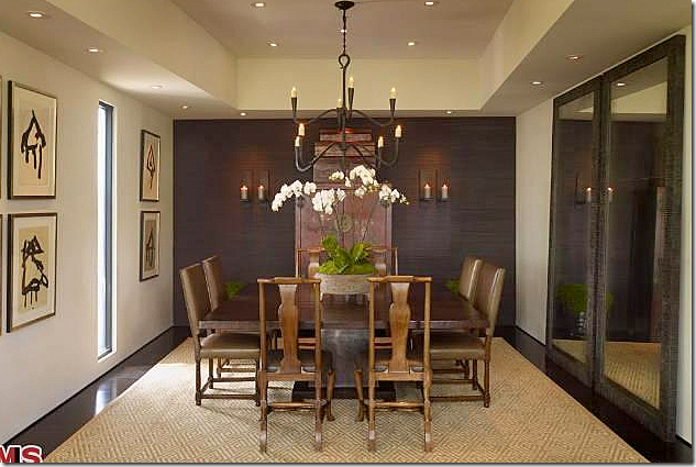
BEFORE: in 2006, the owners decorated it with the same Oriental chests, chandelier, mirrors and art work, but the square table and chairs is not nearly as attractive as the ones used today.
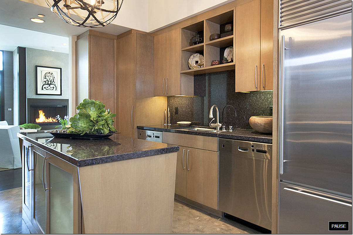
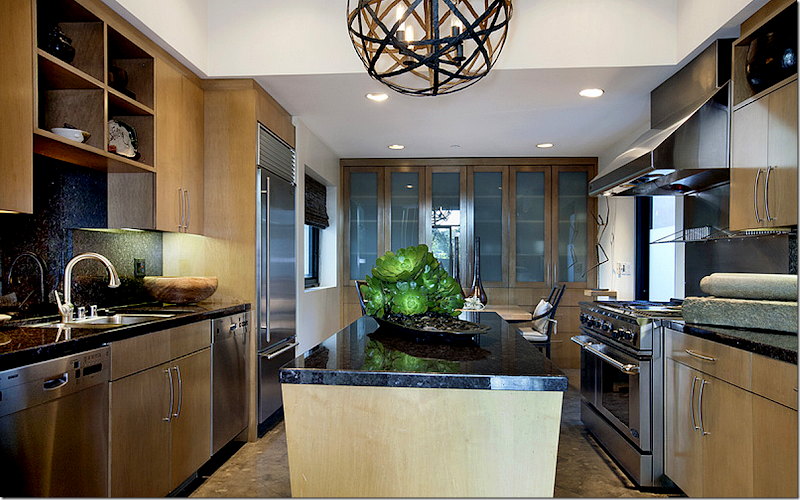
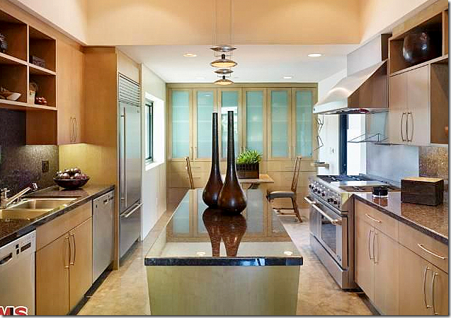
Across from the living room is the kitchen with its brown granite, stainless appliances and taupe colored walls that match the color of the grasscloth.
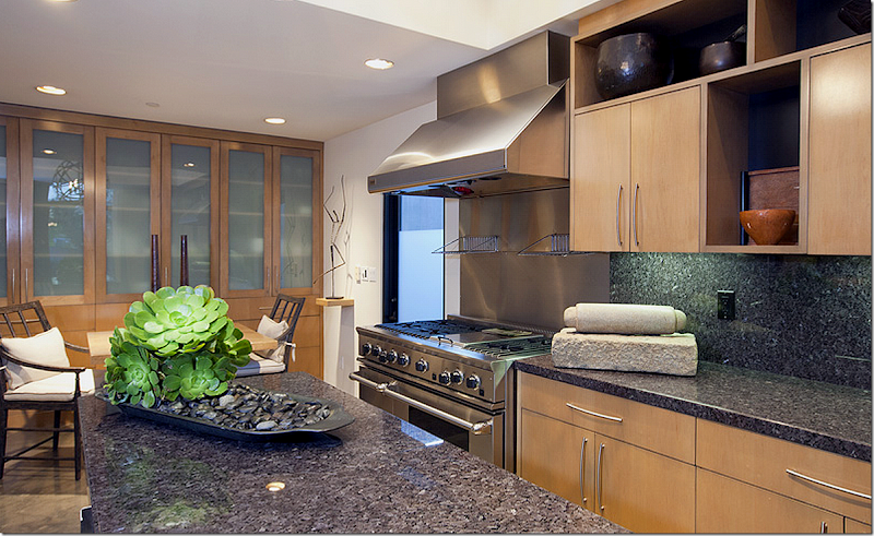
And looking the other direction is a small breakfast area with a built in china cabinet. The kitchen is contemporary- but not stark or cold. More texture- notice the stone rolling pin and the plants in a tray of stones. Off the kitchen is a small enclosed garden.
And here, you can see the light fixture over the island.
BEFORE: back in 2006, there was a different fixture over the island. I like the one there now much better. They also have since added a shade in the kitchen window and gotten a new faucet.
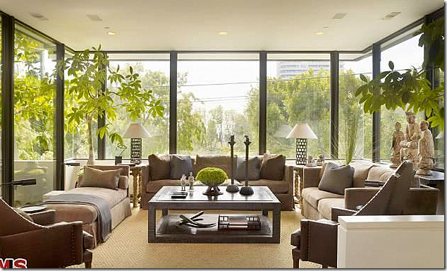
And the family room – over the garage. Again it’s a mix of styles and textures. And again, a thin textile is layered over the diamond patterned seagrass. The room is all glass on three sides – making it seem like a treehouse. Against the window on the right, there is a series of oriental figures sitting on a console. Notice how the lamp bases are see-through, so they don’t block the view. Despite being very contemporary, the room is warm and welcoming due to its furnishings.
BEFORE: Here’s how the family room looked decorated by the current owners in 2006. There is no layered rug, and the coffee table is different and the pillows have changed. Otherwise it looks very similar, but not quite as beautiful.
Below, I found a picture of this room as it was decorated by the first owners – the ones that hired Belzberg to renovate their house in 1998:
BEFORE: In 1998, this is how Milo Baglioni decorated the family room for the original art-collecting couple. He used all very modern furniture, a sectional sofa, and a contemporary rug. That lamp! NO! I like how the current owners decorated this room so much better!!!
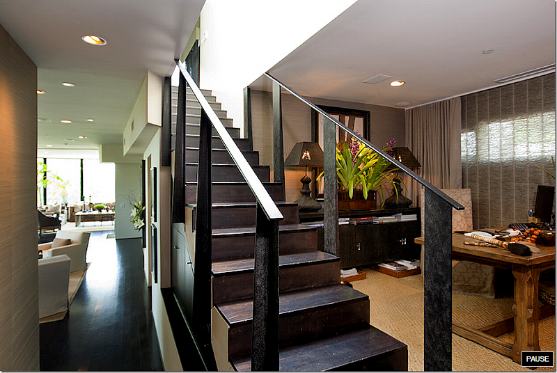
At the back of the house is the office, with the diamond patterned seagrass. grasscloth wallpaper, and beautiful Conrad shades. Two unusual lamps sit on the console. And notice the stairs – the metal reminds me of the same metal as used on the dining room chairs and table.
The powder room is wallpapered on the walls and the ceiling to create a jewel box effect. The large round mirror is the focal point, but notice the vessel sink – a stone trough. And they used another sconce/flower vase.
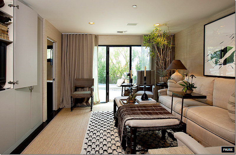
The media room faces the swimming pool. Love the coffee table – it looks like an Indian bed – and love the textiles, the rug, the lamps. I love all the accessories – like the candlesticks. That looks like an antique barley twist chair against the window.
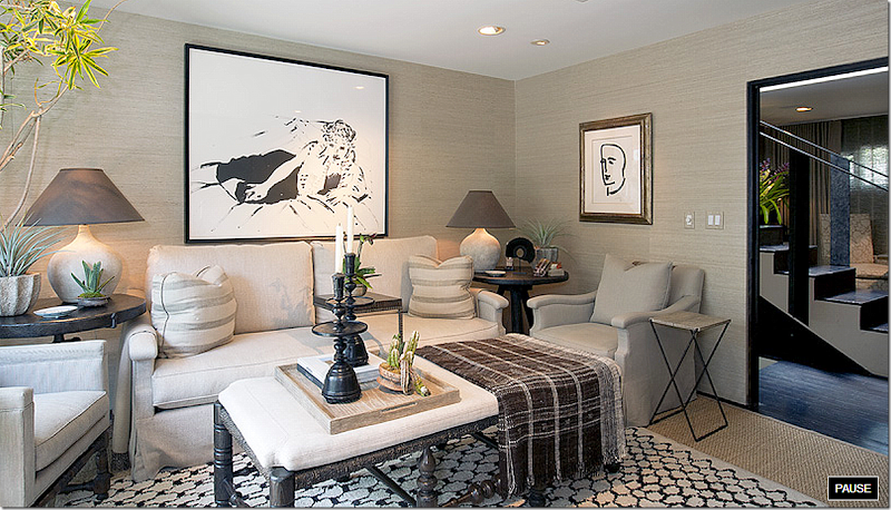
And looking the other way – you can see the stairs and the office outside the door. Love that painting. At first when I saw that – I thought perhaps Renea Abbott from Houston had designed this house because she had that same Hockney print in her house at one time. But no, it wasn’t her. Love those lamps. e
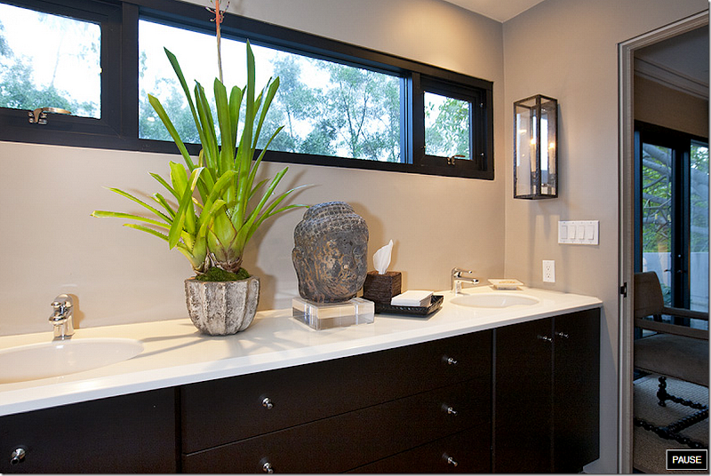
The bathroom off the media room continues the same mix of rough textures and plants. Pretty sconces.
And the shower. Is any inch of the house not decorated? I’m sure when guests are there, they remove the old oriental screen, right?
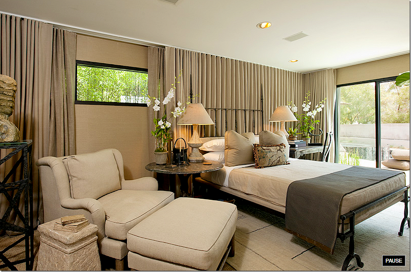
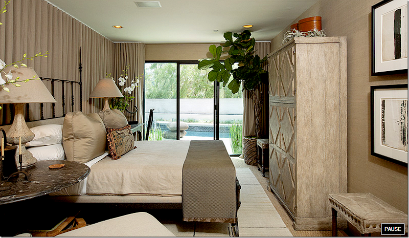
And next to the media room is the guest room – another of the two rooms left intact from the original reconstruction by Belzberg in 1998. Again, flat cotton rugs layered over the seagrass. Notice the bed – I love that frame – especially at the foot of the bed. More textiles – layered on the bed, along with a tapestry pillow. More beautiful lamps. Love the concrete table next to the club chair. And I like how they treated the small, tall windows behind the bed – just curtain the entire wall! The swimming pool is right out the door.
Another view – love the stone topped side table and notice that bench with the giant nailheads.
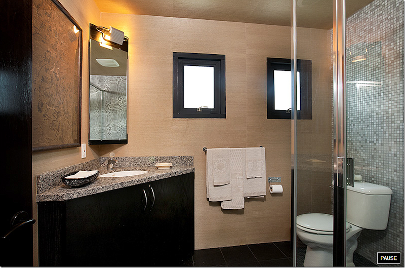
And the bathroom off the guest room, love the print above the vanity. The grasscloth was brought into this room. I love how all the same elements were used throughout the house to make it all flow.
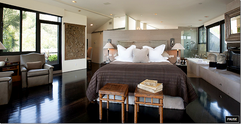
Up the stairs with the iron rails is the addition which Belzberg built in 1998. Outside the door is a small balcony area on the left side of the house. The floor is loft style – with the bedroom, bathroom, and study all occupying the one large room. You can see the study behind the bed on the left. And the bathroom is open to the room on the right. The bed rests along a short wall, wallpapered in the same grasscloth. The floors are the same dark hardwoods found through out the first floor. The bed is simple, again covered in a flat textile. Notice the hanging textile to the left of the bed. Different from the rest of the house, there is no rug!
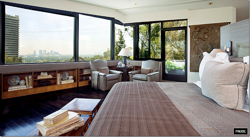
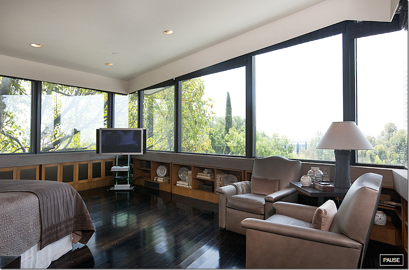
Low shelves and cabinets beneath the windows circle around the room. The owners have used antique vellum covered books and oriental pottery to fill them up. In the corner is a pair of club chairs. More vellum books on top of the two bamboo tables at the end of the bed. And – on the right, the door that opens to the small balcony.
Hiding under the cornice boards are dark brown textured shades that hide the morning sun. Below is a view of how the bedroom looked before it was redecorated:
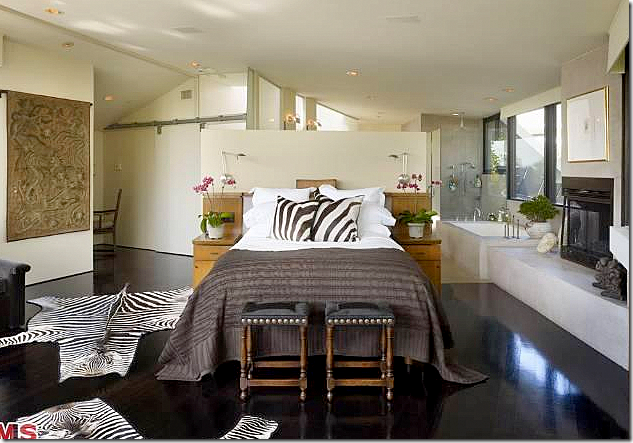
BEFORE: Here’s how the current owners decorated the master bedroom in 2006. The bedding is the same – but they added zebra pillows and two zebra rugs. Just a little over kill. The benches are different at the end of the bed, too, as are the light oak colored night tables – which it looks like were part of the headboard. The wall behind the bed was not covered in the grasscloth and the walls were ivory then, not white. I like the current color scheme, the grasscloth and white walls better. And here- you can see there is a fireplace on the right that warms the bedroom and bathroom behind it. Do you like this room better with the zebra patterns or without?
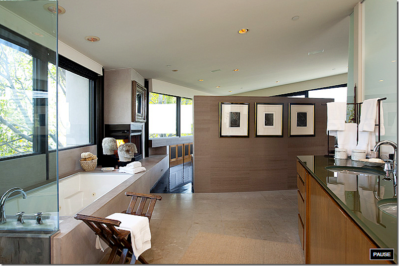
The bathroom is at the back of the bed. The owners put a series of art work on the half wall behind the bed. What a great view from the tub.
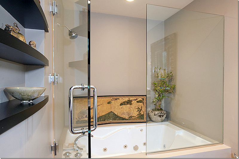
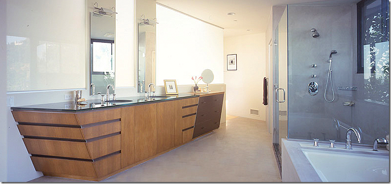
And looking the other way. Notice how the owners accessorized the bathroom with a wooden stool, plants, a rug, and more. They also added a rain forest in the shower. And notice those lighted frosted glass panels behind the sink – these are actually windows that face the side street.
BEFORE: Here is how the bathroom looked in 1998 with the original art-collecting owners. No accessorizing. I like how it looks today much better.
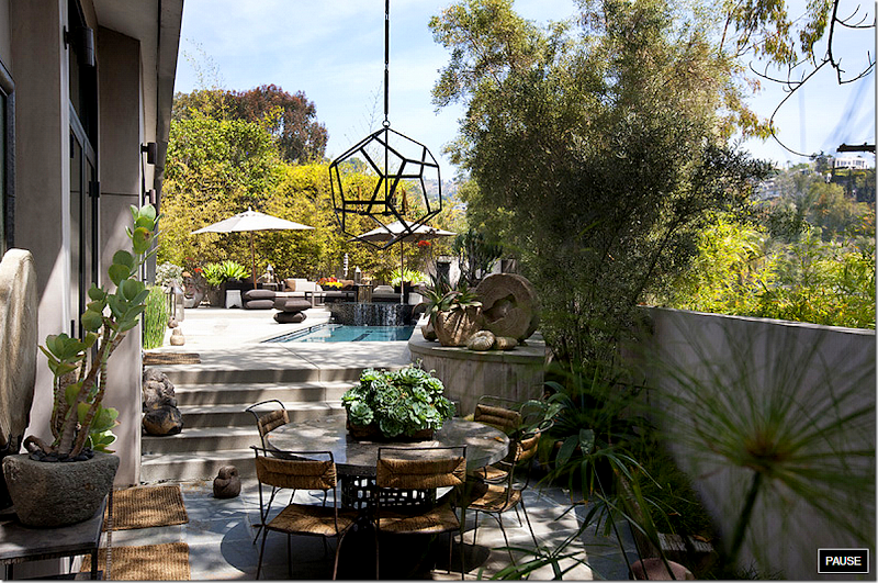
The house wraps around the side yard where the swimming pool is. Outside the living room is this outdoor eating area – decorated like the house with a chandelier and assorted stone items.
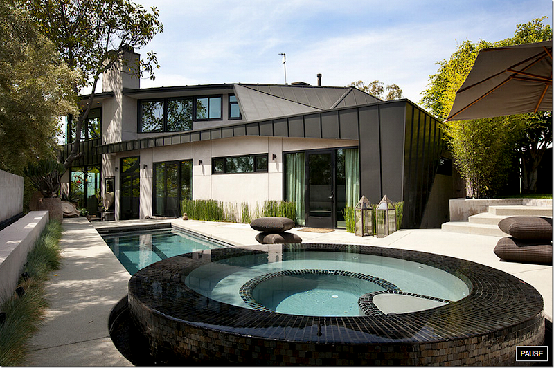
And looking at the other view, back towards the eating area, is the swimming pool and hot tub. The media room and guest room are seen through the doors on the right. Above is the master bedroom and bathroom loft.
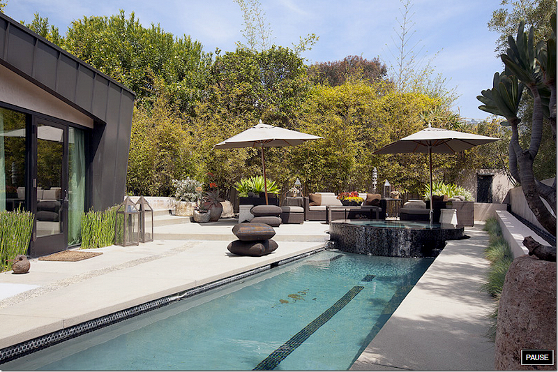
A view of the long pool, with the hot tub at the end. The back yard is screened from the neighbors by tall trees.
A night view of the eating area under the large tree that screens the living room.
The view at night of the wall that surrounds the side yard and swimming pool.
Who designed this house? It really was driving me crazy. It couldn’t be Milo Baglioni who had decorated this house for the original owners – Baglioni had passed away at a very young age. So, who was it? Obviously whomever lived here had great taste, a love of textures and organic furnishings. They love gardens and flowers which are abundant throughout. They have a love Oriental furnishings and accessories- both of which are seen in every room. They love textiles and drape their chairs and beds and sofas with a collection of unusual fabrics. And they are obviously up to date with decorating. Many of items are trendy – the concrete tables, the white linens, the seagrass, the fiddle leaf trees, and all the stone objects. Still, something about the spaces looked familiar, but why??? Why???
If you are designer, have you figured it out yet? Do you recognize the light fixtures? The tables? The lamps? The bed????
Nothing is secret on the internet anymore. See a house for sale on a realtors web site and put the address into google and it will tell you who owns the house now, when they bought it and who they bought it from. Nothing is sacred, nothing is secret. And through a little research everything was answered.
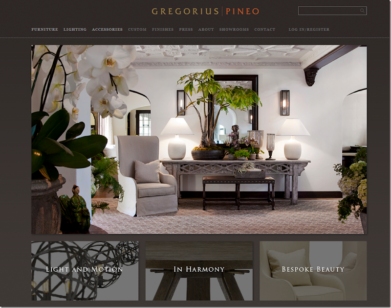
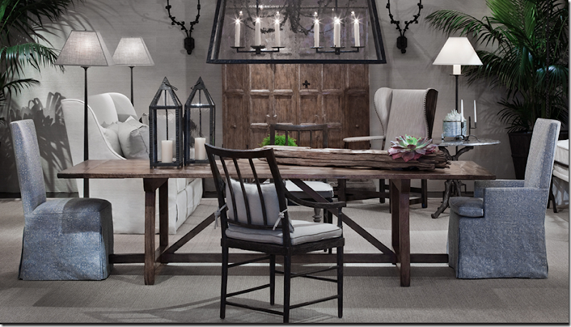
No wonder everything was so beautiful, so well put together, so well designed. No wonder everything flowed together creating a cohesive vision. The owners are principals in Gregorious Pineo, the very high end, to the trade only, furniture, lighting and accessories company. The photographs from their showroom are equally as beautiful as their house!
I had so much fun going through their web site to see which pieces are in their house. You might want to do that too.
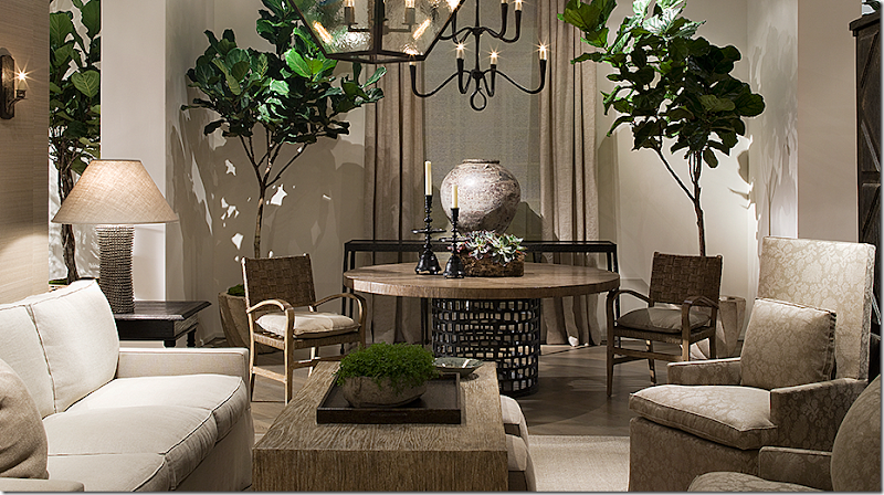
Like the great chandelier in the dining room – seen here in their showroom.
And all those wonderful lamps. And those tables. And that barley twist chair, not an antique after all.
That wonderful bed in the guest room – comes with a canopy or without. Stunning.
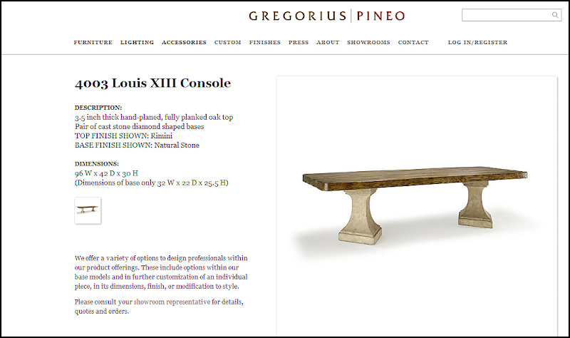
I particularly love the console in the living room – piled high with oriental antiques and their wonderful lamps.
And all their wonderful lamps!!
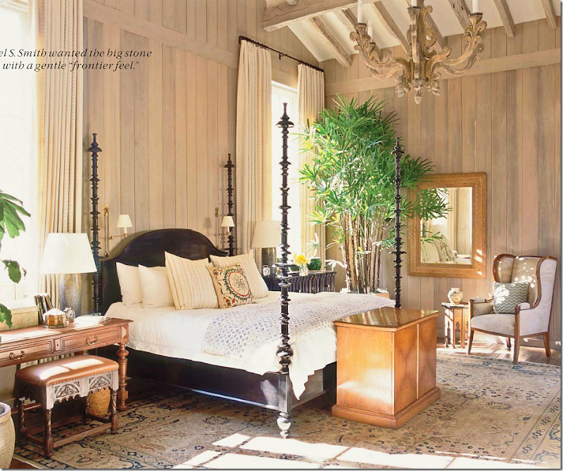
So many of the great designers use their furniture. Designers like John Saladino and Michael Smith – who placed their bed in this house shown last year in Veranda. Notice how the bed is similar to those wonderful candlesticks in the media room. Those candlesticks really reminded me of something – that I couldn’t place – until I saw this bed!!!
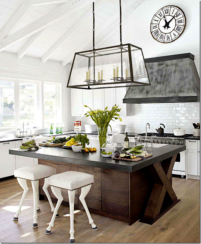
Myra Hoefer used their wonderful light fixture in this kitchen shown last year in House Beautiful.
Remember how I wondered if Renea Abbott was the decorator? Well, she did use their sconces here in that wonderful house she designed that was shown in Veranda a few years ago.
And here – these sconces too!
To visit the Gregorius Pineo web site go HERE.
In Houston, the Gregorius Pineo catalogue is available at:
CULP ASSOCIATES
5120 Woodway Drive
Suite 4018
Houston, TX 77056
Tel: (713) 623-4670
sales@culpassociates.com
AND FINALLY:
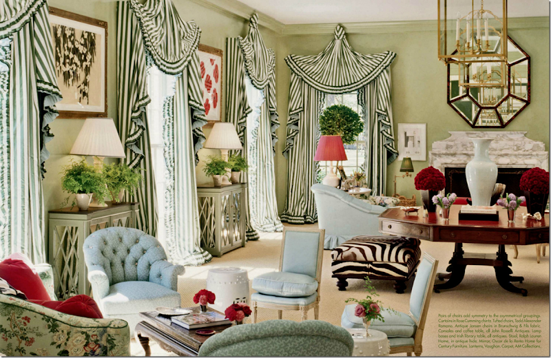
Remember this house featured in Veranda last year? I think this is the only house in Houston that Miles Redd has decorated. I could be wrong, but let’s say it’s the only house in Houston that he’s decorated that’s been published! Only Miles would think to do curtains like this – and mix them with classic furnishings and fabrics including antique Jansen chairs, along with that fabulous antique Irish library table!! Unreal. I think I stared at this photograph for thirty minutes and then decided never to decorate another house. Why bother when Miles is alive?
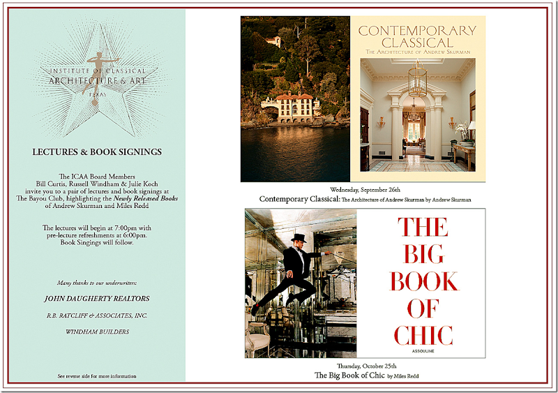
The great himself, Miles Redd. He must be missing that house because he is coming back to Houston…this Thursday, October 25th, at 6:00 pm. Book signing, refreshments and a lecture – all at the Bayou Club. Invitation below:
If you don’t live in Houston or can’t make it to the book signing, you can pre-order his new book: The Big Book of Chic below. Just click on the image!

