It’s been a while since I showed a house from the Aidan Gray contest – so I thought now was the time. This house, located in Houston, made the semi-finals, and I really thought for sure it would make the finals!!! The house has an interesting design history. It was built by a popular real estate agent who is friends with Ruth Gay, owner of Chateau Domingue. Ruth helped the owner with the décor, adding some of her fabulous architectural pieces here and there like antique mantels and doors and aged terracotta floors. The original owner then put the house up for sale. Luckily I was able to find the original real estate photographs – showing the pretty décor, filled with antiques.
The next couple to own the house was not into antiques and furnished the house in chrome and contemporary furniture. Unfortunately, I also have those real estate photographs! Which brings us to the present day. The contemporary loving couple sold it to the current owners who have worked hard to turn the house back to its original French roots – with the help of the uber-talented interior designer Nicole Zarr of Triangle Interiors, Inc. The results are fabulous – the house is beautifully decorated, so warm and inviting in soothing shades of yellows, blues, grays and creams. I hope you like it as much as I do!!
Enjoy!
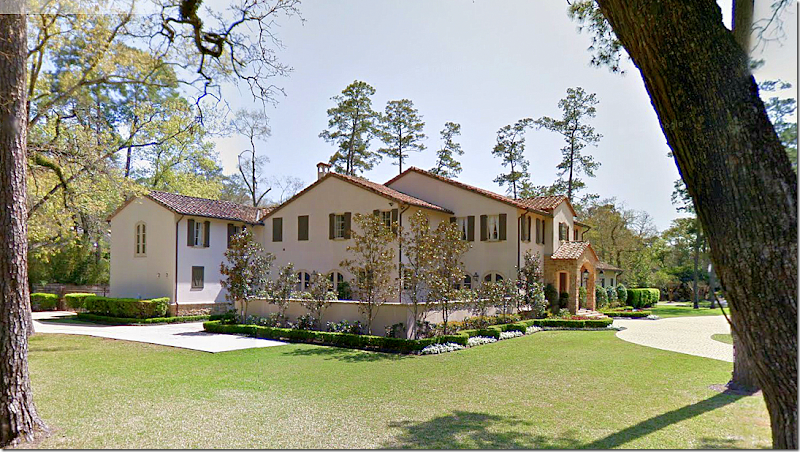
The house is stucco and stone with a tiled roof. The study is to the right of the front door and the dining room is to the left. At the right wing – is the master bedroom. On the very left of the house is the kitchen and, then the garage.
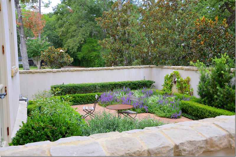
At the side is a walled courtyard that the dining room and breakfast room/kitchen overlook.
The courtyard with lavender and box.
The back yard shows a large covered patio with a fireplace and kitchen. The family room and living room have French doors that open onto the patio. To the very left is the master bedroom wing. Upstairs are the numerous bedrooms, a game room, an exercise room and a media room.
For each room – I will show the real estate pictures from the two previous owners to compare to today’s décor.
The Entry:
There is no picture of the entry from the original owners, but here from the second owners – with the contemporary aesthetic –is the view looking towards the front door. The contemporary couple kept the original antique lantern.
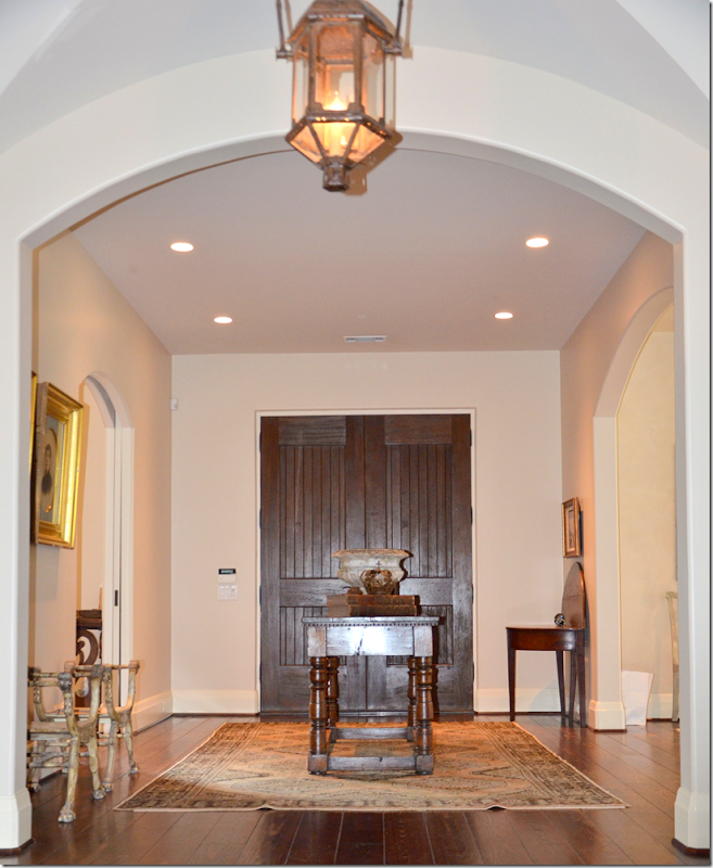
Here is the same view today – the current owner placed an antique table in the middle of the entry, on top of a rug. To the left is the library and to the right is the dining room.
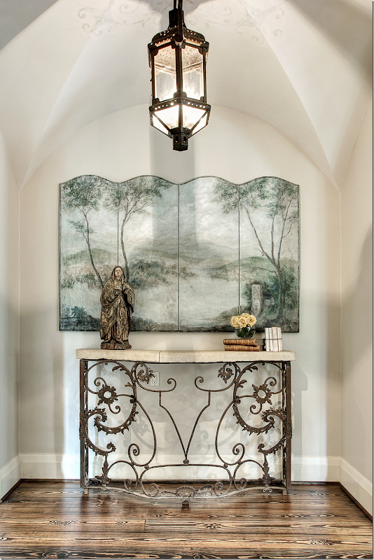
Past the front entry hall is a small vestibule with a groin ceiling. Leslie of Segreto Finishes painted a subtle pattern around the original antique lantern. Beautifully styled by Nicole Zarr, a screen sits atop a console – with antique books and a santos. Sooooo pretty!!
The Study:
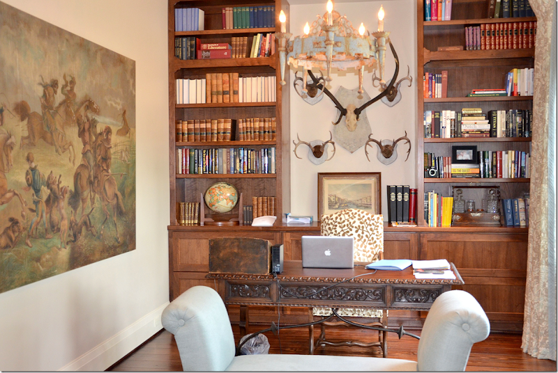
Inside the office at the front of the entry hall, is an antique desk with a wonderful painting. A beautiful painted iron chandelier hangs over a bench.
The Dining Room:
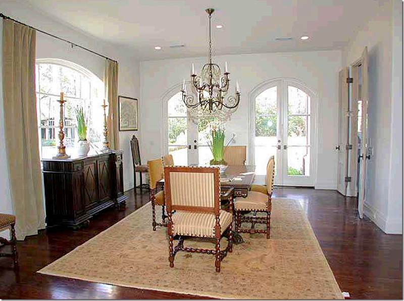
Across the entry hall from the study – is the dining room. Here we can see the original owners décor – this owner built the house and decorated it with the help of Ruth Gay from Chateau Dominque. The French doors open onto the side courtyard. The double doors lead to the kitchen. I love the décor – with the antique table and chairs and an iron and crystal chandelier. Sorry the real estate pictures are such poor quality!
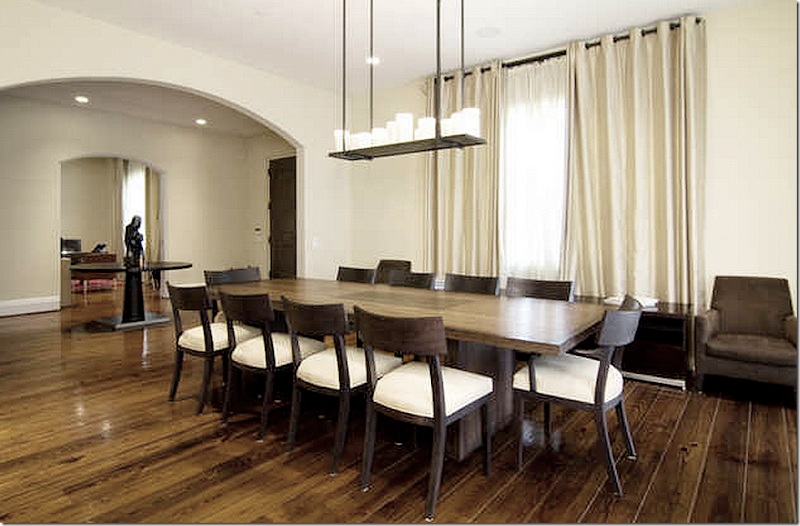
The second owners dining room – hard to believe it’s even the same house! The curtains cover up the pretty front window. The crystal chandelier was replaced with a faux candelabra. What can you say?
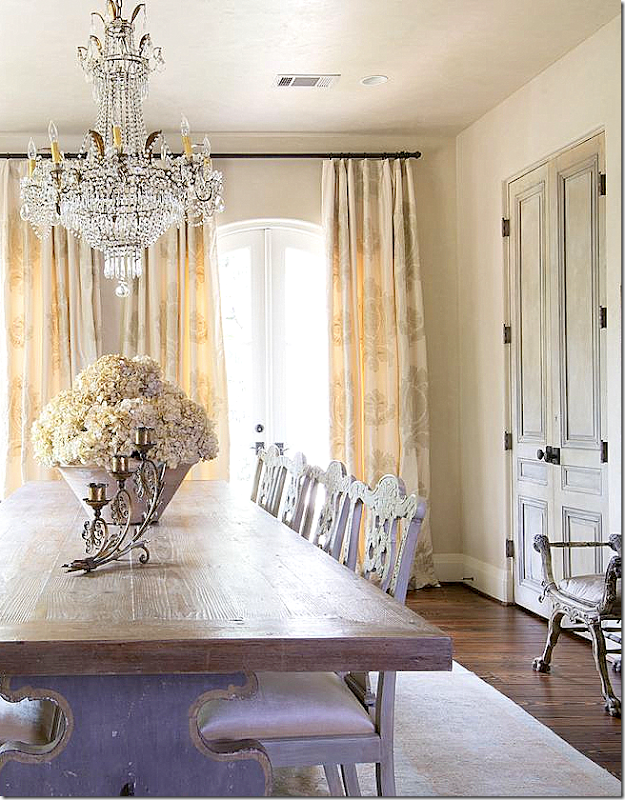
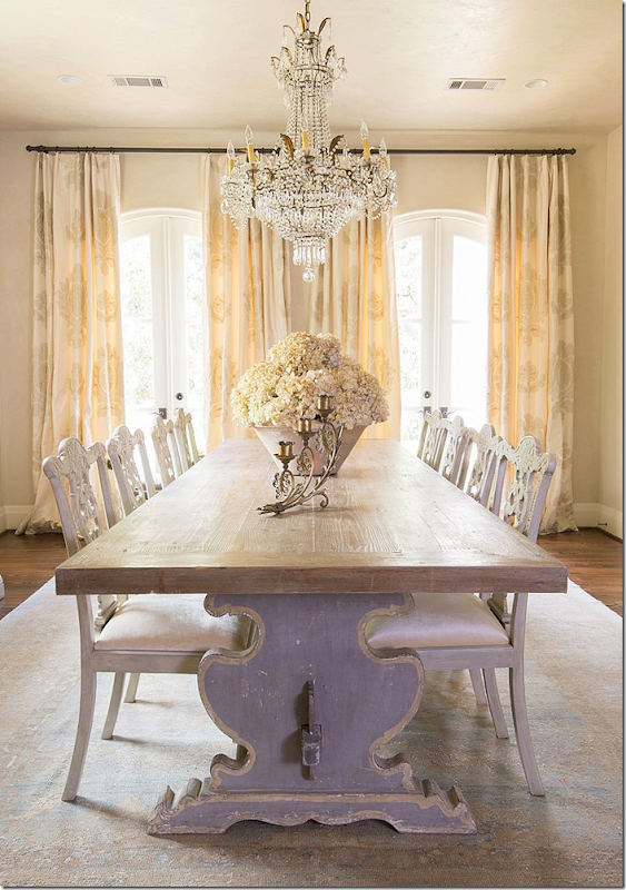
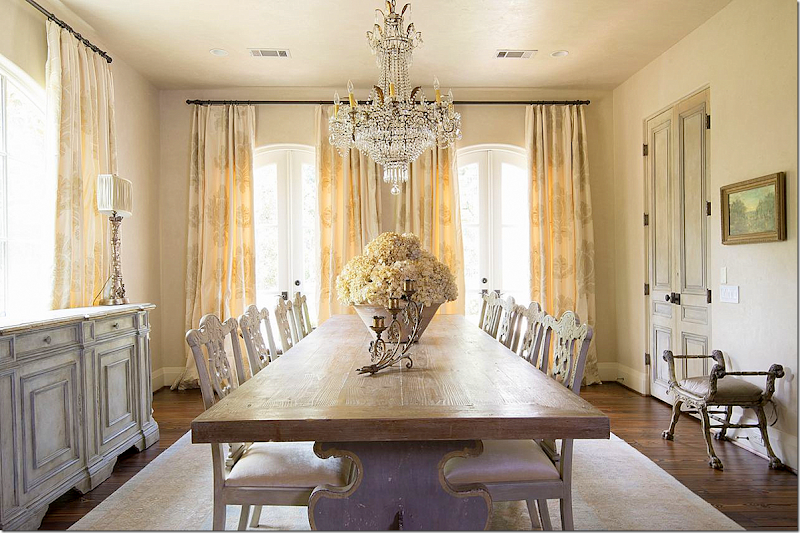
And the dining room today – decorated by Nicole Zarr. Stunning! I love this room so much. First, the charming dining room table with its carved wood base and painted chairs is fabulous. Second, the chandelier is a show stopper. It’s just gorgeous! To the left is a painted console that fits right under the window.
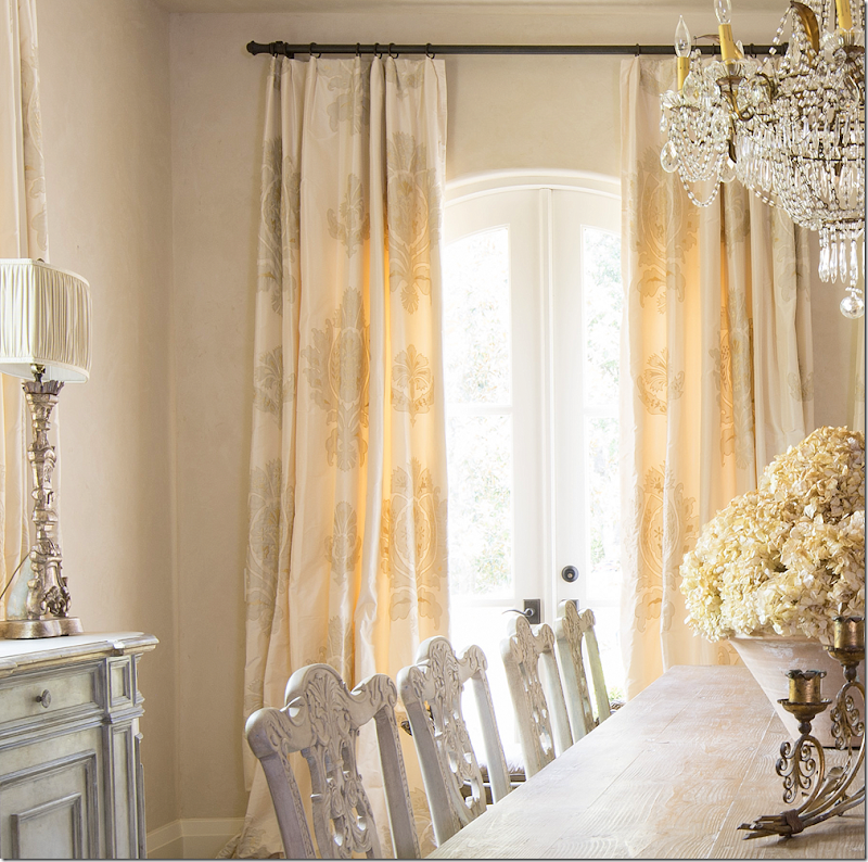
A close up of the chandelier – love its macaroni beading. Notice the beautiful antique pair of doors that lead to the kitchen. Again, adding doors like this to a house makes such a difference! You don’t have to have antique French doors – try going to architectural salvage houses where you can find old doors that have plenty of patina, for much less.
Here you can see the table base, painted. So charming!!! Also notice the curtains. I love the way Nicole designs her curtains. Most have a subtle pattern that makes them all the more interesting. And I love the pot of hydrangeas. Also notice the muted rug – in light blues and yellows.
Here you can see the pattern in the curtains – so pretty!
The Living Room:
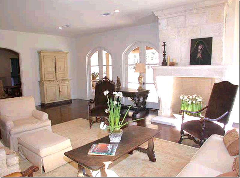
The original owners decorated the living room with Spanish styled tables and French chairs, using taupes and brown velvets. Ruth Gay placed the 18th century stone mantel, found in France. In the back, a cream painted armoire. Lovely!!
The second owners furnished the room in boring contemporary sofas and chairs. At least they kept the fireplace!!! The curtains couldn’t be any more uninspired.
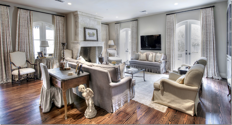
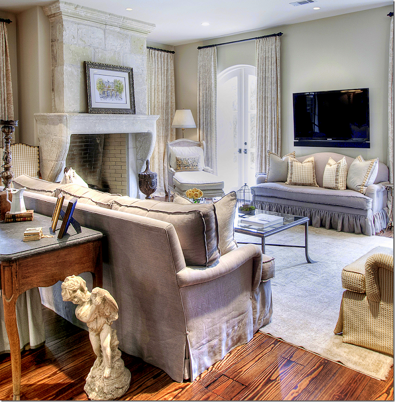
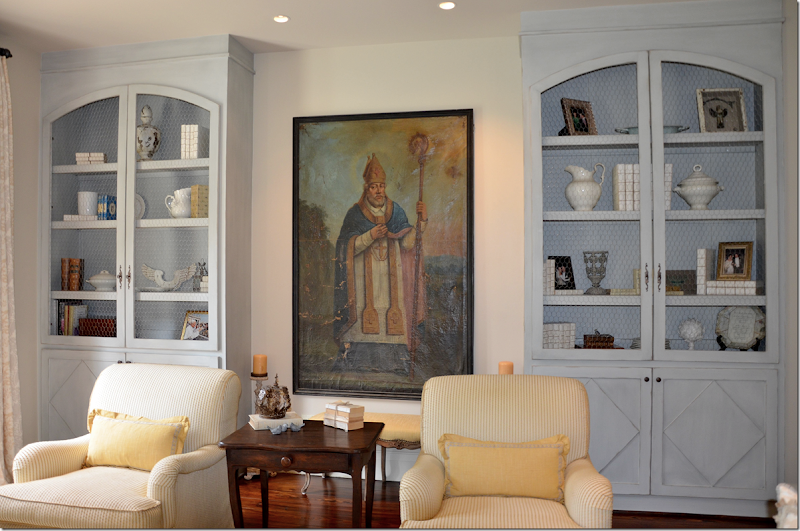
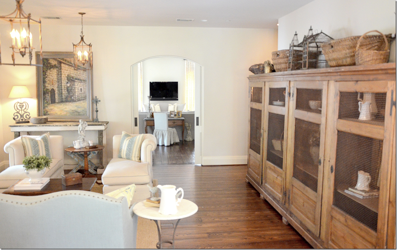
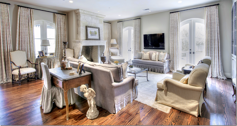
And here is how it looks today – decorated by Nicole Zarr. She used linen to cover the sofas. A small check is on the two chairs. She used an area rug, again, very muted. The curtains have a subtle toild pattern. Along the back wall are two built in cabinets.
A close up of the seating groups around the fireplace.
I love the curtains – with trim on the leading edge. The mantel is gorgeous too. Incredible. The antique mantels are just so much better looking than the repros, but unfortunately, they are way too expensive for most of us!!! The owners were so lucky the house came with all these architectural elements. Pretty chaise in the corner.
Along the back wall – two cabinets were added – they have a Swedish feel with their carved doors and chicken wire.
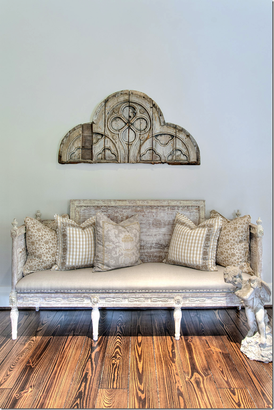
And along the side wall the leads to the family room is a Swedish sofa with a mix of pillows.
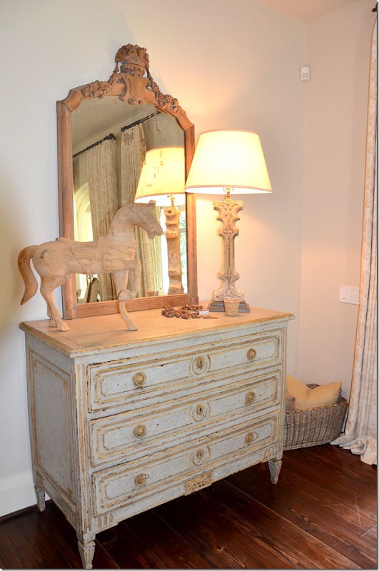
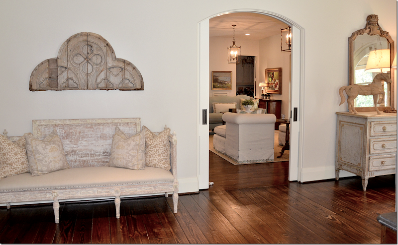
And on the other side of the doorway is this antique chest and mirror
Through the double doors is the family room.
The Family Room:
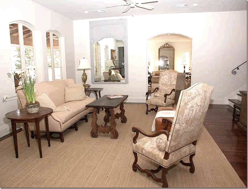
The original owners decorated the family room with French styled chairs and sofa. Love the two tall chairs with toile fabric. The stairs led to the upstairs bedrooms. Through the windows is the covered porch with its outside fireplace and kitchen. Through the doorway is the living room. Love the way they decorated this room.
The next owners furnished the family room with more contemporary furniture. Again, it’s hard to believe it’s the same room. I wonder why they even bought this French styled house? It just doesn’t go with their aesthetic at all!
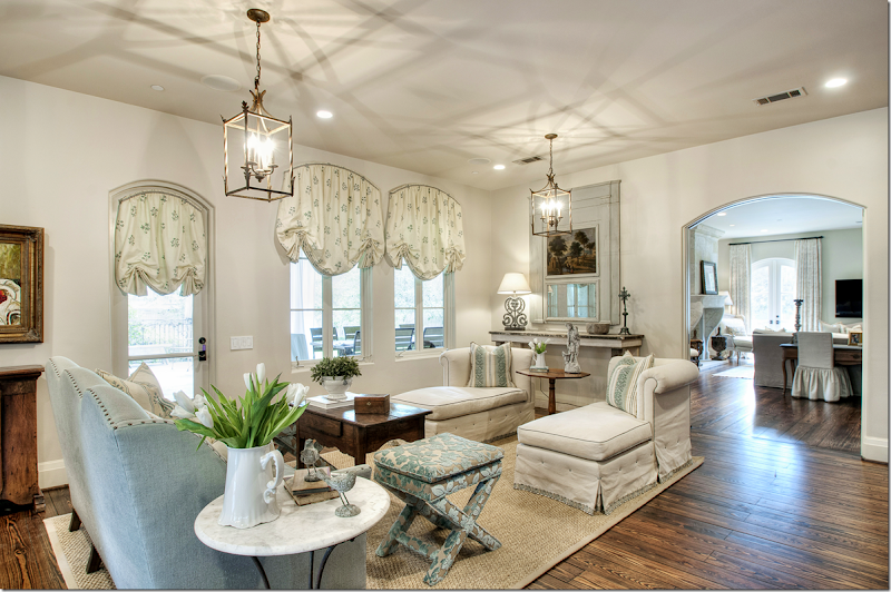
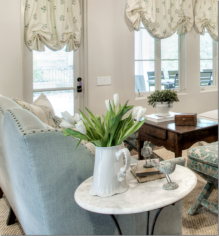
And today! The room was decorated by Nicole using creams and light blues. I love the window treatments. There are chaises instead of chairs which are great for watching TV. Love the highback sofa in light blue velvet. And I love the tall table used for a coffee table. So fresh and pretty! Through the arched opening is the living room.
A close up of the trumeau – so pretty. Notice the trim on the chaise. Love the decorating!
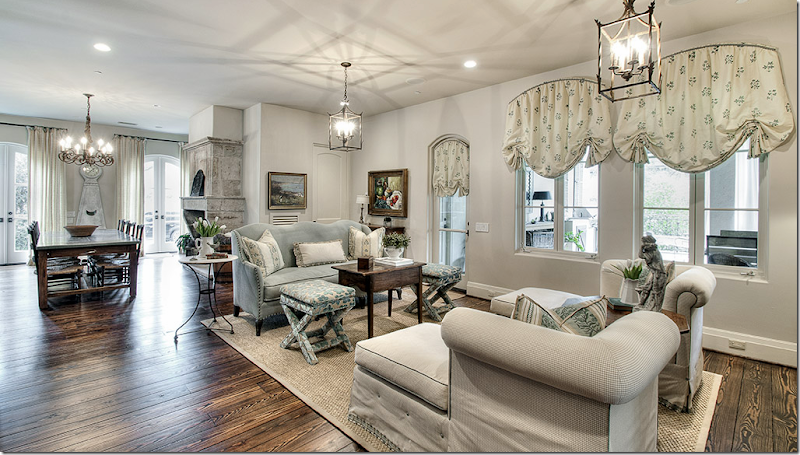
And looking the other direction. The breakfast room and kitchen connect to the family room. The covered terrace is outside the windows of the family room.
Close up of the fabrics used.
Across from the family room- is a large French bookshelf. You can really tell the difference between the pictures that the homeowner submitted herself and the ones her decorator had professional taken! These were also taken much earlier – you can see the trumeau is a new piece – there was once a painting there.
Pretty light blue velvet with nailheads.
The Kitchen and Breakfast Room:
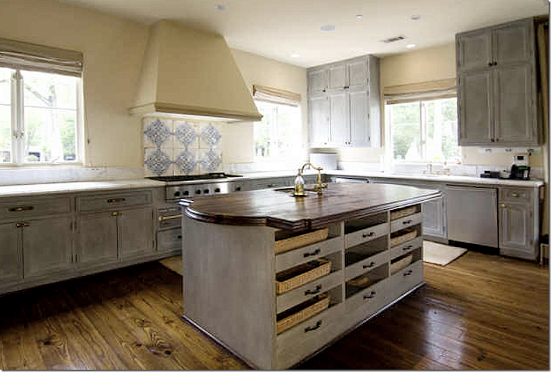
The kitchen has remained almost the same through the three owners. Tiles on the backsplash and pretty painted cabinets.
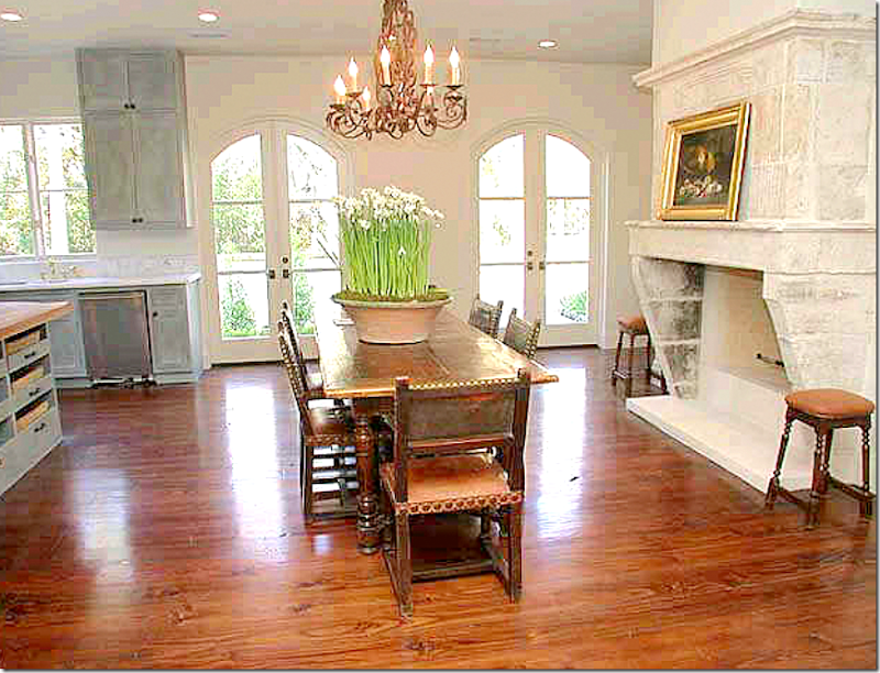
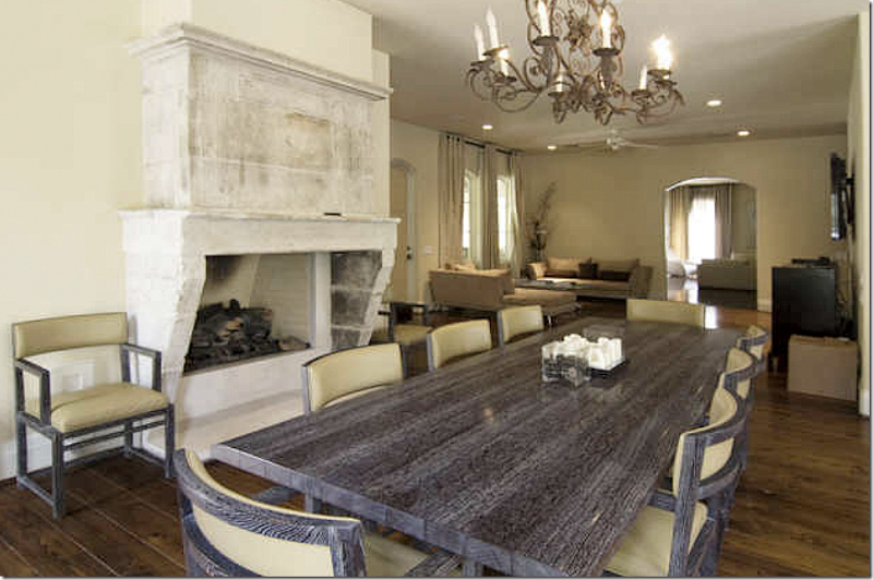
The first owner – with another stunning antique Chateau Dominque fireplace. This light fixture also stayed through all three owners. Through these French doors is the side courtyard.
The second owners added plain khaki shades.
And they added another contemporary table and chairs - just so boring.
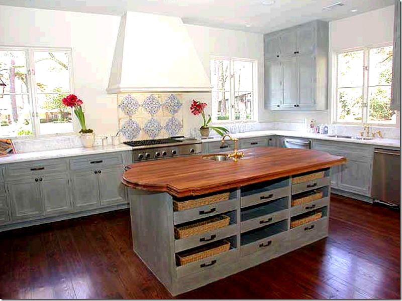
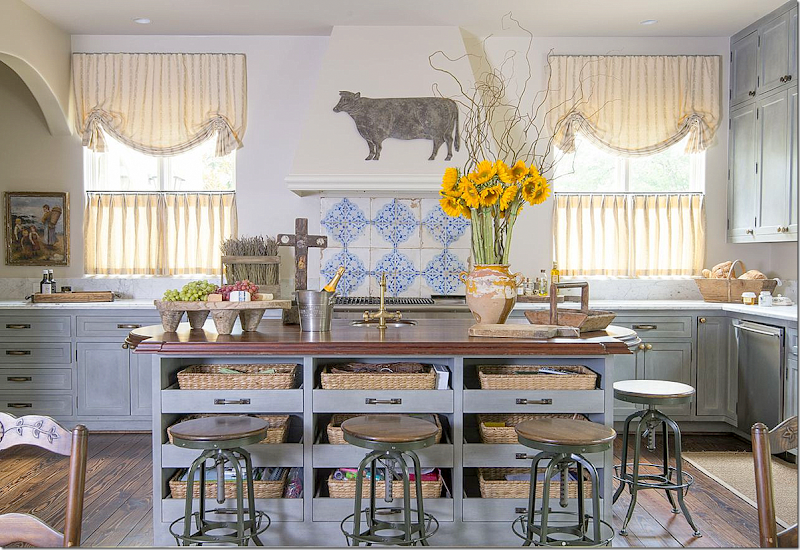
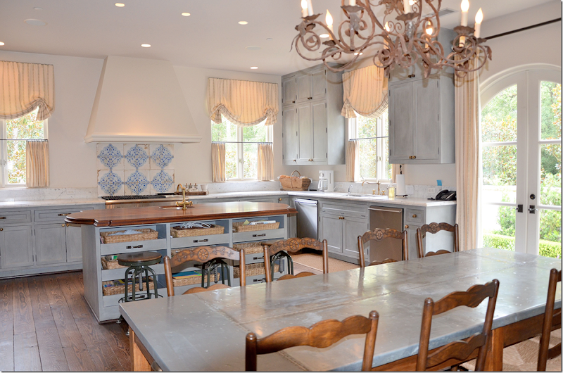
And today – industrial stools were added for around the island. Cute window treatments in yellow stripes were added along with French styled accessories. I love the painted cabinets and tiled backsplash mixed with the white marble.
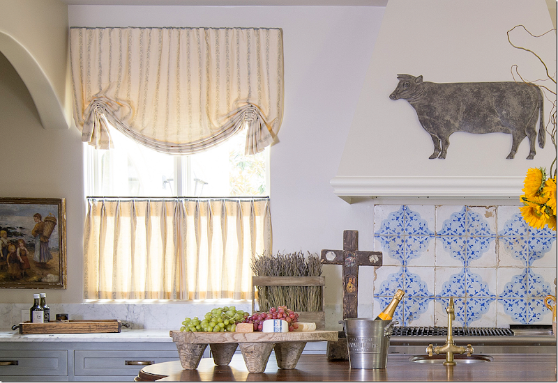
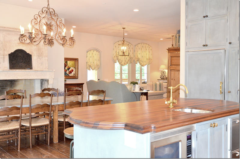
In this closeup you can see the marble countertops and the walnut on the island. I love the antique tile backsplash. Using tiles like this is a great way to add patina in your house without a huge expense – unlike an antique mantel. Love the way Nicole did these curtains!
And a shot of the breakfast area, overlooking the kitchen.
Looking back from the kitchen to the family room.
Another view of the breakfast room with the beautiful antique mantel.
The Master Bedroom:
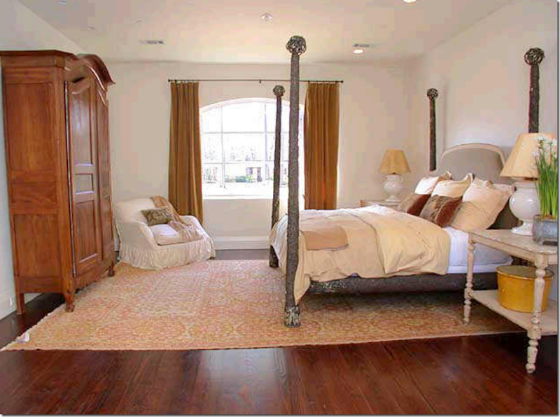
The original owners used a four poster bed and a French armoire.
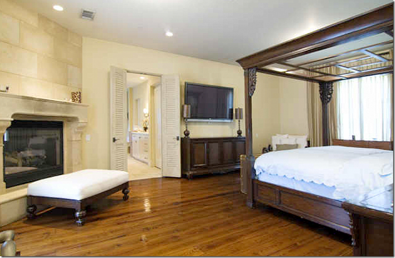
The second owners – here you can see that there is another fireplace in the bedroom.
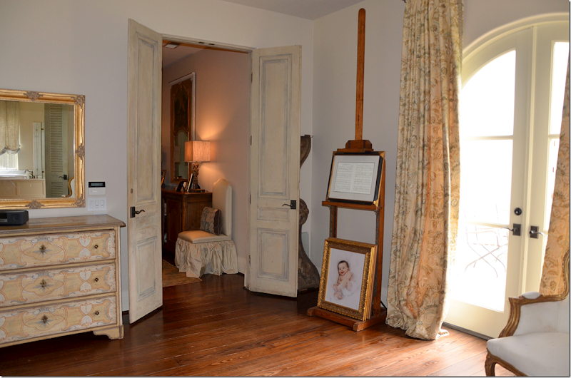
And today, the present owners have hung subtle patterned curtains in yellow. Notice the pair of antique doors that lead into the master bedroom.
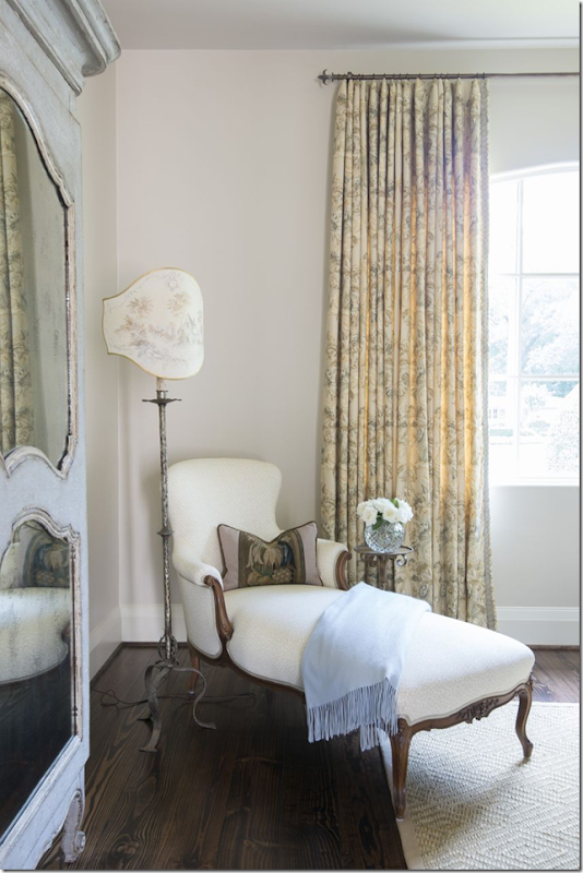
And, across from the bed, there is a blue painted armoire and French chaise. Love the lamp!!! Such a pretty a vignette. I wish there was a picture of the bed!
Here you can see the pattern in the curtains and the subtle pattern in the chaise fabric. Notice the trim on the leading edge of the curtains.

This really interested me – the original owners and their beautiful master bath. Love the marble shower and I especially love the antique terracotta floor from Chateau Dominque. Gorgeous!
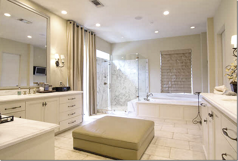
The second owners – with the contemporary aesthetic – TOOK OUT THE TILED FLOOR!!!!!! Wow! That’s sad! And of course they hung up more boring curtains and I have no clue what that leather ottoman is doing in the bathroom!
At least the owners chose an antique stone tile to replace the terra cotta. It’s still very pretty – I just wish they would have left the terracotta down!
In the pool bath – the original terra cotta floors remained. Nicole Zarr put up a new wallpaper and added an antique mirror.
I love this house – the layout and the décor – and I thought it was so interesting to see how three owners decorated it – from French to Contemporary and back to French décor. It amazes me that the second couple even bought the house – with its 18th century mantels and antique terra cotta floors, the old iron chandeliers and sconces – and then they added a houseful of contemporary furniture! Why not buy a modern house instead?
I talked to the present owner – and she said she was glad that the house was furnished with the contemporary furniture when they looked at it – because it kept a lot of potential buyers away!!
I especially love the way Nicole Zarr decorated it – with a continuity of colors – creams and blues and pale yellows. I love her use of patterned curtains and antique rugs in soothing colors. And I love how she uses trims to highlight edges on furniture and fabric.
I especially love the dining room – with its painted furniture and gorgeous chandelier! What a beauty it is and what a beautiful room!!
I asked the designer Nicole if I could show a few more examples of her work – and she graciously sent some pictures. Here are few of my favorites:
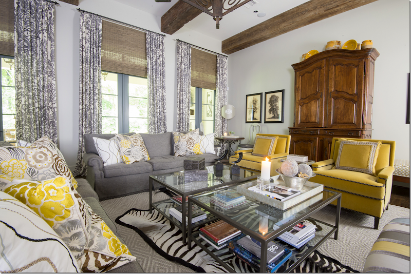
This family room is chic in bright yellows and grays. The patterns are much more bold here than in the previous house, and the effect is more trendy. I love how she mixed in antiques with the contemporary pieces.
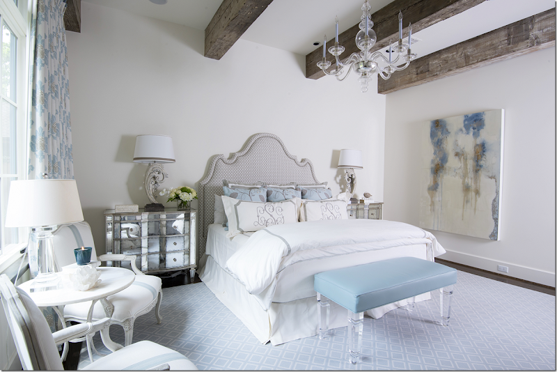
This bedroom is all soft blues and whites. Again it’s a mixed of the more traditional with new looks such as lucite and mirrors.
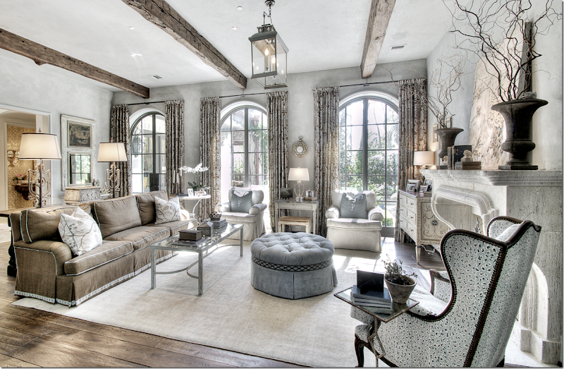
In this house, Nicole mixed browns and blues and creams. Love the curtains – and love the colors. Notice the trim on the brown sofa and ottoman. I also really like the furniture arrangement with the two chairs against the windows.
Here’s a closeup – Nicole used such pretty painted pieces in this room. The side table and the chest are just beautiful.
Leslie of Segreto Finishes painted this room and added the detailing at the ceiling and the two pictures flanking the French doors. On the stone floor, Nicole added a very subtle rug. So pretty!
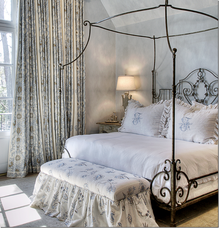
For the master suite – I like how she took a large room and filled it up so it becomes cozy instead of cavernous. The canopy bed is a great idea to lower the ceiling to human proportions.
A close up of the beautiful fabrics she used. What a pretty bed!
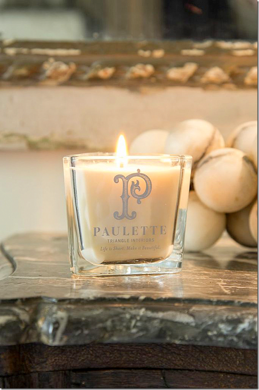
Nicole Zarr took over her mother’s interior design firm, Triangle Interiors, Inc. after she got sick and passed away. Today Nicole helps raise money for cancer research and has created a candle in her mother’s, Paulette Domercq, memory – with the saying “Life is Short. Make it Beautiful.” So true!
A huge thank you to Nicole for the beautiful pictures.
To contact the designer:
Nicole D. Zarr – email her at:
Nicole@triangleinteriors.com or phone: 713-973-6040















STUNNING!!!!!!
ReplyDeleteThanx for another wonderful post! The caption on the courtyard photo makes note the plant material is lavender. Houston's climate does not favor lavender and the beautiful bedding plant is probably the easy to find, easy to grow Angelonia. Hope this helps.
ReplyDeleteIt maight not be lavender because you are right - it doesn't grow well here, but it LOOKS like it!!!
DeleteDid I see Restoration Hardware stools around the kitchen island and a Restoration Hardware crystal table lamp in another pic? RH has beautiful decor and used in the right places and in moderation is very pretty.
ReplyDeleteExactly - that is entire point! Mix it up - add a lamp or two from Aidan Gray or RH- or a chair or a chaise. Just don't do the entire house in it!!
DeleteOh, how you have spoiled us Joni. Don't get me wrong, this home is BEAUTIFUL! Just thinking what it would have looked like if Pam, Jane, or Tara had decorated it. Please don't stop bringing us eye candy.
ReplyDeleteWow -- you REALLY don't like contemporary. Maybe not your cup of tea, but I thought for the most part, it was tastefully done.
ReplyDeleteI agree. It reminded me of some homes in the Southwest (I'm from Arizona), where you see a mix of Old World architecture and contemporary furniture. Very clean and relaxing, and when done right can be beautiful and interesting. However, I would say that the contemporary couple could have really nailed the juxtaposition with some more color--art, pillows, some pottery, etc. I agree with Joni that the blinds were rather bland, though at the same time I would argue that the minimal style really highlighted the architecture of the house.
DeleteTerrific post Joni - and Nicole's work is beautiful. Loved it all except that horrid TV dominating that sweet little sofa in the living room. And who would want to sit on that sofa under that gigantic black box? If they just had to have a TV in that room, why would they not put a smaller TV in one of those cabinets? Or place that monstrosity in between the cabinets and move the art somewhere else? Or loose the sofa and put a console beneath it? Or best of all, eliminate it all together and find a place for it in the family room? For me, it totally ruined Nicole's beautiful design for that room but least it wasn't over that incredible fireplace!
ReplyDeleteThanks so much for such a lovely way to start a Wednesday!
best,
linda
I have to agree, I was shocked to see that anyone would destroy such a beautiful room by using a TV and most particularly hung over a sofa. Unless you have no other room in which to place a TV, I cannot imagine ever having a TV in a formal living room. I am curious if the designer lost an argument on that point with the owners.
DeleteJoni, you continuously demeaned the curtains of the second owners. Yes, they were a solid color, but perhaps they were an interesting woven material that gave texture to the room. You don't see patterned curtains with contemporary furnishings often, if ever. If used, they are often stripes. I do agree that it was entirely the wrong house for the style furnishings, but a buyer should have the ability to look beyond someone's furnishings and have their own vision. I would have bought this house for the courtyard - such a lovely spot.
I agree with Anon 8;52, the tv on the wall is terrible design!~ The house is a little busy, too much furniture! I prefer the uncluttered look of the original owners. All that furniture takes away from the beautiful fireplaces, etc. Overall, however, the bones of the house are pretty and the garden is beautiful. Thanks Joni for showing 3 variations for the same house.
DeleteWAIT!!!!!!!!!!!!!!!!!!!!!!!!!!!!!!!! Before everyone goes off on the TV- there is a piece on order to cover the TV, it just isn't in yet!!!!!!! ok? I just don't want this to become a huge deal. The TV WILL be covered!!!!! ok? Remember, real people live here. And I can imagine that a husband might want to sit down and watch tv away from the kitchen or family room. And I love that the family uses the living room instead of not using it. Just relax people - the TV will be completely disguised. Maybe when the piece comes in Nicole will send us a picture to show us!!! And please, remember, let's be respectful. Don't leave a comment saying anything you wouldn't say to the owner's face if touring the house in real life. That is ALL I have EVER asked of everyone!!! OK? Carry on. ;)
DeleteALSO - I forgot to add!!!! The TV will be moved to the side wall between the two built ins where it will be even more disguised!!! So please - no more mention of the TV!!!! ;) It will all be taken care of as soon as the wiring is finished and the piece on order comes in.
DeleteThis probably should have been a part of your narrative if you don't want people to notice or mention it. I sort of resent the attitude that you show pictures and then order your readers not to mention the fact that something is tacky on the assumption that at some point in the future it will be "taken care of" = give us a break, really??? Do you really want to control all the message on this blog and if so, you don't need readers.
DeleteYou are kidding, right? You have dissed the second owner's decor, curtains and everything they did in the house, but now you have decided that the third owner needs some special dispensation from you and your readers. If you believe your readers are so damn ignorant that they should look at the pictures you post and over look the obvious, you are insulting them. If you don't want comments on an ugly TV screen in a formal living room, then don't post the picture. You will then not have to contend with the obvious response. Grow up, Joni!!!
Delete"Don't say anything you wouldn't say to an owners face . . . ."
DeleteJoni, would you make the comments you made about the contemporary decor to that owner's face? Truth is such a bitch!
If you weren't so predictable!!! I warned the homeowner and designer today that there were several men who comment on this blog who can be vicious and rude and really mean (and funny too! sometimes!) I told them that after work - when they get home - the comments will come. And like I said - how predictable. I should have commented that tv was going to be covered and moved, but I didn't. I didn't think it would be such a huge issue. myself - I thought - how nice they really live in their house and not treat it as a showhouse. But that's me. Once the comments started - I added what I was told abt. it. The original pictures were sent in almost a year ago and many things have changed in the house - as its still a work in progress. LIke the bedroom - it's not complete yet. Nor is the living room - with the TV situation. I don't think they need "special dispensation" - if I did - I would just erase the comments. And obviously the decorator and owner agree with you because they are in the process of fixing the TV situation. I don't need to "grow UP" - I already apologized about being too harsh about the second owners, but something tells me that if I had said how great that decor was - you would have called me out on that too. I'm not perfect and never claimed to be. BUT the truth is - the Tv has been discussed already - and the solution was explained - and you just can't let it go but need to lecture the designer on something she is already rectifying. Do you honestly think she placed that tV there on purpose instead of a beautiful mirror or painting. YOu must be kidding. Give it up already - you are really so predictable.
DeleteGorgeous house! However, I have to disagree with you on the master bath flooring -at least as far as pictures go- I feel that the new flooring tremendously enhances the beauty of the bathroom, the color compliments the marble. The terracotta, while beautifully works in the right places, stuck out like a sore thumb and stole the show from the marble.
ReplyDeleteI agree, the flooring was a vast improvement. I also liked the contemporary bathroom with its clean and crisp lines. I liked the idea of an ottoman although I would have preferred a softer fabric in a nice graphic as a focal point. Even in very traditional homes, baths can be more contemporary because of functionality.
DeleteI endorse the flooring change. Terracotta (rustic) and pristine marble (fine) clash in color, feel, etc. The decorator would have had to work hard (change color of cabinets, etc.) to harmonize the two better, and the results may still not have worked well.
DeleteBTW - I have a tiny picture of the new bathroom - but it was too small to show - inside, there is a beautiful macaroni bead chand that was once in the dining room and moved here when they got the new one int the dnining room. There's a small rug in the middle wiht a small table and a bench. It's a darling slipcovered bench. The doors leading to the bathroom are antique shutters. ALSO - the master bedroom has a new custom made bed coming, it's just not in yet. I hope they will send in those pictures to show when it is complete!!!!
DeleteHoly smokes! It's clear that the second owner bought the wrong house and could have used the help of a designer. Nicole's work is amazing. Out of this world! Can you imagine the budget she had to work with? Probably more than most of us spend on a home! A few too many ruffles for me, but loads of beauty!
ReplyDeleteNicole!! OUTSTANDING...it is just...picture perfect. (The t.v. thing...I agree.) THANKS, Joni! franki
ReplyDeleteThat home absolutely took my breath away! I do agree with Anonymous about the TV. I am surprised it was left exposed. It doesn't seem to be consistent with the look she creates in the entire home. And I disagree with Courtney Leal on the terracotta floor. I think the floor was gorgeous and yes, even in there. It gave the bathroom almost an outdoor feel, like you were bathing in a courtyard. Beautiful! I also noticed this owner must be Catholic (Yay for that) due to the paintings, crosses and the plaque above the Swedish sofa representing the Holy Trinity. I loved that she had a piece of her faith in almost every room. I really wish we could have seen more of the bedroom. I bet there was some awesome artwork or other Catholic representation in there, along with a beautiful bed! The thing that caught my eye the most in all of these rooms was the fabrics. Her window treatments were stunning - the yards and yards of fabric in the drapes, the trim, the darling curtains in the kitchen, and the upholstered pieces were so comforting and softening, and inviting. They just made you want to lounge and never leave. I guess this is just my style because I loved every bit of it. Thank you for a beautiful and "breath of fresh air" post.
ReplyDeleteSee my comment about the bedroom and bathroom and tv above. It's all good. As for the religious symbols - that went over my head! I didn't realize that about the holy trinity. !!! Learn something everyday - but I love what you said. !! I"ll ask her if she is Catholic, that would be interesting to know.
DeleteI love Nicole's aesthetic--pretty and warm, layered, but not cluttered. Oh how her subtly-patterned fabrics at the windows warm up the rooms. Like you, I prefer the French antiques to the contemporary. Thanks for a great post.
ReplyDeleteHmmm. There have been many heated exchanges on the comments about criticizing a posted home and its interior. Yet the second owners of this home came in for a real drubbing from Joni. There seems to be an expectation that every home deserves a degree of respect, regardless of whether or not it is to your taste. Why not this one?
ReplyDeleteYes, I know, I know! I am guilty of that! I'm not perfect. Also, they are from out of the country so I knew they wouldn't see my comments, but I shouldn't have been so mean. I agree. I 'm sorry! I just couldn't understand y they chose this house if they were contemporary. And yes, I do like contemporary when well done. I"ll shut up before I get into more trouble.
Delete"Also, they are from out of the country so I knew they wouldn't see my comments . . . "
DeleteYou have to be kidding. The internet is worldwide in case you didn't know. So, it's okay to insult people now if they are out of viewing and hearing range. Is that the new rule. Basically, Joni you have shown that your own rules don't apply to you. I think we get the picture - hypocrite!
How can it be insulting just because you have to bring it to someones attention that they bought a house that was not designed to be decorated in the contemporary style. If this couple is from out of the country then that explains why they did not know how to buy a home where the outside look would work with the inside contemporary look they chose. If this couple is unable to discern between styles then they are probably unable to be insulted anyway. I am with Joni--- it doesn't really matter how well contemporary design is done-- it is still COLD and BORING.
DeleteWhile I do not have a contemporary decor, I have seen it executed by design professionals that made it absolutely stunning. When done right, it is neither cold nor boring. Maybe it would be wise for you to do some research before making your bold, ignorant statements specifically in all caps. I suspect the contemporary photos we saw were the result of advise of a real estate agent whose interest is selling a structure - not selling a design. Someone pointed out, and I totally agree, that the simplicity of contemporary design actually accentuated the bones of the house far better than the ruffled, frou, frou, we are seeing in the current design. I would encourage you to take another look and change your lens.
DeleteAnon. 2:46, you sound so cosmopolitan. Can you share more of your global views about how people cannot be insulted if they cannot "discern" between styles. This is so forward thinking. Tell us the truth, you sit on the United Nations Human Rights Council, right and Mi Kno Flule is your designer.
DeleteI for one am getting tired of comments only reflecting "it's GREAT". Come on, people can voice what they like and don't like....as long as it's civil....what's a style blog for? Can we have the house rules then to review???
DeleteInteresting: yet another decoration in all neutrals...and in every room! For those who thurst for more color, check out the September issue of Architectual Digest. Especially appreciated is the room featured on pages 170 & 171: proof that color doesn't have to look like Pee Wee's Playhouse!
DeleteNicole's design work is beautiful in this home and the added images!
ReplyDeleteI have to say that it was not the contemporary owner, but their choices. Of course I can imagine much more contemporary art and sculptures.
That big round blank table? The table in the dining with a tiny something in the middle. Also why would they leave the kitchen so traditional...I could see a zink countertop, etc.
I don't see that the master is contemporary at all!
I guess I am saying that as a contemporary home, it could have been a surprise if done uniquely right!
xoxo
Karena
Feature: Love Where You Live"
My favorite parts of this home are the lavender courtyard, fireplaces, window treatments, and dining room. Great styling in the kitchen (loved the cow on the rangehood). The printed curtains really make the rooms. Nicole Zarr did a wonderful job -- the rooms are lush, comfortable, interesting, and pretty.
ReplyDeleteI agree with the comments about the TV (take it to the family room and hide, if possible). The only other (admittedly nitpicky) detail I have reservations about is the amount of contrast trim and piping in some of the photos. Some detailing can truly make a room. Too much screams "A decorator was here. Take notice, it's custom!" For this reason, I'm not a big fan of contrast piping on sofas (i.e. brown/blue/cream living room in the "additional photos" section). It's too matchy-matchy, and the owner has to reupholster if she wants to change the color scheme (even on an otherwise neutral brown sofa). Same thing with the ottoman in that room (XX trim) or the trim at the bottom of the bedroom curtains in the last photos of this post. Of all the beautiful items in these rooms, does one really want to draw the eye to the ottoman or the floor next to the window? The bedroom curtains are printed and beautiful enough; I'd only trim at the floor if they were too short. Again, this is a very minor criticism and a personal preference. The rooms, overall, are very beautiful.
I know what you mean, but then again - that is what I love about using a designer - all the details are thought out and made more beautiful than just buying a bunch of furniture from a store or online. I love the use of trim when used to enhance a line, which was done here. I didn't find it excessive at all. but some people don't like it - some do. As for that room with the piped sofa, the entire room was designed around blue and brown, so they would have to change a lot to remove one of the colors, not just the piping. Great comment. Gives you something to think about!
DeleteBe still my heart. This home was beautiful. Loved the mantles and the French bookcase. Thank you for a beautiful blog. I always enjoy reading it. I did like the Royal Palaces blogs. Please do more.
ReplyDeleteBlessings,
Love it all. Especially like the breakfast area with those great ladderback chairs with the rush seats. Would love to find some like those. The table is beautiful too.
ReplyDeleteJoni, your posts are the best! I LOVE your style. Thank you, thank you, thank you.
ReplyDeleteMarilyn in Mt. Vernon, VA
Nicole's version is so beautiful. Agree that this house was not suited to minimalist contemporary furnishings, and, like you, I wondered why they bought this style house in the first place. Also agree with comment above about TV placement - it's jarring, but the placement makes sense for optimal viewing. I just think it needs to be disguised. And those chaises in the family room don't face a TV - maybe not enough seating space for the family to watch together? If there was a TV in the family room, it would need to go where the trumeau is with viewing only from the family room sofa. I think people don't want to trek to the media room (if there is one) just to watch TV. But everything is gorgeous and I love those curtain fabrics!
ReplyDeleteIt's possible there is a tv in the family room against that wall now. I don't know - some of the pictures - not the professional ones - were taken early on in the design process and things have changed. And Nicole has a piece on order to cover the TV in the living room. But - there is a play room AND a theater in the house where I imagine the kids probably watch tv. But who knows? Maybe the kids don't watch a lot of tv? I mean - I have one in everyone room - but I notice they don't. Not in the ktichen or breakfast room or study, etc. So maybe they don't watch a lot of tv? The owner did tell me that her husband wanted the tv placed where it was which is why they have ordered a piece to disguise it.
DeleteMEN!!!
DeleteI actually liked the first take on the house. It looked like they were using a bit of a Spanish Revival influence that really suited the house. The second version looked unfinished. I would like to have seen that accessorized. # 3 is too much for me. I prefer a simple reduction style.
ReplyDeleteI, of course, love the 3rd owners design choices Beautiful. Joni, I have a question please concerning drapes. In the last bedroom picture the drapes were extra wide. When extra wide drapes are made (I assume 2 widths of 54" fabric) where is the seam joining the two widths - down the middle or is a width cut down the middle and joined to each side as when making a tablecloth? Is the placement of the seam the same whether the fabric is solid or patterned?
ReplyDeleteThanks, Joni. Absolutely love your blog along with everyone else.
Gay Riggs
Baytown TX
It just depends where the pattern is and how it laid out, but usually the seams is just in the middle - that way you only have one seam as opposed to two. It's not like a tablecloth where you dont want the seam on top of the table. hope this helps!
DeleteI didn't know I could love blue so much, but that shade with cream is heavenly!
ReplyDeleteI love blue and pink. I wish I those colors in my house. don't know why i don't!! i always had a blue bedroom always. don't know why mine is green?
DeleteWhat a gorgeous home! While Nicole did an absolutely wonderful job designing and decorating for the 3rd owner's, I too, prefer the original owners look myself. I think the reason the house wasn't selected by Aidan Gray is that there was really nothing he could have done to improve the house. The pictures of the contemporary style look very much like the owners had moved out already and left most of the furniture behind for selling purposes. I doubt if the house really looked like that when they were living there. Just look at the baskets on the kitchen island. Empty. Thanks, Joni, for taking us on three tours of this magnificent home.
ReplyDeleteWell, there were so many beautiful homes submitted - but that could be the reason. He didnt' see where he could improve the design with his own? maybe. the two houses he did do - both had empty rooms.
Delete"Before and After" could be one reason, as he knew Joni would show both views. Given that this home has a lot of antiques and a distinctive personality, the Aidan Gray reproductions may not have shown as well in comparison. I also have another theory: wall space. The main rooms of the house above have windows on two sides, a third wall accommodating a wide entry (and in the case of the living room, a fourth wall having built-ins). Aidan Gray is selling vignettes of accessories, needing considerable wall space to place consoles against, hang pictures, etc. When I look back at the photos taken at the winners' houses, I see a dining room (with no windows) having Aidan Gray pictures wrapping around the space. Another photo had two walls meeting at an angle, with a table in front of one, and a loaded console in front of the other. There aren't two "empty walls" meeting anywhere in the house above. The fireplace in the above living room is beautiful ... but it's not symmetrical (large window to the left, small to the right). A lot of Aidan's photos rely on symmetry (identical chairs on each side of fireplace, etc.). I don't know whether any of this is true, I'm just guessing...
DeleteI've been looking for some cafe curtain rods like the ones in the kitchen (i.e. inset into the window frame). Anyone know where I can find them? Thanks.
ReplyDeleteantique drapery rod co. http://www.antiquedraperyrod.com/
DeleteTelevision smacked against any wall is a faux pas. Turns a gorgeous room into a modern ugly thing.
ReplyDeleteDid you not get the memo? Joni doesn't want the elephant in the room discussed lest we insult the owners and the designer. It is butt ugly and I don't care who I insult. If the husband or wife can't take the heat, then don't put your freaking house on the internet. Ugly TV screens don't go in a living room. In fact, if you have a family room, or media room, why in the world are you watching TV in a formal living room? You are totally correct, Jayaitch. It is a massive decorating faux pas.
DeleteOH just stop. I already talked about this ad nauseum. The comnments about the TV were made and I explained that this was a temporary situation. That's all. I didn't say we couldn't discuss ==- I offered the explanation for it. big difference. And y are you even worrying about where they watch tv? is it any of your business? for your information - the husband wanted it there, it's where he watches tv. I only asked what I say everytime - just respect the people who live in the house when making comments. You must not have gotten that memo.
DeleteYou made it our business as to where the TV is watched when you posted the pictures. You didn't seem to get the memo about the second owners. Was it your business what kind of furniture or curtains they put in the house? These people, unlike the current owners didn't give you permission to post pictures of their home let alone make your snide comments. You seem to be caught in your own web - no pun intended.
DeleteThe house has excellent bones. Whether you like the contemporary look, or not, even that fits. Personally l like the current look. It appeals to my feminine sensibilities.
ReplyDeleteThanks, Joni, for visit to another beautiful home.
Hi Joni, I am looking for a blog you did of a remake I think of a home in New York. It had a beautiful little girls room with a large print of a ballerina.
ReplyDeleteThanks, Elaine
My email is ElaineCMG@aol.com
ReplyDeleteWow! Phoebe Howard move over! Nicole Zarr is my new favorite. Hope she's still working when that elusive ship comes in. Thanks for the great post, Joni.
ReplyDeletecouldnt agree more.
DeleteThere is only one reason why this hose did not win the Aidan Gray contest- how could they have improved on perfection? Bravo, Nicole!
ReplyDeletexo
Mimi
i know! i agree!
DeleteBeautiful transformation, love it all, did anyone else find the dark stained floors distracting?
ReplyDeletei happen to love dark hardwoods - i really want to restain mine darker. or lighter. can't decide! this house would look pretty either way. i don't think there is a correct an answer. perhaps light stone floors look best - and hardwoods look best dark? not sure - but either look is beautiful. it's just a personal decision.
DeleteTo me it was the textured look of the hardwood floors that was a bit off to me - not the fact they were dark.
DeleteTo Anon 3:29 above, I suspect the "textured look" was the photography, not the actual floors. When I sold my house, my realtor had a professional take the photos. After whatever he did with photoshop/color correction, the floorboards had that same, very grainy look. The true color of the floors was far more uniform in real life.
DeleteZarr did a beautiful job and the photos are beyond wonderful but I would move into that contemporary version tomorrow. I really loved how this beautiful house supported that minimal furniture. Plus I would spend half of every day out at the pool/patio. Lovely house.
ReplyDeleteJoni, This home is amazing...inside and out! The dining table has me swooning and I love the blue and cream room.
ReplyDeletexx,
Sherry
Question? In the current living room, I wonder how practical it would be to have the sofa under the TV? I've never seen this before and while I love the sofa and can see why the designer put it there- to balance the space- I wonder how a real family can watch TV? Unless they don't- which may well be the case. Your design thoughts please, Joni?
ReplyDeleteCrystal xx
The tv is being moved to between the bookcases and it will be disguised under a custom made piece that hasn't yet arrived. When that happens, Nicole will place either a painting or a mirror there. Plus, I believe only the husband watches here.
DeleteThe fabric of the bedroom draperies is gorgeous. I am seriously smitten. Do you know whose it is? The grommet top draperies aren't dressy enough for a house of this calibre. I am wondering if possibly those owners took their furniture with them and the furniture pictured is from a staging company? Love the wool rugs too.
ReplyDeleteMD
Joni:
ReplyDeleteHaven't commented for a while but really had to this time. Love Nicole Zarr! Beautiful job - the bones of the home are beautiful and all three designs are lovely, but Nicole has that extra magical touch that I so love in Jane Moore, Pam Pierce, Katie Stassi and a few others. Nicole is added to my search list and will be looking for all her work. Thanks for the post!. Beautiful!
Janice
Hi Joni,
ReplyDeleteI really enjoyed this post, so thank you. The same house three different ways, it's not too often that you can compare differences. I love the way Nicole Zarr has decorated the house for the current owners and I noticed (and was wondering if you had too Joni), that even though they are not exactly the same the bottom shot showing the side of the dining room table has a similar shape to the pattern of the curtains in that room.
I also loved the mirror that was added to the family room, it made the room and gave it a feeling of grandeur. I also loved the mix of the furnishings and especially loved the details of the curtains and trims on the chairs etc.,
Hope you and your family are well Joni.
Take care
Janine
XXOO
Tasmania, Australia
I will be nice and not call out what these "certain" men are that post the nasty anonymous comments. I have a feeling these "men" were bullied as kids and now want to get even by bullying online (yet, as always, in a cowardice way by doing it anonymously). Real men are up front & honest with their comments & don't hide behind anything. They say it to your face. These "men" are all over the design world (if you know what I mean).
ReplyDeleteKat
Hey Kat, you are referring to that gay guy you can't afford to hire, right?
DeleteThe overarching color choice made the rooms "haunting". And the more contemporary yellow room, not her strength. Very pretty fabrics and furniture pieces.
DeleteWho are you referring to, Kat? Maybe the guy who spent the afternoon in your living room trying to convince you that "maroon" was no longer in vogue - you remember right? I believe him name was Wist Gho Lmp.
DeleteYet another beautiful post, Joni, chock full of details and inspirations. I absolutely love the chandelier in the dining room. Please thank the home owners and designer for sharing this home with us.
ReplyDeleteXO, Victoria
I would love to know who made the iron bed. Beutiful post!
ReplyDeleteAmelie
Kim Kno Lai Mai
DeleteIve said it a 100 times - and i still dont get it!!! what are you saying here?
DeleteNicole did a beautiful job!! The couple soooo hired the right designer! And it just makes me cringe when I see people fighting the style of a house. Talk about...WHY????! Why not buy a more modern house? Why do people feel the need to buy a classic house and then rip out everything that makes it classic? GRRRR! Thankfully that second couple just added their ugly decor. and with the exception of the terracotta floor they left it alone. *sigh of relief*
ReplyDeleteThank you again for another wonderful post Joni! I ate this one up like candy *winks* Vanna
Bingo on some points, wondering light. This is not typical of American interiors, but typical of those in Houston which are redundantly shown on this blog. The designers there must have all gone to the same school of design as all you see are washed out fabrics, cheap curtain rods, very little trims, beat up case pieces and occasional tables trying ever so hard to pretend they once sat in the palaces of Europe and religious relics from Mexico. I will disagree on one point, while I like valances, they can render a window treatment very tacky if the wrong person designs and fabricates them. In some cases, seeing the style of the window is a far better choice than having a treatment that screams "look at me". I just think the fabrics are just "ho hum" and if more luxurious fabrics were hanging, the windows would be more beautiful. Europeans, except those who are trying to achieve the Belgian look, would have more refined antiques. Apparently, people in Houston haven't gotten the memo that faux finishes are not being used as prominently as they once were. The first thing I would do in this house is get rid of that hideous finish on the kitchen cabinets.
ReplyDeleteThe curtains in the so called "family room" look like something most people would put in a bedroom or bathroom. They look like fabric picked up at a discount fabric store.
ReplyDeleteI find the TV discussions rather amusing. The husband requested a big, ugly TV in the middle of the living room. So let me get this straight- the family lives in a stunningly beautiful French home. Room after room is soft, pretty, and feminine and filled with expensive custom pieces... and he just wants a place in the heart of the home to watch TV? sounds like a pretty good compromise to me. I'm shocked he agreed to cover it up!
ReplyDeleteYes, the question is: how do you reconcile otherworldly interiors with real world living habits?
DeleteI don't have the type of place that would allow a built-in cabinet for a TV - I would rather have it out.
Thanks so much for all the effort you put in to show case the house under different owners and different styles of interiors. If you are extolling Nicole Zarr's work or the house, I am ok with that. My grief, I'll be honest while reading your post I was not very comfortable with the second owner's taste bashing. Tastes differ and quite frankly what the second owner has done leans more toward contemporary current Swedish than Nicole Zarr's presentation :). It is your blog post and sure you are welcome to express your opinion.
ReplyDeleteI am so happy that Wandering Light and 'anonymous' as a follow-up comment have given you some insight of fashion trends that tend to be marketed as 'European', 'French', 'Asian' or 'Indian' but are quite frankly tunneled and not truly reflective of their origin. They rather come from perception of one school of fashion as a trend. I cannot imagine chicken wire display units in a house of this expanse and that is my taste (and my origin, school of design and where I grew up- chicken wires are best left in barns). Therefore, quite frankly it is reflective of different tastes through different owners (and times) and you happen to lean most towards the most recent one. Fyi.. I come from over 25yrs of experience in the fashion industry (Ralph Lauren and Tommy Hilfiger to name some).
However, thanks again for lovely pictures, fun reading and some interesting insights.
I've actually seen this fabric. Its a Hinson fabric...Can you get Hinson at a discount fabric store?
ReplyDeleteEvery fabric company sells their left over bolts and discontinued or second run fabrics to discount stores. In fact, some companies have their own discount outlets. It doesn't matter who made this fabric, it looks too effeminate for the family room. In fact, this entire house looks like a man has never stepped foot into except for the tv screen in the living room.
ReplyDeleteMy guess is that the second owners perhaps never felt comfortable in this home. I've lived in a home in which the architecture just... didn't feel right to me. It's a matter of personal taste, and everyone has one. I bet they now live in a fabulous contemporary home that suits their aesthetics, style and furnishings much more.
ReplyDeleteAnd the TV? About 97% of households have at least one. It is what it is. They're ugly, but so are most electronics, as well as other items we use daily. The coffee pot and telephone on the kitchen counters, and the toilet paper roll in the pool bath, are all ugly, too. At least this decorator decided to design around real life, to a degree. Personally, I was distracted by the other lovely furnishings in the home. Beautiful and functional. Thank you, Joni!
Once again, the angry UNTRAINED wanna be designer writes another mile long blog that insults, degrades and vents her unnecessary and nasty opinions. One can only be a winner in her closed little mind if things are smothered in slipcovers and overly puddled tablecloths (white, of course) and cluttered and matched ad nauseum. Obviously a Drama Queen, but certainly not a professional. Go back to school and get a license and then call yourself a designer.
ReplyDeleteOr perhaps this is the kind of tripe you Anon 9:17 would likely find more appealing to your elevated senses:
Delete"My dear late friend and Parish Hadley mentor, Tice Alexander, was a wonderful and charming man, from Kansas City, who made his home and life in New York. While I've posted about Tice before, I failed to show my readers a picture of him, showing what a handsome and stylish devil he was. This portrait is by the late Fernando Bengoechea - another fabulous talent, lost to the tsunami. To explain how important Tice was in my life, I should tell you that we were roughly the same age, and we attended classes together at the renowned Fashion Institute, under the aegis of our chairman, the late Stanley Barrows - and Tice went on to work with Albert Hadley at the famed decorating and design firm, Parish Hadley Associates. If Tice was still living I would still be in New York, working with him, just as our old friend Kelly Graham works with John Barman.
Tice was such a beacon for me, and when I lost him, I too was lost. He never tried to re-invent the wheel, he simply chose the best for his clients, and that was always his hallmark- the finest quality and workmanship, with a classical point of view, very timeless and chic. We did the President of Princeton's house, we did a large apartment on upper Park Avenue, and we did a beautiful house in Houston, Texas in the River Oaks section. There were other Park Avenue jobs, less major, as well, and when Tice and I first met, he was living in a large half-floor on Park in the nineties, with socialite Fred Bricker. Imagine my excitement and pleasure at being invited to dine there, and coming into the marble lobby, and then the black lacquer elevator foyer with a coromandel screen - lit with the lowest possible wattage, and the heavy scent of YSL opium hanging in the air! That apartment seemed so HUGE, as all the floors had been bleached and pickled almost white- with french frames "dancing" everywhere you looked. The library was done in classic upholstered pieces, covered in a trashed out Clarence House print. It all made such an impression on me. The master bedroom had been made from THREE rooms- and the king bed looked like a postage stamp in it. Then Tom Britt would drop in and talk about how exhausted he was, which was totally understandable, since he works like a banshee and loves every minute of it. I'm crazy for Tom, and did work for him one Summer many years ago, an experience I'll always treasure.
Stanley Barrows, the former Parsons School chairman - taught Tom and me, and SB told Tice that I reminded him of Tom when he was at Parsons! Tom and Angelo Donghia shared an apartment while attending Parsons. I just love all of this decorating trivia. It's become an integral part of who I am. Tice, you were a great guy, thanks for the ride, it was fabulous!"
You are not likely to find this kind of bullsh*t here.
Anon. 9:17am - Slow down a bit and catch your breath. The so-called "mile long" blog happens to be what sets this one apart from the rest of the pack with their tiny pictures, their over use of the same jargon and references to their former lives at Parsons, their travels which makes them an immediate expert on all things worldly, or the famous people they met when working in the big city as interns for the who's who of interior design. We DON'T NEED any more of those! Speaking of wannabe designers, I just described them. If they are not that successful in their own right, they describe their erstwhile friendships (actually only met once or twice) with designers of note. Perhaps it was an invitation extended to a friend for cocktails and they happily rode the coattails to the event. If you read at all, you know all of these bloggers by name. They can't help themselves. They self identify as important and don't understand why the rest of us didn't notice that fur cloak they threw on the floor for the rest of us mere mortals to pick up.
ReplyDeleteMay I strongly suggest that you tuck your tail and run home to the rest of your half breeds. We don't all have to agree on every design style, and I certainly find a lot of redundancy here, but there is something to learn even in that. I appreciate the details, the time and effort that goes into publishing and apparently from the readership here, so do a lot of others.
Now go back to your blogging and read both of those comments that were posted on your site, including the one you wrote yourself.
Wow, I'm having a hard time with some of the remarks here. Sounds as if there are some very unhappy designers commenting from
Deletebehind closed doors.
Why so venomous? It floors me that people express themselves so intensely over furniture placement and styles.
Count your blessings as you must not have any bigger problems.
As a "regular" person such as myself, I enjoy reading Joni's blog very much and appreciate the hard work she puts into every post.
I think people are intentionally trying to crush you Joni. Please don't let them or, better yet, block them.
A fond reader from the Chicago area, Julie Margaret.
It looks like Anon 9:17 was delivered a TKO. I think we can all read the type, you know the guy in the latest fashion, fitted jacket, tight pants, turned up polo collar, and a pack of business cards just at the ready for the next sip and see (who we can take home - oops). Envy runs rampant in this group because they are so miserable with themselves. Oh please attach links to some of your inimitable work as we are all waiting with baited breath to see what that Parsons, et al degree really did for you. And please drop the name calling as many of us on this board actually work with those you wish you really knew. I am personally sick of your riding the coattails of Tice Alexander, the dear Albert Hadley with whom you think you actually had a friendship, and others of that era that you want to attach your rag tag success to. You are just too easy to identify. Go back to your phony world in South Florida, the Hamptons, New York, Philly and elsewhere. They must be lonely places.
DeleteJust finished the post. Really like this home and am happy the third owners have made it their own...but have to admit - every time I saw the second owners pictures - I fell in love. Loved the more sparse and eclectic feel of the second owners space.
ReplyDeleteI think I like a combination of the first and third owners. Like you say, the second owners' furniture is not horrible, it just doesn't suit this house or is too stark and sparse. I love the original bathroom and can't think why anyone would rip those beautiful tiles out.
ReplyDeleteThe last rooms i.e. the blue and brown living room unrelated to the above house which Nicole Zarr decorated is just magical, I don't usually go for something that decorated but I can't stop gazing at it.
Joni, I really enjoyed this post so much . . . what specifically inspired me, and I'm surprised hasn't been mentioned and discussed more, is how the use of yellow brought a warmth to the dining and living rooms. For those, like me, who find some of the homes done all in greys/neutrals a bit drab, this house was a real treat to take in. Nicole married the warmth and charm that color brings with the greys and creams that are so popular and the result is wonderful. I love the living room, dining room and family room especially. I for one am a fan of the "details" on the upholstery, as I think it makes the room that more special and interesting. I love the mix of wood and beautifully painted pieces. Last, I appreciate the use of mirrors, art, plants/flowers which always bring "life" to a home.
ReplyDeleteThank you to Nicole and the homeowner for sharing with us.
Thank you so much to feature my house! I am so thrilled,I like your interior designs of bed room so much.
ReplyDeleteNot sure what happened in the comments but I am blindsided!
ReplyDeleteIt does appear that folks comment without reading the comments.... makes for redundancy for those who do read the comments.
Folks this is a blog, it is a lot more fun if you go with the flow.
Crown molding would have added so much to this house. As beautiful as the last owners decorated it just did not look finished.
ReplyDeleteWow! I have no words to express my gratitude about this picture. I mean what a dynamic research capability you guys have. I think you totally mad to put your best efforts to making such a wonderful decoration .Heart soft….truly..Truly fabulous the combination of architectural stones & lights. Great job..
ReplyDeleteOur tailoring company has a long history of providing custom made suits for men in Houston. We have been in this business 30 years. We are definitely one of the broadest tailoring companies in Houston. Our tailors provide suits, jackets, pants, and other customized clothing for professionals in the country.
ReplyDeletehttp://festariformen.com/custom-made-suits-houston-2/
I re-migrated to Palm Beach after living in Tuscany for five years; I naturally missed the scenery of the Tuscan Hills, the picturesque beauty and old world feel. My sister recommended Authentic Provence and mentioned their European garden antiques and unique French and Italian Décor that added that touch of elegance to her estate. I hastily visited their showroom and The Secret Garden, an outdoor showroom and was in awe of all the authentic garden antiques, European planters, Antique Garden Fountains, Outdoor Furniture, Wellheads and Gazebos that Authentic Provence had to offer, it was definitely life changing for me, as these finds are so rare in the US. Now when I have that longing for my Tuscan life I simply venture into my garden and I’m immediately transported to Tuscany. Visit them at www.authenticprovence.com and be inspired by a world that is exquisitely divine.
ReplyDeleteVery useful info. Hope to see more soon!.
ReplyDeletearchitects in rawalpindi
if you want to be a professional graphic designer so you can join us with professional teacher in this course we will cover all Photoshop course and tools and adobe illustrator tools this is best graphic designing courses in lahore
ReplyDelete