The popular blog, La Dolce Vita, Here, recently showed a beautiful house for sale in Houston’s posh River Oaks neighborhood. The house had been put up for sale after a total renovation by the fabulous Bobby McAlpine of the McAlpine Tankersley architectural firm from Birmingham. Susan Ferrier from the same firm did the interiors.
When I first saw the house on La Dolce Vita – it looked eerily familiar and I knew I had seen it before, but where? A quick look into the archives of HAR produced the original house when it was for sale before – and then I remembered. I had admired the house when it was for sale at that time and I showed it to Ben saying – what a great house to restore! To me a total renovation looked impossible – but seeing the house in the talented hands of Bobby McAlpine and Susan Ferrier – it seems all so obvious what should be done and how.
So – enjoy seeing how this important Houston house – built and designed in 1938 by the renowned architect Charles Oliver – was totally renovated!
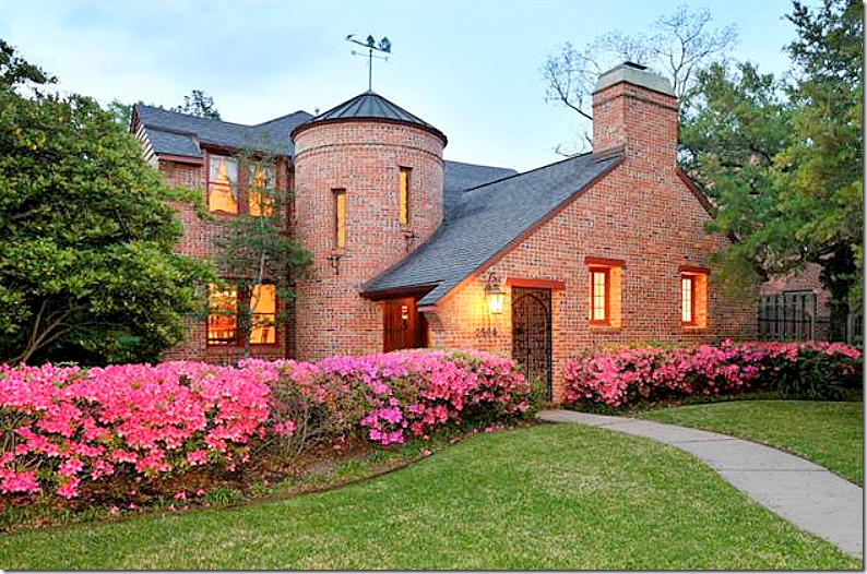
Here is the house as it appeared when it was for sale. The house is only two bedrooms which may be a factor on why it is for sale so quickly again. It has 2,700 sq. ft. and a garage apartment with a study downstairs that does give some bedroom flexibility. It is an original River Oaks house, built by the River Oaks Corporation.
In 1997, the house was for sale for $375,000. In 2010, it was priced at around $975,000 after several reductions. Today the asking price is $1,950,000 – but the renovations are extensive, as you will see.
As you can see – the charm is immediately evident – but so are the issues. The red brick is attractive, but it really clashes with the hot pink azaleas. Why plant that color? White would have been better if you had to have them – but they add nothing. Neither does the red trim.
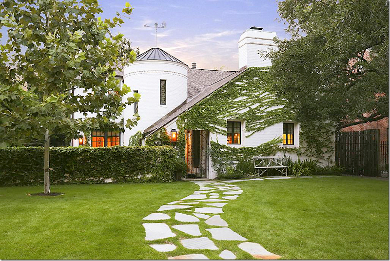
And wow – here is the façade all redone by Bobby McAlpine. Amazing what a can of white paint can do because that is basically the biggest change to the house. They did take out the azaleas which adds to the curb appeal along with the addition of the stone sidewalk, which is another great idea – and a low cost option that could be easily copied. Of course McAlpine added a new lantern and a few new windows – I would be shocked if he or Susan hadn’t – but basically not much changed here. This should give those who own houses with bad brick colors the confidence to repaint them. The transformation is absolutely amazing. And finally – no flower beds- just vines. How English looking – and how refreshing.
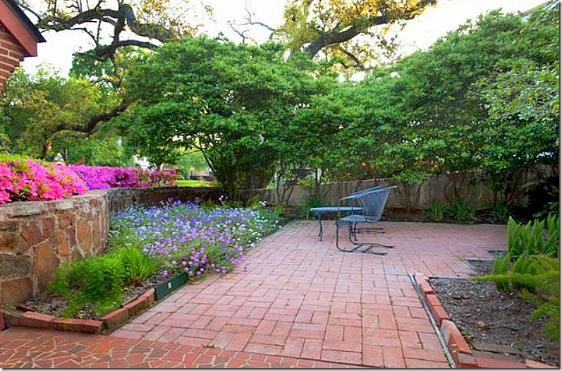
The front courtyard- there is a low stone retaining wall which is a hidden surprise and I love it! Brick patio.
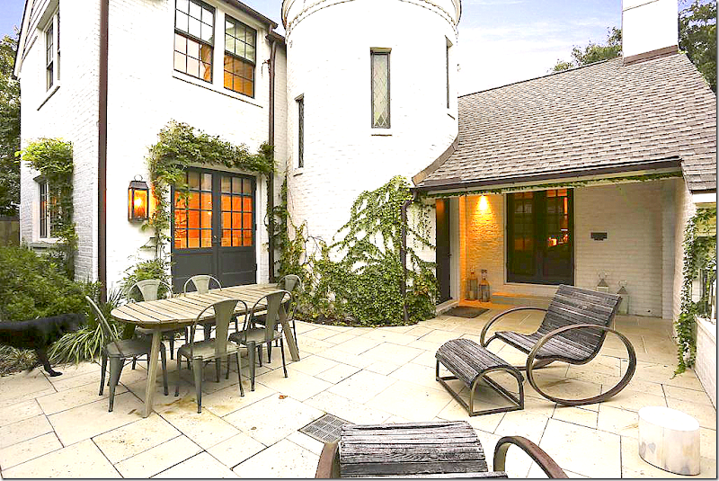
And here is the new courtyard – with white stone and black French doors that replaced the windows. The French doors create the indoor/outdoor feel inside. I love the white stone, but I would have opted for the much lower costing gravel courtyard myself. The sun wouldn’t bounce off the gravel as much as the white stone – which I think might be blinding at noon. The stone is pretty and easy to clean. Still, I can’t help but think gravel would have looked better. OK. I’m criticizing Bobby McAlpine? I don’t believe it!!!! And, ok, while I’m criticizing – would the stone wall have been better kept as it was? Or is McAlpine right – all white everywhere?
Ready to go inside?
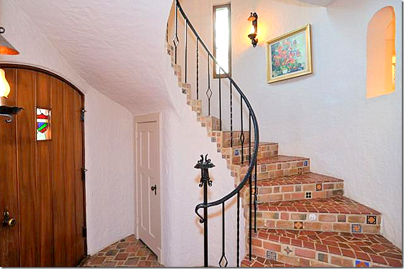
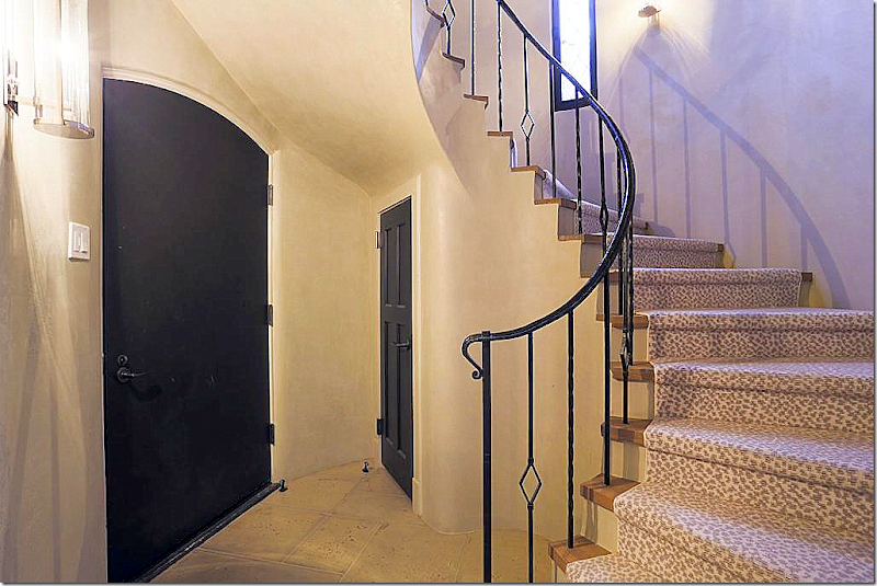
And – the focal point- the staircase inside the turret. The floor is tile and the walls are stucco. The arch at the upper right looks out towards the hall behind the entry.
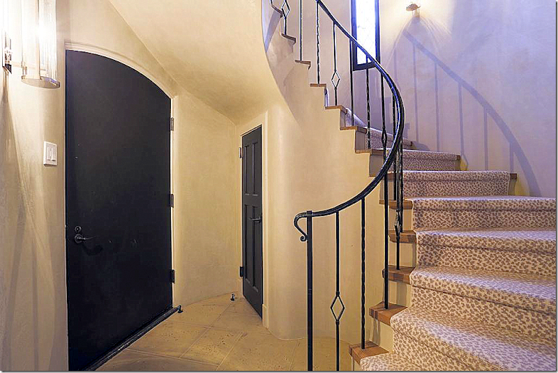
And today! WOW. How fabulous does this look???? I love it! The iron stair rail remains with just the post removed. The tiles were replaced with the stone and wood treads. The doors have been painted black. The entry was just cleaned up and streamlined and it is a huge improvement. Love.
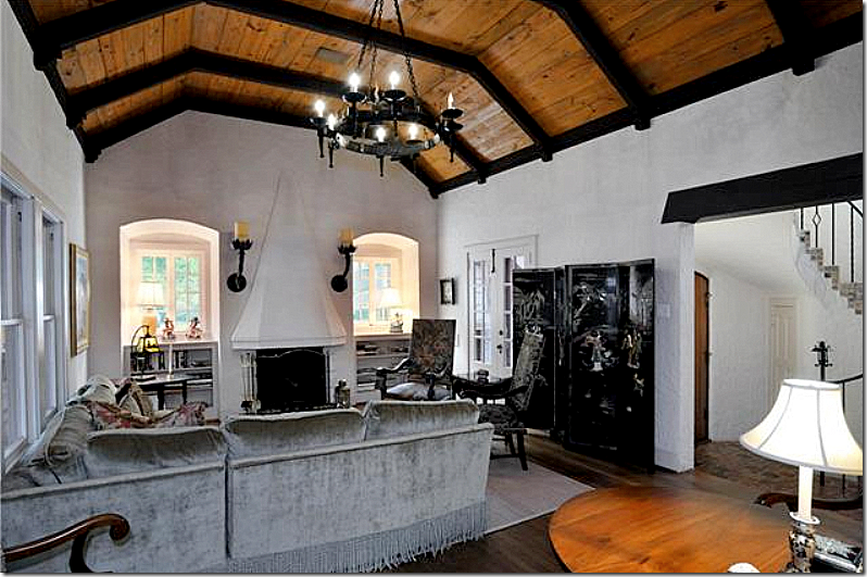
Off the entry is the large, high ceilinged living room with a fabulous wood ceiling and beams. Notice the fireplace and sconces and notice the charming windows on each side of the fireplace. It’s a great looking room even before.
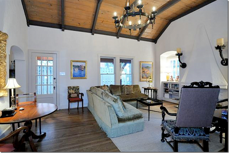
And another view – looking toward the side view. An arch on the left leads into the study.
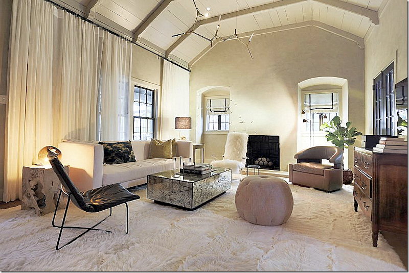
AND – here is the new living room!! The changes are mostly cosmetic – painting the ceiling and beams creamy white, which I love. Segreto Finishes did the stucco walls – which always adds so much to a room. The mantel is gone which I think is a shame, but I don’t miss the overbearing sconces. The décor is very contemporary – but very youthful. I love the ceiling fixture and think its perfect for the space and style. The dramatic curtains screen the side of the house with the too close fence and they stretch the window, adding a soft texture at the same time. I love the new colors on the ceiling and think it’s the absolute correct choice for the room. I must say – I really like the wood antique chest. I think every and any room looks good with at least one antique piece. I would love to see this photographed professionally.
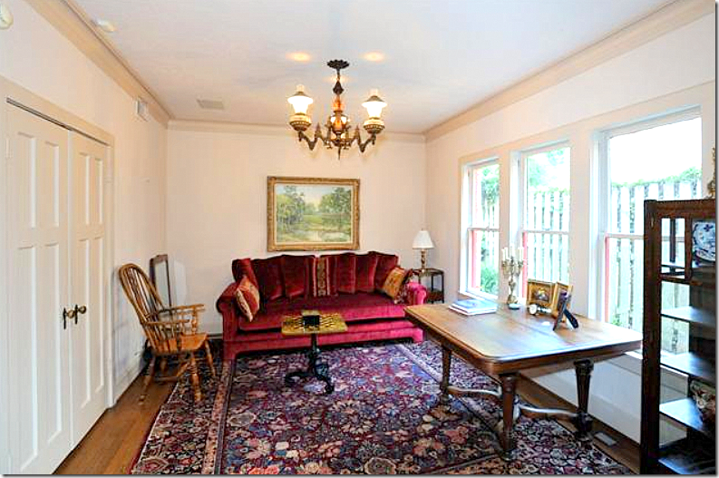
Behind the living room and along the side fence is the study.
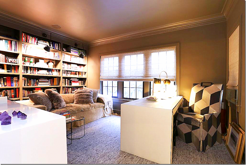
The study today – bookshelves were added along the back wall and the walls and ceiling were giving a darker metallic gold color.
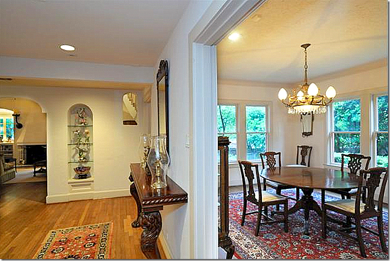
Off the hall that leads to the back portion of the house - you can see into the living room on the left. Next to the arched shelves – notice the higher arch which is open to the entry hall. To the right is the original dining room. In the renovation – this area becomes the kitchen. Where the windows are – these become French doors that overlook the front courtyard. The windows on the right become smaller ones which overlook the side yard and fence.
And how it looks today. The arches and shelves are cleaned up in the renovation. Besides the new stucco texture, a wall of wood shiplap boards was added for even more texture.
Looking from the living room towards the dining room and the kitchen in the back. Today – the kitchen is where the dining room was and the dining room is where the kitchen was.
And the dining room. After this room became the kitchen, the wall on the right was broken through to become the butler’s pantry, shown further along.
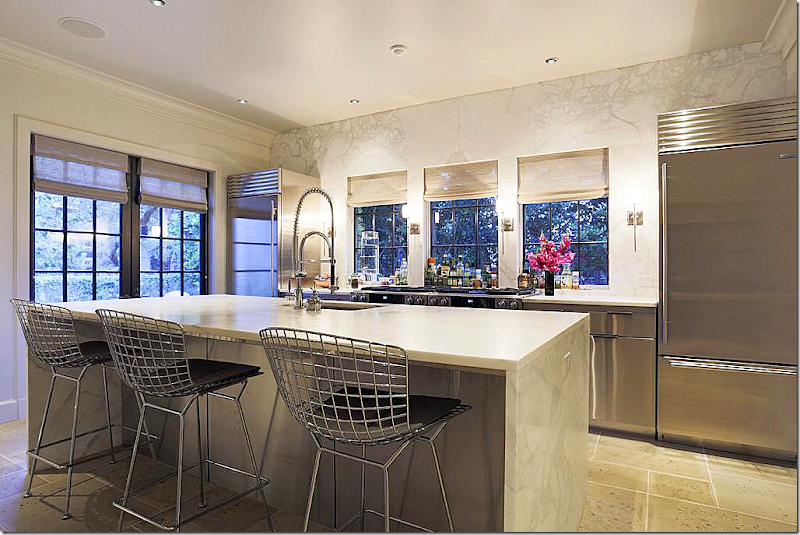
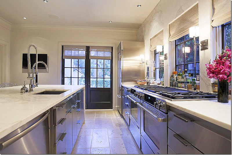
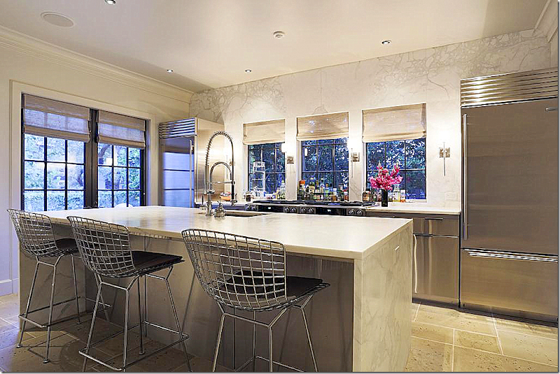
And the kitchen today! So beautiful. A contemporary, clean lined spaced filled with white marble and stainless appliances and cabinetry. The new French doors replaced windows that now overlook the front courtyard – making the courtyard an extra room. The three new windows overlook the side yard. The back wall is marble – just gorgeous!!!!! So luxe!!! I love the symmetry of the refrigerator and freezer being separated and framing the cooktop. The cabinetry doors are also stainless. Veddy nice!!
And looking towards the front courtyard. It seems that two ranges and two stove tops mimic a large professional range- great idea!!! The kitchen is fabulous – I love it. McAlpine and Ferrier are known for wonderful kitchen designs – and this doesn’t disappoint.
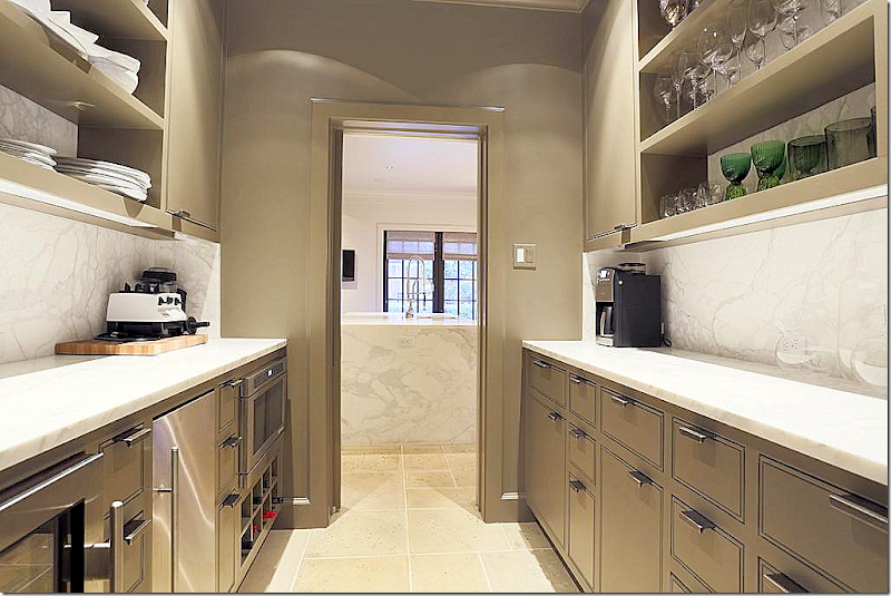
In the space where the kitchen and family room once were – a large butler’s pantry was carved out of the remaining space. Again, beautiful marble countertops and backsplash and open shelves. What a luxury of a space.
And at the end of the hall – on the left is the former kitchen and on the right is the family room. Both rooms overlook the back yard and garage. Today – this is now the dining room and butler’s pantry.
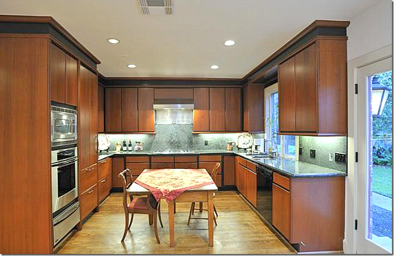
The original kitchen which was renovated at some point in time – half of this space is now the butler’s pantry.
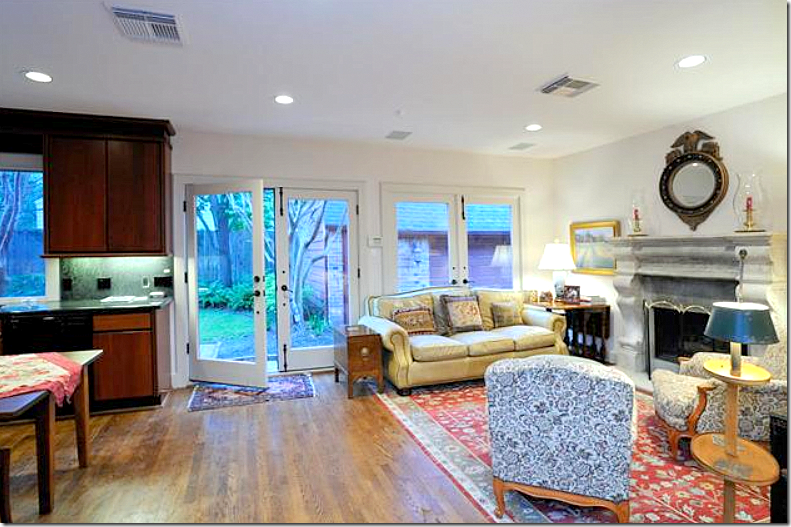
The family room – with a nice fireplace. It’s interesting how the front of the house is so charming architecturally with the gorgeous living room and entry hall in the turret, yet the back part is rather plain as if the architect ran out of ideas.
And today – overlooking the backyard – is the dining room. The fireplace has a new stone mantel, along with the shiplap wall for added texture. Beams were also added to create some needed architectural interest. Susan Ferrier designed a great banquette along the back wall – but the star here is the FABULOUS marble topped Saarinen table. LOVE!! These tables are available in different sizes from Design Within Reach HERE. I grew up with this table (sans marble top) and tulip chairs and this is the one piece of iconic midcentury designs that I covet. Well, not the only one – there are wonderful chairs and chaises that I love too, but this table just kills me. For those on a tight budget – consider this copy from IKEA to get the look.
On a budget, you can get the look for just $199 from IKEA. I would pair this large wicker chairs. The Design Within Reach marble topped version is so expensive – starting at $5k and going up to $13,000!!! But – it’s worth every penny.
Back to the dining room – by adding a love seat and chair by the fire place, the room becomes a sort of family area and not just a dining room. By adding the beams, new black windows and the wall to wall stone mantel – these elements add to the once architecturally plain room. What I do wonder is why the dining room wasn’t put where the study is – to create a connection to the front part of the house? Laughing while writing this, imagining Bobby hearing my suggestions while rolling his eyes.
Upstairs, the master bedroom – has interesting ceiling lines that follow the roof. This room overlooks the back yard.
Both the bathrooms and kitchen had obviously been updated at some point - but in this renovation, they were taken down to the studs.
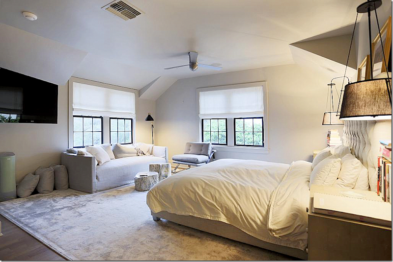
The master bedroom today. The windows were changed and made bigger. Susan Ferrier would have a fit if she saw this photograph – how it wasn’t staged. The pillows weren’t even put on the bed. And it’s a shame the photograph was taken at this angle because you can’t see the focal points – the headboard or the hanging lamps - which both look very interesting. It looks like there is a shelf over the bed with two framed prints. Wish we could see it!
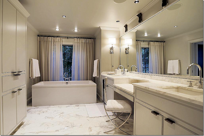
The master bathroom has the same cabinetry and marble as the kitchen and butler’s pantry – which I love – it creates a wonderful design continuity throughout the house. Beautiful sconces and tub.
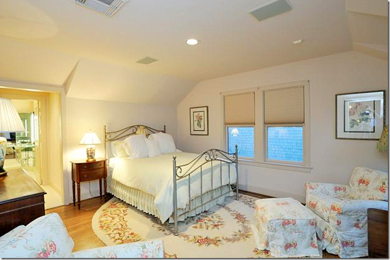
And the second bedroom, before.
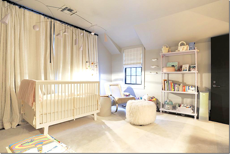
Today, the bedroom is a nursery. Love the light fixture. I’m sure the family is probably moving because they have outgrown the two bedrooms. This is a singles house or an empty nester, unless there is an older child that could stay in the garage apartment. Two bedrooms today are just so limiting. I’m surprised with the square footage that another bedroom couldn’t be added on somewhere upstairs? The two story living room really limits the number of upstairs bedrooms. This room looks large, 16x13 – could it have been divided into two?
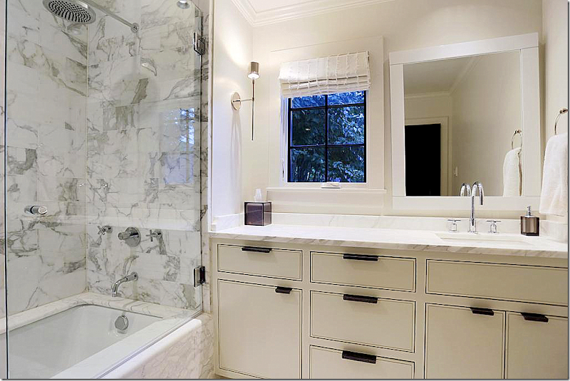
The second bathroom with the gorgeous marble bath and a charming new window. Love the hardware that is found throughout the house – and all the sconces Susan chose.
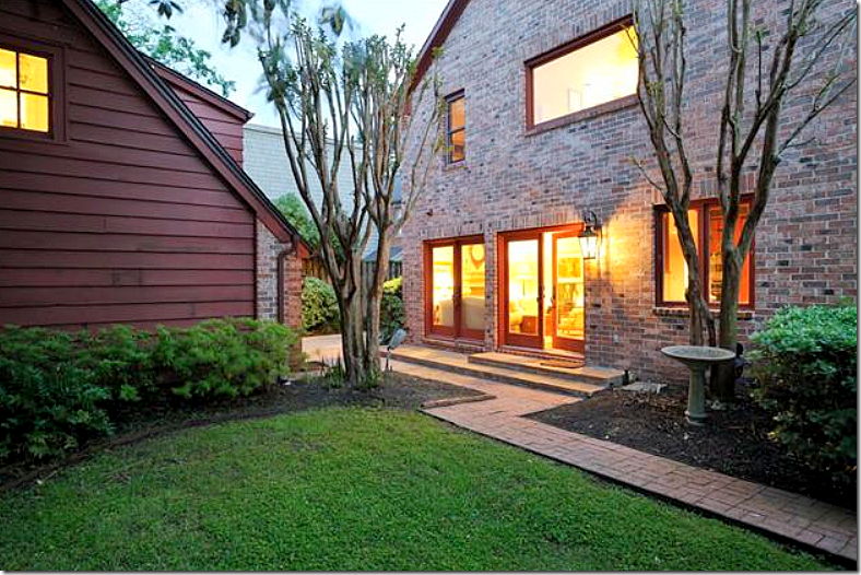
The back yard before. Here you can see what was once the open kitchen on the right and the family room on the left. The master bedroom and bath are seen above. Today – this back area is the dining room on the left and the butler’s pantry on the right. And you can see the garage apartment here, also.
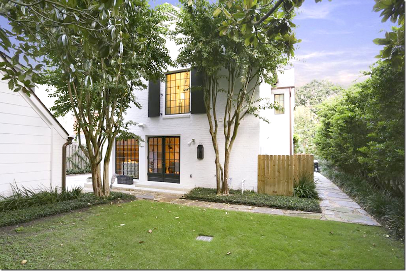
Basically the same view- with the renovations and the new stone walkway. The new windows and doors make such a difference, as does the white paint.
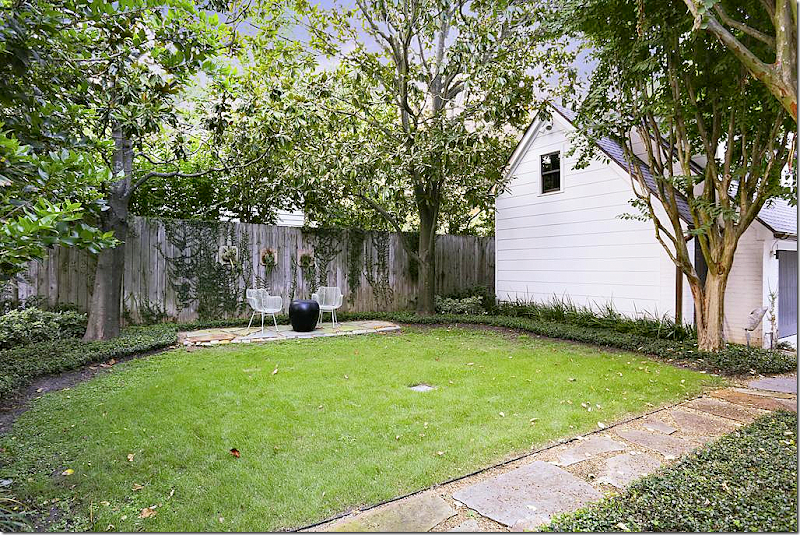
The backyard is just waiting for a swimming pool! This is something that a couple with a baby wouldn’t want, but for an empty nester – it would be perfect.
The house is sale pending now – not surprising at all. To have the combination of an original River Oaks Corporation house – updated for today by the master – Bobby McAlpine and Susan Ferrier – is a rarity in Houston.
And I hope you found it interesting to see what changes McAlpine made and what he chose to keep. Like the entry, which he basically left alone except for finishes……
…as opposed to the bathrooms and kitchen which were totally gutted and renovated – which was the right move. What McAlpine and Ferrier did was take an older, dated home and turn it into a more contemporary house perfect for a young family. What do you think?
Did you ever read Bobby McAlpine’s book? This was one design book I READ cover to cover. To order click on the image below:
AND – and new book by McAlpine and Ferrier – coming out in April! Can’t wait. Pre-order below:
Finally – did you ever listen to Bobby McAlpine when he visited the Skirted Roundtable? We kidded that he was the first guest to drop the f-bomb (more than once) but he was also one of our more intelligent visitors. I remember the three of us being just stunned. He was fascinating and we hung on for dear life, clearly out of our league. And nice? And funny? One of my favorite guests, ever.
Listen HERE.

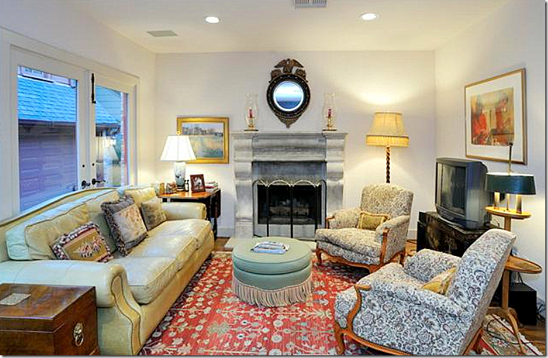

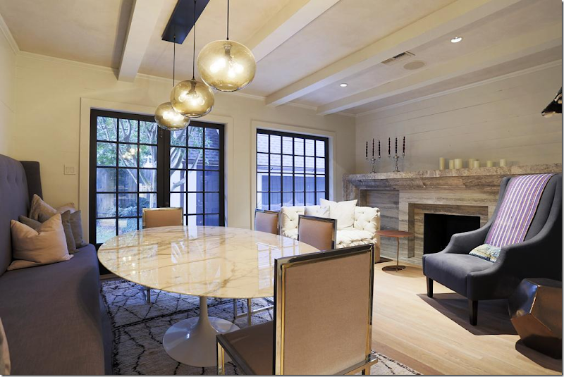
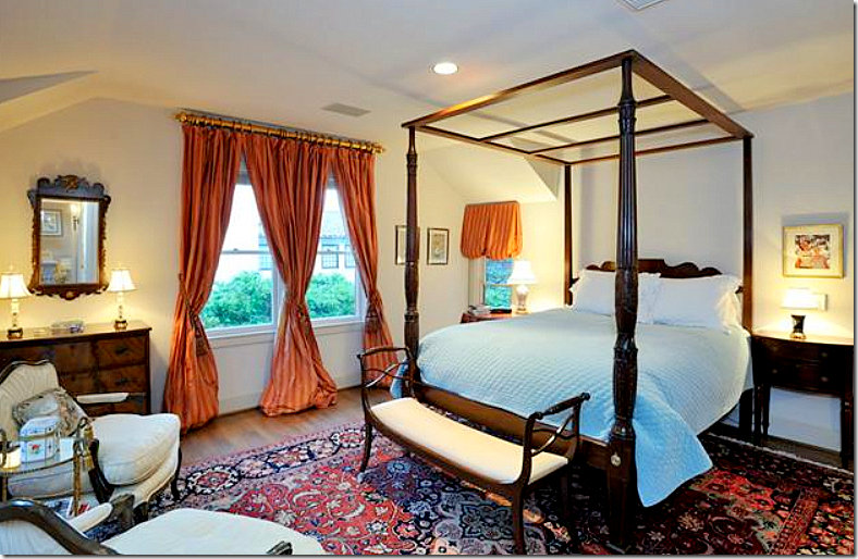
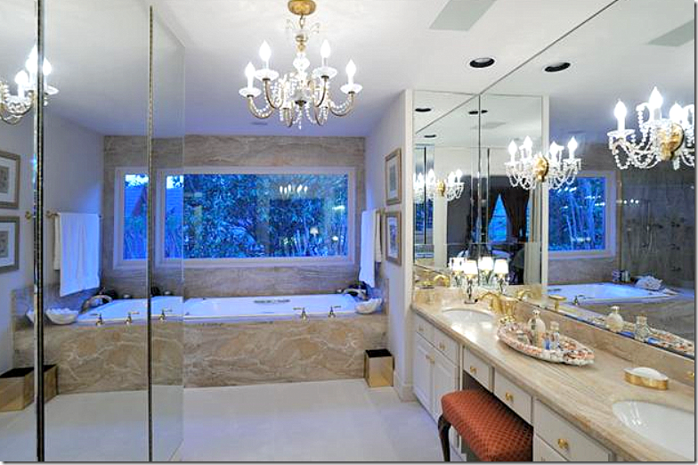

The window detailing and the kitchen for me are the winners! And I will try and find the link to his interview. Happy new year Joni!
ReplyDeleteWhat a stunning home! The kitchen was just breathtaking and timeless. I love the exterior brick being painted white, always such a dramatic change.
ReplyDeleteThank you for such a great post Joni . Hope you have a wonderful new year.
Betsy
West of the Square Designs
Joni: Thanks again for featuring our work here on your blog. A thorough investigation as always....
ReplyDeleteThis is just my personal preference, but I liked the feel of the old inside before the renovation, now the house looks just too cold/stark to me. But I love the outside transformation. The white did wonders !
ReplyDeleteI am with you, Joni on the courtyard, the gravel would have been my choice as well. But maybe gravel is too hard to keep looking perfect?
Great post as always, Joni!
Dolores
Tis interesting....these young designer wishes. We just had a Realtor look at our 1938 Tudor and the renovations suggested are almost verbatim to the above home. I won't be doing the work...but it would be fun to see afterwards. Happy New Cheers to You! franki
ReplyDeleteWOW. THAT is interesting. hmm. At least you have a preview of how pretty it could be!
DeleteWonderful transformation. I miss the window in the front door. Would have switched out the stained glass obviously, but it looks so cold without one.
ReplyDeleteI wonder if there is one and you just can't see it because the pictures are so blown out? i thought it might be there - maybe a door without the window. it's hard to see. but i agree - i miss it if it is gone.
DeleteMy DREAM hose..when can I move in haha:) I hope you had a great Christmas holiday dear.
ReplyDeleteCheck out my new post...Cute curtain inspiration :)
Have a fab day
LOVE Maria at inredningsvis - Swedish decor, food, and fashion
Clearly the updated exterior, the kitchen, foyer and living room and bathrooms are big improvements, but that's where it stops. The house lacks warmth perhaps as a result of the contemporary furnishings or the over abundance of hard finishes. While we are not told if the interior design was the clients preference, much of it looks inappropriately scaled for the size of the space where it is being used. For example the enormous banquette and table in the small dining/family room. This space appears to have been an after thought or perhaps the owners don't entertain much. I agree with you on the courtyard and the use of another material other than the white stone. Over all, the house has a tomb like vibe, boring and lacking in character. I don't know why you need to apologize for disagreeing with Bobby McAlpine, Joni. Seriously, his portfolio shows that he is not above laying an egg occasionally (this being one of them), but above all I would not be found guilty of feeding his insatiable ego as it quite clearly needs a house of its own already.
ReplyDeleteOh boy - i couldn't disagree more. Bobby is nice, very nice and i have no idea about an ego, but the man has more talent in his toenails than the majority of working architects have in their entire portfolios. The man is a genius. There is no other word to describe him accurately. imo he changed contemporary architecture - he made it warm and livable and used antiques instead of italian sleek furniture to further convey the human dimension so often lacking in modern spaces. He is one of the greats and we are here witnessing it.
DeleteClearly Joni, you are not studying contemporary architects. If you like Bobby McAlpine and his formula which is repeated almost everywhere he does a job, then go for it. I listened to your interview and found him arrogant and oppressive. So he uses antiques - so what? Hundreds of designers and architects use antiques and I don't see you obsessing over them. This comment of yours is the typical "suck up" quality we have come to expect when you feature a home by a contemporary designer or architect whose favor you so covet. It's very easy to see your motives. Sorry, I don't mince words.
DeleteFrom another Anon, here: I like your comment, because it's frank. Joni seems sincere when she writes her blog posts. Actually, she does point out when she doesn't like things....and you can't really expect her to batter people she's featuring. On the other hand, I am tired of reading comment after comment on all kinds of blogs rubber stamping the same: "great", "fab".
DeleteI'm polite, and sometimes I've left comments with a different point of view that are zapped. Happened to me on French Essence: I said I was a longtime resident of France (American) was looking for a new house and sometimes tastes change: after years of old beams and crumbling stonework, the French rustic look holds no charm for me (and a large swath of French people, too, as a matter of fact). That post never showed up.
At least Joni lets those who disagree post!
Let me add: the French rustic look is beautiful on a postcard or in a magazine spread, but I prefer a more cleaner look to live in. In fact, the French way of decorating in America is very different in France. They currently ignore so much of their own vernacular styles. But that's another subject.....
Deleteanother great post! thanks for so many years of enjoyable reading. really i cannot tell you how much your blog means to me. texas is light years away from new jersey but i love your discussions.
ReplyDeletere the red azaleas, my neighbor always worried about the color of her flowers as they related to the color of her home, which was a colonial mustard color. white flowering shrubs surrounded her home.
i do like this house painted white. i love the apartment over the garage. i would be tempted to go live in that apartment and leave the rest of the place to the family! thanks again and wishing you a Happy New Year, Lorraine
Thanks lorraine for all your sweet words!!!
DeleteWow! 2 mil for a 2 bedroom. That's steep! I am not opposed to painting brick. But, I did love the before of the exterior better than the after. Those vines on the red brick would've been stunning! And, as you suggested, gravel would have been divine with the lovely, historic brick. Well, I will have to take a drive to see what it looks like in person. The pictures are blown out and maybe that's the problem. Anyway, I can't help but feeling a bit cold after viewing the renovation. I mean, it surely needed an update, but such a modern take? I did love that sweet nursery and the breathtaking marble in the kitchen! Would make such a cute starter home...albeit, a quite expensive one. Thanks for sharing! I love the home tours. Those are my favorite blogs that you produce!
ReplyDeleteHappy New Year!!
~texassky
It is GORGEOUS inside, but I also loved the before of the extrerior much more than the after. The red brick was charming.
ReplyDelete"The master bedroom today. The windows were changed and made bigger. Susan Ferrier would have a fit if she saw this photograph – how it wasn’t staged."
ReplyDeleteSusan Ferrier should have a fit that the room is being shown period. From an interior design point of view, it looks like the owners shot their wad on marble and stone and said "oops" when it was time to decorate. The window treatments are terrible, the rooms are cold and uninviting and the landscape pathetic. One would assume that having spent the kind of money this renovation would have cost that the last thing the owner would do is leave those tacky treated wood fences in place. They appear in almost every Houston property shown and they are such a blight on the landscape. Can't homeowners at least paint them?
Staining the fence will make it last longer, & increase property value in addition to aesthetics. How do so many not 'see' those fences? Thanks for making me laugh this cold morning. xot
Deletei knew tara would love that comment about the fence! i think its because we all grew up with them - and everyone has them, rich or poor - and we just don't 'see' them anymore! they are hideous though. i'm looking at mine as i write this!!! what i would give for beautiful brick walls around my courtyard.
DeleteYou can't paint your wood fences where I live! The city requires them to be stained natural colors ... Thank goodness!
DeleteYou must live in a world of "ugly". I suppose the city was concerned about the use of all colors of the rainbow or worse, but stains don't always enhance the color of the house as in the one which is the subject of this post. A lovely white or dark Charleston green would have looked so much better. A little less marble would have paid for a brick fence as well.
Deletethank you for the post! I take away some decor ideas....loved all the renovations but it needs one more make over in furnishings! But I would rather purchase a house in this stage.
ReplyDeleteyou were my first blog and still my favorite. thanks for all your hard work I appreciate it. my best Mary Ann
I like both the white exterior and the original exterior. As for the interior, I would never have taken out the tile on the stairs--such a wonderful and original vintage touch. While renovations were needed for the kitchen and baths and some additional windows--I did not like some (or most) of the furnishings, Great post--very interesting.
ReplyDeleteBeautiful, thoughtful renovation. The exterior of the home is lovely. The interiors are a tad contemporary for my taste however, everything flows... The kitchen and baths are stunning with all the marble! It feels a little stark, less cozy than the way it used to be...
ReplyDeletexo,
Ivy
I am a huge fan of Bobby McAlpine! Thank you for this post Joni! Love this house!
ReplyDeletexx
Greet
Always love Bobby McAlpine's work, though I'm not particularly fond of the decor here. It always amazes me that a couple with a baby can afford to buy (at just under a million) and remodel and redecorate to this extent. Obviously, not in my world. With the master on the second floor, it might not be as appealing to an empty nester. Still, the house is a gem. I spoke to Bobby at a booksigning and mentioned The Skirted Roundtable interview. He laughed and said that he'd gotten in trouble for his language. Unlike the anonymous comment above, I found him to be a very humble, thoughtful man.
ReplyDeleteHe is. We were struck by how sweet he was. Another surprise was mario buatta. OMG- what a doll!!!! David Easton too. That makes the women sound more bitchy - but they absolutely are not. Another surprise was Carolyne Roehme. She was the nicest ever! That was a shock. I expected a stuck up you know what - but she was the opposite. i wanted to be friends with her!! Allessandra Branca was a doll - very open and Charlotte Moss is THE most interesting woman, so southern, so nice, so accomplished. one surprise was Suzanne Kasler - she was very, very shy!!! That shocked me!!! She wasn't what i thought she would be - I thought she would be a powerhouse type A (which im sure she is) - but she was very quiet and very shy, very very soft spoken,very feminine, very reserved. you could tell she guards her privacy. Gosh, we have met some wonderful people! We need to do another interview- it's been too long!!!
DeleteThere are too many interesting and great designers and/or architects out there to repeat any of the ones you have mentioned. I agree on one thing, Mario was so much fun to listen to, but some of the others not so much. I have listened to all of them and indeed you did have some very gracious guests. Charlotte Moss was not one of them. If you go back and listen, none of them for the most part gave any meaningful information except again Mario. Perhaps the first thing you should do is bone up on your format and questions and stop acting like silly school girls meeting Elvis.
DeleteThanks for the mention, Joni! I am so glad that you did this post. I love when you showcase "before and afters" because you are so thorough. It's interesting to see your readers' comments about what they like/dislike about the house. All in all, I think it's a very charming house that has come a very long way.
ReplyDeleteThanks Paloma so much!
DeleteJoni, Your blog is so fascinating, always, and your eye for detail is stunning. Most of us don't "see" the things you know are important. I'd like to suggest that you do more with the way to get a look without a huge budget. When you do that, occasionally, it is just fascinating, and I bet the majority of your followers are not in the league of some of the houses you feature. Just as with this IKEA table suggestion, you could contribute so much to regular folks who need advice, where to go information, how to get something decent if you aren't a millionaire. With your taste and eye and know how, I followed your advice when you featured affordable chandeliers a while back, and am very happy with the result. Thank you! It is your tutorials aimed at typical people that stop me in my tracks. Simply wonderful! It is clear that you put enormous time, research, and knowledge into every post. Thank you for all of it.
ReplyDeleteWell said and I agree!
DeleteThanks for the thorough job on this blog post Joni! You are very talented. I do like the new renovations. Definitely more up to date.. I am on the fence though with painting the brick. I think that re-working the landscape to suit the red brick would have been a better choice. However, the outside facade mirrors the inside renovations. So no surprises as you step in the front door. I so love the new stair runner. Lovely. The overall feeling of the new look in the home is bright and airy.
ReplyDeleteI love, love, love the changes to the exterior... BUT the interior -ugh! Why did they rip out original tile work in the entryway or the architectural details around the fireplace? Why would people who love contemporary, hip, young, fresh, streamlined finishes buy a house that is a 30's tudor revival to begin with? I feel like they ripped out the soul of the house. I know that tile in the entryway does not meet today's color schemes... but I think that it have been a heroic, brilliant feat to keep the tile and make marry it with a pleasing design. I mean, one day, people are going to look at pictures of this house and ask, "WHY would anyone rip out that fireplace and tile and replace it with such trendy finishes?" But, maybe I just don't think like someone who is in the market for a million dollar house. ;)
ReplyDeleteOOps, sorry for the typos and such. I have a toddler in the room. ;)
DeleteYes, I'm with you there.
DeleteI agree about the fireplace - but not the tile! i love the new updated look in the entry. i love how Bobby updated the Tudor for today. i don't know - i just didn't like the old tile or brick at al - but that is all so personal!!! and i didn't notice the typos - i'm the queen of them!!! ;)
Deletein my opinion the updates make it not look like a Tudor at all. It is a lovely home but the reno makes it a terrible example of Tudor style. It just seems a shame to remove all the originality that is so hard to find these days and replace it with something so bland. I agree with Laura, this would have been wonderful if it had been in a more Modern home. I have a tudor that has been gutted and it is so difficult to put that character back in.
DeleteReally, really sad to see the ultra modern renovations in this historic home. Couldn't they have flexed their design muscles in a new structure?? What a shame. I do love the new exterior white and landscaping, but to remove that fireplace etc? I gasped...and not in a happy way. :(
ReplyDeleteadore the exterior + but not the interior! great research + photos. xxpeggybraswelldesign.com
ReplyDeleteI am shocked at this renovation and can't believe Bobby McAlpine had a hand in it. I makes me lose respect for him, frankly. It shows no respect, at all, for history. To take an original River Oaks
ReplyDeleteCorporation house and virtually demolish it's original character, is to me, criminal. Changing some of the windows, was fine, even relocating the kitchen was okay but to paint over the beautiful
original brick and to rip out those gorgeous tiles on the entry staircase is awful. Although I love contemporary houses and furniture, I also object to the interior selections. Again, there's no connection to the outside, except for the color white. I guarantee the neighbors are sick about this.
I don't lose respect for McAlpine, here, as he The Best of The Best, but I agree that not everything needs to be modernized and I that the choices here were a bit out of place. Could it be that this project was - gasp! - client driven?
DeleteThere is such a thing as classic style, and while I don't believe in venerating real estate, and that each house belongs only to its current owner, it seems a shame to take everything "to the studs" in the name of bland, if fashionable, slabs of cold hard surfaces. I would like to have seen Mr. McAlpine put his very skilled hand on the spirit of the existing house. Gravel, ftw! You were exactly right about that element, Joni.
I think there is much to admire in the renovation, but I secretly wonder if this particular house wouldn't have been better served by the likes of Tim Curry.
Amazing how that different plaster colour immediately brings a softer, warmer patina to the stairs and hall.
ReplyDeleteWould have thought the arched ceiling was the one thing worth saving though. It warmed up the big living room and added character. Yes, I would have left that alone.
The house was historical, beautiful, and charming before all of the character was stripped away. What a travesty to take such a lovely home and make it so cold and contemporary.
ReplyDeleteCindy
Hi Joni, Thanks for sharing this beautiful home and I do love the exterior changes. The inside is too modern for my taste, though I am sure his clients preferred this style. The wood ceiling and beams in the family room were charming and painting the entire room white appears very cold and stark to me. I would have loved to see a little bit of the historic character of the home saved. We all can't love the same decorating style but that doesn't mean the designer didn't do a beautiful job. I appreciate all the work you put into writing these post.
ReplyDeleteHugs,
Sherry
I agree with most of the posters who say that the character of the house was stripped away. The only thing that I really liked was the new black steelcase windows. They seem very much in keeping with the period of the house. Most of the decor was a case of 'what were they thinking.'. A sad renovation but as always a well researched article. I think that your style of decorating would have been much more in keeping with this home. Soft, elegant and classic without being boring and colorless.
ReplyDeleteTaking a home the age of this home which was built in l938 and bringing it up to date over time is a difficult task if one wants to keep a semblance of architectural history. I am first surprised that this house does not have some historical designation because some of the changes would not have been permitted under the guidelines. There was little attention paid to history here or to architectural context. The color of the brick could have been mitigated by changing the landscaping although I am not nearly as opposed to painted brick as I am to some of the more extreme changes on the inside. It would have been possible for instance to have designed the bathrooms and the kitchen to accommodate modernity but using styles and materials that reflected the style of the home. I think what is sorely missing here is harmony. If the owners like contemporary furnishings, then those furnishings would have looked infinitely better in a more contemporary style home - not in a Tudor. To use one of McAlpine's favorite words, this was a major f**k up!
DeleteI tend to be an architectural purist, too, and would have saved more of the original elements in the living and entry, but the house had already been messed with. I don't know if there had been an addition at some point in the back where the kitchen/family room was (hard to tell because the brick was a good match in the photo), but the windows and French doors are obviously not original to the house, nor that awful window in the master bath. I even think the old double hung windows may have been replacements since they had no muntins, and I feel sure that the 1938 ones would have. The new black framed windows with muntins which replaced the existing are definitely an improvement. And of course the existing kitchen didn't reflect the period of the house at all. Might as well do a modern kitchen with classic materials. I think the changes were well done, though I don't particularly care for the contemporary furnishings and I'd be tripping on that living room rug!
DeleteAs to the living room rug ???? I wonder how many cats had to be skinned to make it.
DeleteJoni, I could not agree more with above Anonymous. I was horrified by what was done to this home. The house reminded me of one of the famous Moody Sister bungalows in Santa Barbara, CA. Yet, the bad remodel managed to remove all of the charm and ruin the lovely little gem. If they had to repaint that brick exterior - I would not have - why such a stark white? The most frightening addition was the new fireplace in the back of the house. It is wildly out of scale and, combined with the furnishings, not at all in keeping with the spirit of the house. I cannot believe Bobby McAlpine really had a free hand in this. I only hope someone buys the house and restores it to it's prior state.......with a few updates.
ReplyDeleteGreat post though....Love your blog!!
what a great transformation! Just clean it up and keep it simple. Love this!
ReplyDeleteWhile I love Bobby Alpine and think he is uber talanted..this remodel is very disappointing. Like many other comments I feel the charm and soul of this house has been stripped. There is a way to blend updated conviences and maintain the beauty of an older home. This sadly misses the mark. My philosphy is " if you want it to look new, buy new" and in an older home you should respect the original and sometimes quirky details and work with them.
ReplyDeleteSometimes architects get lazy and repetitive and refer too often to earlier formulas which may have worked in an entirely different setting. McAlpine's work is beginning to be repetitive and predictable. As the old say goes, he is beginning to believe is own press.
DeleteI am a big fan of his work and have a small collection of his work but not at all impressed with this. It feels cold/lacks warmth and feels more "model show house' than family home. Just my opinion but there is no denying his talent. I do like the painted brick though, think that was a great move.
ReplyDeleteNot to imply that this IS the case here, but just imagine how easy it is for an architect to give a job to underlings in the firm while charging his/her client full tariff for his hourly services plus the usual up front deposit to be held by and spent by said architect at his/her disposal and the perks of drivers, cars, transportation, hotels, meals, travel, etc. Pretty soon, what use to be talent, becomes a money game. Architects and designers often take advantage of clients whom they believe to be uninformed and disinterested in the process. I would like to know how much input the owners of this home actually had.
DeleteOh, I so agree with so many who say the renovation removed much of the original character that made this house so special. I kept trying to like it. I am a fan of sleek, contemporary decor, but finally I just gave into my sadness at what I feel is a loss. I loved the red brick and the tile on the staircase. I even kind of liked the sconces around the fireplace purely for their uniqueness...although I can see how it would be hard to decorate the rest of the room around them. Much of the interior seems out of context for this home and for the River Oaks area. That said, there are things I love about the renovations - I love the new windows and the placement of the kitchen in the former dining area. The way the kitchen opens up to the front courtyard through the french doors is heavenly. I can imagine pouring a cup of coffee on a beautiful Spring morning and stepping just outside the door to enjoy it. I have fond memories of visiting my best friend's well-heeled Aunt in the River Oaks neighborhood as a child. Her house was a fabulous traditional home with red brick exterior and dark furnishing inside with oriental accents. So luxurious with many unforgettable features. I remember feeling so grown up staying in the guest bedroom because it had a door that opened up onto its own private patio. A floating spiral staircase separated the living room from the dining room. There was even a little bridge that connected the two sections of her swimming pool. I wish I could remember the address. I would love to see that house today.
ReplyDeleteOh I love this house and most definitely prefer the painted brick. I have recently painted my brick cottage too in a lovely pale grey colour called Foggy Grey, I am thrilled with the results, I only wish I had a house as big as this. In New Zealand depending on the area, around my area, this house would exceed 4 million.
ReplyDeleteLee
i'm a little startled...it's hideous, truly.
ReplyDeleteJoni, There is an argument for renovations that contrast historical architecture with streamlined elements. I learn so much about my personal style by studying them, and am equally fascinated by the responses they elicit. Thank you, Kathy
ReplyDeleteJoni, compare the River Oaks house to the Mountain Brook, Alabama house by McAlpine/Ferrier in the February issue of Veranda. Several obvious differences: 1) the published house was styled and professionally photographed for a national shelter mag, not just an MLS listing, so we can drool at it in all its high-resolution glory; 2) McAlpine/Ferrier custom built AND decorated the house from scratch, not just renovated it, so they probably had more design options; and 3) the Alabama house is so much larger that M&F enjoyed greater scope for their distinctive style. The furnishings are more compatible with the architecture, and the textures and materials feel more organic and harmonious. It's a beautiful house, and it looks both comfortable and elegant. The River Oaks house leaves me wondering what the owners and M&F really wanted to get out of the restoration. Best wishes!
ReplyDeleteThis reno: Yuk!!
ReplyDeleteOh my goodness! I just LOVE the white paint! It sets the tone for what is to come when you walk in the front door! Just amazing!
ReplyDeleteI'm a preservation freak in Houston, but I love this remodel! River Oaks is one of our most endangered neighborhoods and this is a great example of adaptive reuse instead of tearing down and building something new that just looks like a cheap knock-off of what Bobby McAlpine was doing 30 years ago. It's not like this is Versailles... all that old stuff that was removed can be easily replaced. Thanks, Joni, for sharing this breath of fresh air :)
ReplyDeleteThe issue and the post is not about whether or not this home should have been torn down or preserved, it is whether or not this renovation hit or missed the mark. It actually does look like a cheap knock off and can indeed be replaced by a more skillful adaption of respecting the period and the architecture.
DeleteChange is not always better.
ReplyDeleteNo, no, and NO. I'm sorry to say I see practically nothing I like here :(
ReplyDeleteWhile I usually love McAlpine's exteriors, his interiors always leave me cold. I agree with Joni's thoughts on the courtyard, but I don't mind the white paint on the brick, but maybe would have done a lime wash on the bricks rather than stark white. I like the kitchen and baths but not too much else on the interior. It does look like a new front door without a window. Definitely would have preferred a small window on the door to let in some light. I bought his book, because the exteriors are always so charming -- I was so disappointed to see that the interiors in no way match the warmth and charm of the exteriors.
ReplyDeleteI have to say I am not really that impressed. I think I even like it better before, it just feels so unwelcoming and stark. It is hard to believe this was done by such a well known architect. There is not a single room I think I would want to live in, maybe the bathroom. Think it needs to be improved upon, sometimes a change is not a good thing.
ReplyDeleteThe fact that this house has only two bedrooms is a major glich given the fact that this could have been addressed in the renovation. Depending on where the study is located, that could be a bedroom, but does it have a logical connection to one of the bathrooms. The bathrooms are very large given the overall size of the home. Could they have been made smaller in order to make an additional bedroom. Without seeing the original floorplan, one would not know. If you are going to hire an architect I would hope that architect would ask some pertinent questions regarding future use of the home.
ReplyDeleteAs to Bobby McAlpine, he designed an outdoor living space for someone I know and it does not remotely go with the style of the home. The owner hired him for bragging rights, but unfortunately ended up with a less than steller job and has spent additional monies trying to rectify the eyesore. He virtually did nothing that a general contractor could not have envisioned with the exception that the builder would have made the addition more visibly seamless. Sometimes you don't always get what you pay for.
Wow! What a transformation. My husband is a big fan of painted brick, and when you are adding on or doing renovations to an existing building it makes sense. I agree about the pink azaleas. I am a fan of white ones, too. That flooring in the entry looks amazingly better as does the back of the house. I like the windows and doors they selected. And the kitchen is a dream. I love River Oaks and am glad to see they worked with what they had instead of tearing it down and building a McMansion in its place. I would love to live here. Oh, and I like the fig vine on the house. Our new neighbors just ripped out fig vine that was covering a fabulous brick fence. Not sure why, but it looks so naked without it.
ReplyDeleteLoved seeing this, Joni. Thank you for sharing. Here's wishing you a Happy New Year.
xo
Sheila
I can't wait to get his new book, I have his first book. I do remember him on The Skirted Round Table (what is happening with SRT anyway - I miss it) and I remember that he pronounced his surname in a funny way. This is a great job, I especially love the kitchen, it has some sort of magic dust about it so that I keep going back to look alt it. The other distinctive thing about Bobby McAlpine is the steel window frames which he uses a lot.
ReplyDeleteAlso, I read "The First Astronaut Wife's Club" a few months ago. The book was disappointing but part of the book went into an area of Houston which all of the astronauts and their wives built their houses in the 1960s, I wish I could remember the suburb, was it River Oaks?
As to where the astronauts built their homes, River Oaks would not have likely been one of them. River Oaks would conjure up visions of oil barons, investment bankers, real estate developers, but not basically government employees which is what the astronauts essentially were. That is not to say that their home would have not been lovely and places of warmth and nurture for their families, but they would probably not have been designer gems.
DeleteI am just reading the comments section and a few people have mentioned The Skirted Round Table. My dream guests on The Skirted Round Table would by Mary McDonald and Pamela Pierce.
ReplyDeleteI have to say that I prefer the "before" version of this house. As many of the comments mentioned, the house looked warmer before. Also (in my opinion), the new exterior of the house makes it look misplaced in its setting...almost as if the house was picked up in a storm and plopped into its current location. Of course, to each his/her own.
ReplyDeletejlonit, I could care less how he wants to pronounce his name, the finish product speaks for itself. He is absolutely full of it and you know what the meaning of "it" is. I would love to see the original astronauts homes. It would be a great study in some cases of mid century modern perhaps.
ReplyDeleteThe new windows and kitchen and the removal of the pink azaleas are big improvements. Personally, I would have kept the tile on the staircase, perhaps adding a seagrass runner. I love leopard prints but it reads wrong here. The red rugs really dated the before home, didn't they? Perhaps the furnishings are from the owners previous home?
ReplyDeleteYou are the best blog out there Joni. I hope you never stop!
What a great post. I love the fact you showed before and after! But...there are only a few aspects of the latest vision that I like. The study is probably the best room. The others are difficult for me to understand. That dining room is a laughable. I can't even imagine a dinner there. And the kitchen, who in the heck would want a stove in front of a window? I like much of the old especially the brick. But as mentioned before I am glad they did not tear it down as so many homes have been in River Oaks the last 20 years. This home would be perfect for me if you agreed to redecorate?
ReplyDelete"Who in the heck would want a stove in front of a window?" Generally people who don't cook, but given the amount of condiments perched on the windowsill, I am assuming these people do cook and clean their window on a weekly basis. I don't see a draft system so I am assuming that it is a down draft which doesn't work all that efficiently most of the time. You are right about the dining room. It looks like you can't decide whether to eat or watch tv.
DeleteThe post was so interesting and, based on the comments, thought provoking. While I absolutely adore almost everything McAlpine et al produce, this one does have its shortcomings. We all need to remember that the client does influence the final product. Joni, any idea on the manufacturer of the kitchen bar stools? Would love them in my kitchen. Leslie
ReplyDeleteI love the exterior and McAlpine.. However, I am not a fan of the interior.. While chic and beautifully executed..it's hard and (I think) too cold for a 1930s (?) house. I think this house wants a less perfect, warmer interior.. Only one person's opinion.
ReplyDeleteGreat post...I loved seeing the before and after. What a difference painting the house white made. I love the way it looks painted white but probably wouldn't do it myself. I loved the way the house was redone but it was a little too modern for me. Love the finishes but I would like to have seen it a little more traditional. Still loved seeing the changes.
ReplyDeleteGosh, that's just awful. I really think they ruined it. Maybe in another house, but this house is now just ruined.
ReplyDeleteWhat a great home. It's just look like my dream house. The bedroom and the dining room was awesome.The interiors used in the bathroom and the kitchen is unique and beautiful. The post has just gave me decorating tips and ideas to select bed, sofa, lamps and lightening etc.
ReplyDeleteFabulous exteriors and fantastic interiors.. looks so great.. Nice choice of color combination and furniture..
ReplyDeleteinteriors designers
Joni....it is so much fun to see this! I am always interested to see how an older home can be transformed into a modern one on the inside. This group makes it look easy, and it is NOT! I have always loved their work and this house just confirms it. Did you know my maiden name is Ferrier? I always have loved the name and when I saw Susan's last name years ago, I folowed her career ever since. No relation that I know of though!
ReplyDeleteLOVE, love love the white painted brick!
Thanks Joni!!!!!
Such a very nice stuff i have seen here and i like it so much. Keep continue your work.
ReplyDeletePending Bett
Thanks so much for the thought and effort to post this renovation. It really helps me visualize both what works for me (the facade/landscaping, wow!) and not so much (agree with posters who find the interior a bit cold). The comments reflect that this is a really useful cataloging of the ways the same space can be very different depending on the treatments. Thanks again!
ReplyDeleteThank you for sharing superb information's............................
ReplyDeleteWow! Every corner of the house is heaven-like! I feel so fantastic looking at your pictures. I collect postcards and I hope I'll get to collect postcards that has pictures of your house on it. The property reminds me of a classic movie I used to admire during college. What a memory capturing page you have here. By the way, if ever you are searching some printing company that prints Brochures / Flyers, Business Cards, Envelopes, Letterhead, NCR Forms, Notepads, Postcards, Small Flyers and offers Marketing tips, Shipping and delivery options, Direct mail programs, Easy to understand directions, Designs galore and Many, many paper, stock, and finish options. I can recommend this link friend suggested to me http://www.printing4u.com/pages/dallas-postcard-printing . Have a great day!
ReplyDeleteI started reading your blog with your Grey Gardens post. I love that post. I find most of your posts very interesting. I wanted to make a comment on this post because I think this house looked so much nicer and pleasing to the eye before the renovation ever started. Sure, some things are nicer. But over all the character of the house was demolished and wasn't replaced with another one. This is one time maybe another designer would have been a much better choice.
ReplyDeleteWow so nice! I like this site. Keep it working every day.
ReplyDeleteEstate Sale Companies Bellaire Tx
We offer custom made ladies suits in Houston TX. All suits are specially made to perfection. At the comfort of your home or office you can have our custom tailors and designers make you a perfectly fitting suit that can be worn at any particular occasion.
ReplyDeletehttp://festariformen.com/custom-made-ladies-suits-in-houston-tx/
Finding a good alteration tailor in Houston TX is always a difficult task. This is because many tailors have specialized on women clothes alterations and only few of them specialize on men clothes repair services. We offer a wide range of clothing alterations and repair services for both men and women clothes.
ReplyDeletehttp://festariformen.com/alterations-in-houston-tx/
Wow, it's great website. I love it. Thanks
ReplyDeleteI can really imagine the backyard with a pool! It would really look nice. Anyway, just to share, I heard from someone who does our arizona pool repair that you can attach a pool fence whenever the pool's not in use to prevent children from accidentally falling over the pool.
ReplyDeleteMy friend mentioned to me your blog, so I thought I’d read it for myself. Very interesting insights, will be back for more! Appliance Repair Houston Service. Call us at (281) 764-6293.
ReplyDeleteHouse to be demolished now :(
ReplyDeletehttp://swamplot.com/daily-demolition-report-knox-2-times/
I LOVED this home, the before/after coverage, and all the blog comments. Often McAlpine/Susan Ferrier has more contrast with dark wall colors so I was happy to see lots of white with some color. Overall, this is a marvelous home, many ideas for updating a home and furniture.
ReplyDeleteWow!!! Really Amazing pictures. This is was really a high relevant information which i really appreciate.I do hope to get more updates and thanks for sharing.
ReplyDeleteWe are the best choice for outdoor pool remodeling company in The Woodlands and surrounding Houston area. Never before has there been so many options to improve the look and efficiency of your existing swimming pool. Make your swimming pool ownership more enjoyable, less expensive and easier than ever.For more details:https://beyondbluepools.com/
ReplyDeleteWow!!! Really Amazing pictures. This is was really a high relevant information which i really appreciate.I do hope to get more updates and thanks for sharing.You can Hire the Best Pool Remodeling Companies in Conroe, TX on HomeAdvisor. Compare Homeowner Reviews from 5 Top Conroe Swimming Pool Remodel.
ReplyDelete