One comment I get over and over again is:
Why don’t you show more reasonably priced houses?
And, I understand that comment.
Interior Design to me is: Dreaming. Wishing. Inspiration.
When I show an interior that is over-the-top or has an out-of-this world budget, it’s not that I mean to imply this is what I can afford (it’s not!) or what I think your house should look like. It’s just that people with big budgets can afford to hire talented interior designers and the effect is (sometimes) visually stunning. And often, it’s those big budget houses that allow us to dream, wish, and get inspiration from.
Still – I personally appreciate a great design with a smaller budget. I also love smaller homes. I love to see a tract home turned into something unique which is probably why I faithfully watch Fixer-Upper each season and why Lauren Liess’ new HGTV show will be so popular!
And…that’s why when I found these two houses shown here today, I thought you would enjoy seeing them too.
Unique? Yes.
Good design? Yes.
Affordable? Well, kind of. Location adds to the cost and has nothing to do with quality.
What also caught my attention is that both houses are contemporary.
The tide has turned (unfortunately!) and contemporary is back in fashion – big time. Driving this trend are the younger Millenniums and Generation Xers. These younger sets don’t want French design or English Country Manor (also unfortunately.) Instead, they want modern, slick, colorful and and lots of pattern.
And when I saw these two houses, below, they ticked all those boxes.

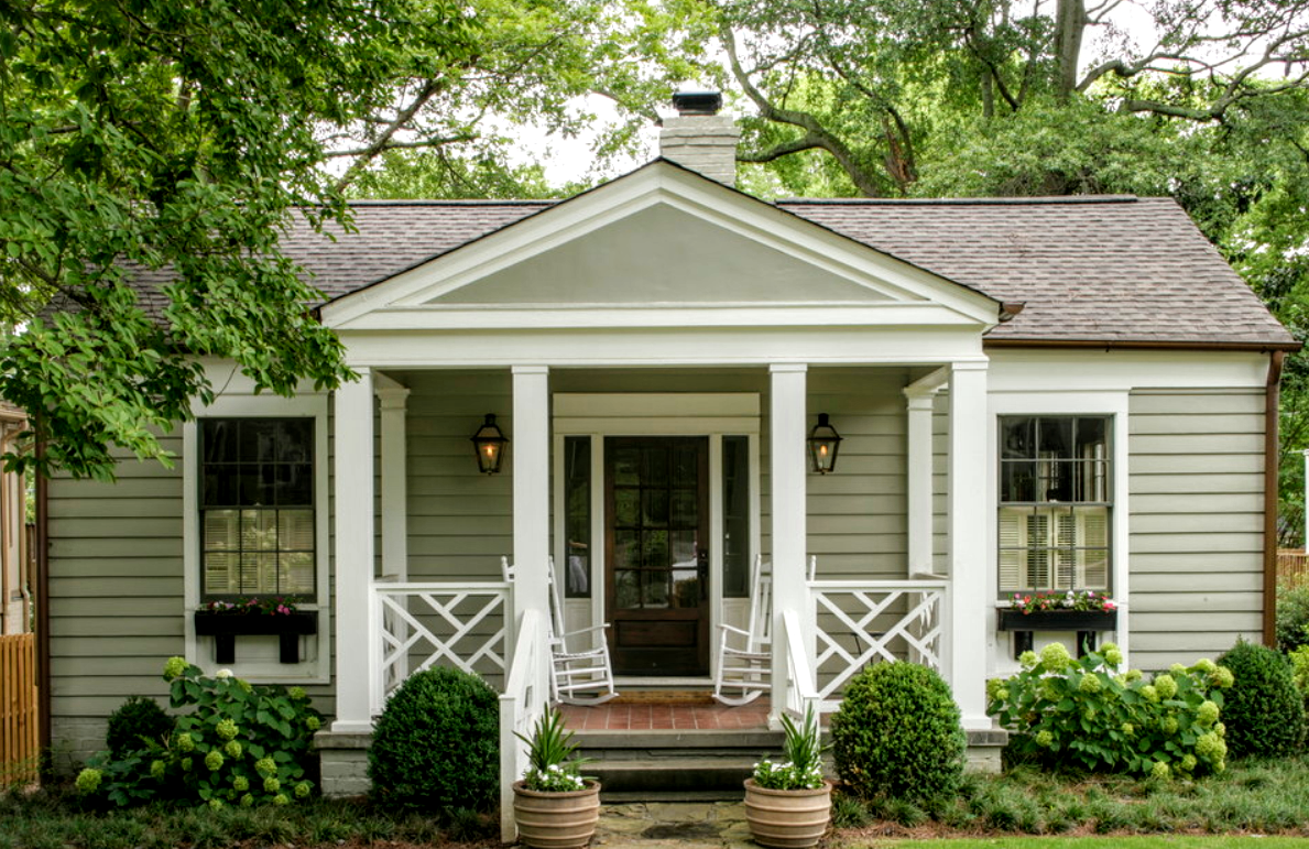
BEFORE: The first house in Houston that caught my eye was this Mid Century Modern house – which was in dire need of a renovation. What’s really nice about this particular house is it is a single story – and for families with young children, it’s great to have the babies close by. Also, single story houses are especially appealing to empty nesters who no longer want to climb a lot of stairs. This house has a front courtyard with no front windows, which makes it seem rather forbidding and uninviting. And it looks, very tired and worn.
The house was built in 1960 and is 2600+ sq. feet. It recently sold after it was listed for only two months!

And here is the house today! What a nice change!!! Look how much more friendly and inviting the house seems now with the new front window installed in the dining room. And notice how the double front door with glass planes lets even more light into the house. Instead of a solid brick wall – there is now a slatted wooden fence that adds to the openness. A fresh coat of light gray paint, new landscaping, and a cleaned up sidewalk creates a much improved curb appeal.
Impact Design Group.
BEFORE: Another view shows the front wall hidden behind an overgrown accent tree.
I think these were the original owners – it’s hard to maintain a house over such a long time. Notice how the brick needs cleaning, but who does that, especially if you are elderly? Sometimes it just takes a young couple to shake things up – like paint the brick, or have it power washed.

The large ornamental tree in front of the house was removed – letting in more light inside and opening up the house to guests. This closer view shows the slatted fence and the refreshed courtyard with new modern lanterns.
Who wouldn’t want to move into this house now??? I would! It’s so inviting and the Mid Century Modern is a nice change from the Georgian and Colonials which are the most popular architectural style in Houston.

The courtyard shows off the modern fountain. Now (pregnant pause) I think I would not have chosen a modern fountain, myself. I would have picked out a more classic styled fountain. You don’t have to overdo the Mid-Century look, you can mix elements which makes it more interesting. Or, maybe it’s just this particular fountain that I don’t care for?
What I do love is all the new windows that were installed in place of the original ones, which while functional, were undoubtedly, dated. The black trim is a nice accent. The trend today is metal doors and windows, but those are so expensive – no one on a budget can afford them; these, less costly, windows are a nice alternative. And I love the new door with the panes. This is a focal point inside the house - so many rooms look out to the courtyard. Love!

The lot is extra large and a pool would be a great addition later. But for now – notice there is another courtyard which the house wraps around. Inside, the former breakfast room has now become the utility room – and that window in the breakfast room was removed, seen on the left side here.

New doors and new siding, along with gray paint and darker gray paint on the doors – all which update the back yard. There is also a new roof which makes the house look almost newly built. The small accent tree was removed.
Notice the breakfast room window which was removed.

There’s a new terrace or a newly resurfaced terrace and whomever styled this house did a great job! New lanterns were also added here.

Another view shows how large the lot this. The house could easily be added onto at a later date. Inside these doors is the master bedroom.

BEFORE: The front doors lead to a hall that runs left to right. And down this step is the carpeted great room. Paneled and beamed with 60s styled prefab wood, there is a nice brick fireplace. The wall on the left that separates the great room from the kitchen has been removed. The dining room is off to the left of the front door, it faces the street.

Today: The dining room is off to the side of the front door and overlooks the street and the courtyard. The step down has been removed – all rooms are now level. There is new gray hardwood floors throughout the house, which is beautiful. This floor is so trendy, but I absolutely love it.
NOTE: Be careful when buying the new wood floors. Some of the choices have fake wood patterns and it looks awful!!!

From the kitchen – here is view of the great room. The shelves were removed which is a new edit and it opens up the room. The paneling and beams were also removed. All new French doors open the room to the back yard. The fireplace was painted with a smear technique and a new rustic mantel was added. I like that they mixed the elements and not everything is Mid Century Modern.
Myself? I would have installed a large lantern or iron chandelier here instead of a fan. But this is Houston and it gets really hot here. And obviously, the builder is a man.

A close up of the refreshed mantel. I use those kinds of urns a lot in decorating. They are not expensive and they are a nice accessory – plus they are large and give a lot of look for the money.

Before: The kitchen with the dining room to the right. The breakfast room is to the left, but it was turned into a laundry room. The kitchen was opened to the Great Room by removing the wall between the two rooms.

Before: The breakfast room with the large windows that looked over the backyard. These windows were removed when this was turned into the laundry room.

Today: Looking from the Great Room back to the kitchen, now open with the wall removed. The dining room is also now open to the Great Room since its walls were removed. And the opening between the front hall and Great Room was expanded. Today, with no stepdown, the opening is much larger.

The view from the kitchen to the Great Room. Through the door at the right is the laundry room.

I love the subway tile - it is classic and will always look nice. Always. Plus, it won’t date or age as fast as all the trendy tiles people are using today. Those trendy tiles will be so out of style in five years. Be careful!!!! Subway is a safer way to go.

The counters are Quartz and Dolamite – a mixture of two colors. Well, I have to say, I’m still a white marble girl but so many people are using the faux marble and it does look good and is a viable alternative to marble, which needs TLC. Marble has to be resealed every couple of years and the faux marbles don’t.
The layout of the kitchen is very pretty with the stove between the two windows. I would not have put in the upper cabinets at all and I would have run the subway tile to the ceiling which would have been really dramatic and great looking. But this design is still very nice. Certainly not worth changing except, I would change out the pendants, which is a personal choice. Despite my critiques, I do really love this kitchen - well done!

After: The breakfast room is now a large laundry room/mud room.

Before: The dining room. That chair is … 60’s cute! I’ve never seen one like that before. The dining room was very large – and the renovators decided to divide it into two rooms. They removed the side window and added a new window at the front – which opened up the room to more sunlight and created a much more pleasing façade.

AFTER: The newly divided dining room. The front section is now a sitting area which seems like a waste – I do wonder why they didn’t make it a small library, at least? The room can be closed off with barn doors with glass, so no light is blocked out if the doors are closed. I’m really not sure why they chose to divide the room at all. They could have added bookshelves along the back wall and made it all one, nice large dining room/library. I will say this - the barn doors do add a nice architectural element.

A beam was added here where the window was removed. Very nice staging.

The sitting room in the front part of the dining room. This is the newly installed front window – which adds to the curb appeal.

Before: The master bedroom overlooks the back courtyard. Look at that TV cabinet!!! It matches the King Henry XVIII chair. Most interesting.
OK. I ASSUME that is the TV cabinet! Any other ideas?

BEFORE: The master bathroom has yellow foil wallpaper typical of the 60s.

Today: The room was made roomier with the newly raised ceiling. It accounts for an extra foot which adds to the luxe factor. The bathroom door was moved to the center of the wall and a modern barn door was installed.
NOTE: The barn door has taken the place of the old sliding doors. Will this be a trend or is it here to stay? I think it’s here to stay.
Sorry to say – but I really can’t stand that bed – it looks so heavy and SQUARE!!! LOL. But in general, the staging is really nice, and staging is such a necessity.

Looking out towards the back terrace.

One more time. Yes – we’d be proud of that barn door too!

The bathroom was reconfigured and since then, seems much larger. The center vanity was moved to the back wall. The shower stall is classic white tile which won’t age as opposed to the trendy tiles of today, which to me – are so unattractive.

Before: The front bedroom that overlooks the courtyard.

Today – with the new windows, this room is now the study. It’s carpeted, probably to save a little money. But – how much do you really save? Instead of the beautiful wood floors found all over the rest of the house, why have carpet here?
Wall to wall shelving would make this a great library but the new owners could add that later. Boy, I really want them to have a library!!! LOL.

Before: The bath was in the blue and white, which I actually like! The former owners were big Mark Sikes fans.

AFTER: The same layout, but all new cabinetry and notice the concrete tile floors. I do love concrete tile, but in 5 years it will scream 2020!!
Do you think that concrete tile is just another passing trend? Since concrete tile has been used for the past 200 years, I think it’s a safe bet it’s here to stay.

This mid-century modern house was recently sold, but if you want to read more about it – go HERE.

Our second house today is called a tear-down, but the owners chose to renovate it instead. Built in 1940, this house is now a sale pending after being on the market for just a few days. It is located in trendy Garden Oaks – which is one reason why it went to contract so quickly.

The front view of the house – shows that there is a large side yard, which is used instead of a back yard.
The garage is now gone, replaced by the front entry.

The back yard looking towards the street and the side yard.
The house now has 1,540 sq. ft., 3 bedrooms and 2 baths.

AFTER: Quite a difference!!!! Now white, with a new driveway for cars, the side yard is open to the street through a modern, very contemporary fence. The garage is gone and that space was used for the entry. Another huge change is the roof was raised and pitched. Love the front lights.
This is the modern Farmhouse look – a combination of contemporary and charming.

The side of the house is used as the back yard.

Before it was staged – this shows the side yard. The floating deck is placed over the gravel. Cute house across the street.
 And another view of the floating deck, now styled.
This view shows the doors open to the living room. The bedrooms are at the back. I think the master bedroom/bathroom was added on to during renovation.

Looking into the house.

The back yard. Since the bedrooms are at the back of the house – the side yard is used instead. Although, the new owners could install a French door instead of a window so that the back yard is open to the bedrooms.

Inside. The new roof is raised and has exposed shiplap. Although the ceiling is new, it looks old and it initially fooled me! It’s just hard to believe this is not original. A loft was added – reached by an iron ladder. The French doors open to the side yard on of both sides of the living room. The kitchen looks out at the front street. The front door is to the left of the ladder.

The view towards the other side – open to the side yard. Notice the exposed duct work which adds to an industrial feel to the house.

The loft. This area is small, but would make a good study or - with shelves along the sides – a library. Hmmm. I want them to have a library too!
Can you tell that I have books all over my house and I’m constantly looking for a solution to that problem????

I love the styling. Great job!!! I do think I would have added two French doors here on this side, not just one.

The view from the kitchen, over the marble counter. Love those glass pendants!
I found this one below that might be the same pendant. Be sure to check dimensions, always.

To see – go HERE

This view shows the French doors out to the side yard.

The kitchen counter has the same shiplap as on the ceiling – which adds a warm texture.

I believe this is Quartzite on the counters. Love the stove – another industrial touch. Wood shelving instead of cabinets. White subway tiles – flanked by two front windows.
 The farm sink and contemporary faucet are nice touches – luxe.
Against this wall is the pantry and refrigerator which looks built in because the cabinetry surrounds it. Why everybody doesn’t treat refrigerators this way just astounds me! It looks so much better than….this:

In another house – the cabinetry was built around the refrigerator – BUT it wasn’t built out enough so that the appliance looks huge and out of place!! If done correctly, this wouldn’t be an issue but for some reason, carpenters don’t do this enough, although it is becoming more common. This is something to watch for when renovating your kitchen!!

AND, here is the house without the staging that shows how VITAL staging is when selling or renting a property. Without the staging, I wouldn’t have looked twice at this house. It looks so plain and so uninviting without the staging. But, by spending the money, which is recouped by a quick sale – the house is so much more appealing with the staging!!!

Such a difference!!!
I love this table. They used a console to save space, but I found one that was very similar, and on sale!!

I love this French table HERE. Notice how pretty it looks when you mix antique-look furniture in with contemporary styling? Love the mix.

And here is the view from the outside, the side yard.

The master bedroom. I believe this was added onto the house during the renovation – creating an extra bedroom and bathroom.

The master bath has a shower with two sinks and a window! Love the light.

The second bedroom is in the house’s original footprint. Very cute styling.

And the original bathroom – renovated with subway tiles – shelves were created out of the extra space.
 The vanity sink. Cute mosaic tiled floor.
The third bedroom, also in the original footprint. Again, very cute styling!

Both these renovated houses appeal to me and I could see downsizing (although the first house wouldn’t be a downsize!) and moving here. Living in a single story house appeals to me so much at this stage of life. And I like the contemporary styling as done here – very light contemporary!!!
BUT……
I can’t help it, I’m still a Francophile for life.

Now, why can’t I find THIS house for $350,000 somewhere in Houston? I’m not asking for much! Those floors!!! Those chairs!!! Sigh.
Those floors alone probably cost $350,000!!!!!
I love Your Posts !!! Keep up the good work. That eye of Yours works overtime.
ReplyDeleteThank you!!!
DeleteExcellent post as usual. Both homes have nice renovations, but are over staged with the decor and the first one is too cold with the color choices. That last picture...the Francophile, took my breath away because that room is GORGEOUS! I do like mid-century interiors when it is luxuriously put together, but I could never part with the French and English country interiors in my home.
ReplyDeleteyep. That last photo. Sigh. Cant compete with that. No way!!!!
DeleteInteresting project, Joni, thanks for finding and sharing them. Loved that original wallpapered bathroom, sad to see it ripped out for such a bland, gray room. That first house (I guess from Lauren's new show?) is delightful.
ReplyDeleteYou mentioned those urns -- what's your favorite source for them?
Rebecca
I get my from Craftex in Houston.
Deleteno - that was not Lauren's house on her show.
Lauren's wouldn't be so...bland.
DeleteI stayed at a Hampton Inn last week with a barn door on the bathroom. Not a great idea. Let's just say they create privacy issues. I loved this post,though. What type of lighting would you have chosen for the first kitchen over the island?
ReplyDeleteI like those pendants in the second house - but with a more contemporary metal. Visual Comfort has some wonderful ones. I just hate that shape! It's too tall and too skinny.
DeleteThere are some MCM homes that I find attractive, but I'm not crazy about these. In fact, in the first example, some of the "before" photos were more appealing than the "after." Too much gray/too monochrome. They seem too formulaic, as if they picked certain Instagram trends (barn doors) and sprinkled them around for good luck. Not to knock your choices. The second one's exterior was breathtaking in its decay, and it's nice to learn that it was fixed up and not torn down. What can I say--they made changes, not exactly my taste. Your last photo, though, hit the nail on the head. You could definitely find it for $350K around here.
ReplyDeleteYes, too much gray. Since those homes are staged and not the nest of a living sensitive soul I will take the opportunity to be critical. 1. The first home reminded me of a home we came across while house hunting 25 years ago in High Point, NC. I liked it because it was a well built new construction, spacious, good floor plan, quality materials throughout but the walls, wainscoting panels and carpet were all of two or three different shades of gray. When we told the realtor we were not considering that home any longer, she replied: “Ah, you decided against the one we call the funeral home.” 2. The “box” with a round hole on the side in front of the bed in the master/mistress bedroom looks like a bird house for a giant bird. What an odd thing. 3. The slated fence in front of the entrance brought to mind fruit crates. 4. I keep wanting to straighten out the runner on the center of the dining room table. The stairs to the loft of the second home are not practical. How can anyone carry stuff to the loft? There are a several things I liked but this post is already too long.
Deleteyou promise? find it!!!
ReplyDeleteWhile I can appreciate the work and design that went into both renovations, I long for rooms with warm appeal. I have tired of gray and white interiors. I love the last picture and all the patina that comes with age. Give me a mix of antiques with a little contemporary, color and pattern and I smile. I really love the effort and time you devote to this website. I tell everyone who will listen all about it. Please keep the great posts coming!
ReplyDeleteI agree! As much as I enjoyed the grey trend, I'm longing for colour - not necessarily bright colour, but mineral blues, mossy greens, pale pink, terra cotta, plum, pomegranate, wheat, etc. French and English antiques with a few modern pieces. And modern art. Heaven!
DeleteI don't believe that fridge in the one picture is original to the kitchen. The hole was made for a different fridge; besides sticking out into the aisle, it is not wide enough to fill the hole on the side. There are counter-depth fridges that don't stick out. I bet the original one fit properly.
ReplyDeleteI think the original fridge broke (kitchen looks like a remodel with a bit of age on it) and this was the one on sale that day. Unfortunate, but my house is also far from perfect.
Sheila
I also like small houses, and the renos, but the agree with the other comments am not a fan of the gray... So flat and one dimensional and yawwwwnnnn...
ReplyDeleteWe recently sold our mother's home which was built in 1959. It had charm, built-ins, etc. The new owners (we knew they would flip it) said they would bring it back to its original mid-century modern feel. Well, needless to say, they gutted the home, shrank the bedrooms, and made it look like every staged one story home in Los Angeles! I am with you, Joni, I do appreciate a mix of contemporary in with traditional, whether its English or French.
ReplyDeleteI find the most exciting and visually stunning interiors are created by designers who are able to mix old and new, antique and contemporary. A home filled with all antiques can feel stuffy, while modern interiors like these leave us feeling cold. Where's the in-between? Clearly a great deal of work went into the renovation and furnishing of these two homes, but to me they feel more of a mish-mash of current design tropes rather than a cohesive interior design theme. I see no personalization in either of these homes, either. Did they throw out all their family photos and quirky knick-knacks when they moved in? Even the few books that are shown look like a décor element rather than an actual reflection of the people who there. That's why you want to see a library, Joni. Your eye craves something to show us who these people really are. A collection of books is a great way to personalize a space and show off your interests as you well know. But what do we do when all of our books are electronic? Have a shelf for our Kindle?
ReplyDeleteThe homes were staged, so there is no personalization.
Deleteexactly. no one lives there! they were just redone.
DeleteWell that 'splains it! But I actually know people who have houses like this. Everything right off the shelf off some high end decorating boutique and nothing personal.
DeleteJoni I’m with you the last photo is me your challenge is to post some small homes in our Francophile aesthetic. Great post
ReplyDeleteKris in Scottsdale
That first house was a great opportunity to actually restore it to its mid-century style with maybe a bit of updating. Instead, it looks like a Restoration Hardware catalog shoot. Very bland and cold. Homes are for people, and that one is completely devoid of humanity. The most interesting interiors to me are the ones that reveal the personality of the owner. When I see something and think, "Wow, I would like to get to know that person", then the design has succeeded.
ReplyDeleteCount me in on "the last photo!!" My children, however, are doing exactly the above!! You nailed it!! franki
ReplyDeleteThe before pictures- fantastic! What a chic time capsule! Super cool!!!!!!!!
ReplyDeleteIf people want budget design go to apartment therapy or hgtv. I believe design should be inspirational, like you say. You can learn from high end interiors and use those same basic principles in one's own home or project. If you don't start out with good inspiration how do you expect the final version to be any good?
ReplyDeleteThat said -these 2 projects are cute little (cheap looking) flips but I worry they're overly stylized and will look as dated in 5 years as the 'befores' did. Keep the trends to cushions and accessories.
I hear you. How many dreams has Veranda and AD inspired over the years? Still....a cute redo means - I can have THAT.
DeleteMy turn: I want my kitchen to be separate from the rest of the house. Let me close off smells and disorder. Breakfast area okay; just not the whole living room. Upper cupboards with tight closures in the kitchen please. My family and I have swept too much beautiful old glass here in earthquake country.
ReplyDeleteLove light and the feeling of openness to a point. Many, make that most, of the recent renos here in LA open up so much it would be like living in a noisy barn. With small children? Eeeek!
I'm with you, Joni, open and cosy, old and new, personalized and ageless or at least non dateable. These are elements of a home. Do love the charm of the last photo.
Thanks for sharing
I am not a fan of the kitchen in the middle of the living room - esp when you entertain with sit down dinners.
DeleteThanks for the research, Joni. Always love your perspective! I am with you on the "too many books, not enough places to put them" problem. Could you do a post on bookshelves or book storage that is not built in? I love the beautiful etageres I see on One Kings Lane, but they are out of my price range. I have looked at the bookshelves in catalogs such as Ballard's and Wisteria, but not sure of the quality.
ReplyDeleteThanks again for your hard work and generosity!
funny that you mentioned it.....it seemed like I kept seeing library friendly houses and thinking. hmmmm - good story!
DeleteThe second house looks funny from the outside front. It looks more like the back of a house, or a garage. The two little windows and the wire fence-none of it feels right for me.
ReplyDeleteThat was me-forgot to sign.
DeleteSheila
really enjoyable post--thx Joni! The exterior update of first home is fantastic--what vision by the architect or designer. Don't care for the interior but do appreciate some of the elements. Would love to see more of these types of exterior renos versus tear down and new, two story McMansion with turret in our West Houston neighborhoods.
ReplyDeleteYou have outdone yourself as usual. You probably don't really want another opinion at this point, so I will keep it brief. That first house looked very fun in it's original state, although I wouldn't want to live in it (either way). I mean, rocking on Henry the 8th's lap? How fun! The second house was weird, and looks like it belongs somewhere else, not Houston. I read through the comments (half the fun of reading your blog!) and have to agree that I am seriously sick of grey and white, although the younger set here in Birmingham is still embracing it as the "next new thing." (They are barely over brown.) That last photo is fabulous! Vive la France!
ReplyDeleteI alWAYS read the comments from last first, so your theory is wrong! lol!!!!!! I liked the 2nd one better - so that's what makes horseracing. I don't know - it was just "cute." And I love cute houses!!
ReplyDeleteGreat post, Joni! Like most of you, I am sick of the grey and white monochrome. So cold and bland. I think eventually the young people are going to get sick of it. All trends eventually run their course. And they will also wish they had all of the antique furniture their parents offered them that they turned down!
ReplyDeleteNot keen about these renovations!! LOVE the final photo! And I do believe that trends like the rolling barn doors are fading ... and I do vote for a garage ... especially during bad weather - what do people with fancy expensive cars do? Run out in the storm and cover their cars?
ReplyDeleteCheers! Jan at Rosemary Cottage
No old people live there with that ladder going up to the loft space...ha!
ReplyDeleteSheila
Somebody help me, please - I've been greiged to death. Sorry, but these are hopelessly out of date already. Boring beige and grievous grey are, I am SOOOOO pleased to say, a trend that has come and gone - replaced by lovely colour colour colour. Of course, there will always be those who cling to a style like some who still wear a mullet. Just look at the brown paneling and shag rugs still to be found in some homes over 40 years later. Sterile white has also seen its day, thank goodness. And whether millenials like it or not, maximalism is now coming to the fore again. Hallelujah! So keep your brown furniture, silk curtains, and your chandeliers, ladies. They are in like Flynn. And if you want the current styles in interior design, HGTV is the very last place to find it. They promote the same old big box look, because that's who advertises with them.
ReplyDeleteI was working in a shop years ago when Aidan Grey came out with the pale wood and grey linen furniture in French lines. It was fun for awhile but even then, people wouldn't buy it unless they could do the entire look. It got old pretty fast and I am surprised to see it still being used in new design.
DeleteI'm not sure who decides what trend has come and gone... Where should one look for the most current style in interior design?? For each person who likes lots of color, color, color in their home, there is another person who does not. So who is to dictate that? I love color, but I think when you work in a high stress job, and dealing with traffic, travel, etc., it can be very calming to come home to a space that is more serene--without so much stuff or color commanding your attention. So my home is very neutral--though has lots of contrast and texture. I will adopt some trends... but still neutral for me (black, white, cream, gray, woods, metals, pottery, black chinoiserie, marble, sterling, plants), and not too much stuff to dust or move to dust. Too much color and "stuff" just feels busy, not cozy, to me. Like an ad page, I need a certain amount of "white space." But I know for some people, more color and more stuff feels cozy (and plainer spaces feel cold), so they prefer that. I think there is room for both kinds of looks to be in style, on trend, it just depends what you like. I tend to prefer things that feel more timeless to me, like marble and subway tile, and white kitchens. I love the look of navy cabinets, but I doubt I could live with them more than a year or two before I got sick of looking at them, but I simply can't afford to replace a kitchen that often. And different wood tones cycle in and out of style. So for me, white it is! But again... each to her own... we all like different things. Certain trends are definitely over and not coming back (old brown paneling), but I've seen a few others recycle through the years. Personally, I think it's a little soon to ring the death toll on grey just yet. But no doubt, it will run it's course, just as other colors and styles have.
DeleteI work in kitchen design and we always try to do deeper refrigerator panels if order for it to look built in. Even a counter depth refrigerator requires more than 24" in order to cover the sides. However you need to be willing to spend a certain amount on your kitchen cabinets in order for us to do this. If you come in with a super low budget we have to place you in stock cabinets and those refrigerator panels only come 24" deep.
ReplyDeleteSorry, Joni... I just hate both of these bland boring boxes. And the fencing on the white one looks like a prison yard.
ReplyDeleteYes, agree! And that white subway tile around the bathtub is sterile ugliness.
DeleteYes and yes. Especially about the fencing.
DeleteMillennials have weird taste, if any taste at all. There are no thoughts originating in their own heads. If the rest of the pack aren't doing it, or if it doesn't show up on alerts on their phones, well, it doesn't exist.
Generalization, sure, but quite true for a large part.
Sheila
Agree! So tired of this pickled wood and grey walls - nothing original.
DeleteFour months ago we moved to a condo/villa. It was built in the early 90's. We purchased from original owner (who like so many in our neighborhood has moved to a care facility). I had to look past pink flowered wallpaper everywhere and a kitchen well past it's prime. I now have my white/gray/black/stainless kitchen, sisal looking carpet, bamboo blinds, and under budget! I'm actually ready to do another. Love seeing the latest renovating trends but realize just about everything goes out of style eventually.
ReplyDeleteAh, staging . . . The staging did not help me to think of the house's romantic elements, such as the first house's sitting room with the wine bottles nestled in a wooden crate (a hint of luxe living), or the same house's small scale desk with seemingly no drawers (an indication of a larger room). Instead, the staging merely emphasized the smaller square footages of the houses and how that limits the ease of living of which a house is capable of providing. Storage-starved houses make me feel powerless. Where do I store the wine @ right temp, or put the stamps & pens?
ReplyDeleteI totally agree with you, Joni... I too am a Francophile!
ReplyDeleteJoni, you got my attention from the very beginning by commenting on the appeal of the single-story houses. We have always owned multistories and there have been nights when my exhausted head has hit the pillow and then I remembered... this item left downstairs (or in the car in the garage) and I wondered just how badly it really needed to be retrieved. Then I would fantasize about living on a single level. In fact, we have found two "forever homes" and have saved searches on our local MLS to snap up the first one that comes on the market. Both are single level as bad knees run in my family and we had trouble carrying our last elderly dog up and down the stairs at the end. In fact, DH blew out his back so it was on me for a while to be her sole source of transport. But... after Harvey... we did not flood but I am definitely paranoid about "next time" and the ability to move furniture up (or prop it on!) the stairs. I don't know if it's a form of PTSD that will eventually recede but I am certainly hoping neither of those forever homes comes up for sale until I can make up my mind if this is a permanent shift in thinking!
ReplyDeleteKate
Wow.
DeleteSheila
house renovations
ReplyDeleteYarrington Construction is a Bendigo based construction company with 15 years trade experience, ranging from house extensions to custom builds.
I bought a material that has several pockets to grow herbs or flowers in. Needs to be hung up on the chain link fence. aluminum fence panels
ReplyDeleteInterior designing is the art of science, that can enhance the space into a effective environment for peoples and visitors too.There was superb collection of pictures that have been shared by you. Thanks a lot for these beautiful pictures.
ReplyDeleteWeb Hosting
Its so unfortunate that my husband left me after five years in marriage. thought he finally left the house in the third year of our marriage just because i was unable to conceive. i wonder what happened to Andrea Delacruz my husband that makes him leave the house. he is a God fearing person and very humble. i know that leaving me wasn't ordinary. we dated for seven months and i never notice such character in him before i married him. i cried and wept through my days and night because i really love Andrea Delacruz my husband. in the process of crying and thinking, i recall that his grand mom never support our marriage, she never wanted me to be married to the family. i never give up and i prayed for God to intervene. one a faithful day it was a Thursday morning when my fellow college in my working place noticed my attitude and behaviour seems different from the real me and i never wanted to disclosed my Family issues but i shared with her my feeling and what i have been going through. she told me that something similar to these happened to her Elder sister and she told me that everything will be fine. she later invite me to her house to meet her elder sister then i opened up to her and she refers me to a man called Prophet Adeyemi and i did just as she said. i called Prophet Adeyemi immediately and he respond to my call in that moment and the first thing he said was 'WOMAN WOMAN' you have to believe and have faith that your problem will be solved. i asked, what should i do? then he said to me in two days time my husband will be back and i asked, Prophet Adeyemi is this going to be real? the last thing he said was that i will testify of his work. i did just as instructed and i watch for good forty-eight {48} hours. hmmmm, it was a good night time at 10:05pm within the days that Prophet Adeyemi told me that my husband Andrea Delacruz will be back, at first i heard the bell rings getting close to my door i heard someone saying HONEY!!!, it sound familiar i opened the door and i saw my husband standing and weeping in front of me. i was not surprised because its all i have been praying for him to come back home. Guess what in six days after i noticed my system and my body temperature is changed and i went to clinic for check up and the doctor told me that there is life in me which means i am pregna i really wants to use this opportunity to thanks Prophet Adeyemi so much and my lovely collage who directed me to Prophet Adeyemi if you have any problem or predicament that is worse or exactly like this you have been into, i plead you to contact Prophet Adeyemint.
ReplyDeleteProphet Adeyemi E-MAIL: adeyemispelltemple@gmail.com
Prophet Adeyemi PHONE: +2348145810121
( Go through his site for more details)
Indeed, he is a great and a lovely man, God bless him for uniting my family.
Do one. (As they say in Britain.)
DeleteSheila
Joni,
ReplyDeleteIt made me smile and then wonder if you were being serious, or tongue-in-cheek when you said the one house had sold after being on the market "for only two months." Either you were being funny, or Houston is WAY different from the two real estate markets I am familiar with, i.e., L.A./Orange County and Seattle and environs. Those two houses would have been snatched up in probably two weeks (Or two hours in Seattle) or less in either of those places if they were priced correctly. Even one month in either of those areas is pretty much considered "stale."
Sheila
This comment has been removed by the author.
DeleteGreat post!! I'm already over the barn door look. I agree with the poster that commented on the lack of privacy with them. I even feel that way with pocket doors. I loved the first home, but wish they'd left some of the character in the house. I guess removing the walls to connect the kitchen and living room eliminated the possibility of keeping the beams. Turning the breakfast room into a laundry room was brilliant, but like you, I don't get the divided dining room.
ReplyDeleteWhatever happened to the HGTV show "Best house on the Block"? I saw the pilot, then nothing. Is it in the line-up somewhere?
I like the first one very much. Although, I am squeamish about painted brick inside or out and I would like a bit more color. Plus I do not mind an uninviting or forbidding entrance. I like the courtyard concept though which is so popular with all the new patio homes out here in Sugar Land.
ReplyDeleteLoved the posts, Joni. Your thorough attention to detail continues to inspire. Our home is a 1958 MCM so I can relate. Happy Thanksgiving! xo
ReplyDeleteAbsolutely love your posts.
ReplyDeleteThe answer to that hulking refrigerator problem could be solved by purchasing a "cabinet depth" refrigerator! They are well known by most of the builders. You just have to insist on it, and start looking at them on webb sites, show rooms etc. The concept is very well accepted and produced among most manufacturers.
Mahogany is an unexpected rich-looking, easy-maintenance, and surprisingly affordable covered porch flooring option. galvanized chain link fence
ReplyDeleteI can’t believe I’m actually writing a testimony. Thanks to Dr. Twaha! What a valley my family has been through. My husband said he was done, he said he wanted a divorce. There was another woman who once told me she will do anything to have my man by her side; he said he was miserable with me. I wanted to run away and disappear at first, but something stopped me in my tracks. I had the desire in my heart to stand for my marriage and then I came across Dr. Twaha website. Thank God for Dr. Twaha! I was told from various places that I officially had an ‘out’ from my marriage, but I didn’t want out. I felt the tug of my marriage vows and knew this whole situation was bigger than me. I praise God that I didn’t submit to my hurt and emotions. The circumstances were horrible. The pain I experienced was so deep, it was physical. My faith when I came across Dr. Twaha was solid. I had this strong trust in him. There are still real powerful and honest people on the net. Now my family is a living breathing example!” (You can contact Dr. Twaha on his email drtwaha@dr.com or visit his website at www.twahamiraclecenter.webs.com
ReplyDeleteAre you looking for a reliable and a good spell caster to bring back your ex boyfriend a divorce with the help of Dr Sambo Email: divinespellhome@gmail.com
ReplyDeleteDr Sambo thank u for what u did in my life because I had lost hope after trying so many spell casters and no one was able to help me bring back my boyfriend because he had changed a lot, suddenly and he stopped calling me like before and didn't even have any more time to hang out with me and even when I sent him messages he read them but never respond me. I loved my boyfriend too much and didn't want to lose him because we had been together for 5years. As I was about to give up I came across Dr Sambo and saw how he had helped many people successfully with their love life. I got his number +2348145810121 and contacted him. He gave me few days to see the results and he did a love and binding spell for me and to my greatest surprise my boyfriend sent me a message after few days and apologized for the way he had been treating me and neglecting me and promised to love me and never hurt me again. I couldn't believe it, because I had been disappointed by so many spell casters it’s been a month now we are living happily and he just proposed to me. All I can say is Thanks you very much Dr Sambo. Your spells indeed works. You can contact him on his email:divinespellhome@gmail.com
ReplyDeleteHenderson Elizabeth
Dr joy is a trust worthy spell caster and he will be of great help to you. I never believed in spell casting but After 4 years of marriage my husband left me because I lost my womb, and i was unable to give birth to children. I felt like my life has come to an end, and i almost committed suicide, i was emotionally down for a very long time, but thanks to this spell caster called Dr joy whom i met online after my friend Becky Ross told me how he also helped her to bring back her husband in less than 2 days. I believed her and decided to give Dr joy a try and i contacted him on his email joylovespell@gmail.com. and explained my problems to him. He laughed and told me that In less than 2 days, my Husband will come back to me again, and that he will restore my womb and i will give birth to children. At first i thought it was a joke but i took courage and believed as Dr joy has said and it did happen just as this Great spell caster said, My husband called me and was crying, begging for forgiveness. I forgive him and today i am so glad that all worries and problems has gone away, and we are even happier than before, another good news is that i am pregnant now, and very soon we will have our baby. Dr joy is really a gifted and a powerful spiritual man and i will not stop publishing him because he is a wonderful man. I advice you all If you have a problem and you are looking for a real and genuine spell caster to solve all your problems just Contact Dr joy on his email on joylovespell@gmail.com. because he will always help you to solve all problems. Once again thank you Dr joy. Thank you, thank you.
you can also call him or add him on Whats-app: +2347088404185.
The primary reason for the change was too beat the scorching heat of the summer. The renovation Kuwait was on the rise with new forms of architecture getting in the city.
ReplyDeleteAs I get older, I'm becoming a minimalist. Want to downsize, sell everything. Purchase a small rancher/fixer upper and live happily ever after. Texas is a state I'd love to live in. Your page has given me some ideas of what I want to do. Thanks.....
ReplyDeleteYou have made some decent points there. I looked on the internet for more information about the issue and found most people will go along with your views on this web site. Raleigh Contractor
ReplyDelete