Each year Pantone picks the color that will dictate fabrics, clothing, home goods, toasters – you name it! And, this year the top color is Tangerine Tango, followed by Solar Power yellow. Well…no thank you! Both those colors do nothing for me. The two greens they predict we’ll use are a bright mossy color and a rather anemic turquoise. Despite what Pantone predicted, it seems I’ve been seeing green everywhere lately in all different shades and tones. I guess no one got the memo from Pantone.
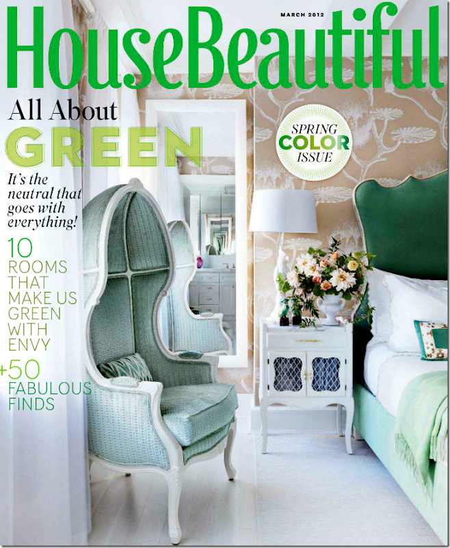
The entire issue this month from House Beautiful is green. And it’s a great issue. Look at the green headboard on the cover!
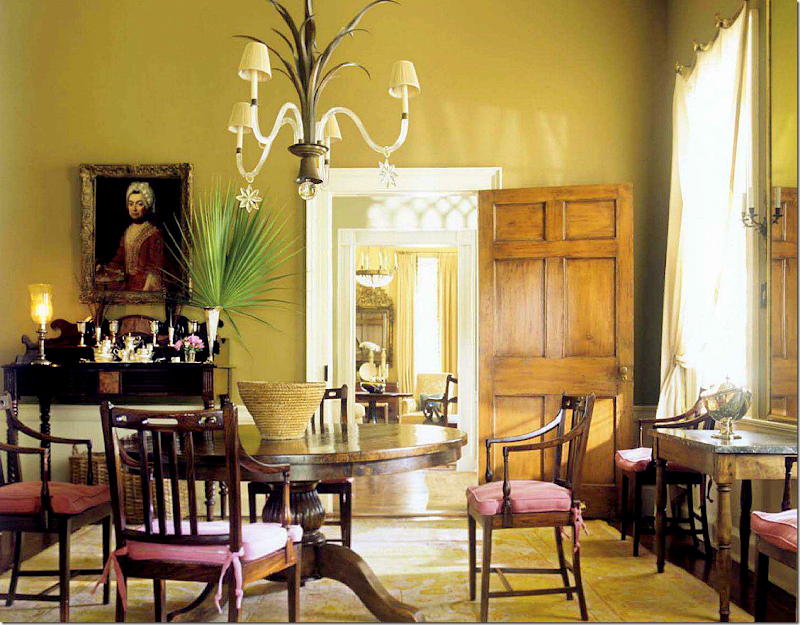
Dining room by Amelia Handegan.
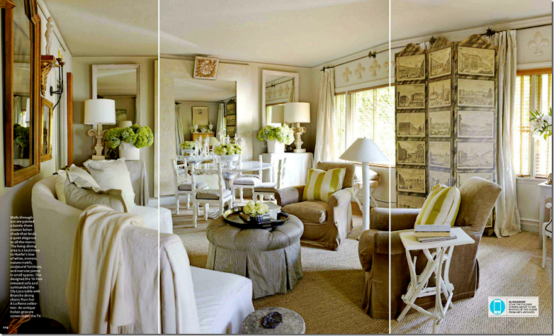
Designer Myra Hoefer redid her entire house in shades of greens and creams and golds – love it. Love her!
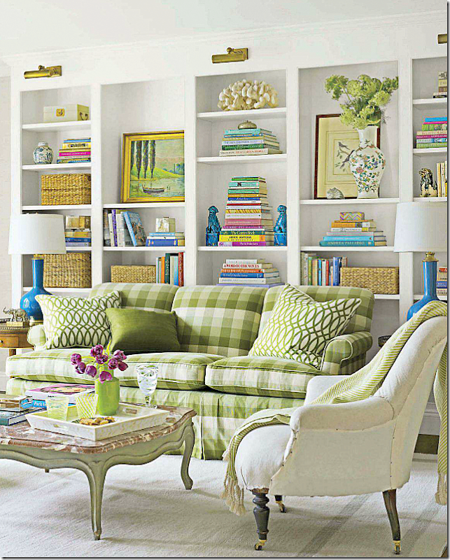
Meg Braff mixes bright greens with bright blues in this house.
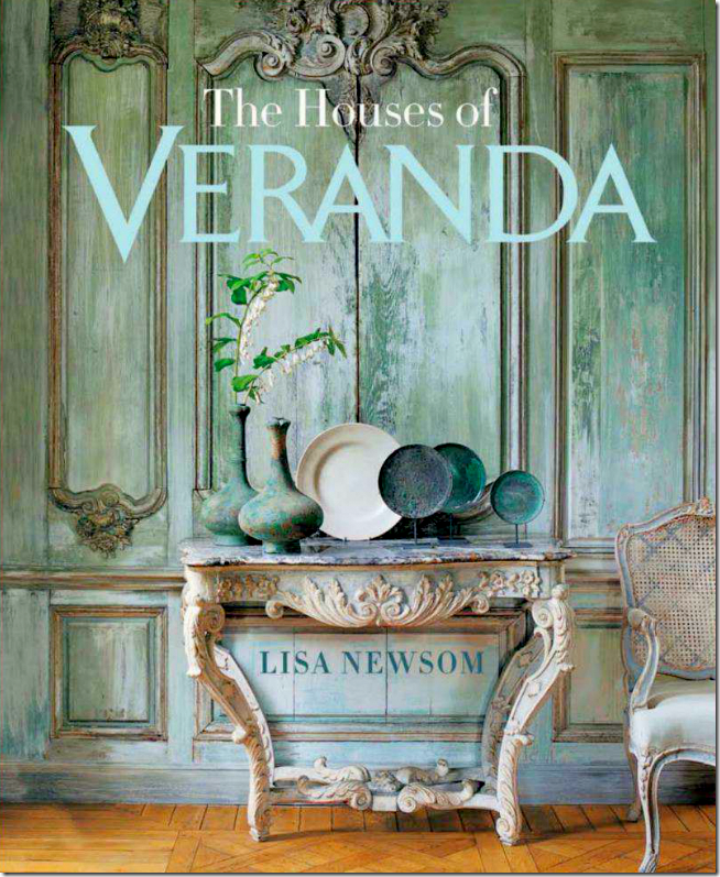
The new Veranda is green too. They are advertising their new book (CAN’T WAIT!) – with this famous cover of a house in Belgium with fauxed green walls. Probably one of their prettiest covers ever. Everything in this photograph is perfection.
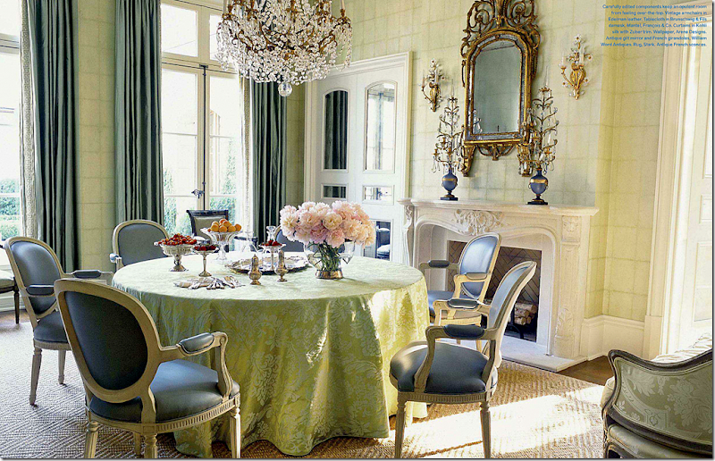
Inside Veranda, there is green everywhere – like this gorgeous dining room by Suzanne Kasler. Those chairs!
And this dining room by Jane Schwab – another beauty. (This entire house is gorgeous!)
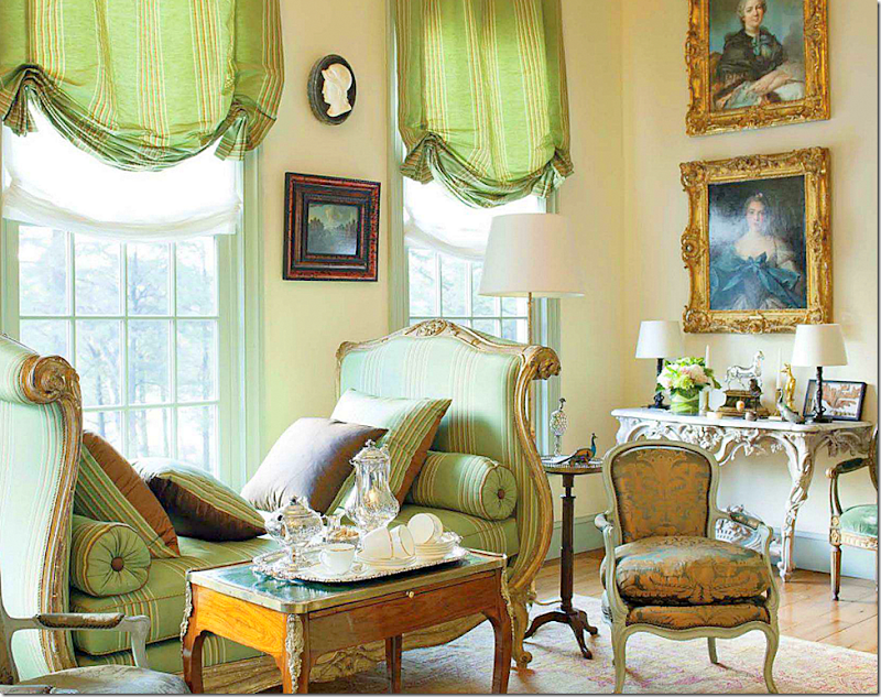
And this living room by Robert Couturier – in green stripes and French antiques. Luscious.
So, when Blayne Beacham, photographer, of Beacham & Co. Realtors in Atlanta sent me pictures of a new listing, I was just floored! Another house with green everywhere?? What is going on, I wondered?? Has green become the trendiest color while I was sleeping? OK, OK. My own bedroom is green and so is my guest room. But still, I just can’t remember green getting this popular. A few years ago, the greens were more of a seamist color, but today – they seem to be stronger and more…green! I’m loving this new shade of vivid green, especially wen you can see it used throughout a house. So, I just had to show these pictures of this house in Georgia – with its strong use of greens. It’s an historic house, built in 1939 by Frazier and Bodin. It was recently restored and renovated by architects Stephen and Kerry Fuller. ENJOY!!!!
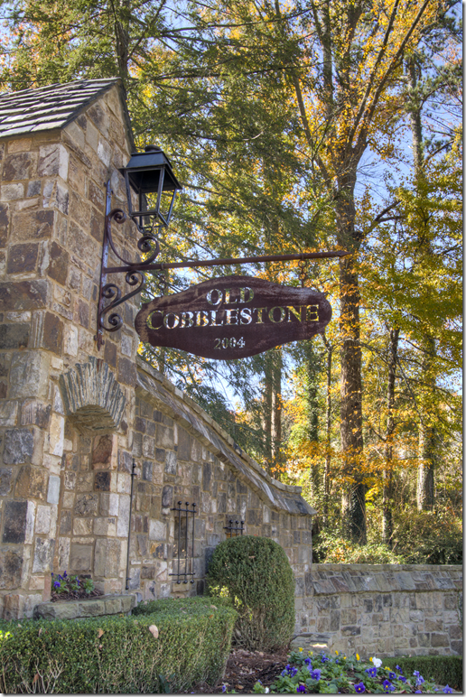
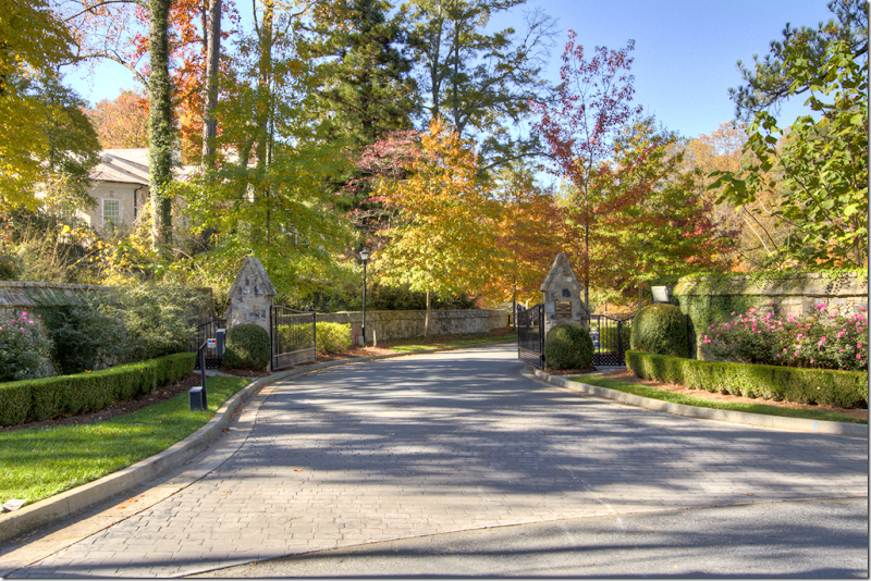
The drive up to the house is impressive – with twin, tiny stone houses that flank the gates.
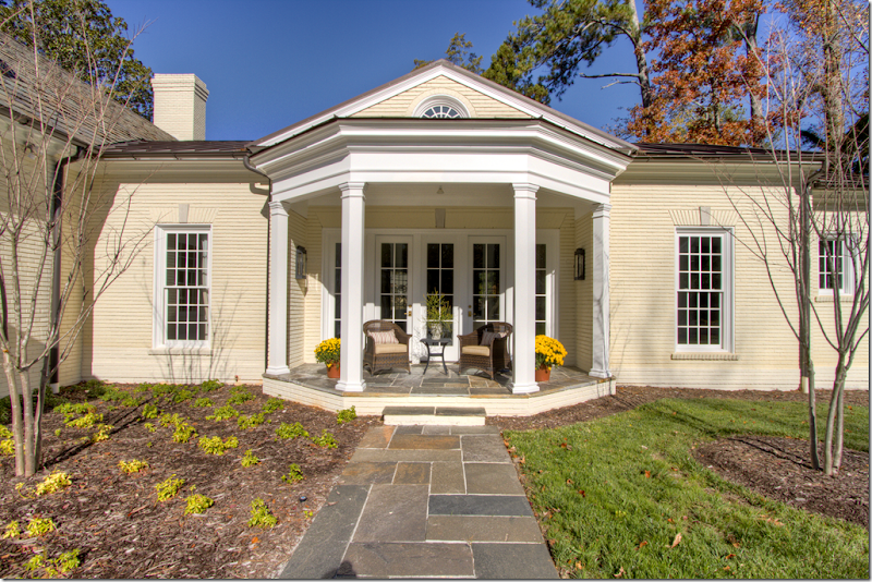
The property is almost 2 acres, the house is large with five bedrooms and 6 1/2 baths. There are 4 garages divided in two spaces. The façade hides the true size of the house.
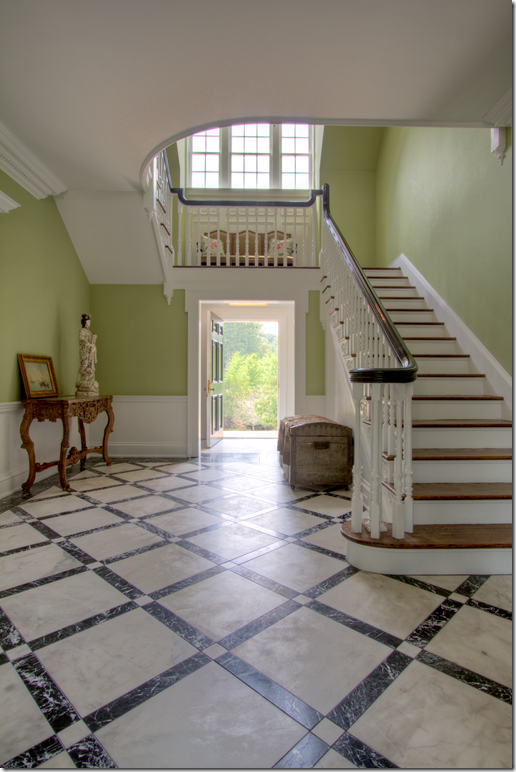
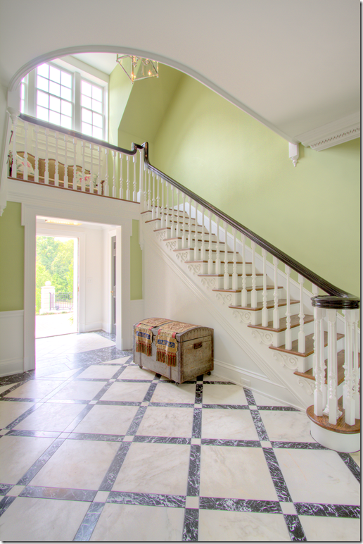
The front entry hall with green painted walls. The floors are white and back marble. I love how the stairs wrap around over the front doors. That’s something you don’t see much in new houses, but it’s so charming! I love this space. Notice the beautiful curve of the landing on the floor above.
Notice the trim work under each step – and the carved balusters. Beautiful!!!!
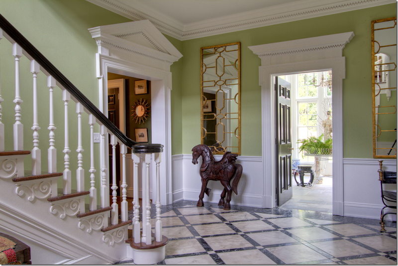
The view when entering the front door. The entry leads into the solarium. The dining room is on the right and the living room is on the left. Notice the pediments above each doorway.
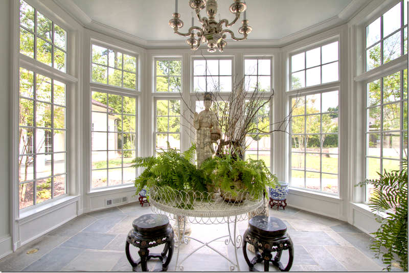
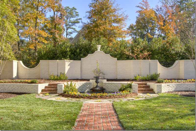
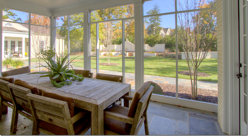
The solarium with slate floors. On the left, is the master bedroom wing, secluded from the rest of the house. The solarium overlooks a brick accent wall in the garden:
The brick accent wall which the solarium looks out on.
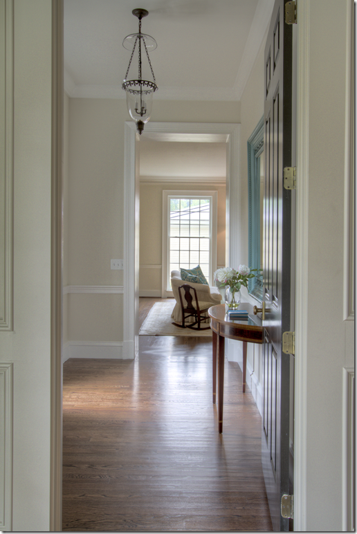
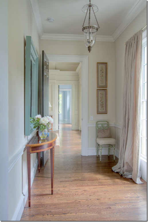
Off the entrance hall, to the left is this charming green painted hall that leads to the study and then further down, to the living room. I miss this in newer homes – halls, and separate rooms that don’t open up to each other. It makes a house so much cozier I think and it’s a feature I wish architects would bring back when designing homes today.
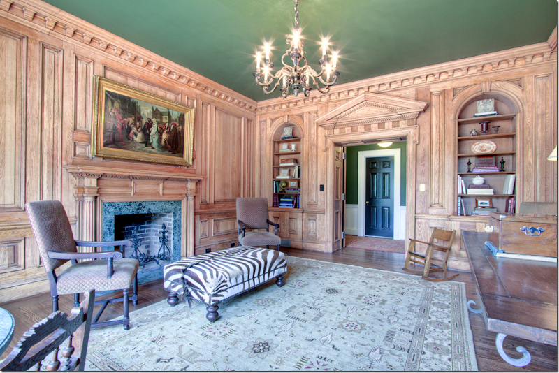
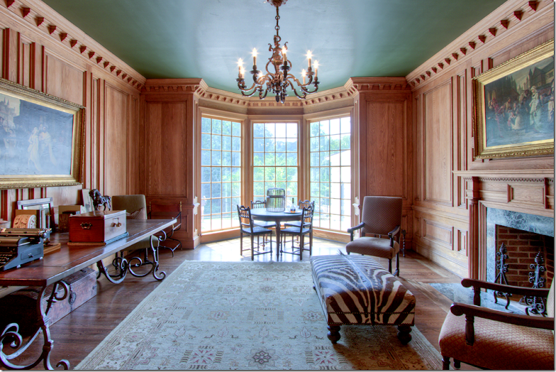
The wood paneled study. The ceiling was painted a deep green to offset the light wood walls. The ceiling ties the room in with the hallway and its helps grounds the room, making it seem warmer. Great fireplace – another feature that isn’t used as often as it was before. If this were a new house, there probably wouldn’t be a fireplace in this room.
The beautiful bay windows opens to the front of the house. This would make a perfect room to play cards in. the molding in this room is incredible.
And off the green hall, past the study, is the living room – its walls with just a hint of green to them. Notice the gorgeous woodwork – the crown molding and the pediment over the door. Twin chinoiserie cabinets and birdcages flank the grand doorway.
The view as you enter the room – a linen slipcovered sofa. There’s such a pretty symmetry to this room – the two black doors, with their gorgeous pediments, flanking the fireplace with its bullseye mirror.
This view faces the front of the house – that’s one of the garages – creating a perfect spot for a courtyard. Again, touches of green with the two velvet chairs.
A short hallway or vestibule runs between the living room and the master bedroom. You can see the living room here.
And looking from the living room into the master bedroom, on into the master bathroom. Such a beautiful spot with the antique console and mirror and chair.
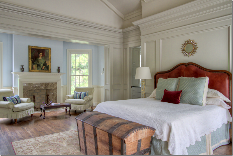
I don’t know this – but I am going to speculate that this master bedroom wing was added on during the renovation – clues – the higher ceiling. But such a beautiful room – with the sitting area and fireplace. Here – instead of greens, reds and blues are used. I love the portrait over the fireplace. The master bathroom is behind the bed through the door. On the right side of the bed, not shown, are French doors that lead to a private patio. Again, beautiful molding here.
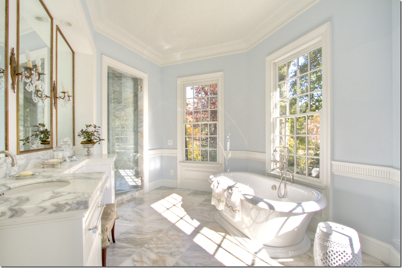
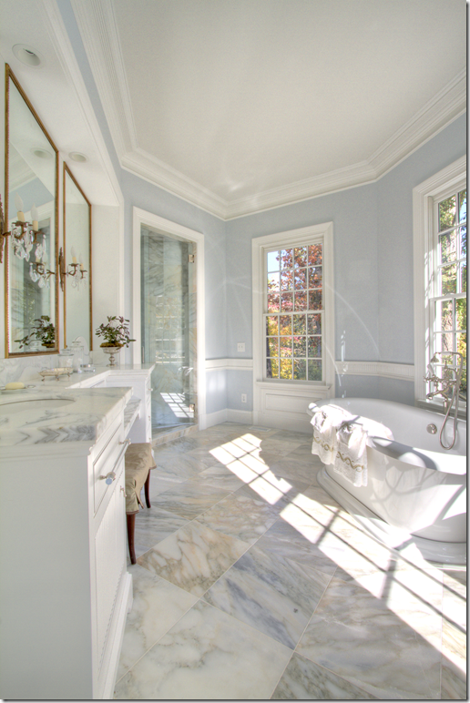
The bathroom is beautiful in light blue and white marble. Look at the pretty sconces and mirrors on the vanity. Notice the beautiful wainscot molding.
The white marble is so pretty!!
Here is the master bedroom’s private porch. It overlooks the back yard. On the far left is the window to the small vestibule that leads to the bedroom. On the far right is the bathroom. What a great place for morning coffee. And here, you can see the round window at the ceiling of the bedroom. I would assume there are two – one on each side of the room.
That’s the left side of the house. Now, we’ll go back through the living room, to the hall that leads to the entrance hall.
Back at the entrance hall, we’ll take a right to the dining room and to see the other side of the house.
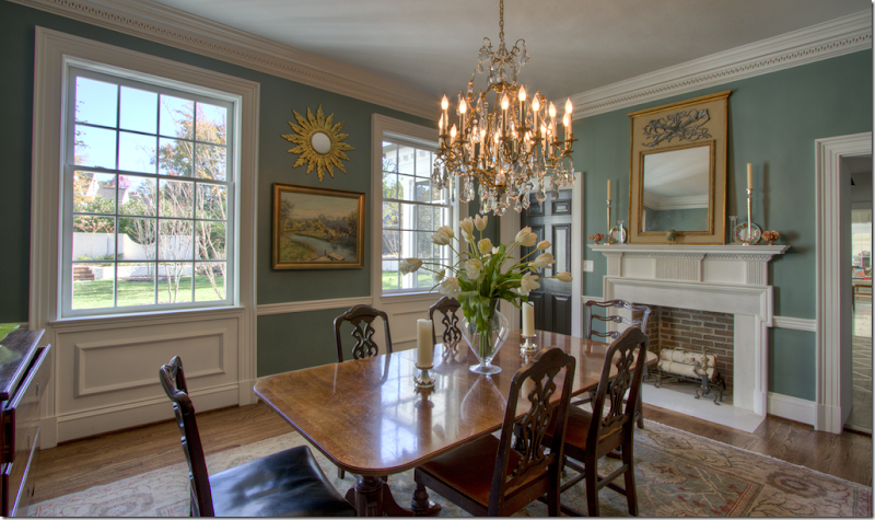
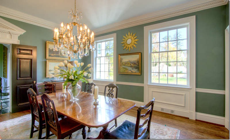
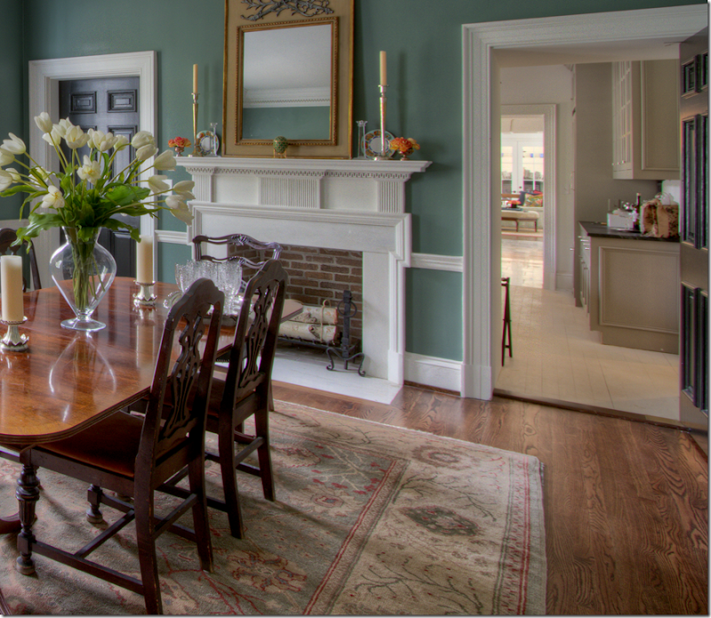
The dining room over looks the back yard (you can see the accent brick wall here.) There’s a fireplace which is such a treat!!! The walls are the same warm green found in the halls and the study. I love this room, it’s so warm and cozy looking.
A view back into the entrance hall – notice the pediment over the door – again something not found in today’s homes. And I love how all the doors are painted black. They look so great against the green walls and white of the woodwork.
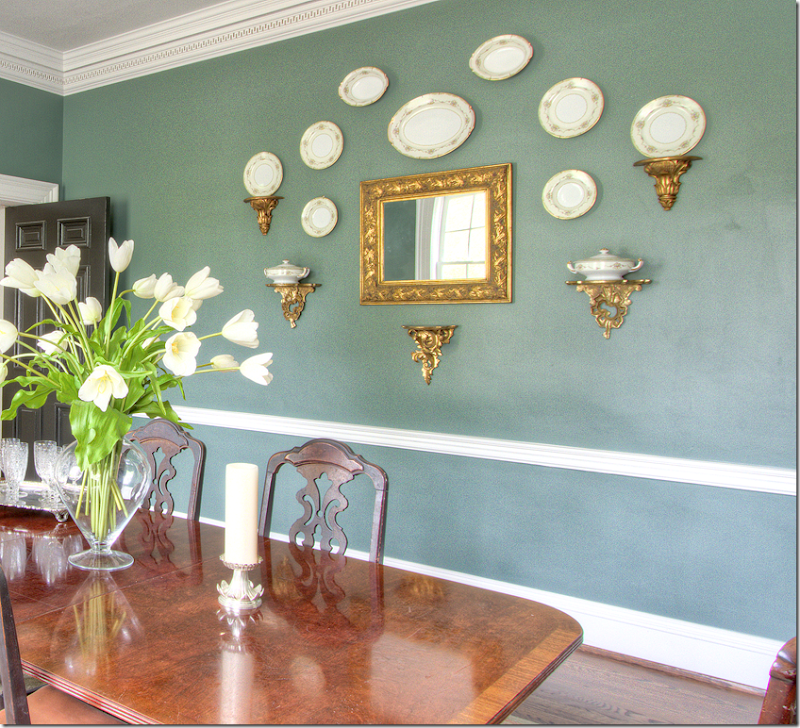
And across the room is this collection of plates, hanging symmetrically around the mirror.
Past the dining room, is the catering kitchen/wet bar – and in the background is the kitchen and family room.
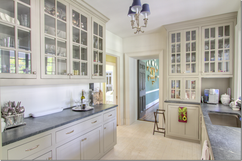
Leading from the dining room is this most charming room – a catering kitchen/wet bar. Notice the painted floors. The cabinets are a putty color with just a hint of green. Gorgeous countertops. I am assuming this is the original kitchen. And through the door – you can spy a bedroom that faces the front of the house. No pictures, though.
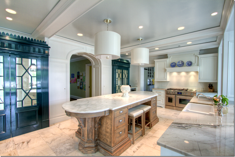
Leading off the catering kitchen is the main kitchen. I am going to assume all this part of the house is the new addition. A large marble covered island is in the center of the room. Marble floors. Twin cabinets, painted a deep green, have chinoiserie styling with mirrored doors.
And looking the other direction, to the left is the breakfast room and on the right is another beautiful cabinet and the family room.
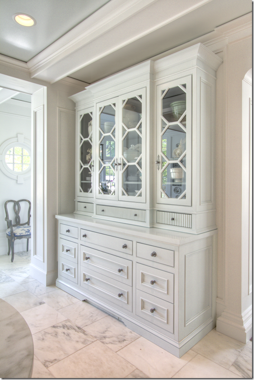
This built in has octagon shaped panes!
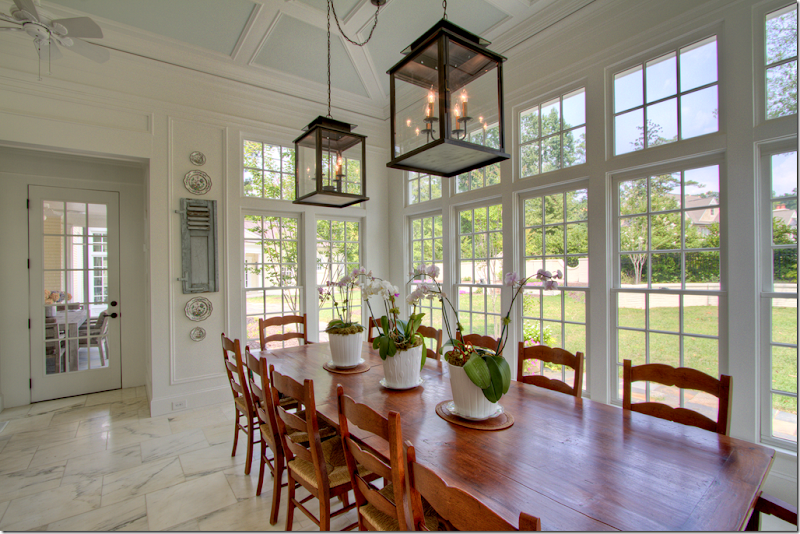
The breakfast room overlooks the back yard. Twin lanterns. Through the door is a covered porch for outdoor eating.
The breakfast room connects to the large family room here.
And the outdoors eating porch through the breakfast room. The catering kitchen overlooks this porch. To the left you can see the master bedroom wing.
Off the children’s play area – looking through the kitchen to the breakfast room.
e
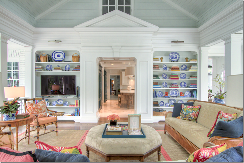
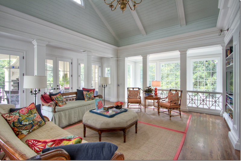
The family room is bright and cheery in greens and corals. Pillows are made out of Schumacher’s famous Chiang mai Dragon. Through the doorway is the kitchen, then the catering kitchen, through the dining room to the entrance hall. On the very right is the opening to the breakfast room. And above, is an interior window that opens to the upstairs.
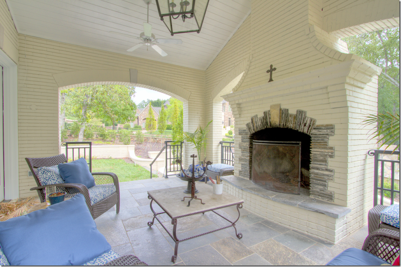
Looking the other direction – behind the family room is a covered porch with a fireplace. To the right – is the stair area leading down to the finished basement. There’s a bedroom and bathroom in the basement. Two more bedrooms are upstairs.
Here you can see the beautiful roof line and the half circle window. Behind is the porch.
The covered porch off the family room.
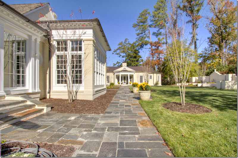
To the left is the family room, then the breakfast room with the flat roof. At the end of the walkway is the master bedroom wing.
And the end of the property – the covered porch is to the left. There’s an outdoor kitchen to its right. Below is the basement. And again, past the breakfast room with the flat roof, you can see the master bedroom wing.
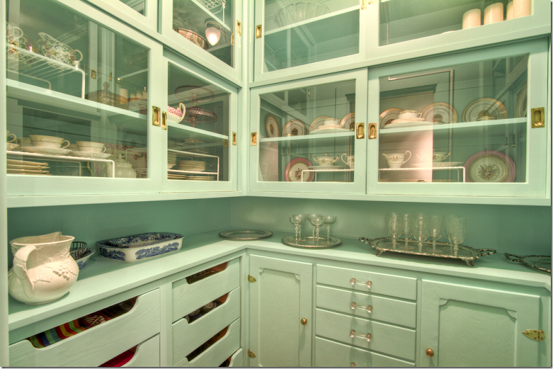
And, hidden away is this green china closet. What a luxury!
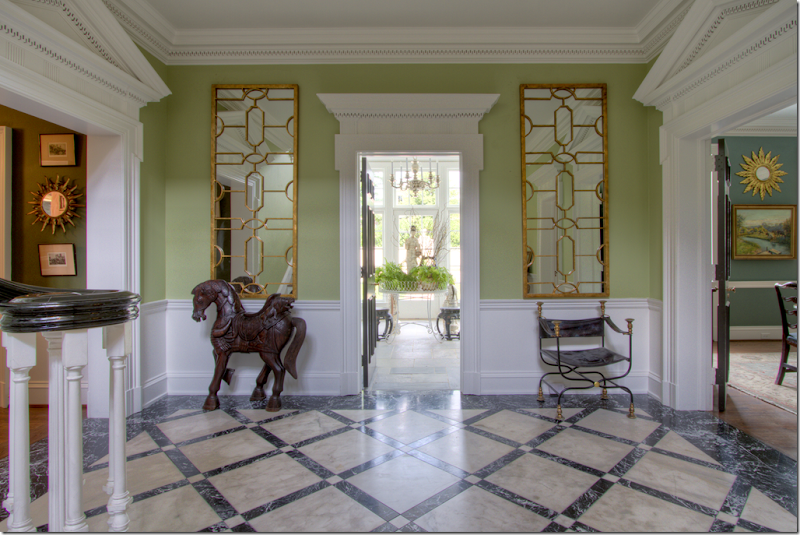
Had to show the entry hall one more time – I think it’s beautiful!!
I hope you’ve enjoyed seeing this renovated classic house in Dunwoody. What did you think about all the greens? Are you liking the green trend or not? I don’t think I could ever have an all green house. I could have an all blue house, but not green, so I would probably limit the green to just a few rooms. But that’s personal – everyone has their own color preferences. I do like the way this homeowner used green – different shades and tones throughout – instead of just one.
All photographs by Blayne Beacham. Please see Blayne’s blog HERE. She always has the best houses on her blog.
And, a huge thank you to Blayne for letting me show one of Beacham’s properties. I love when Blayne lets me show a house of theirs! I really appreciate her generosity. And I’m so demanding too - I make her remove the watermark on her photographs – just for you!! The photographs are so much prettier without them. So another HUGE thank you to Blayne for that.
To see the listing of this house, go HERE.
And finally, to see the architect Stephen Fuller’s web site, please go HERE.

