COTE DE TEXAS

Does Your City Have Its Own Style?

71 comments


image

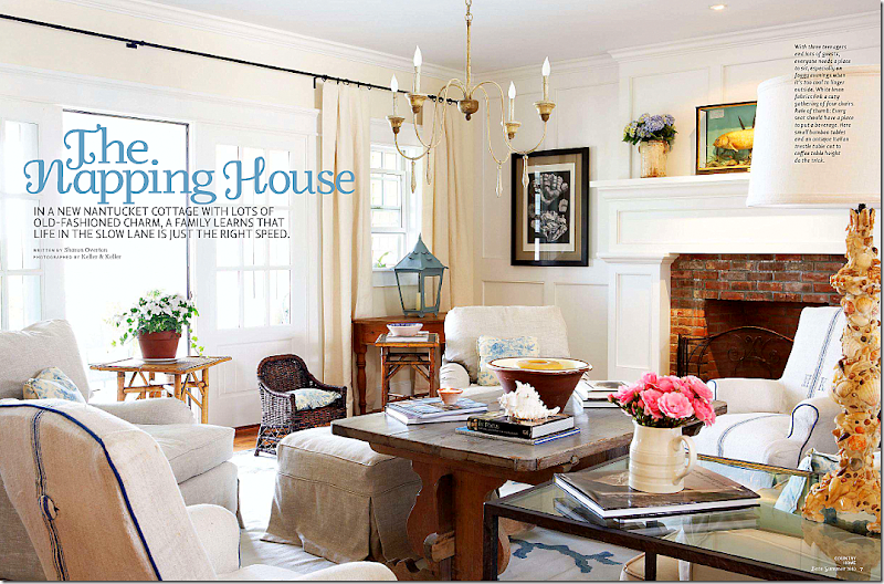
I was looking through a specialty magazine and came upon this house on Nantucket Island.  Gee, I thought.  This reminds me of Houston for some reason.     I’m looking at this picture and feeling at home.  Why???   Look….they even have the same child’s sized wicker chair that I have and bought here in Houston at The Gray Door.   Hmmm.   That’s odd.    All the tiny English bamboo tables, just right for drinks – that’s something we use in Houston.   The big clay pot candle.   The ironstone and French confit pot.  The dhurri, the slipcovers.   The Bennison fabrics.   


image

Is that Rogers and Goffigon fabric (a Houston favorite) on those beautiful French chairs?   Can’t tell but it looks like it to me.   And, yes, seagrass makes an appearance.  And the wood Italian light fixtures that everyone in Houston seems to have these days. This room reminds me of Houston. 


image

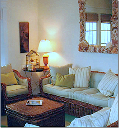
I found this picture on the designer’s web site – it shows the room next to the dining room.  It explains the décor theme, these fabrics, a solid and a stripe, are the same colors as the dining room chairs – it all blends together.   Easy, summery wicker furniture makes sense here in a beach house.  An iron side and large shell mirror finish the room.   I wish this picture was better quality.   But the magazine didn’t include this area of the room.


image

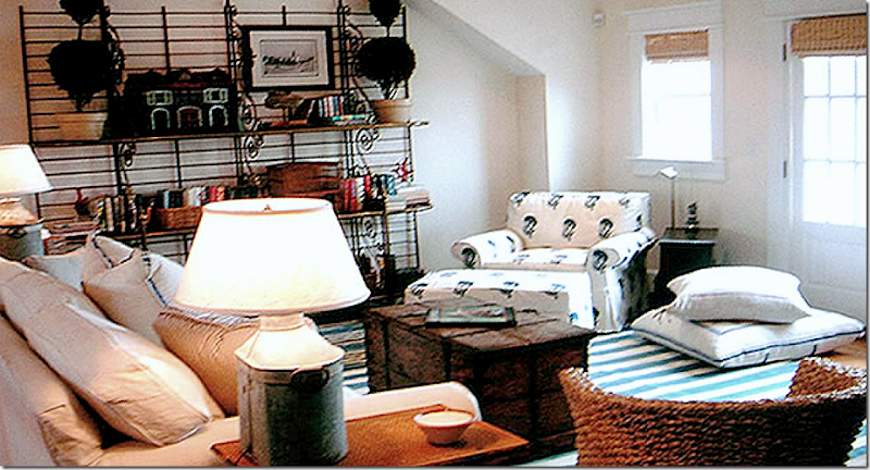
Loving this house more and more.   The wicker, the fabulous blue and white striped dhurri, the Les Indiennes style fabric.   The telescope looks antique – and is so Nantucket.   It gets me thinking….does a city have a “look?”   I know Houston does, and I think Nantucket does too.  L.A. does – and Southern California in general has a certain style.  NY has the sophisticated contemporary look.   Does your own city have a design style that you would recognize?


image

I found this picture on the designer’s web site – it really shows you how cute the room actually is with a large bakers rack and comfy sofa, chest, and two chairs and ottomans.  The magazine picture only shows a small vignette.


image

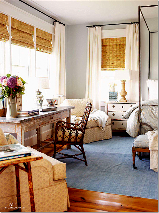
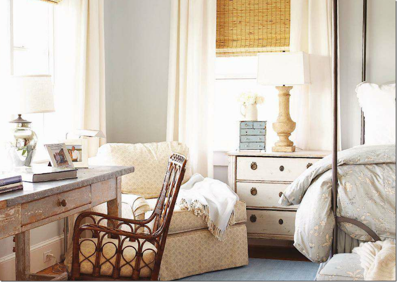
If you haven’t guessed who the designer is,  the lamp gives it away.   This designer always uses wonderful lamps like this.  I wish we could see more of the bed.  Loving the Chelsea Editions side chest, the zinc topped desk,  and the blue, denim like dhurri rug.


image

A closer look at the lamp, the desk,  and night stand.  The designer uses muted fabrics – nothing jarring, nothing harsh.  Everything has integrity with this designer.


image

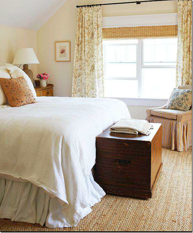
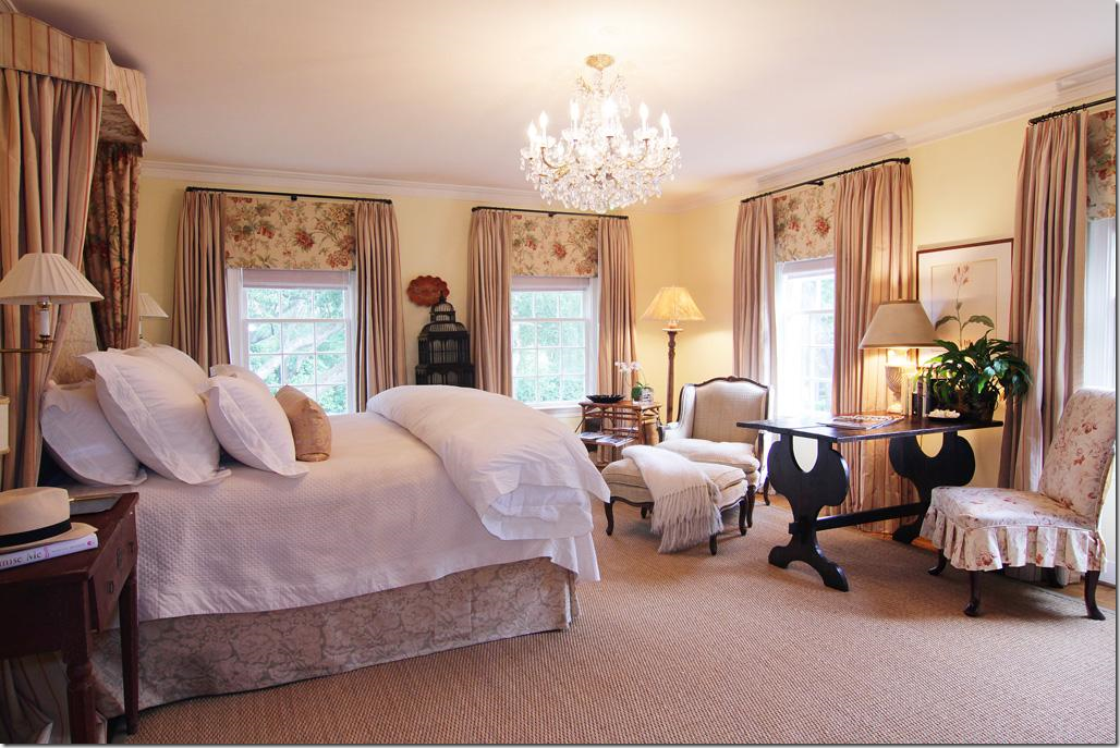
Come on.  This bedroom has to give it away.  The antique trunk – the second one seen in this house, the seagrass, the cushy plush, downy bed are all trademarks of the famous, very, very talented Houston designer.


image

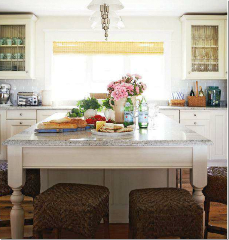
The kitchen is simple, yet functional with its white subway tile backsplash.  Is that granite?   The island is so big – I’ll bet it’s never clear!!


image

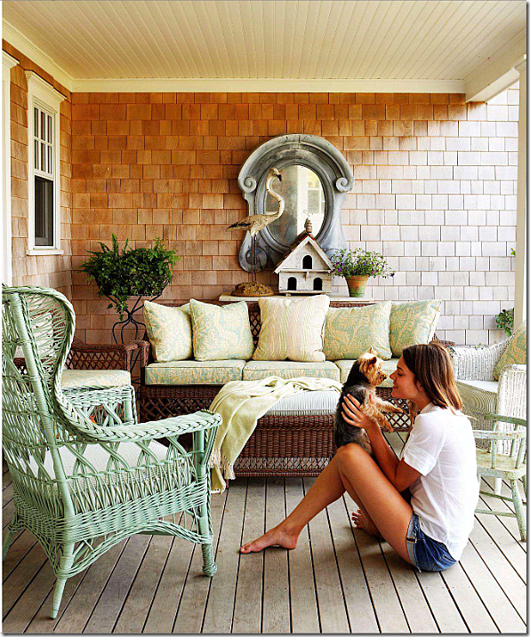
More wicker dressed up with wonderful English style fabrics – the mirror!!!   The mirror!!!  That must tell you something!


image

A closer look at the soft muted linen fabrics.


image

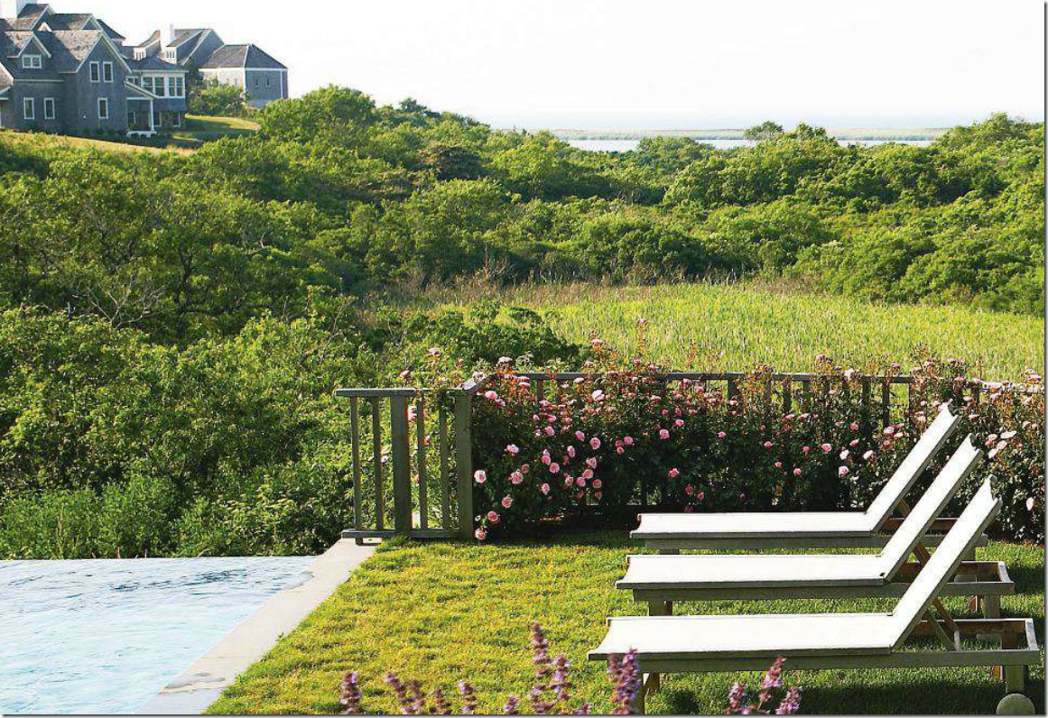
What a view.  This definitely isn't Houston!!!


image

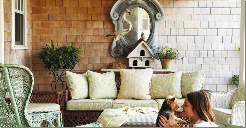
The antique French zinc window – on Houstonian Heidi Dugan’s porch.  Remember her beautiful house?  The House with Two Courtyards, by Ginger Barber HERE.   Yes, Ginger Barber designed the Nantucket house for a family from Houston.    


image

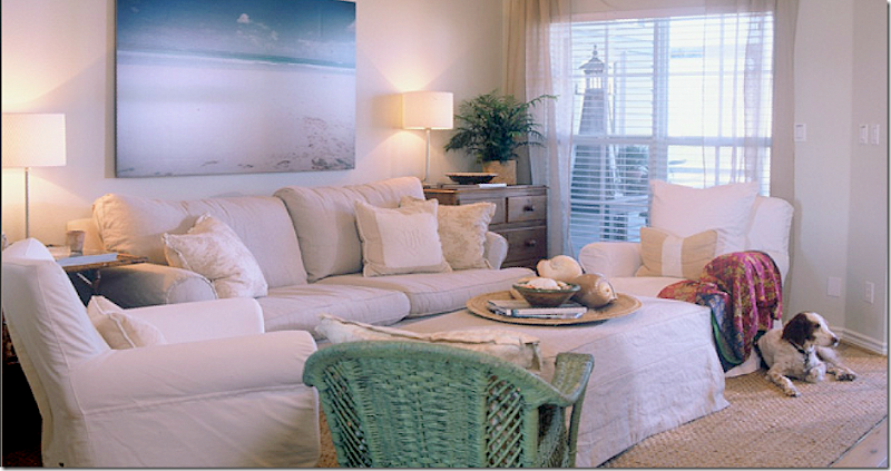
Ginger’s own beach spot was shown in a magazine some years ago.   She took a rather simple builders grade house and made it her own style with seagrass rugs, wood floors and slipcovered furniture.   As usual, she used linens and soft, muted linen prints on pillows. 


image

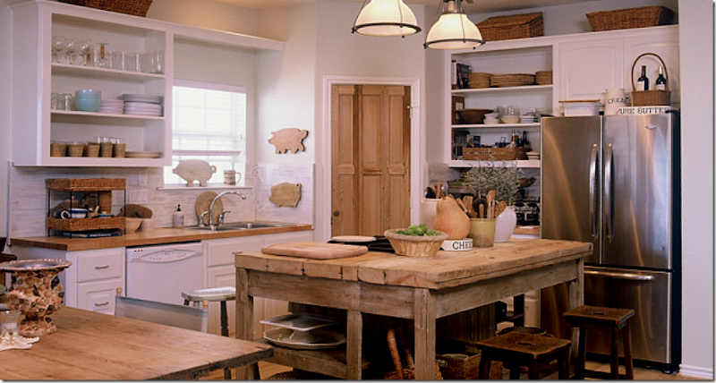
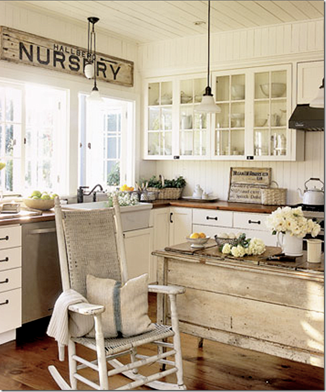
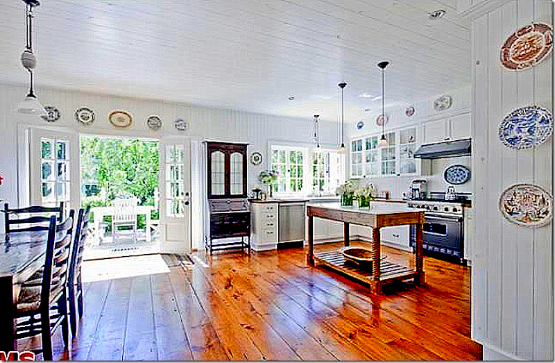
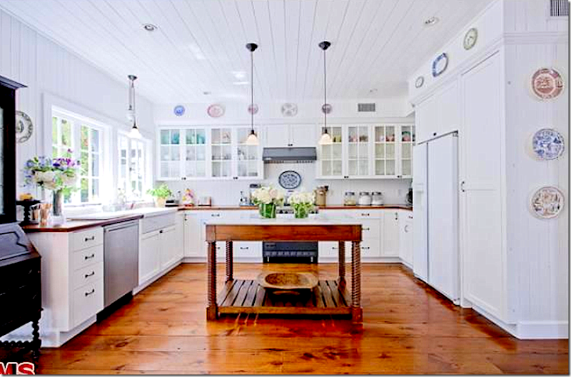
The kitchen is where she really changed it all up.  She put in a pine pantry door, took off cabinet doors and used a fabulous antique table as a center island.  Ginger is partial to pine wood and light colored wood stains.   She showed in this kitchen how with just a few tweaks, you can turn a builders kitchen into something more your own style.


image

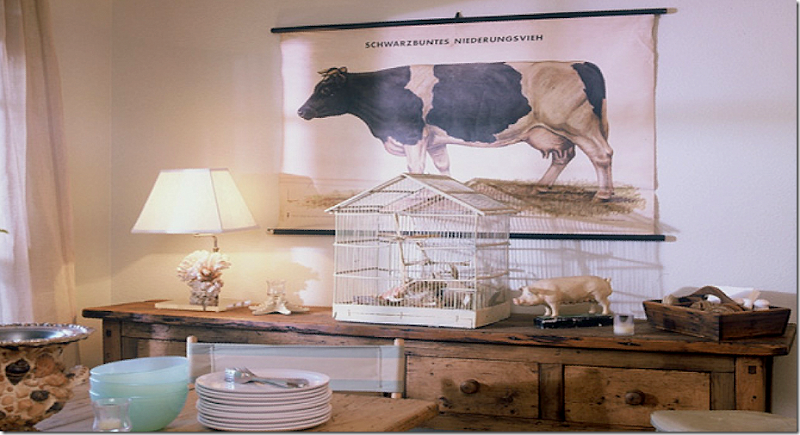
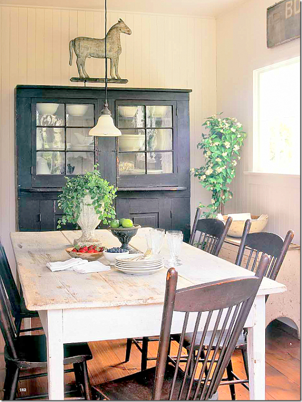
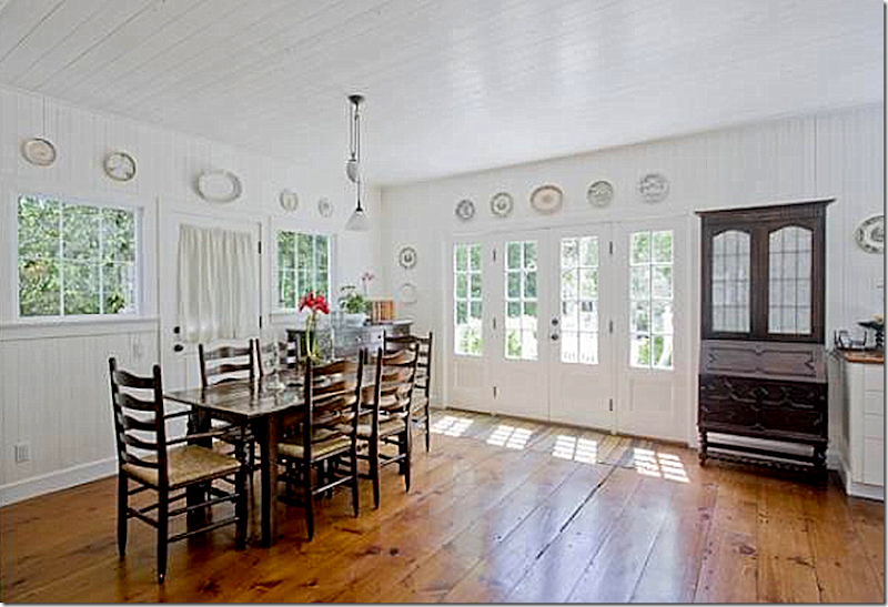
Her dining room is a casual mix of wood antique furniture.  Love the teaching chart of the cow!


image

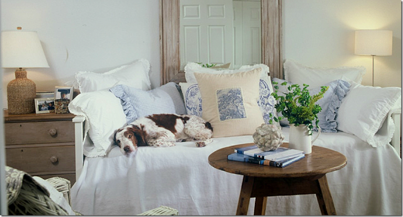
I love the guest room with more wicker, pine, and a comfy day bed. 


So Ginger designed a house in Nantucket for a family from Houston.  By using a designer from their hometown, they brought a touch of it to their faraway second house.   I’m sure that makes them feel more at home in Nantucket – rather than going all out Nantucket style.


What Is Nantucket Style??


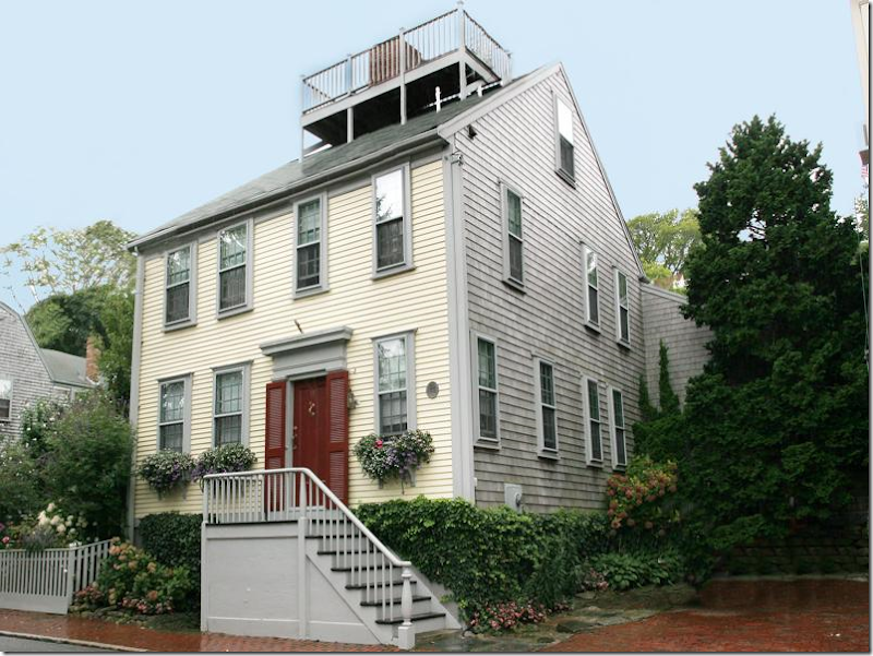
Everyone knows what Nantucket style is from the outside.  All the houses have naturally aged, gray shingles which gives the island charm and gives it a design continuity.


This house is how I imagined the upscale houses are:  American antiques and American symbols such as stars and stripes. 


The living room is rather staid – rather boring.  It looks like a hotel lobby to me.  Yet, this is one of the more expensive houses for sale on the island.  Give me striped dhurris and slipcovers and distressed furniture any day of the week over this look.


This second house is rather beautiful.


image

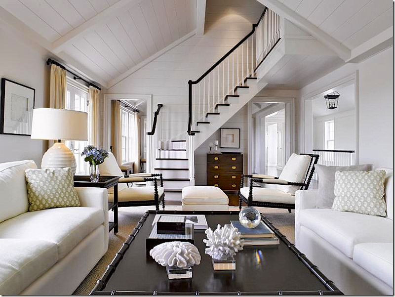
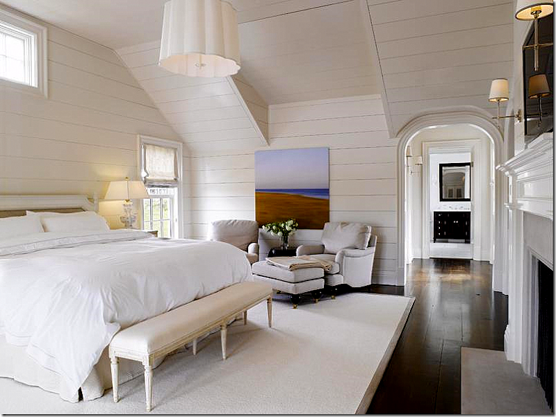
I think the interiors are gorgeous with white walls, black accents and creamy colored curtains.   It’s dressy for a beach house, yet it looks  like a beach house on Nantucket.  The dark campaign style chest – that’s something that Houstonians wouldn’t have – it’s very New Englandish. 


Hmmm…a little too styled for my taste. 


Aren’t the lines beautiful?   And looking at the dining room from this angle, it’s less cold looking with the large black dresser.


I love the kitchen with its great lighting fixtures, the mix of white marble and the cream tile, and I love the banquette used at the kitchen table. 


image

Beautiful hardwood floors and the paneling throughout the house is so pretty. 


image

The guest room is nice and modern with a mix of classic elements.  Very beautiful house – I wish I knew who the designer is.   Does this mean Nantucket to you?


image

This house really struck me as typical Nantucket style.  This house is in town. 


image

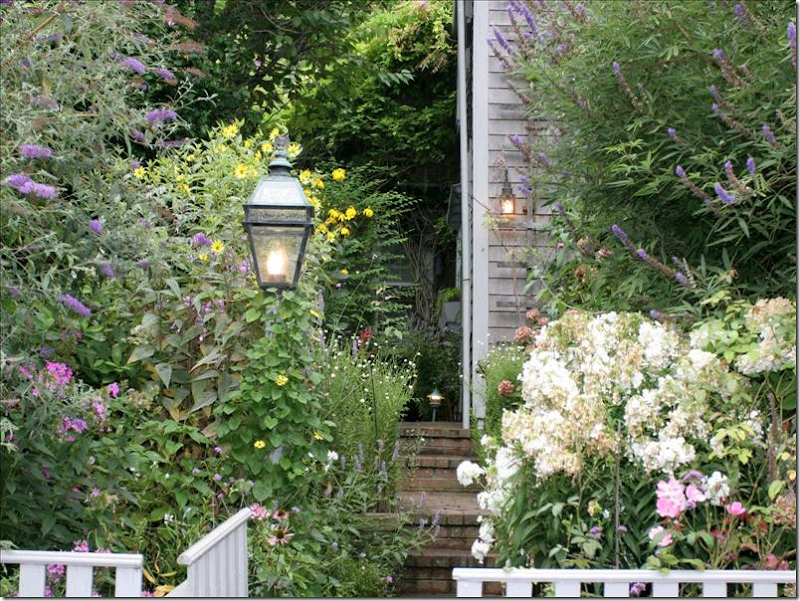
It has the lush secret gardens that come with the town houses.


image

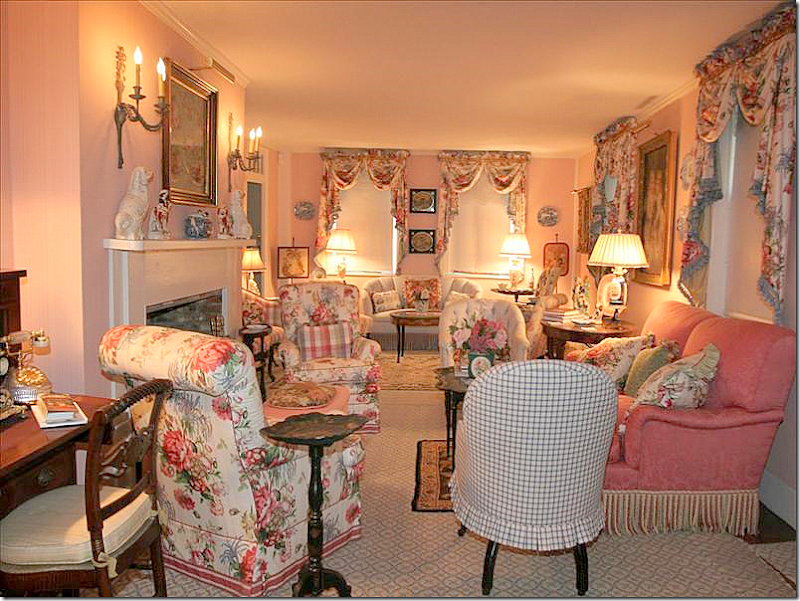
Wow.  Take me back Mario.   This is how I always imagine those town houses in Nantucket look like.   Very English with a mix of fine American antiques.


image

The owners spent a fortune on this décor.  But – in what year?   I am dying to know who designed this!  And what year it was designed??


image

Toile dining room.


image

The family room looks more typical American antiques style.  


image

A larger view of the family room.   I’ll bet that in its day, this was one of the prettiest houses on the island.  I’m just sitting here thinking, if I owned all this beautiful upholstered furniture – how would I update this house for the new century?  All in white slips?  Leave the curtains?  Leave the chintz?   Nah, it all has to go to the upholsterer!  ASAP.   It’s like a time capsule, isn’t it? 


image

The master bedroom – more chintz, more needlepoint.


image

A guest bed.  I do love the monogrammed bed covers.   I had one just like that, in blue trim, 20 years ago. 


image

So charming, so Nantucket, but so in need of updating.


Houston Style:


image

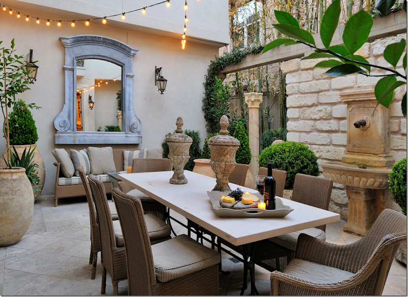
Thinking about it – what is Houston style?  It extends first to the landscape – lots of boxwoods, confit pots, antique outdoor furniture – less sets of wicker or iron pool furniture.  The space might often be quite small – as lot sizes shrink and new houses get bigger.


image

Even in the most exclusive of houses, you will probably find textured blinds and seagrass rugs. 


image

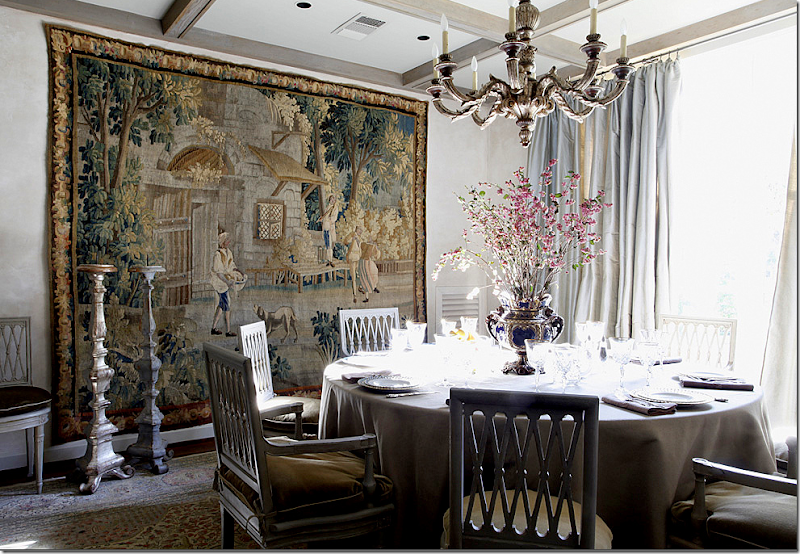
You might see antique oushak rugs, Bennison fabrics, antique putti, and candlesticks from cathedrals – always, either new or antique.


image

In the more exclusive homes, you will find antique sofas and tables – younger families might have the same look, but by using reproductions. 


image

White, always white, gilt mirrors, chandeliers, and silk curtains.  The room doesn’t have be large to get the look.


image

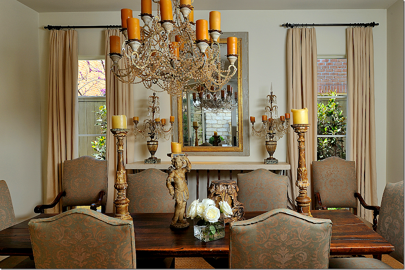
Dining rooms have wood tables – old or new, trumeaus, one of a kind chandeliers, altar candlesticks.  Gorgeous – by Ginger Barber.


image

In Houston, you still see skirted tables in dining room especially.   If they can’t afford a huge tapestry, you will see masses of tapestry pillows instead.


image

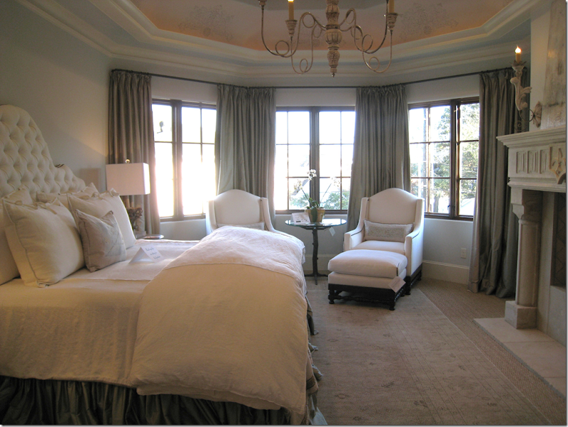
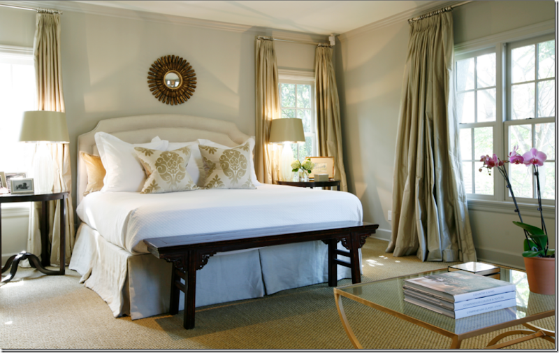
Master bedrooms have seagrass and simple bedding.   There are usually upholstered headboards.  In many Houston houses, a sunburst mirror is above the bed – new or old. 


image

Some Houstonians layer oushaks over seagrass in bedrooms and living rooms. 


image

Bedrooms often have beautiful window treatments, with either fabric or textured shades layered under the panels. 


How do you define your city’s style?   Is you décor typical of where you live, or do you decorate as if you live in L.A. or Atlanta instead of Minneapolis?

To contact Ginger Barber, see her web site HERE.


Summer House in Nantucket Restored by Nancy Fishelson

48 comments


image

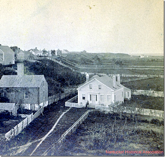
House in Nantucket – 1870.


I have been collecting pictures of readers kitchens for the past few months, gathering them to up to write a story.  Many of you have generously been sending in pictures of either your new or newly remodeled kitchens.  Some of you have sent in pictures of your entire house.  And sometimes the pictures of your kitchen are so interesting looking I have asked to see more of the house itself.   This is the story of one of those really different kitchens that came in and caused me to want to see more of the house.    The owner explains that her family is from Atlanta, but they summer on Nantucket, in this small house, a clapboard Greek Revival, built in 1840.  After the house was purchased in 2006, an extensive renovation took place.  While walls came down and ceilings were raised, the basic integrity of the house remained.  


image

2006

When the house was bought in 2006, the floor plan needed help - it had many small rooms, but no flow.   The kitchen was in need of a total remodeling.  


image

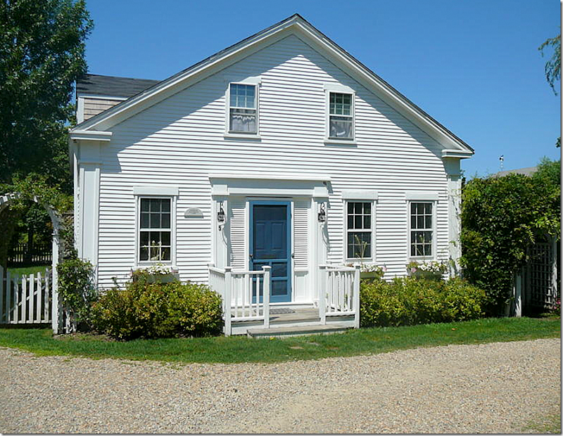
Today – the house is painted white, while the doors are painted blue.


The owner told me that she is a big fan of Nancy Fishelson, a very talented and popular architectural designer, who specializes in restoring older homes.   Besides the renovation of the main house, there was an unfinished storage shed which the owner wanted to turn into a bedroom for her mother who comes to visit several weeks each summer.  Nancy Fishelson was the perfect person for the job.  Nancy’s own houses have been published in many magazines over the years and she has a large following.  The shed/bedroom that Nancy designed turned out fabulous – and is now the favorite guest room for those who visit. 


image

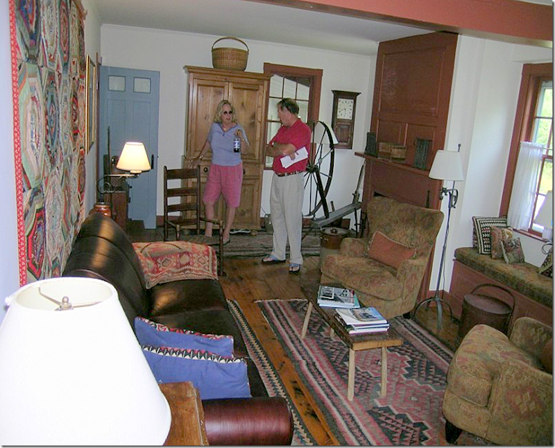
Before:   The living room.   The décor was more suited to a Colorado cabin than a beach house on Nantucket.


image

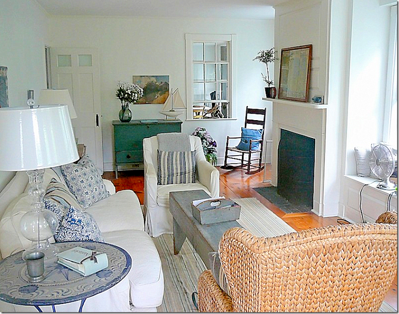
Today:   The living room is bright and cheery with white slipcovers, and blue and white striped fabrics.   The room is filled with American antiques.  Notice how different the fireplace looks painted white instead of its former colonial red.  Through the window is the dining area located in the kitchen.   Originally this dining area was an outdoor porch that was incorporated into the new kitchen. 


image

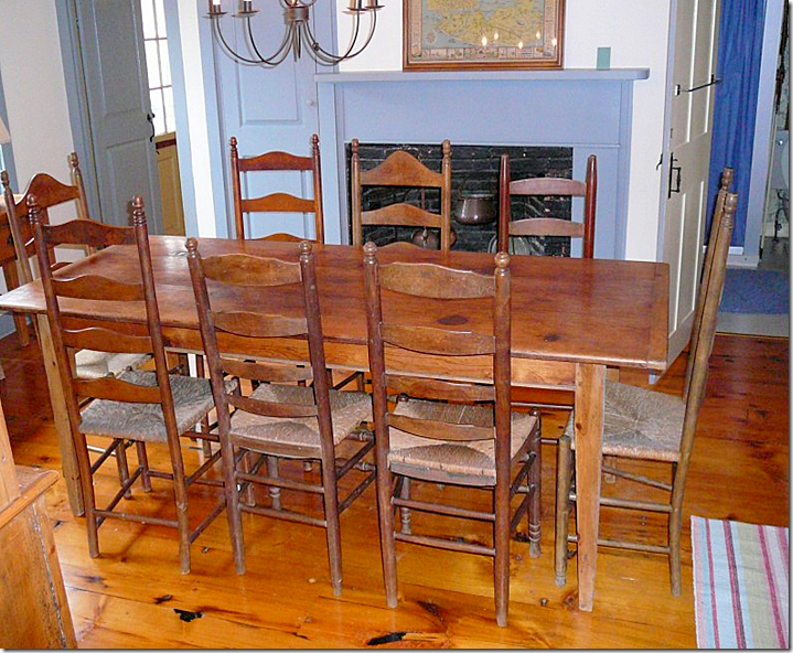
Before:  The dining room was next to the living room was in the middle of the house, while the kitchen was hidden far away.   It was decided to move the kitchen to the dining room, which had great views out its windows.


image

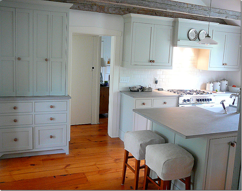
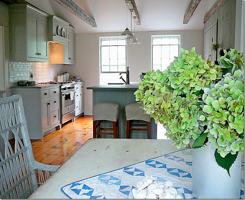
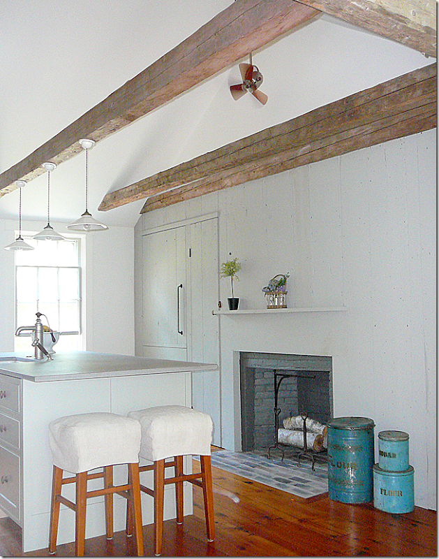
After:  The kitchen is now located in the former dining room.  The blue fireplace was painted gray.  Amazingly, when they pulled off the 1940’s mantel, the original wide board sheathing was exposed.   The owners loved the paneling so much that they uncovered it around the wall and even used it on the Sub Zero panel fronts.  The ceiling was opened up and vaulted, using Nancy Fishelson’s trademark grey collar tie beams.  All of Nancy’s houses have these fabulous beams which add so much character and texture, especially in an all white room. 


image

Here’s a view of the fireplace with the original paneling.  All the cabinetry was painted Benjamin Moore Fieldstone – a color the owner says she got from Sally Wheat’s infamous kitchen!  The countertops are Fireslate.  The refrigerator, to the left of the fireplace, is almost completely disguised behind the paneling.  And a Shaws sink was used, the owner said, after reading about it here on Cote de Texas!


image

Looking the other direction – the backsplash is a crisp white subway tile.  


image 

Before:  looking from the dining room into the porch – before it was incorporated into the kitchen.


image

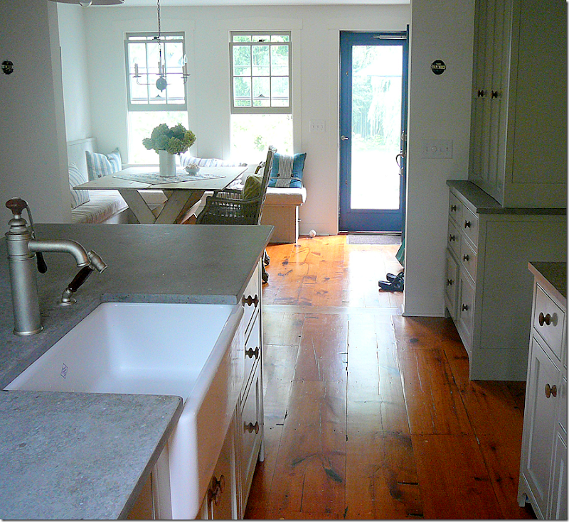
After:   And looking to the right of the island, is the dining area.  This part of the room was once an unheated porch which the owners incorporated into the kitchen after tearing down the connecting wall.  Aren’t the wood floors gorgeous??!!!!!


image

Looking from the banquette dining area into the kitchen.


image

The original antique sheathing was used to construct the banquette.  Cushions are made of 19th c. oatmeal colored duvets, and the pillows are made of old striped rag rugs.


image

Another view from the old porch looking into the new kitchen, formerly the dining room.  Notice the beam that was placed on top the opening between the two rooms.


image

Another view of the beautiful ceiling beams.   I love the three light fixtures and the tiny ceiling fan hanging from the beam.


image

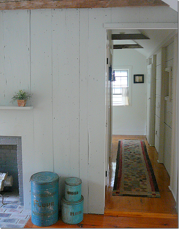
A view past the kitchen down a hallway.


image

And looking into the living room from the dining area through a window which was once in the outside porch, but now is in the kitchen!


image

Before:  the same window when it was the porch, before it was turned into the kitchen/dining area.


image

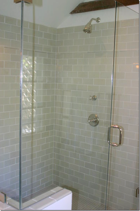
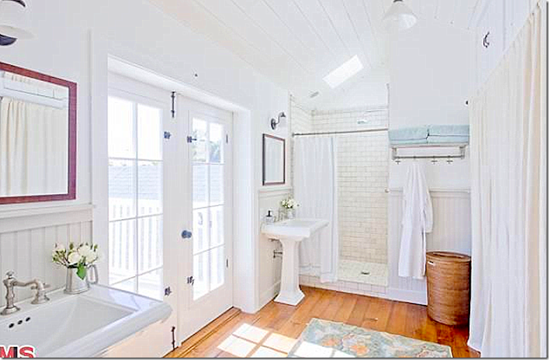
The bathrooms were all restored, but while the showers were modern, the old beams were left.


image

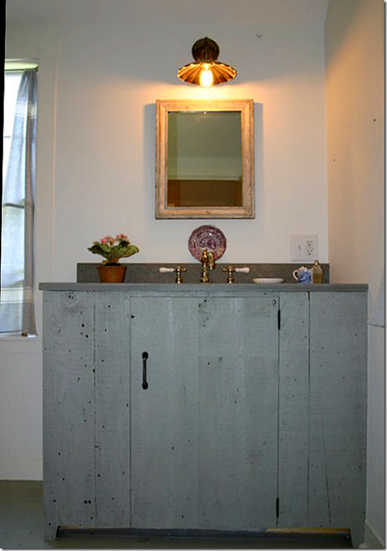
And the sink cabinets were made out of the original paneling found in the dining room.  Great light fixture!


image

Closeup of the sink cabinet above with the same countertops found in the kitchen.


image

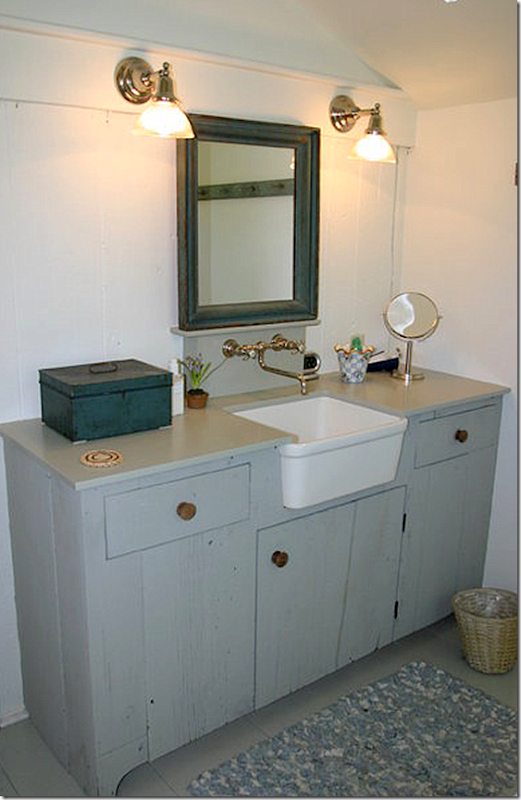
Another sink cabinet made during the remodeling.  I love the small apron sink!


image

The unfinished shed that became “Mother’s Guest House.”  Nancy Fishelson transformed this barren space into what is now the favorite guest room.  Besides being known for her work on houses, Nancy also transforms gardens.


image

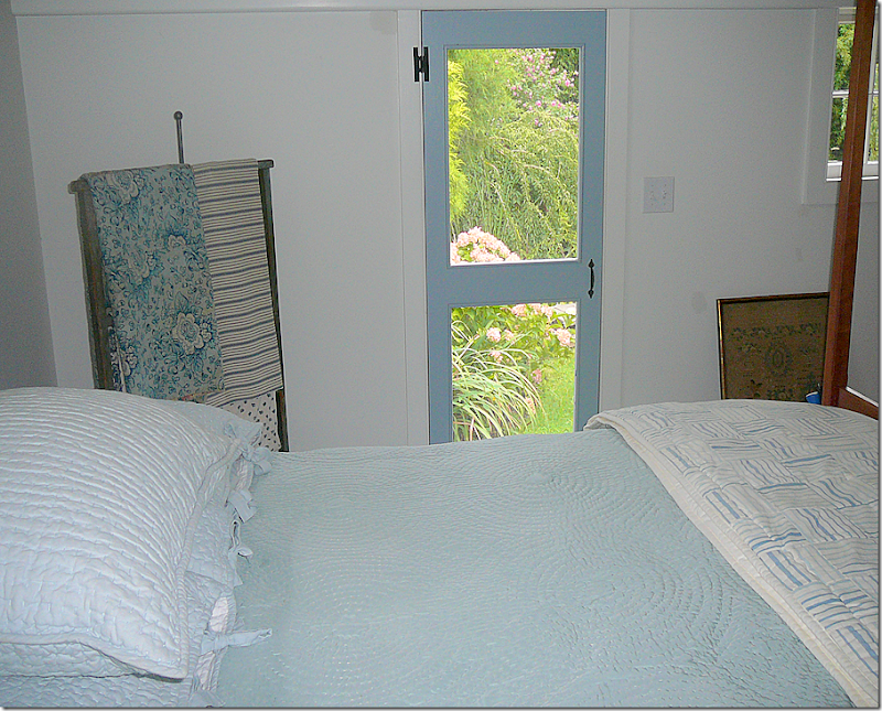
Inside, with its blue painted floors, Nancy used her trademark grey collar tie beams on the now vaulted ceiling. The room was furnished with American antiques, most fitting for a house on Nantucket Island.


image

The front door of the guest house looks out on the garden. 


image

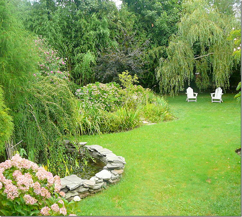
A view of the gardens with its stone rimmed pond.  

Construction by Buccino HERE for more “before” pictures.


image

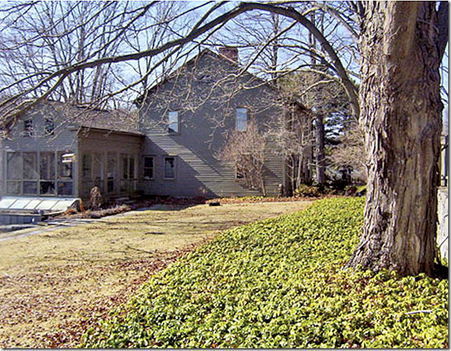
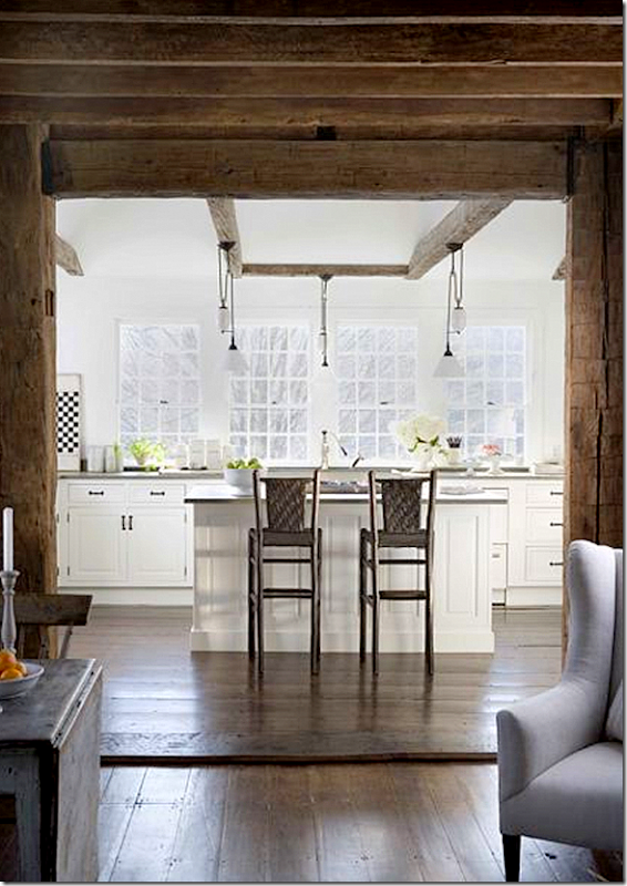
So, who exactly is Nancy Fishelson?   After living in California for many years and making a name for herself, Nancy found this 1790s clapboard house in Litchfield County CT. located on 20 acres.  This is how the house looked like when it was bought.  Nancy specializes in restoring old houses and is tops in the field of architectural design.  As usual, the more I leaned about Nancy, the more pictures I gathered to show you!!


image

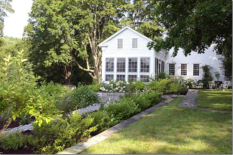
Today, the house looks like this – painted white and totally restored.  She raised the lowered ceilings, opened up doorways and added windows throughout.   Many smaller rooms were combined in larger, more open ones.  She created a new kitchen and turned three small rooms into a large master suite.  Nancy says this house is more simple than others she has owned – saying that through the years she has learned that “less is more.”  The gardens are spectacular.  That room overlooking the garden with all the windows is a sleeping porch – the windows come off during the summer months. 


image

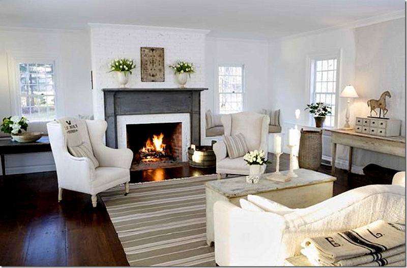
Inside, the house has her trademark white walls and wood floors.  She has an extensive collection of American antiques which look right at home in this 1790s house.


image

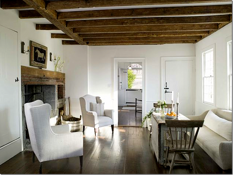
Looking from the keeping room through to the Dutch door, another favorite element of Nancy.   Wow – that fireplace!  The kitchen leads off this room.


image

This is the now enclosed porch, which opens to the kitchen.


image

Another view inside the sleeping porch.


image

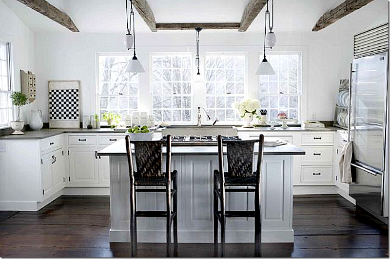
Nancy’s kitchens are legendary seen here through the keeping room.


image

Her beautiful kitchen with its dark hardwoods and white walls – two of Nancy’s trademark.


image

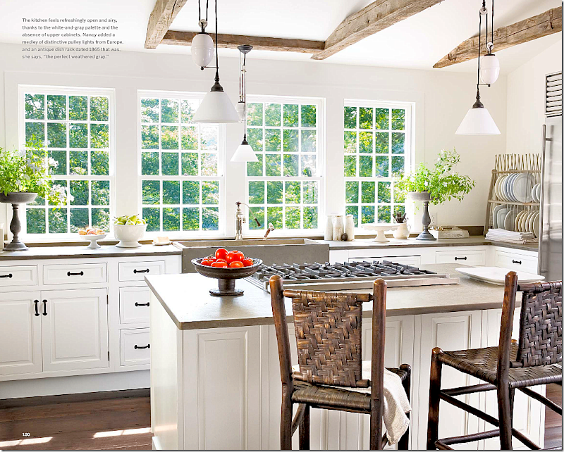
In Country Living magazine, the kitchen was shown in a close up.   The pulley lights, which came from Europe are beautiful.  In most kitchens, she replaces overhead cabinets with windows over the usual apron sink.  The countertops are Fireslate – the same as the reader’s kitchen. 


image

BEFORE.  Hard to believe this is the same kitchen!   Nancy raised the roof, installed new windows and new cabinets she bought on eBay.


image 

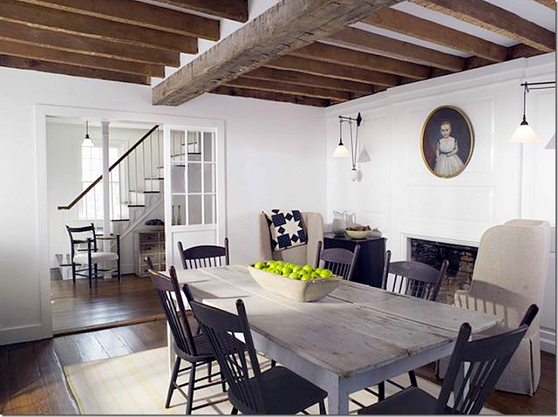
Beautifully, quiet dining room with grayish painted table and more pulley light sconces.  I love the French doors that are used inside the house instead of solid doors.


image

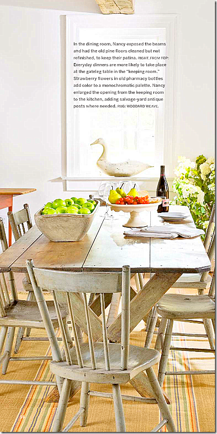
Country Living magazine showed the dining room with gray painted chairs and a bright yellow rug.  The pictures from Country Living magazine look so different from the other pictures of her house!!


image

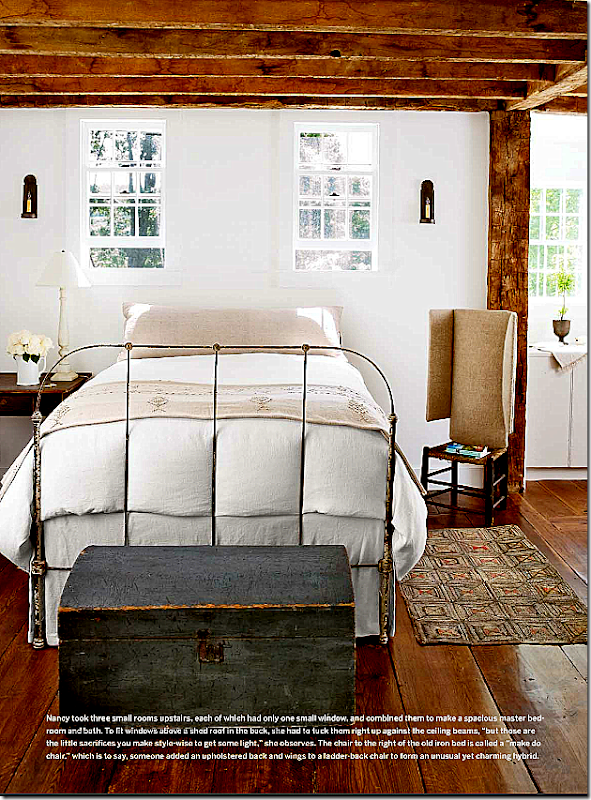
Three small rooms were turned into the master suite – filled with American antiques.


image

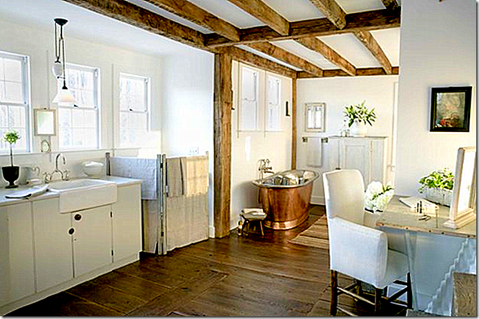
The bathroom has this beautiful copper tub – what a luxury!


image

A view of the master bathroom.  Notice the apron sink, the copper tub, and the beautiful wood beams.


Want to see more of Nancy Fishelson’s work??


image

Before she moved to Connecticut, Nancy lived in this charming 1940s two story house in Mar Vista, California.


image

The living room was furnished in all white upholstery and her usual American antiques. 


image

Another picture of the living room.


image

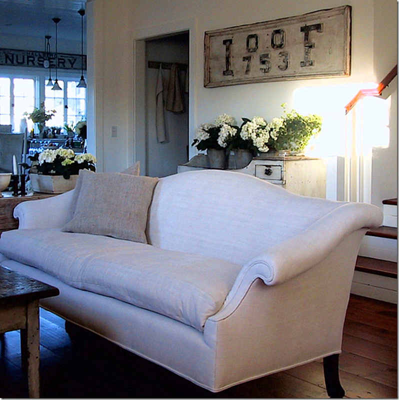
A rarely seen view of the living room with the dry sink and sign behind the sofa.


image

Closeup view of dry sink and sign above it.


image

Nancy is fond of using signage throughout her house.   Again, the wood floors are gorgeous.


image

The dining room is located inside the large kitchen – a room she completely remodeled.  These chairs and table look like the ones she now has in her dining room.


image

Nancy used old wood floors as kitchen countertops, and again, she used the pulley lights. 


image

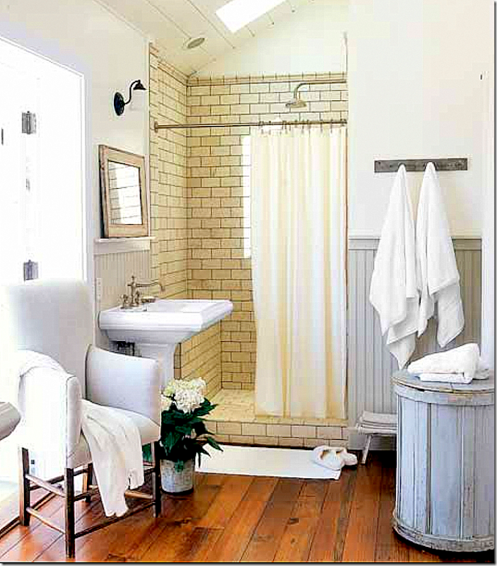
The master bathroom has two pedestal sinks and tiled shower. Her antique upholstery adds just the right touch.


image


A vintage bathtub sits in the master bedroom, in front of the balcony.  I love how she added the high doors in the corner cabinets. 


AND AFTER NANCY MOVED OUT…

image

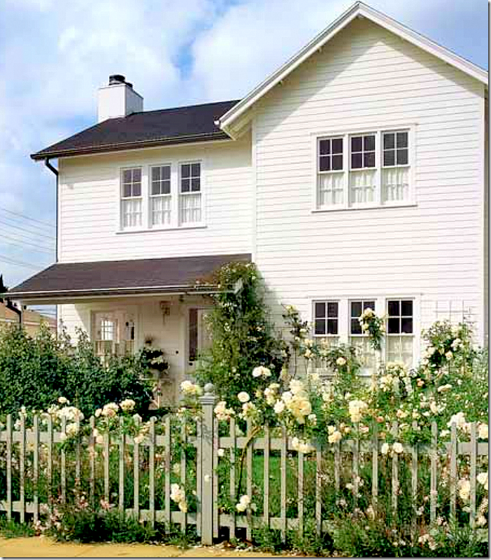
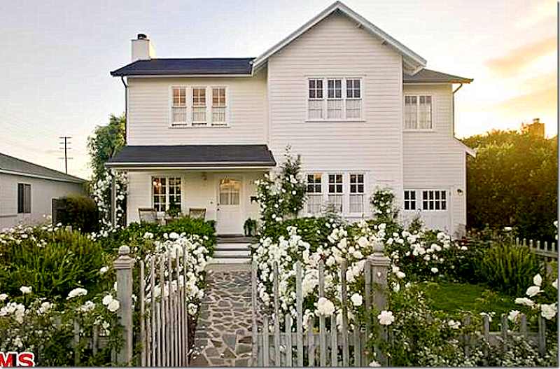
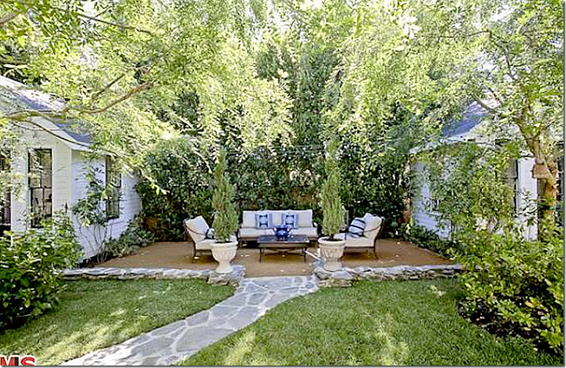
Years after moving out, the house in Mar Vista recently sold – what does it look like today?  The yard is still how Nancy designed it with the stone walkway, picket fence and masses of roses. 


image

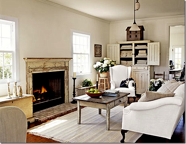
The floors remain the same, as does the antique mantel with brick hearth.  But the furnishings can’t compare to Nancy’s charming American antiques collection.  It looks so bare and has none of the warmth or coziness it had when Nancy lived here.   You can see into the dining room/kitchen here.


image

The kitchen remains the same, except for the furniture.   The pulley lights and wood countertops remain, just as Nancy designed them.


image

A view of the dining area.


image

Another view of the beautiful kitchen.


image

The bathtub was removed from in front of the balcony!  I wonder why? Nancy said she loved to leave her bed and jump into the bath!!


image

The bathroom remains the same.


image

The backyard is still beautiful – just as it was in Nancy’s day.   While the house is still pretty, it is lacking Nancy’s styling and antiques.


AND BEFORE THAT HOUSE, THERE WAS THIS HOUSE…

image

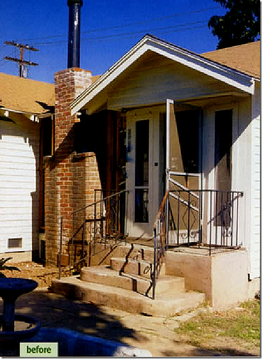
Another project Nancy took on was restoring five 1920s bungalows in what was once a Mormon community in California.   Here is what one of the houses looked like – which Nancy bought and lived in.


image

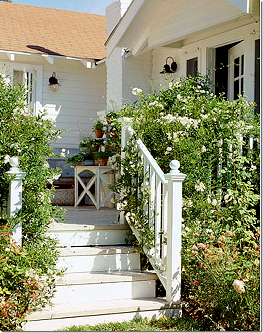
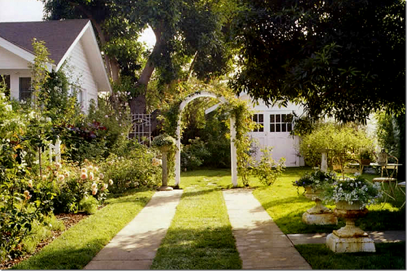
And after – white paint, picket fences, roses, and French doors.


image

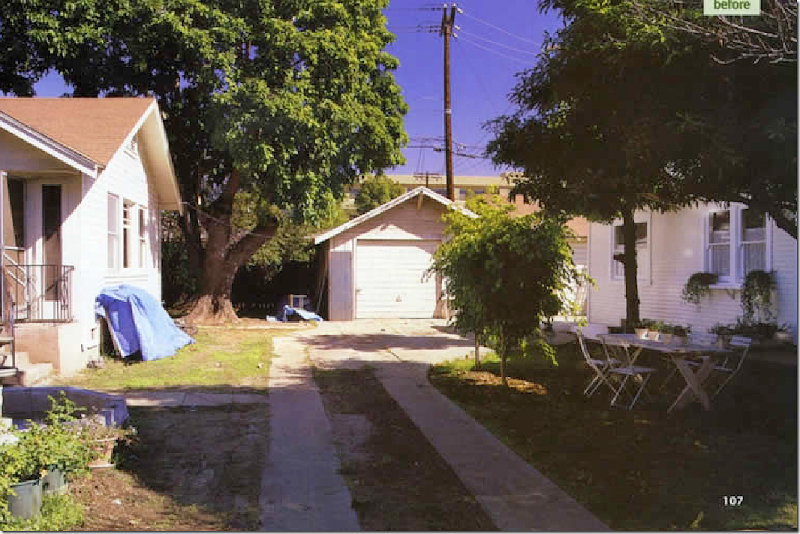
Before:   Nancy bought this house which came with a small cottage.  While she remodeled the house, she stayed in the cottage until the house was ready.


image

The same space after Nancy left her mark – she put on a charming new garage door and landscaped the yard in the romantic English style.


image

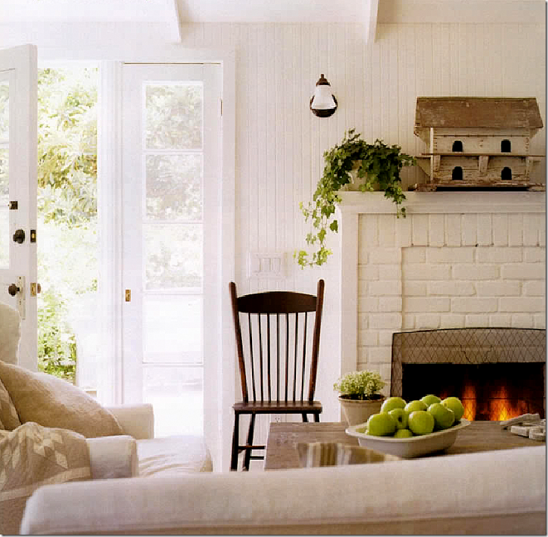
She raised the ceiling, added beadboard, and French doors.


image

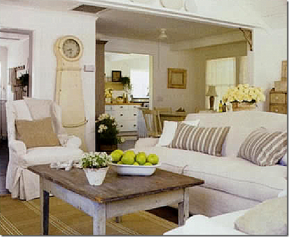
The main living area with a view to the dining area and then the kitchen.


image

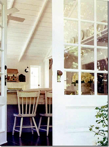
This gives you a view of the vaulted ceiling she uncovered.


image

In the kitchen, she removed the overhead cabinets and added an apron sink – years before they were so popular!


image

The restored bathroom.


image

A cabinet filled with her mother’s collection of white ironstone.


So….what happened to this charming bungalow?   Linda and Lindsay Kennedy approached Nancy to sell them her house.   A deal was struck and the Kennedys moved into the house in 2003. 

                                                                                  image

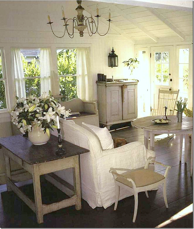
At the time, the Kennedys owned Chloe Décor, a company that specialized in Swedish antiques.  Here, the house was shown in the book Swedish Interiors by Eleish and van Breems.   The Kennedys filled the house with the Swedish antiques they sold at the time, directly from home.  You can really see how pretty the living room is with its vaulted beadboard ceiling and the interior and exterior French doors.   The Swedish Mora clock adds so much atmosphere to any room!


image

Looking the opposite way in the living room.   Trademarks of Nancy’s – dark wood floors, white paint, raised ceilings, beadboard – can all be seen throughout this bungalow. 


image 

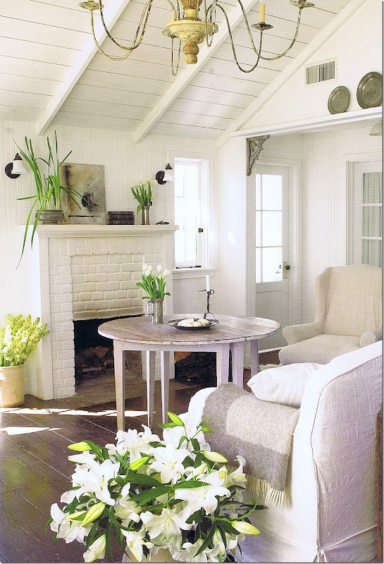
Another view of the living room with the painted fireplace, just as Nancy left it.


image

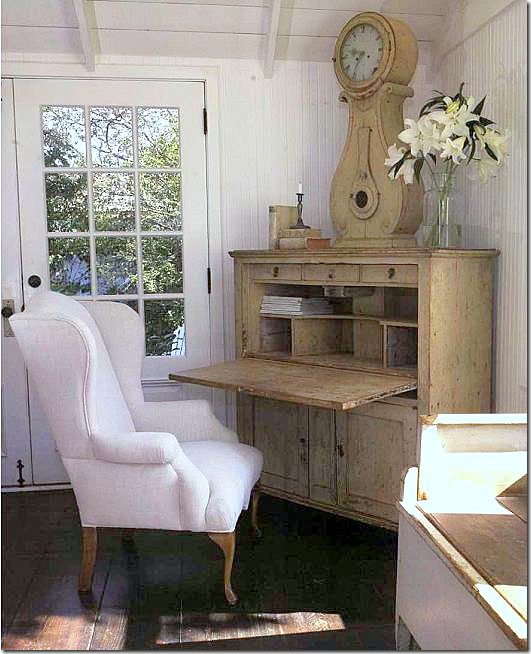
In this corner, a gorgeous Swedish desk with clock. 


image

In the bedroom, another beautiful clock and desk, the bathroom can be seen through the French doors.


image

Nancy always designs kitchens without upper cabinets above the sink – instead she uses windows to open up the room.  The kitchen looks almost exactly as Nancy left it, except it has more plants.


image

The charming back yard, open to a porch off the living room.  The Kennedy’s eventually sold this house and moved on, even selling their company.  Brooke from Velvet and Linen visited Linda in her new home – see it HERE.


BUT WHO BOUGHT THE BUNGALOW FROM THE KENNEDY’S???

image

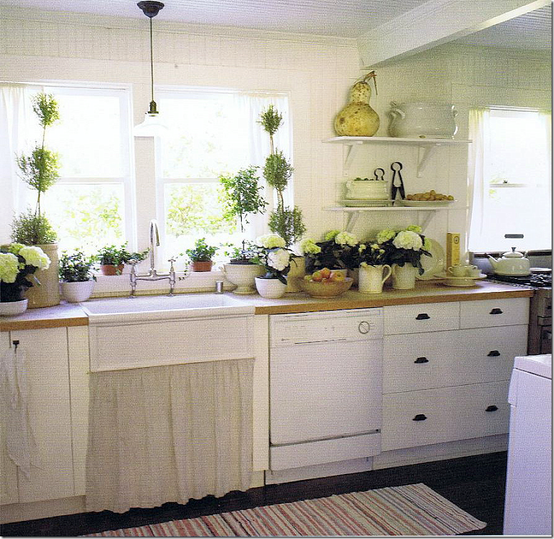
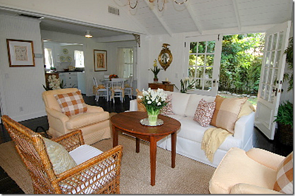
Looking completely different, the bungalow recently was sold again.  Here, with seagrass and bright yellow check fabrics, the house seems more grown up!!  I love those French doors that Nancy installed – notice they are paned only on the top half.


image

I wish these pictures were bigger.  I love the way it is decorated by the new owners.


image

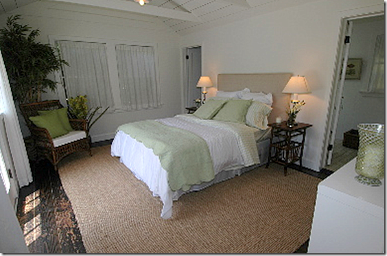
The bedroom looks so different with the seagrass and green and white bedding.  Very nice!


I hope you enjoyed the Nantucket house and kitchen sent in by a reader – who used Nancy Fishelson to help restore it with integrity.

To read more about Nancy, please visit her web site HERE.  She sells some of her wonderful antiques on her web site and there is a portfolio section for your perusal.
If you have a new or newly restored kitchen you would like to share with us, please send it to my email address at mrballbox329@aol.com

Watch for more readers kitchens and houses in the near future.
Thank you!