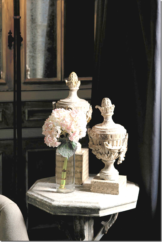
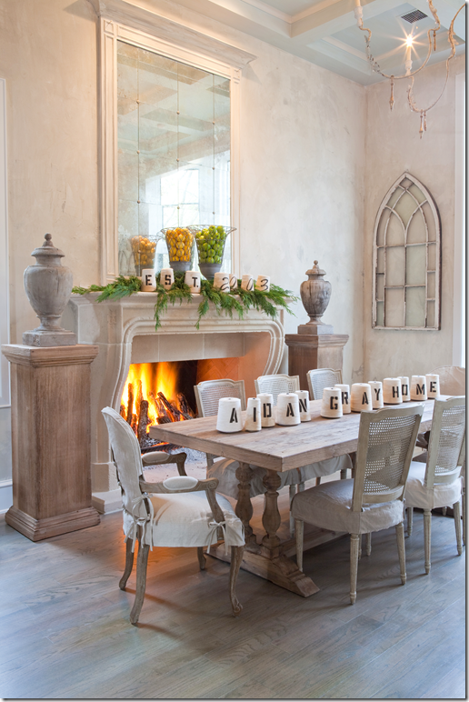
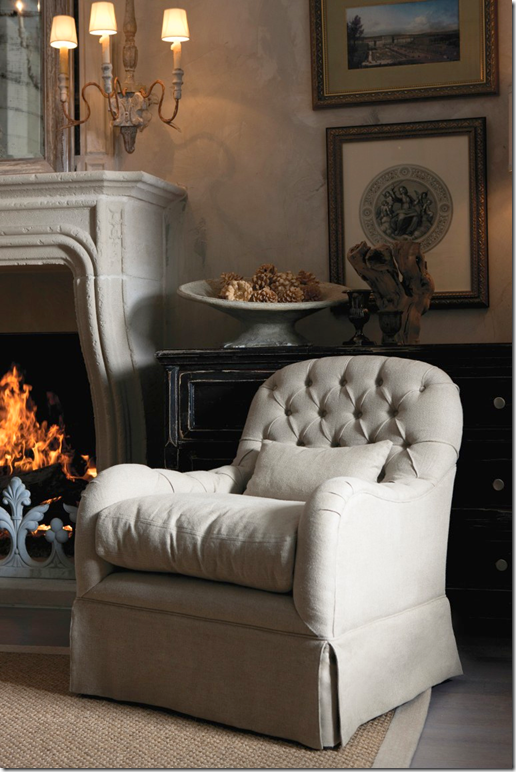
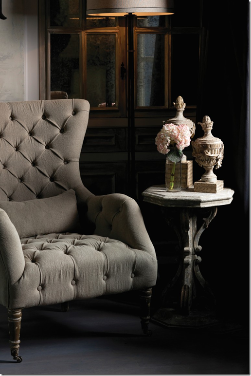
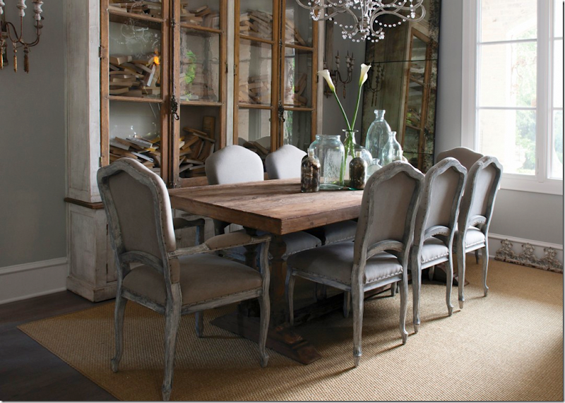
Photograph from the Aidan Gray catalogue.
Recently, Randal Weeks and his wife picked the winners of the Aidan Gray catalogue contest. I have already notified all six winners by email. As I said, we got a large response from readers who live in all different kinds of houses – ranch houses, houses on vineyards, castles, country houses, lake houses, suburban houses, and houses in the city. I’ll be showing the winners along with all those who entered, house by house over the next few months because I think everyone is really curious to see how we all live!
I know I was thrilled by the photographs. Reading all the entries made me realize how many of us truly care about our houses – which is probably why you read the blog in the first place. But more important, so many of us are truly proud of our houses, which was evident by what you wrote in your entries. Our houses are so much more than just pretty, they are where we share our lives with the people we love.
I know I joke a lot about house envy and burning down my house whenever I tour a prettier one, but the truth is…Ben and I have lived here around 18 years now – far longer than any place either of us have ever lived in - and the thought of ever moving away makes us both sad. There are so many memories here – our daughter grew up in this house – and we raised a lot of cats and dogs along the way. Actually, Ben and I both grew up here too. We were in our late 30s, freshly married and new parents back then, and now, we are staring down 60 – almost a lifetime. Every corner of our house reminds us of good times and some sad ones too. And thinking about our future here causes some concern. Will the stairs become too much for us to handle one day? Could we add an elevator to the house if we did ever need one? Will there be room for a mother-in-law to move in? Would Elisabeth want to live here with her own family after we are gone? Questions, I have no doubt, that everyone thinks about.
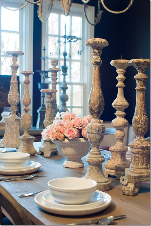
Aidan Gray tablescape.
And so, reading everyone’s entries, I felt your pride and excitement when sending in your pictures. It made me wish everyone could be a winner – because, in truth, how do you judge the “best” house? The six winning homes aren’t any more special than the ones that didn’t win. I came to realize that Randal had specific goals in mind when he picked a winner – things I hadn’t even thought about. He looked for light and space and he looked at specific corners and hallways. It wasn’t a matter of which house was the prettiest, it was more a matter of – this house has an entry hall that would work for the catalogue. Or, this house has a bathroom that would make a good backdrop for a French chair. Or this fireplace would be great with Aidan Gray sconces flanking it. In other words, he was very specific when looking at the choices – which probably is why it took him so long to pick them!
Look at photographs from different catalogues to grasp what I mean:
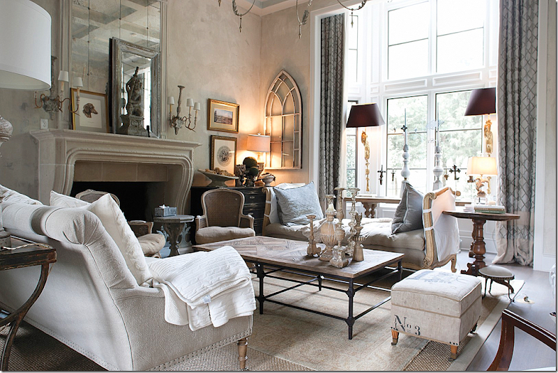
Here is Randal’s living room as it usually is.
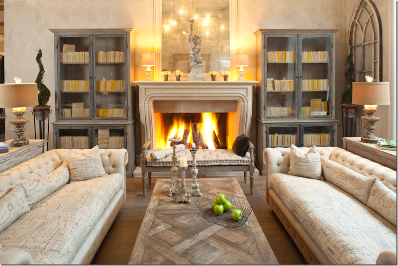
And here it is, styled completely different for an Aidan Gray catalogue. The only things that remained are the mirror, the window, and the coffee table. The fireplace becomes the most important element in the room.
And here is the same living room – styled as a dining room for a catalogue. It’s amazing how different the same room looks in each picture! Notice how important the fireplace is in the pictures. You can see what I mean when I said that Randal wasn’t looking at what people owned, but rather what angle would look best in a photograph. It didn’t matter if the furniture you owned was perfect, new, or even if you didn’t have any! He is using his own furniture for the pictures. His criteria for the spaces was which one would make HIS furniture look best.
Here, in another catalogue picture is the same living room – this time focusing on just a chair and the sconces.
And here, again, another chair, table, and lamp.
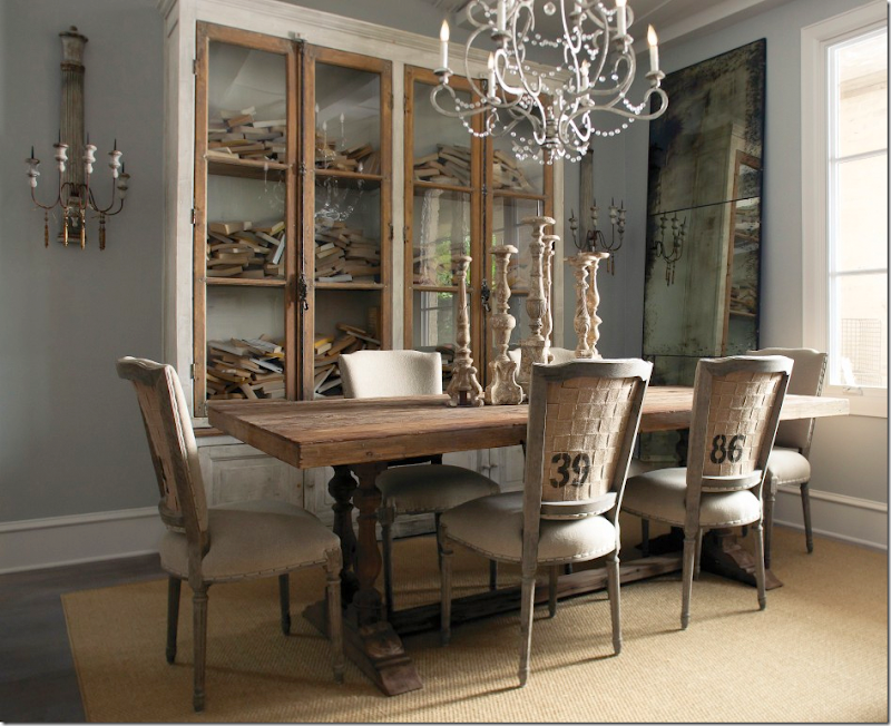
He styled his dining room for the catalogue, this way….
And that, just by changing chairs and the tablescape.
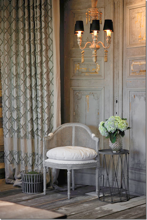
But most interesting are the studio shots – taken with a rough board floor and a wooden screen. One chair, a chandelier, a table, and a drape.
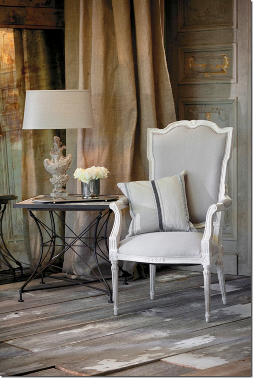
A burlap drape makes the space look different.
Here, add new furniture – for a new look.
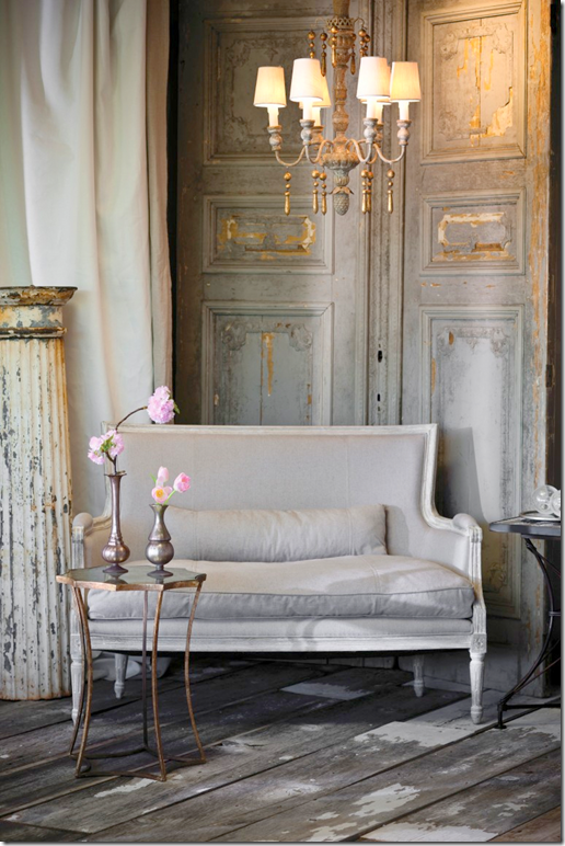
And here, a settee, a white drape, table and a chandelier.
You can see how different all of the looks are that I’ve shown – with only 3 different backdrops in all: the living room, the dining room, and the studio corner. I can’t wait to see what he does with the new catalogue taken in the readers’ houses!
And now, here is the first place winner:
The house is located smack in the middle of the state of Louisiana. It was entered into the contest by the interior designer who worked with the homeowners on the floor plans and all the finishes. The house is brand new and the decorating process is just beginning. Stacey Serro is owner of the design firm “p-l-a-i-d inc.” (which cleverly stands for paint, lighting, accessories, interiors, design) who worked on the house. Besides the interior design, p-l-a-i-d was involved in space planning, schematic design, architectural detailing, finish selection, millwork design, and furnishings. Several important pieces came from Paris where Stacey and her clients shopped together.
The house is located on a large piece of property – where the swimming pool’s infinity edge seems to fall into the expansive pond. There are also several verandas including one with an outdoor kitchen. There’s also a hot tub, and an orchard on the property. Architecturally, the circle is a design element found throughout the house. You can see here in the above picture, the circles in the windows, the front door, and the attic window. Another design element is the arch – again found in the windows and main doorways.
Of all the houses presented to Randal, I felt this one would be #1 for several reasons. I liked the lines, the arches and circles, and thought they would appeal to Randal. I also liked the large rooms and felt he would be able to take a lot of pictures and have many choices for smaller vignettes. The fact that it was new and was still being furnished was a plus because it would mean Randal could bring in a lot of furniture without much upheaval. Still, I was shocked we both picked the same house for #1. Of all the six winners, I only guessed two as winners! I’m hoping he will run this contest again next year so that my choices will get another chance at winning!!!
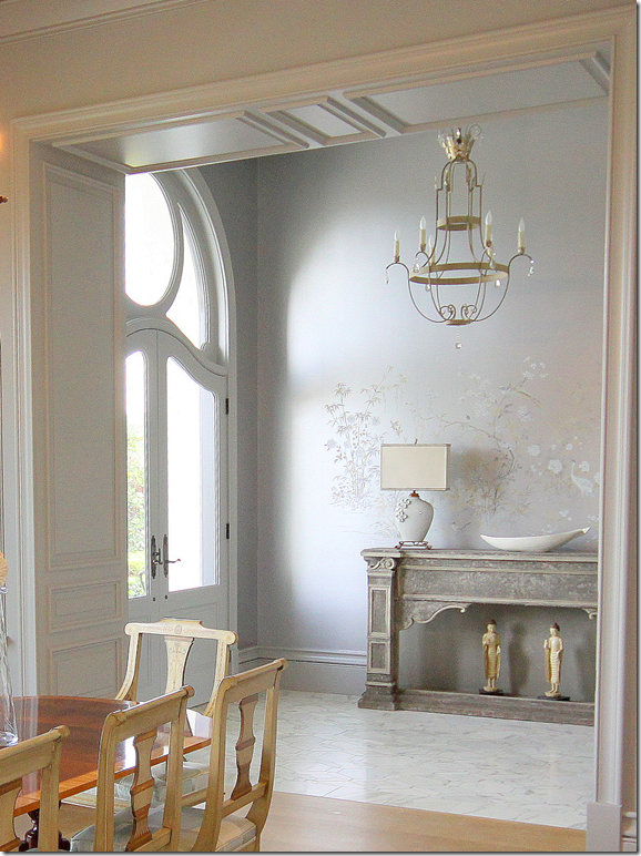
Here is the entry with a marble floor and handpainted wallpaper. I love the gray tones of the paper and thought that would work well with Aidan Gray furniture. Also, in each room there is a fabulous light fixture. Now, I don’t know this for sure, but I do think that many of the fixtures came from Louisiana’s Julie Neill. They look like the fixtures in her catalogue. One guest room actually has an Aidan Gray chandelier in it! As you can see, the dining room is off to the right of the entry hall.
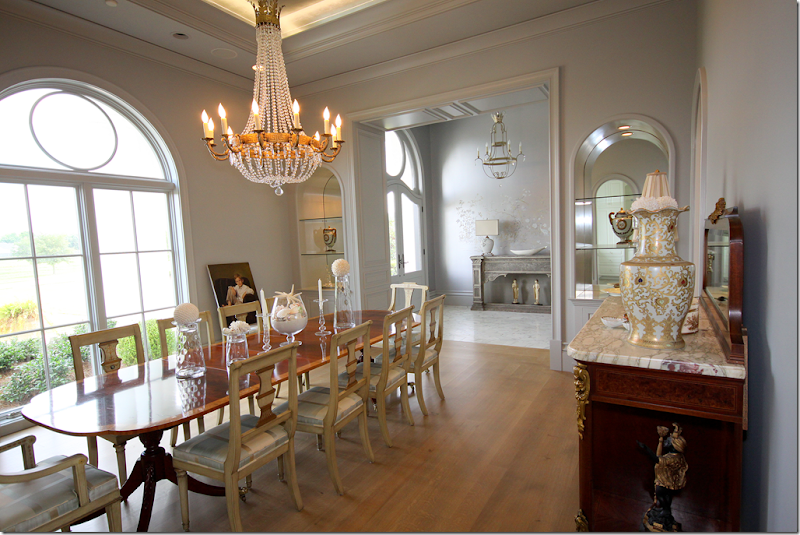
And here is the expansive dining room. I love those painted chairs and the chandelier! As you will see throughout – paintings and mirrors were still needing to be hung. Rugs hadn’t arrived yet and some rooms were lacking curtains. The owners had just moved in and decorating was just beginning. I can’t wait to see it when it is completely finished!!! Notice that the shelves are arched here, a design element that is repeated throughout the house.
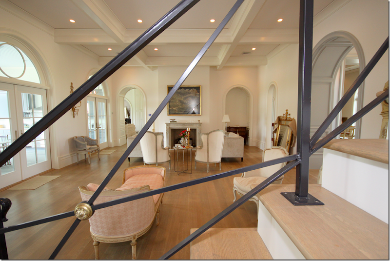
Here is the main living room, which looks out onto the veranda with the outside kitchen and the swimming pool. The room is furnished with French furniture. At the end is a beautiful marble fireplace. Notice all the arches here – the doorways and the transoms over the French doors. This picture was taken on the staircase through the beautiful iron railings – which inspired Randal, as you will see:
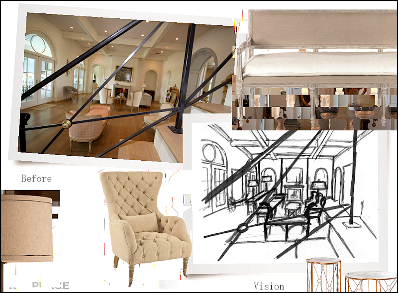
Here is what Randal envisions – taking a photograph from this same position for his catalogue. This picture is a mockup of his plans. He will add his own furniture, these chairs and two settees and tables and lamp. You can see how Randal drew out the furniture placement in the living room. I wonder if when he gets there, he will take other pictures from other angles in the room. Now, notice on the left side of the room – by the windows – there are sconces and a cane chair:
Here is that window wall – along the back of the living room with the gold sconces and cane chair. This photographed also inspired Randal:
And here is how Randal envisions this view – with his sconces and a settee and chair.
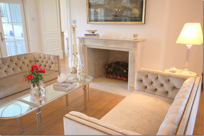
And in the living room – the two tufted velvet sofa which flank the carved marble fireplace.
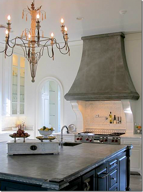
The kitchen is off the dining room and living room – both through arched doorways. Here you can see the wonderful large island and range hood with marble backsplash.
Another view showing the range and chandelier.
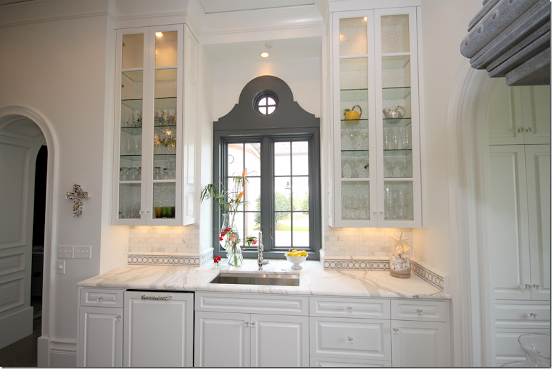
The view of the sink – with the gorgeous veined marble countertops. I love the backsplash with the circular tile motif. Notice the circle element is repeated here – in the windows and in moldings.
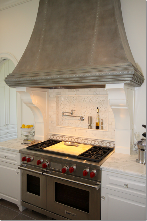
Closeup of the Wolf range. The gray hood is so pretty.
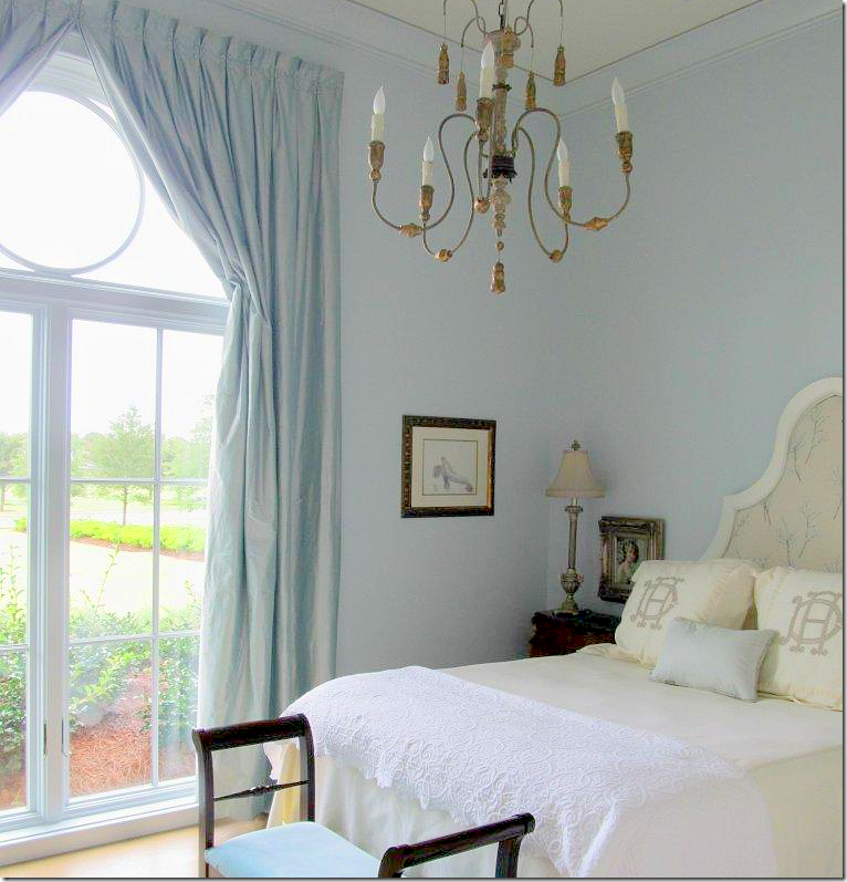
The guest room with the Aidan Gray light fixture hanging. Here you can see the circle element repeated in the window.
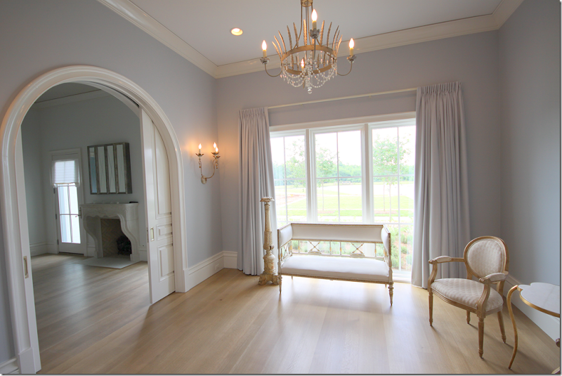
The sitting room off the master bedroom – with it’s pretty chandelier and sconces. I really love the color of the walls, so soft! And the silk curtains match exactly. Through the arch is the bedroom with another beautiful French mantel. Notice how pretty the millwork is – especially in the carved door.
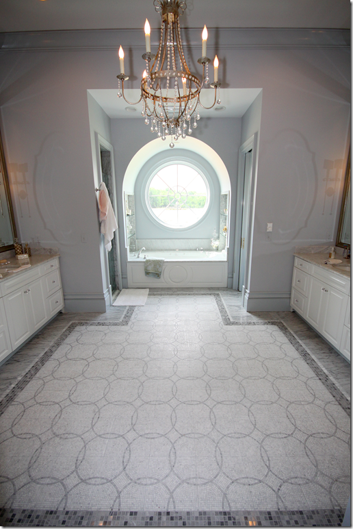
The master bathroom has a large circular window over the bathtub. The floor tiles repeat the circular motif with a darker marble border.
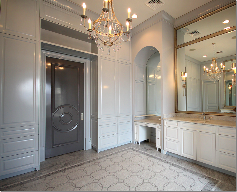
Looking at the other way – the door is painted a darker gray with a circular motif. Love the door – and love the cabinets. Randal was really impressed with the bathroom. This picture was taken before the hardware was finished being installed on the drawers.
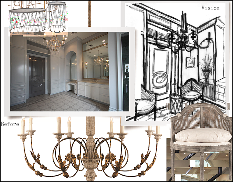
And here are Randal’s plans for the bathroom! He will use this as a room, not a bathroom. You can see in his drawings that he will skirt the vanity’s legroom. The two caned chairs will flank his table. The focal point will be the beautiful dark gray door with the circular motif!
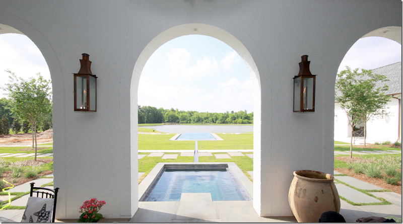
Here is a view of the back veranda. The pool has an infinity edge which looks like it is cascading into the pond!
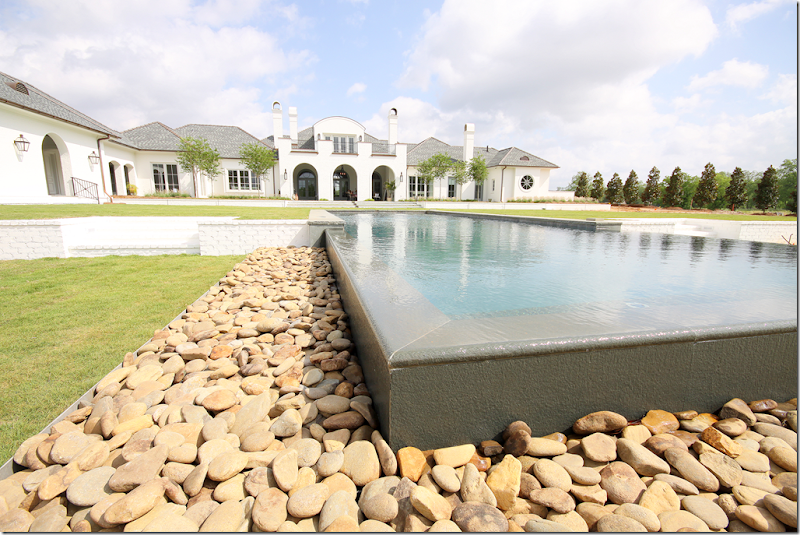
Here is a shot of the back of the house. The orchard is on the right side of the house. You can see the master bathroom also at the right of the house – that’s its large circular window over the bathtub.
I can’t wait to see how the finished photographs from the catalogue look compared to Randal’s drawings. Hopefully we’ll get to see the pictures long before the catalogue comes out. Hint, hint! This is going to be quite a journey and I’m so excited to share it with all of you!
And a huge thank you and congratulations to the homeowners and Stacey Serro who submitted the house!!
To visit the web site of p-l-a-i-d, inc., go HERE.
One last word:
Be sure also to check out Paris Finds – a collection of décor items imported directly from Paris by Stacey Serro of p-l-a-i-d. Paris Finds recently just got in a new shipment of items bought on Stacey’s last visit to France. To see the Paris Finds’ inventory, please go HERE or HERE on Etsy.
I hope you enjoyed seeing House #1. Next, we’ll show House #2!
AIDAN GRAY CONTEST WINNER–FIRST PLACE!
Subscribe to:
Post Comments
(
Atom
)







hi - just wanted to let you know that I am going to set up comment moderation on guest houses ONLY. I am going to try it out and see how it goes. I think you probably know why I am going to try this - to keep the terribly mean comments about guest's houses off here. Any other posts, including my house, my work, etc. will NOT be moderated. Also, I will be fairly lax in moderation and don't expect to have to deny anyone - I won't deny messages to other posters, for example.
ReplyDeleteONLY mean comment about people who have been nice enough to let their house be shown.
I'm not sure if it will work. I hope Ill be able to do it. But let's see with this one post how it all works out. I've been thinking about moderating in this small exception (guest houses) for awhile and so many people have asked for in private emails, so let's see how it goes.
Thanks,
Joni
p.s. any comments about moderation will be allowed through. I am only doing this to stop the terribly insulting comments that have been said lately.
Joni
I can see why this house was the winner, it is truly stunning and will provide an ideal backdrop for his line. I can't wait to see the final shots as well and congratulations to all of the winners!
ReplyDeleteKat
O-M-G that house is breathtakingly gorgeous!!!
ReplyDeleteWoW
-linda,ny
Please moderate comments! What a great contest. This was a winner for everyone, readers, homeowner, decorator. Tks!
ReplyDeleteKaren
What an absolutely gorgeous house! I can see why it won. The Aidan Gray products were made for this house.
ReplyDeletea superb choice Joni this home is wonderful this is why I read your blog. Bravo!
ReplyDeleteHe did good... the house is perfect! Vicky
ReplyDeleteBreathtaking home. The Designer did a fabulous job. Congratulations on a great choice for #1 (however I hope that more "normal" homes are winners as well because we all don't have millions in the bank!)
ReplyDeletethis is the most "luxe" house, irrc. there is a house from houston that is fabulous. and the others are pretty. one from dallas if rather large, but furnished in a friendly, cozy way. you'll just have to wait!! I do think that maybe large rooms are important for the space needs of the crew.
DeleteThanks Joni. Love your blog and glad to see that we all can get "AG" no matter what our zip code!
DeleteThis is going to be one fantastic project to see.
ReplyDeleteWow. Louisiana. Who knew? It's a nice house.
ReplyDeleteBreathtaking is just the word. What a wonderful house, and how perfect that it isn't "done" yet. It will make a great backdrop. Thanks so much for this fun fun contest!
ReplyDeleteAIDAN GRAY + WINNERS HOUSE = A CATALOGUE TO BE COVETED :-)
ReplyDeleteGreat choice, the house will showcase the Aidan items very well. With all of the care and attention put into the finishes and details of this house, I am surprised that they decided to do an asphalt roof. A 'real' roof (slate, or tile) would have been so much prettier and in keeping with the elegant architecture.
ReplyDeleteIS it asphalt? i thought it was tiled. the house is so large, expense could have been a factor in a slate or tile roof, can't imagine how much the slate would cost in a house that large. maybe the decorator will explain the choice.
DeleteIt all depends on the slate. Some people are using synthetic slate which is being made in Belgium. I would not recommend it as the color is only on the surface of the material. In a climate such as La., you would be recoating it every 4 to 5 years if not sooner. Real slate is quite expensive but there are certain style homes that would not look right without it. French is of course one of them. Shake roofs look great at first as well but like synthetic slate they fade terribly in the sun over time and the edges tend to curl. Slate is a big investment, but for someone building a large home, I would try to find other ways to cut expenses and use real slate as curb appeal is every bit as important in the overall scheme as the interiors.
DeleteJoni,
ReplyDeleteWhat a beautiful and worthy house for the contest. I loved what you wrote about how so many of us thoroughly enjoy our homes, so true. Even when we get restless with a room or a vignette, the joy and comfort our homes provide us is evident.
I'll be eager to see what the catalog pages look like once Aidan Gray finishes their magic.
Karen
A good selection on two accounts - the home is unfurnished and the interior rooms will be a beautiful backdrop for the Aidan Gray look. Do you happen to know what style the architecture is as it seems to be totally disconnected in style and feel to the interior. When seeing the initial photo of the exterior, I was not expecting the ambiance of the interior in the least. The house is very transitional/modern on the outside.
ReplyDeleteI see what you mean - the outside seems more contemporary than the furnishings and the interiors. Their large family room is more traditionally furnished and there is a keeping room that seems more antique-y. But i didn't get the right pictures to show all of the rooms. I would say the house is transitional, both inside and out.
DeleteWhat a gorgeous home!! I've been waiting with anticipation to see who the winners would be and this home deserves to be photographed! The homeowner has exquisite taste, I love all the details that went into the construction of the house & filling it with beautiful antiques takes it over the top! I have the same Lillan August coffee table in my living room and want to flank the fireplace with two sofas...now I'm going to be looking for pale gray velvet ones...yumm! Thanks so much for posting Joni & can't wait to see the rest!
ReplyDeleteHeidi
G-O-R-G-E-O-U-S ! I cannot wait to see the catalogue and I am so happy for this homeowner and for all of us who love your blog!
ReplyDeleteThe house is incredible, the Aidan Gray decor is always elegant and beautiful. The symmetry of the front and back vista of the house is very well thought out. I'm looking forward to seeing the rest of the winners!
ReplyDeleteI'd personally like to see you moderate the comments always. The rude hide-behind-the-keyboard remarks at the end of the blog have at times been distracting from what are always very well written posts.
I will only do comment moderation when it's someone's personal home on here and only for the most snarkiest of comments. As you can see, I am leaving comments on that aren't "positive" - it's just for those few anons who delight in antagonizing homeowners who are nice enough to share their houses. Esp. the contest entrants. They didn't enter their houses to be criticized by anons. But normally, in most stories, there's no need for comment moderation, as i do like the discourse, as everyone knows.
DeleteAt this busy holiday time with all the hustle bustle, it is a true pleasure to take in the sheer beauty of the homes, furniture, objects, etc. that you feature here! I can't wait for the rest of the Aidan Gray feature and totally understand the need for moderation. As always, thank you Joni for your great efforts!
ReplyDeleteStunning!! I can see why this house won, wow!!
ReplyDeleteIt will be so much fun to see the photos featuring this house. And yes, please do edit out mean anonymous comments. They do not add anything to our enjoyment of your blog.
ReplyDeleteWhat a gorgeous house and what a fun idea the contest was! I would love to see this post all over again with pictures from the catalogue when it comes out! PS - it would also be so neat to see how the owners "finalize" some elements, such as the rugs you mentioned that are on their way, hardware in the master bath, etc.
ReplyDeleteThe home is lovely-- although I look forward to its developing more soul. I have no doubt it will develop one if the owners live there full time. And the catalog collections would be perfect here.
ReplyDeleteI'm also in favor of comment moderation; while I hate syrupy adulation, I also despise snark and vitriol. So-- I think you are quite right to filter out nastiness. I would hope that people will be kind in their judgments-- we all have limiting factors, and if we are showing real homes, where people actually live, they will be revealed.
I know what you mean, but in a new house, it takes a while to add on those layers of friendly clutter. And also, they are just starting the decorating process, it will take a while - which is what I think appealed to Randal in a way. He could see the room easily.
DeleteAidan Gray is delicious! + thanks for sharing. xxpeggybraswelldesign.com
ReplyDeleteExquisite selection Joni! This was worth taking a break from Cyber Monday to come over and view, so calming and beautiful.
ReplyDeleteMolto grazie
Excellent choice! Beautiful! I look forward to seeing the variety of the other entrant's homes. Also, please continue to moderate comments. We can all do without the toxic, cowardly ANON haters poisoning an otherwise perfectly delightful experience. Why give a format to such trash? You don't have to share your blog with them. Many blogs don't allow ANON comments, for a very good reason. Let them get their own blog.
ReplyDeleteBreathtaking home! Can't wait to see it in the catalog with AG products. Interesting to know what Randall used when looking for a home and to see the differences in his own home with different shots. As always, I learned something new from you! Thanks so much for the information on Paris Finds, Stacey is incredibly talented and I am looking forward to "stalking" her work! Have a great week. Sarah
ReplyDeleteJoni it is so amazing that you both chose this home as #1! It is stunning and the architectural details are perfect backdrops!
ReplyDeletexoxo
Karena
Art by Karena
PS Joni, yes do moderate comments on your guests posts!
ReplyDeleteIt is your work and hours of research, not for mean spirited people to use as an editorial!
xoxo
Karena
Art by Karena
OMG! I love the circular details and arches in this house. I think the kitchen sink area is the prettiest I've ever seen. Love it! Thanks and looking forward to seeing the other winners.
ReplyDeleteAny way you could get the paint color of the living room?
Maureen
I was wondering what the circular details were all about. Is there a significance to this repetitive design?
DeleteFor the paint color, go to the website for p-l-a-i-d,inc. -- link above -- and I'm sure they could tell you the paint color of the living room
DeleteWOW!! Absolutely divine house! A perfect fit for Aidan Gray. It's getting so hard to find antiques, and I'm seriously thinking of stocking new furniture like the pieces from Aidan Gray. I'm really impressed with their designs and finishes. Can't wait to see the catalogue.
ReplyDeleteLoi
WOW! I can see why it was chosen. It will be so much fun seeing all the Aidan Gray furnishings and how they will set up small intimate areas. My favorite part is the little corners decorated so cozy. Can't wait to see the catalogue!
ReplyDeleteALSO,
I think it is a slate roof not asphalt. I do know tile is very heavy. One very large home in the Woodlands burnt to the ground last year. The firemen said they could not enter the home to fight the blaze because of the danger of this heavy roof falling in on them. They had to work from the outside only. The residents were so shocked to hear this. Most of the new homes today have tile roofing. It's a little scary.
I have a home of approximately 10,000 square feet. When a home is designed of this size, a good architect will specify roof support to accommodate slate. This is not typically 2x4 nor 2x6s. You must have very substantial framing in place to support slate and that decision is made in the design process, not after. I don't know what kind of roof the house in La. has. I tried to determine it from the pictures but it did not look like slate to me. It is possible that it is faux slate which is made in China as well as in Belgium. My slate is from Vermont. The ridge caps looked like slate, but the overall looked like asphalt but that could be only the fact that the roof was mottled and it was difficult to accurately determine the material.
DeleteThats very interesting and makes perfect sense. This roof doesn't look like slate but maybe its wood shake? The comment about the fire and the firemen not being able to go inside is frightening, I think I would forgo putting my money in a roof and focus on beautiful details and furnishings and of course a pool! This house is gorgeous and after Joni's explanations I can see why it was chosen, I can't wait to see the other homes. Thanks to the homeowners and designer for sharing and Joni for the time she puts into her posts. Cheers!
DeleteA beautiful interior to work with -- and it's like a blank canvas since it isn't totally done. It will be perfect. Can't wait to see the other homes. What a great contest.
ReplyDeleteWhat a beautiful home! I can't wait to see it "staged" with the Aidan Gray furnishings. I will definitely have to make sure I get a copy of that catalog if they publish one for mailing purposes. As far as the "Paris Finds" of Stacy Serro, she has some lovely items, but I don't think most of our readers are going to be able to afford $4500 for a pair of architectural finials. That was the first thing I clicked on. I love using that sort of site for inspiration and shopping elsewhere for bargains!
ReplyDeleteWhat an absolutely wonderful house, Joni! I particularly love the windows and that fabulous steel ballustrade and stair rail. So neat. I wonder who the artchitect was on this project?
ReplyDeleteI also enjoyed seeing the different rooms in the catalog shoot and how they changed them. And it is particularly insteresting to see what they look for in a catalog shoot. I love the lighting fixtures they were featuring.
Last, but not least, I know what you mean about wondering what you are going to do with your home as you age. Those are real concerns because stairs can be harder and harder to climb. I know. I took a tumble down ours, and what would not have hurt much in my thirties is pretty awful with twenty years added to it! I keep forgetting I'm getting older. I also don't want a brand new house that has a slab foundation because the floors tend to be very unforgiving. It is painful to stand on terra cotta tile, too. I never dreamed these things would be an issue, but they really are as one ages. Getting old is definitey not for sissies! ;-)
XO,
Sheila
This home is such a beautiful dream!!! The addition of Aidan's vision and the sketches are most intriguing (thank you so much for including those!) I love how his eye takes a space and converts it to 'something else' - in ways that many would not have thought of! It reminds me of a stylist that can take an accessory and use it to make an outfit look completely different...except he's doing it on a much larger scale!
ReplyDeleteThe colors and details of the home are exquisite. How wonderful it must be for the designer and homeowner to have a new canvas to 'paint' on! We can see how this home was the #1 choice for both yourself and AG! :) Thank you again for all the time, effort, and sharing...Cote de Texas really is something that I look forward to reading every chance I get~ Perhaps you can also do a follow up on this home after the owners have had a chance to make it a little more personal...it would be fun to see how it grows into it's next phase!
Joni, I enjoyed your comments about the love you have for your home and the comfort of memories it provides you. It is easy in the design business to get caught up in having "more", "new", "trend", etc., but you seem to be grounded in what is really important in life and that is what we carry in our hearts - memories. Good for you. I think that is a lesson we all need to learn.
ReplyDeleteok, moderating comments is such a pain! you are a slave to the computer. but i must say i haven't had to delete one single comment. maybe we can go back to just regular in a while. i will not be moderating as a rule, only when it's a guest house, but so far, not one comment was deleted, just to let you know. maybe the nasty anons are gone for good?
ReplyDeleteExtraordinary! I would have picked that one for #1 too. But excited to view the other beautiful homes! Great job, Joni! And I sure hope the nasty anons are gone for good. Just ignore them, or delete them, please. I hate reading their nastiness...bless their hearts! ;)
ReplyDeleteJoni, What a gorgeous home! I am looking forward to seeing more.
ReplyDeleteAmazing gorgeous house. Looking so fantastic. Thanks a lot for sharing with us.I'll visit your blog again.
ReplyDeletehttp://www.youtube.com/watch?v=0F4ParJQ2CE&feature=youtu.be
ReplyDeleteComment moderation...hmmm. No comment.
ReplyDeleteWouldn't you love to ave his sketches framed as art work for your house. I know I would.
ReplyDeletekaren
I think tis the perfect back drop for an Advertisement, it allows the room to transform effortlessly because its fresh and untouched at the moment! Once Randall works his magic those rooms are going to bee awesome! The colors and details lend themselves perfectly to this line of furnishings! Congratulations to the owners and to P-L-A -I D!
ReplyDeleteKarolyn The Relished Roost
Well, I can certainly see why this was the winner - a perfect fit for all of Aidan Gray's gorgeous furniture and lighting. What a fun contest and how exciting to be such a part...can hardly wait to see the catalogue and the other winners!!
ReplyDeleteWhile I understand your desire to not offend homeowners who have put their homes up for review. Remember, that they in fact volunteered to do just that - allow their homes to be the subject of your blog post. Fifty-seven comments so far and for the most part they are boring, gushing, and full of accolades the reader deems you want to hear. Why is that you might ask. Clearly, you are not allowing honest opinions to be submitted here. On any given day with any other home, you would be at 150 to 200 comments. I know comments are not necessarily what you are looking for, but face it, the conversation has been boring to say the least.
ReplyDeletehonestly, there has not been 1 comment that i have held back - not one. so...who knows? it's a real hassle to moderate. i'll only ever do it for guest houses, like i said, if even that, if it keeps this way. there was a good discussion about the roof. yeah = i get it. it's not funny and i do miss that, a lot. but i don't miss the really, really mean comments about people's houses. so comment all you want. like i siad, i am getting ready to show two rooms in my house so you can have a field day with that. one thing i will be doing is setting up at the verification becuase there is SOOOOOOOOOOOO much spamn!!! hundreds of spam commentrs on old stories - it's jsut ridiciulous. i hate those verifications, but that spam is really getting awful. look at any old story and you will see what i mean. they make it sound like a real comment, but there is always a link to a internet web site. just awful. do y'all mind if put up the verification? you can be anon still, it just will weed out the bots, that's all. let me know.
DeleteI hope one of the rooms will be your library.
DeleteI hate verifications because many are really difficult to decipher (poor eyesight I suppose). I have seen spam here but had no idea that you were getting that much.
DeleteLove your tours Joni! And your comments on everything are the best! x Maria
ReplyDeleteWhat a stunningly beautiful home. It will be the perfect backdrop.
ReplyDeleteThank you for the time you spend continuously showcasing such beauty.
What an absolutely stunning house! I would have picked this house too the rooms are so large and high ceilings, fabulous! I can't wait to see some of the after pictures. Lucky homeowner!
ReplyDeleteXXX
Debra~
We are so honored to have won the Aidan Gray contest! We love our AG pieces. The architect was Remson-Haley-Herpin from Baton Rouge, with Bill Powell as lead architect. Interior Designer: Stacey Serro of Studio Luna and P-L-A-I-D, from New Orleans. Landscape Architect: Jeff Carbo of Alexandria, LA. The roof is asphalt. The kitchen island and hood is made of zinc, by Bastille Metalworks of Savanah. Most of the lighting came from Julie Niel in New Orleans, Aidan Gray, the kitchen chandelier came from Paris Finds. The house sits on 13 acres with a 3 acre lake behind the house. Still alot of work to do on the interiors. Can't wait to see the photo shoot in progress. Thanks for all the positive comments!!
ReplyDeleteHi Joni,
ReplyDeleteBeautiful choice and I love all the circles.
Your blogs are generally so rich in content that I don't have time to peruse the comments so I did not know you were having an issue with boorish behavior. That's too bad and especially considering how hard you work on this terrific blog and how innocuous the topic is. Good grief - it's interior design not politics, healthcare or social security! I"m glad now that I haven't been reading the comments - had no idea of your concerns until I saw your blog today regarding you decision to moderate. What a pain for you! I totally agree - it's your blog so do as you wish and shame on those who have inspired it -- maybe they'll move on once they have no way to display their hostility. And I have no problem with verification - it's everywhere now. Spammers are akin to pond scum spoiling the beautiful water for everyone else so do whatever you need to get rid of them.
Thanks so much for all your great work - you blog is a truly a treat and I look forward to it every morning.
best,
linda
This has been such a fun competition. I can't wait to see the rest of the finalists and the final catalogue. It's going to be interesting for us punters to observe what goes into the making of a catalogue, the behind-the-scenes stuff.
ReplyDeletewaow what a well decorated room.i love all.plastic business cards
ReplyDeleteBeautiful home. The room and furniture are very Gorgeous . I like it.
ReplyDeleteBeautiful home. The room and furniture are very gorgeous. Perfect collection.
ReplyDelete