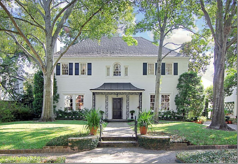
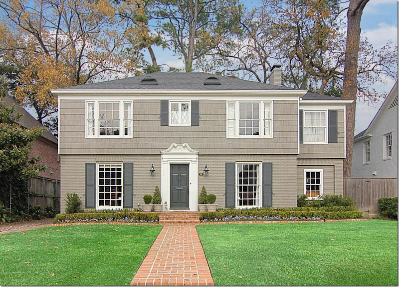
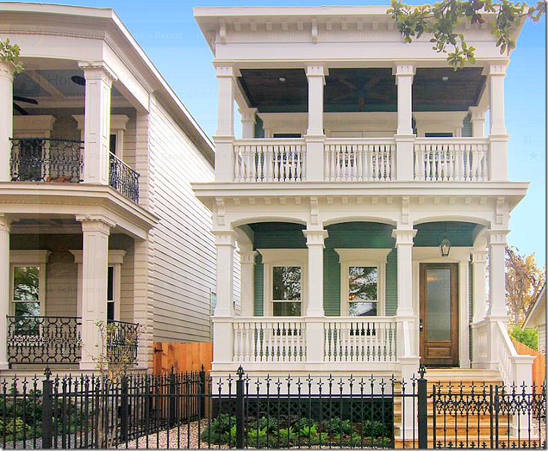
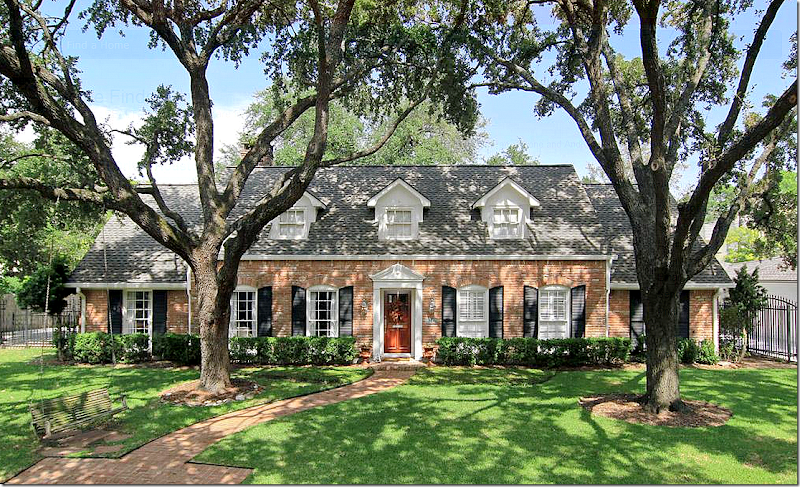
And, today, we have another question from a reader:Dear Miss Cote de Texas: thought I would reach out to you and perhaps inspire a post or even a series of posts, which selfishly might help me out :).My family and I are going to be relocating to a new city. Yes it can be stressful but at the same time extremely exciting to think about the possibilities that await in a new home.We are currently home owners, so it won't be our first time at the rodeo, but as an avid CdeT reader over the past few years I would love to get your thoughts on what to look for in a home. When we bought our current house a few years ago, I was pregnant with my first child and we were in a bit of a hurry to get settled. After looking at what felt like a million houses, we ended up buying a house that was right for the moment but one that we have grown out of as our family has gotten bigger and our children have gotten older. While I love this house for the many memories it has given us during the past few years, I have always felt ambiguous about it. Like I have never really been in love.I am absolutely hoping to avoid that this time around and would love your advice on how to look and wh3t to look for. We constantly hear about the need for "great bones" and I know their are many cosmetic things that can be turn-offs or turn-ons. So what is really important? Once we get past the big things like neighborhood and mechanicals, where should we put our energy?I thought this might be a question a lot of people could be interested in. What makes a house have “good bones?”First – what you like in a house or why a house appeals to you is something very personal. So, it’s hard for me to say – “buy this house” or “look for this in a house” – when it’s my taste and not yours. Still, there are some things that I think are worth contemplating before buying a house.Do you want a new house or an old house? I love older houses built in the 30s and 40s. I love the smaller room sizes and that older houses aren’t open concept. I love the kitchen not being in the middle of the family room. I love a separate dining room and a nice entry hall. And I love the mature landscaping that comes with an older house. Yet, everything I described is exactly opposite of what I live with!If you want to buy a new house, I think there are some features that you should be careful to avoid if possible, which I will outline in detail. And there are drawbacks to buying an older house – especially if you prefer the open concept living which most older houses don’t have. With an older house – unless it has been extensively renovated – you will have more maintenance issues than you would with a brand new house. So, there are give and takes with each option.You seem to know about neighborhoods and schools, which are two of the more important factors when buying a house, although, as far as schools are concerned, there is always carpooling. We never lived anywhere near where my daughter went school, and I carpooled her for years until she got her drivers license. So, schools can be a flexible situation when buying a house. But location or neighborhood is not flexible. The wise man says, always buy the least expensive house in the most expensive neighborhood as opposed to buying the most expensive house in the not-so-ideal neighborhood. For investment purposes, this is probably a good adage to follow.Once you find a neighborhood you like, the choice of a new house versus an older one will be made for you, unless you plan to buy a tear down and rebuild. I looked around at houses for sale in Houston to find some that would appeal to me – from the outside, at least.Look for a house with clean, simple lines and classic windows and doors. I always am drawn to Georgians because they are so symmetrical looking. Like this:You can’t beat a house like this – with beautiful, classic proportions. The windows are nicely placed and aren’t overwhelming. Great front porch and mature landscaping. A brick house is almost maintenance free, which is another thing to think about. Here, the brick has been painted white – which is so pretty. An older home is hard to beat from the outside.Another classic house with pretty windows. It’s very symmetrical with an asymmetrical wing on the right that only adds to the charm. Half wood shingles, half brick – the upkeep would be more labor intensive than an all brick house. Pretty landscaping.Gorgeous classic house, with beautiful wood windows. It’s mostly brick, but there is some wood siding that would need painting every so often. A house that looks like this is really hard to top.
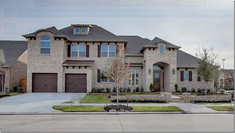
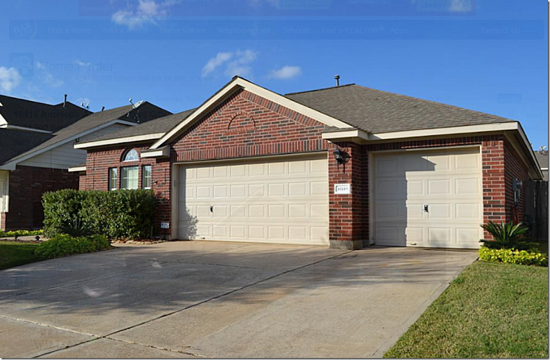
Another brand new house that truly looks old. Try to buy a house that an architect designed. I would choose a house like this one above any day over a typical new one in the suburbs with much more square footage. In so many of those new houses in the suburbs, they look like an architect never touched the plans. Windows and doors are placed everywhere and anywhere with no sense of design. The builders throw every element in the house, rather it’s appropriate to the design or not. And, the houses end up a mess. Worse, there’s no thought given to furniture placement. This house above is never going to “go out of style” or look like the decade in which it was built. It will always look like a house in New Orleans.Ranchburgers from the 50s and 60s can be wonderful. Notice how symmetrical this design is. Since it’s older, there is great curb appeal. Such a pretty house!While the door is a little off center (it makes me wonder if this was actually once a duplex and the other front door was removed) – this authentic bungalow has great appeal. Isn’t this charming? All wood, it would require maintenance, but I wouldn’t let that stop me from having a wonderful house like this.Well. This is a perfect example of a new suburban house built without much thought given to classic design principles. There are some pretty things about this house, like the stone and brick, but there is just too much going on here. It’s so off balanced looking – even the garages looks a little strange. There’s a tin roof and a shingle roof and the window over the garage also seems off balance. Instead of the front door being the focal point, the garage is. This looks like two houses smushed together. And it’s such a shame because this really could have been a beautiful house – if only it were more symmetrically designed and less lopsided looking. Try to avoid turrets, especially those that make no design sense.Many new houses have front loading garages. So does my house. I would give anything to not have it, but it is what it is. This house is all garage. If you have a front loading garage, try to make it more attractive and less a focal point. Is there even a front door here?
 Look at the non descript façade of the canal house that Brooke and Steve of Velvet and Linen bought. The front loading garage was the focal point of the house. But with a little ingenuity – the house was dramatically changed:
 Yes, it’s the same house. Pea gravel replaced the concrete driveway and carriage style garage doors replaced the plain, boring one. Old shutters lead to the front door on the right. New stone lined flowerbeds add to the curb appeal. Just beautiful! I showed this to Ben, hint-hint.Now that we’ve looked at the outside of houses – what constitutes “good bones” inside?I like symmetry inside with a nice entry and a center hall, separate dining room and living room or library with a wood tread staircase to the second floor. Ceiling height should be at least 9’ or 10’ or up to 12’ in a large house. Any higher and you lose that intimate human scale that makes a house cozy and welcoming. Surfaces can be changed – but if you don’t want to remodel or update a house, look for wood floors or a very neutral stone. Tile floors can really date a house and wood is the most classic choice. Try to find a house with one floor covering that runs throughout the main level. If you choose a house with a classic façade, most likely the inside will be classic too – with lots of wall space and not a lot of superfluous windows everywhere.With kids, it’s great to have the master down and the children upstairs. The most ideal set-up is a little study by the downstairs master that can first be used as a nursery if you are still in the baby stage. A library or office is nice for children to have a place to do their homework in and keep the rest of house neater. A laundry room is a must, as is a mud room where the children can keep all their coats and boots in one place when they come in from school. A bathroom for each bedroom is a plus and will add to the value of your house. Teenagers require their own space, so a playroom for little ones one day will give teens needed privacy.
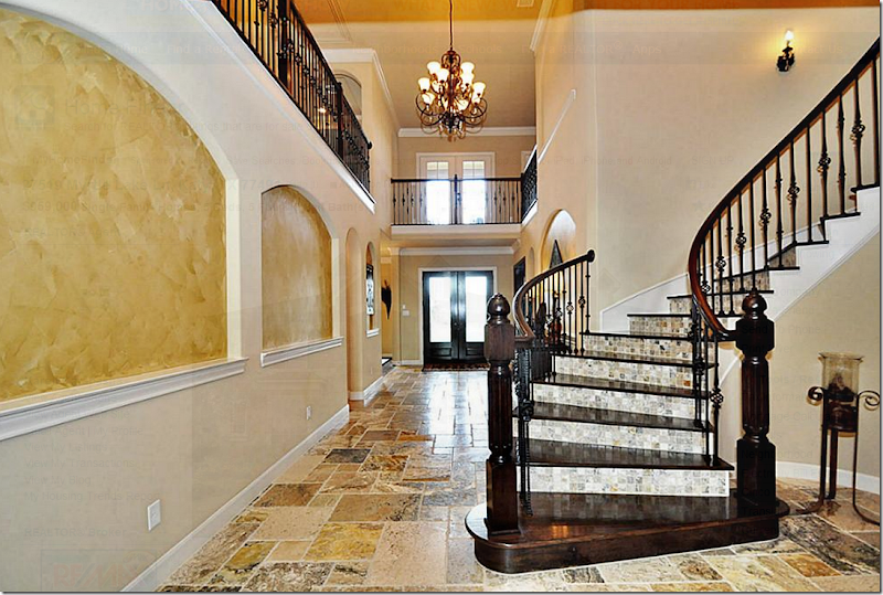
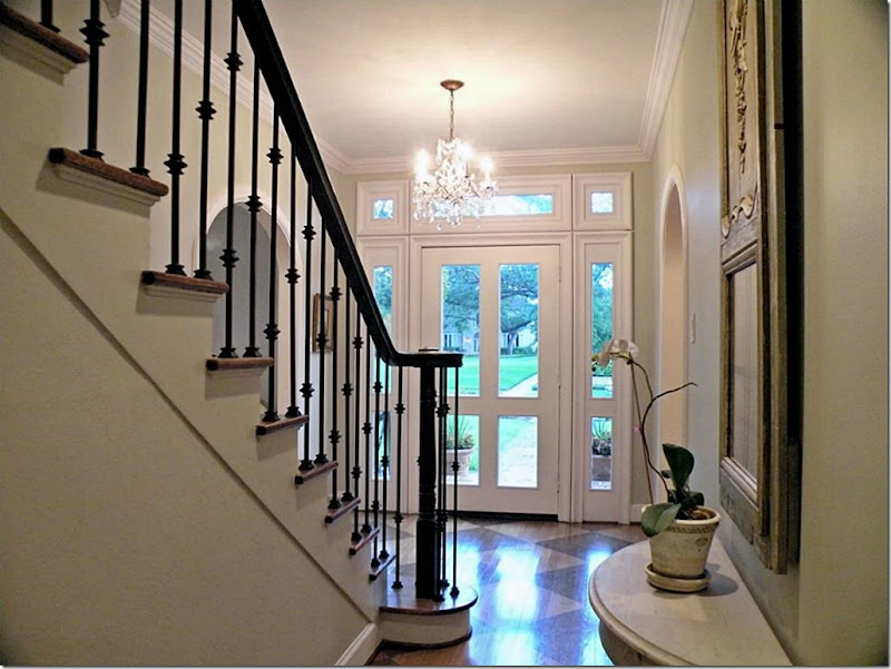
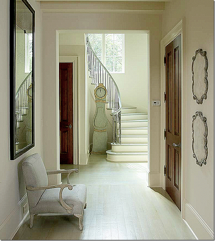
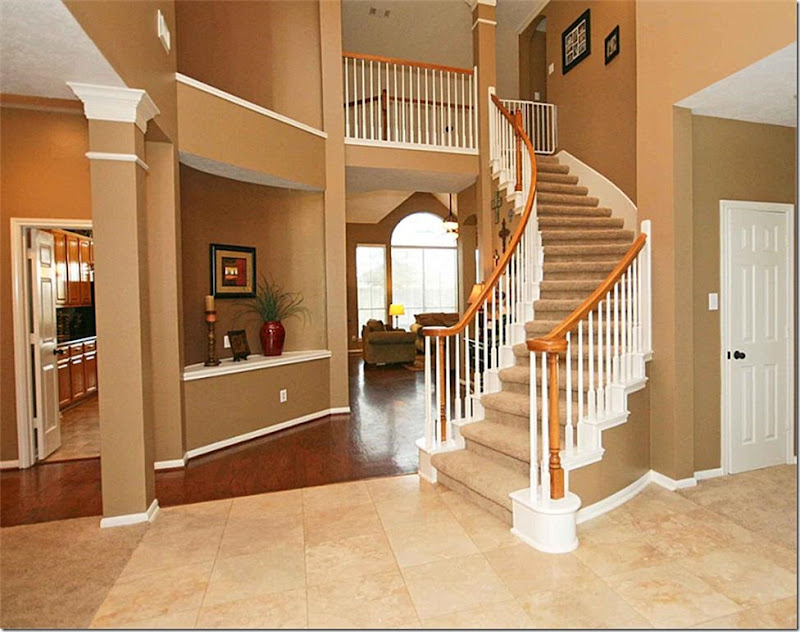 Here are some things to watch out for and avoid: I would nix this above house for several reasons. First, look how many different floor coverings there are in just this one area – carpet, stone and hardwood and tile! Four!!! Unless you plan to totally remodel, avoid this kind of situation. Even if you did rip it all out it would cost a pretty penny to fix this if the slab isn’t flat underneath all these different floor coverings. Try to find a house with just one floor covering throughout the downstairs. Look how jarring the stone looks against the wood – it cuts off the large entry, making it appear smaller. This house would look so much better if it was just all wood. Additionally, the stairs are carpeted. With kids, this carpet would have to cleaned or replaced often, otherwise it would look terrible after a few years. Look for stairs with wood treads. AND, even if you take the carpet off, you still don’t have wood under this. It would cost a fortune to redo these stairs, since the treads are plywood. With small kids, it just best to find a house with wood treads. Finally, notice the large niche above the built in. Avoid houses with these kind of niches. They are just dust collectors and serve no purpose at all.I would avoid a house like this – first, the tile is way too trendy looking. In a few years, you would probably get tired of it. Look for quieter finishes – like wood or stone floors. And notice the stairs. Instead of leaving the risers wood, they installed a busy tile that fights the floor tile. Another thing to avoid, those niches on the walls. The only thing you would do with these niches is to place a series of paintings or prints there. Avoid houses that dictate your interior design! And finally, the open balcony over the entry – this would become an loud echo chamber. ALWAYS avoid open balconies this large, especially with noisy children.A pretty, classic entry. Timeless. Pretty front door. Hardwood floors and stairs. Simple iron railing. Classic molding. This is a room where nothing would need to be changed before you moved in.Look for – simple iron or wood railings. Wood stairs and painted wood floors. This entry is so much prettier with all the simple choices – instead of different flooring materials and busy looking stair rails. Beautiful!
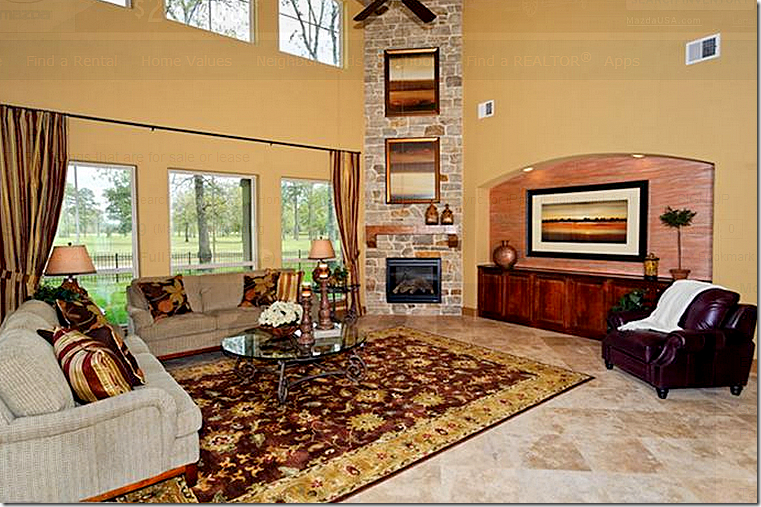
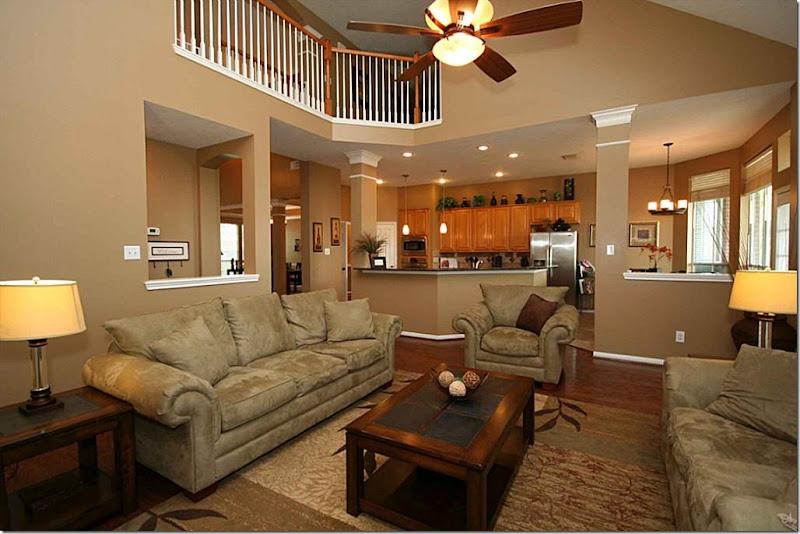 This is something I would avoid at all costs: the upstairs overlooking the downstairs family room as shown here. If the ceiling was just high or pitched, it would be nice – but with the open balcony like this, it is a disaster with active children or music loving teenagers. The house will be an echo chamber. I had a client with this situation and we had to go back in and close off the balcony at great expense to quiet the noise - and they only had two children. They didn’t realize the issue with the noise until the night they moved into their beautiful new custom designed house. The husband started looking at new houses one week later!!! It was awful. But, once we walled off the upstairs balcony, the sound level was tolerable. Avoid a open balcony with a double height ceiling at all cost. Don’t ask for this trouble if you can avoid it!!!!And here we have the window issue – how would you hang curtains here? Again, in a house with “good bones” you wouldn’t have this problem with the windows. A house with good bones has pretty windows that were designed with thought. I can only assume this homeowner was clueless how to hang curtains since there aren’t any. I really wouldn’t know how to hang them either. This is very important: before buying a house – look at ALL the windows and ask yourself if you would know how to cover them. If you can’t figure out what to do with the windows, walk away or bring your designer in to give an professional opinion. I can’t tell you how many emails I get with pictures of windows like this – saying what do I do????
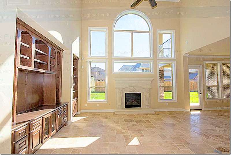 Another house with bad windows. Terrible windows actually. What is that horizontal window over the fireplace for? And windows over a fireplace? Where’s the chimney? Again, before buying a new house – look at all the windows. And look at the walls. Be sure there is enough room along a wall for your bed or sofa. And if you have a lot of art work, make sure there is enough wall space to hang your pictures.
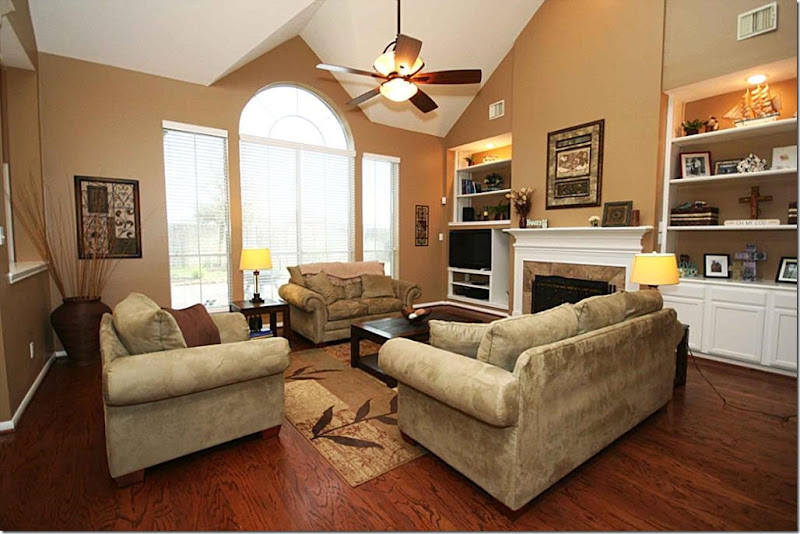
 Classic wood windows and French doors are so much prettier than walls of plate glass windows. Here, the raised ceiling isn’t too high and the beams help the room remain human scaled. Compare this high ceiling with the high ceiling in the house before. Which room looks friendlier, warmer, cozier? This house is the epitome of a house with “good bones.” From Classic Casual Home.
 Here, again, the open balcony. Imagine you have friends over and the kids are upstairs running up and down the hall with their friends. Disaster. This balcony is pretty, but avoid this unless you are a empty nester. Again, this ceiling is so high, the room seems cold no matter how warm the decorator tries to make it. It would be hard to feel cozy in this room. Another thing to think about is the flatscreen. Be sure you aren’t limited to putting your flatscreen only above the fireplace.
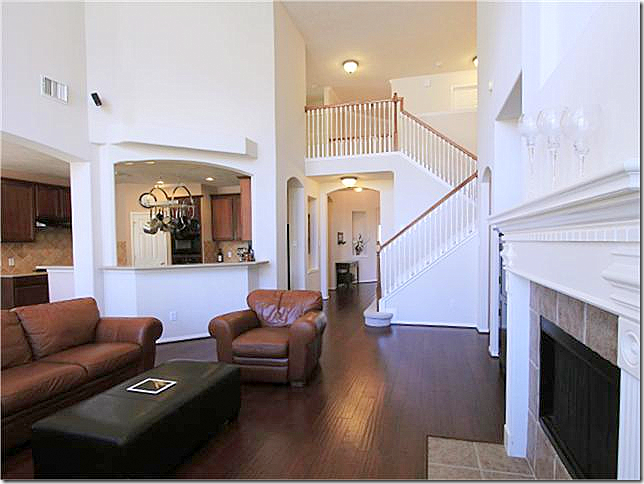 Human scale. This is a pretty house – with nice white walls and nice, dark hardwoods. Yet, the ceiling is so high in this room, I can only imagine the echo in here. Double height ceilinged rooms can be so hard to feel comfortable in. There’s no sense of warmth or coziness in a room like this. And, again, you have the open balcony that will carry all the upstairs noise right down into your family room and kitchen. A classic house will have ceilings that relate to the human size.
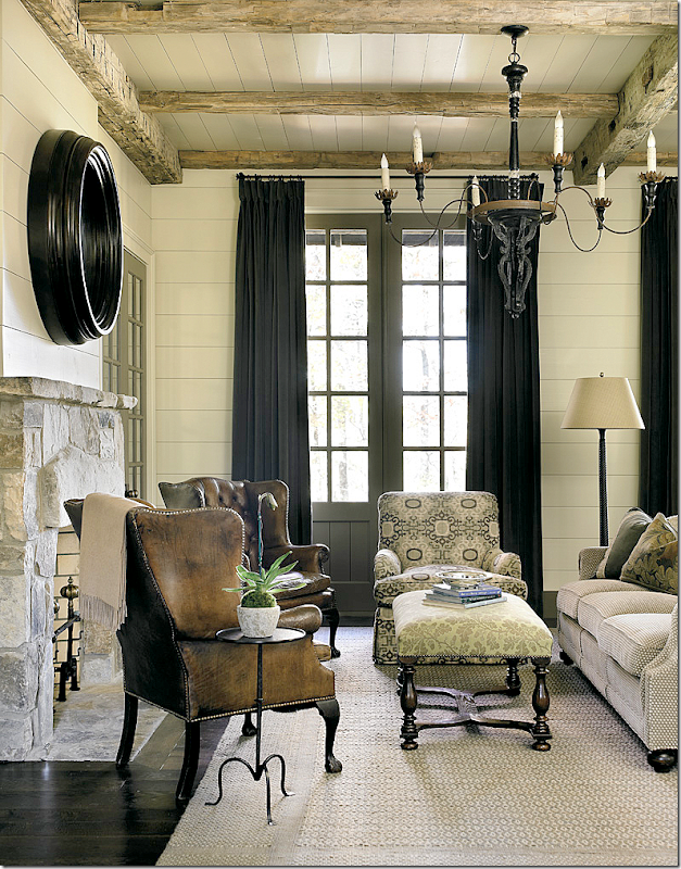
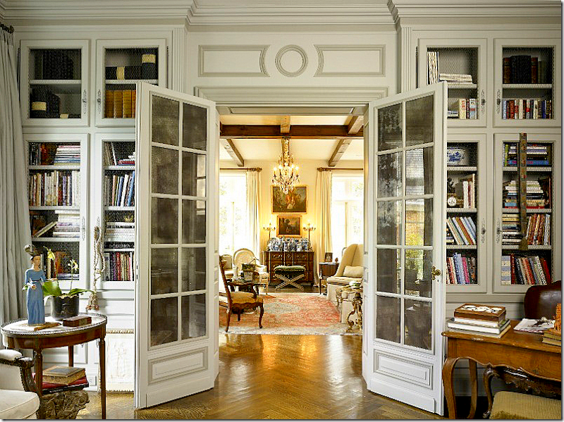
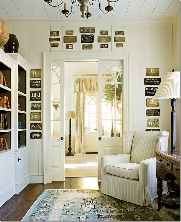
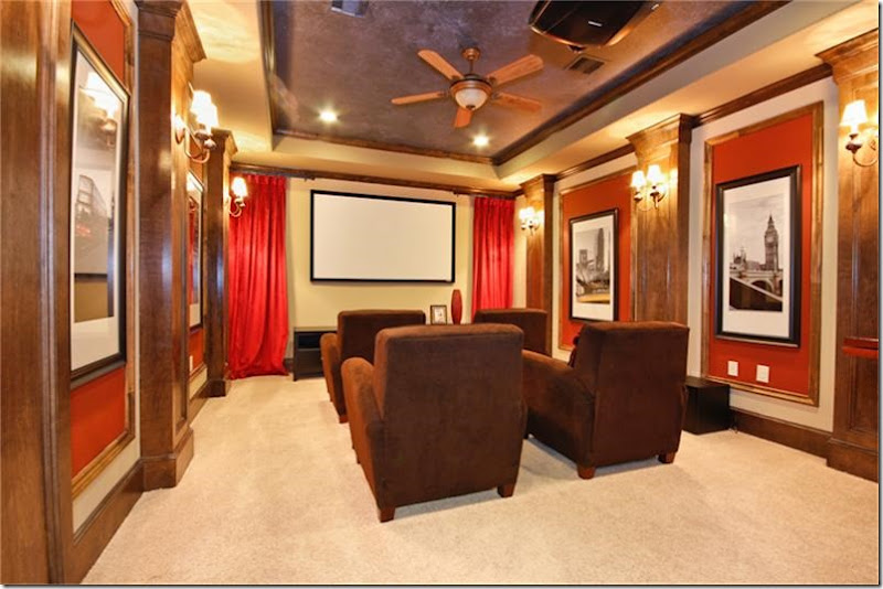
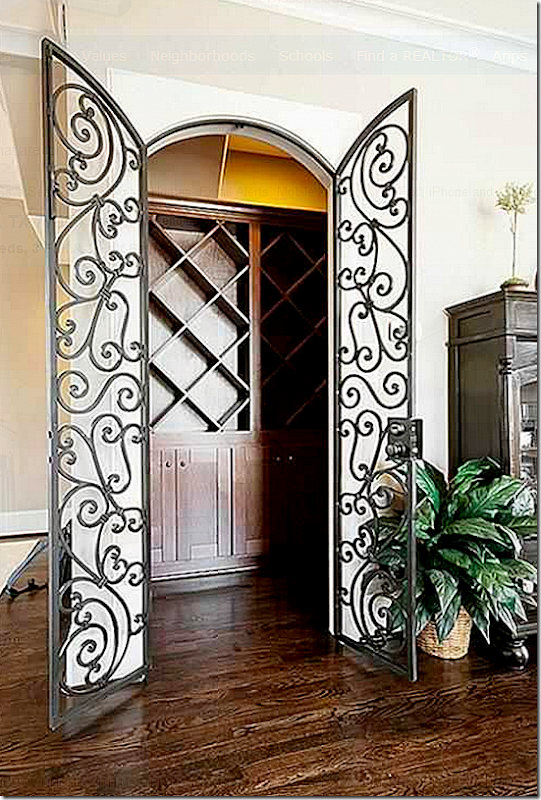
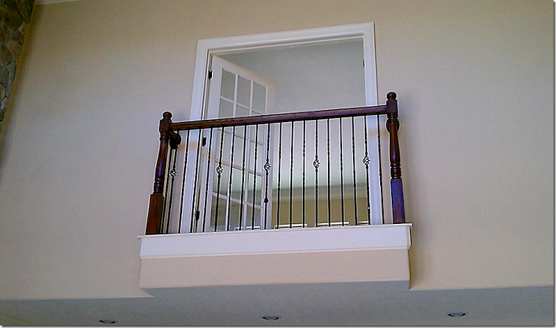
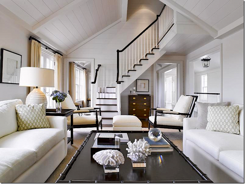 Not all high ceilings are bad. Compare this room with the one before it. Notice how the planks on the ceiling warm up the space and make it seem cozier. Simple wood railings and treads – so pretty. Also, there isn’t a large balcony overlooking the room, creating an echo chamber. Instead, there is only a small section of landing.When looking for a house, look for a more traditional fireplace mantel. This would be expensive to remove and it’s a real eyesore. Avoid gimmicks like this built in niche. The simpler, the better.A pretty wood mantel with marble surround is classic and tasteful. Avoid the gimmicky looking mantels pretending to be either antique or from a ranch.Pretty windows are things that make a house have good bones. And French doors are hard to beat. Also, the ceiling in this family room is probably 9’ – instead of a two story ceiling. The room is warm and inviting. High ceiling rooms can be hard to furnish and they tend to make people feel more uncomfortable. Cozy rooms are great for families to sit around, watch tv and cuddle.Cozy family rooms with bookshelves, curtains, French doors, and normal ceiling heights. Much more desirable than a large, cavernous room with high ceilings and balconies overlooking the space. Pretty doors and windows.Make a library out of any room by flanking a sofa with built in bookcases. Again, warm and inviting and cozy. Pretty windows and woodwork. Rooms don’t have to be huge. Smaller scaled rooms invite a closeness that is missing in the massive rooms found today in many newer houses. Think human scale.The wood on the walls and ceilings is so warm and cozy looking. These ceilings are tall – maybe 12’ – but the beams and wood planks keep it in scale with the human form. Gorgeous doors.Instead of regular doors – interior French doors are a charming and classic looking touch. And instead of a home theater, chose a library where the children could work on their computers and study.Such pretty doors and nice wood paneling.When looking at new houses, beware of the gimmicks thrown in to entice you. Home theaters are great, if you have plenty of extra square footage. But with young children – this space would be better suited as a study or a playroom. Try not to be swayed by gimmicky rooms in new homes, like wine cellars or home theaters. Look for studies and libraries and laundry rooms and mudrooms. Rooms that you know you will use!Unless you are a true wine connoisseur, don’t fall for the wine cellar or wine tasting rooms. It’s a waste of space. Think of the built in bars from the 50s and 60s that no one ever uses anymore. You would use a wine cellar even less.Juliet balconies. Avoid. I love how the builder designed this. Kidding. Just awful.
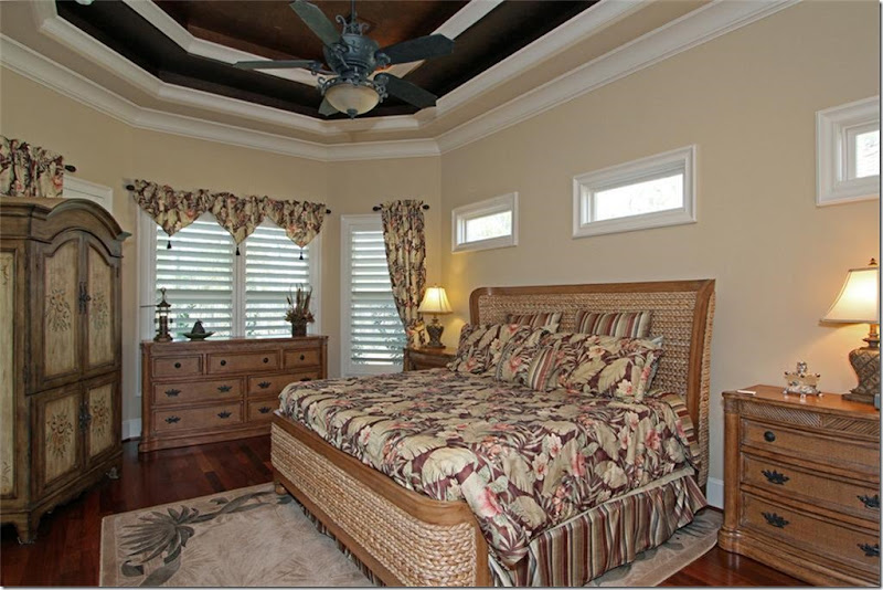 The dreaded tray ceiling. I’m not sure when these got so popular, but so many of the new houses have these. I have one in my master bedroom. Try to limit your tray ceiling to just one tray, instead of two or three. And if you have all of these trays, don’t draw your eye to them. Paint them the same color as the walls, not a dark accent color. That’s all you notice in this bedroom – the ceiling!!! And again, the windows. How in the world would you cover those 3 windows over the bed and what is the purpose of them? Think about waking up each morning to the sun blaring down on your head. And windows like these are low enough to interfere with your headboard choice. Again, don’t limit your decorating choices before you even move in. Take a good look at ALL the windows in the house before you buy a new house. A classic house, with good bones, wouldn't have those windows, nor that ceiling.
Pretty windows are the basis of “good bones” in a house. These windows are perfect for the space. They are well thought out and covering them with curtains is an easy task.
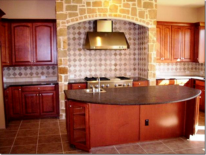
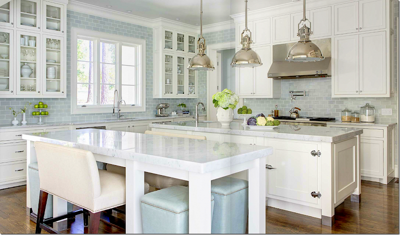
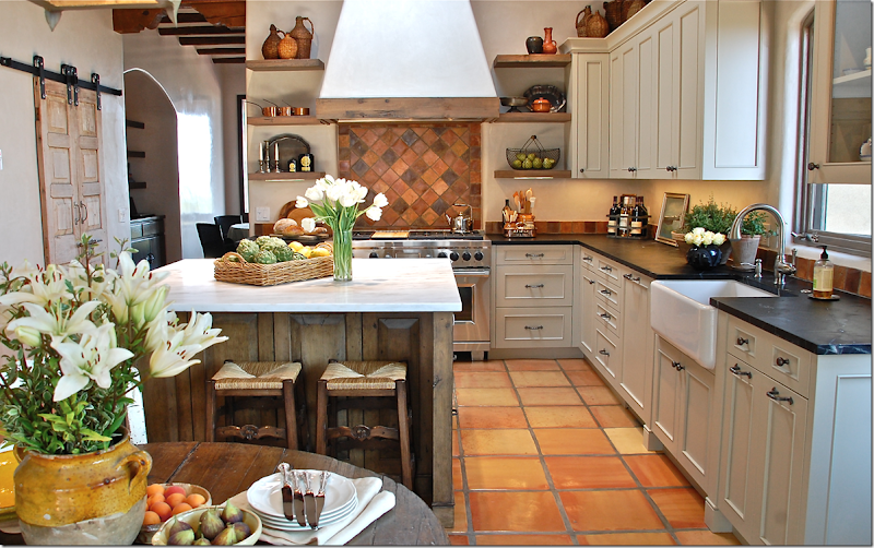
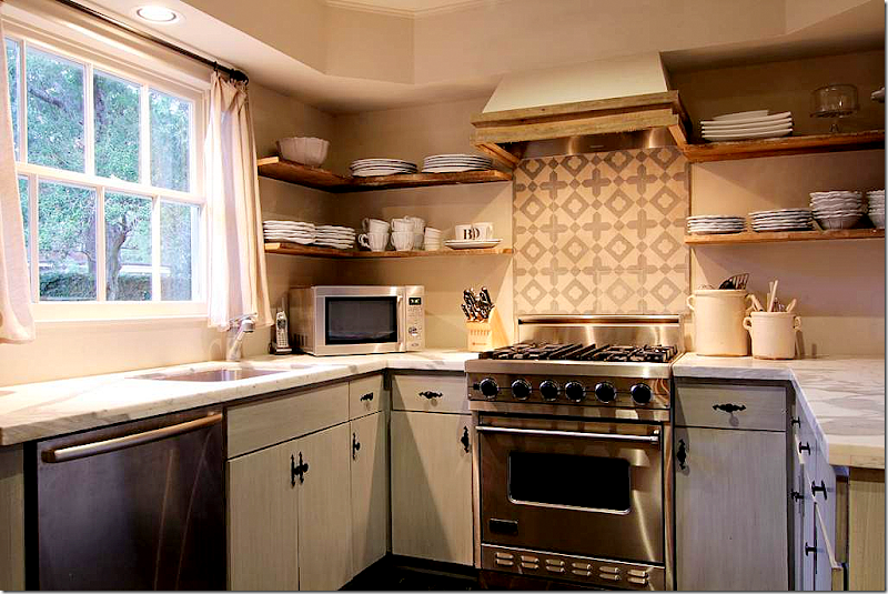
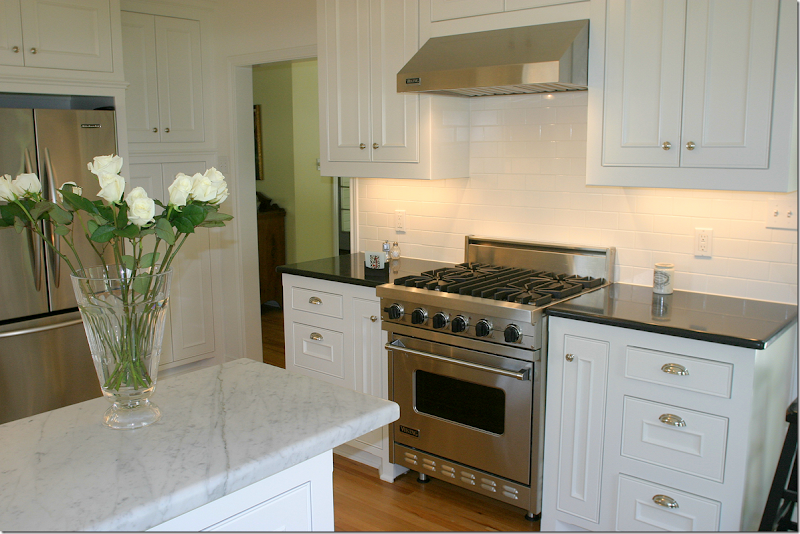
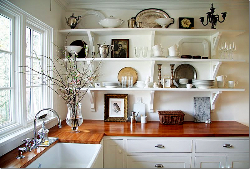
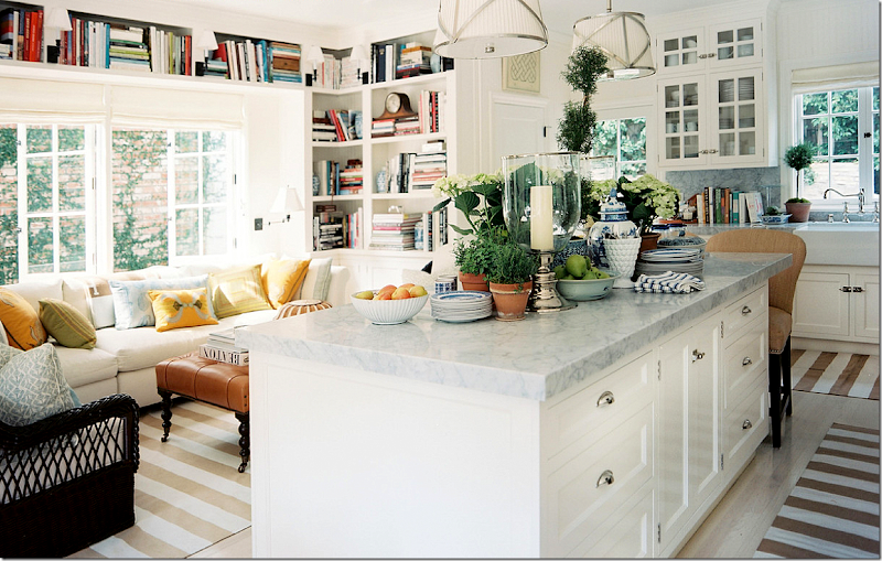
Disguise less than perfect windows with shades and curtains – like I did in my bedroom. This is one long, but short window here. Terrible. By adding four drapery panels and one textured shade, I made it seem like there are three pretty windows here.Go for simple in the kitchen. You’d get so tired of this stone and tile after a few years.Choose a quiet granite and backsplash over one with so much movement. Keep the backsplash simple otherwise you’ll tire of it quickly. No need to get fancy with backsplash designs. A nice subway tile is classic.A white kitchen with white marble and hardwood floors is so classic and soothing and beautiful. You’d never get tired of this kitchen and hopefully, it’s timeless enough to last.This classic, old fashioned looking kitchen would look good forever. Notice how both these kitchens took the backsplash up to the ceiling. Don’t skimp on a pretty backsplash. This beautiful subway tile makes the kitchen so luxurious as opposed to just a few rows of tiles.If you don’t like all white – go for black countertops. This Santa Fe kitchen is so beautiful. There is a simple backsplash that doesn’t overpower the space but ties in the tiled floor. The owner could have gone for a kitschy Santa Fe kitchen, instead she went for classic but with a southwestern vibe. Love!A kitchen doesn’t have to be huge to be functional. Again, just a bit of design in the backsplash limited to behind the stove. If your backsplash is busy looking, limit it to a small area.This was a reader’s kitchen she sent in. Black granite, white marble and subway tile – so classic and pretty. You would never tire of this look.Butcher block countertops and open shelving. Timeless and ageless.By adding a sitting area near the kitchen, this space is so inviting for children to do homework while mom cooks.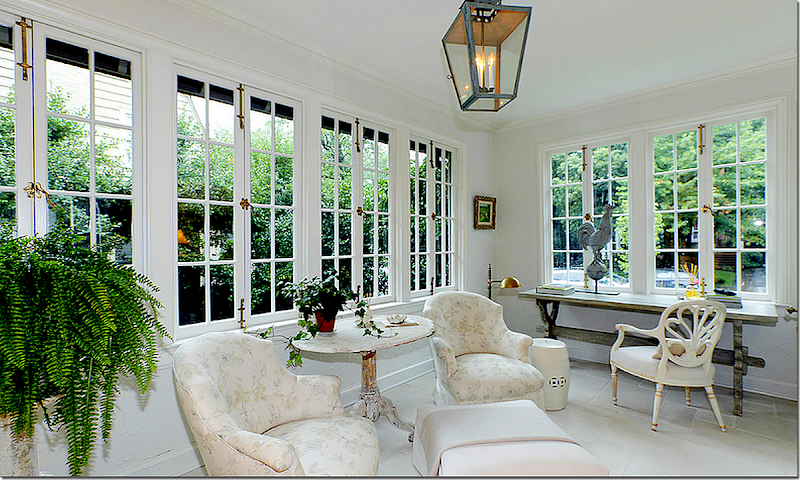 Older homes often have enclosed sun porches which make good studies or play areas. When the kids are teens, a space like this is perfect for offering them privacy with a friend or date.
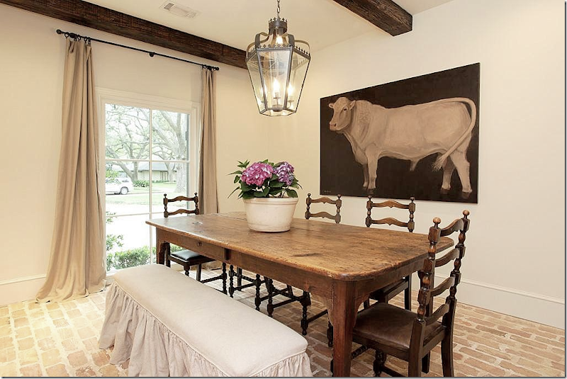 Instead of stone floors – think brick for warmth and a classic look. And beams add so much warmth.
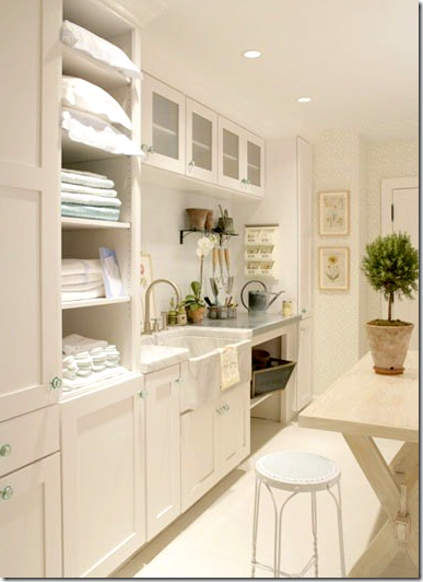
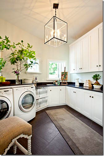
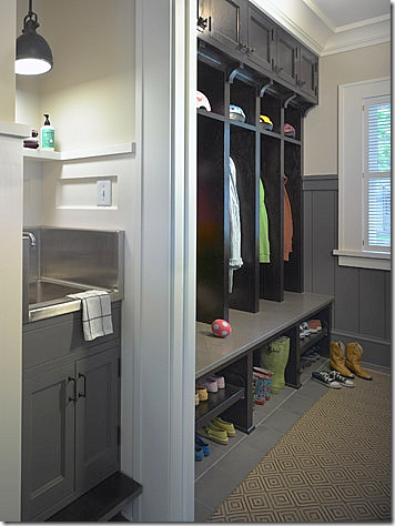
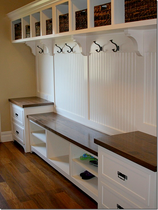
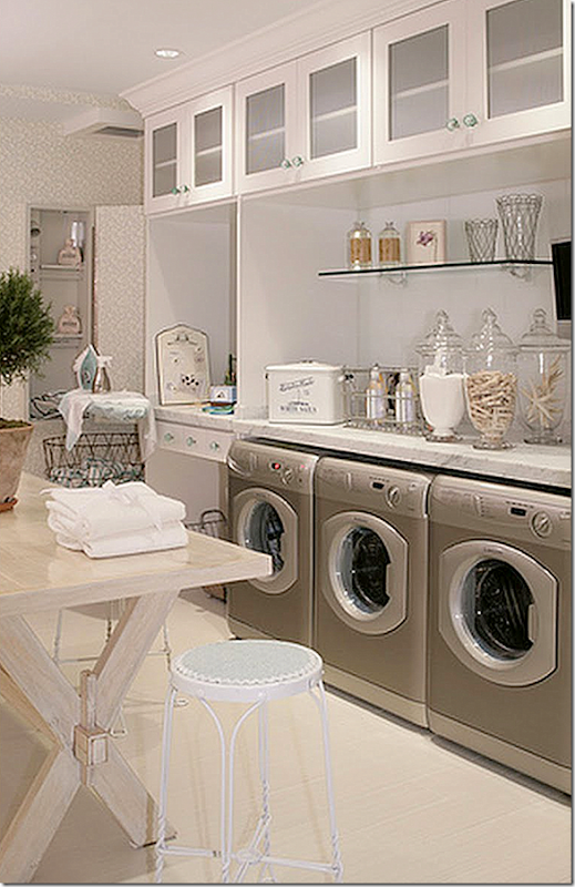
Instead of that wine cellar – make sure you have a dedicated laundry room. The bigger the better as far as I am concerned. What a dream room!! You’ll have better luck finding a big laundry room in a new house rather than an older one. Just make sure the house has one. Some new houses put the laundry on the second floor – you should figure out if that is something you would like when searching for your new house. I’m more inclined to think a laundry room should be on the first floor, with a door to the outside. Then, you can incorporate the mud room in with the the laundry room if need be. You can also make the laundry room a pet center, a place to put the dog beds, bathe the pets in a big farm sink, keep their dog food there, etc. And the laundry room, if on the ground floor, could double as a place to pot flowers and wash off after working in the yard, or for the kids – playing outside.And on the other side of the laundry above shows its large sink, a must in my opinion. A big farm sink would be great for washing pets if you have them. The table is for folding clothes and towels.Nice. I would do anything for a big laundry room! If you put in extra cabinetry, it could double as a butler’s pantry if you need one. Put in an extra refrigerator to hold soft drinks for the kids.The laundry room can double as a potting shed. Isn’t the vintage sink wonderful with the brass faucet with its patina??Built in crate for the puppies is a good idea in the laundry room. Though I don’t recommend crates! Poor baby!!!!!!If you have the room, add a separate mud room for the kids’ coats and shoes. I like the idea of a sink in the mud room – to wash up before they come inside with dirty hands. It looks like there is a built in step to the sink for the little ones.These individual doors instead of open cubbies keep the mudroom clean looking. This mom is really organized. It looks like there’s a bulletin board of each locker for notes.Each child gets his own space, hook, shelf, drawer, and basket. Use individual lockers if you don’t want a cluttered look in your mudroom. This is a great idea. You could also buy a row of old school lockers to do the same thing.
 Here instead of that home theater – create a room for your kids to study in. Velvet and Linen turned a home office into a special place just for their children. And again, a space like this could do double duty for a play space for friends when the kids are younger and teen aged.
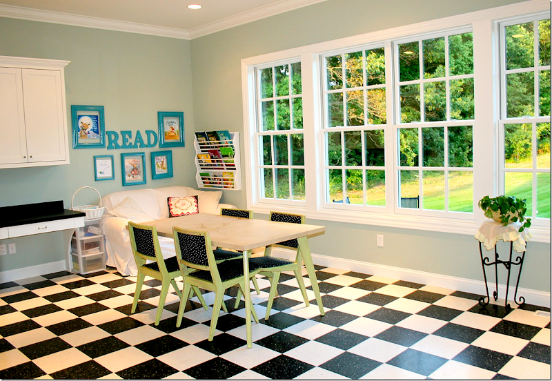
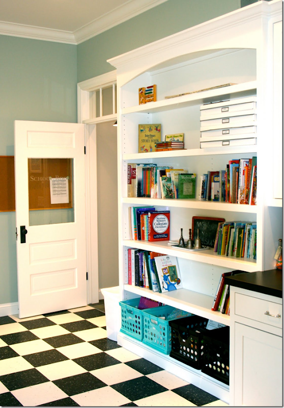
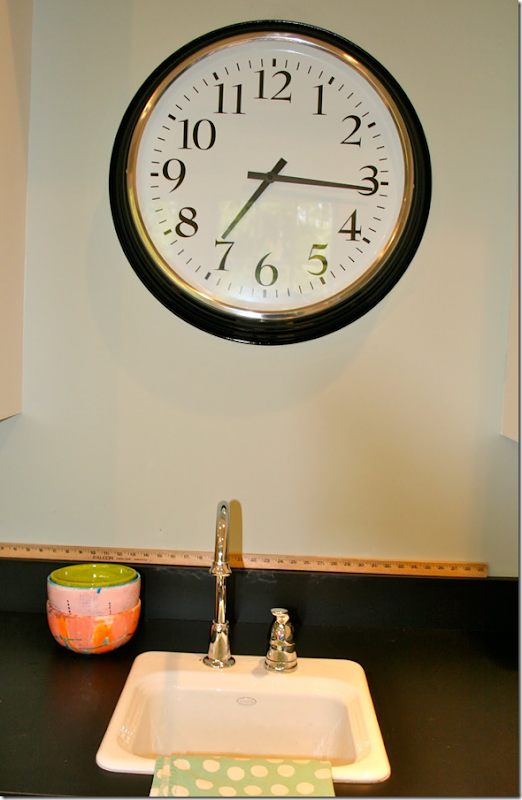
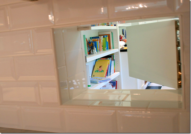
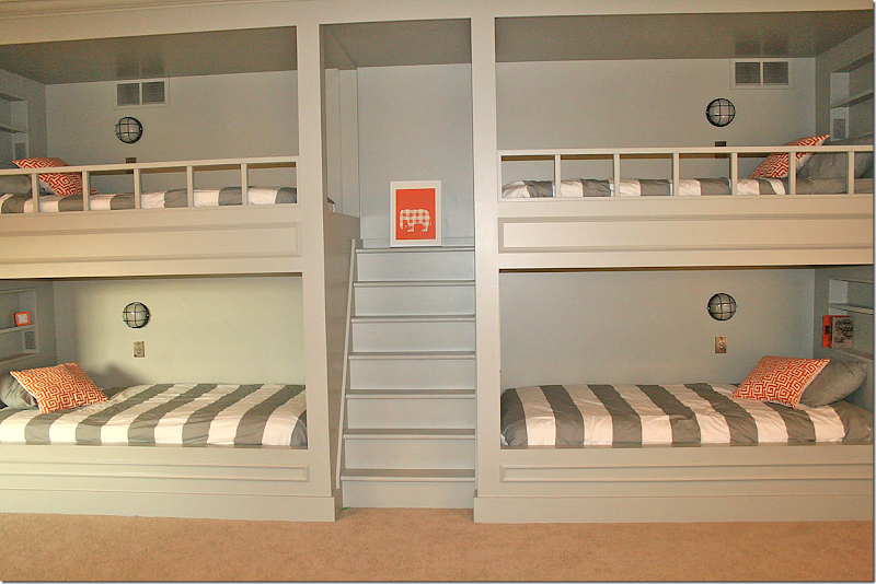
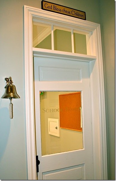 It sounds like you have a lot of children, so I thought I would add pictures from a favorite blogger who homeschools. She has the coolest “school” in her house that I’ve ever seen. Her blog is August Fields here and I featured her kitchen a few years ago. She has six children – 4 boys and 2 girls – and she is a real inspiration. Here is the door to the homeschool. It’s an old one that she cleaned up – love the bell and the lettering on the door.And, here is the main room! Isn’t this adorable!?!! She started homeschooling with her eldest child, who is now 11. Even if you didn’t homeschool, isn’t a room like this so much more valuable than a home theater? It would make a wonderful playroom too. Great ideas to think about when house hunting - vinyl floor for easy upkeep and cleaning, lots of storage space and shelves. And notice the beautiful windows. What a difference they make.Next to the front door is a wall of built-ins to hold all the school books.There’s a sink for easy clean-ups. Great idea for home school rooms and playrooms.Another great idea. There’s a secret pass through in the kitchen backsplash that allows mom to peek into the school room. Good idea for a playroom too.AND - this is the most amazing thing – a water fountain for the kids!! Mom says the kids love it and drink from it all day long, especially during the hot summer months.And finally, here’s one last idea from August Fields. Her kids all share rooms – a girls room and a boys bunk room. Here is the boys room with four bunk beds. Each bed has its own light and shelf for books and toys. These striped duvets are from West Elm, and Target carries them too.The bunkrooms are something to think about. I have no idea how many children you have, but bunking them together according to sex is a good way to save on space. Instead of six bedrooms for all her kids, this mom uses just two bedrooms.
I hope I’ve given you some food for thought when you go house hunting! Send us some pictures when you get settled into your dream house!!
Submit questions to Dear Miss Cote de Texas at mrballbox329@aol.com

















What a great post covering the essentials! I sent it to my daughter, my niece, and my goddaughter. none of whom are homeowners yet.
ReplyDeleteThis is one for the files. No matter what stage of life you are in, this post has well thought out tips for home buying. Good job Joni!!!
ReplyDeleteKaren
I loved this post, and just pinned several of your examples! It's such a helpful checklist. Now, I wish you could come to NY and give me a few ideas for my home!
ReplyDeletejoni, I might be late for church because I spent so much time going through this piece! wonderful. thanks for helping me put my thoughts on houses into words. we are in a 1940s brick cape cod. as I grow older, I appreciate the smaller and cozier spaces/rooms more and more. when we re-did our kitchen 13 years ago, I would not even consider granite. just not appropriate for my space, I thought. I was in such a quandry. I finally went with cherry wood countertops, which I love, and it has added such charm.
ReplyDeletethanks, as always for the time you put into these pieces...donna
Joni I think you covered everything here what a fabulous post for someone who is house hunting! Only one tiny disclaimer, an older home is not more upkeep then a newer home. We've lived in both new and old, currently in a 223 year old house and it isn't more upkeep then a new home. A house simply requires upkeep. You've really shown some wonderful examples here.
ReplyDeleteXXX
Debra~
well, going into it - a new house can be maintenance free for a while - no new roof or ac or heating, appliances - those kinds of things. at least that is what my husband says!
DeleteAn older home DOES require more upkeep as all "systems" within a home have a limited life. Depending on the age of the home you may need to replace one or more part ... and it can get quite expensive. I've only lived in "old" homes, but the potential need to replace componenents is an important consideration for first time homebuyers.
DeleteGREAT chart of life expectancy of various parts of a home:
http://www.nachi.org/life-expectancy.htm
Years ago, homes were built to last. Nowadays, due to shoddy building practices and poor quality building materials, it's best to get out by the 10 year mark before things start falling apart- because they will! Yes, all houses require maintenance but to be safe, never be the second owner of a new house!
DeleteGreat post!! Thanks for all your insight and wonderful examples.
ReplyDeleteYou nailed it! Best post of the year.
ReplyDeleteIt's so interesting to me that so many of the bad examples exist even in expensive homes. Hope you have a great 2013 and THANK YOU for Cotedetexas
ReplyDeleteJulie in Fort Worth
WoW! so comprehensive. I an ready to MOVE. Dammit!
ReplyDeleteWow Joni, this post is awesome! You provided so many details that people overlook when buying a home, especially a suburban home that builders load with obstacles, which lead to decorating stress and buyers remorse. Your blog is the best!
ReplyDeleteWhat a great post and so very informative. My home is chock full of those negatives, its my 5th house and I rushed into buying it, I changed gears in location with less than a month to go with enrolling my son in school and coming off housing plus I was in the middle of separating from my son's father. If you do find a home that is in a great school zone and convenient but has the "negatives" find an architect or designer and have him/her come in and give you a realistic evaluation of "fixes." Also, if you are like me and an emotional buyer, make sure your other half or someone close to you is observant to details and knows your family needs and can look at the house and give you an honest evaluation. A wall in my bedroom is off by 4-6 inches, it skews the entry door and the door leading into the bath is narrower than the closet door! BUT the house was beautifully decorated and I was too busy noticing that instead of the bones of the house. Plus I had the worst home inspector in the world.....another good person to really research....don't just automatically assume the one your realtor provides is the best.
ReplyDeleteJoni thanks AGAIN for such an insightful, beautifully written and researched post.
I've read that real estate agents call competent home inspectors "deal breakers."
DeleteFabulous post! I know who I'm contacting when I need advice. You put together such a thoughtful and detailed answer to your reader's question. I've never been a fan of the McMansions that seem to be all over the place, because of many of the negatives you pointed out. A little character and charm goes a long way in my book. I have 4 kids, and August Field's schoolroom almost makes me want to become a homeschooler..... almost :)
ReplyDeletei know!!!!!!!!!!!!!!!!!!!!! me too!!!!! almost! haha. she is a saint. no housekeeper either.
DeleteWhen I saw the title of this post I was less than enthusiastic about reading it because I have no plans to move. Wow, was I wrong! I never would have thought about looking at the windows in a house before buying it. Your suggestions are so practical and the pictures illustrate your points so well. I had to laugh when I got to the picture of the dining room with the large cow. You have trained us well. Love the room - couldn't help but notice the "dead" space between the curtain rod and the top of the window, though.
ReplyDeletesomeone emailed me and wanted to know who the artist of the cow was! yeah, i noticed that dead space too. i'm so addicted to that.
DeleteA bad room, bad flow, a bad house will be bad every single day of your life. You'll feel it even if you don't know the problem. Best to take a very experienced designer/architect along for the hunt, certainly before making a decision. Take Joni! Better to seek advice on the first day. Pay them, it's very high value service. They can be objective and separate bad cosmetics from the truly bad, look past mess and staging, make value judgements. It's a rare event, buying a house, and we aren't so good at it. Our friend (Gordon in Atlanta) is spectacularly good at this. Thanks so much.
ReplyDeleteJoni, seriously why are you not in the process of writing a book. This post is brimming with the most thoughtful, practical and
ReplyDeletelogical information that anyone would ever need whether a first time home buyer or someone in the situation that your reader finds herself in.
I am not being glib when I say to you, you really need to publish a comprehensive book on the practical applications of design. I could not agree more with the advice you gave your reader and plan to bookmark this post for children and friends looking to make that huge emotional and financial commitment of home buying.
I completely agree!!
DeleteI totally agree!
Deleteawww. stop!! so sweet!! i love the cote de texas questions because they give me ideas to talk about that appeal to a lot of people. i would have never thought of this topic, but it does apply to everyone and i love the comments where people added the things i didn't even think about! i love the comments where people discuss and add to the reasons. it's good for everyone, so thank you all.
DeleteIf you are ever in need of examples of egregiously bad architecture, you need look no further than my own home! The windows! The railings! The asymmetry! That's so awful I have to mention it twice...the asymmetry!
ReplyDeleteOther than that, I truly love my home...but it's the little things that kill!
xo
Andie
I hear you! me too me too!!!!! i have so many things wrong w/my house and i love it despite all that. but, to do it all over again. the list is endless - starting with a laundry room.
DeleteThanks so much for your post. We have been looking into downsizing, and I have been overwhelmed by the number of homes with niches, half-moon windows (I refuse to call them Palladian because they are soooo tacky), and two story family rooms. You have clarified my objections for the Mr. who loves the idea of a whine (oh Freudian slip) cellar and media room/man cave. On the other hand, I have been thinking our ideas are so dissimilar that we should get 2 houses.
ReplyDeleteParents build an expensive wall so they won't hear their children upstairs? Dad did it cheap, he called it parenting. We were quiet. Or else.
ReplyDeleteAll your positive parenting comments made me laugh, thinking of my dad.
Not saying dad had the right parenting style, just what I grew up with. An obvious factor in needing to live in a super nurturing environment as an adult.
Garden & Be Well, XO Tara
actually, their kids were quiet. it's just the echo from the tv, the stereo, friends - it was awful.
DeleteSuch a great post. I wish I could have read it before we bought. I flew to our new city for 3 days and had to find a house in that time period. Though our house has great potential (why I chose it), there are little things that I didn't notice before.
ReplyDeleteExcellent post Joni! Know when I was helping my daughter to purchase her first home (she was single at that time) I couldn't help but point out many flaws to her that I noticed particularly in relatively new built homes. ie: Opportunity for furniture arrangement to name one. Needless to say the Real Estate people didn't appreciate me, but my daughter did as so did other prospective purchasers within ear range as on occasion some of them actually followed us from room to room. ☺ -Brenda-
ReplyDeleteP.S: It took us many weeks until she found a home that suited her lifestyle and budget at the same time and years later when it came to selling it, she sold it herself within two days.
Your suggestions were so refreshing to read. I have never understood all the hoopla over the open room concept that seems to be so popular today. The story lofts are so deceiving! While they may be pleasing to the eye at first glance and instill a sense of space but in reality they're nothing more than an echo chamber like you said. 25 yrs ago we built our home and had a balcony in a hallway that overlooked the kitchen. Even though we worked with an architect, none of us gave a thought to the negatives that quickly became evident. Thinking back, it was done for aesthetic purposes to show off the logs to the cabin we built around. Several years ago we closed it off which gave us a nice reading room upstairs. Wala - no more noise and better yet, no heat loss downstairs from rising upstairs! After all was done, hubby and I both said we wished we had done this from the start :)
ReplyDeleteJoni
ReplyDeleteI got a huge kick out of this post. Those McMansion pictures look like so many of the hideous examples we have here in CA. Why you have not published a book yet is beyond me! I keep waiting!
Omg ms cote de texas. We are looking for a new- old house but for the price whe can afford tey are supertiny. I would love your comment on this house we are considering. It needs updating, floors, bathrooms, etc. Love your blog! http://m.movoto.com/photos/real-estate/homes-for-sale/CA/Bonita/543-Trailridge-Dr-210_120056057.htm
ReplyDeletehttp://m.movoto.com/photos/real-estate/homes-for-sale/CA/Bonita/543-Trailridge-Dr-210_120056057.htm
the house seems nice - there isn't the high ceiling echo chamber, the floors are hardwoods, except for the kitchen - but those tiles are neutral. great back yard!!!!! it's a split level - I don't understand those, we don't have those here in Houston. But if you are used to them - then that's great. the windows look like you could easily cover them. it doesn't look tiny to me - it looks like you could make it a cozy, family house. the only thing i see is the ceilings on the bottom level look a little low, but that might be the pictures. great views! there is carpet on the stairs that you couldn't really redo, maybe if you got a flat weave carpet with a simple design in it? also, i would paint all the cabinets if this was my house. just be sure there is a laundry room. and be sure the ceiling on the bottom level doesn't seem to low in person.
DeleteThanks four your response!. What I like the most is the backyard. And yes , the lower level has low ceiling- it's actually regular, but has good lighting. There is no laundry room, but plenty of space to make one of the kitchen. ( I would of course paint the ugly cabinets)
DeleteYou are great, best blog ever ! I wish you could post more!
Oh, Marcela, PLEASE don't buy that house. It is ranch / craftsman on the outside and Art-deco + ??? on the inside. Split-levels always look a bit off. They are one of the most offensive floor plans ever! There are plenty of homes in the San Diego/Bonita area. That lower level will ALWAYS look squashed and small even if it is not. If you don't LOVE it now, you will never love it. Save yourself the time, energy and money of redecorating, redecorating and redecorating. Keep looking. There is bound to be a home in your price range that does not have the obvious flaws of this house.
DeleteActually there are less than 45 houses for sale in the area i m looking for,and although o dont love it- the pictures with the horrible 80 decoration - i can change many things, well except for the floor plan..., i dont knoe if it would bother me. I wish i could spend a night in the house, in any before deciding. I think that that should be choise in such a big investment. The house was empty when i went to the open house and it looks very different. But i ll keep looking..., thanks!
DeleteIMO, split level per se is not the problem, the problem is how open the floor plan is. There are very few walls between rooms and no doors to shut spaces off from each other. This means the noisiest, messiest activity at any given time is always the dominant one. My house is like this, though less open, and it's been a huge problem. You can't, for instance, cook a meal without the kitchen detritus being visible to guests; you can't read a book if someone's watching TV, you can't have a quiet conversation if someone's practicing the piano.
DeleteThe many asymmetrical sloped ceilings give me pause, too. In real life, are they cosy or do they just feel random?
On the plus side, the bedrooms look good (plenty of walls for furniture), the yard is great if you like a pool, and the kitchen is huge. To me, that wouldn't be enough to compensate for the openness of the main living areas, but you have to choose based on your priorities, not mine!
Your post resonates so much with me. I totally agree with the turret -- what's with that? The only thing I would add is a good layout/flow that works with your lifestyle. This past year, we have been looking at moving to a bigger place. My pet peeve has been the layout. Some things just do not make sense.
ReplyDeleteI love, love, love your post! We purchased a federal style house built in 1856. With the walls a foot and a half thick it's the most cost efficient home we've ever owned...even with period accurate windows. I love having "real rooms" and a kitchen where I can close he door if I'm cooking something that stinks, open concept plans he smell goes all over he house.
ReplyDeleteThis was an amazing post. really, really well done. you have yet to disappoint. I think I pinned everything here (except some of the "new")
ReplyDeleteThis is a fabulous, informative post! The only other thing I'd suggest is that the reader spend some time looking through magazines and checking out architecture blogs and sites and Pinterest to help her determine what her favourite architectural styles are.
ReplyDeleteLooking at some of the pictures you posted reminded me of my friends' house. W and L bought a new builder's house that is filled with poorly-conceived "features". It was as though the builder had a checklist of must-have additions and installed them without giving any thought to their usefulness or appropriateness.
Now W and L have a double-height open concept living/dining area, a wall of glass with a fireplace in the middle of it and not one, but two, wine rooms. They can't figure out how to furnish the living/dining area, the wall of glass still doesn't have curtains (after 6 years) even though it faces their neighbour's back yard and neither of the wine rooms has ever been used. They hate the huge window in their stairwell and the window in the door to the master bedroom. The one granite counter top looks ridiculous because all the other counter tops in the kitchen are laminate. The two oddly-shaped balconies (one accessed from the living room and one from the bedroom) are never used. Although the balcony accessed from the living room is set up for a barbecue, the only way of getting the barbecue to the balcony is through the living room! And the only way of getting the food to the barbecue is also through the living room!
I suspect that W and L were taken in by all the "features" and didn't give much thought to how their furniture would fit the house or how they would cover all the windows. The first time they had me over, they were waiting patiently for me to say "wow". I did say "wow", but is wasn't for the reason they were hoping for!
i can see it all. 2 wine rooms? why??????
DeleteI agree, best post of the year. So comprehensive and sensible. Great Job!
ReplyDeleteFabulous post filled with wonderful examples of beautiful classic design. Your advice is spot on...So many of these new Spec homnes are just completely dreadful...all those built in niches are the absolute worst...and as you pointed out here, the windows become laughable. You need to start another business consulting with builders.
ReplyDeleteI just want to add a few caveats to what Joni has provided here. First of all, this is one of the most comprehensive assessments that I have ever read that a designer might use to caution a potential buyer of a new home. My comments are not meant to distract from what has already been said, but to add a bit of my own experience and observations.
ReplyDeleteWith respect to different floor finishes - much depends on whether or not there is a clear demarcation between one space and another. The visual Joni used was a logical one for her argument in that the spaces all converged except for one room. I think it is wise to consider the way
the floor plans flows. Consider if there is a cased opening or an actual door which separates one room from another or is it simply a pair of columns.
Remember first and foremost, even if you build a home with the most acclaimed architect, there is no perfection. There are always compromises and the best way to decide on how much compromise you are willing to make is where you are in your life and the ages of your children.
Many people choose marble in their foyers, hardwood in the living room, dining room, library, etc., but then want some sort of stone in the kitchen. Not all stone has to be jarring. It can be so innocuous that it reads totally neutral. The space will tell you immediately if that is true.
Remember, there are no perfect homes. I used a very well respected and successful architect in my area to design a French home 20 years ago. I have many of the elements Joni described, but a couple I don't have. Once living in the home, we soon began to speculate on the things we would have done differently, but also the wow factor of the many things we were happy that we listen to our architect about. Not having the perfect home is no crime. THERE SIMPLY ARE NONE! So if you are looking for that perfect space, list your priorities and attempt to achieve as many of them as you can and life will enable you to accommodate the ones you cannot.
flooring - yes. if the room openings are cased - that makes difference = esp. in one story houses or non-open concept houses. we had an awful architect - i couldn't agree more!
Deleteagain - if the house isn't open concept and the rooms are open to each other in a way like i showed. i just prefer the less amount of flooring the better, but that can be personal, of course.
my house is full of things that i said to avoid - no laundry room, no mud room, balcony overlooking the foyer, too high ceiling in my family room, too many builtins - some really fugly windows. trust me. nothing is perfect and certainly that list isn't either. just a guide if starting out. chose to follow it or not!!
thanks for a great comment!
what a fantastic post, as well as a thoughtful and informed response to a reader question! this is everything i think about when i see houses, but have never taken the time to truly analize and list.
ReplyDeletethis should make you laugh: my girls & i love good design, homes and inspired creativity and, talk about it a lot. so often when we are in the car together, just going wherever, we'll chat about the houses we see. common comments from my daughters are...."those windows are gorgeous, true divided light & real wood" or "mom, did you see those bad shutters? way too small, no hinges and they need shutter dogs" and so on :)
thank you for sharing your expertise!
i forgot shutters! we can't all have gorgeous shutters!!! and we all don't !!! i wish i had thought of that - but that's an esasy fix, it was really trying to talk about things that weren't easy to change.
Deletethanks!!!!
Joni, This was absolutely perfect! The written information and the perfect pictures for visuals was invaluable. It summed up what I would have thought about, after buying the home, when I wasn't over whelmed. So, to have this info before hand... thank you. We too are moving in the near future because of my husband's job, so this article couldn't have come at a better time! You really should write for the home/weekend addition for the WSJ. Laurie'
ReplyDeleteThank you! Please have all builders read your post! Symmetry equals calm and we all need more of that in our lives. Huge lofty two story rooms are amplifiers and they make you feel like you are watching TV in a hotel lobby. Rooms need walls and ceilings! And those stupid wine rooms with the frosted doors that say "wine" have to go! Less is more, less fussy more clean and simple. My mantra is simple is the hardest thing to do well.
ReplyDeleteI agree with all of the above, and would add:
ReplyDelete1) Think about your storage needs. Is there a place for guests entering the front door to hang their coats? Are bedroom closets adequate for your needs? Where will your out-of-season clothes go? Towels and linen? Suitcases? Christmas decorations?
2) Light is so important (nothing more depressing than a gloomy room). Realtors will turn on the lights. You should shut them off to see what the room really looks like at that time of day. I also take a compass with me to verify the orientation of important rooms (I prefer south and west).
3) Walk the edges of the property. What can your neighbors see? Is there a transformer behind the stand of trees at the back?
4) Park in front of the house in the early morning hours. Is the neighborhood's morning rush hour traffic channelled down your street? What about your pathway to work? Your neighborhood may seem well-located, but if there's only one route out you'll spend a lot of time waiting in traffic.
I'd go so far as making a trial run to your work place at rush hour - you don't want a nasty surprise like a left turn at a busy intersection with no traffic light.
DeletePlus go by after work hours and on weekends to see what kind of people are out and about, any kids, loose pets??? Are there sidewalks, for the first time I live in a neighborhood without sidewalks, there are golfcart paths but its not the same. Great idea about the lighting, visit the house in the evening, I have an obnoxious street light located across the street and it shines in my bedroom at night, especially annoying during winter when there are no leaves to filter. If there is no fence around the property, check to see if there are any restrictions with regards to height or setback. Ditto for adding a shed or garden room. Love the idea of taking a compass!
Deleteomg!!!!!!!!!!!! yes yes yes!!!! closets, coat closet, storage!!! lighting!!! traffic!! neighbors! where were you when i was writing this?
DeleteThis is just a great post, Joni. The question asked was rather difficult because choosing a home is so personal. However, you nailed it all - good classic proportions and structure, traditional,livable rooms without all the gimmicky junk. I am so glad you included the smaller bungalow home with the big front porch and showed some smaller kitchens also. And, warned against the very ugly macmansion house - omg - what horrible proportions!!! I see so many of these types of home - and the windows everywhere and all different sized - ugh. Very good advice - well done!
ReplyDeleteHello Joni, This is a great post for anyone looking to buy because you cover so many elements that are easy to overlook in the excitement of home hunting... I think we need to create Joni's check list...:)
ReplyDeleteI hope to be flat hunting soon ( time for a change in london) so I am going to use your inspiration to make a list of elements that I need to find and 'not find'! FLats aren't so easy and have so many limitations but I am sure the principles work...
Have a great week... xv
Nice blog... thanks for sharing with us..
ReplyDeleteIn my opinion, one of the most important factors in choosing the "perfect" home, is orientation to the sun. The reason this is so critical, is that you cannot pick up your house and rotate it. (Well, you can, but not very economically.) Orientation to the sun determines the quality of light each room receives and can have a major impact on heating and cooling bills. In the days before refrigeration air conditioning was routinely used in residential buildings, homes were oriented to capture sun in the winter and minimize sun exposure in the summer. Even in a "tract" home, the same floor plan can live very differently depending which way it faces.
ReplyDeleteHaving lived in 12 different homes during my lifetime, I prefer the rooms that are used most in the mornings (kitchen, breakfast room /familyroom and masterbathroom) to receive light from the southeast. This gives you light and warmth in the morning when you need it the most.
Houses that face directly north, east, south or west usually have landscaping problems. The north facing side will always have a limited plant pallet because so many plants do not do well in the shade. A side that faces due north can have moss problems even in a warm dry clime such as southern California. North facing rooms always have blue-ish light and seem cold even when the temperature is not. The south facing side of the house will be in full sun all day which is hard on lawn grasses. The east side is typically the most comfortable but only gets sun 1/2 the day so flowers like roses may not receive enough sun. While the west side absorbs heat in the hottest part of the day. Since most of us do not live on our garages, the west side of a house is the best place for a garage. If you have a choice, try to get a hill or a neighbor's two story house to give the west side of your house shade in the afternoon. Failing that, plant deciduous trees on the west side.
Regarding windows, rooms that receive light from at least 2 directions are the most pleasant and are easiest to decorate. They receive natural light a large part of the day AND the color of light is more consistent throughout the day. Many of the traditionally styled homes have windows on at least two walls. A large central hall, as suggested by Joni, can also let light flow between rooms. AND, in the pre-airconditioning days, if a house was properly oriented to prevailing winds, the central hall, often with transom windows, would assist with ventillation.
Not an easy thing to pick the "perfect house". With so many bad choices today, it is however, VERY easy to pick an imperfect house. For more ideas about what to avoid, read "What NOT to build".
While this may seem like overkill, if you only have 3 days to select a new home, get the addresses of ALL the homes you plan to see. Then look each on up on Google Earth or get a plat map. I print these up and keep them with my notes on each property. This will show right away how the house is oriented to the sun. A home that seems pleasant in the spring or fall, may be blazingly hot in the summer of miserably dark in the winter.
ReplyDeleteForewarned is forearmed.
great comment. but if a house is not one room deep = the back room will get opposite lite than the front room, so the siting isn't quite as set in stone. same with the west side and the east side.
Deleteand trees - shade in the summer, bare in the winter to catch the sun.
but = there is also a/c so the heating and cooling isn't as important today as it was before a/c.
You constantly amaze me!! What great information all in one post!! Thanks Leslie
ReplyDeleteI'm with you on the laundry/mudroom on the first floor. When we renovated we knew we wanted a mudroom but deliberated over putting the laundry in that room vs. putting one upstairs. We finally decided to put it all in one room. I have two kids and a big messy dog. We enter the house through that room and it's great to dump the dirt and crap there. My boys sometimes strip down there after a muddy soccer game and throw everything right into the wash. I splurged on a nice sink, which, as you said, is great for washing dirty hands potting plants and arranging flowers. We don't have a butler's pantry or bar, so I set up a bar in there when we have big parties. The sink can double as a cooler or a place just to store ice.
ReplyDeleteGreat post!
We've had a second story laundry room and hated it. Our machines shook the floor so much that we worried about the strength of our structure! We even installed shock absorbing feet and a shock absorbing pad, but it was still worrisome.
DeleteLibby P
I am always so inspired by your posts. You are my absolute favorite thing in my in box. This was invaluable to me and I am not even house hunting. Thank you for posting this information that most of us would have to hire a talented designer to learn. Have you considered writing a book?
ReplyDeleteI love this post, really thoughtful and accurate. I lived in a house with a two story family room open to the second floor. Hated, hated it. It was hard to heat and the echo was horrible!! My children were small and we could not watch TV without waking up our children, we even bought cordless headphones, finally we just moved into our bedroom to watch TV. Awful, good lesson. I knew we were going to build so I kept a list of all the things important to us, visited every show home, took pictures, kept notes and got lots of ideas from my mother who is fabulous with design. It was hard to find a floor plan without all the crap you are talking about, and I definitely did not want a big pointless bonus room with tiny bedrooms that most plans had. Eventually I designed it myself. Simple classic rooms, big paned windows, lots of french doors. Big mudroom with a sink and tons of cabinets and cubbies...love love that. Master down, children up. No weird niches or strange shaped windows (although the builder who lives next door has all that is his house-Ha). This is a wonderful educational post!
ReplyDeleteWhile I thought your post was informative and helpful, I had to laugh when I read it. You would HATE my house. It meets not one single requirement of yours! Yet, I love it here and can't imagine ever living anywhere else. The front of the house is not at all symmetrical, the second floor opens to the first, we have half circle windows in 2 rooms and not one single room is white, slipcovered or has seagrass anything in it. We raised 4 kids here - 3 of them boys and noise was never an issue. We would just close the bedroom doors and things were fine. Echos were managed by furniture and area rugs and we seriously never had a problem with it. I hung drapes between the half circle window and the windows below it and it looks great. My own personal requirements were quite simple. I wanted to have property larger than a lot size, not be too close to our neighbors and have a front yard (our last house had none of these things). As for the house itself, almost everything was negotiable. I think the person who asked the question should first ask herself what the absolute non-negotiables are. Then decide what she wants/needs, then what she would like, and finally, what would be nice, but she can live without if she has to. Maybe she can walk around her existing home and list all of the things she likes and loves about it and what she absolutely needs to have in the next house that isn't in this house. That's the best place to start. When she checks out houses to purchase, bring a voice recorder or use the feature on the cell phone and take voice notes about what you want to change in each room and each house. Then go home and listen to the voice notes. If it needs too many big changes, it might not be the right house. Honestly, I really think that the right house is something you just feel inside. When you find it, you just know it. Once she finds the right house, decorating will take care of the flaws. I feel that decorating is essentially making the most of the space you have, highlighting the things you love and hiding the things you don't.
Deletekath - like i said before - i was laughing too because i live with so much that is not on my list! my house has so many things i would change today!! and my family - no one has slips and seagrass but me and they all have gorgeous houses!!! so, trust me - i appreciate all kinds of decorating!!! you are lucky though that the echos didn't bother you, because i do think that is important.
Deletethanks so much for a great comment!
Thanks for the very helpful information. A lot depends on your location and what sells in your area. I'm old school and entertain in my living room and dining room. My Liv Rm is 2-story with a coffered, ceiling (visual weight), and looks out to a fabulous landscape and guests remark how tranquil and resort-like it is. It's a shame when a 2-story room looks out to your neighbor's brick wall. I have a separate family room, next to kitchen, which I made more cozy for TV viewing. I agree with practically all your ideas and have incorporated them into my home; it's very reassuring as I'm about to build my next home. I know many friends have opted-out of the "great room" plan because there's no private space except in the bedroom.
DeleteSuch a nice place for renovation and house exterior and interiors. Good reading.
ReplyDeleteGreat post. The neutral family room with french doors along one side - do you have the paint colors? Love the whole look.
ReplyDeleteGreat post, we wanted to buy a new home, but frankly I couldn't get past all the design flaws in the master planned subd homes. We finally found a foreclosure in the neighborhood, built 6 years ago, but it was an older designed plan the previous owners wanted because of the shape of the lot. So thankful, we got symmetry, porches (a must in my opinion in the south)and no niches!!!! I wish new home builders could read this post, I would add that you need to consider the future flexibility of your home. Such as aging in place, whether that means growing children or parents coming to live with you (that was a need we had). You need to write an ebook, like Colour me Happy which I purchased before you recommended and it was very helpful.
ReplyDeleteWhat a wealth of good information and advice here. It makes me regret some of the choices I made when I built my home 14 years ago, but fortunately I love my home anyway. Too many of us, I think, go to builders' open houses and are drawn in by gimmicks. It isn't until you live with those decisions that you realize simple and classic are better most of the time.
ReplyDeleteBeat...Victoria
PS: The numbers I have to enter to prove I am not a robot -- trust me, I am not -- are much too small and dark for these old eyes to decipher. Do they have to be that way???
i can't change it and yes it's a pain i know, but it stops the 1000 of spam comments on all the old blog stories. you can switch it to audio. i know it's horrible. sorry!
DeleteWow, what a great post! So informative, I wish I could buy a new house! I always read your blog but never comment. Could not let this one go by without letting you know how much I enjoyed it.
ReplyDeleteJoni, you are amazing! i feel as if I am in a master class every time I read these posts of yours. I concur with everyone who says you should write a book AND talk some sense into those crazy contractors and their McMansion obsessions!
ReplyDeleteGreat advice! I agree with all your suggestions. And isn't it amazing that so many of the big builder houses of the 90's and 00's are so awful? They all had to have two story or high vaulted great rooms with a 'study loft' open to it on the second floor. How is anyone supposed to study when you can hear every noise (especially the TV) from below? Just stupid. As you noted, I also know of several people who had to close those in with walls to keep down the noise and make the space actually useful as an office or bedroom. Another point I would add regarding windows that Charlotte also mentions above: in important rooms, have light enter from at least two sides and three is even better. That's one of my pet peeves about new tract housing - most rooms only have windows on one side. It really affects the quality of light and shadow. All (non-attached) older homes will typically have rooms with light on two sides - necessary when they needed the windows for cross ventilation as well. My house was built in the 20's and my kitchen, dining, and living rooms have windows or French doors on three sides, and all bedrooms have windows on two or three walls. Yes, it can cause headaches with furniture placement, so the position should make sense. But I think that's one of the things that makes older houses more appealing that you can't quite put your finger on when comparing with new ones. If you drive through new subdivisions you'll usually see houses with large blank sides - most all windows are grouped at the front and the back. The builders say this is for privacy (because they've jammed the houses so close together!). It's also cheaper. I hate that! A good source for what makes houses work is "Patterns of Home" or the original "A Pattern Language" where they've identified all those elements that create an enduring and satisfying place to live. The only other point I'd add is buy a house within your budget. Yes, it should be as good as you can afford, but it won't make you happy if you have a huge debt obligation that weighs you down.
ReplyDeletethere is nothing prettier than a one room deep house with an enfilade - light shining through both sides of the room.
Deleteoh stop. now i am making myself crazy!!!! i want a house like that so badly!!! i'll never have it, but i want it!!!
Carolyn, your post about your house could have been written about mine, and the funniest part is that I recently bought and a reading "A Pattern Language" -- and lapping up those parts about windows on 2-3 walls of each room. Yes, this is absolutely a must-have! Furniture placement is a challenge in my 1920s house but I wouldn't have it any other way. I was even going to add a comment about the no-windows-on-the-sides deal that seems to be ubiquitous in all subdivisions from the last 20-30 years, but you beat me to it.
DeleteOne other peeve to add -- both my brother and my sister's families live in large late 90s houses; one even has the dreaded open hallway looking down on the great room. But to me the biggest pitfall is how steep the stairways are! These houses are a lot larger than mine, but they really skimp on hallway space and use such a small footprint for the stairway that by necessity the treads are narrow and the risers are high. In contrast my stairway, by no means grandiose, consumes a significant amount of floorspace out of the house's available square footage. No complaints from me though, because it looks great AND is highly functional. It helps that it's all solid oak and has generous landings partway up and at the top.
Great Post! I have to agree about the 2 story family rooms. My old house had one - very, very noisy. It's funny how as I get older I don't long for those grand, showy homes; I just want a cozy home, with the nice huge laundry, mudroom, and a big kitchen. Thanks again Joni!
ReplyDeleteThanks you so much for this article..I really enjoyed reading all your tips and very much agree with everything. New is great, however there is something so appealing about older homes that are human scale. I have one of these new home with the huge ceilings and although pretty is very difficult to decorate..Replacing light bulbs and dusting is a challenge..and what I dont understand are the huge master bedroom with so much space, huge sitting rooms adn enough space for 2 king size beds. Now I am venting and will certainly know what to purchase the next time round.
ReplyDeletehave a great week!
Sarah
Grand advise, Joni. It is all about life style(how one wants to/does live). This should be required reading for all builders/arch. The whine/wine room is the perfect name! have a wonderful Monday. xxpeggybraswelldesign.com
ReplyDeleteYou have the best posts...I find myself reading every single word and then going over it....I could not agree more about the windows. Those huge windows in new homes are just plain ugly. I'll take french doors any day.
ReplyDeleteI love this post, so well done. This should be a book!
ReplyDeleteBOO HOOOO - I wanted the 2-story great room with overlooking balconies and now I find out they are totally impractical. I have slight claustrophobia so I love high ceilings, but maybe I am carrying this height to the extreme. I haven't actually lived in anything higher than 10 ft.
ReplyDeletehey! listen!!! if that is what you love - go for it! you can get high ceilings without the echo. i showed several rooms that had very high ceiling without balconies all over the place!!!! you can have it. my sister in law's sister has a house with 12 ceiling and it is gorgeous!!!!!!!!! and her staircase overlooks the entry so it's not so noisy. it an be done!!! follow your heart !!
Deleteand go to a house and have the kids go upstairs and talk - and see how it is.
Yes, we are fun girls, sexy girls and all-about-international-design girls!
ReplyDeleteSo many great ideas and thought in this blog. Lots to contemplate. Sign me up for a Georgian home. I love symmetry. Off kilter drives me nuts. Again great blog.
ReplyDeleteAnn
Joni, that was brilliant. You should send this post to developers and realtors everywhere. Maybe it would impact the quality of what is yet to be built! Better yet, publish it in book or e-book form so purchasers can be educated and discerning when they shop for such an expensive investment. Although much of this is intuitive for me at this stage, after years of scouring magazines and renovating, I realize that putting it all together in one format would be 'quality of life' saving for so many! What a truly great service you provide! I bow to the light in you!
ReplyDeleteGreat and well thought out information. I'm impressed with the amount of time you put in to your posts. People don't realize how much work this takes so I just wanted to acknowledge that.
ReplyDeleteThis is a great post, and I would say that every Realtor should read it before getting a license, but in my area 3/4 of the new builds would be disqualified for purchase (with good reason) right away! I agree with you on the front loading garages. You can fit a lot more house on a lot if you don't have a side driveway using up the space, but it looks much better to the side. I think local builder's architects have decided that the solution to a garage door glaring at you is to add peaks and windows to the roof above, giving it the "Garage Mahal" look. I think the builders in our development went down your checklist and used it as a "to do" list- we've got all the big offenders. And I can tell you that no amount of carpeting on the stairs gets rid of the echo chamber effect.
ReplyDeleteWOW, such a great, informative and inspirational post. Surely this took you a lot time...thank you for the information and your time!!!
ReplyDeleteBlessings,
Cindy
Hit the nail on head again. Fabulous, fabulous! You make it all make sense, that is why it is so easy to learn from your design knowledge.
ReplyDeleteAbsolutely stunning posting. Beautiful photos, and clear and concise suggestions. I so wish I'd have had such excellent guidance before we last purchased, 3 years ago. I've been miserable every since. Thanks very much for this very helpful information!
ReplyDeleteJoni, you are a bona fide genius!! And so generous with your expertise. So many of the no-nos you've mentioned are problems we are still dealing with now that we've been in the house for 15 years. You are a national treasure, and I wish I'd had this information when we purchased, but will certainly bookmark this post for future reference.
ReplyDeleteSue in RI
I'm a genius!!! That's why I have no laundry room and have to iron in my entry hall. Genius!!!!
Deletethanks for your very, very sweet comment.
Ironing in the entry hall . . . . What do you do when the Avon Lady calls?
DeleteI have a large laundry room but like to iron in the kitchen so that I am around family traffic and
have someone to talk to. It makes that awful chore go faster. By the way, a damp lint free cloth, a fabric softener sheet and a little heat in the dryer goes a long way in avoiding ironing. Sometime, depending upon the fabric, you don't need the fabric softener sheet.
LOL I have a 2 story foyer with the landing overlooking the entry and thats exactly where I iron! I have no idea why as the ironing board is stored in the soon to be lady cave, I think its the light and being able to lay the clothes across the banister for my son to grab....redneck I know. My laundry room is a miniscule 5x8 and doesn't have any outside access, I didn't think about the size when I bought my front loading washer and dryer which are rather large for the space....I was just so excited to have a laundry space since my last was in the basement. But with all the "negatives" of my house and dreaming about my "perfect dream" house, I appreciate and am grateful that I have it and accept the challenge of making it into a "blog worthy" home! You do need to write a book, this is a great post
DeleteYou are so talented! What an amazing compilation of important considerations when choosing a home. Having raised our three kids in one problem house and then one terrific house, I can tell you that it really matters to how the family functions. Our current house has such good karma. Rooms function in sensible ways. Furniture fits appropriately. The scale is for humans and not giants. The house itself promotes a happy life for our family. We had the same sort of furnishings in both homes and the first felt off and the other feels great. So, it is not about just looks.
ReplyDeleteFantastic post! You covered so many great points.
ReplyDeleteOur little 1970's Oxnard house is honored to be included!
We bought our Oxnard house because it has a great layout and wonderful light. The new garage doors and landscaping were simple fixes.
Plants are a great way to detract from less than ideal architecture!
I agree, always buy a house that an architect has designed ;)
A well designed house can accommodate your family as everyone gets older and your needs change.
Thank you again, Joni, for including our homes in your post!
xo
Brooke
While I have great respect for architects, buying a home designed by an architect is no guarantee that it will be well designed. The building has to be sited correctly on the property. Simply look through the internet or thumb through magazines with "architect" designed homes. You will find many of the horrors Joni pointed out in this blog post. On the other hand, many of the Craftsman houses, mass produced and prefabricated by Sears and Roebuck 60 to 100 years ago, are both charming and very livable.
DeleteIt is better to understand how YOU live and what is important to you. Personally, I don't care one bit for a porch. I would rather have a courtyard out front as a buffer between the street and my home. A house built on a rise is also very important to me. Can't stand the hemmed in feeling of looking over the fence at my neighbor's house.
Because I like gardening and landscaping, I like to be able to look from the front door all the way down the hall into the backyard. Conversely, I do NOT like to look from the entry hall off to the laundryroom and then out to the garage. Can't tell you how many expensive, otherwise nice homes that have had THAT feature.
Much like choosing the "perfect" spouse, it helps to have a list of the top 10 things you MUST have as well as a list of automatic disqualifiers. Life is to be enjoyed not merely tolerated.
Hi Joni,
ReplyDeleteWhat a great post!
You have nailed it to the door!
Please, someone send it every coorporation and local builder rolling out acre after acre of ugly, uncomfortable new home designs.
I have been trapped by each of these bad elements in one house or another, and some design flaws are just too big to fix.
Thank you for spelling it out!
Suzanne
With respect to heating and cooling, your local power company stands ready to give you the best advice on how to maximize your savings on heating and cooling based on their evaluation. When building our house, they actually recommended an HVAC engineer who designed our system which is all electric for maximum savings. If you are building, do not overlook this important component. It should be addressed by competent people as your plans are being drawn if building from scratch.
ReplyDeleteBy the way, this post exemplifies what one would hope a design blog would encompass. Not just beautiful pictures to inspire, but real information that educates and informs the reader. Joni, your posts lately have begun to go in that direction and I commend you for it. You have a lot to offer your readers and just showcasing readers' kitchens and renovations is not always the ticket. This post truly reflects your talent.
Wow what a wonderful post! So timely for me too. We just relocated to Houston from overseas and are in the process of finding a house in Houston. I am actually in love with the "green house" in River Oaks that you posted some pictures of. That house fits our needs/tastes perfectly except unfortunately there is no room for a pool.....at this point we are convinced we need a pool for the scorching summers here. Thanks again for the wonderful post, I might be contacting you in the future when we have a house and I need to hire a decorator!
ReplyDeleteThank you for an excellent and well-illustrated post for design criteria!
ReplyDeleteHere are a few other points that I have found helpful.
I'm with Anonymous January 27, 2013 at 8:33 PM on bringing a compass - the direction the house faces and room locations is paramount for me (in the cold Northern US).
Do the rooms get light from two sides?
Is there a deck to connect the house to the backyard? A place for a grill next to the kitchen?
Is there a porch to connect the home with the neighborhood? Are there sidewalks, do people walk? Where does the mail arrive?
Check the lay of the land, is the house at the bottom of a neighborhood hill and at risk of flooding in storms?
Check for any deed restrictions, and beware any Home Owners Associations (HOAs) restrictions.
Look at a map of the home, locate the airport, busy roads, sewage treatment plant, industry, etc.
Will airplanes be landing over the house? Will the westerly winds carry smells from local businesses, or freeway noise?
Other helpful reading: Sarah Susanka's "Not So Big" series and Christopher Alexander et al.'s "Pattern Language".
thanks for a great comment! the compass is a hit. i would never think of that, but i think i have a built in compass. i hate the northern light in my living room. it's always cold in there, but the too high ceiling is another reason i hate that room. did i mention i don't have a laundry room either? just kidding, that's all i've talked about tonight.
DeleteJoni,
ReplyDeletewow. you continue to impress me with your knowledgable and chuck full of info posts! august fields is honored to be a part of it. thank you so much. and i must say, you really did touch on some "real" conversations that come up between builders and home owners. we stood steadfast on: No tray ceiling in the bedroom, Side loading garage, No open balcony in the foyer, a larger than life mudroom, and symmetry, symmetry, symmetry.... again, great post, and i agree with many of the previous comments......you need to write an ebook! :)
Once again you hit it out of the park! You put into words so succinctly yet thoroughly what so many instinctively know and even more struggle to understand. Not only do you have a wonderful design aesthetic, but you are so generous with your insights. Bravo and thank you!
ReplyDeletelol @ anonymous
ReplyDeleteSpectacular!! My friend bought a "not to human scale" over the top house and wants me to help her decorate it....gulp. This re-iterates your exceptional taste and is really easy to follow. Very helpful.
ReplyDeleteI'm house hunting now, so I loved this post! I think people can have trouble seeing good bones through clutter and bad decor. It can be hard to objectively look at windows, room and ceiling sizes, and flow in a room last decorated/cleaned out in 1995. By the same token, some of the new build monstrosities are clutter-free and at least neutrally decorated, and can feel more homey and liveable than they actually are.
ReplyDeleteWould it be possible to see a list of "do's" that included real pictures from real listings? I love ogling the designer pics, but none of the homes I tour will ever look like those.
I totally agree! many of the pictures showed nice decorated and updated rooms that are to die for. Sometimes it's hard to see pass the ugliness and bad taste with the decor. I find that most of the houses I like, i can't afford at all since they are updated already. I would be nice to see pictures of houses that are for sale now in the different areas and different budgets
DeleteJoni,
ReplyDeleteI have sent this post with as many people I can think of because it is so valuable. Thanks for sharing our Santa Fe kitchen for readers who need an alternative to the classic white kitchen. As much as I love the all white kitchen look--sometimes it is just not a fit for the environment.
Keep up the spectacular work!
Joni, We really enjoy your exciting blog. Thank you for all your efforts. My friend and I want to come to Houston to go Antiquing . Is there any information out there that could help us with a charming small hotel and directions to the good Antique Stores.Thank you sincerely, Elana Donovan
ReplyDeleteJoni, in regards to the little craftsman cottage with the offsetting front door, that is a common feature of these cottages. My Grandmother lived in a similar cottage. They were not previously duplexes. The front door is offset simply because the front rooms are not symmetrical. The front door probably enters on the living room, which in her case was the smaller of the two front rooms and the other front facing room was a larger bedroom. There are numerous examples of this asymmetry in the Houston Heights.
ReplyDeleteJoni, realtors should have you on retainer! For years our family would rent vacation homes and spend most of the week discussing what we liked, disliked or would change. One house had the open 2nd floor area supposedly for the kids. Looked great but we soon moved the tv into a bedroom because o f the echoing noise! Our house must haves is a patio front & back (check sun exposure), a large covered porch/sun room to be outside during a thunderstorm, a huge cubby laundry room with tons of cupboards, extra hooks for friends coats and WIDE cubbies. Teens seem to have more stuff than little kids. Oh, and electrical outlets in a cubby for charging phones. An upstairs hall, a 1st floor master NOT under the kids rooms! And any of the kitchens you featured. When we built our "perfect, forever" home (now I know there's no such thing) I took the floor plans and specifically reviewed one thing at a time: outlets, windows, views, furniture placement, traffic flow, firewood storage, Christmas decorations...everything. It's not perfect but little changes (an extra 2ft in the mud room, a longer window behind the sink) are some of my favorite things. Good luck to your reader in Houston.
ReplyDeleteThank you, thank you Joni for this brilliant post and the time and effort you put into it. I actually got a notebook and pen and wrote everything down least I forget! I'd like to add to the list of do not's is a cooktop on an island; it ticks me off every single time I have to clean it and didn't even use it!
ReplyDeleteI have had a cooktop on an island for 17 years and never want to face a wall to cook again. I love it.
ReplyDeleteEvery post of yours is extraordinary, and this one is right up there with the rest of them. Wonderful, wise advice that I wish I had been given years ago. Now, if I could just be in your reader's position now, I would know what I love and what to look for, thanks to you, Joni! And I am so with you on the front loading garages, softer finishes that don't jar the senses, timeless, classic elements that never go out of style. Thanks for a wonderful hour just meandering through all these photos and your wonderful tips and advice. Hope your reader ends up with a beautiful classic home like you have advised, and shares photos with us.
ReplyDeleteYou have a new fan. This post was so well thought out and thoughtful.
ReplyDeleteThis is a fantastic reference in ways of actually looking at architecture. I will bookmark this post. Thank you.
Fabulous post Joni! I remember my husband and I standing in our kitchen when we first looked at our house and we were worried that it would feel too small because it wasn't like the new houses. It's a seperate room but if felt cozy, warm and inviting. We loved the home because it didn't feel too open. Each room had character and charm. We decided to buy the house because it was different and felt charming and full of interest. It's fun to have a home that makes people curious what is around the next corner instead of seeing everything room in the house as soon as you step into the entry.
ReplyDeleteI love this blog post! Great work. I agree with every word of it. So much happier in our older house than our two previous houses built in the 1990s. I am going to share this with my readers on my Facebook page. Fabulous!
ReplyDeleteAs a military spouse, I will definately keep these tips in mind for our next move! We are currently living in a lovely "new" home in Colorado Springs. Like so many houses in Colorado, we have a basement--luckily it was a finished one. My daughter sleeps downstairs and the Master bedroom is upstairs. Unfortunately it is right over her room. Might I recommend to people shopping for new homes to consider the location of their Master bedrooms to their children's rooms. In our case it isn't to avoid hearing my daughter--quite the opposite! It can really hamper a couple's spontaneity!!! It doesn't help that the floors are thin and hardwood. One can hear a person walking across the floor upstairs, and people talking when in the room directly above them. Running water also is quite noisy as the pipes run down the wall where my daughter's headboard is placed. Just some things to think about!
ReplyDeleteThis post is definitely a keeper! I LoVe your bedroom. Where oh where did you get that delightful wallpaper? Must have :) Thank you so very much for sharing.
ReplyDeleteHowdy! I am getting ready to build a new home and I *love* so much of what you shared in this post. Actually, I went weak in the knees when I saw YOUR bedroom wallpaper! Where is it from? I'm looking for something similar for my new dining room. Would love if you share the source.
ReplyDeleteThanks for such a GREAT post!
One of the biggest problems with housing in this country is that, in cities especially, the streets run north and south or east and west. Nothing against "men". However, since they control most planning commissions and still design most of the residential architecture, they don't think about things like the quality of light in a room. After all, most men are not in a home as many daylight hours as are women.
ReplyDeleteIf real estate agents were really trained to look for well designed homes, 75% of them would be out of business. There are so few homes that are oriented properly to the sun or that have all the good qualities Joni and others have outlined on this blog.
If you want a home that is not squarely north,-south or east-west, suggest you look on a curvy street or at the end of a cul-de-sac. Streets that are defined by the curves of waterways or mountaneous terrain offer a variety of exposures.
Charlotte Des Fleurs, You used the 'M' word! I worked in the custom built in industry for years and always hated hearing 'well that is the way we have always done it, no need to change'! http://www.youtube.com/watch?v=7ZwOGVWqHAw scene from movie Mr Blandings builds his dream house shows that attitude of communication (still very much alive today). And builders are about price points.
DeleteI remember the first time I saw so much wasted space in a Parade of Homes house. I walked up to the builder and said 'where is all this extra living space you mentioned on your sign'? He pointed to the pantry, the shelves started about 30" from the floor and the room was wide and long. I said, 'you mean extra living space in there'? He smiled and said 'yes'. I laughed and said 'you won't find me living in the pantry'! Just NO concept for how the house would be used but trying to incorporate 'features' that would sell emotional buyers.
You are so right on when it comes to the horrible things builders are doing to homes these days. Beautiful images and ideas!
ReplyDeleteI haven't read any of the other comments yet, but I just wanted you to know that, in my opinion, this was the most well thought out, researched and thorough "dissertation" on what to look for in a house. You are so right Joni. Thank you for taking the time and effort to do it. You are the best.
ReplyDeleteAs always, so thorough! I love how you pointed out the ugly things builders do in newer homes. So horrible! I wish more people understood how awful these homes really are and stop buying them. Then maybe styles would change.
ReplyDeletecheck out Phoebe Howard's blog, Mrs Howard Personal Shopper, the 4th image from the last (sorry not a great descriptor) handles the typical Atlanta 90's builder special window rather well
ReplyDeleteIt was so great...,i love the design..,
ReplyDeletechair furniture design
Thank you for the wonderful post. I agree with just about every point, especially front loading garages and mish mash of architectural styles. You really need to write a book and this subject needs to be written about. You are really talented!
ReplyDeleteWow, such a beautiful house thanks for sharing.
ReplyDeleteBuying a House Toowoomba
Best post ever!! If more buyers heeded your advice, then perhaps the market for those heinous builder homes would dry up.
ReplyDeleteOur first home was a one story 1924 Craftsman bungalow, which we loved but outgrew (and it didn't make sense to renovate in that particular 'hood). For our second home, we were almost swayed by square footage and a massive wine cellar into buying newish construction with zero yard, until the home inspector showed us how he could drive a butter knife straight into the "stucco" exterior. Eeek! Thank goodness we ended up with a 1920 Colonial Revival with great bones in a wonderful in-town neighborhood with an excellent public elementary school instead. In order to buy into our 'hood, we had to live with dated kitchen, bathrooms, a creepy basement furnace room/"laundry room," and two old basement apartments for 8 (!) years, but it ended up being for the best as it gave us time to think and plan for a renovation that would serve us well for the next 10+ years of raising our kids. We have now completed the first two phases of an architect designed multi-phase renovation. Most recently, we gutted the terrace level apartments and incorporated that space into our main home with a mudroom, laundry room, bunk room/kids' study, bath, family room, and screened porch. And we used August Fields' bunks as the model for our built-in bunk beds, which have seen a LOT of sleepover action this year. Thank you Sara for the inspiration!
Best of luck to your reader in her search for the perfect family home!
What an amazing post!! Really. I would have loved to have read this prior to my various house hunting adventures. I had to laugh at the "echo chamber" comment about homes with balconies looking over the family room. We have this now and you are spot on. Our upstairs landing is open not only to the family room/kitchen in the back, but the dining/living room and entry in the front. When we first moved in I could make no sense of the acoustics, hearing someone's voice call out it was anyone's guess as to exactly where they were in the house. My dream remodel project is to enclose the family room by changing the ceiling line, $$$$, but it would totally work and fix the one major (and it is major!) issue in my (I think) long term home.
ReplyDeleteHave a great weekend Joni! Janell
This post was great! This could/ should be part of a book. I love older homes for the reasons you listed (charm, separate rooms, classic lines) and hate new construction for the examples you provided. I was on the hunt for a home a few years ago and was so discouraged by all of the many rooflines, open floor plans, 2 story foyers, etc. Yuck! I look forward to reading more of your ideas.
ReplyDeleteCarrie
carrie@neatsmart.com
Great post! As many of us live in the homes with the newer builder "features," what do you recommend about the large niches in the two story rooms? Do you leave empty or accessorize them? I have two in my two story living room. Thank you for all of your help!
ReplyDeleteThis is a must read post for anyone thinking of buying or building a home at any time in the future. We are at the beginning stages of building a home. I told the architect that I want the home to fit in with the neighborhood, it needs to look like it was built from 1920-1940. I'll have to make sure he reads this post!
ReplyDeleteJoni dear ... One of your all time best posts ever... . so much good information and insight ! Haven't been around blog-world for a while but whenever I stop by I'm always reminded why you remain the MostPopularGirl. Big nods of agreement on all those horrid windows / overly high ceilings and especially the out of balance front facades on the suburban monstrosities. We've recently decided to leave Santa Fe and move to either Austin or Houston and I've been amazed at how difficult it is to avoid "Those Houses." Would love your input on neighborhoods to consider in Houston - perhaps that's a separate letter to post to Dear Miss CdT. Judith
ReplyDeleteGreat post. I didn't know that your master bedroom had a tray ceiling, looks like you've always concealed it in the photos. Also, your bedroom wallpaper reminds me of Mary McDonald's new wallpaper. I know they are quite different but similar.
ReplyDeleteI love this post!! So many of the houses not to buy look like exact ones that we viewed while house hunting in Dallas. UGH! Why do they have to build so many ugly houses?! We ended up with 90's red brick that unfortunately has an oak tray ceiling in the living room, a and a giant arched window in the dining room. I always swore I wouldn't buy a house with arched windows because it's so hard to figure out window treatments for them, so of course that came back to bite me in the butt. It truly is a great house for our family, (or will be, once I get rid of all the 90s oak and awful current paint choices), but I still can't figure out what to do about that huge arch in the dining room...
ReplyDeleteThis post is a wealth of information and so thoughtfully assembled. As we are the process of building our new home, I regret that there are certain elements you covered that we just didn't get quite right but, alas, for the most part, we did OK!
ReplyDeleteExcellent post!
Angela
Ontario, Canada
You basically covered everything I don't like about the homes in the Houston suburbs! I was in tears trying to find a house nine years ago. I was moving from a tiny Victorian that I loved, but I didn't love the neighborhood. The house we bought had absolutely no character at all on the inside, but I knew I had to work with it. After adding a mouldings to all the doors and windows, wainscoting, and new flooring I can't say it looks like a typical tract home any longer. It's not perfect, but it's come so far!
ReplyDeleteThanks for sharing this post! I love the pictures, too. You offer a lot of useful information, especially for first time home buyers. My husband and I are looking to buy our first home and we're actually interested in homes for sale in Mooresville NC. But,because it's our first home it's going to take some time to pick one that fits our budget and personal taste.
ReplyDeleteNice shots you have here! I agree with you when you mentioned that nothing beats an inexpensive house in a very expensive neighborhood when searching for an ideal place to live. Texas is all about diversity. To live in a diverse environment means the exploration of individual differences in very safe and nurturing living conditions. Moreover, we should also take into considerations the quality of the house structure like roofs, gutters, and the walls, especially if it’s an old house. Asking questions from the right people about these things is vital in choosing the perfect abode. Lenore Rushford
ReplyDeleteThis is hilarious because I live in Dallas but actually found you through Maria Killam in Canada! I will be exploring your website and past blog posts as I'm remodeling my 1970s house.
ReplyDeleteWonderful informative very useful post, Joni!
ReplyDeleteI just bought a home with 'echo' issues and am using a company called 'SoundSense' based in New york who specializes in sound mitigation issues / techniques.
And your point about proper windows is so true!
It is the perfect house for every one... all daily use needs in this house available.
ReplyDeletefirst time home buyers & real estate san jose ca
I was married for five years without any child,because of this my husband start acting very strange at home,coming home lately and not spending time with me any more. and because of this my husband divorce me. So i became very sad and lost in life because my doctor told me there is no way for me to get pregnant this really make life so hard for me and my family.my friend told me abou LIVINGFAITH SPELL CASTER from the Internet,how he has helped people with this similar problem that i am going through so i contacted him and explain to him.he cast a reunite spell to bring back my husband and it was a miracle three days later my husband can back to apologize for all he has done and told me he is fully ready to support me in any thing i want,few month later i got pregnant and gave birth to twins (girls) we are happy with ourselves. Thanks to dr.ogala for saving my relationship and for also saving others too. continue your good work, If you are interested to contact him and testify this blessings like me, the great spell caster email address is:livingfaithspellcaster@yahoo.com
ReplyDeleteyou have to large size of font size in your post it is not good to search engine.
ReplyDeleteSheds and patios toowoomba
I have been rejected by my husband after three(3) of marriage just
ReplyDeletebecause another woman had a spell on him and he left me and the kid to suffer. one day when i was reading through the web, i saw a post on how this spell caster on this address spirituallove@hotmail. com have help a woman to get back her husband. and i gave him a reply to his address and he told me that a woman had a spell on my husband and he told me that he will help me and after 2days that i will have my husband back. i believed him and today i am glad to let you all know that this spell caster have the power to bring lovers back. because i am now happy with my husband.his email : spirituallove@hotmail. com
This is just the most inspiring post. I wish you would do one for empty nesters! You have such great taste.
ReplyDeleteIt's not a question of if, but when. At some point, your garage door or gate will need some sort of repair. Doors In Motion is a fully insured company that can handle anything from general maintenance, repair or even full replacement of garage doors and gates. We will always provide our customers a free onsite estimate and give them options on how we can safely get them up and running. We understand that your time is important, so it is our goal to serve you 24 hours a day, 7 days a week and at no extra charge. Here are options fort worth garage door repair, fort worth garage door services, fort worth garage door installation and fort worth garage door sales.
ReplyDeleteOk, so I just recently moved to southern Houston and I believe my first realtor (yes there were many)tried to pushed off several of those cast off bad picture homes on me. I wasn't having it. Four realtors later, finally bought a home and I nailed it according to you!! Yeah me!! I am so glad you wrote this because I was second guessing everything. Thank you so much.
ReplyDeleteGreat article! The only thing I'd disagree with is the Juliet balcony. Our new construction builders slapped some 2x4 boards across a door in our breakfast nook that leads outside, told us 'you can build your own deck' and left it. We realized it was a bad spot for an outside door.... and we didn't want a deck anyway.... so we had a Juliet balcony installed outside the door. At least the boards nailed across the outside of the door are gone now, and the balcony is pretty : ).
ReplyDelete
ReplyDeleteSANGO86.COM's interior construction service has many different services. Including: construction of laminate flooring, plastic flooring, neo-classical construction, gypsum ceiling construction and others.
thi công sàn gỗ cầu thang tại hà tĩnh
đơn giá thi công sàn gỗ tại hà tĩnh
đội thi công sàn gỗ tại hà tĩnh
giá thi công sàn gỗ tự nhiên tại hà tĩnh
Hello,
ReplyDeletePENNYMARKLOANSERVICES Limited is a private loan Company, that gives life time opportunity loans. Do you need a loan urgently to pay off your debts or you need a loan to enhance your business? You have been rejected by banks and other financial institutions? Do you need a consolidation loan or mortgage? looking for more, because we are here to make all your financial problems a thing of the past.
We lend funds to individuals in need of financial assistance, that have a bad credit or in need of money to pay bills, to invest on business at a rate of 3%. We want to use this medium to inform you that we provide a reliable beneficiary assistance and will be willing to offer a loan. So contact us today by email at:pennymarkloanservices@gmail.com or via whatsapp +1(559)3320134
business for sale in houston tx by owners
ReplyDeleteCertified Business Brokers in Houston, helping business owners get top dollar for their business. We provide business sales and commercial real estate services.
business for sale in houston tx by owners
ReplyDeleteWe help business owners get top dollar for their business. We're Houston based business brokers that provide both business sales and commercial real estate services.
Houston commercial real estate for sale
ReplyDeleteIf the real estate is not owned, our professionals can assist with the transfer of an existing lease or negotiation of a new lease. Alternatively, if a buyer does not want to buy the real estate, we can facilitate the drafting of a new lease in conjunction with each party’s attorneys or counselors.
https://houstonba.com/commercial-real-estate
COMMERCIAL REAL ESTATE
ReplyDelete–HOUSTON BUSINESS ASSOCIATES
As a valued added service, our professionals can assist sellers with the sale of their business and associated commercial real estate. HBA offers licensed real estate agents who are experienced with diverse types of commercial real estate including small lots, acreage, buildings and shopping centers. Whether it’s a small or large property, we will evaluate the comparable sales near the subject property and come up with a market analysis. In addition, the professionals of HBA work with 3rd party certified real estate appraisers when a formal report is required for lenders and financing.
https://houstonba.com/commercial-real-estate
Thanks for the nice blog. It was very useful, Thank you. how to sell a house fast
ReplyDeleteNice Post Thanks For Sharing Filter coolers best tasting water in Houston
ReplyDeleteThe Informative content and Great information, Thank you. electric rates Dallas
ReplyDeleteIf you are looking for franchises for sale in Houston , then you can contact the different vendors who are well aware of the brands that are on sale and the price that the seller is quoting for them or directly contact Houston Business Associates .
ReplyDelete