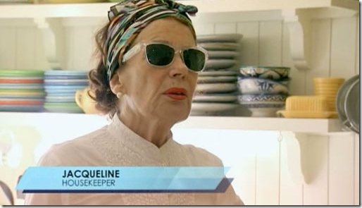
Bravo’s hit show, Million Dollar Decorators (MDD) with its first year line-up. All five decorators hail from Los Angeles. After a short 8 episodes, MDD was picked up for a second season.The Season Two promotional picture. Notice anything different? Yes, poor Nathan Turner was not in Season Two. Bravo didn’t want to spend money reshooting the promo picture, so they just airbrushed Nathan out. So sad! But, at least, Nathan was a big part of the second season as Mary McDonald’s best friend forever (BFF.)I don’t know if you watch the Bravo reality show, Million Dollar Decorators, but I sure do. In fact, it’s probably my favorite TV show ever – even better than Thirty Something and Downton Abbey. So, that should put it in perspective for you. The only bad thing is, the seasons are so short – both the first and second season lasted only eight weeks – barely enough time to get settled into your recliner (sure!) with popcorn and your i-pad.I-pads are a must for watching Million Dollar Decorators. With the advent of Twitter, you no longer have to watch the decorators with just your husband, who has probably already fallen asleep anyway. Instead, you can watch it with other design aficionados from across the country who are just as excited about the show as you are. AND – the best part of Twitter and MDD? The stars, the interior designers themselves, are also on Twitter, right along with you. So every compliment OR insult you hurl through your keyboard lands right at the decorator’s feet. Oh, the fun of it all!In case you’ve never watched Million Dollar Decorators – the premise is four interior designers from Los Angeles star in the show which follows them around while working with their mega rich clients. The designers – Kathryn Ireland, Martyn Lawrence-Bullard, Jeffrey Alan Marks and Mary McDonald – are the real deal. They truly are at the top of the feeding chain, and are some of the best designers in the business, no matter which coast you live on.MDD star Kathryn Ireland. If she’s not drinking, then she’s trying to keep her bosoms covered. Sometimes she does both things at the same time!As usual, Season Two was high on drama, mostly behind the scenes, and mostly concerning Kathryn Ireland. Ireland has a larger than life presence with her smoky English accent and sharp tongue. She likes her wine, as does her housekeeper, the babushka-wearing, ultra chic French Jack-leen, as she correctly pronounces “Jacqueline.”Yes, we were actually subjected to Kathryn’s Pilates poses on MDD this season. You might ask, what does Pilates have to do with interior design? I have no clue. I think it may have more to do with trying to find Kathryn a husband!On both Seasons 1 and 2, trouble seems to follow Kathryn, whether it’s with her clients, or her getting too tipsy to stay awake at a hotel in Palm Springs. Last season she had a client from hell, who wanted to micromanage her Malibu beach house redo. Eventually, she fired Kathryn from the job. So embarrassing when you get fired on TV, but Kathryn actually seemed to be more relieved. This year, she had a client who wanted to micromanage her Dallas, Texas house redo.There is always drama. Either the delivery truck is late, or lost, or the furniture is stolen.There’s always some kind of drama on MDD to make it more exciting. But truthfully, it all seems so fake after a while. Every single installation has a TIME factor. Either the delivery truck is late or the paint is still wet - but the installation HAS to be finished up in the next hour! It’s always a frantic installation with the ridiculous made up time conflict. I don’t think one single installation was completed without this time factor being a major issue. It’s always hurry, hurry, hurry!!! And of course, it always works out in the end. Bravo should rethink this scripted, made up drama. There’s enough real drama without adding in bogus ones.The gorgeous duo: Ross and Jeffrey Alan Marks, newly engaged!The designers all have huge personalities – every one of them. Mary McDonald is the wittiest one, without a doubt. She is laugh-out-loud funny. On the last episode, Nathan Turner accused her of being just like the women on the Hoarders reality show, and I burst out laughing with them. Jeffrey Marks and his partner Ross have shown America how normal a gay couple is. Their affection for each other is endearing – and when they got engaged on the last episode, everyone was thrilled for them. Martyn Lawrence-Bullard is another funny one with his ever-present five o’clock shadow, dramatic voice and over the top mannerisms. And Kathryn is the lovable ship wreck. A single mom of 3 teenaged boys, she works herself ragged and always finds herself in a bit of a jam.After two seasons, I am so anxious to know if MDD will be renewed for a third. We who love it are all diehard fans, but how many of us are there? Hopefully there are enough viewers that Bravo will bring these four back again for Season 3. If Bravo was smart, they’d have two shows – one from Los Angeles, and one from NYC with Charlotte Moss, Bunny Williams, Miles Redd, and Mario Buatta!! Now THAT would be a TV show worth watching!Here are some of my favorite highlights from Season 2. See if you agree – or perhaps you have a favorite episode that I missed?MARTYN LAWRENCE-BULLARD:
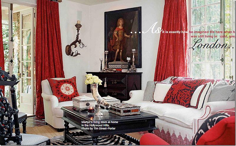
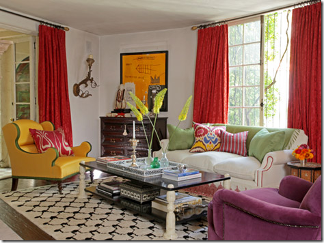
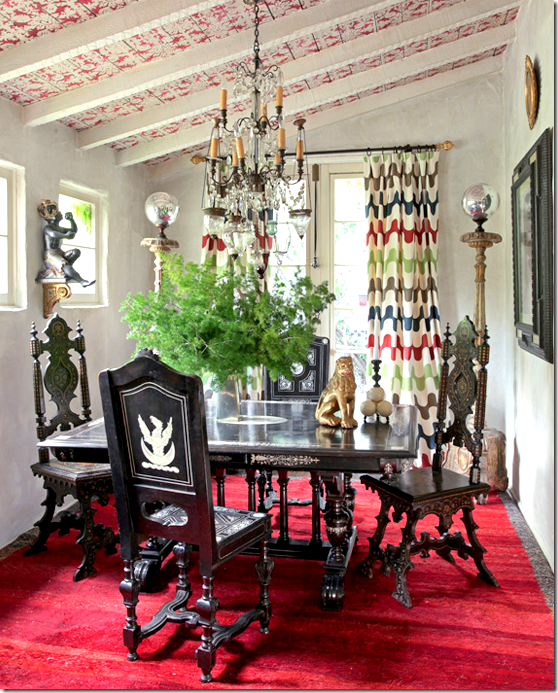
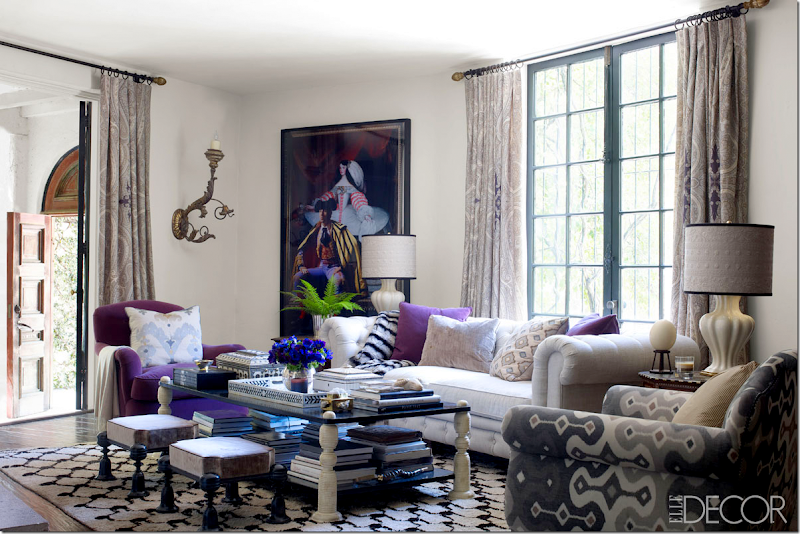
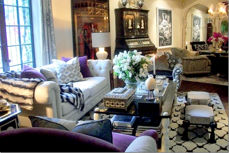
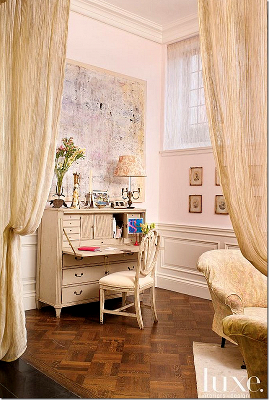
This season Martyn Lawrence-Bullard designed a bedroom and dining room for Jimmy Choo’s Tamara Mellon and a pub for his sister back in his hometown in England. He also spruced up the house of actress Stacey Dash. But my favorite of his projects was the redecoration of his own house in Los Angeles. He lives in a classic 1922 Mediterranean villa that is 2800 sq. ft. Past inhabitants of his house are Rudolph Valentino, Gloria Swanson and William Faulkner. (Notice that desk – it shows up later in the story!) Only Martyn could make a pair of khakis look so chic.Being a designer, he has redecorated his house several times. This is how Marty’s house used to be and I just loved this decorative scheme – all white, black and red with lots of suzannis and antique textiles. Love the red curtains! Gorgeous!Recently, Martyn did a small redecorating – bringing in more color to highlight his new fabric line. Out went the seagrass and zebra and in came a Moroccan rug, a new coffee table and all new pillows.Here’s how he changed this section of his living room – with an assortment of chairs and large photographs. The dining room can be seen through the doorway.And here is his small dining room after the second redecorating. His fabric was used for the curtains. On the show when Martyn informed his partner that he was going to redecorate, he got quite upset. Martyn’s partner doesn’t like change. So, of course, Martyn had to hurry up and finish the installation before his partner came home from work! Always that faked time conflict! And of course, his partner LOVED the new décor!The MDD Reveal:And here is the newest version of Martyn’s living room – as seen on this season of MDD and in Elle Decor. New sofa, same rug and coffee table and newly recovered purple chair. New ikat covered chair (which shows up later) and new paisley curtains and Spitzmiller lamps. Recently, Martyn has been using purples, lilacs and lavenders quite a bit more than ever before. His latest fabric line is available at Schumacher. Notice the black and ivory tray on his coffee table – more about that later!Styled by Stephen Pappas; photography by William WaldronAnd looking the other way towards the sitting area and onto the dining room. The fabulous desk can be seen here.
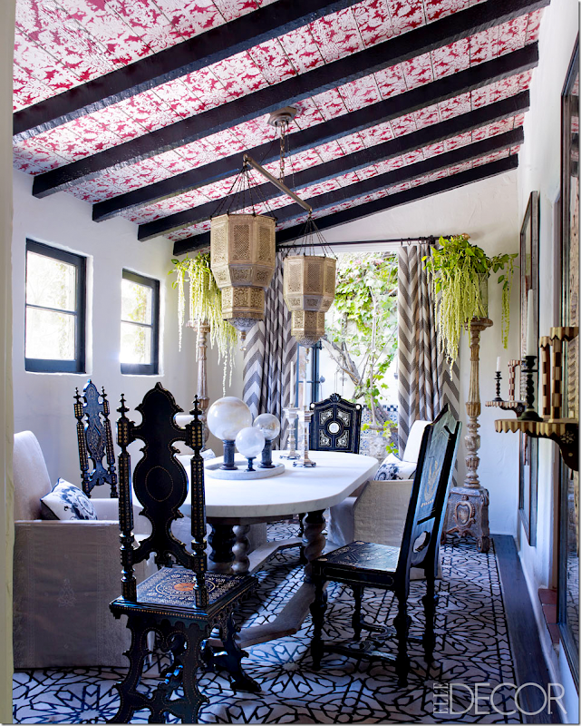
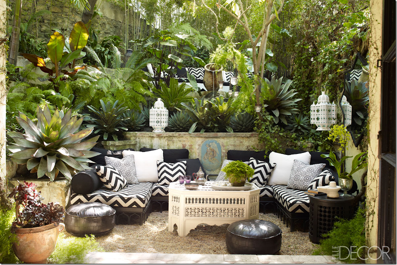
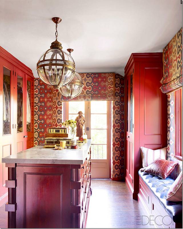
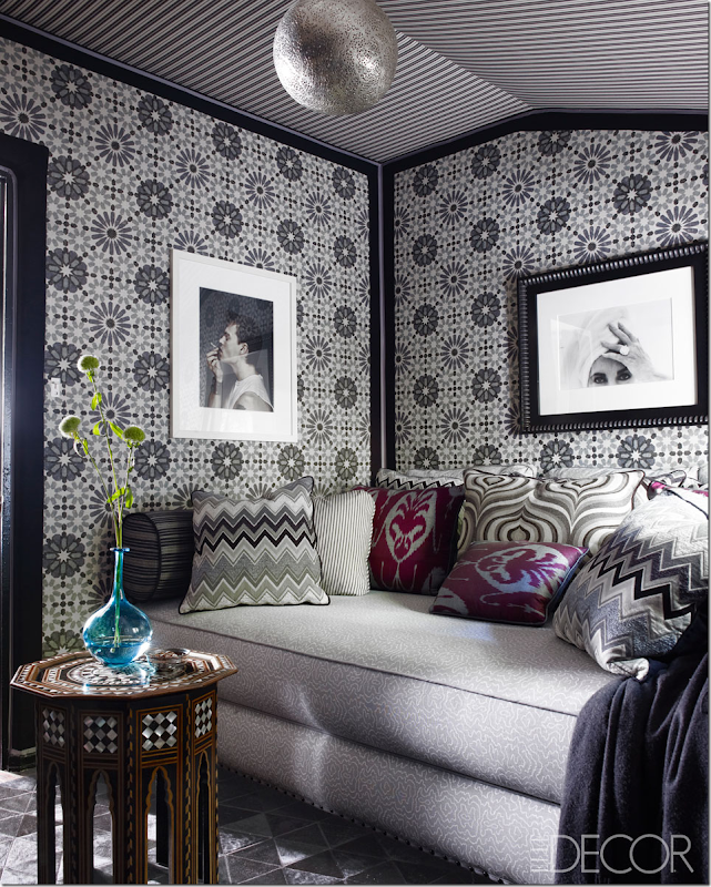
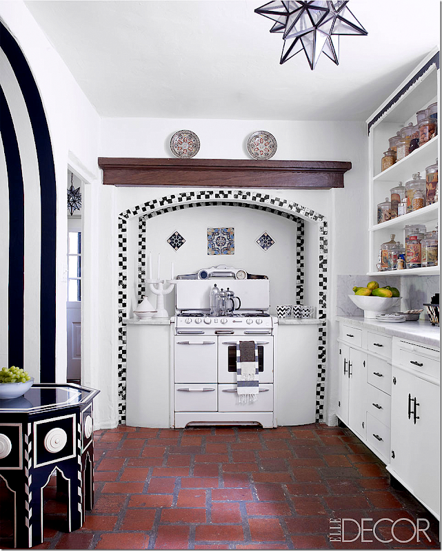
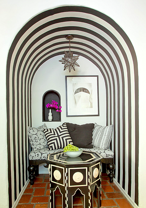
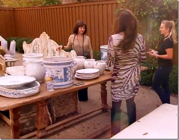
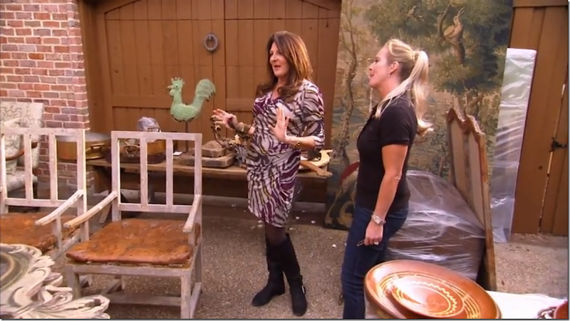
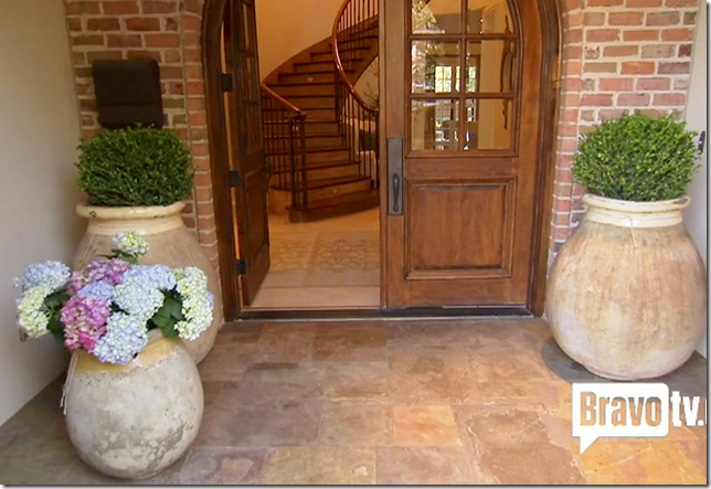
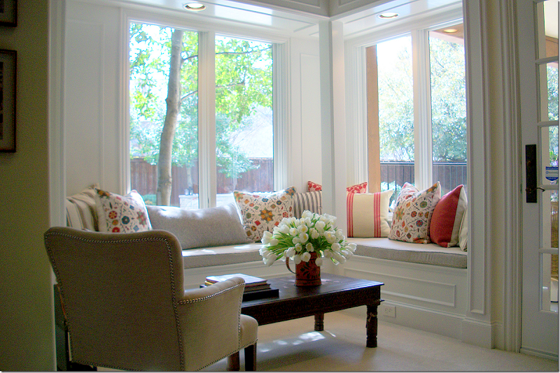
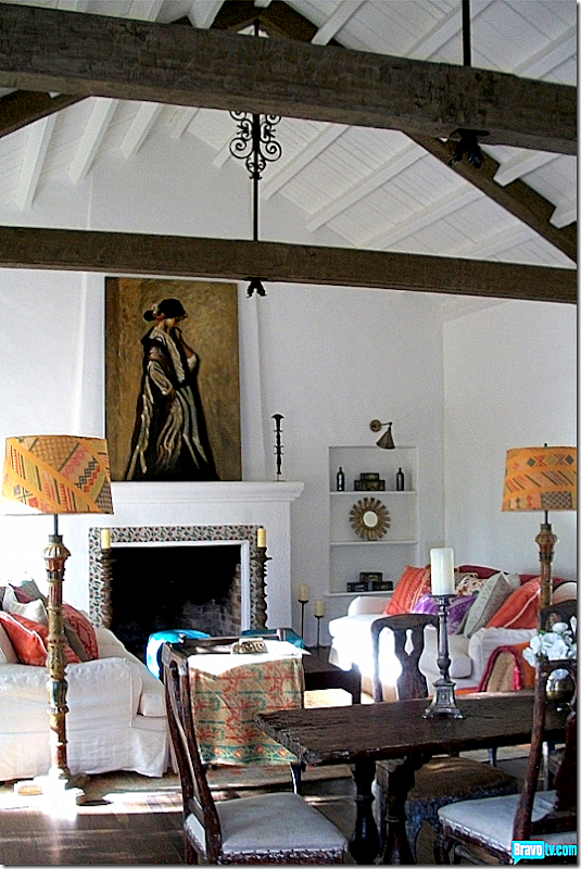
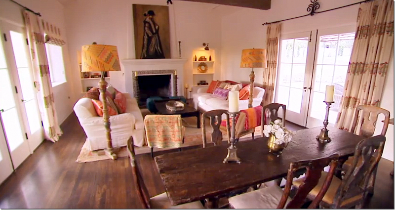
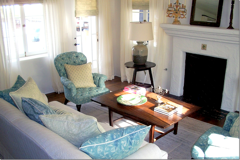
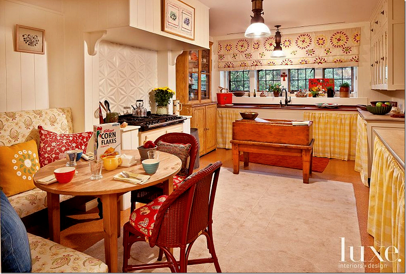
The sitting area with recovered chairs, new mirrors and a new chandelier inspired by his trip to India with Mary McDonald.The dining room got new chevron patterned curtains and a new table. The chairs remained and slipcovered chairs were added, as was a new rug and an Indian inspired light fixture.The backyard terraces up the hill. The plaque was added by Rudolph Valentino! Can you spot the fountain? More fabrics by Martyn.Martyn designed all the furniture in the master bedroom, including the fabulous bed! Divine – as he would say!rThe fabulous closet was once a guest room.And this maid’s room became a screening room – completely covered in Martyn’s fabrics.All original to the house – the stove was installed in 1930 by Gloria Swanson. The breakfast nook is to the left, pictured below:The arched breakfast nook with its black and white painted stripes.And finally, the bathroom in black and yellow tiles. Doesn’t this make you want to move to a vintage 1920’s house in the hills????KATHRYN IRELAND:Next up are Kathryn Ireland’s projects. After the first season’s fiascos, she really deserved some wonderful clients, but alas, that didn’t happen this year!First up was an old friend who had just moved into a house in Dallas. Kathryn was called in to redecorate while the owner would do the basic legwork. Except the owner really wanted to be in control of the project this made Kathryn so aggravated and frustrated – and she wasn’t acting. At the installation, she screamed – “I’m losing my mind!” while the client hovered over her and micromanaged every pillow placement, proving again, NEVER let the client be at home during an installation!!! The budget started out at just over a million(!) but the owner told her it had to be a quarter of that. Kathryn wasn’t too pleased to hear that.The BEST part of this story was the two trucks filled with antiques that Houstonian Ruth Gay of Chateau Domingue drove up to Dallas. Kathryn went crazy over all of Ruth’s (in the khaki sweater) antiques - and who wouldn’t? It was a designer’s dream come true. Except, the homeowner, in the blond ponytail wasn’t too impressed and nixed almost everything in the shipment. Ruth – bring those trucks to my house – I wouldn’t nix anything! As long as you are paying!! I have no shame, I know it.Here the homeowner tells Kathryn, no more screens! She already had one in her dining room. She did keep the green weathervane in the background.Here, Kathryn literally screamed she was losing her mind over the owner’s presence during the installation. Shortly after this, Kathryn left the house and came back the next day while the owner was gone. During the previous night, the owner had placed everything the way she wanted it – and Kathryn took it all apart and put it back the way SHE wanted it, which did look so much better, I must say. Why hire a first rate decorator and then question every thing she does? During the final reveal, the couple did appear to love everything that Kathryn had done – except the curtains. Kathryn agreed to redo the curtains using the darker side of the reversible fabric.A trio of beautiful pots with box and hydrangeas. There goes the budget right there. Those pots cost a fortune.The bedroom where all the tension between the homeowner and Kathryn took place. Kathryn placed that gorgeous antique map of Paris and the owners loved that because they honeymooned there.The sitting area of the master bedroom.While the Dallas house eventually turned out quite pretty, filled with Chateau Domingue’s pieces and accessories, the story behind the story was quite horrific. This episode aired on a Tuesday, but the homeowner and her husband most likely didn’t watch it. On the Saturday of the week before, while they were celebrating the husband’s birthday in NYC, the husband first beat his wife, then suffocated her to unconsciousness with a pillow. He landed in jail, and she went to the hospital recuperating from her multiple injuries. When the episode aired, it showed their house and their seemingly happy life. The incident put everything into perspective. All the money in the world, the most beautiful house with priceless antiques, the happy, smiling faces of the husband and wife and their two daughters – and it all means nothing, in the end. I keep thinking of that poor woman, in the hospital room, clinging to life, bruised and beaten, and this episode was played all over America showing her in a not so great light. Real life can be really, really sad and tragic. I do question why Bravo didn’t pull the episode altogether. They had to know about the incident – the story was all over the papers because the husband is quite well known in NYC. Even papers in England picked up the story. The episode should have been pulled, but I guess Bravo didn’t care about anything except the mighty dollar.Ojai – again:Next Kathryn decorated a house in Ojai, the same town where her former house, now owned by Reese Witherspoon, is. This is the third house to be publicized that she has decorated in this area. Recognize that painting on the fireplace? Yep! It’s the same one that was in her own Ojai ranch!Remember it? Here’s Kathryn’s Ojai ranch with the same painting.Another view of the client’s Ojai house as seen on MDD. This room turned out really pretty. And here I want to say something that is probably not popular. Kathryn has a beautiful line of fabrics – they are quite lovely, without a doubt - some of her fabrics are personal favorites of mine. And they are quite distinctive. She mostly uses her own fabrics on projects with a few exceptions from Robert Kime or Fortuny mixed in. And because of this, her projects have begun to look alike. This room looks like her other Ojai property that was featured in World of Interiors, and her own Ojai house, and her L.A. house’s guest room, and on and on. I wonder if it is going to work against her after a while?The Ojai house – in her aqua fabrics.And the sitting room, again, in her fabrics. On the wall was an antique thread holder which made a very unique piece of art. The floor is new tiles.And the wonderful Ojai kitchen with its two farmsinks and center table.
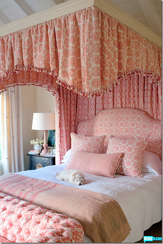
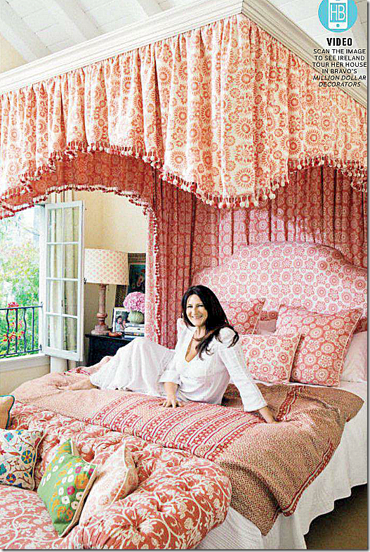
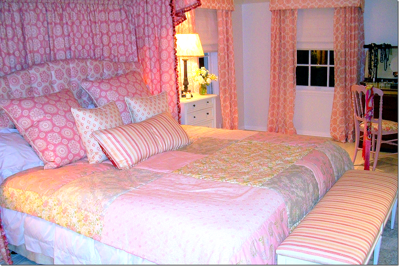
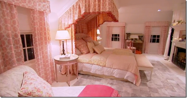
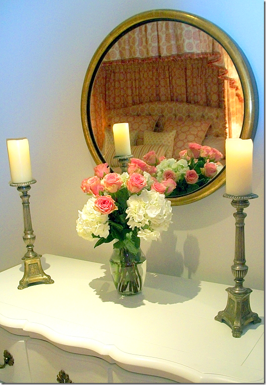
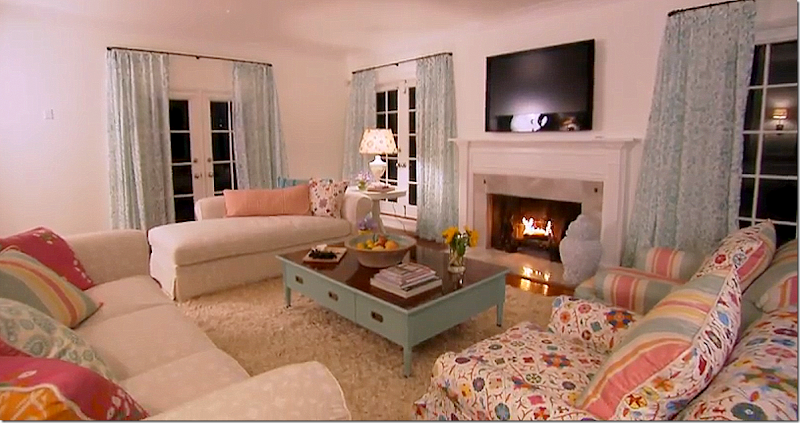
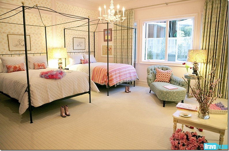
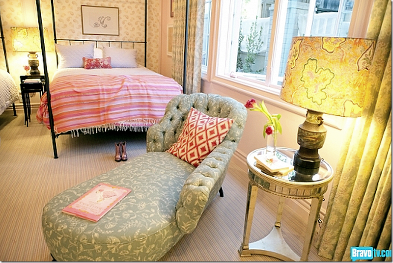
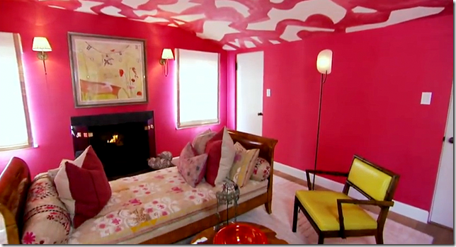
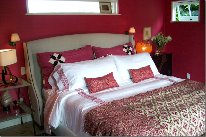
The Ojai master bedroom. Sorry these pictures aren’t that great – they come from the website. Notice the pink fabric on the windows. This is a fabric from Kathryn’s new line Summers in France.The pink fabric at the windows.And here is the same fabric – not sheer – used in Kathryn’s newly remodeled bedroom.Her bedroom used to be in reds and creams – but I am loving the new décor in the pink fabric! Soooo pretty!!!Lindsey Lohan Project:And troubles just mounted for Kathryn with her next client, the actress Lindsey Lohan. After meeting at a party, Lindsey told Kathryn she was a big fan and wanted to be on the show. Bravo agreed and a contract was signed. Lindsey was to appear in a few episodes and Bravo would pay for the $250,000 decorating costs for her newly rented house in L.A. Things were going smoothly, until the day of the big reveal when Lindsey was in a minor car crash and was taken to the hospital. Kathryn was called to go see her, but after arriving at the hospital, she was turned away. Being a professional, Kathryn returned to Lindsey’s rented house and finished the installation. Once Lindsey was released from the hospital, she refused to come back for the final reveal. Instead, we saw the finished bedroom and living room – at night – Bravo was never allowed to go back into the house to film. Since then, Lindsey was kicked out the house for non payment and all the furniture was hidden away in a storage unit, presumably by Lindsey. At this time, Bravo is still trying to recover their paid for furniture, to no avail.And, here is her bedroom. Yes – it’s the same pink fabric used in the Ojai master bedroom and in Kathryn’s master bedroom. The room is really adorable. Kathryn’s famous quilt fabric is used on the bed.A view of the canopy that Kathryn installed, along with the chaise, the rug, and the bleached white hardwoods. Lindsey had told Kathryn she wanted a bed just like hers.Such a cute room. And such a shame that the segment was ruined in the end.The beautiful canopy reflected in the mirror.Lindsey’s new living room – with more of the Ojai fabrics. The budget was $250,000 – all free to Lindsey. It makes me wonder if Bravo has paid for any of the other remodelings seen on the show?JEFFREY ALAN MARKS:Jeffrey Alan Marks, or JAM as he is called, and his partner Ross had several projects this season. This house in La Jolla was their biggest project. This room was done in all grays and pinks. Of course – during the installation, there was a huge time issue when the rugs couldn’t be laid because the truck was late!The daughters room in the La Jolla house was done all in Kathryn Ireland’s fabrics. Yes. Again.Close up of girls room with Kathryn Ireland fabrics.`For this project, Jeffrey let Ross handle it. This was a bedroom suite for a model and her husband and in the sitting room, Ross chose to put this wild pink and white wallpaper on the ceiling! I know this kind of free-form hand drawn wallpaper is all the rage, but I just hate it!!!! The walls are covered in a hot pink grasscloth, which I did love. The husband wasn’t too pleased, as you can imagine.
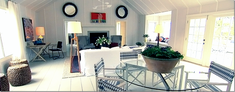
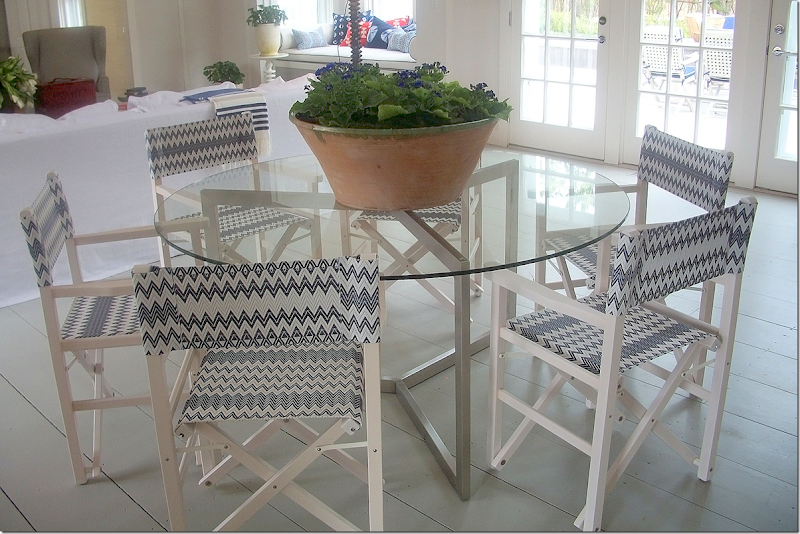
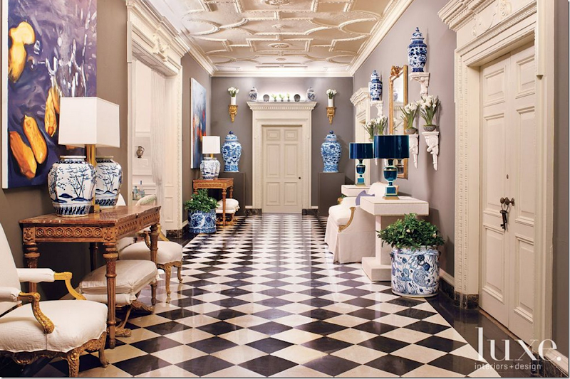
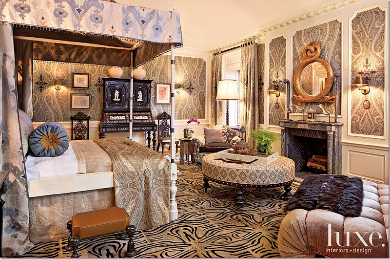
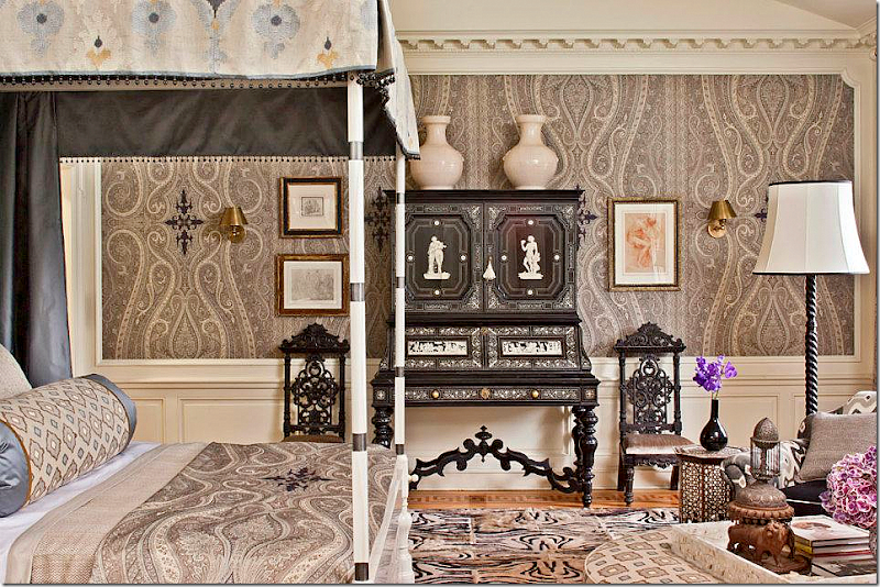
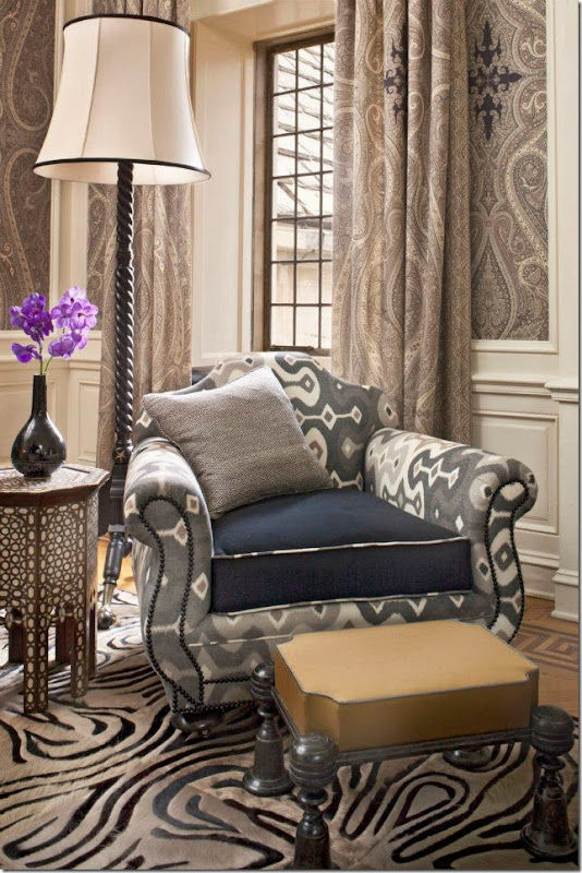
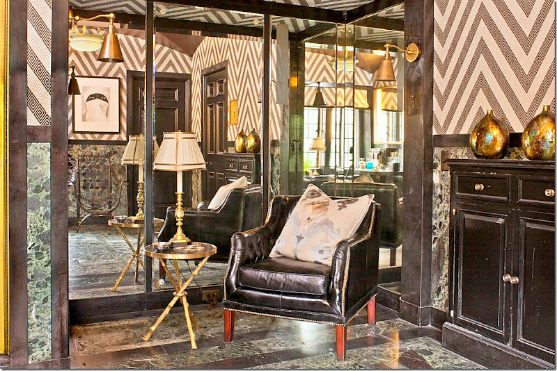
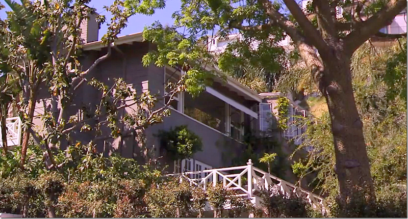
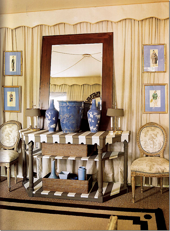
The bedroom side of the suite was much prettier, but really – what are those two lamps? An orange ball from Halloween and the other from the Jetsons? I do love the bedding – especially the textile at the end. I wonder if Bravo paid for this room too? It seemed a huge risk for the homeowners to use the hot pink wallpaper. Did they agree to it because it was free?This Nantucket beach house was a pure WIN for JAM and Ross! The owner wanted JAM to only use furniture from catalogues, and I thought he was going die when he heard this. JAM just does not decorate from catalogues – everything is custom made for his clients, but here, he agreed to shop retail. The entire house was gutted and redone at 3 x the original budget. But, it is a winner. Everyone on Twitter absolutely loved the house. AND everyone wanted to know the sources. JAM listed each piece and which catalogue it was purchased from on his facebook page. To see it – go HERE.I wish I had more pictures of the house, but Bravo doesn’t realize the important of showing lots of BIG photos! This is interior design after all, not the Housewives of Beverly Hills!JAM did splurge on this chair fabric. Love how he painted the floors. Notice the darling window seat with cute pillows in red, white, and blue.GREYSTONE MANSION SHOWHOUSE FOR LUXE MAGAZINE:For the Greystone Mansion Showhouse put on by Luxe Magazine, all the MDD decorators participated except for JAM who claimed he was too busy. I wonder if he was sorry he didn’t do it in the end. Mary McDonald got the main hall to design. It came with the gorgeous black and white marble floor – she added all the consoles and mirrors, art work, and blue and white porcelains. So beautiful – and so Mary, whose trademark is the blue and white vases.Martyn Lawrence-Bullard got the master bedroom, which he covered in his own fabrics, and wallpapered in his paisley print, which caused JAM to say – “does Martyn now claim he invented paisley?”Here is a closeup of the gorgeous desk that Martyn brought from his own house to the Greystone Mansion.The ikat chair was also taken from Martyn’s home.Either this is the bathroom or closet that connected to the master bedroom. Notice the stripes on the wallpaper are made up of Greek keys.Poor Kathryn got the raw end of the deal. The room she got to design was this tiny study off of Mary’s grand hall. She created a woman’s sitting room and closed it off from the grand hall with portieres.And Kathryn’s second room, the upstairs kitchen – or, the children’s kitchen. It was really plain and she did a great job, using her check fabric to hide the carpentry. She also brought in the AGA, of course, and added the upholstered banquette, along with a slew pillows in all her different fabrics.INDIA:More than a few episodes were about Mary and Martyn going to India to design a line of products to be sold on One King’s Lane. Mary and Martyn competed each day to see who was the better dressed.Actually, I think Mary just wanted to go to India to give her an excuse to wear her extensive collection of saris. That woman has the most gorgeous clothes and even more gorgeous jewelry. Their line was a huge hit at One Kings Lane and even I bought a piece – a large tray, which I noticed that Martyn also has and keeps on his coffee table. I am so thrilled with the tray. Here’s a look at it on my wine table:I’d love another one for my coffee table. It’s so heavy too – really great quality – One King’s Lane.And finally, MARY MCDONALD:I’ve been a fan of Mary’s for a while now, but it wasn’t until MDD did I realize I wanted to be BFFs with Mary! She is without a doubt the funniest and most chic person I’ve ever not met before. But, I’m afraid Nathan Turner has already filled the role of most favorite confidant. This season revolved around the fact that Mary had just moved back into her house that she bought some years ago as a single person. She lived in the house with her partner for about a year and then they moved into a grander house, which was featured in Veranda and other magazines. While living in the large house, she kept her own smaller house as a hotel of sorts for visiting friends. Recently, she and her partner broke up and she is now again back in her old house – redecorating it for herself.I didn’t realize how painful this all was for Mary until I read her blog on Bravo’s web page. She writes:“For those of you just tuned in, I moved back to a house I have owned a dozen years but only lived in briefly for a point with my ex. I had separated from living with him for 18 years so the entire thing is completely traumatic and I am a bit shocked I even let myself or my personal life be seen on this level, to be honest.This episode makes me cringe actually. For a person who is on career-based reality television, I keep my personal life and relationships quite private. So to even see myself talk at all about my relationships and personal transitions makes me quite nauseous. Although I kept the house I moved back into for years as a guesthouse for out of town friends, etc., I had it completely decorated and published in several books. But now I need something that is me right now in life. I kind of needed a new stamp, so for a couple of months I had to cull through storage from my old 10,000.00 square foot house to see what I could re-use and still feel "NEW" about.”Wow. That’s sad. Having to live through a breakup on television when you don’t really want to publicize your private life must be so awful. Still, the stories about her redecorating the house were my favorites from this season. The original house has been published so many times over the years.Here is the shot of Mary’s house that Bravo used. This is her garage with the trellis above it – notice the huge blue and white vases at the corners – only Mary! The actual house is on the left, up the hill. That long window is her bedroom.
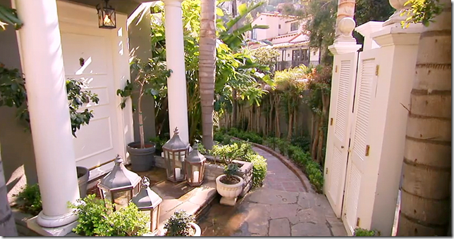
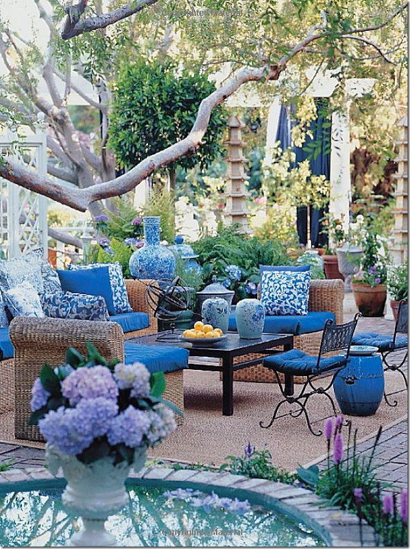
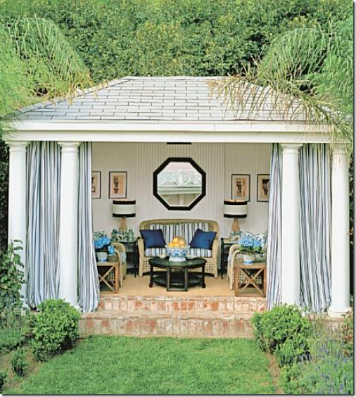
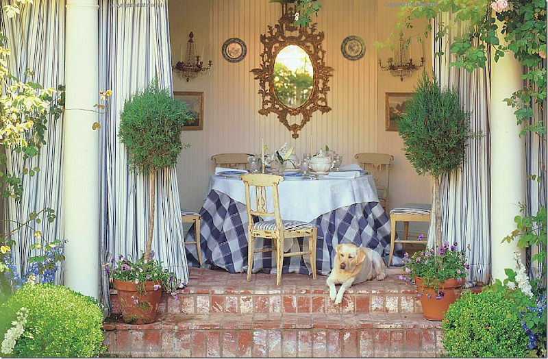
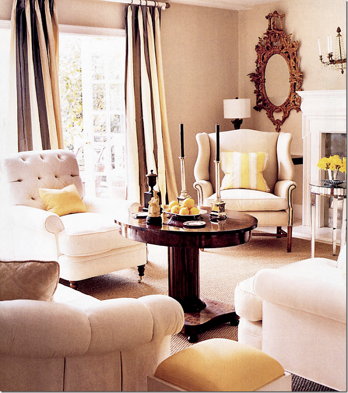
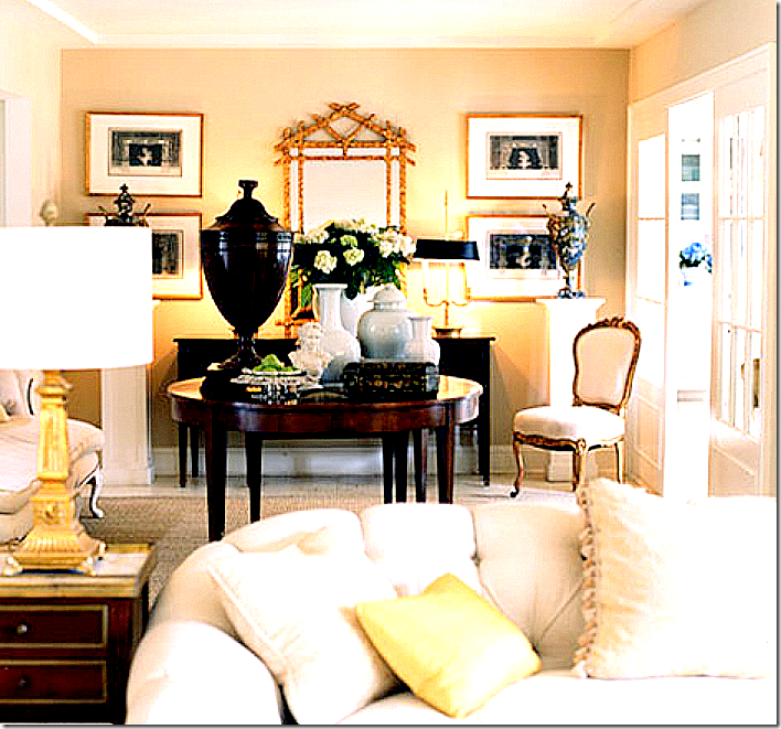
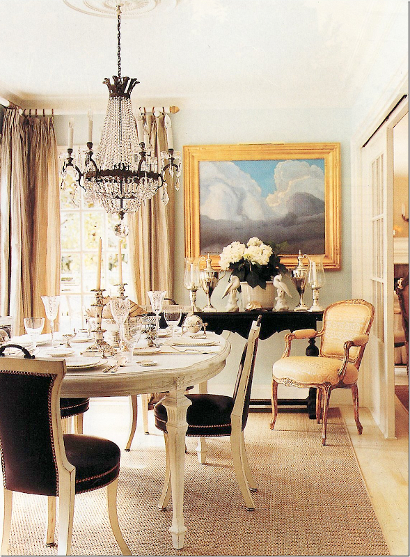
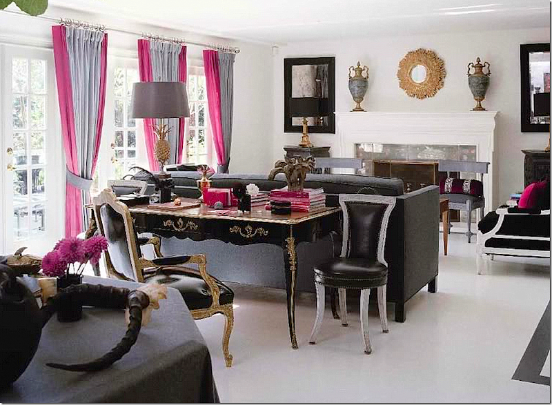
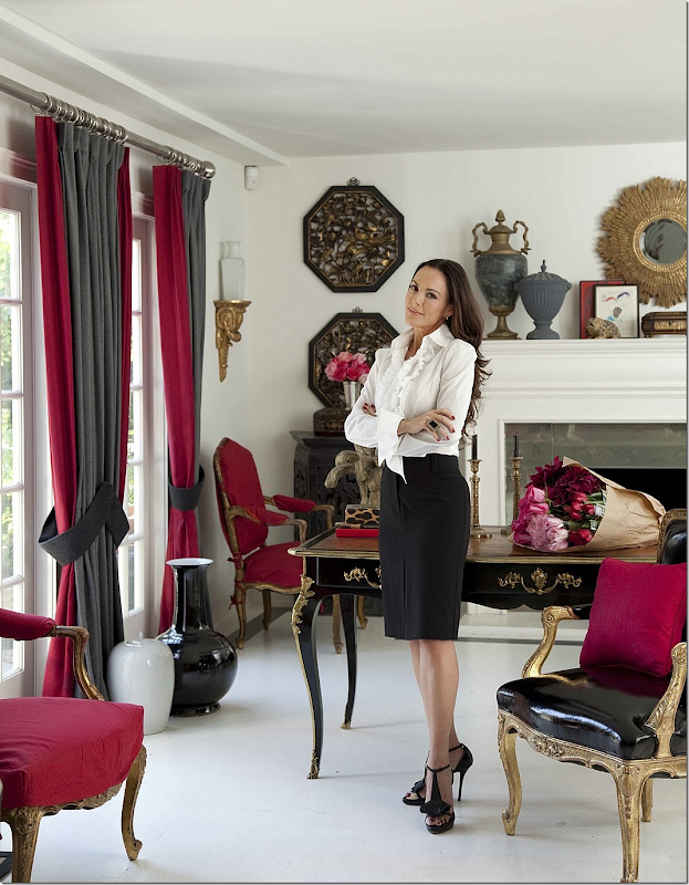
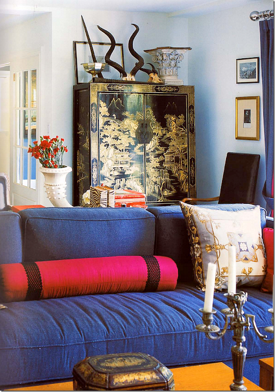
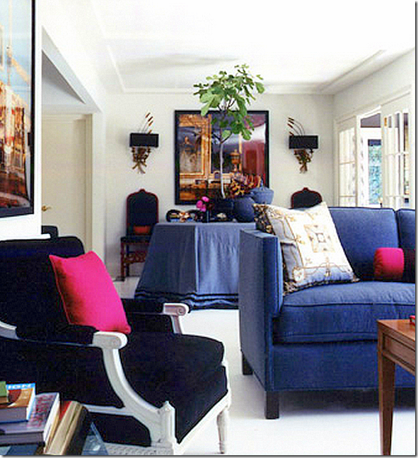
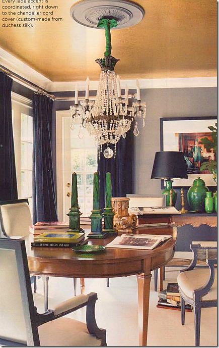
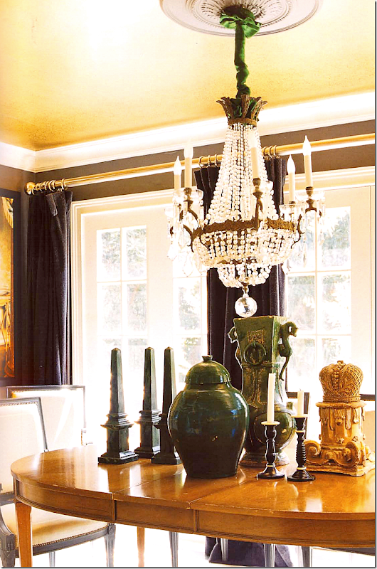
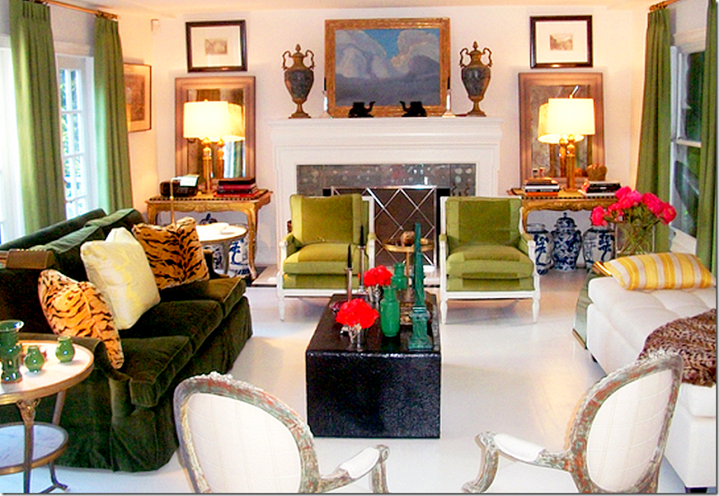
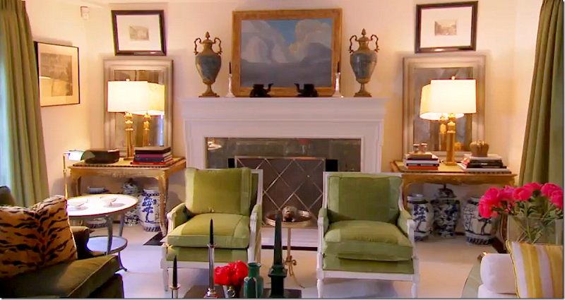
Mary’s 1940s house fronts right off the street. She added the portico at the front door and shutters to dress it up.Inside the shutters – is her front door with the porch accessorized with numerous lanterns.The back of the house - it’s on three levels. The main level is on the 2nd floor. A tented guestroom and the striped family room are on the bottom level. Her bedroom and another guest room are on the third floor. That’s her bedroom with the large window and her bathroom with all the open casement windows. Love the Chippendale inspired balcony railings she installed.Out back, there is a terrace with a fountain. This area changes with each photoshoot, but always, there are blue and white porcelains.To create a view outside her kitchen window – she added a gazebo where the hill climbs up her back yard.Here, in this photo of the gazebo, you can see where they photoshopped out the neighbors houses behind the gazebo. Sneaky!!And the gazebo restyled for another photoshoot – sooooo pretty! I love this photo with the sconces and checked tablecloth and the potted plants on the brick steps.Mary has decorated this house three different times. First - when she lived there with her partner. Second – after she moved out and turned the house into a guest house for visiting friends and family. And Third – when she recently moved back in after the breakup. This third decoration was the focus of her projects on Million Dollar Decorators this season.Inside the front door, there are stone steps and seagrass. The floors are painted white with a border of black.First Decoration: The first décor of the house had gray walls, white floors, and bright yellow accents. Love the striped curtains. I think this might be my favorite décor of her living room – and it’s the oldest, but it is still classic.Looking behind the sofa – there is a library table, a settee and an antique gilt chair. This area opens to the entry and stairs on the left and the dining room through the French doors on the right.Past the French doors is the dining room – so classic, so pretty. The chairs are so lovely and so is the table. Love this – and miss it so much! Why change when you already have perfection? The table with its bleached wood is so in vogue right now. This room would be perfect for a house today. But, it was all dismantled in the second redecoration phase.2nd Decoration: Once Mary and her partner moved into the new “big” house – she turned her house into a guest house for visiting friends and family. This is when she added the black border to the white floor. The color scheme became dark gray and red. A friend gifted her with the antique desk. Through the doors is the terrace with the Chippendale style balcony.The gorgeous Mary McDonald in her newly decorated living room – with blacks and dark grays and reds. The French gilt chairs are all gorgeous, as is the desk. For this photoshoot she changed up a few things – like the plaques instead of mirrors flanking the fireplace.Behind the sofa is an oriental armoire. For some reason the gray sofa looks blue in the photo!Love this chair with the black patent leather and gilding.And looking behind the sofa – there is a skirted table in the area between the entry hall and the dining room.The dining room in the 2nd decoration has a new table and new chairs. Mary added gold leaf to the ceiling and used green accessories.Another look at the 2nd Décor dining room. Must say, I miss the first dining room.Third Decoration: This season, Mary moved back into her house and started a total redo. This redecoration was shown from start to finish. She decided to keep the white walls and floors and introduced shades of green:Third Décor: The final reveal on MDD showed Mary’s new living room. Done in shades of green – from moss to acid to forest. She bought the two gilt tables for each side of the fireplace. She added a daybed and four French chairs.The tiger pillows are repeated in the chairs in the foyer. The blue and white jars are under the consoles.
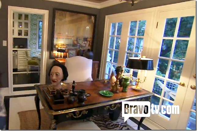
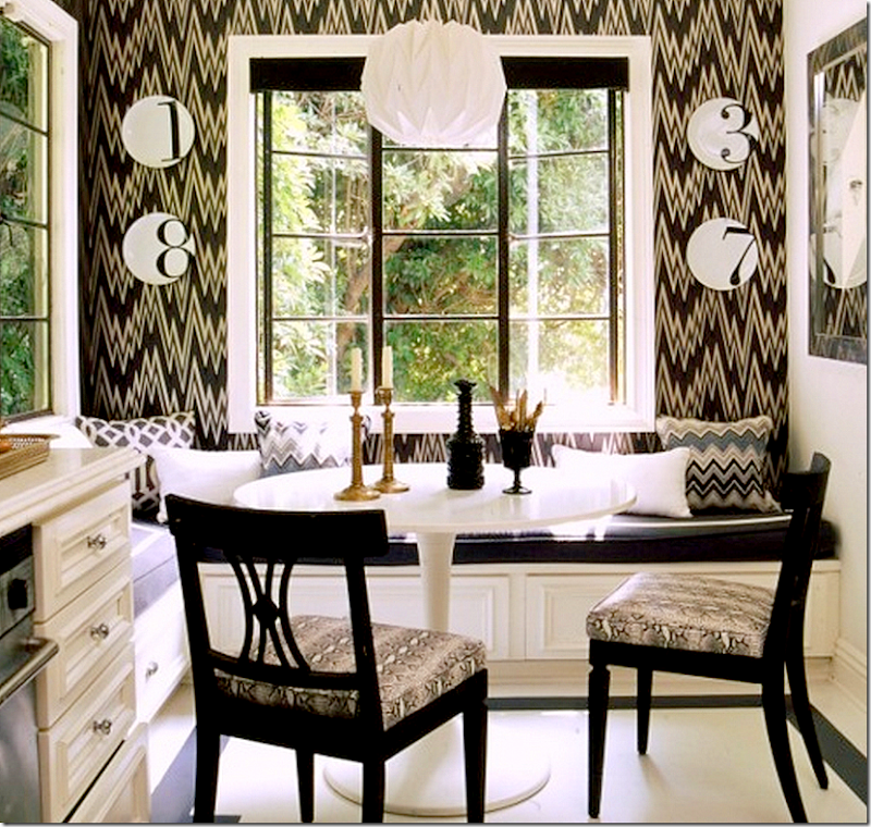
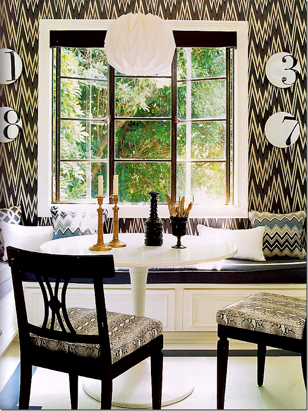
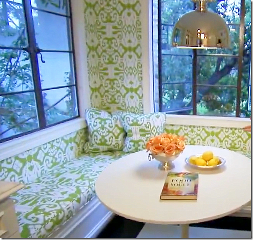
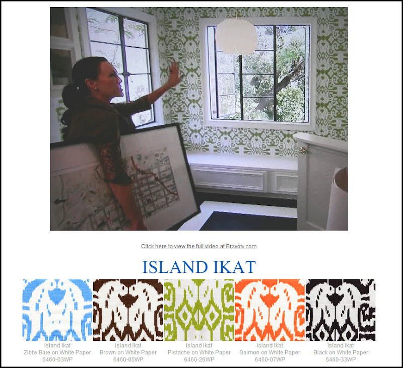
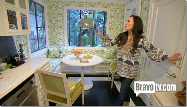
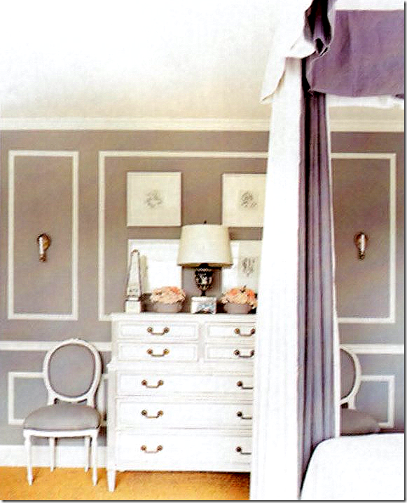
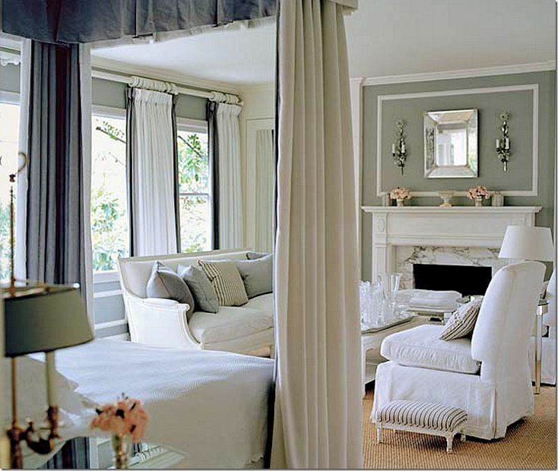
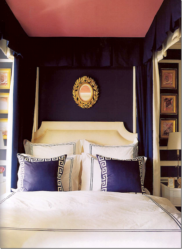
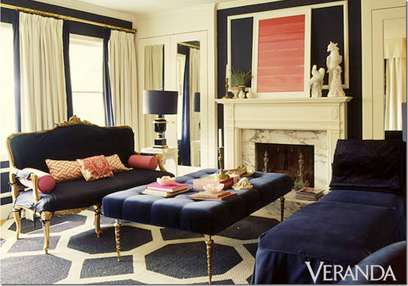
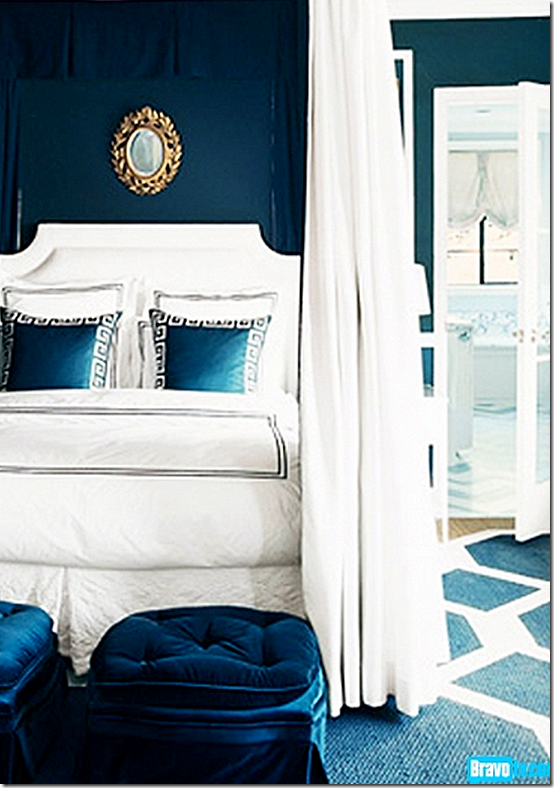
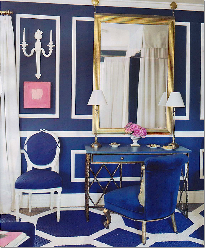
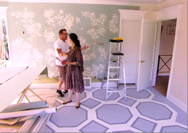
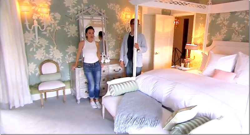
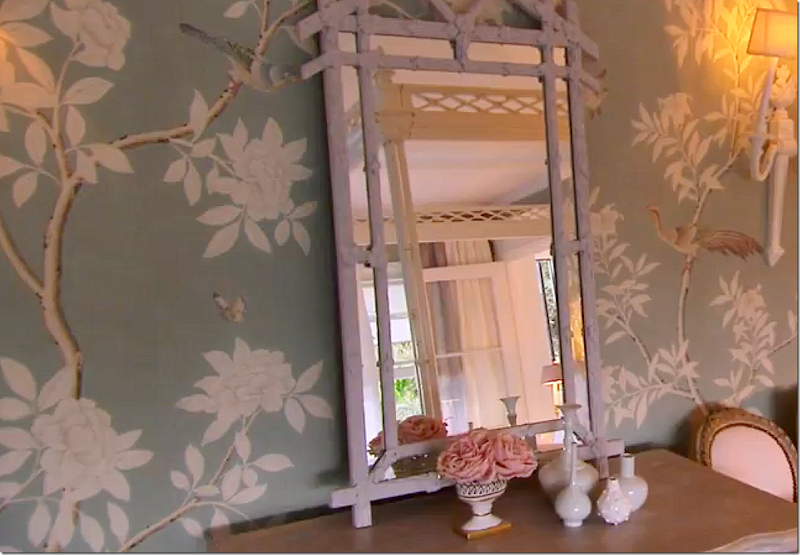
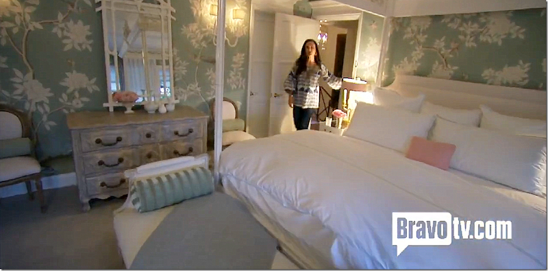
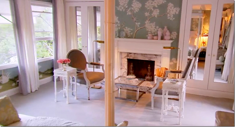
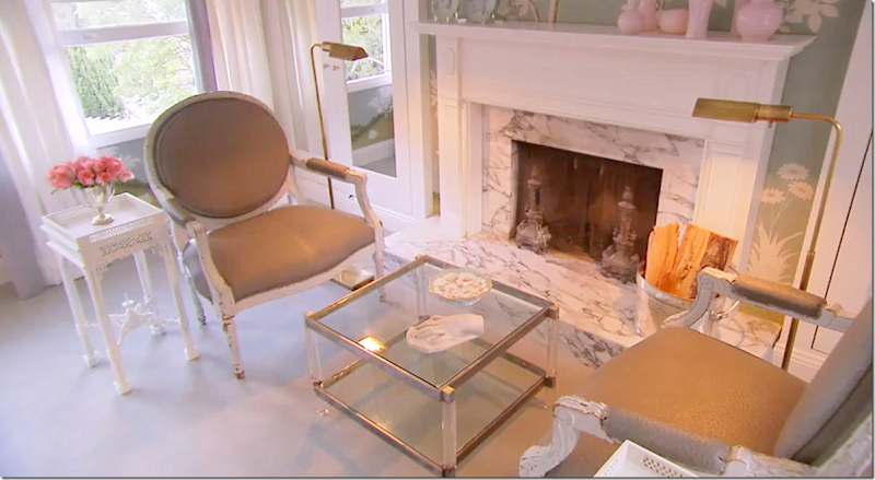
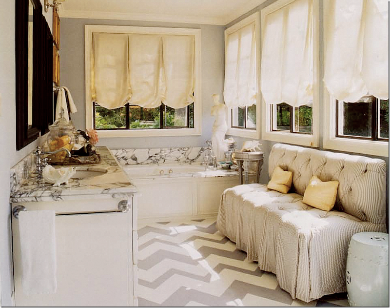
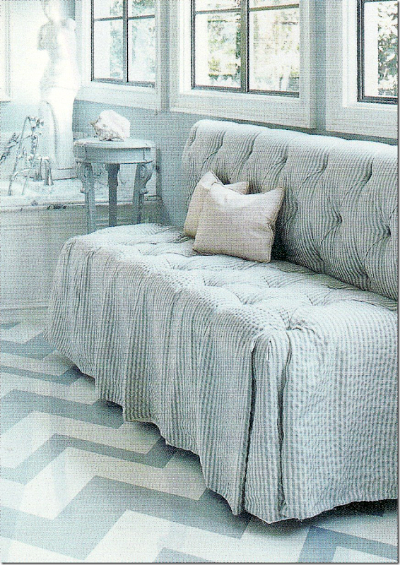
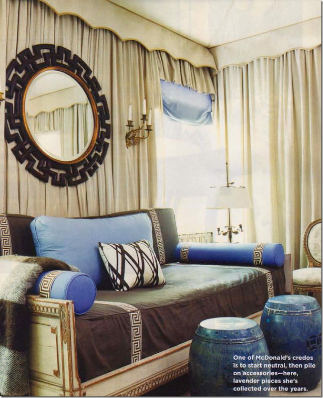
I like these chairs with the two tones of green. But, I must say – I still like the first décor of this room the best.The shocker was the dining room. I guess Mary has decided she doesn’t want have dinner parties here - so she chose to use the room as a study. The gorgeous desk was moved in here. Don’t know what that head is – but it’s so Mary!Second Décor: Here’s a picture of the kitchen from the Second Décor – when the house was used as a guest house. Black and white and gray wallpaper. The numbered plates add whimsy.The kitchen had white floors with a black border back then.Third Decoration: The big reveal on the last episode of Season 2 showed Mary’s new décor. The kitchen is just beautiful! The wallpaper and fabric are gorgeous and just perfect for the space. Fabulous choice! And the green ties in so well with the new green living room fabrics.Quadrille wasted no time advertising the fabric and paper on their home page, HERE.Mary did black and white floors, but I might have done all white with a green stripe or maybe green and white checks. She added two French green velvet chairs and a new light fixture.And, here, the two BFFs Mary and Nathan admiring her new room. LOVE!First Décor: When Mary first decorated her master bedroom – it was done in grays with pink accents. Just gorgeous! Of course, this is a favorite of mine.Along this wall were two French chairs in gray and white.The curtains are white with gray borders. Seagrass on the floor and beautiful white marble on the fireplace.Second Décor: When turning her house into a guest house, Mary redid the master in bold blues and whites and pinks. Notice the canopy has a pink ceiling in it.And she stenciled a bold pattern on the sisal rug. A new gilt settee was slipped in navy with pink pillows. And she added a chaise and a tufted ottoman. Love the mirrored closet doors.Here you can see the clear glass door that leads to her bathroom.Against this wall, blue and white. Notice how she does her slipcovers – with thin ties. So much different than the way I do mine with wide tabs. Which look do you like better?Third Décor: For the final episode of MDD, Mary revealed her new bedroom. After first repainting her floor in new lighter colors, Mary found a Gracie handpainted wallpaper that she liked. The problem is that it didn’t go with the newly repainted floor. Just a little $10,000 mistake!!!! I’ve always wondered how much her painted floors costs.I wish I had good pictures from Bravo, but this is it. The Gracie wallpaper is absolutely gorgeous!!! I have to say I like this bedroom with the wallpaper even better than the 1st Décor with the gray and white walls. Mary brought over this bed from her former house – she designed it. But, I miss the curtains on the bed. Beautiful French bench at the end of the bed and darling French chairs on either side of the gray French chest against the wall. Touches of pink are found throughout the room, including the pink painted tole lampshades. Mary is 48 years old and looks so fabulous in the t-shirt and jeans! She is so gorgeous.Here’s a view of the wallpaper and mirror against the wall.I miss her painted floors. The plain wall to wall carpet does nothing for me. I’m surprised she put plain carpet in here and think maybe she was just in a hurry to get it done for the big reveal on the last episode of the season.And this area looks like another quick put together for the show. I’m sure when this house is published in a new magazine, it will all be perfect.A close of the vignette in front of the fireplace. I miss the settee and day bed from the 1st Décor.Here is her bathroom through the clear glass door. A seersucker, tufted settee sits on the painted grey and white chevron floor. White marble – just beautiful. I think the bathroom was decorated for the First Décor gray and white bedroom – and she left it like this through the blue and white and now the Gracie wallpaper bedroom decorations.Close up of the darling tufted seersucker banquette.Second décor: No pictures of the lower level of her house were shown on MDD, so she probably hasn’t redecorated these rooms yet. This is the ground floor family room that was redecorated as a guest suite for her guests. There’s a door that leads to the outside, giving her guests their own entrance.2nd Décor: the adjoining guest bedroom was tented. Love those chairs with that toile fabric.And looking the other direction with the antique day bed and Greek key trim.
And for the third bedroom – during the 2nd Décor – Mary designed this bedroom folly. So very Mary.And so, the second season of Million Dollar Decorators is over! It just flew by in two short months and now we have to wait another year for season three, if there even is a third season!If you never watched the show but want to see it, you can subscribe to the entire season for $10 on youtube.com HERE. Both first and second seasons are available to purchase.AND to celebrate Season Two of Million Dollar Decoratorswe have a brand new Skirted Roundtable with Nathan Turner!!!Nathan Turner, the L.A. interior designer who was on the first season of MDD and was a guest on the second season of MDD stopped by for an interview on the Skirted Roundtable.Nathan is the sweetest man ever. He talks about his business, his store, and Million Dollar Decorators, of course.Plus, Nathan has a new book out. The book reminds me a bit of a Martha Stewart book – a bit of entertaining, a bit of decorating, a bit of family and a bit of cooking!!To order Nathan Turner’s new book, double click below:To listen to the Skirted Roundtable interview with Nathan Turner, go HERE.He is such a doll! You will love him when you listen – I know we did!!AND AND AND -- our next interview is already done!! And it’s a good one. Ms. Charlotte Moss comes to the Skirted Roundtable for her second visit. Charlotte was our first “big” interview over 3 years ago. Look for it – coming in the next few weeks!!!
IT’S OVER–ALREADY?? NOOO!!???
Subscribe to:
Post Comments
(
Atom
)




![image_thumb[32] image_thumb[32]](http://lh4.ggpht.com/-DC3S1Jos6ZQ/UPDpSlMZCHI/AAAAAAABq6Y/cQONH6O9K0Y/image_thumb32_thumb1.png?imgmax=800)
























Oh Oh Oh. BEST POST EVER!!!
ReplyDeleteI love this show and am having withdrawals, luckily I have most of their books and get my daily fix from re-reading them. I love all of these characters and their work (except for Martyn's sometimes trashy but expensive decorating - I love his own magical/beautiful home but not so much his celebrity clients' homes). Even if Kathryn/Marty/Marty/JAM & Ross weren't decorating they'd make a great reality show just being themselves. Also love Nathan Turner and hope to see more of him next season. Please please please let there be a next season.
Okay now I'm off to read this post again.
Mary's original grey bedroom has always been a favourite for me. I saw photographs of this bedroom before I was ever aware of who she was. The new bedroom with the beautiful wallpaper is also lovely but the original grey one is still my favourite.
ReplyDeleteI also love the latest reincarnation of Kathryn's red & white swagged bed.
Joni - I think the head on Mary's desk is supposed to be Diana Vreeland.
ReplyDeletei thought that might be it. just wasnt sure. thanks!
DeleteOMG...totally agree...best show ever! They are all so witty and smart (and they get along with each other!). I hope they come back too, and with Nathan; love it when he and Mary get to laughing about something; makes me wish I was their bff too! Thanks so much for this post, I was having withdrawals as well!
ReplyDeleteJoni, great PI job on the backstories! Also wish there were more episodes from this season to look forward to..."camp Mums", JAM & Ross doing anything, Martyn & Kathryn saying "dahling and ravishing" at the drop of a hat. No wonder we all want Mary for a friend; her sense of style, humor,
ReplyDeletevulnerability and beauty make her the perfect friend package. Who cannot relate to "Park Avenue lady goes Bohemian in a loft" vibe?!
Joni thanks for the great post! I too am a big fan of the show, love them all! But I must say I remember seeing Mary's house years ago (maybe hgtv?) featured her original kitchen, bathroom etc, that was my favorite.
ReplyDeleteAnd the views into the garden, perfection. Saved several!
ReplyDeleteCreated the same chinoiserie railing Mary Drysdale has for a client last year, used hogwire, invisible to the eye, to meet code regulations & it passed inspection.
Of course I'm forwarding this to my client today.
Garden & Be Well, XO Tara
What a fantastic post. I love all of the background information you shared with us. I really enjoy the show and wish it had a longer season. A New York version would be fab!
ReplyDeleteI don't watch the show, mostly because these rooms - with the exception of Mary's work - are so hideous. Seriously, do people pay for Martyn to do what he does? Mary appears to be the only one with taste, imho. Martyn's dining room chairs? Really?
ReplyDeleteI adore MDD and watch every episode only when i won't be interrupted and can take it all in. There is so much!
ReplyDeleteI thoroughly enjoyed this recap post because I didn't know most of the background stories, especially the story behind the Dallas client . So sad!
I would love for my favorite decorators to come back for another season :)
Love The Skirted Roundtable and can't wait to go for a walk and listen to both Nathan and Charlotte!
try subscribing for $20 for both seasons and watch it on your computer - no commercials! the best !!!
DeleteJoni, Great post! I've never even heard of the show, but you can be sure I'll search for it! As always, love your long, newsy and funny posts! Beth
ReplyDeleteJoni I just have to say it...BRAVO! A standing ovation occurring in Phoenix this morning!
ReplyDeleteYour favorites were also mine.
I always dvr the episodes so I can first watch the story line and then go over everything with a fine tooth comb. I had been so disappointed when I heard that Mr. Turner would not be in the second season but thankfully there he was. I am so looking forward to your interview with him.
The great CHARLOTTE MOSS~ can't wait.
As for the head on Mary's desk I can't help thinking that it looks a lot like the ultra chic Diana Vreeland. Google and see if you agree.
Wonderful!!!
You did such a great job on this post + loved the back stories(Bravo is about the $$ therefore they wouldn't dare pull the texas episode). Adore Mary so much got her latest book for a client.Have a wonderful weekend! xxpeggybraswelldesign.com
ReplyDeleteI have never seen the show so I was debating if I wanted to read this post... I started it, almost decided to exit out but then
ReplyDeleteyou drew me in...
like you always do...
How sad about the couple in New York... reality tv to the extreme.
and Lindsay... and the missing furniture!
This post HAS IT ALL... and one of the BEST you have ever written!
Hi, Joni,
ReplyDeleteOh, I am addicted to MDD!! Loved your recap and the backstories that you provided. Your blog friend, Artie ?, of Color Outside the Lines, did one too and he shows a photo of a window that Mary did with the Diana Vreeland head in it. Here is the link:
http://niagaranovice.blogspot.com/2013/01/million-dollar-decorators-season-recap.html
Between the two of you, I am in heaven hearing your take on the show and being reminded of the best rooms and beautiful decor. Oh, how I wish that it wasn't so formulaic though. I agree the time crunches are annoying because of their repetitiveness and they never show the finished rooms in enough detail! I cannot understand why Kathryn Ireland has agreed to be on the show since, although she is endearing and undoubtedly talented, she doesn't exactly inspire confidence in her professionalism. Remember how she was always late to client meetings in Season 1. Who agrees to show themselves in such an unflattering light--not to mention being fired on the show!?!? And, I would never agree to replicate a look for a client exactly as I had done it before--as she did for Lindsay Lohan. You can always convince a client that their look should be personalized and that an exact replication is not what they are paying a top designer for. Just my two cents.
Thanks for another fantastic post!
xo, AnneHH
listen to the skirted roundtable and hear what nathan had to say. he was just too nice for the show and refused to let himself be shown in a bad light. he has a business and didn't want to come off looking flighty or making mistakes.
DeletePS Loved the interview with Nathan Turner--especially the part where he talks about being on MDD!!
ReplyDeleteHi Joni,
ReplyDeleteThe most fabulous show on television, hands down, bar none! Fabulous design, famous designers, real clients, albeit quirky ones, aren't they all, haha. The drama, the lol funny. I have repeated, and I'm sure not exactly, the line where Mary muses she may be her own worst client. To die for funny. My husband can do Martyn's voice, to a tee, makes me laugh. What can I say, I am easily amused. I hope we see this show for years to come. Love your post today, such research on all of your posts. You are to be admired.
my husband can do martyn too!!!!!!!!!!!!!!!!!!!!!!!!!!!!!!!!
DeleteHi Joni,
ReplyDeleteI loved this post! I am obsessed with the show, record and rewatch episodes multiple times. I agree with so many of your comments.
My favorite looks this season were Mary McDonald's wallpaper in her kitchen and bedroom, and JAM's Nantucket great room and master
bedroom. I agree that Kathryn and Martin use way too much of their own fabrics - they need to mix it up. As JAM did in Nantucket!
I preferred that house over the custom La Jolla house. I also adore his own house, with the great fabrics and accessories.
On that topic, does anyone recognize the blue print pillows in the Nantucket guest room or the grey/yellow fabric on the woven chair in the
in the master? I can't source them.
If you start a petition to bring back and expand the show, I am definitely on board!
I loved this show and agree the season is too short. Mary and Kathryn are funny and very talented. Don't always care for their style but the show is informative and great dec ideas. Hope the show,returns. You did a wonderful and thorough story on the show. Didn't know about the drama with Lolan or the sad story about the married couple. Always enjoy your posts and commentary, always so fascinating.
ReplyDeleteWow, where to begin. First, I love MDD and was sad to see the season end. Can I ask why Nathan wasn't invited back? Does he discuss during his interview on the SRT?
ReplyDeleteMary is my favorite. She has a a style that not many people can pull off. She always looks impeccable -- head to toe. I'm with you on her house. The first iteration was the best IMO, but I can certainly understand why she wanted to change it up after the breakup. Loved the wallpaper in the kitchen too! I thought the episode with her difficult client Margie and her freaking dog "Monty" was entertaining. Is grass cloth in for everyone or just the rich and famous? Although he's a hoot, Martyn's style is too ornate for me. I really didn't care for the Tamar's sexy 70's dining room redo and the dining room table debacle was a bit much. And, Stacy Dash's sex kitten act was way over the top. I agree that Katherine's designs all look the same. That said, I love that fab pink pink fabric!
The Nantucket house stole my heart too. Thanks so much for sharing JAM's source list. I'm thrilled about the engagement but was bummed that Ross cut his hair.
Mary and Nathan are adorable -- dogs and all. Their trip to the dog park in an early episode was hilarious.
Thanks, Joni. You've outdone yourself again!
Maureen
i agree with every single thing you said. hated tamara dining room with a passion! staceys was ok, i guess. loved the nantucket house so much!!! love the pink fabric even though she overdid it this season.
DeleteOmgosh! I got a cup of coffee sat down and started reading and reading and reading!! Joni, this is an amazing post. It covers it all.Bravo should hire you to write their promos!! Thank you so much for all the research and hard work it took to write such an informative post. I love this show and I am like you, I wan to do lunch with Mary. Love her personality. Her touch of whimsy in her amazing designs. I must say JAM did an amazing job on the last house and it was one of my favorites. Martyn bugs me most of the time and his designs are just waaaay over the top for my taste, but I found him endearing in the last episode. Kathryn is a HOOT, love watching everything she does. She has such a wonderful way of mixing old and new and making an interior look as it evolved over time. Love that about her designs. Great post, wonderful Saturday morning reading,
ReplyDeletexo Kathysue
Fabulous post! Loved every inch and word! I didn't know about MDD until I began reading your blog, then tuned into the show! It's marvelous, and entertaining to watch the personalities of these designers. I personally don't care for Martyn's fabrics... but absolutely love Kathryn's!! Martyn's are lovely, but altogether in the rooms makes my brain nervous! Kathryn's fabrics and style are my cup of tea! Loved the episode with Jeffrey's beach house... serene, calming, beeeutiful... and Kathryn's re-do of Lohan's rental... everything she did there, I would love to transfer to my abode!! Thanks for all the photos and your commentary! Love the show, and your blog!
ReplyDeleteJoni - What a great posting on MDD and the backstories. My heart goes out the Dallas lady who knows what turmoil she may have been going thru while on the show. I love Mary's kitchen and bedroom the wallpaper made me swoon! I wish the season was longer and would prefer watching it over any 'housewives' series. I agree with you that.
ReplyDeleteBravo should bring on an East Coast version of MDD- would like to nominate Miles Redd
Kris in Seattle
Great post! I live for Martyn's one liners as I do Maggie Smith's on Downton. I must say I tuned out the first season as Kathryn got on my last nerve with her babbling, but my sister convinced me to come back this season and I'm glad I did. Like you,I fret on how many are watching and hoping it returns! Thanks for taking the time to pull all of these photo moments together here.
ReplyDeleteBest regards,
Regine
Joni I really enjoyed your post on the show! I am really pleased with Martin's design aesthetic and where it is going! My favorite!
ReplyDeletexoxo
Karena
2013 Artists Series
Hi Joni!
ReplyDeleteWhat a great post! I don't have cable, so I've never seen MDD. I'm not a fan of so-called reality shows because they seldom have anything to do with reality. And I must admit that if these people are considered million dollar decorators, I'm glad I can't afford them! Except for JAM's designs and Mary's work for the Greystone Mansion Showhouse, I'm totally underwhelmed. Every one of Kathryn's rooms looks the same - like a fabric store exploded in them. And Martyn's work ... well, all I can say is "yuck".
I love your idea of a New York version of the show, with Charlotte Moss, Bunny Williams, Miles Redd and Mario Buatta - real million dollar decorators.
Having never watched this program, I want to ask one question. Do you and your readers think this program makes the design profession look frivolous and stupid? Somehow I doubt the designers you suggested for a NY version of the show would be game to stake their reputations on what sounds like a weekly version of "train wreck".
ReplyDeleteAs to the SRT, why recycle Charlotte Moss. She was so overbearing the first time. What do you expect to learn the second time around?
As usual Joni, you share all the best parts with great wit and wisdom! Thanks for highlighting every designer, and I love your idea of a NYC version!
ReplyDeleteLiz
Thanks for the great post. What great pictures and I felt like I had a backstage pass with all your background stories. You never fail to amaze me with your attention to detail. I love people who have negative comments and have never seen the show!!! Gotta love it. Anyway, I think the show is super entertaining. As a designer, it is always nice to see other people's processes. Especially when they are doing their own homes. That's when you really see their esthetic. They are all over the top but if they weren't there wouldn't be much of a show. I especially love Mary. I, like you, love her great sense of style and I tune in as much for her clothes and jewelry as I do for her interior design. I think everyone of these designers are super pretentious but at least Mary, Nathan, and Kathryn have a sense of humor about it! I hope they will be back for more.
ReplyDelete"Negative comments, but have never seen the show" - really ? So far I haven't read any. I do think it would be useful, however, if you
Deletelearned to spell "aesthetic" instead of esthetic. Of course, we know that was some silly typo on your part - yea right! The comments have been great. Didn't you say "everyone of these designers are" super pretentious" - negative? No way because that's your comment.
Grow up!!!
Well I think calling it a train wreck without ever having seen it is not entirely fair, just saying. By the way, esthetic is a variant of aesthetic so both are actually correct but thank you for "trying" to school me. On to bigger and better things, sorry for disruption. This was a great post for us fans of both Interior Design, the show, and Joni!!!
DeleteIt was never called a "train wreck". The phrase was "what sounds like a "train wreck". There is a big difference. Joni's
Deletedescription of the drama that gets created on this show (probably for no other reason than ratings) certainly sounds like a train wreck
to me. The producers clearly did not want the type of show that show how designers actually work and interact with their clients which is the reason that I stated some of the names offered up as potential candidates would not go near this program. Can you ever imagine Albert Hadley ever agreeing to this? Certainly not - not even when he first began his career nor any of the other designers who came out of the Parish Hadley firm. This program would have wrecked their careers and begs the question why anyone who cherishes their professional reputation would ever be part of it.
Sorry, but it sounds like more trash TV to me.
ReplyDeleteHow many Free redecorating projects? several years ago i was sitting in my soon to be remodelled home with the producer of This Old House. Of course, My architect and husband were very excited. Me and my contractor, not so much. One would have to sign a contract to use the appliances provided by the sponsors. Would I want to be Locked in to use GE appliances? I really had five star in mind. most materials would be free, but they count as taxable income. What if they spend $100k on things you don't even want, like home automation you don't understand, or some really nice lighting with a dashboard of switches on the wall, or the worlds most whiz bang toilet, pun intended. they might have had to run two shifts of framers to meet the time constraints. Would my decorator be credited? As it turned out my project was too complicated for them to cover in their spring season. It was interesting to meet the producer and fun to be considered, but I was relieved that they moved on.
ReplyDeleteSuch a dilema! How did you ever survive this ordeal? The horror!
Deleteallthatispie definitely needs to be in therapy. This must have been ubber traumatic. Somehow I wish she could
Deletehave gotten that "whiz bang toilet".
Great post Joni! I wonder if the seasons are so short because that is all the designers can do. I imagine it is a huge intrusion on their time. I will miss Martyn's one liners for sure, and now that I know he moved to Hollywood to be an actor, EVERYTHING makes so much more sense....Super Glam-glam.....
ReplyDeleteAnd what was Kathryn's best line? "You need to get your first prison sentence out of the way. It's like your first marriage."
Just loved it all! Thanks for this walk down memory lane!
Excellent post about an excellent show! I agree with everything you said--you always have such a good eye.
ReplyDelete-Suzanne
Wow, I LOVED this post! The only complaint I have with this show is that there are so few episodes. When will we know if it is going to be picked up for a 3rd season? I also wish Bravo would have publicized it more. . . Thanks for doing your part, Joni, to promote it!
ReplyDeleteI love MDD too! I completely agree, though, about your comment on Bravo trying to make a sensational story when there isn't one. Why pretend that something might not happen or that there is a giant, looming deadline when there really isn't? It doesn't add to the show and makes Bravo look ridiculous when they break for commercials or do the teasers. The fun of the show is seeing how REAL designers, at the top of their game (whether you go for their styles or not), work. The show is entertaining enough without the addition of fake drama. I feel like it kind of compromises the show's integrity, though, when it pays for the work (like in Lindsay Lohan's case-- I didn't realize that!). Yes, I know it was TV, but I was still disappointed. Anyway, still a fan!
ReplyDeleteI could not wait for this show... but ended up NOT liking it. It is so fake and I could not take it.
ReplyDeleteSo fascinating Joni! I love the whole recap!
ReplyDeletex
Maria
AMAZING!! I loved this post!
ReplyDeleteI watched the show but not regularly - it was great! I'm glad it was already on it's second season and will be hoping and looking forward to the third season! Of all the designers, I really like Mary's work the best....the others were fun to watch but I could LIVE with her style - that elegant kind of feel without being to ostentatious. And she uses a lot of color in her work!! Love it Thanks for the recap, Joni! I missed a lot of episodes over the last season - will need to catch up before the weather warms up in Seattle!
ReplyDeleteMDD is my guiltiest pleasure and worst-ever addiction. Thank you for yet another AMAZING post! I love all the background you always provide. I feel warm- hearted at the comraderie here of so many MDD-lovers (because I don't have any friends who watch it, and my husband finds it nauseating and unbearable, lol). And I'm with you 100%: Mary is so damn funny. I just love her. So stunning, so self-deprecating, so hilarious. This is my first time ever to post on your blog after years of reading it. Thank you for being such a BRILLIANT (as Martyn and Kathryn would say) blogger.
ReplyDeleteI do love this show but missed quite a few episodes because life was just too crazy the last month or so. I will have to check it out on Youtube. I was so disappointed when I learned Nathan would not be on...so then I was super glad when he was with Mary a lot in this year's episodes. I think he makes for really good tv. I am totally mesmerized by this show...but hate...the fake deadlines. I don't care about watching them rush around...don't the producers get it that the people that like this sort of show...are not ones that care about a competition or set deadline? Quite the contrary! Anyway....8 episodes is not nearly enough....we need 16. Loved seeing all these photos put together in one spot.
ReplyDeleteFascinating! How did I not know about this show? Halfway through reading every word of your post I stopped to find episodes on Hulu, Bravo, and smart search on my TV. Nothing! : ( What a RELIEF to find your link at the end to both seasons and Nathan's Roundtable. You pulled out all the stops with this one. Thanks again, Joni, for what you do here.
ReplyDeleteThanks for the good content.
ReplyDeleteI could LIVE with her style - that elegant kind of feel without being to ostentatious. And she uses a lot of color in her work!!
http://www.zabzan.com/
http://www.zabzan.com/movie/
http://www.thaieasybuy.com/
http://www.new2car.com/
I worship Mary and adore Martyn!!!!! Martyn is the epicenter of laid back posh! If he and Robert Pattinson were walking down the street together I would tackle Martyn first! Well maybe not....:-)
ReplyDeleteSo sad this show is ending. Absolutely addictive. Mary is a genius. Her designs are beyond compare.
I found that same faux bois mirror Mary McDonald used in her bedroom at a thrift store in San Diego. I waited 3 days for it to go on sale 1/2 off. I paid $40.00
ReplyDeleteSCORE!!
Does anyone know the name of the artist of the modern artwork that Kathryn used in her secretary's room at Greystone? I just love that room and Kathryn too!!!
ReplyDeleteWe can Use decorative mirrors to add instant light to your living space.Go green and add a hanging pot holder to your kitchen. To know more about decoration, go Interior Designers in Chennai.
ReplyDeleteTwo years in marriage with my Husband with a kid, my husband started going out with other ladies and showed me cold love, on several occasions he threatens to divorce me if I dare question him about his affair with other women, I was totally devastated and confused until a friend told me about a spell caster who help people with their relationship and marriage problem by the powers of love spells, at first I doubted if such thing ever exists but decided to give it a try, when I contact Dr Mack and told him my problem, he helped me cast a love spell and after 24hours my husband came back to me and started apologizing and ever since the spell cast, he has stopped going out with ladies and he is with me for good and for real. Contact this great spell caster for your relationship or marriage problem at Dr_mack@yahoo.com :))))
ReplyDelete