I found these three houses for sale (actually one is a rental) in Houston – each completely and totally different. Let’s pretend that money is not a object. Which, if any, would be your dream house?
Enjoy!!
House #1
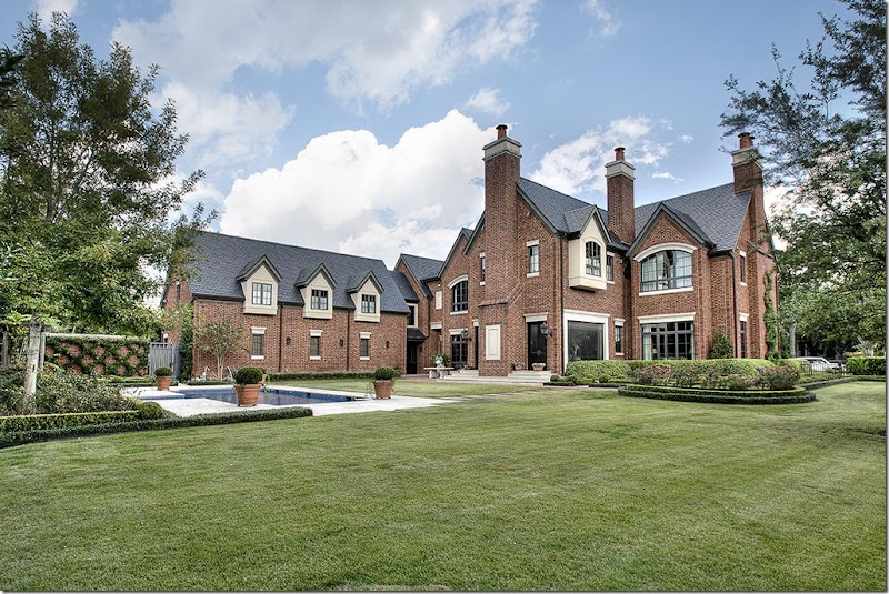
Built in 2005, this Tudor inspired house designed by Tom Wilson, has it all. It’s over 11,000 sq. ft. and if you have to ask the price, well – you know the saying. Slate roof, Rocky Mountain hardware throughout, 5 to 6 bedrooms, wine cellar, two staircases – it has it all. Located in River Oaks on a large corner lot.
Realtor’s web site: HERE
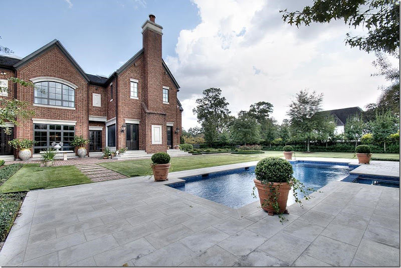
The back yard – with a swimming pool off to the back.
And a pretty box garden with pond.
I like the planters at the corners of the pool.
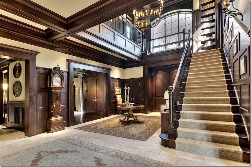
The entry – limestone and mahogany. You KNOW I love the seagrass going up the stairs! And I love the library on the landing..
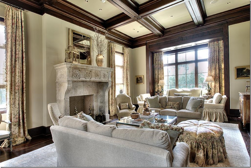
Just so beautiful. That fireplace. And I love those curtains! A soft chintz paired with Conrad shades. Love the accent chairs by the fireplace.
So, why does this appeal to me? Let’s break it down. Of course the architecture is gorgeous – tall ceilings, pretty windows, nice furniture and a wonderful fireplace – but forget the architecture for the moment and let’s just look at the furniture. The room is large, but it’s filled, not spare. The furniture helps make it look warm and cozy – instead of cold and empty. So many houses that I saw today on the real estate web site had rooms this large, but they looked empty even when they were decorated. There would be only one seating group or just a cursory second seating area. Mostly, their windows weren’t covered. Without the curtains and the two seating areas, this room would not look nearly as great as it does. Adding the second seating arrangement in a room this size adds visual interest and a sense of coziness.
Most people would try to stretch out one seating area to fill the room – but it’s the extra furniture and the window treatments that really makes it right. Furniture doesn’t have to be expensive – you can add a sofa from Pottery Barn or Ikea, along with a few extra chairs to achieve a similar effect in a large room. Or buy a second hand sofa at a garage sale and reupholster it, or slipcover it. There are so many options today, no matter what the budget.
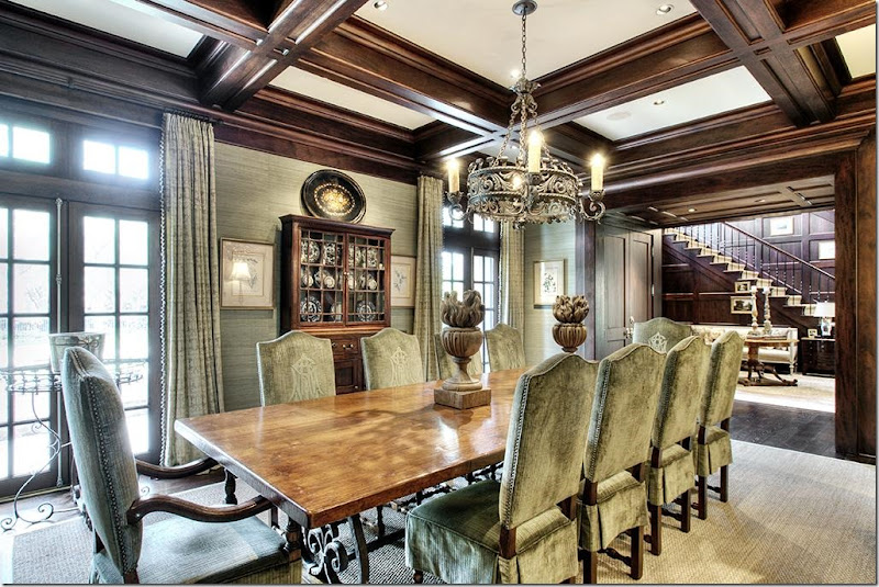
The dining room has a large French styled table and chairs. And, simple seagrass underfoot. I love the use of a simple product – like seagrass – juxtaposed against all the richness. It helps keep it more balanced, and not so dressy.
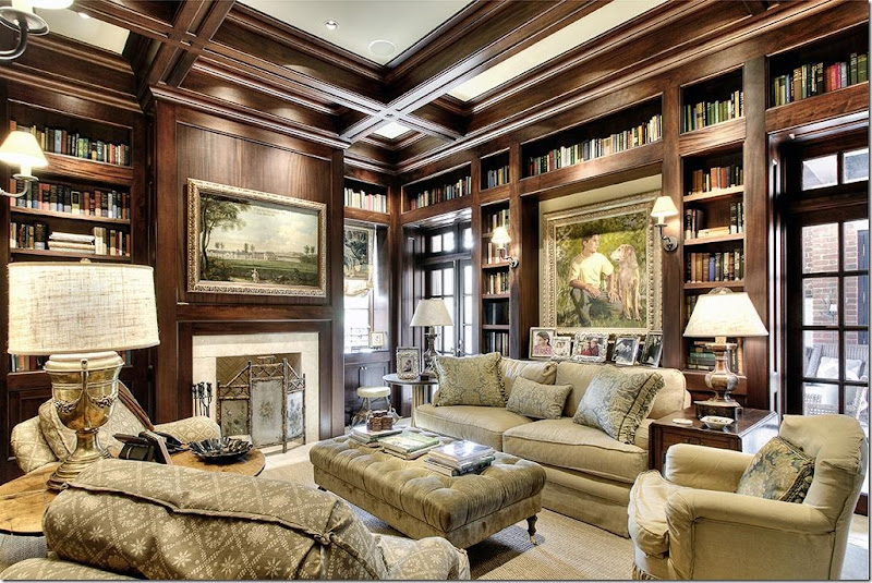
The library is khaki colored with a mini print on the chairs. More seagrass. And notice the beautiful fire screen. Love that. Again, the furniture fits the space, fills the room perfectly.
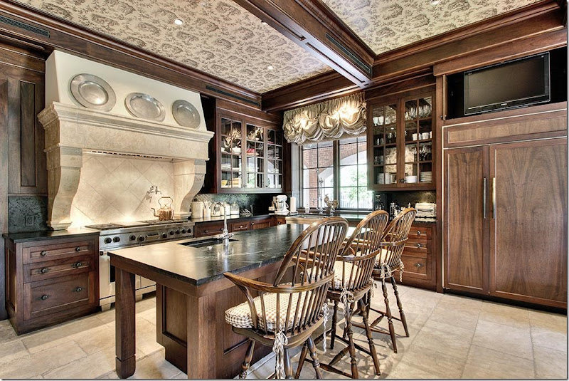
The kitchen – I love the range hood with the 3 pewter plates above. But I especially love the toile wallpapered ceiling. That really is so fabulous and such a great idea! Wrapping the ceiling with the wallpaper envelopes the room and truly makes it seems like a warm, cozy place.
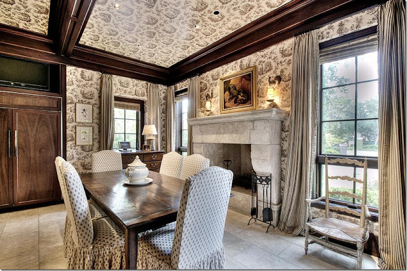
Limestone floors and notice the wallpaper continued into the breakfast room, down the walls. Pretty striped window shade. What a beautiful place – and again, so warm and welcoming.
The kitchen/breakfast room is my favorite room in the house – I love that fireplace, the curtains, the antique chair, the simple creamware on the table. Who wouldn’t want to eat here? It would be so romantic on a cold, rainy night, with the fireplace lit. Love.
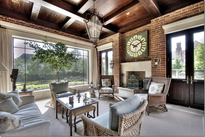
Screened in porch with darling patterned carpet and blue and white fabrics. Another great fireplace with checked curtains. And, another great space to spend time in!!
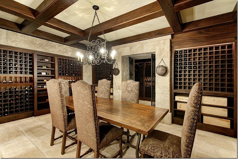
Wine cellar with a French table and chairs. Obviously, they are collectors and probably use this room for wine tastings and dinner parties.
Thought: While looking at the houses for sale on HAR, I saw so many wine cellars in new houses and really what’s the point? Those people aren’t all wine collectors. Wine cellars have become bloated bars. Builder’s shouldn’t put them in spec houses – how many of us really collect wine? Wine cellars should be left for custom houses only. In spec houses, they seem like wasted space.
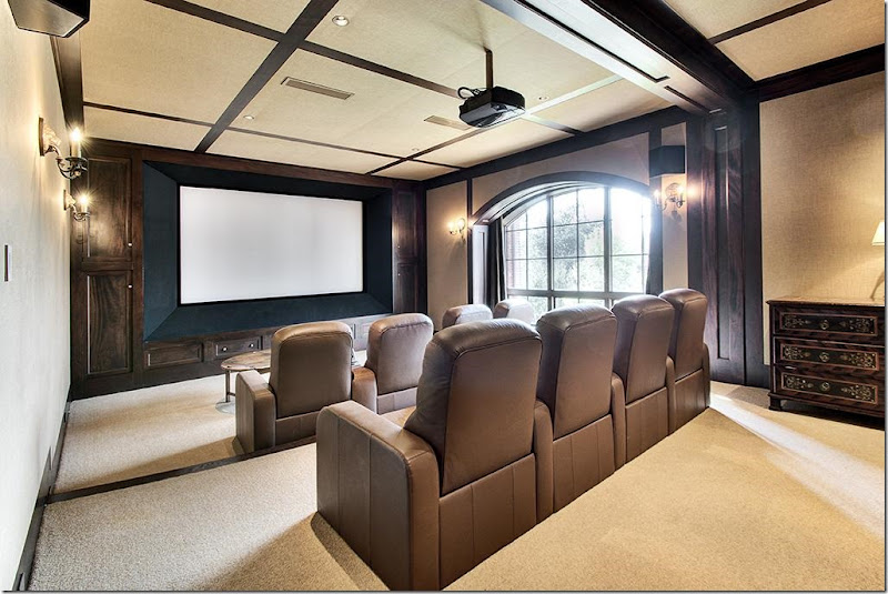
Home theatre. Lately people are decorating their theatres more like a room than a movie theatre but if you have the room, why not? I still can’t imagine how much fun it must be to have a real theatre in your house!!
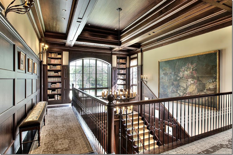
The landing is warmed up with an assortment of rugs and books. Love that bench with the tapestry on the top.
Shoot! No pictures of the master bedroom and bath! Still, what a stunner this house is! I love the décor – it’s not the typical Houston look. No white slipcovers, no gray painted walls – instead this décor is perfect for the house, large with lots of wood. The designer filled it up without making it look like a furniture store. It’s warm and friendly – cozy and inviting – and beautiful!!!
House #2
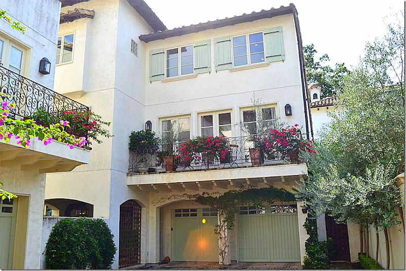
Next, is an unattached townhouse in a very small complex built by one of my favorites – Southhampton Homes in Houston. Built in 2005 and just under 4500 sq ft, there are 3-4 bedrooms and 4 1/2 baths. Everything about this townhouse is pure charm. From the garage doors, to the balcony with French doors, to the wood shutters, to the tile roof, this house just exudes a French sensibility. To enter, go through the gate under the stucco arch.
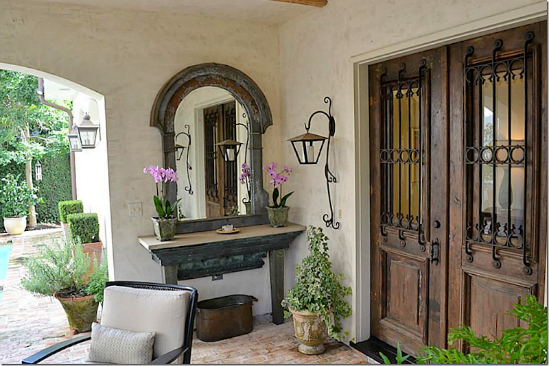
The backyard is actually the front yard! Through the arch you enter the covered patio and pool area. The owners have decorated this outdoor room with gorgeous lanterns, pots, mirrors, and furniture. Southampton Homes uses old materials in their houses – as seen here at the front door. Notice the adorable lantern at the side of the door!!!
The floor is brick which adds to the charm. Notice the beams in the porch.
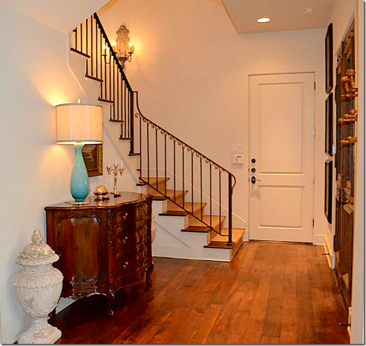
The townhouse is three floors – with the main living area on the second floor. So, we’ll go there first. You enter the front doors and go up the seagrass covered stairs to the main level.
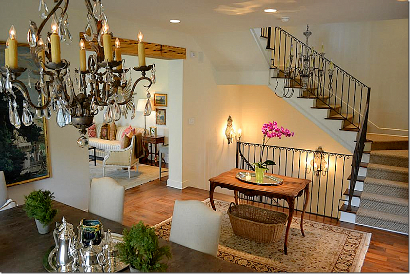
The stairs lead to a second floor landing – where the dining room is in the middle. When you reach the second floor, the living room is to the right and the kitchen is to the left. Notice the pretty sconces and chandelier in the stairwell. Let’s visit the living room first.
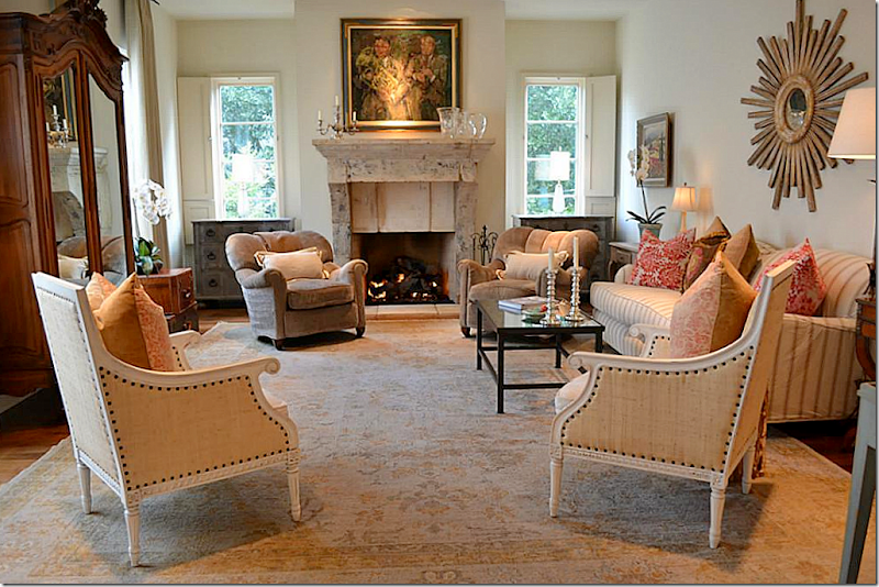
A large antique stone mantel anchors the room. Wood shutters cover two windows and curtains cover the others. A striped slipcovered sofa is paired with two club chairs and two Swedish inspired Oly Studio chairs. Twin Swedish chests flank the fireplace. Love!
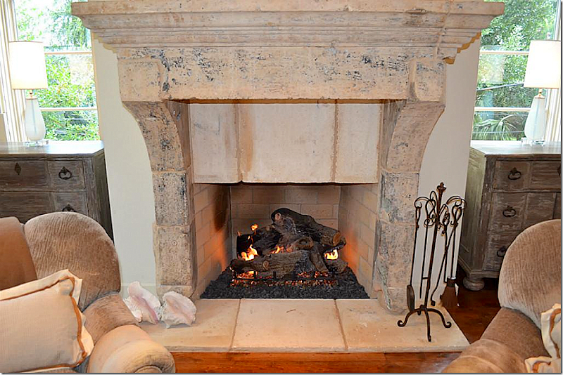
Close up view of the fabulous stone mantel.
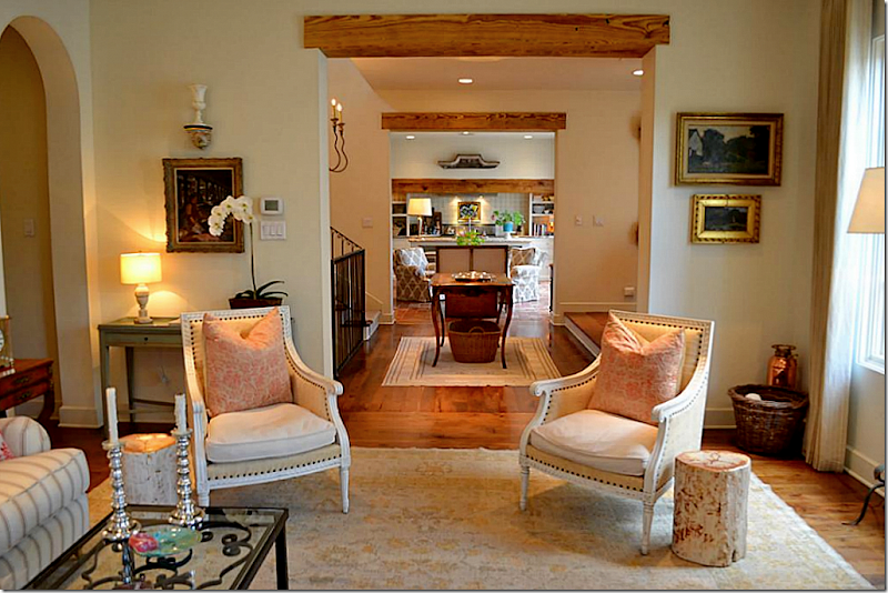
Looking towards the dining room on the right and on towards the kitchen. Wood beams accent each room opening.
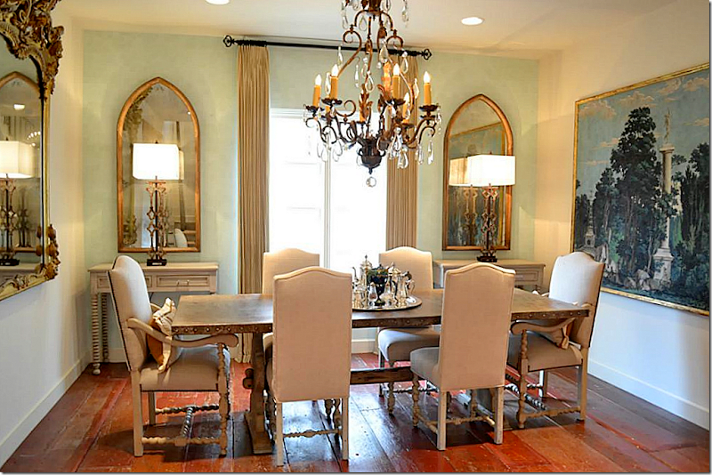
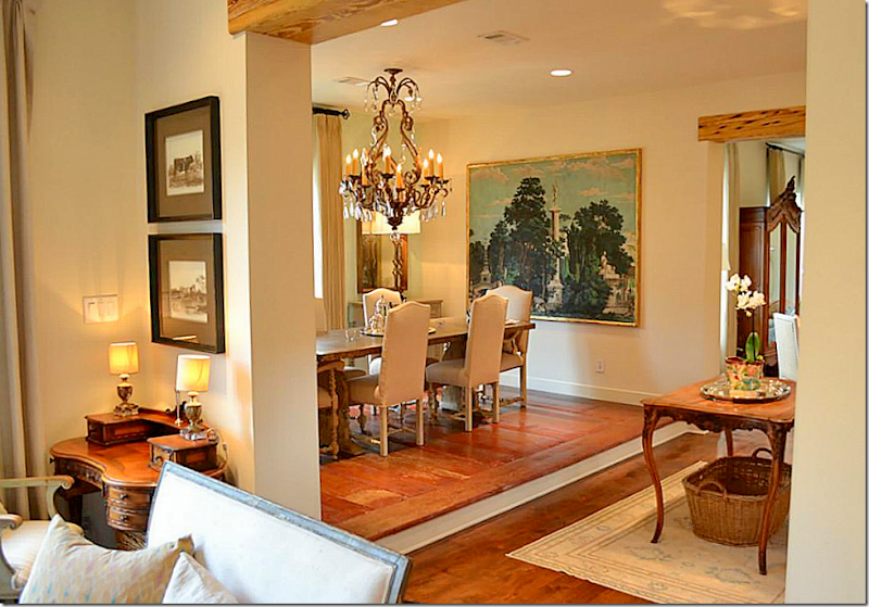
Off the landing is the dining room, with a French table and chairs. Matching consoles and mirrors flank the French door. Along one wall is a framed mural. Notice the wide planked wood floor! I like the way the back wall is painted a soft blue to tie in with the mural.
Off the landing is the kitchen and breakfast sitting area.
Instead of a breakfast table, the owners use this as a sitting area. Notice the aged tiles in this room – adds more charm. The French doors on the left open to a balcony. Antique settee and chair with two club chairs.
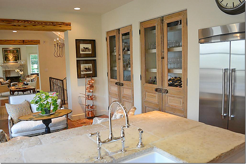
The bar and cabinets are behind two sets of antique wood doors with original hardware – beautiful. The counters are antique stone.
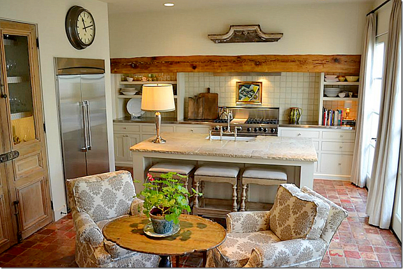
No need for a large breakfast table – there is plenty of seating at the bar. Love the beam and the open shelves. Is this Houston or France??? Can I move in today?????
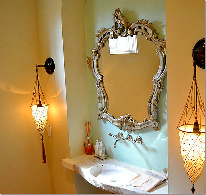
The powder room with its tiny, charming window – has an stone sink with Fortuny lights. The back wall is painted in the soft eggshell blue.
The master bedroom is on the third floor with a high ceiling. It also has a fireplace.
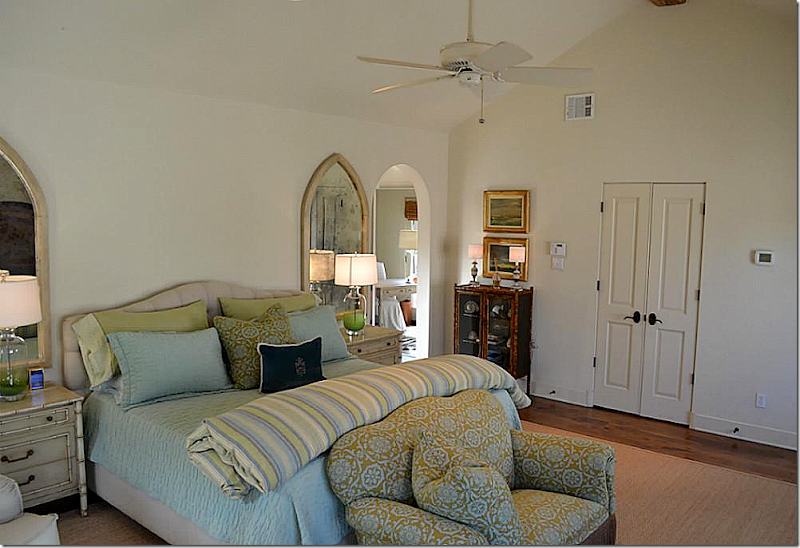
Cute bedding and fabrics in the greens and blues found throughout the house. Through the arch is the bathroom and study. Hardwoods with seagrass.
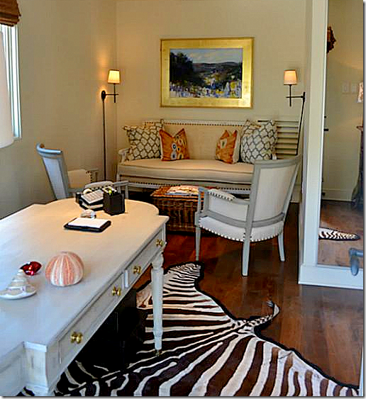
The study off the bedroom, with cute French chairs and an Oly Studio sofa.
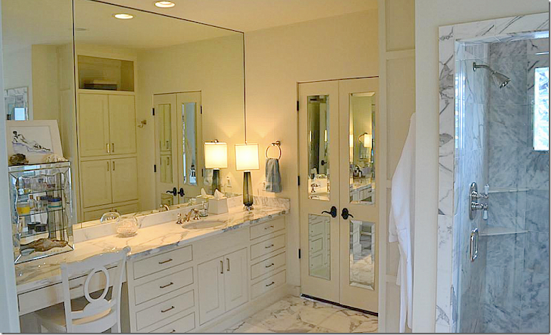
Gorgeous white marble counters, floor, and shower. Love the mirrored doors.
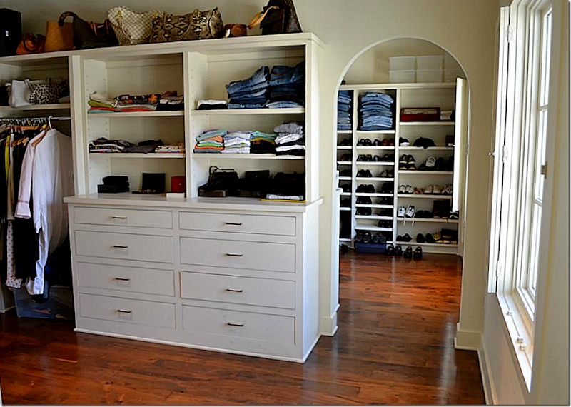
Even the closet has charm – with its arched doorway and window!
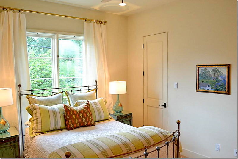
Two extra bedrooms – this one has the lime green stripes and checks with matching glass lamps.
While this bedroom has twin antique headboards, and wall to wall seagrass.
And looking the other direction to the street view.
This ensuite has subway tile and I love the way the owner painted the walls 1/2 gray to mimic a wainscot. Love the hanging basket that holds extra towels.
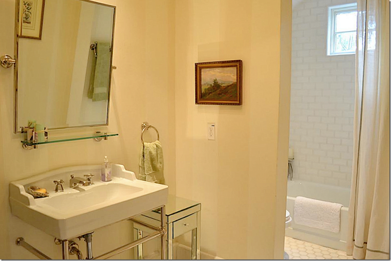
And this bathroom has subway tile and tiled floor with muted striped painted walls.
Now, let’s take the main stairs back down to the first floor.
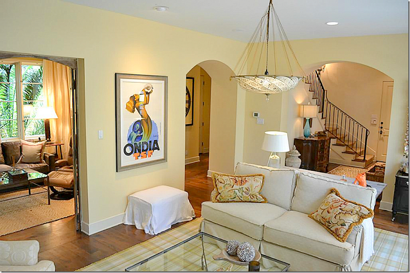
One the first floor, past the front door is a large sitting area that overlooks the swimming pool. Cute plaid rug and beautiful Fortuny light fixture.
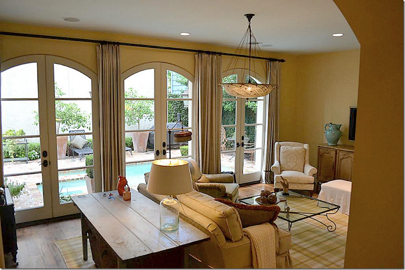
And looking the other direction – out the French doors to the swimming pool. So charming!!!!
Through the antique doors – is a library, which could be a fourth bedroom, creating a teen suite downstairs (perfect for one child !!! yes!!!!!! )
This room is set up with a wall of shelves, making it a perfect library or study.
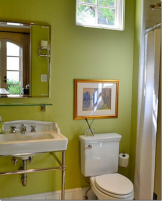
And the bathroom, downstairs, with the green walls.
Through double mirrored doors is the laundry room, with its tiled floors.
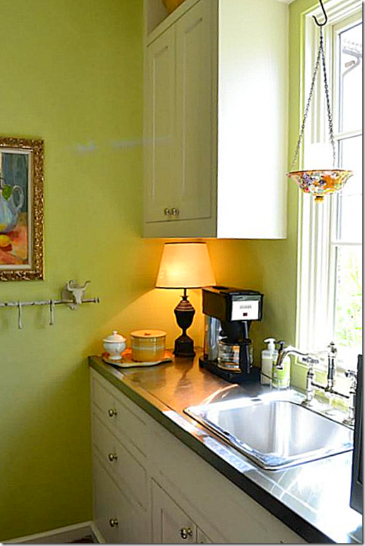
And another view of the laundry room, doubling as a coffee bar!
This townhouse is so charming, a bit of Provence in the Rice Village area. It’s hard to recreate this look without the architecture. Here, the architecture is so important to the vibe – the French doors, the shutters, the wide plank hardwood, the ancient tiled floors, the beams, the iron stairway, all the old doors and hardware, the stone mantels and countertops. These owners used linens and cottons to decorate – nothing fancy – which suits the architecture perfectly. Even the main living room looks comfortable enough for a Sunday spent watching football around a roaring fire. Southampton Homes really know how to add elements to a house that make it special. Each of their houses is unique and even their spec homes look incredibly custom.
House #3
And now for something completely different!
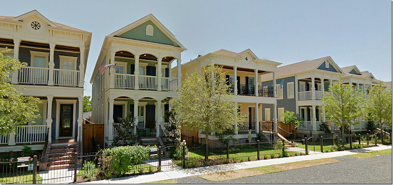
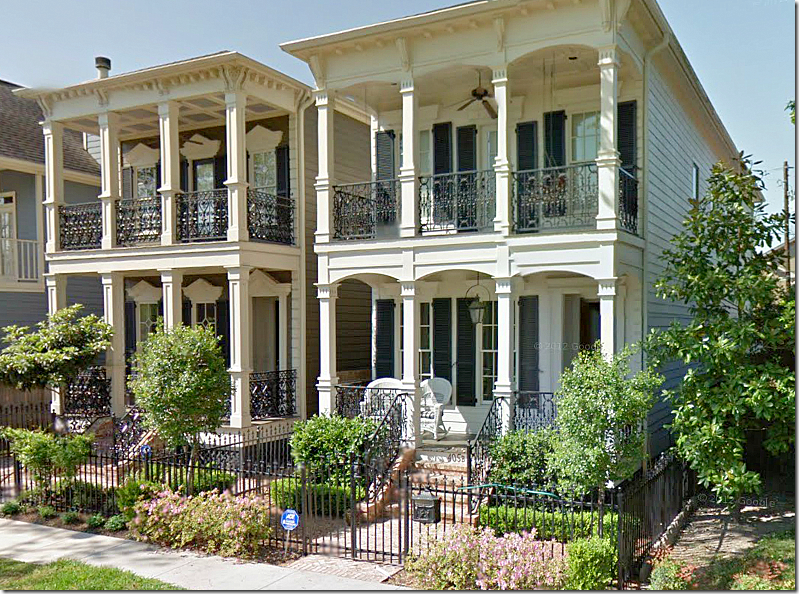
Elisabeth will be finished with college in another year and 1/2, so when she comes home, she likes to search on HAR for reasonably priced rent houses and apartments. We like to look together and ooh and ah over all the cute redone houses in older neighborhoods – which is how I found this next property. Located in the Heights, one of Houston’s oldest neighborhoods, this house is brand new. It’s one of nine houses being built right next door to each other. Most row houses in the Heights have a Galveston/New Orleans look to them, with back alleys where the garages are located. Here’s an example of typical Heights new construction houses:
Typically, a builder will buy up several lots and erect three, four, five row houses. The front yards are often behind black iron gates, which add even more charm.
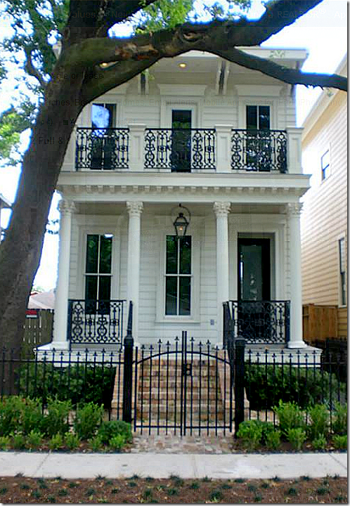
Here, this builder bought two lots and built similar houses next door to each other. Houses like these are remarkably affordable and are often finished very nicely, with marble and granite and hardwood floors. Other builders choose to renovate the small Craftsman style bungalow that are original to the neighborhood.
The Heights neighborhood is being revitalized at a fast pace, who could resist a house like this? So charming and so perfect?
Unfortunately, I couldn’t find a house for sale that was furnished. Most were new and so, were empty. But I did find something for rent that made me stop and I kept going back to it for another look.
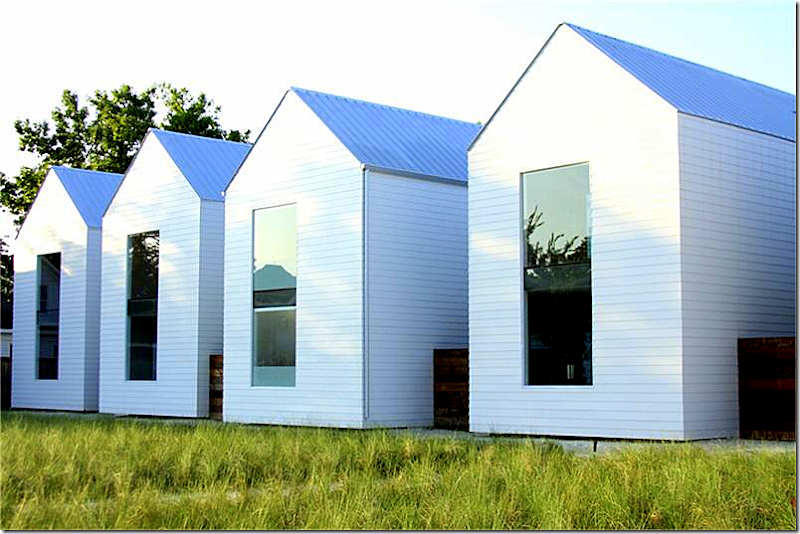
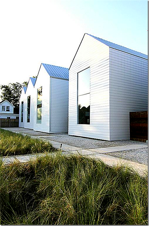
Instead of building a faux Greek Revival house, Shade House Development – the design firm of Holden Shannon and Matthew and Tina Ford, bought a plot of land in the Heights. The project - called Row on 25th – will eventually house nine rental houses. For more information on Shade House Development, see their web site HERE.
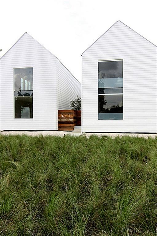
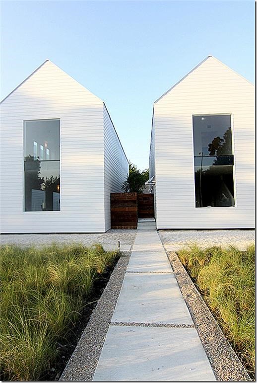
Here you can see the sidewalk and the gravel front of the bungalows. Tall grasses take the place of a manicured, mowed lawn. The houses aren’t built in a straight line – you can see here how they placed either forward or back to create a sense of rhythm. And, each house is painted a slightly different shade.
The grass changes with the seasons. Here, the grass is summer green.
And here, in winter, the grass goes dormant. This looks like a painting, doesn’t it?
The concrete and gravel front walk that leads to the row of houses. Built this year, each house has a private courtyard, a 2 car garage, and each is just under 2,000 sq. ft.
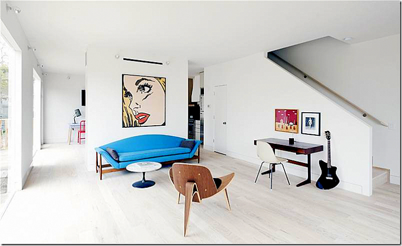
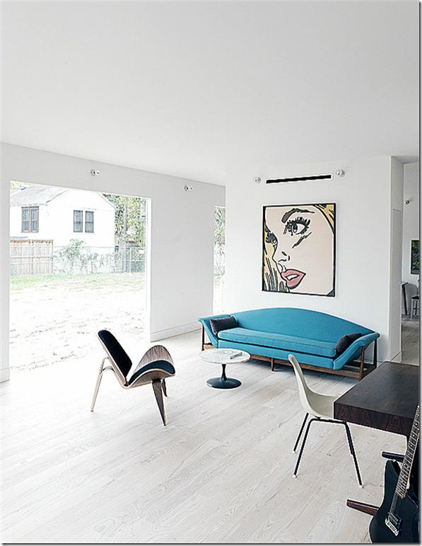
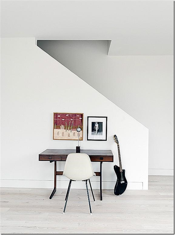
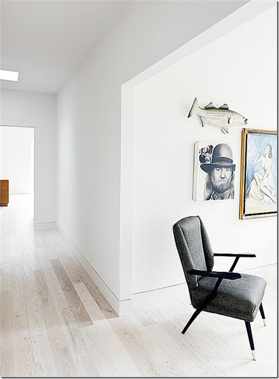
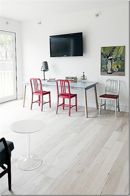
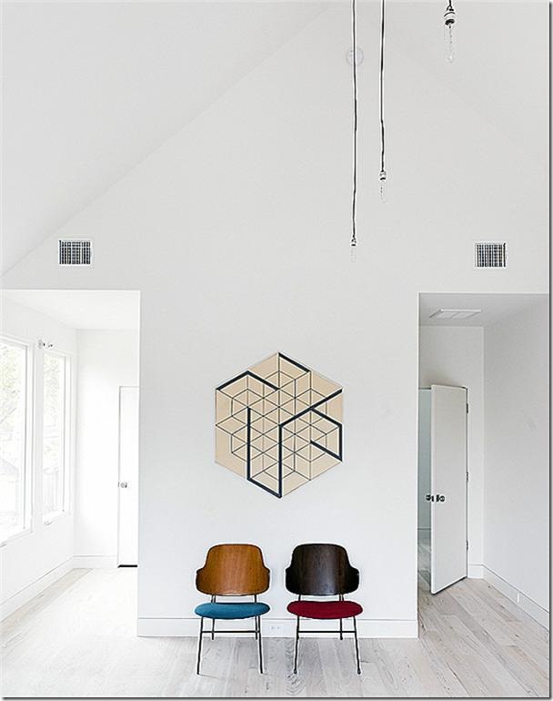
Inside the houses are very minimalist, without any superfluous trim, yet the fixtures are surprisingly luxe. Here the living room is divided by a wall from the kitchen/dining area. The floors are white (Ash) as are the walls.
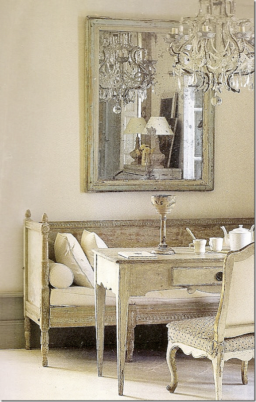
While the builders chose to furnish their rentals with mod choices, I kept thinking if I lived here, I would put in antiques, Swedish gray ones along with French gilt wood, and add a chandelier or two. I could see putting a huge tapestry on that wall, or maybe a few old portraits or a mirror and chest like this:
A Swedish chest and ironstone (Tone on Tone) would look fabulous on the dividing wall.
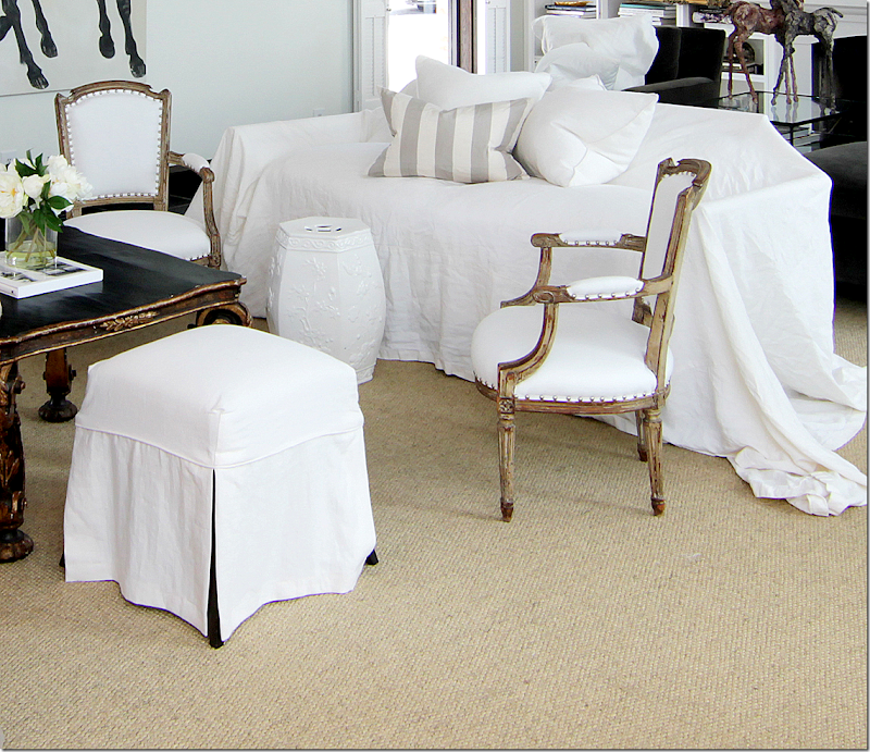
I would add white slipcovered sofas and a few antique chairs or two. Gilt would look so good with the white walls.
Maybe a few gilt French chairs and a black coffee table, and gray and white striped pillows, along with a seagrass rug – for texture.
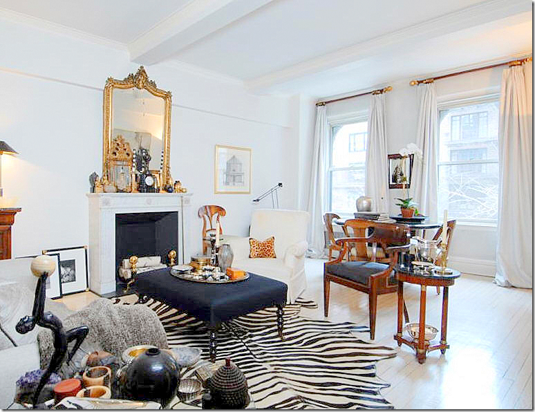
A zebra rug would add needed texture against the white floors, like this. Add some white taffeta curtains for some quiet glamour.
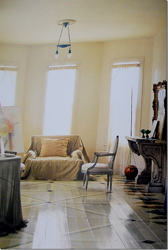
I envision something like the bungalow that Houstonian artist Salle Werner-Vaughn created. She created an ethereal living space in a series of old houses right near the Heights. She sparingly furnished the light-filled house with a French chair here, a French table there.
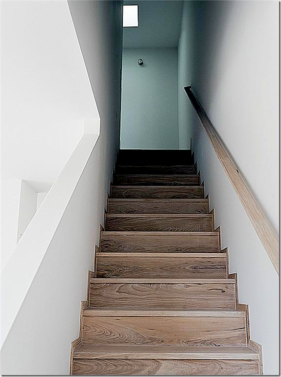
The bungalow’s staircase, stripped to the bare essentials.
The houses were built using “green” materials.
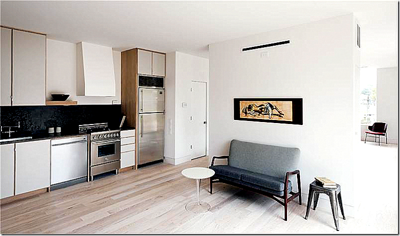
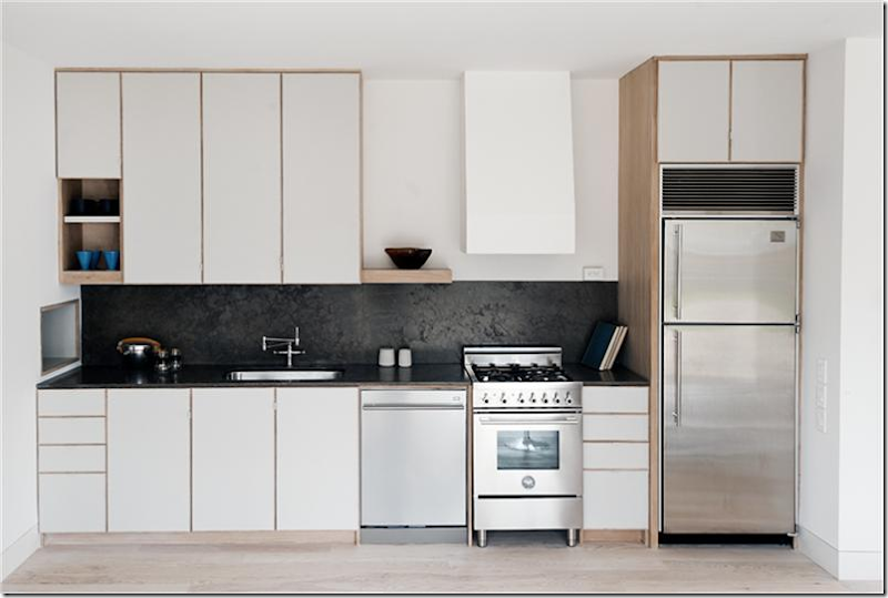
The kitchen is minimal, but luxe. There is a Subzero refrigerator, an Asko dishwasher, and a Bertzazzoni range. Wow.
Again, the builder has chosen to furnish the bungalow with modern furniture, but I would go in the complete opposite direction.
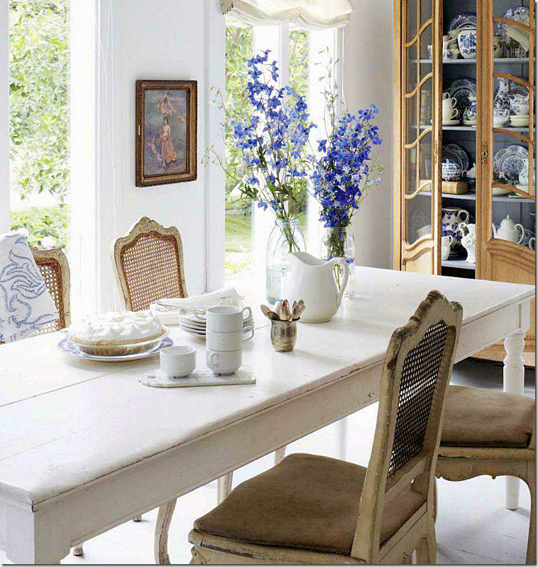
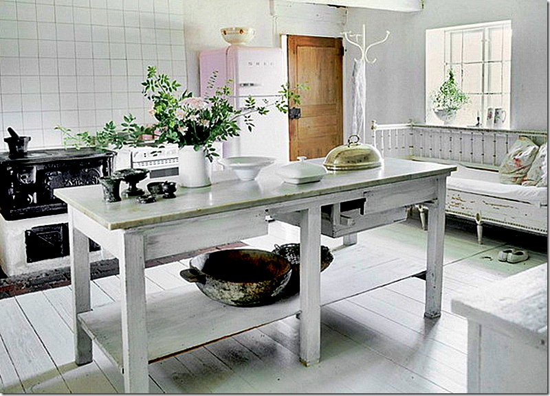
I would use a white wood table and antique chairs in the kitchen/dining area.
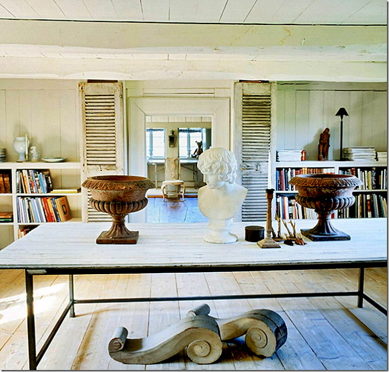
A large table would double as an island. Add urns and busts for a classical look.
Creamware, silver, and an antique Swedish sofa, or a copy of one!!
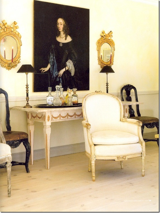
Perhaps add a gilt and painted console to create a bar. Hang sconces and a portrait, and pair with an assortment of antique French chairs.
The kitchen. It’s amazing how much you can get in a small space. The table should do double duty as an island to prepare the food at. Want to hide the kitchen? Run a wire from wall to wall and hang fabric from it. This way you could hide the kitchen altogether when entertaining.
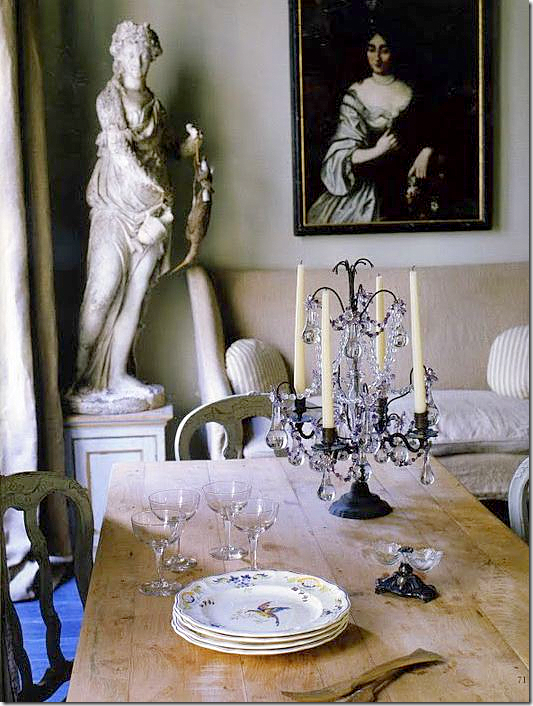
More ideas for the kitchen/dining area. Add a wood table, a sofa, a sculpture, a candelabra, and a portrait to create an 18th century feel in a 21st century space.
Let a Swedish sofa acts as a banquette, taking the place of several chairs.
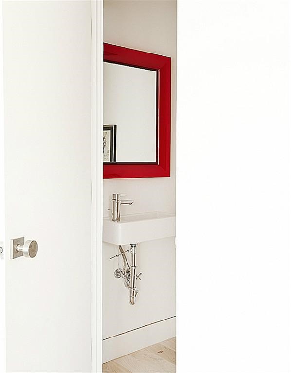
The powder room.
Instead of the red contemporary mirror – put in a beautiful Venetian one. They look surprisingly good mixed with modern fixtures.
No frills stairs. But, wouldn’t a black and white striped runner look great here?
Like this.
Or something like this – in Renea Abbott’s townhouse.
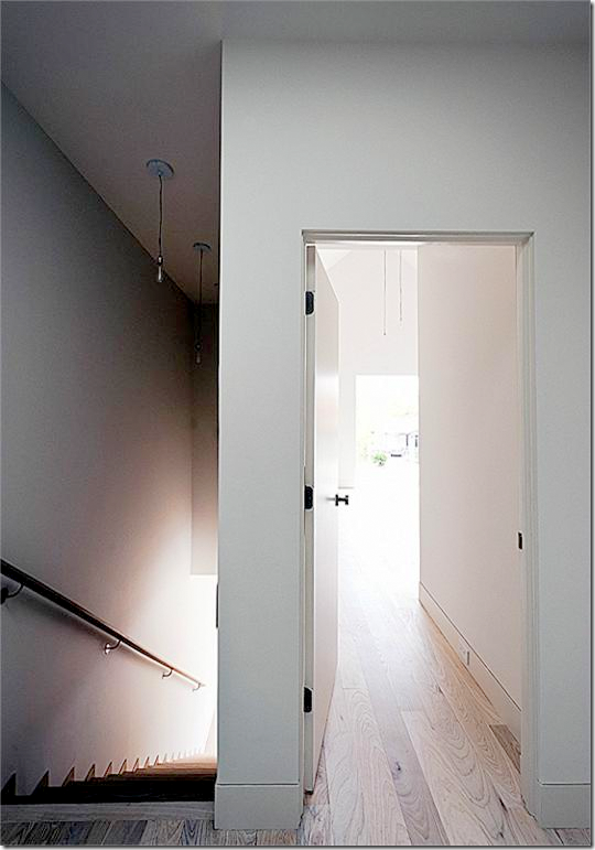
There are 3 bedrooms upstairs.
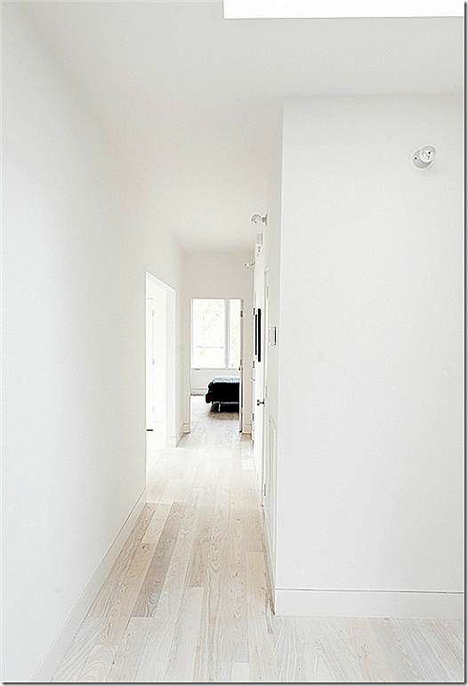
Upstairs, the bedrooms are just as the rooms downstairs with white Ash floors and walls.
The upstairs hallway.
The hallway would make a great gallery wall for a row of photographs or paintings.
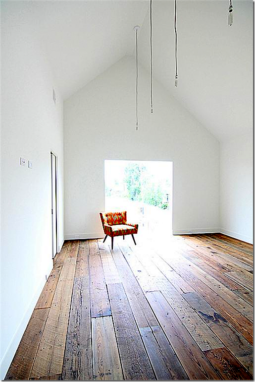
While most of the Row houses have the white Ash flooring, some
have reclaimed wood planks – your choice.
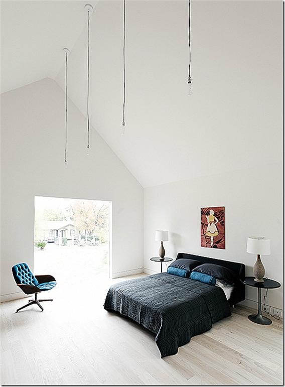
The master bedroom has a high ceiling.
There is a series of hanging lights – I would probably take those down and replace them with one chandelier.
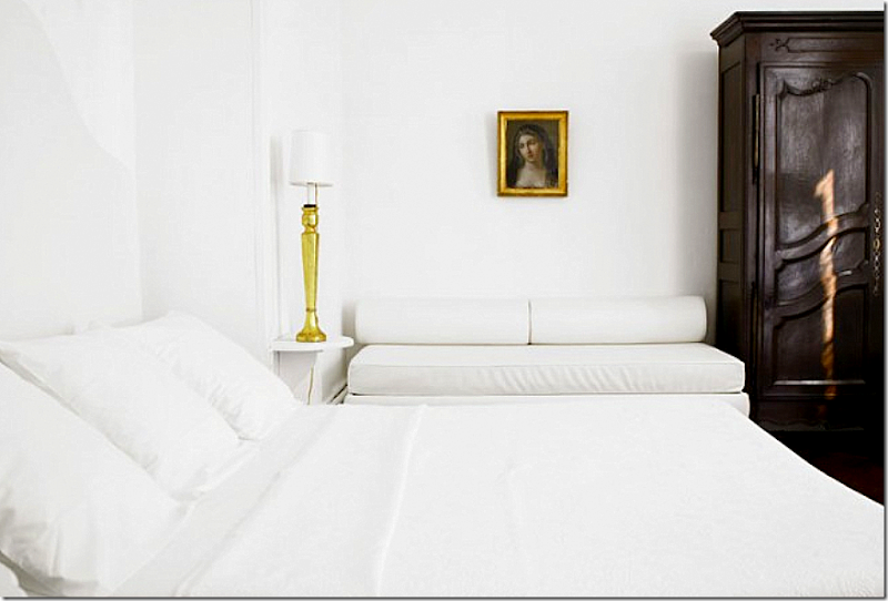
White bedding, a grisaille mural, with a gilt French chair. A white cowskin rug. Not much else is needed.
A dark French armoire would look great against the white walls and bedding and gilt accents.
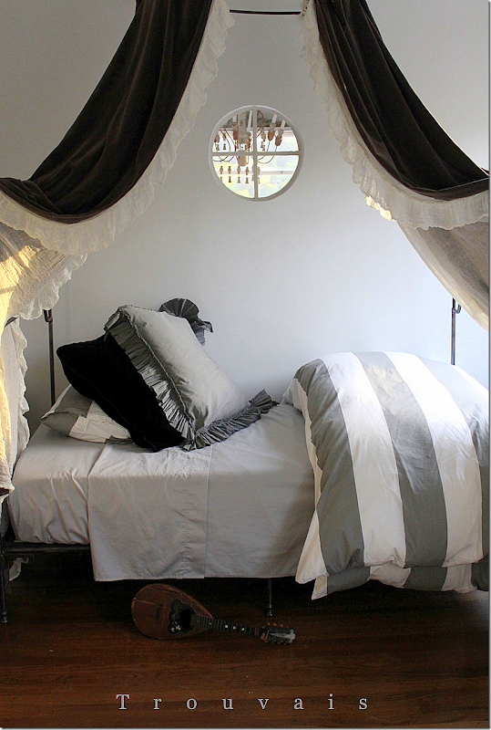
In the guest room – do what Trouvais did in her new one – using the same bed that my daughter Elisabeth has from Anthropologie, Trouvais paired West Elm stripes and Belle Notte linens with hand dyed velvet. Gorgeous!!! What a great look with a minimalist background. HERE.
Paint a wainscot of gray, pair with a gilt mirror and antique table and chandelier.
The master bathroom has limestone shower and floors.
Close up of the stone counters.
I really like this bungalow and would love to help my daughter decorate it – if only she was already graduated and looking for a house - but that’s a few years away. It’s fun to dream a bit. All her life, Elisabeth has been obsessed with clothes. Her first temper tantrum was when she wasn’t yet two. I always bought her black and white saddle oxfords to wear with white leotards or socks. Each time her foot would grow, I’d just get her a new, bigger pair. That is, until she went with me and saw a pair of red sequined shoes. I had to pick her off the floor, she was so hysterical that I was going to buy those ugly saddle oxfords for her again! Of course, I didn’t.
Her love of clothes never wavered, ever. Until she got her first apartment. And now, she’s become obsessed about decorating, which is great for me. We look at houses on HAR and pinterest until the wee hours of the morn and talk about her love of dark navy walls a-la Mary McDonald, who is her new style guru. It’s fun to look at pictures and dream and scheme. It doesn’t cost a dime and it’s harmless.
That’s what I had planned for this post - looking at pretty houses and dreaming. Was there one of these three houses that appealed to you – money no object? Did you like the mega mansion with the sky high price tag? Or did you flip over the Provencal townhouse, like I did? Or, do you have you own fantasies about how you would decorate the minimalist bungalow, like Elisabeth does?
Tell me your pick – if any!!!
THREE HOUSES: THREE CHOICES
Subscribe to:
Post Comments
(
Atom
)

















no 3 would suit me just fine. I do love the minimal decor but I also love what you have added. All that white....wow!
ReplyDeletepve
House No. 1 was lovely, but there was way too much stained wood for my taste. The style, grounds and landscape have great potential.
ReplyDeleteHouse No. 3 was very appealing (the New Orleans style of course), but the minimalist version left me very cold. While the interior gives
a buyer a lot of decorative options, the sterile exterior is not very appealing. It is likely that covenants and restrictions would prohibit
very much improvement to the exterior, including landscaping. Ultimately, I would pass on all three even if money were no object. Great post, by the way.
I meant to say also that the second townhouse was lovely, but I would like to see it empty. It was hard getting past the
Deletedecor and clutter, but it has great potential. It could be a great place for Elizabeth.
Even though there are no pictures of the interior of the homes in the Heights neighborhood,I would love to live in one of those or one of the bungalows would suit me just fine. I'm in love with the reclaimed wood floors.
ReplyDeleteI would love no. 3 with a mix of the builder's picks and yours. I hate to say hate but I really hated no. 1.
ReplyDeleteMy daughter and I sometimes indulge in internet dream decorating too. Good bonding time.
Home #2 won my heart...wonderful French feel, indoors and out.
ReplyDeleteHow creative...using a perhaps French grape harvest basket for towels in the bath.
And the pair of Swedish chests flanking the stone fireplace mantle...worked so well with their shape and color.
Too many magnificent features to mention...don't know how the owners could leave.
The last one, but I'd furnish it more like you would. I am not one for minimalism!
ReplyDeleteSo glad you used Tone on Tone's picture. He's the most darling man! We all had dinner at my house over the summer!
Thank you, Meg!! Tom and I loved meeting you and Connor :)
DeleteAmen to your assessment of Loi, Meg. And I would love to add some of Tone on Tone's Swedish and Danish and French finds to my house. Now on to this post, enjoy dreaming with your daughter, Joni. My daughters and I do the same. I love the decor of the first house, but agree with Loi in the next post--bleach and paint some of the dark wood. Next, you are exactly on point, the grand house has a wonderfully cozy ambience because of just the right amount and scale and upholstery of the furniture. Besides the scale and subject matter of the paintings added to the warmth--not to mention the drapes. (I am in love with the linen chintz in the living room!) And the rugs. With you, I adore the library on the landing and the tapestry on the bench. (I wonder whether the owners will be able to use things of this scale in their next home? And further, why they must move after only living in such a wonderful home for only seven years? This home deserves to be generational! Again, Joni, your long and detailed posts are fabulous and so interactive! Thank you for all your work!
DeleteHi, Joni - Happy New Year! The first house!!! For the beautiful gardens, gorgeous paneling and amazing architecture!! I would keep some of the dark paneling and bleach or paint some of it. Perhaps bleach the beams and cabinetry in the kitchen. Also my favorite room. I love the eating area in front of the fireplace. The house is huge, but it feels warm and soulful.
ReplyDeleteThank you for sourcing our pieces :)
Cheers to a fabulous 2013!
Loi
Also, I love the bleached and whitewashed white ash floors in the Shade House Development. They are a nice alternative to white oak, which looks great bleached. I don't recommend bleaching red oak....can turn pink.
ReplyDeleteHi, While fun to look at, none of these homes inspired me enough to think about (dream) what it would be like to actually live in one. The first house, well done all right, is to big and excessive for my taste - even if I won the lottery, I would never build a home like this one. The second place...elements were good enough - although the kitchen was awful! But, I would never want to live in that sort of setting - I prefer a detached home in and of itself. And, at my age (though not old!) I have to think about all those steps - 3 stories...ugh. The 3rd place...I did not like at all - like living in a "pretend" neighborhood...no history. All house the same. I think I would dislike this one the most.
ReplyDeleteThanks for the post..something to think about...I have always wanted to live in a old commercial building - loft space - old school, library, church...I just think that would be a design challenge and the architecture would be cool to design around.
Also, it is fun to dream, especially if you love homes as much a we do! I have, on occasion, looked at NYC townhouses and apartments for sale via Stribling via NYSD - I did spot an adorable apartment - needs to be updated although Mark Hampton did it years ago. You enter the foyer and then go up a flight of stairs to the apartment( so New York) - 6 million. I could live there! Fun to dream!
ReplyDeleteLoved the land that came with house #1. LOVED the ambiance and architectural details of house/condo #2, but would feel very hemmed in because it is a condo. #3, sorry, but they look like the storage sheds people buy to but BEHIND their garages so no one can see them. In spite of their "greeness", the resale value on those oversized storage sheds will be nearly zero in a few years. Not a good investment for a young woman starting out.
ReplyDeleteIf I were truly choosing my dream home…it would be choice #1 with you and Loi as the designers! But, believe it or not…I would rather pick the last of the choices….the Shade House Development because it's fun, innovative and creative all at the same time! it reminds me of our beach home…in the Bungaloos mind you…and it definitely reminds me of all of the homes that I look at with my daughter that lives in New Orleans! The other two choices are fabulous and one would think I would choose that…not now that I am older and want to be helping my children have exciting and fun and creative lives. ( and perhaps I realize now just how fun it is to be young and house hunting!) Thanks for sharing these choices and thanks again for tagging me in your post on Ann. I truly appreciate it!
ReplyDeleteCarolyn
The first home was stunning and quite a surprise for Houston!
ReplyDeleteThen you showed the Provencial home and my heart melted. It's everything I dream of, it's the inspiration for what I wish I could do and it's a pleasure to study it.
I'm like you and would put old pieces in the stark rental. I like the vision of the builder with the large windows and the seasonal grasses. My husband would flip over the huge, bare windows; they go against his very private nature!
My mother and I have used magnifying glasses to look at magazines for years. We've talked hours on end about the tiniest details. She's in her 70's, lives in far west Texas and I'm in Houston but a couple of times a week we share a cup of coffee (over the phone) and discuss the decorating books she's checked out of the library and her favorite shows on HGTV. Decorating and appreciating make the miles disappear!
All the houses are stunning! But, I love your ideas the best- I can see it now! What great vision you have.
ReplyDeleteI have been in the first house on the azalea trail one year. It was lovely. Since I live in Houston, I am always intrigued when you do these posts. Fascinating concept on those houses in the Heights. Thanks for sharing Joni and Happy New Year!!!
ReplyDeleteHi Joni! I tried to find an email address for you but couldn't. My niece just purchased a house in San Antonio and is anxious to find someone to help her decorate it, and there may be some renovations needed. Do you know anyone there you could recommend? Of course, if you worked that far away, I'd love to recommend YOU! Thanks!
ReplyDeleteI love house #2, but I also love #3. I love French and Swedish style. The 3rd house felt Swedish modern which is the only modern I like.
ReplyDeleteReading this in bed whilst it rains outside, typical UK weather - this post lets you dream for sure. Love #1 as it was detached and had lots of outside space, but for charm and more important, character, it has to be #2.So warm, cosy and pretty and such attention to detail.#3 would be ideal for young people starting on the property ladder, but your choice of decor much warmer.Why do people automatically pair a modern house with stark modern interiors, sometimes the opposite as in this case would work much better.
ReplyDeleteLove the post - keep them coming Joni!
I think I remember driving by the first home in River Oaks, but who knows since there are so many tudors! The house was well done inside to balance all of that dark woodwork, but it's still a little dark and austere for my taste. I love The Heights so even though there's no home pictured I'd take one in a heartbeat.
ReplyDeleteNo.3, no question, no hesitation. Might have something to do with New Orleans being my hometown and I miss it bunches! I lived in Houston for 3 years and was very happy there; had a friend living in The Heights too! It's nice to dream, isn't it...
ReplyDeleteJane B
House #2 is so charming and well done, although I don't think I could live in a townhouse...I like houses on one level. The exterior of the houses in the Heights are perfect. The modern bungalows are too stark on the exterior, but the starkness works on the interior with your suggestions for gilt and chandeliers and Loi's Gustavian furniture. High drama.
ReplyDeleteXO, Victoria
Love house 1 - beautiful architecture and interior design. We are moving today to Chadds Ford, PA from NJ to a home that is not my dream - owned by an older couple who made it look like Florida inside. Just awful. My dream is to have you there by my side helping me decide what to do!
ReplyDeleteDefinitely house #2....I love everything about it! The bungalow's are adorable and perfect for a young woman like your daughter! Love, love this post Joni!
ReplyDeleteNone of the 3 would suit my life right now, but my husband and I talk about living in a loft or townhouse when we are empty nesters. Although I love to garden, the thought of minimal yard upkeep is appealing. Loved your ideas for #3. And, I loved the painted wainscot. I might have to steal that idea.
ReplyDeleteThanks for another great post!
House #1 is too large and excessive. Also, I would not choose so much dark wood. I did think the breakfast room was charming.
ReplyDeleteHouse #3 is too austere on the exterior and interior. Like other posters, I would choose Joni's interior ideas. But, I still would not want to live in one of these houses.
House #2 was more appealing, but, the fact that it is on three levels would nix it for me.
This was a great post and the three houses were fun to see. And, it was nice to realize, that I would choose my own house over all three!
Well, if money were no object, I'd buy all three! Have lavish parties and events at the main, super large house, work from the little bungalow with the modern finishes, although, I'd have to hire you to come and decorate it for me, and live 80% of the time in the townhouse. Something about that townhouse - it's really inviting. Great post Joni! And you're absolutely right! No harm in scheming, and it'll help you and Elisabeth get down some must-have ideas before she's back and ready to go house hunting!
ReplyDeleteI prefer #1. Actually, I love it. What was that two or three tear downs for the one? I love the large lot, not for the yard but for the distance from neighbors, the architecture and most of the interior. I do prefer a light and bright kitchen instead. But why do builders here in the south keep putting fireplaces, and so many in homes? What a waste. Although, on recent days a fire feels great. I just think that a builder/designer should come up with a new focal point of a room instead of a fireplace.
ReplyDeleteI appreciate aspects of the others but would not like living on three levels. There are days that I wish I were a minimalist.
That was what my husband and I thought before we bought our townhouse! It was a custom build on a corner lot with a wraparound garden and had everything on our "need" list, plus virtually everything on our "want" list we couldn't pass it up. I was amazed how it feels virtually the same to go up two flights of stairs vs. the one in my childhood home. I will admit that we are young and healthy, and my mother did have some comments after twisting her knee on the tennis court, then coming over to my house. So, that likely makes a difference. But we love the minimal grounds maintenance and the "lock & leave" capability. I'm glad every day that we went for it.
DeleteThe foyer in House #1 is jaw dropping!! Wow! So many gorgeous architectural details...but House #2 seems like a more relaxed and livable space. House 3# is too minimal for my taste, but very sophisticated!
ReplyDeletebefore praising this wonderful collection, I say don't try to use a table for an island. A work island should be work island height unless you want to kill yourself. I really enjoyed this post, especially the third, which is like a scapbook of best ideas, and the second is too die for but kind of frustrates me, because when you build or remodel, your have a hard time being patient enough to spend years finding all those antique pieces.Time is usually the essence of such a project. just the floors would have been enough to suit me. the first one was done really well, but there is not enough paint in home depot to cover that wood. Think of that pretty toile with the wood painted out, how light and airee that room would be. and the stairs look like something out of Giant, which has some appeal, but one would get tired of all that wood. It would be nice to have an antiqued or rustic finish on some of that wood, and maybe leave wood in one or two rooms, and paint the rest out
ReplyDeleteYou've outdone yourself with your ideas for the bungalows. I love the combination of clean, modern lines with French and Gustavian classic furniture and accessories. The first two houses didn't appeal to me--both felt overdone. But, I don't think I'd choose to live in any of them. I agree with Susan--I would choose my own house, although with some of your decorating ideas. Thanks for the post.
ReplyDeleteI'll take #2 please. Beautiful dream house.
ReplyDeleteI loved this post, what a way to have my coffee ! I loved all three, but #2 would be for me hands down. I would feel like I needed to whisper and tip-toe in the first home, but I did love it. It was just too large! The 3rd would be perfect if you did the decorating, but #2 was the best. Thanks
ReplyDeleteJoni for the super dream house # 2 because # 1 has too much dark stained wood. If I could see the surrounding, I can see #3 as a possibility. The minimalist lines give a blank slate for antiques and all things French!
ReplyDeletexoxo
Karena
Art by Karena
I fell in Love at #2.
ReplyDeleteOh, I laughed at the tantrum and red shoes! I did the same thing to my Mom. I thought I would just DIE if I didn't wear my Sunday school shoes to school! My Mom was made of sterner stuff. She won, I lost. I adore dreaming and scheming with my young adult kids about their houses. Lizzie is lucky to have you. As to the houses, I'm ready to give my stuff to the kiddos and go condo. I'm just not able to deal with the upkeep. Each house has certain virtues.i loved this post. Thank you.
ReplyDeleteMargaret
Joni....I could move into number 2 and just change a few things to my personality, but love most of the furniture and the things they did. They other two homes were gorgeous, just not my style. It would be fun to redecorate the first one and lighten it up.
ReplyDeleteJoni, I wouldn't turn down any of them though my favorite interior is #2. I love the furniture and lightness of this home.
ReplyDeletexx, Sherry
They are all interesting in their own right, but #2, I DIE! That townhouse is just perfection. I could move right in and not change a thing, and I NEVER say that! I definitely prefer your interpretation of #3 than the current styling; I just can't get behind the ultra modern sparse furniture!
ReplyDeleteI loved this post! My favorite is absolutely house #2! So beautiful!
ReplyDeleteHi Joni, I would choose #3 because I love the heights, adore the way you would put all the furniture in place also love river oaks, the houses in River Oaks are too grand but love the address! The town house #2 is Beautiful also but on too many levels. Grand post. xxpeggybraswelldesign.com
ReplyDeleteOh wow! This is so beautiful. It was nice reading this blog. Thanks for sharing.
ReplyDelete#2 hands down, I tried everywhere to locate it on HAR (just to see MORE) and can't :(
ReplyDeleteI want that house!
Olivia
I totally flipped over the townhouse. Move me in! And I agree absolutely with your design ideas for #3. Love your design ideas. Love 'em. The cool thing about #1 is that the owners apparently have both loads of money AND great taste. Adore the fireplaces. But #2 is the clear winner of my heart! Great post, Joni! I will study #2 over and over again. So very beautiful.
ReplyDeleteIf money were no object, I wouldn't buy any of them! I'd build something wonderful.
ReplyDeleteThe first house is too large and has way too much dark stained wood for my taste. That said, I think it is beautifully constructed, decorated and landscaped, with exactly the right amount and style of furniture and accessories. Kudos to the interior designer!
The townhouse has some furniture that I liked, but the architecture isn't my taste.
And the third house looks like a garden shed! Except for the beautiful ash floors, there's absolutely nothing about it that appeals to me.
However, I absolutely love the pictures of the Heights houses that have a Galveston/New Orleans look! I don't know what they look like inside, but I'd take one of them based on the outside alone!
Well, if I was choosing a dream house, money no object, it wouldn't be in Houston. Just sayin' ;-) Despite the impressiveness of #1, it does look cozy and welcoming - hard to do with such grand spaces. But WAY too much house for my tastes. I think #2 is adorable - love the old architectural elements and the decor, but I would neither want a townhouse nor three stories (getting too old, darnit). Number 3 is a stretch for me; I'm not a modernist. I don't like the lack of privacy both indoors and out, or so many in a row virtually just alike. I could imagine one of these units as a vacation house perhaps in a mountain meadow or an isolated stretch of rocky coast, or somewhere with an encompassing view to put that oversized window to good use, and where you wouldn't have to worry about privacy. I would have the reclaimed floors and mix in distressed antiques and time worn or primitive wood pieces in warm wood tones to counteract all the white. I'd try to balance the white minimalism with wabi-sabi, like Axel Vervoordt might do. Like you, I'm always house dreaming in my favorite locale and love searching the real estate sites. No daughter to share with, but my sons are used to my sending them houses to look at, but they don't really get into decorating, and neither do my daughters-in-law, which is mildly frustrating for me, as I'm all about it. Oh well. I have hopes for my granddaughter, but she's only nine months old!
ReplyDeleteJoni,
ReplyDeleteWhile the first home is absolutely perfect, the architect left nothing out, I would like the second home. More my size and certainly liveable and fun.
Karen
House # 2. I didn't care for the other 2 at all.
ReplyDeleteHouse #1 - love all of the detail, but I instantly want to bring in gallons and gallons of white paint! I love the townhouse! Absolutely beautiful. I, too, would have loved to see the interiors of some of the New Orleans-style homes in the third choice. Thanks, Joni. I love "window shopping" with you!
ReplyDeleteLauren
Ohhh Joni, Mom bought me a new pair of saddle shoes every year too! Great memories. I wanted to repeat the tradition but Sophia a.k.a. Punky Brewster, wouldn't have it. I loved the town home. First one was too fancy for me, I'd have to dumb it down.
ReplyDeleteHappy New Year to you sweet lady!
xoxo
Jennifer
Oh I just LOVE #2...everything about it really although I never imagined I would like a townhouse! I loved the details, coziness and warmth of the space. #1 is way too big for my taste, too grandiose and cold for me! #3 I could see myself in too, I have always loved row houses and if it were decorated like #2 I'd be in heaven!
ReplyDeleteOh my what a fun post! #2 had me at hello!! My family and I have been looking for a new home for a while now. I have imagined myself in all types of homes and you are right, it is a lot of fun. I love your ideas for #3 and I really don't know how you could not like #1...I do get the dark paneling thing...but to have the house with all the finest would be wonderful.
ReplyDeleteHouse 2, House 2, House 2! Loved it.
ReplyDeleteJenny C.
Joni, great post! So much fun to see how "the other half lives." I so enjoyed the tour of house #1. If I were light years younger and had kids still at home it would my choice. House #2 is adorable and more what I would want now a days. I kept wanting to add moulding to house #3. As a gardener who loves ornamental grasses I'll mention that the grass used for landscaping house #3 is Pink Muhly Grass (Muhlenbergia capillaris). It's blooming in the second photo and is such an amazing ornamental grass. Vikki in VA
ReplyDeleteI loved all three! But my favorite was the townhouse! I felt it was cozy and warm, I loved the front doors and the kitchen! I thought the first house was beautiful and I loved the inside of the rentals! Great post! Thanks!
ReplyDeleteJoni!
ReplyDeleteI LOVE you! And I HATE all three of these houses! And you may hate me from now on!
I am so sorry! I just think there is no point if I do not tell the truth!
Awful! And I have real reasons why they are so awful to me!
You certainly do not have to publish my opinion !!
These houses make me sick to my stomach!
I love your blog!
Keep spreading good taste in Texas........gosh! I love that state so much! And all the women in it!!
Penelope
Penelope!
DeleteSometimes you can end a sentence with a period!
Not an exclamation point!
Also!
Not ever sentence needs its own paragraph!
Gosh!
"I HATE all three of these houses! Awful! And I have real reasons why they are so awful to me! These houses make me sick to my stomach!"
DeleteOkay, I think we get it - you don't like these three houses. Are you going to tell us what those reasons are, Penelope? Or do we have to guess?
BTW: Please feel free to use normal, every-day punctuation. Periods are nice.
I have been a decorator for 40 years!
DeleteI only love MY house!
None of my sentences have any relationship to any of my other sentences!
I love your comment!
Penelope
This comment has been removed by a blog administrator.
ReplyDeleteI love all these three houses. But i like the most (tom wilson) designed home. I like big homes like 5 to 6 bedrooms. The bedroom furniture is so chic...... Find out more here
ReplyDeleteIf money were no object then it would definetly be House #1. It is so elegant and done very well. House #2 would be my second choice and a close runner up.
ReplyDelete1st house reminds me of a well-appointed RV. Did you see the show about outrageous boats? Most of the boats looked like the 1st house. Odd to see a boat, house, RV all in the mega $$$ range looking like the RV. Of course with the lottery I would take all 3 & redecorate ! And add a nice plane. An island too.
ReplyDeleteOoooooh the house with pool & patio grill/plastic cover on view from the interior living room. Puppet Barbuda sees these things. Such an easy fix with antique hinged shutters.
Happy New Year !
Garden & Be Well, XO Tara
what an enjoyable post, I love the dark trim in the first house. Unfortunately the only mahogany in my house is my lovely front door with beveled glass insert; my trim is stained pine (very last century but I love it). I could easily live in one of the town homes, what a great development. The bungalows were intriguing; not my style but with your vision I could see myself in one if I had to live in the city. Your eye for detail and presentation are one reason I so enjoy this blog. My oldest daughter will be heading off to college next fall and I can't tell you how many pairs of sparklely shoes I have bought, red, gold and even cream ones. This year I saw Target had them in women's sizes! Happy New Year to you lovely lady.
ReplyDeleteI had a blast!!
ReplyDeleteHATED the first one...tooo much wood...goodness.
LOVED the interiors of number two...so very much...especially the kitchen counter and faucet!!
I would so miss having a yard and trees though.
No way on the third UNLESS I was single and young. It would be perfect for your daughter. I love her bed and how they dressed it.
(you are making me feel like I'm some kind of judge with an opinion that matters Ha!)
Oh! Those shoes? I LOVED mine...7th grade...we called them Beebops and some people wrote on them in ink and on each other's. But I see her attraction to the red sparkly ones too...she sounds awesome!
ReplyDeleteI like house #1 as long as money is no object. It has all the comforts and beauty. House #2 was lovely as well but I would not like to live on three floors. Also, the traffic pattern to the pool is a turn off. I did not like house #3 at all...too cold and unappealing.
ReplyDeleteYeah, that's pretty much my reaction to the houses. There's no way I could afford any of them, though. :(
DeleteGreat fun to see these three housing choices! I wouldn't choose any of the three myself as is--I love a BIG house and generous lot with lots of windows but the first one is too dark inside with the stained moldings for me. Wouldn't choose House #2 because my days of living in a townhouse are over. I did that and we like more natural light that you can get in a townhouse. My favorite would be the bones of the first but with the decor that you recommended for House #3. I LOVED the images that you showed of the gray and gilt and French antiques. So pretty to me and would be perfect if we could marry that decor with the bones of House #1.
ReplyDeleteIs that too much to ask for this fantasy exercise?
ATTENTION ALL JONI FANS IN SOUTHERN CALIFORNIA- While trolling Craigslist on my lunchbreak, I came across a lovely French settee just posted this morning in the Seal Beach area (405 and Wardlow). The wood appears to be walnut. Love the interesting shape and it looks really compfy. Wonderful in front of a fireplace, at the end of a bed or in a large masterbath. The upholstery appears to be in great shape (cushions might need a little restuffing or fluffing if they are down filled). If it were mine, I would carefully remove the gimp then paint the frame a soft white or perhaps a very light grey. Then I would replace the gimp.
ReplyDeleteHowever, it is not mine and I am not the one selling it, so that is all I know. Please check it out! If you buy it, I would love to see what YOU do with it. Please contact me by email. Under Joni's tutelage it should be wonderful. Ooo,la,la!
Charlotte
http://losangeles.craigslist.org/lgb/fuo/3530816270.html
Looks like I am on a "sette" jag today. Mon Dieu! For you folks in Central CA, here is a settee to try on for size.
ReplyDeletehttp://modesto.craigslist.org/atq/3525306275.html
I love the beautifully carved ribbons and bows along the back. This is definately an antique, probably from the late 1800's. Such intricate carving suggests walnut. However, from the back, the wood looks like pine, so, who knows! Absolutely ghastly fabric. What were they thinking? However, the stuffing and seats seem to be in good shape and the price is right. It would be lovely redone in a natural linen with French nail heads. Sigh...I wish I had an antique store.
Would love to see what someone does with it!
Happy shopping, Charlotte
I'm surprised by how much I like the townhouse, but I do love seeing Tom Wilson's work. He was the architect for my parents very modern house in West U 20 years ago. It's amazing to see how many different things he can do well. I'd hire him. Would love to have one of his signature screen porches!
ReplyDeleteI love the first two homes - a LOT!! The size of the first one is great for a family like ours, but there are some features and details on the inside of the second home that I like better - especially in the kitchen area. The one thing I don't care for on the second home is the way the driveway and arch almost hide the entry. I love what they have in the entry but just don't like that it's so hidden like that - my parents live next to a house like that and it always gave me the creeps going over there at night because I was afraid someone was hiding behind there (chicken, I know). The neighbor's home was also set very far below street level and was secluded - too secluded for my taste. On the third home, the modern one, if it were furnished the way you envisioned it, then I would like it. I don't care for the super modern, minimalist furnishings. I do like the series of 4 lights hanging from the tall ceilings though...but I would like them better in the hallway not there in the bedroom. The single chandelier that you suggest sounds way better! What a fun tour of homes!!
ReplyDeleteTo furnish the rented "bungalows" with style (on a renter's budget) you need some good pieces at reasonable prices. Karina Gentinetta out of New Orleans has some gorgeous pieces on 1st Dibs. http://karinagentinetta.1stdibs.com/store/furniture_item_detail.php?id=727142 However, buy a few of her pieces and you will have spent enough to make a down payment on your OWN bungalow.
ReplyDeleteYesterday afternoon on my way to Staples, I took a quick spin through Granny's Attic in Temecula (about 1/2 way between L.A. and San Diego). To my surprise, one of the dealers had a couch whose frame was virtually identical to the beautiful couch from Ms. Gentinetta featured on this link. However, the couch at Granny's attic would need to be recovered or at least cleaned. While the fabric is in excellent condition and the cushion appears to be down filled, one notices an elusive eau de chat. For $600 plus the cost of changing the frame color and perhaps just having the couch fabric cleaned, you can have a beautiful curvy, French (or Italian) styled couch for under $1,000.
By the way, on the same trip, I found two gorgeous French styled, white washed chairs with natural linen seats and French nail trim - $185 each. Very solid construction but sized for a smaller woman (probably around 5 feet tall). Perfect for a dressing table, in a small bedroom or bathroom. Another booth had a Venetian mirror identical to the one in the bathroom in House #2 at a cost of ~$79.
Ooo, la, la!
Anyone want photos? Email me. I don't work for Granny's Attic but I frequently find a diamond among the dross and I am happy to help fellow decorating addicts.
Smiles from my Slice of Provence in Southern California,
Charlotte
I'd take #3 and put it in Alys Beach on Hwy 30-A/Beaches of South Walton (FL Gulf Coast).
ReplyDeleteProvencal townhouse, hands down...although I'd like it as a French stone farmhouse on one level...
ReplyDeleteOh wow - these are all beautiful! I thought the tudor would be my fav - but it was so dark inside. And So big. And then I thought the Provencal would be my fav...but your ideas for that minimalist house - that would be my pick. I cannot believe I am saying that. I love the idea of all that gilt and beautiful french furniture against such a stark white background. Beautiful. And like nothing I've ever done before! Thanks for bringing beauty to my week. Appreciate all you do!
ReplyDeleteI WANT the Townhouse #2 for me please! I want/need to downsize. They all had beautiful features and elements. Thanks for sharing.
ReplyDeleteTikaa
www.totallytikaa.com ( I changed it)
I'd have to go with the small rentals...reclaimed wood floors, slipcovered furniture and a few antiques : o ) We live on the Texas coast down toward Galveston. I love the Heights area!
ReplyDeleteJoni I guess I'm getting old, but all I could think of with the mega mansion is how it is jut too much space. I picture my husband and I rambling in there. I like my space, but that is too much for me at this point, though one of my best friends keeps adding on and adding on to her house for who knows what reason other than she loves a project and likes a great big house. She grew up in one that dwarfs her current one and probably this one featured, too. I, on the other hand, prefer livable spaces and the warmth of square rooms in which you can't hold a ball!
ReplyDeleteI Iiked a lot of things about the townhouse, especially the unique features they incorporated, but they need a round dining room table desperately. That room was just a bit too small. I would rather have less bedrooms and a bigger living room and dining room for entertaining. I loved those doors in the kitchen. So neat, and the door outside and the light you liked. All wonderful. I liked the steel railing, but I would have preferred one slightly different. I am a huge lover of steel banisters/ballustrades on a staircase.
Believe it or not, I loved the third, too. I can definitely see that space transformed with antiques, and I can also see it with a good mix of absract art and other pieces we have. I would love to gallery some of those walls. If I were younger, I could go for something like that. I'm too old and set in my ways now and pretty much of a traditinalist.
One thing I have got to mention is that the older I get, the more I see the value of a one-story house. We've always had two stories, but I see the advantages of the other now. But, and this is a big qualifier, I cannot stand slab foundations as they are unforgiving on a daily basis and downright cruel in a fall. So I would probably opt for life in a rehabbed older building than in something brand new that didn't take that into consideration. I also like architectural elements which most new construction is sadly lacking if you don't build it yourself.
I can't wait to see what Elisabeth does when she finishes school. I bet she goes traditional in the long run.
This was fun!
XO,
Sheila
I'll take Door # 2. Absolutely no desire to live in a mega mansion, but that charming townhouse is just what we would like to find here in our neighborhood. Couldn't live happily in the mod complex, though your interior redo ideas help considerably. This is a fun post. Thanks!
ReplyDeleteAfter re-reading this post, I find it more amusing all the time. The minimalist, clapboard "bungalows" look like something dropped off by FEMA for hurricane victims. Is FEMA finally planning ahead? You have had several Dear Miss Cote De Texas posts over the last year where homeowners complained about having to do "corrective" decorating to inject life into a bland and/or badly designed home. I know, as decorators, we like to make a silk purse out of a sow's ear. However, why encourage anyone, especailly developers, to create a sow's ears in the first place?
ReplyDeleteBy the way, a "bungalow" is one story house with a low pitched roof. These oversized storage sheds really don't qualify for ANY time-honored architectural category.
Numero 2 is me! Not too much, not too little. Just right! I could move into #2 immediately and not have any regrets in not choosing the others. So when shall I have the movers come?
ReplyDeleteI'd go with the middle place although I am really surprised at how much I liked the ultra-spare modern box houses at the end. I think I would furnish them in French/Swedish style, or maybe a bit of Jeffrey Alan Mark or Kathryn Ireland style. Yes, pleasantly surprised by those box houses.
ReplyDeleteI know that house number two is filled with wonderful architecture, and I love that about it. However, everyone is remarking that it is "just the right size" or "much more cozy and manageable", etc. Perhaps compared to the monstrosity that is house number one, it is. But it is still 4500 sq. ft.! That's not a small, manageable size to me. That's a big townhouse. It doesn't look huge because the rooms are sized smaller, but there must be a lot of rooms. Too much work for me.
ReplyDeleteHouse #2 would be perfecto for my hubby and I..... LOVE it!
ReplyDeleteMy fav was house two, but I would never do a townhouse. But the finishes were superb!
ReplyDeleteWonderful read! franki
ReplyDeleteInformative blog. Keep posting
ReplyDeleteLove love love n. 3
ReplyDeleteFresh and totally unconventional
Wow! that was really wonderful collection . really Great contribution buddy. At-least one day in my life want to live in any one of that Houses.
ReplyDeleteThanks a lot for showing me this all.
houses for rent
Im so inlove with the 1st house specially the Home Theater.Sigh,still dreaming of having a house like that.
ReplyDeletedoor hinges
House number #1, absolutely wonderful!
ReplyDeleteWhat a gorgeous home! I love the door hardware in the living room. The white and black accents are stunning.
ReplyDeletesan jose california real estate & home for sale in san jose
Tackle all the red clay spots in our yard and get a table for our deck.We have chairs but no table.
ReplyDeleteoffice furniture online & office desk furniture
great choices really. but to decorate these house perfectly anyone need some great outdoor furniture. I have purchased some Outdoor Furniture Perth and i have got so many good options.
ReplyDeleteThere are ways to tell the difference between genuine fine bedroom furniture and veneered particle board, so make sure you are buying the real thing and getting value for money.
ReplyDeleteoffice furniture online & Office refurbishment companies
Excellent post! I must thank you for this informative read. I hope you will post again soon.
ReplyDeleteAccommodation in Sitges & Sitges Apartments For Sale
A commitment of thankfulness is all together to share such an astounding information........
ReplyDeleteTienda de muebles de oficina en Guanajuato