Remember the Aidan Gray contest that we ran last year? About 60 of you entered it hoping to win the prize where Aidan Gray owner, Randal Weeks, would bring a houseful of his furniture into your home to photograph his newest catalogue. I narrowed down the applications to just around 20 (just!) and from those, Randal picked the six winners. Recently I heard he had been photographing some of the winning houses – but hadn’t heard the outcome - until the other day, that is, when I got an advertisement email from Aidan Gray. Imagine my surprise when I noticed the backdrop of the ad was one of the contest winner’s house!!! I was so excited!! Randal was sweet enough to send me the photographs from the two houses in Dallas that he has photographed. I found it so interesting to see how his furniture changed their rooms and I thought you would like to see the final results too!
Both houses that have been photographed so far are located in Dallas. This house shown above won 2nd place in the contest. It is an older home, and rather large – having been added onto several times over the years. The house is located in beautiful and historic Highland Park.
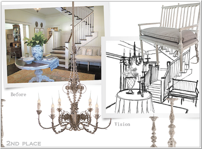
The front door opens to this wonderful, old world feel entry and stair hall. A large, welcoming foyer is, unfortunately, often missing in the newer houses of today. This space with its white moldings and dark brown hardwoods caught Randal’s eye.
He envisioned changing the room to look like this – with a skirted table, a chandelier, an AG bench, candlesticks and wire baskets.
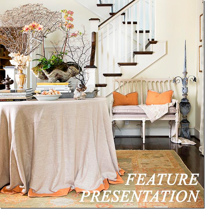
And here is the first advertisement from the 2nd Place winner! Using their rug, Randal brought in more orange through the pillows and the trim on the skirted table. He used his own bench – the Coyle Love Seat. The Coyle also comes in a larger size. Randal put a few of his accessories on the table. But, as you can see the plans for the chandelier were canceled as were the candlesticks. I can see where he didn’t have the room the chandelier. The clam shell came from the homeowner. I just love how this looks – I think it’s really pretty. While I like the way the foyer usually looks – I also like it here, with the AG furniture.
Off the entry hall is the living room and further down is the library which leads to the screened-in porch. The area open to the right of the sofa is the dining room – but the homeowner didn’t send any pictures of it with her entry.
The living room is filled with French styled furniture.
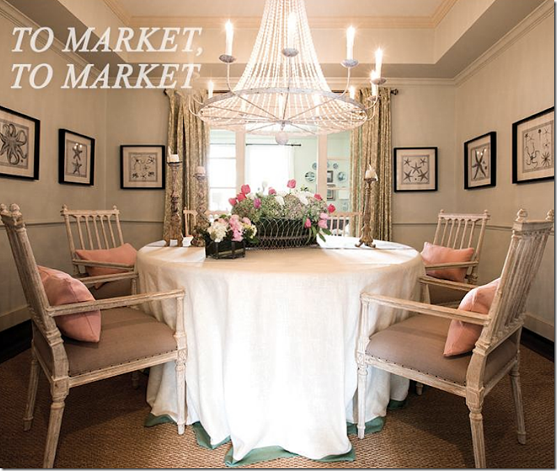
And here is the Aidan Gray promotional photograph of the dining room. He brought in another skirted table and added four Coyle dining room chairs with arms. Overhead, he hung the beaded Naples chandelier. On the table are Aidan Gray candlesticks and basket. I really like the Coyle family of seating. Again, I like what Randal did to the dining room- but I can’t compare it to what it normally looks like since we didn’t get a photograph of the room.
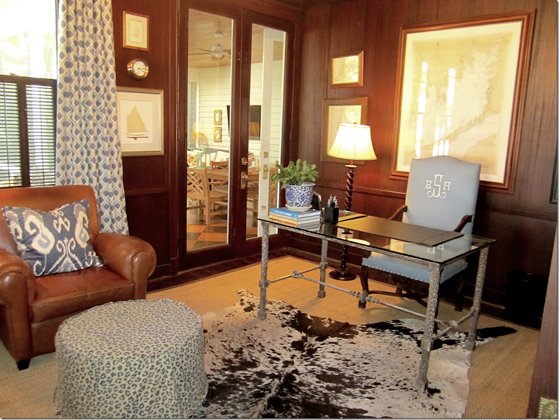
Next to the living room is the husband’s office that connects to the screened-in porch.
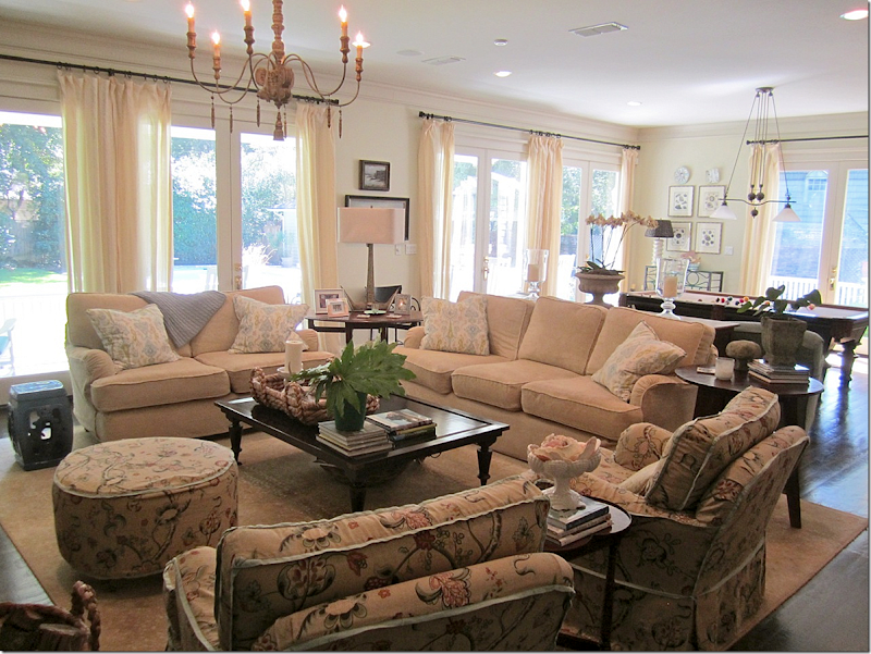
The porch leads back to the kitchen, breakfast area and family room.
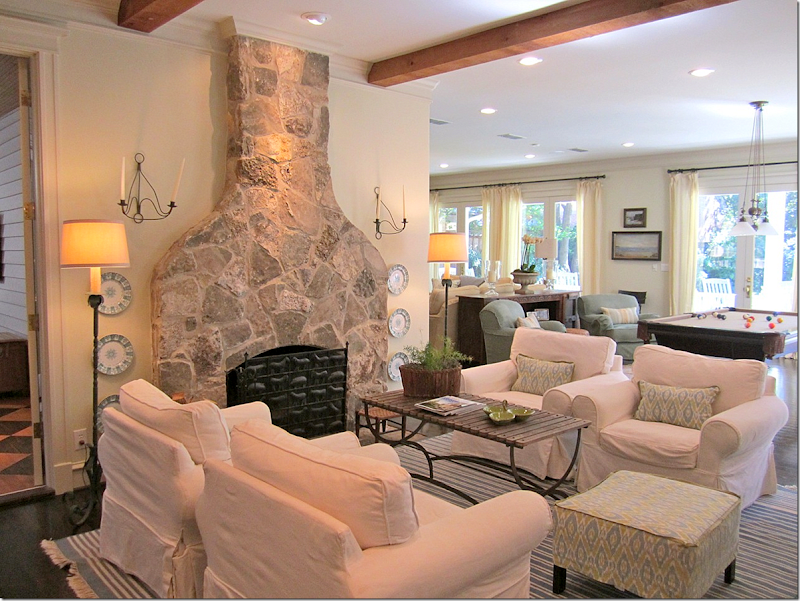
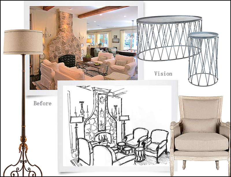
Through the screened-in porch is the keeping room which is right off the kitchen and family room. The space is filled with slipcovered furniture and a blue and white rug. This is another vignette that Randal wanted to photograph.
He planned to place four French bergeres around a trio of small tables. He also wanted to use sconces and floor lamps.
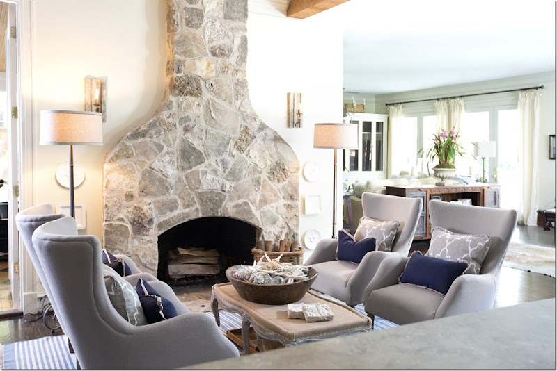
And here is how the room actually turned out – quite different than his original plan. Aidan Gray recently introduced a line of mid-century influenced seating and here, four of the new Olivier chairs in dark linen were used around the new Foley coffee table/bench. Love that bench! He used the Winchester floor lamps as planned, but a different set of sconces were placed on the wall.
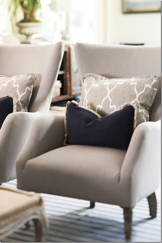
Close up of the new Olivier chairs and pillows. Be sure to check out the other new chairs in their catalogue.
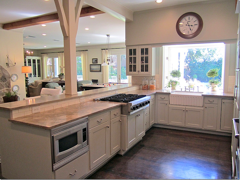
The kitchen overlooks over the keeping room and the family room.
Against the kitchen window, Randal took a few photographs using one of the AG2 lamps and a trio of their candlesticks.
The family room and pool table area over look the large back yard and swimming pool.
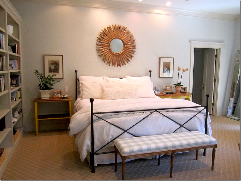
Upstairs the owner showed us her master bedroom suite – with its built in book cases.
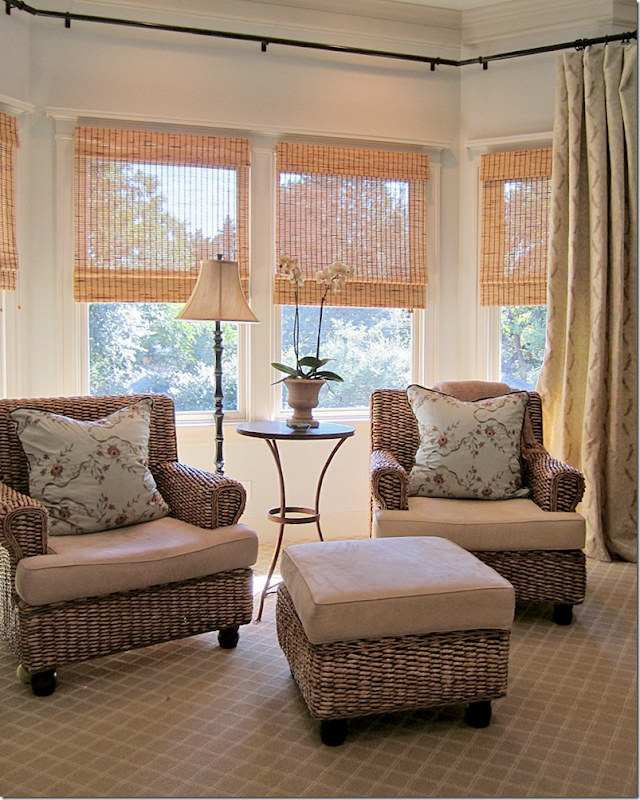
And a bay window with chairs and ottoman.
Randal planned to photograph the master bedroom using an Aidan Gray chest, lamp and bench – but plans changed.
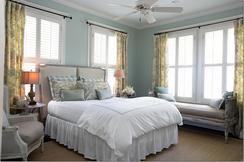
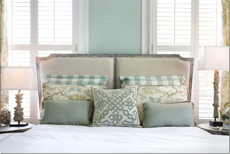
Instead, he photographed a bedroom that the owner didn’t submit in her application. This bedroom – probably a guest room – faces the front of the house. Randal brought in a collection of furniture and lamps to use here.
He used the beautiful Eames bench covered in hemp.
A close up of the linen covered headboard.
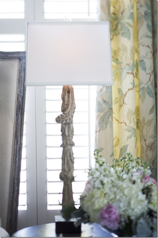
On one side – an Aidan Gray lamp.
And a different Aidan Gray lamp on the right side of the bed.
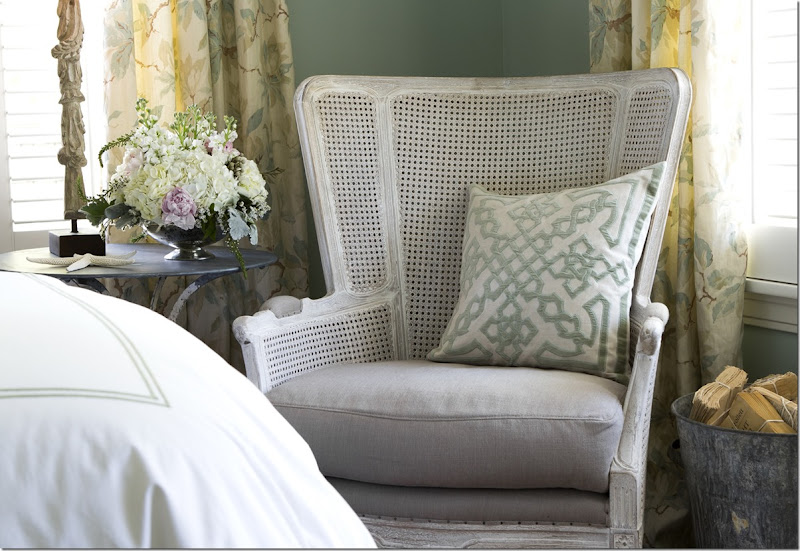
And he chose a large scaled cane bergere for next to the bed. Love this chair!
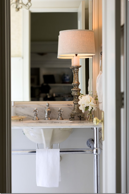
And in another unplanned photograph – an Aidan Gray lamp sits on a bathroom vanity.
And finally, upstairs is another room we didn’t see – a bedroom turned into a sitting area. Randal used the 4 bergeres that were supposed to be used in the keeping room – paired with the wire tables and garden buckets, mirror and sconces. Love those tables. The chandelier is also Aidan Gray. This photograph was used in another mass ad email.
In the end, in the 2nd Place house – some of Randal’s original plans were executed, while others were changed and tweaked – and some photographs, like the dining room and sitting room, were a total surprise!
To read the original story of this house winning 2nd place, go HERE.
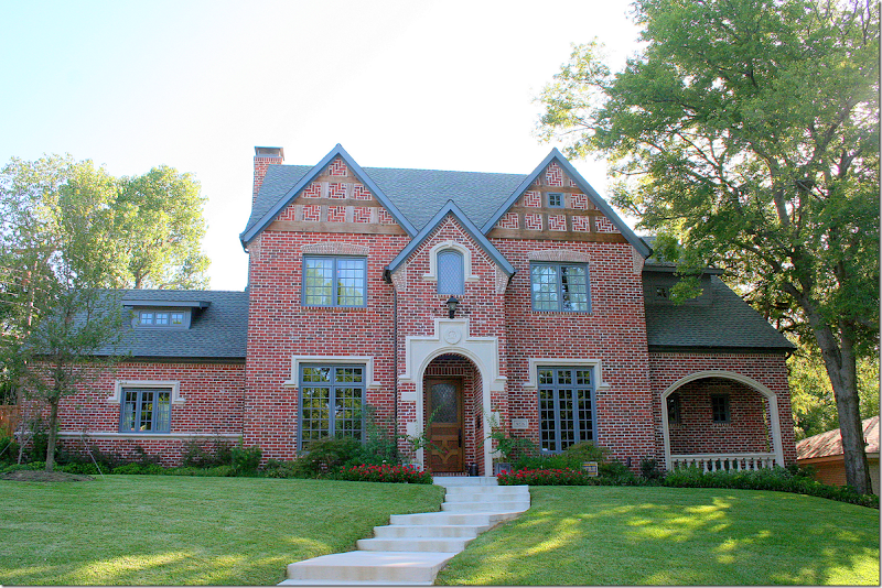
This Gothic Revival house located in Dallas’ Lake Highlands area near White Rock Lake was the 3rd place winner in the Aidan Gray contest. The house was built in 2010.
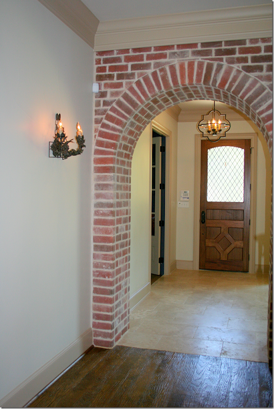
A leaded glass door opens unto the foyer that leads to the family room and kitchen which are located through the brick arch. Right off the front foyer is the blue paneled library and the dining room.
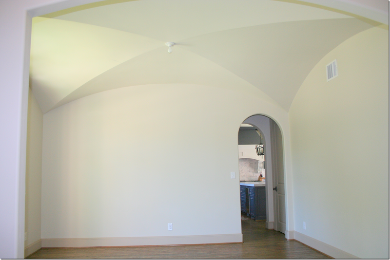
To the left of the foyer is the dining room with its pretty ceiling – through the arch is the kitchen. Now, as you can see the dining room is completely unfurnished, but this didn’t stop Randal from choosing this house for 3rd Place. Randal didn’t submit any plans to use this room, instead the plans he submitted were for the kitchen. But, this is where it gets really interesting!
When Randal came to tour the house, the homeowner, Tiffani McKenzie, explained that she had been an interior designer who had worked for a high-end firm until she got pregnant. Now she does interior design under her own name. Tiffani shared with Randal what her ideas for the dining room were – and one item was to glaze the walls – using Houstonian Leslie Sinclair’s firm – Segreto Finishes. Along with the glazed dining room, Tiffani also wanted Segreto to work on the beautiful cabinets in the family room. Randal quietly listened to her plans and then left.
The next day, Randal called her to tell her that Segreto would be painting her dining room and family room cabinets!!!!!!!!!!!!!! Talk about winning the LOTTO!!! Hey, Randal, I want my house glazed too!!! Tiffani was besides herself and couldn’t quite believe it. She said she felt like she was in a dream. I can only imagine! Segreto is the best of the best – bar none, and anyone lucky enough to be able to use them is truly blessed.
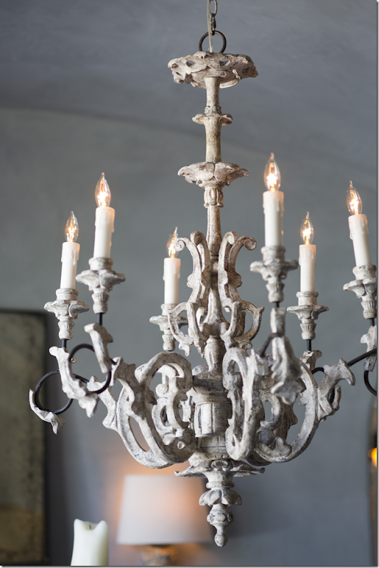
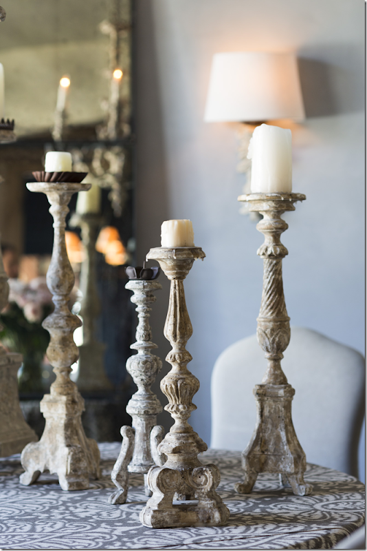
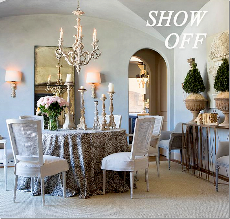
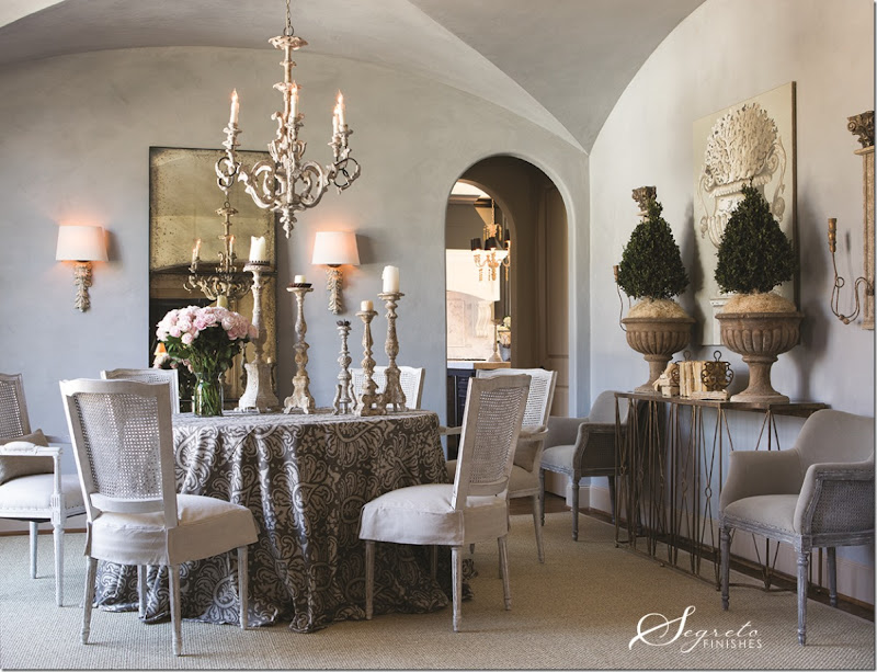
And here is how the once empty dining room now looks!!!! OMG!!! I love the gray glazed walls that Leslie did. Since there is so much blue in the house – the soft color makes perfect sense! Isn’t the color gorgeous? Randal used a skirted table and placed a collection of his chairs around the table along with a combination of Aidan Gray candlesticks. He included two Sue caned dining chairs around the beautiful Marlene console with its antiqued mirror. He used the Fragment Carved Leaf sconces, along with the new Ebby High French chandelier. Against the wall is the large, three sectioned antiqued mirror. Large gilt sconces flank the console and a seagrass rug anchors it all.
Wow. I am so happy for Tiffani and so grateful for Leslie of Segreto for doing this. What a dream come true!!!
Tiffani wrote me:
It has been so fun to collaborate with Randal on my dining room and see my design ideas come to life once he started layering it with his beautiful furniture and accessories and then to have Leslie's talented crew out to my house....I still feel like I'm dreaming. I can't say enough about Leslie's team and how professional and nice they all were. I worked closely with her head cabinet artist to come up with the finish of the cabinets in the great room and I couldn't be more pleased!! Everything feels much more balanced now.
The photo shoot was so fun and I am so grateful to you and Randal for running this contest. Randal has to be one of the nicest and most talented people I have ever met. I feel so honored that he would want to collaborate with me on my dining room! And as I'm sure you can understand to have someone as creative and talented as Randal tell me that he really loved and appreciated all the other design features I created in my house is huge for me personally and as a designer. I really can't wait for you and everyone else to see how all the photos turned out! Randal's new products are amazing!
Thanks Tiffani!
A close up of the new Ebby chandelier.
The tablescape.
A collection of Aidan Gray candlesticks – these are really great, I use them all the time.
A view of the beautiful sconces – the Corinthian Column Top Wall Candelabra. Love this vignette with the orchids in the wood like urns.
Close up of the Aidan Gray products used in the dining room.
And here is the final photograph that was sent out in a promotional email.
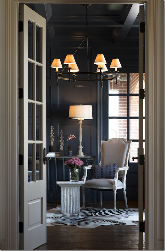
Off the foyer to the right is the blue painted paneled library that faces the front yard and leads to an arched porch.
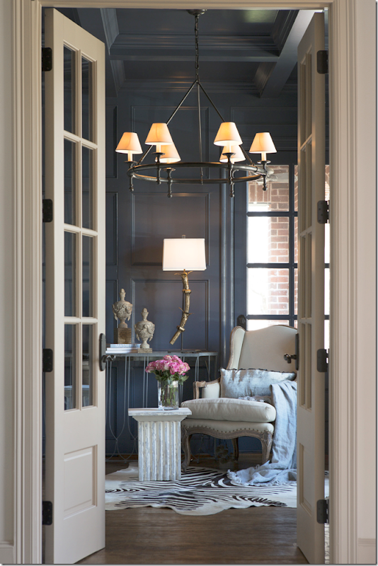
In the library, Randal set up a small vignette using his bergere and his column table – which comes in two sizes! These are much more price friendly than the RH ones. Against the wall is a console with AG finials and an Aidan Gray lamp. Surprisingly, the homeowner’s own chandelier was used in the picture!!
Here – a change out of the chair and the lamp and accessories. I think I like the first picture best. I really like that table!!! The Wishbone console has the antique mirror top.
Close up of the accessories on the console table in photo #2.
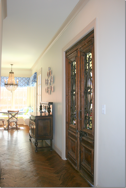
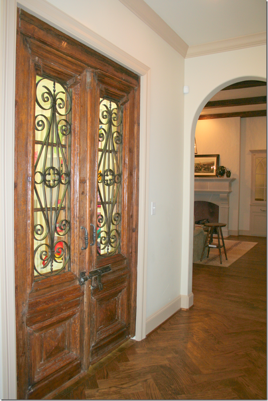
The entry leads to a hall that runs along the back of the house. Towards the left of the hall is the kitchen and the playroom which is behind the antique doors seen here.
And to the right of the hall is the family room seen here, which leads to the large covered porch and the master bedroom suite.
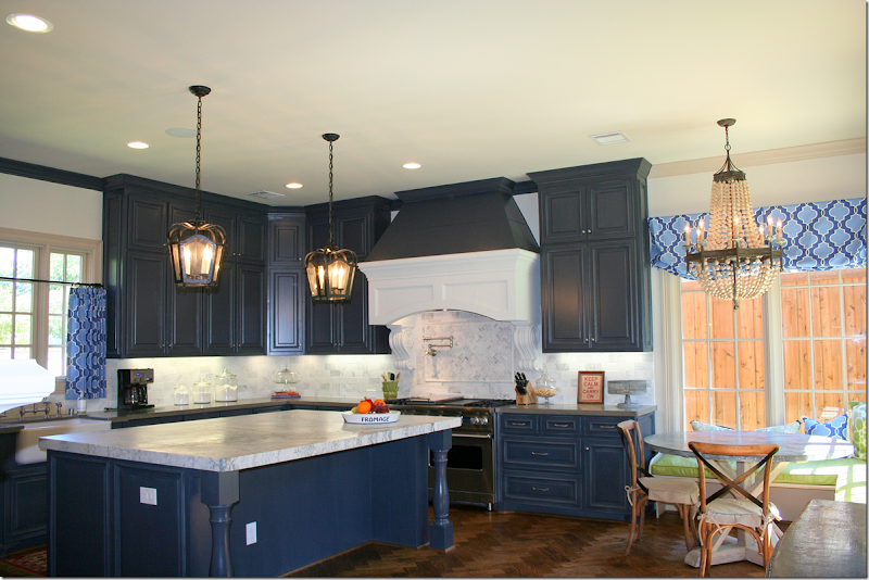
The kitchen and breakfast room are painted in the same dark blue as the library. The backsplash and island countertop is marble.
There is a small sitting area in the kitchen with a fireplace. Randal liked the kitchen and wanted to take pictures in here.

He proposed using two Aidan Gray chandeliers, along with barstools and accessories.
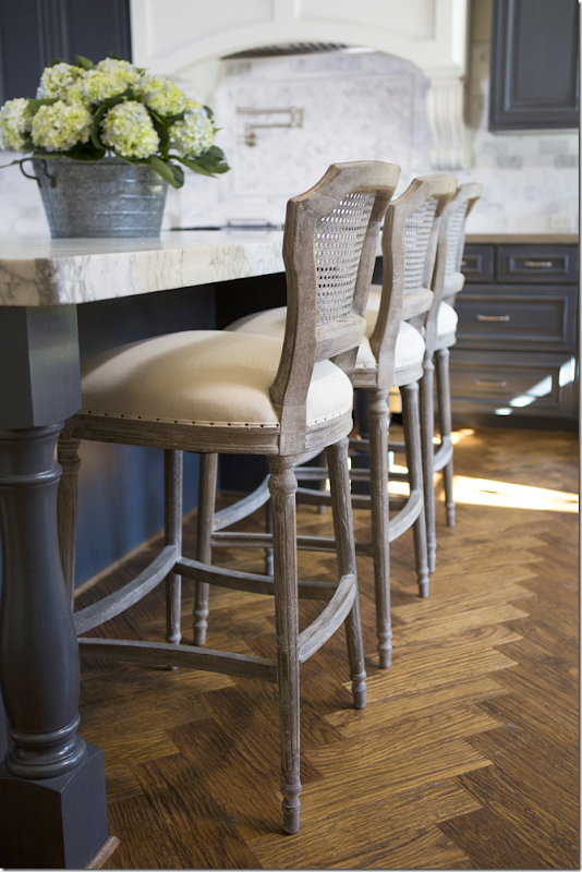
Here is how the final ad looks! A trio of Aidan Gray Chelsea barstools were used, as were a pair of gilt light Grenoble fixtures. Brass and navy are hot today, and I think if Tiffani ever updates – she could switch out the hardware in here to shiny brass. I love how the gilt looks against the dark walls. He also used his wire basket and candlesticks.
Close up of the Chelsea bar stools. Pretty hardwoods!
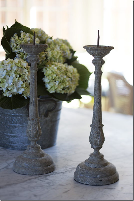
And close up of the Aidan Gray candlesticks.
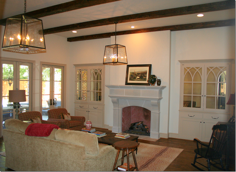
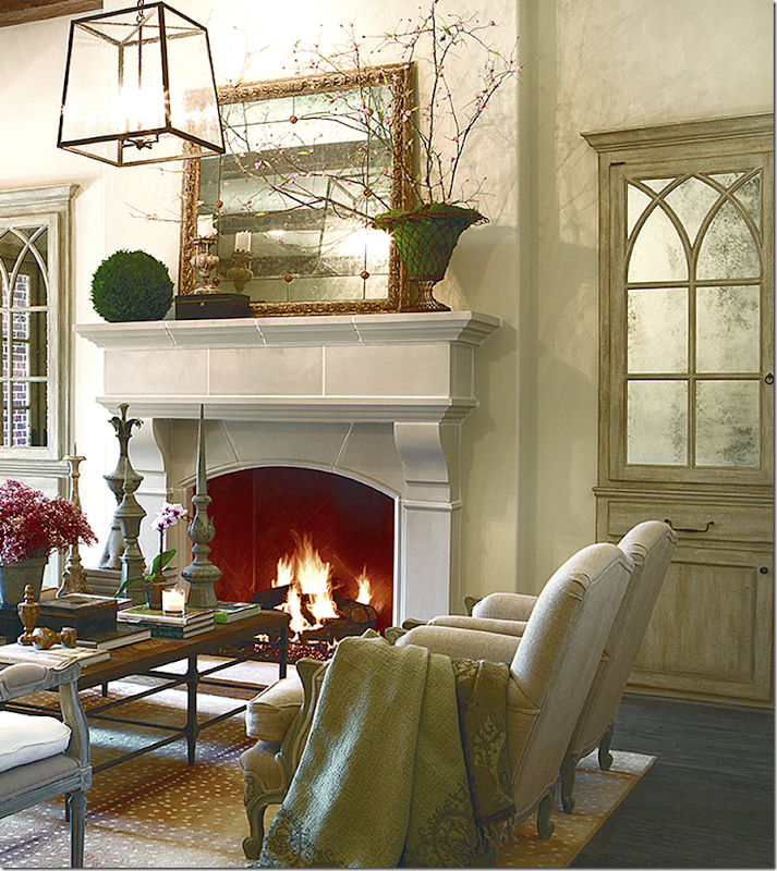
To the right of the front entry and back hall is the master bedroom suite and the family room – both rooms open up to the outdoor covered porch with dining area and seating area around a large fireplace. Two lanterns hang over the large room with its antelope rug. The two cabinets with their gothic inspired detailing have antiqued mirror glass in them. Tiffani says that the antiquing process was never strong enough – but she didn’t want to tear it apart to redo them. Additionally, she had always wanted Segreto Finishes to glaze the cabinets. Enter Randal Weeks. He asked Leslie Sinclair from Segreto to come to Dallas to do these cabinets and the dining room walls. While the cabinets were being glazed – Tiffani took out the mirrors and had them re-antiqued for a much more dense look, which she now loves. While Randal did not originally plan to photograph the family room – after seeing it, he decided to go ahead and do it, to beautiful results:
Here is the family room filled with Aidan Gray merchandise!!! Wow!!! I LOVE this!!! First, the room itself is beautiful with the beamed ceiling, French doors, stone fireplace and Gothic inspired mirrored cabinets. You can see where cabinets now have a glazed finish on them which gives them an aged appearance. Also, the heaver antiqued mirrors look so much better – what a great, permanent change for the homeowners! Randal kept her lantern – which surprised me – and he kept the antelope rug, which didn’t surprise me. They don’t carry rugs at AG right now. In the middle of the room, he used the homeowner’s coffee table – another surprise that he didn’t use the opportunity to showcase one of their own tables. Next he placed the Liam bench in front of the fireplace – I love this look – he put four Paris Salon chairs around the coffee table. He accessorized the coffee table with various decorative items from AG. On the mantel he placed more accessories and the Aidan Gray gold Bilzen mirror. This mirror is exceptionally pretty. It also comes in a gray finish, but I’m partial to this finish below:
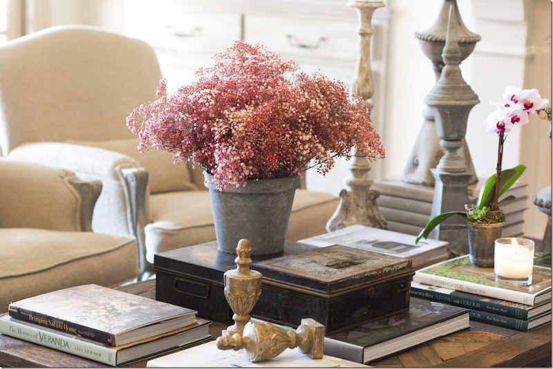
Close up of coffee table – I have those two gilt Jeanette Alter finials and they look great in bookshelves and on tables.
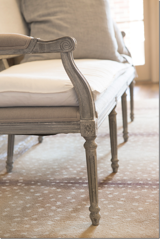
Close up of the Liam bench.
Close up of the newly glazed cabinets with the antique mirrored glass.
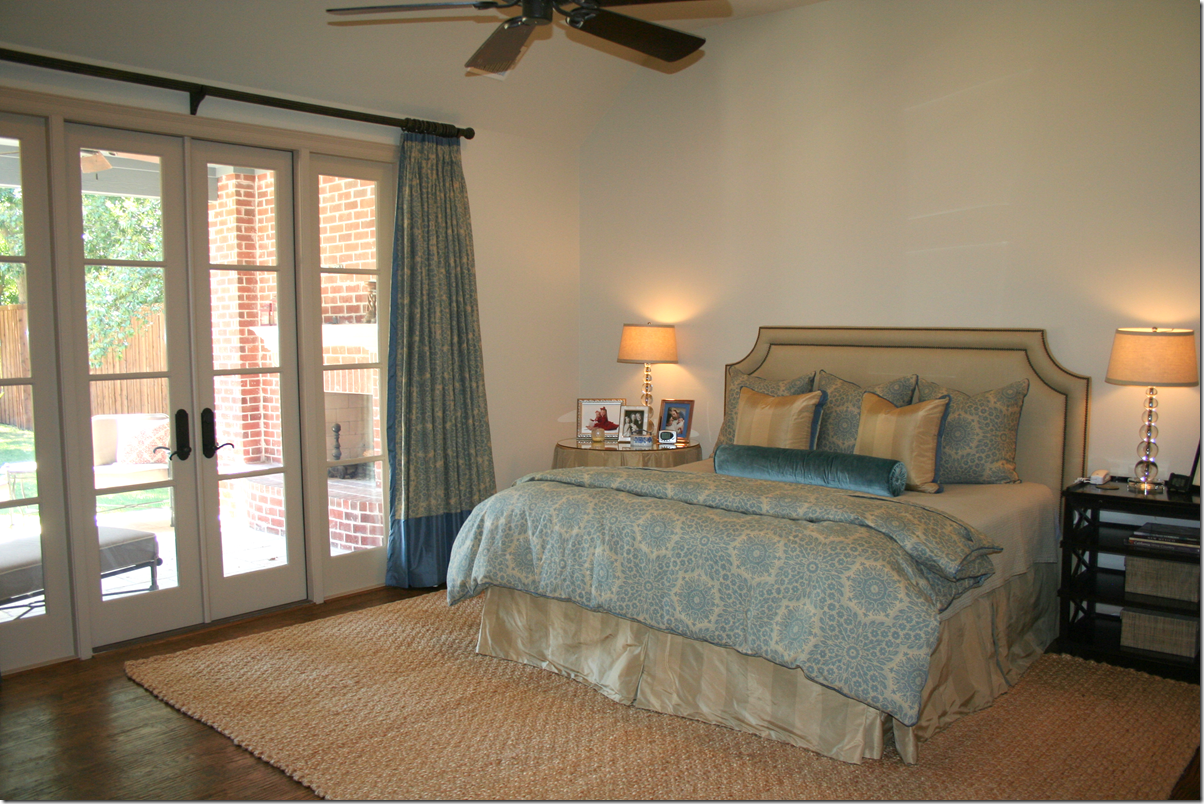
And here is the master suite in the taupes and blues that run throughout the house.
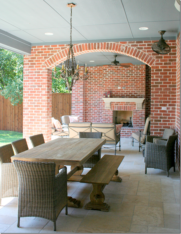
And the back porch that runs along the family room and the master bedroom.
And, though only the kitchen was planned to be shot – Aidan Gray also photographed the dining room, library, and the family room for their new catalogue. Still, whatever happened to the house that won 1st Place? Or the three runner-up houses?
To read the original story about the 3rd Place winner, go HERE.
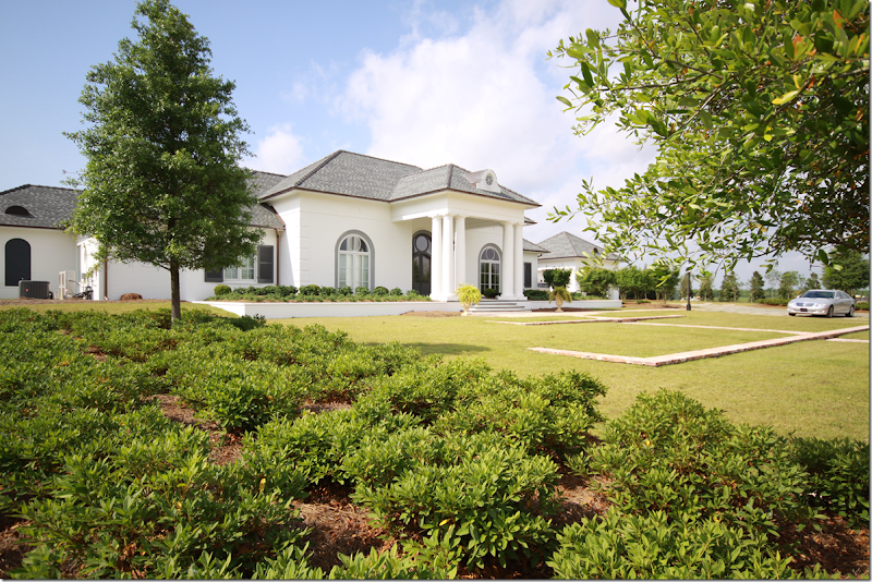
The house that won First Place is located in Louisiana – newly built, the homeowners were still in the middle of decorating the large house when they entered the contest.
Here’s the original story of the 1st place winner. HERE.

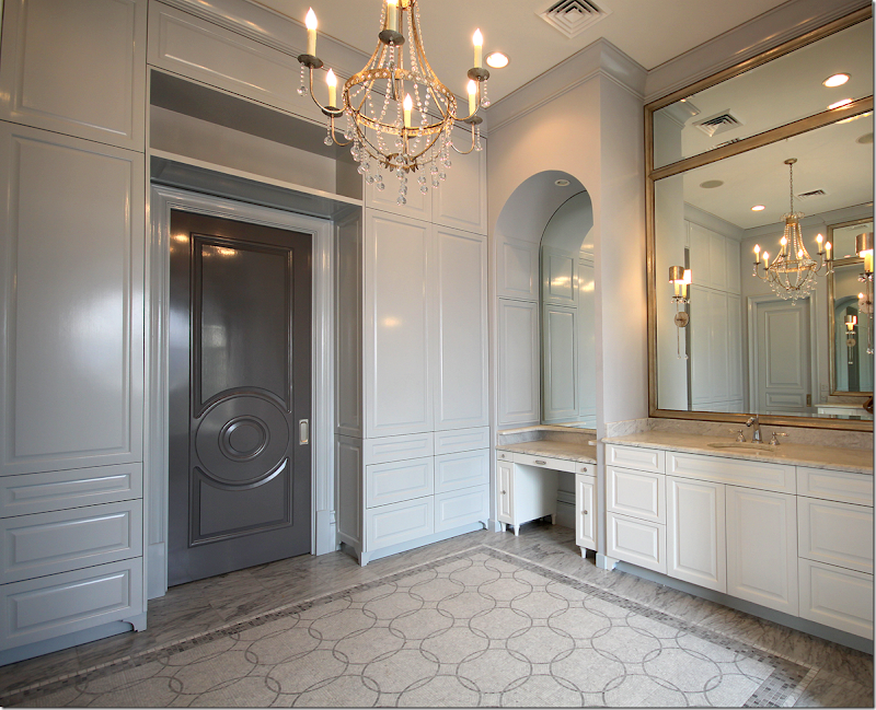
And he wants to set up the master bathroom like a salon.
Since the house is in Louisiana, logistics for photographing there are a bit harder than in Dallas. Plus, there are 2 houses in Houston and one in Austin that were runners up that haven’t been photographed yet either.
It’s possible that he will try to get to these houses before the year is up, but if not - there is always next year!
Randal, a huge thank you for sharing your catalogue process with us! This has been so great! I think everyone has truly enjoyed this from start to finish!!!


















Hadn't thought of White Rock Lake in a zillion years. Many stories there from my college days at SMU !! Looking forward to seeing campus again with the new Bush Library.
ReplyDeletePorch with major views of fence backside. Really?
Puppet Barbuda is not amused at the disrespect exterior design receives.
Fun concept AG created.
Garden & Be Well, XO Tara
We can't all have such a gorgeous backyard and conservatory like yours! Jealous!
DeleteActually we left the back untouched on purpose because we knew we wanted to build a pool and guest house in the future. We just finished building the swimming pool this week and the outdoor kitchen along with the pool/guest house is scheduled to be finished by August!
DeleteTiffani, please post pictures of your pool and outdoor kitchen. You have a beautiful house and love, love, love your dining room! :)
DeleteOMG Tiffani your house is so gorgeous and if that is you with your baby then you my dear are gorgeous too!!!!
DeleteDid someone put a quarter in the jukebox and as for Nitwit Rising or is that just Tara singing from one of her old 78 rpms?
Delete"Puppet Barbuda is not amused at the disrespect exterior design receives."
DeleteMore accurately read as "the bubba gump" is not amused at the disrespect exterior design receives. Just consider Tara the Paula
Deen version of landscape design - a lot of cackling nonsense with a quarter cup of wisdom thrown in occasionally with a teaspoon of sugar to make the stupidity go down.
Hi Joni:
ReplyDeleteLove the color of the walls in Tiffani's dining room that Leslie at Segreto painted--- Do you suppose you could get the color of paint that she used for these walls--- that is if she did not make a custom mix. I would like to use the lighter first under coat that she used.
Thanks
Susan
Susan it was a custom mix with plaster. There was no under coat. Sorry!
DeleteAbsolutely beautiful! All the Aidan Gray furniture and accessories look like they have always been there....in a fresh way, of course! The dining room with the glazed walls by Leslie should be on a magazine cover. I want that wall treatment!! And all the furniture :) x Loi
ReplyDeleteAbsolutely lovely Joni.....What a beautiful transformation!
ReplyDeleteThis really made a difference, the furnishings were the icing on the cake. I would say that in this instance let them eat al the cake!
Lovely and so fresh and soft to the eye.
-LR
Thank you for sharing! Both homes are beautiful, but I particularly love the house in Highland Park. Everything about it is beautiful. I live in neighboring University Park and I think I've driven by the HP house. How lucky for both families!!!!
ReplyDeleteYou do such a great job setting up the "before" and then revealing the "after"! I gasped and my jaw literally dropped with the dining room transformation and then again with the family room. Oh my goodness! So much fun to read your blog and be inspired.
ReplyDeleteWow this is amazing. So many gorgeous rooms..his furnishings are spectacular and timelessly elegant without feeling too stuffy. Love them all...fabulous!
ReplyDeleteJoni, these rooms are so beautiful, I have fallen in love with gray all over again- and the gray glaze by Leslie and Segreto is absolutely stunning- I will be rereading this post many times!!
ReplyDeleteThese homes were GORGEOUS to begin with... then they were taken to a new level. Your readers have impeccable taste and homes for sure. No wonder they read CDT.
ReplyDeleteWhy can't Aidan Gray open a store in Australia. It is interesting to see how these photographic shoots pan out. My favourite is the living room with the antelope rug.
ReplyDeleteWHO MAKES THIS RUG PLEASE?
DeleteLovely. What do you think the floral drapery (and pillow?) fabric is in the first house bedroom? So pretty.
ReplyDeleteThe fabric looks a lot like a floral I purchased from Calico Corners a few years ago. I think it came from Laura Ashley (or Ralph Lauren?), but I can't find it on Calico's website. Perhaps it can still be found in the store.
DeleteWoW WoW WoW, Love it! Tiffani's dining room is the bomb! Both houses were beautiful to begin with. I would love to know the color blue used in Tiffani's library. That antelope rug has been on my design bucket list forever, I think I want my entire house done in Aiden Gray! The first house is so charming and welcoming and I love the bedroom textiles. So interesting to see how the Oushak? set the tone, the foyer was lovely with its blue and white but that pop of orange gave it an edge. Thank you so much Joni for this great post, Aiden Gray for the contest and thank you ladies for sharing your homes! Happy weekend everyone.
ReplyDeletethey have tons of things that aren't like what you said - did you check out the chandeliers? the new chairs? the iron/mirror consoles and tables? AG changes their merchandise a lot. take a look at the new things.
DeleteJoni I loved the houses and the AG products used, especially the lamp featured in the first photo of the study, do you have the name of it, for some reason I can't find it on the website. I know Tiffani's dining room was a blank canvas but other than that each room built upon what the homeowners already had which is great and genius marketing, Loi summed it up, it didn't look staged, it looked natural and established. Thanks again.
DeleteJoni, I hope you confused with another anon, I am anon 6/22 1012 and 6/23 1028, I love everything AG and I love these houses, if I came across negatively I am sorry it was not my intent. Sarah
DeleteCool design !
ReplyDeleteThis was so fun to see!!! All houses are so beautiful. I was so honored to be asked to help with Tiffani's home! She was so sweet and gracious!! I think the wonderful Aidan Gray furnishings really made my work look amazing! Thank you Joni, Randal and Tiffani!! xo Leslie
ReplyDeleteLeslie, your work is ahhhmazing! I have had one of your chests pinned on my furniture board for ages. I dream one day of having it in my home. Best, Beth C.
DeleteHow awesome is that brick arch?!! Now I want one... some day... sigh...
ReplyDeleteJoni,
ReplyDeleteI wondered if you were aware that many of your pictures do not load onto an iPad? So frustrating as I want to see everything! The Apple store told me that it is the type of file that is uploaded. Hope there is some way you could solve this problem!
Thanks,
Nanch
I read from an iPad and all of the pics load for me!
DeleteM
All of the pics also load onto my iPad. At first I had a lot of difficulties, and then one day it all worked. I don't know what happened in the interim (someone in my family changed something? -- clearly I'm no tech wizard), but try someone else at Apple. It should be able to be done.
Deletemine load too
DeleteTiffani's dining room and the work Leslie did on the walls and on the cabinets in the family room are gorgeous. I love the way AG outfitted it. All the rooms are now layered to perfection. I didn't like the dark blue walls in the library at first until AG softened it with the first group of furniture and accessories. There is so much to learn by studying these photos. Thanks, Joni.
ReplyDeleteBest...Victoria
This is better than ANY design course...the colors, balance, etc. Kudos to your coverage! franki
ReplyDeleteAbsolutely beautiful post Joni! I always enjoy your post!
ReplyDeleteUgg. I feel like a shrew here. The homes are BEAUTIFUL, but I honestly think this "look" is getting overdone? Love it, and have used some of these ideas and textiles in our own home, but now worry that it is getting tired? We are working on a remodel at a second home and I'm not sure I would lean in this direction anymore as I fear it's becoming "cliche" and dated. Not to anger the masses, just my concern that it has become predictable after a decade of the same aesthetic. The same chandelier, the same candlesticks, the same grey wash finish and it is now a popular knock-off in the discount home goods stores. What is next and new? I rode the "French"/burlap/Belgian linen/RH train. Now what? We aren't in France.
ReplyDeleteBecky.
Becky I know what you mean, I never quite embraced the gray and gray wash, probably because I exhausted the shabby chic look and now have bins of barkcloth and lots of white chippy things hogging up the garage and basement. What I love about Tiffani's family room is the mirror in gold, Randall kept her rug and used that throw. To me, it isn't overdone. Ditto on the 1st homes foyer. I think Tiffani's dining room is a great space and with Segreto's touch it took it to that WoW factor, the groin vault (?) ceiling is a feature I really admire, I wouldn't necessarily pick the same furnishings for myself but his choices are divine for the space. I love her blue library and am partial to the 1st photo. I only found the 1st home's living room predictable, these "models" each contain an element of individuality.
DeleteBravo, finally someone said it! The look is getting over worked because of design blogs and the sheeple that define their taste from reading them. It's time for AG to refresh their look. There is not much difference between them and Restoration Hardware. Please redesign those hideous sconces and chandeliers with the neck breaking arms and the dangling junk made from composite material that is so distracting. Hire some first class designers/artisans and refresh the look, PLEASE!!!
DeleteI have to disagree, design blogs are educational, especially Joni's. Like I said, I am a "sheeple" and have crap residing in my garage and basement to prove it, but since I have been reading design blogs I have learned to repurpose and refresh instead of trying to recreate something from the pages of a magazine. I didn't mean to be critical of the 1st home's living room, it was like looking at my own home: secretary, ghost chair, sisal(?) rug, zebra, garden stool, clam shell, french furniture....check check check....What I love about this post is Randal added his products but also used alot of the homeowner's existing things retaining the individuality of the homes and their occupants. If it wasn't for Joni and design blogs then we wouldn't have seen the before and afters and had a tutorial. AG is not RH and I think this post proves they are first class. Randal didn't walk into these homes and move everything out and install an AG storefront, he enhanced and as Tiffani said "layered" and helped her fulfill HER vision. I would love to know if they got to keep the products and if so, did they keep everything, for instance, as much as I loved Tiffani's family room, the Liam bench wouldn't work since we like to jump and sleep on our family room sofa but he would have to pry that mirror and those accessories out of me.
DeleteI just cannot say enough about the Master of Aiden Gray work his magic.
ReplyDeleteThe fact that he enlisted the best of the best; Leslie Sinclair of Segreto Finishes does not surprise me!
The Dining room Glazing is phenomenal. Working with Tiffani and her own furnishings really pleases me.
Thanks Joni for an incredible feature.Ii would love Carte Blanche to go on an accessory spree at AG!
xoxo
Karena
Art by Karena
NOVICA Giveaway!
I agree with Becky in the most respectful way. I absolutely love this look and drool over every CdT blogpost but as she mentioned, I worry that 10 years from now, my house will scream 'dated'. With college tuitions looming in a few years and caring for elderly parents, the budget to redo the interiors at will simply isn't and won't be there. I try to pick pieces that I hope will be classic and timeless, and then my heart sinks when I see them reproduced everywhere, which to my way of thinking makes them "trendy". Any input that anyone, particularly Joni, can offer would be so appreciated! And, the houses in today's post are just breathtaking...
ReplyDeleteI hear you about the upcoming expenses which have the potential to be or at least feel infinite. I think about this a lot as we have just moved and I have unfinished spaces...my father-in-law lives with us, and he is a throw-money-at-a-problem Texan, while I want to take my time and think carefully though what I want and will CONTINUE to want in my home for the three generations of us who live here.
Deletedesign trends change every ten years or so and you just can't change that fact. i have noticed this though - houses that are decorated w/antique furniture, repo or period can look timeless. i did a story once about timeless design. http://cotedetexas.blogspot.com/2010/09/top-ten-design-elements.html please read this - i think it will answer your question for you.
DeleteThis comment has been removed by the author.
DeleteWhat a fun experience!!! I wonder if any of the homeowners bought any of the furnishings?
ReplyDeleteWow wow wow! is right! I always say this, but without Joni's detailed descriptions I would not be able to see a single thing in these pictures. My eyes just wash over it. I am beyond impressed with Tiffani's vision for her house. With a house that lovely it would be easy to just settle in, but instead she has what are clearly grand visions. And then to know *exactly* who you want to do a sophisticated glazing project, and have that person be the top top top of the line craftsman. I am beyond impressed. And I too gasp aloud when I saw the dining room. Perfection! I have to admit I did not really get this glazing craze until today. I am so glad to see walls and cabinets juxtaposed. Leslie, can you tell me a little about this process? I always thought it was some kind of antiquing/distressing process using a paint like chalk paint. I knew it had a sophisticated look but I didn't really get how complicated and polished (or "finished" or "done") it was. Where does this look come from? How did you master the technique? And while I am asking how about a guest-post-as-a-master-class? I am now so curious about it! Lovely job ladies, all of you!
ReplyDeletei'm sure thre are tutorials on the internet if you google it. i will say that leslie's crews are incredible. the prettiest walls in the world. bar none. and her plaster walls are to die for.
DeleteHow fun! Do the homeowners get to keep the furnishings?
ReplyDeleteAbsolutely loved the peach foyer and the vaulted dining room photos. Top of the class styling. One thought I had while perusing the photos is that the Aiden Gray line looks so much better with dramatic architecture. The first house is an ordinary/classic home -- lovely, comfortable, but not particularly architecturally special. The AG furniture in situ looks nice, but nothing to rush out for (I know the peach photo comes from this house, but it is so cropped that it could be anywhere). When the AG is placed against a more dramatic backdrop (vaulted ceilings, large rooms with very high ceilings, top-of-the-line kitchen, dark-glazed library), the furniture looks outstanding. I'd describe the difference as "striking upmarket" vs. "Ballard cozy". I was kind of surprised, as it's the same furniture. This is not a critique of either home, as both are absolutely lovely in their own ways. However, I think in the future AG might want to photograph its furniture in dramatic settings as it really suits their pieces. Then we can all rush out, buy, and install it in our (sadly) more ordinary interiors.
ReplyDeleteHi Joni,
ReplyDeleteI have a design question. I noticed in the living room of the first home (2nd place), you enter the LR with the back of the sofa facing you. I wanted to place my sofa with it's back to the LR entry and someone said to me that it says, "STOP, don't enter." She said it doesn't invite you into the room. I would love to know your thoughts on that.
Thank you,
Jan
that's a feng shui principle - i don't adhere to it at all, but it you place a console table behind a sofa like that with two lamps - it will make it much more inviting. it's not the BEST way to do furniture probably, and it can close off a room - which might be a plus if you have a huge cavernous room.
DeleteI remember you posting all the entries then the winners. Nothing that was done was less than spectacular! AMAZING transformations and they really know their look when they chose those houses! Thanks so much for sharing, I will come back a few times to see again and spend more time admiring the details!
ReplyDeleteMakes me want to visit the houses and actually walk through the spaces! Virtual tours would be the only thing to improve those incredible photos!
Where could a person find those wonderful sconces on Tiffani's dining room walls? I just love them. I love that style chandelier also. Are they Italian? The more I see that style the more I love it. Could you let me know via email? jhernstedt@charter.net
ReplyDeleteThank you, thank you! Julia
- from aidan gray of course! i just realized i didn't give out their web site: www.aidangrayhome.com
Deletethanks, Joni! Love your blog!
ReplyDeleteNo words for Joni!! I so enjoyed this post! The houses look all stunning with the Aidan Gray furniture!
ReplyDeleteThank you for sharing all these pictures!
xx
Greet
LOVED this Joni... I wish he would come to France and give me a makeover!
ReplyDeleteWonderful post and so many fabulous ideas... xv
Simply spectacular design and finishes. So inspiring. Thank you for yet another fabulous post, Joni. This one takes my breath away!
ReplyDeleteI love your in depth reporting but that is definitely not an Eames bench.
ReplyDeleteEverything is so beautiful Joni. Randell did an amazing job of recreating the spaces. Just one thing...Randell I would love to have my dining room glazed too....;) Randell has given me some wonderful ideas, get rid of to many sofas and go with the chairs, love that look. Ok I'm off to go shopping....I wonderful if Randell could deliver and help me place the items?
ReplyDeleteXXX
Debra~
wow! E
ReplyDeleteWhat a really fun post! I love seeing the "before" and "after" photos. We have finally find a new home and my mind is racing with ideas after seeing all of the beautiful homes. Thanks so much for the inspiration.
ReplyDeleteIt truly is ALL beautiful....Although I have to say in my opinion the first house...which was the 3rd place winner...I actually loved the way she had it decorated better than the after...I think he is awesome and did an amazing job, but to me It was just perfect in the before pictures..I think it is because I really didn't think the skirted entry table did it justice..I loved it better the way she had it...The next house was an awesome AFTER....Sometimes I find myself really liking the befores better than the afters in remakes...He does have wonderful items and I love everyone of his candlsticks, which I have a weakness for...Wonderfu; work
ReplyDeleteJoni - wonderful post! Do you know where the beautiful tableskirt fabric is from in the dining room? just beautiful!!
ReplyDeleteWhat a fun post! Loved the homes, both before, and after. What lucky homeowners to have such lovely homes. I would love to hear from the homeowners as to whether they are inspired to keep some of the changes, especially the dining room in Tiffani's house, since it was a blank slate, would you consider keeping the AG pieces? Congratulations to all! Cant wait to see the winning home! Best, Beth C.
ReplyDeleteWhat an amazing post! I just love seeing all of the amazing details and finishes! It feels like I am actually there! What an amazing opportunity these homeowners were given! So jealous!!!! As always Joni, you never disappoint! Love you!
ReplyDeleteThis is not much different than the last post about the great Restoration Hardware Move In. The only difference here is that the owners actually entered a contest and won these pieces. I will credit AG for using the pieces so selected in a lovely way and for not designing their furniture for the occasional giant that wants to take a seat or a piece of furniture that can be repurposed for an indoor jungle gym. It all turned out great for the homeowners. I know they are pleased with the result. Fortunately, none of these pieces require an indoor crane to lift one out of a seated position as do some of the RH sofas.
ReplyDeletehello this is blog very usefull for me, cause i have blog like this niche
ReplyDeleteso if you wanna be please visit my site
your product is very good for wedding gift.
ReplyDeleteBeautiful homes, Joni, the befores as well as the afters. The Aiden Gray furniture is gorgeous, but I have to say that the befores often did look more "comfortable", if not more stylish. You do such beautiful in-depth posts, so glad I saw this one.
ReplyDeleteHugs, Cindy
Seriously Joni, not until you started the ridiculous profile/letter id stuff did we have the intrusion of the "far east' nut wings into you blog. I think they have defeated your original purpose of eliminating spam. Perhaps you need to regroup.
ReplyDeleteAwesome post! about portfolio of wonderful designing services that attracts the consumer's attention. We provide superior custom apparel & uniforms, fulfillment services, employee recognition, consumer promotions etc in Dallas, TX at affordable cost.promotional products Dallas
ReplyDelete