A short while ago, a Houston interior designer and blogger Amanda Carol of Amanda Carol At Home contacted me about a job she is currently working on. It’s not yet totally finished, but she wanted to share pictures of what she has accomplished so far. The house is located in The Woodlands, a verdant suburb north of town. Amanda lives there too and it is where she started designing just a few years ago. I really love what she has done with the house – a pretty two story newer construction with an open floor plan. Before, the house was painted a dark and dreary taupe - and now it is very bright and stylish and sophisticated! See if you agree!
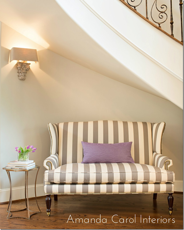
The newly redone rooms start at the entry hall. Amanda chose this wonderful striped settee to sit under a beautiful curved staircase. Above, is a sconce from Aidan Gray. I just used these myself and I love them! It looks especially good here, I think. A small gold table and lilac pillow provide the accents. The walls in the house were a dark taupe and the first thing Amanda did was repaint downstairs and upstairs in the lighter Benjamin Moore Revere Pewter. This paint is a gray that color expert Maria Killam recommends.
Photographs by Laurie Perez - she is really talented, btw. I first saw the work she did for Sally Wheat.
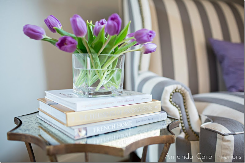
The top of the table is an antiqued mirror. Amanda accessorized it with books and flowers. You could also use antique books here.
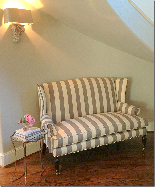
And a second view of the entry hall.
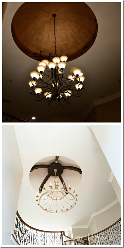
Also in the entry, up above is a dome that was faux painted copper with vines along the edge. In the before picture you can see the dark color the house was painted before. Amanda painted out the faux copper and installed beams in the dome, along with a new brass chandelier replacing the builder grade one that was there before. Huge change for the better!
And a shot of the entry hall ceiling.
A close up of the chandelier. All the lighting fixtures came from Curry and Co.
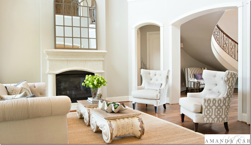
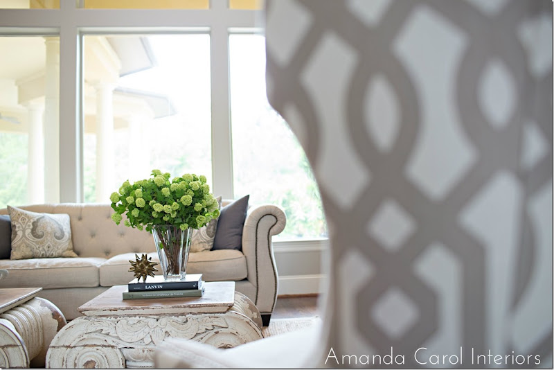
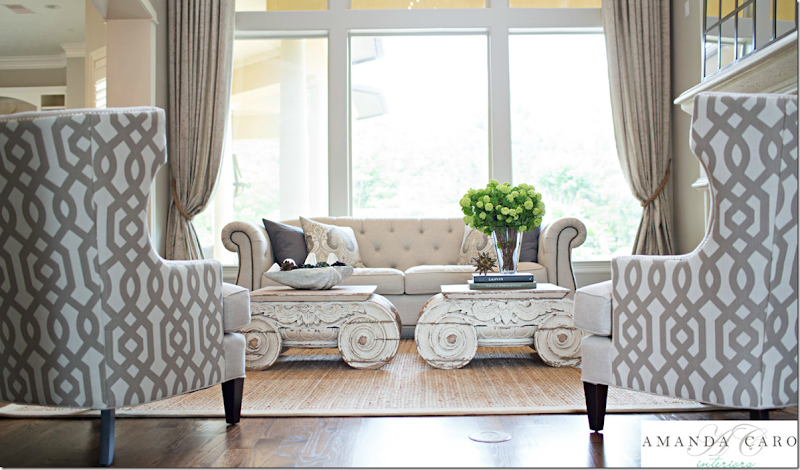
The living room is done in soft linens – with a trellis pattern on the chairs. My favorite part is the capital coffee tables from Restoration Hardware – those are soooo fabulous!!!! Especially the two of them together – love those! Soft curtains frame the view.
And looking the other direction toward the entry hall. You can see busier patterned fabric is on the back of the chairs only, which is a great idea. It gives a bit of pattern without being too much. The room has a high ceiling – so the mirror is extra large, which is good proportionally.
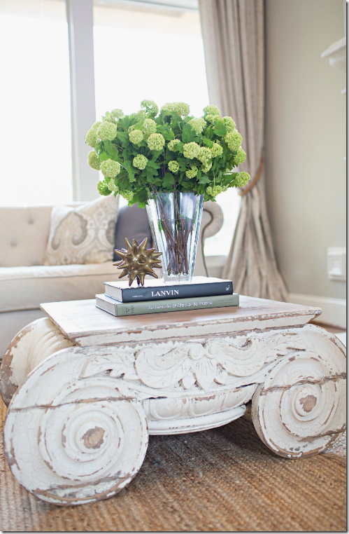
Close up of one of the tables. This reminds me of the antique capitals in the townhouse that Ginger Barber designed.
In this photograph from Ginger’s client’s living room – she used two antique capitals. Finding capitals that are the right size and the right price can be really hard – so it makes the Restoration Hardware tables a great alternative. Except of course, the RH tables aren’t cheap! And two of them….oy!!! It would be worth it to find them on sale if you need two. But they are fabulous. This is first time I’ve seen them used in a house, I’d love to “borrow” the idea!!
Tufted linen sofa with nailheads and gray and paisley print pillows.
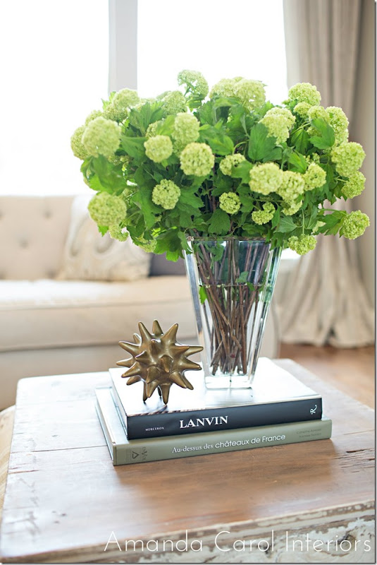
Accessories are kept to a minimum which keeps the house from looking cluttered.
On the other table a large clam shell filled with succulents and moss.
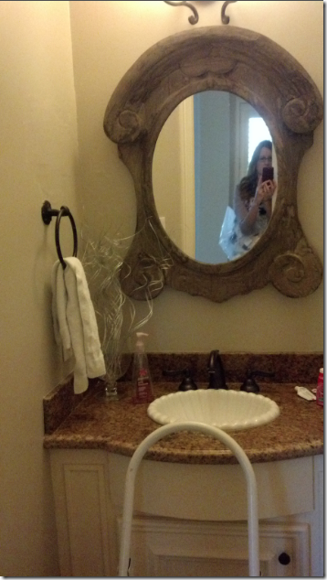
Before picture of the powder room – typical builder grade selections. That dark granite looks dated all of all sudden.
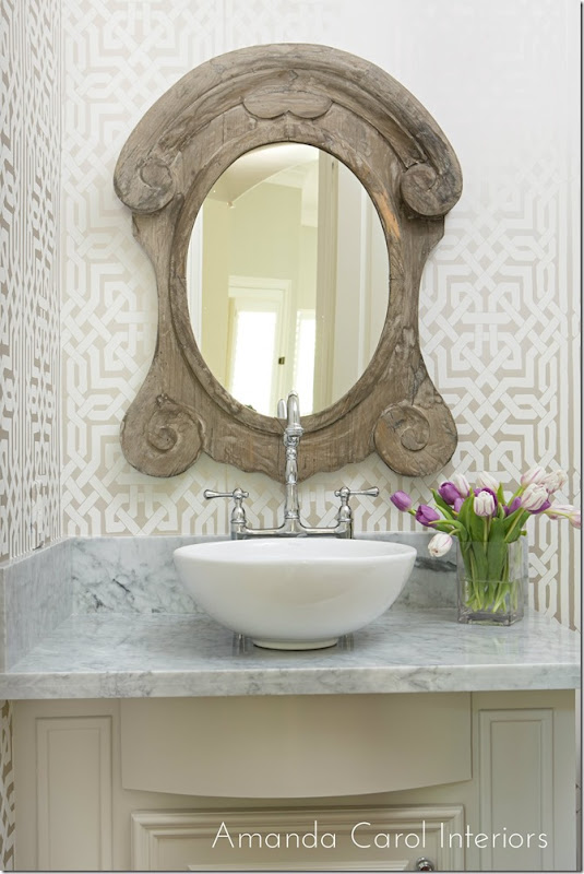
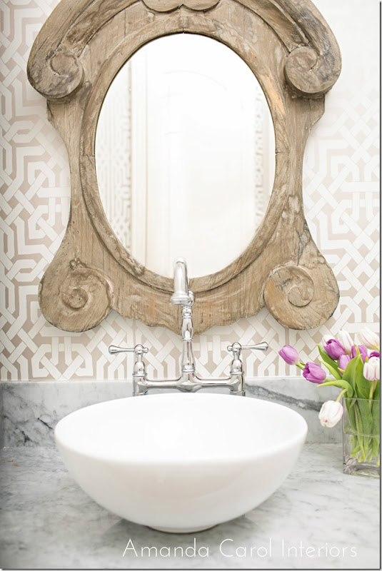
Amanda chose a Schumacher trellis patterned wallpaper – which links the space to the living room. The granite is replaced with marble and the sink is also replaced with a fab faucet.
French window styled mirror.
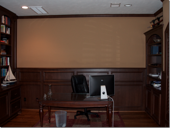
A before shot of the study with the dark taupe walls that the entire house was painted in. So dreary!
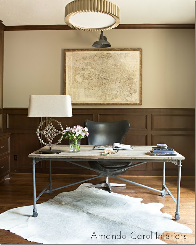
Today, the room is alive and eclectic with a mix of contemporary and stylish furniture. A great industrial styled desk and chair sit atop a cowhide rug. The antique styled map is a good counterpoint to the modern feel of the room. The paint on the wall makes all the difference. I really like the light fixtures – especially the one over the map.
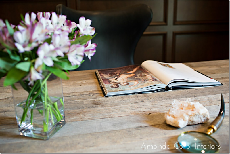
Desk top accessories.
Before – the dining room is the same dark taupe found throughout. Here, the only item that remained is the wood table. The large mirror moved to over the living room fireplace.
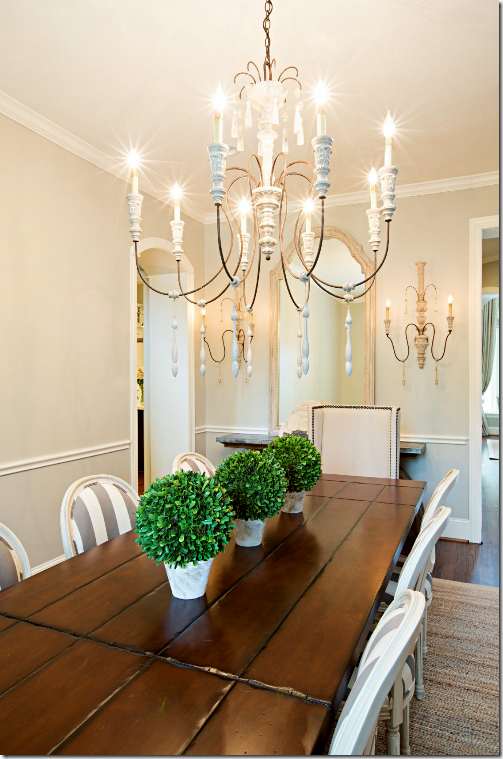
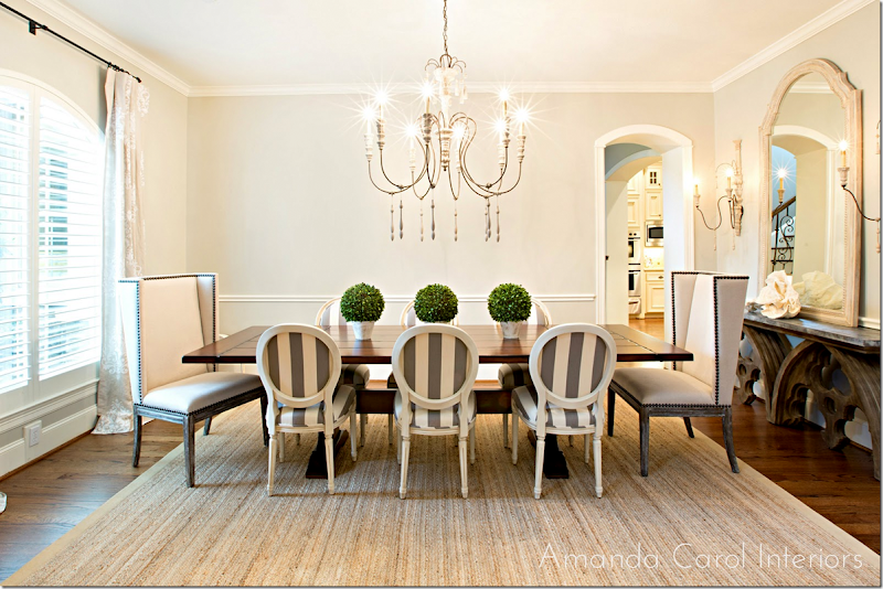
And today, the room I love the most – the dining room – SOO PRETTY! The French chairs are striped in the same fabric as the settee in the adjoining entry hall. Two tall nailhead chairs accent the host and hostess positions. Plus, the height of the two chairs adds interest. The curtain fabric is linen with a quiet pattern in white. Along the wall is the zinc top Aidan Gray console – love it! And the large chandelier has just the correct proportions.
I love the French chairs with the striped fabric – just love it!
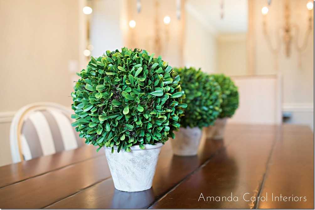
Three botanicals sit on the long table. This reminds me of Carol Glasser’s dining room with the row of simple candles. You don’t have to do the expected candlesticks with a bowl in the middle on a long dining table.
Carol Glasser’s table – three simple candlesticks reminds of the three pots on Amanda’s table.
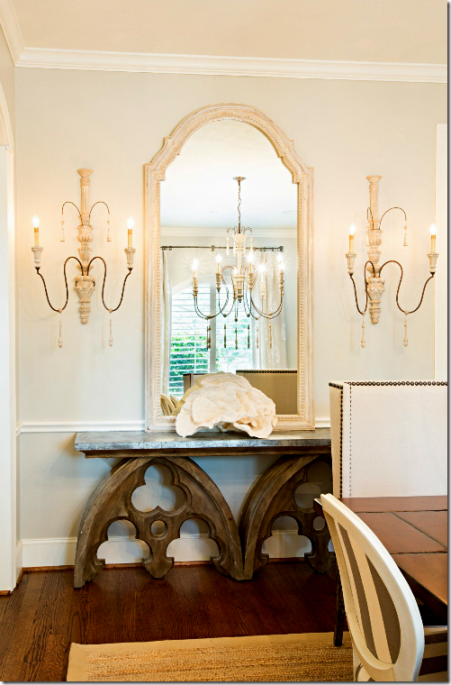
Against the side wall is the console with a large rose coral, tall mirror and two pretty sconces.
I love all the changes Amanda did in this room – and in the house. Before it was so dark and out of style. Today it is fresh and bright and stylish. From the dining room..
…to the living room room with the great capital tables and chairs…
..to the pretty welcoming entry. These three main areas are all open to each other and they blend together so well. By using linens and classic patterned fabrics in the same color range – nothing is jarring. Instead, the updated house is now stylish and sophisticated.
A huge thank you to Amanda Carol for sharing her latest projects. To see her portfolio and to read her blog, please go HERE.
Before & After–From Dark and Dreary to Bright and Stylish.
Subscribe to:
Post Comments
(
Atom
)








What a beautiful home. She did a wonderful job. So much better! Love all that she did to update the home especially the bathroom! Would love to see the rest of the home.
ReplyDeleteA much brighter and lighter paint color alone was enough to transform this home. I don't quite understand the necessity for the black beams in the light dome, but whatever. It does look like the work of a young, relatively inexperienced designer, however. The capitals have no lasting design value and most likely the homeowner will tire of that bulky RH look in a couple of years. Did the two hosts chairs in the DR also come from RH? The two fabrics on the wing chairs in the LR are gimmicky. Using the graphic that was used on the back of the chair would have looked great by itself in the LR with the solid sofa. Love the stripe settee, but would not have carried that fabric into the dining room. It takes away from the importance of the settee and looks like the designer ran out of ideas.
ReplyDeleteYIKES! Come on. now, let's not start. I saw these pictures and smiled and got so excited. I think it looks great. i LOVE the tables! LOVE. They make the living room imo. since when are two fabrics gimmicky?
DeleteCome on - let's not nitpick every decision. This is a guest and a homeowner. Otherwise, I am going to close the comment section. The house looks great. Enough.
Threatening to close the comments because they don't agree with your opinion - really mature, Joni! Stop insulting your readers with posts like this and you won't need to make your silly threats. You basically have indicated that you think we are dumb, backwoods nobodies who haven't been anywhere and have no idea what is and is not good design. Wake up, sister!
DeleteJoni has indicated no such thing. This is her blog and she may post whatever she likes! If you don't like the posts, stop reading the blog. There is certainly no need for your rude comments!!
Deletewhat???? omg come on! I just asked t hat y'all be respectful. Leave a comment -that you would say to the homeowner while walking through the house. after all they are reading this. i didn't say i didn't agree or don't understand the nitpicking, jsut asked to be respectful.
Delete"Come on - let's not nitpick every decision. This is a guest and a homeowner. Otherwise, I am going to close the comment section. The house looks great. Enough."
DeleteAnon. 10:57, put your reading glasses on. The above quote is Joni's words. They were not made up out of thin air.
Anon 1:48 Joni nicely asked you to be respectful, not to nitpick and you somehow turned that into: "You basically have indicated that you think we are dumb, backwoods nobodies who haven't been anywhere and have no idea what is and is not good design. Wake up, sister!"
DeleteSuch unnecessary rudeness on your part! If you can't offer constructive, respectful feedback - feedback that an adult, professional would offer to another, then please refrain from commenting at all. No one on here deserves or appreciates reading your vitriol.
Yes Anon 10:57 I think I will stop reading this blog. Joni has a dual personality. It's too confusing. One day she hates something the next day she loves it. One day she posts lists of design do's and dont's and the next day she contradicts them. There's no continuity and she wonders why she gets comments like these. This house is well done for a young couple by a newbie designer. That's not the problem. The issue is that readers like myself are confused because Joni has criticized many things in the past that this house features. The Restoration Hardware look? The rugs being too small? The curtain rods hung too low?
Deleteomg. i see things i would do differently. i get that. of course i do. for instance - i would have added a huge fabric shade to cover the top windows in the living room! and i would have done 4 panels, not 2- but that's just me. Yes, I like custom cut seagrass, but these rugs are seagrass and you can't custom cut them. look - there were things in carol's house that i would have done differently - but that doesn't mean i don't like it, i love it. but she made choices i wouldn't have. just because I show a house doesn't mean i am going to point out what i would have done differently. sometimes it's appropriate and sometimes it isn't.
Deletein the design elements series - that was intended to show how i would have done things and imo - how not to do things. showing a house like this is different.
I guess it goes to show I am not a designer because I disagree with Anon 0506, I like the beams in the light dome and think it creates visual interest. I would think the capitals are timeless, after all they are reproductions of an architectural element that has been around for centuries and as gimmcky as the pattern only on the back of the wing chairs is, I love that idea as I am a pillow freak and prefer my pillows (fortuny, tapestry or stumpwork) on a solid fabric. Once again tying in the fabric on the dining room chairs with the settee seems like a good idea to create a visual flow although perhaps in the same colors just not the same pattern? I recently painted a room Revere Pewter and used it cut 50% on the ceiling in a pearl finish based upon Joan's (love of a house) advice. I never got on the gray bandwagon but love this color, it is so soothing. Just to show how unoriginal I am I put my 2 kaboo wicker chairs in there with a louis chair after falling in love with those pieces based upon you, Joni. Didn't do bookshelves, just a hulking display piece from Ethan Allen to store my cross bottles and other tchotchkes, I call it the room bloggers built! Haven't gotten a zebra rug but its next, I regret not hauling one back from Africa instead of the juju which to this day I haven't used:( As always great post and thanks to the designer and home owner for sharing.
ReplyDeletewhen you see something you like and copy it -= that's not not being original in my mind. nothing is original. everything comes from something. miles redd told us that he hadn't had an original design - except for 3 ideas - he's designs are always inspired by something, usually another designer. there's nothing wrong with it. i would love to use those capital tables and hope i get a chance to. I've wanted to ever since seeing gingers!!!
DeleteEasy, peasy Joni. Go to RH and buy a pair. Not likely you will for all the reasons stated here.
Deletethey are expensive. i was suprised how much they were.
DeleteYes, they are expensive, shockingly so for what they are. For the same money, the homeowner could have bought a more timeless piece rather than one that in a few years will be declared passe' like all of the other junk being hawked by RH at the moment. Perhaps the owner wanted RH. That piece of information has not be established. If, however, the young decorator recommended it, then the homeowner got poor advice. Now if one wanted to put a moat in their living room so that children can run around playing on it, then the capitals might have been the right idea.
DeleteI would use these in a heart beat, if the client could afford them. even over Ginger's antique ones, because those arent functional. you can see what I mean. Ive loved that look since I saw it in Ginger's client's house, but I can only imagine how much Ginger's pieces were. yes they might be a better value in the end but ANY antique is always a better value than a new piece always. so i you care about value, then buy only antiques. My issue with RH was with that deconstructed upholstery line, iirc. I hated that. i buy a lot of things from RH and so do big named designers. you don't like those tables, i get that. ok i do. the owners do. that's why people's houses look different.
DeleteName on "big name designer" that would put their name on anything currently in the RH catalog? Name one! You can't.
Deleteoh, i certainly can. I was told about this house where the source for the sofas was RH. I can't say who it was - call me a liar. I wouldn't have said it without having proof.
DeleteIndeed you can't or you would. So we are to trust your say so here because you are desperate to make a point. If you truly know a "big name designer" as you referred to them who uses RH, please tell us who that designer is or don't make up convenient truths.
DeleteThere was a California wine country house featured in the June issue of House Beautiful that incorporated several pieces from RH (including a sofa), as well as pieces from West Elm and even an Ikea love seat - further proof that one can design a stylish and beautiful space even with inexpensive or "off the rack" furniture. A true design talent can pull together a fabulous room with pieces from anywhere.
DeleteThis before/after feels more like being able to breath or not breath.
ReplyDelete'Before' feels like a house that can cause illness, divorce, a life-is-terrible attitude. Worse, someone paid for those feelings/views.
Garden & Be Well, XO T
Amen Tara!
DeleteIn the room you like best - dining room - why is the table placed the way it is? It would seem if it was turned ninety degrees it would fit better?
ReplyDeleteWithout seeing the entire space it's hard to determine, but I tend to agree with the observation. Also, why not hang the curtain rod higher so that it is just under the crown molding?
Deletethat's just the way the wide lens is making it seem. i would bet a pretty penny the dining room is turned the correct way. wide angle lens tend to distort the side lides.
DeleteIf the table were turned it would project into the entrance hall - as the room is much longer than wide. I love all the changes and, while stunning, the fact that it is a house in which children can run and play. Love the paint changes just lightens it up tremendously.
DeleteAmanda did a wonderful job...what a transformation! I love BM's Revere Pewter. I just used it in a guest bath and recommended it to a client. It is a soothing, mercurial color that is both gray and taupe, depending on the light. The dining room is lovely, especially the scale of the chandelier and the mix of chairs. Looks like your comments section was highjacked by some truck company and another super-critical anonymous reader. I think I'll have another cup of coffee and take a second look at Amanda's work.
ReplyDeleteXO, Victoria
I appreciate seeing a newer home redone. I love to see how a designer can make even a 90s, suburbia home rich with light color, nice lighting, beautiful floors, and some architectural details. Some of us live in these homes based on the school district for our children while we drool over the older, more interesting homes in historic neighborhoods. So thanks! I enjoyed it.
ReplyDeleteme too! that's one reason why i really liked showing this. I bet a good percentage of us live in houses jsut like this. I know I do. not this nice though
DeleteWow! What a transformation! I wish the builder could see it now! That dome in the entry was truly horrendous. Love the after. Love the beams, the light fixture. If I had one nit pick it would be the trellis fabric on the back of the LR chairs. I like the idea of a patterned fabric only on the back, just not this fabric. Because of the pattern's scale, and the angle of the chair it is impossible to line up the fabric. It's lined up along the top, which forces the seams to be misaligned. That would drive me nuts looking at it. For that reason I would have selected a different print. All in all, though, a great design. Gorgeous. Great job Amanda! Best, Beth C.
ReplyDeleteThe decision to use that fabric might have been changed had the designer talked to an upholsterer first about the potential for mismatched repeats. In a fabric this bold, the misaligned fabric jumps out, at least in these photos.
DeleteI didn't even notice it. but yes, it's because the back is curved.
DeleteHard not to notice because there's a close up on them. It's not the designers fault. It's poor workmanship. The slight curve doesn't make a difference by the way. I used trellis in many projects 3 years ago both wallpaper and fabric and seams can be matched otherwise it wouldn't have been so popular back then.
DeleteAmanda did a great job. I do love a home with personal accents, as your living room has. A space that doesn't feel decorated. It's easy to sit here as an "arm chair designer" and critique!
ReplyDeleteOh well!,
Barbara
Great post Joni, and how wonderful to have a designer share their work with you and with us! It is fun to see a normal house transformed. Especially when they share the paint colors and fabrics, so we can really see what is there. Visually, I thought this house was a treat to see. And I understand that everyone is working on a budget. The two places that brought me up short was the lone settee under the stairs, with no art or rug to anchor it, and the over-sized sconces in the dining room. I love the trellis on the chairs, and disagree with the above comments. I think that looks is as fresh as ever, and very very pretty. The powder room is perfect and just the little jewel box you always want that room to be. Amanda did a great job and the owners are at once smart and lucky! Love it.
ReplyDeleteI'm with you on the settee under the stairs - is there enough headspace to sit there? I don't think so - would have liked to see a table (or a pretty desk) there instead. But very nice, otherwise.
Deleteagain, have to disagree! i think the settee is great there and i'm sure there's enough headroom to sit down - plus i love the scale of the sconces and thought they were perfect. I especially like the scale of the chand in the foyer and the one in the dining room is perfect. that's hard to guess out, but she did a perfect job, imo.
DeleteA nine light chandelier in that space looks like a 7/47 landing at JFK - really Joni? Six lights would have been sufficient. I hope no one injures themselves walking into the long arms of the sconces that stick out beyond the sideboard in the dining room. You can have the most beautiful fabrics in the world, but "scale" and understanding its use is one of the most important assets of an interior designer. It is clearly evident that this young designer has much to learn - sorry, but true.
Deletei have to totally disagree. i love the scale of the chandelier in the dining room. sorry. you are wrong, imo. and most sconces do stick out on the wall. jeez. all mine do - some are on walls where there is nothing else there.
DeletePhoto #9 clearly shows there is not enough "head space" for the entire length of the settee. It is a pretty settee and a pretty house. Just pointing out a fact. No intention of being rude or mean. I am not a hater and I am not one of the 2-3 people you mentioned who always write bad things. Your comment "you are wrong" above is very severe. Perhaps you should disable the comments since you add fuel to the fire by commenting yourself. If you don't want opinions then you should not ask "See if you agree?"
DeleteElizabeth, Amanda does not share anything w/her readers. I am surprised she shared this information with Joni!
DeleteShe didn't "share" anything with me. not sure what you are talking about. a lot of designers don't "share" their sources. she did say she got the lights from Curry. the other things I recognized myself and noted. not sure what you are talking about. btw - the homeowner left a a comment saying there is plenty of headroom on the settee. so, let's just drop that ok?
DeleteWrong Anon....I love Amanda's blog and her style. Amanda once wrote on her blogor instagram that people send her mean emails because she will not share sources out of respect for her paying clients. I get that - I would hate for her to share freely what I paid for so I was shocked that she shared with you. Thanks for clarifying, Joni. I am a devoted reader. :)
DeleteAmanda didn't have to share sources. It's obvious to anyone who has ever seen a Restoration Hardware catalog and been in one of their retail stores. Perhaps the trucking company who posted here was looking for Amanda's business card. Amanda doesn't seem to be a designer, just an order taker.
DeleteAnon@7:16, what a mean comment to say that Amanda is an order taker. Everyone's entitled to their own opinions and IMO, I love Amanda's work. What's funny is that people here are criticizing Amanda's work while she's in Hawaii having the time of her life. While you all keep "hating" on Amanda, Amanda is happily making money doing what she loves and taking great vacations and not to mention, posting pictures on her blog/instagram! LOL
DeleteAnon 9:29, What is the rationale (really a knee jerk reaction) for this comment When did anyone here suggest that Amanda should not take a vacation, post pictures on her blog or instagram? LOL
DeleteDear Joni, Love this light and fresh feel! The wall color, Revere Pewter, is perfect.
ReplyDeleteReally love the lighting in the Dining Room especially!
Xoxo
Karena
Art by Karena
What a difference! Beautiful! On a different note-All the pots were taken out of the ceiling in the dining room. Are they considered passé now in the lighting world of home decorating? The wall switch was taken out and put where? The wall looks clean without it but one still has to put on the lights so where was it hidden??
ReplyDeleteSuch eagle eyes!!!!!!!!!!!!!!!!! I wonder if the photographer photoshopped the light switch out. that is a common thing that professional residential photographers do. I love her work. would love to work with her.
DeleteI love how much more light there is in this space. Love a bright space :)
ReplyDeleteEdyta
www.edytaandco.com/blog/
It is pretty, bright and has such a clean feeling.
ReplyDeleteAmanda Carol did a lovely job brightening up 90s' drab and bringing this home into 'here & now'. I appreciate paint info (Revere Pewter) since we are considering that color to update our home. Regarding some comments, I imagine the designer's work reflects the homeowner's preferences. That said, I am not a fan of the dark beams installed in the dome. Perhaps if those were lighter? Current installation brings to mind a large claw or worse, a spider! Also... the RH capital tables... While I love the look of marble and whitewashed furniture, we are seeing it everywhere and I wonder how soon it too will feel tired & overdone.
ReplyDeleteThanks for sharing Amanda's work--I always look forward to your posts.
Great update ! I would have used a table in the Foyer and would love to see something of the homeowner and less of the, " I just decorated!" look. I am guessing that will come later, maybe, let's hope. Thanks!
ReplyDeleteI'm sure the edited out a lot for the professional photographs. but these are the formal spaces.
DeleteWhat an improvement! Are all the rooms Revere Pewter? I've been considering that color lately.
ReplyDeleteIs there any lighting in the living room? Or is this a room used only during the day? I would like to see a table for those chairs so that there is a place to put a glass of wine.
Joni, your posts are the best! I always save yours for the last (save the best for last) I read so I can go back and study your posts because you are so thorough. My sons refer to my decorating blogs as my porn!
Tough crowd here as usual. The decor looks great to me and a huge improvement, but I don't claim to be an expert and that is just my opinion. It's bright and stylish, as mentioned--very nice. Thanks for sharing the name of the paint color.
ReplyDeleteI like the brightness and youthful feel of the home. Amazing what a difference lightening up a space can make. All in all, I think it is a job very nicely done!
ReplyDeleteAmanda you did a beautiful job!! I know your client must be thrilled! Soooooo much better....light airy and fresh! And Joni thank you for another wonderful post! Vanna
ReplyDeleteLet me say this again, this house wasn't put on here so that everyone could nitpick every single design choice. Try to remember, there is a home owner involved here along with a designer.
ReplyDeleteIf the comments are always so negative, no one will ever give me pictures to show. Already I have heard from designers who feel this way and won't give me their photos because of the mean comments.
You can point out things, flaws, etc. in a constructive manner. Just try to be respectful. Don't say something here that you wouldn't say to the homeowner if you were walking through her house with her. That would be a good guideline to go by. Because in essence that is what you are doing. ok?
Thanks.
Joni, I apologize. My comment was not meant to be mean spirited or disrespectful at all. I just thought if someone sends photos for exposure to their design business, they have to be able to handle criticism. Criticism can help to see things that were not visible and help build talent. She is talented and overall she did a great job on what once a very dreary house.
DeleteJoni, no apologies required. If one is not ready for prime time, one should not publish their designs. It's really that simple. You insult your readers by requesting that they ignore some of the obvious mistakes. You have a sophisticated readership, both homeowner and professional and to require that we dish out praise where it is not warranted is simply hypocritical and disingenuous at best. I won't do it, so sue me!!
DeleteSo this is really all about you, Joni? No one will give you pictures. You are not only the author, but the editor of this blog. You failed to vet this designer's work. That is unfair to the homeowner for sure, but whose fault is it in the end - yours.
DeleteTime and again you have featured renovations by homeowners that you rave about that are not that great. This time, however, you are featuring a "professional" who asked to be shown on your blog. She put herself in this situation as well as her client. You have no one to blame here but yourself for not being more selective.
I read a fair number of design blogs and I have to say that I am always surprised by the rudeness of the comments on this particular one. What is it with this crowd? These pictures are meant to give ideas and to see how different people worked with different spaces. You don't have to love it all, but there's certainly no need to trash the designer or Joni for posting the pics. There is a constructive way to give feedback and this certainly isn't it! If you have so many issues with what you see, just stop reading and spare the rest of us your rude, mean-spirited commentary!!!
DeleteThank you - anon 11:07. the problem is I usually don't moderate the comments so what people are truly saying is said here, which usually i don't mind. espcially when it is about me and my work. But when a young designer asks to be shown, and let me say - i love this house and what she's done with it. i meant every word i said. i get a lot of houses that i don't show - but this one used some furniture that we all can buy and that makes it more accessible. i loved her style and how she changed the look of the house. I just ask that people be respectful when it's a designer, not me. That's asking to much though. There are a very few that want to be rude here and just tear everything down. i get that this designer is not Suzanne Kasler or Bunny Williams. duh. We don't have to just be rude. And there have been some really rude comments made by a few here today. as usual.
DeleteAnon 8:27 no, it's not about me. it's about all the readers. do you not get it? i get all kinds of requests to show work and i don't show it all, but i have heard from a few designers who won't let their work be on here anymore because of people like you. now, i get alot of complaints from people that say i show too many houses that are expensive and out of the normal price range. yet, every time i show a "normal" house, people like you are rude about it. seriously - if you really hate my blog so much, please move along. go read someone who shows only fabulous house by fabulous designers so you can ooh and aw. because i'm not that blogger. i do try to show regular houses and extraordinary houses. The issue is I don't get a lot of designed houses that are more in the normal price range. So when i do, I love to show them. If you don't care for that, then truly, go read a blog that only shows houses that you love. You'll be so much happier than wasting your time here.
DeleteYou said it wasn't totally finished in your comments and I think Amanda Carol should have waited until it was to show it. There's no artwork on the walls. It looks unfinished. Your readers aren't fans of Restoration Hardware, trendy fabrics and fake boxwoods. I don't think the comments were that harsh honestly. Your readers are sophisticated and for you to go from Carol Glasser to this is actually irresponsible on your behalf.
ReplyDeleteirressponsible? to show a house that probably cost around $5k as compared to one that cost $5million? come on. that's just ridiculous. most people can't afford a 5 million dollar house plus a designer of the caliber of carol glasser. The alternative is quite nice. I even compared some pricey decorating here - to show there are ways to get the looks for less. she isn't finished in the other rooms - the kitchen and the bedrooms. I don't have art work, is my house not finished? omg this is just too much. irresponsible? for showing both spectrums??
DeleteOk, I understand now. When you word it like this then it makes sense. You set the bar Joni, so when you post something there are very high expectations. Wish you would have clarified what you wrote here in your original introduction. You had so may high end designer posts in a row with Ellen & Portia, Jessica Simpson/Rachel Ashwell and India Hicks that it threw me for a loop. Mea Culpa. Your house is beautiful and I've never thought it look unfinished or lacked artwork. It's not comparable.
DeleteThanks. I do try to show regular homes, but most people don't hire decorators or aren't able to decorate their own house. so when I get on that is in a more normal price range, I am thrilled! even more so when I love it - like this house. I was so excited when I saw Amanda's photos. I know most here feel the same way, it's jsut the a few very vocal ones who put a shadow over everything. Also, the homeowner said they are very young and will be collecting and adding to their possessions as the years go on.
DeleteJust piping in here, but what's wrong with liking Restoration Hardware? Did I miss some memo wherein Restoration Hardware was named as the devil and anyone who covets their furniture, devil worshipers? There are several pieces in their collection that I prefer over the more expensive alternatives. I have an English Mastiff, which means I have a walking drool factory living within the walls of my house, and I've had my Restoration Hardware leather sofa for 2 years now. Even with a giant dog sleeping and drooling on it, it still looks fabulous. As far as the house featured today, I thought it was lovely. There were design decisions I wouldn't have gone with, but I'm sure the homeowner loves it. Sometimes it's a matter of personal taste. In a room full of people (or in the comment section of a particular blog) you're likely to find people with a wide assortment of styles and tastes. I certainly appreciate Joni sharing those houses on her blog. And for the record, I often dislike the ones designed by the Big Name Designers just because they're TOO decorated. I like Joni's style. That's why I come here. And why I felt the need to comment this time. I can appreciate criticism, but I think there's a point where the delivery becomes disrespectful.
DeleteVery well put, Erica!
DeleteI like to see a wide range of houses, and I appreciate people letting us into their homes! I am considering mixed some dining chairs and had thought about two winged chairs with nailhead trim mixed with parson's chairs.
ReplyDeleteThe trucking company seems to have made the nicest comments. Who knew!!
ReplyDeleteJoni:
ReplyDeleteA great post as always. I really liked all that she did on this house--- It is so fresh and clean and calming. I am so happy when I read your posts because they generate so many ideas for me to work with and I am so grateful that you take the time to research all these homes and the latest design ideas and keep us informed of all the hard work that designers do to help people realize their goals of a beautiful home. I'm off tomorrow to Schumacher factory warehouse to search for fabric for my granddaughter's bedroom and also for fabric to build a sofa and two english arm chairs and ottomans for my daughter's family room. I am so lucky to have access to fabric and furniture in my area ---and with your library of ideas that you post --- I have an endless supply of ideas to work with.
Susan in Charlotte
Thsnk you Susan. if you stay with neutrals on your upholstered fabrics, you can bring pattern in with the pillows and curtains. that way, you can always change out the pillows to get a new look without much money. the curtains could be a bit more expensive to replace if you have a lot of windows, but it will still be cheaper than redoing all your furniture. Also, you can bring in pattern and color in the ottoman - another piece that wouldn't be pricey to redo in five or 10 years. good luck!!!
DeleteHi Joni,
ReplyDeleteI have loved following your blog for years...it is one of my favorites. So I was surprised and humbled to see that today's post was about my own home. I will try to put on some "thick-skin" and happy to help answer some of the critiques and comments. One comment said that the house did not look finished, antiques etc....I will agree in some ways...my husband and I are in our early 30's and when we traveled we were still saving money to pay for school instead of collecting antiques as I wish. We also have two young children who still love to do cartwheels, draw on furniture, and play sword fight so I'm sure if we had antiques displayed they would be in crumbles in a matter of seconds =) I do hope we will have many more years to collect and travel to fill our home. Our walls are filled with artwork and family pictures that are not shown in the photos. As for why the ceiling beams are dark...we actually contemplated making them a weathered lighter wood vs the dark that they are, but if you come to visit you will immediately agree and understand why we choose the darker wood...we have large double wood front doors in the same color scheme as well as other accents in the home such as the family room fireplace mantel and kitchen island that are the same. And....our dining room table is turned the only way it will fit...if we turned it the other way it would stick out into the entry way. For the settee, you will not hit your head sitting on it unless you are a giant=) Amanda did a wonderful job making this a home, that we now love, to raise our family.
Joni, thank you again for your wonderful blog.
Jerissa
hi thank you so much and thanks for having a thick skin. I know I have to have one each time I show my own work or my own house. Still, I hope you realize that many here loved your house. There are always 2 or 3 anonymous people (the same people each time) who show up and nitpick every decision then they blame it on me for showing the house. Please understand that this 2 people hate ME. It's not against the decorator or the homeowner - it's really against ME. They like to come here and try to upset me. So, don't take it personally, becuase I am truly the target.
DeleteAll i can say is that when amanda sent me the pictures - i was thrilled because i loved what she had done!! i couldn't wait to show your house. i was especially taken with the dining room for some reason - not sure why, but I just LOVE it!!!!! And a lot of people agree with me. Now, as for the nitpicking, i do think people try to learn from the pictures and question decisions - not done mean spiritedly - but truly question - why was that done that way? like the table - i knew it was the right way - but the wide angle lens made the space distorted a bit so that it seemed longer than it truly is. art work? I have almost none in my house. instead, I have mirrors like you. I just prefer mirrors over art work, because I can't afford the ark work I like!!!! ha! I didn't agree with that comment at all - I don't think it looks unfinished at all. I like the way it's not cluttered. But, like you said, you have a lifetime to collect and buy and trust me, you will!!! Another thing that amanda did which i love is the living room - and the chairs and the capital tables. I just love that look and hope I get to do it for a client too!!!
thank you so much for responding here. I know it can be a bit of a lions den, just remember that i am the target here. If you want to email me - please feel free to at mrballbox329@aol.com
Joni, you are a hypocrite. You started out the post by saying:
Delete"It’s not yet totally finished, but she wanted to share pictures of what she has accomplished so far"
You set poor Jerissa up for her home to be critiqued. Re-read what you wrote. Then, you call it a $5,000 renovation??? Just awful.
Jerissa your home is lovely, thank you so much for sharing it. You are right, you have a lifetime to collect what you love and I admire you for waiting until you find something perfect rather than go out and fill a blank wall. But you already have the most precious and dear collection of all, 2 children who are loved. How refreshing to read that they "live" in the house. I love the light dome and everything shown, Amanda has done a great job. Have a wonderful summer! Sarah
DeleteThank you Joni,
DeleteThe capital tables are our favorite also...my children love to play obstacle course which usually involves jumping on top of one to the other =) They hold up to anything!
Jerissa
This explains everything. Who knew RH was producing obstacle courses, but it does make sense now that I look back at the picture.
DeleteDespite trying to make yourself look like the victim as usual Joni, this has absolutely nothing to do with whether someone likes or dislikes you and you know it. Stop the poor mouthing and realize that your readers are not ignorant nor do they have short memories regarding prior posts. So you now say that some designers don't want to be published here because of criticism. Do they really believe that their work is so above reproach that they can't put it to the test of your readers? If so, they are simply pathetic egotist.
DeleteJerissa, please ignore the few haters - you have a lovely, inviting home and one that I'm sure you will continue to add to over the years. I love your RH capitals - architectural elements such as these are timeless and even better that they are sturdy enough for your children to play on! I, too, have a young family and our home has a few RH pieces mixed in with antiques, family heirlooms, and inexpensive pieces from our first place. I think the mix makes it interesting and it's definitely more practical and liveable for our family - I never want any of our rooms or furniture to be "off limits". I enjoy seeing rooms like these instead of spaces full of priceless furniture that you can't imagine anyone ever sitting on or enjoying. Thank you for allowing your home to be shared on this blog and best wishes to you!
DeleteANON - RIGHT! it's NOT finished!!! the ktichen/breakfast room and master bedroom are still being worked on. how is that hypocritical? She is transforming the entire house, but hasn't finished all the rooms. And I said, the difference between a 5 million dollar house and 500,000 house. I might have missed a zero. I NEVER EVER said or meant to write it was a 5,000 job. It's not. it's quite a bit more. I only stated the differences between carol's house - 5mll and this one, 500k. just relax. the tables alone are about that price.
DeleteJerissa - thanks for being a good sport. I hope you realize by now, that it is just about two people (men) who keep posting the rude comments over and over again. It's not about you, or Amanda, or your house - it's about their hatred for me. They hate me and they hate my blog, but they won't stop posting here. They derive pleasure from antagonizing me for some reason. Sorry you had to get caught up in the middle of their games. I know who one of them is, but not the other. One is a professional. I wonder what his clients would think if they saw what he writes?
DeleteThanks again for being so understanding~~!!!!
So now you have elevated yourself to designer/soothsayer. This is really getting hilarious. Stop posting Joni- you are beginning to look ridiculous. You are too much, really!!
Deletesoothsayer? you DO know that every comment can be traced? right? you DO know that? even the anonymous ones - so put that in your pipe and smoke it. you thought I just made that up? nope sorry.
DeleteThis comment has been removed by the author.
ReplyDeleteWow, this is just like reading a middle schooler's texts. It's amazing what people will say behind the mask of their computer! From my untrained perspective, I think the redesign of this house made it bright, fresh, sophisticated but livable, the backdrop for a real family to fill with real life. I love all the textured neutrals, especially the bathroom!! Lovely. Thanks for sharing and inspiring.
ReplyDeleteJoni - I am always so amazed by the thought and consideration you put in your postings and learn something new each time. This posting prompted a couple of questions. First, can you share where the Curry lighting used in the remodel can be purchased and also if you have any other suggestions for beautiful fixtures other than Aiden Gray, Brown and Circa? Secondly I find it very difficult to find beautiful and practical coffee tables for rooms that are used everyday. I reviewed your past blogs and found a lovely post from 2011 but wondered if you have any new sources other than Restoration Hardware and the iron and wood "Houston-look" coffee tables seen in many designs using French antiques. Thanks! Melinda
ReplyDeleteIsn't the fixture in the dining room beautiful? I love it. Curry is sold through stores, etc. A designer can get it wholesale for you. Otherwise you have to go through a store. Horchow has a great selection, so does Shades of Lights. Circa or Visual Comfort as you said is a great source too. In Houston, there's a lighting shop downtown by Brennans that is great. Blanking on the name of course. There's a little shop on Alabama that fixes chand that sells great ones too. It's called Alcon. Plus they can make you one. Boxwoods has great fixtures. All the antique stores in Houston. AND - AREA. that's a good source for fixtures. Coffee tables are harder. Nadau in the Rice Village is cheap source that I've used before. Plus there's an ethic store on Post Oak at San Felipe I like. for old tables in Montrose there's the crazy Irishman. Colin Gibbins. I love Joyce Horn antiques for great ones that are more reasonable than other stores. not cheap, but reasonable. Coffee tables are hard though.
DeleteThe price of the capitals as shown in the RH on line catalog are $1995.00 a piece. Joni is right, they are very expensive. Considering that the homeowner has two of them, wouldn't you think for $4000.00 a designer could find a lovely antique piece or a stylish new piece? It's incomprehensible to me that anyone would pay this for something that is clearly a trend, but have no tables with lamps in the living room despite evidence of a floor outlet by at least one of the chairs.
ReplyDeleteMaybe the capitals were bought at the outlet store for way less than $4,000.00 for both of them.
DeleteMaybe the homeowner and designer actually like the capitals. It's possible.
DeleteI think that is the case - she likes them! And Amanda was right to go for two, not one. No they aren't cheap at all but i can imagine how much two "real" antiques would cost. So, it's still a cheaper way to get the look, also, they are functional - you can use them. The older ones don't have flat tops like that- just going by the ones that Ginger used. Unless you have a period Louis XIV chair, any other antique was once a reproduction. If it was made in the 18th or 19th century, while the chair may be antique - it is truly a reproduction.
DeleteOne would not have to use "two" antique cocktail/coffee tables - think about it, Joni?
DeleteAnon~
DeleteYou really focus on Joni's words/opinions and posts.
You must be a regular reader and see some profit in this blog or you would not have made such a reference.
Why such a critical spirit?
Dee
In my mind Amanda did a great job lightening and updating the space by making some simple changes. I have to say the comments about the settee have made me chuckle! I have an antique bench in my entry that I am sure not a sole has ever paused to sit on. Sometimes we place things for visual interest knowing they will never get used.
ReplyDeleteStunning, absolutely stunning. What a transformation. And it doesn't ever over reach or "cloy". This woman has taste. Congratulations to the home owners who had the good sense to let her do what she does best. And thank you for presenting the before and after pictures. What a difference time and money can make. Makes me want to go right home and imitate. Ann
ReplyDeleteMy favorite thing about this entire post is that nobody knows how to spell "capitel".
ReplyDeleteIt has been spelled by the author of the blog and in several comments the way it is spelled by Restoration Hardware in their catalog.
DeleteLOL
Deleteyep! that's right! It is called the Capital Table in the catalog.
DeleteDear Anon~
DeleteCapitel is clearly a spanish word that would translate to "capital" in english.
My guess is that RH did not want to appear as if they misspelled the word.
Then again, you may have had a good time with that.
Dee
I'm rolling my eyes at some of these comments. This home is beautiful! I can see it's not finished, but I also remember not seeing end tables and lamps in a recent post here by a famous designer. No one said a word about it then. Snobbery at it's finest.
ReplyDeleteWow! What comments! Her home is fresh, significantly lighter, and totally appropriate for a couple in their 30's. It takes a long time for people to develop their style and for homes to evolve; and I especially love that Jerissa has given such great justifications for why these pieces and design choices work for her at this time in her life. And to this non-designer, that's what counts. It's her home and she loves it; it doesn't have to be AD.
ReplyDeleteWow. I am the friend who told Jerissa that her home was featured on Cote de Texas...and now am wishing I hadn't! Jerissa and I run together in the mornings. We talk design, ideas, what would truly work for a home with children (and husbands), and we talk about compromise. Everything costs money and heaven (and Jerissa) know that most of us in this world can't afford a designer or the pieces that Jerissa has selected for her home. Having been to pool parties and birthday parties here and having sat in those trellis chairs with a cup of coffee in my running clothes, I can honestly say that the home is lovely. It leaves nothing to be desired as far as comfort. Not a piece of furniture is off limits. We jumped on the leather sofa in the family room to soften it up. I guess what I am trying to say is, although the home looks like a showcase in these photos, it is a functioning family home. I find Jerissa's home and its inviting and comforting ways inspirational. No. There are no antiques. She has reused pieces from her starter home and incorporated them into new design. For a young professional, this is exciting! There is no way with young children I could afford to start completely over. I love to see how she has reinvented some of her furniture. Yes, she has pieces from Restoration Hardware. The capitol tables are bold, for sure. Trendy? Maybe. But fun and interesting and something I certainly don't see in every home I walk into...RH or not. I loved that Joni compared Jerissa's home to some of the greats. That is where we get our inspiration. But Jerissa has made this house her home...she hasn't attempted to make a replica of a picture she saw in a magazine or blog...she incorporated her own ideas and likes and pieces to make something unique to her. That is something not easily achieved.
ReplyDeleteJerissa told me to read these posts so we would have something fun to talk about on our morning runs. :)
Thanks for giving us something to chuckle over on the hills,
Bee
No one has criticized Jerissa. It seems the criticism is aimed at the poor design advice she received from an inexperienced and young designer. I have not read one comment that suggested she had to have a house full of antiques or even one for that matter. There is, however, a big difference both visually and materially in buying investment pieces (which do not have to be antiques) and buying trends. This is what is so glaring about some of these photographs. The design is very trendy and perhaps that may be what Jerissa wanted, but it is not the best way to invest in one's home.
DeleteThere seems to be an interesting pattern emerging here. Jerissa says the children enjoy using the capital tables as obstacle courses jumping on top of them sometime, and Melissa says she and Jerissa jumped up and down on a leather sofa to break it in. Wow, I think we may owe the designer an apology. She wasn't decorating a house, she was decorating a zoo.
DeleteAnonymous,
DeleteI disagree on multiple levels. A person's home is very much a part of them- a representation. By being so blunt and harsh, I do think it can cut a home owner to the quick. Also, the comments about the antiques are being blown way out of proportion. I have read Joni's Top 10 Elements of Design and I know that although antiques are on there, you can achieve that look with replica pieces that are worn and weathered looking. It is about interest, story, texture. As far as investment pieces...this is in the eye of the beholder. If your critical eye is looking at these pictures and telling you "This is not a good investment", you are taking this blog and the looking at pictures of homes WAY too seriously.
Trust me Melissa, I don't take this blog seriously, but I do agree with others that investment buying is far smarter than buying trends.
DeleteFrom someone who jumps on sofas to soften them - lol
DeleteInteresting, isn't it, that I am not afraid to put a name behind my opinions. Feel free to use it in your sad and pitiful comments. You clearly don't have friends with children, nor any true friend that would let you partake in mere silliness in their home...like jumping on a couch.
DeleteMelissa,
DeleteYou're a good friend. Good for you for sticking up for your friend. Curious though... I re-read all the comments again and didn't find one thing on anyone initially saying the designer should have used antiques. The house is beautiful. The description said it wasn't finished, so sometimes posters give advice. Devoted followers also get confused with Joni's conflicting opinions. As fas as Anonymous posters go like myself. I'm not hiding I just believe in privacy. Good bad or ugly I'm sure the designer has seen more traffic on her website. "All publicity is good publicity". Joni gets a lot of traffic and now a lot of people know who Amanda is. Best to you, your family and Jerissa.
Anonymous, didn't I read above that you were going to stop visiting this blog? Curious that you have so much time to spend repeatedly posting snide comments on a blog you seem not to enjoy. Surely you have better things to do elsewhere.
DeleteMelissa, I loved your comment. I hope you realize that you are really only arguing with two men who have nothing better to do than put down me and Amanda today. And I think there is a third anon - I would guess it's a woman. so - of all the great comments, the ones talking about the zoo, the moat, the antiques, etc. - those are the same 2 or 3 people, over and over again. I'm glad you stuck up for your friend, but it makes me sad that you had to. Even my mother - who had impeccable taste - the best taste of anyone I've ever known - emailed me to tell me how much she liked this house! and that's saying something!!!! If Betty Rae gives it her stamp of approval, then, it deserves it.
DeleteJoni or Jerrisa, who makes the dining host chairs, love those! I love those RH captials, same with your lighting choices. I learned long ago that having antiques is not the a good idea with young children and besides if it is something that is "trendy" and you get tired of it, better to have a RH repro that will be more marketable on craigslist or equilvalent when you want to jettison it. But I think these have staying power. I also like seeing how you "upcycled" things into different rooms and kept the mirror in the bathroom. LOL I have a fiend who paid $1700 for a USED Pottery Barn sofa at consignment and when I argued with her that she should have gotten a Lee Industries or better her response was "I like Pottery Barn." I must add that it looks damn good in her house and hubby and kids love it. You and Amanda make a good team and Melissa's friendship is priceless. Cheers!
DeleteGood morning Joni~
ReplyDeleteI think you need to return to your title and brief intro when you get comments like this.
It is a before and after... in progress.
I was actually encouraged to see changes that are do-able, without a major overhaul.
It seems like the designer did the one thing that many overlook. She considered the homeowners!
I enjoyed this post.
Dee
Just to be clear...what I meant by the above statement, is that you gave every one fair-warning!
DeleteI maintain that it was an encouraging post.
Dee
yes Dee - but what i actually meant was that - I wouldn't be showing the entire house yet because those rooms were finished yet -- the bedroom, the kitchen, the breakfast room - she is still working on those.
DeleteThank you for your kind words!
Wow, I just started reading some of the comments... I'm taken aback that people are so offended by such a pretty home. It looks light, airy and comfortable to me. I love the decluttered simplicity of it and how each piece seems to have a purpose. Oh well. Not sure where the anger comes from, but I personally enjoyed looking at the pictures.
ReplyDeletethe anger comes from their hatred of me. that's all. just plain and simple. glad you enjoyed the story!!
DeleteJoni, that is an absolute lie and you know it. What a terrible comment to make about people you do not know. Shame on you!!!
Deleteseriously? you think those two anons who have been here for years now actually LIKE me? omg. that's hysterical! they hate me and everything about me!!! they love to put down everything i say! I really don't care ever - except (for the 1000th time) when its about a designer or a homeowner who was nice enough to let me show their pictures. And even then, they often have very good and valid points - but they things in such a mean, hateful and condescending way - that it becomes offensive. One of them feels that if a designer or homeowner puts their work out there, they should be willing to take all the criticism. OK. they have a point, I understand that. I do. It's just that it always becomes to personal and so mean. They don't say it once, but three and four times and use such sarcastic and mean language. i know homeowners have gotten their feelings hurt, badly. And i hate that. It just takes all the fun out of it. Also - it makes them question their designer. And sometimes, they are bitching about something that is a design choice - not right, not wrong.
Deletei'm so over this now. But don't tell me - shame on me! It's not a lie. I KNOW there are a few (probably a lot more) of these vocal anons who really and truly dislike me. that is NOT a lie.
Normally I do not post comments on any kind of blog. However it is hard not to respond to the comments I have read above. I have been fortunate enough to be welcomed at this home. It is lovely, refreshing and welcoming. It has been fun watching it come together as each piece is added or details are completed. The powder room was just completed last month and we were all so excited to see it! How fun and also nerve wracking trying to make decisions that work for the whole family while are also tasteful. I find the entire home to be just beautiful and I am so happy for the family that they are enjoying their home so much. I am almost 67 years old and I am shocked by the cruel, demeaning, critical comments that have been made by a few people on this blog. What happened to the idea "if you can't say something nice, don't say anything at all"? I don't think anything has been gained by anyone by the derogatory comments made to Joni and about Amanda. Come on people, this is supposed to be fun and light hearted. I thoroughly enjoy looking at the pictures Joni posts and look forward to her posts. There are always things I like and others I do not care for. Isn't that what makes it fun to go to others homes, seeing how they put things together to make a home? My gosh let's be nicer!
ReplyDeleteThank you Mary! I agree with you 100 percent! Again, just ignore those anon comments that are so mean. they are made by 2 0r 3 people who keep posting them over and over and over again. Like I said, my mother sent me an email yesterday - telling how pretty the house was. And if she gives her stamp of approval...well, that means it's pretty!!!
Deletebtw - in case you want to read about Betty Rae and her sense of style - here's a story I wrote several years ago on her birthday!
http://cotedetexas.blogspot.com/2008/03/happy-birthday-to-design-mentor.html
Mary Deemer- you are absolutely correct.I too am aghast at the vitriolic comments left by some posters that just are meant to be deliberately hurtfurt to the owner of this lovely house, to the designer, and to Joni personally. I am so sorry to find such unpleasant people on Joni wonderful blog.A pox on them-and on all their 'houses'!
DeleteThe house is so pretty, and now reflects a lighthearted happy vibe-and I thank Joni once again for taking the time to show us this lovely transformation.
Joni- you are WONDERFUL.
Dolores
That horrible mean-spirited anonymous needs to go have some time out! I'm sure she's so experienced that she saw the first arts and crafts pieces of furniture came to light. Everybody who's had to a living room knows that interior design is and effort of trial and error. Nothing is perfect. Tastes, moods and seasons change. That's the beauty of it. People's personalities evolve and decorating is a permanent work-in-progress. People loved avocado green, then mauve pink, then burgundy and now it's gray. Who cares? The fun part is rediscovering a room a thousand times over. Besides, aren't we "experienced" (or should I say old) decorators encourage young people and their novel ideas? What Meanie Anonymous did was equivalent to criticizing a toddler for not walking gracefully while balancing a book in her head! To Carol I will have to say this: go for it! Experiment with the new but check the history book for what becomes classic. I know I've made enough mistakes for not sticking to the classics. Check Coco Chanel and Dan Caruthers. Stay away from patterns and things that you'll get tired of looking at in two-years time. Stay away from fads and trust you inner voice. Overall, make rooms feel peaceful and playful. And here's where I stop to go take note of my own advice.
ReplyDeleteJoni: You are great and I love your blog. I tell anybody who will listen about it. You are better than Veranda under Caponigro and you have filled the void that Lisa Newson left when she became Editor-at-Large.
Anne O Nemus
Amanda did a wonderful job! I'm happy you shared the paint color, I always love to know. The detail on the dome is brilliant, it brings such great interest. I have used Revere Pewter in my dining room as well and it's a great, cozy and lovely color that changes with the light of the day. I love it and hope to use it again someday.
ReplyDeleteBless their hearts... There's just no need for that type of negative talk displayed above.
Love the design, Amanda! Keep up the good work :)
xoxo
Kaara
Thanks for sharing these photos. It's fun to see inside various homes, so I'm just enjoying another designer's work. Life's too short for so much controversy.
ReplyDeleteJoni, if the comments on the blog can be traced, why oh why won't you just block the two anons from posting? I can't imagine anyone other than those two ill mannered, and unkind nut cases would do anything other than jump for joy. If it is truly possible to identify the hateful comm enters, then do so and take measures to STOP THEM. This blog is yours, you are the boss, you set the tone. Perhaps I am misguided in thinking you have the power to exile he or she, but if you do and you are not using it, then I am confused by your motives.
ReplyDeleteI painted my house BM's Revere Pewter! It is THE most lovely color. In the morning, as the fresh light bounces throughout the room, it becomes so light and airy. Throughout the day, it warms up with beige undertones. Then with low-light in the evening it's very romantic and moody. I picked this color for my main living spaces from a fun review of Gwyneth Paltrow's CA home in Veranda. I've had nothing but compliments on it...including from my husband!!! Now I have 6 more rooms to paint. That seems the hardest task; picking a paint color. I messed up in my powder room. It's a spring green from Pratt & Lambert. Pretty. But, it doesn't transition well with the BM's RP. I'm a DIY and will make those mistakes. I do want to say that design information can be confusing. The biggest lesson I have learned is what may work in one house, might not work at all in another. I value your design knowledge Joni. I don't always like what you do. But I take many ideas you have introduced me to, and incorporate them into my home. I have young children and can't see spending thousands on beautiful antiques just to have it marked with crayon or chipped wood from a toy car accident. It's quite possible that I may never be able to afford that ginormous Louis mirror that would look simply divine over my fireplace. BUT, I can still make decisions that make my home comfortable and beautiful at the same time; thanks to blogs like yours. So, forget the anons that are just being downright rude, respect the readers that question the style and keep on educating us ALL about interior design!!!
ReplyDeleteTexassky
Anonymous, 30-something female who should probably be doing other things than posting from work. :)
Joni, thank you for sharing beautiful pictures with us, your readers. I discovered your blog about two years ago and I read it religiously. You put so much effort, research and time and it is very noticeable based on what you write. I don't understand these "anonymous" mean people who come here to criticize your work and/or the work of other designers, but I guess there will always be jealous people in this world we live in. Please continue to write and post beautiful houses so that people like me who really appreciate them can continue getting inspired. I love your blog, Joni.
ReplyDeleteWOW! Reading all of this in one go made my head spin around like the girl in the Exorcist. Which reminds me, why not finally give the Anons the publicity they deserve by outing them. It's such an American, head in the stocks in the public square kind of thing to do. I'm glad you gave the link to the post about your mother's tastes. I think I missed that one and will enjoy reading about her. If the home owner loves her house, and it sounds like she does, who cares what we think other than good for her?
ReplyDeletePersonally, I'm in such the time warp that I am going to paint my living room ceiling the bronze color of the much discussed dome! I figure if Joe Nye can so can I!
amanda is a great designer. people forget when looking at a designers work that the client has the ultimate say. as designers we don't get everything we want for a client's home. we compromise. many clients don't like antiques. so we compromise. or they decide that they want draperies but those are expensive so woven shades under the draperies aren't worth it. so we compromise. that's how it goes. amanda does great work.
ReplyDeletejoni i'd consider making people sign their names. allowing anonymous comments only gives people permission to spew filth they wouldn't if there name was attached to it. they lose their manners. if you're going to say it then own it otherwise keep your "mouth" shut.
Jami, woven shades under draperies is an invention of this blog. You are not likely to see this treatment in many places in other parts of the country except Texas. I personally can't think of a better way to ruin the look of expensive fabric and beautiful windows than to put those cheap looking shades under them. As yourself a question and truly answer it honestly. Would you really use these hideous shades had you not first seen them here?
DeleteGood points about designer/client relationships. Would you continue to work with someone who only wanted paint and a truck load of Restoration Hardware furniture?
DeleteAs mentioned above, I just saw a home in House Beautiful where the designer noted that the home owner specifically wanted to use mostly online and catalog furniture in her home and they ended up using several pieces from RH. He didn't seem to find it off-putting at all and pulled together a beautiful, stylish home with a mix of pieces - worthy of notice from a national design publication. An enormous budget and custom furniture are no guarantee of style (see Christina Aguilera's home) nor does catalog shopping preclude one from having a beautiful space. I read all the time about designers who find things at thrift shops and flea markets - good design can come from anywhere!
DeleteIf you visit Amanda's blog and read some of her past posts, you will quickly see how many of them feature either RH or as in several cases her attempts at achieving what she refers to as the RH look in pieces that she has in fact found at flea markets. Amanda is really into that look so the home featured here with its abundance of RH furniture is no accident and is most probably the collaboration of the owner and Amanda Carol. As to the HB article, I am certain that the designer had a purpose in noting that the owner wanted to use the RH pieces. That way, he/she disassociates themselves perhaps from a look they would not have preferred. Having not see the article, it's hard to evaluate the outcome. Perhaps he/she used some of the pieces from the "Small Spaces" catalog which definitely have a different scale than what RH is currently featuring.
DeleteThe HB house was designed by Steven Shubel and it was fantastic, we were all so busy drooling over Jeannette's house that it was ignored and or it isn't the typical "look" Joni's blog features. He used RH, Wisteria, Z gallerie, Aidan Gray, Crate and Barrel and other accessible to the genereal public sources. Although I am more of an East coast decor gal I think the house was an ecletic fun mix. The Peak of Tres Chic quotes Miles Redd: "What’s nice about being on your own is you’re in control. Every good decorator is a little bit of a control freak. When you’re in control, if you don’t click with someone, you don’t have to accept them as clients. Decorating is about personality. I love the people I work with." -Miles Redd. I think Shubel was probably stressing good design is accessible, you don't have to have hundreds of thousands of dollars, put your money with talent. A good designer could probably furnish a house from Walmart only, talent is talent, no matter how many alphabets come after your name. As pointed out using Christina Aguilar for example, she was a client with a super large budget and an aesthetic that doesn't gel with most of us but instead of making a silk purse out of a sow's ear the designer created a shoddy product, even if Christina was a difficult person set in her ways, s/he could have designed something with more taste. A designer friend came to my home and re-arranged the furniture and took all my accessories out and "edited" them back in, there were a few things that he obviously would have thrown in the trash heap given the opportunity but I was adamant they were staying, the things I didn't have displayed properly shine and those little "eye sores" are now minimized.
DeleteThe Stephen Shubel house was lovely, but what you failed to mention and what is evident from the pictures is that Shubel did not use catalog and on line sources exclusively. He has used a bare minimum of these pieces in rooms where they are sat amongst finer pieces of furniture, beautiful wall coverings, fabric and rugs. Therein lies the difference. For instance, he pairs beautifully the Crate and Barrel dining chairs, with a pair of antique chairs and the West Elm cube benches draped in simple linen are featured in front of a beautiful window treatment as well as wall treatment. This is both a clever and wonderful way to incorporate pieces that a homeowner has selected not only for style but to minimize cost. What Shubel did not do is deliver a truck load of exclusively catalog and online sources and say "job done".
DeleteJoni, keep up the fabulous posts! I so appreciate that you share more "normal" homes from time to time. In this post we are given sources for attainable pieces so THANK YOU! I wish your 2-3 ANON HATERS would just go away but please don't let them deter you from exactly what you do here. You ROCK!
ReplyDeleteHi Joni,
ReplyDeleteMy house is also painted in dark, but rich colors. I love them, but I recognize it is time for a change. Can you make a suggestion for a great light paint color? Do you know what color was used in this update? It is very soothing and warm. Also, if you have suggestions for trim colors I would really appreciate your input.
Thank you for the help!
K.Brady
Joni thanks so much for showing us Amanda Carol's work with your comments, and for allowing us to read the Anon comments that you must have been sorely tempted to pull the plug on, as is done on so many other sites. I've found the whole conversation so stimulating even if I don't agree with some of the opinions. This is the reason we read your blog. Well done!
ReplyDeleteActually Joni I'd now love to see you to allow the 2 very critical ANONS to do guest posts on your blog.They could show us their favourite rooms decorated either by themselves, or someone at Amanda's stage, but not by famous decorators. I'd just love to see their taste displayed for comments. Kind regards from Sydney.
ReplyDeleteDear Anon June 19th 11:37: To your comment about my house being a "zoo"....My house is a "zoo" filled with happy children, laughter, and wonderful friends. I would not want anything less. I pray that one day you will have your own "zoo" at home...as it is the best thing to come home to (and I do not mean this as sarcastic or hurtful at all).
ReplyDeleteJerissa
In most homes adults don't jump up and down on sofas to "soften" them and children don't use cocktail tables as obstacle courses, including jumping up on top of them while playing sword games. Most people do have designated spaces where children are allowed to play and enjoy themselves so that when they visit in other people's houses they know how to behave. Perhaps RH is missing a golden opportunity to advertise just how tough their furniture really is.
DeleteI don't normally comment on these posts but could not resist in this case. This anon person must live in a cold sad home.
DeleteHi...this is a beautiful home. Period. I love the light airy feel, its so inviting and crisp and elegant. To me nothing like a soft tonal neutral room to beckon you in. Thanks for sharing.
ReplyDeleteJoni thank you for your post and such interesting comments to read with my cup of coffee. I feel sorry for this anon person. They must not have any children. lol
ReplyDeleteTammy
It is a lovely home if you like McMansions (with architectural details like that cringe-worthy dome and staircase) in the suburbs filled with catalogue furniture. It is a certain taste loved by many, but it's not for everyone. Having said that, it's a huge improvement from where it was before. I think Amanda is a great designer.
ReplyDeleteWhat is so "cringe-worthy" about the staircase? Obviously, it is very busy and would have looked better with fewer pickets and more space between the elements. I don't think it was executed well, but the elements by themselves were nice. The dome would look far better without the black beams and a more elegant light. It definitely reflects the generic "blog reader" look so often seen on this site.
ReplyDeleteThe staircase is a personal taste thing. I think it's beautiful in a very grand, luxurious house. I think it's cheesy in a McMansion that is pretending to be something it's not. And yes, I cringe a bit whenever I see one in suburban developments. I'm from Dallas and familiar with the Woodlands in Houston. In general I don't understand why the architects & builders of these homes add these details. It probably helps the builder sell the house the year it was built because it happens to be hot at that moment, but it's typically out of style within the next year or two. This home is a good example of that.
ReplyDeleteIf you're from Dallas, then I would agree that you probably have a good handle on "tacky". However, when reading the term "McMansion" my first read is to assume the writer is jealous - maybe, maybe not?
ReplyDeleteLol! You're right, there are parts of Dallas that are tacky. Just like there are in every major city. My husband and I chose a beautiful part of Dallas close to the city with lots of older homes with character & charm, surrounded by trees that have been here for a hundred years. Not to mention all the cultural activities & events we have at our fingertips. As in all major cities, this part of town is more desirable and therefore more expensive. Our home is older and 3000sf with 4 young kids can be tight, but it's our style of home and what we chose for our family. This particular homeowner just prefers large & newer house in areas like the Woodlands. I'll admit that sometimes I wish I had the oversized game room to throw my kids toys in. Or the massive walk-in pantry for all their snacks. But at the end of the day the overall feel of those homes are not who we are. Definitely could've afforded a "McMansion" in a suburban development but chose not to. I should've used a different word other than "McMansion". It's just that is the word the general population uses to describe this style of home.
ReplyDeleteLol! I didn't know this until now, but I live in a custom-built "McMansion" near The Woodlands with my husband and three young children. We are perfectly happy in our "McMansion" and are blessed to be able to afford it when there are so many people with much less and who only dream of having a house like ours. Although I agree that perhaps our house does not have the "character" that an older home in central Houston would have, we made the decision to move out here because that was what was best for our family. Hopefully, one day our house will have the character of an older home. I have many friends who have chosen to stay in town and raise their families there. They live in very lovely homes as well. None of us have made the wrong choice. Everyone is doing the best they can for their own families. I'm sure we all work very hard to make our houses a "home". Not really understanding the condescension I sense here about living in a large house in the suburbs...
DeleteYou sound like your have a very beautiful home, in a great neighborhood, with a lovely family to fill it. I live in a town with beautiful neighborhoods that sound exactly like yours and when homes go on the market, they last only days - they are in great demand. It's often hard to create ambiance and character in a McMansion. I bet your homes has it all. I enjoyed your comments. They put so much into perspective.
ReplyDeleteAnon. 5:59, you sound like the kind of reader whose house would be a more logical inspiration than the one we have seen on this post. I hope you will share it if you are comfortable doing so. The character of modern homes are often lost in the soaring ceilings, the lack of real partitions between living spaces because the builder uses columns instead and windows with no style or character to define the space. How can one put a beautiful window treatment on some of these ill conceived windows of which the proportions are so lacking in harmony with the rooms they are designed for. Track builders are a scourge to the modern landscape, and while I don't believe in allowing committees to decide if a design meets a certain design criteria, I can understand now why some neighborhoods have architectural review board and even then you get some head scratchers.
ReplyDeleteI think it's great to have a variety of inspiration from which to choose. Being that modern homes are harder to decorate "professionally"; being that not everyone can be lucky enough to live in or possibly afford an older home with built-in character; and being that not everyone can afford a "professional" designer, it is inspirational to see a "real" house designed on a "real" budget.
DeleteI appreciated this article immensely and especially appreciated the homeowner for allowing her private home to be shared. Please ignore all the negative comments (unless they can be seen constructively) and remember that you and your family are the ones who are living in this house, so who cares what anyone really thinks (including me)!
Super and high concept fashionable couch sets are the first pick of the homeowners. Couples need all new couch set that appears perfect awesome and complement the beauty of your home, as it pertains to buying new house. This is the reason they choose most modern and comfy couches set for their living rooms.and i thinks that DFS leather
ReplyDeletesofa company is best for the stylish sofa for your home and offices...
I love Amanda Carol's redo's of the interiors - absolutely gorgeous and inspired!
ReplyDeleteThank you for this blog, Joni, and the hard work that you clearly put into it! I for one very much appreciate it!
Ignore the haters - at heart, they are clearly just jealous and unhappy people who don't have the money to do things with the panache shown above.
Superb way of explaining, and great blog to get wonderful information ! Thank you so much.online mattress and bed retailer
ReplyDeleteHi, apologies if this has already been asked but where is that chandelier from?? LOVE IT!
ReplyDeleteI have to say I am shocked with the rude comments on this blog, insulting a homeowner and her designer. It's one thing to have an opinion and give some feedback. Its another to attack and nit pick it all. I get the impression that reader is more about being rude and let me say, this is not about him/her. If they don't like it, get out of the conversation! period. Isn't that what it's all about, choice! Beauty is in the eye of the beholder. It's all personal taste. Some will love things, others will not. This homeowner with the lovely house should not have to get a thick skin and should be proud of her home. If she and her family loves it, that is truly only what matters. Thank you for sharing, I enjoyed seeing the pictures very much. Whether this designer is a beginner or been doing it for 30 yrs, and if her clients are happy.....In a perfect world everyone would love everything and everyone...how boring would that be anyhow. This "truck driving company" was unnecssarily rude and I felt like he/she was just being a bully. Truly not appropriate and not necessary at all. There is no reason not to be respectful...whether it is approval or not. This is Jodi's blog.
ReplyDeletePS. There are other blogs and support groups for bully's and Narcissist's behaviour who really only want to pull everyone in (and they did) and make it about them. I came here to see lovely pictures and I think it was wonderful of the homeowner to share. Thank you for that and please disregard those terrrible comments. The rest of us really enjoyed seeing the transformation. If you completely ignore them, they will get bored and go away as they should
ReplyDeleteI absolutely love every room! Is there a name for this design? It appears formal, yet so inviting and casual at the same time. Thank you.
ReplyDelete