
Sisters, Mona Thompson and Talena Ray
A new décor shop, Providence Ltd. Design, just opened up last October in Little Rock, Arkansas. These two beautiful women are behind the store – aren’t they the prettiest – and they are sisters! Actually Talena is affectionally known as Sister, which is probably a normal name only for someone from the south. Both Mona and Sister are well known and very successful interior designers in Little Rock and their new shop is an extension of their passion.
Providence Design -
located at 2212 Cantrell Road Little Rock, Arkansas (501-372-1886)
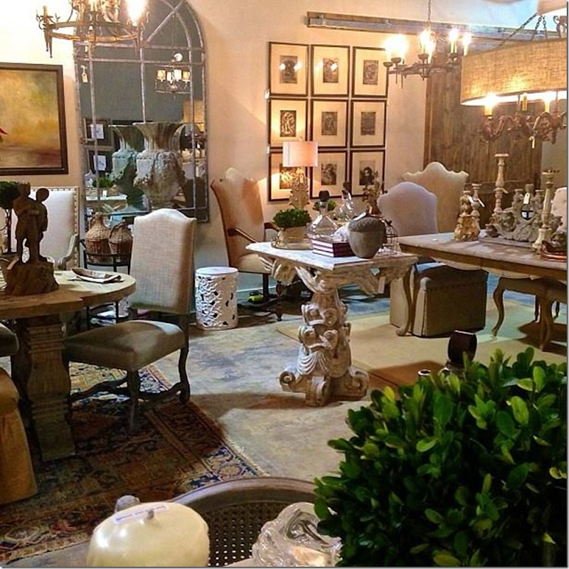
Shopping at Providence Design is an fun experience – it’s located in a warehouse, nothing fancy, but it’s a true labor of love for these two women. They
filled the shop with both new and old pieces – exactly how they decorate their clients’ houses. They strive to keep everything affordable as well as beautiful. I love their style and am so excited to show you some of their design work today!!
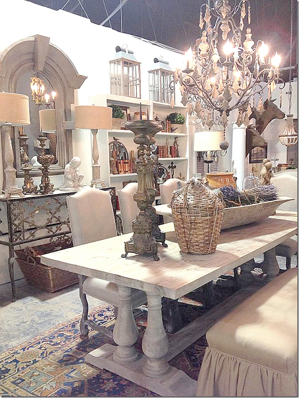
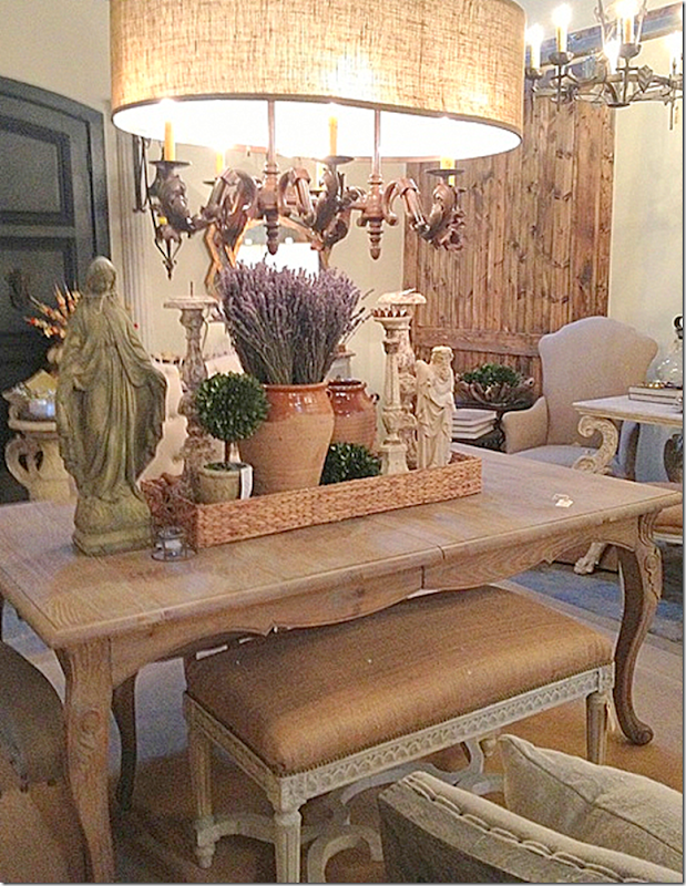
Here’s another view from Providence Design. Be sure to visit their web site if you want to order anything online!
Providence Design’s projects are often featured in At Home Arkansas magazine. All the past issues of this magazine are available digitally in case you want to see more of interior design from Arkansas. I love free online magazines!
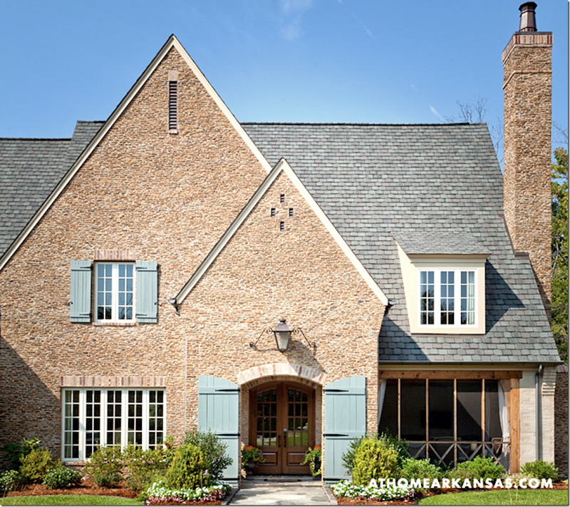
The first project from Providence Design, shown in the November 2013 issue of At Home Arkansas magazine, is this wonderful house with turquoise French shutters at the front door. I love these shutters – aren’t they wonderful?!! The screened porch is at the front of the house – on the right. This house was designed by architect T. Douglas Enoch and it was built by the Parkinson Building Group.
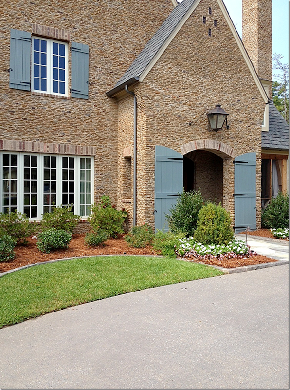
Another view of the front entrance with a traditional French lantern centered over the arch.
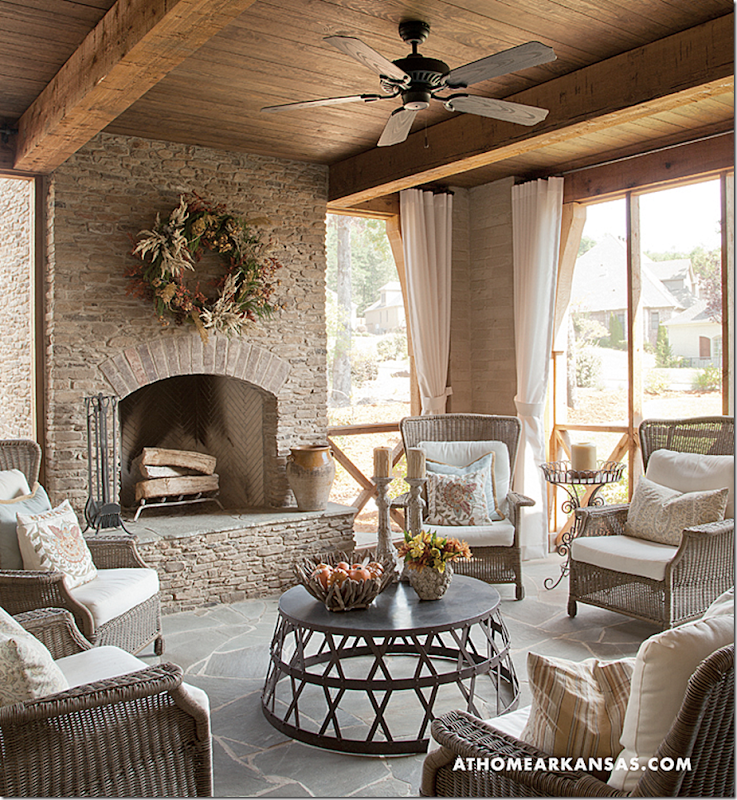
At the side of the screened in porch is the wood store which was created in the back side of the fireplace.
The front screened in porch is decorated like a room inside the house.
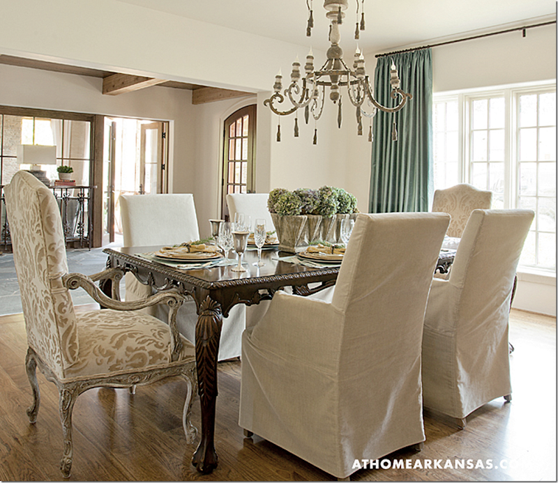
At the front – to the left of the entry is the dining room. Notice the screened in porch seen through the French doors. Mona and Sister used the owners previous furniture – they just updated it with slipped chairs and added the host chairs.
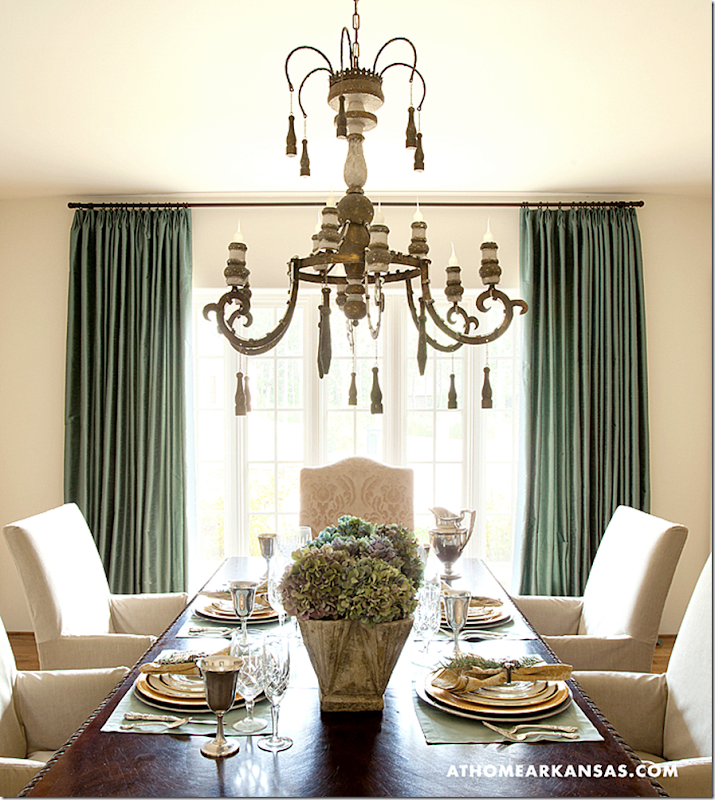
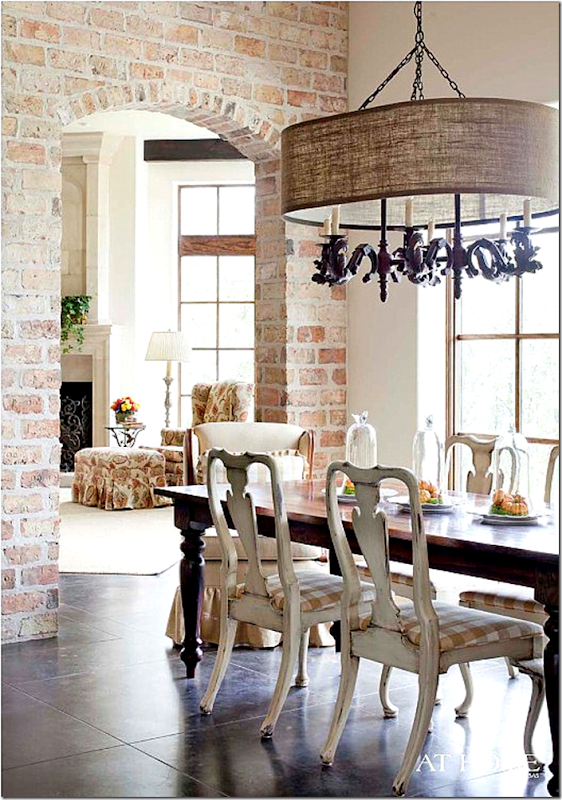
I love the chandelier – with its painted white finish!
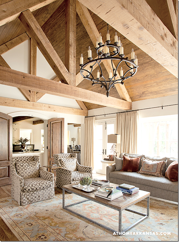
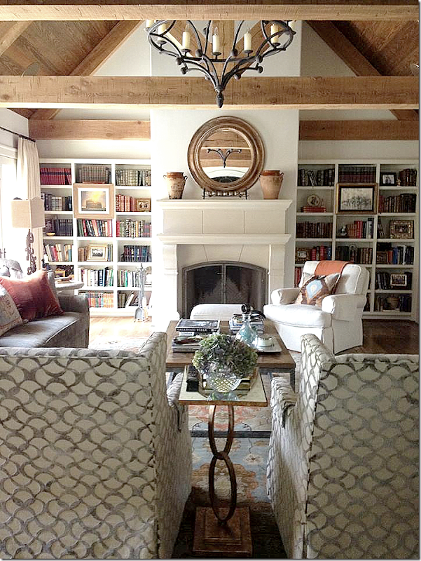
The tall, cathedral ceiling in the living room.
The room is a mix of traditional furniture with more contemporary fabrics. Notice the wood shutters that separate the kitchen from this room.
The house was built without using crown molding and baseboards.
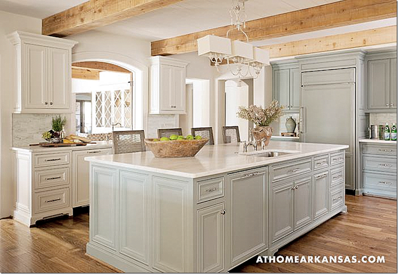
White cabinets mixed with those with a hint of blue were used in the kitchen.
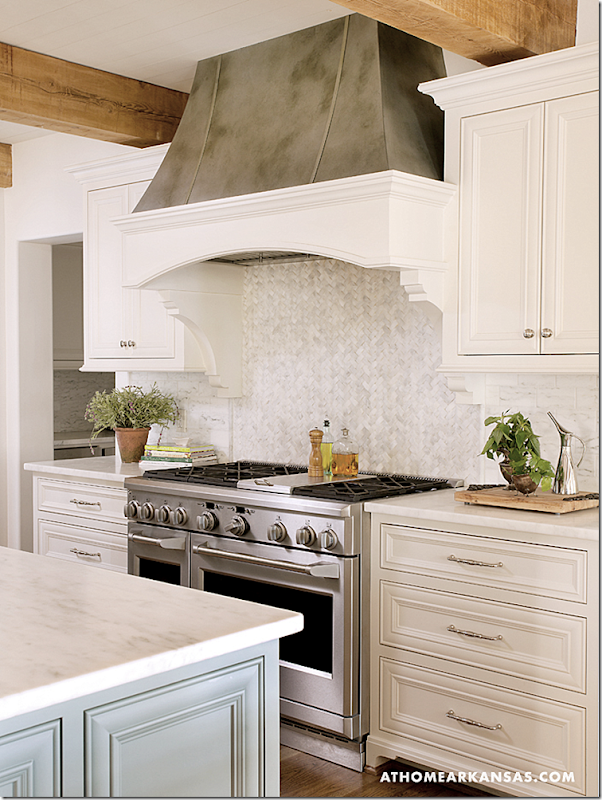
In favor of more authenticity – the hood is made of copper.
I love the flagstone floor in the breakfast area!
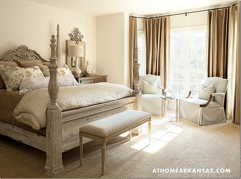
The master bedroom.
And the fabulous master bath – again, with the wonderful flags. I love the chandelier and the sconces. Too pretty!
The second house shown today was seen in the November, 2011 issue of At Home Arkansas magazine:
The house was again built by the Parkinson Building Group – but the owner is Bill Parkinson himself and his wife Jessica. They asked Mona to help them furnish their large French inspired house located in Little Rock. This is the couple’s fifth house they have built! The house is built on a bluff with a view of the river from some of the rooms.
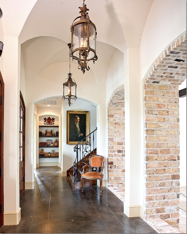
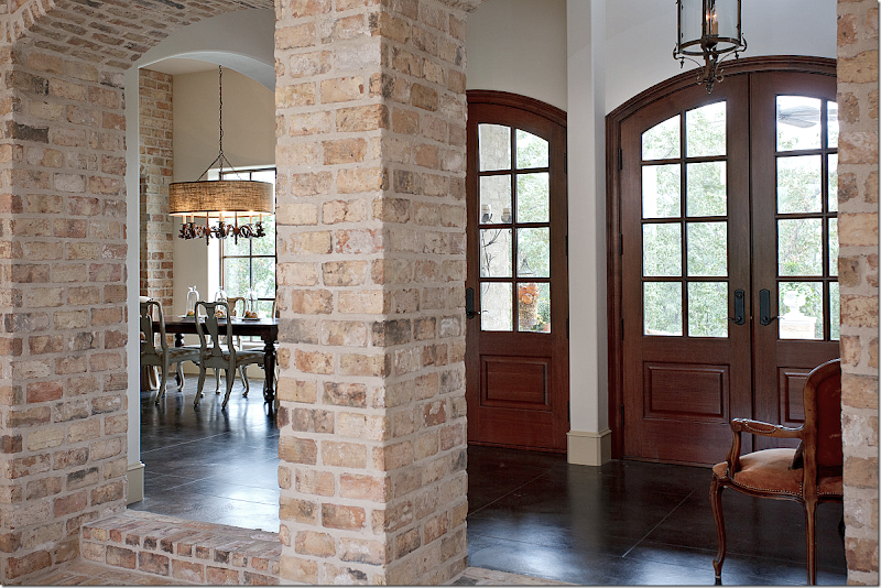
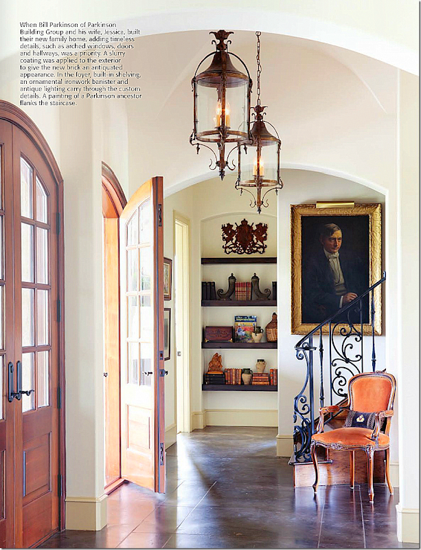
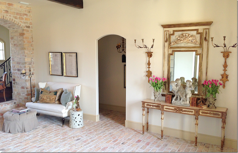
The floors are stained concrete and brick. The couple love exposed brick and chose to put a lot of it inside the house. The painting hanging in the staircase is an ancestor. Notice the groined ceiling in the foyer. At one end is a built in bookcase that warms up the area. To the right is a series of brick arches that lead to another room with the exposed brick floors.
The breakfast room is off the foyer to the right of the front door.
A close up of the built in bookcase and beautiful iron railing
The room off the foyer has brick floors and wood beams.
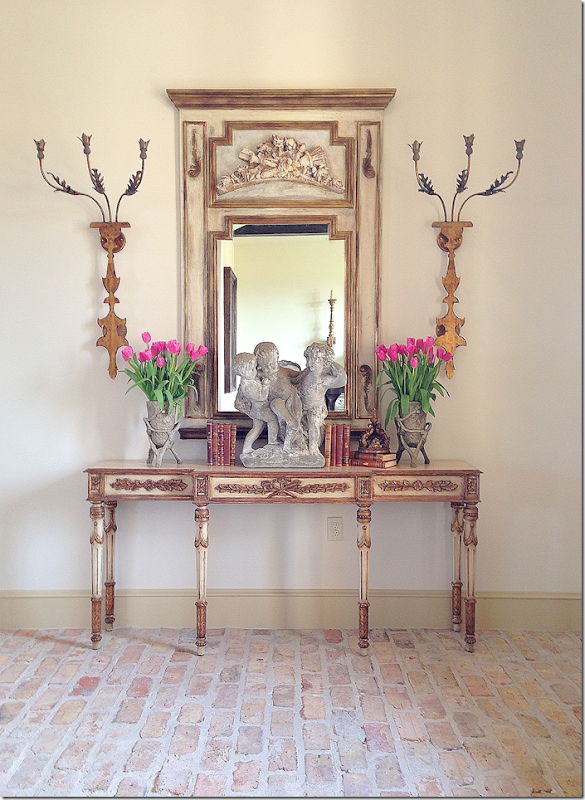
A close up of Mona’s vignette on the console table.
Providence Design’s aesthetic is a mix of old and new. The antique books add a warmth to the stone cherubs.
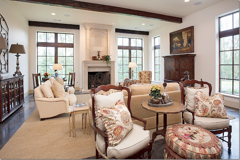
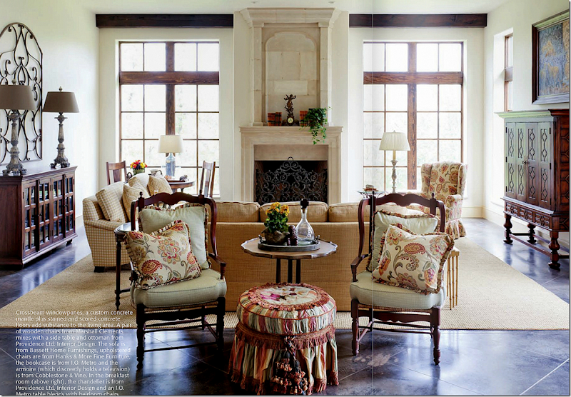
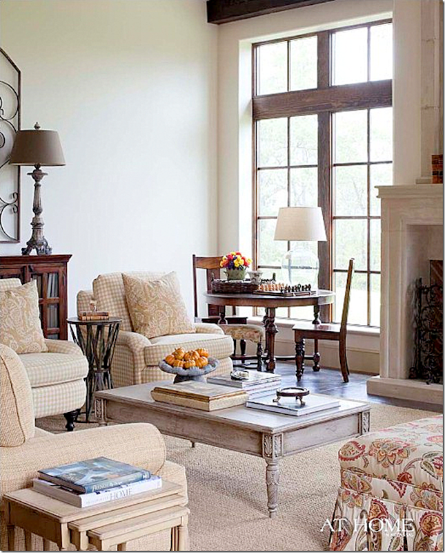
The large family room is furnished with French antiques. There are two check fabrics and a floral pattern used as an accent.
I love the way Mona placed the French chairs here instead of a console table behind the sofa. The chairs seem so much more welcoming.
A view of the left side of the room - showing the painted tables that mix with the stained dark wood furniture.
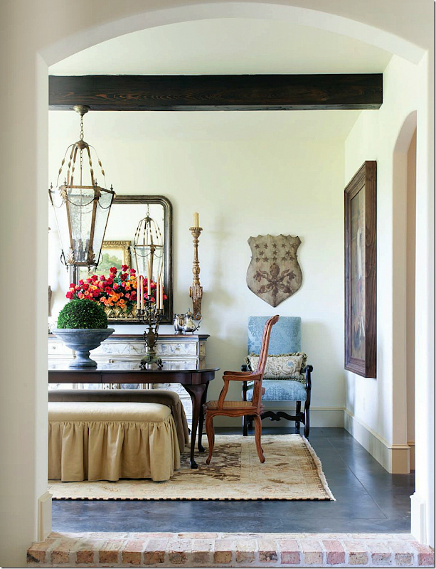
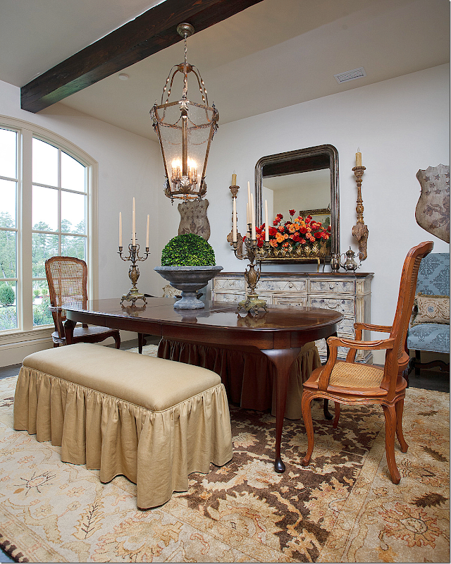
Up the brick steps is the dining room.
Mona opted to use a pair of slipcovered benches instead of chairs. A lantern hangs over the table instead of a fancy chandelier. I love the dining room – it’s so F rench!!
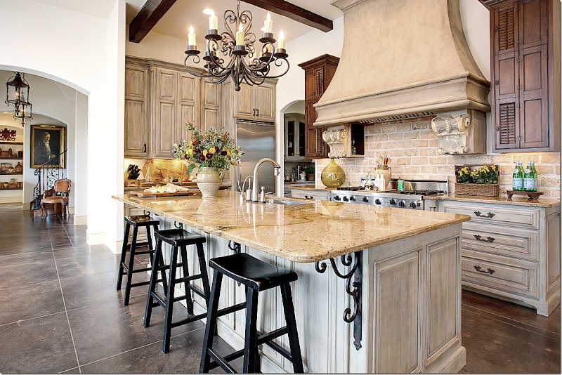
At the end of the foyer is the large kitchen – notice the corbels on the stove’s hood. The backsplash is the same brick found throughout the house. And notice the cabinet doors that flank the stove with the shutters – so cute!!
The breakfast room with the French chairs in checked fabric leads to the large living room.
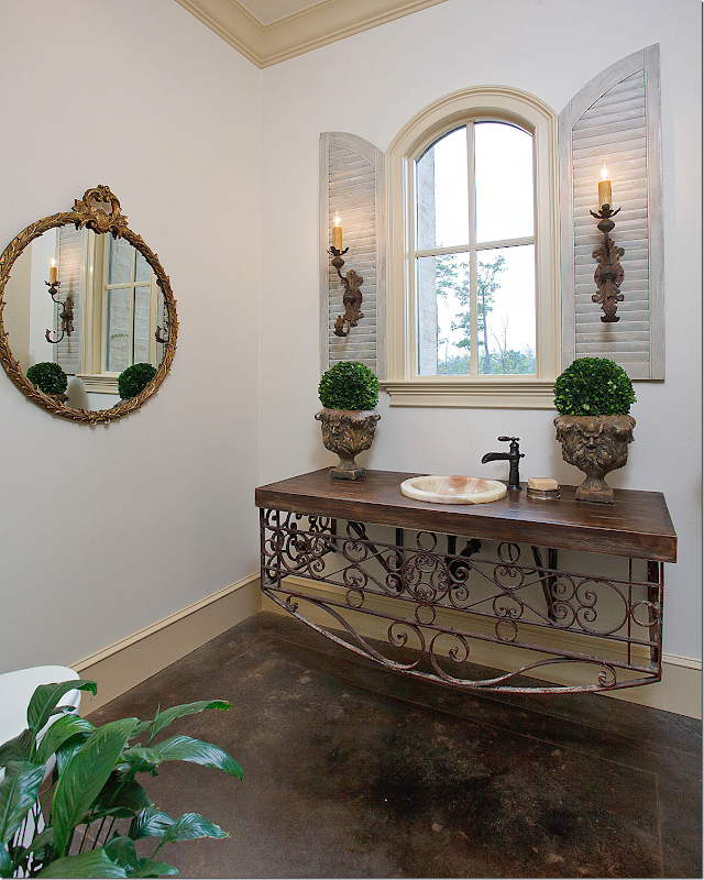
The powder room has a repurposed iron railing console. Notice the indoor shutters. I love how they added the sconces there. Beautiful!
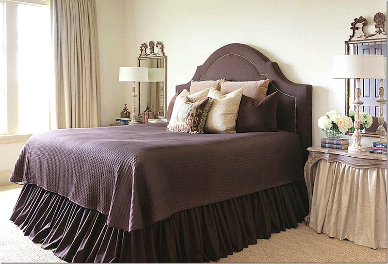
The master bedroom - the bed is flanked by a pair of French mirrors.
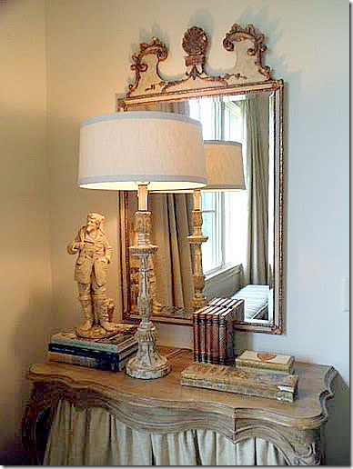
Notice how a linen skirt was added to the bedside consoles.
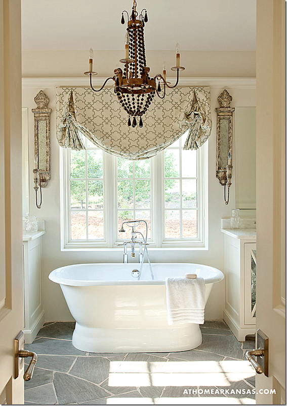
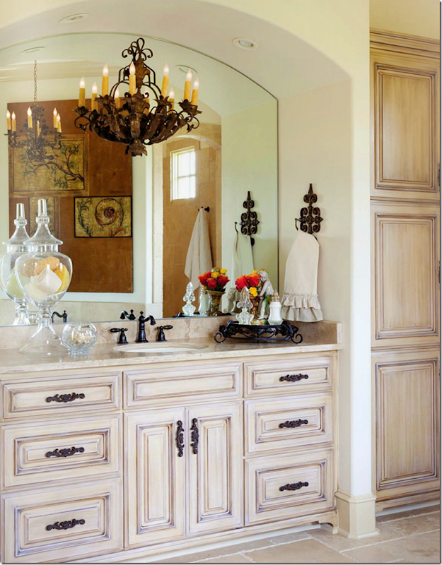
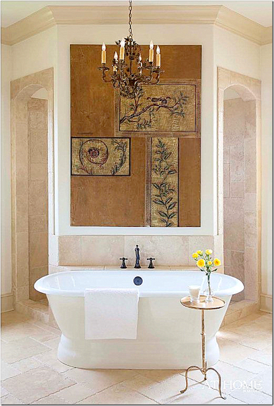
The master bathroom.
A tub stands in front of the double sized shower.
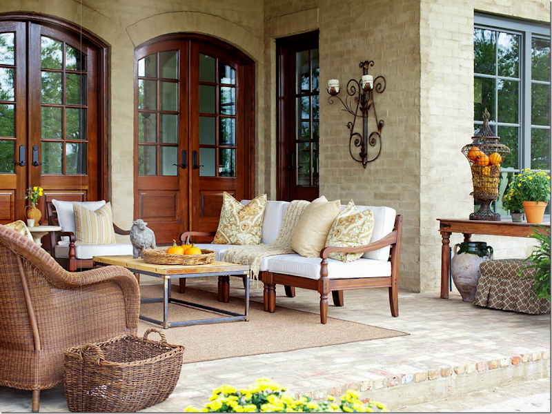
And, outside – the back porch is treated as another room.
I hope you’ve enjoyed seeing the work of Providence Design. Besides working in Arkansas, they also do design online. A huge thank you to Mona and Sister for sharing their photographs with us today!!!
To visit Providence Design’s web site and to order from their shop – go HERE.
To read Providence Design’s blog – go HERE.

Personally, I’m in love with these cloche candles they sell!!






I have been a long time fan of their blog and now I see why they are so successful .
ReplyDeleteWonderful lanterns, chandeliers, shutters....and I could soak all day in the free standing tub. All the rooms are so inviting!
I have been reading their blog for quite some time and always enjoy it. I only wish I lived closer so I could shop at their amazing shop! Okay, I'm off to visit their online store now :o)
ReplyDelete~Des
Ok, my heart is beating really fast. I love these two! I've been following them for quite some time. And literally following
ReplyDeletethem - I saw them at Round Top and wondered just what treasures they were buying! I would have paid to just hang around this talented pair. Super post Joni. And the new shop is on my must visit list !
Beth
Once again, I'm nauseated: nothing but neutrals. WHEN is this white blight going to stop? Nothing I haven't seen before a million times: only thing HOUZZ features and French country blogs show now.. No wonder textile companies are closing shop. Am I the only one out there yearning to turn the neutral page? I have a memory: there once was a decorating universe with pattern, texture and COLOR. Cultlike believing the only way to have a calm interior is to have a colorless world. Not for me, but I wonder why nobody else seems to find this true?
ReplyDeleteThat being said, these two gals are adorable and they do colorless really well!
Seriousy? I think they use a lot of color! I do not see what you are talking about?
DeleteThe same Anon: Surprised you see color compared to let's say, Mario Buatta or Miles Redd. This is the same 'washout' look that is eternally popular. Honestly, I like this look, but I don't like it when it's so ubiquitous that it steamrolls every other type of decoration. I see 'hints' of color, but this the neutral look, is it not?I
DeleteI just returned a book that someone lent me on French Country (as in the real French countryside) that someone wrote and photographed in the mid-90's. No neutrals, no Gastauvian....this is a totally new and artifical trend that took hold in the last 15 years. Interiors before were more multi-colored with deep caramel the overriding color and walls often were clad with patterned fabric.
Remember the Pierre Deux look when it first came out? Something like that. And Charles Faudree mastered it better than the French!
If your sources are Mid-90's publications, then no wonder you see no neutrals, no Gustauvian. Charles Faudree gave us his interpretation of what he perceived as country French. I suppose many French designers found some humor in it's over layered, over worked attempt to imitate. I don't disagree that because of the internet, there appears to be a saturation of the neutrals, but then I am assuming that the clients who are being served by these designers doing this work know that trends come and go and that is their risk.
DeleteI prefer the "white blight" as far a kitchen is concerned. I do love jewel tones though. Joni thanks for this great post. I'm familiar with the area and have family in Pleasant Valley off 430 in Little Rock. One can see all the great homes over looking the Arkansas River while traveling south on 430 crossing the river. Thanks for posting.
ReplyDeleteBeautiful ladies with a lot of talent. I enjoy their Sunday night supper post on their website as well as their designs. I especially like house No. 1, the furnishings are lovely and the flow of the house is well done. I would live on the screened porch in the summer and the rest of the time enjoying the beautiful kitchen. House No. 2 is trying a bit too hard at attaining some faux provenance or authenticity. Way too many hard surfaces.
ReplyDeleteI've been following these ladies on Pinterest and Facebook now for a while. They are very talented...would love to see their store one day. I also showed my friend the large iron and burlap light fixture in the dining room and she ordered it through them for her new home. It's beautiful and well-built! Thanks for the feature :)
ReplyDeleteI am also a huge fan of theirs, they are as beautiful as they are talented!! Loved seeing so much of their beautiful work on one page...great post! This post also reminded me of how much I love brick interior walls....gorgeous!
ReplyDeleteI have also been a long time fan of their blog. Mona and Sister are two very talented ladies and I'm so pleased that they've opened a shop in Little Rock. Maybe one day I'll get to see their store when I'm down that way. You've done a fabulous job of featuring their work.
ReplyDeleteSam
Joni
ReplyDeleteWhat is your view on tiled flooring in "living" areas that aren't the kitchen/hallway? I live in a lateral appartment in London and was considering tiling in a neutral large tile throughout with large rugs on top. This is v.practical as the rugs can always be rolled back - there isn't space/money in my life to have a utility room and garage so sometimes the lounge has to double as "potting shed" or "bike repair room", so washable surfaces are important. I see a lot of hard floors in the houses above. Do you have a view?
I like stone better than tile floors in the areas - i think that is very beautiful!!!
DeleteManor house architecture with subdivision landscaping.
ReplyDeleteOf course I adore that style once the manor house has an owner wanting a manor house garden ! Voila, a new client.
The sisters are new to me Joni, thanks for the introduction. And, yes, the Southern stuff. I grew up with great aunts known as Big Sister & Little Sister.
A lot happy the sisters store is far, far away. Very safe.
Garden & Be Well, XO Tara
my favorite - big sister and little sister! the best!!!
DeleteMona and her sister do have an eye for beauty! Love their style and I am always looking forward to Mona's blogposts! They are both very talented designers! Thank you for this post Joni!
ReplyDeleteAnd congratulations to Mona and Talena for these beautiful house projects!
xx
Greet
The way the look and dress their taste has to be exceptional!!
ReplyDeleteI couldn't agree more. I have never had a decorator this beautiful. Lovely, lovely ladies and I bet they are just as sweet.
DeleteThey couldn't be any cuter. What I love about their style is that it isn't cookie cutter. They bring elements of many styles in. It's beautiful and interesting.
ReplyDeleteI picked up several ideas for my new home.
As always Joni, a fabulous post.
Absolutely fabulous. Your blog just keeps getting better and better and then some!
ReplyDeleteLucky Little Rock!! Fabulous photos of their work and it SO SPEAKS to my aesthetic!! Heading right over to their blog!! THANKS!! franki
ReplyDeleteThis comment has been removed by the author.
ReplyDeleteJoni thank you so much for featuring Mona and Talena. They are two of the most talented and lovely ladies in the design business!
ReplyDeletexoxo
Karena
The Arts by Karena
OMG...I am so thrilled! I'm from Little Rock and had NO IDEA these ladies existed!!! I love it! Can't wait to go check out the store...heading to their blog and store website now!
ReplyDeleteFinally...it feels like Little Rock is moving on up! :)
Thanks for the great post!
Love the look the Cloche Candles. However, since I make and sell container candles, I know that you could not burn those candles while under the cloche ~ no oxygen! They would smoke and be snuffed out within a minute or less. Still, a very attractive look if you just want a candle for show.
ReplyDeleteAlso liked the use of the linen skirt UNDER the curvy wood of the console in the master bedroom. Excellent way to add visual weight and softness while maintaining the decidedly French look of the console. At my house I would use the skirt to hide a basket of books and perhaps other bedside necessities that might otherwise clash with the decor.
Did not know about their blog. While I am not a fan of the white-and-grays malaise, they do have some interesting ideas worthly of emulation.
Joni,
ReplyDeleteI love Mona and Sister's blog. It's fun to see a concentrated dose of their amazing work. Wish I lived closer so I could visit their shop.
Karen
LOVE everything!! It's a good thing I'm nowhere near their store *winks* Vanna
ReplyDeleteThis is just so lovely of you, Joni. I think they have a look similar to your's, don't you? Very high style but very comfortable too.
ReplyDeleteBeautiful post !
These two have come a long way in the past few years toward developing a true eye for design. Must say however, they still have a lot to learn.
ReplyDeleteThey obviously have been able to acquire some interesting accessories for their shop, but when it comes to selection for specific pieces in a room,
their amateur eye shows through. Enough angel statues and endless gilded sconces! I'm not trying to be mean spirited, I know their style has it's
place and if it pleases the client that is certainly the end goal. There are many designers and individuals that have a keen eye and are truly creating
exquisite interiors from classic to contemporary. These two are not quite in that category, but with time, perhaps they will learn to decorate from instinct
instead of the predictable.
Laura, you basically outline the risk of using designers who also run retail shops. They buy what sells to the public and they have to get rid of it before the next buying trip. I agree with you that the sight of statuary and sconces which were from an "old church" in France - wink, wink, are a bit of an over kill.
DeleteWow, I am working on a contract flying into Little Rock a couple of weeks each month. Can't wait to visit their shop!
ReplyDeleteI like the look, I am just so tired of it.... I am really into interesting mixes and some color. They are super cute and I do follow them . Just ready for something new and exciting.
ReplyDeleteI'm a huge fan of those two! Mona and Sister have such taste, style and pizazz. Their interiors reflect it. And, oh my gosh, can they do Christmas!!! Also, they share the best recipes - yum!!! Fabulous post, Joni.
ReplyDeletexoxox
Loi
PS - Their shop looks fabulous - hope to visit with an empty van in the future!!
ReplyDeleteI love these two homes...I really everything about them. They are very warm, inviting and interesting. I see many things that I could mirror in my own home. Thanks for the inspiration! I did not know about their blog, so thanks! This was a great post with very pretty interiors!
ReplyDeleteLovely post on the Sisters! Keep up the great blogging Joni...loving every one!
ReplyDeleteSusie from San Antonio
What a wonderful post! What cute and special sisters, thank you for sharing! Oh my, those homes are just gorgeous!
ReplyDeleteLOVE the sisters!
ReplyDeleteI remember when I began blogging and Mona would leave encouraging comments on my posts. She is as humble as she is beautiful and talented!
Thanks for sharing this, Joni!
xo
Andie
these houses are beautiful and look welcoming. However I would decline a dinner invitation to house #2 if I had to sit on a backless bench all evening! While a very cute look, the comfort factor (and that should be the most important consideration for a host or hostess) is non-existent.
ReplyDeleteMy thoughts exactly. Comfort should be the focus of any dinner party and two benches put guests at a distinct disadvantage. This may be cute, but it is not only impractical, but actually visually unappealing.
DeleteThe visual appeal is even more diminished by the use of an English table with Queen Anne legs. The look is contrived and the styles were never meant to compliment each other.
DeleteThese ladies are really growing their business! These are two lovely homes for their portfolio. Mona is as sweet as she can be and I wish them all the best in the world. Beautiful feature here, Joni. Love those slate floors!
ReplyDeleteI love the 2 wood chairs. They remind me of the ones in Charles Faudree house. I found on and old blog of yours that the name of the wooden chair is called Josephine. Would you know where I could find the Josephine chair or the ones in this living room. I really love these chair and have searched on the internet with no luck. With your connections I though maybe would know. Please advise.
ReplyDeleteBeverly
Reminds me of the song from the Marilyn Monroe/Jane Russell movie, Gentlemen Prefer Blonds, "We're Just Two Girls from Little Rock" I have a feeling that these women don't live on the "wrong side of the tracks."
ReplyDeleteThrilled to see the sisters so beautifully featured. They'd are as lovely as their work
ReplyDeleteDebra
Nice information presented . you can also go through this Interior Designers for MNC Companies in Bangalore
ReplyDeleteI love brick floors, if I ever build my own home I'm having brick floors, it instantly gives the effect of a French farm house.
ReplyDeleteYour Blog is quite impressive. I was searching this type of information. Do write such type of articles in future also.
ReplyDeleteJoni, Joni, JONI!!! This is wonderful , and the shop is worth a trip to Little Rock to go see! Thanks!
ReplyDeletexo
Sheila
Where is the coffee table from on the porch with the wicker chairs?
ReplyDeleteDelighted that I found your site, fantastic info. I will bookmark and try to visit more frequently.
ReplyDeletemoving companies in Winter Park