My own photograph of Donna Gray’s living room.
A few months ago, I took photographs of The Gray Door’s Donna Brown’s townhouse above her shop HERE. Now, I’m not a great photographer. Everything I know about cameras I learned from tutorials on the internet and that is not saying a lot. For a while I thought that the better, more expensive the camera – the better, more professional my photographs would look. But – that isn’t the case. There’s a reason why magazines and interior designers hire professional photographers to take pictures of houses...their images just look better!
When I took the pictures of Donna’s townhouse, I knew that the magazine Antique Shops & Designers had already taken their own photographs – hiring the wonderful Jack Thompson for the story. And though I do love taking my own pictures – I couldn’t wait for you to see Thompson’s photographs of Donna’s rooms when the magazine went online, which it just very recently did. His photographs show off her beautiful space so much better.
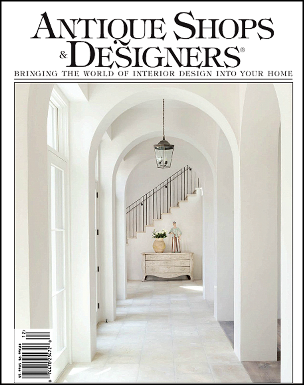
The cover of the new issue of Antique Shops & Designers. The cover shows a new house designed by the editors of the magazine - Dot & Dana Design (713-254-3458). I can’t wait until they show more of the house – maybe the next issue?!! It looks gorgeous!!!
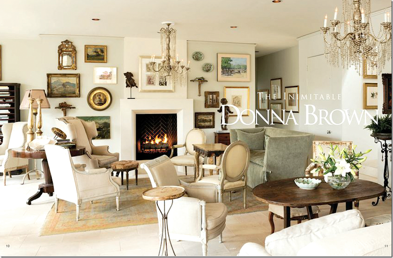
Here is the magazine’s view of Donna Brown’s living room. OK. It might not look that much different to you than my photograph – but all I can see is the flaws in mine! I love how you can see both chandeliers in this view. And the fireplace is lit – something we didn’t do, but then again, it was summer. Still – it looks so much better lit. My favorite part of the room is the gallery wall of paintings. I love how she included the oil in the round, gilt frame and the antique mirror and it makes me want to copy this in my house.
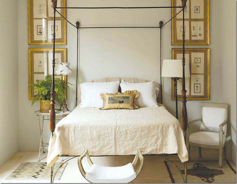
Donna’s bedroom – great symmetry with the four frames surrounding the four poster bed.
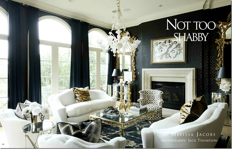
Another story in this issue shows the townhouse of Renea Abbott and Greg Manteris. While, we’ve seen the living room before – the pictorial shows rooms in the townhouse never seen before. I loved finally seeing more rooms.
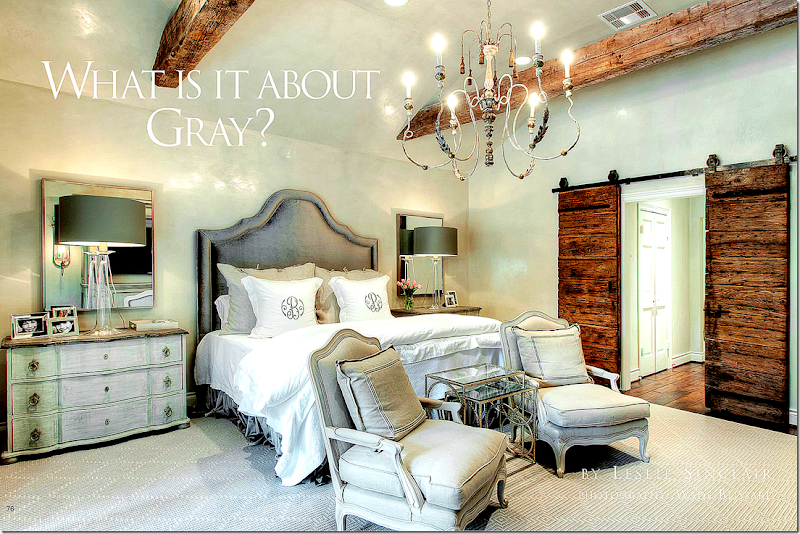
Leslie Sinclair of Segreto Finishes wrote this wonderful story about the color gray, probably THE color of this decade. Look for really exciting news about Leslie coming here soon!!
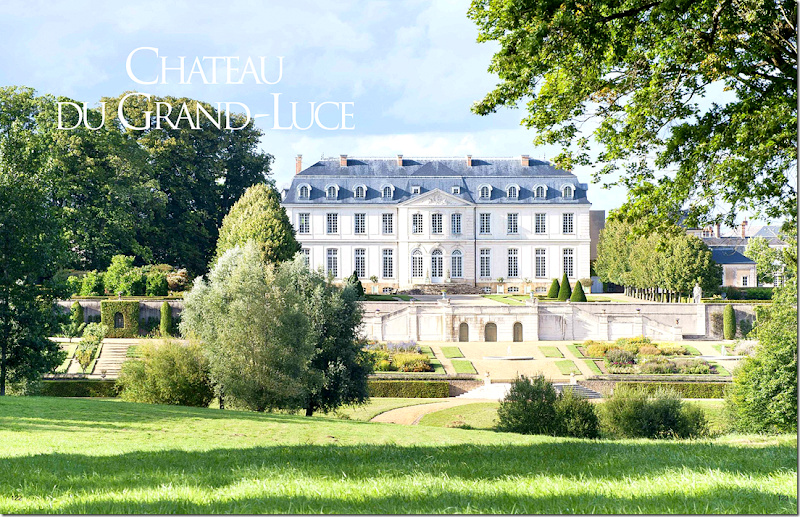
And my other favorite story in this issue – is this one about Tim Corrigan’s French estate – Chateau du Grand-Luce. This is the back view of the mansion which overlooks acres and acres of parkland. The interesting thing is that the front of the estate is located right in the middle of town. Seeing this, you would think the house is in the countryside, but – the front gates are right off the main street. The story of this large estate’s renovation is incredible and Corrigan wrote a book about it last year.
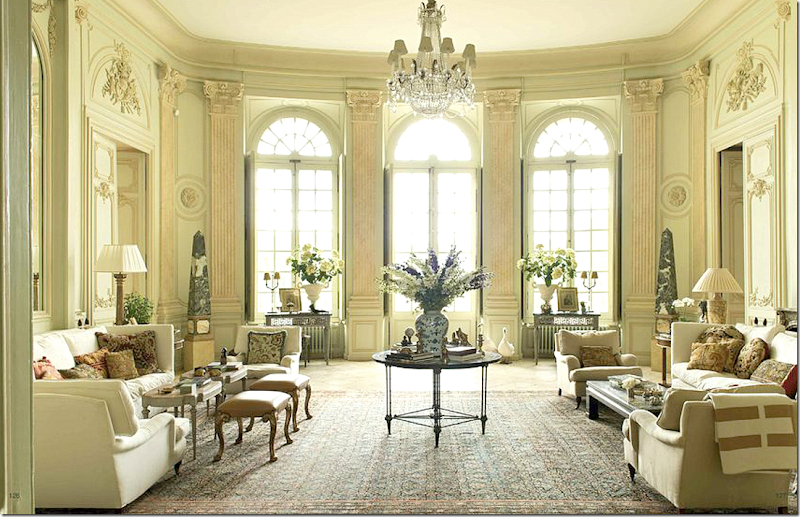
Here’s a photograph from the magazine showing the main living room in the mansion.
As usual, there are many more stories on art and design in this issue.
To read the current issue of Antique Shops & Designers – go HERE.
Enjoy!!!
If you are interested in reading Tim Corrigan’s book about the Chateau du Grand-Luce – just press the photograph below !


Beautiful!
ReplyDeleteSheila
stunning!
ReplyDeleteIt looks like there are different sofas in the Donna Gray's photos. I look forward to seeing your own photos. They are more real to me.
ReplyDeleteCorrigan's living room proves that white slipcover couches with mixed layered pillows does not have to be bohemian or rustic cottage. I also like your first photo! Much more substance than the professional photo that overemphasizes the top half of the room's glam where the eyes don't normally rest. Another enjoyable post!
ReplyDeleteI've never heard of this magazine and it sounds fabulous! Thanks as always for sharing.
ReplyDeleteThank Joni a treat as always!
ReplyDeletexoxo
Karen
The Arts by Karena
Gagging on the white and neutrals - please move on, there's whole world out there to rediscover!
ReplyDeleteJust "browsed" the current "on-line" "Antiques & Designers!" Marvelous!! Page 98 was a favorite. :) franki
ReplyDeleteHi Joni, Beautiful spaces. I love your photographs! Not too staged and just what we might see when popping in to visit. Have a super week.
ReplyDeleteMary
I keep thinking I need to subscribe!! What a fabulous issue!
ReplyDeleteWe need to talk. Donna Gray's living room. Those framed pictures are everywhere and it destroys the visual: in halls on the walls. Now the fireplace - great with that herringbone in the firebox, great with the brighter white mantel against the off white wall. Going good until we have to have some focus. The focus is destroyed by the pictures and all those chairs everywhere. I'm not sure, if I were a guest, just where the action is centered. There are sparkling moments in the living room but they are so diluted by the random hanging of pictures and the plethora of chairs that I lose the pluses.
ReplyDeleteBut as always, I am never lost in your blog which is simply superlative. My hat is off to you.
Ann
Joni,
ReplyDeleteSo gorgeous! Just when I am ready to throw in the towel on my "grand pile" you present a beautiful post like this one. Thanks for the inspiration. Annie
I am willing to bet this looks great in person, but in a photo, I agree with Ann. To much wall art and chair over load.
ReplyDeleteso nice blog and thanks for share
ReplyDelete