Five years ago, I wrote a story about a renovation of an old building built in the 1930s in Leiden – a small city about 30 minutes from Amsterdam, in Holland. A friend, Ron van Empel, whom I had met on the internet, owned the building which included three apartments and a décor shop. The shop houses Ron’s company, The Empel Collections, where he sells the lamps and lighting fixtures he designs and builds, along with other furniture for the home. His Empel Collections – started with just one lamp – and today has over 800 designs.
Mr. Ron van Empel
Why Holland? Well, I’m going to guess that many of you readers are the same as me, completely addicted to floor plans and renovations and stories of how one can turn an old, run down property into a beautiful and welcoming home, no matter what country it is in. Plus, it’s more interesting to read about a building in a foreign country for once!
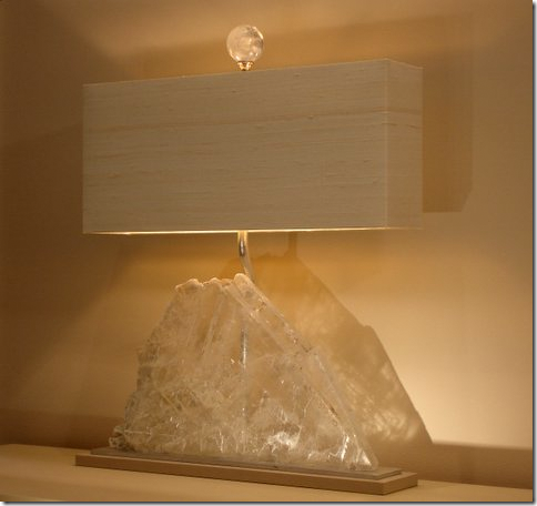
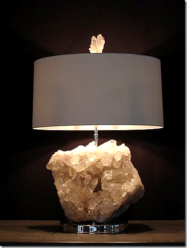
Ron personally hand makes his custom lamps which he also designs. This lamp has beautiful crystal spikes. Imagine this in a faux fireplace lit up – or on a mantel. This is my favorite lamp he has EVER made!!! LOVE LOVE LOVE!
In our email discussions, Ron would send me pictures to show me how he was restoring his property and by the time his renovations were over, I had 100s of his photos – which I would pore over, trying to figure out how it all fit together.
Using his pictures, I wrote the original blog story about Ron’s building and its restoration. Actually, it probably would have made a good design book.
But – at the time I wrote the story, Ron still had some work left to do. I couldn’t show the two back yard porches because they weren’t completed. And now five years later – he has renovated Apartment #2 and redecorated Apartment #1. It seemed a good time to revisit the Empel Collections building.
If you never read the first story or you need a refresher, it might be good idea to read the original story HERE.
Leiden
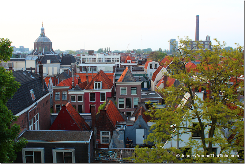
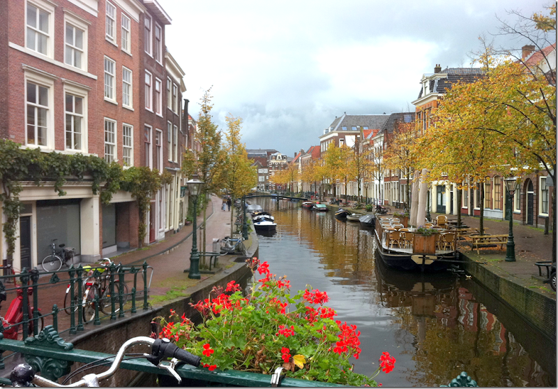
Leiden, with its many canals and quaint old town center, is considered one of the prettiest cities in the Netherlands. It’s known for being the birthplace of Rembrandt and home to the oldest university in the country, which was founded in the 16th century. The city is small, with a population of just 100,000 and 20,000 University students.
Charming Leiden
Buildings in Leiden are from the 16th century on – while Ron’s 1930s building is considered new. His neighborhood is in flux – basically middle class before, and today home to many university students – which is exactly what Ron was when he first saw the floral shop building.
To start this story, you must understand that space is a rarity in Holland – and every square inch of a building is utilized. Buildings are never razed, rather they are renovated. So that the exteriors retain their original look – changes are done on interiors mostly – while the facades remain basically the same with just a few changes.
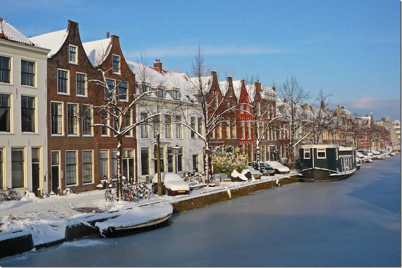
Winter in Leiden
When Ron moved into the building, it was a flower shop with three apartments. He bought one apartment, Apartment #1, over the shop – using it as both his living space and work space. At the time he was an interior designer, but he gradually began designing and building custom lamps. As his new business took off, he needed more work space, so he bought Apartment #2 in the building.
All the while he coveted the space owned by the flower shop. If he owned that space, he could expand his business from just lamps to home décor. Eventually, his prayers were answered, and the flower shop was put up for sale. He then spent three years negotiating the deal and another year renovating the space, turning the decrepit shop into a beautiful showroom for his lamps and home décor merchandise.
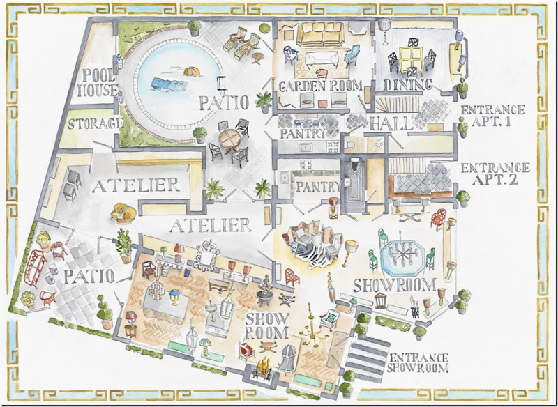
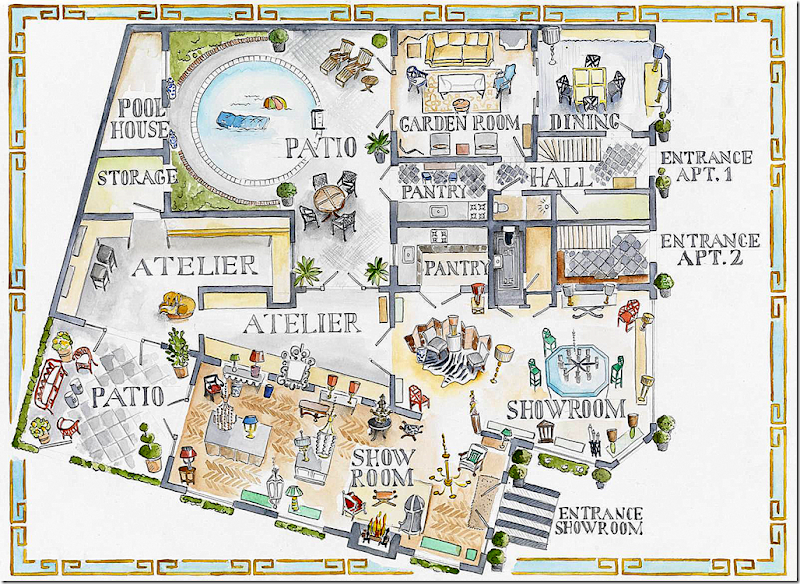
Using Howard Slatkin’s hand drawn floorplan as inspiration, Ron’s new (and only ever) employee, who is also an artist, drew his building – showing the entire first floor – including Apartment #2 and the two back porches. Use this plan as a guide to follow the story.
The Map: At the left is the showroom with its entrance in the new main annex and the patio behind it. Next is the showroom and the two ateliers (workrooms). Ron built the larger atelier – between the two back patios. Connecting to the showroom is the second patio with a pool and pool house that leads to Apartment #2. At the front are the three doors that lead to the 3 apartments.
Apartment #3 remains elusive to Ron and is the only part of the building he doesn’t own. But….one day!
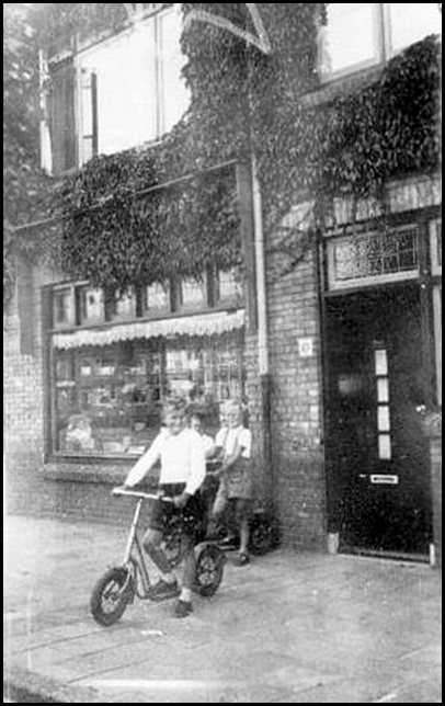
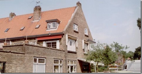
An early photograph of Ron’s building – seen right behind the family. Set on a large corner lot, the Empel Collections is today located where the large picture window is. Above is Apartment #1. Missing from this picture is the annex that sits to the left of the building. It was added at a later time.
The front of the building – showing the door to Apartment #1 and the large window where Empel Collections is located. The window is the original – with the leaded transom above the plate glass. Retractable awnings once covered the windows.
Another early view of the building, showing the main street.
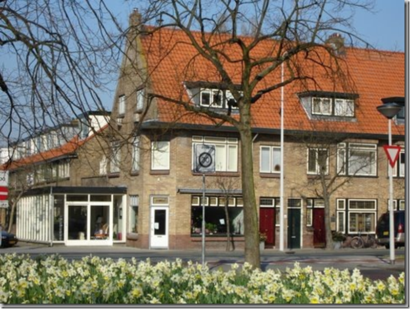
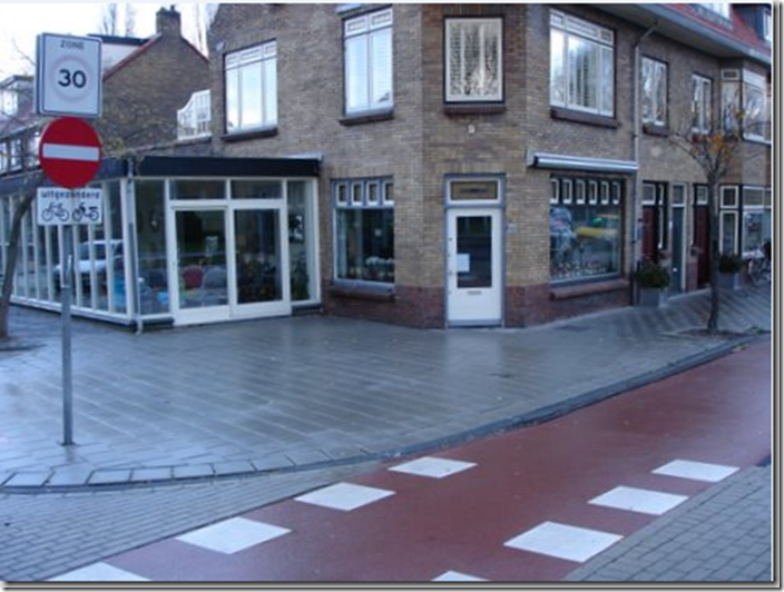
A color photograph of the front of the building – showing the one-story white annex that was added onto the florist shop. Later, Ron totally rebuilt this annex. The three doors to the three apartments are seen to the right of the front window. The last large window at the far right is the dining room in Apartment #2, recently renovated by Ron.
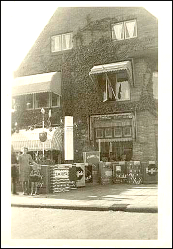
Here is a photograph from the 1930s – when the main tenant was a tobacco shop. You can see the large cigarette and pack props. The one story annex was added to the area where the family is standing. Above, is the two story Apartment #1 where Ron first lived. You can see the retractable awnings here.
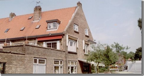
Today, all the vines are gone. The brick remains the same. Although Ron cleaned the brick, he couldn’t paint it.
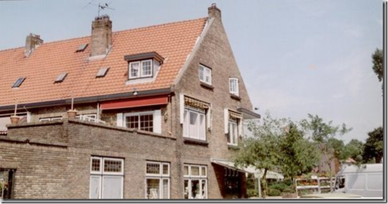
Another early photograph shows the side and back of the building. This is where the annex was added on. Above, on the second floor, behind the low brick wall, is an open air terrace that leads of Apartment #1. Ron often entertains on this terrace.
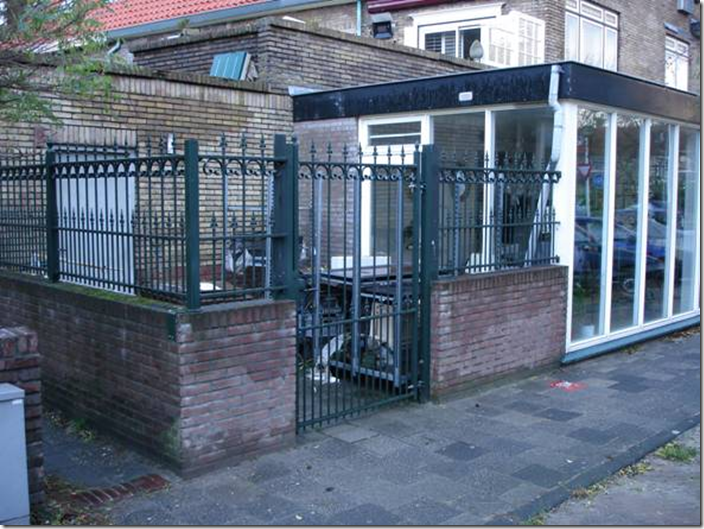
Another shot the side of the building showing the old white annex that the florist added to the building. When Ron bought the floral shop, he took the annex down to its studs, raised its roof and completely renovated it. The messy area behind the iron gates is today a beautifully redesigned patio.
Above, on the second floor, Ron added the faux white paned windows to each side of the terrace as a wind breaker.
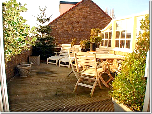
Today: that same 2nd floor open air terrace – as seen from inside Apartment #1. You can see the faux paned windows at the right. The left of the terrace overlooks the side street, while the right side overlooks the back swimming pool terrace.
Before the renovation, the painted white front door to the floral shop was located at the corner. Today, it is located where the new annex is.
TODAY:
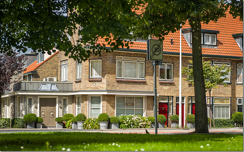
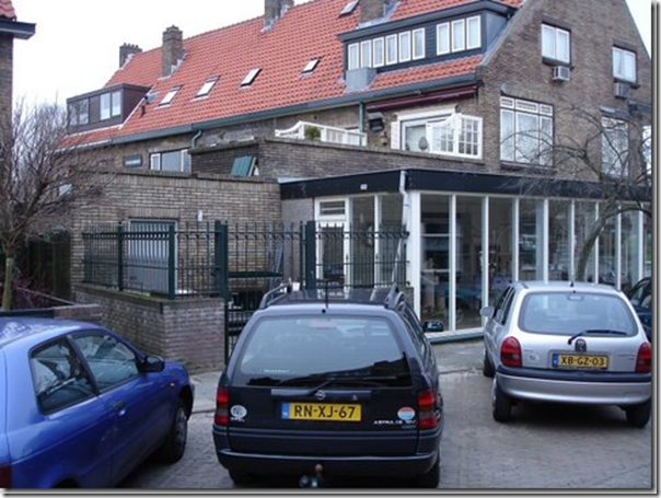
And today – the newly renovated building with the new rebuilt annex with its double, painted brown, front doors. Ron replaced windows so that they lined up on the first and second floors. You can see the former front door was replaced with a window. He also added a strip of white wood overhang on top of the front windows where the building is curved – this helps to unify the annex and the original brick building.
Empel Collections starts at the annex and continues to the front window. The three apartment doors are in red. The window past the red doors is the dining room in
Apartment #2.
Apartment #2.
Closeup of the beautiful new annex with the brown double front doors. Note its stacked stone chimney. So charming!
Ron completely rebuilt this annex, replacing the decrepit original add-on from the old flower shop. He tore down the first annex to the studs and raised the ceiling – topping it with the standing seam metal roof. Inside, he added a fireplace, which adds so much atmosphere to the showroom.
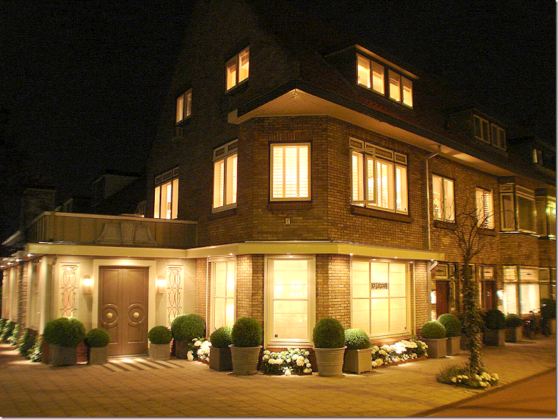
The new building is so pretty at night – with the three apartments and the showrooms lit up.
Let’s go inside!
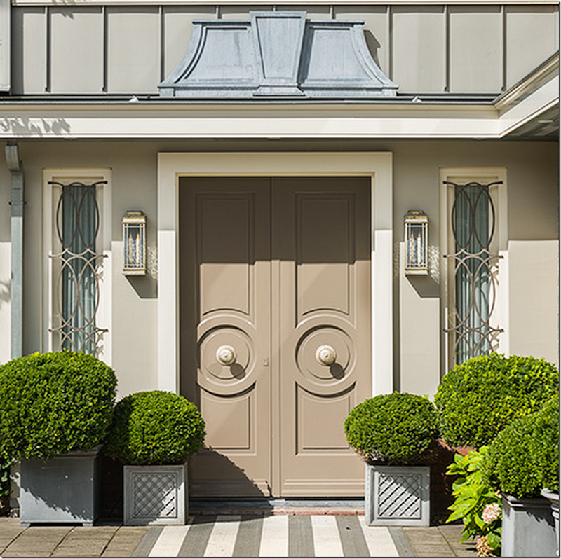
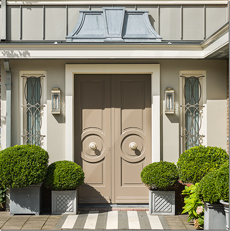
Inspired by the great Dorothy Draper, Ron designed the front doors, the lanterns, the side light grills, and the zinc pediment which tops it all off! He added Versailles styled zinc pots filled with trendy box and a striped rug.
The Empel Collections Showroom:
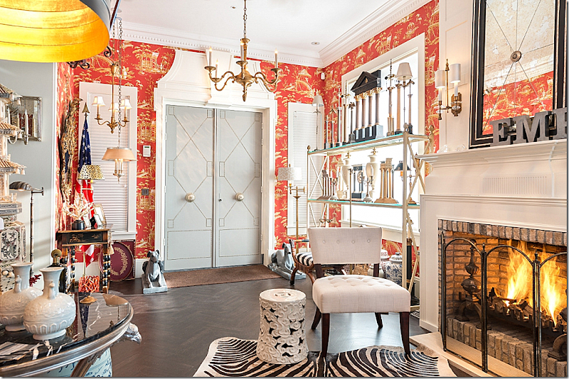
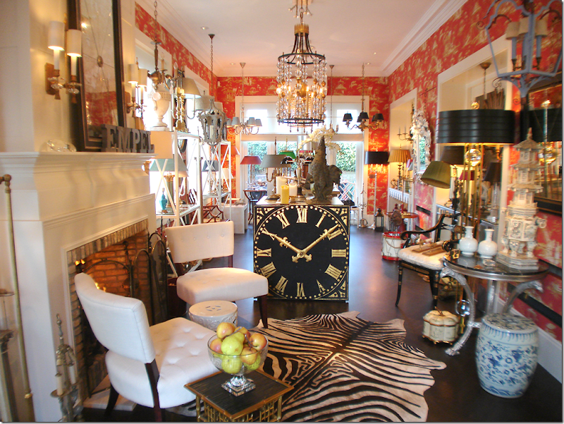
The double doors open into the newly renovated annex with its roaring fire. The room has dark, warm hardwoods and red chinoiserie wallpaper. The shelves are filled with his lamps and other décor items. Ron’s idea to add the welcoming fireplace was such a great idea.
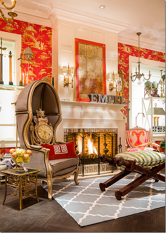
The fireplace with a new vignette of Empel lamps and furniture.
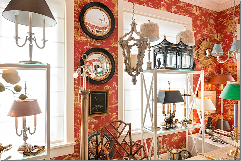
More lamps and merchandise.
Looking from the front door to the back patio, behind the iron gates.
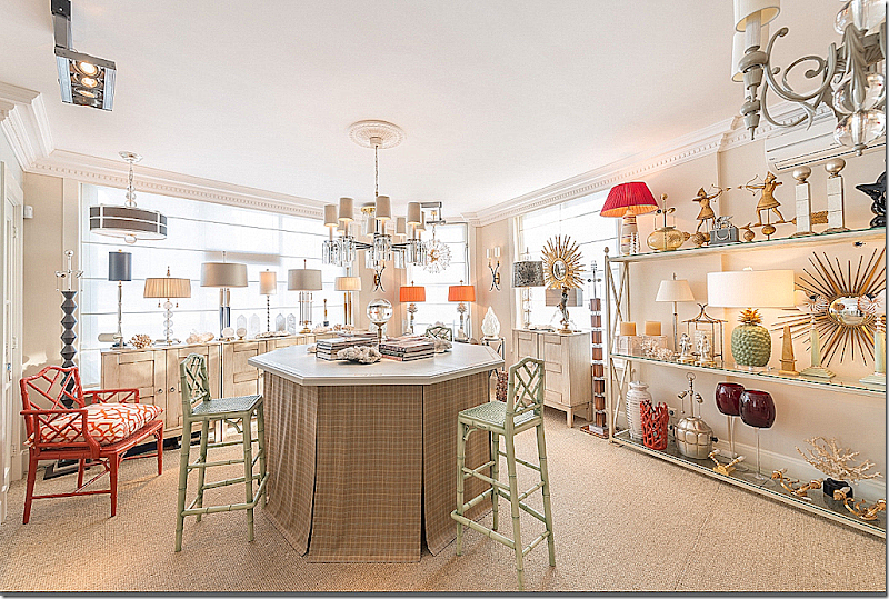
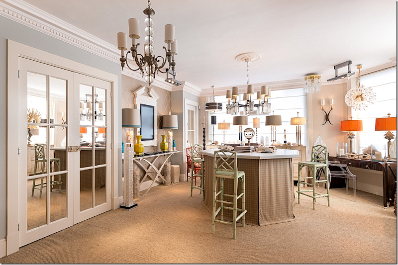
The main showroom is in the original 1930s building – with the front windows overlooking the street.
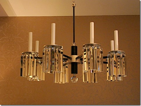
The mirrored French doors lead to the powder room. The showroom is designed to properly display the Ron’s lamps, sconces and chandeliers.
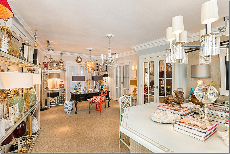
Looking towards the back of the showroom. The doors at the back right lead to the swimming pool and porch and Apartment #2. Another door leads to the kitchen. One day – when Ron retires, he plans to move into the showroom – making it his home.
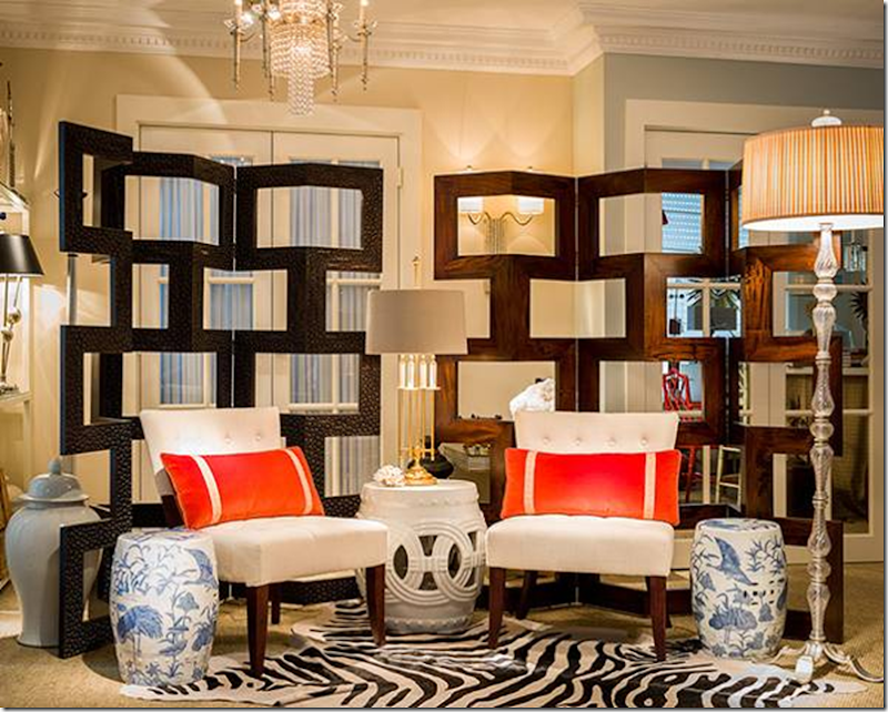
A new vignette in the showroom with modern screens and chairs.
Close up showing doors that lead to the Atelier or workshop. This Atelier behind the French doors was added on by Ron and is located between the back porch at the end of the annex – and the swimming pool porch, behind Apartment #2. Look at the floorplan to understand the layout.
I love the lamps Ron is designing using geodes and crystals for the base.
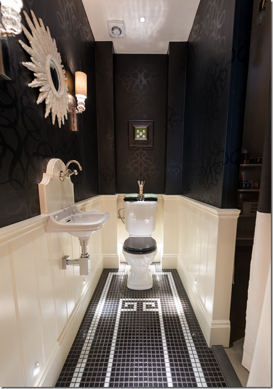
The powder room is black and glossy white. Another room inspired by Dorothy Draper.
Here you can see the large Atelier which was added on by Ron. It lies between the two patios.
There are two back porches behind the building. One porch has a pool and a pool house and leads from the showroom to Apartment #2. The second porch is at the back of the annex behind iron gates.
Original view: Here is the side and back view of the original building – before there was an annex. At the side on the second floor – is Apartment #1, including its 2nd floor open terrace. The terrace remains today. On the other side of the back of the building is the swimming pool area.
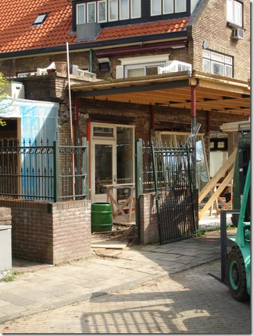
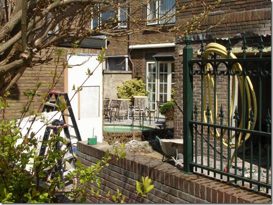
The old annex and the old patio – today this patio is completely redone. The brick wall on with the door was torn down – this is where the new Atelier was built.
The old annex – taken to the studs, the roof raised, ready to be rebuilt.
Here, the brick wall is now torn down and the Atelier is going up. At the right – you can see the upper floors of Apartment #1 and 2.
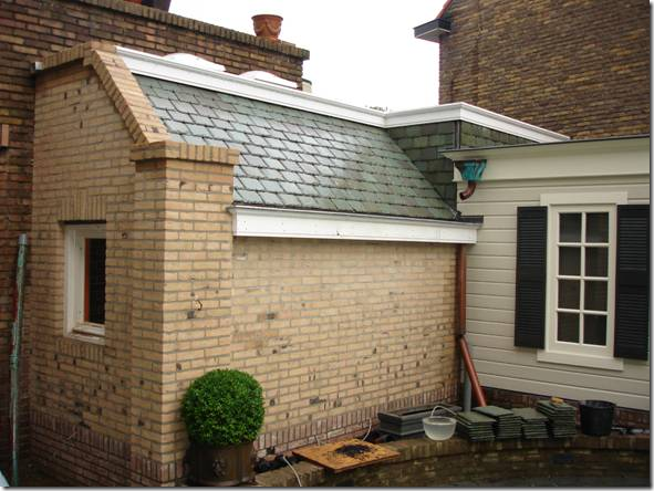
The new Atelier shown from the other side – between the pool porch and the annex porch. From this side – the new Atelier will become a charming building – to rival the charming pool house.
The almost finished Atelier – reached from the showroom. You can see how valuable every square inch is in Ron’s hometown of Leiden. Ron used a small alleyway between the building and the swimming pool porch and built the Atelier.
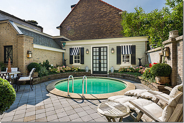
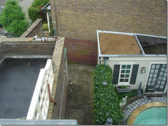
The swimming pool today, the small poolhouse and the new pretty Atelier building at the left. Behind the poolhouse is an alley. The poolhouse’s roof is flat. The tall brick wall seen behind the poolhouse is the neighbor’s building on the other side of the alley.
Now – this photo shows the pool and pool house and the ivy covered brick wall and hidden alley between the pool porch and the floral shop. This small space is where Ron found the room to build the Atelier building. At the left of the photo is the open terrace on the 2nd floor with the faux white windows. Remember – every square inch counts in this tiny country, which is slightly less than twice the state of New Jersey.
Here - you can see the top of the newly finished Atelier building, now in place where the hidden alley was.
When I wrote the first story about the renovation of the building, Ron had not finished with the back porches, which is why he wanted me to revisit Empel Collections to show off the new spaces!!
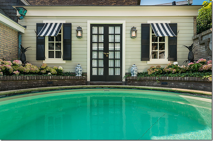
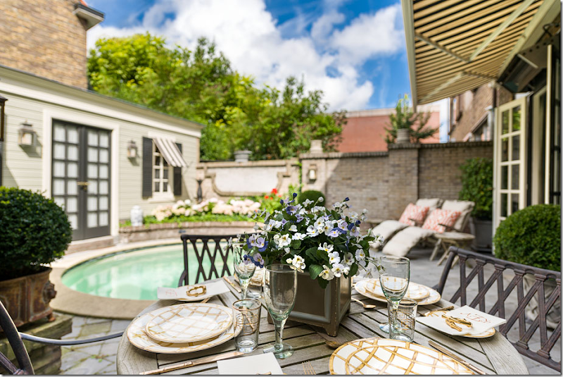
The poolhouse was originally a storage shed that Ron rebuilt – he used symmetry to make the small building more substantial looking. Swimming pools are a true rarity in Ron’s hometown!
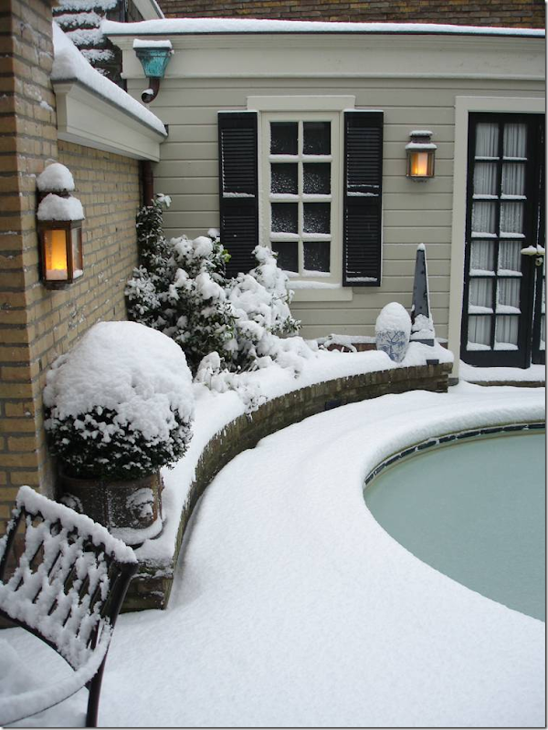
Why there aren’t many swimming pools in Leiden!
BEFORE: the florist shop was located behind this solid brick wall. Above is the open air terrace to Apartment #1 with the faux white windows.
AFTER: The same view. The showroom is now open to the swimming pool porch through the new French doors that Ron placed in the brick wall. The kitchen in Apartment #2 is seen on the left.
AFTER: The opposite view. Looking from the showroom’s French doors to the pool house and Apartment #2 on the right. Ron added the retractable awning for sunny days.
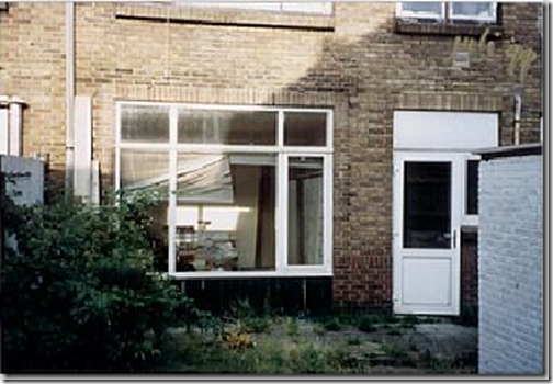
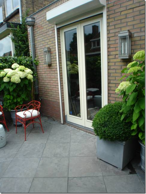
BEFORE: Apartment #2 where Ron lives today. When he moved in – there was no swimming pool or landscaping. First – he removed the doors and windows and replaced them both with French doors.
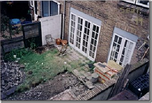
BEFORE: After Ron installed the French doors, the back porch was still barren before he installed the swimming pool. FYI – this picture was taken from the open air terrace of Apartment #1. Use the floor plan to understand the location!!
BEFORE: 1940’s The side of the building before there was an annex.
BEFORE: The side showing the old white annex of the floral shop. Behind it is the iron gate enclosed patio.
DURING: Ron tore down the brick wall that divided the back porch behind the annex and the swimming pool porch. In its place, he erected the Atelier building. Here – the wall is torn down, but the Atelier is not yet built. You can actually see the swimming pool porch and Apartment #2 from the side of the building where the annex is. At the left is the side of the poolhouse.
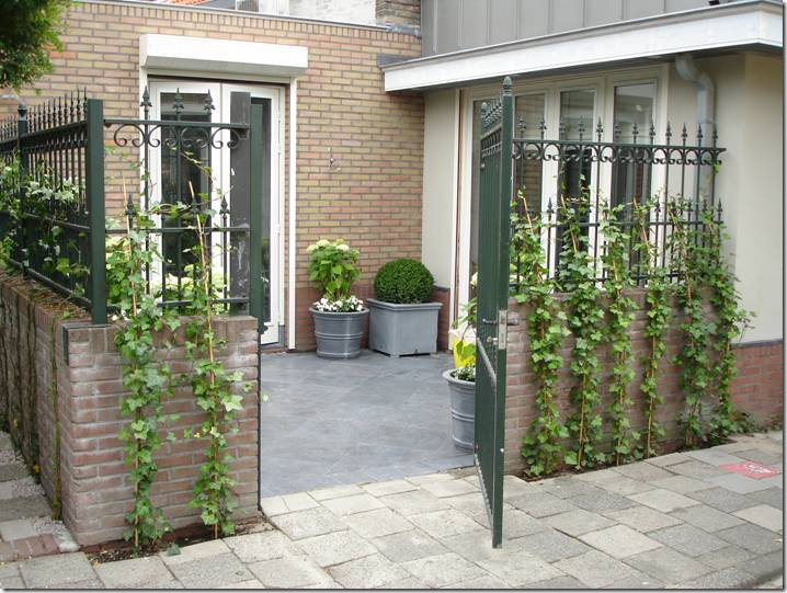
AFTER: the other side of the new Atelier building - and at the right is the door to the annex and the red chinoiserie wallpapered showroom. The iron gates remain, but Ron quickly planted vines to shield onlookers from spying on the porch.
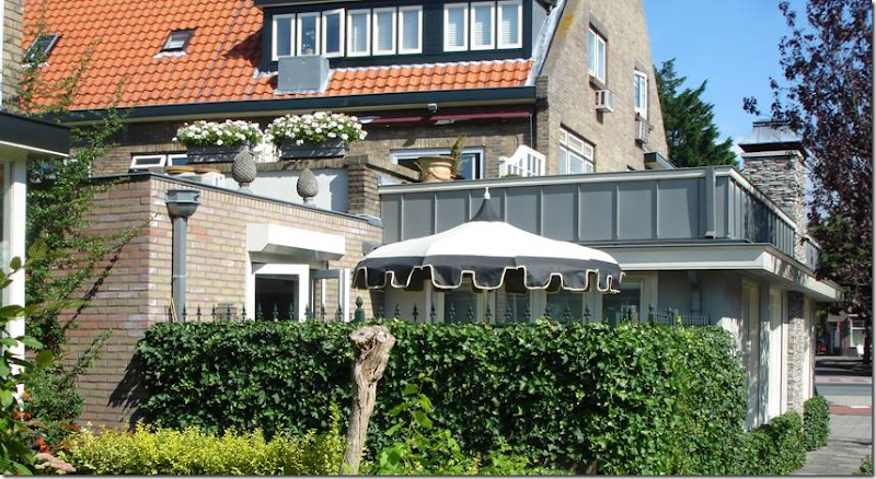
AFTER: The new annex, and the new Atelier – at the left of the umbrella. The iron gates that surround the back porch are now completely covered in the vines.
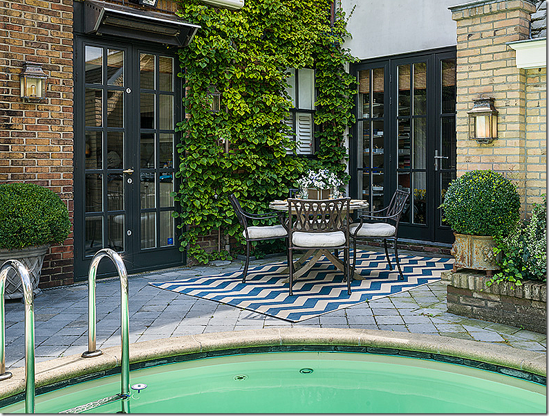
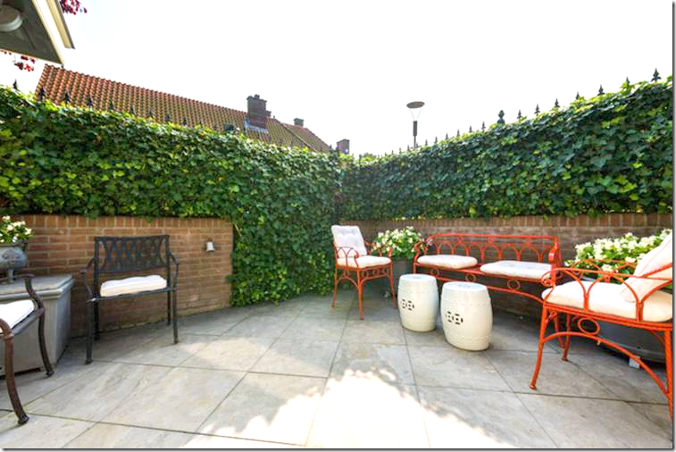
Of course Ron decorated the back porch, using the zinc Versailles style planters and hydrangeas and box. The floor is the same slate seen throughout the property in different areas.
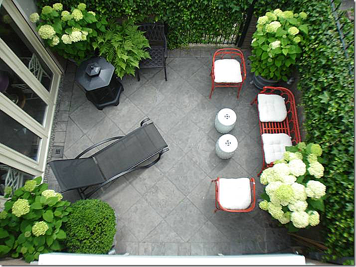
Looking down on the back porch from the open terrace on the second floor of Apartment #1.
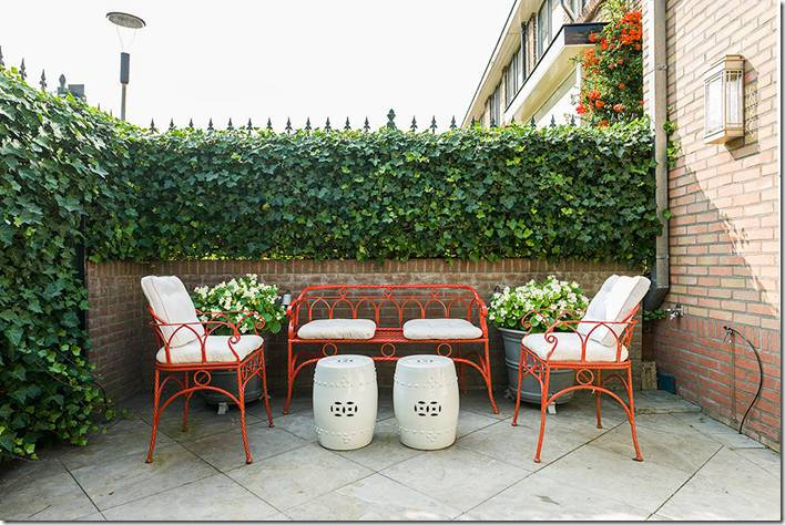
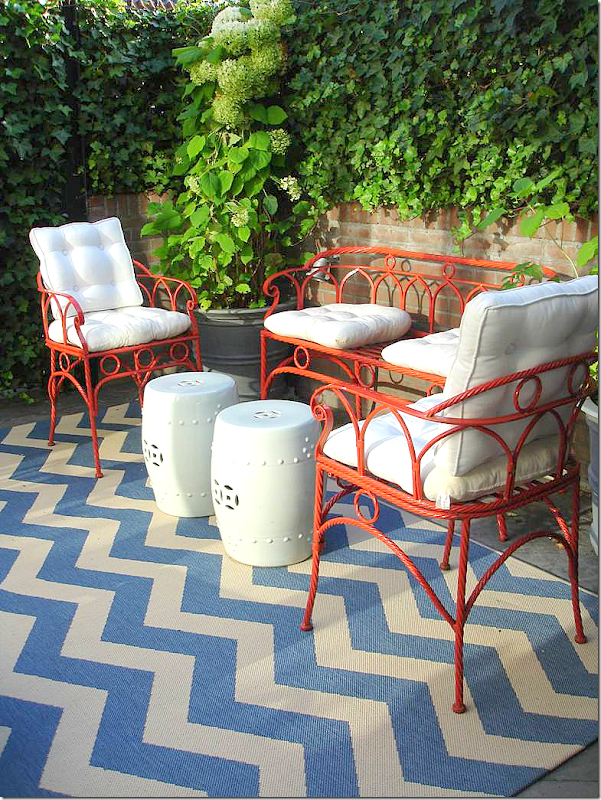
Ron painted the iron furniture a bright red – to coordinate with the red chinoiserie wallpaper that lines the walls of the neighboring new annex.
During the summer, the adds the bright blue and white chevron rug.
This view shows how even the gate is disguised by the vines. It still opens, but the porch retains its privacy.
I keep repeating the floor plan so you don’t have to scroll up and down when we change to a new area.
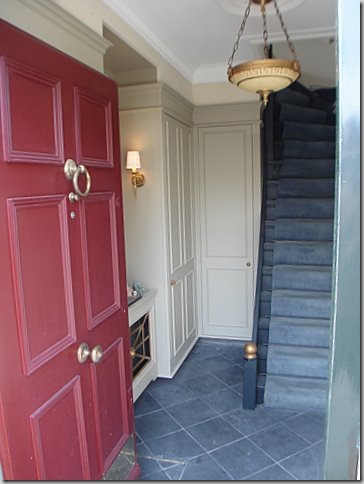
The first red door on the ground floor leads to the entry foyer of Apartment #1, where Ron first lived for many years. The apartment is located on floors 2 and 3, so the stairs in the foyer take you to the 2nd floor. Ron completely renovated the apartment and the foyer – the red again ties in with showroom.
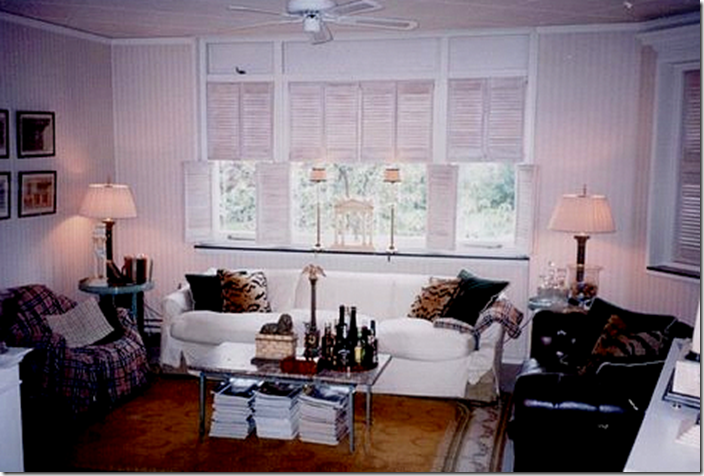
Here is a rare photo of Ron’s original décor – straight out of college. It seems very trendy today with the white sofa and leopard velvet pillows and tufted leather chairs.
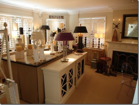
As Ron’s business grew, so did his need for space. While waiting for the florist to sell his shop, Ron needed room to make his lamps, store his lamps, and sell them. He bought Apartment #2 to live in and turned his first apartment’s living room into the factory and the warehouse. This is how Apartment #1 looked before he moved into the floral shop – can you see the fireplace in the middle of all this?
After Ron renovated the Floral Shop, he turned Apartment #1 back into his personal living space. Here is how the living room looked five years ago. Since he is in the design business, you can only imagine how often he redecorates.
Read the original story to see how Ron lived in this apartment first – and how it has evolved over the years.
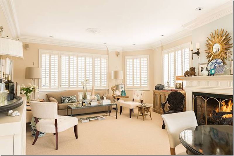
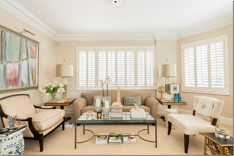
Today: Apartment #1. The windows look out over the front street. The apartment is now decorated in mid century modern with classic touches.
Another view of the living room.
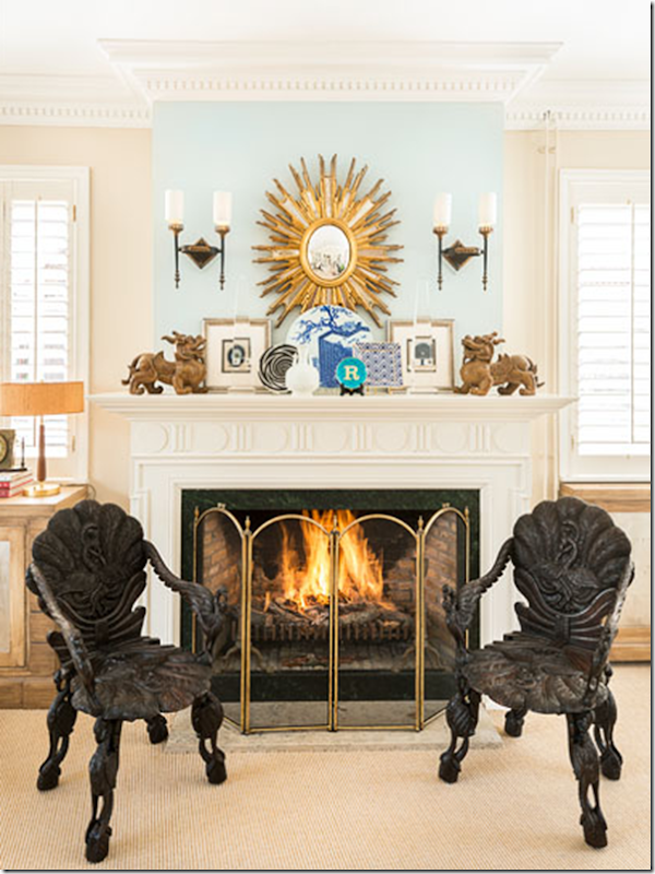
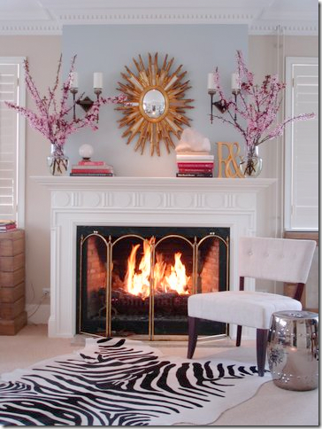
The fireplace vignette. Ron loves symmetry as you can tell by this photograph. This is one place that he continually redecorates.
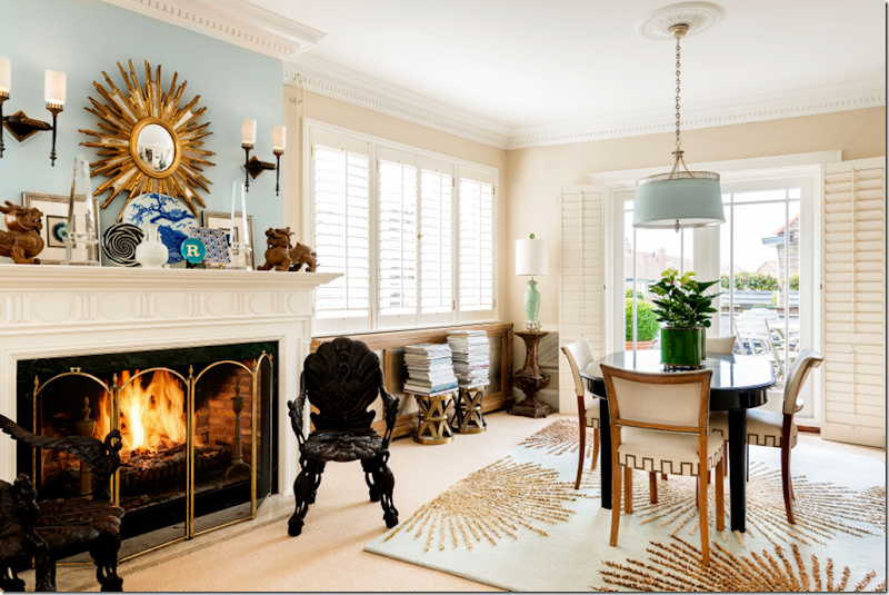
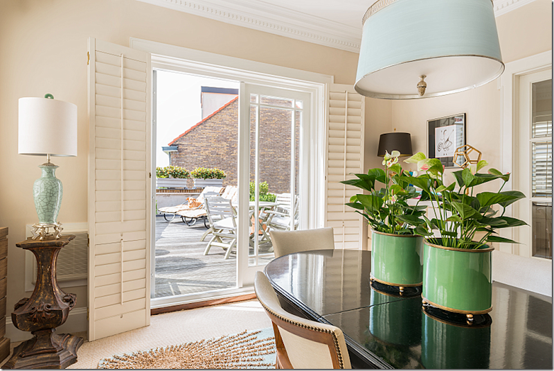
The dining room looking over the open air terrace with the faux white windows. I love this new hanging light fixture. The windows next to the fireplace overlook the annex and the side street.
The entertaining terrace that overlooks the side street and on the other side – the swimming pool. Through the door on the right is the kitchen.
The everchanging fireplace. I love this design.
And another.
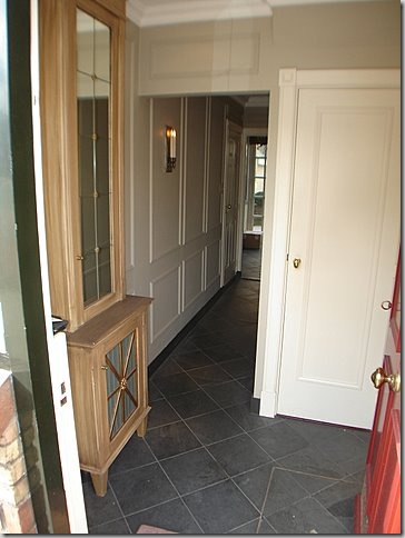
APARTMENT #2 ENTRANCE : While waiting years and years for the floral shop to be sold, Rob bought Apartment #2. This one is located on the first and second floors. On the second floor – he built a door to connect his two apartments. The foyer resembles the one in the first apartment with similar decorative elements.
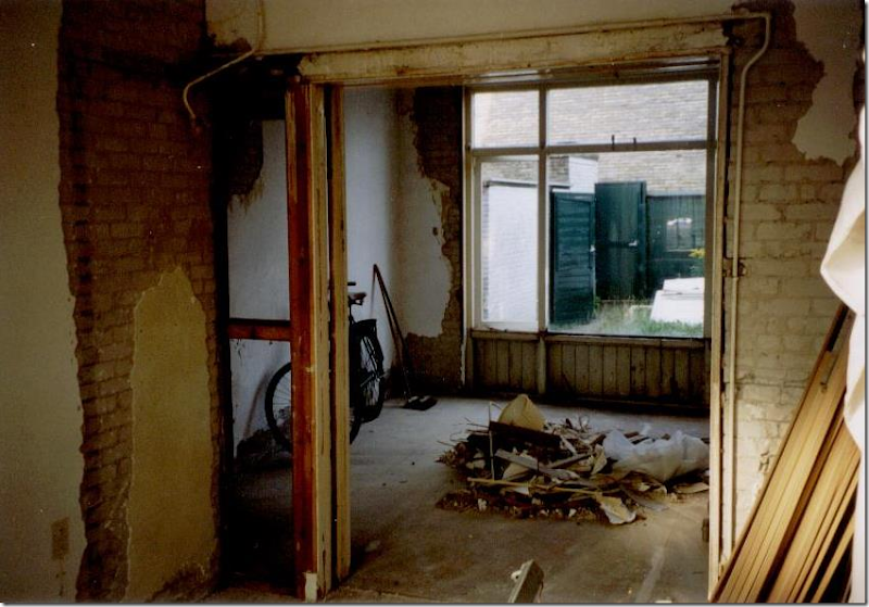
BEFORE: Here is how the living room in Apartment #2 looked when he bought it. Through the window is the back patio where he will install the pool.
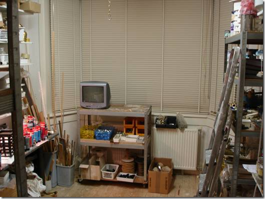
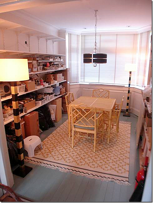
Connecting to the living room is the dining room which overlooks the street through its bay windows. Ron turned the dining room into a much needed workroom where he would make his lamps.
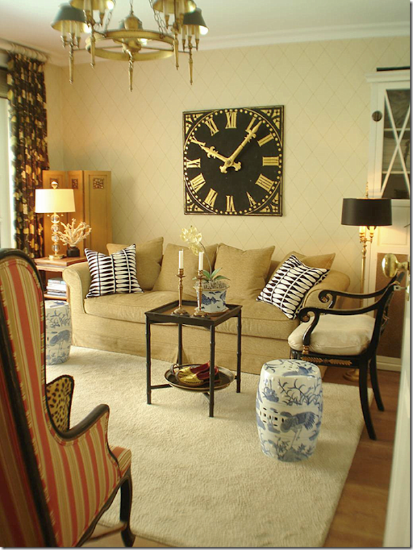
BEFORE: Originally the living room was decorated like this. I love that station clock!
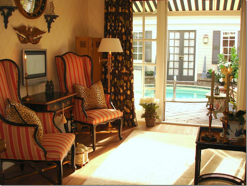
The other side of the living room how it was originally designed – symmetrically, of course. The French doors open to the swimming pool and pool house.
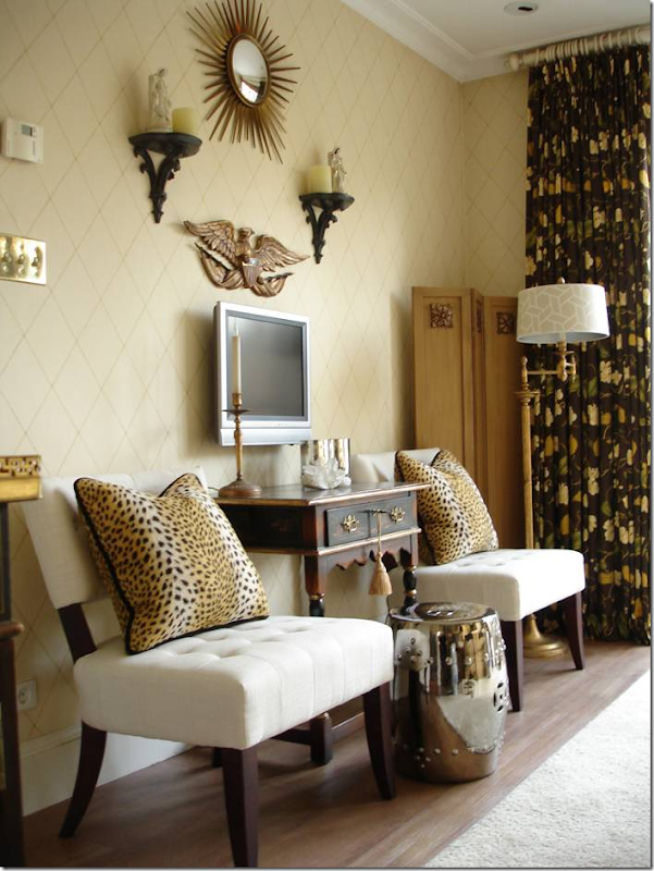
A minor remodeling updated the living room.
And how it looked on the opposite wall.
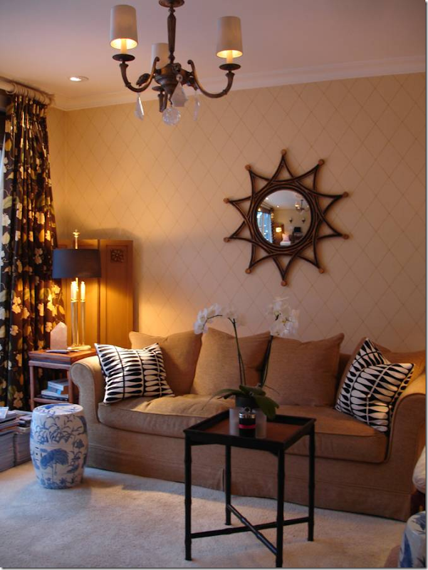
Night view of another redecoration – with new curtains and chandelier.
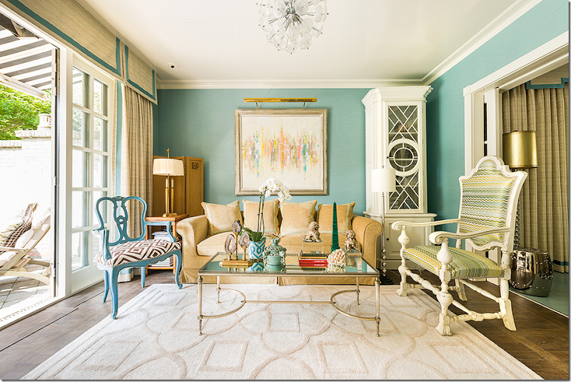
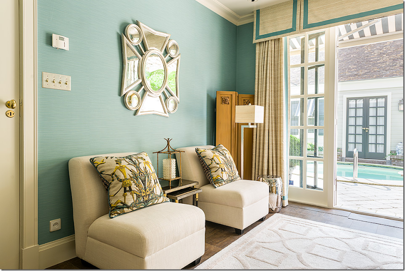
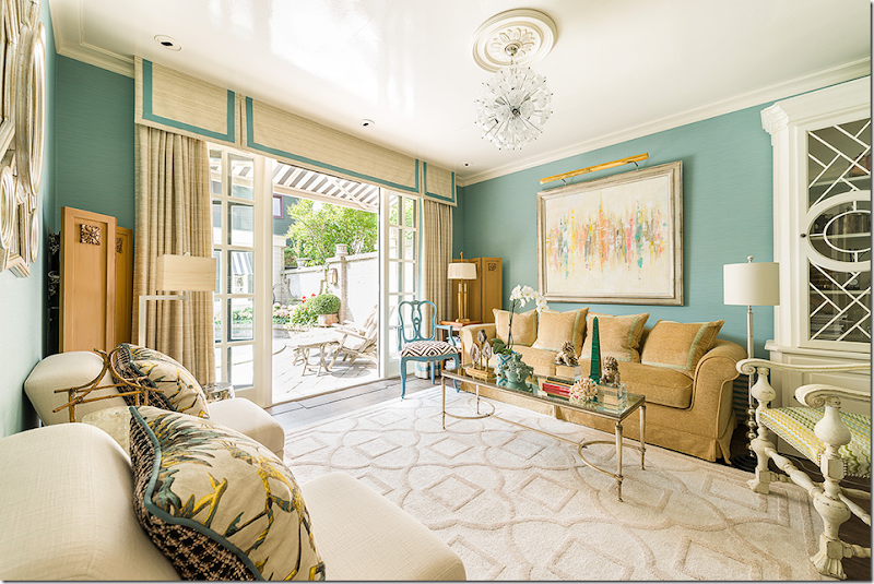
TODAY: Recently – Ron completely redecorated his Apartment #2. New dark hardwoods were added along with aqua wallpaper and a new ultra trendy Sputnik chandelier. New furniture and art work, along with a new rug and curtains gave the room a completely fresh look.
The opposite view with a mirror Ron designed. The flatscreen is cleverly hidden behind the wood screen and comes out only when needed.
The ceiling is glossy – which shows off the Sputnik a bit better.
A night view of the Sputnik chandelier. Love this!!!!
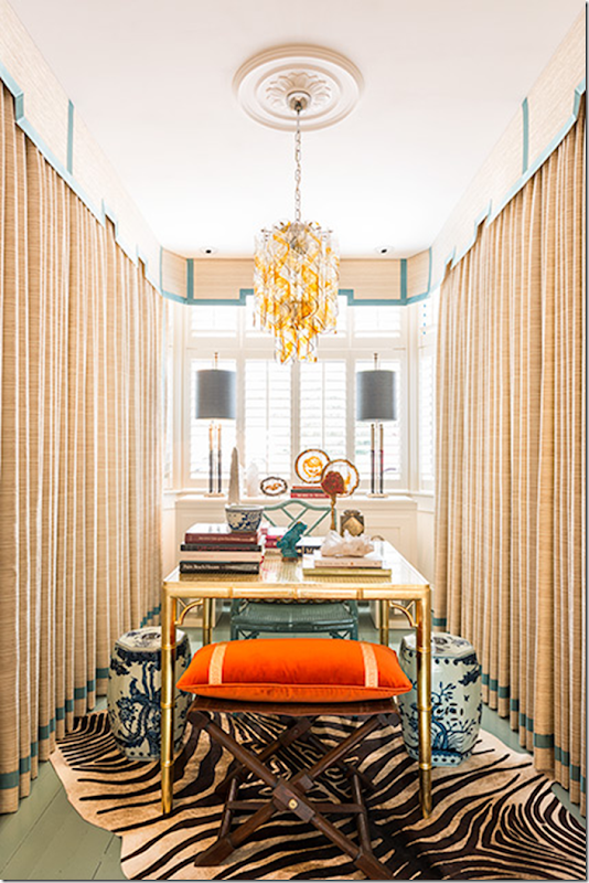
And a peek through the French doors into the newly renovated dining room. For years, this was a work room – but now, it is a much needed dining room AND an office, which is hidden behind the curtains. Remember – every inch is valuable in Holland.
When Ron used the front dining room as a work room – it was closed off by French doors from the adjacent living room – to hide the mess.
How to keep the valuable shelves in the new dining room – but not see them????
In order to use the room as an extra work space – Ron hid the shelving behind wall to wall curtains – that match those in the adjacent living room. Ron painted the floor aqua here – which inspired the aqua wallcovering in the living room.
The night view showing an earlier table and chairs.
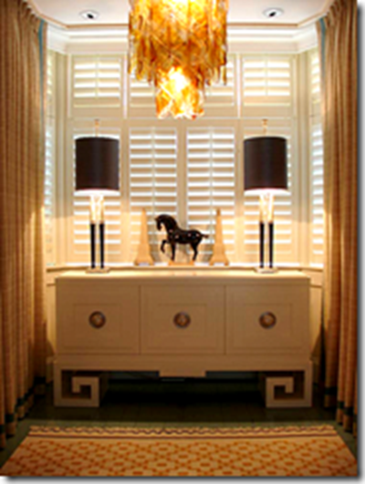
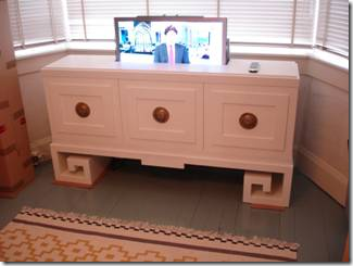
Ron is always looking for ways to hide flatscreens. Here, it looks like just a console.
But – a flatscreen emerges from the top!
I hope you enjoyed this visit to Leiden and Empel Collections. Ron would love to have you visit – winter or summer! Just email him or give him a call or just stop by the shop.
You could spend an hour or a day there – picking out a lamp or having him design one especially for your needs! In fact, you don’t even need to visit Leiden – just visit his web site HERE.
Ron will be glad to work with you online to design a custom light fixture.
At the web site – at the top upper right corner, click the flag of your country to read the web site in your own language.
A HUGE thank you to Ron van Empel for the tour of his building, five years later – showing us all his new updates and renovations.
Ron – let’s do it again in five!!!



![image_thumb[4] image_thumb[4]](http://lh3.ggpht.com/-DyAR2-7Db7c/VLTPS8rTj7I/AAAAAAACwuc/wvSPhP5LimM/image_thumb4_thumb.png?imgmax=800)


![image_thumb13[1] image_thumb13[1]](http://lh5.ggpht.com/-bPiFsLYBesw/VLTPjFlYe8I/AAAAAAACwwM/4Hl74oGMEis/image_thumb131_thumb1.png?imgmax=800)






![image_thumb71[1] image_thumb71[1]](http://lh5.ggpht.com/-pF-4a2dLsRI/VLTRL9nV3FI/AAAAAAACw4Q/ejl-n7Wncw0/image_thumb711_thumb.png?imgmax=800)



![image_thumb14[1] image_thumb14[1]](http://lh6.ggpht.com/-vc0eGSWrvQY/VLTSRY_MNSI/AAAAAAACw_A/t0ZdOTgbnwQ/image_thumb141_thumb.png?imgmax=800)

![image_thumb1[1] image_thumb1[1]](http://lh5.ggpht.com/-yM7_xAt4nAk/VLTSr345sHI/AAAAAAACxBQ/9HD7cBVNGno/image_thumb11_thumb.png?imgmax=800)


Wonderful!!! The Netherlands is my favorite country. I have spent time there every year for 15 years bicycling over the entire country several times. I love Leiden. The Dutch people are so practical and friendly. I have many dear friends there. Their use of space is ingenious. We Americans could learn a lot from them about preservation.
ReplyDeleteDear Joni,
ReplyDeleteWhat a wonderful article about Ron's house renovation. I am very glad I discovered Ron's work a few years ago. He is so very talented and knows how to help customers to choose the right lamps. His collection is extended and so very beautiful. I would recommend your readers to visit his website to discover more of his work.
xx
Greet
Wow - that was a LOT of work, but a lovely end result. His lamps are incredible! I love the idea of that first one in a fireplace, too. Is that an American flag in the first picture of the current showroom?
ReplyDeleteYou missed something HUGE. Locked eyes and OGLED when I first saw it in pic #60.. Outside, in one of the large pots by the pool, Hydrangea 'Anna Belle', is in a tuteur. Never seen this done. Ever.
ReplyDeleteWill be doing it for clients, me, for evermore !
Love his lamps, still have some of my childhood rock collection. Of course they are in a garden trough outside.
Garden & Be Well, XO Tara
wait - do you mean in the porch by the annex - not the pool?
DeleteLove your article! I lived in The Netherlands for a few years and this made me miss all the beautiful scenery there. I loved seeing the transformation of a very typical Dutch style home. Best wishes Ron!!
ReplyDeleteIncredible use of space. Just beautiful and a wonderful post. Thanks for sharing.
ReplyDeleteWhat a fabulous space! I wish I could move in! I think that is the first swimming pool I've liked - love the small round shape. I'm putting it in my notes for future use. Thanks for the tour!
ReplyDeleteJoni, Ron is so talented and I adore everything he has created in his amazing building, both the shop and the apartments.
ReplyDeleteHis lamps are gorgeous and I agree with your favorite the crystal lighting at the very start of your article. What a charming place to live as well!
xoxo
Karena
Featuring "Inner Spaces"
Lordy, Lordy...what an enchanting and TALENTED individual!! Nothing short of a "Phoenix rising!" A most brilliant read!! franki
ReplyDeletestunning + love his lamps with the crystals + loved everything. xxpeggybraswelldesign.com
ReplyDeleteBeautiful. What a great job he has done!
ReplyDeleteSheila
A world created to share with others.
ReplyDeleteWhen I first saw this post, for some reason it didn't interest me and I quickly moved on to another blog. Today I came back and read the entire post and I'm so glad I did! He is so talented and his light fixtures are some of the best I have ever seen. I love that he is inspired by the great Dorothy Draper. He has done so much work to the building and it looks beautiful inside and outside.
ReplyDeleteSimply gorgeous!! Ingenious use of space -- this posting should be featured in Veranda or House Beautiful!
ReplyDeleteReally well done indeed! Thanks for all of your hard work!
Jan at Rosemary Cottage
I like the lighting behind the bathroom stool. I have never seen that done before and it works here so well.
ReplyDeleteEnjoyed this post very much. Often the scale of some American homes just aren t applicable in the UK, so this building was a pleasant change. The scale is comparable to many homes here and so easy to relate to. Loved the microwave idea but not so impressed with the view of it from the outside!
ReplyDeleteThank you Joni for sharing this transformation! I live in a 1930s cottage so his genius design solutions for small spaces were very relevant to me!!
ReplyDeleteDo you know of a paint color similar to the blue/grey color in the showroom?
ReplyDeleteRalph Lauren Outlet
ReplyDeleteKate Spade Outlet
MCM Backpack Outlet,
MCM Backpack
UGG Boot Clearance
Oakley Sunglasses Outlet
North Face Outlet Online
Marc by Marc Jacobs
This is a great post it shows some information and best advice I needs for a blog. Thanks and keep on posting. Please visit http://goo.gl/2CYuE3
ReplyDelete