And today, we have a new Dear Miss Cote de Texas decorating problem!!
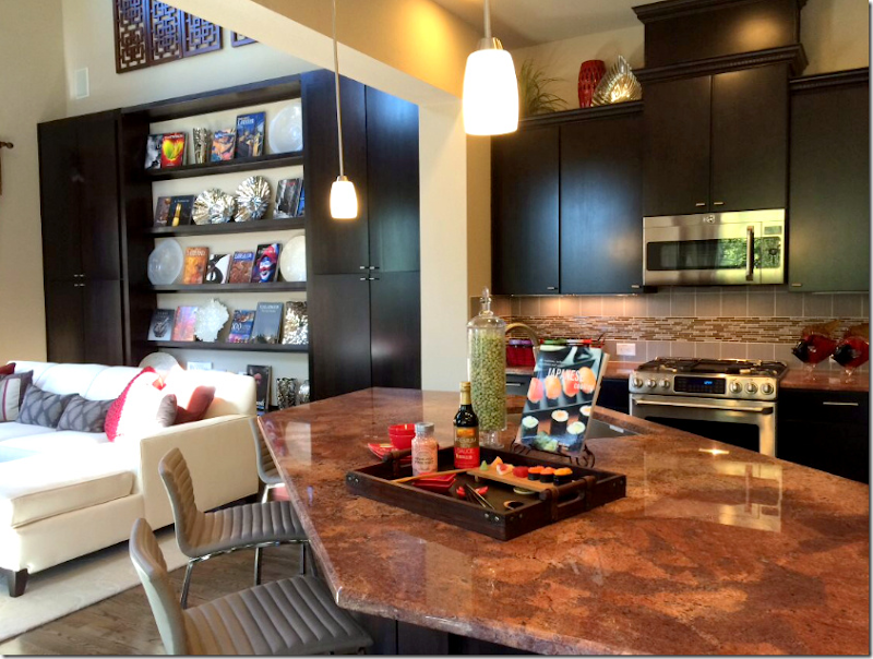
I am wondering if you have a suggestion for my kitchen? It has a huge Bordeaux island countertop. I don’t particularly like the dark interior. Do you suggest I paint the ebony cabinets in both the living room and kitchen to white or change the countertops/backsplash? Which one offers the most impact to lighten the room yet provide the best value in terms of the cost? All furnishings in the picture come from the stager. I will have a dove colored sofa and white barstools. Thank you!
And here is the issue. The house looks rather contemporary, with high ceilings and modern cabinetry. The granite counters and tile backsplash look dated to me. The main questions are -
1. Should she keep the dark cabinets in both rooms or go with white?
2. Should she keep the granite countertop and backsplash?
I may need some help with this one!! OK, here goes.
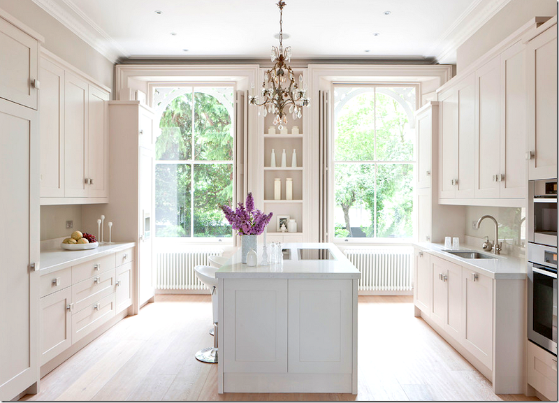
First, you must take into account the architecture of the house. No matter how much you might want a white kitchen like this one above – you have to be sure it will look good in the space. To go with an all white kitchen – you would have to do a white family room next to it and I’m not sure that is the route I would go.
While an all white kitchen is so beautiful – I like the dark cabinetry that is there now. If your budget is not large, consider keeping the cabinets dark and using funds to replace the countertops/backsplash which is more important and a better use of your money.
The more all-white kitchens I see, I really don’t think you should go this route. Keep the cabinets dark.
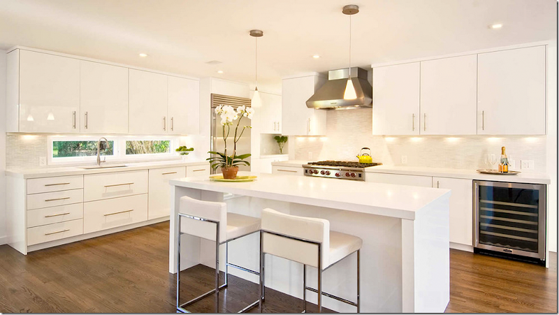
Now, with the dark cabinets - what you don’t want – is a dark kitchen. Today, with your dark cabinets and dark granite – there isn’t much contrast. White countertops, when used against dark cabinets, will provide that needed contrast and add an attractive pop to your kitchen.
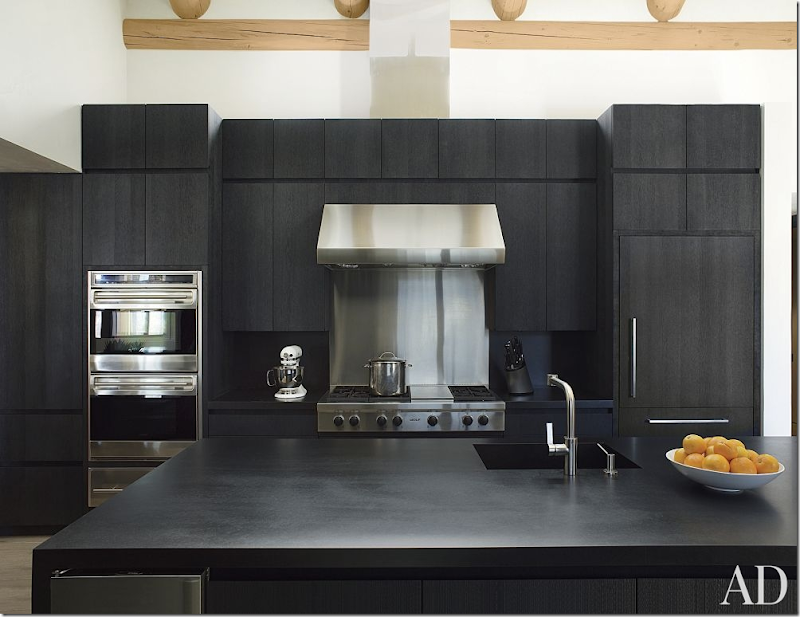
All dark counters and cabinets – too dark.
If you do choose to leave the cabinets black – what then of the granite and backsplash? I think you might consider this:
1. Do you have to keep the irregular shape of the island? Could you square it off? I would make it a plain rectangle, if possible.
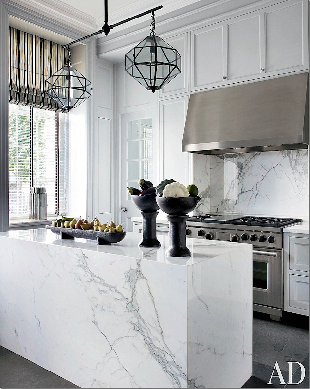
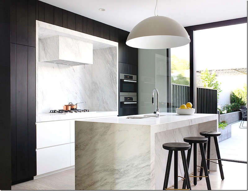
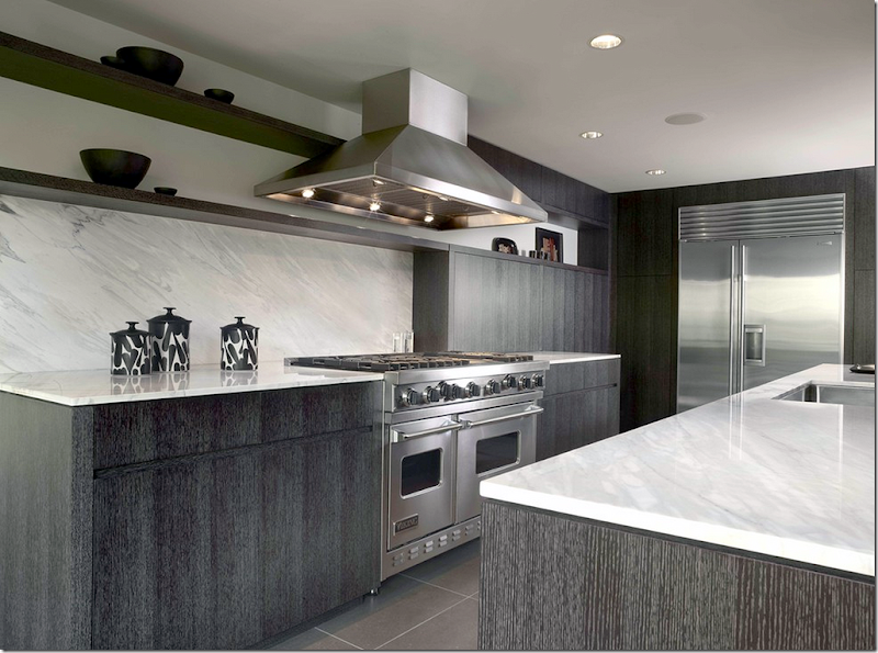
2. When replacing the countertops – how about this look seen below? A combination of the white and black look?
A beautiful white marble countertop – and backsplash – would look more in tune with today, rather than a busy, dark granite more popular in the last decade. Consider a white/gray quartz if marble scares you.
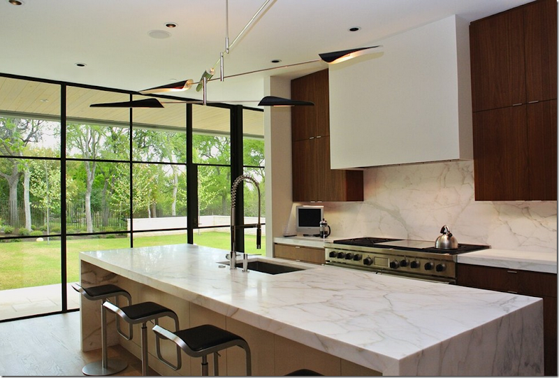
Here – white quartz – with dark cabinets. Notice too, the oversized hardware which would be nice in your kitchen.
I love the look of the dark cabinets with the white island and backsplash. And a fabulous statement light fixture over the island.
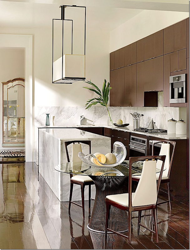
Consider using the same material on the backsplash as on the countertops for a more streamlined look. Don’t forget to think about a new light fixture.
To further customize and update your kitchen, consider replacing the microwave with an interesting stove hood.
In summary:
1. Keep the dark cabinets.
2. Replace the countertops with white marble or quartz.
3. Use the same material for the backsplash.
4. Replace the lights over the island with something more today.
5. Consider removing the microwave and replacing with a hood.
What do you think? I would love to hear your ideas about updating this kitchen.
Do you have a decorating issue? Email me with pictures of the area and I’ll try to come up with a solution:
email me at cotedetexas@aol.com
And finally:
If you love the gardens at Highgrove, Prince Charles’ private country house – there is a new book just published about his fabulous creation. The book was written by famous English landscape architect Bunny Guinness, a member of the brewing family – and the niece of the rose breeder David C.H. Austin!! Wow. That is impressive. I love David Austin roses.
The book is interesting in that it is separated into months. From January to December – it gives you a look at the beautiful garden whether it is winter or summer. I love that!!!
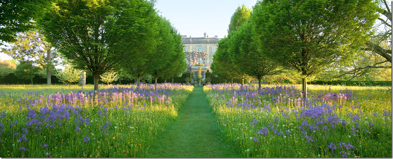
The Wildflower Meadow Garden – shown in spring.
The most well known part of Highgrove – The Thyme Walk. These bushes were here when Prince Charles purchased Highgrove – and he spent years cutting the boring bushes into incredibly weird but fabulous shapes.
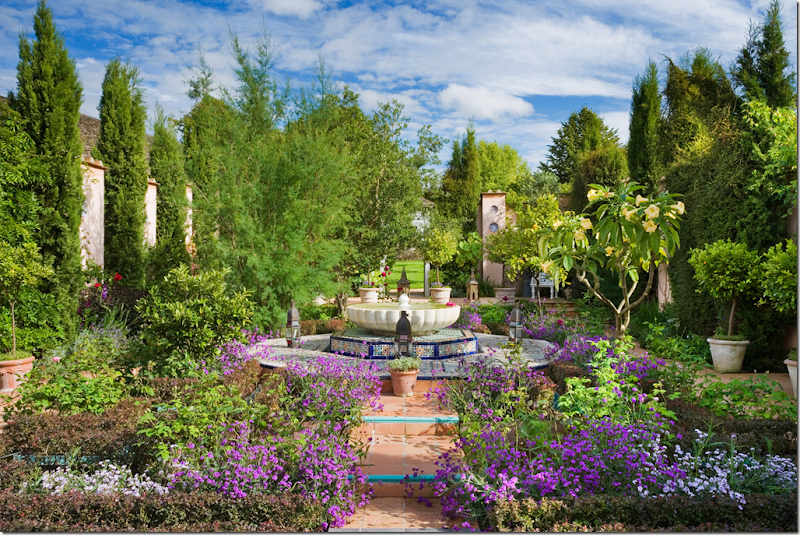
One of the newest gardens at Highgrove – The Carpet Garden.
To order this book on Highgrove, please click on the picture below!!





I think your suggestions were fabulous. The only thing I would add is to paint the rooms a lighter, cooler color.
ReplyDeleteWow, that is almost EXACTLY what I thought! Definitely keep the dark cabinets. I would go with white marble with gray veining on the island. I don't think the backsplash necessarily has to be the same, though - that is a lot of cold (and expensive) marble; I could also see a coordinating tile. Also, while replacing the microwave with a hood would be great aesthetically, for both financial and practical reasons the microwave could be left as is... Definitely new hardware and maybe a new light fixture. It depends a lot on budget :)
ReplyDeleteI totally agree! And agree with MargieB on lighter, cooler paint color to go with it all.
DeleteFirst changes I would make would be the backsplash and counter tops. They date the kitchen the most. I think marble countertops would be perfect, but something different for the backsplash. Love your idea of replacing the cabinet hardware and removing the microwave. She could have open shelving where the microwave is now. Brass hardware would look great on the dark cabinets. I would also paint the walls as someone else suggested, and update the lighting fixtures. I hope she shows before and afters!
ReplyDeleteI have never commented here before, but I just wanted to let you know that I always read and enjoy your posts. Thank you.
ReplyDeleteSeems the black/white kitchens are trying-too-hard. Add real life with cooking/food on the counters, how does the black/white look then? Worse, better? Perhaps I'm stuck in the black/white of the 1930's, great effort that did not show trying-too-hard.
ReplyDeleteYou got me, with the Highgrove book. Can't wait to order it. Pruning 'boring bushes' into 'incredibly weird but fabulous shapes' is a garden design conceit done for centuries. I've only been doing it, in the right gardens, for a few years in my 3 decade career. Slow to the epiphany, better late than never. Arne Maynard is a master at it for decades.
Garden & Be Well, XO Tara
Totally agree Joni on changing the countertops to a white marble but I'd do a tiled backsplash. Keep the cabinets dark as you said and replace the hardware and maybe paint the walls a warm light grey. If possible too reshape the island. I would keep the microwave as although a hood would look much better there's the issue of where the microwave would go. Great advice Joni. The new Highgrove book is beautiful - I gave it to my mother.
ReplyDeleteI completely agree with leaving the dark cabinets. I think the white marble would be perfect as well. I would do a tan vein in the marble and do a contemporary brass (my new favorite!) hardware on the cabinets and a coordinating chandelier! These rooms have the making of gorgeousness! Good luck... could we see pictures in the end?
ReplyDeleteyes! I should have said to use brass. that would be a great way to update. thanks!!!!!
DeleteGreat thoughts Joni. I was just at Book Club at a friend who has been remodeling her kitchen.
ReplyDeleteShe went with marble counters and painted the tall cabinets a slate gray! so striking!!
xoxo
Karena
The Arts by Karena
Totally agree with your advice about leaving the dark cabinets, Joni. Also agree with prior comment about changing the shape of the island, if possible. I have a marble island and love it, but all depends on the home owner's tolerance for the imperfections that occur over time with marble. Not so bothered by the microwave. Also can see a different tile backsplash if a marble slab is not in the budget. Hope we shall see the final renovations! Thanks to the home owner for sharing.
ReplyDeletelove your recommendations + wouldn't change a thing xxpeggybraswelldesign.com
ReplyDeleteOMG...Joanie...you just rose TO THE TOP with that statement..."FIRST, YOU MUST TAKE INTO CONSIDERATION...THE ARCHITECTURE!!!" YES!!! I "HEART" YOU!!! franki
ReplyDeleteHate "spell check" Joni!!! :( fmp
ReplyDeleteI would replace the counters and backsplash with light colored marble or quartz. Remove some of the upper cabinets and have a finish carpenter install simple moldings on the doors before having the kitchen and family room cabinets painted either white or gray. If the homeowner likes the dark cabinets and only wants to make a smaller change replacing the backsplash and counters would make a big impact. In either case I'd replace the microwave with a hood. Good Luck!
ReplyDeleteJoni: Totally agree with your ideas. The dark cabinets can be striking but the countertop and backsplash really date the house and limit her color palette to a coordinate with the granite that appears to be an orange-y shade of brown. I also agree that if possible simplifying the shape of the island would be lovely. Again, agree that using the same material on counter-top and backsplash or perhaps a very simple subway type tile. I've seen way to many kitchens that have busy back-splash and it dates the kitchen in a short period of time. Depending on the look or taste of the home-owner, a small section of caustic tiles over the range might be nice. I'm not a fan of the micro-wave either and an attractive hood would be better but that may be too many $$ and may be an issue about where to put microwave. Had same problem in my old house and ended up removing one of the double ovens and putting micro-wave there. Especially enjoy these types of posts that help out the "average" home-owner! Thanks so much to you and homeowner! Debbie
ReplyDeleteGood advice, Joni. Painting these cabinets would not be a good idea at all - especially painting them white. Now, if the home owner really wants the cabinet color changed I could see a Miles Redd (the dark blue kitchen he did) treatment - but this is distinctive look, not for everyone, and its very expensive to lacquer cabinets. The homeowner really must consider the existing architecture of the house (as you said) and go from there. The marble or quartz would make a huge difference here. The back splash is a matter of taste - there are many options - I probably would not do the marble on the back splash. I agree - hide that microwave and do the hood. I like these kinds of post - thanks!
ReplyDeleteOh, I forgot - YES, get rid of that irregular shaped island!!! This is a pet peeve of mine - odd shaped islands/bars - I can't stand it. There was a situation in my sister's kitchen where the "kitchen designer" thought it best to angle a counter top (the section of cabinets kicked back 4-5 inches there) and no...just no. My sister listened to me, thank goodness. She did a marble looking quartz with a beveled edge and she has had no issues with bumping into it, etc... - really it looks great because the whole kicked back area (like 10') is where the stove is centered with the hood. Please, don't angle counter tops! I'm laughing because its such a small thing - like I said, its a pet peeve!
ReplyDeleteAgreed with your judgement Joni -work with what you have. The dark cabinetry is wonderful -go with a neutral lighter color to brighten things up -some off-white silestones and quartz's might be pretty and add some sparkle.
ReplyDeleteI think you nailed it on this one. I especially agree about the microwave. Having one over a gas cooktop is not safe.
ReplyDeleteJoni, can you please explain why you said if you have an all white kitchen you would have to have an all white familyroom. Why couldn't the family room have color?
ReplyDeleteI meant - the walls and cabinets would have to be white, imo. you could bring color in like a bold print with a white background, but i think that basis would have to be white.
DeleteThe cabinetry would be very expensive to replace and it looks like its in great shape. The problem is not with the cabinet color but with the granite and backsplash. I agree to replace it with a more contemporary countertop material like Ceaserstone, Silestone or Quartz, in white, depending on the budget. Make sure the backsplash is the same material which would make it look outstanding. I'm not a fan of the odd shaped island but hard to tell from the photo if you could change the shape of it or make it a waterfall (like the photos in your blog). I would also try to change the hardware except you want to make sure that it doesn't leave any odd holes in the doors. I don't agree that you need a white family room for a white kitchen. I have a Hamptons look kitchen with white inset cabinets up to the ceiling. I have French limestone on the floor in a grey and my family room flooring is a driftwood color wood with brown leather couches and a warm stone color on the walls. The starkness of all white is a bit cold, IMHO, for a family room.
ReplyDeleteReading the homeowners remarks, it seems that maybe she does not care for the dark cabinets. I was not sure. But if so, what about painting the cabinets grey?, changing the hardware to a more substantial pull, changing the counters to white with a little grey mixed in, a rectangular box light fixture over the island. About the island, what about a butcher top? and made into a true rectangle. A nice hood would be a great addition if possible. Just some thoughts.
ReplyDeleteI was going to say paint the cabs grey - but she seemed to want to do one thing - either paint the cabs or change the granite. but yes! grey would be gorgeous and not as stark.
DeleteFab suggestions Joni. I would not have thought of the white countertop, but you are right - sometimes you have to respect the house style and the budget and stick with what works unless you want to gut the whole thing. :)
ReplyDeletexo Terri
Hi Joni!
ReplyDeleteYou asked our opinions!
I have a different one!!!
I wonder about the countertops! Why do you think they are granite? (They look like marble to me!) Terra-cotta color marble....(there are many of them). (the pictures may be not good enough for me to tell. It sure looks like marble to me!!)
I agree the tile backsplash is dreadful! (it needs to go!!! I agree about getting rid of the ("trendy" at the time) microwave/fan,,,EEEK!!!
I also totally agree to change the shape of the "island"! (reminds me of a "kidney-shape pool" (another "trend")
Perhaps the pieces from the island countertop eliminated to make a rectangle....(brilliant on your part) could be used to make a backsplash; replacing the tile!
(I am slamming "trends"!! I don't believe in them!!!) as you know!
Alert! If you change your cabinet hardware from handles to knobs (I prefer knobs); it is an easy fix....You don't have to "leave odd holes in the doors!!)
Your painter plugs the holes.....(not very expensive....I have been doing it for 45 years)' and then you have knobs; not handles. I don't like handles in my kitchens! I prefer knobs....(every now and then I like the old-fashioned pulls on lower drawers.....handles are too obvious on upper cabinets....for me!!!)
I would completely paint all the cabinets and walls...... off-white.. or pale grey or (peach a bit lighter than the marble). so the cabinets match the walls.....walls would match the cabinets. That eliminates the "stuck on " feeling! It is ubiquitous now. Every single kitchen in every magazine touts these "stuck-on " cabinets. I grew up in old houses...in Pasadena California...all of the cabinets were built with the houses....and always matched the walls.....I love that. It is serene and unstudied...and elegant!
Yes!! Change the hood to a plaster one...also off white(or wall color)...and keep the counters if they are salvageable; My problem with these cabinets being a contrasting color; it calls attention to the "stuck on" variety of cabinets. Which are purchased from "cabinet companies" and not "built in " and custom made for the kitchen! They are just announcing their arrival! Hello!
They ordered me to go here! And I don't belong here at all! But here I am!
If the walls matched the cabinets.....the rooms would seem twice as big...much simpler; and there you go! It is all looking so "cut up" to me! those dark cabinets! Yikes!
Just my two cents! (I forgot to say...do the backsplashes in matching marble which could be salvaged from the extra cut off from the odd-shaped island) It would be interesting to do the backlash in "rectangular pieces" of the trimmed-down island! Rectangular pieces in sizes that could fit together!
If the counter is granite (sure doesn't look like it; but pictures were not that great) all bets are off. I really have never liked granite from the day it became a "trend"! I left a note at a client's kitchen when asked to approve a sample of granite "I HATE this! It looks like the seagulls have been here for a week; and they just left! This is what they left!!"!!
This is what makes horse races.
People who say they are "against trends" are full of shit. It's all "trends." Nothing is "timeless." Saying "I love everything Mario Buatta/Sister Parish/Nancy Lancaster/Elsie De Wolfe/ does!" just shows an inability to think independently, to make distinctions, to stand up to orthodoxy--which is itself a "trend."
DeleteSay something original Penny. "I'm against trends!"--it doesn't get LESS original than that.
I love it when you do these "Dear ...". Please keep them coming.
ReplyDeleteget the information Packers and Movers Bangalore @ http://packersservice.com/packers-and-movers-bangalore/
ReplyDeletepackers and movers in Bangalore service for all india top company movers and packers Bangalore very grateful to get the information Packers and Movers Bangalore @ http://professionalmovers.in
ReplyDeleteIt is possible you may have to be enabled to delete comments if spammers post like the one above. they want to raise their profile by being linked to from other websites.
ReplyDeleteAnyway, I always like these posts about what makes something unappealing. Thank you
I saw this exact kitchen on another blog. Do I read too many blogs? http://www.mariakillam.com/heavyliftingpaint/
ReplyDeleteThat's too good! :-)
ReplyDeleteMiss Cote de Texas you are always so right on! Save money do the important things...can I hire you to do my house! Your readers are so darn lucky that you are so darn talented...need I say more?
ReplyDeleteOne of the original designs for a contemporary art museum in the Northeast had people entering through a point (strong glass angle) - ah, the ART put into that draft design! Needless to say it was shot down for its lack of conception that human beings would be circulating into and thru it. It IS a NATURAL human reaction to avoid points. Kudos for getting rid of the funky points on the island and trusting your human instincts.
ReplyDeleteYou’ve made some good points there. It’s a good idea! Please visit http://goo.gl/jmZezw
ReplyDeleteRalph Lauren Outlet
ReplyDeleteKate Spade Outlet
MCM Backpack Outlet,
MCM Backpack
UGG Boot Clearance
Oakley Sunglasses Outlet
North Face Outlet Online
Marc by Marc Jacobs
A very good and informative article indeed. It helps me a lot to enhance my knowledge, I really like the way the writer presented his views.
ReplyDelete"quartz countertops houston
"