OK. Ready for some fun? Well, it’s fun for me! I thought while the Final Four was going down, I would host The Final Three. I searched HAR (Houston Assc of Realtors) for about three days looking for three houses that were really enticing. Searched for three days – over and over again – looking at the same houses until I thought my eyes would fall out. And whew!!! What a bunch of stinkers are for sale right now! I mean, seriously, does anyone hire an interior designer in Houston?
Usually there are a plethora of interesting houses decorated to the nines, up for sale – but not now. What is going on???? If you are looking for a house in Houston right now, good luck!
I finally found three houses that are really interesting to play along. You know the drill. Look at each house and decide which one is your favorite. Come back and leave a comment telling us which you liked, or didn’t like. Be nice though – please!!
I tried to find three very different looks to choose from. One house is Mid Century Modern Chic. The second is European Minimal and the third is Masculine Classic. Care to guess which is my favorite?
Also, at the end of today’s story – I’m going to preview a HUGE contest that is going down SOON!!! So be sure to read to the finish!
OK – Ready to play?
HOUSE #1 Mid Century Modern Chic
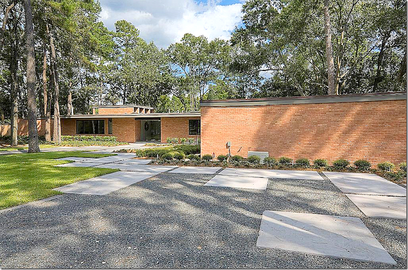
The first house is a mid-century modern which was extensively renovated by the current owners. It is located on the bayou – Houston’s only “view.” Trust me – a house on the bayou is a real treat in pancake flat H-town.
I know I rarely show mid century modern, but at this point – if you can’t beat ‘em, join ‘em. A bit of a joke, but the Millennium set really likes this style. And if all mid century modern looked like this house, I would love it too.
The house was built in 1960 – an almost true mid century modern. Flat roofed – the landscape is minimal, with large blocks for walking placed on top of dark gray gravel.
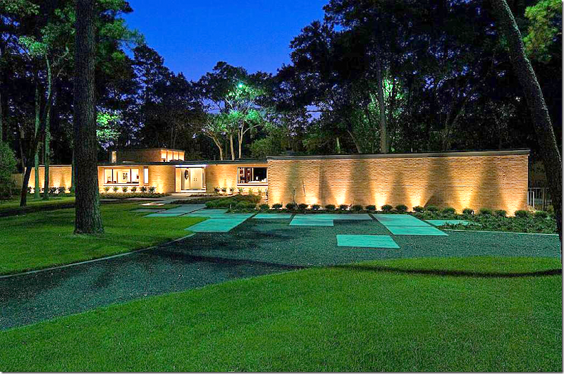
The same view – at night.
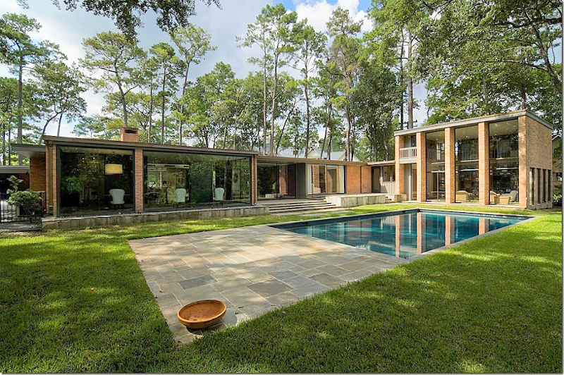
And, the back of the house – L shaped around the swimming pool. The large two story family room was – I believe – added on at a later date. The living room and dining room are seen at the very left. The bedrooms are at the right – before the right angle at the family room.
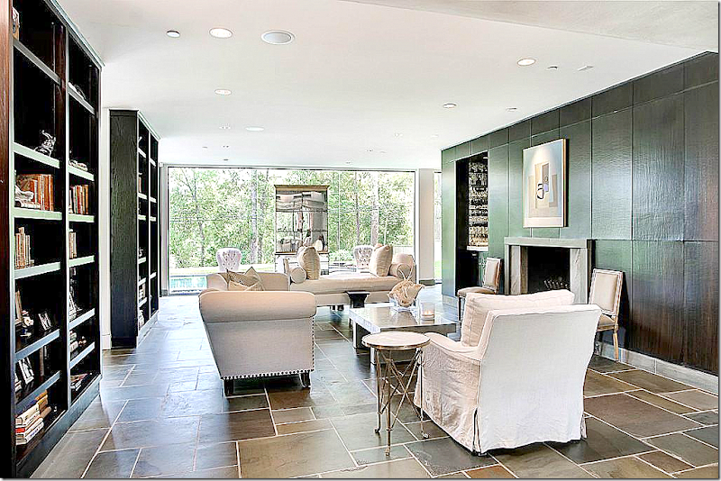
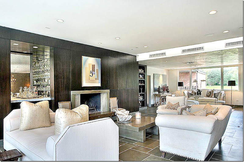
Inside – the large living room overlooks the back yard pool, and further back, the bayou. Here, bluestone covers the floors. The paneling is stained black. On the right is the fireplace and wet bar. Behind the bar is the breakfast area, while the main dining room is to the left of the living room.
The view towards the other direction – the front of yard. There is another sitting area in this part of the room.
The front sitting area. While the house is mid century – the furnishings are a mix of antique and classic.
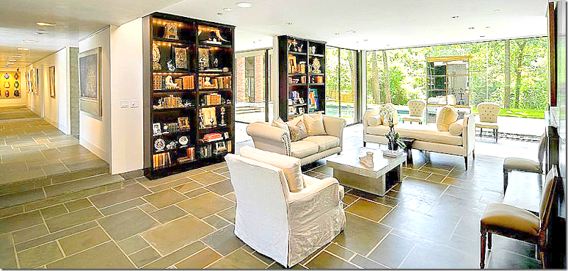
The living room – with the bookcases lit. Towards the left is the main gallery hall that leads to the bedrooms and the two story family room. The dining room is past the two bookcases.
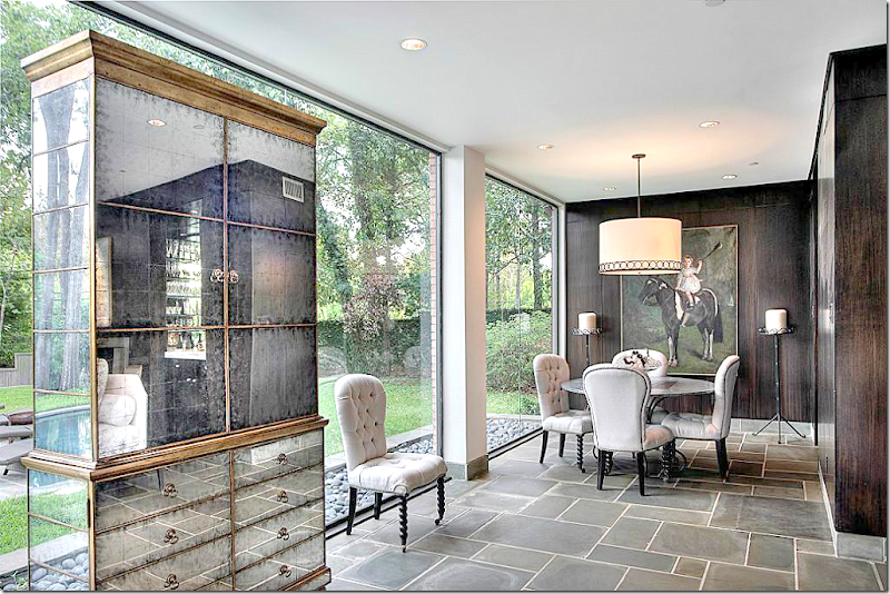
The smaller breakfast room, past the wet bar.
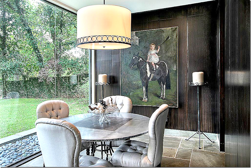
Closer view of the zinc top table, tufted chairs – and the fabulous painting! Love that so much. Through the door at the right is the kitchen. Notice the river rocks that flank the house on the outside – instead of bushes.
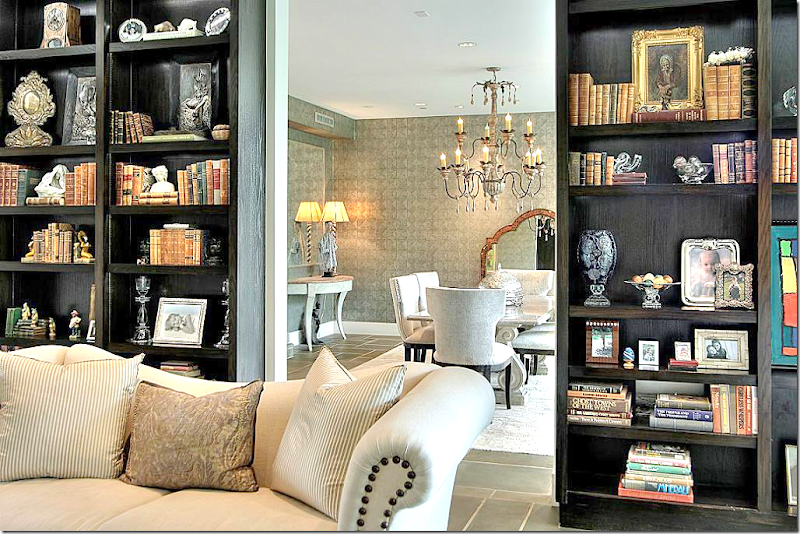
A glimpse of the dining room through the shelves.
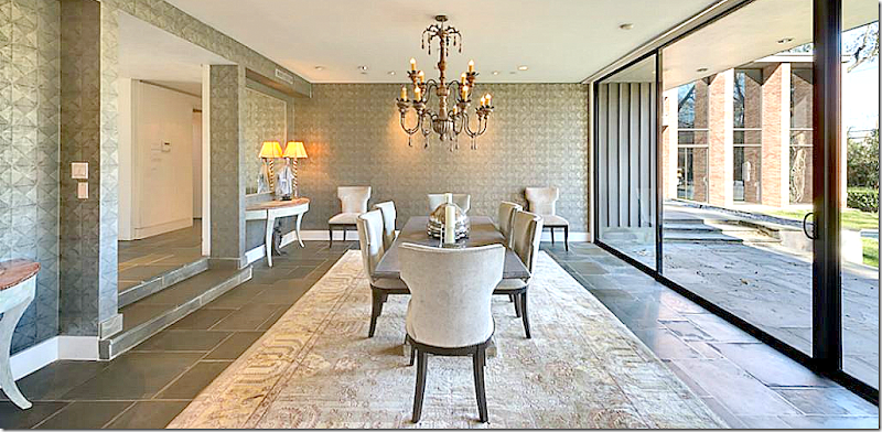
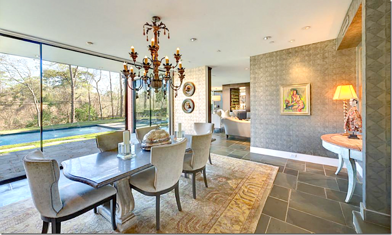
The sunken dining room with contemporary wallpaper. Swedish styled demilunes are used on either side of the gallery hall opening. Beautiful light fixture. Through the window you can see the two story family room.
The view into the living room.
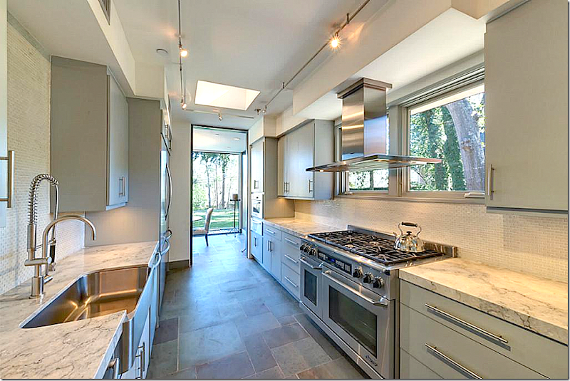
The totally renovated galley kitchen with wonderful appliances. Through the door is the breakfast area in the living room.
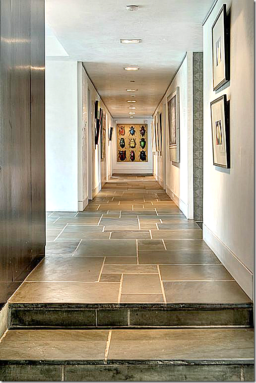
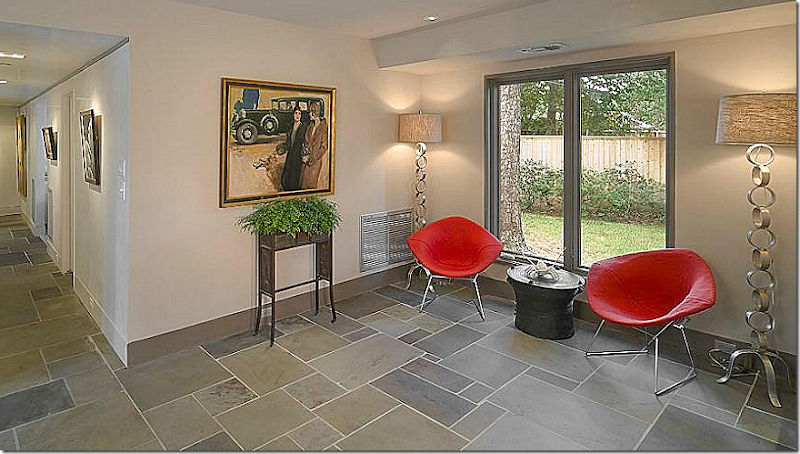
The gallery hall – that leads to the family room. The master bedroom is on the right at the end of the hall.
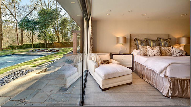
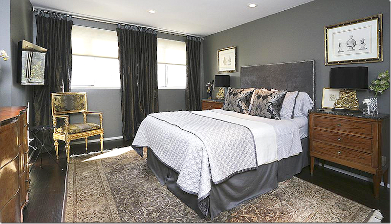
And – here is the master bedroom, in sophisticated colors and furnishings. It overlooks the pool and bayou.
A closer view of the bedroom view.
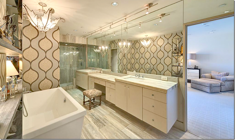
The master bathroom – totally renovated. Notice the light fixture over the vanities.
A guest room with wallpaper and a wonderful light fixture.
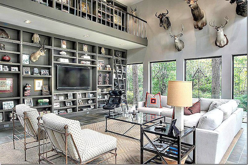
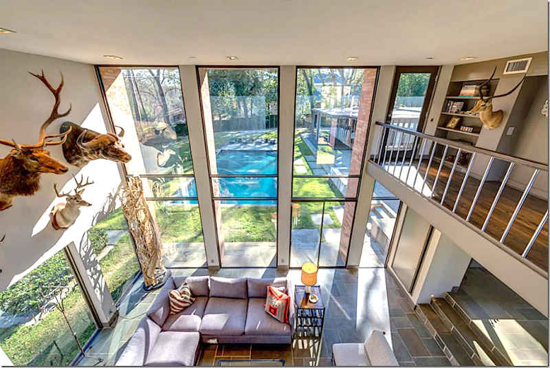
The two story family room – decorated with trophies from hunting trips.
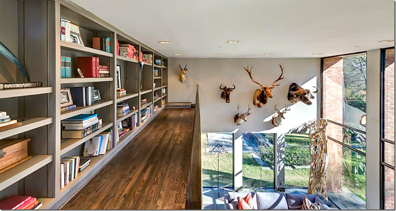
The view of the shelves – and the gallery upstairs that surrounds it. The room is painted the same as the rest of the house – and the shelves are black also – for design continuity.
The view of the swimming pool. At the right are the stairs that lead off from the gallery hall.
View of the shelves and landing on the second level.
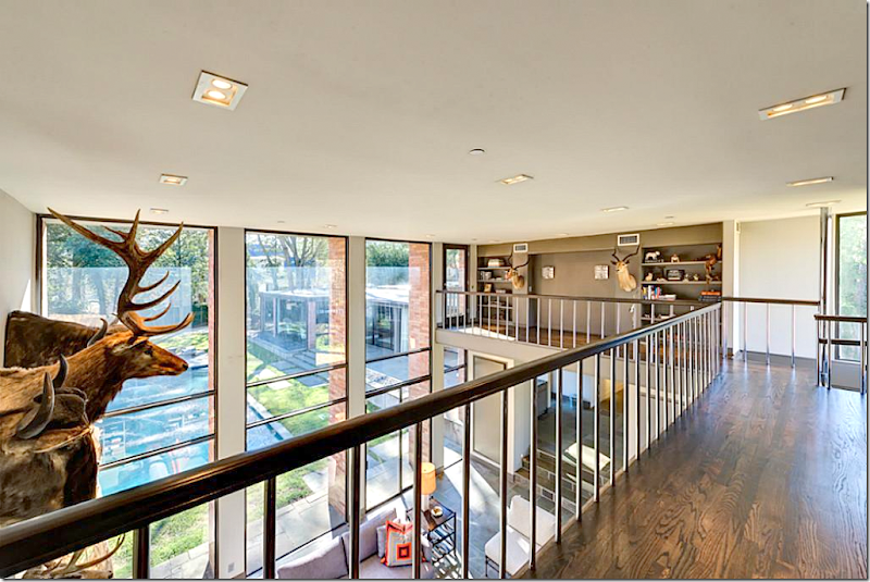
One other view of the landing.
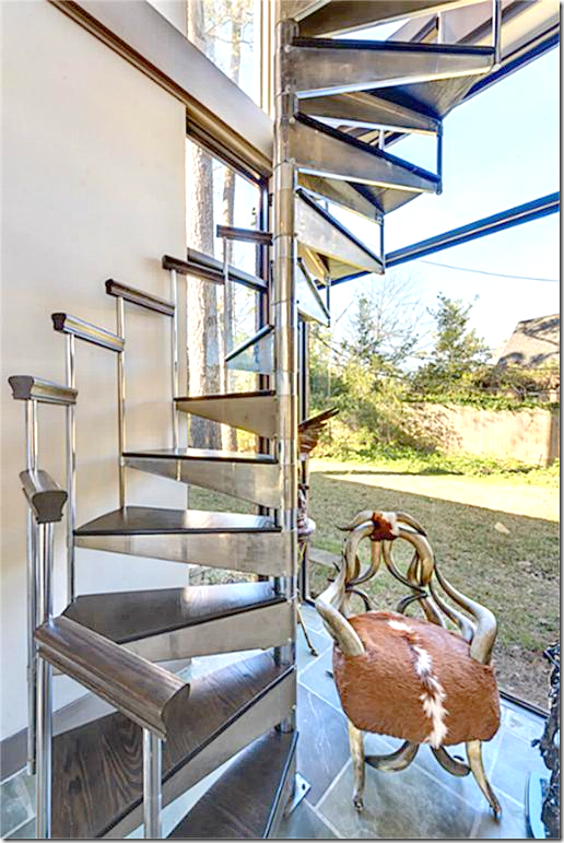
The spiral stairs that lead to the gallery – made of the same wood as the shelves and steel.
A guest bathroom.
A seating area – at the end of the gallery hall by the family room.
And, there it is – House #1 – Mid Century Modern Chic
Now on to
House #2 – European Minimal:
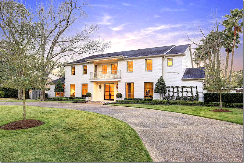
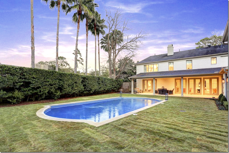
European Minimal is a large house, completely and totally renovated two years ago. The house was originally orange brick, but it is newly painted trendy white, with a new steel front door and new windows all over, including a new balcony railing over the front door. The house has new European styled landscaping – minimal box and gravel.
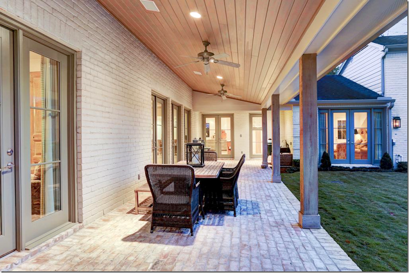
New brick porch out back and all new French doors.
European styled pool – with no tile surround.
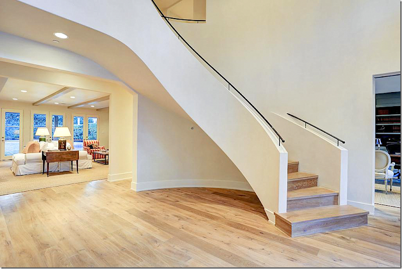
The walls are white, the floor is bleached. The new staircase looks like a modern sculpture. The large entry has a living and dining room to the left, a study to the right, and the family room to the back.
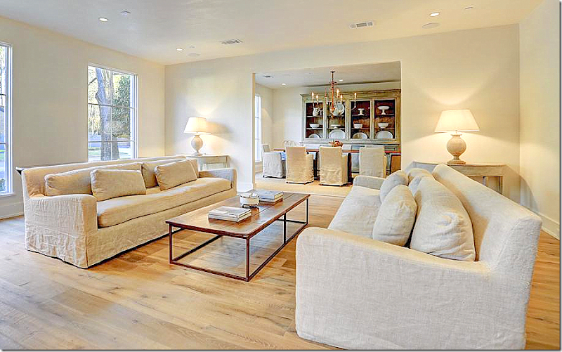
Simple overscaled slipped in linen sofas with a decidedly Axel Vervoordt styling to them. Simple demilunes, painted – with lamps adding the decorative accents. European minimal styling at its best.
The look is quiet, serene, calming. The shapes and finishes become the stars and the focal points, rather than paintings and accessories.
All trim has been removed from the house – crown and around the windows and doorways. Everything was taken down to the basics.
I don’t know who decorated this house, but I can guess the finalists.
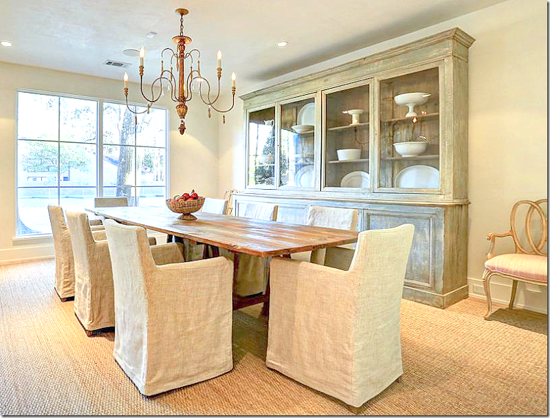
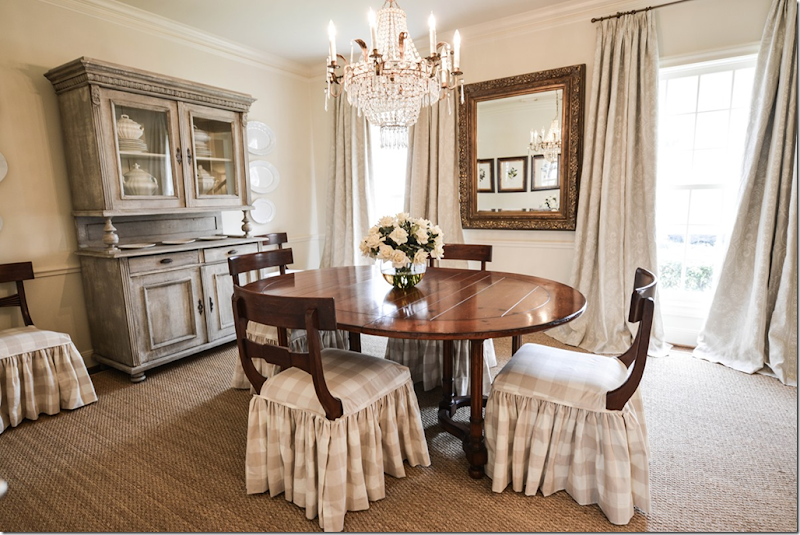
Simple elegance – slipped linen chairs, rustic table, a gorgeous china cabinet filled with creamware. And then … I love the touch of the fancy chairs with pink sink fabric.
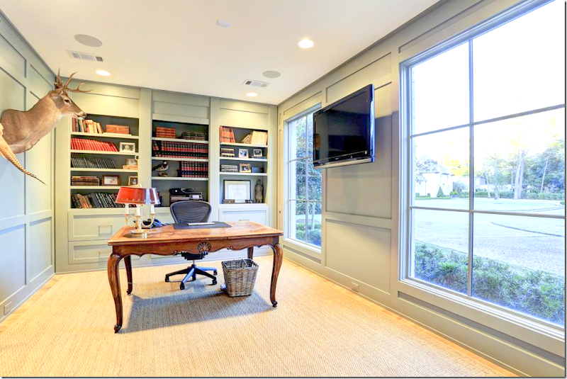
To the right of the entry way is the office – painted a soft aqua. Simple with a few trophies on the wall.
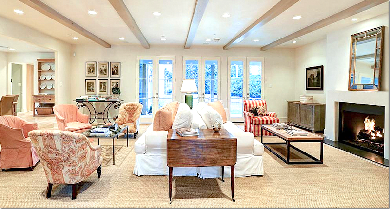
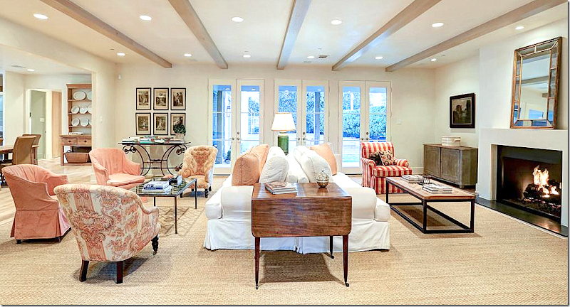
The family room is my favorite – with pink and red toiles and linens and checks. The back to back sofas in white make a large room smaller and cozier. The fireplace was redone with a sculpted mantel. I love the two antique chairs in the pink toile. I just love this room!
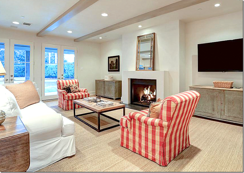
And here is another view – showing the kitchen. In this room – a few dark antiques were mixed in, along with prints and oils.
Painted Swedish cabinets provide just a touch of subdued color. Large, custom cut seagrass adds texture and more soothing color.
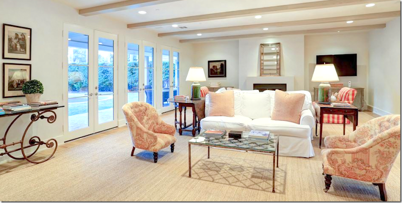
Looking the other way. Notice the lamps with their green color.
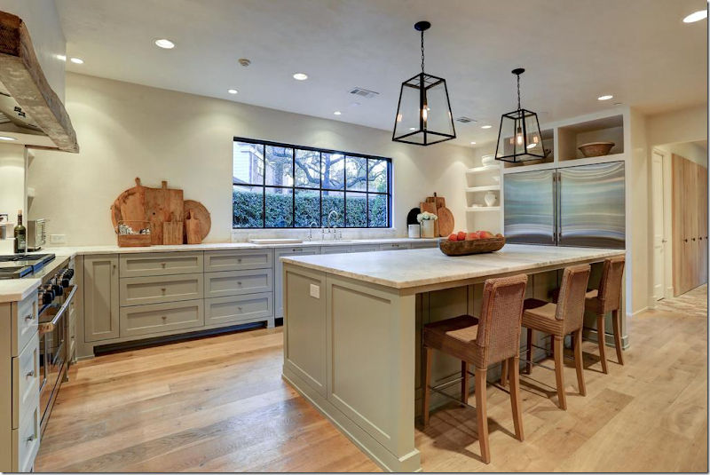
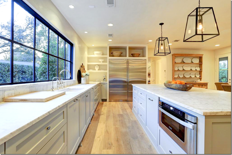
The kitchen area is totally new – completely renovated. It’s open with all lower cabinets only – all painted a soft aqua. The light woods blend in with the rattan chairs. Love the white platters.
Looking towards the family room. Love the wood beam over the range. Marble counters.
Trendy antique breadboards – the newest must have accessory in the kitchen. The kitchen is simple, but chic and luxurious and very European/Belgian in feel.
Double refrigerator. Love the large shelves above it. Perfection.
This built in cabinet is so pretty - simple Shaker cabinets, padded feet, marble counters – and a pretty collection of creamware.
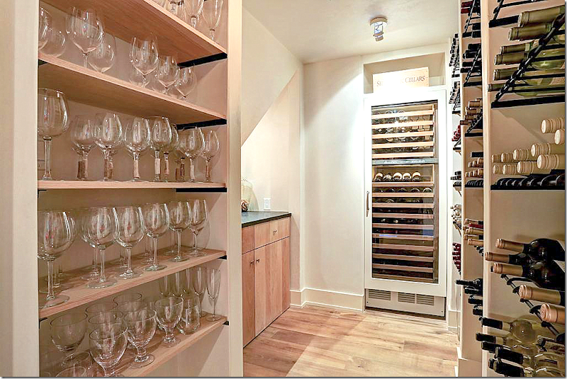
Even the wine cellar is simple, but elegant. No gaudy faux Italian iron gates. Just pretty wood shelves and plain glassware.
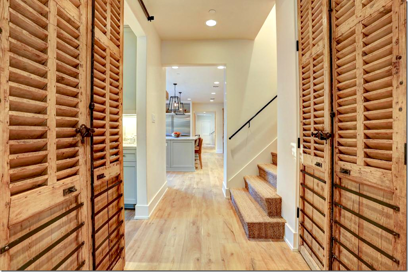
Past the kitchen - antique shutter pantry doors, seagrass stairs.
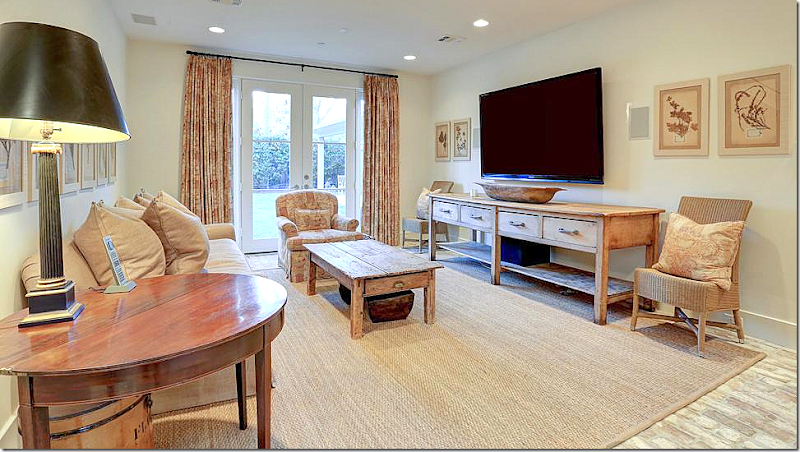
Beautiful brick floors, whitewashed – in the back study. Pink toile linen mixes with pine furniture and herb prints.
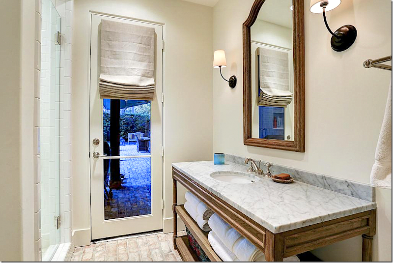
At the back is the pool bathroom. I suspect there was brick flooring in orange that they painted white. Maybe. Regardless, I love the brick floor for a change – I even think it would have been beautiful in the family room and kitchen too. Antique styled console with marble.
Upstairs – this feminine bedroom in blue and white toile with benches. Mirrored nightstand and trendy crystal fixture add some sparkle. Soothing green walls.
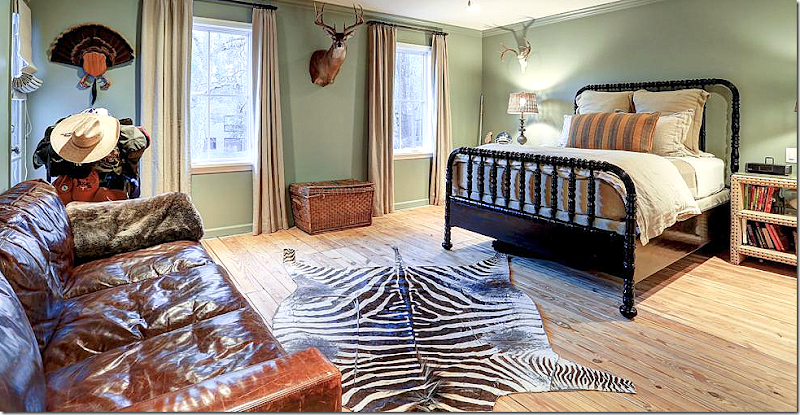
A boy’s room with leather sofa and zebra and wood floors.
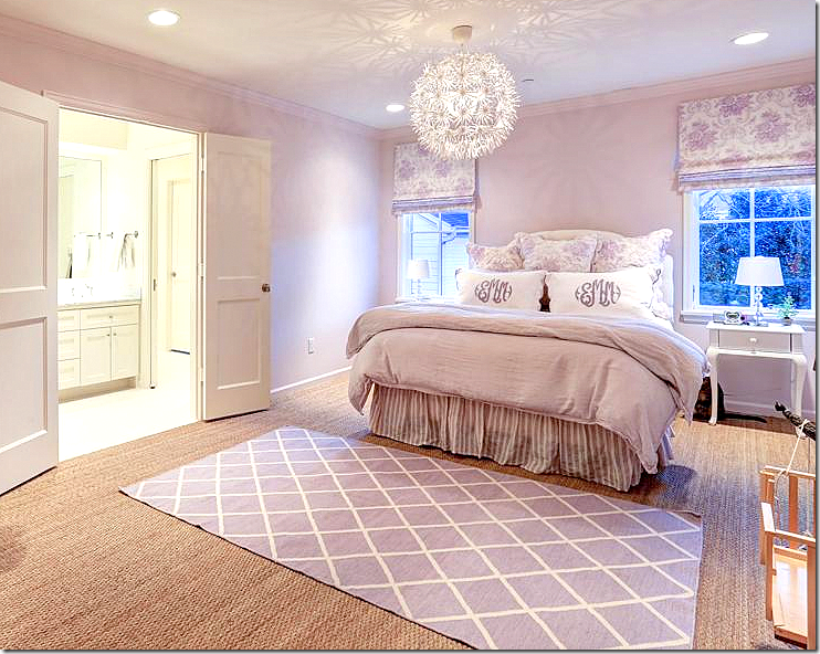
This girl’s room is perfect in lilac!!!
And one other girl’s room in lilac.
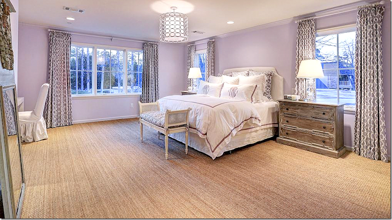
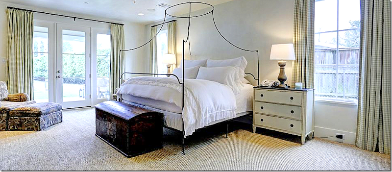
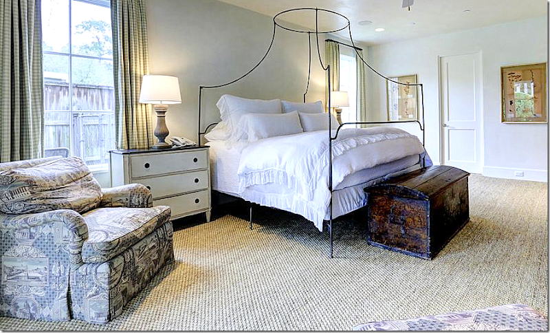
The master is on the ground floor – with Swedish nightstands and green check fabric with purple toile chairs.
Love the canopy bed and the antique chest. Love this!
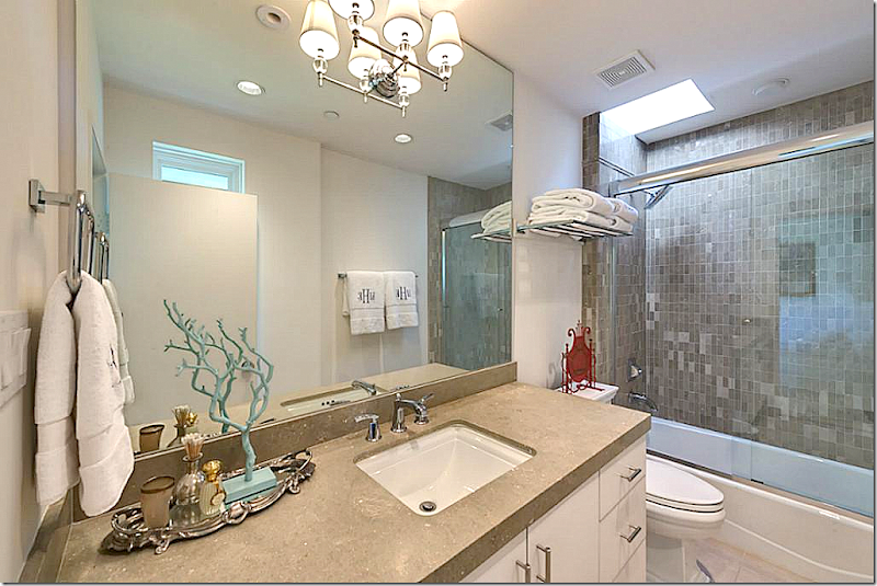
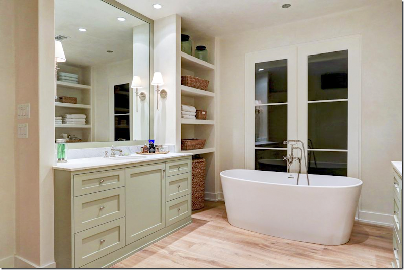
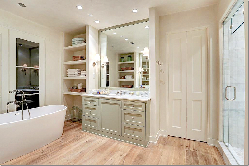
The master bath has two vanities – with a bath and shower between them. Wood floors.
And the other side. Showing the same simple Shaker cabinetry, painted in light green – offset by white walls.
So – there is House #2 European Minimal
And on to House #3 – Masculine Classic
First, you may remember a few years ago I showed a modern townhouse in one of Houston’s first Townhouse developments. It was owned by Shabby Slip’s Barbara Carlton and it was a fabulous mix of white slipcovers and antiques.
The complex is Mid Century Modern with flat roofs and clean lines. It is highly sought after by those in the know – and a reading of its inhabitants is like a who’s who’s of talented and chic Houstonians. House #3 is in that same complex. Also, there is another townhouse for sale in the same complex designed by Chandos Interiors that is also beautiful HERE.
House #3 – Masculine Classic
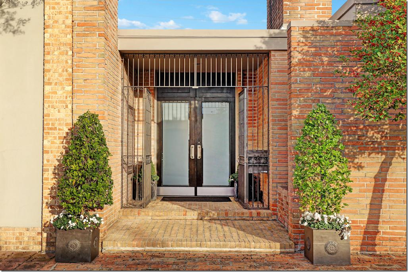
Masculine Classic – Zinc planters greet guests at the frosted glass double front doors.
You walk into the foyer with its white stone floors – paired with dark walls which look almost like eggplant, a gorgeous shade of deep gray/purple. The townhouse is filled with exquisite antiques and art work.
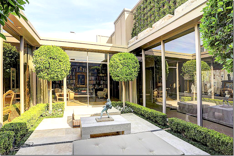
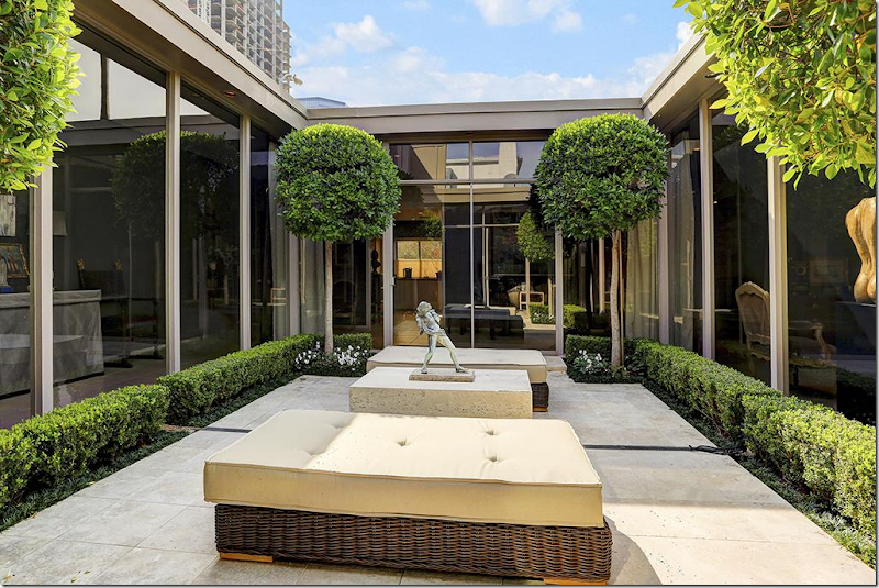
The 1 1/2 story townhouse is built around a large rectangular shaped atrium. The owner, a prominent designer, used simple box and vines and Ficus to landscape the focal point of his house. The living room can be seen at the left and the library is straight ahead.
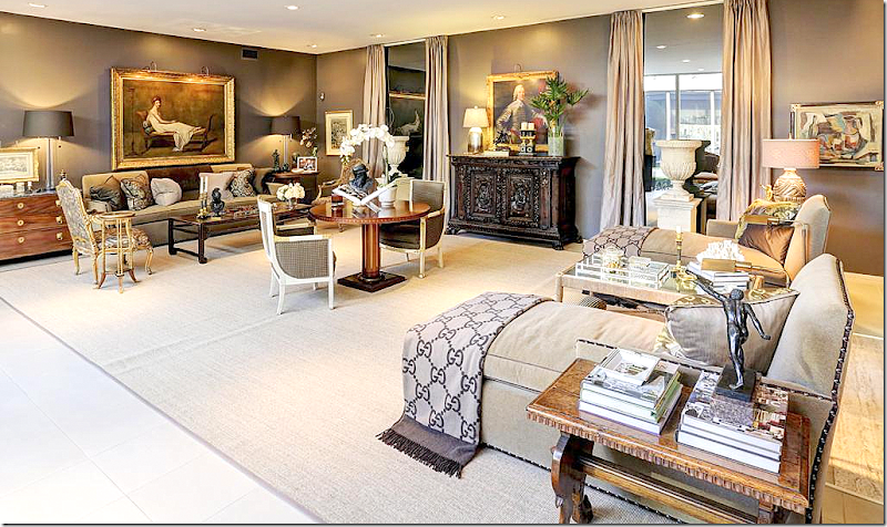
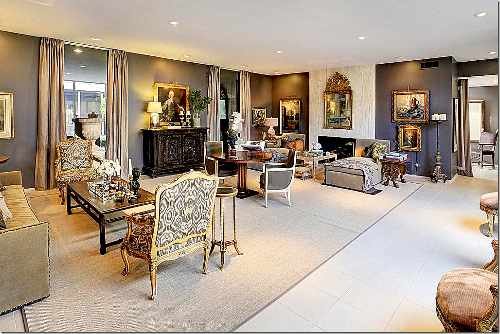
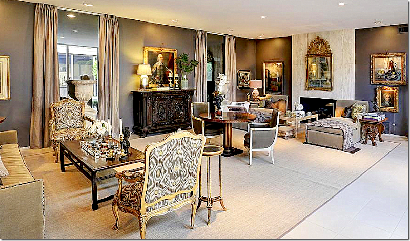
The living room is a long space – with an antique center table dividing it into two seating groups. One grouping has a sofa and chairs, while the other has two chaises. Instead of a long windowless wall, the designer installed mirrors that act like faux windows – he then flanked them with curtains. The mirrors help provide symmetry and break up the expanse of wall space. In front of the window are two large white urns.
The townhouse has a John Saladino look to it and I wouldn’t be surprised if the owner was a big fan of his, like me! Maybe that’s why I am so attracted to this house?
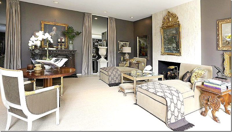
Looking the other direction towards the two chaises and the fireplace. You can see the foyer to the right of the living room – divided by porteries. I love this space – it’s so sophisticated and classic with its French antique chairs in Ikat fabric, along with all the fine accessories and furniture.
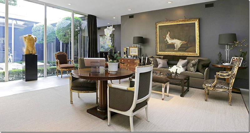
This view of the sofa and center table shows the atrium behind a large nude sculpture flanked by two French antique chairs. I love the oil above the sofa.
Here’s a closeup of the couch with its Oriental coffee table and beautiful chest – notice its feet! There’s a wonderful antique clock on top of the chest.
Close up of the twin chaises with their Gucci throws. Notice the beautiful antique mirror on the marble mantel.
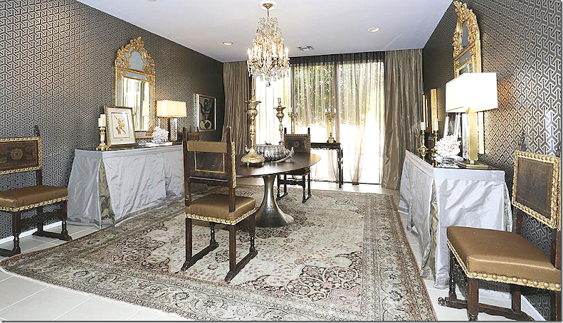
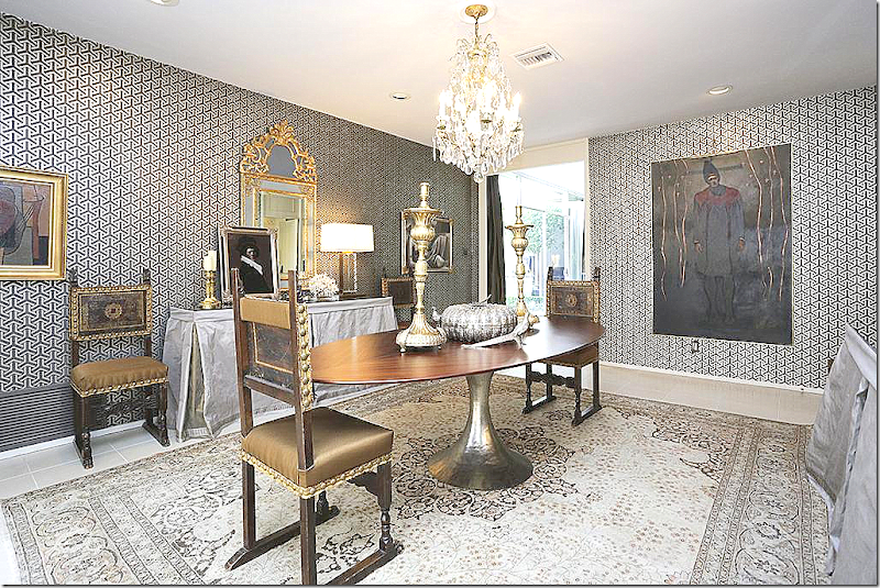
Past the living room is the dining room with its contemporary Saarinen table over an area rug. Matching silk covered consoles are such a great idea – love the mirrors.
Here you can see the wallpaper better. Through the doorway is the hall that leads to the living room.
Past the dining room, seen ahead is the hallway with the black piano. You can see the living room to the right of the dining room.
And across from the piano hall is this hall with a skirted console and a purple velvet covered chair. At the end of this hall is the stairway that leads to bedrooms.
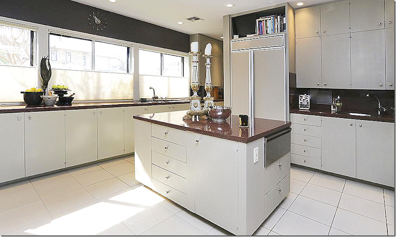
The kitchen is contemporary with granite counters.
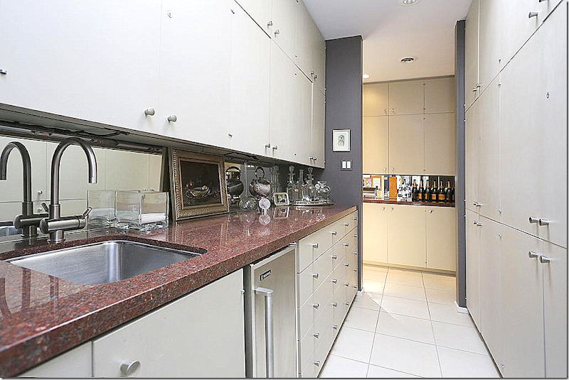
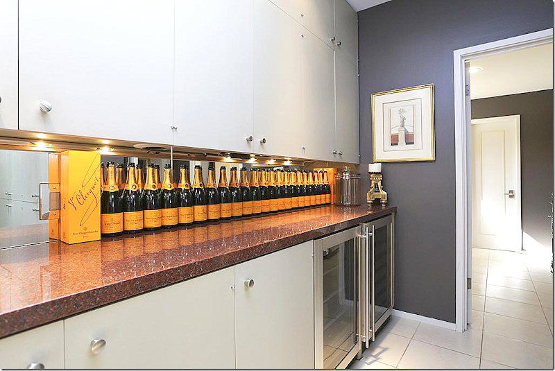
Wonderful space in the butler’s pantry.
In the wine room – someone loves champagne!!!
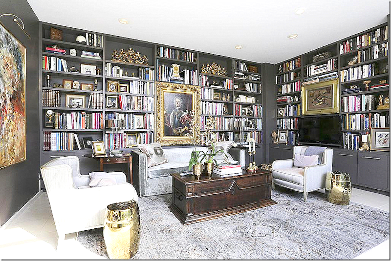
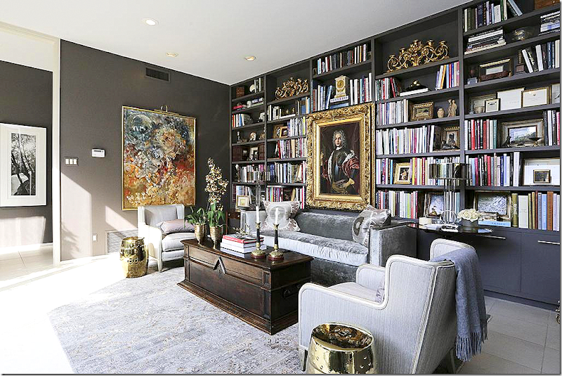
And – next to the foyer – is the library. What a space!
A mix of classic and contemporary art work and a collection of new and old in the shelves. This is such a lovely space. The foyer is off to the left.
Another view of the interior atrium.
The powder room with the same beautiful wall color found throughout.
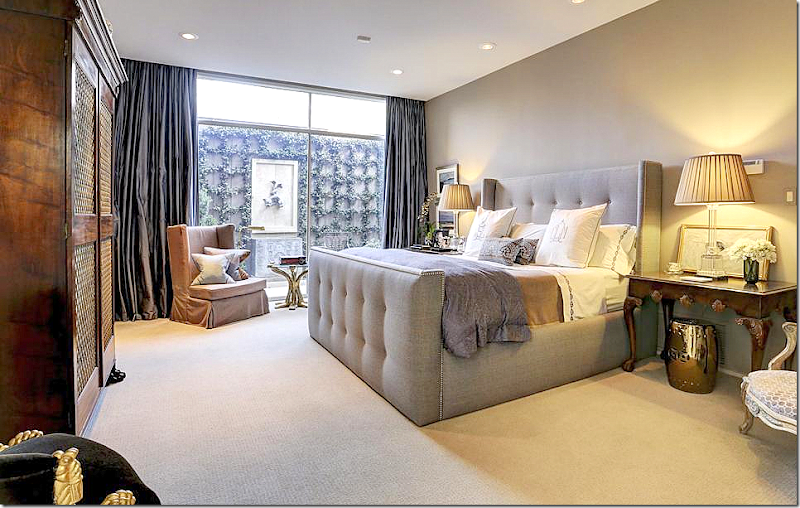
One of the downstairs bedroom. This looks out on an enclosed courtyard.
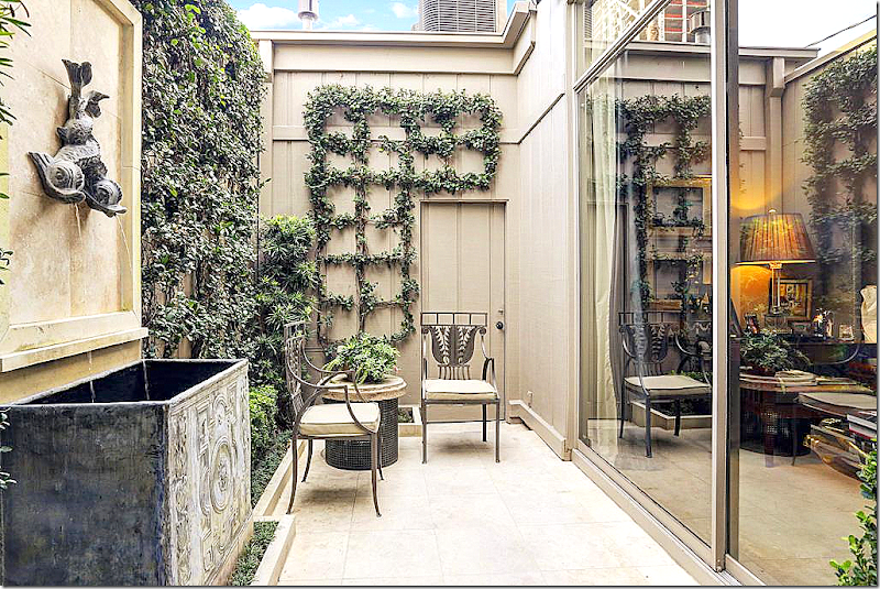
A view of the courtyard with the zinc fountain – love!!!
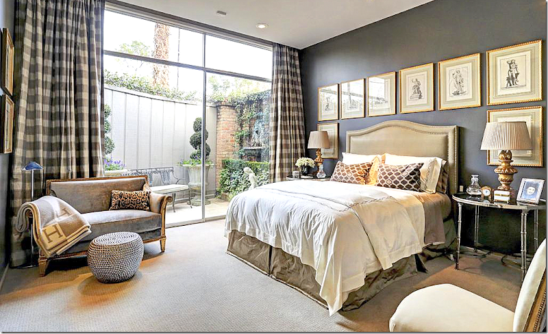
Another bedroom off another courtyard – with the dark walls. I love the set of prints on the walls. This is such a great element to use instead of one piece of art. Pretty fabrics and lamps. I love this room!
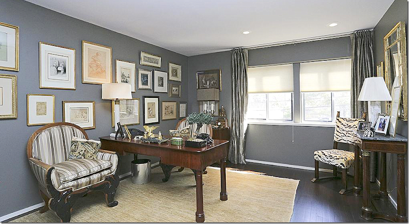
Upstairs is a study – again with the dark walls and now, dark floors. Beautiful gallery wall – and love the tiger velvet chair in the corner.
And a beautiful guest room upstairs with antique chests and again, wonderful lamps!
So, now you have to choose. Which is your favorite, House #1 - Mid Century Modern Chic with its Modern design and contemporary touches? Or, do you prefer House #2 - European Minimal with its Belgian sparseness? Or, is your favorite #3 - Masculine Classic, the cluttered, filled to the brim townhouse with the John Saladino inspired classic design?
Let me know your favorite, or if none of them suits you at all! I’m sure you’ve figured out my favorite is #2 – European Minimal. Most interesting - all three houses are sale pending right now. No surprise, since these were the prettiest houses for sale in Houston right now!
NOW – For some exciting contest news:
I have a BIG announcement coming, a BIG contest!!!
If you are in the market for curtains and are thinking about buying hardware for those curtains – or if you would like to update your hardware (hint, hint) – think about taking a picture of where those curtains are going to go. Think and dream about Antique Drapery Rod, HERE.
We are going to be giving away a LOT of drapery hardware to a LOT of lucky readers. More information will be coming soon.
Final Three–Your Choice of Styles
Subscribe to:
Post Comments
(
Atom
)

















So hard to decide - they are all just gorgeous houses, and there were things in each that I had to keep in my "don't forget" file. But the one I'd most want to live in is #1- if it were in my budget, I might even be willing to battle the Houston traffic just to enjoy that fabulous home.
ReplyDeleteMy favorite is the 2nd house, although they all have some really beautiful rooms! The European minimalist is calm and uncluttered which really appeals to me now, and I too love the living room with the back to back white sofas.
ReplyDeleteLocked on the house/room with stuffed heads blanketing the walls.
ReplyDeleteHis heads? A wife? She cannot abide them, yet he's paying for her lifestyle.
"What fresh new hell is this?" Shakespeare.
Impossible to make my brain stop with the instant stories !
Garden & Be Well, XO Tara
ps...adore all the homes.
House #3 has all of the bells and whistles, for me! I prefer a bit of "clutter" for warmth and interest.
ReplyDeleteLoved this post and would rather read it than be concerned about the Final Four any day!! Like you #2 is my favorite, but enjoyed having at peak into all three beautiful homes. Trying to figure out where #3 is located is it Bammel Lane or Timmons? Have a great day!
ReplyDeleteOutside the Loop! (although just barely). It's on Longmont, same side of Post Oak Lane as George and Barbara. We looked at it - and LOVED it - but feel really obligated to stay on one floor due to a family member's recent and permanent disability.
DeleteI think 41 lived there before they bought their townhouse further up the road.
Deletesuch a cool place to live!
Prior to his death, my father-in-law lived in one of the nearby townhouses. I was married in his atrium. I loved that townhouse. But, my pick is #2. I love the calm, edited Belgian feel with the spark of red and toile. fabulous.
DeleteHi Joni,
ReplyDeleteThanks for the great post. It's really hard to vote for a favorite-- I think I'd like the midcentury one more if there was a bit more of a mix of midcentury and antique furniture. The second European one is pleasant, though (and I hope I'm not being mean) not particularly memorable.
I don't know that I'd call the 3rd "masculine classic" house the best and I don't know that I'd want to live there, it was definitely my favorite by far to look at and deserves my vote. While some might call it "cluttered," I think it's a nice change from the ultra-minimalist Belgian style or the all-beige rooms that have become ubiquitous of late. There is nothing wrong with Belgian minimalism done well, particularly in an old house with lovely bones (see the Belgian Pearls blog, for example). But all too often the drive to reduce clutter and color for the sake of "tranquility" results in rooms that have had all their lifeblood drained out of them and have as much personality as a Restoration Hardware catalog or a hotel room.
I don't think a house has to be packed to the gills with knickknacks or mementos. But I do like to look at a house and see objects that clearly belong to and reflect the passions or interests of the owner, rather than just elements carefully picked by a designer. A good house should make you think "an interesting person must live here." While the architecture of the 3rd house is not my style, and I wouldn't make many of the decorating choices the owners made, it is clear that they actually took an interest in collecting the art and objects displayed in it. It is also clear that their library is for reading and not for show (like so many so-called "libraries" now that have no books in them or a couple rows of leather-bound tomes bought by the yard for effect).
Ultimately, when looking at the design of someone's home I think the best reaction you can have is not "oh, I could move right in here" but rather "oh, I would like to get to know these people."
I completely agree!
DeleteWell said. I agree.
DeleteVery well said!! I agree completely!
DeleteI couldn't live with the animal heads for one second!
#1 for the streamlined decorating and open airy feel to the house and yards
Deletewhew! great comment!!!! thanks. actually all the comments have been wonderful. thanks to everyone!!
DeleteYes, I once saw a family home that was so perfectly decorated. The owner ( a book club member) showed us upstairs, downstairs, every single room. The only thing I could tell you about the owners after seeing the house was that they have a couple of very neat and tidy children. The house had ZERO personality...as it ended up, so did she. She dropped out of our book club...I guess she thought we were all too relaxed and outspoken.
Delete"relaxed and outspoken"..haha...that is putting it mildly!
DeleteWhat a nice feast for the eyes this morning! The #1 mid-century with that blue stone and views is my vote! I let out a noise when I saw the animal heads, you said to be nice so I'll say no more....
ReplyDeleteWonderful post Joni, Thank you!
Surprisingly I liked all three houses despite the fact that I normally hate mid century modern. The second one was my favorite of course....such a beautiful home!!!
ReplyDeleteHappy Easter!!!
~Des
Joni: Thank you for this post. It was enjoyable. My daughter and son in law just put their house on the market in Houston. In 2 days, it showed 28 times, and they got 11 offers! Crazy market! My favorite house in your trio is #3. Regarding #1, I have great appreciation for midcentury architecture, and although the furnishings were lovely, they were inconsistent with the architecture, which is a big mistake, I think. It's like asparagus served with ice cream. Separately, they are both delicious, but they shouldn't be served together. The art pieces are fabulous and go with the furniture very well, but not with the architecture. It just seems the owners taste doesn't fit the style of the house. Their things will look better in a different style of house. The #2 house has some great features, and I like a clean look, but to me, it is just too spare. The entry/staircase is not just spare, it is empty. A good piece of sculpture that would have complimented the staircase would have been a good choice. It almost looks like they just staged it for selling. The big failure for this one to me is the lack of fabulous art. The art that was used is too small, and too timid and unsophisticated. I compare it to driving a Lexis without out power windows. To me, this house needs some monumental abstract art to fit the scale of the house. Also, even though it is meant to minimal, it would have benefitted from some additional, carefully chosen accessories. The #3 house is so complex and curated. The designer definitely has a level of expertise and sophistication, and the individual pieces are impeccable. My favorite thing was Saarinen dining table contrasted with those chairs that look like they came from a Spanish palace! The kitchen is my least favorite part of this house. Lots of good storage, but just too much monotonous cabinetry I think. Thank you again for this post!
ReplyDeleteTo terrybrowder;
DeleteEnjoyed your observations. Ice cream/ asparagus=good one!
Sheila
The kitchen? me too! i think it needs updating. but not sure what I'd do???? oh well. thanks for the great comment!
DeleteI like home #2 and I'm fairly certain that would be your choice as well!
ReplyDeletewww.BundleMeBaby.etsy.com
Let's see.. so hard to decide! I would pick number 2 but would have to spruce it up some...so sparse. All three are beautiful. I think I know the who the last house belongs to as well. Maybe he rotates inventory in and out of his store? Again, I would have a hard time picking...
ReplyDeleteJoni I am going with # 3. First it is masculine but not overly so. Sure some of the color palette is dark, however it is also very sumptuous!
ReplyDeleteI am sorry and try not to judge, I just cannot get over trophies as these in the other two homes. It just bothers me. More than that the first two didn't feel finished to me...needing rugs and accessories The pool areas need to have plantings, pots and furniture .
All interesting for sure!
xoxo
Karena
The Arts by Karena
Ellipsis: Dual Vision
#1 for me - That is a gorgeous mid century modern!
ReplyDeleteJoni another great post! Thanks for letting us play.
Delete#3 takes it for me due to the lavish interior furnishings presented with lots of space, light - a nice balance of cozy and expanse. I think my husband would feel comfortable there also. #1 appeals to me for a one-level house with an enclosed courtyard and a tremendous greatroom which dispels any ideas about "ranch" house. #2 is also wonderful for an example of minimalist Euro. Not an easy choice! GREAT post!!!
ReplyDeleteAll 3 are beautiful homes decorated with great taste. My favorite is #3. It looks like a home I could really live in. I wish I had a house in Houston to sell right now :) Thanks for the fun.
ReplyDeleteI was not expecting to like #3 best, but I do. #2 is lovely, also. Any house with trophy animals on the walls is immediately out of contention, because I think the karma of a previous owner who killed animals for the fun of it would forever permeate that house.
ReplyDeleteLauren
These posts are always so intriguing. Seeing how some people live....I really liked #2. It was spare but beautiful. We know that they were told to remove anything personal for the HAR pictures so I can't judge the lack of personality too harshly. As I become more vintage myself, I find that all the "stuff" is driving me crazy but I can't bring myself to live any other way. But I do love seeing spare surfaces which don't exist in my home. #1 and #3 were beautiful in different ways but #2, I could move into. Thanks for the look-see!
ReplyDeleteThanks for another labor intensive and beautiful post. I love aspects of all of them. I'm leaning towards #1, both inside and out. I still love a galley kitchen. I love the toe friendly bed in the guest bedroom of #3.
ReplyDeleteI don't think I would want a home on the bayou here in Houston. If it hasn't flooded it will.
Great post!
I loved all 3 and could be happy in any of them but I chose #3 because it showed the most personality of the owners and I love John Saladino's style.
ReplyDeletethis was fun fun fun! Thank you ... your posts are always so thoroughly detailed and thought-out .... with that said .. #3 ... so much thought went into creating that space.
ReplyDeleteBlessings for a beautiful Easter and many more fun posts to come!
I would have to go with #2 for sure! However, it's a little sparse for me so I would add my own touches, accessories, collections. I like a house to have some things on the walls, the counters, and the tables as I think it reflects whomever lives there and seems much more personal (at least to me). On another note, did anyone else DIE over the (barely shown) backyard/patio of #3? I didn't love the house but the ivy, planters, and two fountains I could see were to die for!! Soooo wish I could see the whole outside of #3!! Thanks for a great post Joni! Now that I'm doing a bit of blogging too I see how unbelievably time consuming it is and this was a wonderfully written and researched post! xoxo
ReplyDeleteSheila
www.maisondecinq.blogspot.com
I'm also in love with the atrium and courtyard too! But, number two is my favorite.
DeleteThanks for a great post, Joni. Happy Passover/Easter.
Maureen
Love #3. The décor is consistent throughout, and inviting, comforting, and cozy.
ReplyDeleteAs for the other two: It makes me so sad that people are still proud to hang the severed heads of beautiful animals on their walls.
Sheila
Great post + I like #3 with all the objects + great photos xxpeggybraswelldesign.com
ReplyDeleteLove #2 the best! Love the architecture of #1 but the furnishings didn't enhance. #3 enjoyable but a little too precious for me.
ReplyDeleteI agree with Peggy, # 3 is the best !
ReplyDeleteDean Farris
There are things I like about all three but my favorite is #2. I would have to add art and accessories though. The decorating is a little sparse.
ReplyDeletexx,
Sherry
The Mid-Century Modern is stunning, from an architectural standpoint. Love the straight lines and exterior landscaping, so classic and clean. The interior design insults the structure, looks dated and is trying way too hard. The European home is also lovely. The floors, cabinetry and wall colors are exquisite. However, the interiors say.... "I've seen this look in design magazines and am trying to replicate Belgian minimalism". They have collected some nice pieces, and selected attractive linen for slipcovers, but the overall look is not balanced or complete, and certainly "not" Axel Vervoordt! The Masculine Classic, while over the top formal, seems to be the only interior that is at least sure of what it wants to be. I'm not that formal, but lets give credit to the owners for having a well developed sense of design and carefully collected rooms.
ReplyDeleteI know that real estate is the main focus for these homes, and they are all amazing properties. Just find it a bit disappointing when the interiors are counter to the structure and distract from the real property.
Number 1, Mid-century. Love it.
ReplyDeleteFunny that the "masculine" house is the only one without dead animals.
ReplyDeleteI dont think male decorators hunt too much.
DeleteBest comment ever, lol!
DeleteTo the contrary, I am the owner / decorator of house #3. I love "hunting"...the Marche aux Puces in Paris, the Winter Antique Show in N.Y. ,even Roundtop, TX! All joking aside, I have enjoyed everyone's comments and especially the compliments. Joni, thank you for posting our home, along with the two beautiful others. Dennis Lyons
Delete@JONI - OMG - You Cracked me up and made me laugh out loud.
DeleteGreat comment!
Congratulations to you, Dennis Lyons, on your extraordinary home. And happy hunting -- for art and antiques, of course!
DeleteHouse # 3 is my favorite- there may be masculine elements but it is warm and welcoming and clearly designed by a pro. House #1 has some lovely elements and so does #2. # 2 needs to be warmed up. Overall, the first 2 houses are not in the same league as House #3 when it comes to style and interiors.
ReplyDeleteI love house #2. The walls, light paint colors, white washed brick, bleached wood floors, marble, antique doors and reclaimed wood used throughout... It is beautiful! A lot of detail went into these selections. You said it was renovated. I would love to see the before and afters. I love the kitchen with marble, antique pine furniture, and collection of creamware. I am into the linen and seagrass look so this house really appealed to me. I wonder if it is sparse because they've only lived there for 2 years. Maybe they didn't get to finish decorating it before putting it on the market? It would take me years to decorate a house of that size. I counted 3 living rooms!
ReplyDeleteThe other houses were not my style, but I still found them enjoyable to look at and can appreciate the design aspect of each. If I had to pick a second place it would be house #1. I'm not into mid-century but the light and linen fabrics and couple of antique furniture pieces drew me in!
Great post-I love seeing Houston homes!
#3. The style, it is delicious. Color and texture and placement of furnishings. Great taste whomever put it together has what it takes. Ann
ReplyDeleteSurprisingly, I liked house #1 the most. I bet you did too. Although, a year ago, I would have written that I thought your favorite was #2.
ReplyDeleteAll the homes are lovely and I would change several things in each to make it mine. House #2 looked staged. If it had any sign of "a family lives here" I would have chosen it.
Dee
# 1 and # 3, as they are "collected homes." Neither is totally my "style," but I can tell immediately that they are reflections of the owners. Home #2 is just too staged and "model home-y" for me. I once read that when you walk into a home, you should know who lives there. House#2 just doesn't have any identifying personalism. I do like the pink chintz, though. I think I know where those townhomes are, and have admired them forever...still a secret....and thank you so much for letting us peek at so many wonderful photos of each home. I am on my second scroll, right now. I also read through all the comments, and was amused by the preoccupation with the trophies. I see them as pure Americana, and bring 'em on! Linda Klnger
ReplyDeleteAnon. 3:53:
DeleteIt is not a "preoccupation with the trophies."
It is a disgust and a sickening feeling that there are still people who think it's a good idea to kill big, beautiful, wonderful, magnificent animals and then proudly display their severed murdered heads on the wall. It's unfortunate that you are amused.
Sheila
We get it Sheila, you're socially conscious.
DeleteI forgot to vote! #3 hands down for me!
ReplyDeleteTo me the midcentury modern house's furnishings do not complement the house. I liked both the exterior and the interior but not together. The second house was a little spare although there were some lovely touches. There was something off about the kitchen of #2. The sink wall area was way to sparce...needed some open shelves or something. House #3 just didn't draw me in for some reason although the outdoor space was lovely and there were some inviting parts. Which is your favorite Joni...I bet I can guess...
ReplyDeleteLove, Love, Love house #2........so light, airy and comfortable! I could see myself living there! I wish the outside pool area was not so minimal but that is about all I could find that I would change about this beautiful house! And please do tell who you think were the finalist in decorating this house!
ReplyDeleteOf the 3 houses you show, I also like #2 the best. But none of them are in my taste nor would I feel comfortable living in them. Besides to live in one of them would mean moving to Texas and leaving the "best place on earth", San Francisco! Thanks for another great article though!
ReplyDeleteSarah in SF
I like and dislike bits of each house, but if I had to pick it would be #2 for me.
ReplyDeleteI loved the midcentury modern house (surprisingly) and also the European minimalist house. Both were lovely and would be comfortable to live in.
ReplyDeleteNo. 3 hands down. It is not my taste, but it is executed well and the decor flows beautifully from room to room. It definitely is owned by someone who knows what they like and has spent a lot of time collecting. While a bit dark, it does exude drama which was probably the intent. House No. 2 looks like they didn't pay the decorator and she left before the job was finished - poorly done. House No. 1 comes in second.
ReplyDeleteWell, I am positively shocking myself by picking house # one!! So much architectural interest, so much light, so much space! This is the first time I've LOVED a modern home. Will you be tallying and let us know?
ReplyDelete#2 is livable to me...thanks for all your hard work pulling this together for our enjoyment, Joni!
ReplyDelete#3 for me, then #1. Hate the animal head trophies (so sad that animals are used as "decor").
ReplyDeleteThis is a question for any Realtors reading the comments or someone knowledgeable on the topic of mounted trophy heads. I am so intrigued that so many homes for sale are decluttered and staged on Realtors' commands - yet the animal heads remain despite a significant percentage of the population's distaste for them. Why? Are they so heavy that the bolts holding them leave huge holes in the walls? Can no artwork temporarily replace them? From the tone of some of these comments, they seem to have the same effect as leaving your pet alligator in the garage for a showing without leaving a warning note on the door (true story!).
ReplyDeleteSo like-minded on this. The hunt trophies are hideous and creepy - they totally put me off. Would never want to live in a house where the previous people thought they were appropriate - would feel that something of their cruel attitude to life and animals as game for shooting would linger on after they'd left and leave a bad atmosphere in the house. Pamela - Australia
DeleteYou forget these homes are in Texas. When in Rome and all that.
DeleteNumber #1: but I would LOVE to see the change to a more modern décor and artwork .... It would be wonderful to be able to see that cool house all re-done .... I wonder which designer would do that house best?
ReplyDeleteAnother fantastic posting!
Jan at Rosemary Cottage
I'm in love with that mid-century house. I mean, not the house, as much as the décor of several of its rooms. Some of the pieces are just to die for, like those standing candelabras in the family room behind the sofa, the chairs in the sitting area adjacent to the main living room, the daybed and that beautiful mirrored case piece! Ah - definitely saving to the inspiration file!
ReplyDeleteThanks Joni, great post!
xoxo,
Artie
All three are wonderful. It was hands down #3...Until the kitchen......Then it became a tie between 2 and 3 Vanna
ReplyDeleteI think house #3 is by far the most impressive, but I am not sure I would ever feel at home, however my two St. Poodles would look fabulous .... House #2 is more my style, I could easily own that place, but I might just pick house #3 anyway... House #1 looks like a school to me, I would not have even gone inside if I were house hunting in TX. Vicky Darnell
ReplyDeleteI love the townhouse concept, so #3 for me. We're in the throes of toddlerhood here, so give me a few years.
ReplyDeleteI do wonder, though, what people are supposed to do that find themselves in an MCM or more modern setting with inherited and beloved furniture which is not modern? In an ideal world, we'd all be able to afford a house that matches our personal style. But if the only place one can find a job is one of the most expensive areas in the country with predominantly MCM housing (thus leaving one with minimal choices), and one is not at all into MCM decor, what does one do? I'm sure I'm not the only one in Blogland that has this dilemma. I would love it if decor bloggers did a series on this.
MCM?
DeleteThis comment has been removed by the author.
DeleteTo put MCM in caps like that means 1900, so I thought it meant a house from then.
DeleteSheila
Joni..as much as I love your posts, I also love reading all the comments..there as interesting as the post!
ReplyDeleteI liked #2 as well, but I think I would add some stuff, it was just a bit too minimal for me. Great post Joni.
ReplyDeleteI like parts of all three, but if I had to live in one of these spaces I'd choose #1 based on the interiors and furnishings. I like the juxtaposition of furnishings in a streamlined interior. Joni, you still have the best blog I read! Thanks for being consistent for such a long time!
ReplyDeleteI think the furniture in House #1 (admittedly beautiful) - fights with the architecture. I love the light in House #2, but find it trendy and not very interesting.. I think I could go shopping and achieve the look in House #2 (if I had the cash). House #3 looks curated and full of personality. It's my favorite by far..
ReplyDeleteWhere can I get the house #3 photos in a print version? I want to save it as inspiration.
ReplyDeleteSheila
I liked #3 as well. It is warm and inviting for any occasion. You can go home and relax or throw a dinner party and not have to worry about the ambiance. The other homes would need preparation for "change".
ReplyDeleteMy favorite home is #1, but why oh why did they decorate in this style? Beautiful, but not right for this home.
ReplyDeleteI hope the new owners are brave and think outside the box with this awesome space!
Definitely house #3!! LOVE the interior, everything about it!!
ReplyDeleteHome #3. When can I move in???
ReplyDeleteAll three homes are lovely. House #1 and #3 are architecturally similar except that house #1 is obviously larger and on a beautiful large piece of property.
ReplyDeleteHouse #2 is also a pretty house but looks a bit staged and does not seem to reflect the personality of its owner. I love house #1 but over all and especially décor house
#3 wins. It is not only beautiful but does reflect the personalities of it occupants. The décor is very elegant and sophisticated but still warm and inviting which can be difficult to achieve.
Definitely House #3 wins!
Home #3. A fantastic, sophisticated mix of styles. It creates something that is quite elegant. And the colors are great.
ReplyDeleteHouse 3 Masculine Classic Clean & warm, very European
ReplyDeleteDefinitely house #3-- though I don't find it all that masculine other than the dark gray throughout. Love the use of art and baroque frames.
ReplyDeletePlease, please, please stop decorating with decapitated, murdered animals. Horrible! I couldn't stay in a room with mounted "trophies."
ReplyDeleteThe comment regarding "male decorators not hunting" was not cute. It was homophobic, plain and simple. And not surprising, given the "trophies".
DeleteYou made me laugh out loud with "does anyone in Houston hire a designer?" HAH! Knew you loved number two! Easily could have been designed by one of our faves, Ginger Barber. I loved how the mid century modern house didn't go with that era inside. I thought their furnishings were equally beautiful with number two. I'm always so impressed with minimal design and the self control it takes to not clutter it up, like I do! LOL. I wish I could pare down like these folks and make life simpler. GREAT post and know you put boo-ko hours into it. xoxo Jennifer
ReplyDeleteA mixture of antiques and classy furniture adds more style to this house. Looks really beautiful.
ReplyDeleteI'm torn between 1 and 3. I think I'll vote for 1. Yes, 1 it is!
ReplyDeleteFun post - of course I am going with #2! I like to look at, and can appreciate modern homes with lots of glass, but I could never live in one, just not my thing. The last two photos - those are my favorites - love that look - similar to yours.
ReplyDelete#3 is what I would call my dream home! To find a structure that has such amazing scaled volumes which has been so tastefully filled with the best of furniture & amazing accessories - to me, it reads like a story book of the owner's life. Everything is beautiful. Every piece of furniture, the art, the fabric has been pulled together in such a tasteful, elegant and comfortable way..... I think I would have the adventure of a lifetime just by spending a weekend in this home. And the main courtyard, as well as the other garden areas, are as stunning as many I have seen in on the west coast! Beautiful!!
ReplyDeleteGoodness. If I could have the pool & wooden walls in house #1, children's rooms & kitchen in house #2 and courtyard, floor plan and marble fireplace in house #3 I'd be set. There's things that I can appreciate in all of them. Dang it! I can't choose. This is why when we build our house I'm going to be all over the place. I like everything.
ReplyDeleteI liked parts from nearly all three of them, but I liked #1 the best, minus the "trophies." The views are gorgeous, the home felt warm, and it was just well done. Though the library from #3 is gorgeous and made it hard for me to choose! The second one was a distant third for me--the minimalism was a little too stark for me, and the Belgian look is starting to feel overdone to me.
ReplyDeleteWow, this is a tough one. All three are spectacular in my view. One question, can I choose the Belgian Sparse, knowing full well, it will eventually have many collections. Would this work? I do love the last one, full of soul and glitz, didn't know this was possible...
ReplyDeleteOZ Bên cạnh việc chuyên cung cấp dịch vụ trọn gói thiết kế và thi cong noi that , thi công nha o, thi cong van phong – thi cong shop, thi cong karaoke , thi cong nha hang, thi cong khach san, thi cong resort, thi cong spa, công ty còn chuyên sản xuất các mặt hàng đồ gỗ nội thất cao cấp trong nước và xuất khẩu.
ReplyDeleteCông ty có một đội ngũ nhân sự bao gồm kiến trúc sư, cử nhân mỹ thuật công nghiệp lành nghề và yêu nghề. OZ luôn đưa ra những sản phẩm thiết kế nha dep, biet thu dep, nha pho dep, can ho dep, nha ong dep , phong khach dep, phong ngu dep, sáng tạo đồng thời phù hợp với khả năng đầu tư của khách hàng. Bên cạnh đó còn thực hiện ý tưởng của quý khách hàng trong thời gian nhanh nhất với chất lượng tốt nhất thông qua các kiến trúc sư nhiều năm kinh nghiệm.
snr phẩm máy hàn tig Vạn Thái
Phụ tùng ô tô huyndai
ba đờ sốc
Phu tung oto ford
Phu tung oto Toyota
Phu tung oto kia
Phu tung oto Mitsubishi
Phu tung oto honda
ba do soc
phụ tùng ô tô Hàn Quốc
Phụ tùng ô tô mazda
Phụ tùng ô tô Daewoo
Hoàng Gia là thương hiệu wedding và tổ chức các sự kiện đặc biệt hàng đầu tại Việt Nam, luôn sáng tạo và đi đầu với những ý tưởng phông sân khấu cưới vad dịch vụ tổ chức cưới cưới độc đáo, ấn tượng
I'd like to see design #1 (mid-century modern) restored to its original appearance inside....as much as possible....and furnished with retro-style furnishings. I also think the add-on (family room) should be demolished, since it detracts from the horizontal lines of the original residence.
ReplyDelete