I know everyone is busy at this time of the year, but for those of you who might want to take a few minutes away from the festivities, I’ve written this tribute about a good man – and what he added to our lives through his love of design. Enjoy!! Years ago when I asked a fellow blogger, Things That Inspire, what I should write about next, she said – how about your “Ten Favorite Designers?”
I did write the list, but when I finished at #8, I stopped. I tend to do that alot for some reason - start lists on the blog and never finish them. For years Things That Inspire would say - who was your favorite designer, who was #1 going to be?!? I always thought that my favorite designer was so obvious. As for the favorites list, it has changed over the years. There are a few I named that I wouldn't put on the list today and there are so many more designers that I adore, that suprisingly didn’t make the list. My list, from bottom to top, was:
10. Alessandra Branca
9. Michael Smith
8. Suzanne Kasler
7. Lynn von Kersting
6. Suzanne Rheinstein
5. Charles Faudree
4. Gerrie Bremermann
and,
3. Charlotte Moss
What a list! Today, I would include designer Daniel Romualdez, for sure. And where is Windsor Smith, Rose Tarlow, Miles Redd, David Easton, Bunny Williams, and Mario Buatta? And, why are there no Houston designers on the list? Carol Glasser or Pamela Pierce or Ginger Barber - where are they?
(To Read the stories #3-10, go HERE.)
It's glaringly evident who was going to be #1 - John Saladino, of course.
But 2nd place isn't nearly as obvious. In fact the runner up was Dan Carithers, the interior and furniture designer from Atlanta.
The dapper, Southern gentleman Dan Carithers.
Carithers was a huge influence on me and on my work. For years whenever I would see a house in a magazine that I loved, the designer would inevitably be Carithers. And then, there were the many clients who would come to meetings with tear sheets of his projects.
My first exposure to Dan Carithers was 25 years ago. I've written about the house HERE that Ben and I built in Ft. Worth, when we lived there for not quite two years. I had seen a living room by Carithers that I adored and tried to copy.
Another photograph of that same room I copied. Here Carithers styled the desk as a bar.
Karen later recalled the wedding reception: “It was an intimate luncheon at the home of a friend and all the tables were decorated with Dan’s signature beige-and-white striped linen cloths, casual garden flowers and objects that had special significance for the couple. It perfectly summed up Dan’s approach to decorating and living a beautiful life: to always surround yourself with the people and the things that have meaning. The day remains a favorite memory for me.”
Whenever Carithers was featured in Southern Accents or any other magazine, it was an event. I, along with scores of readers, would obsess over every picture for weeks. I loved his aestethic and felt he had the best taste. It was as if he spoke to me.
An early modern high-rise apartment by Carithers, 1981 in Southern Accents. See more of this apartment at The Peak of Chic HERE. This 80s styled design was the home of the owners of Rich’s.
Carithers started his 50 year career at Rich’s Department Store in Atlanta. He traveled around the world for Rich’s, buying antiques in Europe that he would then use in the displays – vignettes that resembled a home – which he would change out twice a year. Stylish shoppers would flock to the downtown store to see the new displays.
After Rich’s, Carithers started his own firm, along with a collarboration with Baker Furniture. He designed classic pieces for Sherrill that are still sold today.
An ad showing some of the Carithers Collection for Sherrill.
A few years ago, Carithers developed unfortunately Alzheimers and retired. In 2013, he and Nancy had an estate sale and then sold their beloved and much photographed house. Recently, they moved and their new townhouse was featured in House Beautiful this month.
A living room by Carithers.
A dining room by Carithers.
Here are some things Carithers said years ago in interviews – that still resonate today.
His influences are Jean-Michael Frank, Colefax & Fowler, and David Hicks. His favorite detail? Small trims and small welts. His favorite countertop? Kashmir White granite. He likes to mix classical, soft drawings with strong modern art. His favorite fabrics are cotton, linen and silk (but not shiny - of course!) He dislikes any fabric that seems fancy. Accessories he likes are weathered wicker, creamware, terra cotta and woods; avoid trends. Keep window treatments simple. He says of over-swagged and heavily trimmed windows:“oh my Jesus, look at that window treatment!”
A bedroom by Carithers with Rose Tarlowwallpaper and fabric.
According to Carithers – the quickest way to dress up a room is to paint the trim white and slipcover everything – slips should be fitted, not sloppy and made of classic fabrics like ticking, stripes, checks, or florals. He prefers a white trim, like a starched white man’s collar.
Favorite top five paint colors? Pratt & Lambert’s Seed Pearl and Silver Lining. Donald Kaufman’s DKC49 and Benjamin Moore Mink and Fernwood Green.
A Carithers dining room with handpainted wallpaper.
He said while his rooms never look “dead rich” he certainly doesn’t mind it to look expensive.
Change things up from time to time; put some accessories away, put others out and move the rest around. Don’t let anything become static.
A southern home should never be without graciousness, hospitality and good manners.
And this: "If I had $500,000 to spend on a room, I'd spend $400,000 of it on the accessories . . . A sofa's a sofa, a rug a rug, but accessories are how you can sense what a person is all about. They are the most important ingredient in decorating. It's the accessories that create the "I'm home" feeling."
Carithers and his wife Nancy in their garden.
First let’s take a look at the Carithers house, which was photographed many times for different magazines:
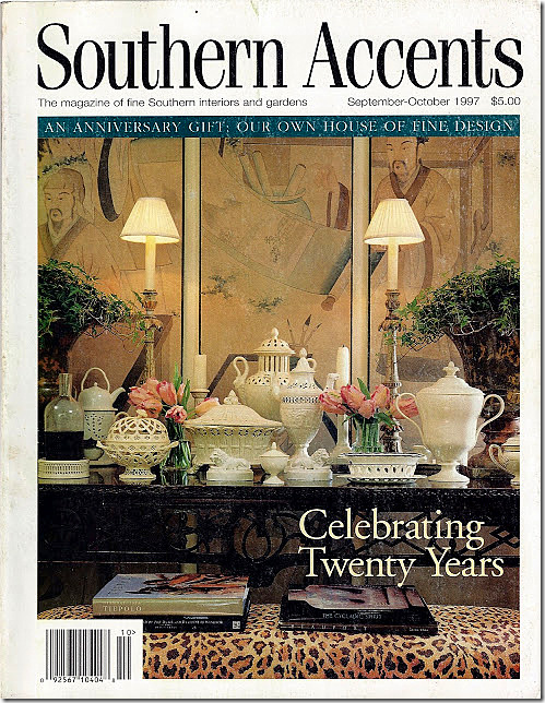
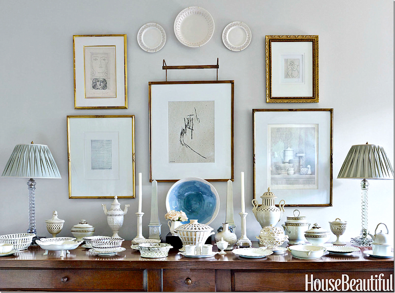
Carithers is famous for his outstanding collection of creamware, shown here on the cover of Southern Accents in 1997. His collection inspired so many people to start buying creamware – instead of the more colorful transferware. I know he is why I started my own collection, along with a few clients of mine.
Carithers lived for almost 40 years in this 1937 cottage in Atlanta’s Buckhead community. Originally the house was red brick with white grout. When he moved in all the doors were replaced with French ones to flood the house with light. The front bay window was added to the living room.
Today, the new owners have painted the red brick, white – which I love! The front door is in the middle with the living room to the right. To the left of the front door is the study. At the very left where the roof becomes one floor, is the “long room” or family room – this room was added onto. It might have once been the garage?
An earlier photograph of the house – where there was a front walk lined with boxwood. Taller box hid the front of the house. Today, the walk is no longer lined with box and the taller box have been clipped. Also, the family room on the left was covered in vines, those are gone too.
The back yard is a series of stone steps that wind up the hill through the garden.
Throughout the all-green garden are antique suprises – plaques and urns and benches to sit upon.
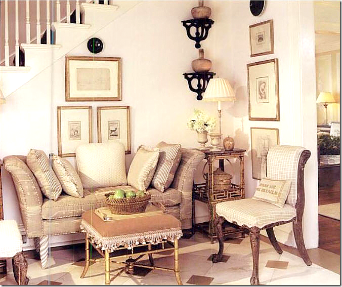
The foyer – seen in 1997. The painted floor came about when Carithers was moving a sofa from upstairs – which was then dropped. In order to hide the damaged wood, it was painted with 14 shades of white and 1 shade of brown.
Southern Accents 1997: Sorry – a terrible scan! This shows the entry looking into the living room.
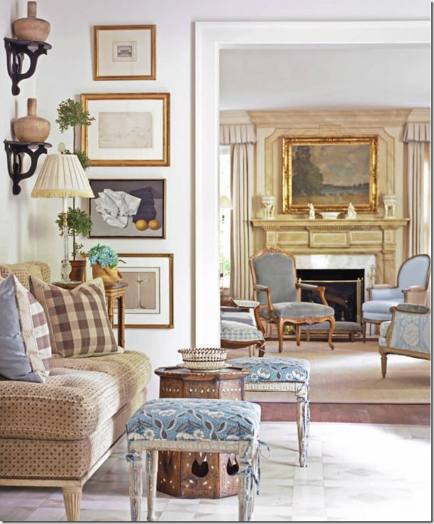
2013: And later, a photoshoot in Traditional Home showed a totally redecorated home.
The same view looking into the living room – shows matching slip-covered in blue linen French stools, along with new fabric on the settee and new check pillows. It looks like he toned down the floor color with a cream and gray paint.
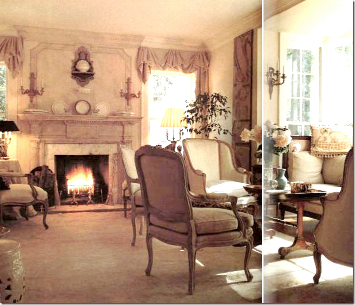
A very old scan of the living room.
Carithers moved into the house almost 40 years ago with an antique Knole sofa which was too large for the living room. In order for it to fit, he bumped out the front window to create this bay window, which became the focal point of the room and the exterior. Originally he had a bracket over the mantel that displayed a tureen, seen here; later an oil painting was placed on it.
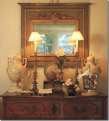
Early Photoshoot: An antique trumeau and chest with the creamware urns which later ended up on the mantel. These urns are the crown jewels in his creamware collection.
1997: Southern Accents – The French day bed is shown slipcovered in ticking with scallops and tabs. This daybed inspired my own living room’s slipcover! French bergere in checks with burlap sides, before its time. Club chairs replaced two bergeres.
A closeup of the changes. The new look is fresh and very youthful, but classic.
2013: In the corner, the chest is replaced with a console. The shades are now linen curtains with pleated valances and a tiny blue trim.
THE CREAMWARE:
1997: The creamware was first displayed in Southern Accents in front of an oriental screen, not to be seen again.
2002: There is a new wood console along the back wall in the living room which sits under a collection of drawings by Picasso and Matisse in gilt frames.
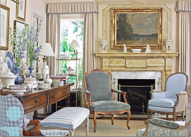
2013 in Traditional Home: Now with the new fabrics, Carithers added some blue & white porcelains mixed in with the creamware. I love the oil painting, it looks so good with the new fabrics. Just beautiful!
THE DINING ROOM:
1997: The dining room is painted yellow with an assortment of French chairs and a skirted table.
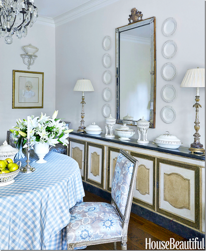
Creamware plates flank the mirror. The chandelier is Baccarat. The French doors open to the back parterre garden were added by Carithers when he moved in.
2002: For Christmas, Carithers added a red tablecloth.
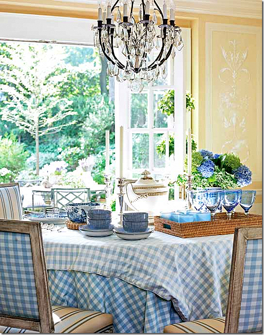
2013: And the newest view – in blue and white checks with yellow striped fabrics. Instead of painting the walls, he added the yellow stripe to bring it all together.
In the Tradtional Home photoshoot, Carithers said:
A close up of the paneling and painted murals on the dining room walls which Carithers added for architectural interest.
THE FAMILY ROOM:
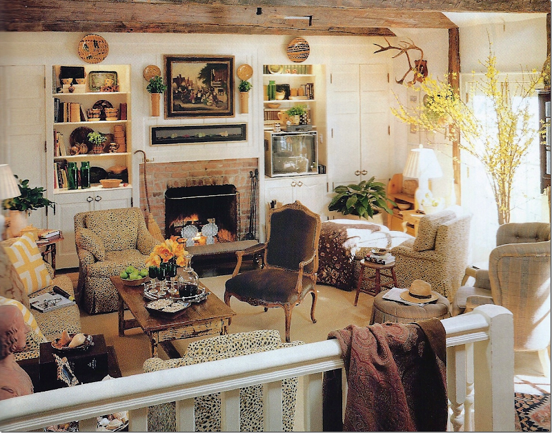
1997: An addition to the house, Carithers added the same rustic beams that he used on a myriad of projects for clients. This room was reserved for his love of browns and beiges and his large collection of pottery. The French chair in brown suede is presently in the living room in velvet. A romantic, Carithers call this the “long room” – not family room. Antlers – before the trend!
2013: The newest design – new cabinets, renovated to look more sophisticated. New upholstery in plain suede. New antique French coffee table and antique chairs. Antelope print pillows. Above the mantel, newly hung art work. Before the room was quite busy and cluttered and here, less so. The colorful pottery makes the room look a bit more chaotic. To calm it all down, Carithers used the pale, plain fabrics. He says that this collection of slipware has risen greatly in value since he began acquiring it. But, he doesn’t care about the value – he only cares about the color.
THE BREAKFAST ROOM off the dining room:
1997: A beautiful antique French table with French chairs. White plate rack with the collection of black and white transferware.
2002: For Christmas, he adds red tulips and red napkins.
THE KITCHEN:
2013: For the lastest redecorating, new white paint freshens up the kitchen, along with editing.
2013: Carithers collection of ironstone and transferware decorates the kitchen.
THE STUDY:
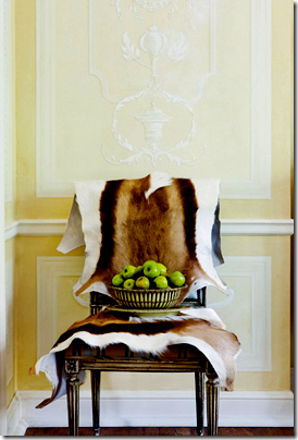
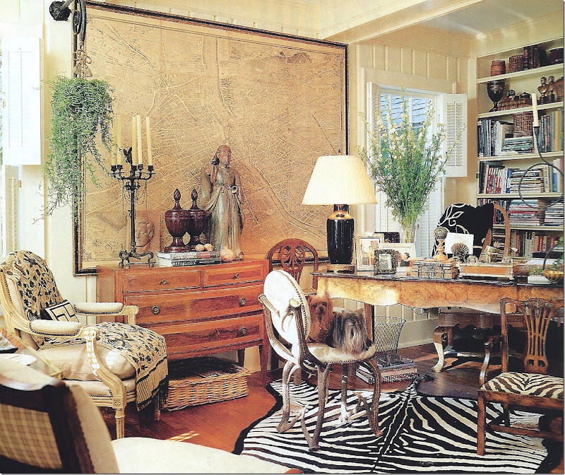
1997: I love the study, with the zebra rug and antler chair, miniature chair, and oversized antique map. Perfection!
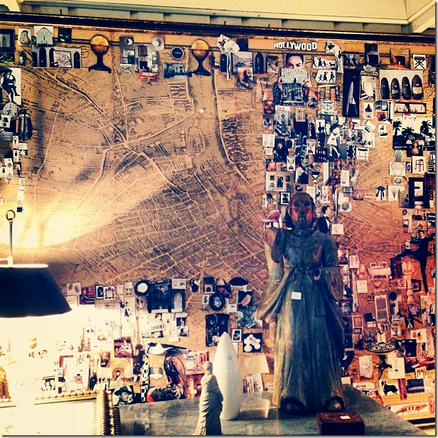
Years later Carithers used the map as an inspiration board, adding clippings from magazines to it.
THE BEDROOMS:
1997: Southern Accents showed this pink bedroom, with a quilted bedspread and French fabrics.
Across from the bed is this beautiful Palladian window that Carithers installed along with a country French bench.
1997: And there was this green toile guest room.
2013: And in Traditional Home, the green toile bedroom, with just a few changes.
Which brings up to today.
2015:
Dan Carithers with Judy Bentley in the garden of his new townhouse.
This month, House Beautiful featured Dan Carithers. Two years ago, he and Nancy sold their house and purchased a sunny townhouse with a pretty garden. Since Carithers has Alzheimers, Nancy asked their friend, the designer Judy Bentley to help decorate their new home. Judy was a former client of Carithers who then worked with him before starting her own business.
Instead of buying new things, Judy went through the Carithers’ house and picked the best of the best to take to the townhouse. She did the main rooms in blue and white and the den in browns. Nancy had a large say in the decorating.
The Peak of Chic, Jennifer Boles, wrote a wonderful story about Judy HERE and she is also who wrote the House Beautiful story.
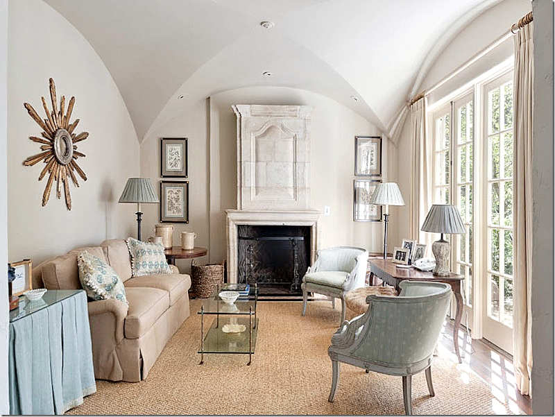
The new living room – with a large custom cut seagrass rug. The French day bed rests against the wall under Nancy’s family antique mirror. The tall French table acts as a coffee table. Interestingly –the chinoiserie table that went missing from the living room in the old house, reappears here next to the sofa! It must have been moved to an upstairs bedroom. Also, the club chair on the right is new, covered in Hodsoll McKenzie. All other fabrics are Clairmont. I love the white walls against the blue and white fabrics. The paint is Benjamin Moore’s Winds Breath.
Against one wall in the living room is the beautiful collection of creamware, underneath the collection of gilt framed prints. The lamps are Bacarrat.
Such a lovely townhouse! Not seen, is a large winding staircase in the foyer that is a beautiful focal point.
The dining room with the skirted table and Jansen chairs, now upholstered in a beautiful, fresh fabric. While the French chairs have the same check fabric on the back, the new Hodsoll McKenzie Cotswold Floral replaces the yellow striped fabric from the house – that coordinated with the yellow walls. The white paint here is Benjamin Moore’s Palace White. The antique console holds the beautiful collection of creamware. The former brown brackets that were once in the foyer are now painted white – and hold more creamware. Not seen is the bay window in the dining room.
I wish there were more pictures from the townhouse, but judging from these photos, it looks like a lovely home, large enough for guests, but not too large that is hard to take care of. Also, it shows that when moving – you don’t have to have new things – if you have nice things, they will look wonderful in any space!
Back in 1999, Veranda had this Carithers designed house on its cover. It was a gorgeous house and everyone was talking about it when they got their new issue. The house was older, built in 1958. It looked new at the time but it was totally renovated. The cover showed the living room. This house was also featured in the book The Houses of Veranda that Lisa Newsom wrote a few years ago – thus validating how beautiful the house truly is!
The house was for sale earlier this year and it looks completely different inside with its furniture from the new owners. Obviously, the previous owners had already sold the house before this sale. Take a look.
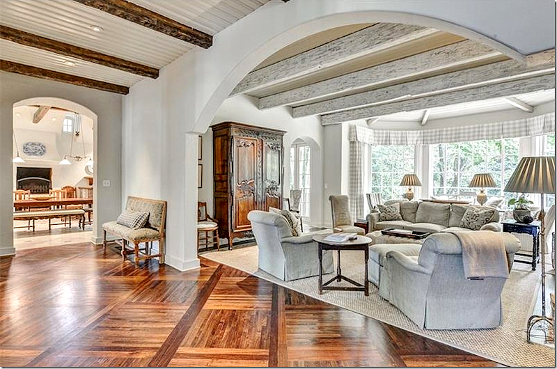
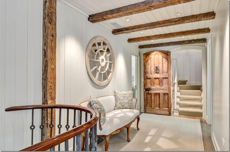
CARITHERS: In 1999, the entry showed French doors at the front – just like Carithers had at his house. Also, there are rustic beams on the walls and ceilings – these beams are similar to the ones Carithers used in almost all his jobs. The foyer and the living room, dining room and hall have a series of arches that were added for architectural interest.
TODAY: The photography is very different – the house looks very white, not how it is in reality, unless the walls have been painted a white white. You will see how different professional photographs are from real estate photographs, due to the light.
The wall sconces remain. And here, you can see the stairs lead down to the basement level, something that most houses in Atlanta have.
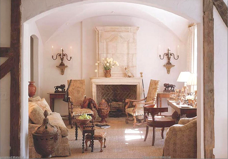
CARITHERS: The living room was so gorgeous! A beautiful French stone overmantel and sconces with feminine candelabras are a focal point. Seagrass rug for texture. Lots of French antiques and urns, ala Carithers. The fabric looks the same as Carithers had in his own family room before it was remodeled. The antique chairs have original tapestry. Subtle check curtains. Just gorgeous – Carithers at this best!!!
A close up of the fireplace - I love the brown bricks and andirons, beautiful.
Today: Pictures of the house are found on Caroline Willis’ web site HERE. Willis once worked for Carithers and apparently decorated the house for the new owners. You can see, the living room looks totally different. Notice the arched door to the left of the fireplace was removed. I kind of liked the openess it brought.
Another view of the living room.
And how it looks today on the real estate pictures. So different from Carithers.
CARITHERS: Across the entry from the living room is the dining room which is very similar – almost a twin room with the arches. This room was another gorgeous Carithers design. Skirted table – with his signiture two layers of fabric and his assortment of chairs for interest, some are damask, others leather. But, it’s the collection of creamware and the cachepot on the fireplace that are just stunning. Above the windows are rustic beams and checked curtains. I can’t tell you how gorgeous this was in 1999!!! Stunning!
Carithers: A closeup of the creamware collection which are wine coasters and the terracotta cachepot – wow!!!!
On Willis’ web site, her version of the dining room, no rug, and the floors look lighter than they are today.
Real Estate: Patterned curtains, similar chandelier, skirted table. No rug.
Looking from the dining room to the living room.
Here’s a view from the front door back to the family room.
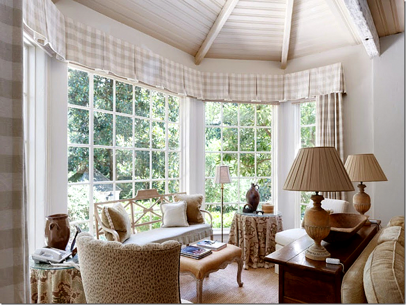
CARITHERS: The family room was done in warm colors and fabrics – taupes with navy. Notice the beautiful terracotta statues in the back of the sofa. Another beautiful fireplace. Check armchairs and lantern over the back of the room in the bay window. Blue and white delft porcelains on the mantel.
The side of the room with the gorgeous antique chest with trumeau and large apothocary jars. Beautiful. Love the unique garden seat. Notice the beams in this room are lighter than the others.
The family room under Willis. Instead of the chest and mirror – there is an armoire.
Real Estate: Basically the same furniture arrangment. Notice the ceiling – beadboard between the beams. Check curtains.
TODAY: The large hall that runs behind the living room and dining room – leads to the kitchen at one end.
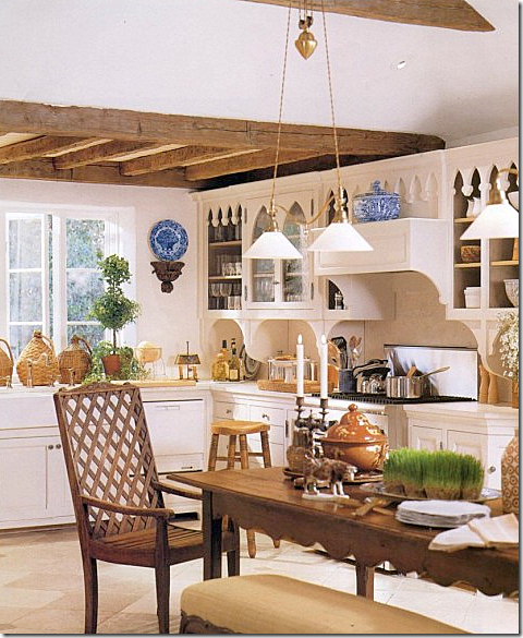
CARITHERS: Remember this photograph???? I do! The view looking into the breakfast room. This was so gorgeous in the magazine. The twin light fixtures were divine! The ceiling was raised in this room and there was a high fireplace that was the focal point of the room.
Carithers: A view towards the farm sink. Love the lattice chair!
TODAY: I wish the photographs were normal looking and not so washed out! The new owners used a similar table and bench – and kept the light fixtures. They have a nice collection of blue and white transferware – but, but, but – the Delftware before was gorgeous! Do you see the difference? Well – Delftware costs a lot more than transferware, but it’s just gorgeous. I do like the platters and it’s a good compromise. I’ve always wanted Delftware, but it’s totally out of my budget! haha!!I wonder if that is a pizza oven?
Farm sink, refrigerator behind cabinets. Love the platters in the plate rack.
CARITHERS: The keeping room. Heavenly. Beautiful sconces with plates. I know I keep saying this, but I just LOVED this house!!!! I was obsessed with it – and truly still am I guess. He was so great! So perfect! Nothing out of place, nothing wrong. The accessories just make that wall. Remember his quote about accessories? So true!
There are a few more Carithers houses in Veranda and S.A. that were on a par with this house – but this one was a bit more special.
Carithers: The lovely master bedroom with bold checks and soft floral curtains. I love the rug. A very classic and timeless design.
Carithers added shiplap paneling on walls and ceiling and corner cabinets for architectural interest.
Willis’ master bedroom. More sedate, but similar to Carithers.
Today: Real estate photograph.
CARITHERS: The master bath.
Carithers styled it with blue and white, an antique mirror and a unique window.
TODAY: The entire master bathroom.
Today: Real estate photograph.
Willis – second guest room.
The bathroom in the guest rooms with tile countertops and pewter sinks.
Willis: The upstairs study.
Real estate – hard to believe it’s the same room as seen before. I do wish we had photograph’s of Carither’s rooms upstairs.
And finally, today, the basement.
The house is beautifully decorated today, but it is hard to follow in the footsteps of Dan Carithers, who is a master at furniture placement, antiques, and accessorizing – all done with a limitless budget. His clients did tend to have bottomless pockets which does help with accessorizing.
Awwww. Mr. Dan Carithers, the consummate Southern Gentleman. What a great legacy he leaves. I hope that someone close to him puts a book together of all his work. There probably are lots of projects we have never seen.
Dan Carithers and Charles Faudree. Lovers of southern decor are truly feeling a true void.
A wonderful and Merry Christmas to all!


