Domino Magazine comes out with their Top Ten Designers each year, so why shouldn't Cote de Texas? The difficult part of my list was naming just TEN designers. I could have gone on and on and I left out some that on another day might have made the list. There are at least two designers that aren't on here but deserve to be so, I'll probably add them in as a "runners up" position - it's too painful to leave them out! In the end though, this list comes from my heart. Each designer making the list, I have followed for years - none is new to me, nor new to design either. There's a whole group of younger designers whom I adore, but they don't stand out individually as much as my TEN do. There aren't any surprises to my list - I've talked about each and every one before on my blog and sometimes more than once, or even twice. These TEN are the ones whom when I see their work in a design magazine, I get a a little flutter. The ones on this list who have written books - their books are my favorites, the ones who haven't written a design book, I wish they would. There's no one on my list I wouldn't love to work for or with. I would turn my house keys over to each one, no questions asked - just saying "redo it, I trust you!" That is, of course, if I won the lottery. None on my list comes cheap, they all command top dollar and they all are worth every cent of it.
And, finally, I must confess I didn't come up with this idea of naming my Top Ten. It was Holly of the beautiful design blog Things That Inspire who gave me this idea when I confessed to her I was suffering from writer's block. It was also Holly's idea that I should space it out and just name one designer at a time. So, thanks Holly - great idea!! I hope you enjoy reading about my Top Ten as much as I did writing it - I would love to hear who YOUR Top Ten is - leave it in comment, if you can! And, if you do play along - leave your #10 choice only, then with each installment add the next - when I name my #1 - so will you! So, here goes - #10 on my list (even though the order doesn't really mean all that much - putting my TEN into any kind of order was harder than coming up with the list.)
#10 - Alessandra Branca
Alessandra Branca, born and raised in Rome, Italy, now lives and works out of Chicago - though I'm not sure how or why she ended up in the Windy City. Her grandfather was an art historian for the Vatican's museum and her mother is a well known painter of botanicals, which Branca frequently uses in her designs. Art and design is in her blood, you might say. About her youth, Branca says she was "Obsessed with the way things ought to look, moving the bedroom furniture around and, for the longest time, caring far more about art and architecture than about boys." Known for her bold use of color, Branca attributes it to her childhood where she was surrounded by Renaissance art. She sums up her work in design this way when she compares it to portraiture: "The designer creates a three-dimensional likeness of the client that is meant to reflect, to entertain, to amuse, to comfort, to impress, certainly, and to serve."
Branca is somewhat young and thus, works with a lot of young families with children. She prefers to use bright, joyful colors and reds and blacks are constants in her designs. Her homes are accessible - warm and friendly with a mix of the antique and the traditional. She loves fabrics and uses lots of patterned linens and toiles. Much of the upholstered furniture she places is of her own design. Branca's designs are classic, yet there always seems to be a touch of whimsy about. She is an avid reader and likes to visit house museums. She has a shop, Atielier Branca, attached to her Chicago office where she says she buys only the things that she will never see again. Summing up her aesthetic, Branca declares: "Mainly, I believe that you don't need things to be flashy to have them feel elegant. So many people misinterpret elegance. It isn't rich or fancy. It's comfort. The best luxury is comfort."
Atelier Branca
1325 North State Parkway
Chicago, IL 60610
312-787-6123
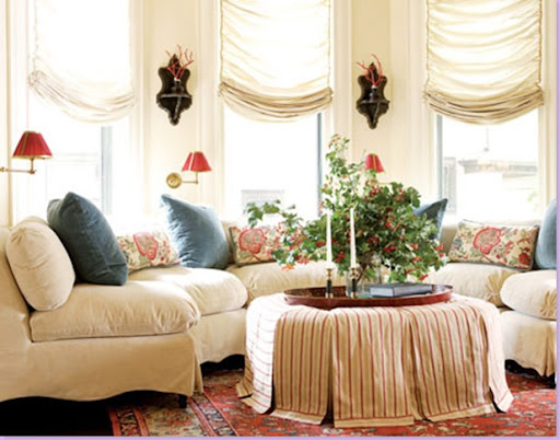
For this family with young children, Branca took a large curved window and placed a plush seating area in it. I love the ottoman with its loose cover. The colors throughout the apartment are cream, blue and red. Note the small sconces between each window. Branca uses the black pedestals in many of her designs. Branca pays attention to the smallest of details. Here, she curves the sofa's skirt on the side edge to provide just a hint of interest where normally there would be none.
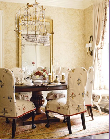
In the dining area, the chairs wear slipcovers in case of childrens' spills. The boat chandelier lends a sense of whimsy to the room. An eye for detail: note the red ribbon trim added to the slips' skirts.
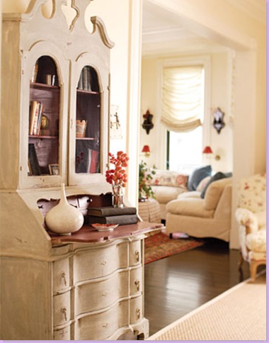
View of entry with its painted secretary - note the red interior of the desk.
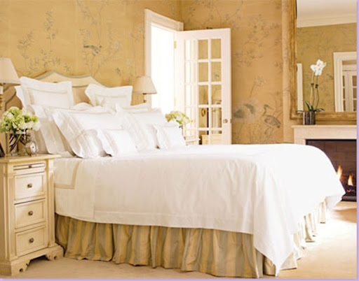
The master bedroom with its hand painted wallpaper. The dust ruffle is made of striped silk. The upholstered headboard is trimmed in light blue velvet. I love how the french door replaces a more traditional interior wood door.
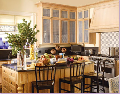
The apartment's blue color flows into the kitchen with it's blue and white tiled backsplash and fabric in glass doors.
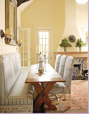
The breakfast table is a casual antique. The banquette is made of vinyl coated fabric to protect against spills and to facilitate easy sliding in and out. The fireplace mantel sports the same blue and white tiles as the kitchen backsplash. A rug in the reds and blues of the apartment warms up the space. Note again, the french doors in place of wood doors.
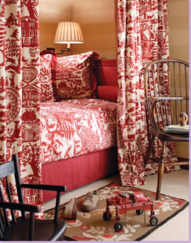
A bed enclosed by toile fabrics provides a cozy sleeping nook. The walls are painted in a subtle horizontal stripe.
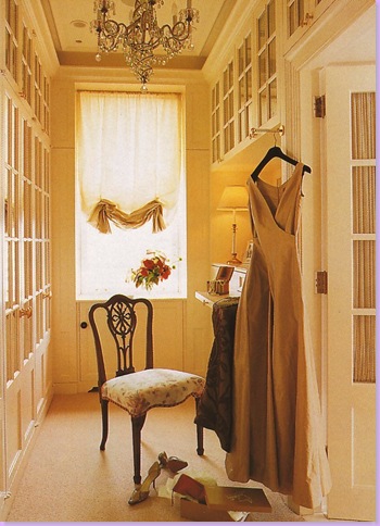
His and Hers Dressing Rooms: Here, the ladies side where her clothes are stored behind french doors.
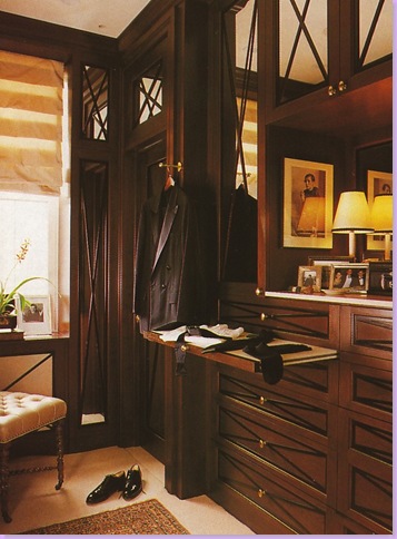
The man's side is all dark woods befitting an English gentleman's room.
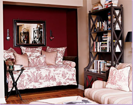
For another project, Branca uses her signature reds and black and toiles.
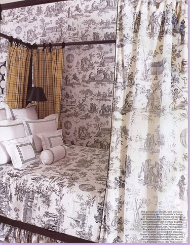
For this project, Branca mixes toile and plaid in an unusual, but pleasing pairing.
Branca's store Atelier Branca, which is attached to her Chicagoan offices.
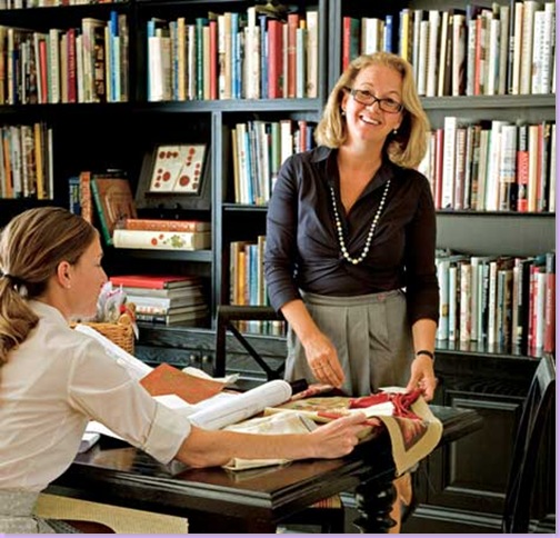
The designer with her trademark glasses and blond hair confers with an employee in her office library.
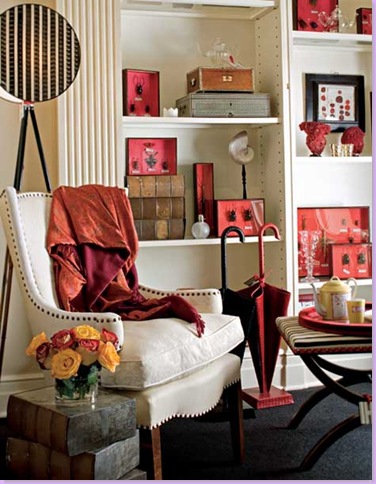
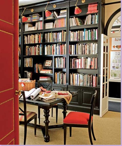
Here, a shot of the library in the trademark Branca reds and blacks. Note the brass shelf lights at the top of each section.
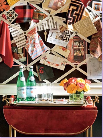
A drinks table is dwarfed by Branca's inspiration board.
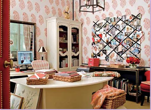
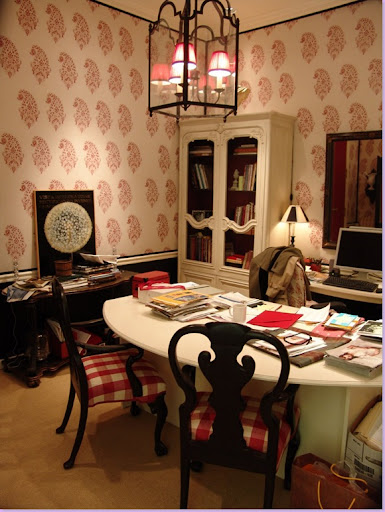
In this office, the walls are upholstered in a large red paisley pattern. Another inspiration board looms dramatically over the space. Note the doors made of red felt and brass nailheads and hardware seen just to the left.
Another view of the office with it's bold black chairs and red and white buffalo check. Notice the light fixture within a fixture.
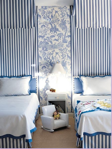
In this child's room, Branca pairs a bold blue and white stripe with a toile fabric.
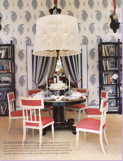
For this Showhouse dining room, Branca pairs a large scaled paisley wallcovering with striped drapery fabric. The Swedish chairs wear red. The chandelier is covered with a whimsical "hat."
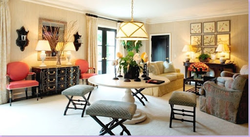
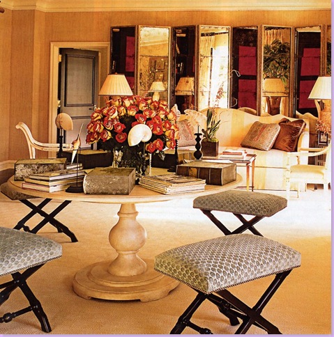
Branca redesigned a suite at The Peninsula Hotel Beverly Hills. A table with four stools divides the large room into two areas. Again, red and black are used as accent colors. Note the black pedestals on the left wall. Branca uses these often - this is the third time they have been used in these photos alone!
The other side of the hotel suite. A large mirrored screen covers the back wall. The camel back sofa wears yellow and cream stripes.
I will be posting the next chapter - The Top Ten by Cote de Texas - #9 in a few days. I hope you enjoyed reading about my first choice!


