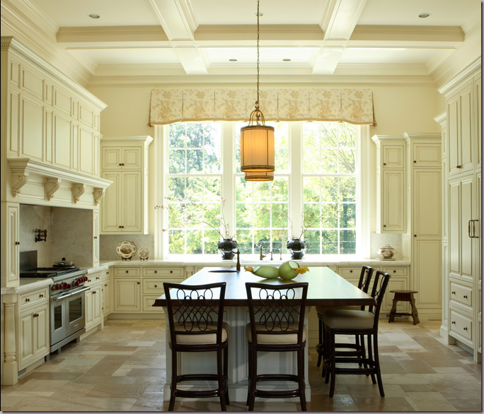
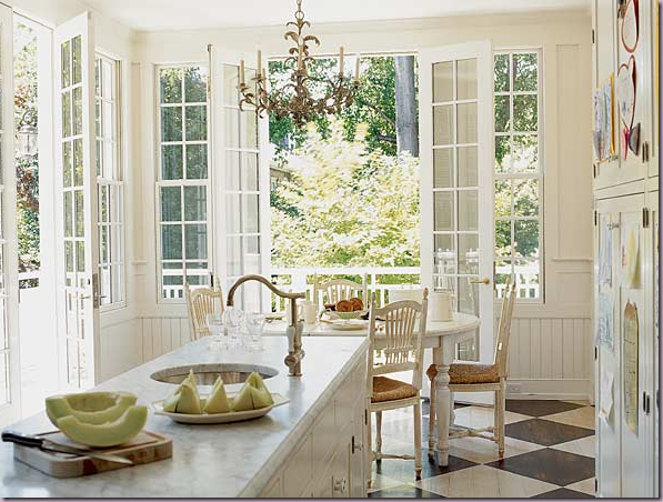
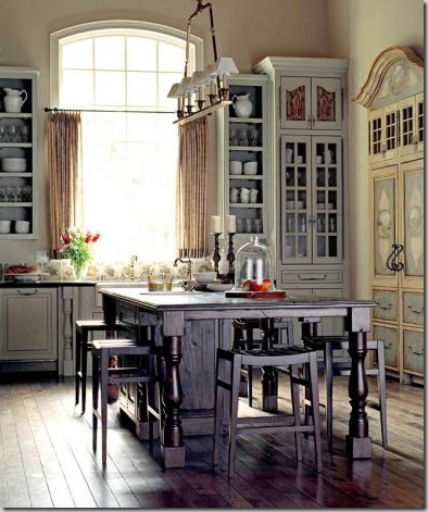
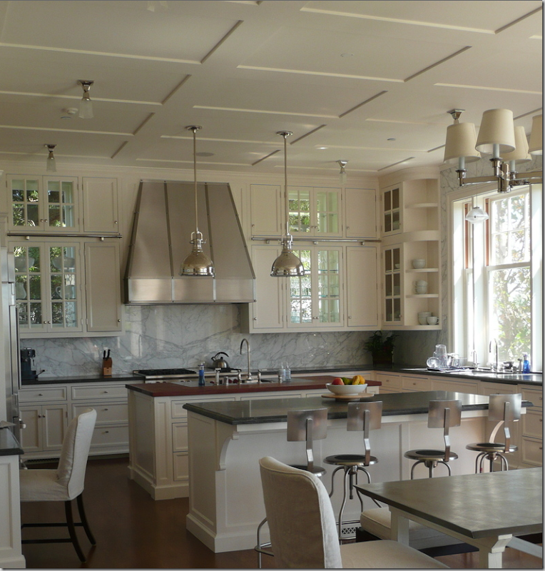
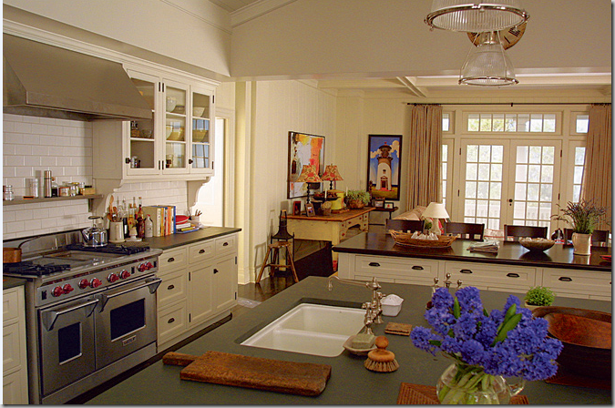
Things That Inspire recently emailed me this picture of the kitchen, below, and said, “I love this – this is my dream kitchen.” While I immediately agreed it was indeed beautiful, my mind started thinking – what is it about this kitchen that intrigues us both? What elements make it so appealing? How could she take this picture and recreate this kitchen in a new home or even in a current home? I emailed her back, writing - “the most interesting thing about this kitchen is the large, high window, the symmetry of the placement of the window, the approach to the kitchen, and the large island with the lighting fixtures above. The cabinetry is nice of course, but it’s the symmetry of the room, with the large wide window that really catches the eye.” Things That Inspired wrote back “I just liked it, I didn’t analyze why, but you’re right about the window.”
Things That Inspire’s dream kitchen: the large center window is the most important element to include if wanting to copy this kitchen. The second element is the actual shape of the room – square, with a large center island with hanging fixtures. Paint the walls and cabinets cream and place floor tiles in the same color. And lastly – bring the cabinetry to the ceiling.
That conversation got me thinking. Design blogging exposes one daily to hundreds of images. Most are fleeting, few linger in the mind. When a room does impress, it’s for a reason, though the exact reason might not be overtly apparent. Sometimes, only by dissecting the elements in a room can one understand the appeal and further, utilize those elements in one’s own home. Understanding the pleasing elements in a photograph can be a good tool if you are in the market for a new home or are remodeling, or maybe you are just looking for ways to rearrange a tired room. But, how does one isolate what appeals? How does one look at a picture and determine the elements that are important to incorporate in your own design?
Recently, I did a small remodeling project in my kitchen and in preparation I furiously studied pictures of kitchens in magazines and blogs. So many blogs show the same kitchen over and over again – of course! The beauty of certain kitchens appeals to all, but why? Kitchens are hot now - it seems everyone is either updating theirs or thinking about doing it – and with good reason. The kitchen has undergone a huge transformation while no one was paying attention. The other day, I picked up a kitchen remodeling book at the store – it was older, from the mid 90’s. Not exactly ancient, but for a design trend, ten years is a life time. In this book, 95 per cent of the kitchens shown had stained wood cabinets, mostly in light, honey tones. The white kitchen was a rarity. Appliances were mostly black and stainless, some white. Granite was the countertop de jour. Sinks were stainless and under mounted. Light fixtures were cans and fluorescent. Faux Italian styled kitchens were the rage. In short – the kitchens from the 90’s look nothing like the kitchens of the 2,000’s. Thank goodness.
The kitchens of today shown in shelter magazine and on design blogs are mostly white with stainless appliances. Painted cabinets are either gray or ivory or black. Stained wood is dark – honey color wood is a thing of the past – and then, often used only to highlight a center island. Of course, there are all types of kitchens being built today, but the one that builders are putting in spec homes time and time again are white or cream, and marble is the top choice of countertops. Recently, the L.A. Times asked designers what was out in design. One was sick of stainless appliances – which made me laugh – what would he propose to replace stainless? Colored appliances. I think the harvest gold refrigerators have cured us all of those! Another said granite was now dated and recommended Corian, marble, soapstone and concrete, all great choices! So, today, let’s examine some of the kitchens that we oohed and aahed over this past year and try to figure out how we can me them our own!
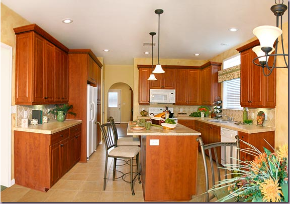
This kitchen suddenly looks dated, though it’s elements are current – the stainless appliances and center island with granite certainly remains in fashion. But the honey colored wood and floors have been left behind for either darker woods, or gray and white paint.
Although the owners updated this kitchen with pendant lights, granite countertops and tumbled marble backsplash, the white appliances and honey colored stained wood reads passé. A house with this kitchen, though updated, would not sell as quickly as one with painted cabinets and marble countertops. Stainless appliances would have to be installed too.
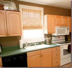
Cottage Living magazine showcased this kitchen remodel of a honey colored wood kitchen with green Formica. Yikes! The owner, a friend of Erika’s from the blog, Urban Grace, works for the magazine. Erika just recently posted a wonderful story on this kitchen – read it here.
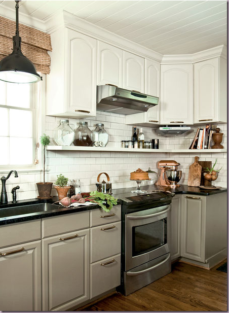
The finished product: How to change a kitchen stuck in the early 90s with honey colored oak cabinets? Paint them gray, or white or both!
Looking at the kitchen through the dining room.
The remodeled version brought into the 21st century: gray painted bottom cabinets mixed with white painted upper ones, white subway tile backsplash, hanging cabinets from the ceiling, open displays shelves to hold dishes and tools, stainless appliances, outdoor lighting fixture brought indo0rs, new bead board ceiling, oversized hardware, and oil rubbed bronze faucets. Each of these elements helped to update a kitchen hopelessly stuck in the 90s. This kitchen is a success – but what elements did she not change but still the kitchen remains trendy? The cabinets. Despite the endless advertisements for fancy cabinetry made in England, a coat of paint can rescue almost anything and bring it up to date. Take a lesson here. Prioritize. If you are a cook who needs all the latest bells and whistles in your drawers, a paint job won’t be enough for you. In reality, these simple cabinets look great here, and the owner saved thousands of dollars that she was able to put into appliances.
ELEMENTS TO COPY:
1. Gray painted cabinets on the bottom, white on top. The gray paint on the cabinets is Farrow and Ball Mouse’s Back.
Paint dated cabinetry, don’t replace it.
2. Black or dark countertops – either granite, soapstone, Corian.
3. Stainless appliances.
4. White subway tiles.
5. Open Shelving.
6. Large, outdoor lighting fixture.
Suzanne Kasler’s kitchen for a Southern Accents Showcase Home.
View from across the island.
Bloggers love this kitchen – it’s been shown on numerous sites, dozens of time. Designed by Suzanne Kasler for a Southern Living show house in Florida, the appeal of this kitchen is easy to see: the light blue subway tiles on the backsplash. The blue tiles are highly reflective of the light pouring in from the large windows which are another important element. The highly polished Carrara marble continues the shiny feel of the space. The natural brown window shades tone down all the light. Finally the over scaled hardware on the island drawers are great. What is interesting is that Kasler chose NOT to use polished nickel fixtures, rather she opted for a matte finish. Perhaps this was chosen as a foil to all the light reflecting surfaces.
ELEMENTS TO COPY:
1. Light blue subway tiles with a glossy finish.
2. Carrara marble, highly polished.
3. Stainless appliances.
4. Woven fiber shade in brown.
5. Oversized hardware and fixtures in matte finished nickel.
6. Glass paned upper cabinets, but no upper cabinets on window wall.
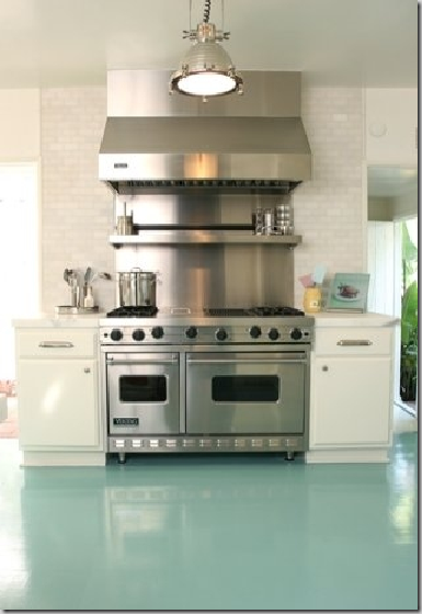
A variation on the above kitchen, is this one designed by Windsor Smith. The beautiful blue is on the floor, here, rather than the walls. A wood floor, painted this gorgeous color in a glossy finish is a way to inject color into an all white kitchen. Consider painting tired wood floors rather than stain them. It’s a great way to get a totally new look.
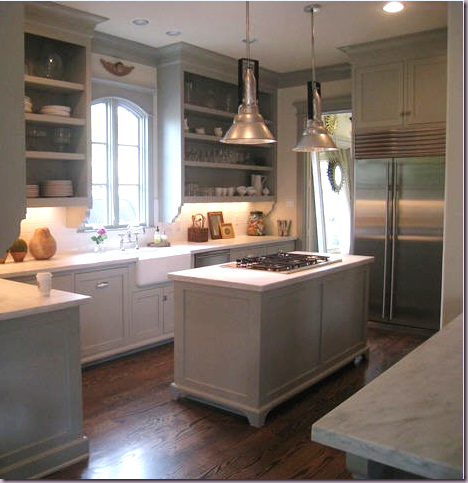
Stalking the Wheat's remains one of the most commented stories on Cote de Texas, with the kitchen the most preferred room. I’ve found this picture copied on numerous blogs, which is so exciting. But why are so many people drawn to this kitchen? In a word, the color.
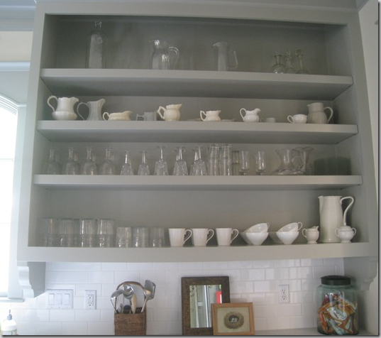
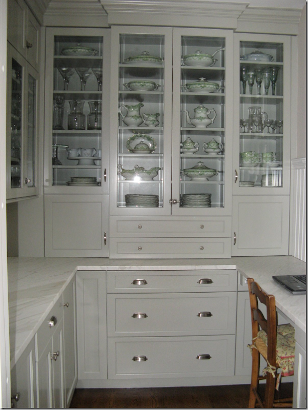
Sally Wheat removed the cabinet doors and had the carpenter create 3 inch thick shelves which give them a more solid presence.
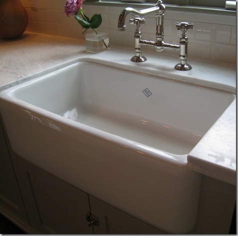
The original Shaw farm sink with the cute emblem. This brand is my favorite of all the farm sinks – I think I just like the emblem! Polished nickel bridge faucet gives a very authentic look to the kitchen.
ELEMENTS TO COPY:
1. Benjamin Moore Fieldstone paint on the cabinets and trim, white on the walls, dark wood floors.
2. Carrara marble countertops, subway tile backsplash.
3. Remove cabinet doors, use 2 to 3” thick shelves, and attach brackets under cabinets.
4. Center island – attach “legs.”
5. Two large stainless industrial lighting fixtures and stainless appliances.
6. Shaw sink and a bridge, polished nickel faucet underneath a charming arched wood casement window.
7. Bin and latches hardware.
Gina from the blog Willow Decor emailed me some time ago inquiring about Sally Wheat’s paint color. Tonight she posted the results. From an empty closet, she created this incredible PANTRY using the Wheat’s kitchen as a guide! The lighting makes the paint look lighter, but it’s exactly the same, as is the gorgeous honed Carrara marble and bin pulls and latches. Be sure to read the whole story at Willow Decor and see the before and after pictures. Great job, Gina!
Bellacasa designed kitchen in Houston
When designing kitchens, like any other room, a focal point needs to be established. This kitchen actually has two focal points. The back wall where the sink is under the long bank of windows is one focal point - sinks and the window above them are a typical choice for focus. Another choice that is gaining in popularity in the states, is the range and hood. Europe, with their less frequent use of wall ovens, has long made the range and hood the center of attention. Here, this kitchen with its large range and even larger hood demonstrates how to turn this area into a focal point. This beautiful kitchen designed by Bellacasa of Houston popped up on quite a few blogs – and for good reason, it is beautiful. Though it appears that ease movement between the appliances was abandoned for visual considerations. The range is so far from the sink and it’s placement right in the middle of the eating area makes it seem impractical. The black and white marble floors are an additional eye catching and essential element.
ELEMENTS TO COPY:
1. Create a focal point with the range and hood.
2. Create a second focal point with the sink and a large bank of windows along back wall. No overhead cabinets on this wall!
3. Design the kitchen in a rectangular shape for symmetrical proportion.
4. Include a large eating area in the middle of the room with a chandelier hanging over it.
5. Black and white marble floors on the diagonal sets off cabinetry that is painted a gray-green.
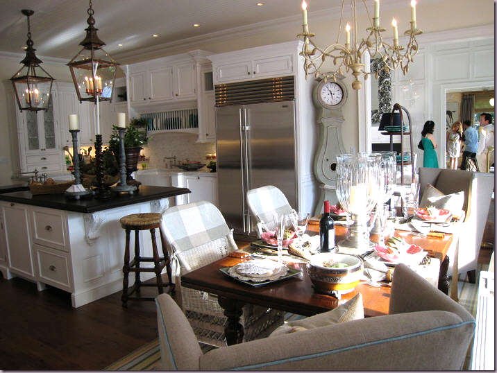
This image from a showcase house floated around the blogs this past year. Again, white painted cabinets and a large island are two common elements. But other details makes this kitchen different. First, the two large French antique styled lanterns pop the island. The lanterns are quite beautiful and by using two – they become the focal point. The island top is further brought into prominence with it’s black countertop. It appears to be honed finished black granite. The Swedish Mora clock is an accessory, but it’s an important eye-catching one. And last, the chandelier, cream painted iron and wood, plays an important roll. Less important, but notable, is the plate rack over the sink. Since there are no windows to create interest, the plate rack is a great alternative, and something to remember when considering your own kitchen design. I wish we could see the range – sometimes tells me it IS a range and not a cook top and wall oven.
ELEMENTS TO COPY:
1. Use two large lanterns over the island to create the focal point when copying this design.
2. Honed black granite brings further importance to the island as the focal point.
3. Consider using a plate rack above the sink when a window isn’t possible.
4. Large clocks, either round Station clocks or tall Mora clocks create interest.
5. A contrasting chandelier goes above the breakfast table.
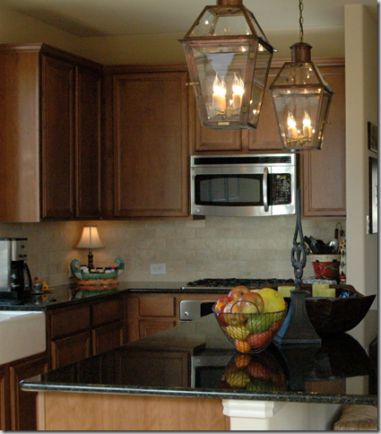
A loyal reader of Cote de Texas recently built a new house. When she saw the above kitchen with the two lanterns, she had to have them and ordered these two beauties from Bevolo, which specializes in recreating antique lanterns. She’s just moved in and sent me this picture today to show off her kitchen. Aren’t the lanterns gorgeous? Her kitchen opens to her living area so the lanterns can be enjoyed while using the couch. Great job Cindy!
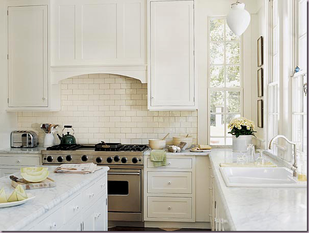
Seen in Southern Accents, Frank Randolph created this beautiful conservatory style kitchen here and below.
The all white kitchen, with Carrara marble and painted white cabinetry.
This kitchen seen in Southern Accents by Frank Randolph proved to be one of the most popular of the year, judging by blogger approval. Why? It’s a basic white cabinetry, Carrara marble affair. What’s important here – is the space – the attached breakfast room sets this kitchen apart. The French doors and sun streaming through the wood mullions provide much of the appeal – it’s as if the kitchen was located in a separate conservatory built in the 18oos. The black and white marble floors and the bead board further add to the “past era” look of this space. In the kitchen area, upper cabinets were nixed in favor of more French windows that reach from side to side. A range and the hood hidden behind a wooden arch provide another focal point. Absolutely gorgeous – and easy to copy!
ELEMENTS TO COPY:
1. Use wall to wall French windows and doors and bead board to create a conservatory like space.
2. White cabinetry, Carrara marble and white subway tile for the backsplash.
3. Black and white marble floors.
4. Use a stainless range and wooden, arched hood.
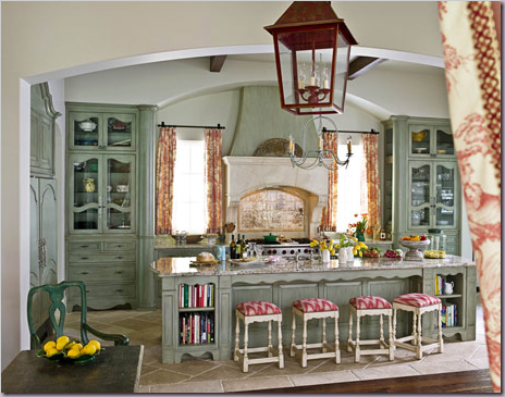
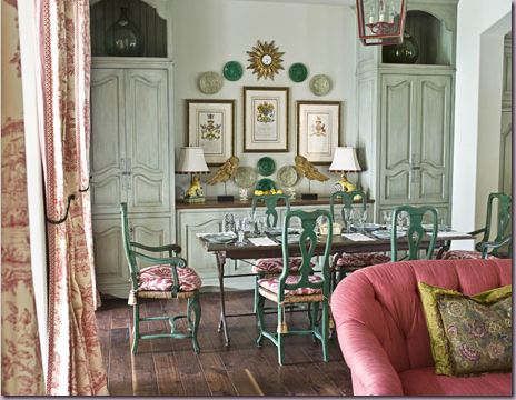
Michelle Allman from Houston designed this kitchen above and below:
This kitchen shown in House Beautiful, designed by Houstonian Michelle Allman, created a huge amount of attention in the blogs this year. Everyone seemed to love it, which is interesting because it is not white and there’s no Carrara marble. This is important to ponder for a moment. This kitchen and breakfast room goes against all trends, yet it doesn’t seem lost in another decade. It should say to everyone, if you love something – go for it, even if the trend setters say it’s out of style. The death knell for toile has been rung so many times, yet – here it is looking fresh and timeless. Where to start with this kitchen? It’s appeal lies in it’s warmness, it’s hominess. The first element is the cabinetry, faux painted a seafoam green. The focal point is the back wall – with two armoires symmetrically flanking a large oven and new limestone mantle, replicating the look of an antique fireplace. A large arch tops the vignette, as do other arches which separate the rooms – the toile hangs as portieres in the archways. A large island holds the sink and the refrigerator is hidden on the left in yet another armoire. An iron chandelier hangs over the island, while a red lantern hangs over the dining table. I think I would have used lanterns in both places, myself. The ceiling is high with rafters. The floor in the kitchen is limestone and there are wood planks in the breakfast room – again, I would have used the dark wood floors throughout for more continuity. But, that’s just me. Across from the kitchen, the breakfast room continues the country French look with the zinc topped table and green painted chairs. The armoire cabinetry is repeated here with two more cabinets flanking a buffet. In the kitchen, the wood in the armoire doors is removed and replaced with chicken wire, in the breakfast room the armoire doors are closed. Of course, to copy this kitchen, you would need the space, an expert carpenter and painter – to say the least. But, you can achieve the feel following the steps below:
ELEMENTS TO COPY:
1. Focal point of the kitchen is most important with symmetrical armoires flanking large mantel and oven. The most important element is the two armoires – they could actually flank the sink – with a row of windows and curtains above – the effect would be almost the same. The armoires in the seafoam are the most important elements to recreate here.
2. Seafoam painted cabinetry, with lots of curvy, French detailing.
3. Large island placed in front of back wall.
4. Arches used between armoires and rooms.
5. Pink-red toile used as curtains in both rooms.
6. Red lanterns used in both rooms.
7. Bright white walls and dark wood floors.
Another house in Houston by Bellacasa eerily similar to the kitchen before!
This kitchen, also in Houston, was designed by Bellacasa. The similarity between these two kitchens is striking and one is left wondering which came first, and which was copied? Oh well – both are beautiful and imitation is the sincerest form of flattery. Here you can see that the basic elements are the same, so the feel of the rooms is very similar. This room is longer and not as wide, but the two armoires play the most important part again. Red toile appears again. And again, there are two armoires flanking an oven and the hood, but this hood is more traditional and not reminiscent of a fireplace. Again, there is a large island, but this island is dark, not seafoam. I think two red lanterns over the island would look so much better here. The refrigerator is an over the top element, hiding behind yet another armoire. This I would eliminate. These pictures of the second toile kitchen illustrate how similar these special kitchens are, and how easy it is to take the elements you like from a space and make them your own.
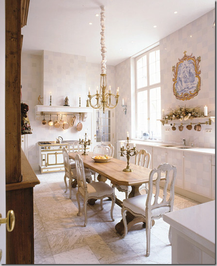
This beauty of a kitchen was found in Belgium. At first glance it looks like a dining room, not a kitchen. The floors are marble and the walls and cabinets are finished in what appears to be wallpaper. The area above the sink becomes the focal point – a shelf with a blue and white mural. Large windows frame the sink on both sides. The French La Cornue range in white and brass is the jewelry of the room. The copper pots above blend in with the brass in the room. The painted white chairs surrounding the light wood table doubles as an island. Finishing it off is a large wood cabinet. A simple, yet elegant space – recreating this space would not be hard, but the La Cornue is extremely expensive – and it is such an important element here. I would copy this look by putting a white range inside a cabinet, also painted white and use brass hardware.
ELEMENTS TO COPY:
1. White walls and cabinets and white marble countertops and floors.
2. Create a focal point on the sink wall with flanking windows and no overhead cabinets.
A medallion like mural could be duplicated by hanging blue and white plates.
3. Use white oven with brass hardware to create another focal point, hanging brass pots.
4. A large light table with white chairs make the kitchen a very dressy place and it can double as a dining room.
5. A brass or crystal chandelier would both work here.
San Francisco kitchen, with two farm sinks.
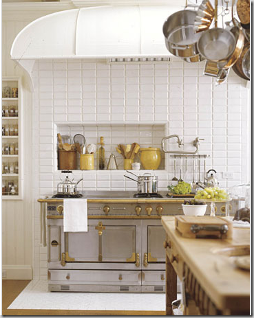
The beautiful La Cornue range sits under the original hood.
This kitchen in a turn of the century house in San Francisco showed up on everyone’s favorite list. A House Beautiful Kitchen of the Month – this photo of its double farm sinks with the twin dishwashers and Calacutta Ora marble is what really caught everyone’s eye. The farm sinks, seeing a huge revival these days, with beautiful polished nickel faucets are so beautiful – why not have two? The owner has four children and she says she puts the dirty dishes in one sink while she’s cooking in the other. She also has two refrigerators, one with glass doors for vegetables only – must be nice!
ELEMENTS TO COPY:
1. Focal point wall with two sinks and polished nickel faucets.
2. White Carrara marble, white cabinets.
3. La Cornue range – set with it’s own tiled floor platform – substitute a large range here.
4. The rounded hood fits over the entire area with a wall of subway tile reaching to the top. Inset a cubby for oils!
Interior designer Pam Pierce from Houston designed her own kitchen in a true country French manner. The cabinets are highly unusual – handmade with cubbies where the appliances are inset, along with wood doors. Steel windows and doors are another unusual element. Rustic wood shutters provide texture, as does the antique butchers table. Limestone floor and stucco walls add more tactile finishes. The two large accessories, the antique French lantern and cow’s head are important to the design.
A view into Pierce’s breakfast room where the antique table and bench is. The focal point is the cabinet – constructed in a similar manner to the kitchen cabinets. Burlap portieres separate the two areas. Just beautiful. Is it possible to recreate this kitchen anywhere? It would be difficult, but there are certain elements that would be important to duplicate:
ELEMENTS TO COPY:
1. Plaster skimmed walls – with no moldings at all.
2. Iron windows with painted black frames.
3. Rustic, simple cabinetry – with old shutters for doors.
4. Cream colored honed, stone floors.
5. Spare, oversized antique accessories such as a lantern or large apothecary jars.
6. Rough burlap or linen curtains.
7. Rustic wood island.
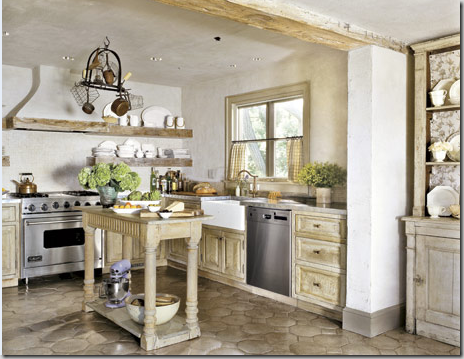
This kitchen by Jose Solis Betancourt, who learned from the master John Saladino, is similar to Pierce’s kitchen, but is more traditional. If you like Pierce’s space, but feel it would too difficult to recreate, take a good look at this one. Rather than using centuries old floor tiles, these tiles are readily available. The carpentry looks rustic because of its faux paint job, not because he used antique doors, like Pierce. Betancourt did use what looks like aged timber, but a good faux artist could recreate their texture. Notice how he used the timber as shelves! An antique island is so attractive – and so much more interesting than a new one, in the right setting. The range and it’s hood become the focal point.
ELEMENTS TO COPY:
1. Use white and fauxed pale wood tones to recreate a rustic look.
2. Timber is used for shelves, molding and rafters which add to the antique, rustic look.
3. Saltillo tiles can be painted to match the cabinetry.
4. Incorporate an antique table or console to use as a center island.
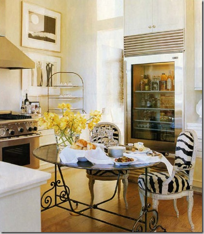
Shabby Slips owner Renea Abbott’s kitchen in her Houston townhouse is a personal favorite. Pared down and simple, the beauty lies in her top of the line appliances and eat in kitchen table. White marble countertops and white walls add to the sparse, clean look. The only color is in the flowers and refrigerated items!
ELEMENTS TO COPY:
1. Stainless appliances, range and hood. The refrigerator’s see through door is essential to the design.
2. White walls and countertops, light colored floors – the least amount of color, the better.
3. Zebra pattern on chair’s upholstery or cushions. An alternative would be a zebra rug or faux zebra rug instead.
4. French styled zinc table with scrolls adds necessary curvy lines to the room.
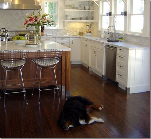
Blogger Katiedid from Sacramento added a new kitchen to her home this year which was met with resounding approval from the design blogosphere. An all white design with white marble, walls, and cabinetry, Katie added a stained wood island to pop the space. The wood blends with the dark hardwood floors and is an essential element of her design. Katie used the Carrara marble as her backsplash, elevating it’s importance stylistically. The range with it’s large hood becomes the focal point. Katie also decided against upper cabinets over her sink, opting instead for a bank of windows. Open shelving takes the place of the cabinets. Stainless appliances and contemporary stainless chairs add the finishing touches.
ELEMENTS TO COPY:
1. Dark stained wood island and floors.
2. White walls, cabinets, and Carrara marble countertops with the marble backsplash a must.
3. Range with stainless hood.
4. No overhead cabinets, banks of windows instead.
5. Contemporary bar stools bring this kitchen into the 21st century.
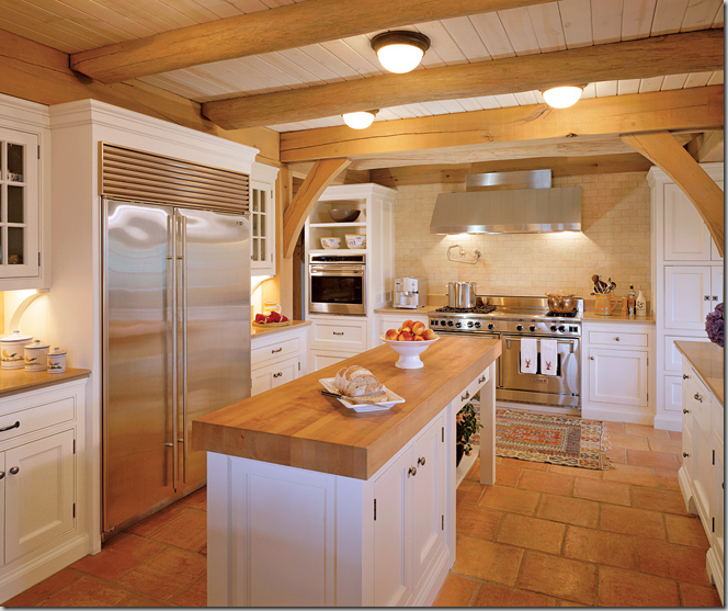
A farmhouse style kitchen for today. Bright white walls and cabinets contrast with butcher block, rustic beams, and Saltillo floor tiles. The range and hood alcove becomes the focal point. Antique rugs on the floor warm up the room. Glass paned cabinets add texture. Ceiling is wood boards.
ELEMENTS TO COPY:
1. Stark white walls and cabinets.
2. Butcher block island.
3. Mexican tile floors.
4. Wood ceiling with rafters.
5. Range and hood in alcove becomes the focal point.
6. Most important element – two colors only, white and pine color.
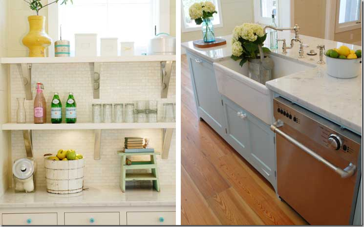
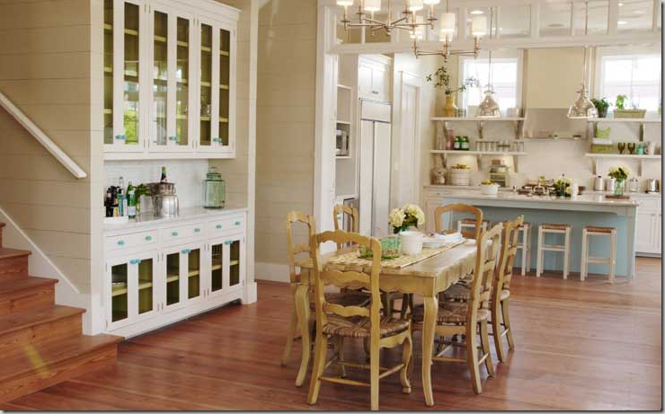
This kitchen designed by blogger Erika of Urban Grace in Florida is another blogosphere favorite. Everyone loved this beach town kitchen it for it’s stylish casualness. The fabulous tall backsplash with open shelving and windows above becomes the focal point here. Erika used white marble and white tiles and mixed in lots of stainless, but as a surprise – she added the color blue on the island and in the knobs. The added color brings a playfulness to the design and makes it more accessible. She then added yellow accents. If you love color and white, think about adding both in your kitchen design, like Erica did.
The knobs are glass, colored blue and the island is painted blue, not white.
Looking in from the large living-dining area at the kitchen.
ELEMENTS TO COPY:
1. Create a focal point along the back wall by placing the range and hood here, flanked by long open shelving with stainless accents.
If possible, add windows above the shelves.
2. Add color to the island – it doesn’t have to be blue!
3. Two lighting fixtures are better than one when the island is long. These fixtures add just the right amount of accent.
4. Use colored glass knobs to match the accent island color.
5. Instead of a plain entry way, add a row of transoms windows above the opening.
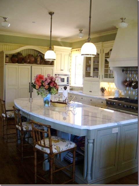
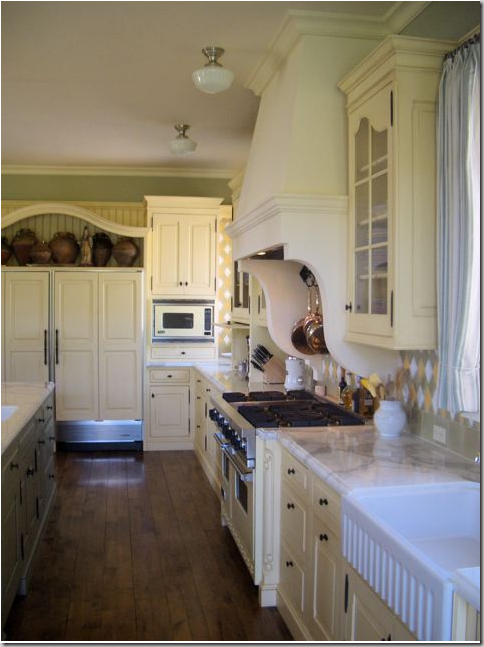
This southern California kitchen designed by blogger Velvet and Linen’s Brooke Giannetti and her architect husband Steve received rave reviews when Brooke first showed it. A colorful room, filled with greens and blues and yellows, there is Carrara marble on the countertops, along with a wonderful mix of colors used in the tile backsplash. The cabinets are a luscious warm, cream color, not white. Here again, the range with the large fireplace hood is the focal point. The curves in the island are repeated in the shelf above the refrigerator and in the glass paned cabinets. Wonderful bamboo styled bar stools with a flowery fabric fit the kitchen’s style. Reproduction school house lighting was used over the island and the range – which adds to the turn of the century feel in this space.
A close up of the range hood’s curved detailing and colorful backsplash.
ELEMENTS TO COPY:
1. Color: use cream on cabinets, and blues, greens, and yellows on island and backsplash.
2. White marble and farm sink are other authentic elements to use in a turn-of-the-century look kitchen.
3. The large range with fireplace hood becomes the focal point, flanked by glass paned cabinets.
4. Curves – use curves in the island, the cabinetry, the hood – the curves are as important an element as the color is to recreate this look in your own home.
5. Authentic school house lighting.
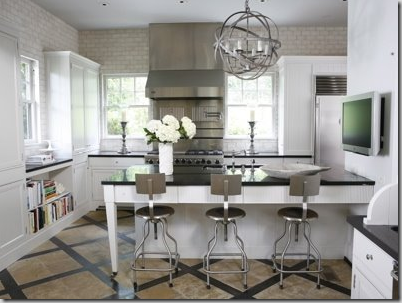
Another Giannetti designed kitchen. Steve Giannetti is fast becoming one of my favorite architects (Sorry Kurt!) His homes take you back to another era, when beautiful detailing mattered. There is such an authenticity to his designs, you might not realize the home is new – there is no detail too small not to matter, whether it is the molding or the air conditioning vents – everything is stylish and delightful. This kitchen is a perfect example of this attention to detail. Large, cool, and serene, it reminds one of those wonderful old servants kitchens of old – so beautiful! Two islands were used, with a Calacutta Ora marble backsplash. To create contrast – Giannetti used black granite and wood countertops. Stainless pendants and appliances provide the sparkle, as do the glass paned cabinets which are backed with windows. The bar stools could not be more perfect!
ELEMENTS TO EMULATE:
1. Black granite countertops, white marble backsplash with white wood cabinetry and wall color. This look is all about subtle contrast.
2. Large island, preferably two, if space allows, but the second island is not necessary to achieve this look.
3. The range and large stainless hood become the focal point along the back wall, flanked by glass paned cabinets.
Consider backing the cabinets with windows to let light stream in.
4. Two hanging stainless lights highlight the island.
5. Sink is placed underneath a row of windows – no upper cabinetry along this wall.
6. Industrial bar stools made of steel, while not essential, are highly desired.
Take a peek at this kitchen found on Pure Style Home – a great blog written by young interior designer Lauren. The chairs bought at Beach Dwelling are the same ones as in the Giannetti designed kitchen. The kitchen is very similar in elements and could be a good copy. The floors though send this kitchen off into a different style - good, just different!
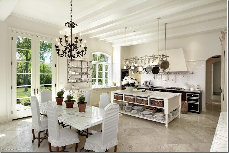
A home for sale in Illinois with a marble kitchen.
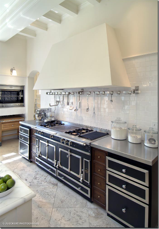
A close up of the gorgeous, La Cornue range – to die for!
This kitchen, in Illinois faced mixed reviews – some loved it, some found it cold. I happen to love it. A large space, the gorgeous, heavily veined marble is the star here. Carrara marble like this is hard to find now, if not impossible. The Carrara now coming from the quarries is gray with little to no veining – it looks mushy, not crisp like this. An alternative to Carrara is Calacutta Ora marble. These two marbles are often confused and truly – I’m not sure if this is Carrara or Calacutta myself! Besides the marble, the other standout is the French La Cornue, a masterpiece few of us will ever be able to afford, unfortunately, as one this size can cost as much as $40,000! The large pot rack is another eye catching feature. The triple, arched casement window is charming. The floors are also marble, as is the table top. Stunning is the word that comes to mind.
ELEMENTS TO COPY:
1. White: white walls, floors, cabinets, upholstery.
2. Marble, white Carrara or Calacutta marble everywhere and then some.
3. Focal point – French range with hood. A substitute would be an American stainless or black range – which would provide the focal point.
4. Large steel pot rack.
5. Island with baskets, which add needed texture.
Other popular photographs of kitchens give ideas to use:
In New Orleans, this homeowner added silk draperies to her kitchen, as if it was the living room! I adore this room. Her antique light fixture is beautiful.
Houstonian interior designer Lisa Epley used a dark color on her kitchen walls. The color gives it a very sophisticated look which is great to use when the kitchen is open to the living areas. Large white plates and platters pop the wall color, as does her beautiful Calacutta Ora marble countertops. The mirror backsplash and glass paned cabinets add more sparkle and drama to this dressy kitchen.
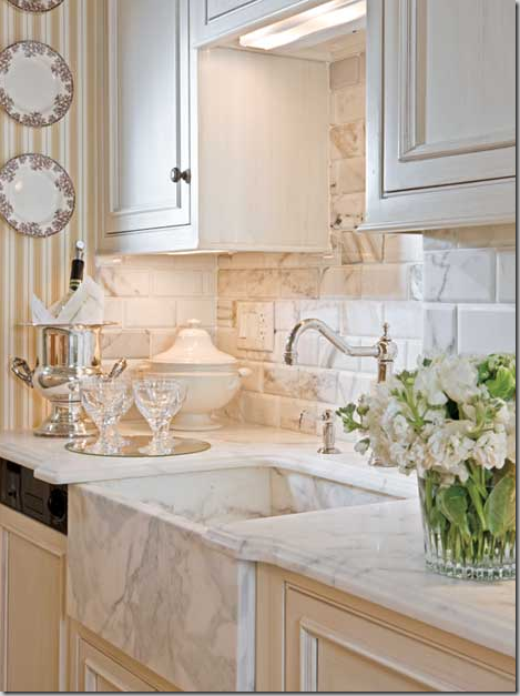
To me, the prettiest elements in a kitchen today is the farm sink and polished nickel faucets along with heavily veined white marble. This has it all! The backsplash is subway tiles made of marble, as is the farm sink.
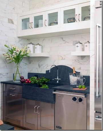
When you don’t have a window above the sink, I love this treatment of the backsplash – a slab, carved in a high arch, the soapstone takes over as the focal point. I love marble handled this way – in a kitchen and in a bathroom.
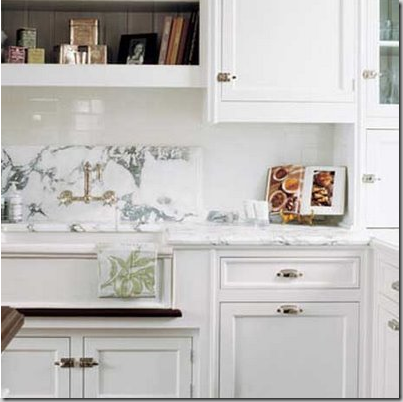
This white marble backsplash would have looked fabulous if the fabricator had carved it in an arch. Oh well – they didn’t ask me for advice, and it’s still beautiful.
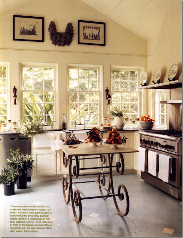
If you are tired of your dark hardwoods and want a lighter look in your kitchen, consider painting them! Simple to do and a great alternative to brown floors, just be sure to seal it. Also, this kitchen has a beautiful wall of windows above the sink. I love how Suzanne Rheinstein put lighted sconces between the windows – this is a good idea to incorporate. And, her antique baker’s table makes a perfect focal point.
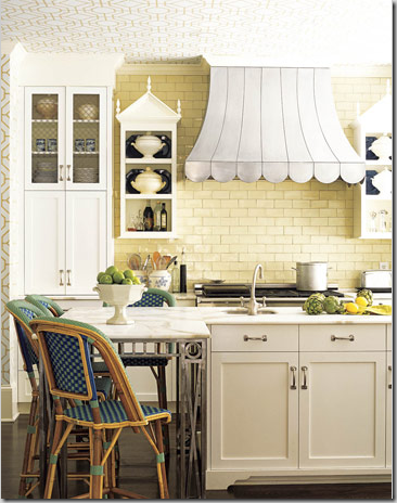
Everyone, I mean everyone, loved this kitchen in House Beautiful. The range hood is incredible! Scallops and curves make it as sexy as it is cute. Two pagoda styled shelves flank the hood. The cream subway tiles set off all the lighter colored cabinetry. White marble countertops were used and be sure to notice the iron table legs! A range hood like this is definitely worth copying!
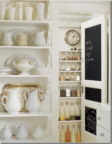
Ironstone looks wonderful in all white kitchens. You don’t have to spend a fortune either. Ironstone, even old pieces, are relatively inexpensive, especially on eBay. Too much of ironstone is never enough! If you don’t want to buy old, go to Target and buy a set of white plates and platters – the effect will be the same. Notice too, the blackboard inset into the pantry door. This is another great accent in white kitchens.
Besides hanging ironstone platters on the wall, put them on wonderful, old vintage shelves, like here! These antique, rusted brackets are nice contrasts to the shiny white tile and white plates. Collect platters, plates, pitchers and tureens. Tureens do great second duty as planters too.
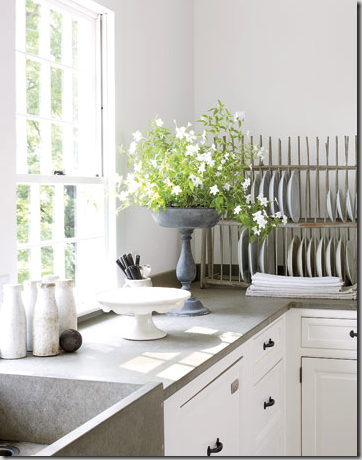
Plate racks make good and useful accessories. An antique plate rack is desirable, but a built in one will do just fine! You can hang them, or just place them on the countertop like this one, or you can build them into your cabinetry.
And finally, the kitchen that spawned a thousand copies: the Something’s Gotta Give kitchen. Everyone loved the white cabinetry, the subway tiles, the black soapstone countertops (though they were really just painted wood for the movie), the polished nickel fixtures, the great range and stainless hood, the glass paned cabinets, the school house light fixtures, and the huge double islands and bin pulls. Looking at this kitchen today, years later, it is amazing how prophetic this design was. Today, it seems almost commonplace. Back then, people took pictures of the kitchen to their designers and said “I want this.” So did all of America it seemed.
The most beautiful kitchen in West University, not! This is my disaster before the updates. Oy! Stunning, isn’t it? I’ll show it next time. It will look better on its own rather than compared to such gorgeous kitchen shown here today!
For a detailed study of farm sinks and fixtures, be sure to visit Brooke’s Velvet and Linen.

