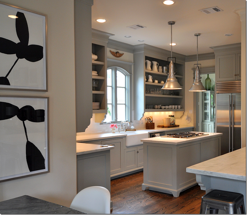
In the past year or so since I first showed Sally Wheat’s house, I’ve received many emails about her kitchen. While everyone seems to love her house – it’s the one story on my blog people talk most about – it’s her kitchen that really strikes a chord with so many readers. And for good reason – it’s beautiful – and at the same time, it’s attainable. While unquestionably luxurious, it’s not huge or over the top. It’s size is moderate and the appliances, save for the refrigerator, are all affordable. Because its size is more typical and there isn’t an antique limestone hood for a focal point, the kitchen appeals to a wide range of readers. Those with dated kitchens in need of an updating look at Sally’s kitchen and think: I could have something like that. I know I did.
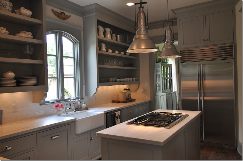
Sally’s Kitchen: the inspiration behind my own small kitchen remodeling.
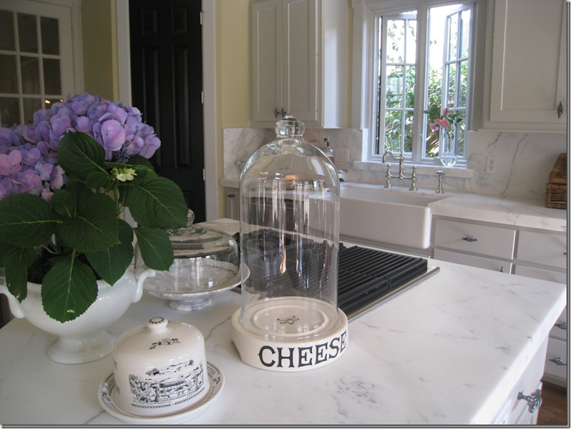
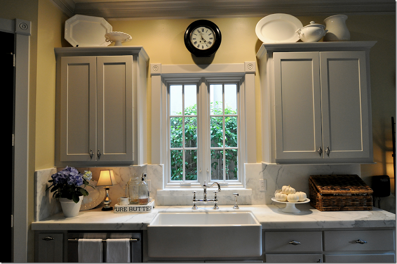 My Kitchen – After it’s renovation.
After I first went to Sally’s house, seeing her kitchen prodded me to finally give my own kitchen the remodeling it desperately needed. While I couldn’t afford the beautiful Sub-Zero refrigerator she had, I could afford a new stainless one. And while I couldn’t buy new cabinets, I could paint mine gray, like Sally’s. The major elements I chose to copy were the casement windows, the farm sink, and the polished nickel faucet. I had already replaced my hardware, but to do it over again, I would probably have chosen the bin pulls like Sally. Of course, the biggest expense was replacing the tile countertops. Although Sally also has white marble, I would have used it regardless of whether Sally had used black granite. The marble was without a doubt the most important element in my renovation and the one thing I wanted above all else.
My center island holds my cooktop, just like Sally’s does.
Another aspect of our kitchens Sally and I both share are center islands where our cooktops are located. If Sally’s kitchen had a fabulous limestone hood and a chef’s range – it would be focal point, and something that would be out of the price range of most who wanted to copy her look. But it is exactly the lack of such luxury that makes so many people look at her kitchen and realize they could have something very similar.
Case in point. This is quite a stunning kitchen with a gorgeous stone hood. The contrast between the black and white painted cabinets and the white marble and wood countertops keeps it all so interesting. But, copy this kitchen? No. There would be nothing you could do to a “regular” kitchen to make it look anything like this, not with a range hood like this that is such a bold focal point.
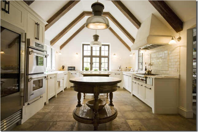
Another case in point: A beautiful kitchen like this is just a dream for 99.99% of the world. Even if you wanted to copy this kitchen, it would be virtually impossible to do so unless you had the basic elements: a gloriously tall, pitched ceiling with beams. Everything about this room is custom – the antique stone floor, the stone hood, the windows, the cabinetry. Even the island is a unique antique. I think when searching for inspiration it’s best to be realistic. Find something that you could honestly make your own, rather than reaching for something that will never look as good!
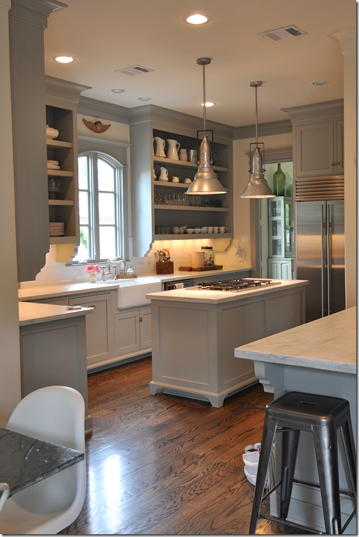
By contrast, Sally Wheat’s wonderful kitchen IS attainable: the size, the style, the painted cabinets, the stainless appliances. While some things in this space may be out of the reach of budget conscious remodelers, it is still full of wonderful elements that most could copy. So, it was no shock when I got an email from a reader in west Houston who had done just that. She had recently completed a remodeling of her house – the living room, dining room, kitchen and family room had all been taken down to the studs. She told me that her new kitchen was modeled after, of course, Sally Wheat’s! When I looked at her pictures of her kitchen, I could immediately see the elements she took from Sally to use in her own kitchen. The homeowner said she used the blog for much of her inspiration. She intently studied Sally’s kitchen, noting which things she loved and which she wanted changed. And though she says the two kitchens don’t look that much alike, Sally’s kitchen was an enormous influence on her. But, it must be noted that the redo was also this homeowner’s vision. And what a vision! What a remodel! Enjoy!
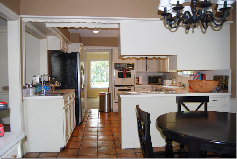
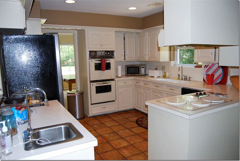
BEFORE: the house has a typical floor plan for Houston. At the entry, the living room, then dining room is located to the left. The family room is straight ahead and looks out to the backyard. The kitchen connects to the dining room and family room. Here you can see the yellow dining room with its large window connected to the kitchen through the door. The family room is on the left, where the bar is. The breakfast room is shown, right off the kitchen. The homeowner could have chosen to do a simple remodeling: freshly painted cabinets, new countertops, new appliances – and maybe new floors. Many people with kitchens like this do just that – and no more. But this homeowner had bigger ideas. She wanted to turn her unused living room into a dining room. The freed up dining room space would become part of the kitchen. The wall between the family room and living room/dining room would be taken down. The entire public area of the house would be open and airy, each room easily accessible from the next. To do this, the walls would have to be taken down to the studs.
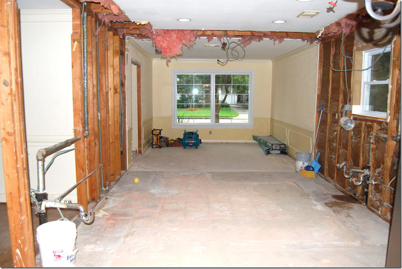
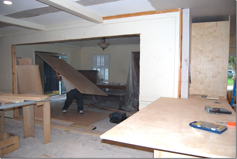
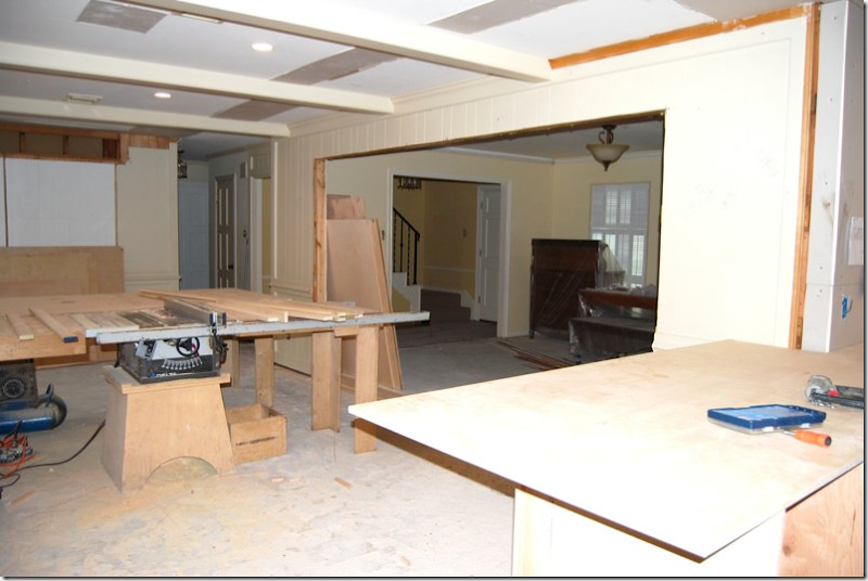
DURING: The kitchen was totally removed. The wall between the kitchen and dining room was also removed so that the kitchen would be one large space. You can see where the old terracotta floor in the kitchen was – the dining room’s foundation is slightly higher. It’s so fascinating to look inside the walls at all the pipes and wires! And look how old the wood looks, it’s probably so hard and rigid after being encased inside the sheetrock for so many years.
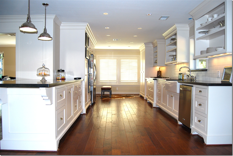
AFTER: The stunning kitchen is revealed! Isn’t this gorgeous? It’s even more amazing when you realize the homeowner is neither a designer nor an architect – she did this all on her own vision!!! The small kitchen is now long – the former dining room has been added to the square ootage. What was once a small U-shaped kitchen, is now a long galley styled space. The footed cabinetry borrows its look from Sally’s kitchen – in both kitchens the Shaker doors are inset. While the inset doors are more expensive, just adding “feet” to cabinets is a wonderful way to simulate this vintage look when remodeling. Both this homeowner and Sally used bin pulls for hardware – the homeowner purchased hers from Restoration Hardware. Both used white subway tile and dark hardwood floors. A major difference though is this: Sally’s cabinets are gray and her countertops are white marble. This homeowner chose white cabinets and honed black granite countertops. Both are wonderful and highly personal choices – none is either right or wrong. The pendant lights are similar to Sally’s, but not quite the same: Sally bought hers at Brown, the homeowner bought hers at Lighting Headquarters on EBay. The cabinets are painted Sherwin Williams’ Divine White.
BEFORE: The U-shaped kitchen, with the dining room on the left and the breakfast room on the right.
DURING: Looking from the family room, over the counter, into the kitchen. The farm sink has been installed. This sink was one important element that the homeowner wanted to repeat from Sally’s kitchen.
AFTER: The same view looking from the family room into the kitchen. Here you can see an important element that the homeowner borrowed from Sally Wheat: the open overhead cabinets. This feature is quite prominent in Sally’s kitchen, as it is here. Just beautiful! I love the honed black granite – it doesn’t look like granite – it looks more like soapstone. Do you also see the influence of the Something’s Gotta Give kitchen?
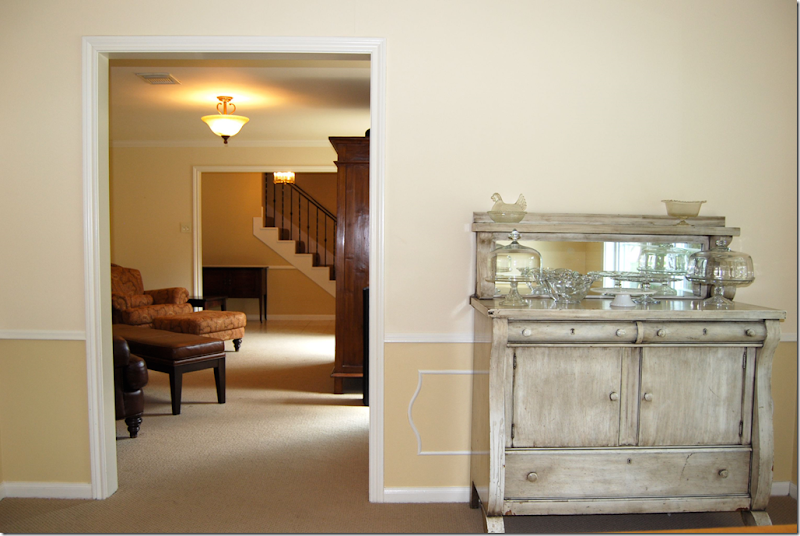 BEFORE: The dining room - looking through the living room into the entry. The living room will become the dining room. The dining room will become the kitchen.

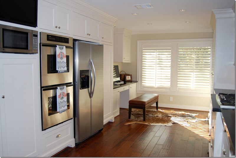
AFTER: Where the dining room once was becomes a work area for the homeowner with the addition of a built in desk. I love the leather bench instead of a chair – and I love the cowhide rug! Sally also uses cowhides in her home. The homeowner added pricey looking wooden shutters. The floors are Anderson, hand scraped hardwoods. And of course, all the appliances are stainless. Notice the refrigerator – a trick I used too. Instead of an expensive built in Sub Zero, the cabinets are built out around the refrigerator, where at first glance, it looks like a built in one.
BEFORE: The family room, looking into the kitchen and breakfast room. This entire wall between the kitchen and family room will be removed. The wall between the family room and living room, where the sofa is now, will also be removed.
AFTER: Here is how it looks from the family room into the kitchen. Gone is the doorway and the pass through. Instead there is a large counter and the two rooms flow into each other. So beautiful! The breakfast room gets the wooden shutters too.
BEFORE: A view from the kitchen into the family room. The wall where the sofa is will be removed to open up the living room/dining room to the family room.
DURING: The same view with the wall between the family room and living room/dining room removed. The wall between the family room and the kitchen has also been removed. Suddenly – the small rooms are all open to each and seem much bigger.
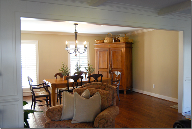
AFTER: the view from the family room into the new dining room, which used to be living room – and all closed off. Instead, now the two rooms flow into each other. The once rarely used living room becomes an open dining room which gets much more use and visibility. The former dining room is long gone – it now part of the kitchen.
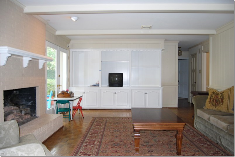 BEFORE: The family room before the wall between the two rooms was removed. Here you can see the old flooring, the 60’s parquet that is found in every house in West Houston! The dated shelving unit was also replaced.
DURING: The family room is now open to what was once the living room, but will now be the dining room.
AFTER: The view from the kitchen to the family room. The shelving unit was replaced with an attractive console. So much more prettier!!
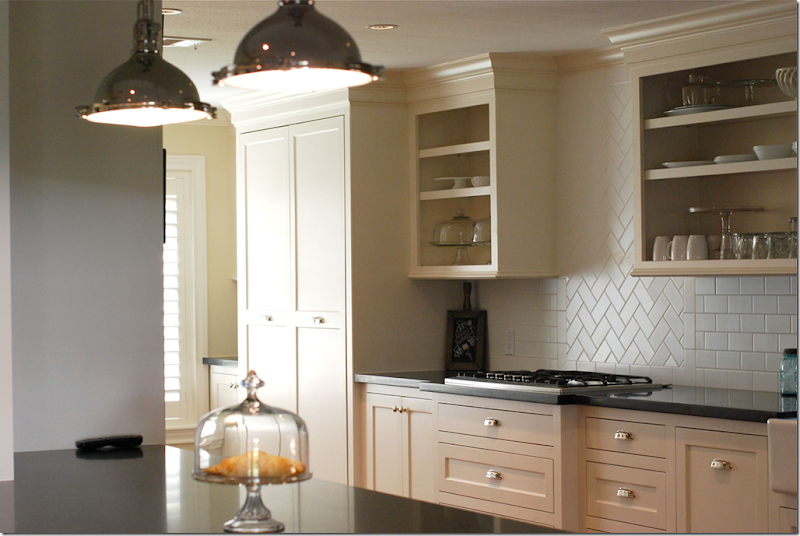 A closer look at the subway tiles which were installed in a herringbone pattern above the cooktop. There is so much storage space!
The homeowner’s new kitchen: notice the brackets placed under the bar; in Sally’s house the similar looking brackets are placed under the overhead cabinets instead. Here, the homeowner copied the bracket elements, but chose to use them in a different way – something to remember. Elements can be utilized differently but still give the same visual effect! Notice, also, the similarity in the overhead cabinets to Sally’s (see below.)
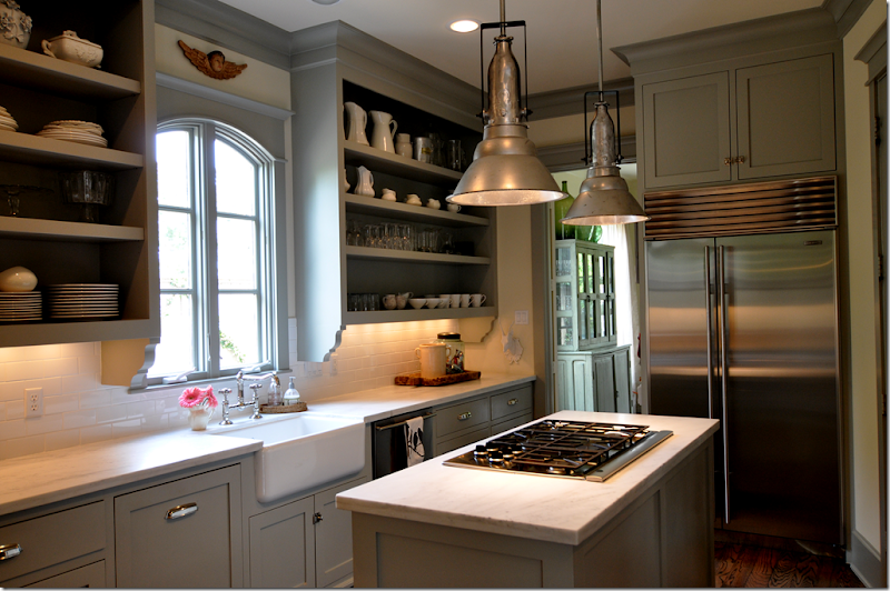
Another look at the inspiration kitchen – notice Sally’s inset cabinets – how similar they look to the homeowner’s and how important an element they are! Also, the farm sink is another important element she chose, as are the white subway tiles. Notice the brackets underneath Sally’s cabinets, the homeowner chose to copy these – but used them instead under her bar counter, thereby getting the same effect. Notice too – how similar the lighting pendants are – another important decorative item in both kitchens.
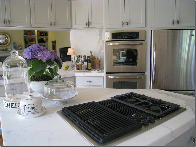 My kitchen remodel: I used exactly the same trick as the homeowner to make my refrigerator look like a built in Sub Zero does. By adding cabinets above that are the same depth as the refrigerator, the unit looks cleaner lined and more custom. My refrigerator was so inexpensive, yet I think it looks rather great! Asked how and why I chose my particular appliances, I was drawn to the handles. If I liked the handle, I chose that appliance over the next one with the same price.
And finally – one last look at the beautiful new kitchen! Job very well done! I just love this remodel – it is so well thought out by someone who is not a designer or an architect. Not sure they could have done a better job. Many thanks to the homeowner for sharing her new remodel! Congratulations, use it in good health and much happiness!!!!!
Remember – Be sure to share your remodel with us! We love them!!

![[SK_WPF.JPG]](https://blogger.googleusercontent.com/img/b/R29vZ2xl/AVvXsEgvIOA2v6xOBX8U-Tir3Y_VQiCfgIQ1BihfvIgJhHPpRi0W5z0DXtHxOsgDlRm5x5yWTqQBk0XHhV9eWS2oTSBoyJl-mJnOXmagtUKvaE-7IsXtnFD2o49XpnqeTSvhjIlfDf5HE96HpqY/s1600/SK_WPF.JPG)
