Well, it’s hot in Houston. BIG surprise! The summer heat is at full steam and it’s got me thinking of the beach and beach houses in particular. So, I was especially excited to receive these photographs of a beach house remodel in Rosemary’s Beach, Florida. The designer is Jenny Johnston who currently leaves in Shreveport, Louisiana, but is actually a native Houstonian who was lucky enough to work for 8 years as an assistant to the great interior designer Cathy Chapman. I adore Cathy’s work – so I had a feeling that Jenny’s work would be top notch too. The Rosemary Beach house is Jenny’s client’s vacation home.
As you will see, the before pictures are pretty cute which is no surprise for a house in Rosemary’s Beach! But, Jenny has moved it into the 2010s - where interiors are a bit more quiet and toned down. Jenny has captured that trend perfectly! There’s a LOT to learn from these pictures if you are looking for ways to update your own house, so take notes. To show you exactly what changes Jenny made, for each room, I will show you the Before and then the After picture.
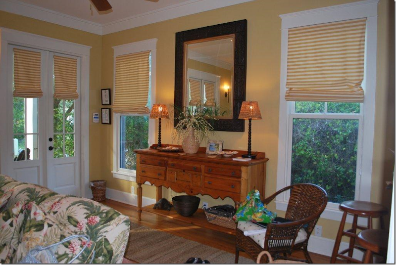
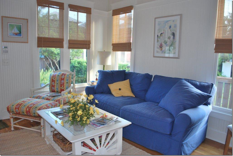
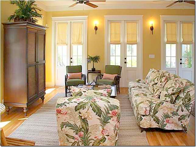 BEFORE: Living room. Typical 1990s yellow painted walls with lots of patterned fabric. Notice the humongous armoire – to hide the TV in and the orange stained floors.
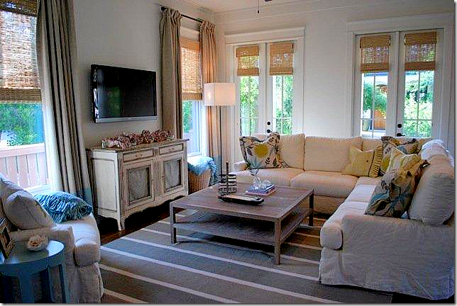
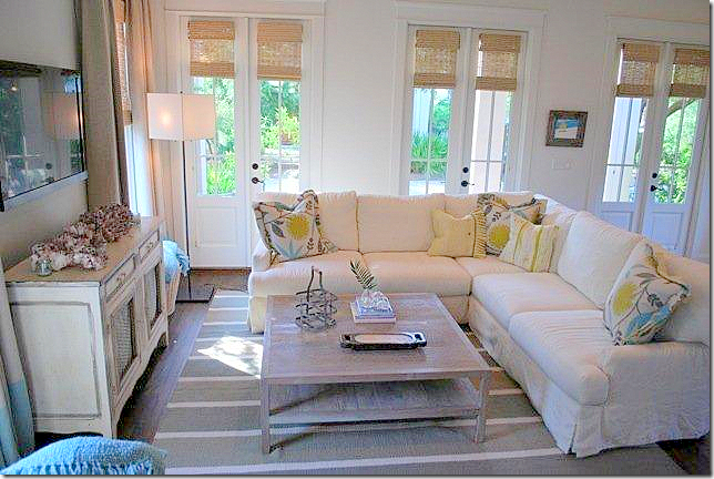 AFTER: Jenny has painted all the walls white – trending the house into the 2010s. The patterned fabric is exchanged for a family/pet friendly white linen slipcover. The slip is updated for the 2010s – it’s tightly tailored and as far away from Shabby Chic as you can get. Instead of fabric shades, updated textured shades are placed in the French doors. The British Colonial type sconces were removed. The limed wood coffee table is another example of updating the interiors for today. A striped dhurri rug in gray and white picks up the colors in the pillows. And – the armoire is gone. Instead there is a beautiful painted French buffet with a flat screen above it. In all, the new interiors seem more sophisticated, quiet, and ready for the next decade.
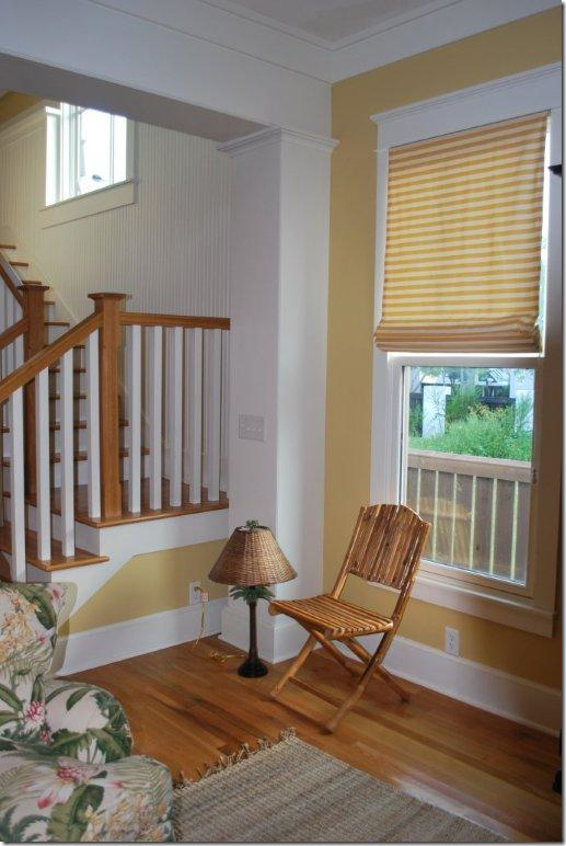
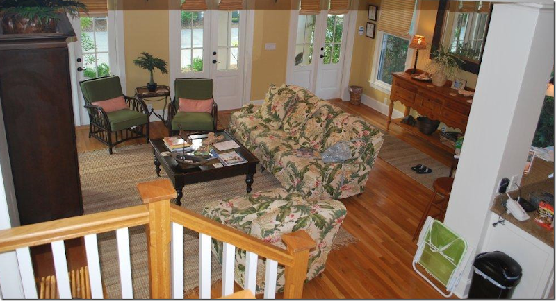 BEFORE: Looking from the stairs into the living room. Notice the pine console on the wall by the back door. And, notice the wood stain on the banister – orange. So 90s!
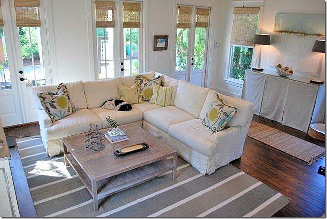 AFTER: A tall, linen skirted buffet replaces the dated pine console. Modern lamps and artwork add an eclectic touch. Notice the dark wood floor which really grounds the white walls. The dark wood is so much better than the old orange stain!
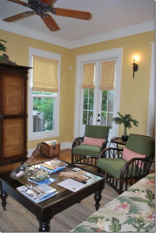 BEFORE: British Colonial decor in a corner of the living room. Notice the ceiling fan here.
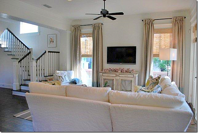
AFTER: The same corner. Here you can see the linen curtains on the side windows and the contemporary floor lamp. Notice the ceiling fan – all these contemporary touches work so good with a mixture of the more traditional pieces like the antique painted French buffet.
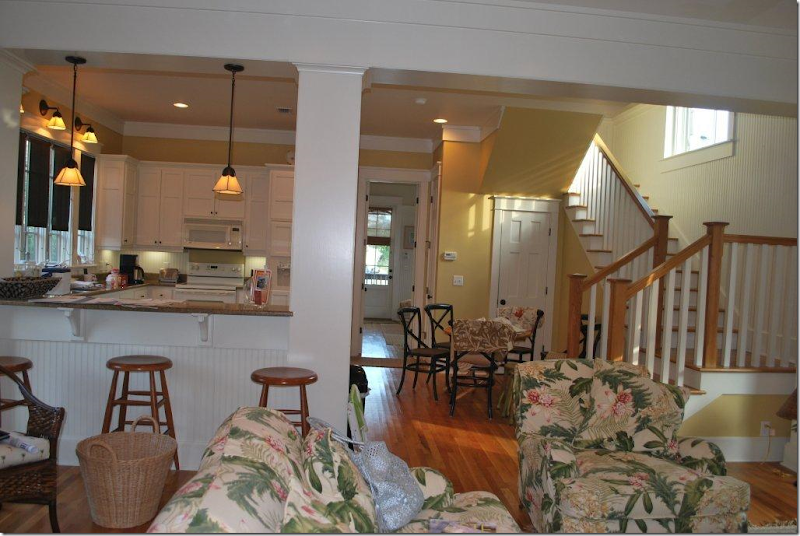 BEFORE: Looking towards the kitchen and the stairwell.
AFTER: Notice how Jenny painted the stairwell banister dark, getting rid of the pine colored stain from before. Also – notice the darker wood floors. I love the way the curtains were made and I love the simple rods. The simpler the better going into the 2010s.
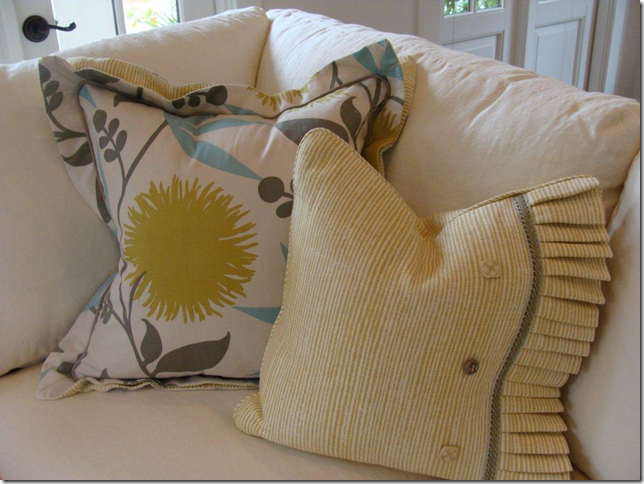
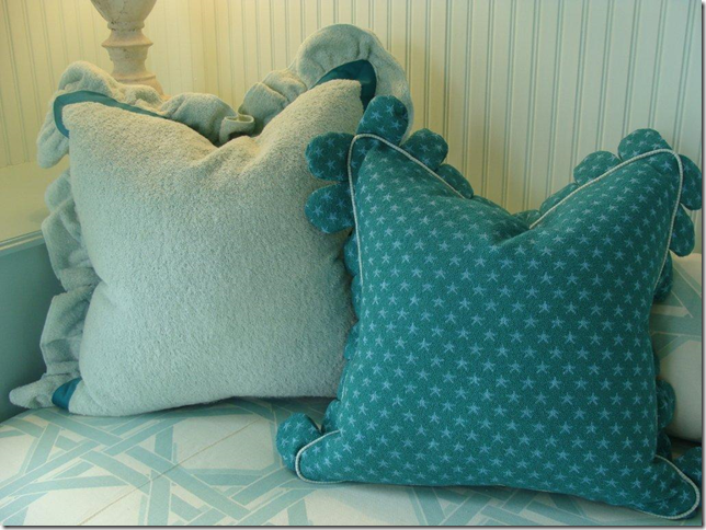
Close up of the living room’s pillows. Youthful fabrics are perfect for a beach house.
Notice the cute table next to the side chair.
BEFORE: Back entry – pine console with Ballard twisted barley lamps.

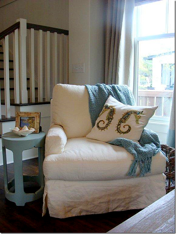 AFTER: corner chair with darling turquoise blue table. I love the touches of blue throughout the living room.
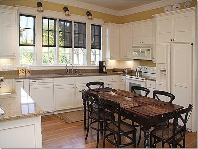 BEFORE: Granite kitchen with white appliances and eat in table.
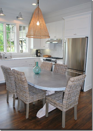
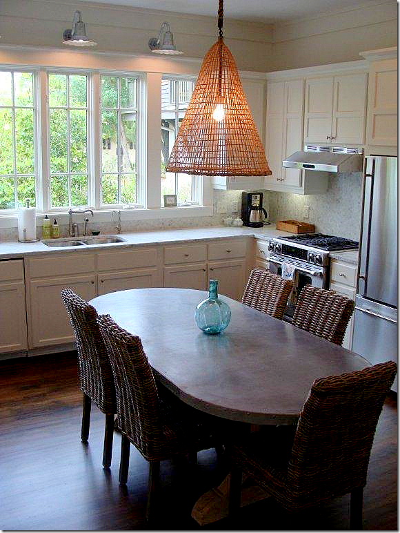 AFTER: The kitchen was updated a notch – new countertops, new stainless appliances, new industrial lights over the sink, new zinc and wood table with gray wicker chairs. Notice the new refrigerator. One small change really updates a look tremendously.
AFTER: Here you can really see the great zinc top table and the gray wicker chairs. There are also bar stools in the gray wicker.
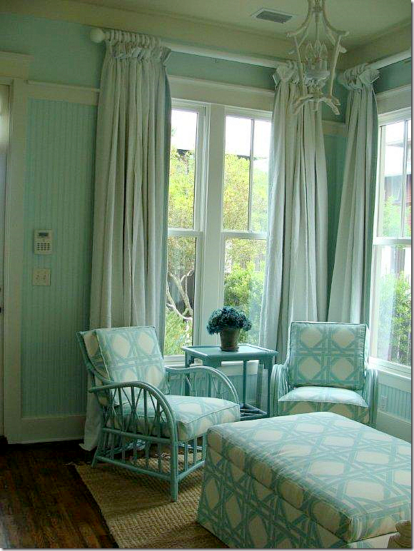 AFTER: This room is now a daughter’s bedroom. The two chairs from the BEFORE living room have been painted and moved into here – which is a great idea! Love the curtains and the chandelier.

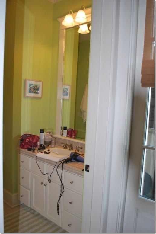
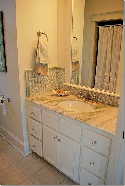 AFTER: new marble countertops and backsplash. White walls instead of green walls.
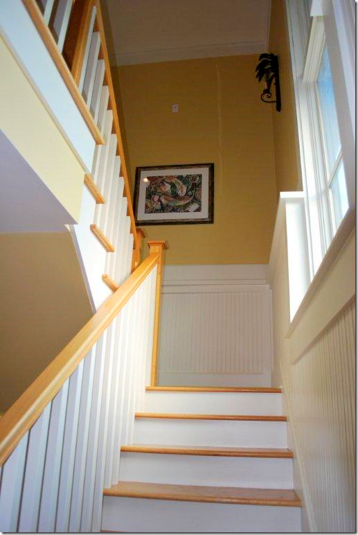 BEFORE: stairwell with British Colonial type sconce and orange stained wood.
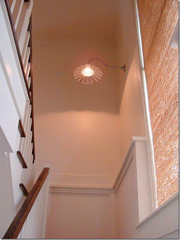 AFTER: Industrial light, white walls, dark banister, and textured blind.
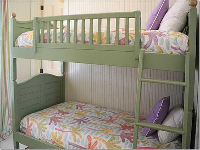 BEFORE: Bunk room – this room is very small and the beds really took up a lot of space.
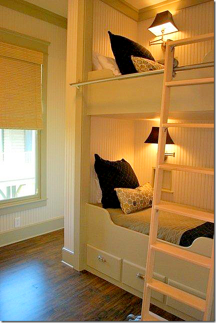 AFTER: By building in the bunk beds, they become little rooms of their own. Notice the built in lamps. There is a TV built into the end of each bed. Jenny says the room seems so much larger now. The master bedroom is not yet completed, but hopefully, I’ll show those pictures as they become available.
 A big huge thank you to Jenny and her client for sharing these pictures!!! I hope you have enjoyed seeing how you can take a beautiful interior and update it for today!!!
Jenny Johnston can be reached on Facebook HERE, and by email at texasjennyj@comcast.net


