Here’s a redo of a living room I recently completed for a long-time client – one of my first. I always say I probably wouldn’t even be doing interior design if it wasn’t for this client who pushed me and gave me the confidence to keep at it. The client moved into this house around ten years ago and at the time we recovered some of her furniture from her old house for her new living room. A few months ago she called wanting to update her look by removing her red striped wallpaper and putting slipcovers on her furniture. Here is what her living room looked like when she bought the house:
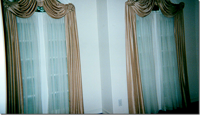
Naturally the first thing to go were these curtains and the sheers.
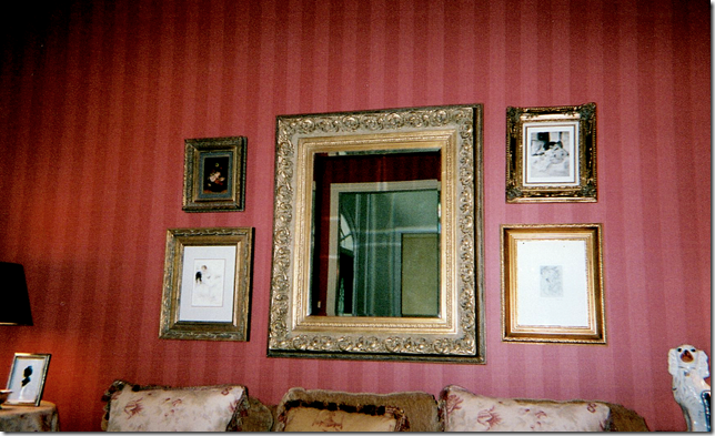
I don’t have many pictures of the living room as it looked after she moved in, just these few cropped ones. We papered the room in a Colefax and Fowler red stripe. Directly across from the living room is the dining room which we papered in a light yellow damask. Both rooms have custom cut seagrass. Here, above the sofa is a collection of prints and a mirror that came from her old house. Besides the wallpaper, we only ordered some pillows and a chair and a few tables.
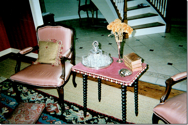
Across from the sofa we recovered two French chairs in a red silk check. I found this antique table with bobble fringe and a red velvet top. The owner had the rug which we layered over the seagrass – and a square ottoman/coffee table was placed over both.
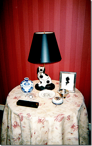
We had a skirted table and some pillows made out of Bennison’s Musk Rose. The homeowner has a large collection of Staffordshire dogs, some of which were made into lamps. These are the only pictures I could find – I wish you could see the whole room, but still, it obviously really needed updating. Here’s how it turned out:
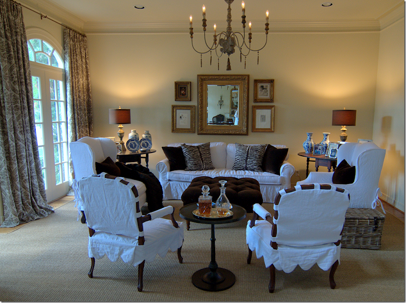
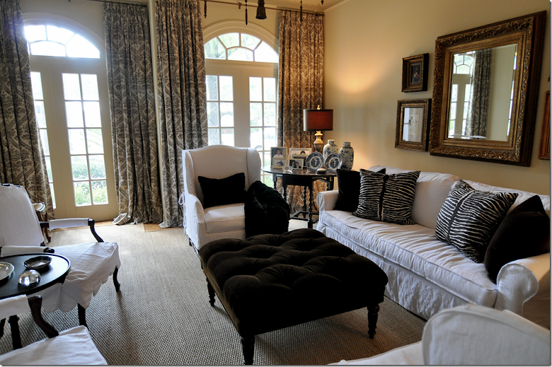
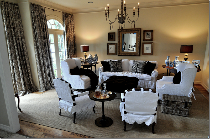
First, the red wallpaper was removed. Then in order to keep continuity, the walls were painted a soft ivory, Pratt and Lambert Ceylon Ivory, the same color as the molding in the dining room. Next, we pulled up the rug and removed the two mismatched chairs flanking the sofa.
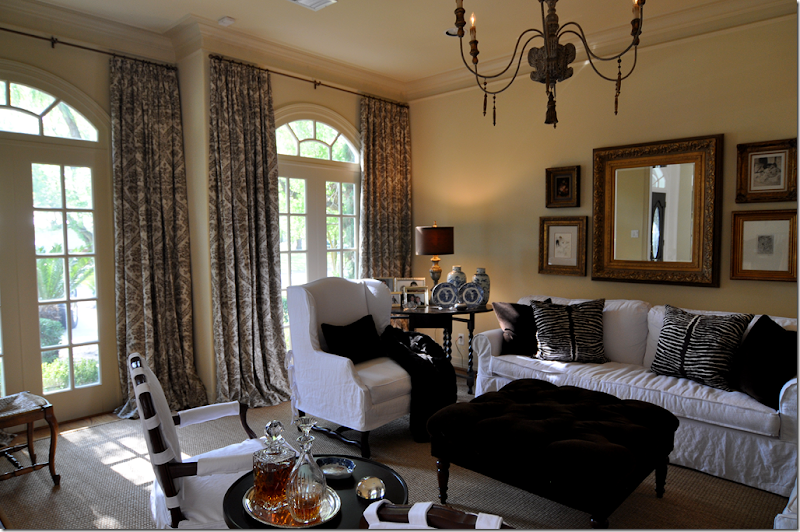
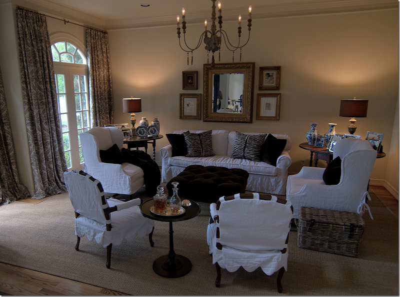
Two new matching side chairs were bought at Hein Lam and slipped in white linen from Glicks. We picked these tall wing chairs with French Os de Mouton legs because the room really needed some varied height. Then we slipcovered her sofa which was formerly in a coffee colored chenille. The sofa was also updated at that time – instead of three cushions, we changed it to two back cushions and one bottom cushion.
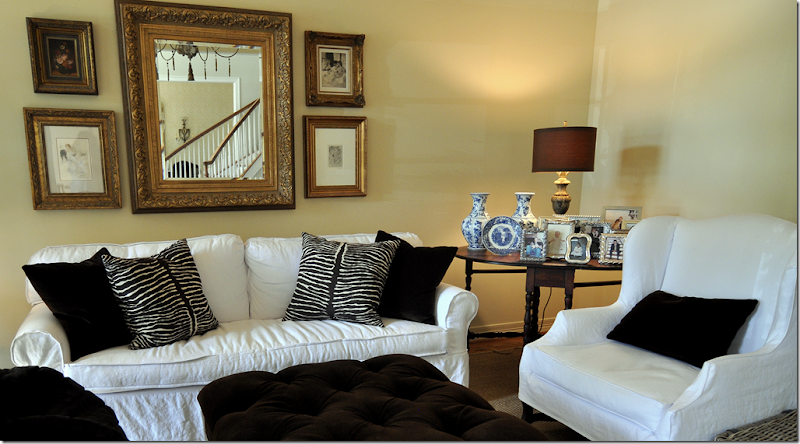
Next we reupholstered her ottoman and had it tufted in a dark chocolate velvet. The pillows are in the same fabric, plus there is the Brunschwig and Fils animal print. The lamps and chandelier came from Aidan Gray, whom I am thrilled to announce will soon be a Cote de Texas sponsor!! The two French chairs, formerly in red check, were sent out for slipcovers with a scalloped detail. The homeowner found the dark iron table at Pottery Barn. The family really uses this room – the kids do homework and read in here - and before, there was a large French washing basket for all their books and papers. I changed it out for a more updated and closed Kooboo basket – it’s neater with a top than looking at a pile of school books and magazines.
We got rid of the dreaded skirted table and brought down another vintage gate leg table she was using in her upstairs study. The homeowner loves the prints and mirror, so they stayed above her sofa, as did all her framed photographs – but believe it or not, I did remove over half of them.
The biggest change was when I convinced the homeowner she really needed curtains to soften it all up – and she finally agreed. But, it wasn’t easy to convince her. The linen fabric is a brown damask on an ivory ground from Pindler and Pindler - very, very reasonable. And last, we added a faux mink throw.
I cant’ tell you what a huge difference it made - it looks like a completely new room with all the red wallpaper and red and cream fabrics gone. The white is so fresh and the room looks much younger. Everything was a compromise between us – I probably would have just hung a lone round mirror over the sofa instead of all the prints, but those are the homeowners favorite things. I wanted to add a green tree, but that was vetoed. So were urns on pedestals to flank the doorway. Everything was bought with a strict budget in mind. The only real extravagance were the two chairs, but at least they were on sale. All the fabrics were extremely reasonable, as were the lamps and chandelier from Aidan Gray. Only the Brunschwig fabric was pricey but we needed just one yard. As always, Monica from Custom Creations by Monica did the curtains. Next we are going to update her family room – and finally get rid of her leather sofa!!!

