The Reader’s House today was really supposed to be on the Reader’s Kitchen Series, but after seeing pictures of her house, I decided it was too cute not to show! The home owners, Amanda, an interior designer on leave while raising her family, and her architect husband, along with their two young children recently moved into a 15 year old house. The house is located in The Woodlands, a large, wooded, planned community north of Houston. I love The Woodlands and have great memories of it as my husband Ben owned a house there when we were dating. Of course that was in the early 80s under Jimmy Carter’s reign when interest rates were double digit. When Ben sold his house (snort) – he was so upside down, he had to bring a check to the closing. But that’s a sob story for another day.
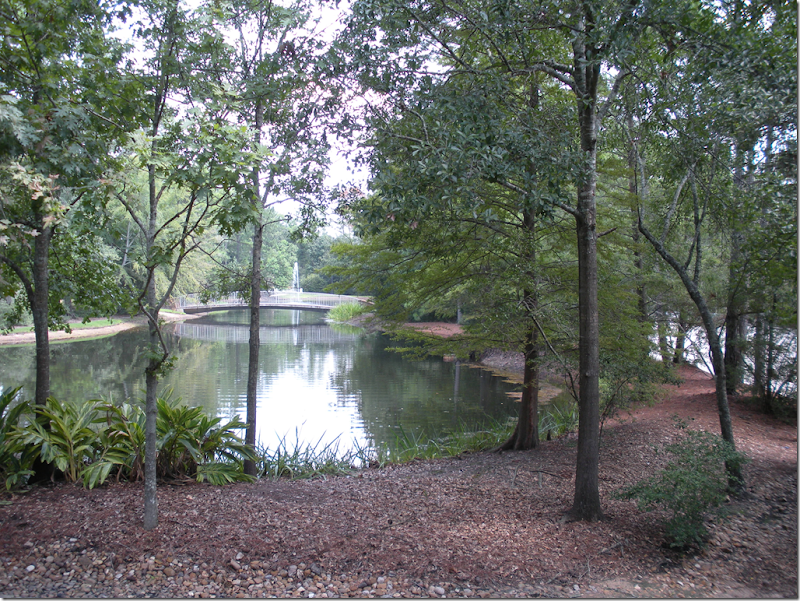
This lake bordering the business district hides the building – something that was purposefully planned. You can just barely see it through the trees.
The Woodlands is exactly like it sounds – a forest full of towering pine trees, lakes, and hidden winding paths for walking and biking. The houses have natural landscaping and many yards don’t have fences or sidewalks to keep everything open and green. It’s a wonderful place to raise a family, with great schools and churches in the area. All these things were a draw for the Burketts whose children are now just old enough for school.
A Hike & Bike trail in The Woodlands.
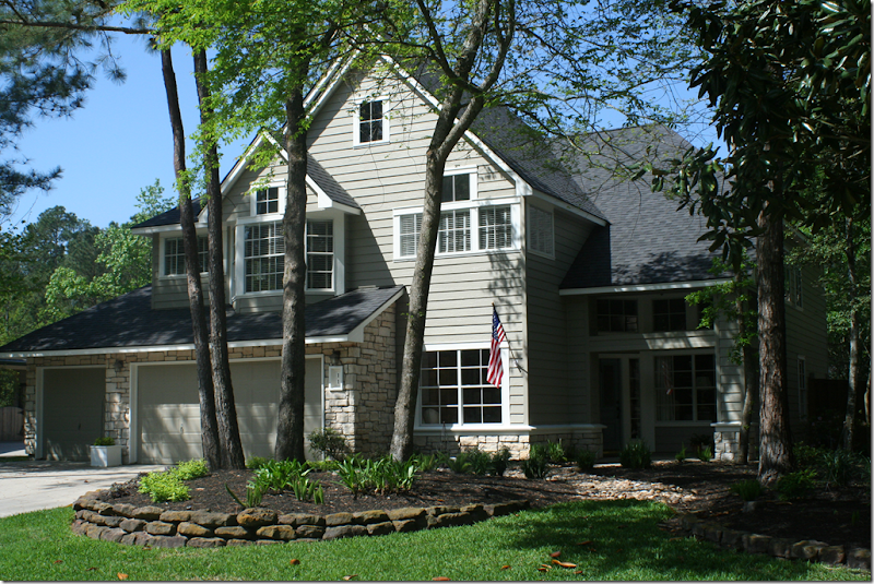
Amanda’s house – wood and stone with charming small, square windows. Eventually, there will be a trellis over the front porch and new carriage styled garage doors.
Amanda writes a blog which is part “mommy blog” and part “design blog.” She is deeply religious and stated her philosophy about design on her blog:
“Before I post any pictures, I'm going to get personal {sorry}. I love design. It's a big part of who I am. I know that when God planned me, knit me together, He knew I'd love beautiful things. And while I do, very much so, love beautiful things . . . I am so blessed to know that they are, in fact, just things. So please know, when I go on and on about paint or hardware or lovely little garden gems or anything French, it's just a great love of mine. The greatest love is Him.”
I think Amanda beautifully sums up what most of us feel in our hearts. While, yes, we all love design and fixing up our houses, still, we know that we are very, very blessed, that what really matters is a love of God, family, and close friends. And I might add – we are all so lucky to live freely here in the United States, while so many are still enslaved around the world.
The turquoise blue front door is somewhat hidden on the front porch. So cute!!!
When Amanda moved into her new home, she had many ideas for what she wanted to do with the interiors. She knew she couldn’t do it all at once, so she made a list of what needed to be accomplished first, then other changes would come later. Most importantly, all the renovations and furniture buying would be done with a strict budget in mind. The outdated kitchen was first on the list. The layout was good and would stay, but a few key elements needed to be changed to make it more up to date. Some things didn’t need changing: thankfully, all the hardwood floors had just been refinished. But the entire house, inside and out needed painting. The front door and doorbell were on the list to be changed out. Additionally, Amanda dreamed of linen curtains for the living and dining room and study and rugs were needed for all the downstairs rooms. There were little things on the list – such as a message board for the utility room – done in burlap and nailheads. And there were big things on the list - the fireplace needed a total renovation.
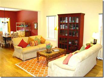
BEFORE: When Amanda first saw the house – this is how it was decorated in yellows, reds, and creams.
BEFORE: The dining room was painted red.
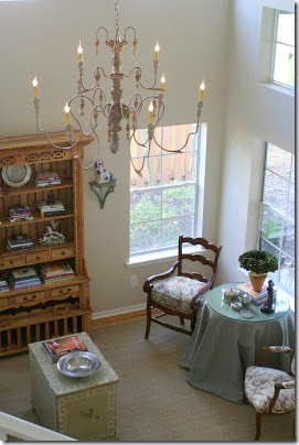
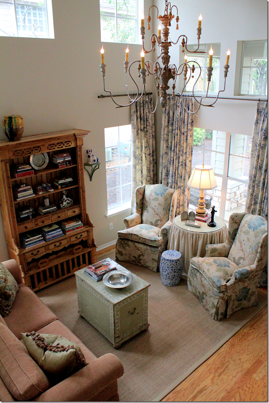
When they first moved in, Amanda’s husband gifted her with this wonderful Italian wood chandelier for the double height living room. The French chairs were a temporary fix.
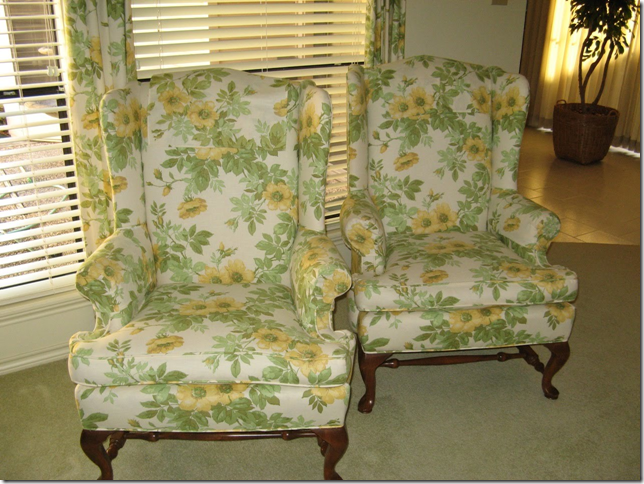
Amanda bought these vintage wing chairs for the living room, planning to recover them.
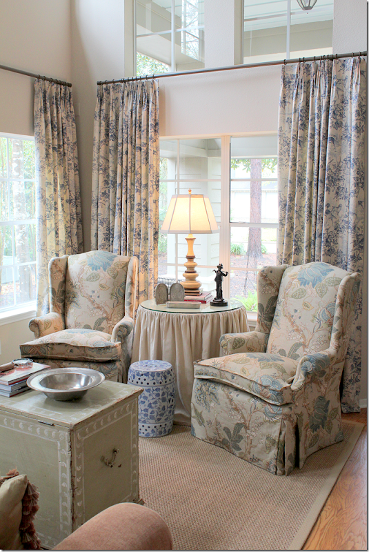
AFTER: Today, the living room has linen curtains, seagrass and the two wing chairs recovered that flank a skirted table. The pine piece is a reproduction French chicken coop – with the cages on the bottom. And I love how she staggered the blue and white garden stool in front of the skirted table!
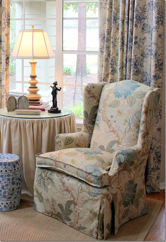
So pretty!!!! To update the chairs, Amanda chose a waterfall skirt with a 1/2” flange welt, an idea she got from Charles Faudree. The gathered skirt is a creamy linen with a hem trim in hemp. Notice the darling painted trunk that she uses as a coffee table.
The curtain fabric is Brunschwig and Fils “On Point” in blue – a favorite of Amanda’s since she started out as a designer in Denver – with Douglas Associates, Inc. The chairs are covered in P Kauffman’s linen “Florabunda” –Seaglass. Amanda wants to someday get a new sofa – but, one thing at a time!!
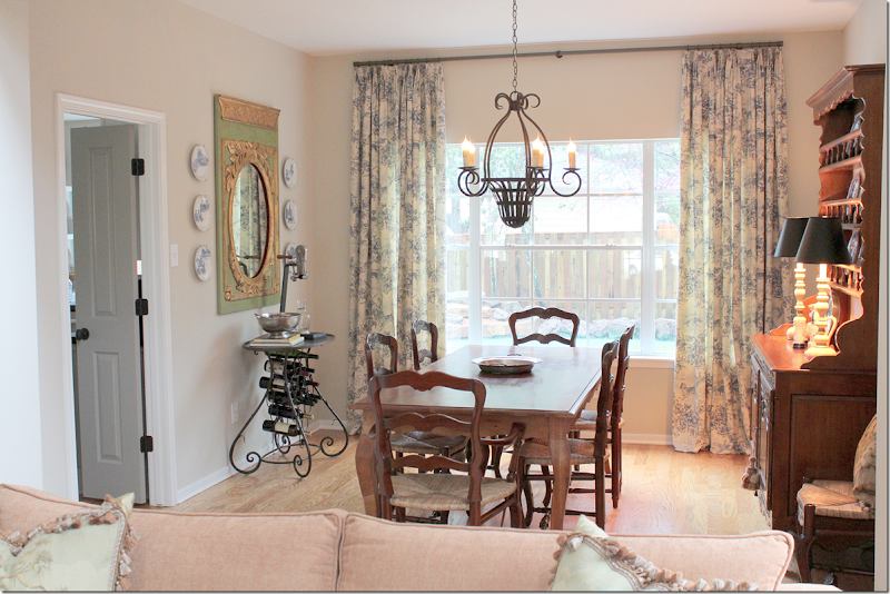
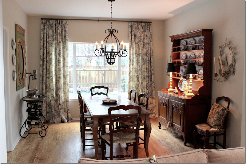
The dining room – repeats the linen curtains. The table, chairs, and buffet are all French. Gorgeous mirror with surrounding plates. Through the double doors is the kitchen and family room.
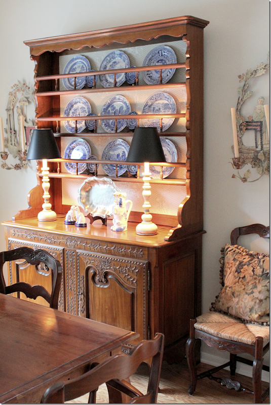
The French cabinet displays blue and white transferware. Charming metal sconces flank it on both sides.
Still on the list – a seagrass rug for the dining room.
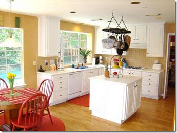
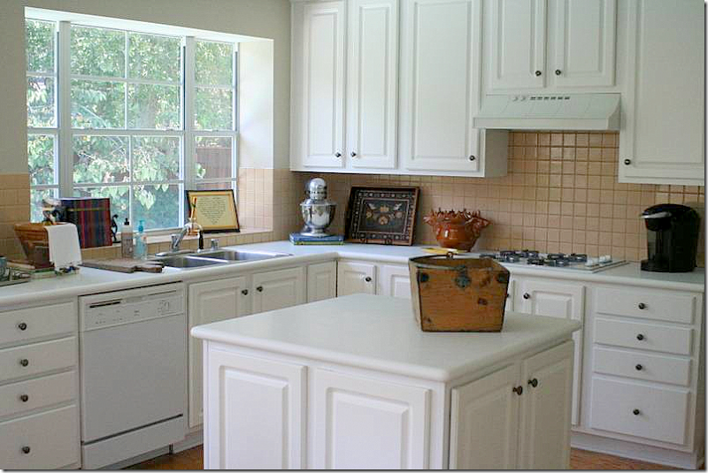
BEFORE: The kitchen had a good layout and a wonderful wide window over the sink that looks onto the back yard pool. The backyard backs up to a natural preserve.
STAGE 1: The kitchen was done in several stages. Here is how it was when Amanda moved in. Corian countertops and beige square tile backsplash. The island was non descript.
The first stage happened before Amanda moved in. The wallpaper was removed and the walls were textured and painted. The pot rack was taken down, as was the chandelier. Left for the time being were the white countertops and peach square tiles.
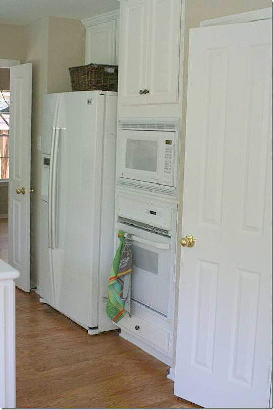
Left over from previous owners - white appliances and a refrigerator that stuck out from the cabinets.
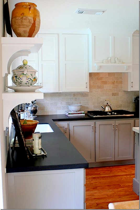
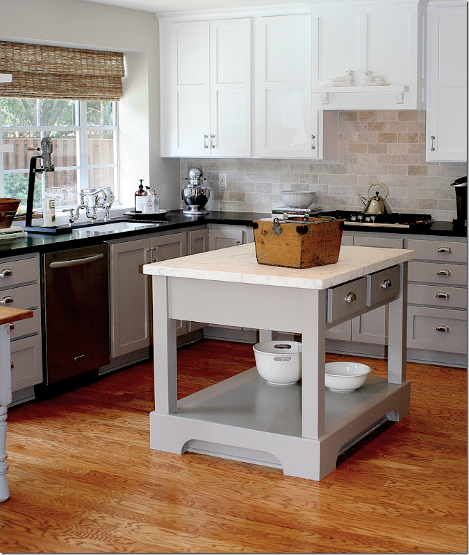
Some time later – the Corian was replaced with honed black granite with a 3 cm square edge. The backsplash was replaced with travertine subway tiles – honed and tumbled. A new Kitchenaid cooktop and dishwasher were installed and a Blanco single basin undermount sink replaced the double stainless sink previously there. The faucet was installed in polished nickel providing the “jewelry” to the room. Amanda says this is one of her favorite items in her new kitchen. Upper cabinets at the window were replaced with bracketed shelves. New Shaker style cabinet doors and drawers replaced the old plastic-covered cabinets. Upper cabinets are white, while base cabinets are Benjamin Moore’s HC-105 Rockport Grey. New Martha Stewart hardware in polished nickel for the doors and drawers came from Home Depot:
Another huge change was the new vent hood.
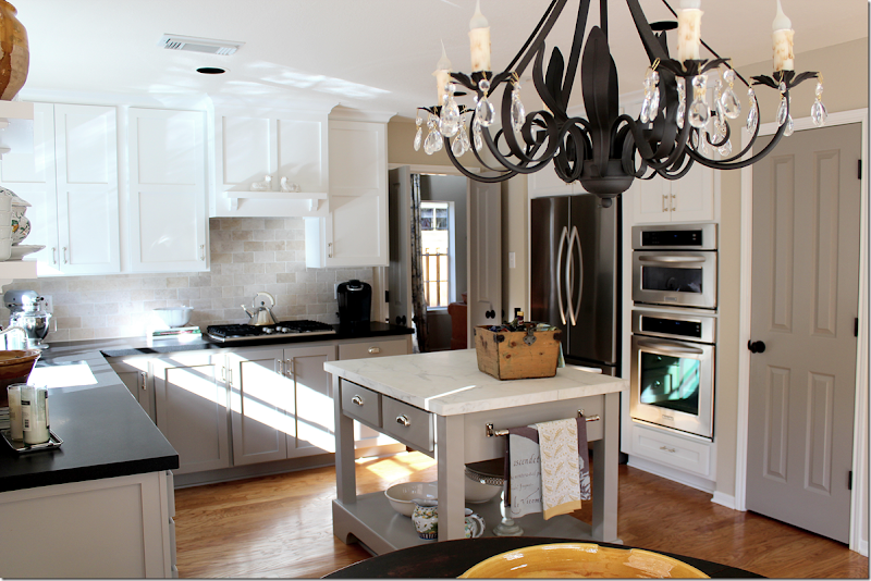
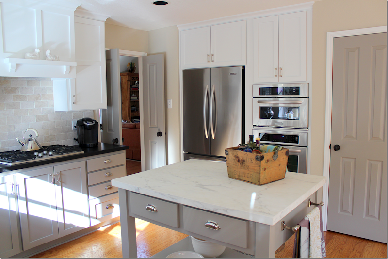
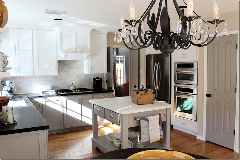
AFTER – in the final renovation stage, a new island replaced the former non descript one. The new island, topped with Calacutta Ora marble is the focal point of the kitchen. The edge is 3 cm square and the marble is honed. Notice the cabinetry above and next to the stove top with its grid-like lines.
A new KitchenAid refrigerator was surrounded by cabinetry to appear built-in, as was a new convection oven and microwave. A towel bar from Restoration Hardware was added to island. All doors in the house were then painted the same BM gray, instead of builders white – as was the island. This is such a great idea – and really makes builders grade doors look so much more important. Through the double doors on the left is the living room and dining room.
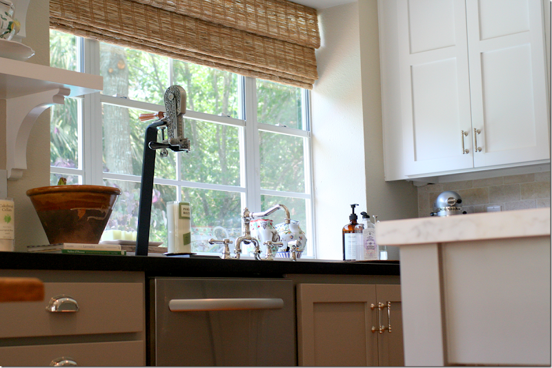
And, as a final touch – new woven blinds were installed in the window. You can really see the beautiful bridge style faucet here.
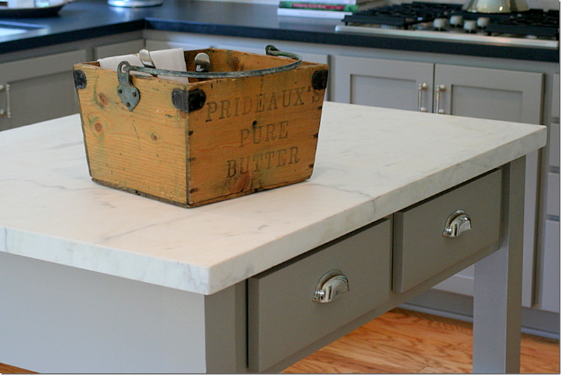
Close up of the Home Depot Martha Stewart polished nickel bin pulls and the Calacutta Ora marble slab.
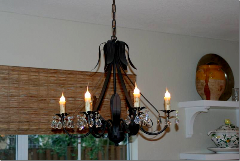
Close up of the new light fixture and the bracketed shelves that replaced the upper cabinets.
Close up of the polished nickel bridge faucet.
A recap: from this…
To this…
To this.
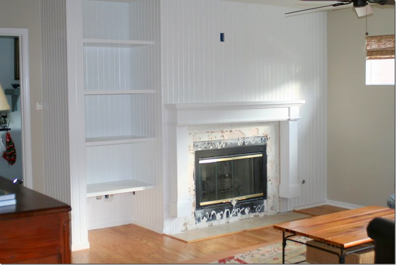
BEFORE: Another big change came in the family room which sits next to the kitchen and breakfast room. The fireplace was a major eyesore.
DURING: The entire wall was paneled in beadboard. A new mantel was built and the tile was removed.
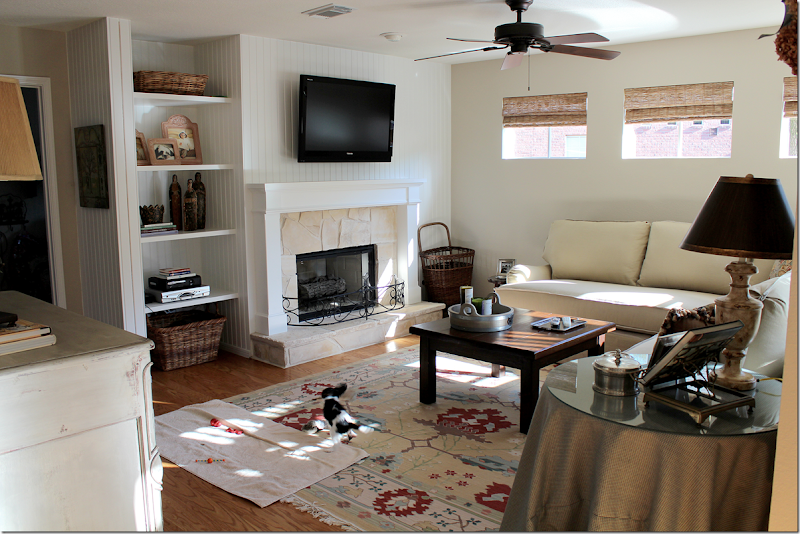
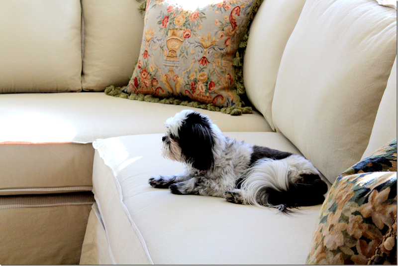
AFTER: the fireplace now has a stone surround and hearth, along with a charming firescreen. A colorful rug from Shades of Light was added (excuse the puppy’s blankie and toys!) – as was a new coffee table, woven shades, ceiling fan, sectional and skirted table. What a difference the beadboard and stone made.
This room is so cute now! The sectional is from Quatrine bought on sale at 1/2 off custom sectionals. It is slipped in linen with a charming 1/2 flange in a contrasting ticking stripe. I love how the same shades are seen throughout the house – it makes the rooms flow into each other.
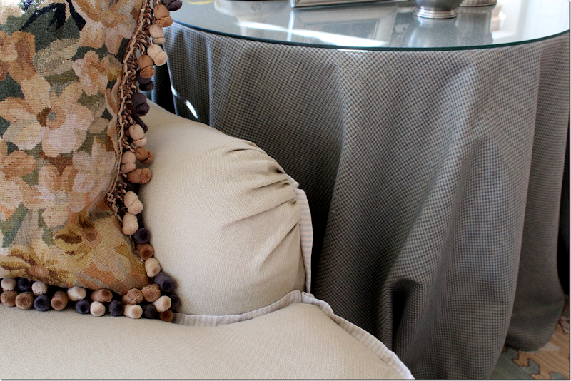
Here you can see the ticking stripe flange. Slipcovers are, of course, kid and pet friendly and are washable.
Close up of the flange detail and the tweed skirted table.
Other changes in the room – as with all other doors throughout – this was painted the same BM gray.
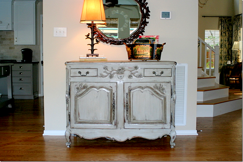
BEFORE: This French buffet was repainted….
And after – it is now painted a trendy gray.
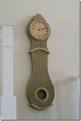
At the stair landing, a painted Swedish style Mora clock hangs – adding a charming touch. Amanda likes to mix styles – Swedish, French, light woods and dark woods. She told me she likes to change things out – to keep it all fresh. My feelings exactly!!!
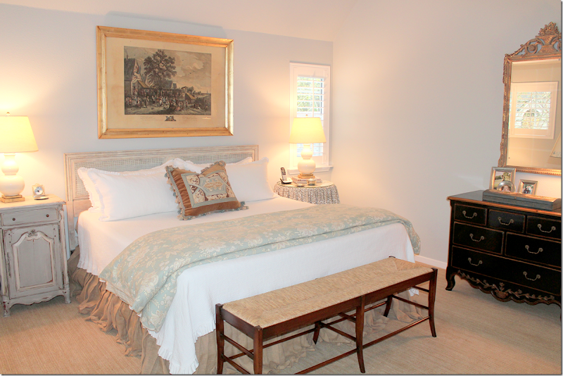
The vaulted master bedroom has a painted cane headboard and a painted French nightstand.
Such a beautiful mirror over the black chest.
The bedding is a combination of white and light blue floral and ticking stripe. The dust ruffle is burlap linen. And no, that really isn’t seagrass – it just looks almost exactly like it!!
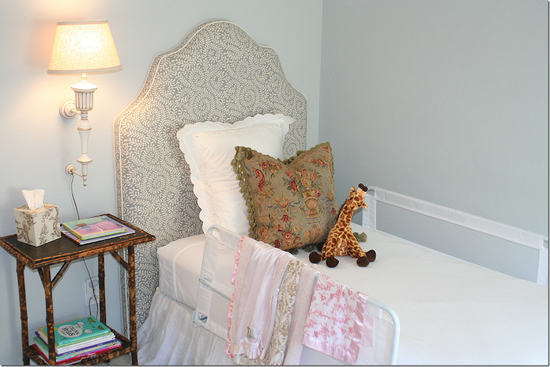
Her baby girl’s room is a mix of new and antique. I adore the headboard! English antique bamboo side table.
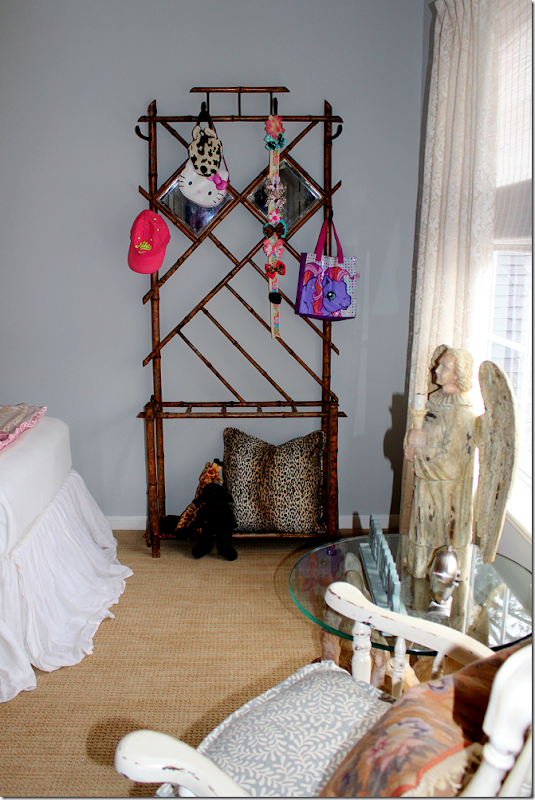
And an antique bamboo hat rack – what a great idea – for purses and backpacks. The curtains are lace.
The rocking chair cushion matches the headboard.
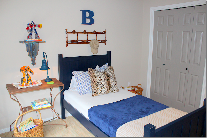
And the little boy’s room is navy and cream. Love the animal skin pillow! Notice his gray painted closet doors.
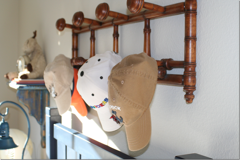
And an antique hat rack for all his hats. I love the way Amanda used the antiques in the children's room – it warms up the decor and makes it all so much more cozy.
Finally, I hope you’ve enjoyed this peek into the Burkett’s family house!! Their King Charles Cavalier puppy hopes so too! To read Amanda’s blog “Unmistakably Blessed,” go HERE.
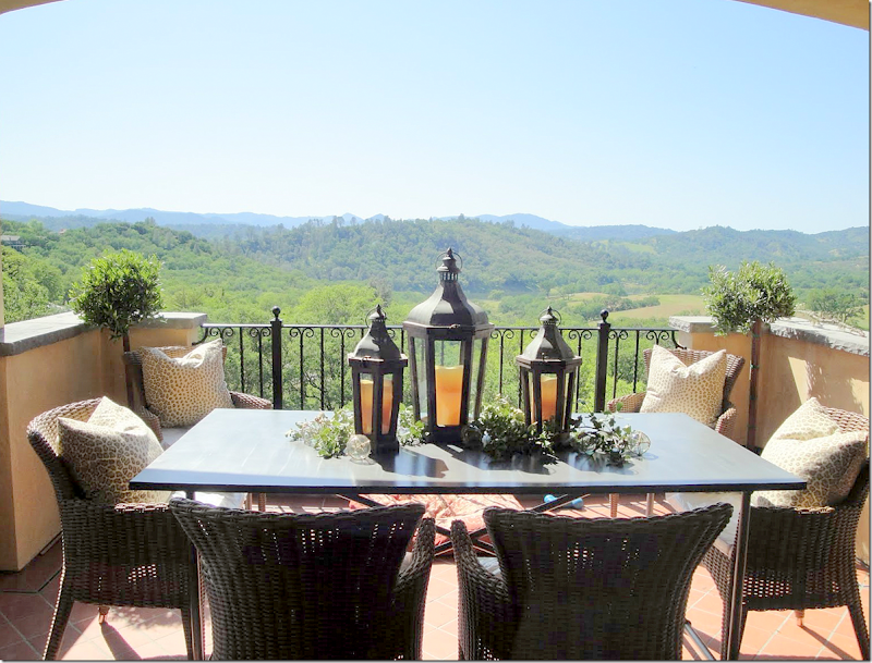
And, we have a winner in the Villa Cantinas weekend giveaway. The winner lives nearby in California and plans to take her quilting group with her! In case you would like to vacation at Villa Cantinas – go HERE to learn all about renting it.
And Cindy Hattersley, the designer and owner of Villa Cantinas would like to announce her new blog “Rough Luxe Perspective” – to read it, go HERE.

