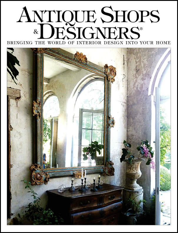
A few weeks ago, I wrote about the latest issue of Antique Shops & Designers magazine. The magazine profiled the wonderful townhouse of the beautiful and gracious Barbara Carlton of Shabby Slips – one of Houston’s prettiest antiques and décor shops. To read the magazine article, go HERE. To read the original Cote de Texas story, go HERE.
Barbara Carlton along with her daughter Renea Abbott opened Shabby Slips in 1992 and it continues to get better and better each year. A visit to the shop is such a treat to the eye. Everything is beyond gorgeous – it’s so hard to leave empty handed. Both Barbara and Renea are interior designers with similar aesthetics, but there are unique differences. Renea doesn’t do only white slipcovers any more, today she mixes in a lot of gray and black and gilt to her sophisticated designs. Barbara admits she still loves white and every place she has ever lived is designed around white linen. She grew up watching old western movies and says that also still influences her decor.
The magazine showcased Barbara’s latest home, a 1963 contemporary townhouse in tony Tanglewood. The photographs were beautiful, but as space in a magazine is limited, you couldn’t see as much of the house as you might have liked. Until now that is! A reader emailed me that she had toured a house for sale and thought I would love. She hadn’t read the story of the townhouse or didn’t connect it with the space she saw in person. I have to say that I love readers, especially those bearing tips like this! A quick note to the listing agent, Rosie Meyers and I was in business. The photographer, veteran TK Images (more about them below) sent over the luscious, huge, HiRes photos of the townhouse and here they are today.
I totally understand why the reader didn’t recognize the house – missing from the magazine due to space constraints are the focal points of the house- the soaring, high ceilinged stair hall and the two atriums, around which the house was designed. My jaw dropped at the stair hall. It is stunning.
The townhouse is just over 3220 sq ft., with 2 atriums, an elevator, and 2 bedrooms/2 1/2 bathrooms. As you will see, it has been completely updated while retaining the original mid-century modern feel.
Enjoy!!!
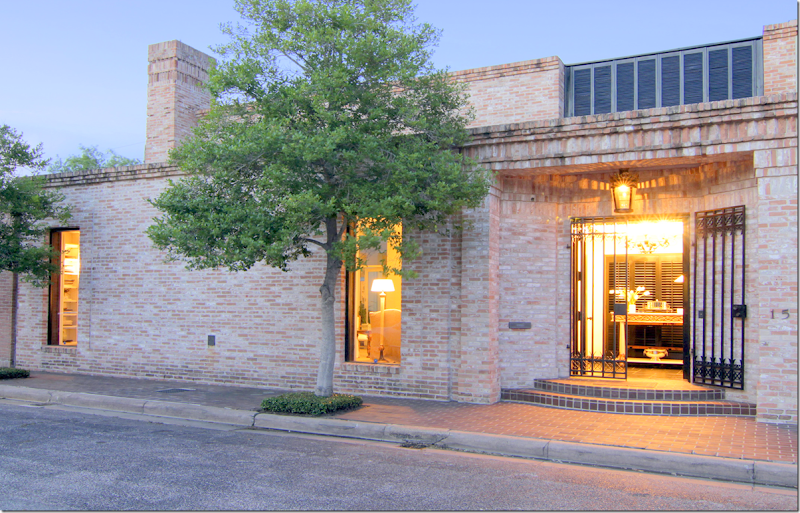
Located in a small gated community, a stone’s throw from the Galleria AND the home of a former United States President (beat that!) – the streamlined exterior says Mid Century Modern.
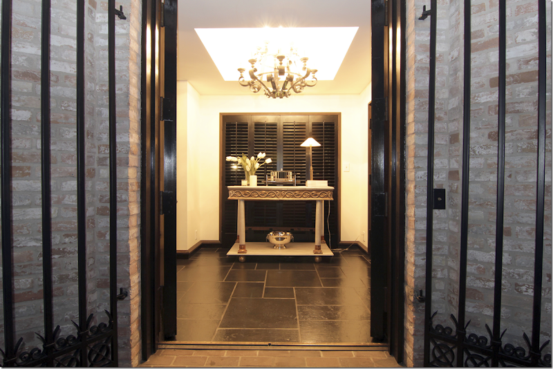
The black painted front doors open onto a space with black slate floors and black baseboards. The walls are all painted white throughout. The antique gilt and cream console rests in front of the black painted shutters – allowing the atrium beyond to be a surprise that unfolds as you walk further into the house.
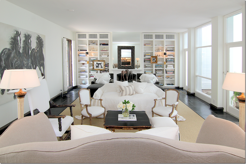
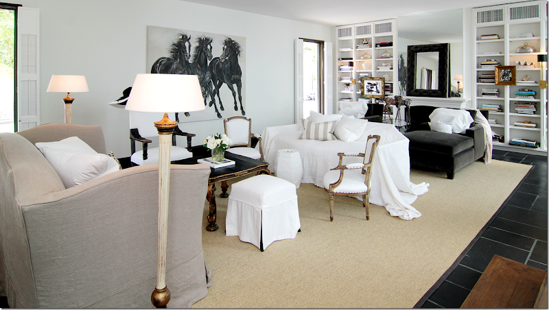
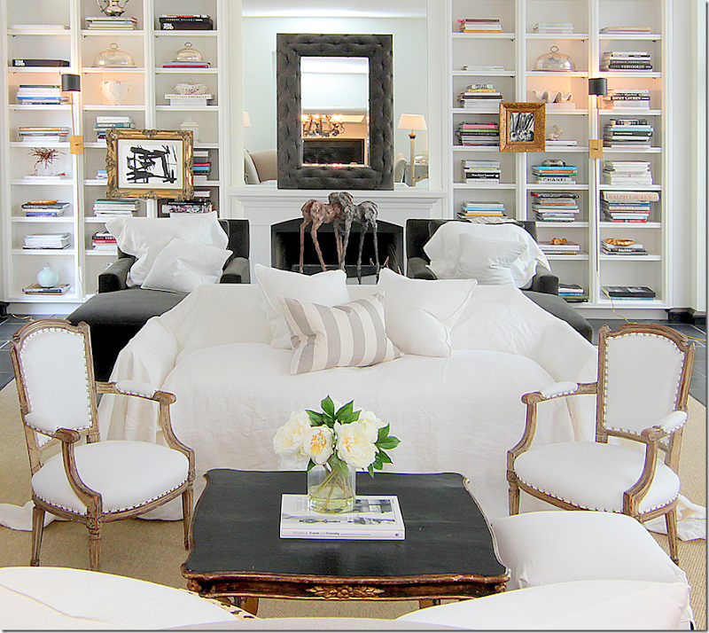
Directly to the left of the foyer is the large, main living room with its black slate floors. The room is large enough (28x18) for two seating areas. The two windows on the left overlook the street, while the row of windows and doors on the right lead to the brick floored atrium. Two sofas, one in linen, another with a white slip casually placed over it, face each other. Towards the back of the room is the fireplace, flanked by bookcases. There, two chaises upholstered in dark gray velvet sit next to each other. A large canvas of horses faces the first sitting area.
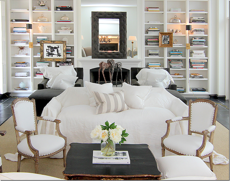
Can I say how much I LOVE the way this room looks? I love the mix of antique chairs, a large Spanish chair mixed with two smaller French armchairs. The silk stripe pillow is the only pattern in the room, which I love. Anchoring the two areas is a large seagrass rug. Notice the beautiful coffee table in black with gilt accents. Love!
A close up view – Carlton says she puts loose slips on sofas and chairs at a whim. I love this look!!!
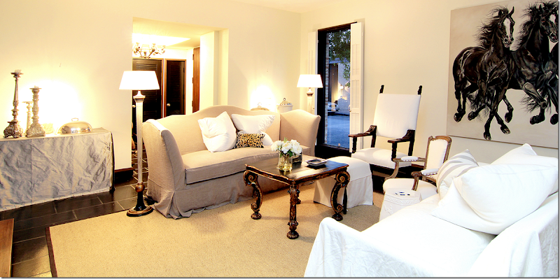
The linen sofa has a scalloped back and arms which creates interest when walking into the room. Here you can see the two chaises that flank the fireplace. Darling little slipped ottoman with black lining peeking out. And I love the two floor lamps. It’s amazing how the large painting of the horses creates movement in the room, isn’t it????
Looking the other way – you can see back into the foyer. To the left is the atrium, and then – you can see the stair hall off to the back left. This stairhall overlooks the second atrium – or the large one. Notice flanking the entrance to the room are two rectangular skirted tables in silk taffeta. On the gray velvet chaises are white linen pillows – Shabby Slips makes the MOST gorgeous pillows!! In between the chaises is a glass coffee table.
And a view of the fireplace with its mirrored mantel, with a second mirror on top of it – is that tufted velvet on the frame??? Gilt framed pictures hang from the bookshelves, while a large horse sculpture sits on the coffee table.
A night view of the first seating area, with the gorgeous coffee table. Notice how pretty the back and the arms of the linen sofa are. I love how Barbara puts the pillows in the middle of the sofa. Much better than having to move them when you sit down – they are already moved!! The silk velvet pillow pops the two white linen pillows.
Now, for the magazine shoot for Antique Shops & Designers, Carlton brought in two club chairs instead of the loose slipped sofa. Plus, she removed the two taffeta covered skirted tables.
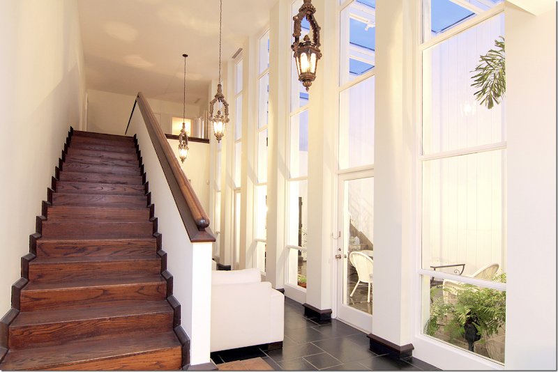
Leading off the living room is the stairhall, with the larger atrium on one side. Is this not GORGEOUS???!!!! OMG!! This room wasn’t seen in the magazine article due to space constraints and my eyes popped when I saw it! Those tall windows, 4 stacked to the ceiling, the antique lanterns, the gorgeous wood staircase – just stunning. Notice the black molding that connects the slate and wood with the white walls. And notice the beautiful railing. It doesn’t say who did the renovation, but they really did a fabulous job. The two bedrooms are both upstairs and there’s an elevator for easy access. Remember the shutters in the entry? They hide this fabulous atrium and stair hall so that it becomes a gift for the eyes that reveals itself the further inside the house you walk. The kitchen and dining room are on the other side of the house and look over both this atrium and the one in the living room. To reach the back rooms, the doors are at the end of this hall. This hall is wide enough to be another furnished space. Here, Carlton has put two arm chairs along the stair wall.
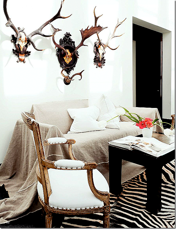
From the magazine Antique Shops & Designers – this photograph shows the stair hall as it was decorated for the shoot. In real life, Carlton actually keeps the two club chairs here – but I LOVE this look, especially with the French gilt chairs and the zebra! On the right is the entrance into the dining room.
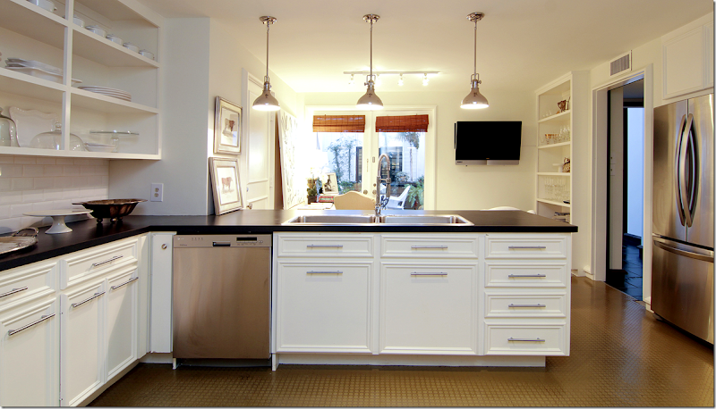
Here is the kitchen and the breakfast room – with the doors overlooking the larger, front atrium. You can see through to the black shutters in the entrance hall. At the open door on the right is the stair hall.
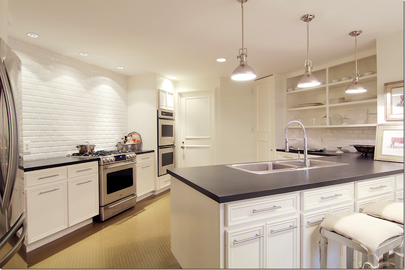
Looking the other direction into the kitchen. All overhead cabinets are gone. Three open shelves hold glasses and dishes. Notice the beautiful wall of white subway tile over the stove and oven. There are two more ovens to its side. Not sure what the counter is – it could be matte black granite, but not sure.
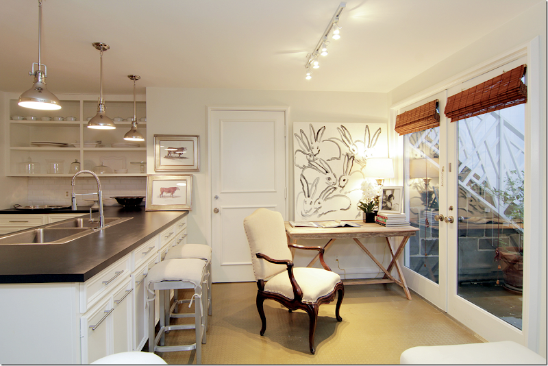
Carlton’s breakfast room doubles as her office. Love the photograph of Jackie Kennedy. And those bunnies! Too cute. Pretty French chair. The door leads to the slate floored atrium. Notice the stairs through the windows? Let’s look at the front atrium, ok?
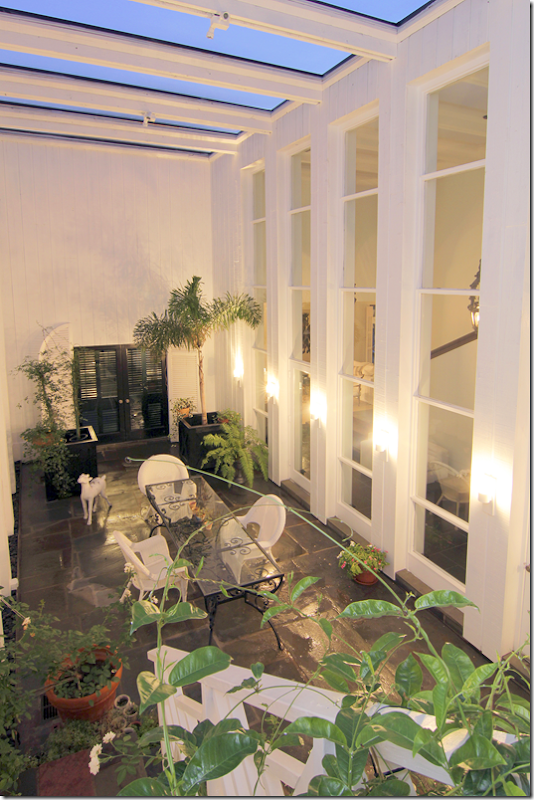
The front atrium serve as an outside dining area. You can see the black shutters which lead to the entry hall. To the right is the stairhall. On the wall inside – you can see the sitting room off the stairs. The sitting area measures 29x7 which allows for the two club chairs. Antique horns hang off the wall. In the atrium, Carlton has black slate floors which make the room seem outside/inside. White wicker and black iron continue the décor theme from the inside. If you had a party – you could throw open all the doors and let the crowd meander from the inside to out. You can see into the living room from the window.
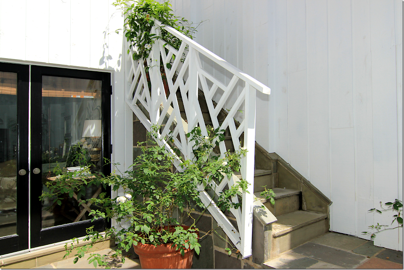
At the back of the atrium is the door that leads to the breakfast room and kitchen. Look at the Chippendale styled stair railings!!! GORGEOUS! The stairs lead to the balcony off the master bedroom.
Looking down from the balcony onto the front atrium. Here you can really see how beautiful the wall of windows is.
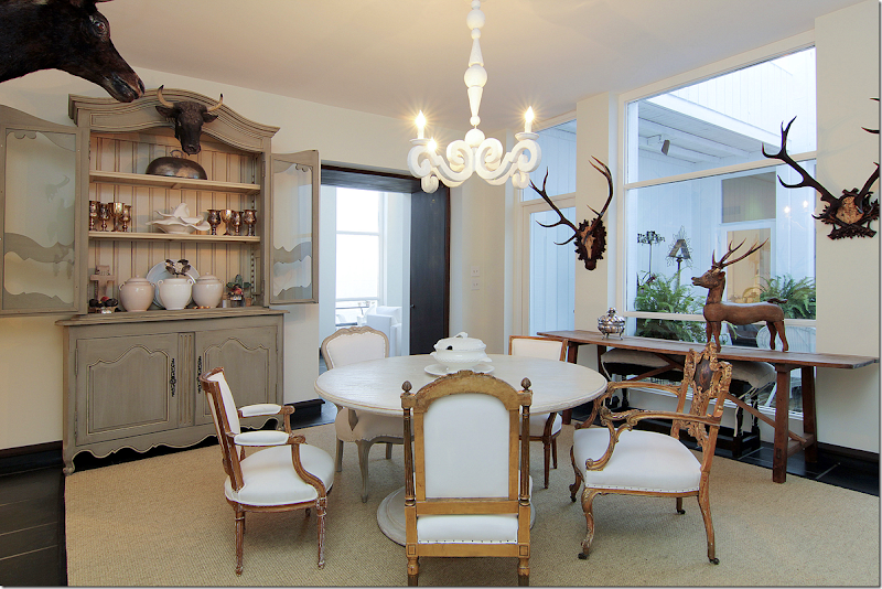
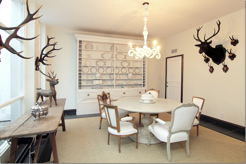
Off the end of the stair hall – the kitchen is to the right, and the dining room is to the left. Through the black doors (notice how the threshold on top of the doors is painted too) is the large dining room (17x15) – which sits across from the second, smaller atrium. This atrium is directly between the dining room and the living room. You can see the stair hall and the windows to the first atrium through the black doors. I love the antique armoire filled with Carlton’s silver collection. Notice how the chairs are all mixed around the dining table. No two are alike. One chair on the right – the gilt one – is beautiful!!
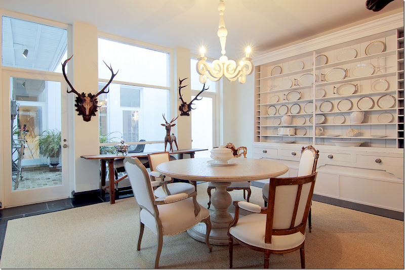
Along the atrium window is a console. Antique horns are on the walls. And along the back wall is this fabulous cabinet filled with white ironstone. The French plaster light fixture is the same one that Sally Wheat has in her dining room. Remember?
Along the wall are more horns. Notice how the floor molding continues up around the door.
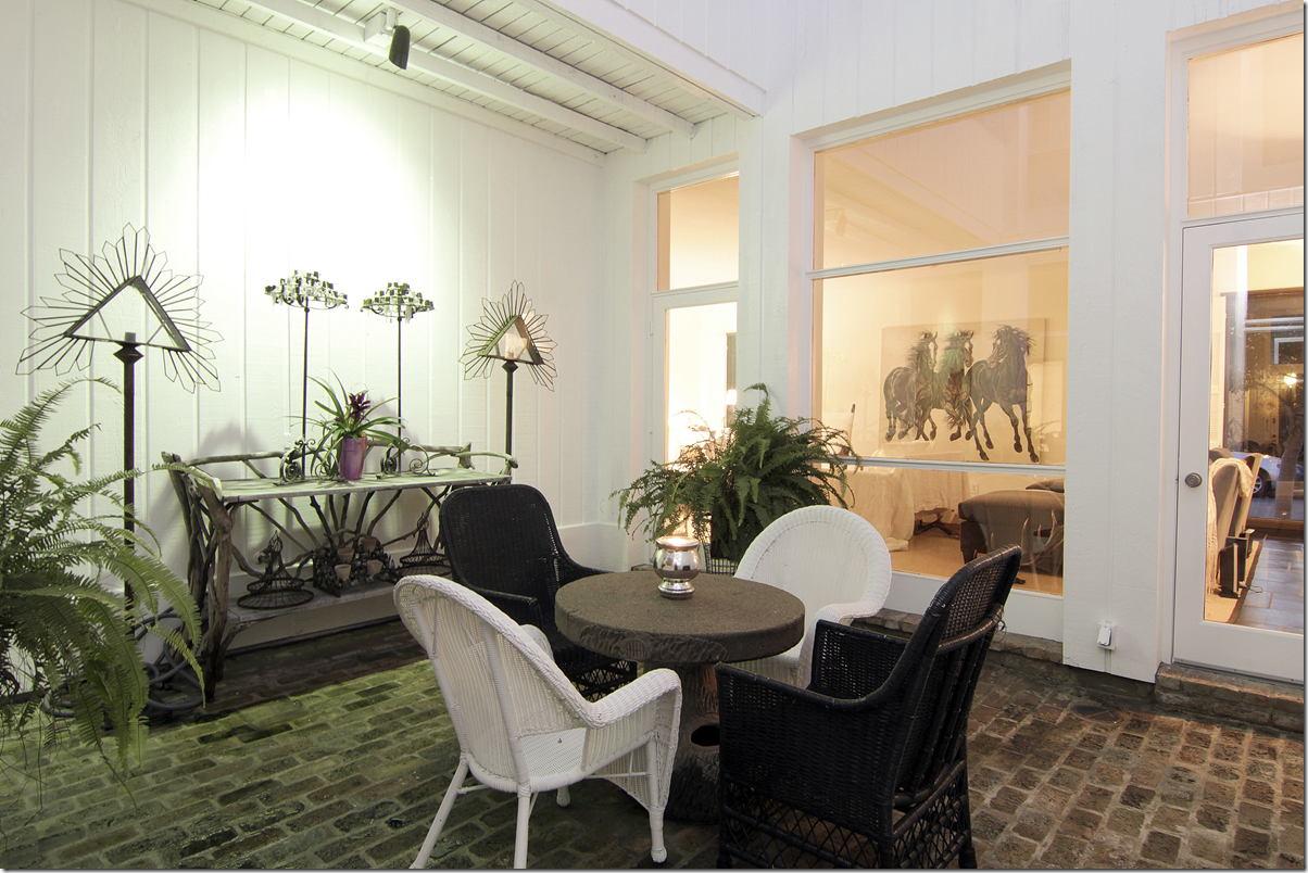
The second, smaller atrium is set up with a faux bois table and black and white wicker – again, continuing the black and white décor scheme outside. The floor here is brick. Against the wall is a faux bois console.
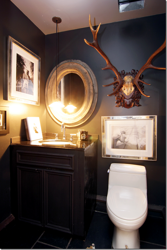
The powder room – I’m going to guess this is off the foyer, with its black painted walls and cabinet. Notice how Carlton hung the pendant low, over the sink. Horns mix with photographs of Marilyn.
Ready to go upstairs?
Any excuse to show the stair hall again! Here, the floor changes to hardwoods which run throughout the upstairs. There are two bedrooms and two baths upstairs.
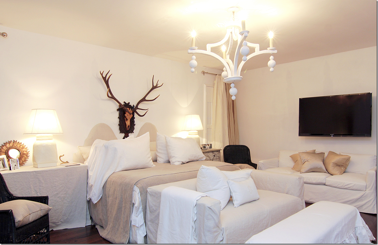
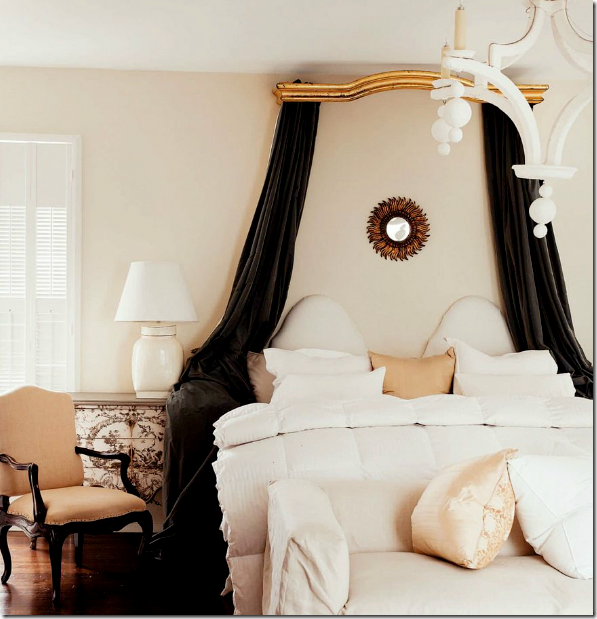
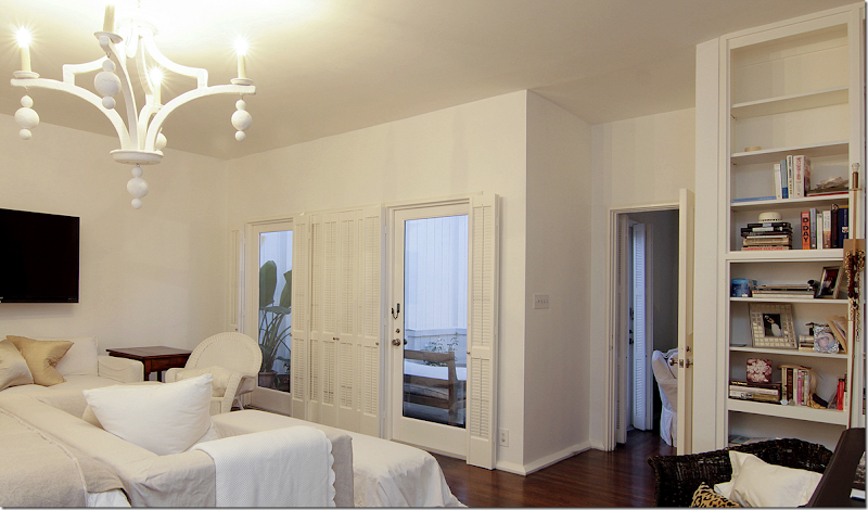
The master bedroom doubles as a sitting area for Carlton. Loose slips cover all the furniture. Another plaster lighting fixture similar to the one downstairs hangs here. Love the black wicker here. And again, more horns, which are a definite decorative element used throughout the house.
For the magazine photoshoot – an antique cornice was brought in, along with more dark, gray velvet. The nightstands were exchanged. It’s interesting to see how different a magazine photoshoot can be from how the owners really live. So much more attention is paid to the décor! I do really love this canopy though, and wished she had kept it!!! It adds a romantic touch to the room.
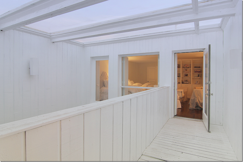
More built in shelves here. Through the glass you can see the outdoor balcony that overlooks the large atrium, which the Chippendale styled stairs lead to.
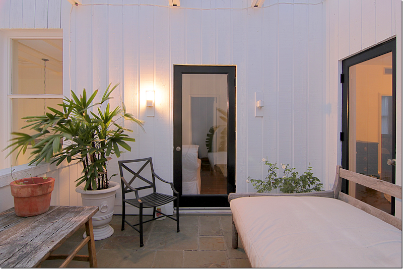
The master bedroom is over the kitchen area. Here you can see through this door the landing off the stairs. This balcony overlooks the large atrium. There’s a day bed out here and if I lived here – I would sleep here on nice nights!!!!
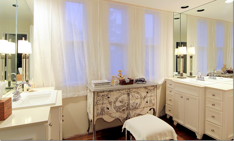
The master bath vanity area has his and her sinks in cabinets that look like furniture. Sheer curtains cover the windows, while a painted chest acts as a vanity. Cute!
A view into the bathroom with its tiny mosaic tiled floors – very mid century modern.
Whoa! I love this closet! First, I like how Carlton wears mostly black or white. Love the stole hanging. The mirror at the end is a great tool to make the large closet even larger. This door leads to the balcony over the smaller atrium. I wonder if this floor is original to the townhouse? Interesting.
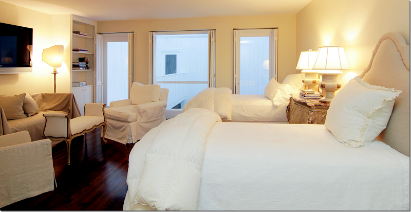
The guest room has twin beds and its own sitting area. Through the windows is the balcony that is over the smaller atrium.
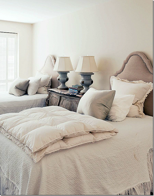
For the magazine photoshoot – more attention was paid to the bed pillows, of course. Plus you can see the beautiful marble topped night table.
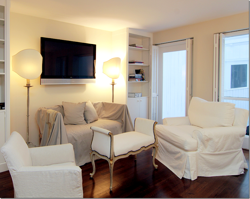
Twin bookshelves become an alcove for the bench. Love that white settee with gilt accents – beautiful!!! And those shades really made the lamps so important. What a difference they make over just a regular round shade. They look like sculptures now.
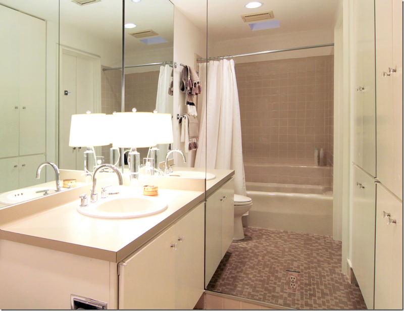
The guest room bath. This was probably updated some but the mid century feel was left. The cabinets look streamlined and original. Carlton probably just added the mirrors and new sink, countertops, and hardware.
The balcony that leads from the guest room over the smaller atrium.
I hope you enjoyed this extended look at this wonderful townhouse since we only got a short look before! To read the story in Antique Shops & Designers, go HERE. To reach Rosie Meyers about this house or to see the listing, go HERE.
A huge thank you to TK Images for letting me use their beautiful hi-res images of this house! TK Images is quite a company. They take pictures of every kind – and they specialize in real estate photography. The owner, Julie Pistone Krampitz, was once a real estate agent herself and she truly understands the art of taking photographs of the house. TK Images has a team of photographers and editors who use wide angle lenses and lighting to take really great interior photographs. On their web site, they have a check list that shows what to do to get a house ready for a shoot.
Here is the list – which I think would be useful for anyone taking pictures of their house:
- Turn on all lights and lamps. Replace burned out light bulbs
- Turn off ceiling fans
- Check house for cleanliness
- Bathrooms - put away toiletries, toothbrush, toothpaste, towels, shampoo, soap
- Kitchen - remove dishes from counter, garbage from trash can, clutter, magnets from refrigerator, and pet bowls
- Remove clutter throughout the house
- Put away high chair, booster seats, toys, etc.
- Store all workout and medical equipment
- Make sure items stored under beds are not visible
- Put pets away, out of photography areas
- Have the yard mowed. Trim trees. Make sure leaves are blown.
- Put away all outside trash cans, recycle bins, water hoses, security signs
- If there is a security fence around pool and you do not want it seen in photo, please remove security fence before photo shoot. Remove pool equipment from pool
- If homeowner does not want child's name or personal photos shown, please take down before photo shoot
- Take down holiday items so photos are not dated
- For dusk shoot, please make sure there is a water hose at the property
While some items on the list may seem obvious, I can’t tell you the number of houses on HAR, and other real estate sites, that look TERRIBLE. Hooked on Houses often shows real estate listings that are so truly bad – they are funny. Why would anyone even look at some of these houses to buy? A professionally taken photoshoot for a real estate listing is vital.
TK Images have won awards for their image and it shows. It makes such a difference to show your house to its best advantage when either selling it or when showing it to an editor for publishing.
To go to TK Image’s web site, go HERE.
AND FINALLY – WOW. THAT’S ALL I WILL SAY!!
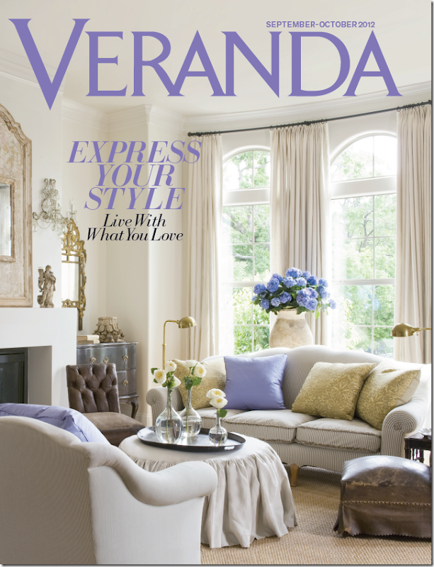
Well, ok, I’ll say a little more: A birdie sent me this preview cover of the new Veranda. OMG!!! I want to crawl in this picture and live in it for eternity, as long as I can have those hydrangeas, along with the purple title!!!
Can you guess whose house this is???
The issue will be out soon. Soon. Start looking for it in a week or two.
OK, I do have to brag, I have those same sconces. Hehe.

