The last post on Jane Moore’s townhouse in Veranda garnered many comments and I thought it might be interesting to address two of the more popular topics discussed. First, there were some questions about how to properly hang a large tapestry like this one which Jane first used in the family room in her former house.
Once Moore moved to her new townhouse, the tapestry was one piece that passed her editing process. Who can blame her? This piece is gorgeous and is probably the focal point of her public spaces. Actually, gorgeous? It’s stunning.
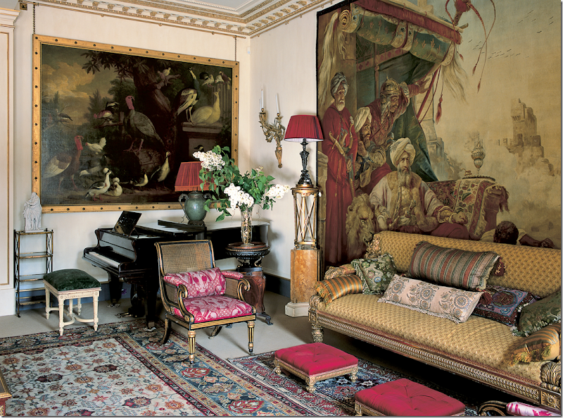
The interest in the tapestries got me thinking of how many other designers in Houston and elsewhere use these large tapestries in their design.
But first, a quick and very simplified history. While fragments of tapestry have been discovered from the 3rd century BC, it wasn’t until the 15th century during the middle ages that tapestries became more widespread. Portable, they were used mostly to cover and insulate damp stone walls of castles and the houses of the upper class. Additionally tapestries protected beds against drafts and were used as internal doors to stop cold winds. These tapestries were quite large and required big looms which in turn required large work forces to produce. In short, tapestries became an important and vital commodity. During the 1500s Flanders was the primary place tapestries were made. They were quite costly and only royalty and the wealthiest and most privileged owned one (which is still true today!) Another place that used tapestries were churches, which brought them out on certain holidays and occasions. These tapestries most often depicted biblical scenes.
The earliest tapestries were the millefleurs – here one person or a small group of people stood before a background of plants and flowers. Next, battle scenes and architectural scenes became popular. During the late 16th century – people commissioned themselves into their tapestries – showing them hunting or their peasants at work (sometimes the patrons would be disguised as the peasant.) Following, the Verdure tapestry came into favor. This rich, green plant and floral background showed large bucolic estates in the foreground. By this time, northern France and Flanders were the two major centers of tapestry making along with Les Gobelins in Paris, which was established in the late 17th century.
The industrial revolution and the new mechanical Jacquard looms brought about huge changes in traditional tapestry making which had became prohibitively expensive. Flanders was the center of the Jacquard looms and these tapestries produced here are still considered the finest Belgian export.
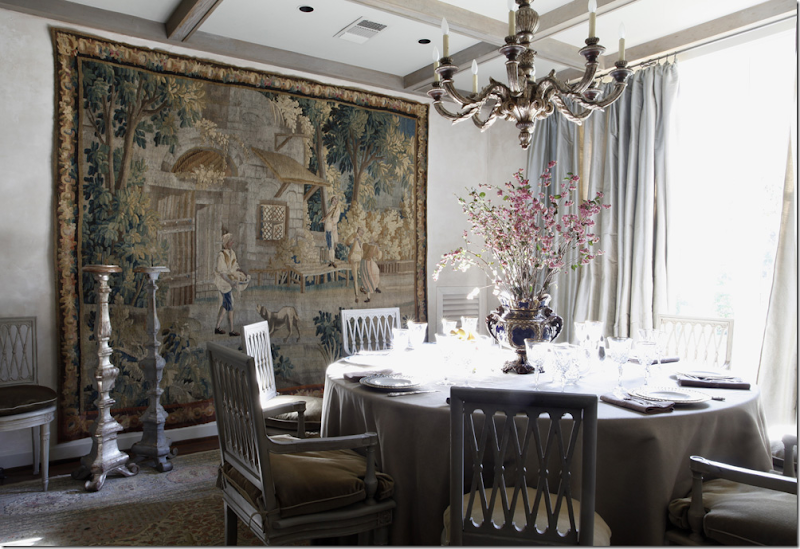
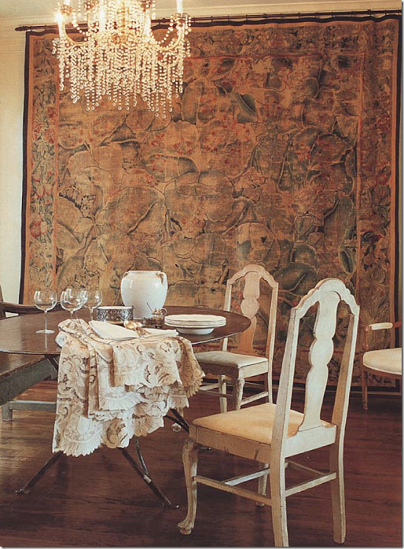
Here, a large antique tapestry is used in this Houston dining room decorated by Eleanor Cummings and Babs Watkins. Again, what a focal point! The thick texture of the tapestry plays off the silk taffeta on the window and the skirted table. Just beautiful!
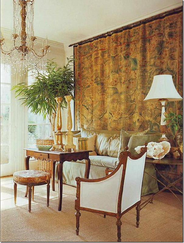
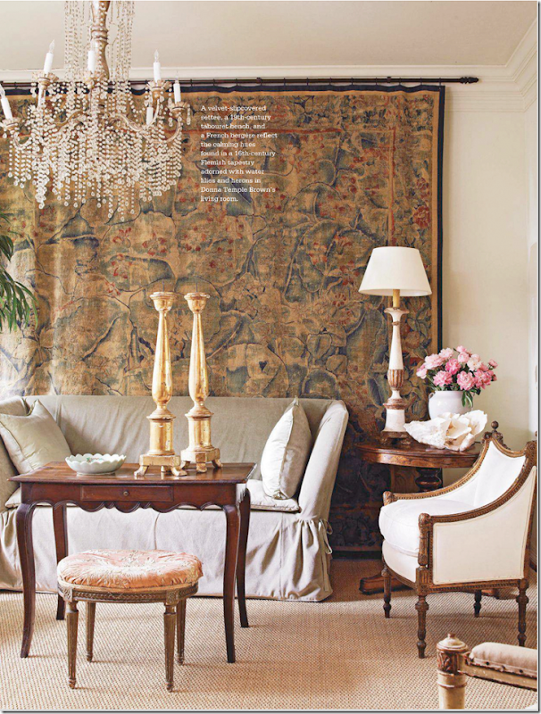
Popular Houston antique shop owner Donna Brown of The Gray Door used this unique tapestry from the 16th century in her townhouse. She changes up her furniture arrangements a bit, as you will see. Here this area is used a living room. She has two matching chandeliers on both sides of this large space. Isn’t the chandelier gorgeous? It’s like a dripping waterfall of diamonds.
A head on view of the 16th century Flemish tapestry which depicts water lilies and herons. I’ve never seen a tapestry like this before. It is quite large and is probably one of her most prized possessions.
And here, she uses this same space as a dining room. Great juxtaposition of fine and rustic antiques, metal and crystal.
England? NO, it’s Santa Fe designed by Houstonian great Beverly Jacomini. Besides using a plethora of Bennison, she also used a smaller tapestry. Love this!!!!
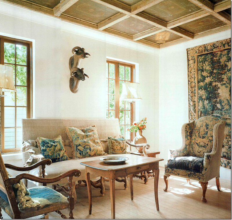
In this charming vintage San Antonio, Texas house, a large antique tapestry hangs in the living room of designer Linda Keenan. Another tapestry covers the wing chair and the French chair. All the pillows are tapestry remnants. Too much? NO!!!!! This is beyond gorgeous in my opinion! LOVE!!! The blog Ivy Clad wrote a great story about this beautiful house HERE.
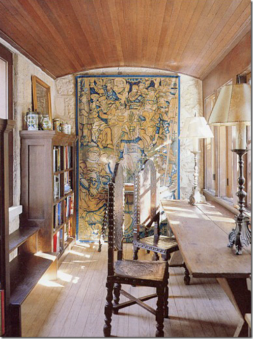
More? Another tapestry covers a stone wall in the study.
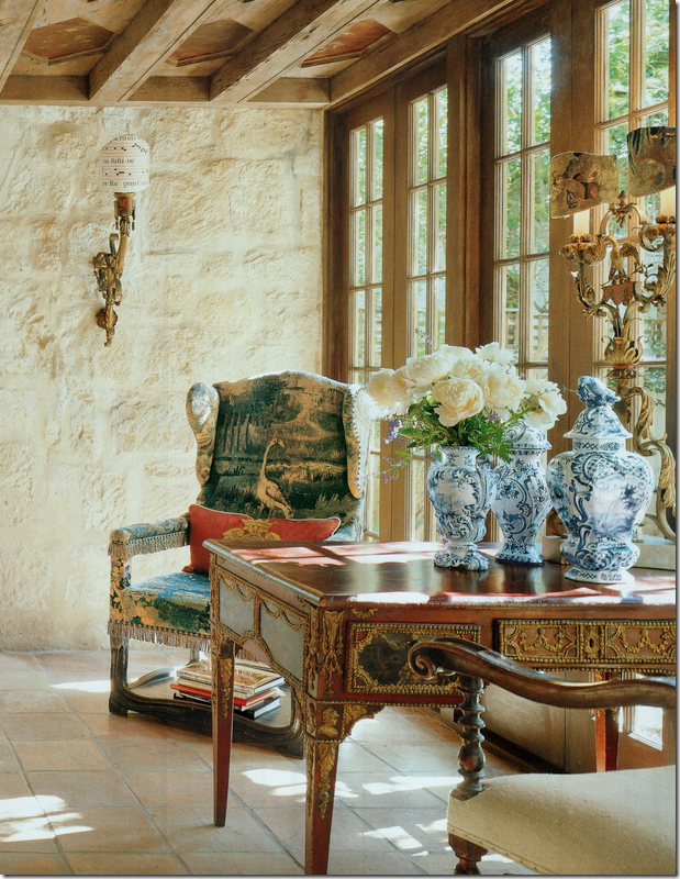
And, just one more. Another wing chair covers an antique wing chair. And notice her Delft jars – whoa. GORGEOUS!
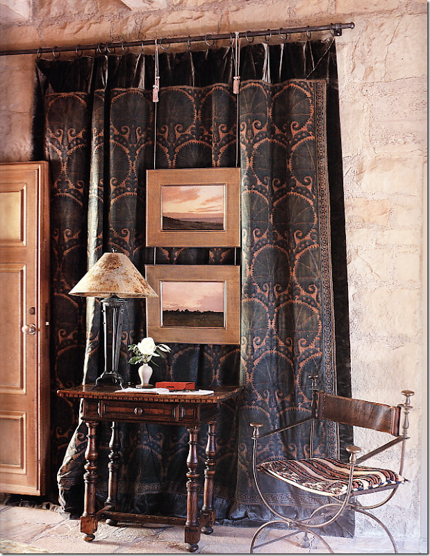
John Saladino is the king of using tapestries. He usually layers his with mirrors and art work on top of them.
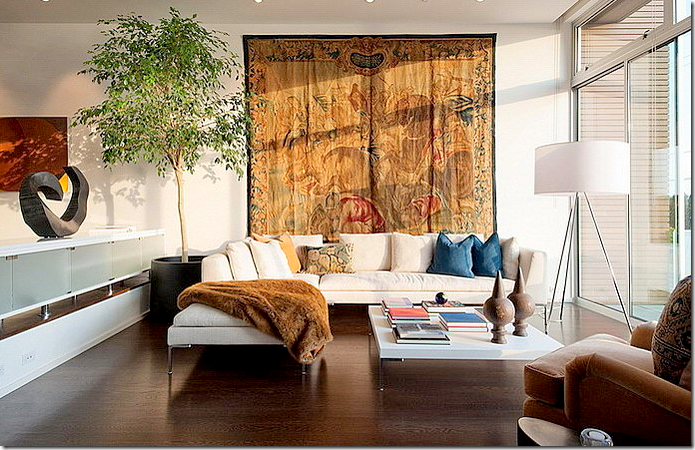
Here a very contemporary setting with an antique tapestry.
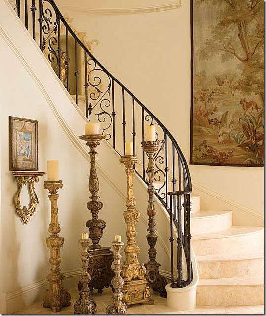
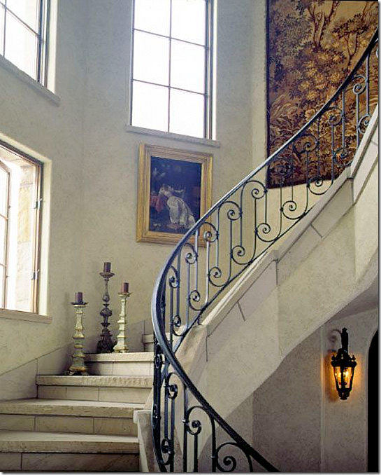
Here, in a Dallas house – a limestone staircase and an antique tapestry. Stairs are a popular place for one.
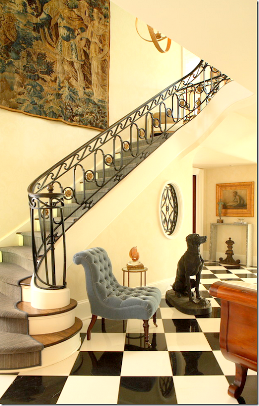
Another stairway, but doesn’t the runner’s color fight with the tapestry? Strange choice.
Another stone stair and tapestry: made for each other
Again, a gorgeous tapestry, but the collection of prints takes away from the beauty of the piece! Why?
I think the wall color and furniture color is too matchy matchy for this tapestry. Again, it takes away from the piece – makes it just blend in instead of standing out!
A vivid tapestry which covers almost the entire wall.
Can’t afford a pricey Belgian Verdure? Why not hang a needlepoint rug instead?
Or hang an ethnic tapestry? I love this bedroom – the spread, the pillows, the tapestry.
Or hang a new Suzani. Ebay has a lot of them for sale for very reasonable. You don’t have to get a bright one, there are some that are more pastel. This is from an interesting blog HERE. Looks very Kathryn Ireland-y with the red lampshade.
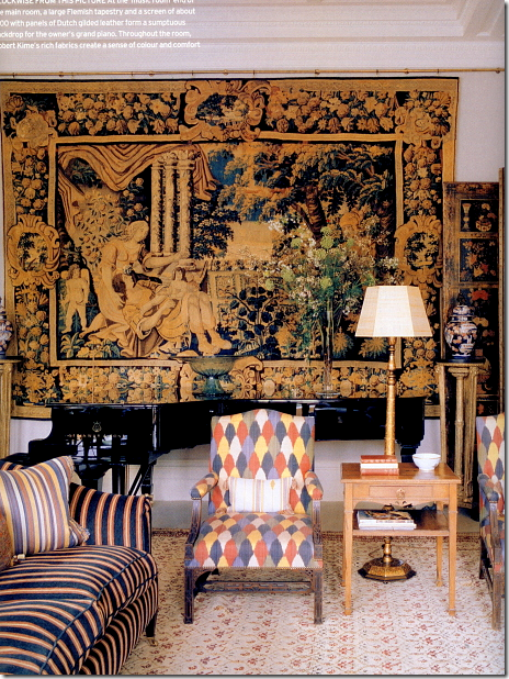
OK, someone asked for some Robert Kime. Here you go!
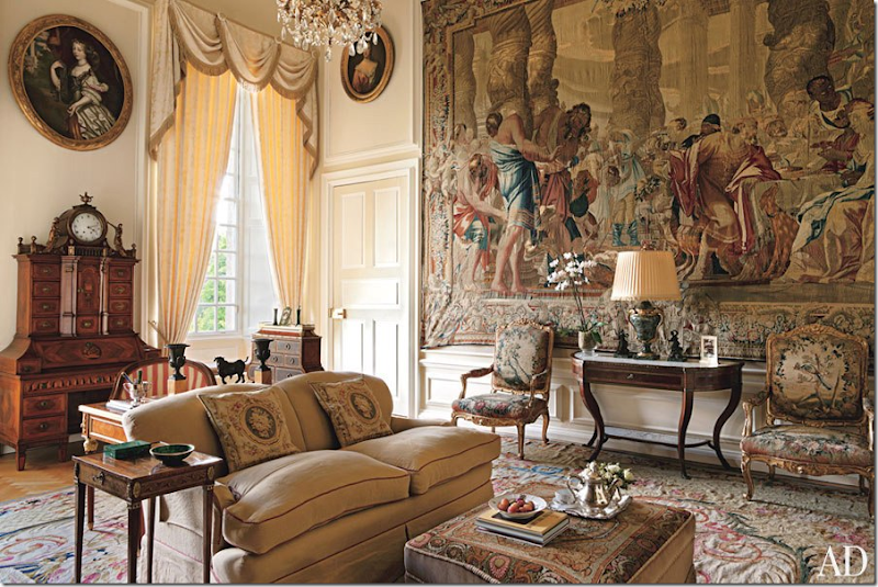
It seems like England has a lot more houses with tapestries than the U.S. Look at this one! Amazing! But, I’m afraid this is way too busy for Houston decorators. They prefer the much quieter tapestries – less detailed.
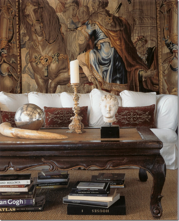
One of my favorite photographs ever! Notice how the slipcover makes the tapestry just pop out against the white. The brown table echoes the browns in the tapestry. And I love the way the coffee table is accessorized. It’s done without using anything trendy. Diandra Douglas.
The designer Suzanne Kasler uses a lot of tapestries. Here, she puts a long one behind a cabinet.
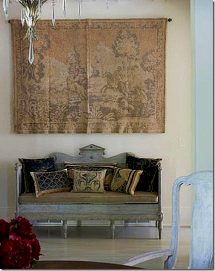
At this entry hall, she used an antique Swedish sofa underneath a tapestry.
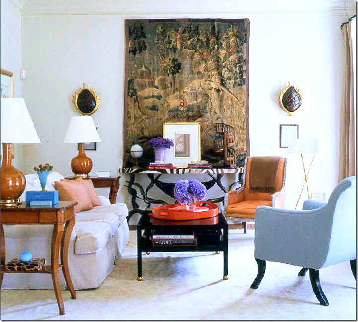 |
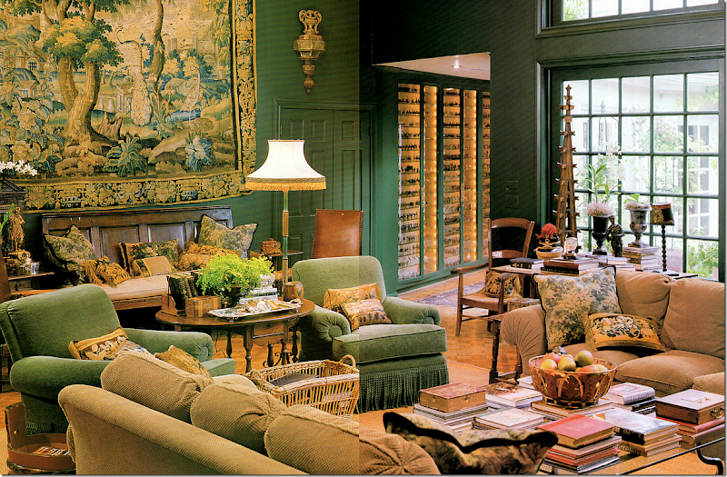
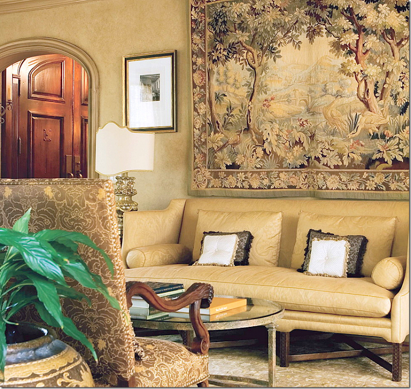
In her former family room, this large Verdure tapestry is the focal point. Love this room. The lamps – that orange leather chair, the zebra console, beautiful.
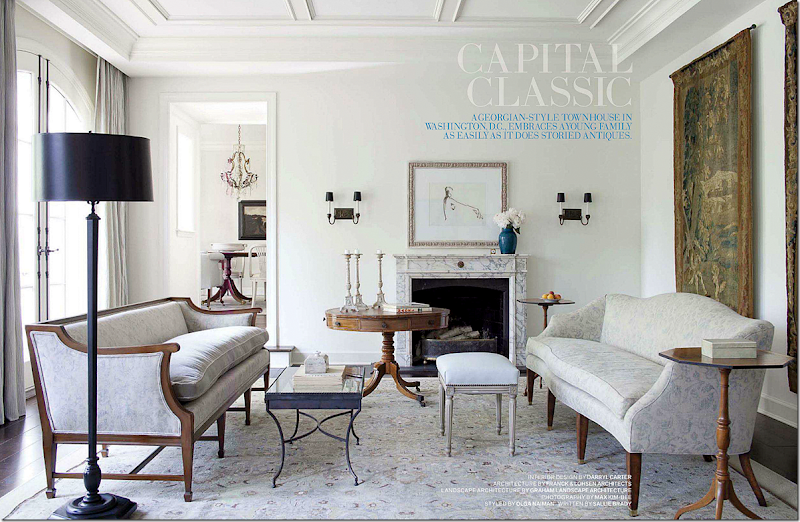
Another favorite room – by Darryl Carter. He uses two matching tapestries! That is a first! Notice how the blue of the vase picks up the exact blue in the tapestry. That vase wasn’t chosen by chance.
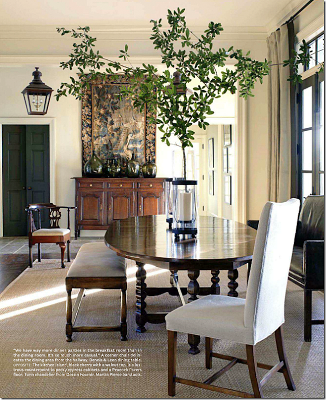
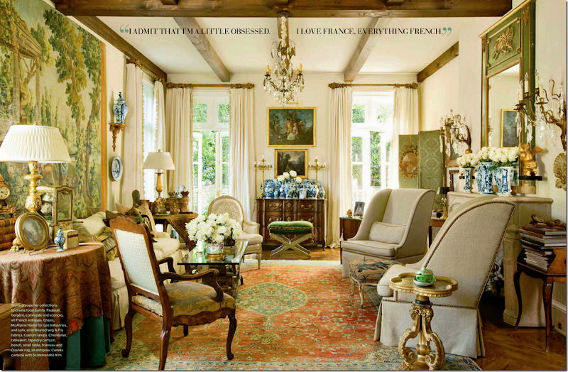
All antiques and antique reproductions but this quiet space has a modern quality to it. Large tapestry hangs over a French buffet.
Kathryn Ireland used a tapestry with reds and browns to go with this dining room. Notice the white walls make the tapestry pop. Any other shade and it would have become muddled.
An alternative to pricey tapestries are the cartons or cartoons that were used the create the tapestry. It’s really a painting, but somewhere there is a tapestry that looks exactly like it. Cartoons can be less expensive than an actual tapestry, but they are not cheap. Another room I love!
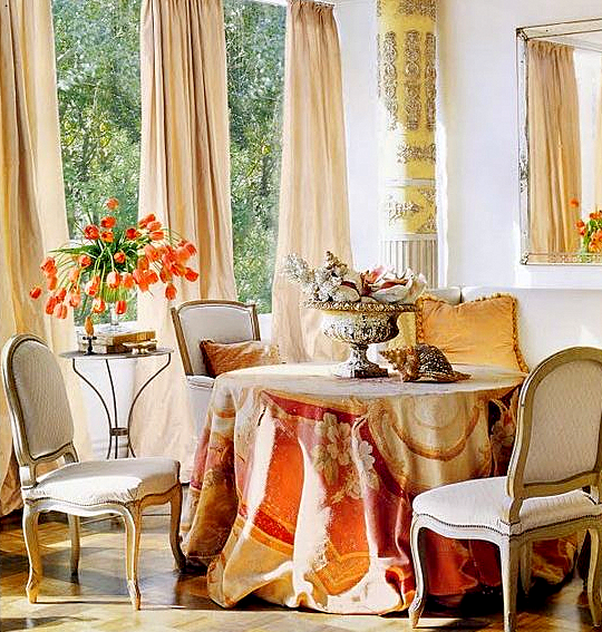
Houstonian Kay O’Toole placed an antique tapestry on her table. One of the prettiest Veranda covers ever! I love the styling of the photo with the soft peach taffeta curtains, the orange tulips, the pink shells. Gorgeous!!
Can’t afford a tapestry at all? Do what I did! Buy a pillow created with tapestry remnants. I made those two pillows backed with brown velvet on the chairs. Forgot about those burned out light bulbs!!
But the beauty on the sofa – with antique gold trim – came from Maison Maison. She used a much deeper brown velvet – I should redo mine that way too. I will say, that these remnant pillows aren’t cheap either. You can spend anywhere from $500 to $2000 depending on the size. That’s why I made those two pillows myself. I found the remnants at antique mall for dirt cheap. Maison Maison is now located in Jane Moore’s former space. They have great pillows. Another place that has the best pillows – new, not old, is Boxwood. OMG – the best pillows ever!!! So big, so stuffed with great down. Fabulous.
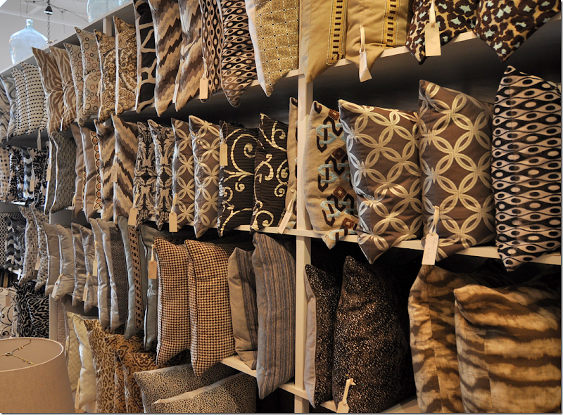
These are just Boxwood’s brown pillows – to give you an idea. OK, back to tapestries.
We had the discussion on the last blog – if you bought a new repro – could you make it look old? I thought maybe you could just get it wet and put it out in the sun for a month or two to try to fade it. Popular commenter Miss Charlotte thought that was a bad idea. I guess if you pay a lot for a repro, it wouldn’t be worth taking a chance on fading it. Any ideas of how to make a new tapestry look old?
This company HERE looked like they have good reproductions, but even so, they run from $1,ooo on up. Even owning a reproduction is not cheap!!! Nothing has changed in the tapestry business during the past five centuries. Only the very wealthy and royalty are able to afford one!!!!
On 1st Dibs, I went looking for pretty ones that were inexpensive. SNORT. This beauty was one of the cheaper ones at $9800! HERE.
Another one just under $10K HERE. The rest were outrageous. Some were over $50K!! I will say this though, I usually ask if the 1stDibs dealer will give a discount and most do. So, if you are buying online – don’t be afraid to ask, all they can say is NO!
About the question asked on the comments on how to properly hang a tapestry. People were worried that they way Jane’s was hanging was incorrect and would pull the threads out. Someone said the proper way is to attach a board to the wall and then attach the tapestry with velcro. This opinion was seconded. But, another person chimed in and said there were special rods made for tapestries that alleviated the pulling of the threads.
If you do buy one, at these prices I am sure a professional hanger would come to the house to properly affix it.
Next most commented on the Veranda townhouse was the kitchen!!
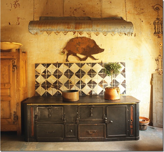
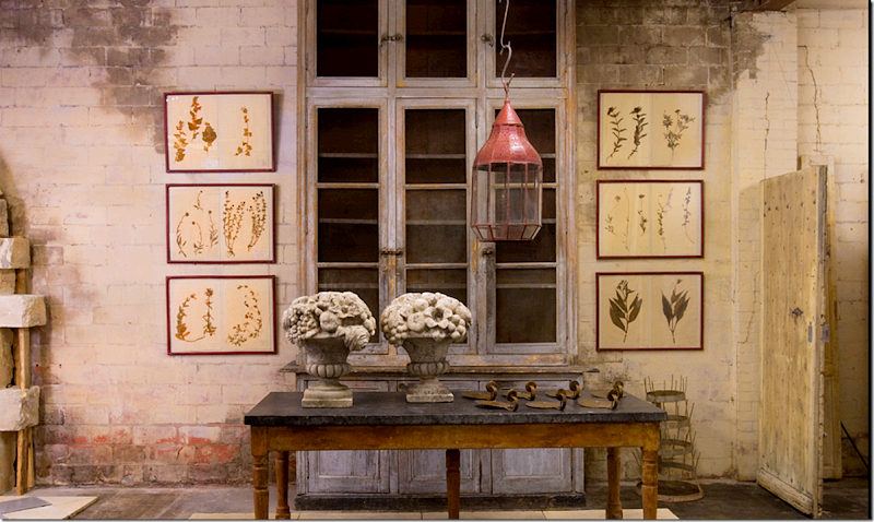
Many people in Houston are creating unusual kitchens that look more like one found in Provence than in Texas. Thanks to Chateau Domingue who import architectural and decorative elements – it’s easy to find antique tiles and stones for a backsplash or a floor or countertops. Look at this charming range they imported! Designers can cull together different items from their inventory and create a space that looks and feels as if it came from the other side of the globe – because many of the building parts did. Chateau Domingue has been a large influence over designers in Houston – the ease of shopping on West Alabama and the abundance of their supplies adds to this look becoming more popular.

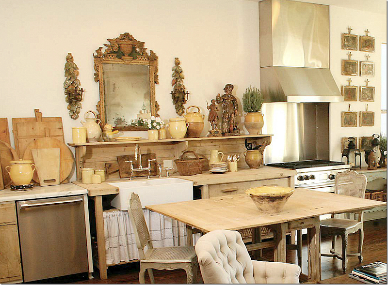
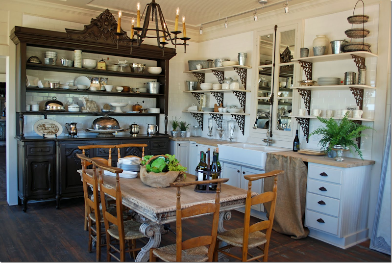
There were quite a few comments about Jane Moore’s kitchen which is unfitted. The cabinets were removed and she installed an antique architect’s desk to house her sink. A marble counter houses her dishwasher and the range is freestanding. There were those that loved it and those that questioned the ability to cook in this kitchen. Well…as a single mother with grown children, I doubt she cooks up a storm in here. But why not? She probably uses her dining table as a counter. Her pots are in the basket – just like they would be in a drawer. I don’t see why cooking would be that difficult here! But what do I know – I don’t cook. What I DO love is how the woods are all the same tones – the desk, the table, the chairs – which are from Found For The Home (who have a new address btw at 3433 West Alabama, Suite B.) Even the bread boards pick up the limed wood look. The mirror reflects back the family room with its own limed woods of the etagere and the old doors and the yellow ware pots.
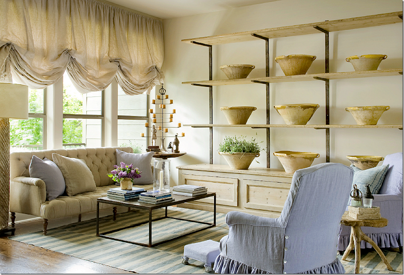
The adjoining family room picks up the same woods as the unfitted kitchen – in the etagere, the small wood table, the color of the linen, the old doors (unseen here) and the yellow ware bowls. Even the lamp picks up this color. The lavender makes it a pop of soothing accent color.
Here’s another look at Moore’s kitchen. Here the chairs were different – this was taken a while ago – notice how much the new chairs add – the tone of the wood, the industrial feel to the stools – they make a huge difference.
All the comments got me thinking – how many other Houston kitchens similar to this have been published in magazines?
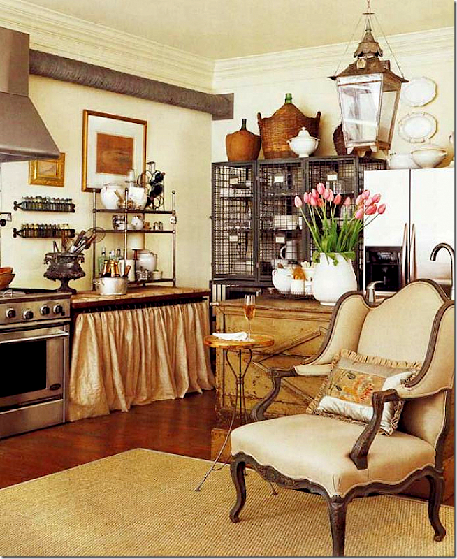
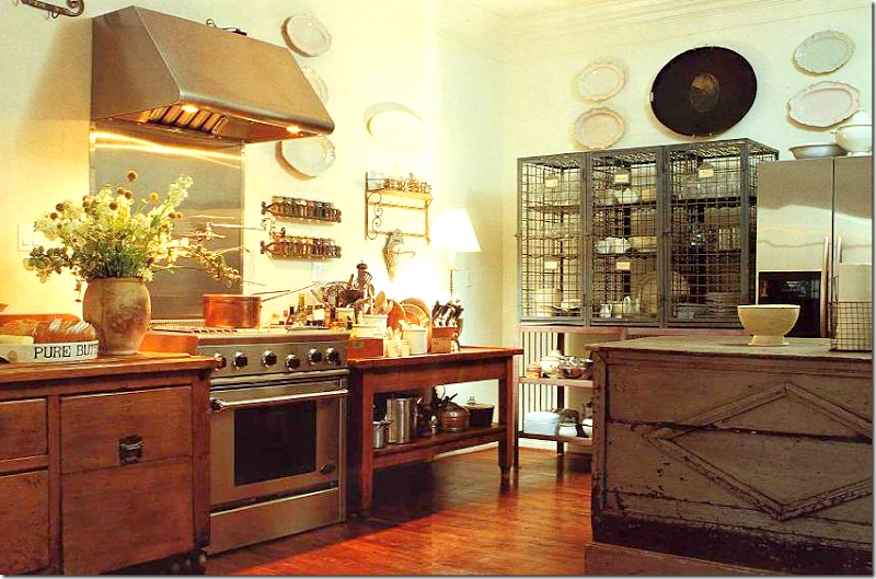
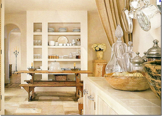
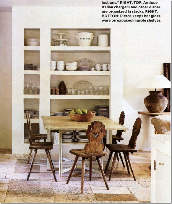
For example, another unfitted kitchen that is similar to Moore’s is again, Donna Brown’s of The Gray Door. Pam Pierce helped Donna design this space and I love it! In the back is an old French wire piece that holds dishes and glasses. Her sink and dishwasher are in an antique counter – behind that chair. Her stove is free standing. An antique lantern hangs above it all.
The wire piece that hold plates and glasses.
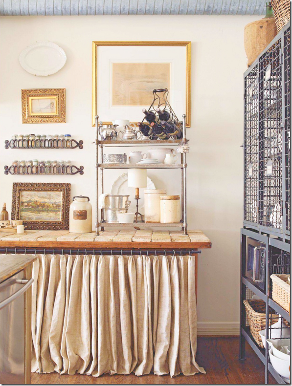 Notice the tiled counter with the linen skirt underneath. Here you can see her dishwasher to the left.
An earlier shot before that table was skirted and tiled. The counter on the right holds her dishwasher and sink. Notice how this publication photoshopped out the vent that leads from her range!
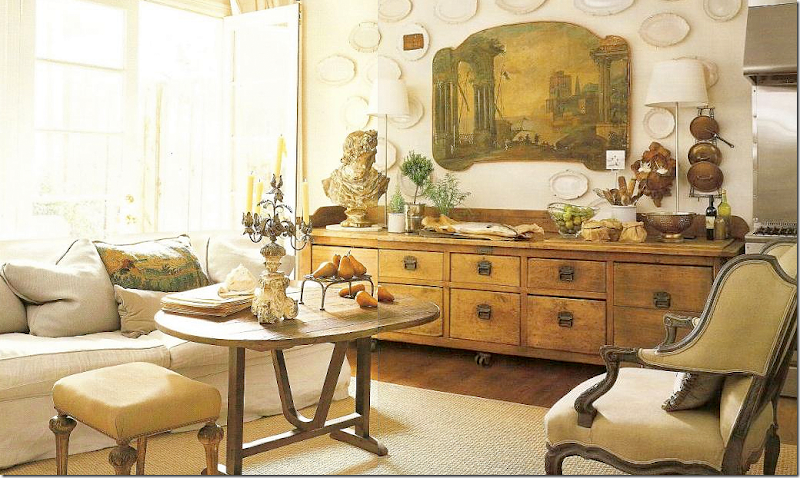
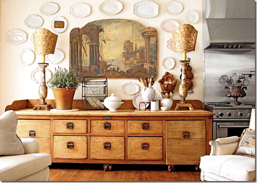
Donna’s family room is right off the kitchen. A large antique filing cabinet is to the left of her range. I love that painting! The wine table doubles as her coffee table and a place to grab a meal.
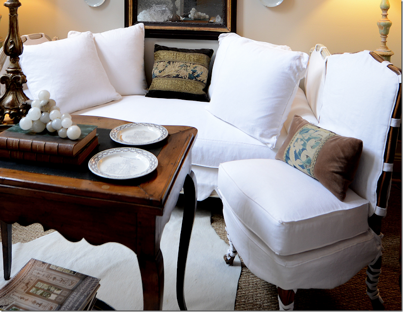
Here is a closeup view of the family room – you see that chandelier? I actually bought that from Donna for a client’s dining room! We went to her house to see it and bought it right from her house. And notice the tapestry pillow on her slipped sofa. A garden is out the French doors.
Since Donna’s house has been published several times – there are always changes in the styling. Here is one more newer shot with different accessories. There is a different chair and the lamps are different with large Fortuny shades.
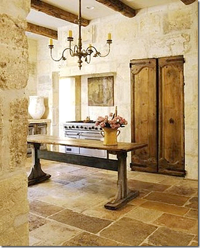
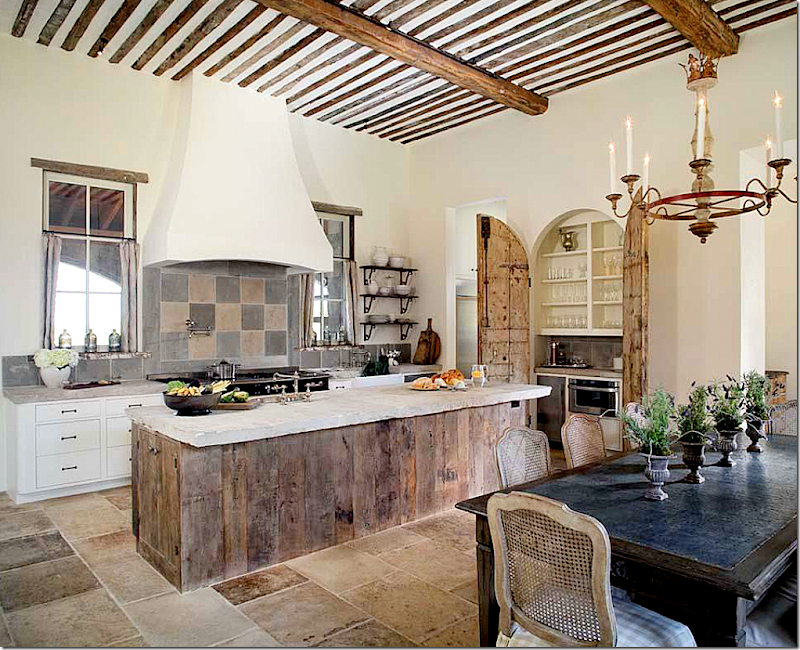
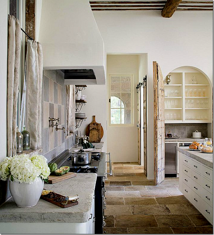
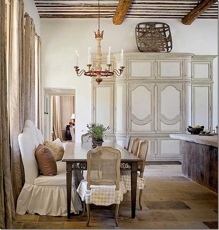
This kitchen is pictured on Chateau Domingue’s web site. Here is another example of a rustic kitchen in Houston – old doors hide the pantry. The range stands alone in its own hearth. The floor is antique stones as are the walls – all of which Chateau Domingue stocks. They also produce new building materials that replicate the old. It’s a candy store for designers and builders.
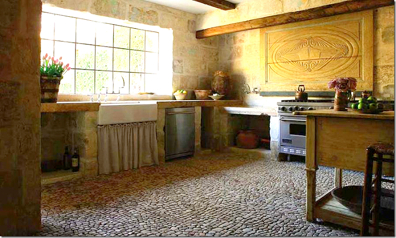 |
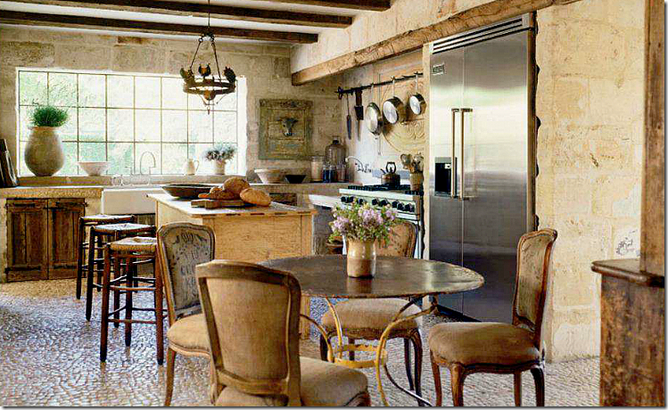
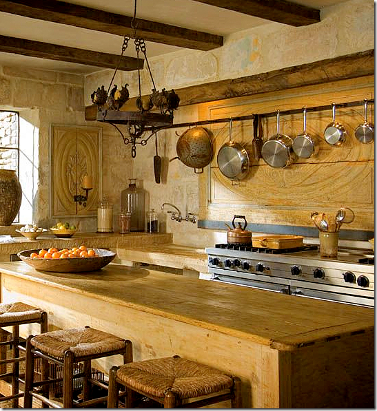
Ruth Gay who owns Chateau Domingue has completely renovated her house with materials from her company. Pam Pierce also helped with the design of her rustic kitchen. Ruth has two sinks – one farm sink with a linen skirt underneath it and the other a trough, to the left of her range.
The house started out as just a regular house, but after Pierce renovated the kitchen, every room in the house eventually was totally changed, a process which took over three years. This house was featured in Veranda earlier this year. The floor is actually 17th century cobblestones that were installed tiny piece by tiny piece.
Her island is also an antique shop cabinet. You see the trough sink next to the range?
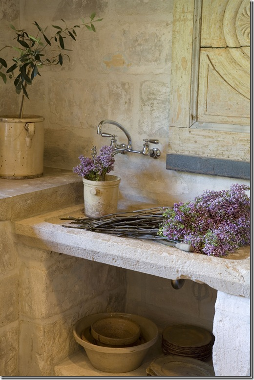
A close of the trough sink and notice the sconce. That has now been replaced as you can see in the earlier picture.
Another close up of the trough sink. Notice the limestone counters and walls. What a great sink for flowers and filling up big pots of water. Her kitchen/house is phenomenal.
Her farm sink. Look at those counters – I love them!
And here is the close up of the cabinet right next to the sink. The doors are antique – nothing faux about these. The gate closes off the kitchen to the outside doorway.
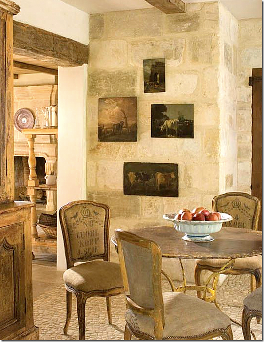
And, here is the breakfast area in the kitchen. The family dining room is seen to the left. Plus there is a more formal dining room – but it’s not really formal in the typical sense. Her house truly looks like it is in Provence, probably because all the building materials came from there.
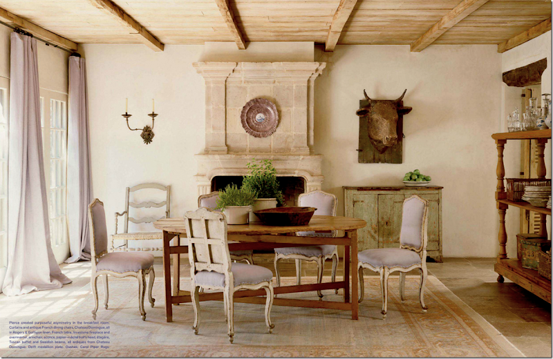
Can’t stop showing more and more! Here is her family dining room with the lavender fabric. The plates and glasses are stored on the shelves at the right. Notice the fireplace. Chateau Domingue has the most amazing collection of different fireplaces.
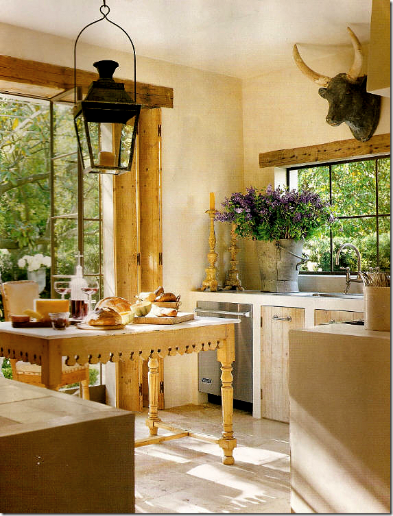
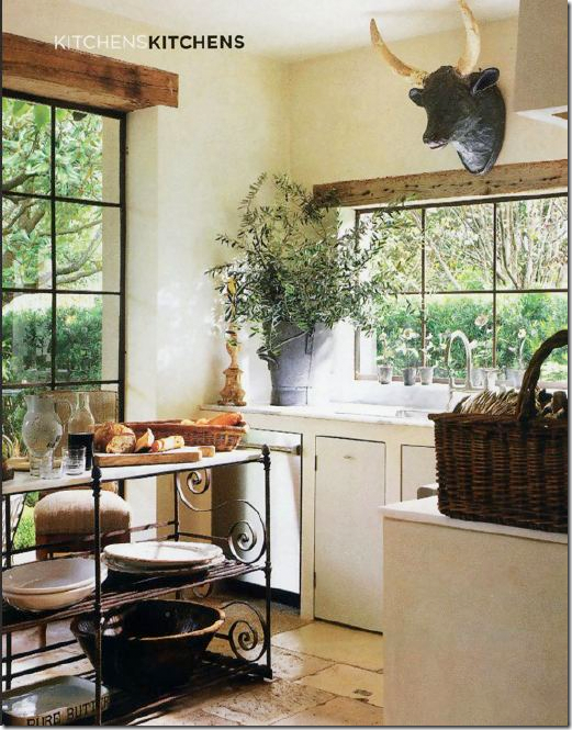
Before designing other’s Provençal kitchens, Pam Pierce had her own to contend with. A small space, she used only bottom cabinets, again with old doors. An antique butcher’s table serves as the island. Steel doors lead to a gorgeous garden. And the bull’s head!!!!
Restyled for a different photoshoot – a French rack is used as the island and the lantern is gone! I miss that lantern!
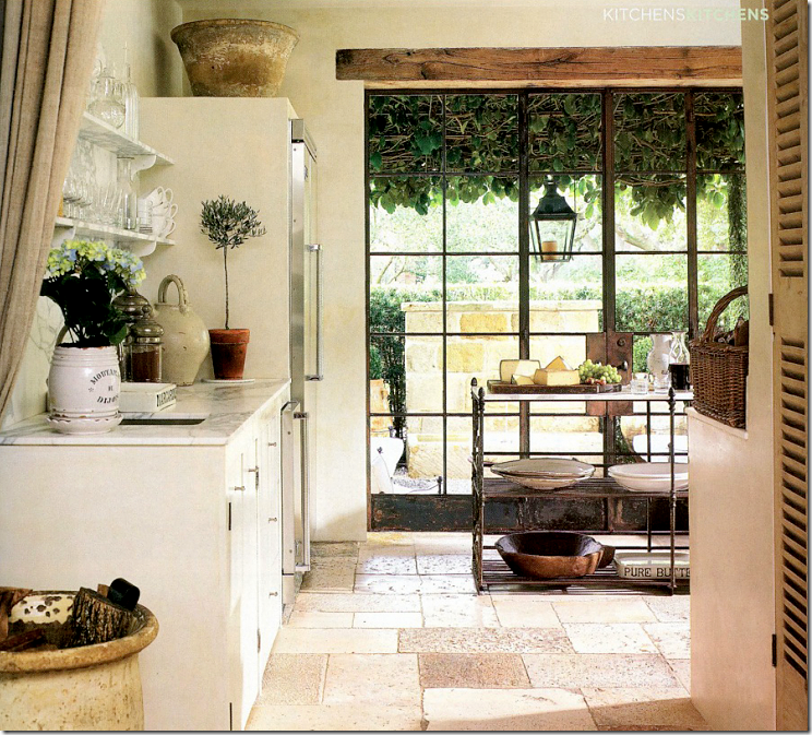
Well, there’s the lantern – it moved outside. Showing another side of Pierce’s kitchen, she has marble countertops and open shelving. Linen portieres divide the spaces.
Off the kitchen is the breakfast area where shelves store the essentials.
Another photoshoot with different table and chairs.
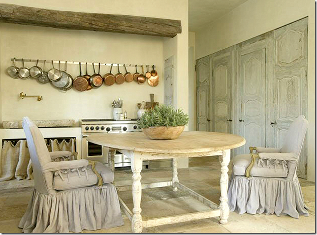
Still, another kitchen with a trough sink next to the range. It looks like an antique stone or vessel of some kind. Notice how instead of cabinetry there is a frame with a linen curtain. Beautiful pots – hanging in a row – resemble charms on a necklace. And notice the alcove that the range sits in: an old beam defines the space. Beautiful set of old doors hide the pantry. It’s amazing how much an old door adds to a room. Again, Chateau Domingue. Nobody does slips as pretty as Pam. No one.

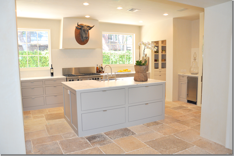
Not only does Pierce do rustic Provencal kitchens, she also does contemporary ones like this. But, by adding an antique chest she brings warmth, texture and a bit of a surprise to the sleek edges of this space. A simple row of white pots and old wooden bowls and plates provide synergy with the smooth marble. And that lamp!!!
Another view of the contemporary kitchen. Where do these fabulous bull heads come from???? And those huge apothecary jars? I want both!!!
Outside of Houston is a second home furnished in a French way. A huge antique cupboard takes the place of built in cabinets along with open shelves. Again, the dining table does double duty as an island. The subway tiles go up to the ceiling – a look I love.
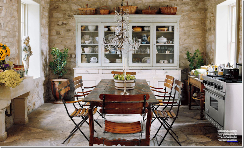
This second home in Fredericksburg, Texas for Houstonian Julie Greenwood is again, an unfitted Provencal styled kitchen. The large cupboard takes the place of built in cabinets. An antique wood table serves as counter space. The dining table doubles as the island. The range is freestanding and the sink on the left is like a trough. Original stone walls and floors and the chandelier above sets it all off. Julie, who owns a successful real estate business in Houston – also has a gorgeous antique shop in Fredericksburg called The Garten. Looking for wonderful antiques – peruse the web site HERE.
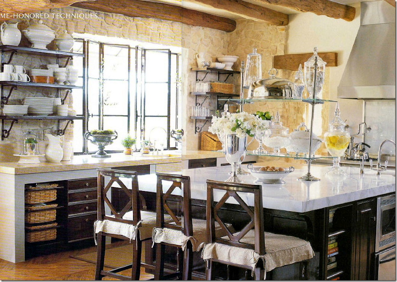
Another Houston designer Renea Abbott of Shabby Slips chose a rather French approach to her cabinets for this kitchen located in California. Notice the bottom cabinets are open with a wood frame built around them. No upper cabinets – instead there are shelves on the stone walls. Again, there are the gorgeous steel windows. The only American look here is the large marble topped island. But the glass shelf etagere looks like a Parisian pastry shop.
This Provencal inspired kitchen is in Cynthia Davis’ house – a decades old bungalow she shares with her architect husband. Notice instead of cabinets on one side, there is an antique butcher’s block. And also notice how the range’s hood extends over the entire side of the kitchen. The cow head came from a shop in France. Baskets take the place of cabinet doors. Davis is the shopowner of Indulge, one of Houston’s most popular destinations for French styled home decorative pieces. The shop itself is like visiting one in Provence with its thick stucco and stone walls.
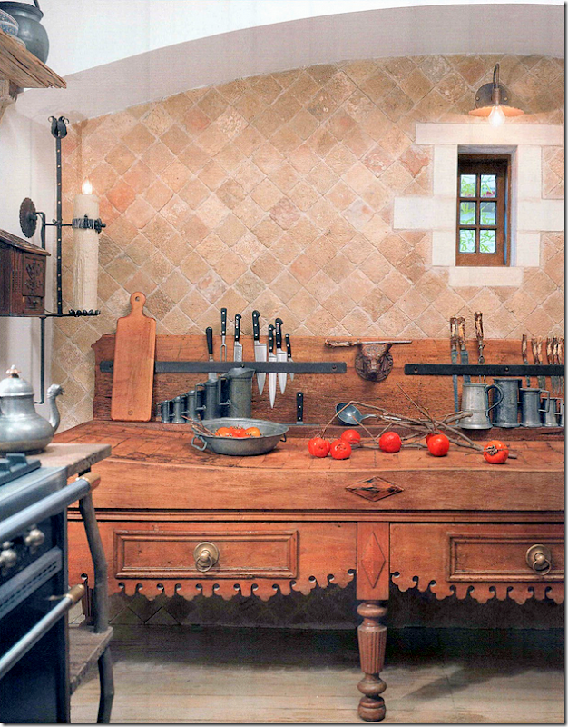
In Linda Keenan’s San Antonio home, this butcher block came from, where else but Chateau Domingue. It is used instead of a row of cabinets. The arch and tiny window are so charming. Tiles are also from….all together now…Chateau Domingue!
Remember this house in Mississippi designed by Kevin Harris HERE and Annelee Primos HERE ? House is loosely used term here, castle might be better! Though not in Houston, Chateau Domingue sourced many of the building elements, including those in the kitchen: the counters, the beams, the floors. Chateau Domingue though located in Houston is an international company – shipping their products everywhere. Though the designer did use cabinets, the look is still unfitted with the rustic island and stone counter tops. And notice those doors!
Those countertops are unreal. Behind the doors is a drinks station.
The pantry looks like a huge armoire. Just beautiful!
Now, there is nothing wrong with this kitchen. It’s quite lovely with granite and wood cabinets and stainless appliances. But, after seeing all these unfitted kitchens – or kitchens filled with rustic architectural elements, it’s hard to get excited by a kitchen like this. So, yes, maybe the Veranda kitchen isn’t the easiest one to cook in, it sure is a good looking one!
Visiting Houston? Be sure to go visit Ruth Gay at Chateau Domingue, pictured above. If not – visit their web site HERE.
AND finally, just tooting my horn!
Styleblueprint, a lifestyle blog just recently named Cote de Texas to their list of Top Ten Design Blogs!! Wow! I was stunned and quite humbled. A huge thank you to Styleblueprint and to all the readers who have made this endeavor so rewarding and fun over the past five years! Without the readers – I am nothing. A million thanks.
Read the article HERE.

