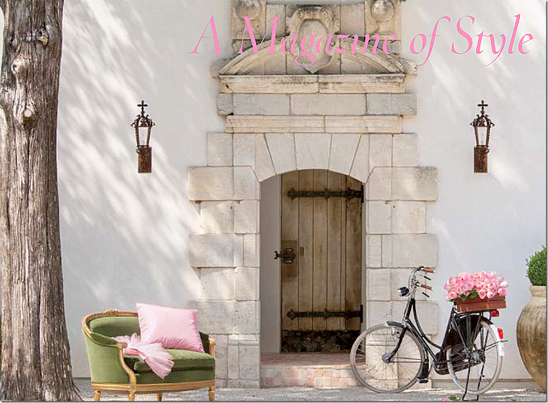
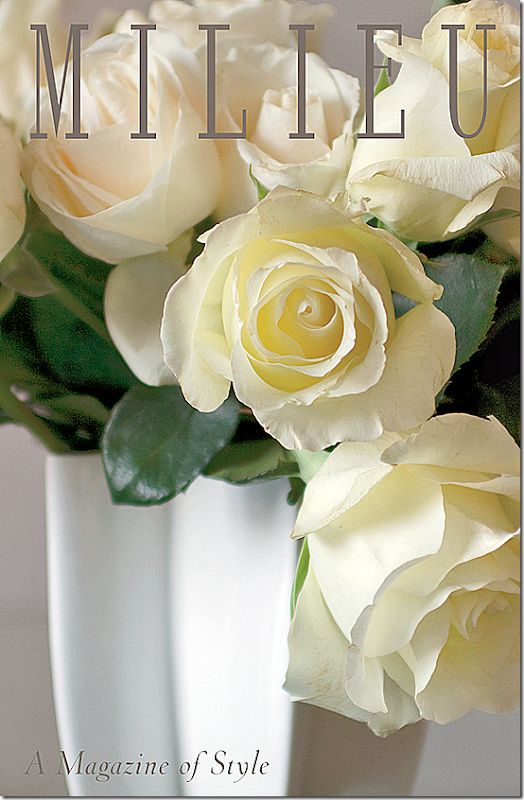
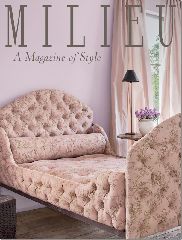
Could you just DIE from this cover? The gorgeousness of it?????
I told you a few weeks ago about a new magazine coming out soon – “Milieu.” The brain-child of interior design great Pamela Pierce, Milieu is set to be on the stands this fall. It’s been so exciting to watch the magazine come to life, started from an idea to become the real thing which you can hold in your hands.
Recently Pierce talked with me about her goals for Milieu. She spoke about quality design magazines of old. In those earlier days, a photo spread might be as long as 18 pages, with full sized photographs of such wonderful quality that the images leapt off the pages. Today, décor magazines show smaller pictures, rarely, if ever, giving a full two pages to one image. And, a photoshoot might be only 8 or 10 pages – 18 is unheard of now.
Then, there are the editorial descriptions that are written obtrusively over the photographs with dark and bold fonts, hiding the image behind the words.
Another concern is the quality of the paper. Speciality decor magazines once used the finest paper, so heavy and thick when the page was turned. But no longer, it’s a luxury that’s gone by the wayside. What a shame.
Pierce knows all this. She’s been featured many times in design magazines and she knows firsthand the differences in today’s magazines. When planning Milieu, she strove to bring back the lushness of the photography, the thickness of the paper, and the more in-depth stories with clean, single and double page photographs.
Milieu will contain wonderful photographs of interior design and gardens found in the United States and Europe. Additionally, there will be features stories on other subjects, such as jewelry and art. The operative word is quality in design, quality in product.
While the first issue is slated to debut this fall, Milieu has produced a “mini-mag” which is a small issue used to introduce the magazine to potential advertisers. Pierce is proud of the mini-mag and has graciously allowed me to show some of its images since it won’t be published.
One aim of Milieu is to always show houses that haven’t been published before. How many times have you paid for a magazine and then found that you’ve seen the house before? Milieu will show only fresh, never-before-seen images – which can be really hard in this day of web sites and pinterest and instragram. So, while some of the photos in the mini-mag have been on the internet, this will not be the case with the magazine. It’s a lofty goal, but one that Pierce will strive to accomplish.
Today, I am thrilled to share with you some of the photographs from the Milieu’s mini-mag! I hope you will enjoy them as much as I did!
1. The Schatte Residence:
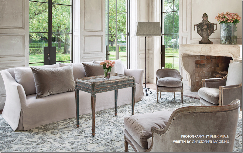
This gorgeous house in the museum district is the home of Andrew and Annette Schatte. Annette is a well know antique dealer. Here, in the living room, the sofa is Belgian inspired and the rug was custom made with silk and metallic threads. Standing, is a iron floor lamp with a rectangular shade, a trademark of Pam Pierce.
The house is stunning and its position across from the Museum of Fine Arts is even more impressive. It is made of stucco and was built with antique architectural elements in a blend of the classic and the contemporary. Notice the wonderful stone mantel and the paneling. And also be sure to notice the steel doors and windows that overlook the fountains on Montrose.
In the powder room, notice the gorgeous antique doors, painted a soft French blue. An antique stone sink is set into the wall where a single faucet looks so chic. Hanging above is a Louis XVI gilt mirror.
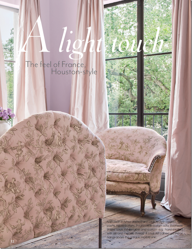
And another photograph from the guest bedroom, with the Napolean III tufted bed and a Louis XV style bergere, wearing my favorite oriental toile fabric! The curtains are a blush silk taffeta that are simply gorgeous. Also, notice the wood floors.
The homeowner, Annette Schatte first became known to design lovers when her former house on North Boulevard was decorated by Babs Watkins and photographed for Veranda. I always say that that photoshoot of the North Boulevard house was one of two houses by Watkins that were the start of the “Houston Look.” Schatte has a beautiful eye for design and antiques. She teamed up with Watkins to open an antique shop – Watkins Schatte - that became THE place to buy one of a kind antiques from Europe. Schatte later opened her own shop further down on Bissonnet, where she continued importing the finest pieces, introducing Houston to the light and painted woods that are now so popular. She sold her shop to Margaret Naeve, and today she offers her antiques at 2620 and on the internet HERE.
The Jane Moore House:
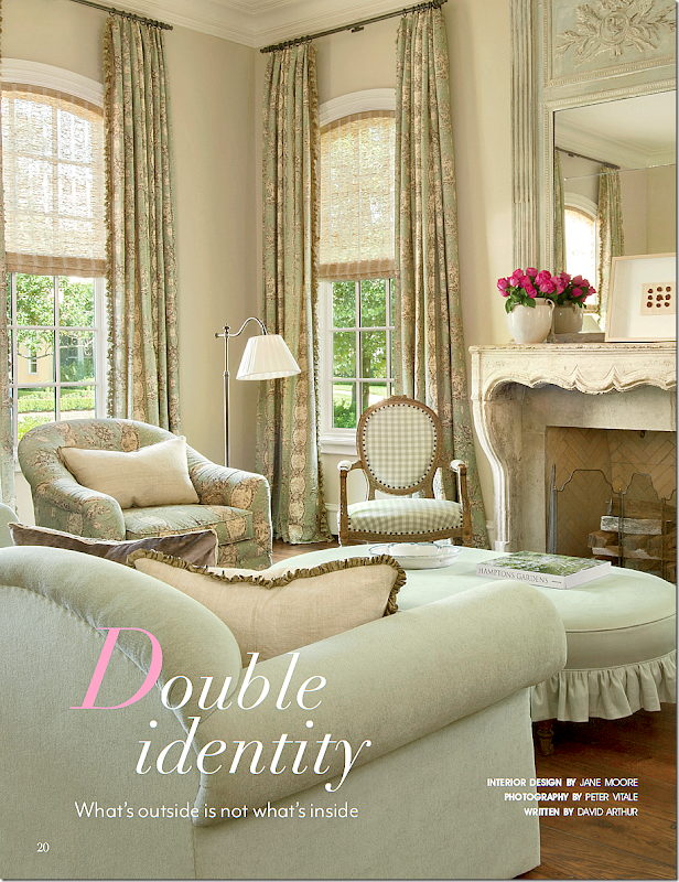
The second house is located in River Oaks and was designed by Jane Moore, whose own townhouse was recently featured in Veranda. This house has a classic Georgian exterior, but the interiors are a mix of French and Swedish design. The living room has a beautiful antique stone mantel with lovely toile and check fabrics in green and khaki. The trumeau is so pretty!
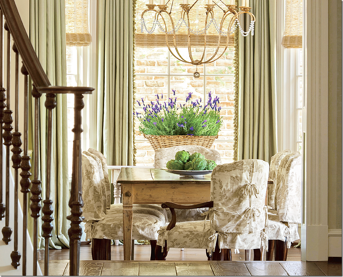
The dining room was made more casual with chair slipcovers made of linen toile. The ties are such a charming touch.
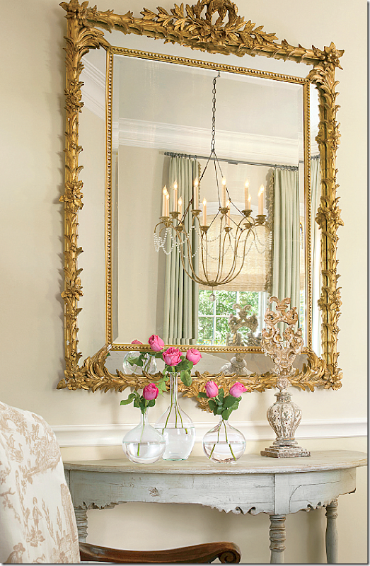
The dining room chandelier is reflected in the mirror above an antique Swedish demi lune. I love Jane’s aesthetic so much. Such beautiful photography by Peter Vitale.
Santa Fe House:
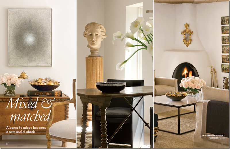
The third main feature of the Milieu mini-mag is a renovated Santa Fe house. Here, in a two page spread, three vignettes of the family room are shown. The house is a mix of contemporary pieces, such as the coffee table and art work, and fine antiques, such as the Spanish desk.
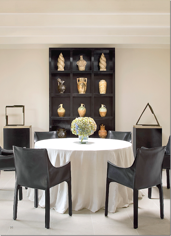
The dining room is an eclectic space, with a linen covered skirted table and modern sculptures.
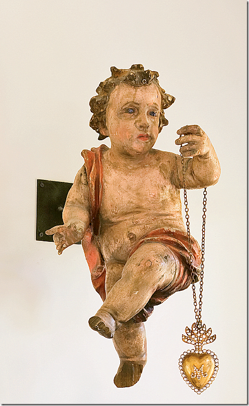
Hanging on the dining room wall is an antique cherub with a dangling necklace.
I hope you have enjoyed this small glimpse of the Milieu mini-mag. I don’t know about you, but I can hardly wait for the first issue this fall! If the magazine is anything like the mini-mag, it will be incredible!!!
For questions about advertising rates, please go HERE.
And, for information about subscriptions, please go HERE!


