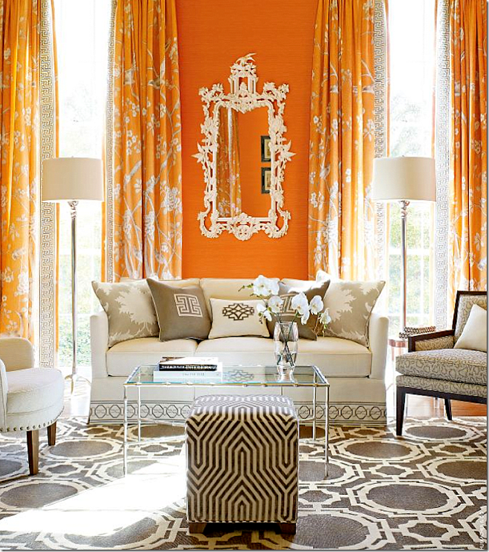
Los Angeles interior designer, Mary McDonald, of Million Dollar Decorators fame just came out with a new fabric line for F. Schumacher and I am literally drooling. While, I’m not a big fan of citrus orange – it’s too bright for me – but notice the curtains and the gorgeous rug!
This ad ran in the new Elle Décor and I was slightly Fifty Shades of Grey over it!
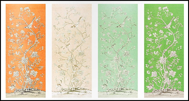
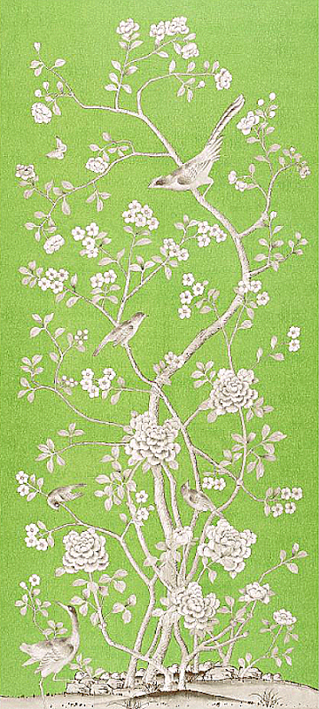
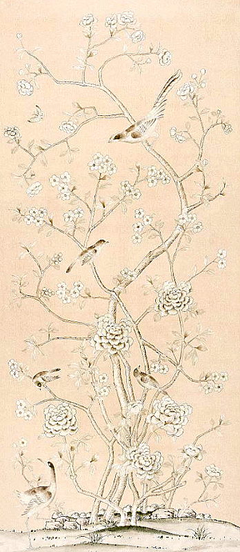
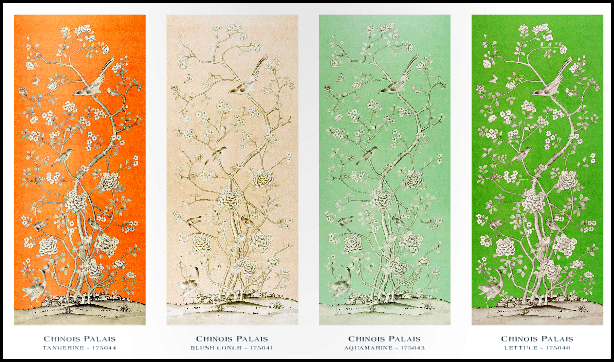
The curtain fabric comes in 4 colorways – tangerine, blush conch, aquamarine and lettuce. To die for!
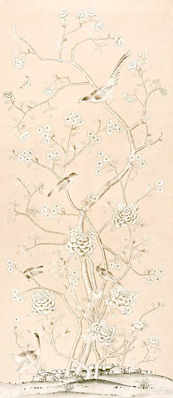
OMG! The blush conch – imagine this color mixed with a soft brown in a bedroom. I literally gasped when I saw this on the F Schumacher web site. Gasped. I want to have curtains made out of this! Anyone want a new bedroom designed by Webb Design?????
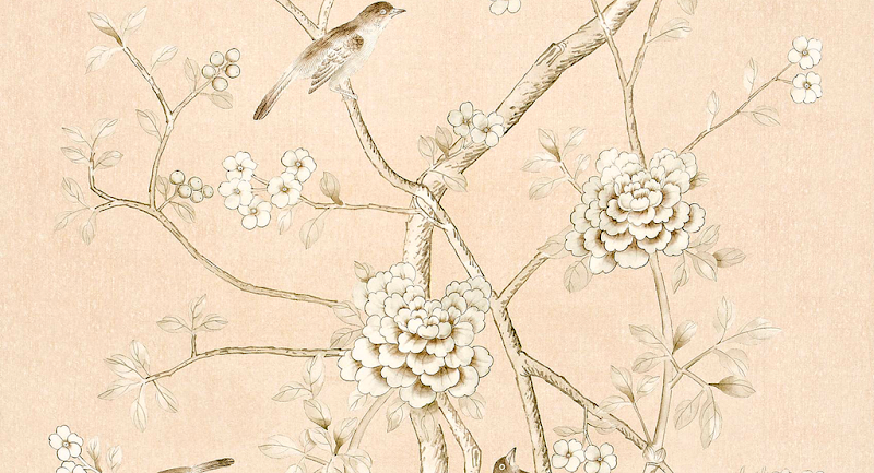
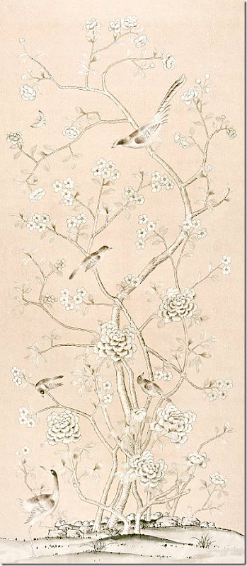
I love the Lettuce colorway too. And the aquamarine colorway. The Schumacher web site says you could use this as wallcovering but the width is not that wide (54”) and I think it would get boring to see the same scene repeated over a large expanse like in a dining room – but in a small space, such as a powder room or dressing area, it could be great. Personally, I think this is a perfect curtain fabric, or a chair fabric or a pillow. The vertical repeat is 131.5 – so the tallest windows it could cover would be around 10’.
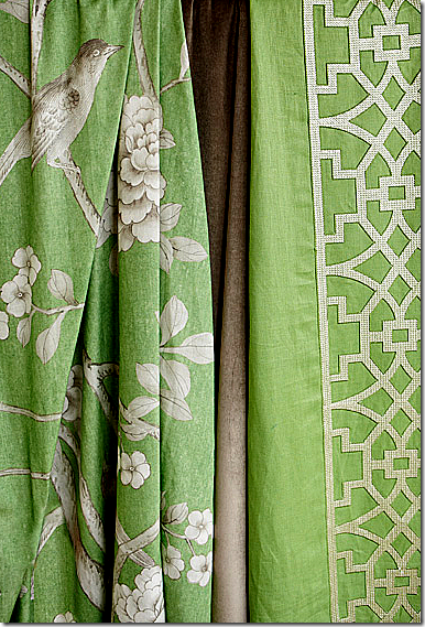
A blow up of one section of the Chinois Palais fabric in blush conch. And the best part? 100% linen. Leave it to Mary McDonald to come up with the best new fabric design I’ve seen in ages.
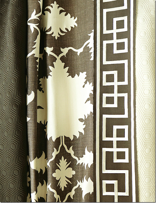
She pairs the mural fabric with her other new fabrics – a brown velvet, a more contemporary fabric, and a cut velvet.
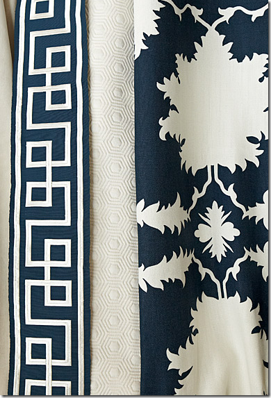
This linen – Garden of Persia is another great one. And notice the Octavius tape for trims – gorgeous!
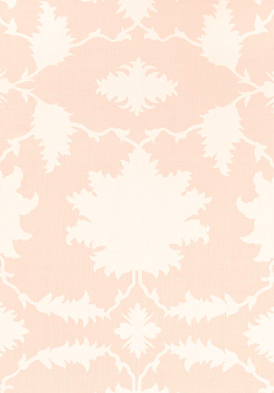
The linen – Garden of Persia – in the blush conch colorway. Imagine this as the duvet and headboard with this curtain:
What a gorgeous bedroom!
And there is this linen pattern – Villa de Medici which you could also mix with the Chinois Palais fabric.
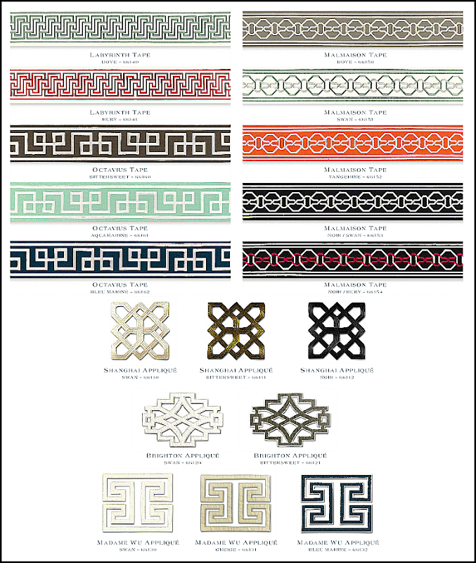
And there are her tapes and appliques that are so unique and match the aesthetic of the fabrics just perfectly.
I’ve often thought about fabric designing and how hard it must be. There have been a few bloggers who have recently designed their own fabric lines – and I’ve always been in awe of their abilities. One -
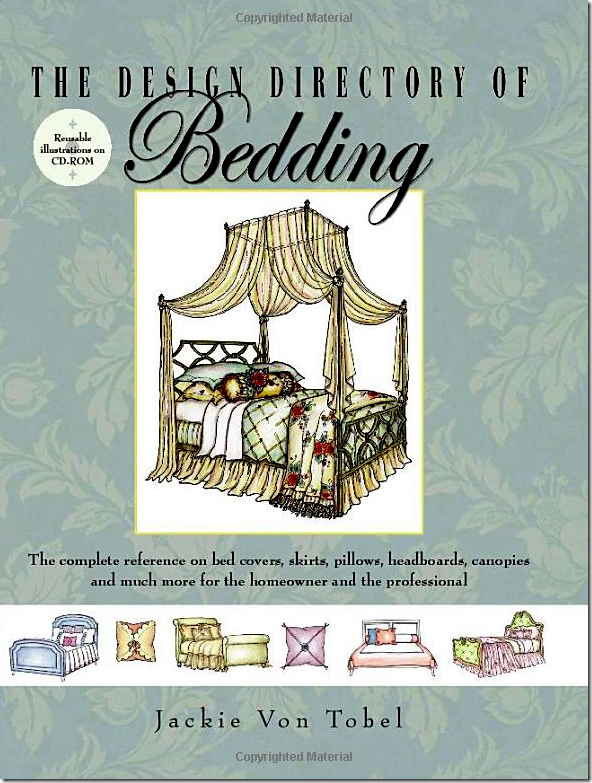
Jackie Von Tobel designed an entire line of fabrics – which she drew - but then again, she’s an incredible artist. Her two books are all hand drawn – with over 1,000 illustrations per book.
Besides this book, there is another one on Window Treatments HERE. Jackie’s fabric line was inspired by her own drawings from both books.
Another interior designer blogger, Pure Style Home, started her own fabric and furniture line Here called Lauren Liess Textiles. Above, on a chair she designed, she covered it in two different fabrics from LL Textiles. I love the green chintz, which comes in several different colorways.
These women aren’t that much different than me, but I am amazed that they were able to design fabric lines! I can’t even imagine how you go about it. Where do you start? Do you have to be a good artist?
Looking at Mary McDonald’s new fabric line, I can understand more easily how she started. She looked around her house and at her projects for inspiration. That much is obvious. For example:
In her new fabric line for F. Schumacher, orange is one of 4 colorways.
Now, this bright orange is a color she has used in designs before. In her former house, the large entry was mainly orange with blue and white accents. The entry hall was stunning and the focal point of her entire house.
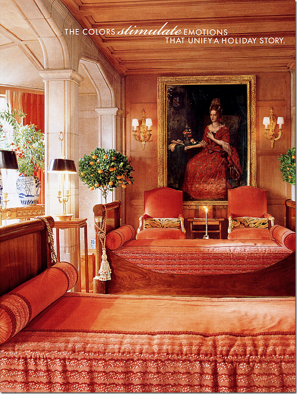
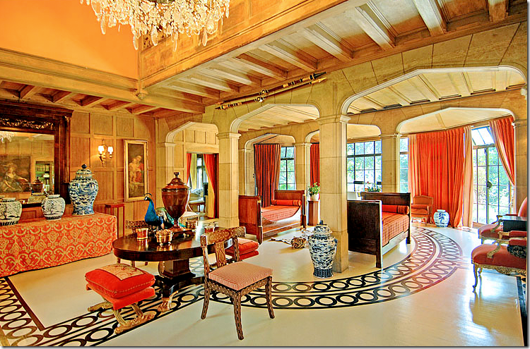
In the center of Mary’s large entry hall, the ceiling drops, and stone arches surround the space. Mary put two antique Empire day beds in this area covered in tangerine colored fabrics. The two chairs wear tangerine velvet.
Another look at her two story Tudor styled entry hall. Is it any wonder where the inspiration for the Tangerine colorway came from?
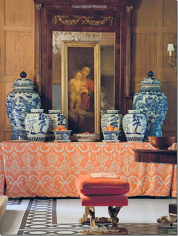
And, the inspiration for her Chinois Palais fabric is obvious too!
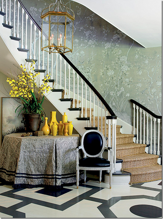
Mary uses handpainted wallpapers from Gracie and DeGournay in many of her projects. She recently redecorated her bedroom in an aquamarine paper, very similar to her Chinois Palais aquamarine fabric.
And, in this house’s entry way, she used another aquamarine wallpaper.
This de Gournay wallpaper in a dining room she designed may have inspired the Lettuce colorway:
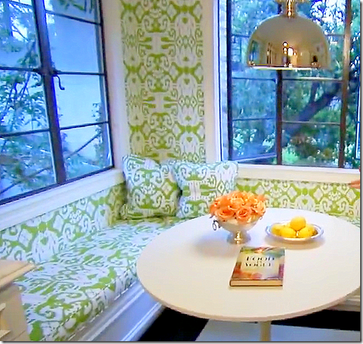
It’s also obvious why she chose a Lettuce colorway – you only have to see her newly redecorated kitchen to understand:
The Lettuce green and white fabric and wallpaper used in Mary’s new kitchen décor may have inspired her Lettuce Schumacher fabrics.
Her guest suite is decorated in shades of greens, pinks, and browns – did this also inspire her Lettuce colorway?
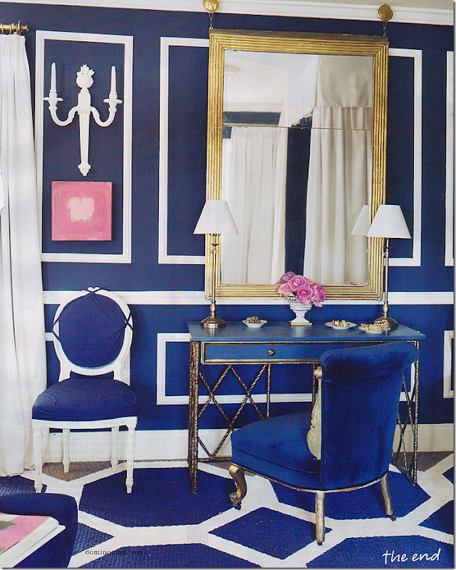
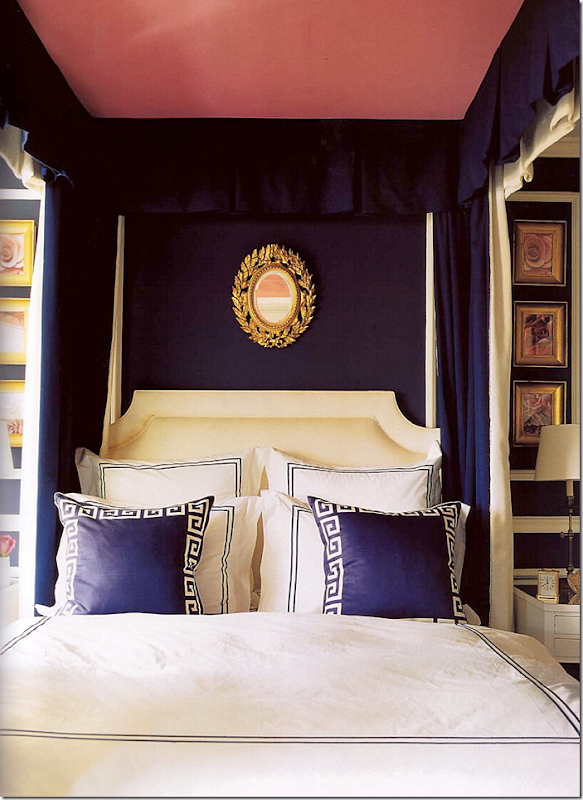
Mary’s former bedroom in bold navy and white.
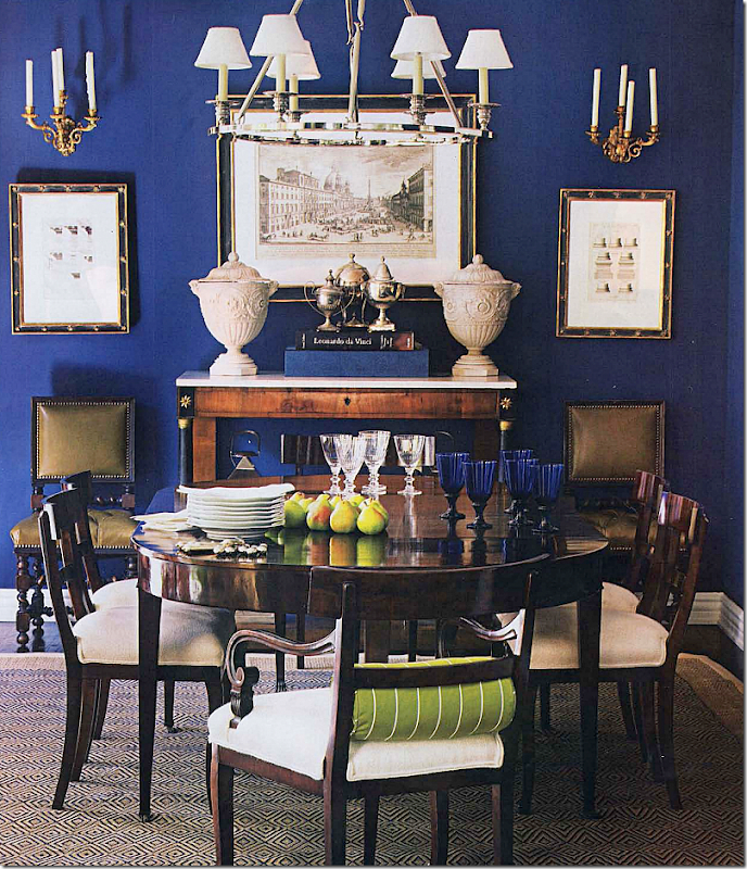
This dining room in dark navy was another inspiration - love the touch of the lettuce green.
Did these blue rooms inspire her Bleu Marine colorway? So pretty! Again, this mix would make a wonderful basis for a family room or a bedroom design.
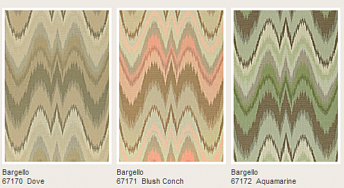
Mary has two fabrics based on a needlepoint stitch. Here, this linen is a cross between the flamestitch and the more modern chevron, although the web site names marbled Florentine papers as the inspiration.
And this fabric, Bargello, a cotton. Both these two fabrics have a direct correlation to Mary’s personal life:
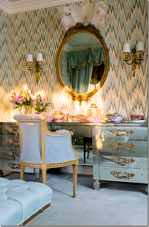
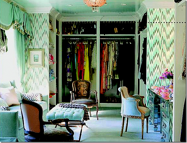
In her former house’s dressing room, the walls were papered in a very similar pattern! While this wallpaper’s lines are more severe, Mary’s Bargello fabric shows softer, curved lines.
Such a beautiful dressing room! I would love this!
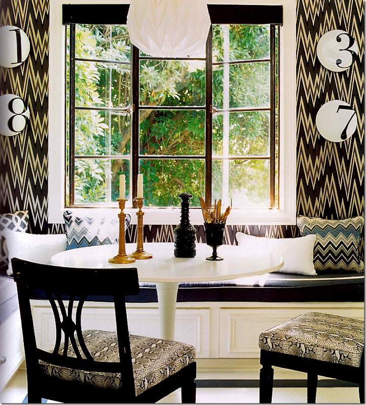
And in her kitchen, the former décor had another flamestitch wallpaper. Notice the pillows repeat a similar pattern. Mary must really be a fan of the flamestitch.
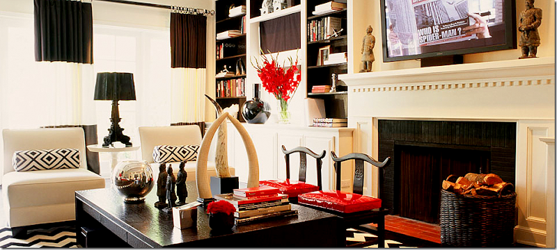
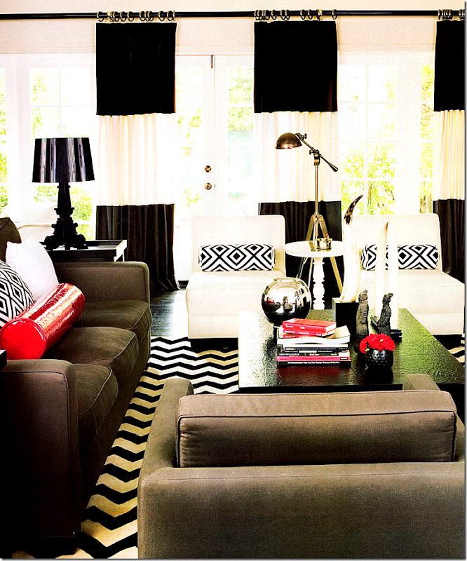
Mary designed this high contrast red, black and white family room.
And another view of the contemporary room. Did this room directly inspire Mary’s Schumacher fabric line?
These fabrics and trim in black, red, and white seem to have been inspired by the above family room.
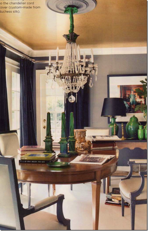
Mary’s newly redecorated living room is filled with different shades of deep greens.
Her former dining room holds a collection of green malachite and various green urns and vases.
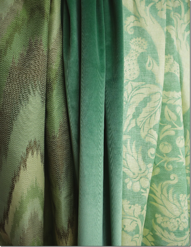
Were these green fabrics inspired by these two rooms?
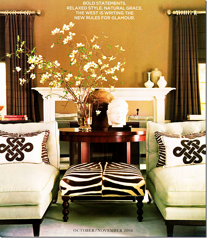
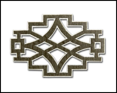
One large segment of her line is the trims – the appliques and the tapes - that coordinate with the fabrics.
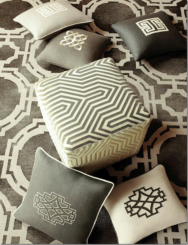
Here, in this room Mary designed, you can see she used a similar applique on these pillows.
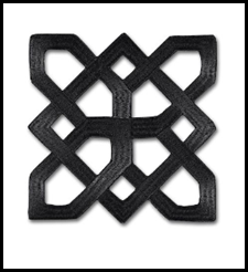
Mary’s Schumacher Brighton applique is reminiscent of the pillows above.
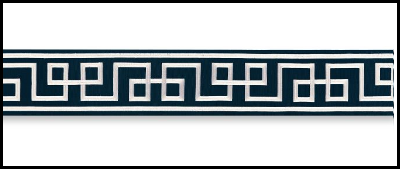
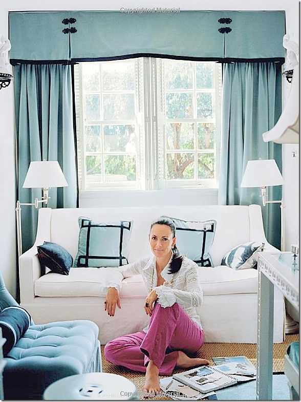
In her blue and white bedroom, she used a Greek key applique which inspired her Schumacher stylized Greek key.
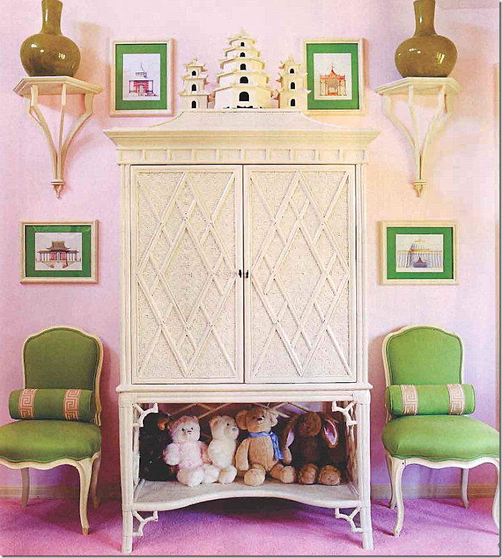
In this girl’s bedroom, with the Blush Conch and Lettuce color scheme, she used a Greek Key trim on the pillows.
The Octavius Tape comes in Bleu Marine, Bittersweet, and Aquamarine colorways.
And here, she used Oriental styled appliques on her curtains’ cornice.
These appliques might have inspired her Shanghai trim.
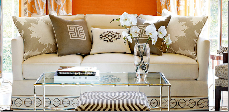
And here, a selection of pillows with the appliques sewn on. The large pillows are her Garden of Persia fabric. On the sofa is her Malmaison tape.
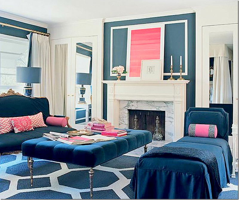
Perhaps Mary McDonald is most famous for the bold, geometric shapes she paints on floors and carpets. Here in her bedroom, the sisal rug was painted in a large blue and white pattern.
This house has a black and white pattern painted over hardwoods. Love!
In her former house, she painted a graphic pattern that encircled the middle of the room and went around the perimeter of the entry hall.
Looking down at the pattern on her floor that circles the middle section of the room. Gorgeous chandelier!
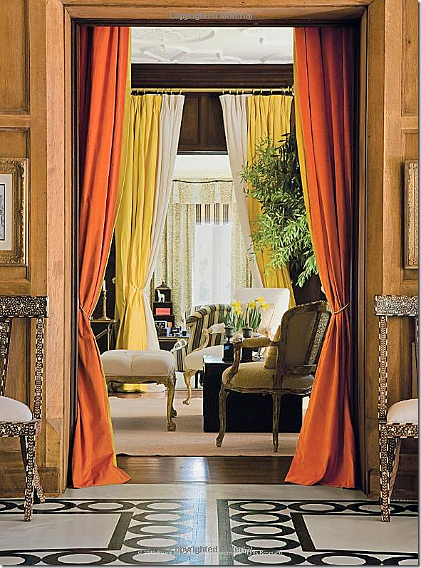
In another view of her former house, the floors were previosuly stained brown wood planks and painting them white and black was a late design decision – which I think was genius. Here, you can see the enfilade – from the dining room, to the entry hall, to the living room, through to the study with its striped chair. Portieres divide the rooms.
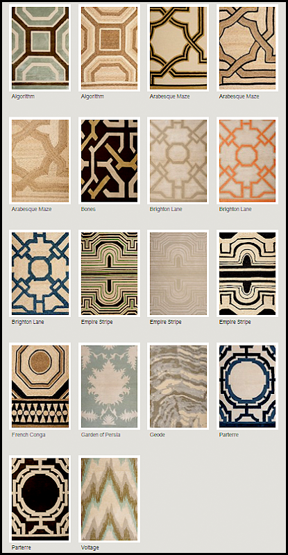
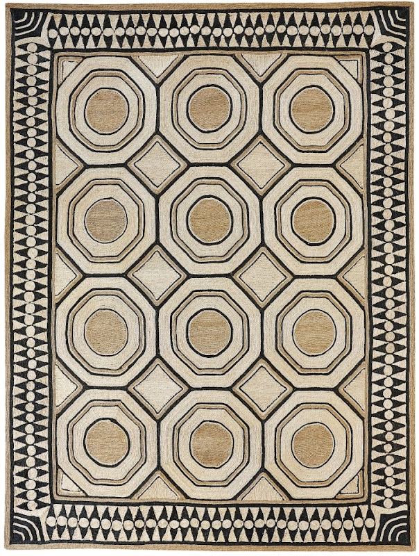
Mary’s bold painted floors became the inspiration for a line of rugs sold at Patterson, Flynn, and Martin, through F. Schumacher. Here, is the Paterre rug which is sold in two colorways. Isn’t it gorgeous??
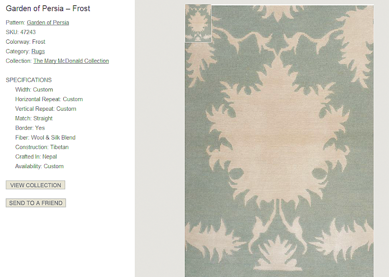
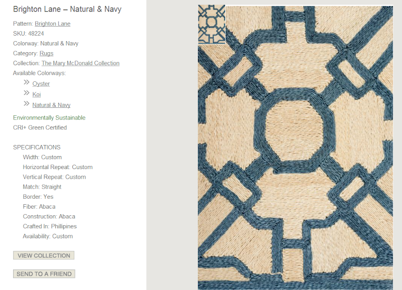
Mary designed 18 rug patterns. Some match her fabrics, like Garden of Persia and Voltage.
Here is the Algorithm rug.
While many rugs are silk and wool, some are fiber rugs, such as this one, French Conga, with it’s great border.
Here, a wool and silk blend rug, matching the Garden of Persia linen fabric.
And another textured one, to go with Mary’s blue fabrics – Brighton Lane.
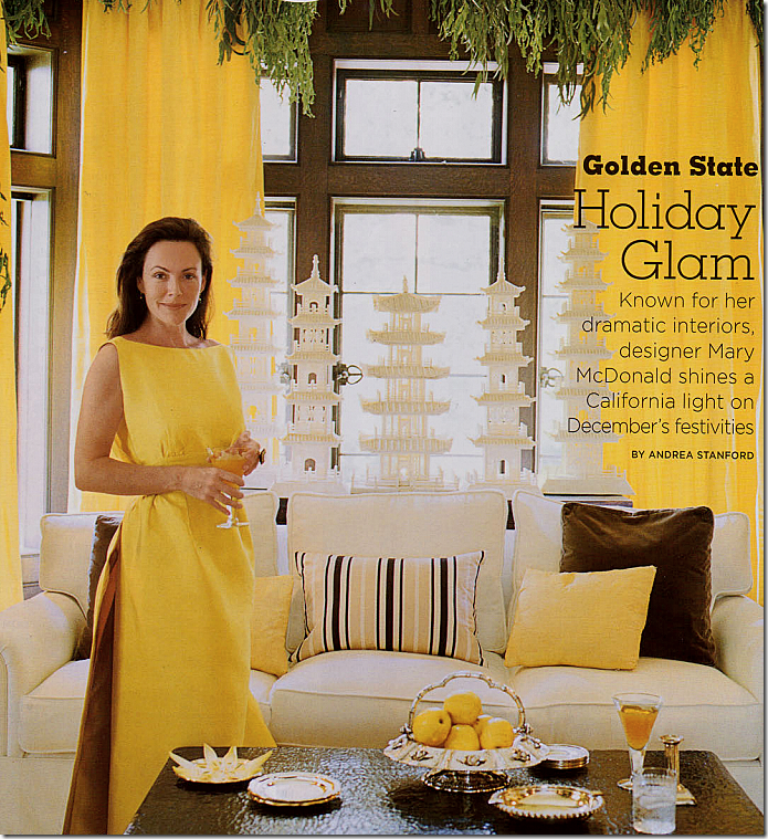
There is one thing about the Schumacher fabric line that surprised me: there was no yellow colorway. Mary is known for using bold sunny lemon yellows, often paired with brown silks and velvets, stripes and solids. Here, in her former house, standing before her collection of incredible ivory pagodas, Mary dressed in bold banana to match her décor. But why no yellow colorway? Is it no longer a favorite of hers?
Seeing how Mary dreamed up her fabric line by referencing old and new projects, and former and current houses for inspiration, I thought I might try designing a line of fabrics, using the same technique:
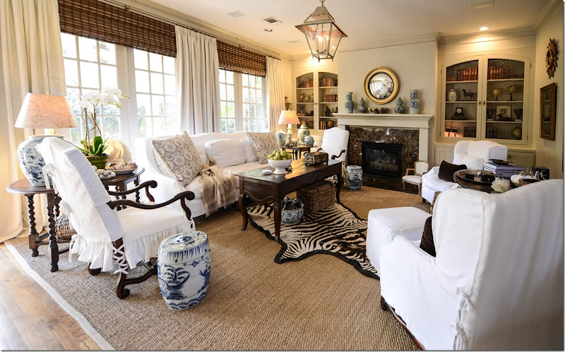
Let’s see. First I looked at my house for inspiration.
Then, I looked at my client’s rooms – and viola! I came up with my own line of fabrics.
Joni Webb Designs for FOS Fabrics:
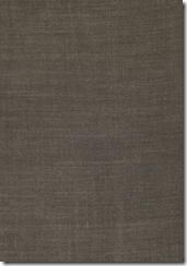
Let’s see, I designed a brown velvet, an ivory velvet, and a brown glazed linen.
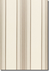
Next, I designed an ivory matte taffeta silk, a linen stripe, and a white cotton.
There’s a white linen, an ikat, and a snow white linen
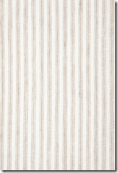
And there’s a ticking stripe.
Done. Whoa. That was really, really hard!!! Geez, wonder how much I can sell it for?
Just kidding, just kidding. But, seriously, these are really the only fabrics I seem to need these days, that is unless I can have this one:
Actually, this really does look good with “my” fabric line! Anyone want a new bedroom designed by Webb Designs using this as a curtain???? I’m ready!!
If you don’t have Mary McDonald’s book – you can order it here from Amazon. Just click on the picture.

