Last week, the Decorative Center in Houston hosted their annual Spring Market, featuring speakers Mary McDonald and John Robshaw, among others. At the event, the awards - the 2013 “Stars of Design” and
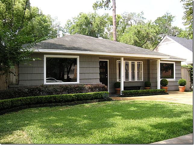
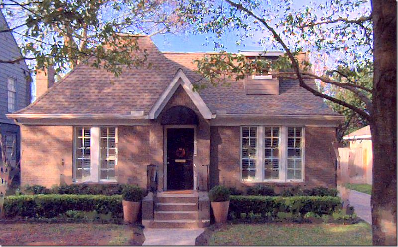
“Stars on the Rise” were announced. The recipients of these awards are selected by a panel of architects, interior designers, artists and designers. Two 2013 “Stars on the Rise” are familiar to readers of Cote de Texas – designers Sally Wheat and Ashley Goforth. Congratulations to both!!Long-time CdT readers will remember Ashley Goforth from a story I did several years ago on a house that was for sale in West University in Houston. The house was an original bungalow from the 1940s – something that is becoming a rarity in this neighborhood where people typically tear down the older houses and build larger two story houses on the empty town lot.I had found this small bungalow for sale on the internet – and loved the way it was decorated. So did most of the readers, judging by your comments. At that time, I didn’t know who the designer was, but the owner wrote in, telling me that Ashley Goforth had been her interior designer. I knew Ashley from the time she had spent working for Renea Abbott of Shabby Slips before she started her own company. Ashley was kind enough to send in other projects she had worked on and I showed them HERE.Recently Ashley wrote to tell me that the new owners of the West U bungalow had contacted her to decorate it for them, also. She thought, and I agreed, that readers would be interested to see how one designer decorated the same house for two different clients.Front façade.
Back yard with a large terrace.
The bungalow in West University has been updated. The one car garage was incorporated into the house. It has 3 bedrooms and 1 1/2 bath. The sq. footage is 1,420 and it is on a typical 50 x 100 lot. The first owners who hired Ashley were young, with young children. The new owners were empty nesters. After seeing the house on Cote de Texas, they contacted the real estate agent and put a bid on the house. Since they loved the décor so much (and it probably was a deciding factor when buying it) they hired Ashley to decorate it for them also. The new owners and the former owners made an arrangement concerning some of the pieces of furniture. The couch, the curtains, the headboard and a few tables were included with the house. By simply recovering a few pieces, Ashley was able to continue the look from the first owners – yet make it a bit more sophisticated for the empty nesters.
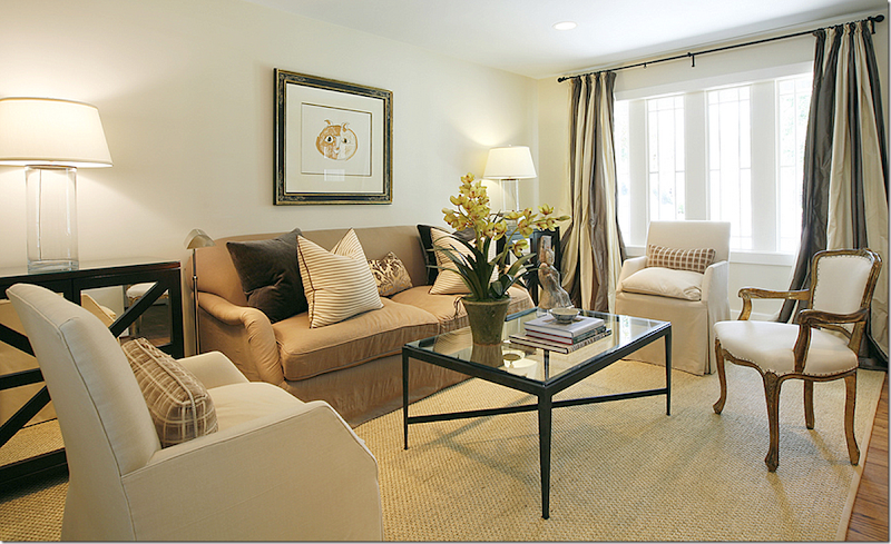
HOUSE #1: For the first owners, a young couple, Ashley used khakis and creams to decorate the living room. Striped silk curtains covered the front window. Contemporary touches were brought in with the end and coffee tables and lamps and art work.
House #2
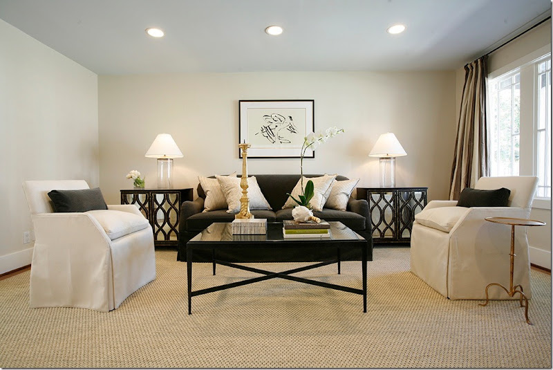
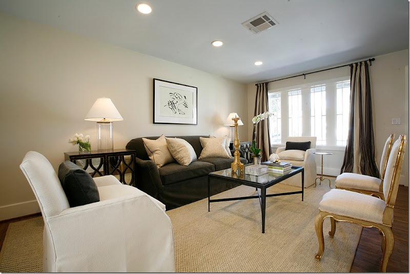
For the new owners, an empty nester couple, Ashley changed the color scheme, updating it to a more sophisticated palette of deep grays and light creams with touches of black. The former owners sold the new owners the sofa and chairs and the coffee table. Ashley recovered the sofa and added a few new pillows, along with similar, but new end tables and lamps. The curtains and seagrass remained in the house.
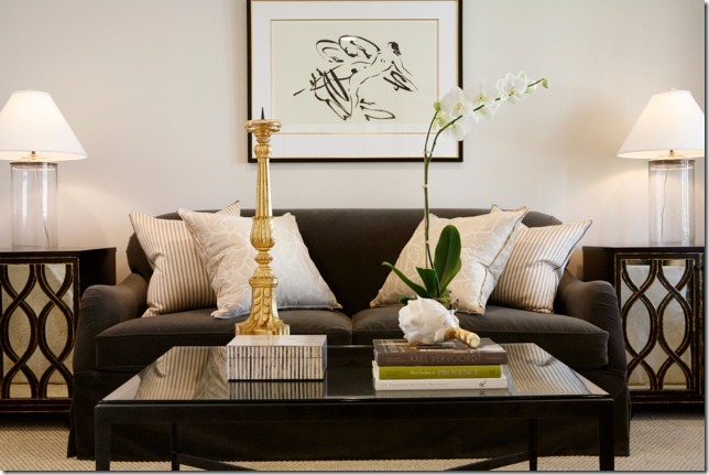
A close up of the newly covered dark gray sofa – the art work reflects the new color scheme.
And here - you can see Ashley added two French chairs with a gilt finish – love this. The touch of gold in the chair and candlestick really dresses up the room.
Across from the sofa, Ashley paired an antique chest with a Louis Philippe mirror and an arm chair with a painted finish.
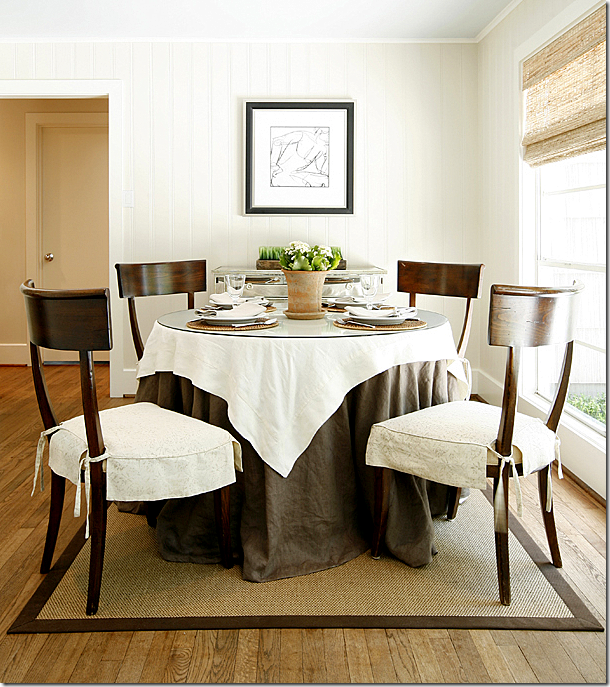
HOUSE #1 - In the adjoining dining room, Ashley used a round skirted table with a mirrored chest.
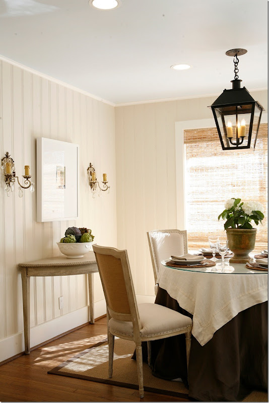
HOUSE #2 – The new owners kept the skirted table and window shade, but made the room all their own with new painted French chairs with tiny nail trim and a lantern. The room is less contemporary now – and I have to say I love the second version, here, best!
Instead of the mirrored chest – a Swedish style demilune was added, along with sconces and the lantern.
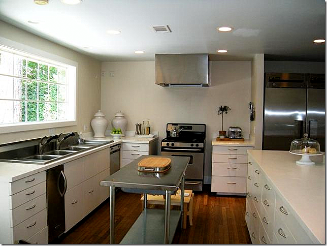
House #1 – the kitchen was remodeled for the first owners with a new window and cabinetry and appliances. A steel trolley became the island.
House #2 – for the new owners, there is now a wood island with metal stools. There is also a new range that now fits the space – whereas before, it was too small. Ashley decorated with similar white jars, but added a white ironstone plate and bowl.
House #1 - the master bedroom’s high headboard hides a small window with no view. Painted dark brown, the bedding and lamps are in high contrast to the darker colors.
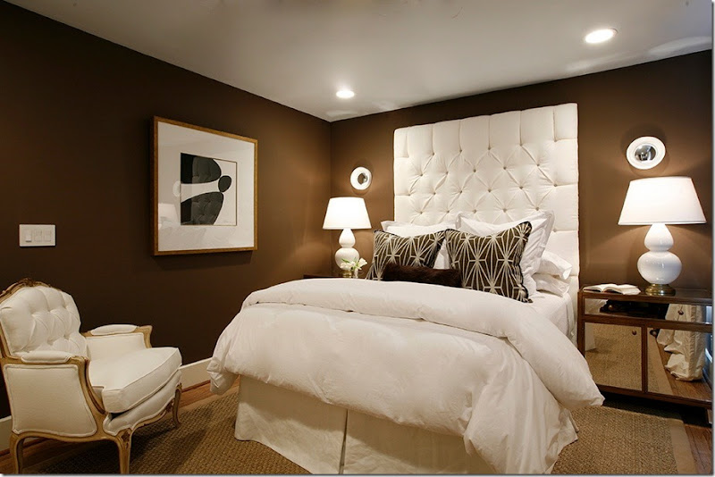
House #2 – the owners loved the dark brown walls, so they remained, along with the recovered headboard. New mirrored nightstands are paired with white lamps and tiny convex mirrors. The print pillows add to the contemporary feel of the room.
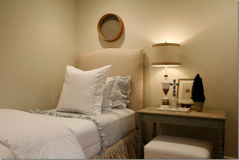
The former owners used this bedroom as a nursery, now it is a guest room with a ticking stripe upholstered headboard and rustic end table.
And in another view of the guest room - with the ticking stripe dust ruffle and rustic end table.
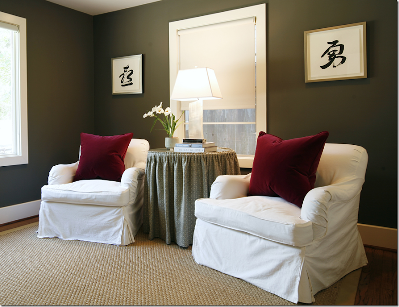
House #1 – the third bedroom is used as a study – with dark gray walls and slipcovered arm chairs. The burgundy velvet pillows and printed fabric skirt add color and pattern to the room.
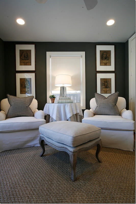
In the 3rd bedroom, the new owners also use it as a study, with two club chairs and French ottoman. The walls are again a dark gray. A fabulous series of prints are framed alike. Love these so much!
I have to say I love House #2 – with the new, empty nester owners just a bit better! It’s a rare chance for a designer to do the same house twice – especially when the new owners request a very similar look – just with a little tweeking. Ashley took the challenge and changed the décor just a bit. It’s more sophisticated with its living room color scheme and the updated dining room to reflect the new owners.
And it’s interesting to see how very important good décor is when you want to sell your house. Would the new owners have even looked at this house without Ashley’s wonderful design? It’s obvious that was what attracted them to the house in the first place. And by arranging to buy a few key pieces from the former owners, they were able to get a very similar look that was changed just a bit to fit their life style and aesthetic.
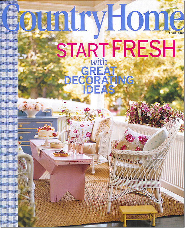
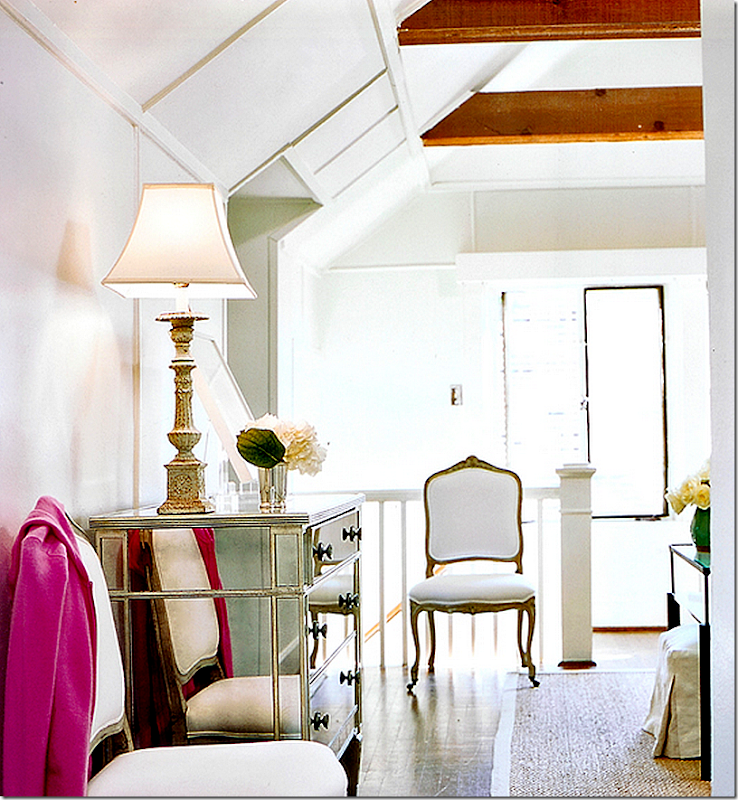
When Ashley Goforth first married, she lived in a triplex, in a small 650 sq. apartment with great bones. The triplex, a three story house, is an original to the older neighborhood and was located on one of the prettiest streets in Houston. The house had been subdivided into 3 apartments – and the newlyweds rented the top floor which came with raised ceilings and beams and dormer windows. It was published in the former Country Home magazine in 2006. The photographs show that Ashley’s distinctive style was obvious even back then in her very first home. Right after the magazine article came out, the young couple moved out of the triplex to a house – with more room for their growing family.
Ashley’s first house shows that her distinctive style – classic mixed with contemporary – was already obvious even back then. The linen slipcovered furniture was mixed with black accents.
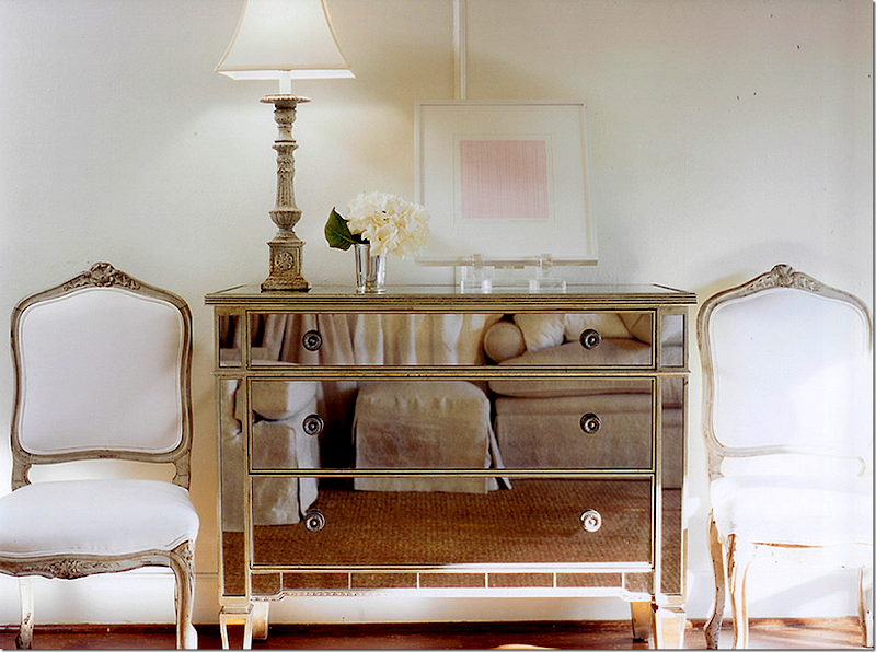
Across from the sofa, Ashley used a mirrored chest – a wedding gift from her then boss Renea Abbott of Shabby Slips. Mixed in were two French chairs covered in white.
Another view of the sunny, top floor apartment. I remember reading this article back then and thinking how wonderful her first house was!
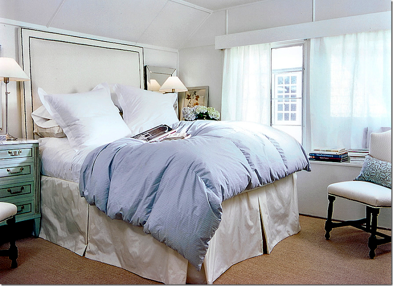
The master bedroom had a tall upholstered headboard which fit perfectly under the eave of the ceiling.
Love the green side table!
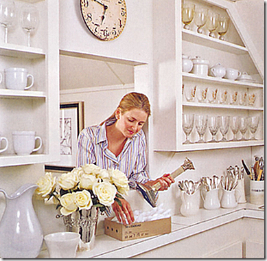
The kitchen – shows Ashley’s growing collection of ironstone which held her silverware.
The couple quickly outgrew the small one bedroom apartment and began a hunt for their first “real” home. The answer came in a charming 2 story house in a beautiful, older, close in neighborhood, filled with bungalows.
The house had 2 bedrooms and 1 bath and they bought it from the original owners. After living there for 1 1/2 years, Ashley hired architect Kurt Aichler to add over 1200 sq. ft. – including a den, kitchen, and master suite with a closet and a bath. Ashley has graciously allowed me to show the pictures of her first house!
Bing Maps show the cute bungalow with a black awning over a black front door. There is now a dormer window up front – the new addition is at the back so that the façade still fits in the neighborhood.
Photographs by Julie Soefer
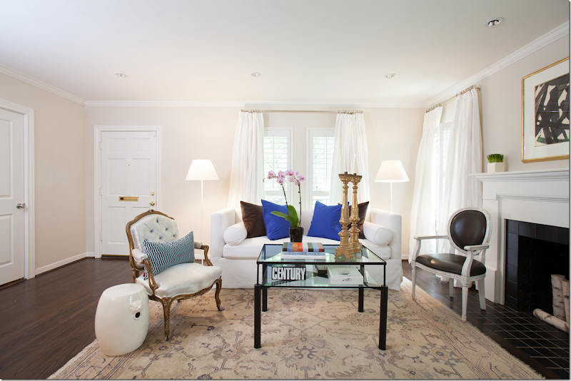
The front door opens to the original part of the house – Ashley used white paint and white linen curtains over shutters. The sofa is a very tailored white linen slip with the coffee table from her original apartment. A pale Oushack rug covers the hardwoods.
Ashley restyled the same room with bright blue pillows. Which pillows do you prefer – the brighter ones or the patterned ones in the other photograph?
Same view with different styling- I think I prefer these pillows on the sofa better.
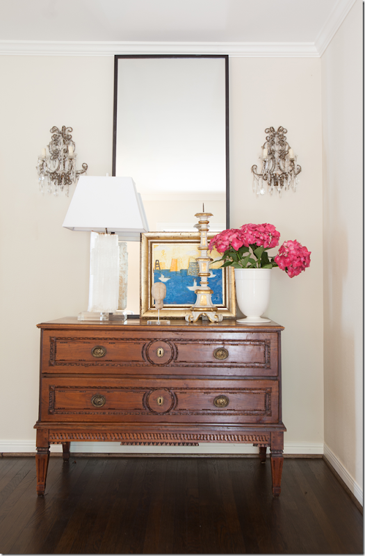
Across from the sofa and leading into the dining room, is this antique chest – styled with a contemporary lamp and mirror and flanked with vintage macaroni bed crystal sconces. This mix of old and new is a trademark of Ashley. It’s a perfect way for the younger set to decorate – mixing the love of antiques they got from their parents and adding a dash of the more modern look for today.
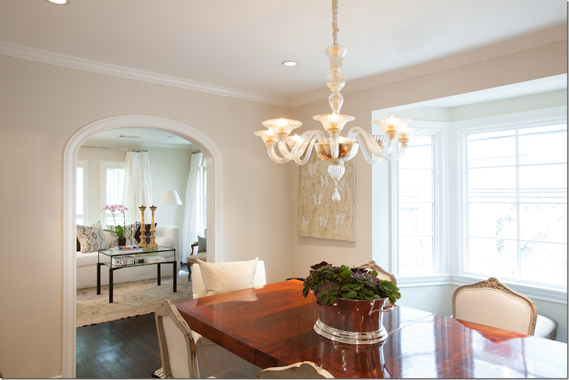
Past the living room is the dining room - which leads into the kitchen and family room that Aichler added on to the house. The contemporary Parsons styled table sits atop a zebra rug.
The living room is through the arched opening – and on the right is a bay window. Around the table is a mix of French chairs with slipped host and hostess ones. Beautiful chandelier!
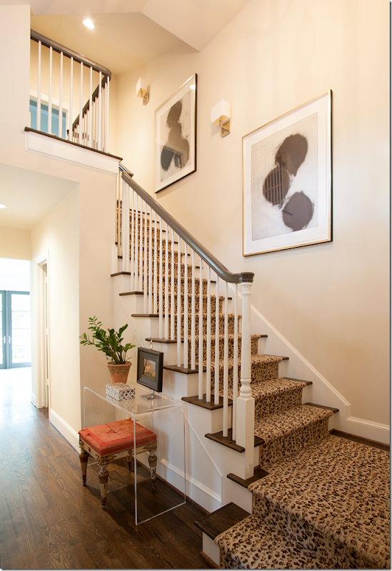
The stairs are beautiful – mixed with the animal skin runner. Below, an antique bench sits underneath a simple lined acrylic console. Love the art work and the sconces leading up the stairs.
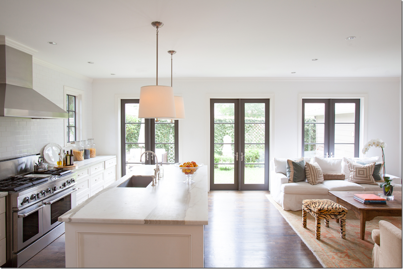
Past the stair hall is the newly added on kitchen/family room. The three French doors lead to the outside courtyard.
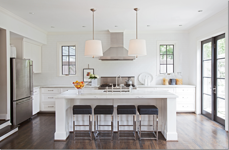
The addition by Aichler is stunning. The entire back wall is subway tile. The island and counters are topped with white marble. Two windows flank the range – and two contemporary light fixtures frame the hood. Just beautiful!!!!
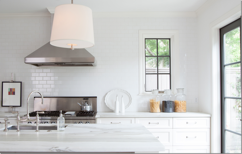
Close up of the kitchen shows the entire back wall of white subway tile.
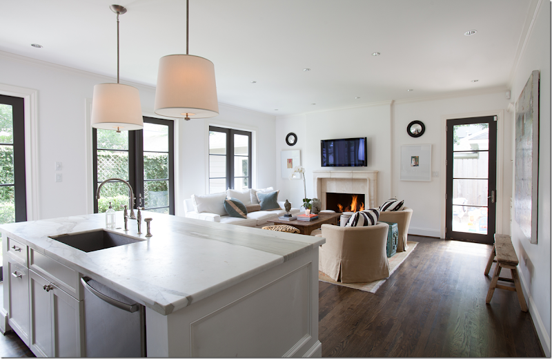
And the view past the island shows the sitting room with its stone fireplace. The marble slab is so pretty.
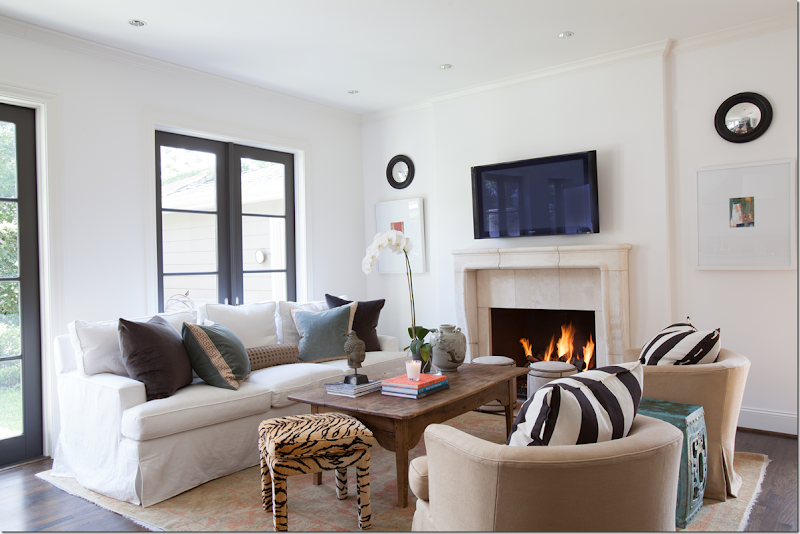
Ashley used another white slipcover sofa – perfect for children and mixed it with khaki chairs and a rustic wood coffee table. Beautiful velvet pillows.
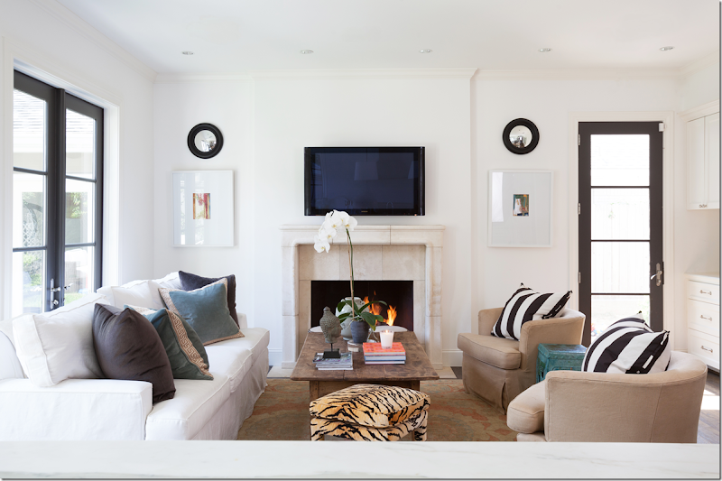
I like how she styled the fireplace wall with the prints and the convex mirrors – this really takes the eye away from the flatscreen. Underneath is another Oushak, this one is a bit more colorful.
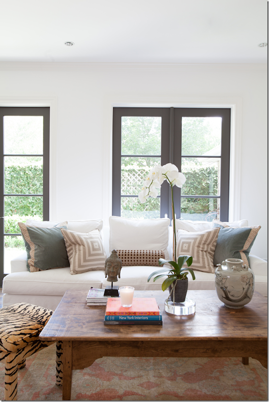
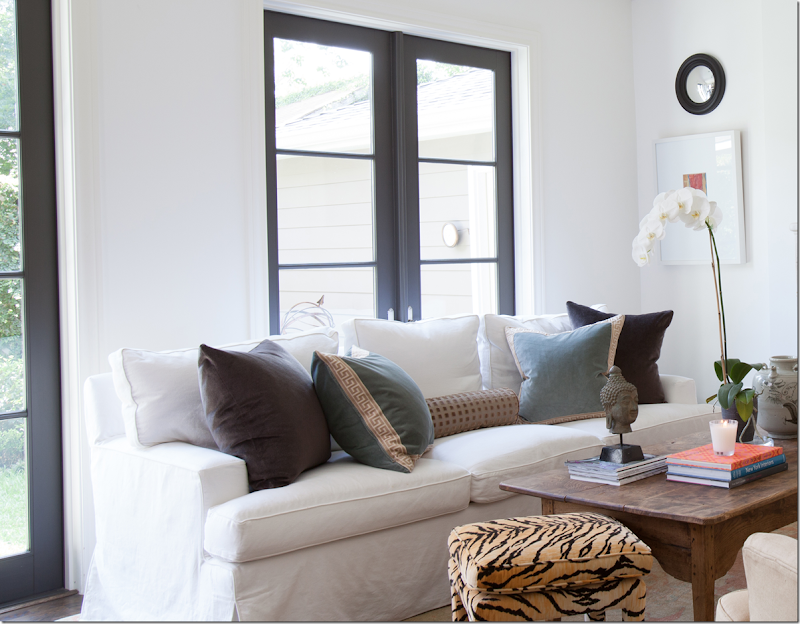
Ever the decorator – here Ashley restyled the sofa with different pillows – but I think I like it with the dark velvet pillows better. I love those aqua velvet pillows with the Greek key trim.
Yes, I think I like the pillows just like this.
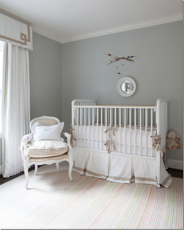
The nursery is precious in whites and tan – with a French chair and curtains with a trimmed valance. Love the striped rug layered over a plain rug underneath.
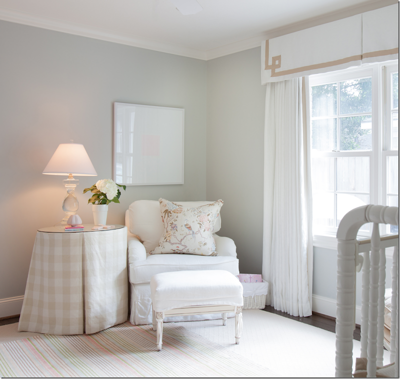
Across from the crib is a slipped white chair and ottoman and skirted table. I love the curtains!!!
The little boy’s room has an upholstered day bed with nailheads and a cute mix of pillows.
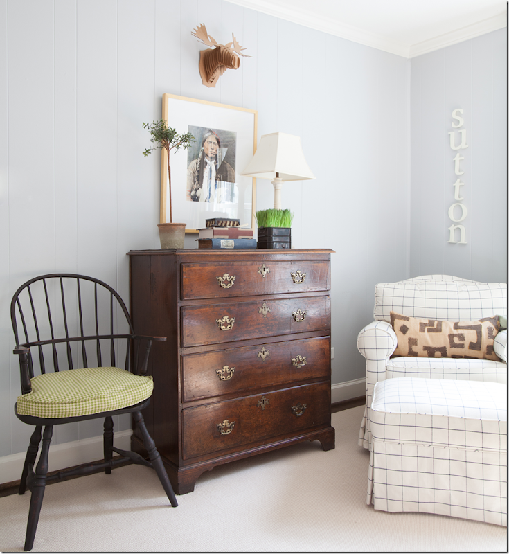
Across from the bed, he gets a touch of Americana with a Windsor chair and wood chest and Indian print. Love the pane fabric on the chair and ottoman. Perfect for a little boy!!
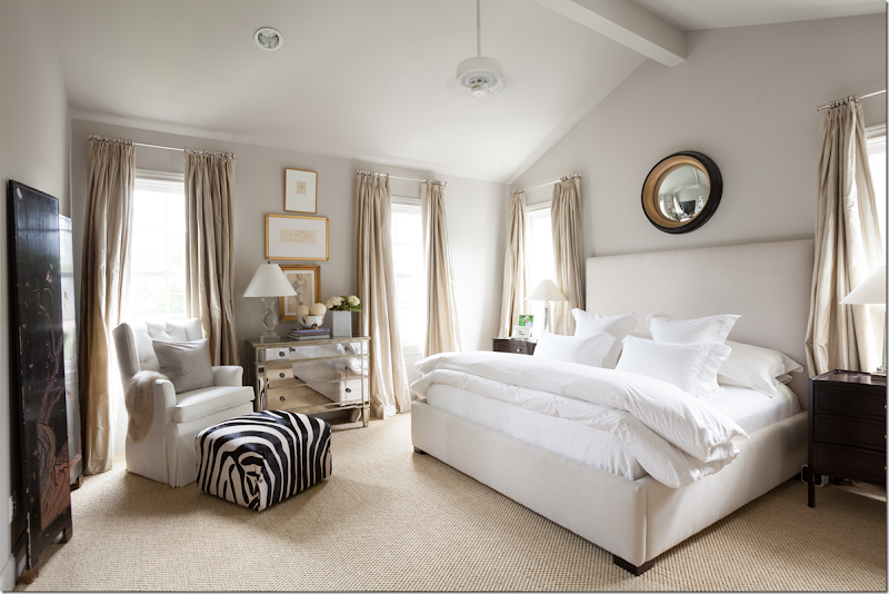
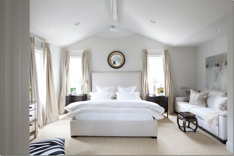
Upstairs is the new master suite that Aichler designed. The ceiling is vaulted and room has many windows which make it so sunny and bright. Upholstered bed, tailored with white bedding, sits underneath a large convex mirror. So beautiful.
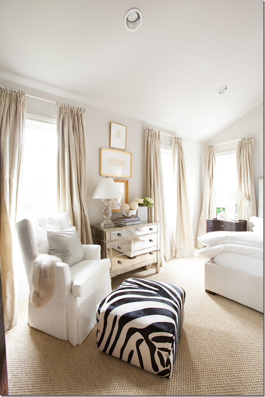
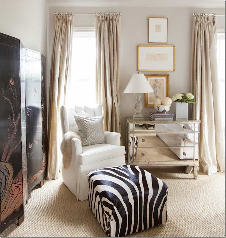
Between the windows with silk curtains is the mirrored chest from her first apartment. A tall chair is mixed with a zebra print ottoman which adds a pop of contrast to the beige room.
Next to the chair is an antique lacquered screen. I love the series of gold framed prints and the nickel curtain rods and rings look like jewelry in the room – so pretty.
Next to the bed is a white sofa underneath a contemporary painting mixed with a chinoiserie table.
Flanking the bed are dark nightstands. I love all the touches of black and gold throughout the room.
And finally, the new master bath with marble subway tile in the shower and marble tiled floor. Love the two twin windows.
A huge thank you to Ashley for sharing these photographs today!!!
AND:
![[Banner%25202%2520v%25202%255B4%255D.jpg]](https://lh6.ggpht.com/-5TAnn3mXgjw/UYR3dSt4swI/AAAAAAAByt0/839mLtNzVtw/s1600/Banner%2525202%252520v%2525202%25255B4%25255D.jpg)
The link to my interview on A House Romance was not working last time – so if you tried to find the blog, but couldn’t – here it is HERE. Sorry about that!!!!

