A short while ago, a Houston interior designer and blogger Amanda Carol of Amanda Carol At Home contacted me about a job she is currently working on. It’s not yet totally finished, but she wanted to share pictures of what she has accomplished so far. The house is located in The Woodlands, a verdant suburb north of town. Amanda lives there too and it is where she started designing just a few years ago. I really love what she has done with the house – a pretty two story newer construction with an open floor plan. Before, the house was painted a dark and dreary taupe - and now it is very bright and stylish and sophisticated! See if you agree!
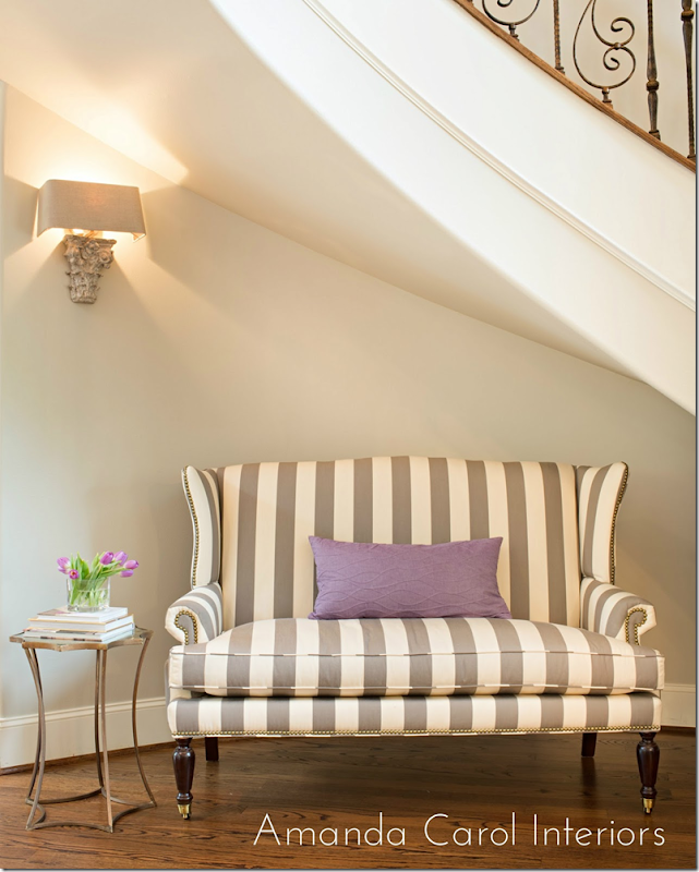
The newly redone rooms start at the entry hall. Amanda chose this wonderful striped settee to sit under a beautiful curved staircase. Above, is a sconce from Aidan Gray. I just used these myself and I love them! It looks especially good here, I think. A small gold table and lilac pillow provide the accents. The walls in the house were a dark taupe and the first thing Amanda did was repaint downstairs and upstairs in the lighter Benjamin Moore Revere Pewter. This paint is a gray that color expert Maria Killam recommends.
Photographs by Laurie Perez - she is really talented, btw. I first saw the work she did for Sally Wheat.
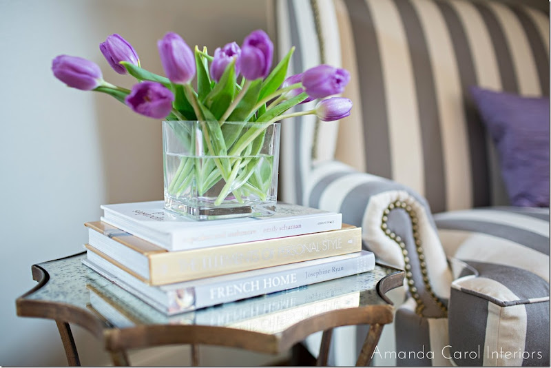
The top of the table is an antiqued mirror. Amanda accessorized it with books and flowers. You could also use antique books here.
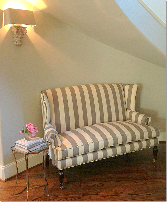
And a second view of the entry hall.
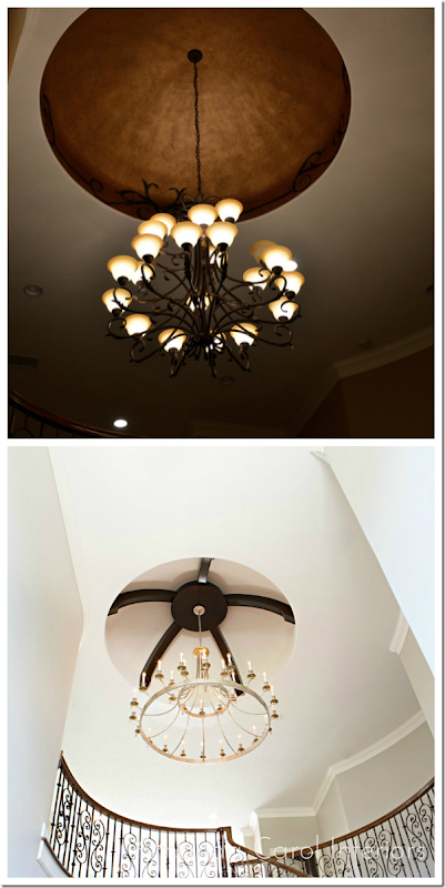
Also in the entry, up above is a dome that was faux painted copper with vines along the edge. In the before picture you can see the dark color the house was painted before. Amanda painted out the faux copper and installed beams in the dome, along with a new brass chandelier replacing the builder grade one that was there before. Huge change for the better!
And a shot of the entry hall ceiling.
A close up of the chandelier. All the lighting fixtures came from Curry and Co.
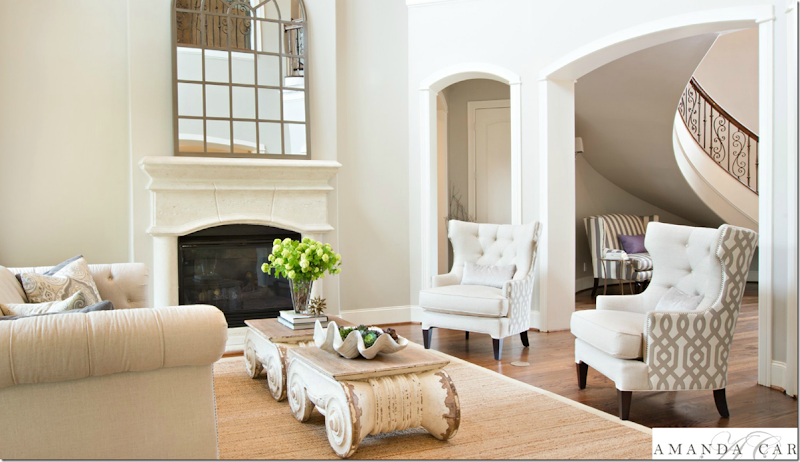
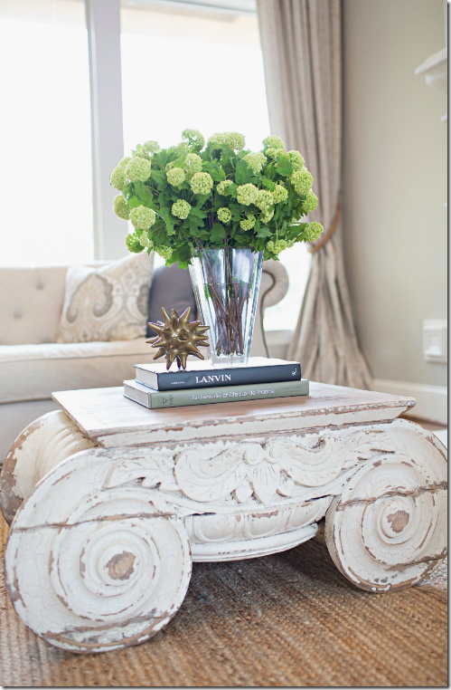
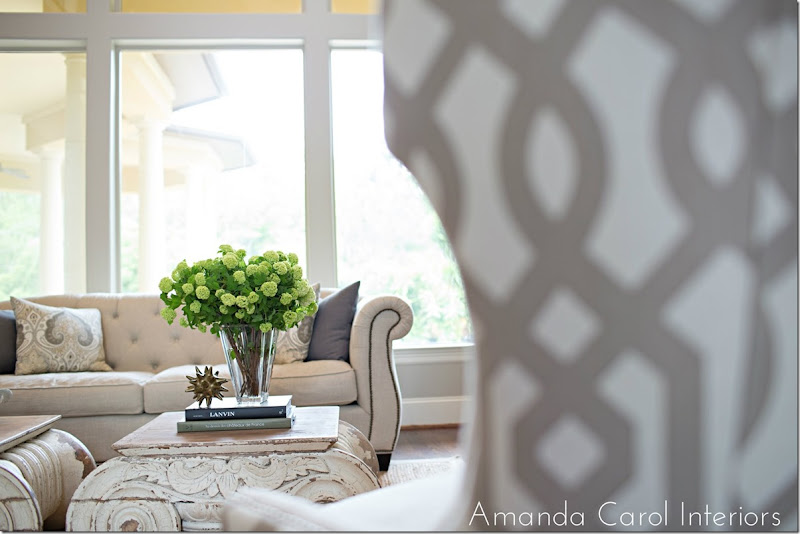
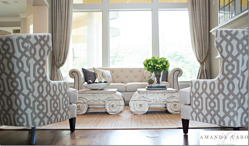
The living room is done in soft linens – with a trellis pattern on the chairs. My favorite part is the capital coffee tables from Restoration Hardware – those are soooo fabulous!!!! Especially the two of them together – love those! Soft curtains frame the view.
And looking the other direction toward the entry hall. You can see busier patterned fabric is on the back of the chairs only, which is a great idea. It gives a bit of pattern without being too much. The room has a high ceiling – so the mirror is extra large, which is good proportionally.
Close up of one of the tables. This reminds me of the antique capitals in the townhouse that Ginger Barber designed.
In this photograph from Ginger’s client’s living room – she used two antique capitals. Finding capitals that are the right size and the right price can be really hard – so it makes the Restoration Hardware tables a great alternative. Except of course, the RH tables aren’t cheap! And two of them….oy!!! It would be worth it to find them on sale if you need two. But they are fabulous. This is first time I’ve seen them used in a house, I’d love to “borrow” the idea!!
Tufted linen sofa with nailheads and gray and paisley print pillows.
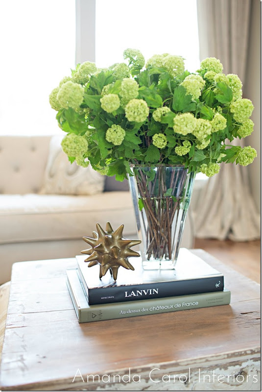
Accessories are kept to a minimum which keeps the house from looking cluttered.
On the other table a large clam shell filled with succulents and moss.
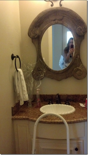
Before picture of the powder room – typical builder grade selections. That dark granite looks dated all of all sudden.
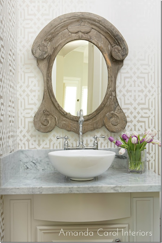
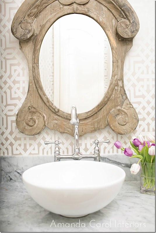
Amanda chose a Schumacher trellis patterned wallpaper – which links the space to the living room. The granite is replaced with marble and the sink is also replaced with a fab faucet.
French window styled mirror.
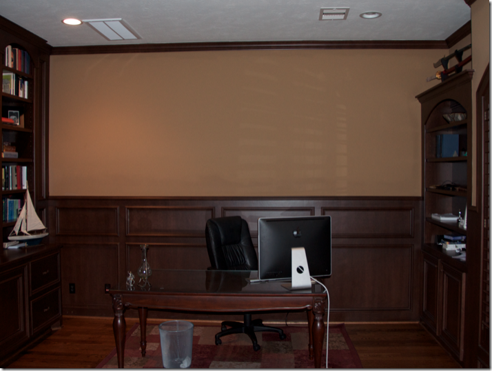
A before shot of the study with the dark taupe walls that the entire house was painted in. So dreary!
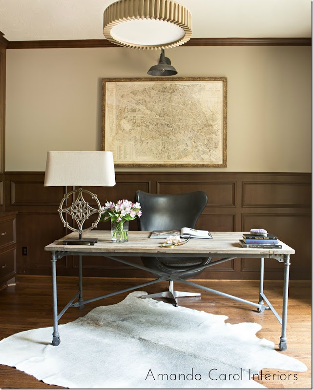
Today, the room is alive and eclectic with a mix of contemporary and stylish furniture. A great industrial styled desk and chair sit atop a cowhide rug. The antique styled map is a good counterpoint to the modern feel of the room. The paint on the wall makes all the difference. I really like the light fixtures – especially the one over the map.
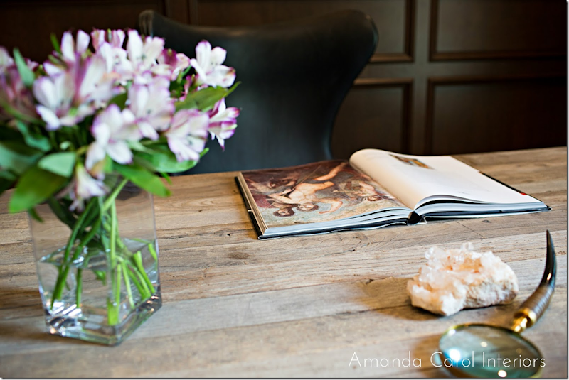
Desk top accessories.
Before – the dining room is the same dark taupe found throughout. Here, the only item that remained is the wood table. The large mirror moved to over the living room fireplace.
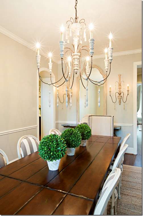
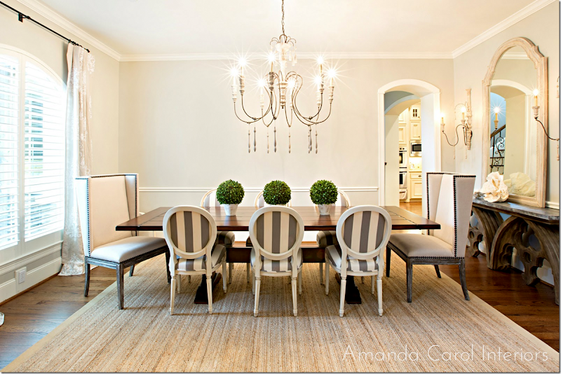
And today, the room I love the most – the dining room – SOO PRETTY! The French chairs are striped in the same fabric as the settee in the adjoining entry hall. Two tall nailhead chairs accent the host and hostess positions. Plus, the height of the two chairs adds interest. The curtain fabric is linen with a quiet pattern in white. Along the wall is the zinc top Aidan Gray console – love it! And the large chandelier has just the correct proportions.
I love the French chairs with the striped fabric – just love it!
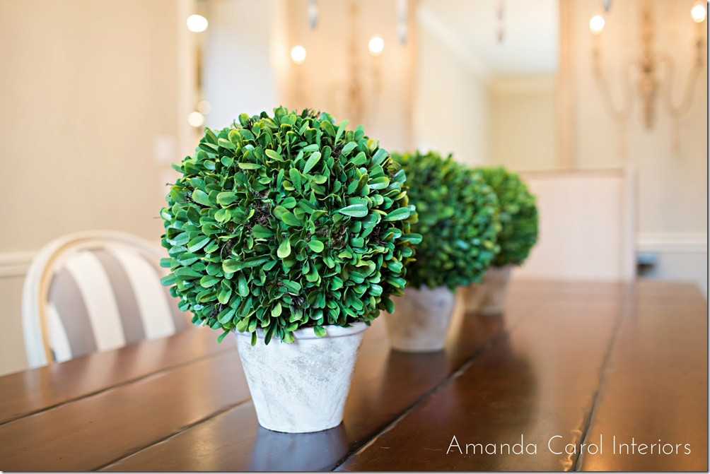
Three botanicals sit on the long table. This reminds me of Carol Glasser’s dining room with the row of simple candles. You don’t have to do the expected candlesticks with a bowl in the middle on a long dining table.
Carol Glasser’s table – three simple candlesticks reminds of the three pots on Amanda’s table.
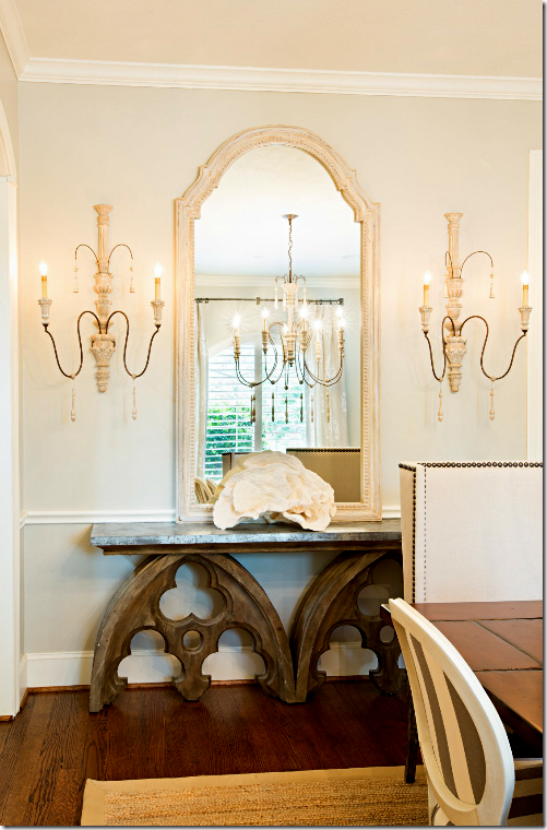
Against the side wall is the console with a large rose coral, tall mirror and two pretty sconces.
I love all the changes Amanda did in this room – and in the house. Before it was so dark and out of style. Today it is fresh and bright and stylish. From the dining room..
…to the living room room with the great capital tables and chairs…
..to the pretty welcoming entry. These three main areas are all open to each other and they blend together so well. By using linens and classic patterned fabrics in the same color range – nothing is jarring. Instead, the updated house is now stylish and sophisticated.
A huge thank you to Amanda Carol for sharing her latest projects. To see her portfolio and to read her blog, please go HERE.

